What is Vermeer Dutch Golden Age?什么是 Vermeer Dutch Golden Age?
In every Vermeer, a north window carves stillness from shadow — and that quality of light, patient and precise, is this system's founding principle.每一幅维米尔画作中,北窗从阴影里凿出静谧——那种光的品质,沉静而精确,正是本设计系统的根本原则。
Vermeer Dutch Golden Age in briefVermeer Dutch Golden Age 速览
The Vermeer Dutch Golden Age aesthetic draws from Johannes Vermeer's approximately thirty-four surviving paintings, produced in Delft between roughly 1656 and 1675. The visual language is defined by the quality of cool, diffused north-window light falling across domestic interiors — pearl-white plaster walls, lapis lazuli ultramarine drapery, buttery lemon-yellow jackets, warm walnut and ebony furniture. Every surface is rendered with the optical precision that led later scholars to speculate Vermeer used a camera obscura as a compositional aid.维米尔荷兰黄金时代美学源自维米尔约三十四幅存世画作,这些作品大约创作于1656年至1675年间的代尔夫特。其视觉语言由一种光的品质所定义——清冷漫射的北窗光线斜照室内:珍珠白的灰泥墙壁、青金石群青的帷幔、奶油柠檬黄的外套、深色胡桃木与乌木家具。每一个表面都以光学般的精确被呈现,这令后世学者猜测维米尔借助暗箱作为构图辅助工具。
As a design aesthetic, this system translates mineral-pigment richness into a contemplative editorial register. The palette is narrow and deeply saturated only in specific roles — the famous Vermeer blue anchors weight, the warm creams and off-whites carry light, and muted ochres and umbers tie background planes together. Compositions are intimate in scale, centered on a single subject or gesture, with generous peripheral silence. Nothing competes with the central luminous moment.作为设计美学,本系统将矿物颜料的丰富性转化为沉思式的编辑格调。色板范围狭窄,仅在特定角色中深度饱和——著名的维米尔蓝锚定视觉重量,温暖的奶油色与米白色承托光感,柔和的赭色与棕褐色将背景平面联结在一起。构图在比例上是亲密的,聚焦于单一的主体或姿态,周围保留充裕的沉默。没有任何元素与中央的光辉瞬间争夺注意力。
The style is best described as meditative clarity — the opposite of Baroque theatrical drama, even though it shares the same era. Vermeer was interested in ordinary moments rendered extraordinary by attention: a woman reading a letter, milk being poured, a lace-maker bent over her pillow. That same quality of devoted, unhurried attention to a single subject is what distinguishes a genuine Vermeer-derived design from surface-level period pastiche.这种风格可以被描述为沉思式的清明——与巴洛克戏剧性相对,尽管两者共享同一时代。维米尔关注的是被专注所提升为非凡的寻常时刻:一位女性在读信,牛奶被缓慢倒下,蕾丝工俯身于枕头之上。同样这种对单一主体虔诚而不慌不忙的专注,正是真正源自维米尔的设计与表层时代仿制品之间的根本区别。
See the Vermeer Dutch Golden Age design system查看 Vermeer Dutch Golden Age 完整设计系统
Where does Vermeer Dutch Golden Age come from?Vermeer Dutch Golden Age 从何而来?
Johannes Vermeer was born in Delft in 1632, the son of a silk-weaver turned art dealer. He lived his entire life within a few streets of the market square, joined the painters' guild of Saint Luke in 1653, and died in 1675 leaving his wife Catharina Bolnes and eleven children deep in debt. During his lifetime he had a modest regional reputation; the grand rediscovery came nearly two centuries later, in 1866, when the French journalist and critic Théophile Thoré-Bürger published a landmark article attributing some seventy paintings to Vermeer's hand. The subsequent verification and pruning of that attribution list to the current approximate thirty-four is itself a story of connoisseurship, scientific analysis, and occasional fraud.约翰内斯·维米尔于1632年生于代尔夫特,父亲是一位由丝绸织工转行的艺术品商人。他一生都生活在市集广场附近的几条街道之间,1653年加入圣路加画家行会,1675年辞世时留下妻子卡塔里娜·博尔内斯与十一名子女,以及沉重的债务。在世时,他仅拥有有限的地区性声誉;真正的重新发现发生在将近两个世纪之后的1866年,法国记者兼评论家泰奥菲尔·托雷-比尔热发表了一篇重要文章,将约七十幅绘画归于维米尔名下。随后将这份归属名单核实精减至目前约三十四幅的过程,本身就是一段鉴赏学、科学分析与偶发欺诈交织的历史。
Vermeer worked within the Delft School, a loose grouping of Dutch Golden Age painters — including Pieter de Hooch and Carel Fabritius — who shared an interest in the domestic interior as subject, in architectural perspectival space, and in the careful observation of how light behaves on different surfaces. The Dutch Golden Age was made possible by the extraordinary commercial wealth of the Dutch Republic: Amsterdam and the port cities controlled a significant fraction of global trade, and this prosperity created both a large merchant class with disposable income to spend on paintings and a domestic culture that prized the home as a site of comfort, order, and moral virtue. Genre painting — scenes of everyday middle-class life — arose to meet this demand.维米尔在代尔夫特画派内工作——这是一个松散的荷兰黄金时代画家群体,包括彼得·德·霍赫与卡雷尔·法布里蒂乌斯——他们共同关注室内场景作为主题、建筑透视空间,以及对光线在不同表面上行为的仔细观察。荷兰黄金时代建立在荷兰共和国非凡的商业财富之上:阿姆斯特丹与各港口城市控制了全球贸易的相当份额,这种繁荣造就了一个拥有可支配收入购买绘画的庞大商人阶层,以及一种将家庭视为舒适、秩序与道德美德场所的家居文化。风俗画——描绘日常中产阶级生活场景的绘画——由此应运而生,以满足这一需求。
The camera obscura hypothesis, debated since the art historian Philip Steadman's geometric analysis in 2001, holds that Vermeer projected the scene through a lens onto a ground-glass screen or canvas and traced the optical image. Whether or not this is literally true — and many scholars remain skeptical — the hypothesis captures something essential about the Vermeer aesthetic: the interest in optical truth, in the way light halos around a white collar or halates on a window ledge, in the slight softening of objects not at the plane of sharpest focus. These are qualities derived from optical instruments, whether or not Vermeer used one.暗箱假说自艺术史学家菲利普·斯特德曼于2001年进行几何分析以来一直存在争议,该假说认为维米尔通过镜头将场景投影到磨砂玻璃屏幕或画布上,并描摹光学图像。无论这是否字面上为真——许多学者仍持怀疑态度——这一假说都捕捉到了维米尔美学中某种本质性的东西:对光学真实的兴趣,对光线如何在白色衣领上晕染、在窗台上漫溢的方式的关注,以及对焦平面以外物体轻微柔化效果的敏感。这些都是源自光学仪器的特质,无论维米尔是否真的使用过它。
The pigments Vermeer used were among the most expensive available in seventeenth-century Europe. Natural ultramarine, ground from lapis lazuli mined in Afghanistan and traded across the continent, cost more per weight than gold. Vermeer used it lavishly — not just in skies but in shadows, in fabric folds, in the modulation of wall plaster — which is part of why his estate was insolvent at his death. Lead white, smalt, yellow ochre, vermilion, and bone black round out the palette. These were applied in thin, translucent glazes over opaque underlayers, which accounts for the luminous depth that distinguishes Vermeer's surfaces from those of contemporaries working more directly.维米尔所使用的颜料是十七世纪欧洲最昂贵的颜料之列。天然群青由产自阿富汗、跨洲贸易的青金石研磨而成,按重量计算价格超过黄金。维米尔大量使用它——不仅用于天空,还用于阴影、织物褶皱、墙壁灰泥的色彩变化——这在一定程度上解释了为何他的遗产在其辞世时已资不抵债。铅白、蓝铜矿、黄赭石、朱砂与骨黑构成了完整的色板。这些颜料以薄而透明的釉层叠加在不透明的底层之上,正是这种技法造就了那种将维米尔的表面与更为直接作画的同时代画家区别开来的光辉深度。
What defines the Vermeer Dutch Golden Age look?Vermeer Dutch Golden Age 的视觉特征是什么?
Light Source光源方向
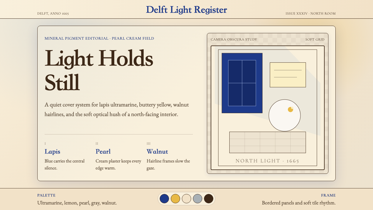
All illumination enters from a single direction — invariably the left side, from a high north-facing window. This produces a characteristic gradient: one side of every form catches cool, bright daylight while the opposite side recedes into warm, muted shadow. The light is diffused and soft rather than the raking theatrical spotlight of Caravaggio or the Dutch tradition of candlelight painters. Interiors are neither fully lit nor dramaticaly dark — they are in a state of luminous equilibrium, where shadows still hold color and the lit surfaces glow with contained radiance.所有光照均从单一方向进入——总是左侧高处的朝北窗口。这产生了一种特征性的渐变:每个形体的一面承接清冷明亮的日光,对面则退入温暖、柔和的阴影。光线是漫射而柔和的,而非卡拉瓦乔式的戏剧性侧光,也不同于荷兰烛光画传统中的强烈聚焦。室内既非全然明亮,也非戏剧性的幽暗——它处于一种光辉的均衡状态,阴影中仍保有色彩,受光面则以内敛的光辉发光。
Palette Restraint色板的克制
The Vermeer palette is simultaneously rich and narrow. The dominant ground tones are creamy off-whites, warm stone beiges, and chalky plaster greys — large, quiet fields that give luminous accents room to breathe. Against these grounds, two signature chromatic moments define each composition: a deep lapis-derived blue, cool and saturated, and a warm lemon or golden yellow. These two accent colors rarely appear at full intensity simultaneously; more often one dominates while the other plays a supporting role in a smaller area. Supporting neutrals — warm umber, muted ochre, dark ebony brown — provide structural framing without competing.维米尔的色板同时具有丰富性与狭窄性。主导的底调是奶油米白、温暖石灰米色与粉笔质感的灰泥灰——宽阔而安静的色域,给予光辉的点睛色彩以呼吸空间。在这些底调之上,两个标志性的色彩时刻定义了每幅构图:一种深沉的源自青金石的蓝色,清冷而饱和;以及温暖的柠檬或金黄色。这两种强调色极少同时以全强度出现;更多时候,一种主导,另一种在较小区域扮演配角。辅助中性色——温暖棕褐、柔和赭色、深色乌木棕——提供结构性框架,不与主色争夺注意力。
Compositional Framing构图框架
Vermeer's compositions are structured by architectural elements — window frames, wall surfaces, table edges, tiled floors — that create a series of rectangles within the rectangle of the picture plane. These inner frames anchor the subject and establish measured spatial recession. The subject is almost never centered symmetrically; instead, it occupies a slightly off-center position within a generous field, often with empty foreground space that creates breathing room between the viewer and the scene. Furniture, maps, and fabric create secondary planes that layer depth without busy detail.维米尔的构图由建筑元素构建——窗框、墙壁表面、桌边、铺砖地板——在画面矩形内创造出一系列嵌套矩形。这些内部框架锚定主体,建立有节制的空间纵深。主体几乎从不对称居中;而是在宽阔的画面中占据一个略微偏中的位置,通常有空旷的前景空间,在观者与场景之间创造呼吸距离。家具、地图与织物创造次级平面,在不增加繁杂细节的情况下叠加纵深感。
Texture and Surface质感与表面
Vermeer differentiates surfaces through the behavior of light on them rather than through outline or graphic contrast. Silk catches light at sharp angles and produces bright specular highlights; wool absorbs and scatters it; plaster is matte and slightly granular; pearls produce a soft, rounded glow distinct from metallic shine. In design application, this translates to a strong material hierarchy: surfaces that should advance use brighter, cooler treatment; surfaces that should recede use warmer, more diffuse treatment. The eye learns to read value gradation as material identity.维米尔通过光线在表面上的行为来区分材质,而非通过轮廓或图形对比。丝绸在尖锐角度捕捉光线并产生明亮的镜面高光;羊毛则吸收并散射光线;灰泥是哑光且略带颗粒感的;珍珠产生柔和、圆润的光辉,不同于金属光泽。在设计应用中,这转化为强烈的材质层级:应当前进的表面使用更亮、更冷的处理;应当后退的表面使用更暖、更漫射的处理。眼睛学会将明度渐变解读为材质身份。
Focused Stillness聚焦的静谧
Every Vermeer shows a figure in the midst of an ordinary, absorbed action — reading, pouring, weighing, sewing. There is no narrative drama, no conflict, no audience address. The figure is complete within itself. In design terms, this translates to compositions with a single clear primary focus — one object, one data point, one headline — surrounded by sufficient quiet space that the eye is not required to choose between competing elements. Secondary information supports rather than competes.每一幅维米尔都展示一个人物正沉浸于某个普通的专注行为之中——阅读、倾倒、称量、缝纫。没有叙事性戏剧,没有冲突,没有对观者的正面诉求。人物在自身内部完整自足。在设计术语中,这转化为具有单一清晰主焦点的构图——一个对象、一个数据点、一条标题——被充裕的安静空间所环绕,使眼睛不需要在相互竞争的元素之间做出选择。次级信息是支撑性的,而非竞争性的。
Optical Softness光学柔焦
Objects at the edges of Vermeer's compositions — or those not at the artist's plane of sharpest attention — are rendered with less edge definition, a technique consistent with the depth-of-field behavior of a lens. This is distinct from generic soft-focus or blurring: foreground elements can be softened while midground elements are sharply delineated. In design application, this principle supports selective focus through varying levels of visual sharpness across a composition — sharp edges at the center of attention, softer treatment in supporting zones — without resorting to literal photographic blur.维米尔构图边缘的物体——或那些不在画家最清晰关注平面上的物体——以较少的边缘清晰度被呈现,这种技法与镜头景深行为相符。这与通用的柔焦或模糊不同:前景元素可以是柔化的,而中景元素则是清晰勾勒的。在设计应用中,这一原则通过在构图中不同区域赋予不同程度的视觉锐度来支持选择性焦点——注意力中心处的清晰边缘,辅助区域的柔和处理——而无需诉诸字面意义上的摄影模糊。
Intimate Scale亲密的尺度
Vermeer's paintings are physically small — the largest, The Art of Painting, measures roughly half a meter by less than half a meter on its smallest dimension. They are paintings made to be seen closely, in a domestic setting, at human scale. This intimate dimensionality is a core aesthetic value: no element overwhelms, nothing is monumental, everything is considered at the scale of a person in a room. Design derived from Vermeer should maintain this quality of considered intimacy — tight spatial relationships, measured proportions, a sense that each element has been placed with deliberate, quiet care rather than broad gestural confidence.维米尔的画作在物理尺寸上很小——最大的《绘画的寓言》在最小维度上约半米见方。这些画是为了在家居环境中、以人的尺度近距离观看而创作的。这种亲密的维度性是核心的美学价值:没有任何元素会压倒一切,没有宏大纪念性,每件事物都在一个人在房间中的尺度下被考量。源自维米尔的设计应保持这种经过深思的亲密品质——紧密的空间关系,有节制的比例,每个元素都以刻意而安静的关怀被放置,而非以宽阔的手势自信被安排。
See the Vermeer Dutch Golden Age design system查看 Vermeer Dutch Golden Age 完整设计系统
Who shaped Vermeer Dutch Golden Age?谁塑造了 Vermeer Dutch Golden Age?
Vermeer (1632–1675) was a Delft painter who joined the Guild of Saint Luke in 1653. Extraordinarily little is documented about his working methods, patrons, or training — he left no letters, no drawings, and only the thirty-four or so paintings. His output was low relative to contemporaries, suggesting either a very deliberate working pace or concurrent activity as an art dealer. His rediscovery by Thoré-Bürger in 1866 sparked the modern Vermeer cult; subsequent generations of critics, novelists, and scientists have debated the camera obscura question, the identity of sitters, and the sourcing of his extraordinary lapis ultramarine. His Girl with a Pearl Earring (c. 1665) became one of the most recognized images in Western art history.维米尔(1632—1675年)是代尔夫特画家,1653年加入圣路加行会。关于他的工作方法、赞助人或师承,有据可查的信息少得异常——他没有留下书信、素描,仅有约三十四幅画作。相较同时代画家,他的产量很低,这暗示他要么工作节奏极为刻意,要么同时从事艺术品经销活动。1866年托雷-比尔热对他的重新发现引发了现代维米尔崇拜热潮;此后几代评论家、小说家与科学家在暗箱问题、画中模特身份以及他那非凡的青金石群青来源等方面展开了持续争论。他的《戴珍珠耳环的少女》(约1665年)成为西方艺术史上最广为人知的图像之一。
Pieter de Hooch (1629–1684) was Vermeer's near-contemporary in Delft before moving to Amsterdam. His domestic interiors share the formal preoccupations that define the Delft School: perspectival architectural space, the fall of light through doors and windows, figures absorbed in household tasks. De Hooch is more architecturally complex than Vermeer — he often shows multiple rooms or outdoor-indoor transitions — and less interested in the concentrated luminous moment. Comparing the two painters clarifies what is specifically Vermeer's: the reduction to a single window, a single figure, a single arrested gesture.彼得·德·霍赫(1629—1684年)在迁往阿姆斯特丹之前,是维米尔在代尔夫特的近似同龄人。他的室内场景共享着定义代尔夫特画派的形式关切:建筑透视空间,光线穿越门窗倾泻而下,人物沉浸于家务劳动。德·霍赫在建筑构成上比维米尔更为复杂——他经常展示多个房间或室内外过渡空间——而对凝练的光辉瞬间则兴趣较少。比较两位画家,恰恰澄清了维米尔的独特性:将一切简化为单一窗口、单一人物、单一被捕捉的姿态。
Thoré-Bürger (1807–1869) was a French art critic and political journalist who, in exile following the failed revolutions of 1848, used the pen name 'William Bürger' and threw himself into Dutch seventeenth-century art. His 1866 article in the Gazette des Beaux-Arts was the first systematic scholarly treatment of Vermeer, correctly attributing works scattered across European collections under various names and establishing the canon that subsequent scholarship would refine. Without Thoré-Bürger's detective work, the Vermeer aesthetic as we understand it would not exist as a distinct design language — it would remain a handful of unnamed genre paintings.托雷-比尔热(1807—1869年)是法国艺术评论家与政治记者,1848年革命失败后流亡期间,以「威廉·比尔热」为笔名,将全部精力投入荷兰十七世纪艺术研究。他1866年发表于《美术公报》的文章是对维米尔的第一篇系统性学术处理,正确归属了散落于欧洲各地收藏中以不同名称挂牌的作品,并确立了此后学术研究不断精炼的经典作品体系。若无托雷-比尔热的侦探式研究工作,我们所理解的维米尔美学将不会作为一种独特的设计语言存在——它将只是几幅无名的风俗画。
Catharina Bolnes (1631–1687) was Vermeer's wife and, with her mother Maria Thins, a significant financial and social support during his career. Their marriage required Vermeer to convert to Catholicism — an uncommon but not impossible arrangement in the Dutch Republic. After his death, Catharina fought creditors and attempted to preserve his estate; she is believed by some scholars to appear in one or more of his paintings, though no identification is certain. Her role is a reminder that the Vermeer interior is also a record of real domestic life, made within a specific household with specific economic and social pressures.卡塔里娜·博尔内斯(1631—1687年)是维米尔的妻子,与她的母亲玛利亚·廷斯一起,在他的职业生涯中提供了重要的经济与社会支撑。他们的婚姻要求维米尔皈依天主教——在荷兰共和国这是不寻常但并非不可能的安排。维米尔辞世后,卡塔里娜与债权人周旋并试图保全遗产;部分学者相信她出现在他的一幅或多幅画作中,尽管没有任何身份识别是确定无疑的。她的存在提醒我们:维米尔的室内场景同时也是真实家居生活的记录,在一个有着具体经济与社会压力的特定家庭中诞生。
How do you use Vermeer Dutch Golden Age today?今天怎么用 Vermeer Dutch Golden Age?
The Vermeer aesthetic is among the most specifically calibrated historical styles available to contemporary designers — its strength comes from restraint, not richness, and from the quality of a single focused moment rather than variety or busyness. Applying it correctly means committing to its core discipline: one light direction, a limited palette weighted toward quiet creams and deep blues with warm accent, generous empty space around a single subject, and deliberate material hierarchy established through light and shadow rather than outline.维米尔美学是当代设计师可使用的历史风格中校准最为精确的之一——其力量来自克制,而非丰富,来自单一聚焦时刻的品质,而非多样性或繁杂。正确应用意味着对其核心纪律的承诺:单一光线方向,偏向安静奶油色与深蓝色并以温暖色调点缀的有限色板,主体周围充裕的空白,以及通过光与影而非轮廓建立的刻意材质层级。
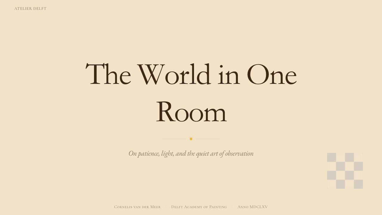
For presentation slides, the Vermeer approach works exceptionally well on feature or cover slides where a single image or idea deserves full attention. A cover benefits from a large central figure or object set against a warm off-white or plaster-grey ground, lit from the left, with title type set in a warm dark brown or deep blue rather than pure black. Content slides should be treated as document pages rather than infographics: generous margins, a comfortable text measure, section headers set in a slightly larger size with more weight, and visual dividers that evoke a ruled edge or a dark wooden frame. Data slides should resist the temptation of color-coding multiple series — Vermeer works best when data is presented in one or two tones, with the main value in the characteristic blue and supporting values in warm neutrals.在演示文稿方面,维米尔风格在特性页或封面页上表现尤为出色——在那些单一图像或想法值得全部关注的地方。封面适合将大幅中央人物或对象置于温暖的米白或灰泥灰底面上,从左侧打光,标题文字以温暖深棕或深蓝色调排印,而非纯黑色。内容页应当被当作文档页面而非信息图表处理:充裕的页边距,舒适的文字行宽,以略大字号和更重字重排印的节标题,以及唤起直尺边缘或深色木框感觉的视觉分隔线。数据页应抵制对多系列进行色彩编码的诱惑——当数据以一到两种色调呈现时,维米尔风格效果最佳:主要数值使用标志性蓝色,辅助数值使用温暖中性色。
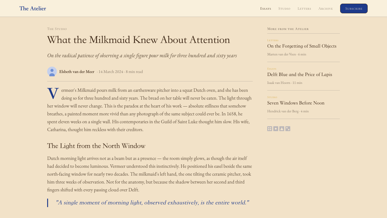
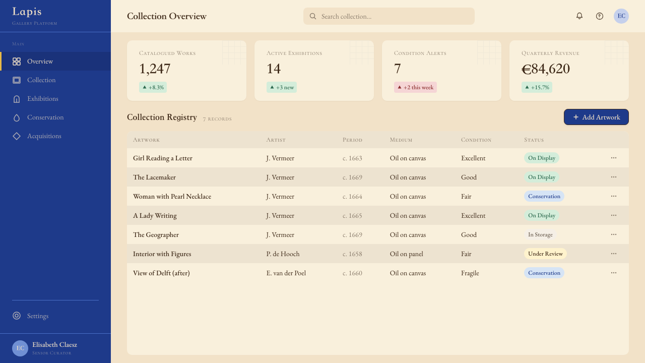
For web interfaces and dashboards, the style suits contexts where trustworthiness, depth, and considered quality are the dominant values — financial products, premium editorial platforms, professional portfolio sites. The approach: a warm off-white or very light stone background carries all primary content; deep lapis blue appears as the primary interactive and accent color; text uses a warm near-black rather than pure black, reducing the stark contrast that would feel more Swiss than Dutch. Card components should have a softened shadow — not the hard-offset Bauhaus kind, but a gentle diffused shadow that evokes the way furniture sits against a plastered wall. Navigation should be understated, typographic, and uncluttered.对于网页界面与仪表板,这种风格适合可信度、深度与经过深思的品质是主导价值的场景——金融产品、高端编辑平台、专业作品集网站。方法如下:温暖的米白或非常浅的石灰色背景承载所有主要内容;深青金石蓝作为主要交互与强调色出现;文字使用温暖的近黑色而非纯黑,以减少会让人感觉更像瑞士风格而非荷兰风格的强烈对比。卡片组件应有柔化的投影——不是包豪斯式的硬边偏移,而是温柔漫射的阴影,唤起家具靠在灰泥墙上的感觉。导航应当低调、字体性,且不杂乱。
For editorial and marketing work, Vermeer-derived layouts achieve their greatest power in long-form reading environments and hero sections where a single image can hold sustained attention. An article layout works well with a wide measure for immersive body text, restrained use of the ultramarine accent for pull-quotes or section markers, and imagery treated with a slight warm cast that recalls period pigment. Marketing pages benefit from the contrast between large, quiet hero spaces and carefully placed detail moments — a single product on a neutral ground, lit from the side, with enough peripheral space that the product appears to breathe. The style pairs exceptionally well with photography of still-life subjects, textiles, ceramics, and objects with surface texture.对于编辑与营销内容,维米尔衍生的版面在长篇阅读环境和英雄区块中能取得最大效果——在那里,单一图像可以维持持续的注意力。文章版面适合使用宽行宽的正文以获得沉浸式阅读体验,克制地将群青强调色用于引用语或节标记,图像处理带有轻微的暖色倾向以唤起时代颜料质感。营销页面受益于宽阔安静的英雄空间与精心放置的细节时刻之间的对比——中性底面上的单一产品,从侧面打光,有充足的周边空间让产品似乎在呼吸。这种风格与静物摄影、纺织品、陶瓷以及有表面质感的物品搭配效果非常出色。
A common mistake when applying this style is treating the Vermeer palette as simply muted or desaturated — adding grey to all colors and calling it done. Authentic Vermeer-derived work is not low-chroma across the board; the blues are genuinely deep and saturated, the yellows are warm and clear, and only the grounds and neutrals are kept quiet. Simultaneously, another error is using too many accent colors: a Vermeer composition typically uses one dominant chromatic accent. Using both the ultramarine blue and the warm yellow as coequal accents in the same composition breaks the focused quality that defines the style. Choose one to lead; let the other appear only briefly.应用这种风格时最常见的错误,是将维米尔色板简单理解为柔化或去饱和——对所有颜色加灰然后称之为完成。真正源自维米尔的作品并非整体低彩度;蓝色是真正深沉而饱和的,黄色是温暖而清透的,只有底调与中性色保持安静。与此同时,另一个错误是使用过多强调色:维米尔构图通常只使用一种主导的色彩强调。在同一构图中将群青蓝与暖黄色作为同等强调色使用,会破坏定义这种风格的聚焦品质。选择一种作为主导,让另一种仅短暂出现。
See the Vermeer Dutch Golden Age design system查看 Vermeer Dutch Golden Age 完整设计系统
Vermeer Dutch Golden Age — FAQVermeer Dutch Golden Age · 常见问题
Is the Vermeer style the same as general Dutch Golden Age design?维米尔风格与一般荷兰黄金时代设计是同一回事吗?
No. The Dutch Golden Age produced an enormous range of visual work — from the high-contrast theatrical drama of Rembrandt's chiaroscuro to the exuberant floral arrangements of Jan Davidsz de Heem, from Delft blue-and-white ceramics to the topographical precision of cartographic prints. Vermeer's domestic-interior genre represents one specific strain within this breadth: the Delft School's interest in daylit interiors, absorbed figures, and optical surface rendering. The Vermeer aesthetic is defined by restraint, interior stillness, and the quality of diffused north light — qualities that are not typical of the broader Dutch Golden Age, which frequently favors drama, richness, and decorative complexity.不是。荷兰黄金时代产出了种类繁多的视觉作品——从伦勃朗明暗对照法的高反差戏剧性,到扬·大卫兹·德·海姆的繁盛花卉静物,从代尔夫特蓝白陶瓷到地形学地图印刷品的精确性。维米尔的家居室内画类型代表着这一广度中的一种特定流向:代尔夫特画派对日光室内场景、沉浸式人物与光学表面呈现的关注。维米尔美学由克制、室内静谧与漫射北光的品质所定义——这些品质在更广泛的荷兰黄金时代中并非典型,后者经常倾向于戏剧性、丰富性与装饰复杂性。
Can the Vermeer aesthetic work in a dark or night-mode interface?维米尔美学可以在深色或夜间模式界面中使用吗?
With significant adaptation, yes — but the canonical Vermeer aesthetic is fundamentally a light-ground system. The characteristic luminosity comes from cool north light falling on warm pale surfaces; on a dark background, that specific light quality disappears. A dark adaptation works best if it is conceived as a candlelit Vermeer rather than a daylit one — deep warm grounds in deep amber or umber tones, with the characteristic blue used as a cooler accent rather than the dominant anchor. The lemon yellow should be used very sparingly in dark contexts, as it can become glaring. Be aware that dark adaptations will feel closer to the broader Dutch Golden Age tradition of night-scene or candlelight painting than to Vermeer specifically.经过较大幅度的调整是可以的——但标准的维米尔美学从根本上是一个浅色底面系统。那种特征性的光辉来自清冷北光照射在温暖浅色表面上;在深色背景上,这种特定的光线品质就消失了。深色改编最有效的做法是将其构想为烛光维米尔而非日光维米尔——使用深琥珀色或棕褐色的深暖底调,将标志性蓝色作为较冷的强调色而非主导锚点使用。在深色场景中柠檬黄应极为克制地使用,因为它可能变得刺眼。请注意,深色改编在感觉上会更接近更广泛的荷兰黄金时代夜景或烛光绘画传统,而非维米尔的特定风格。
How does the Vermeer style handle typography?维米尔风格如何处理排版?
The Vermeer aesthetic has no direct historical typography reference in the way that Bauhaus has its Universal typeface or Art Nouveau has its organic letterforms — Vermeer was a painter, not a typographer or printer. Contemporary application therefore draws on the visual qualities of the painting rather than period Dutch typography. The appropriate typeface sensibility is warm, humanist, and unhurried: letter forms with subtle contrast in stroke weight, a slight lean toward traditional rather than geometric construction, and generous spacing that allows each letter to breathe. Heavy geometric sans-serifs feel alien to the system; so do highly stylized display faces. Type should recede into the composition as furniture recedes into a Vermeer interior — present, functional, and quietly considered, never competing with the central luminous subject.维米尔美学没有包豪斯那样有直接历史排版参考的通用字体,也没有新艺术运动那样有机的字形——维米尔是画家,不是字体设计师或印刷师。因此,当代应用从绘画的视觉品质而非时代荷兰排版中汲取灵感。合适的字体感觉应是温暖的、人文主义的、不慌不忙的:笔画粗细有细微对比的字形,略微倾向于传统而非几何构建,以及充裕的字间距让每个字母得以呼吸。粗重的几何无衬线字体与这个系统格格不入;高度风格化的展示字体亦然。文字应当像家具退入维米尔室内一样退入构图——存在着、功能性的、被静静考量的,从不与中央光辉主体竞争。
What types of products or brands are a poor fit for this style?哪类产品或品牌不适合这种风格?
The Vermeer aesthetic performs poorly in contexts that require speed, high energy, or loud visual signaling. Entertainment platforms, fast food brands, youth fashion, sports and fitness products, and anything that relies on immediate high-impact attention-grabbing will find the style's quietness working against the communication goal. The style is also a poor fit for highly technical products where diagrammatic clarity — precise edge differentiation, multiple color-coded categories, dense information — takes precedence over atmosphere. Finally, products or services that need to communicate global accessibility and cultural neutrality may find the style's very specific Western European seventeenth-century reference carries unwanted cultural weight.维米尔美学在需要速度、高能量或强烈视觉信号的场景中表现不佳。娱乐平台、快餐品牌、青年时尚、运动健身产品,以及任何依赖即时高冲击力吸引注意力的内容,都会发现这种风格的安静正在与传播目标相抗。这种风格也不适合高度技术性的产品——在那些场景中,图表式的清晰度(精确的边缘区分、多类别色彩编码、密集信息)优先于氛围营造。最后,需要传达全球可及性与文化中立性的产品或服务,可能会发现这种风格非常特定的西欧十七世纪文化参照携带着不必要的文化分量。
How do you balance the characteristic Vermeer blue with the warm neutrals without one overpowering the other?如何在标志性的维米尔蓝与温暖中性色之间取得平衡,而不让其中一方压倒另一方?
The key is proportion, not value. Vermeer blue is a genuinely saturated, cool, and deep hue — it reads as heavy and anchoring in even a small area. Warm creams and beiges are large, quiet fields. The relationship that works is the same one Vermeer himself used: let the warm neutral occupy the majority of the composition, reserve the blue for a meaningful minority — a focal drapery, a significant UI element, a key data bar — and trust that a small area of deep blue against a large area of quiet warm will create the luminous contrast you are after. When the blue area grows beyond roughly a quarter of the composition, the balance tips and the warmth of the ground disappears. Introducing the lemon yellow as a tertiary accent at very small scale — a highlight, a label, a small detail — can restore warmth without expanding the blue.关键在于比例,而非色值。维米尔蓝是真正饱和、清冷、深沉的色调——即使在小面积区域中也会呈现出厚重的锚定感。温暖奶油色与米色则是宽阔安静的色域。有效的关系与维米尔本人所使用的相同:让温暖中性色占据构图的大部分,将蓝色保留给有意义的少数区域——一块焦点帷幔、一个重要的界面元素、一条关键数据条——并相信在宽阔安静暖色背景上的小面积深蓝,会创造出你所追求的光辉对比。当蓝色面积超过构图约四分之一时,平衡就会倾斜,底面的温暖感随之消失。以极小尺度引入柠檬黄作为第三强调色——一个高光、一个标签、一处小细节——可以在不扩大蓝色面积的情况下恢复温暖感。
Related design styles相关设计风格
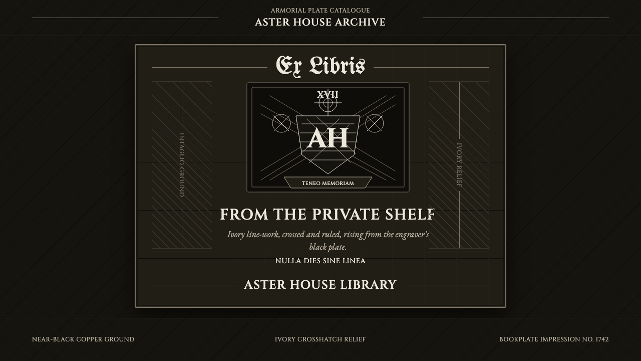 Ex Libris BookplateScholarly ownership, cut in ivory. Cinzel caps and crosshatch rules rise from…学者藏书的象牙刻痕。Cinzel 大写与交叉排线浮出黑版。
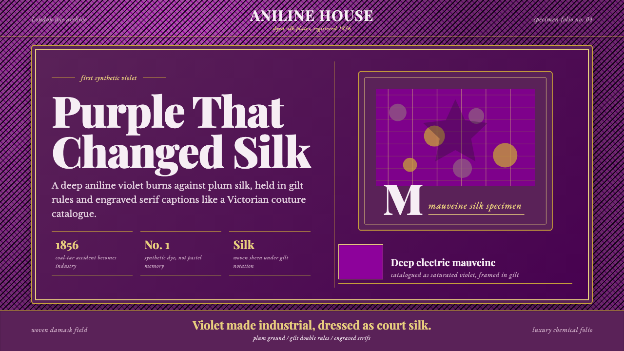 Mauveine (Perkin 1856)Electric purple, framed as luxury. Gilt rules and Playfair serifs turn dye in…电光紫即奢华:鎏金细框与 Playfair 衬线,把染料做成丝绸。
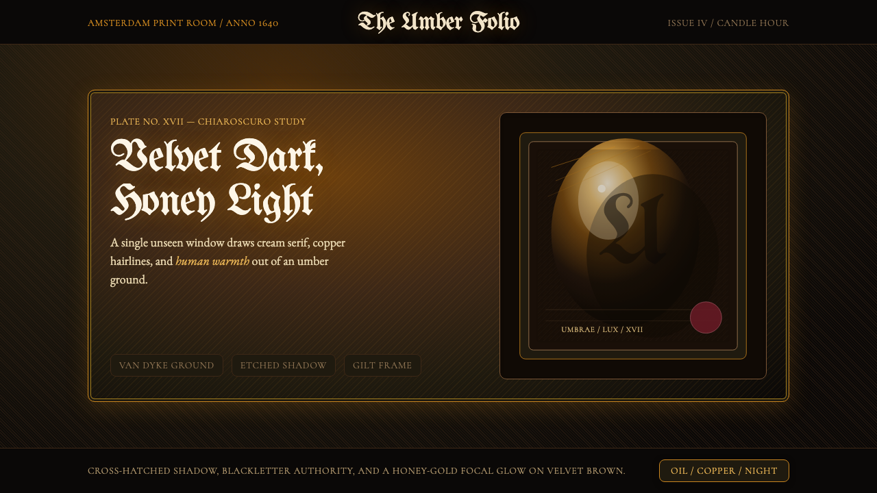 Rembrandt BaroqueDarkness becomes theatre. Honey-gold spotlight and blackletter rise from Van…黑暗成为剧场:蜂蜜金聚光与哥特黑体从范戴克棕浮现。
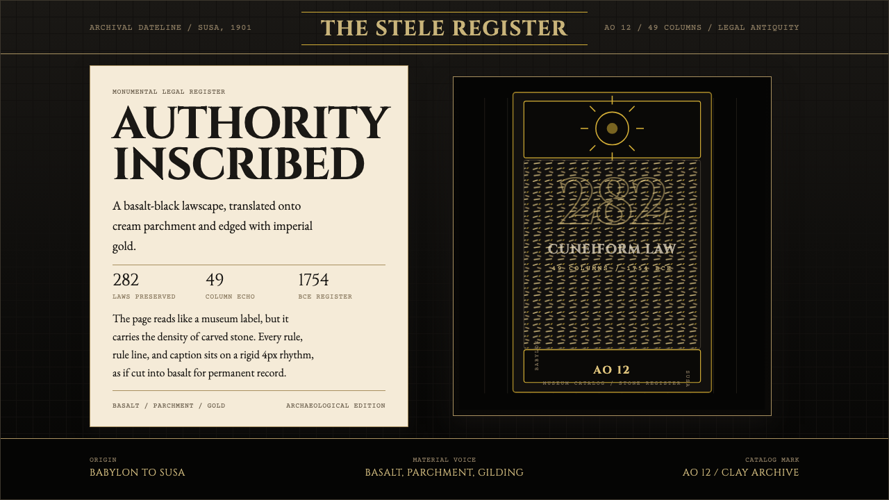 Babylonian Hammurabi SteleAuthority carved in stone. Basalt-black grids, parchment panels, and imperial…权威刻于石上。玄武岩黑底、羊皮纸面板、帝王金点缀。
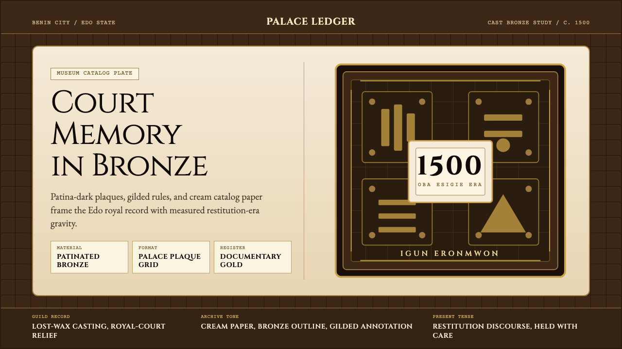 Benin Bronze (Edo, 1500)Royal memory, cast in bronze. Cream plaques and gilded lines carry museum gra…王权记忆铸于青铜。奶油牌板与鎏金线条带出图录庄重。
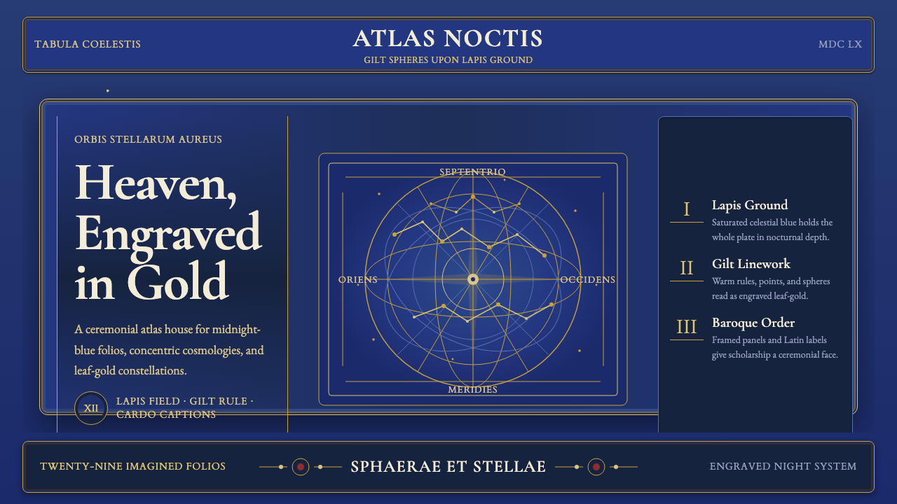 Cellarius Celestial AtlasCelestial luxury on lapis. Gilt serif type, star fields, and concentric chart…青金夜空里的天体奢华:鎏金衬线、星点与同心星图线。