What is Rembrandt Baroque?什么是 Rembrandt Baroque?
Rembrandt's chiaroscuro — a single face pulled from velvet darkness by an unseen light — becomes a design system built on honey-gold highlights, deep earth-pigment grounds, and the theatrical silence of a Dutch master's studio.伦勃朗的明暗法——一张面孔被看不见的光从天鹅绒般的黑暗中拉出——化为一套以蜂蜜金高光、深沉矿物颜料底色和荷兰大师画室戏剧性静谧构筑的设计语言。
Rembrandt Baroque in briefRembrandt Baroque 速览
Rembrandt Baroque is a design aesthetic rooted in the visual language of seventeenth-century Dutch oil painting and etching — above all in the work of Rembrandt van Rijn (1606–1669), whose mastery of chiaroscuro, the dramatic interplay of concentrated light and deep shadow, remains unmatched in Western art history. As a contemporary design system, it translates that pictorial vocabulary into interface, print, and presentation contexts: warm earth-pigment grounds deepening toward near-black at the edges, honey-gold highlights that feel sourced from candlelight or a low Amsterdam sun, blackletter headings that carry the weight of illuminated manuscripts, and cross-hatch textures echoing the copper-plate etching traditions Rembrandt helped transform.伦勃朗巴洛克是一种植根于十七世纪荷兰油画与蚀刻版画视觉语言的设计美学——尤其来源于伦勃朗·范·莱因(1606—1669年)的作品。他对明暗法的掌握——集中的光与深沉的阴影之间的戏剧性交织——在西方艺术史上无与伦比。作为一套当代设计系统,它将那种绘画语汇转化为界面、印刷与演示场景:温暖的矿物颜料底色向边缘渐深至近黑,蜂蜜金高光仿佛来自烛火或阿姆斯特丹低垂的冬日阳光,哥特黑体标题承载着彩绘手稿的厚重感,交叉线影纹理呼应着伦勃朗曾大力革新的铜版蚀刻传统。
The style is deliberately theatrical. Where Bauhaus isolates and clarifies, Rembrandt Baroque envelops and reveals — information emerges from darkness rather than being arranged on a neutral field. This makes it one of the most emotionally legible historical design vocabularies available: it communicates depth, gravity, craft, and antiquity without resorting to pastiche. Used well, it feels less like decoration and more like light falling through a high window onto something worth seeing.这种风格是刻意戏剧化的。如果说包豪斯是隔离与澄清,那么伦勃朗巴洛克则是包裹与揭示——信息从黑暗中浮现,而不是被安排在一块中性底面上。这使它成为当代可用的情感辨识度最高的历史设计语汇之一:它传递深度、庄重、匠艺与历史感,却不流于装饰性的复古堆砌。运用得当,它给人的感觉不像装饰,更像是光线穿过高窗落在某件值得凝视的事物上。
Its defining characteristic is restraint within drama. The palette is narrow — warm browns, near-blacks, and a single luminous gold — but it achieves enormous tonal range through graduation rather than hue variety. The warmth of the earth pigments prevents the darkness from reading as cold or aggressive, which is what distinguishes Rembrandt Baroque from generic dark-mode design. Every compositional decision is oriented around a single question: where does the light fall?它的决定性特质是戏剧之中的克制。色板很窄——暖棕、近黑与单一的发光金——但通过明度渐变而非色相变化,实现了巨大的调性幅度。矿物颜料的暖意使黑暗不至于被解读为冷漠或具有攻击性,这正是伦勃朗巴洛克区别于普通深色模式设计的关键。每一个构图决策都围绕同一个问题展开:光落在哪里?
See the Rembrandt Baroque design system查看 Rembrandt Baroque 完整设计系统
Where does Rembrandt Baroque come from?Rembrandt Baroque 从何而来?
Rembrandt Harmenszoon van Rijn was born in Leiden in 1606, the eighth of nine children of a miller. He enrolled at Leiden University at fourteen but left within a year to study painting — first under a local master, Jacob van Swanenburch, then in Amsterdam under the history painter Pieter Lastman. Lastman's influence was decisive: he introduced Rembrandt to the Italian Baroque, particularly to the work of Caravaggio and his Dutch followers, the Utrecht Caravaggists, who had brought to the Netherlands a radical new handling of light — tenebrism, in which figures emerge from a near-total darkness as if spotlit. Rembrandt absorbed this influence and then exceeded it, developing a chiaroscuro that felt not theatrical but intimate, as though the light source were always just out of frame and always warm.伦勃朗·哈尔曼松·范·莱因1606年生于莱顿,是一位磨坊主的第八个孩子。他十四岁入读莱顿大学,不到一年便辍学转而学习绘画——先师从当地画师雅各布·范·斯瓦嫩堡,后赴阿姆斯特丹投师历史画家彼得·拉斯特曼。拉斯特曼的影响是决定性的:他将意大利巴洛克,尤其是卡拉瓦乔及其荷兰追随者——乌得勒支卡拉瓦乔派——的创作引介给伦勃朗。这批画家将一种激进的新光线处理方式带入荷兰:暗黑主义,人物如同被聚光灯照亮,从近乎全黑的背景中浮现。伦勃朗吸收了这一影响,然后超越了它,发展出一种感觉并非戏剧化而是私密的明暗法——光源仿佛总在画框外某处,始终是温暖的。
By the late 1620s, Rembrandt had returned to Leiden and set up an independent studio with Jan Lievens. This early Leiden period produced small, intensely detailed paintings notable for their psychological precision: the aging face of his mother, the contorted expression of a repentant Judas. In 1631 he moved permanently to Amsterdam, then the wealthiest city in Europe, and rapidly became the most sought-after portrait painter in the Dutch Republic. Amsterdam's prosperity — built on the spice trade, the textile industry, and a vast network of colonial commerce — generated a merchant class hungry for portraits that conveyed dignity and individual character without the dynastic symbolism required by aristocratic patronage. Rembrandt satisfied this demand while introducing a warmth and psychological interiority that his competitors could not match.1620年代末,伦勃朗返回莱顿,与扬·利文斯共同开设了独立画室。这一莱顿早期阶段产出了一批小幅、细节密集的画作,以心理精确度著称:母亲衰老的面庞,悔悟的犹大扭曲的表情。1631年他永久迁居阿姆斯特丹——当时欧洲最富庶的城市——并迅速成为荷兰共和国最炙手可热的肖像画家。阿姆斯特丹的繁荣——建立在香料贸易、纺织业与庞大殖民商业网络之上——催生了一个渴望肖像的商人阶层,他们需要的是能传递尊严与个人性格的画像,而非贵族赞助所要求的王朝象征。伦勃朗满足了这一需求,同时带入了竞争者无法企及的温度与心理内在性。
The 1640s, identified in the source designation as Rembrandt's peak production period, were also the decade in which his style matured into its most recognizable form. His palette darkened, his brushwork loosened, and his interest shifted from surface detail to the emotional atmosphere created by light. His etchings from this period — the so-called 'Hundred Guilder Print' of around 1647–1649 is the supreme example — demonstrate his revolutionary command of the copper plate: fine parallel hatching building tonal gradients from white highlight to near-total shadow across a single sheet. These printmaking techniques, translated into texture and tonal logic, are the technical foundation on which the Rembrandt Baroque design vocabulary rests.1640年代——来源资料将这一时期标注为伦勃朗创作高峰——也是他的风格成熟为最具辨识度形态的十年。他的色板愈加深暗,笔触愈加松弛,兴趣从表面细节转向光线所营造的情感氛围。这一时期的蚀刻版画——约1647—1649年的所谓「百枚金币版画」是最高峰之作——展示了他对铜版的革命性掌握:细密的平行交叉线影在单张纸面上构建从白色高光到近乎全黑的调性渐变。这些版画技法,转化为纹理与调性逻辑,正是伦勃朗巴洛克设计语汇的技术基础。
The Dutch Golden Age context matters for understanding the style's specific warmth. Dutch painters of the seventeenth century worked in oil on panel or canvas, using pigments ground from natural earth minerals — raw umber, burnt sienna, yellow ochre, lead white, lamp black — and bound in linseed or walnut oil that yellowed slightly with age, contributing to the amber warmth that characterizes seventeenth-century Dutch painting when viewed today. Rembrandt in particular favored thick impasto whites that catch light physically, surrounded by thin, transparent glazes of brown and black that recede into shadow. This interplay of material opacity and translucency is what gives his surfaces their extraordinary luminosity — and it is this quality, translated into the warm-ground-and-gold-highlight logic of the design system, that distinguishes Rembrandt Baroque from simpler dark-aesthetic approaches.荷兰黄金时代的语境对于理解这种风格特有的温度至关重要。十七世纪荷兰画家在木板或帆布上用油彩作画,颜料由天然矿物研磨而成——生赭、烧赭、黄赭石、铅白、灯黑——以亚麻油或核桃油调合,油脂随时间略微泛黄,为今日观赏到的十七世纪荷兰绘画贡献了那种琥珀色暖意。伦勃朗尤其偏爱厚重的白色厚涂,物理性地捕捉光线,周围环绕着褪入阴影的稀薄透明棕黑色罩染。这种材料不透明性与半透明性的交织,正是赋予他作品表面非凡发光性的原因——而这种品质,转化为设计系统中暖底色与金色高光的逻辑,使伦勃朗巴洛克有别于更简单的深色美学方案。
What defines the Rembrandt Baroque look?Rembrandt Baroque 的视觉特征是什么?
Chiaroscuro Light Logic明暗法光线逻辑
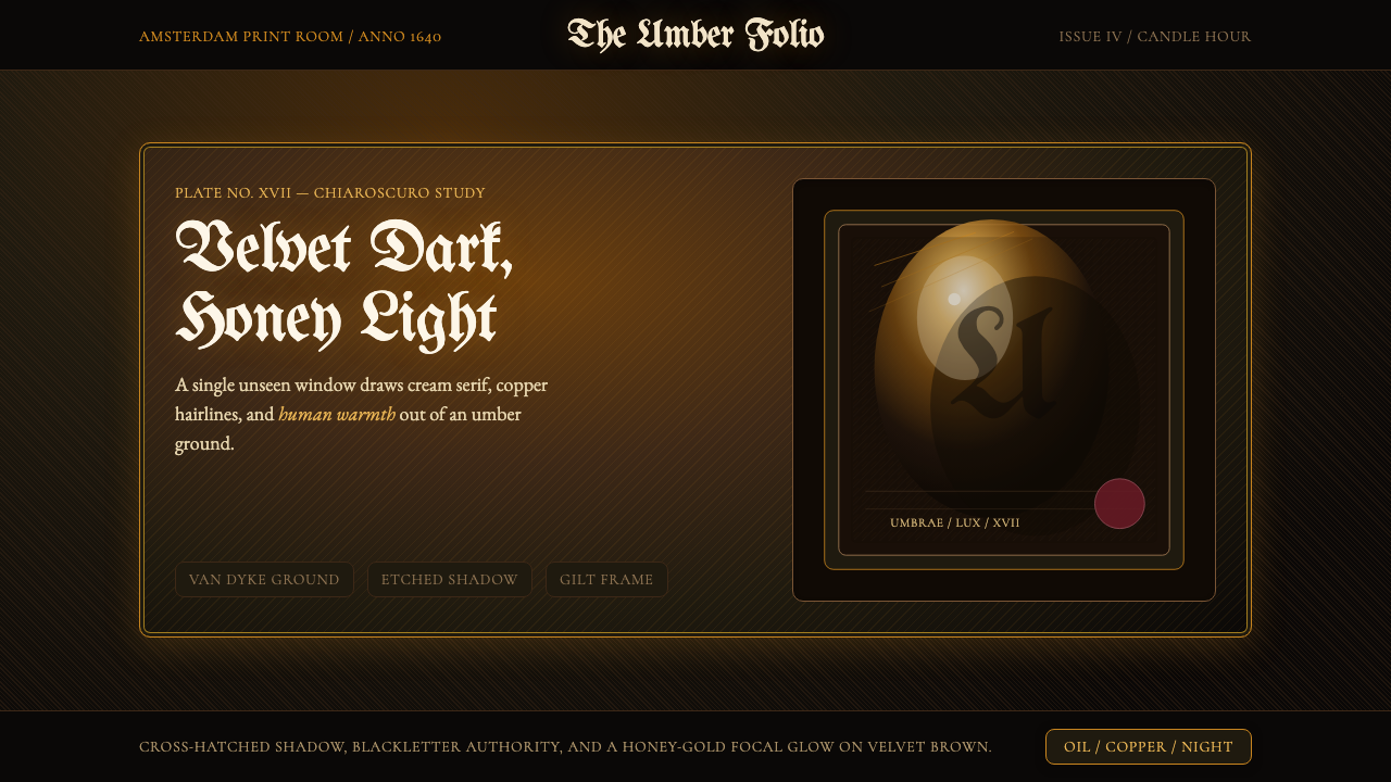
The defining principle of the style is not darkness but the relationship between darkness and a single concentrated light source. Composition is organized around where the light falls: the focal element — a heading, a key data point, a call-to-action — sits in the zone of maximum luminosity, surrounded by a graduated darkening that reaches near-black at the outermost edges. No element at the periphery competes with the illuminated center. This is fundamentally different from conventional dark-mode design, which distributes content uniformly across a dark field. In Rembrandt Baroque, the darkness is active and directional — it guides the eye inward.这种风格的决定性原则不是黑暗本身,而是黑暗与单一集中光源之间的关系。构图围绕光线落点展开:焦点元素——标题、关键数据点、行动按钮——位于最大发光区域,四周是向外渐深至近黑的明度渐变。边缘处没有任何元素与被照亮的中心竞争。这与传统深色模式设计有本质区别——后者将内容均匀分布于深色底面。在伦勃朗巴洛克中,黑暗是主动的、有方向的——它引导视线向内聚焦。
Warm Earth-Pigment Palette暖矿物颜料色板
The color range is derived from the natural mineral pigments available to seventeenth-century Dutch painters: deep Van Dyke brown as the dominant ground, warm raw umber and burnt sienna in the mid-tones, and a honey-gold or amber for highlights. Near-black is achieved through deep warm brown rather than neutral or cool black, preserving the palette's warmth even at its darkest. There are no cool grays, no blue-blacks, and no desaturated neutrals — every dark tone retains its amber undertone. This warmth is what prevents the style from reading as cold, gothic, or oppressive, and what gives it its quality of firelit intimacy.色彩范围来源于十七世纪荷兰画家可用的天然矿物颜料:深沉的范戴克棕作为主导底色,温暖的生赭与烧赭构成中间调,蜂蜜金或琥珀色用于高光。近黑色通过深暖棕而非中性或冷色黑来实现,使色板在最深处仍保有暖意。没有冷灰,没有蓝黑,没有去饱和的中性色——每一个深色调都保有其琥珀底色。这种暖意正是使这种风格不至于被解读为冷漠、哥特式或压抑的关键,也赋予它那种炉火旁私密空间的气质。
Blackletter and Calligraphic Typography哥特黑体与书法式字体排印
Display typography in Rembrandt Baroque draws from the blackletter and textura traditions of medieval Northern European manuscripts and early printed books — the same letterforms visible in the title pages of books published in Amsterdam in the 1640s. These are weighty, architectural letterforms with strong vertical stress, dense ink coverage, and fine hairline cross-strokes. They are used exclusively for headings and display text; body text should adopt a warm-ground-optimized serif with strong contrast between thick and thin strokes, echoing the quality of letterpress impression. The contrast between monumental display type and restrained body text is itself a chiaroscuro move — visual weight concentrated at the point of entry.伦勃朗巴洛克的展示字体汲取自中世纪北欧手抄本与早期印刷书籍的哥特黑体与文字体传统——这与1640年代阿姆斯特丹出版书籍扉页上的字形一脉相承。这些字形厚重、具有建筑感,竖向应力强烈,墨色饱满,横向细笔划纤细。它们仅用于标题与展示文字;正文应采用适合暖色底面的衬线字体,粗细笔划对比强烈,呼应活字印刷的质感。宏大展示字体与克制正文字体之间的对比,本身就是一次明暗法动作——视觉重量集中于入口点处。
Cross-Hatch Texture交叉线影纹理
Rembrandt's copper-plate etchings built tonal gradients through systematically layered parallel lines — single hatching for lighter tones, cross-hatching for deeper shadow. As a design texture, this grid of fine diagonal marks appears in background fields, in shadow areas of components, and as subtle surface treatment on dark grounds. Applied lightly, it prevents flat dark areas from reading as pure void and introduces the hand-crafted material quality of printmaking. The texture should always be subordinate to composition — dense enough to be perceived on close inspection, light enough not to interrupt reading.伦勃朗的铜版蚀刻通过系统性叠加平行线构建调性渐变——单向排线用于较浅色调,交叉排线用于更深的阴影。作为设计纹理,这种细对角线网格出现在背景底面、组件的阴影区域以及深色底面的微妙表面处理中。轻度应用时,它能防止平坦深色区域被解读为纯粹的空洞,并引入版画手工制作的材料质感。纹理应始终服从于构图——密度足以在近距离检视时被感知,轻盈到不干扰阅读。
Tonal Graduation over Color Contrast调性渐变优先于色彩对比
Where Bauhaus uses hue contrast — primary red against cream, primary blue against white — to establish hierarchy, Rembrandt Baroque uses tonal contrast: light versus dark within a narrow warm-brown-to-gold range. Hierarchy is communicated through luminosity: the brightest element is the most important. This means color is not the primary organizational tool; brightness is. A secondary element at the same hue as the primary can be demoted simply by darkening it. The system is therefore highly legible even in environments where color rendering is limited, such as print on uncoated paper or aged screen displays.包豪斯用色相对比——三原色红色对奶油色、三原色蓝色对白色——来建立层级,伦勃朗巴洛克则用调性对比:在暖棕至金色的窄色域内以明暗区分轻重。层级通过发光度传达:最亮的元素最重要。这意味着颜色不是主要的组织工具;亮度才是。与主要元素色相相同的次要元素,只需将其加深即可降级。因此,该系统即便在色彩渲染受限的环境中也具有高度可读性,例如无涂层纸张印刷或老化屏幕显示。
Vignette and Edge Darkening晕影与边缘加深
A characteristic compositional device of Rembrandt's paintings is the vignette: the background darkens toward the edges of the canvas, focusing attention on the lit subject at center. As a design principle, this translates to a gradient or tonal shift from a slightly lighter center ground to a considerably darker edge — applied to full-page backgrounds, card components, and section panels. The effect is not dramatic when well-executed; it is subliminal, subtly pushing the viewer's attention inward. Vignetting should be applied with restraint: heavy-handed application reads as theatrical rather than atmospheric.伦勃朗画作的一个典型构图手法是晕影效果:背景向画布边缘逐渐加深,将注意力聚焦于中心被照亮的主体。作为设计原则,这转化为从略浅的中心底色到深得多的边缘色调的渐变或过渡——应用于整页背景、卡片组件与区块面板。执行得当时,这种效果并不显眼;它是潜意识层面的,微妙地将观者的注意力向内推。晕影应克制使用:过于明显的应用会显得戏剧化,而非富有氛围感。
Gilded Accent as Focal Signal镀金强调色作为焦点信号
Honey-gold or amber — the color of candlelight, of aged linseed oil, of a single beam crossing a dark room — serves as the sole high-chroma accent in the palette. It is applied to the single most important element in any composition: the primary call-to-action, the chart's key data series, the section header that the reader must not miss. Using it on more than one element simultaneously dilutes the spotlight effect and collapses the hierarchy. The gold accent should feel earned — as though a beam of light has naturally selected that one element from the surrounding darkness.蜂蜜金或琥珀色——烛光的颜色,陈年亚麻油的颜色,一束光线穿越暗室的颜色——是色板中唯一的高色度强调色。它被施于任何构图中最重要的单一元素:主要行动按钮、图表的关键数据系列、读者绝不能错过的章节标题。同时将其用于多个元素会稀释聚光灯效果并瓦解层级。金色强调应感觉是被赢得的——仿佛一束光线从周围的黑暗中自然选中了那一个元素。
See the Rembrandt Baroque design system查看 Rembrandt Baroque 完整设计系统
Who shaped Rembrandt Baroque?谁塑造了 Rembrandt Baroque?
Rembrandt (1606–1669) is the central figure and namesake of the style. His contribution was not simply a technique but a philosophy of light: the conviction that darkness is not the absence of visual interest but its fullest condition, and that a single concentrated beam of warm light, correctly placed, communicates more about a subject than any amount of surface detail. His roughly three hundred paintings, nearly three hundred etchings, and two thousand drawings represent the most sustained investigation of chiaroscuro in the history of Western art. His self-portrait series — spanning four decades from youth to old age — remains the most complete document of a European artist's life available from the seventeenth century.伦勃朗(1606—1669年)是这种风格的核心人物与命名者。他的贡献不仅仅是一种技法,而是一种关于光的哲学:相信黑暗不是视觉兴趣的缺席,而是它最充分的条件;相信一束正确放置的温暖集中光线,能比任何数量的表面细节更深刻地传达主体的本质。他约三百幅绘画、近三百幅蚀刻版画与两千余幅素描,代表了西方艺术史上对明暗法最持续深入的探索。他横跨四十年从青年至老年的自画像系列,至今仍是现存最完整的十七世纪欧洲艺术家生命档案。
Lastman (1583–1633) was Rembrandt's principal teacher and the conduit through which Italian Baroque influence — particularly the tenebrism of Caravaggio and Elsheimer — entered Dutch painting. Lastman had traveled to Italy in the early 1600s and returned to Amsterdam with firsthand knowledge of the new dramatic lighting conventions. His history paintings, though today far less celebrated than his student's, provided the technical and compositional foundation on which Rembrandt built. Without Lastman's Italian influence, the specific quality of Rembrandt's darkness — warm rather than cold, intimate rather than theatrical — might not have developed as it did.拉斯特曼(1583—1633年)是伦勃朗的主要老师,也是意大利巴洛克影响——尤其是卡拉瓦乔与埃尔斯海默的暗黑主义——进入荷兰绘画的中介。拉斯特曼曾于1600年代初赴意大利旅行,带着对新式戏剧性光线惯例的第一手认识返回阿姆斯特丹。他的历史画,尽管今日远不如学生的作品知名,却为伦勃朗提供了技术与构图的基础。若非拉斯特曼的意大利影响,伦勃朗黑暗的特有品质——暖而非冷、私密而非戏剧化——或许不会如此发展。
Hals (c. 1582–1666) was Rembrandt's chief contemporary rival for supremacy in Dutch portraiture and represented an alternative approach to Baroque naturalism: loose, gestural brushwork that captured the spontaneous social energy of his subjects rather than their psychological interiority. Where Rembrandt's portraits draw the subject out of shadow with concentrated light, Hals's place subjects in a more even illumination and distinguish themselves through the immediacy of paint handling. The contrast between the two approaches clarifies what is specifically Rembrandt's: the darkness, the warmth, and the sense that the light source itself is an editorial choice rather than a neutral ambient condition.哈尔斯(约1582—1666年)是伦勃朗在荷兰肖像画领域至高地位上的主要同时代竞争者,代表了一种巴洛克自然主义的替代路径:松弛、手势性的笔触,捕捉主体自发的社会活力而非心理内在性。伦勃朗的肖像用集中光线将主体从阴影中引出,而哈尔斯将主体置于更均匀的光照中,以笔触处理的直接性为特色。两种方法之间的对比,澄清了什么是伦勃朗所特有的:黑暗、暖意,以及光源本身是一种编辑选择而非中性环境条件的感觉。
Saskia (1612–1642), Rembrandt's wife from 1634 until her early death, appears in more than sixty of his paintings, drawings, and etchings — and her face, particularly in the golden-lit portraits of the late 1630s, has become inseparable from the visual identity of the Rembrandt Baroque style. Her portrayal in works such as 'Saskia as Flora' (1634) established the archetype of the honey-gold illuminated figure against a dark ground: warmly lit, richly costumed, and emerging from shadow as though the darkness itself is paying her homage. For the design system, she is the model of the illuminated subject — the element that earns the gold accent.萨斯基亚(1612—1642年),伦勃朗自1634年起至其早逝的妻子,出现在他六十余幅绘画、素描与蚀刻版画中——她的面容,尤其是1630年代末金色光照下的肖像,已与伦勃朗巴洛克风格的视觉身份不可分割。她在《萨斯基亚扮作弗洛拉》(1634年)等作品中的形象,确立了蜂蜜金照亮的人物于深色背景前的原型:温暖的光照,华美的服饰,从阴影中浮现,仿佛黑暗本身在向她致敬。对于这套设计系统,她是被照亮主体的模型——那个赢得金色强调的元素。
Segers (c. 1589–c. 1638) was an experimental printmaker and painter whose radical etching techniques — printing on colored cloth, adding hand-painted tints, building up atmospheric tone through unusually dense aquatint-like surfaces — profoundly influenced Rembrandt, who owned eight of Segers's paintings and substantially reworked at least one of his copper plates. Segers's printmaking pushed the etching medium toward landscape and atmosphere in ways that anticipate Rembrandt's own atmospheric tonal prints. As a figure in the Rembrandt Baroque design genealogy, he represents the experimental and material dimension of the tradition: the willingness to manipulate surface, ground, and mark to achieve tonal effects unavailable through conventional means.塞赫斯(约1589—约1638年)是一位实验性版画家与画家,其激进的蚀刻技法——在彩色布料上印刷、添加手绘色彩、通过异常密集的类飞尘腐蚀表面构建大气调性——深刻影响了伦勃朗。伦勃朗曾拥有塞赫斯的八幅绘画,并对他的至少一块铜版进行了大幅度改版。塞赫斯的版画将蚀刻媒介推向风景与氛围,在某种程度上预示了伦勃朗自己的大气调性版画。作为伦勃朗巴洛克设计谱系中的人物,他代表了这一传统的实验性与材料性维度:愿意操纵表面、底料与笔触,以实现传统手段无法达到的调性效果。
How do you use Rembrandt Baroque today?今天怎么用 Rembrandt Baroque?
Rembrandt Baroque is among the most distinctive historical styles available to contemporary designers, but it is also one of the most easily misapplied. The visual language depends on a single organizing principle — concentrated warm light emerging from deep shadow — and every element of a composition should serve that principle. Before applying any specific technique, designers should identify the one element in each view that most needs to command attention. Everything else is shadow.伦勃朗巴洛克是当代设计师可用的最具个性的历史风格之一,但也是最容易被误用的风格之一。这套视觉语言依赖于单一的组织原则——集中的温暖光线从深沉的阴影中浮现——构图中的每个元素都应服务于这一原则。在运用任何具体技法之前,设计师应先确定每个视图中最需要统领注意力的那一个元素。其他一切都是阴影。
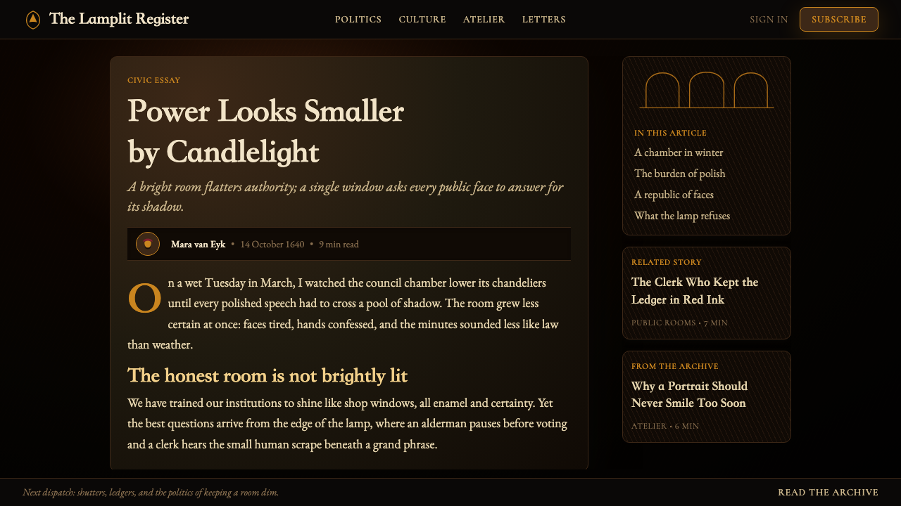
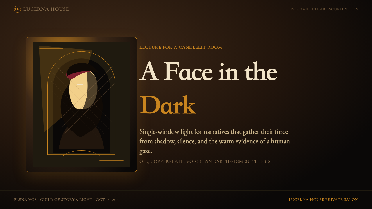
For presentation slides, Rembrandt Baroque creates extraordinary impact on cover and section-divider pages. A cover should work like a Dutch master's portrait: the title and a single supporting visual emerge from a near-black vignette ground, lit by a warm honey-gold highlight concentrated at center. The blackletter or high-contrast serif headline sits in the zone of maximum luminosity; any subtitle or date information recedes into the darker mid-ground. Content slides should maintain the dark ground but lighten the approach: a warm deep-brown background, body text in a cream or warm off-white, section headings in gold, and data elements treated as lit objects against shadow. Avoid placing multiple items in gold simultaneously — if the data table header, the chart's key series, and the call-out box are all gold, the focal logic collapses.在演示文稿中,伦勃朗巴洛克在封面与章节分隔页上创造出非凡的视觉冲击力。封面应像荷兰大师的肖像那样运作:标题与单一辅助视觉元素从近黑色晕影底色中浮现,被集中于中心的温暖蜂蜜金高光所照亮。哥特黑体或高对比度衬线字体的标题位于最大发光区域;任何副标题或日期信息则退入较深的中间调地带。内容页应保持深色底面,但采用更轻盈的处理方式:温暖的深棕色背景,正文采用奶油色或温暖的近白色,章节标题用金色,数据元素被当作在阴影前被照亮的物体处理。避免同时将多个元素置于金色——如果数据表标题、图表关键数据系列和引用框都是金色,焦点逻辑便会崩溃。
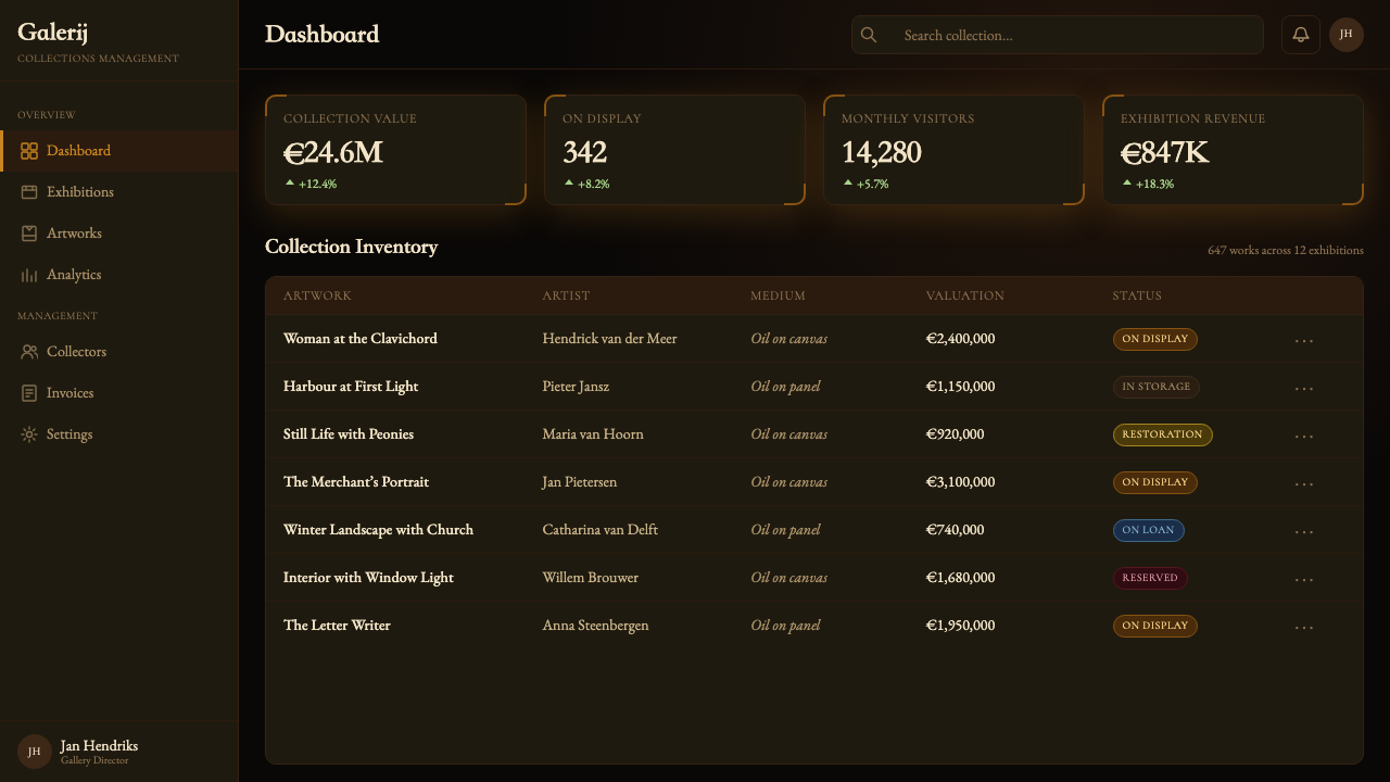
For web interfaces, Rembrandt Baroque is well-suited to premium, high-margin product pages, editorial platforms, and luxury brand dashboards where conveying craft and historical authority matters more than the clean neutrality of conventional tech UI. The approach: a deep warm-brown body background with a subtle vignette darkening toward the viewport edges; cream or warm near-white for body text; gold reserved for the primary call-to-action button, the active navigation state, and the key metric in any data display. Card components should have slightly lighter warm-brown backgrounds than the surrounding ground — not white cards against a dark background, which breaks the tonal logic, but warm-brown cards that are one or two tones lighter than the page ground. Interactive states should shift toward more gold rather than toward lighter grays.对于网页界面,伦勃朗巴洛克非常适合溢价、高利润产品页面、编辑平台和奢侈品牌仪表板——在这些场景中,传递匠艺感与历史权威感比常规科技UI的清洁中性更为重要。方法如下:深暖棕色页面背景,配合向视口边缘渐深的微妙晕影;正文用奶油色或暖近白色;金色保留给主要行动按钮、激活导航状态与任何数据展示中的关键指标。卡片组件的背景应比周围底面略浅的暖棕色——不是深色背景上的白色卡片(这会打破调性逻辑),而是比页面底色浅一到两个色调的暖棕色卡片。交互状态应向更多金色而非更浅的灰色偏移。
For editorial and marketing work — book covers, event posters, premium packaging, report covers — the style achieves its highest natural expression. A full-bleed dark ground with a single vignette-lit image or typographic focal point is exactly the compositional logic the style was designed for. Marketing copy should be set in a single weight of a high-contrast serif, with pull quotes or callouts in the blackletter display face. Cross-hatch texture applied lightly to the background prevents the dark ground from appearing flat or digitally generic. For print work, the palette should be reproduced in warm rich black for the ground rather than a four-color neutral black, preserving the amber undertone on press.对于编辑与营销内容——书籍封面、活动海报、高端包装、报告封面——这种风格达到其最自然的表达高峰。满版出血深色底面配合单一晕影照亮的图像或字体焦点,正是这种风格被设计出来服务的构图逻辑。营销文案应以单一字重的高对比度衬线字体排版,引语或重点说明采用哥特黑体展示字体。背景轻度应用交叉线影纹理,防止深色底面显得平板或数字化式的千篇一律。对于印刷品,底色应以温暖的富黑色而非四色中性黑来复制,以在印刷机上保留琥珀底色。
A common mistake when applying Rembrandt Baroque is interpreting the style as simply a dark theme with gold accents. This misses the essential principle: in authentic Rembrandt Baroque, darkness is not a background setting but a compositional actor. Designers who treat the dark ground as passive — as a canvas to place content on — produce work that looks like generic dark mode with decorative gold touches rather than like a Dutch Golden Age composition. The test: could you remove all the content from the design and still see, in the ground tones alone, where the eye is supposed to travel? If the answer is yes, the chiaroscuro logic is working. If the background is uniformly dark, the style has been flattened into decoration.应用伦勃朗巴洛克时最常见的错误,是将这种风格简单理解为带金色点缀的深色主题。这遗漏了本质原则:在真正的伦勃朗巴洛克中,黑暗不是背景设置,而是构图的主动参与者。把深色底面当作被动元素处理——当作放置内容的画布——的设计师,产出的作品看起来像带装饰性金色点缀的普通深色模式,而非荷兰黄金时代的构图。检验标准:如果你移除设计中所有内容,仅凭底色调性本身,能否仍然看出视线应该如何行进?如果答案是肯定的,明暗法逻辑就在运作。如果背景是均匀的深色,这种风格便已被平面化为单纯的装饰。
Avoid the temptation to introduce cool colors, blue-tinted blacks, or desaturated neutrals. These break the warmth that distinguishes Rembrandt Baroque from gothic or horror aesthetics. Similarly, avoid mixing the cross-hatch texture with soft gradients — the two techniques operate on opposite logics (mark-making versus smooth transition) and produce visual incoherence when combined. When in doubt, simplify: fewer elements, narrower palette, and more deliberate use of the gold accent will always produce more authentic results than elaborate layering.避免引入冷色、蓝调黑色或去饱和中性色的诱惑。这些会破坏使伦勃朗巴洛克区别于哥特或恐怖美学的暖意。同样,避免将交叉线影纹理与柔和渐变混合使用——两种技法运行在相反的逻辑之上(笔触制作对比平滑过渡),混合时会产生视觉上的不连贯。有疑虑时,化繁为简:更少的元素、更窄的色板、更刻意的金色强调,永远比精心设计的多层叠加产出更真实的结果。
See the Rembrandt Baroque design system查看 Rembrandt Baroque 完整设计系统
Rembrandt Baroque — FAQRembrandt Baroque · 常见问题
Is Rembrandt Baroque the same as dark mode?伦勃朗巴洛克与深色模式是同一回事吗?
No — dark mode is a display preference that replaces light grounds with dark grounds while preserving a neutral, evenly illuminated layout. Rembrandt Baroque is a compositional system in which darkness is an active organizing force, not a background color. In dark mode, all elements are equally visible against the dark field. In Rembrandt Baroque, visibility is deliberately graduated: the most important element is the most luminous, and luminosity decreases as elements approach the edges of the composition. The warmth of the palette is also decisive: dark mode typically uses near-neutral or cool-leaning darks; Rembrandt Baroque uses deep warm browns with amber undertones, which read as fundamentally different in emotional register.不是。深色模式是一种显示偏好,将浅色底面替换为深色底面,同时保留中性、均匀照亮的版面。伦勃朗巴洛克是一套构图系统,其中黑暗是主动的组织力量,而非背景颜色。在深色模式中,所有元素在深色底面前的可见度是均等的。在伦勃朗巴洛克中,可见度是刻意分级的:最重要的元素最为发光,发光度随元素向构图边缘移动而递减。色板的暖意也是决定性的:深色模式通常使用近中性或偏冷的深色;伦勃朗巴洛克使用带琥珀底色的深暖棕色,在情感基调上读来截然不同。
Can Rembrandt Baroque work for data-heavy interfaces, or is it purely editorial?伦勃朗巴洛克能用于数据密集型界面吗,还是说它纯粹是编辑性风格?
It can work for data interfaces, but requires careful adaptation. The style's tonal hierarchy is well-suited to emphasizing a single key metric — the gold accent naturally functions as a data spotlight — but it resists the kind of equal-weight data grids that many analytical dashboards require. Effective adaptations reserve the honey-gold highlight for the single most critical data point or chart series, use cream or warm near-white for secondary labels and axis text, and set grid lines and supporting structure in a dark warm-brown that reads as near-invisible against the ground. Color-encoded categorical data works within the palette if each additional category is assigned a slightly cooler or more muted warm tone — never a fully saturated primary. The constraint is productive: it forces designers to identify what the dashboard's most important signal actually is.可以用于数据界面,但需要谨慎调适。这种风格的调性层级非常适合突显单一关键指标——蜂蜜金强调色天然具有数据聚光灯的功能——但它抗拒许多分析仪表板所需的那种等重量数据网格。有效的调适方式是:将蜂蜜金高光保留给最关键的单一数据点或图表系列,用奶油色或暖近白色处理次要标签与坐标轴文字,用在底色前近乎不可见的深暖棕色设置网格线与辅助结构。如果色彩编码的分类数据需要在色板内运作,可为每个额外类别分配略微偏冷或更柔和的暖色调——绝不使用完全饱和的纯色。这种约束是有益的:它迫使设计师确认仪表板最重要的信号究竟是什么。
How do I avoid the style reading as gothic, Halloween, or horror rather than as Baroque?如何避免这种风格被解读为哥特、万圣节或恐怖风格,而非巴洛克?
The distinction is almost entirely in palette temperature. Gothic and horror aesthetics use cold, desaturated, or blue-tinged darks — charcoals, slate grays, blue-blacks. Rembrandt Baroque uses exclusively warm, amber-tinged darks — deep Van Dyke brown, warm raw umber, burnt sienna in the mid-tones. If any cool tone enters the ground palette, the warmth collapses and the style migrates toward gothic. The gold accent also plays a key role: it should be warm amber-gold, not greenish or silvery. Finally, typography matters: gothic aesthetics often use jagged, sharp letterforms; Rembrandt Baroque blackletter should be full and rounded in its strokes, derived from the humanist Northern European manuscript tradition rather than the pointed German Fraktur tradition.区别几乎完全在于色板温度。哥特与恐怖美学使用冷色、去饱和或蓝调的深色——炭灰、石板灰、蓝黑色。伦勃朗巴洛克专用温暖、琥珀调的深色——深范戴克棕、暖生赭、中间调中的烧赭。如果任何冷色调进入底色色板,暖意便会崩溃,风格便会向哥特迁移。金色强调色也起到关键作用:它应该是温暖的琥珀金,而非偏绿或银白。最后,字体排印同样重要:哥特美学常用棱角尖锐的字形;伦勃朗巴洛克的哥特黑体笔触应饱满而圆润,源自人文主义的北欧手抄本传统,而非尖锐的德国花体字传统。
What kinds of content or brands should avoid this style?哪些内容或品牌应该回避这种风格?
Rembrandt Baroque is poorly suited to contexts that depend on lightness, openness, or clinical neutrality: healthcare and medical platforms, children's and educational products, civic and government interfaces, environmental or sustainability brands, and any application where accessibility requires maximum contrast on light grounds. The style's warmth and darkness can also work against food and consumer packaged goods brands where bright, fresh-feeling color is essential. It is equally inappropriate for technology products that want to signal forward-looking innovation rather than historical craft — the style reads as legacy and depth rather than velocity and disruption. Most importantly, it requires a confident, high-quality visual execution to succeed; applied tentatively or with low-resolution assets, it risks looking muddy and illegible rather than dramatically atmospheric.伦勃朗巴洛克不适合依赖轻盈、开放或临床中性的场景:医疗健康平台、儿童与教育产品、市政与政府界面、环境或可持续发展品牌,以及任何无障碍访问要求在浅色底面上最大对比度的应用。这种风格的暖意与黑暗也会对食品和消费品品牌造成阻碍——在那些场景中,明亮、新鲜感的色彩是必需的。它同样不适合希望传递前瞻性创新而非历史匠艺感的科技产品——这种风格传递的是传承与深度,而非速度与颠覆。最重要的是,它需要自信、高质量的视觉执行才能成功;若执行犹豫不决或素材分辨率低,它有沦为浑浊难读而非戏剧性氛围的风险。
Is the cross-hatch texture essential, or can Rembrandt Baroque work without it?交叉线影纹理是必不可少的吗,还是说伦勃朗巴洛克可以在没有它的情况下成立?
The texture is characteristic but not definitional. Rembrandt Baroque can function without cross-hatch texture as long as the core principles — warm earth-pigment palette, chiaroscuro tonal logic, single gold accent, blackletter or high-contrast serif display type, and vignette-darkened grounds — are present. The texture becomes essential in print contexts where flat dark areas would otherwise appear as dead, featureless voids, and in digital contexts where the design needs to distinguish itself from conventional dark-mode work. When the texture is omitted, the style shifts toward a cleaner, more contemporary expression of the same principles — still recognizably Baroque in its light logic, but less explicitly seventeenth-century in surface quality. Both are legitimate; the choice should be driven by context and reproduction medium rather than by a rule.纹理是特征性的,但不是决定性的。只要核心原则存在——温暖的矿物颜料色板、明暗法调性逻辑、单一金色强调、哥特黑体或高对比度衬线展示字体、晕影加深的底色——伦勃朗巴洛克便可以在没有交叉线影纹理的情况下成立。纹理在印刷场景中变得不可或缺,因为平坦的深色区域否则会显得死板、缺乏特征;在数字场景中,当设计需要将自身与常规深色模式作品区分时,纹理也变得必要。省略纹理时,这种风格向同样原则的更清洁、更当代的表达方式偏移——在光线逻辑上仍然可辨认地属于巴洛克,但表面质感上不那么明确地属于十七世纪。两者都是合理的;选择应由语境与复制媒介驱动,而非由规则决定。
Related design styles相关设计风格
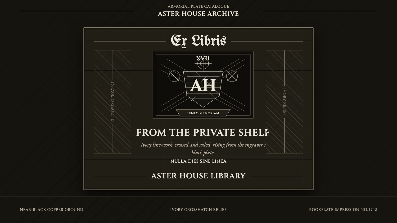 Ex Libris BookplateScholarly ownership, cut in ivory. Cinzel caps and crosshatch rules rise from…学者藏书的象牙刻痕。Cinzel 大写与交叉排线浮出黑版。
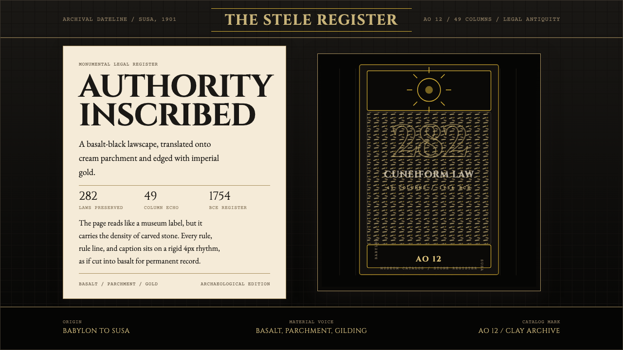 Babylonian Hammurabi SteleAuthority carved in stone. Basalt-black grids, parchment panels, and imperial…权威刻于石上。玄武岩黑底、羊皮纸面板、帝王金点缀。
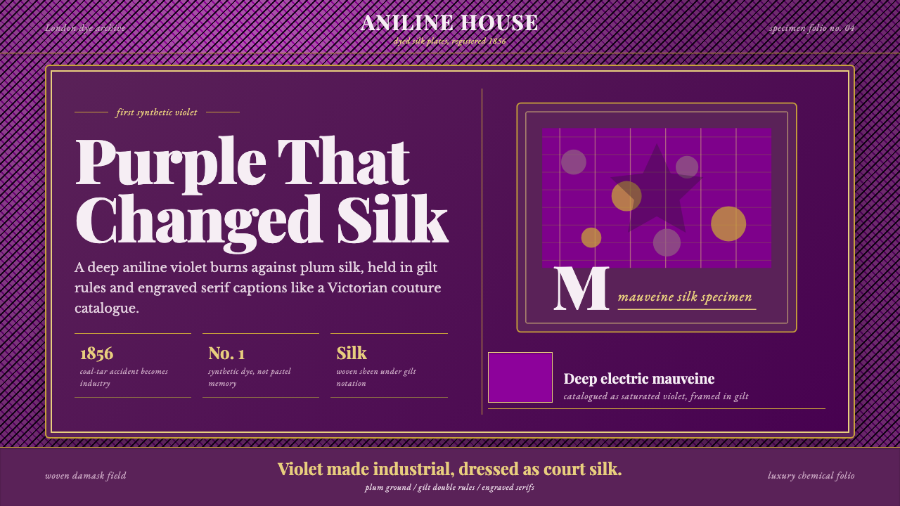 Mauveine (Perkin 1856)Electric purple, framed as luxury. Gilt rules and Playfair serifs turn dye in…电光紫即奢华:鎏金细框与 Playfair 衬线,把染料做成丝绸。
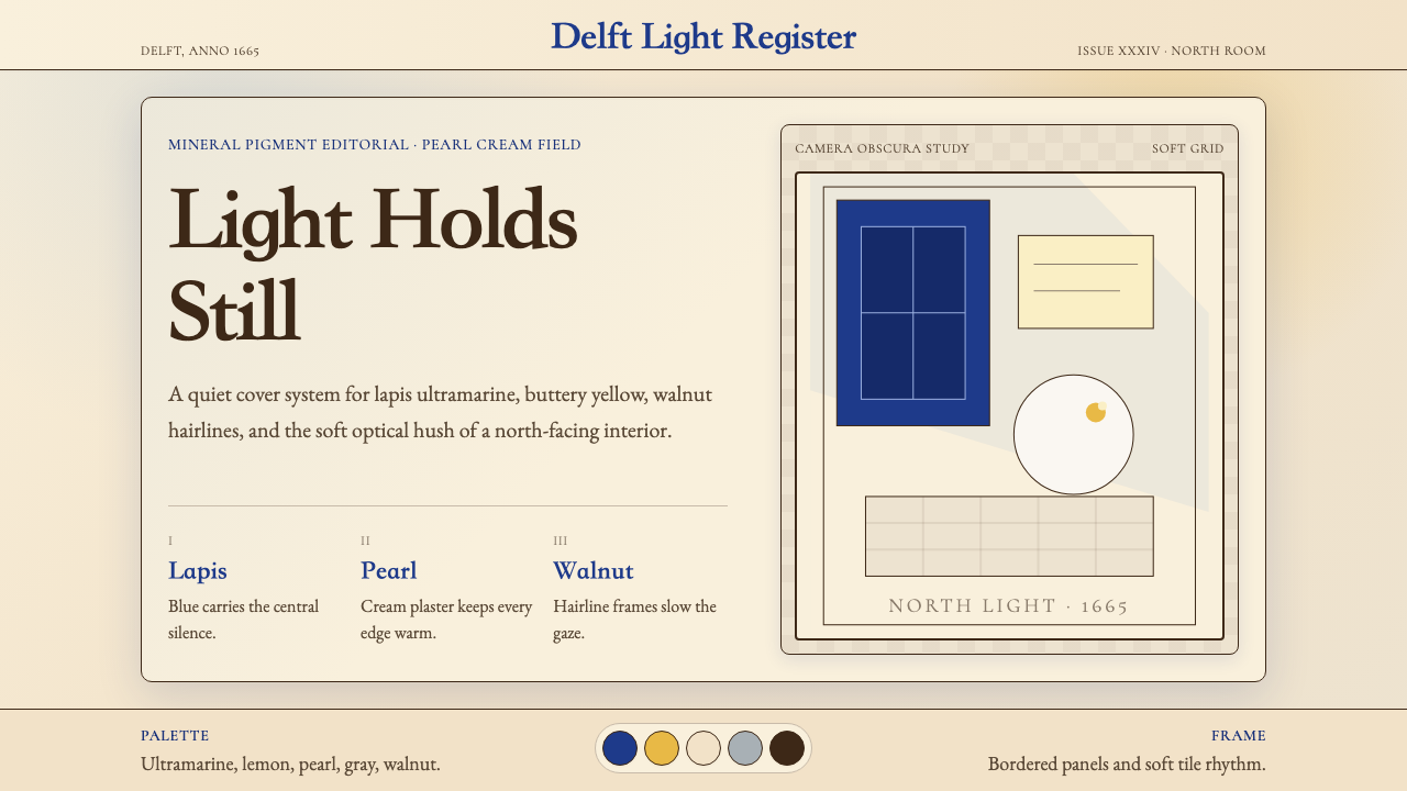 Vermeer Dutch Golden AgeStillness glows. Lapis ultramarine, pearl cream, and walnut frames hold north…静谧发光:青金石蓝、珍珠奶油与胡桃边框承住北窗光。
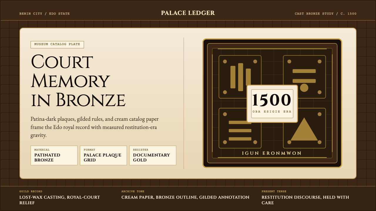 Benin Bronze (Edo, 1500)Royal memory, cast in bronze. Cream plaques and gilded lines carry museum gra…王权记忆铸于青铜。奶油牌板与鎏金线条带出图录庄重。
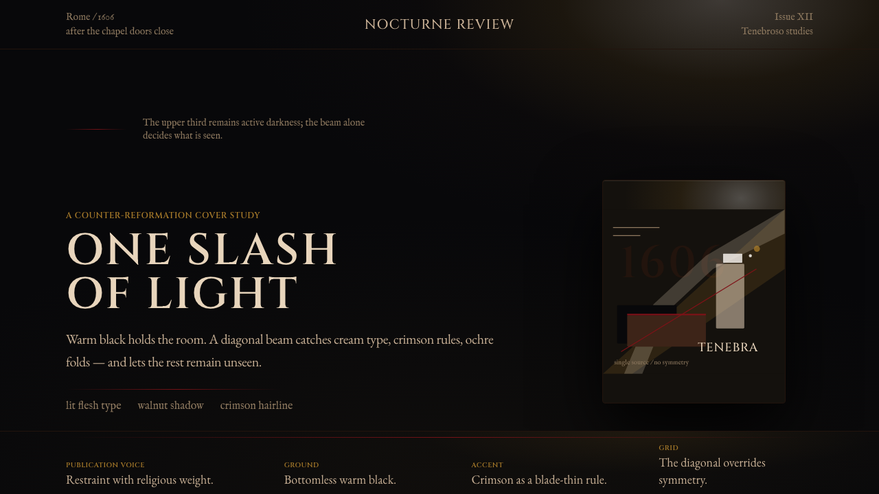 Caravaggio TenebrismDarkness acts first. Warm-black voids, Cinzel capitals, and one ochre raking…黑暗先发声:暖黑空场、Cinzel 大写与赭石斜光。