What is Mauveine (Perkin 1856)?
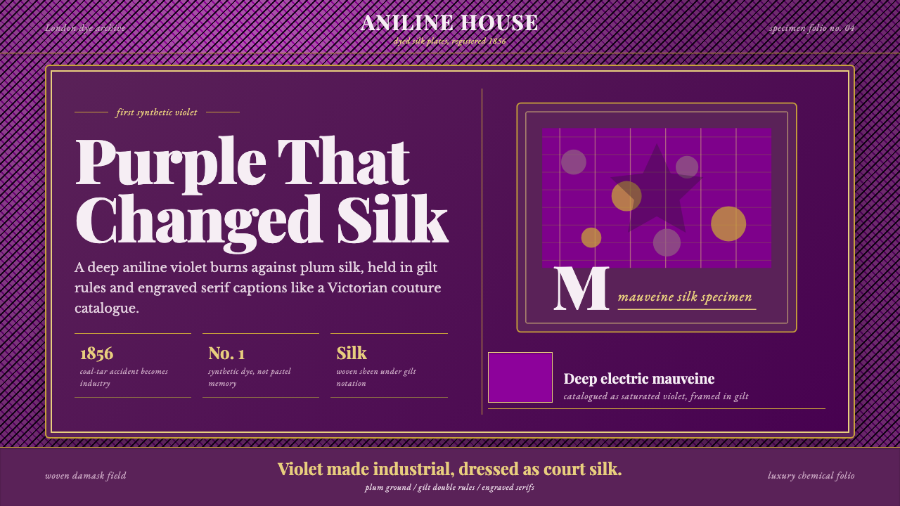
Mauveine turned a failed chemistry experiment into the first synthetic color in history — an electric, saturated purple that Victorian London decided was the very definition of luxury.
Mauveine (Perkin 1856) in brief
Mauveine is the design system built around the world's first synthetic dye, discovered by accident in 1856, and the specific violet it produced — not the soft, faded lavender that popular memory associates with the word 'mauve,' but a deep, saturated, almost electric purple as it actually appeared on freshly dyed Victorian silk. The system reconstructs that original intensity, drawing on surviving Perkin-dyed swatches held in London's Science Museum rather than on the washed-out romantic idea of mauve that decades of sun-fading and popular retelling have substituted for the real thing.
The visual identity pairs that violet with the trappings of Victorian luxury print and textile: gilt frames, woven damask texture, and the high-contrast engraved serif letterforms found on the era's finest stationery and fashion plates. This is a system about the moment a laboratory accident became a court sensation — the dye did not stay in a chemist's flask, it went directly onto silk gowns worn to royal functions, and the design language treats that transformation from industrial novelty to aristocratic status symbol as its central story.
What makes mauveine distinct from other Victorian-era palettes is that its central color did not exist in nature before 1856 in any commercially reproducible form. Every other historical dye color in this design family traces back to a plant, mineral, or animal source; mauveine's violet was the product of coal-tar chemistry, a byproduct of industrial waste transformed into the most fashionable color in Europe within two years of its discovery. That origin story — synthetic novelty dressed in the visual language of old-world luxury — is the tension the system is built to hold.
Where does Mauveine (Perkin 1856) come from?
In 1856, William Henry Perkin was an eighteen-year-old student at London's Royal College of Chemistry, working during his Easter holiday on a personal project set by his mentor, August Wilhelm von Hofmann: attempting to synthesize quinine, the anti-malarial drug then extracted at great expense from cinchona bark, using coal-tar derivatives. The synthesis failed to produce quinine. What it produced instead was a black, sludgy residue that, when Perkin attempted to clean it with alcohol, dissolved into a brilliant purple solution. Rather than discarding the failed experiment as most chemists of the era would have, Perkin recognized that the color might have commercial value as a textile dye, and he tested it on silk.
The timing of Perkin's discovery aligned with a genuine market gap. Purple dye had been prohibitively expensive throughout human history — the ancient Tyrian purple prized by Roman emperors required tens of thousands of crushed sea snails to produce a small quantity of dye, which is precisely why purple had become the color of imperial and ecclesiastical exclusivity for centuries. Perkin's synthetic version could be manufactured cheaply and at scale from coal-tar waste, a byproduct of the gas-lighting industry that was otherwise treated as a disposal problem. He patented the dye that same year, at eighteen, and left his studies to build a factory at Greenford, west of London, becoming one of the first people in history to industrialize a chemical discovery of his own making.
The dye's cultural breakthrough came via royal endorsement. Empress Eugénie of France, wife of Napoleon III, is credited with adopting the color because it matched her eyes, and Queen Victoria wore a mauveine-dyed gown to her daughter's wedding in 1858, cementing the color's status at the absolute top of European fashion. What followed was a genuine mania: satirical magazines of the period referred to the wave of purple-obsessed fashion as the 'mauve measles,' and the color's ubiquity across British high society by the early 1860s made it one of the first instances in history of a specific manufactured hue becoming a mass cultural phenomenon rather than remaining a rare, hand-produced luxury good.
Perkin's discovery is now recognized as the founding event of the synthetic organic chemistry industry — the coal-tar dye trade that followed directly enabled the German chemical companies that would later dominate global pharmaceutical and dye manufacturing for the next century. The original mauveine color itself proved commercially short-lived by fashion standards, falling out of favor by the late 1860s as newer synthetic dyes in other hues emerged from the industry Perkin had started, but its cultural memory persisted, gradually softening in popular imagination from the electric violet Perkin actually produced into the paler, more muted 'mauve' the word evokes today.
What defines the Mauveine (Perkin 1856) look?
Color
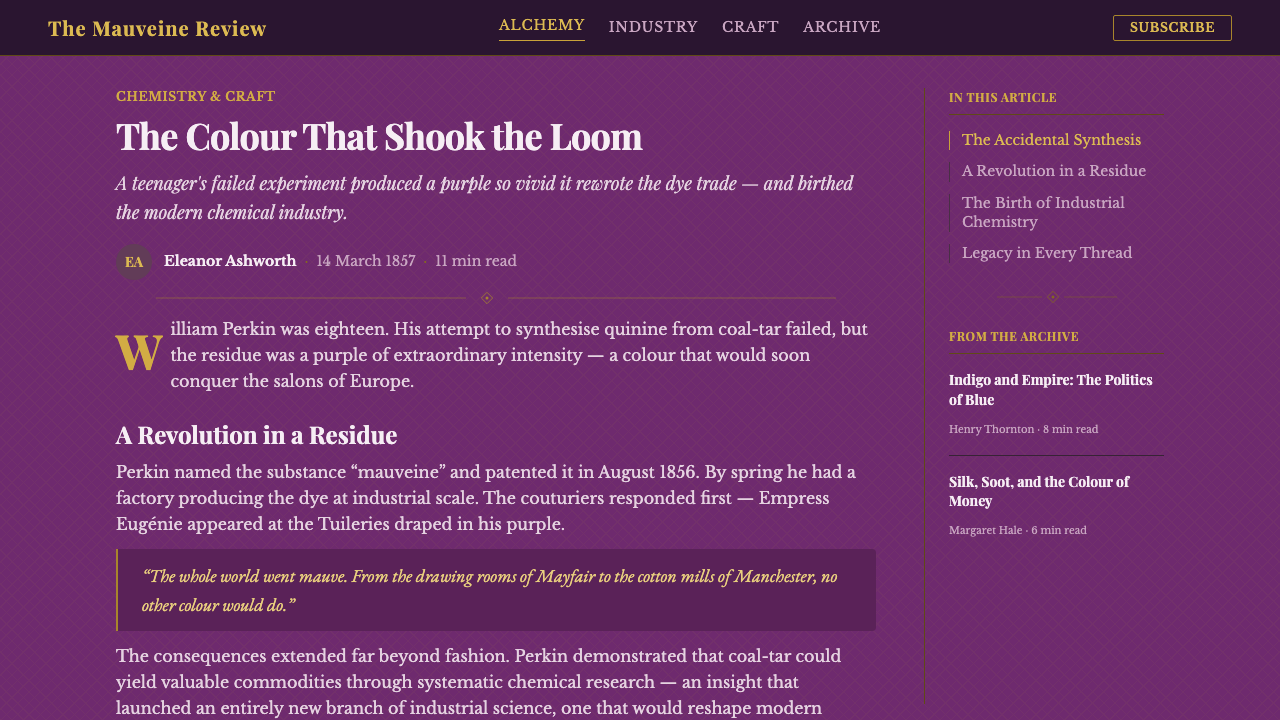
The defining hue is a deep, saturated, electric purple — closer to a vivid violet than to the pale dusty lavender that the word 'mauve' now popularly evokes. This system deliberately restores that original intensity, drawing on the surviving Perkin-dyed silk swatches rather than the faded, sun-bleached idea of the color. Gilt gold appears as a secondary accent, framing the violet the way a jeweler's setting frames a gemstone.
Typography
Lettering draws on the high-contrast engraved serifs typical of Victorian luxury print — stationery, fashion plates, and formal invitations of the 1856–1890 period. These letterforms feature dramatic thick-and-thin stroke contrast, sharp hairline serifs, and a formal, slightly ornate register that signals wealth and occasion rather than everyday commerce.
Framing and Gilt
Gilt-gold rules and frames appear throughout, echoing the ornate picture frames and bordered invitation cards of Victorian high society. The gold is used sparingly and structurally — as a border, a rule line, a small decorative flourish — never as a competing field color, so that the violet always remains the dominant visual event.
Woven Texture
A damask-like woven texture underlies the system, recalling the silk fabric that mauveine was originally dyed onto. This texture is subtle rather than loud — a background quality rather than a foreground pattern — evoking the tactile richness of couture fabric without competing with the violet or the typography for attention.
Deep Ground
The system favors a dark or richly saturated ground rather than a pale one, consistent with the isDark character of the identity. This deep field lets the violet read as luminous and jewel-like rather than as a pastel accent, preserving the 'electric' quality that distinguished Perkin's dye from the muted colors it is often mistakenly associated with today.
Occasion over Utility
Every element of this system signals occasion, formality, and status rather than everyday utility — this is a palette for court gowns, engraved invitations, and luxury print, not for workaday functional design. Ornament is present but restrained: gilt borders and damask texture are earned decorative flourishes rather than clutter, appropriate to a color that was, at its historical peak, worn to royal weddings.
Synthetic Novelty in Old-World Dress
The system deliberately holds a tension: the color itself was a brand-new, industrially manufactured chemical novelty in 1856, yet the visual language surrounding it — gilt, damask, engraved serifs — belongs entirely to old-world aristocratic tradition. This pairing of new synthetic material with inherited luxury signifiers is itself part of the story the system tells, and should not be resolved by making the surrounding elements feel modern or industrial.

Who shaped Mauveine (Perkin 1856)?
Perkin discovered mauveine at age eighteen while attempting to synthesize quinine from coal-tar derivatives during an Easter holiday experiment in 1856. Recognizing the commercial potential of the accidental purple residue, he patented the dye and left his studies to build a factory at Greenford, becoming one of the first chemists in history to industrialize his own laboratory discovery. His work is now credited as the founding event of the synthetic organic chemistry and dye industries.
Hofmann was Perkin's mentor and director of the Royal College of Chemistry, and it was Hofmann who set the original research problem — synthesizing quinine — that led, by accident, to Perkin's discovery of mauveine. Hofmann's broader research program into coal-tar derivatives established much of the chemical groundwork that made the accidental discovery possible in the first place.
The wife of Napoleon III is credited with popularizing mauveine in French fashion, reportedly adopting the color because it complemented her eyes. Her endorsement helped establish the dye's status among European aristocracy well beyond Britain, contributing to the broader continental fashion mania the color inspired in the years following its discovery.
Queen Victoria wore a mauveine-dyed gown to her daughter Princess Victoria's wedding in 1858, an endorsement that cemented the color's status at the top of British fashion and helped trigger the widespread 'mauve measles' craze that swept British high society through the early 1860s.
How do you use Mauveine (Perkin 1856) today?
Mauveine works best wherever a design needs to communicate luxury with a specific historical weight — not generic modern opulence, but the particular Victorian moment when a laboratory accident became the most coveted color in Europe. Because the core tension of the system (synthetic novelty dressed in old-world luxury) is conceptual rather than purely visual, applying it well requires keeping the violet electric and jewel-toned rather than letting it drift into a soft, generic lavender that loses the historical specificity entirely.
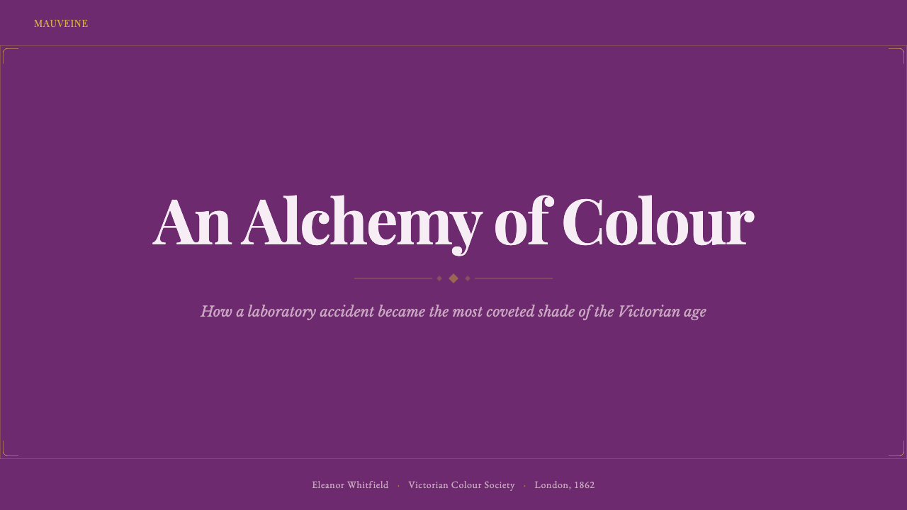
For presentation slides, the system suits cover pages built around a deep violet field with a single gilt rule or frame element and title type set in high-contrast engraved serifs — appropriate for luxury brand launches, heritage storytelling, or any narrative about transformation and reinvention. Content slides should keep the violet as an accent against a darker neutral ground rather than as the dominant fill for every panel, reserving its full intensity for section headers or key callouts so it retains its jewel-like impact rather than becoming wallpaper.
For web interfaces, mauveine suits premium product pages, luxury e-commerce, and brand storytelling sections where a deep, rich palette signals exclusivity — a pricing page for a top invitation-only tier, for instance, or a brand-history landing page. The dark ground with violet and gilt accents works well for hero sections and featured product cards, but should be used selectively rather than as a full-site palette, since its intensity is most effective as a moment of drama rather than a constant backdrop.
For editorial and marketing work, the system is well suited to fashion history features, heritage brand campaigns, or any storytelling about scientific or industrial serendipity turning into cultural phenomenon. A magazine-style layout benefits from generous gilt-framed pull quotes and a restrained use of the damask texture as a section-break device rather than a full-bleed background, keeping the composition legible and letting the violet carry the emotional weight.
A common mistake is defaulting to the pale, dusty lavender that popular memory now associates with the word 'mauve' rather than the saturated, electric violet Perkin actually produced — this softening loses the entire point of the system, which is built around restoring that lost intensity. A second common mistake is over-using gilt as a full background treatment rather than as a restrained framing device; the gold should always read as a setting for the violet, never compete with it as an equal field of color.
Mauveine (Perkin 1856) — FAQ
Is the mauveine color the same as the 'mauve' most people picture today?
Not quite. The word 'mauve' today generally evokes a soft, pale, slightly dusty lavender-pink. The original mauveine dye, as it appeared on freshly dyed Victorian silk in 1856, was considerably more saturated and electric — closer to a vivid violet than a pastel. This system deliberately restores that original intensity by drawing on surviving Perkin-dyed swatches, rather than the faded popular idea the color has accumulated over 170 years.
Why was purple so significant before synthetic dyes existed?
Purple dye had been extraordinarily expensive throughout most of human history, most famously in the form of ancient Tyrian purple, which required crushing tens of thousands of sea snails to produce even a small quantity. This scarcity made purple the color reserved for emperors, kings, and the highest ranks of the church for centuries. Perkin's synthetic dye broke that scarcity for the first time, making a purple-hued garment achievable for a much broader segment of society almost overnight.
Was mauveine discovered on purpose?
No — it was a genuine accident. Perkin was attempting to synthesize quinine, the anti-malarial drug, from coal-tar derivatives during an Easter holiday research project in 1856. The synthesis failed at its intended goal, producing instead a dark residue that dissolved into a vivid purple solution when Perkin tried to clean his equipment with alcohol. His insight was recognizing the commercial potential in what most chemists of the time would have dismissed as a failed, unwanted byproduct.
Why does this system emphasize gilt frames and Victorian print rather than pure chemistry imagery?
Because the story mauveine tells is not only a scientific one — it is a story about how a chemical accident was rapidly absorbed into the highest register of aristocratic fashion, worn by an empress and a queen within two years of its discovery. The gilt frames, damask texture, and engraved serifs represent that destination: the world of Victorian couture and royal occasion that mauveine was received into, not the laboratory it came from. The tension between the two origins — industrial accident and aristocratic embrace — is the point of the system.
Does this style suit modern technology or science-focused brands?
It can, but only if the brand's story genuinely involves a similar transformation — a technical innovation being elevated into something prized and prestigious, rather than remaining purely functional. It suits stories about serendipitous discovery, or about a scientific or industrial breakthrough that unexpectedly became a cultural or luxury phenomenon. It is a poor fit for brands wanting to signal clinical precision or everyday utility, since the entire visual language leans toward occasion, ornament, and aristocratic status rather than function.
Related design styles
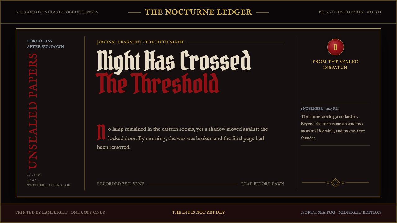 Dracula Gothic (1897)Victorian dread after dark. Blood-red initials and tarnished gilt haunt coffi…
 Dutch VanitasTime waits at the table. Olive-black depths, earth-brown type, and one candle…
 Ex Libris BookplateScholarly ownership, cut in ivory. Cinzel caps and crosshatch rules rise from…
 Flamsteed Atlas CoelestisMeasurement wears mythology. Ivory engravings and gilt stars cross a deep ind…
 Rembrandt BaroqueDarkness becomes theatre. Honey-gold spotlight and blackletter rise from Van…
 Vermeer Dutch Golden AgeStillness glows. Lapis ultramarine, pearl cream, and walnut frames hold north…