What is British Royal Monarchy?什么是 British Royal Monarchy?
Eight centuries of court protocol compressed into a single visual language: coronation purple, imperial gold, and blackletter symmetry that still commands the page.八百年宫廷礼仪凝练为一套视觉语言:加冕深紫、帝国金箔与哥特黑体的对称,至今仍在版面上发号施令。
British Royal Monarchy in briefBritish Royal Monarchy 速览
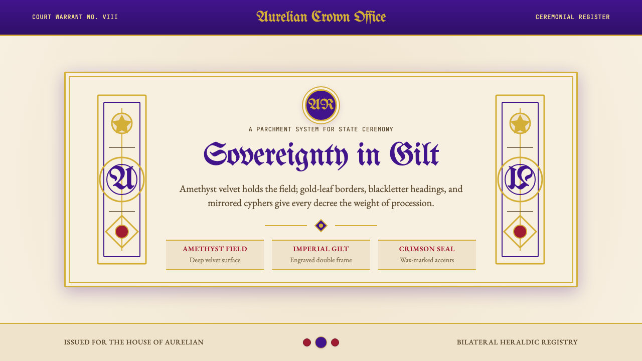
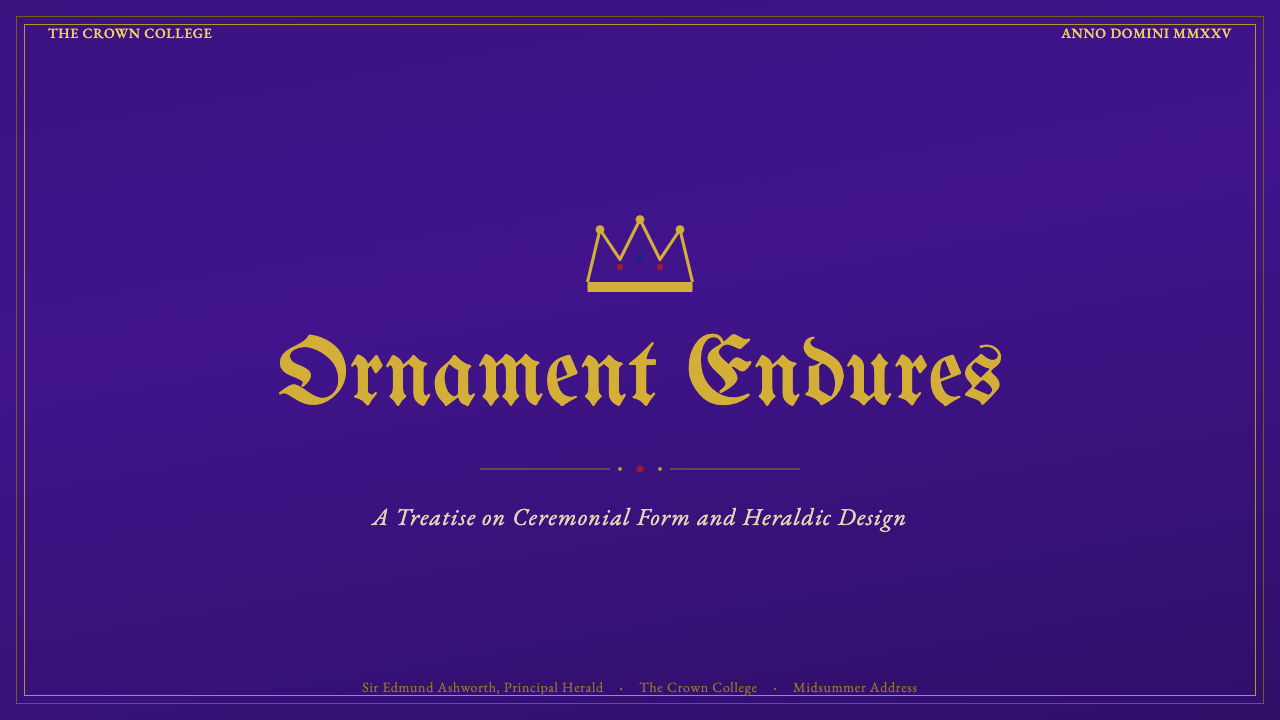
British Royal Monarchy design is the visual grammar of sovereign authority — a system distilled from coronation ceremonies, royal warrants, heraldic proclamations, and state documents accumulated across eight centuries of British court life. Its most recognizable elements are deep amethyst purple, ornate gilt framing, ermine cream grounds, and the layered typographic hierarchy of blackletter display headings descending through classical titling to refined roman body text.英国皇家君主制设计是主权权威的视觉语法——这套体系从八百年英国宫廷生活中积累的加冕典礼、皇家认证状、纹章诏书与国家文书中提炼而成。其最具辨识度的元素是深紫水晶色、华丽的鎏金框饰、貂皮奶油色底面,以及从哥特黑体展示标题、经由古典风格标题字、下至精雕正文字体的多层排印层级。
Unlike fashion-driven historical styles, this aesthetic is not a period curiosity. It continues to appear in live use: on the London Gazette, which has published royal proclamations since 1665; on royal warrants awarded to tradespeople who supply the Crown; on coronation programmes, state invitations, and the ceremonial documents that mark transitions of monarchical power. The visual logic is one of institutional permanence — every design choice signals that what is being communicated has the weight of centuries behind it.与时尚驱动的历史风格不同,这套美学并非尘封的历史珍奇。它至今仍在现实中活跃使用:自1665年起刊载皇家公告的《伦敦公报》、颁发给皇室供应商的皇家认证状、加冕典礼节目册、国宴邀请函,以及标志君主权力交接的各类礼仪文书。其视觉逻辑是制度性的永久感——每一个设计选择都在传递信号:所传达的内容背后承载着数百年的历史分量。
The defining compositional principle is bilateral symmetry organized around heraldic conventions. Coats of arms, royal ciphers, and supporting motifs — lion and unicorn supporters, crown and orb charges, garter motto bands — are composed along a strict vertical axis. Ornate borders and framing devices echo the illuminated manuscripts of the medieval scriptorium. The overall effect is one of contained ceremony: maximum ornamentation in service of maximum legibility of authority.其决定性构图原则,是以纹章惯例为轴心组织的双边对称。盾徽、皇家花押字与配套母题——狮子与独角兽托盾兽、王冠与宝球纹饰、嘉德勋章箴言带——沿严格的垂直轴线构成。繁复的边框与框饰装置呼应中世纪写经室的彩饰手抄本。整体效果是一种有所节制的典礼感:以最大程度的装饰,服务于权威可读性的最大化。
See the British Royal Monarchy design system查看 British Royal Monarchy 完整设计系统
Where does British Royal Monarchy come from?British Royal Monarchy 从何而来?
The visual roots of British Royal Monarchy design stretch to the High Middle Ages, when heraldry emerged across Western Europe as a practical identification system for armored knights and their retinues. In England, the College of Arms — formally incorporated by royal charter in 1484 under Richard III — became the permanent authority responsible for granting, recording, and regulating coats of arms. The compositional grammar it codified: supporters flanking a central shield, a helm and mantling above, a crest at the apex, and a motto scroll below, became the structural template for royal visual identity that persists to this day.英国皇家君主制设计的视觉根源可追溯至中世纪盛期。彼时,纹章学在西欧作为一套实用的识别体系兴起,用于区分身着铠甲的骑士及其随从。在英国,纹章院——1484年由理查三世正式颁发皇家特许状而设立——成为授予、记录与规范盾徽的常设权威机构。它所编码的构图语法:两侧托盾兽夹持中央盾牌、盔甲与盔饰居上、顶饰矗立于顶端、箴言卷轴垂于下方——成为皇家视觉身份的结构性模板,沿用至今。
The typographic dimension of the style crystallized in the fifteenth and sixteenth centuries, when blackletter (Gothic) script dominated official English documents. Royal proclamations, letters patent, and parliamentary statutes were set in dense, vertically stroked letterforms that visually encoded authority through sheer formal density. Even as Roman letterforms gradually displaced blackletter in commercial print from the seventeenth century onward, official royal documents conserved Gothic headings as deliberate archaism — a typographic signal that the document belonged to a tradition older and weightier than contemporary commercial printing.这种风格的排印维度在十五至十六世纪逐渐固化。彼时,哥特黑体字占据英国官方文书的主流。皇家公告、特许状与议会法令均以竖向笔画密集的字形排印,通过纯粹的形式浓度在视觉上编码权威。即便从十七世纪起,罗马字体逐渐在商业印刷中取代哥特黑体,皇家官方文书仍将哥特标题作为蓄意的复古手段加以保留——这是一种排印信号,宣示文件所属的传统比当代商业印刷更古老、更有分量。
The Victorian and Edwardian eras — roughly 1837 through 1910 — represent the period when this aesthetic was most comprehensively formalized and amplified. Queen Victoria's coronation in 1838 and her Diamond Jubilee in 1897 produced vast quantities of ceremonial print material that established visual templates copied and refined across subsequent decades. The Gothic Revival, championed by architects and designers including Augustus Pugin, provided an intellectual framework: medieval forms were not backward-looking pastiche but morally serious alternatives to industrial vulgarity. Royal Warrant holders — firms granted the right to display the royal arms and the phrase "By Appointment" — proliferated, each adding to the stock of imagery associating gilded heraldry with quality and legitimacy.维多利亚与爱德华时代——大约从1837年至1910年——是这套美学被最全面地正式化与放大的时期。维多利亚女王1838年的加冕典礼与1897年的钻禧庆典产生了大量礼仪印刷品,确立了此后数十年间被反复借鉴与提炼的视觉模板。由奥古斯塔斯·普金等建筑师与设计师倡导的哥特复兴运动提供了一套知识框架:中世纪形式并非倒退的摹仿,而是对工业庸俗的道德上严肃的替代。皇家认证状持有者——获授权展示皇家纹章及「御用供应商」字样的商家——数量激增,各自为鎏金纹章与品质、正当性之间的关联积累着视觉资本。
Contemporary practice is maintained by a small community of specialist craftspeople. Tim Noad, Herald Painter to the College of Arms, and Andrew Jamieson, a leading heraldic artist, represent the living tradition of hand-illuminated royal documents — letters patent, grants of arms, and commemorative addresses that are still produced using traditional vellum, gold leaf, and pigment techniques. The coronation of King Charles III in May 2023 generated a new wave of ceremonial material that drew directly on this centuries-long visual tradition, demonstrating that the style remains a living system rather than a museum piece.当代实践由一小群专业工匠维系。纹章院纹章画师蒂姆·诺德与著名纹章艺术家安德鲁·贾米森,代表着手工彩饰皇家文书的活态传统——特许状、纹章授予书与纪念致辞至今仍以传统牛皮纸、金箔与矿物颜料制作。2023年5月查尔斯三世的加冕典礼催生了一批新的礼仪材料,直接承续这一绵延数百年的视觉传统,证明这套风格仍是一个鲜活的系统,而非博物馆陈列品。
What defines the British Royal Monarchy look?British Royal Monarchy 的视觉特征是什么?
Color色彩
The palette is built around deep amethyst purple — the color of coronation robes and velvet throne canopies — paired with textured imperial gold that recalls hammered leaf applied to illuminated manuscripts and royal seals. Ermine cream, derived from the white-and-black fur historically reserved for royalty, serves as the primary ground color, lending parchment warmth to the overall field. Scarlet and navy appear as secondary heraldic hues, always subordinate to purple and gold. The palette communicates exclusivity through its association with materials historically restricted by sumptuary law to those of royal rank.色板以深紫水晶色为核心——这是加冕礼袍与天鹅绒华盖宝座之色——与质感帝国金相配,令人联想到彩饰手抄本与皇家印玺上捶打而成的金箔。源自历史上专属皇室的白黑相间貂皮的貂皮奶油色,充当主要底色,为整体画面带来羊皮纸般的温暖质感。深红与海军蓝作为次级纹章色出现,始终从属于紫与金。这套色板通过与历史上受奢侈品禁令限制、仅皇家身份方可使用的材料之关联,传递专属性。
Typography字体排印
The typographic system operates across three distinct registers. Display headings use blackletter — the Gothic letterforms found on the masthead of the London Gazette and the headers of royal proclamations — whose dense vertical strokes and ornate finishing details carry unmistakable associations with official authority. Titling and subheadings shift to classical roman faces in the tradition of Trajan inscriptions, evoking imperial permanence through upright proportion and strong modulation between thick and thin strokes. Body text settles into refined old-style roman letterforms, legible at smaller sizes and elegant in continuous reading. The progression from Gothic display to classical titling to roman body mirrors the formal hierarchy of state documents.排印体系横跨三个截然不同的层级。展示标题使用哥特黑体——即出现在《伦敦公报》报头与皇家公告页首的哥特字形——其密集的竖向笔画与华丽的收笔细节承载着对官方权威的无误联想。标题与子标题转向图拉真铭文传统中的古典罗马字体,通过挺直的比例与粗细笔画之间的强烈调制,唤起帝国的永久感。正文则安定于精雅的古风罗马字形,在小字号下易读,在连续阅读中优雅。从哥特展示字到古典标题字再到罗马正文的递进,与国家文书的正式层级一脉相承。
Bilateral Symmetry双边对称
Heraldic composition demands strict symmetry along a central vertical axis. Supporting figures — the lion of England and the unicorn of Scotland — flank the royal arms in perfect lateral balance. Text blocks, ornamental borders, and decorative cartouches mirror each other across this axis. This symmetry is not the functional, tension-based balance of modernist design but ceremonial equivalence: both sides of the composition are equal because both sides of the sovereign's authority are equal. Asymmetric layouts are essentially foreign to this tradition; deviation from bilateral balance reads as incompleteness or informality.纹章构图要求沿中央垂直轴线严格对称。托盾兽——英格兰狮与苏格兰独角兽——在皇家纹章两侧以完美的横向平衡相对。文字块、装饰边框与花饰匾额在这条轴线两侧互为镜像。这种对称并非现代主义设计中以张力取得的功能性平衡,而是礼仪上的等价:构图两侧相等,因为君主权威的两侧相等。非对称布局在这一传统中近乎格格不入;偏离双边平衡即被解读为不完整或非正式。
Ornate Framing华丽框饰
Borders and frames are not incidental containers but primary compositional elements. Decorative borders on royal documents range from interlaced strapwork derived from Renaissance ornament to naturalistic sprays of national flowers — Tudor rose, Scottish thistle, Welsh leek, Irish shamrock — rendered with botanical precision. Inner panels may be further subdivided by gilded rules, rope motifs, or chain borders. Cartouches — ornamental frames enclosing text or imagery — appear at corners and along margins, breaking the rectangular field into a composition of nested frames. The effect is that every document occupies its own visual world, bounded and complete.边框并非随意的容器,而是主要的构图元素。皇家文书上的装饰边框,从文艺复兴纹样衍生的编织带饰,到以植物学精度描绘的各国国花——都铎玫瑰、苏格兰蓟、威尔士韭与爱尔兰三叶草——形态各异。内部面板可进一步以鎏金线条、绳索母题或锁链边框细分。花饰匾额——包裹文字或图像的装饰性框架——出现在角落与页边,将矩形版面分解为一组嵌套框架的构图。效果是:每一份文书都占据自己的视觉世界,边界清晰,自成完整。
Gold as Structure金色作为结构
In authentic heraldic tradition, gold (or, in heraldic language) is one of only two metals — the other being silver — and functions as a rule-governed design element rather than mere decoration. The rule of tincture forbids placing a metal upon a metal or a color upon a color, ensuring that gold borders and fields always contrast legibly against the darker hues surrounding them. In applied design, this translates to a structural use of gold: gilded rules divide sections, gold letterforms highlight titles, gold borders define primary panels. The material richness is real but purposeful — every gold element earns its place by organizing hierarchy.在正宗纹章传统中,金色(纹章语言称「或」)是仅有的两种金属之一——另一种是银色——它作为受规则约束的设计元素发挥作用,而非单纯的装饰。着色规则禁止金属色叠压金属色或彩色叠压彩色,确保金色边框与金色底面始终与周围较深色调形成清晰对比。在应用设计中,这转化为结构性的金色使用:鎏金线条分隔章节,金色字形突显标题,金色边框界定主面板。材质上的富丽是真实的,但有其目的——每一个金色元素都通过组织层级来赢得自己的位置。
Heraldic Motifs纹章母题
The vocabulary of British royal heraldry is specific and codified. The royal arms quarter the three golden lions of England against red, the red lion of Scotland against gold, and the golden harp of Ireland against blue. The garter — a blue ribbon bearing the motto 'Honi soit qui mal y pense' in blackletter — encircles the shield. The royal cipher combines the sovereign's initial with 'R' for Rex or Regina. The motto 'Dieu et mon droit' appears on a scroll below. These are not decorative options but regulated symbols whose misuse has legal consequences. Applied design may reference or allude to these forms without reproducing them exactly, but fidelity to their proportions and placement conventions is essential for the aesthetic to read as authentic.英国皇家纹章的视觉词汇是具体且有章可循的。皇家纹章将红地三金狮(英格兰)、金地红狮(苏格兰)与蓝地金竖琴(爱尔兰)四等分组合。嘉德勋章——一条蓝色丝带,以哥特黑体书写箴言「恶者以此为耻」——环绕盾牌。皇家花押字将君主姓名首字母与「R」(Rex或Regina)组合。「上帝与我的权利」座右铭出现在下方卷轴上。这些并非可选的装饰元素,而是受法律规范的符号,误用可能产生法律后果。应用设计可以参考或暗示这些形式而不完全复制,但忠于其比例与位置惯例,是让美学被读解为真实可信的必要条件。
Texture and Material Allusion质感与材质暗示
Unlike the flat, material-agnostic surfaces of modernist design, the British Royal Monarchy aesthetic actively alludes to physical materials: the nap of purple velvet, the uneven surface of hammered gold leaf, the slight translucency of vellum, the aged warmth of parchment. In digital and print applications, this is achieved through subtle textural grounds — not photorealistic reproductions of fabric or skin, but gentle surface variation that prevents the background from reading as purely neutral. The overall tactile quality of the style is one of luxurious weight: objects and documents presented within this visual system feel as though they could be lifted and held, not merely viewed.与现代主义设计平整、材质中立的表面不同,英国皇家君主制美学主动暗示实体材质:紫色天鹅绒的绒毛质感、捶打金箔的不均匀表面、牛皮纸的微微透光、羊皮纸的岁月温润。在数字与印刷应用中,这通过细腻的肌理底面实现——不是织物或兽皮的照片级写实再现,而是防止背景被读解为纯然中立的轻柔表面变化。这种风格的整体触觉品质是奢华的重量感:在这套视觉系统中呈现的对象与文书,让人感觉可以被拿起、被握持,而非仅供观看。
See the British Royal Monarchy design system查看 British Royal Monarchy 完整设计系统
Who shaped British Royal Monarchy?谁塑造了 British Royal Monarchy?
Incorporated by royal charter in 1484, the College of Arms is the oldest continuously operating heraldic authority in the world and the ultimate source of the visual grammar that defines British Royal Monarchy design. Its Officers of Arms — including Garter Principal King of Arms, the senior herald — grant coats of arms, record pedigrees, and organize state ceremonies including coronations. The College's archive of grants and records, stretching back to the fifteenth century, constitutes the primary visual library of the style.纹章院于1484年获皇家特许状设立,是世界上历史最悠久、持续运作至今的纹章权威机构,也是英国皇家君主制设计视觉语法的终极来源。其纹章官——包括职位最高的嘉德首席纹章官——授予盾徽、记录族谱并组织包括加冕礼在内的国家典礼。纹章院可追溯至十五世纪的授予档案与记录,构成了这套风格的主要视觉资料库。
Tim Noad serves as Herald Painter to the College of Arms, one of the most demanding specialist roles in the continuity of traditional heraldic art. He produced hand-illuminated documents for the coronation of King Charles III, working in the same tradition of gold leaf, vellum, and mineral pigments that has characterized royal documentary art since the medieval period. His work demonstrates that the visual standards of the style are not approximated by digital production but maintained through the continuation of craft techniques unchanged in their essentials for centuries.蒂姆·诺德担任纹章院纹章画师,这是维系传统纹章艺术传承的要求最为严苛的专业职位之一。他为查尔斯三世加冕礼制作了手工彩饰文书,沿用与中世纪以来皇家文书艺术一脉相承的金箔、牛皮纸与矿物颜料传统。他的工作表明,这套风格的视觉标准并非通过数字生产加以模拟,而是通过数百年来在本质上未曾改变的工艺技术的延续来维系。
Andrew Jamieson is a leading British heraldic artist whose work spans grants of arms, ceremonial addresses, and commemorative commissions for royal and civic bodies. His practice bridges the illuminated manuscript tradition with contemporary interpretations of heraldic design, demonstrating the range of application — from strictly canonical royal documents to more freely interpreted ceremonial work — that the style supports. Jamieson has contributed to public understanding of heraldic art through both commissions and publications documenting the technical and aesthetic principles of the tradition.安德鲁·贾米森是英国著名纹章艺术家,其作品涵盖纹章授予书、礼仪致辞及为皇家与市政机构承接的纪念委托。他的实践在彩饰手抄本传统与纹章设计的当代诠释之间架起桥梁,展示了这种风格所能支撑的应用范围——从严格规范的皇家文书到更为自由诠释的礼仪作品。贾米森通过委托创作与记录这一传统技术及美学原则的出版物,推动了公众对纹章艺术的认知。
The architect and designer Augustus Welby Northmore Pugin (1812–1852) is the intellectual architect of the Victorian Gothic Revival that provided the British Royal Monarchy aesthetic with its most influential modern elaboration. Pugin argued, in 'Contrasts' (1836) and 'The True Principles of Pointed or Christian Architecture' (1841), that Gothic forms were morally as well as aesthetically superior to the classical and the industrial. His decorative schemes for the rebuilt Palace of Westminster — the building that houses the UK Parliament and provides the visible backdrop to royal ceremonial life in London — established the neo-Gothic interior vocabulary that reinforced the connection between Gothic ornament, royal authority, and national identity.建筑师与设计师奥古斯塔斯·韦尔比·诺思莫尔·普金(1812—1852年)是维多利亚哥特复兴运动的思想奠基人,正是这场运动为英国皇家君主制美学提供了其最具影响力的现代阐发。普金在《对比》(1836年)与《尖拱或基督教建筑的真实原则》(1841年)中主张,哥特形式在道德上与美学上均优于古典主义与工业风格。他为重建后的威斯敏斯特宫——英国议会的所在地,亦是伦敦皇家礼仪活动的可见背景——所设计的装饰方案,确立了新哥特室内词汇,强化了哥特装饰、皇家权威与国家认同之间的关联。
The coronation of King Charles III on 6 May 2023 at Westminster Abbey provided the most recent major commission of British Royal Monarchy design in its fully ceremonial form. The coronation programme, invitation, and associated printed material adhered closely to the established visual conventions — blackletter headings, gilded borders, the royal arms and cipher, bilateral symmetry — while incorporating Charles's personal cypher and new heraldic elements specific to his reign. The event demonstrated that this visual system is actively maintained and updated at each succession, not preserved as static heritage but renewed through each new reign.2023年5月6日查尔斯三世在威斯敏斯特大教堂举行的加冕礼,是英国皇家君主制设计以完整礼仪形式呈现的最近一次重大委托。加冕典礼节目册、邀请函及相关印刷材料严格遵循既定视觉惯例——哥特黑体标题、鎏金边框、皇家纹章与花押字、双边对称——同时融入查尔斯的个人花押字与其统治期特有的新纹章元素。这一盛典表明,这套视觉系统在每次王位传承时都被主动维护与更新,并非作为静态遗产加以保存,而是在每个新王朝中得到更新与延续。
How do you use British Royal Monarchy today?今天怎么用 British Royal Monarchy?
British Royal Monarchy is among the most legible of historical design styles for applied use, because its visual conventions carry near-universal recognition in English-speaking and international contexts — centuries of association with legitimacy, ceremony, and authority mean that audiences decode the signals immediately. Applying it correctly requires understanding that the system communicates through accumulation: every individual element — the gold border, the blackletter heading, the symmetric layout, the cream ground — reinforces the same set of associations. Removing too many of these elements produces something that reads merely as ornate rather than authoritative.英国皇家君主制是历史设计风格中可读性最强的应用风格之一,因为其视觉惯例在英语国家及国际语境中具有近乎普遍的辨识度——数百年与合法性、典礼与权威的关联,使受众能立即解码其信号。正确应用这套风格,需要理解它通过积累来传达意义:每个单独的元素——金色边框、哥特黑体标题、对称布局、奶油底面——都在强化同一组联想。去除过多这些元素,得到的结果只会被读解为华丽,而非权威。
For presentation slides, the style works with exceptional strength on ceremonial or high-stakes covers: annual reports addressing shareholders or trustees, award ceremony programmes, institutional anniversary decks, and any presentation that needs to establish gravity before the first word is read. A cover constructed on this system might place a centrally symmetrical heraldic composition — a bordered panel containing a monogram or device within a gilded frame — against a deep amethyst or cream ground, with the title in blackletter or a strongly modulated classical typeface. Content slides should simplify considerably: a horizontal gilded rule as a divider, generous margins, body text in a refined roman face, and accent color confined to headings or key data. Data slides work well with ornamental borders framing charts and tables, treating each data panel as a document within the document — contained, bordered, and formally labeled.在演示文稿中,这种风格在礼仪性或高风险封面上表现出色:致股东或受托人的年报、颁奖典礼节目册、机构周年纪念幻灯片,以及任何需要在第一个字被阅读之前就建立庄重感的演示。依据这套系统构建的封面,可以将一个中央对称的纹章构图——一个在鎏金框架内包含花押字或装饰图案的边框面板——置于深紫水晶色或奶油色底面上,标题采用哥特黑体或笔画调制强烈的古典字体。内容页应大幅简化:以横向鎏金线条作分隔,留白慷慨,正文采用精雅罗马字体,强调色仅限于标题或关键数据。数据页在装饰性边框框定图表与表格方面效果显著,将每个数据面板视为文书中的文书——有边界、有框架、有正式标注。
For web user interfaces, this style is most naturally suited to contexts where ceremony and prestige are primary user expectations: luxury e-commerce, subscription tiers for premium services, hospitality and hotel brands, private membership organizations, and arts institutions with royal patronage or historical gravitas. The approach: choose a cream or warm white background, use deep amethyst or navy as the primary interaction color, reserve gold for borders, dividers, and premium tier indicators. Navigation and headings in a strongly modulated or classical typeface carry the style's authority; avoid geometric sans-serifs, which undercut the historical register. Symmetric layout structures work better than asymmetric grids — this is a style that prefers centered alignment and vertical axis composition over modernist tension-based balance. Pricing pages become highly effective in this mode: the premium tier framed by a gilded border against a deeper background ground immediately communicates top-tier status.对于网页用户界面,这种风格最自然地适合典礼感与声望是用户主要期望的语境:奢侈品电商、高端服务订阅等级、酒店与款待品牌、私人会员组织,以及拥有皇家赞助或历史底蕴的艺术机构。方法如下:选择奶油色或温暖白色背景,以深紫水晶色或海军蓝作为主要交互色,将金色保留用于边框、分隔线与高级等级指示。强调调制的或古典风格的字体用于导航与标题,承载这种风格的权威感;避免几何无衬线字体,后者会削弱历史语域。对称布局结构优于非对称网格——这是一种偏爱居中对齐与垂直轴构图的风格,而非现代主义以张力取得平衡的方式。定价页在这种模式下效果极佳:以鎏金边框、衬以更深底色框定的高级等级,能立即传递顶级身份感。
For editorial and marketing work, the British Royal Monarchy aesthetic creates immediate authority in sectors that benefit from heritage associations: financial services, professional organizations, legal firms, luxury consumer goods, and institutions marking significant anniversaries or milestones. Editorial layouts should use wide outer margins for ornamental borders or heraldic devices, with body text in a well-set roman face running at a comfortable measure. Section breaks work effectively as full-width ornamental rules or small heraldic ornaments — a crown, a rose, a simple geometric rosette — rather than mere typographic spacing. Marketing materials achieve their strongest impact when the heraldic composition is reproduced at a scale large enough to be immediately read: a full-bleed amethyst cover with a centered gilded device and title in classical lettering requires no explanatory context. The style also supports effective certification and award design — quality marks, seals, and badges that carry genuine authority within the visual system.对于编辑与营销内容,英国皇家君主制美学在受益于传承联想的行业中能立即建立权威:金融服务、专业机构、律所、奢侈消费品,以及标志重要周年或里程碑的机构。编辑版面应在宽阔的外边距处放置装饰性边框或纹章图案,正文以排版良好的罗马字体、以舒适的行宽排印。段落分隔以全宽装饰线条或小型纹章点缀——王冠、玫瑰、简单的几何花饰——而非仅依靠排版间距实现效果。营销材料在纹章构图以足够大的尺寸呈现时冲击力最强,足以被立即读解:铺满版面的紫晶底色,居中的鎏金图案,古典字体的标题,无需任何解释性语境。这种风格同样适合认证与奖项设计——在这套视觉系统内承载真实权威的品质标志、印章与徽章。
The most common mistake when applying this style is treating it as purely decorative, adding gilded ornaments to a layout that otherwise follows modernist or neutral conventions. The result is incoherence: the ornament signals ceremony, but the layout signals efficiency, and the two systems cancel each other out. Authenticity requires committing to the compositional principles — bilateral symmetry, layered typographic hierarchy, bounded and framed panels — not merely borrowing surface decoration. A second common error is color confusion: deep amethyst and imperial gold are specific in tone and saturation; substituting generic purple or brassy yellow produces an effect that reads as costume rather than ceremony. A third error is typographic inconsistency — mixing blackletter headings with geometric sans-serif body text collapses the historical register that gives the style its authority.应用这种风格时最常见的错误,是将其视为纯装饰性的,在一个其他方面遵循现代主义或中性惯例的版面上添加鎏金装饰。结果是不连贯:装饰传递典礼感,但版面传递效率感,两套系统相互抵消。真实性要求承诺于构图原则——双边对称、分层排印层级、有边界的框架面板——而不仅仅是借用表面装饰。第二个常见错误是色彩混淆:深紫水晶色与帝国金在色调与饱和度上是具体的;用普通紫或黄铜黄代替,产生的效果被读解为戏服而非典礼。第三个错误是排印不一致——将哥特黑体标题与几何无衬线正文混搭,会瓦解赋予这种风格权威感的历史语域。
See the British Royal Monarchy design system查看 British Royal Monarchy 完整设计系统
British Royal Monarchy — FAQBritish Royal Monarchy · 常见问题
Is this style appropriate for modern digital products, or does it only work for print?这种风格适合现代数字产品吗,还是只适用于印刷品?
It works in digital contexts, but requires selective application. The full heraldic vocabulary — vellum grounds, gilded leaf borders, blackletter headings, bilateral symmetry — is most effective in high-ceremony digital moments: splash screens, membership confirmation pages, premium tier presentation, award or certification display. Applying the complete style to functional interfaces such as dashboards or data-entry forms creates friction. The productive approach is to establish the style through primary visual elements — a classically proportioned typeface, an amethyst and gold color system, symmetric layout containers — and allow functional elements to operate more neutrally within that established register. Digital surfaces can communicate the aesthetic without requiring every element to perform its full ceremonial weight.这种风格在数字语境中可行,但需要有选择地应用。完整的纹章词汇——牛皮纸底面、鎏金叶边框、哥特黑体标题、双边对称——在高度典礼性的数字时刻最为有效:启动画面、会员确认页、高级等级展示、奖项或认证展示。将完整风格应用于仪表板或数据输入表单等功能性界面会制造阻力。富有成效的做法是通过主要视觉元素建立风格——古典比例字体、紫晶与金色系统、对称布局容器——并允许功能性元素在这一已建立的语域内以更中立的方式运作。数字界面可以传达这套美学,而无需每个元素都承担其完整的礼仪分量。
How does this style differ from Gothic Revival or general Victorian ornament?这种风格与哥特复兴或一般维多利亚装饰有何区别?
British Royal Monarchy design is a specific subset of the broader Victorian decorative tradition and of the Gothic Revival aesthetic. What distinguishes it is the heraldic armature: the compositional logic of the royal arms, the specific heraldic vocabulary of tinctures and charges, and the institutional authority of the College of Arms standing behind the conventions. General Victorian ornament is exuberant and eclectic — it borrows from Gothic, Rococo, Renaissance, and Japonisme simultaneously. Gothic Revival is an architectural and ecclesiastical movement with its own vocabulary of pointed arches and tracery. Royal heraldic design is more disciplined: it has a rulebook, a governing institution, and a narrower palette of legitimate forms. The distinction matters in practice because general Victorian ornament can legitimately mix motifs; authentic royal heraldic design cannot.英国皇家君主制设计是更广泛的维多利亚装饰传统与哥特复兴美学的一个具体子集。其区别在于纹章骨架:皇家纹章的构图逻辑、纹章着色与纹饰的具体词汇,以及纹章院的制度权威为这些惯例背书。一般维多利亚装饰是奔放而折中的——它同时借鉴哥特、洛可可、文艺复兴与日本主义。哥特复兴是建筑与宗教领域的运动,有其自身的尖拱与窗棂花饰词汇。皇家纹章设计更为严格:它有规则书、有主管机构、有更窄的合法形式集合。这一区别在实践中至关重要,因为一般维多利亚装饰可以合理地混用母题,而正宗的皇家纹章设计则不能。
Can this style work for brands that have no royal or British connection?这种风格能用于与皇室或英国毫无关联的品牌吗?
Yes, with honest application. The associations the style carries — legitimacy, heritage, ceremony, authority, premium quality — are valuable across many sectors regardless of literal royal connection. The key is to use the visual language as a system of connotation rather than as literal claim. A law firm, a private bank, a heritage whisky brand, or a luxury hotel can employ the typographic hierarchy, the amethyst and gold palette, the symmetric framing, and the formal weight of the style to communicate a sincere positioning around tradition and quality. Problems arise when the heraldic vocabulary is used so literally — including reproductions of royal arms or phrases like 'By Royal Appointment' without actual authorization — that it implies a connection that does not exist. This is both aesthetically incoherent and, in the United Kingdom, legally regulated.可以,前提是诚实地应用。这种风格所承载的联想——合法性、传承、典礼、权威、高端品质——在许多行业中都有价值,无论是否有字面意义上的皇室关联。关键是将这套视觉语言作为内涵符号系统使用,而非作为字面主张。律所、私人银行、传承威士忌品牌或奢侈酒店,完全可以运用其排印层级、紫晶与金色色板、对称框架与正式分量,来传达一个关于传统与品质的真诚定位。当纹章词汇被过于字面地使用时——包括复制皇家纹章或在未获实际授权的情况下使用「御用供应商」字样——因为这暗示了一种并不存在的关联,就会出现问题。这不仅在美学上是不连贯的,在英国也受到法律监管。
How should photography or illustration be handled within this style?在这种风格中应如何处理摄影或插图?
Imagery is handled carefully in authentic royal design. Portraiture — formal, frontal, and usually oil-painted in the historical tradition — is the dominant figurative mode; photography, when it appears in ceremonial contexts, is treated with the same compositional formality: centered subject, formal attire, and a setting or background that reads as stage rather than environment. Illustrations in heraldic documents are rendered in the flat, outlined style of medieval illumination: figures and animals are stylized rather than naturalistic, colors are applied as flat fills within defined outlines, and shading is minimal or absent. In applied design, photography should be framed formally — within bordered panels rather than bleeding to edges — and treated to heighten contrast and formality. Documentary or reportage photography is inconsistent with the style's register; imagery should feel timeless rather than contingent.在正宗皇家设计中,图像的处理是审慎的。肖像画——正式的、正面的、通常以历史传统的油画形式呈现——是主导的具象模式;摄影在礼仪语境中出现时,以同等的构图正式感处理:居中主体、正式着装,以及被读解为舞台而非环境的场景或背景。纹章文书中的插图以中世纪彩饰手抄本的平面轮廓风格绘制:人物与动物是程式化而非写实的,色彩在明确轮廓线内以平铺填色方式应用,阴影极少或完全缺失。在应用设计中,摄影应被正式框定——置于有边框的面板内而非出血至边缘——并经过处理以增强对比度与正式感。纪实或报道摄影与这种风格的语域不相符;图像应感觉超越时间,而非受制于特定时刻。
What is the biggest risk when adapting this style for non-ceremonial contexts?在非典礼性语境中改编这种风格时,最大的风险是什么?
The greatest risk is irony — the style tipping from authoritative into pompous or self-parodying. This happens when the visual weight of the style is applied to content that does not carry commensurate substance. A startup's landing page in full royal heraldic dress will read as parody, not prestige, because the audience immediately perceives the mismatch between the ceremony of the presentation and the newness of the offering. The style demands content that has genuinely earned its formality: an institution with real history, a service with real stakes, a document with real authority. A secondary risk is execution quality: the style is highly sensitive to craftsmanship. Approximately-drawn heraldic borders, misapplied ornament, or typographic inconsistencies read as pastiche rather than homage, and the more the style is associated with genuine royal documents of high craft quality, the more visible any shortfall in execution becomes.最大的风险是讽刺感——这种风格从权威滑向浮夸或自我解构。当这种风格的视觉分量被应用于实质内容不相称的场合时,就会发生这种情况。一家初创公司的落地页若以完整的皇家纹章风格呈现,读起来会像戏仿而非声望,因为受众会立即感知到呈现的典礼感与产品新生程度之间的落差。这种风格要求内容真正配得上其正式感:拥有真实历史的机构、具有真实风险的服务、承载真实权威的文书。次要风险是执行质量:这种风格对工艺极为敏感。近似绘制的纹章边框、错误应用的装饰或排印上的不一致,读起来是摹仿而非致敬,而这种风格与高工艺水准的真实皇家文书关联越紧密,执行上的任何不足就越显眼。
Related design styles相关设计风格
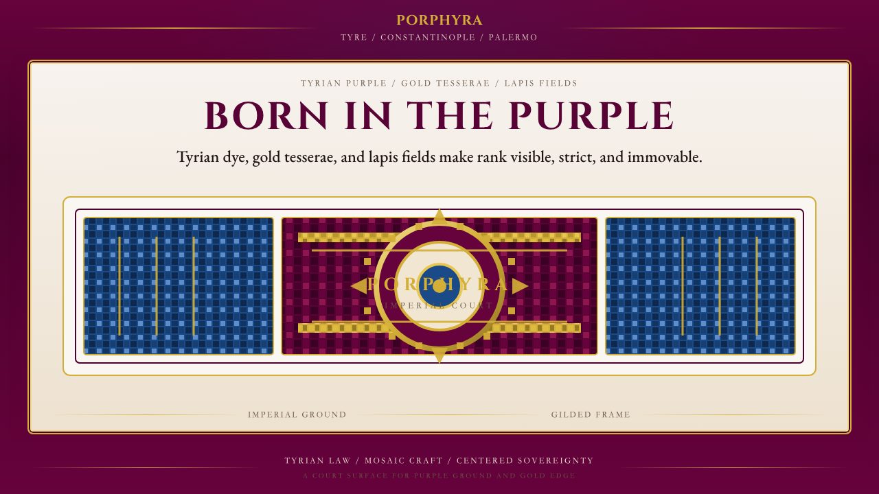 Byzantine Tyrian Purple (Imperial Court)Imperial rank made visible. Tyrian purple, gold tesserae, and centered symmet…帝国权威可见化:泰尔紫、金镶嵌与居中对称。
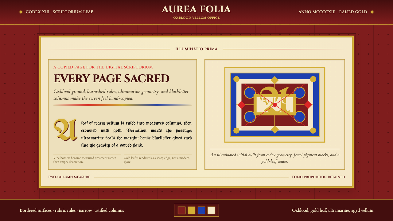 Medieval Illuminated ManuscriptTreats every page as sacred. Oxblood vellum, Cinzel capitals, gold-rule borde…每页皆如圣物:牛血红羊皮纸、Cinzel 大写与金线边框。
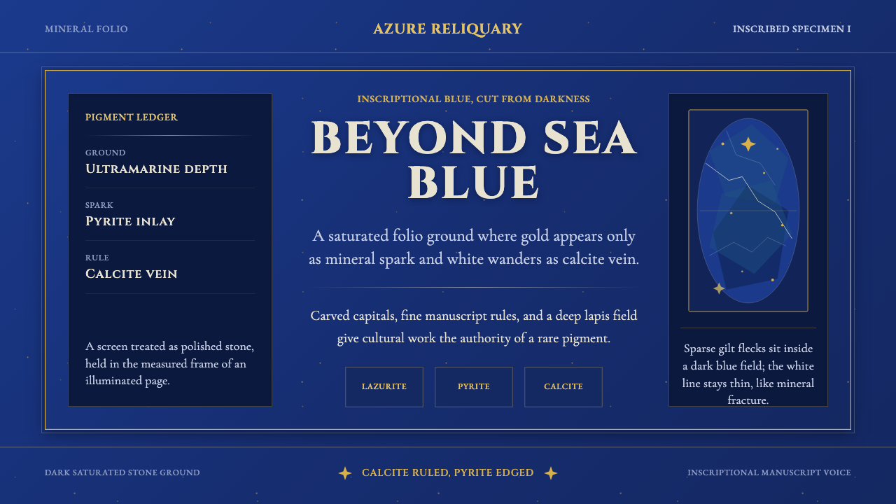 Badakhshan Lapis LazuliStone as manuscript. Ultramarine field, pyrite flecks, calcite veins, carved…以石为页:群青底、黄铁矿金点、方解石纹、铭文大写。
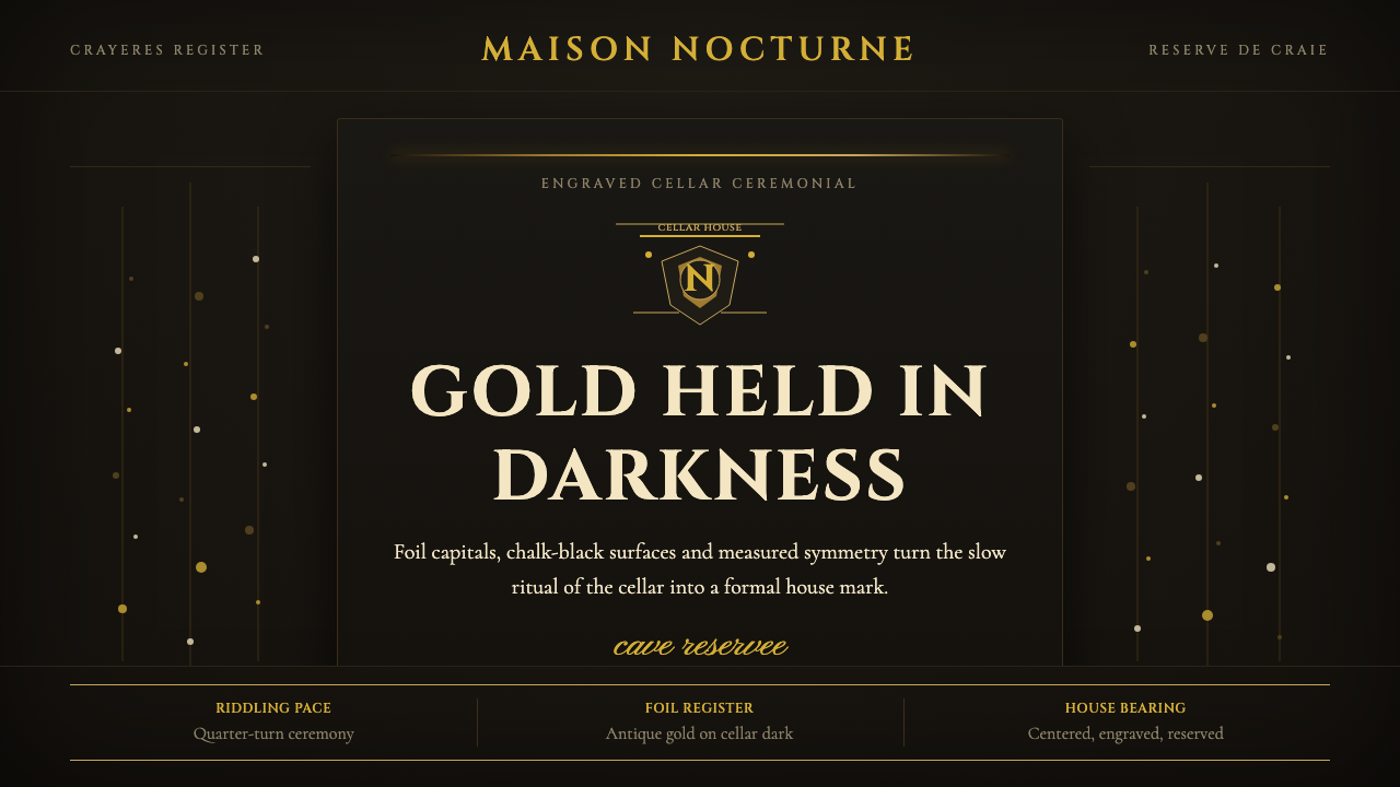 Champagne MaisonGrandeur without glitter. Cinzel capitals and gold foil rules glow in cellar…庄重不闪俗:Cinzel大写与金箔线在地窖黑中发光。
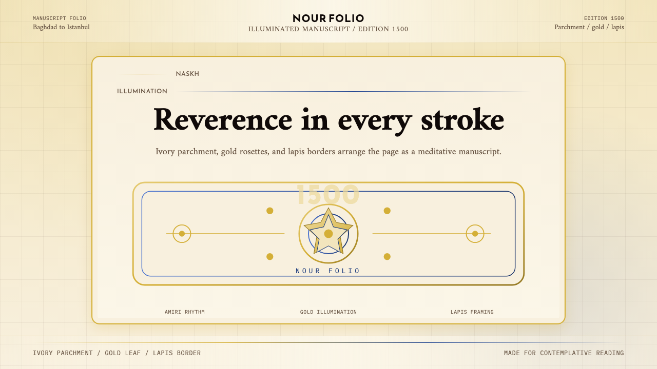 Naskh Quranic (1500)Reverence in every stroke. Ivory parchment, gold rosettes, and lapis framing.每一笔都庄重。象牙纸、金箔花饰与青金石边框。
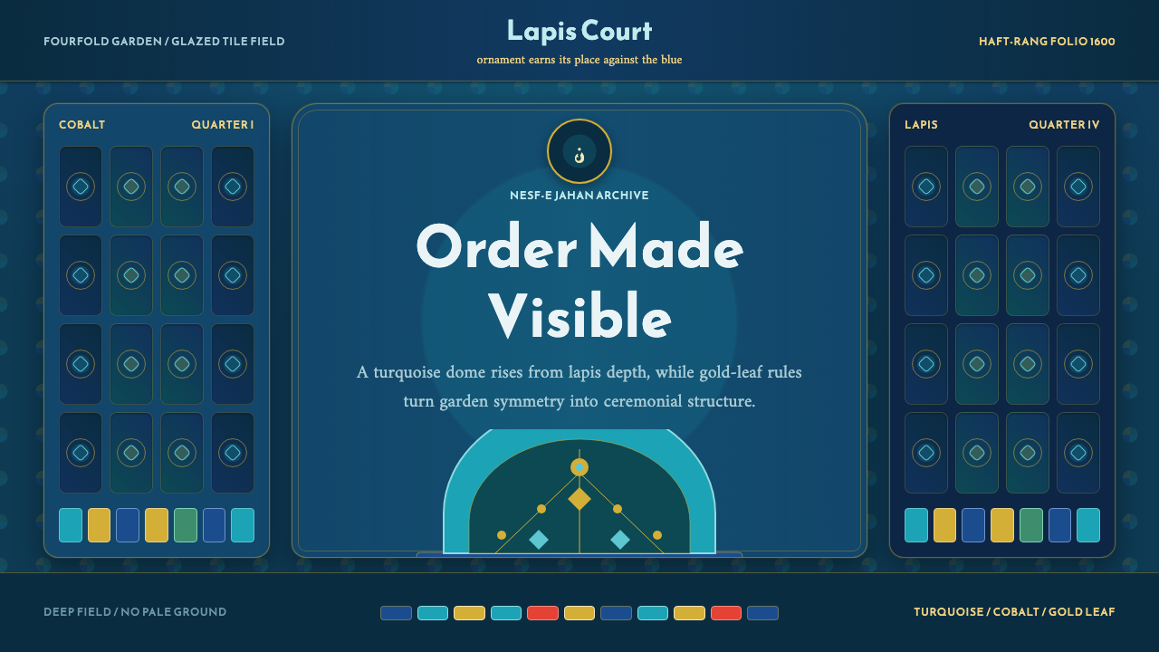 Safavid IsfahanOrnament is order. Turquoise domes and gold rules lock into a deep lapis grid.纹饰即秩序。绿松石穹顶与金线嵌入深青金石网格。