What is Byzantine Tyrian Purple (Imperial Court)?什么是 Byzantine Tyrian Purple (Imperial Court)?
For over a millennium, a single color held the force of imperial law — worn only by emperors, woven from the sea, and encoded into every mosaic, manuscript, and court ritual of the Byzantine world.超过一千年间,一种颜色具有帝国法律的效力——仅皇帝可以穿戴,从海洋中提炼,编织进拜占庭世界的每一块马赛克、每一份手稿与每一项宫廷礼仪之中。
Byzantine Tyrian Purple (Imperial Court) in briefByzantine Tyrian Purple (Imperial Court) 速览
Byzantine Tyrian Purple (Imperial Court) is a design system rooted in the visual grammar of the Eastern Roman Empire at its height — the dense, gold-saturated, symmetrically ordered aesthetic of mosaic basilicas, imperial portraiture, and illuminated manuscripts produced between the fourth and fifteenth centuries. Its foundation is a deep blood-mineral purple of extraordinary richness, counterpointed by imperial gold accents, lapis-toned mosaic fields, and cream tessera surfaces bordered by hairline gilded rules.拜占庭泰尔紫(皇室宫廷)是一套植根于东罗马帝国鼎盛时期视觉语法的设计系统——那是四至十五世纪间马赛克圣殿、帝王肖像与彩饰手稿所共有的密集、金光饱和、对称有序的美学。其基础是深沉矿物紫的底色,与帝国金色的对位强调、青金石蓝的马赛克面板,以及金色发丝边框所框定的奶油色镶嵌内容表面共同构成完整的视觉系统。
Where most historical styles draw their power from simplicity or restraint, Byzantine visual language achieves authority through density and precision. Every surface is considered, every border is articulated, every element is placed within a hierarchical order that makes rank and sanctity immediately legible. This is not ornamentation for its own sake — it is a system of visual law, in which the relative brightness of gold, the depth of purple, and the centrality of a figure together constitute a grammar of power that a Byzantine courtier or worshipper could read as fluently as text.大多数历史风格从简洁或克制中获取力量,而拜占庭视觉语言则通过密度与精确性获得权威。每一个表面都经过审视,每一条边框都被清晰表达,每一个元素都置于一套等级秩序之中,使品阶与神圣性得以立刻被辨认。这不是为装饰而装饰——它是一套视觉法律体系,金色的相对亮度、紫色的深度,以及人物居中的位置,共同构成一种权力语法,拜占庭廷臣或信徒能像阅读文字一样流畅地解读它。
The result is a style of unmistakable gravitas — suited to contexts where authority, heritage, and ceremonial weight are not merely desirable but essential. It operates at the opposite pole from minimalism: rather than communicating trust through absence, it communicates trust through accumulation — the slow, convincing weight of gold on purple, of precision upon precision.结果是一种具有无可置疑的庄重感的风格——适用于权威、传承与仪式分量不仅是期望而且是必需的场景。它与极简主义处于对立的极点:极简主义通过缺省传递信任,而它通过积累传递信任——金色叠压紫色、精确叠加精确所带来的缓慢而令人信服的分量。
Where does Byzantine Tyrian Purple (Imperial Court) come from?Byzantine Tyrian Purple (Imperial Court) 从何而来?
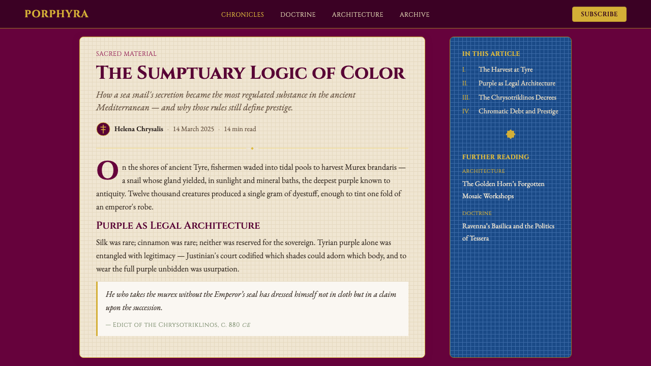
Tyrian purple is one of the oldest luxury materials in human civilization, with Phoenician dye production documented as early as around 1500 BCE along the coast of the eastern Mediterranean. The color was extracted from the mucous glands of the murex sea snail — primarily Murex brandaris and Hexaplex trunculus — through a process that required crushing thousands of shells, fermenting the organic material in open vats for days under the sun, and then boiling and reducing the resulting liquid into a concentrated dye bath. Ancient sources record that a single gram of pure Tyrian purple required approximately twelve thousand murex snails to produce. The stench of the process was so extreme that dye works were by law required to be located outside city walls.泰尔紫是人类文明中最古老的奢侈材料之一,腓尼基人沿东地中海海岸提炼染料的历史可追溯至公元前约1500年。这种颜色从骨螺海蜗牛——主要是刺骨螺(Murex brandaris)和截截骨螺(Hexaplex trunculus)——的黏液腺中提取,工艺过程需要碾碎数以千计的贝壳,将有机物质在露天容器中于阳光下发酵数日,再将所得液体煮沸浓缩成染浴。古代文献记载,生产一克纯正泰尔紫约需一万两千只骨螺。整个工艺过程的恶臭极为强烈,法律要求染坊必须设于城墙之外。
The color's rarity and cost made it politically potent long before the Byzantine period. Alexander the Great reportedly found enormous stocks of purple cloth at Persepolis, already centuries old and valued at staggering sums. Roman emperors progressively restricted its use: Julius Caesar limited its civilian application, Nero prohibited non-imperial purple entirely, and later emperors refined these sumptuary laws into a comprehensive system of chromatic rank. By the time Constantinople emerged as the new Rome in the fourth century under Constantine I, the association of Tyrian purple with imperial sovereignty was absolute. To be 'born in the purple' — porphyrogennetos — meant being born in the purple-draped imperial birthing chamber of the Great Palace, a distinction so important that it became a formal title and a criterion for legitimate succession.这种颜色的稀缺性与成本使其早在拜占庭时期之前便已具有政治效力。据说亚历山大大帝在波斯波利斯发现了大量已有数百年历史的紫色布匹,价值令人咋舌。罗马皇帝逐步限制其使用:尤利乌斯·恺撒限制了平民对它的使用,尼禄完全禁止非帝王使用紫色,后来的皇帝则将这些奢侈品法律发展为一套全面的色彩等级制度。到君士坦丁一世在四世纪将君士坦丁堡建立为新罗马时,泰尔紫与帝国主权的关联已是绝对的。『生于紫色』——porphyrogennetos(紫室降生者)——意味着诞生于大皇宫中覆盖紫色帷幕的帝国产房,这一荣耀如此重要,以至于成为一个正式头衔,也是合法继承权的判定标准之一。
The golden age of Byzantine visual culture spans roughly from the reign of Justinian I in the sixth century through the era of the Macedonian and Komnenian dynasties in the tenth through twelfth centuries. It was during these periods that the characteristic visual grammar crystallized: the hierarchical mosaic programs of churches like San Vitale in Ravenna (consecrated 547 CE), where the famous apse panels place Justinian and Empress Theodora in absolute frontal symmetry, surrounded by gold ground, clothed in purple, their feet slightly overlapping to signal proximity to the divine; the illuminated manuscripts of the Macedonian Renaissance, in which purple-dyed vellum received gold and silver lettering reserved for scripture and imperial proclamation; and the ivory diptychs and enamel reliquaries produced by court workshops whose technical refinement set a standard unmatched in Europe for centuries.拜占庭视觉文化的黄金时代大致横跨六世纪查士丁尼一世的统治,延续至十至十二世纪马其顿王朝与科穆宁王朝时期。正是在这些时期,特有的视觉语法得以结晶:拉文纳圣维塔莱教堂(公元547年奉献)等教堂的等级性马赛克程序,其著名的后殿画板以完全正面对称的方式呈现查士丁尼与狄奥多拉皇后,金色底面环绕,身着紫袍,双脚略微交叠以示对神圣的亲近;马其顿文艺复兴的彩饰手稿,以泰尔紫染色的羊皮纸承载金银文字,仅供《圣经》与帝国诏书所用;以及宫廷工坊出产的象牙二联板与珐琅圣物匣,其技术精湛程度在欧洲数百年间无人能及。
The tradition extended and transformed through the Norman-Byzantine synthesis of twelfth-century Sicily, where Roger II of Sicily — himself a Latin king who controlled former Byzantine territories — deliberately commissioned mosaics in the Byzantine court style for the Palatine Chapel in Palermo and the Cathedral of Monreale. This political mobilization of Byzantine aesthetics demonstrates the style's function as a transferable language of legitimate authority: Roger was not Byzantine, but by adopting its visual grammar he claimed alignment with the most powerful symbolic tradition in the Mediterranean world. The fall of Constantinople in 1453 did not extinguish the tradition — Byzantine visual conventions were preserved in the Eastern Orthodox church, in the manuscript workshops of Mount Athos, and in the visual programs of Russian imperial iconography, where they remained active well into the modern era.这一传统经由十二世纪西西里岛的诺曼-拜占庭综合而延续与转化。西西里的罗杰二世——本身是控制着前拜占庭领土的拉丁国王——刻意委托为巴勒莫的帕拉蒂纳礼拜堂和蒙雷阿莱大教堂制作拜占庭宫廷风格的马赛克。这种对拜占庭美学的政治动员揭示了这一风格作为合法权威的可移植语言所具有的功能:罗杰并非拜占庭人,但通过采用其视觉语法,他宣示自己与地中海世界最强大的象征传统保持一致。1453年君士坦丁堡的陷落并未熄灭这一传统——拜占庭视觉惯例在东正教会、阿索斯山的手稿工坊,以及俄罗斯帝国圣像画的视觉程序中得以保存,并在现代以前持续活跃。
What defines the Byzantine Tyrian Purple (Imperial Court) look?Byzantine Tyrian Purple (Imperial Court) 的视觉特征是什么?
Color Field Hierarchy色彩场域等级
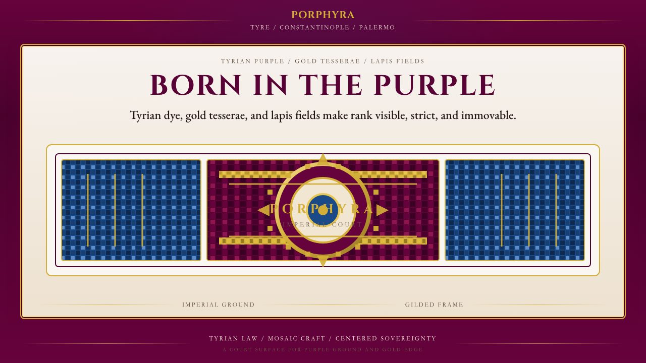
The palette operates across four distinct registers: a deep blood-mineral purple as the sovereign ground, imperial gold as the primary accent and surface ornament, a rich lapis blue as the mosaic field or secondary ground, and warm cream as the content surface for legible text and imagery. Each register occupies a fixed position in the visual hierarchy — purple commands the frame, gold articulates structure, lapis provides depth, and cream receives information. Mixing these registers indiscriminately breaks the hierarchical logic the system depends on.色板在四个清晰的层级中运作:深沉的矿物紫作为至尊底色,帝国金色作为主要强调与表面装饰,浓郁的青金石蓝作为马赛克面板或次级底色,温暖的奶油色作为承载可读文字与图像的内容表面。每个层级在视觉等级中占据固定位置——紫色统领框架,金色表达结构,青金蓝提供深度,奶油色接收信息。随意混用这些层级会破坏系统所依赖的等级逻辑。
Gold Tessera Patterning金色镶嵌纹饰
Byzantine gold is never used as a flat fill. In mosaic originals, each gold tessera was set at a slightly different angle to catch and scatter candlelight, producing a surface that shimmers and breathes. In contemporary application, this quality is approached through intricate surface patterns — geometric interlace, star-and-cross registers, chevron borders — executed in gold against purple or lapis grounds. These patterns serve as the primary visual texture of the system, replacing the plain backgrounds that characterize Western European medieval styles with a continuously ornamented field.拜占庭金色从不作为平涂填充使用。在马赛克原作中,每一块金色嵌片以略微不同的角度镶设,以捕捉和散射烛光,产生一种闪烁呼吸的表面。在当代应用中,这种品质通过复杂的表面纹饰来体现——几何交织、星形十字母题、人字形边框——以金色在紫色或青金石底面上执行。这些纹样是系统的主要视觉肌理,以持续装饰的场域取代了西欧中世纪风格所特有的素色背景。
Frontal Symmetry and Centrality正面对称与居中性
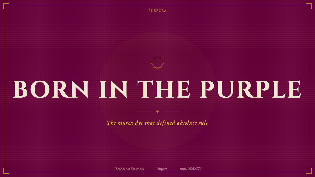
Byzantine composition is organized around a strict central axis. Figures face the viewer directly — never in three-quarter profile, almost never in full side view. The central element, whether a Christ Pantocrator, an enthroned emperor, or a logo mark, is absolutely centered and given the largest scale. Flanking elements mirror each other precisely. This rigid symmetry is not compositional timidity — it is a deliberate formal statement that the central subject exists outside ordinary space and time, beyond perspective's distortion. In design application, this mandates centered layouts on hero and cover surfaces, with bilateral symmetry in decorative borders and ornamentation.拜占庭构图围绕严格的中心轴线组织。人物直面观者——从不以四分之三侧面,几乎从不以完整侧面呈现。中心元素——无论是全能基督、受命皇帝还是标志——绝对居中,并以最大尺度呈现。侧翼元素精确地相互镜像。这种严格对称不是构图上的怯懦——它是一种刻意的形式声明:中心主体存在于普通空间与时间之外,超越透视的扭曲。在设计应用中,这要求在英雄区与封面表面采用居中布局,在装饰边框与纹饰中保持双边对称。
Hierarchical Figure Scaling等级性人物比例
In Byzantine visual practice, the size of a figure indicates rank rather than spatial position. The emperor or Christ is largest; bishops and courtiers are medium-scaled; attendants and soldiers are smallest, regardless of their physical position in the scene. This inverted-perspective logic — where importance determines scale — translates directly into typographic hierarchy in contemporary work. The most important information is largest, regardless of grid position; secondary information is visibly smaller; supporting detail is subordinate and close-set. Scale does the work that color does in Western modernist systems.在拜占庭视觉实践中,人物的尺寸表示等级而非空间位置。皇帝或基督最大;主教与廷臣为中等比例;侍从与士兵最小,无论他们在场景中的实际位置如何。这种反透视逻辑——重要性决定比例——直接转化为当代作品中的文字排印等级。最重要的信息最大,无论网格位置如何;次要信息明显更小;辅助细节从属且紧凑排列。比例在此承担了西方现代主义体系中色彩所承担的功能。
Hairline Gilded Borders金色发丝边框
Byzantine illuminated manuscripts and icons consistently frame content surfaces with precision borders — narrow rules in gold that separate the cream content field from the decorative ground. These borders are not decorative additions but structural necessities: they define the sacred space within which information resides and signal that what is enclosed is of a different order than what surrounds it. In contemporary design, this principle manifests as fine-line gold borders around cards, panels, and modal surfaces, executed with precision rather than looseness. A border that wavers or is casually applied destroys the ceremonial quality the system requires.拜占庭彩饰手稿与圣像画始终以精确的边框框定内容表面——金色细线将奶油色内容场域与装饰底面相隔离。这些边框不是装饰性添加,而是结构性必要:它们界定了信息所居的神圣空间,并表明所围合之物与其周围之物属于不同的秩序。在当代设计中,这一原则体现为卡片、面板与模态表面周围精细的金色细线边框,以精确而非随意的方式执行。一条摇摆或随意施用的边框会摧毁这一系统所需的仪式品质。
Lapis Mosaic Fields青金石马赛克面板
Alongside purple, a deep lapis blue derived from the mineral ultramarine functions as a second ground color associated with the celestial and the sacred — the blue that appears in the robes of the Virgin, in the vault of heaven behind Christ, and in the deep enamel panels of reliquaries. In a contemporary system, lapis serves as the background for secondary panels, sidebars, data visualization grounds, and navigational areas that are authoritative but subordinate to the imperial purple core. Its depth and richness ensure that it reads as intentional and precious rather than incidental.在紫色之外,源自天然青金石矿物的深蓝色作为第二底色,与天界与神圣相关联——这种蓝色出现在圣母袍服、基督背后的天穹穹顶,以及圣物匣的深色珐琅面板中。在当代系统中,青金石蓝用作次级面板、侧边栏、数据可视化底面与导航区域的背景,这些区域具有权威性但从属于帝国紫的核心地位。其深度与丰富性确保它被解读为刻意而珍贵的,而非偶然的。
Iconographic Precision圣像画式的精确性
Byzantine art was never casual in its imagery. Icons followed strict compositional formulae — the tilt of a head, the gesture of a hand, the arrangement of drapery folds — that had been codified over generations and were understood to carry specific theological meanings. Every visual decision was consequential. Translated into design practice, this principle demands that no element appear arbitrarily: every ornamental motif should be drawn from the established vocabulary of Byzantine geometric interlace, palmette, vine scroll, or cross-in-square; every typographic decision should be deliberate and repeatable. The system should feel governed, not assembled.拜占庭艺术的图像从不随意。圣像画遵循严格的构图程式——头部的倾斜、手的姿态、衣褶的排布——这些程式历经数代编码,被理解为承载特定神学含义。每一个视觉决定都是有后果的。转化为设计实践,这一原则要求没有任何元素显得任意:每一个装饰母题都应来自拜占庭几何交织、棕榈叶饰、葡萄卷草纹或方中十字的既定词汇;每一个排印决定都应是刻意且可重复的。整个系统应当感觉受到统辖,而非随意拼凑。
Who shaped Byzantine Tyrian Purple (Imperial Court)?谁塑造了 Byzantine Tyrian Purple (Imperial Court)?
Theodora, co-ruler with Justinian I, is most powerfully present in the mosaic panel at San Vitale, Ravenna (547 CE), where she appears as a full-frontal, hieratically scaled figure clothed entirely in imperial purple and dripping with gold jewels, a jeweled crown, and a hem embroidered with the Magi — establishing her as a sacred as well as imperial presence. Her mosaic portrait is perhaps the single most analyzed image in Byzantine art history, representing the fusion of court ceremonial, Christian theology, and political propaganda that defines the system's visual ambitions.狄奥多拉皇后与查士丁尼一世共同执政,她最强烈地呈现于拉文纳圣维塔莱教堂(公元547年)的马赛克画板中:一位完全正面、等级性放大的人物,全身穿着帝国紫袍,缀满金色珠宝与宝石冠冕,衣袍下摆绣有东方三博士——确立了她既是神圣存在也是帝国存在的双重地位。她的马赛克肖像可能是拜占庭艺术史上被分析最多的单幅图像,代表了宫廷礼仪、基督教神学与政治宣传的融合——这正是本设计系统视觉抱负的核心。
Justinian I (r. 527–565 CE) presided over the height of Byzantine imperial culture and commissioned the two works most central to this style's visual vocabulary: the Church of Hagia Sophia in Constantinople and the mosaic program of San Vitale in Ravenna. His legal codification of sumptuary law — restricting the wearing of Tyrian purple under penalty of death — formalized what had previously been custom into enforceable statute, transforming the color from social convention into legal reality. His architectural and artistic commissions set the formal language that Byzantine court aesthetics would follow for another nine centuries.查士丁尼一世(527—565年在位)主持了拜占庭帝国文化的巅峰时期,并委托建造了与本风格视觉词汇最为核心的两件作品:君士坦丁堡的圣索菲亚大教堂和拉文纳圣维塔莱教堂的马赛克程序。他对奢侈品法律的法典化编订——以死刑惩处擅穿泰尔紫者——将此前的习俗正式化为可执行的法令,将这种颜色从社会惯例转变为法律现实。他的建筑与艺术委托确立了拜占庭宫廷美学此后九个世纪所遵循的形式语言。
Constantine I established Constantinople as the new imperial capital in 330 CE and oversaw the formal Christianization of the Roman Empire, setting the stage for the synthesis of Roman imperial imagery and Christian iconography that defines Byzantine aesthetics. His court ceremonial elaborated the use of purple as the exclusive imperial color, and his building program — including the original Hagia Sophia and the imperial palace complex — established the architectural and spatial context within which Byzantine visual culture would develop. The concept of the porphyrogennetos, the emperor born in the purple chamber, originates in the symbolic world he created.君士坦丁一世于公元330年将君士坦丁堡建立为新的帝国首都,并主导了罗马帝国的正式基督教化,为定义拜占庭美学的罗马帝国图像与基督教圣像画综合奠定了基础。他的宫廷礼仪精化了紫色作为帝国专属颜色的使用,他的建筑计划——包括原始的圣索菲亚大教堂和皇宫建筑群——建立了拜占庭视觉文化得以发展的建筑与空间语境。紫室降生者(porphyrogennetos)的概念——在紫色产房中诞生的皇帝——源于他所创造的象征世界。
Roger II (r. 1130–1154) was a Norman king who ruled former Byzantine territories in southern Italy and Sicily. His deliberate adoption of Byzantine court visual language — commissioning Greek mosaicists to decorate the Palatine Chapel in Palermo and the Cathedral of Cefalù in the full Byzantine style — represents the most significant instance of the style's export and political appropriation. His throne room mosaic, in which he appears receiving his crown directly from Christ, uses the hierarchical scale, gold ground, and frontal symmetry of Byzantine imperial iconography to claim a divine authority equivalent to that of the Eastern emperor. This demonstrates the style's function not merely as aesthetic but as political argument.西西里的罗杰二世(1130—1154年在位)是统治意大利南部与西西里岛前拜占庭领土的诺曼国王。他刻意采用拜占庭宫廷视觉语言——委托希腊马赛克艺匠以完整拜占庭风格装饰巴勒莫帕拉蒂纳礼拜堂和切法卢大教堂——代表了这一风格最重要的输出与政治挪用实例。他的御座室马赛克画描绘他直接从基督手中接受冕冠,运用了拜占庭帝国圣像画的等级性比例、金色底面与正面对称,以宣称与东方皇帝同等的神授权威。这揭示了这一风格不仅作为美学而且作为政治论据的功能。
The illuminated manuscripts produced in Constantinople during the Macedonian dynasty (867–1056 CE) represent the technical and aesthetic pinnacle of Byzantine book art. These anonymous court workshops produced manuscripts on purple-dyed vellum with gold and silver lettering, along with iconic miniatures in which figures of extraordinary refinement appear against flat gold grounds. Their work established the canonical figure types — the elongated proportion, the dished face with large eyes, the schematic drapery — that defined Byzantine figuration for centuries. Though their individual names are lost, their visual conventions formed a shared grammar reproduced across the empire and beyond.君士坦丁堡马其顿王朝(867—1056年)期间宫廷工坊制作的彩饰手稿代表了拜占庭书籍艺术的技术与美学巅峰。这些匿名的宫廷工坊在泰尔紫染色的羊皮纸上以金银文字书写,并配以精湛的圣像细密画——具有非凡精致感的人物形象在平铺的金色底面上呈现。他们的作品确立了标准的人物类型——修长的比例、圆润脸庞配以大眼、程式化的衣褶——这些类型在此后数百年间定义了拜占庭人物画。尽管他们的个人姓名已经湮没,他们的视觉惯例形成了一套在帝国内外复制的共同语法。
How do you use Byzantine Tyrian Purple (Imperial Court) today?今天怎么用 Byzantine Tyrian Purple (Imperial Court)?
Byzantine Tyrian Purple is among the most architecturally demanding historical styles to apply correctly, because its authority derives from systematic completeness rather than surface decoration. Adopting the purple-and-gold color combination without also applying the hierarchical composition, the tessera patterning, the frontal symmetry, and the hairline border framework produces something that reads as vaguely theatrical rather than genuinely imperial. The style requires commitment to its entire grammar, not selective borrowing of its most recognizable elements.拜占庭泰尔紫是正确应用难度最高的历史风格之一,因为它的权威感源于系统的完整性,而非表面装饰。采用紫色与金色的配色组合,却不同时应用等级性构图、镶嵌纹样、正面对称与发丝边框体系,所产生的结果会被解读为模糊的戏剧感,而非真正的帝王气度。这种风格要求对其完整语法的承诺,而非选择性借用其最具辨识度的元素。
For presentation slides, the system works with exceptional power on cover and section-break pages. A cover should be structured as a true mosaic composition: a deep purple ground or lapis blue field, a centered title in gold letterforms of substantial weight, a decorative gold border precisely framing the content area, and a horizontal band of geometric interlace ornament above or below the title block. The hierarchy must be unambiguous — one dominant element, everything else clearly subordinate. Content slides should shift to a cream ground with black body text, a refined gold hairline border framing the slide area, and accent elements in gold or lapis reserved strictly for headings and call-outs. Data slides suit a lapis ground with gold chart elements, where each data series occupies a clearly differentiated visual register.在演示文稿中,这套系统在封面与章节分隔页上发挥出非凡的力量。封面应当被构建为真正的马赛克构图:深紫底色或青金石蓝面板,居中的金色标题字体具有可观的视觉分量,精确框定内容区域的装饰金色边框,以及标题块上方或下方的几何交织纹饰水平条带。等级必须明确无误——一个主导元素,其他所有元素都清晰从属。内容页应转换为奶油色底面,黑色正文,精细的金色发丝边框框定幻灯片区域,金色或青金石蓝的强调元素严格保留给标题与引用语。数据页适合青金石蓝底面配金色图表元素,每个数据系列占据清晰区分的视觉层级。
For web interfaces and dashboards, Byzantine Tyrian Purple is best deployed at the tier of high-stakes, high-authority applications: financial reporting platforms, institutional portals, luxury e-commerce environments, or any context where the product needs to signal permanence, trust, and premium positioning. The approach centers on a cream or near-white primary content ground with black body text, and reserves the deep purple and gold for navigational chrome, tier badges, pricing tier headers, and hero sections. Card components should carry fine gold borders rather than soft shadows; state changes should use gold highlights rather than generic blues. Pricing tiers benefit particularly from the hierarchical logic — the premium tier rendered in full imperial purple with gold accents, the standard tier in lapis, the entry tier in cream.对于网页界面与仪表板,拜占庭泰尔紫最适合部署于高风险、高权威性的应用层级:金融报告平台、机构门户、奢侈品电商环境,或任何产品需要传递永久性、信任感与高端定位的场景。方法以奶油或接近白色的主要内容底面配黑色正文为核心,将深紫与金色保留给导航框架、等级徽章、定价层级标题与英雄区域。卡片组件应带有精细金色边框而非柔和阴影;状态变化应使用金色高亮而非通用蓝色。定价层级特别受益于等级性逻辑——高级套餐以完整帝国紫配金色强调呈现,标准套餐以青金石蓝呈现,入门套餐以奶油色呈现。
For editorial and marketing work, the style's natural register is ceremonial announcement: luxury brand campaigns, premium product launches, institutional anniversary materials, museum exhibition identities, and award or recognition programs. Full-spread layouts work best with a purple or lapis ground occupying the outer frame and a cream panel centered within it, following the mosaic logic of ground and tessera. Pull quotes and key statistics can be set in gold against purple with the same hierarchical weight as a Byzantine inscription. Marketing pages deploying this style should commit to a slow, considered pacing — ample space between sections, wide margins, deliberate transitions — rather than the rapid feature-stacking of contemporary digital marketing.对于编辑与营销工作,这种风格的自然语域是仪式性公告:奢侈品牌活动、高端产品发布、机构周年纪念材料、博物馆展览视觉识别,以及奖项或荣誉计划。跨页版面最适合以紫色或青金石蓝底面占据外框,奶油色面板居中其内,遵循马赛克的底色与镶嵌逻辑。引用语与关键数据可以金色置于紫色底面上呈现,赋予与拜占庭铭文相同的等级分量。运用这种风格的营销页面应承诺缓慢、考究的节奏——区域间充裕的空间、宽阔的页边距、刻意的过渡——而非当代数字营销的快速特性堆叠。
The most common mistake when applying this system is conflating richness with chaos. Byzantine visual culture was extraordinarily dense, but it was also extraordinarily ordered — every decorative element occupied a fixed position within a system of rules. Introducing the color palette and gold ornament without the underlying compositional discipline produces a result that reads as overwrought and confused rather than authoritative and elegant. A second common error is using the purple as a background color for body text: the depth of the color makes sustained reading uncomfortable, and the system's own logic — which assigns cream to content surfaces — provides the correct solution. The purple commands the frame; the cream receives the information.应用这套系统时最常见的错误,是将丰富性与混乱相混淆。拜占庭视觉文化极为密集,但同样极为有序——每一个装饰元素都在一套规则体系中占据固定位置。引入色板与金色装饰而不具备底层的构图自律,所产生的结果会被解读为矫揉造作、令人困惑,而非权威而优雅。第二个常见错误是将紫色用作正文文字的背景色:这种颜色的深度使持续阅读感到不适,而系统自身的逻辑——将奶油色分配给内容表面——提供了正确的解决方案。紫色统领框架;奶油色接收信息。
Byzantine Tyrian Purple (Imperial Court) — FAQByzantine Tyrian Purple (Imperial Court) · 常见问题
How is Byzantine Tyrian Purple different from other dark, luxury design styles?拜占庭泰尔紫与其他深色奢华设计风格有何不同?
Most contemporary luxury design — including many dark-palette styles — achieves richness through material references: deep blacks, muted golds, and restrained typography that implies premium positioning through absence. Byzantine Tyrian Purple operates on an entirely different principle: it communicates authority through abundance, density, and hierarchical precision. The gold is not a whisper but an announcement; the ornament is not a hint but a program. The style's complexity is also historically grounded — every decorative motif, every compositional convention, every color relationship carries a documented history of meaning. This gives it an authenticity that purely invented luxury aesthetics cannot replicate.大多数当代奢华设计——包括许多深色调风格——通过材质参照来实现丰富感:深沉的黑色、沉静的金色,以及通过缺省暗示高端定位的克制排版。拜占庭泰尔紫则基于完全不同的原则运作:它通过丰盛、密度与等级精确性传递权威。金色不是低语而是宣告;装饰不是暗示而是程序。这种风格的复杂性也有历史根基——每一个装饰母题、每一个构图惯例、每一种色彩关系都承载着有文献记载的意义历史。这赋予了它纯粹发明的奢华美学无法复制的真实性。
Can this style work in a light or minimal layout, or does it require full immersion?这种风格能在轻量或极简版面中使用,还是必须完全沉浸?
It can be applied at varying intensities, but lighter applications require care to avoid producing results that look merely purple-tinted rather than genuinely Byzantine in character. A minimal invocation — cream ground, black body text, fine gold hairline borders on key panels, and a single purple accent element — can carry Byzantine character without the full density of a mosaic-patterned cover. What cannot be removed without losing the style's identity is the hierarchical precision: even a light application must place the primary element with absolute centrality and define clear rank among secondary elements. The gold hairline border is the minimum credible signal of the system's heritage.它可以在不同强度下应用,但较轻量的应用需要谨慎,以避免产生仅仅带有紫色调而非真正具有拜占庭特质的结果。最简化的调用——奶油色底面、黑色正文、关键面板上的金色发丝边框,以及单一紫色强调元素——可以承载拜占庭特质,而无需封面马赛克纹样的完整密度。但不能在不失去风格身份的情况下移除的是等级精确性:即便是轻量应用,也必须以绝对居中的方式放置主要元素,并在次要元素之间定义清晰的等级。金色发丝边框是这套系统传承最低限度的可信信号。
Why is frontal symmetry so important to this style, and when is it appropriate to break it?正面对称为何对这种风格如此重要,何时可以打破它?
Byzantine frontal symmetry is not simply an aesthetic preference — it is a theological and political statement that the central subject exists beyond ordinary perspective, outside the contingency of a single viewpoint. In the mosaic tradition, a figure shown in profile or three-quarter view occupies human, temporal space; a figure shown frontally addresses the viewer from a position of absolute authority. In design application, this means that hero compositions, logo placements, and primary call-to-action elements should always be centered. Asymmetry is appropriate for supporting elements and body content — sidebars, data lists, image captions — that are understood to be within ordinary informational space rather than at the level of ceremonial proclamation.拜占庭正面对称不仅仅是审美偏好——它是一个神学与政治声明,表明中心主体存在于普通透视之外,超越单一视角的偶然性。在马赛克传统中,以侧面或四分之三视角呈现的人物占据人类的、时间性的空间;以正面呈现的人物则从绝对权威的位置向观者致辞。在设计应用中,这意味着英雄区构图、标志位置与主要行动号召元素应始终居中。非对称适用于支撑性元素与正文内容——侧边栏、数据列表、图片说明——这些被理解为处于普通信息空间之内,而非仪式性宣告的层级。
Is this style appropriate for digital products, or does it belong primarily to print and physical spaces?这种风格适合数字产品吗,还是主要属于印刷与实体空间?
The style is fully viable for digital products, but the translation requires discipline. In physical mosaics, the gold tessera shimmer emerged from the interplay of individual tiles and candlelight — an optical effect impossible to replicate literally on screen. Digital application must instead achieve the equivalent effect through precise surface patterning, carefully weighted gold tones, and the quality of border execution. The hierarchical logic of the style — its assignment of roles to purple, gold, lapis, and cream — maps directly onto the component hierarchy of a digital interface. The style's natural digital contexts are premium institutional products, high-value transactional interfaces, and cultural sector platforms where conveying heritage and authority is a genuine product requirement.这种风格完全可以用于数字产品,但转化需要自律。在实体马赛克中,金色嵌片的闪烁感来自单块嵌片与烛光的相互作用——这种光学效果在屏幕上无法直接复制。数字应用必须通过精确的表面纹样、精心权衡的金色色调,以及边框执行的质量来实现等效效果。这种风格的等级逻辑——将不同角色分配给紫色、金色、青金石蓝与奶油色——直接映射到数字界面的组件层级。该风格的自然数字语境是高端机构产品、高价值交易界面,以及文化机构平台——在那些场景中,传递传承感与权威性是真实的产品需求。
What kinds of products or brands should avoid this style?哪些类型的产品或品牌应当避免这种风格?
Byzantine Tyrian Purple is poorly suited to products where approachability, warmth, or playful energy are core values. Its visual grammar is inherently distancing — it places the central subject on a pedestal and asks the viewer to approach rather than inviting them in casually. Consumer wellness brands, children's education platforms, casual social applications, food and beverage companies, and start-ups seeking to project informality and accessibility will all be misserved by this style. It is also poorly suited to contexts where iterative, rapidly updating information — news feeds, social timelines, live data streams — dominates the interface, since the style's ceremonial pacing is incompatible with the logic of continuous refresh. Use it where permanence and gravity are genuine virtues, not where they would work against the product's core relationship with its users.拜占庭泰尔紫不适合亲和力、温暖感或活泼能量是核心价值的产品。其视觉语法本质上制造距离感——它将中心主体置于台座之上,要求观者趋近,而非随意邀约进入。消费者健康品牌、儿童教育平台、休闲社交应用、食品与饮料公司,以及寻求传递非正式感与可及性的初创企业,都不适合这种风格。它也不适合迭代性、快速更新信息——新闻推送、社交时间线、实时数据流——主导界面的场景,因为这种风格的仪式性节奏与持续刷新的逻辑不相容。在永久性与庄重感是真正美德的地方使用它,而非在它会妨碍产品与用户核心关系的地方。
Related design styles相关设计风格
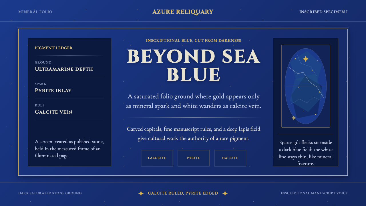 Badakhshan Lapis LazuliStone as manuscript. Ultramarine field, pyrite flecks, calcite veins, carved…以石为页:群青底、黄铁矿金点、方解石纹、铭文大写。
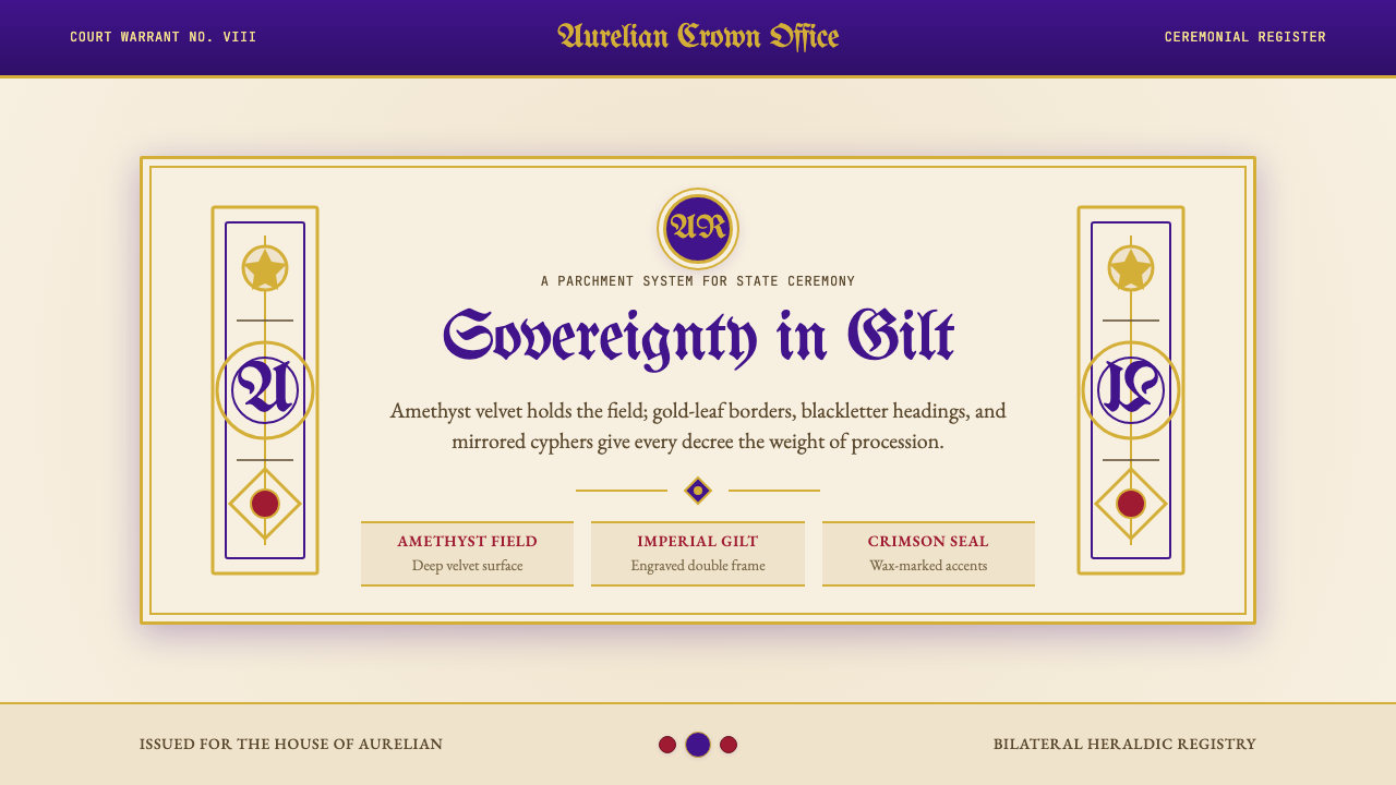 British Royal MonarchyCeremony becomes structure. Amethyst panels, gilt borders, blackletter, mirro…仪式成为结构:紫晶面板、鎏金边框、哥特黑体与镜像纹章。
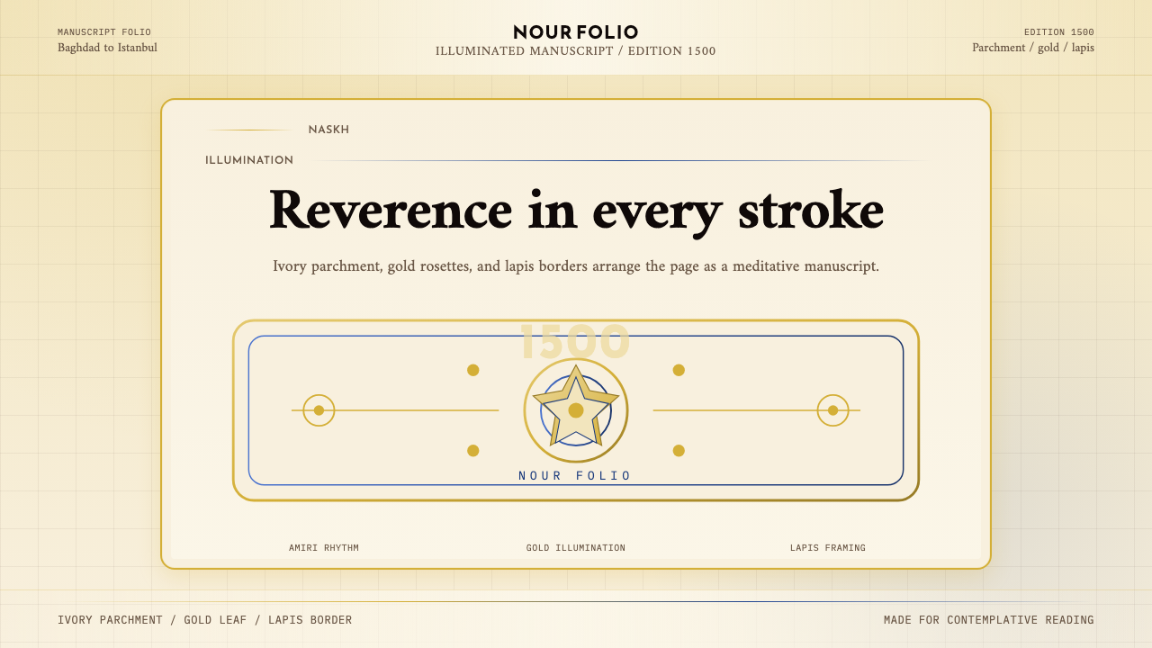 Naskh Quranic (1500)Reverence in every stroke. Ivory parchment, gold rosettes, and lapis framing.每一笔都庄重。象牙纸、金箔花饰与青金石边框。
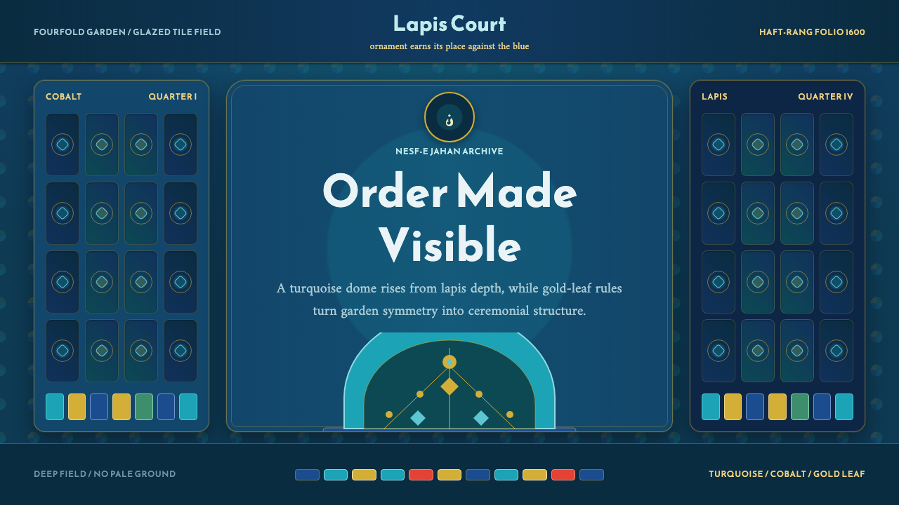 Safavid IsfahanOrnament is order. Turquoise domes and gold rules lock into a deep lapis grid.纹饰即秩序。绿松石穹顶与金线嵌入深青金石网格。
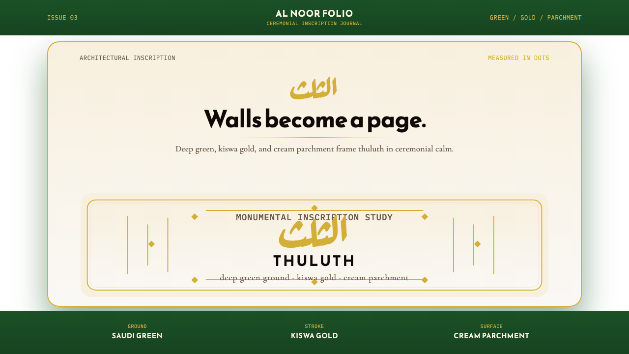 Saudi Thuluth CalligraphyMonumental calm in gold. Deep green, thuluth type, and cream parchment symmet…金色庄严。深绿底、苏鲁斯体与奶油纸面形成对称构图。
 Timurid Manuscript (Herat)Courtly density glows. Lapis ground, Amiri type, and gold jadval geometry hol…宫廷密度在发光。青金石底、金线框与Amiri字体托起手抄本。