What is Badakhshan Lapis Lazuli?
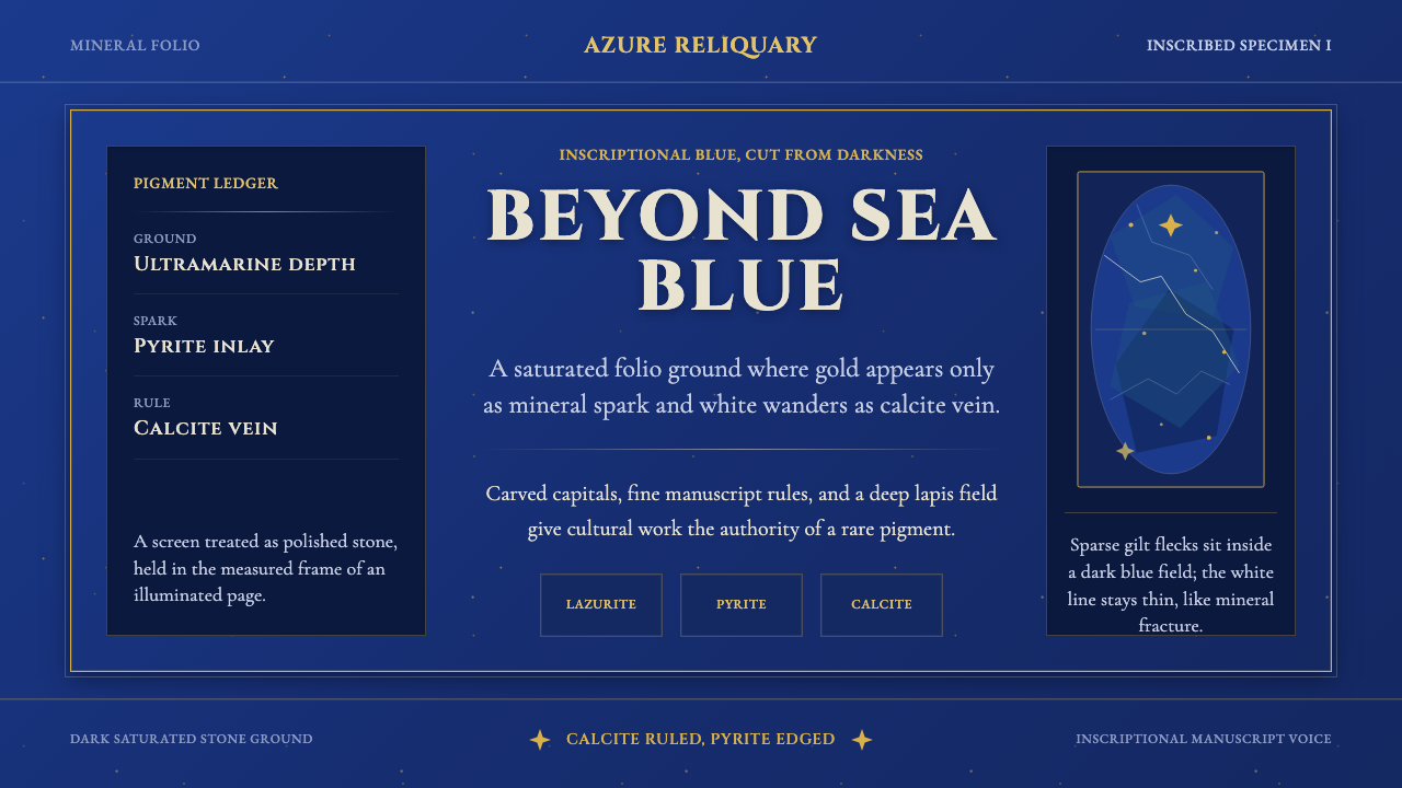
Badakhshan Lapis Lazuli treats the screen as a slab of the world's most precious blue stone — a deep ultramarine field flecked with gold and threaded with pale mineral veins.
Badakhshan Lapis Lazuli in brief
Badakhshan Lapis Lazuli is a design language derived directly from a specific mineral: lapis lazuli, the deep-blue semi-precious stone mined from the Sar-e-Sang deposits in Afghanistan's Kokcha Valley for more than six thousand years. The stone's body is a rich lazurite blue, scattered with metallic gold flecks of pyrite and threaded through with fine white veins of calcite — and this style treats those three elements as its entire material vocabulary.
Rather than depicting the stone illustratively, the system behaves as though the interface itself were carved from lapis: a saturated ultramarine ground stands in for the stone's body, pyrite flecks become sparing gold accents rather than a dominant metallic theme, and calcite veining supplies linear ornament that reads as natural fracture rather than deliberate geometric decoration.
The typographic register draws on inscriptional and illuminated-manuscript letterforms, since powdered lapis became the ultramarine pigment used to paint the Virgin Mary's robes and the most sacred passages of medieval and Renaissance manuscripts — connecting the stone's material history directly to the history of the written and illuminated page.

Where does Badakhshan Lapis Lazuli come from?
The Sar-e-Sang mines in the remote Kokcha Valley of Badakhshan, northeastern Afghanistan, are believed to be the oldest continuously worked mining site on Earth, with evidence of extraction reaching back to at least the third millennium BCE. For most of human history, this single valley was the primary — often the only known — source of true lapis lazuli, making Afghanistan the origin point for one of the most prized materials in the ancient and medieval world.
Once mined, the stone traveled extraordinary distances along trade routes connecting Central Asia to Mesopotamia, Egypt, and eventually the Mediterranean and Europe. It was carved into seals and inlay in ancient Egypt, prized in Mesopotamian jewelry and statuary, and by the medieval period had become the raw material for the pigment ultramarine — literally 'beyond the sea' in Italian, naming the fact that the stone had to be imported across the Mediterranean from its distant Afghan source.
Ultramarine pigment, ground from lapis and painstakingly purified, became the most expensive blue available to painters from the medieval period through the Renaissance, often costing more than gold by weight. Its rarity and cost meant it was reserved for the most important passages in a painting or manuscript — the robes of the Virgin Mary, the borders of sacred initials, the backgrounds of the most lavish illuminated pages — cementing an enduring association between this specific blue and reverence, preciousness, and devotional intensity.
The Sar-e-Sang mines remain active today, still yielding lapis of the same deep, saturated quality prized by Renaissance illuminators, making this one of the rare design references where the source material and its supply chain persist essentially unchanged across thousands of years.
What defines the Badakhshan Lapis Lazuli look?
Color
A single deep, saturated ultramarine blue dominates the palette almost entirely, occupying the overwhelming majority of any composition. Gold appears only as a rare, precious accent — never as a co-equal secondary color — and warm off-white or pale stone tones stand in for calcite veining where a lighter contrast is needed.
Typography
Inscriptional serif letterforms, echoing carved stone lettering and illuminated-manuscript capitals, carry the system's ceremonial weight. These forms are precise and formal rather than decorative flourish, reflecting the gravity historically assigned to ultramarine pigment.
Pyrite Flecks
Small gold flecks are scattered sparingly across the deep blue field, mimicking the natural distribution of pyrite within real lapis lazuli — irregular, non-repeating, and concentrated more densely in some areas than others rather than evenly patterned.
Calcite Veining
Fine, irregular white or pale veins run through the composition like natural mineral fracture lines, used as ornamental dividers or borders that read as organic geology rather than as a ruled grid.
Stone Density
The blue ground carries a sense of mineral weight and density rather than the flatness of a digital gradient — subtle variation in tone across the field suggests the natural inconsistency of a mined stone rather than a perfectly uniform digital fill.
Restraint in Gold
Because gold historically signified rarity precisely by its scarcity in the composition, this system deliberately limits gold's presence — a thin border, a single icon, a scattering of flecks — rather than treating it as a dominant metallic theme.
Manuscript Ornament
Where decorative motifs appear, they recall illuminated-manuscript border ornament — restrained, geometric, and inscriptional rather than florid or naturalistic, reinforcing the connection to the pigment's devotional manuscript history.

Who shaped Badakhshan Lapis Lazuli?
The generations of miners who have worked the Sar-e-Sang deposits since at least the third millennium BCE established and sustained the world's primary supply of true lapis lazuli, making the material — and by extension this entire design style — possible.
Craftsmen who ground and painstakingly purified raw lapis into ultramarine pigment developed the labor-intensive process that turned a mined stone into the most valuable blue available to painters, directly shaping the material's reputation for preciousness.
Manuscript illuminators who reserved ultramarine for the most sacred figures and passages — most famously the Virgin Mary's robes — established the enduring cultural association between this specific blue and reverence, which this design style draws on directly.
How do you use Badakhshan Lapis Lazuli today?
Badakhshan Lapis Lazuli suits contexts that want to project preciousness, gravity, and craft heritage rather than lightness or playfulness. Applying it well means treating the deep blue as the overwhelming majority of the composition and reserving gold as a rare, deliberate accent — reversing that ratio undermines the material logic the whole style depends on.
For presentation slides, the style works well for cover slides establishing a premium, heritage-driven brand story: a full deep-blue field with a single restrained gold mark or wordmark, and perhaps a thin calcite-vein line as a compositional anchor. Content slides should keep body text in a legible, quieter serif or humanist form, reserving the inscriptional display type for headings alone.
For web interfaces, this style suits luxury goods, heritage brands, cultural and museum platforms, or premium subscription products wanting to convey rarity and craft. Primary actions can carry a restrained gold treatment against the deep-blue ground, while calcite-vein motifs work well as subtle section dividers rather than as a repeating background pattern.
For editorial and marketing work — brand storytelling, craft heritage features, luxury product launches — the style provides an immediately recognizable sense of preciousness: full-bleed deep-blue sections, sparing gold typographic accents, and photography treated with rich, saturated blue tones to sit comfortably within the palette.
A common mistake is treating this as a generic 'blue and gold' luxury palette and applying gold liberally across borders, icons, and backgrounds. Historically, gold's power came from its scarcity; overusing it here produces a gaudy effect closer to costume jewelry than to the restrained preciousness of an illuminated manuscript.

Badakhshan Lapis Lazuli — FAQ
Why is gold used so sparingly if lapis is famous for its pyrite flecks?
In real lapis lazuli, pyrite flecks are a minority feature scattered across a field that is overwhelmingly blue — the stone's value and identity come from its ultramarine body, not its gold content. Mirroring that real mineral proportion, rather than inflating the gold, is what keeps the design language honest to its material source.
Is this style the same as generic 'navy and gold' branding?
No. Navy-and-gold branding typically uses a darker, more muted blue and treats gold as a co-equal accent color throughout borders, icons, and text. This style insists on a more saturated, jewel-toned ultramarine rather than navy, and restricts gold to rare, deliberate flecks — the difference between a corporate color pairing and a mineral-accurate material study.
Can calcite veining be replaced with straight geometric lines?
Replacing organic veining with perfectly straight, ruled lines shifts the feeling from natural mineral toward mechanical grid design, undercutting the geological authenticity the style relies on. Veining should retain irregular, slightly meandering paths even when simplified for digital use.
What typography should be avoided in this style?
Playful, rounded, or heavily decorative display faces work against the inscriptional, manuscript-derived gravity the style relies on. Sans-serif faces can work for body text if they remain plain and restrained, but display and heading type should lean toward formal, carved-letter or illuminated-capital character.
Does this style suit a playful or youthful brand?
It works against that tone. The style's entire logic is built around preciousness, gravity, and centuries of devotional and craft history — qualities that read as serious and reverent rather than light or fun. It suits heritage, luxury, and cultural contexts far more naturally than youthful or casual branding.
Related design styles
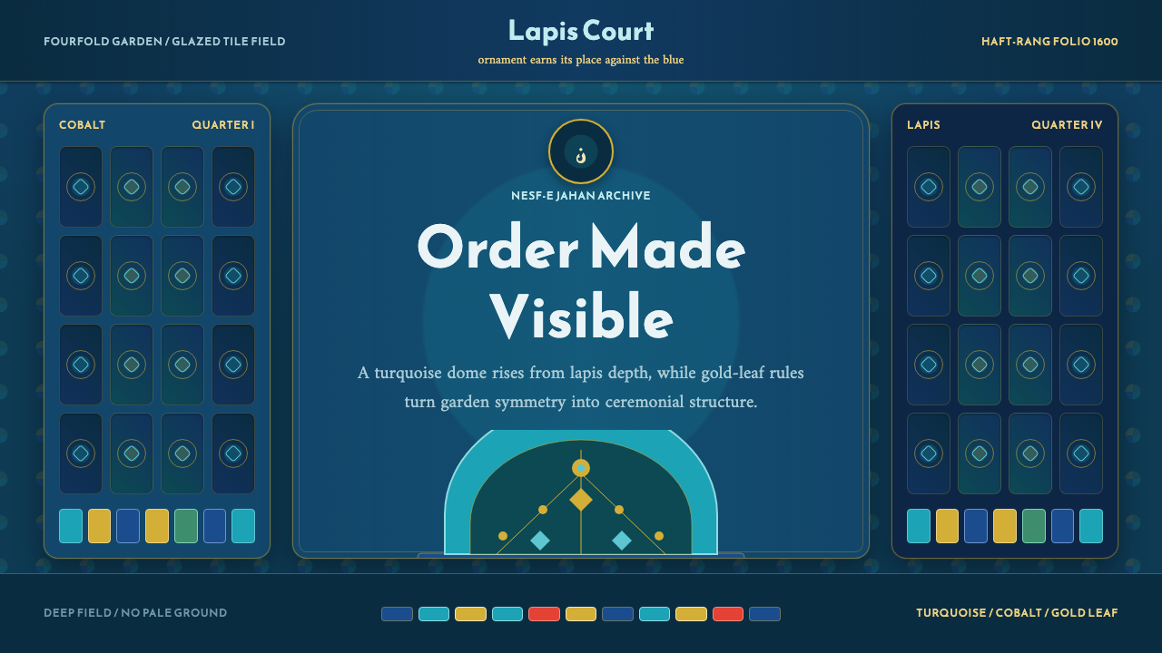 Safavid IsfahanOrnament is order. Turquoise domes and gold rules lock into a deep lapis grid.
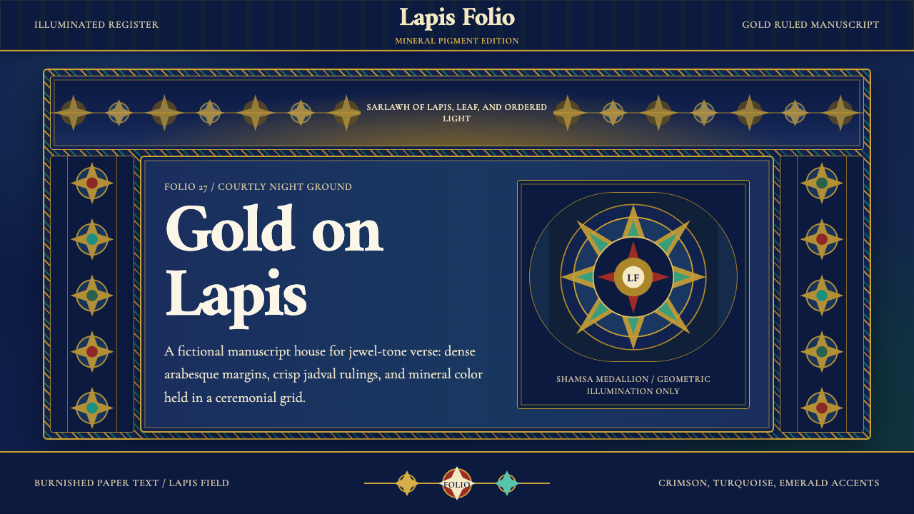 Timurid Manuscript (Herat)Courtly density glows. Lapis ground, Amiri type, and gold jadval geometry hol…
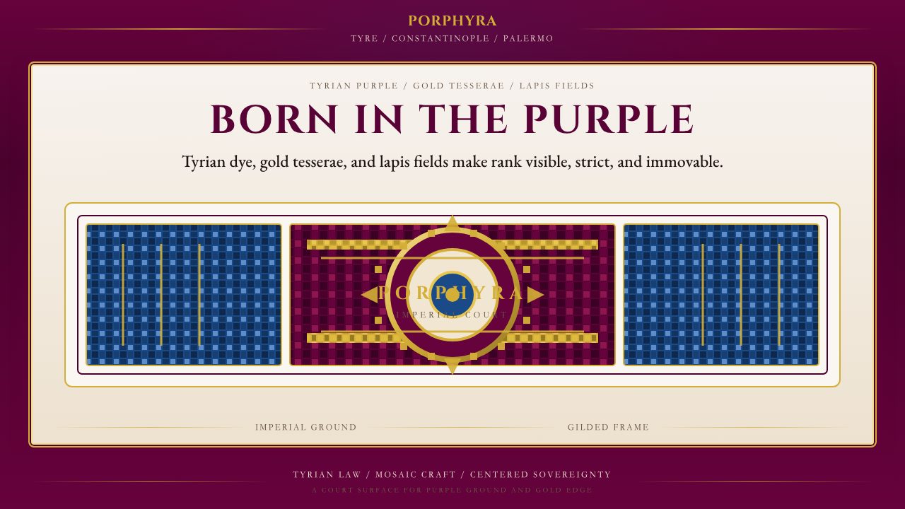 Byzantine Tyrian Purple (Imperial Court)Imperial rank made visible. Tyrian purple, gold tesserae, and centered symmet…
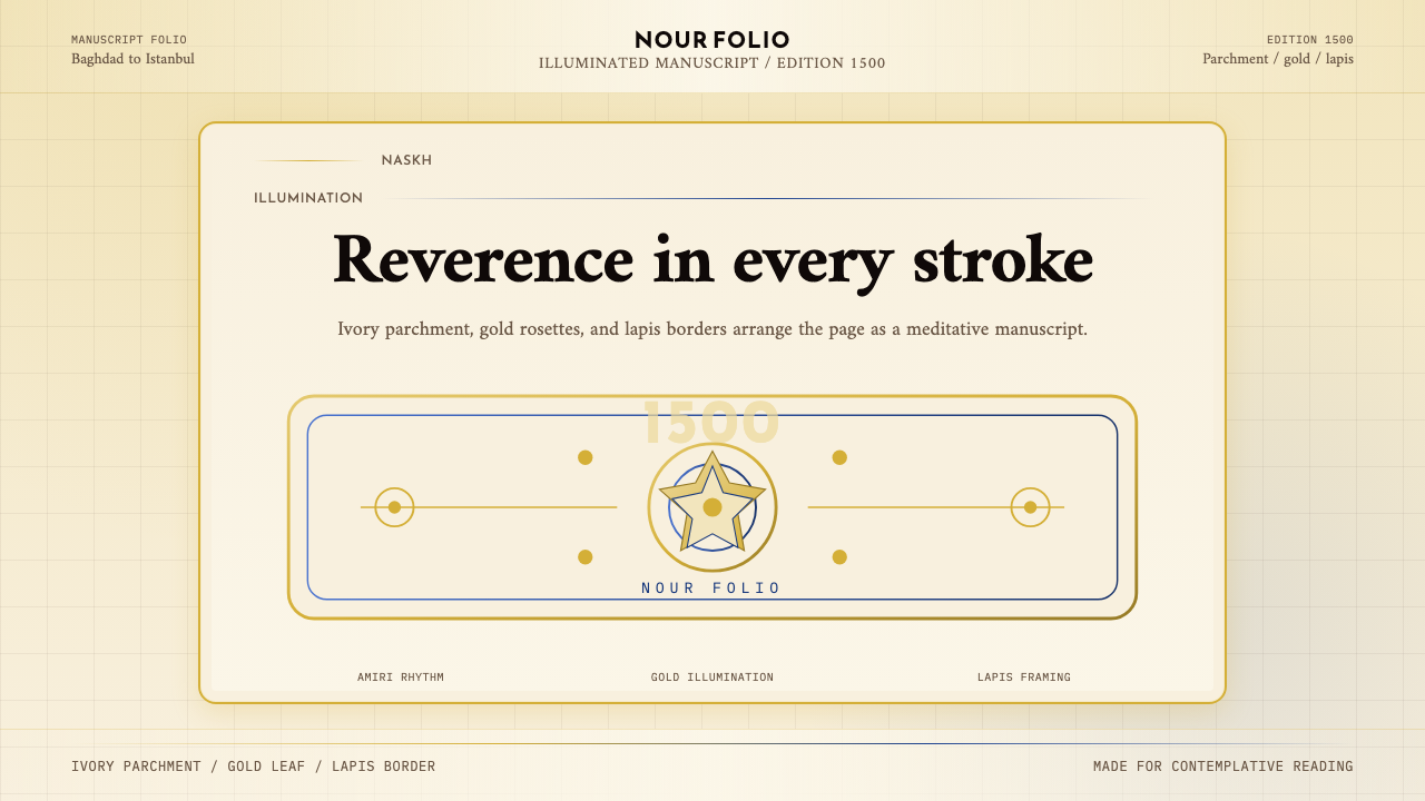 Naskh Quranic (1500)Reverence in every stroke. Ivory parchment, gold rosettes, and lapis framing.
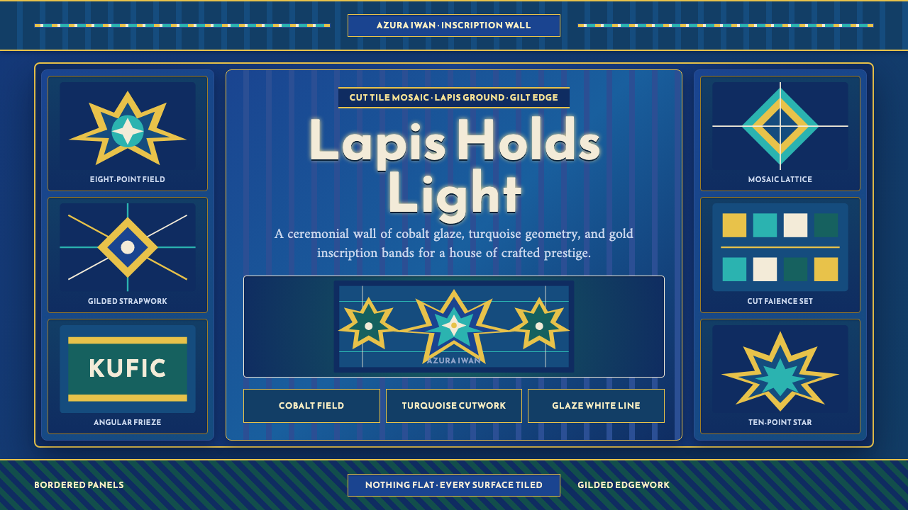 Samarkand TileworkOrnament is the architecture. Lapis panels, gold Kufic bands, and star geomet…
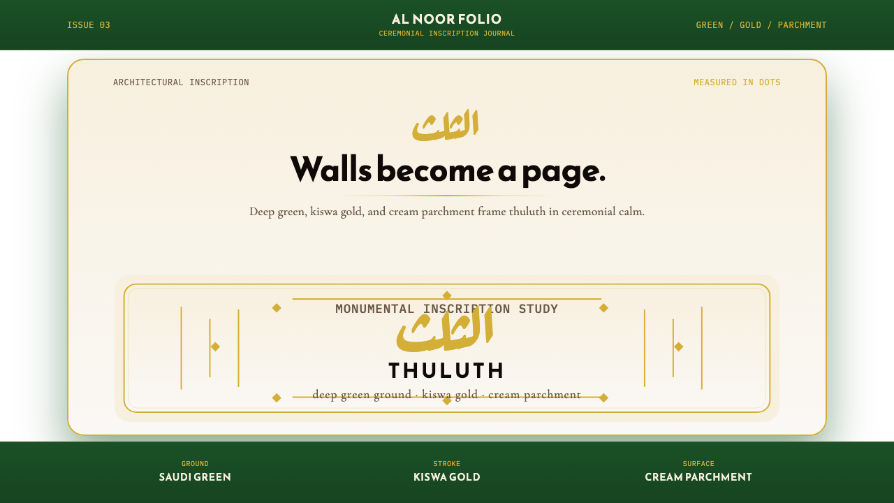 Saudi Thuluth CalligraphyMonumental calm in gold. Deep green, thuluth type, and cream parchment symmet…