What is Naskh Quranic (1500)?什么是 Naskh Quranic (1500)?
Naskh Quranic carries a millennium of sacred precision — ink-black calligraphy, gold-leaf rosettes, and lapis borders born in Baghdad and refined across the courts of three empires.纳斯赫《古兰经》体承载千年神圣精准——墨黑书法、金箔花饰与青金石边框,诞生于巴格达,历经三大帝国宫廷的精炼。
Naskh Quranic (1500) in briefNaskh Quranic (1500) 速览
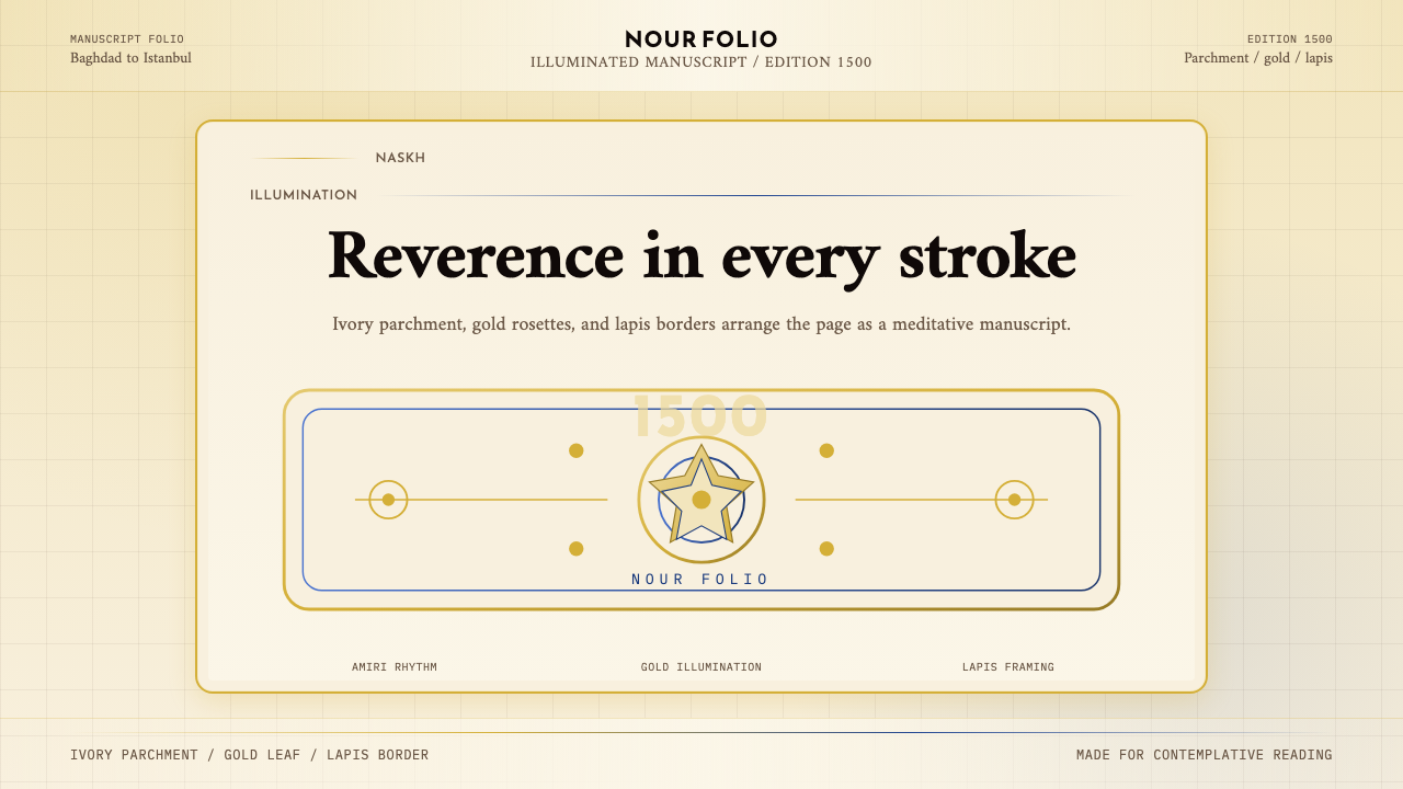
Naskh Quranic (1500) is a design system rooted in the manuscript tradition of Qur'an copying as it reached its apex in the courts of the Mamluk, Ottoman, and Mughal empires. The visual language is built from a small but deeply intentional set of elements: aged ivory or warm parchment grounds, ink-black calligraphic letterforms with their characteristic horizontal flow, gold-leaf illumination rosettes marking verse divisions, lapis-blue border frames, and vermilion or deep red used sparingly for diacritical markers and chapter headings. Together these elements create a visual field that is simultaneously opulent and disciplined — every gilded flourish is placed according to centuries-old compositional rules.纳斯赫《古兰经》体(1500)是一套植根于马穆鲁克、奥斯曼与莫卧儿帝国宫廷《古兰经》抄本传统的设计系统,彼时这一传统已臻于巅峰。其视觉语言建立在一套小而刻意的元素之上:陈年象牙色或温暖羊皮纸底色、具有水平流动感的墨黑书法字形、标记经文分隔的金箔照明花饰、青金石蓝边框,以及极为克制地用于变音符号与章节标题的朱砂或深红色。这些元素共同构建出一个既华美又严谨的视觉场域——每一处鎏金花饰都依照数百年积淀的构图法则安置。
The system draws its authority from the act of copying itself. In Islamic manuscript culture, the Qur'an scribe was not merely a craftsman but a devotional practitioner; each stroke of the reed pen was understood as an act of reverence. This inheritance shapes the aesthetic character of the style: weight, deliberateness, and an unusual generosity of space around every letterform. No element crowds another. The page breathes. Translated into contemporary digital contexts, these qualities produce interfaces and documents that feel measured, trustworthy, and unhurried — qualities increasingly rare in visual culture.这套系统的权威性来自誊写行为本身。在伊斯兰手抄本文化中,《古兰经》抄写员不仅是工匠,更是虔诚的修行者;芦苇笔的每一笔画都被理解为一种敬畏之举。这一传承塑造了这种风格的美学性格:厚重、审慎,以及每个字形周围罕见的空间慷慨。没有任何元素相互拥挤。页面在呼吸。将这些品质移译至当代数字语境,能产生令人感到沉稳、可信、从容的界面与文档——这些品质在当今视觉文化中愈发珍稀。
What distinguishes Naskh from other Arabic scripts — and from later calligraphic traditions — is its proportional system. Ibn Muqla's tenth-century codification established each letterform's geometry in relation to a rhombic dot unit, creating a script where the visual weight of every character is rationally derived rather than intuitive. This underlying geometric rigor, invisible to the casual viewer but present in every curve and horizontal, makes Naskh the most legible and the most reproducible of the classical Arabic scripts, which explains both its adoption for Qur'an copying and its survival into modern digital Arabic typefaces.纳斯赫体有别于其他阿拉伯字体以及后世书法传统的,是它的比例体系。伊本·穆格莱在十世纪建立的规范,以菱形点单位作为每个字形的几何基准,使得每个字符的视觉重量都经由理性推导,而非凭借直觉。这套潜藏的几何严格性——对随意观者不可见,却存在于每一条曲线与横笔之中——使纳斯赫成为古典阿拉伯书体中最易辨读、最易复制的一种,这也解释了它何以被选为《古兰经》誊写字体,并延续至现代数字阿拉伯字型。
See the Naskh Quranic (1500) design system查看 Naskh Quranic (1500) 完整设计系统
Where does Naskh Quranic (1500) come from?Naskh Quranic (1500) 从何而来?
The story of Naskh begins in tenth-century Abbasid Baghdad with a bureaucrat-turned-calligrapher named Ibn Muqla (886–940 CE). As a vizier of the Abbasid caliphate, Ibn Muqla occupied one of the most powerful administrative positions in the medieval Islamic world, but his enduring legacy is a geometric theory of letterform. He devised a proportional system — the first of its kind in Arabic calligraphy — in which each letter's correct form was derived from a fixed rhombic dot unit made by the reed pen. The diameter of the letter alif, the height of letters, the length of horizontal strokes: all were expressible as multiples of this foundational unit. The result was a script that could be taught, corrected, and replicated with a precision that earlier Arabic writing lacked. Naskh — meaning roughly 'copying' or 'transcription' — took its name from its primary function.纳斯赫的故事始于十世纪阿拔斯王朝巴格达的一位由官员转型为书法家的人物——伊本·穆格莱(886—940年)。作为阿拔斯哈里发国的维齐尔(宰相),伊本·穆格莱身居中世纪伊斯兰世界最具权势的行政要职,但他留给后世的遗产是一套字形几何理论。他创制了一套比例体系——这是阿拉伯书法史上的第一套——其中每个字母的正确形态都从芦苇笔所形成的固定菱形点单位推导而来。字母「阿利夫」的直径、字母的高度、横笔的长度:一切都可以用这个基础单位的倍数来表达。结果是一种可教授、可校正、可以前所未有的精度复制的书体。纳斯赫——其名大约意为「誊写」或「抄录」——得名于其主要功能。
Over the following two centuries, Ibn Muqla's system was received, tested, and perfected by a succession of calligraphic masters in Baghdad. The most celebrated of these was Ibn al-Bawwab (died 1022 CE), whose surviving Qur'an manuscript — held today in the Chester Beatty Library in Dublin — is considered the earliest extant complete Qur'an in Naskh script. Ibn al-Bawwab refined the proportional rules and introduced an increased fluency and curve into the letterforms that transformed Naskh from a geometric exercise into a living aesthetic. He was followed by Yaqut al-Musta'simi (died 1298 CE), the last great Baghdad master, who further softened the script and established the conventions that Mamluk, Ottoman, and Mughal scribes would inherit and elaborate.此后两个世纪,伊本·穆格莱的体系在巴格达历代书法大师的接续中被接受、检验与完善。其中最负盛名的是伊本·白瓦卜(卒于1022年),其存世《古兰经》手抄本——今藏都柏林切斯特·贝蒂图书馆——被视为现存最早的纳斯赫体《古兰经》完整抄本。伊本·白瓦卜精炼了比例规则,并在字形中引入了更流畅的弧度,将纳斯赫从几何练习转化为有生命的美学。继他之后的亚古特·穆斯塔西米(卒于1298年)是巴格达最后一位伟大的大师,他进一步柔化了书体,确立了马穆鲁克、奥斯曼与莫卧儿抄写员将继承并发扬的惯例。
The Mamluk sultans of Egypt (1250–1517) were among the greatest patrons of Qur'an production in Islamic history. Their court workshops produced large-format manuscripts — sometimes called 'royal Qur'ans' — with pages so large a single line of text might span the width of an outstretched arm. The Mamluk contribution to the visual language of the Naskh Quranic style was principally in illumination: the geometric carpet pages, the interlocking star-polygon rosettes that marked verse divisions, the polychrome borders interweaving blue, gold, and red in precise geometric lattices. These illumination conventions, developed across the thirteenth and fourteenth centuries, became the compositional grammar that later imperial traditions would inherit.埃及马穆鲁克苏丹国(1250—1517年)是伊斯兰历史上《古兰经》生产最重要的庇护者之一。其宫廷工坊制作大开本手抄本——有时称为「王室《古兰经》」——页面之大,单行文字有时横跨一臂展开的宽度。马穆鲁克对纳斯赫《古兰经》视觉语言的贡献主要在于装饰照明:几何地毯页、标记经文分隔的交错星形多边形花饰、以精确几何格架将蓝、金、红交织的多彩边框。这些照明惯例在十三、十四世纪发展成型,成为后世帝国传统将继承的构图语法。
The Ottoman calligraphic school, centered in Istanbul from the late fifteenth century onward, received this inheritance and subjected it to a new wave of refinement. The pivotal figure was Sheikh Hamdullah (1436–1520), a calligrapher who reportedly copied the style of Ibn al-Bawwab's manuscripts directly, working from examples in the Topkapi library. Sheikh Hamdullah's reform introduced a new balance between horizontal and vertical stress in the letterforms, producing a Naskh that felt simultaneously weighty and airy. His students and their students formed the Ottoman calligraphic lineage that trained master scribes for three centuries, standardizing the Naskh Quranic aesthetic to a degree of refinement that has never been surpassed. It is this Ottoman-Hamdullah synthesis — parchment ground, imperial gold, lapis accent, precise proportional letterform — that the design system labeled Naskh Quranic (1500) distills into a contemporary visual vocabulary.以十五世纪末伊斯坦布尔为中心的奥斯曼书法学派接受了这一传承,并对其施以新一轮精炼。关键人物是谢赫·哈姆杜拉(1436—1520年),据说他直接临摹了托普卡珀图书馆所藏伊本·白瓦卜手抄本的风格。谢赫·哈姆杜拉的改革在字形的横向与纵向张力之间引入了新的平衡,产生了一种既厚重又轻盈的纳斯赫。他的学生及其学生形成了奥斯曼书法传承脉络,历经三个世纪培养出大师级抄写员,将纳斯赫《古兰经》美学规范化至一种前无古人、后无来者的精炼程度。正是这种奥斯曼—哈姆杜拉综合体——羊皮纸底色、帝王金、青金石蓝强调色、精确比例字形——构成了「纳斯赫《古兰经》体(1500)」设计系统提炼成当代视觉词汇的核心来源。
What defines the Naskh Quranic (1500) look?Naskh Quranic (1500) 的视觉特征是什么?
Ground and Color Field底色与色域
The foundational ground is warm ivory or aged parchment — not a cold white, but a tone that reads as material, as something that has absorbed warmth over time. Against this ground, ink-black calligraphy and deep lapis blue establish the primary visual poles, with imperial gold occupying a third, luminous register. Vermilion or warm deep red appears at a much lower frequency, used only for the most semantically important marks. The palette is narrow and hierarchical: every color has a role, and no color enters the composition speculatively.底色是温暖的象牙色或陈年羊皮纸色——不是冷白,而是一种读起来有材质感、仿佛历经时光积温的色调。在这一底色上,墨黑书法与深邃青金石蓝确立了主要视觉两极,帝王金占据第三个、发光的层级。朱砂或暖深红出现频率极低,仅用于语义最重要的标记。色板窄而有层级:每种颜色各司其职,没有任何颜色是投机性地进入构图的。
Calligraphic Line Quality书法线条品质
Naskh letterforms are defined by their proportional precision and their characteristic horizontal emphasis. The baseline of each word runs with a controlled flow, letter connections made with decisive, smooth joins. Vertical strokes are upright and moderately weighted; curved bowls are generous and open. The overall impression is of a script that is legible at small sizes because every stroke is purposeful, and beautiful at large sizes because the proportional relationships between strokes are so carefully calibrated. No element wavers or rushes.纳斯赫字形由其比例精准性与特有的水平强调所定义。每个单词的基线以受控的流动感延展,字母连接以决断而平滑的衔接完成。垂直笔画端正而重量适中;弯曲的字碗宽阔而开放。整体印象是一种在小字号时因每一笔画皆有目的而清晰易读、在大字号时因笔画间比例关系精心校准而美丽动人的书体。没有任何元素犹豫或仓促。
Gold Illumination and Rosettes金箔照明与花饰
Gold in the Naskh Quranic tradition is not decoration in the contemporary sense — it is demarcation. Gold rosettes mark the end of each Qur'anic verse; gold medallions signal the completion of five or ten verses; gold border bands separate the text field from the margin. Applied sparingly and according to a semantic system, gold reads as a structural element that makes the document's hierarchy immediately legible without requiring the reader to decode typographic size differences alone. The illuminated ornament always serves orientation.纳斯赫《古兰经》传统中的金色不是当代意义上的装饰——它是标界。金箔花饰标记每节经文的结尾;金饰章花标志五节或十节经文的完成;金色边带将文字区域与页边分隔。金色的使用节制且遵循语义体系,读起来是一种结构性元素,使文档层级无需读者单独解码字号差异就能立即辨读。照明装饰始终服务于方向感。
Generous Line Spacing and Margin慷慨行距与页边
The spacing conventions of Qur'an manuscripts are among the most generous in any pre-modern writing tradition. Lines of text are separated by enough vertical distance that the diacritical marks above and below each letter — the vowel markers, the pronunciation guides — never touch the lines above or below. Margins are wide, historically serving as the space for annotations, interlinear glosses, and the chain of scholastic commentary. In a contemporary application, this generosity of white space produces a layout that breathes and invites sustained reading rather than hurried scanning.《古兰经》手抄本的间距惯例是前现代书写传统中最为慷慨的之一。文字行间的垂直距离足以保证每个字母上下方的变音符号——元音标记与发音指南——永远不会触碰上下行。页边留白宽阔,历史上曾用作注释、行间疏解与学术评注链条的空间。在当代应用中,这种空白的慷慨产生了一种呼吸畅通、邀请持续阅读而非仓促浏览的版面。
Geometric Border Architecture几何边框建筑
The border systems of Mamluk and Ottoman Qur'an manuscripts are among the most sophisticated geometric constructions in any decorative tradition. Multiple concentric bands — a narrow gold line, a broader lapis band with geometric or arabesque infill, an outer guard band in a contrasting color — frame the text field on all four sides. The corners resolve the meeting of horizontal and vertical bands through specially constructed corner pieces, often featuring a small geometric medallion. This border architecture communicates that the page has been deliberately bounded, that the text within it is set apart from the ordinary world.马穆鲁克与奥斯曼《古兰经》手抄本的边框体系是任何装饰传统中最精密的几何构造之一。多层同心带——一条窄金线、一条内填几何或阿拉伯花饰图案的较宽青金石蓝带、一条对比色外护带——在四边框定文字区域。转角处以专门构造的角饰解决横竖两带的交汇,通常以一个小几何章花为特征。这种边框建筑传达出:页面已被刻意划定边界,其中的文字被从日常世界中隔离出来。
Hierarchy Through Ornament, Not Scale以装饰而非尺度建立层级
Unlike most Western typographic traditions where hierarchy is signaled primarily through size, the Naskh Quranic system uses ornament type and color to signal hierarchy while keeping text size relatively stable. A chapter heading is distinguished by gold rubric and a surrounding medallion, not by being dramatically larger than the verse text. A verse marker is a red numeral inside a gold circle, not a change in type scale. This approach makes the page visually cohesive — the text block reads as a unified texture — while still providing clear navigational structure for the reader.与大多数西方排版传统主要通过尺寸传递层级不同,纳斯赫《古兰经》体系使用装饰类型与色彩来传递层级,同时保持文字尺寸相对稳定。章节标题以金色题跋与周围章花加以区别,而非通过比经文文字大幅放大来体现。经文标记是金色圆圈内的红色数字,而非字号的改变。这种方式使页面视觉上具有凝聚力——文字块读起来是统一的质感——同时仍为读者提供清晰的导航结构。
Material Warmth and Patina材质温度与包浆感
The Naskh Quranic style carries an unmistakable sense of material history — the warmth of vellum and parchment, the slight unevenness that handmade paper gives to ink, the oxidized depth of old gold leaf. In a digital application, this quality is evoked not through photographic texture overlays but through careful tonal choices: a background that reads as warm rather than neutral, gold tones that lean toward amber rather than chrome, deep blues that feel dense and mineral rather than luminescent. The effect is a surface that feels aged without being distressed.纳斯赫《古兰经》风格带有清晰可辨的材质历史感——牛皮纸与羊皮纸的温度、手工纸赋予墨迹的轻微不均匀感、陈年金箔经氧化产生的深度。在数字应用中,这种品质不是通过摄影纹理叠加来唤起,而是通过审慎的色调选择:一个读来温暖而非中性的背景、偏向琥珀而非镀铬的金色调、感觉浓稠而矿物质而非发光的深蓝。效果是一个感觉历经岁月却未遭风蚀的表面。
See the Naskh Quranic (1500) design system查看 Naskh Quranic (1500) 完整设计系统
Who shaped Naskh Quranic (1500)?谁塑造了 Naskh Quranic (1500)?
Ibn Muqla was the Abbasid vizier who established the first systematic geometric theory of Arabic letterforms, deriving each character's proportions from a rhombic dot unit made by the reed pen. His codification transformed Arabic calligraphy from a craft transmitted through imitation into a teachable discipline with measurable standards. Every subsequent master of Naskh — including Ibn al-Bawwab, Yaqut, and Sheikh Hamdullah — worked within the framework Ibn Muqla established, even as they refined and humanized his strict geometry. He is considered the founding theorist of classical Arabic calligraphy.伊本·穆格莱是阿拔斯王朝维齐尔,确立了阿拉伯字形的第一套系统性几何理论,从芦苇笔形成的菱形点单位推导出每个字符的比例。他的规范化将阿拉伯书法从依靠模仿传递的技艺转变为具有可量化标准的可教授学科。此后每一位纳斯赫大师——包括伊本·白瓦卜、亚古特与谢赫·哈姆杜拉——都在伊本·穆格莱建立的框架内工作,尽管他们各自精炼并人性化了他的严格几何。他被视为古典阿拉伯书法的奠基理论家。
Ibn al-Bawwab is credited with humanizing Ibn Muqla's geometric system, introducing a greater fluency and elegance into Naskh letterforms without abandoning their proportional rigor. His surviving Qur'an manuscript — the earliest known complete Naskh Qur'an, now in the Chester Beatty Library in Dublin — demonstrates a script of extraordinary refinement, with letterforms that feel both inevitable and alive. He also contributed to the development of Qur'anic illumination conventions, and his manuscripts show the early integration of gold and color as structural markers that later imperial workshops would elaborate into the full Mamluk and Ottoman decorative systems.伊本·白瓦卜被认为是将伊本·穆格莱几何体系人性化的人,他在不放弃比例严格性的前提下,向纳斯赫字形引入了更强的流畅性与优雅感。他存世的《古兰经》手抄本——现藏都柏林切斯特·贝蒂图书馆,是已知最早的完整纳斯赫《古兰经》——展示了一种极为精炼的书体,字形令人感到既是必然的又是有生命力的。他也为《古兰经》照明装饰惯例的发展做出贡献,其手抄本展示了金色与色彩作为结构性标记的早期整合,这一做法后来被帝国工坊发展成完整的马穆鲁克与奥斯曼装饰体系。
Yaqut al-Musta'simi served as the court librarian of the last Abbasid caliph in Baghdad and is remembered as the final great master of the Baghdad calligraphic school. He made a decisive technical innovation — cutting the reed pen nib at an oblique angle rather than straight — that gave Naskh a new range of thick-to-thin contrast within a single stroke. Yaqut is also credited with standardizing the sub-styles of Naskh and the related scripts (Thuluth, Muhaqqaq, Rayhan, Riq'a, Tawqi) into a coherent system of six scripts. The Mongol sack of Baghdad in 1258 destroyed his institutional world, but his calligraphic tradition survived through his students and shaped the Ottoman and Mamluk workshops that followed.亚古特·穆斯塔西米担任巴格达最后一位阿拔斯哈里发的宫廷图书馆馆长,被视为巴格达书法学派最后一位伟大的大师。他做出了一项决定性的技术革新——将芦苇笔笔尖斜切而非直切——使纳斯赫在单一笔画内获得了新的粗细对比幅度。亚古特还被认为将纳斯赫的子风格及相关书体(苏鲁斯体、穆哈卡克体、雷汉体、里卡体、泰夫基体)系统化为一套六书体系。1258年蒙古对巴格达的洗劫摧毁了他的制度世界,但他的书法传统通过其学生得以存续,并塑造了此后的奥斯曼与马穆鲁克工坊。
Sheikh Hamdullah of Amasya is the figure who brought Naskh to its Ottoman peak. Working from manuscripts he reportedly studied directly in the Topkapi Palace library, he reformed the prevailing calligraphic conventions to produce letterforms with a new balance — upright, proportional, flowing — that struck Ottoman patrons and aesthetes as a recovery of the authentic classical style. Sultan Bayezid II reportedly held the inkpot for Sheikh Hamdullah as he wrote, an act that signals the extraordinary prestige calligraphy held at the Ottoman court. His reforms became the foundation of the Istanbul school, whose masters trained Qur'an scribes for the next three centuries.阿马西亚的谢赫·哈姆杜拉是将纳斯赫推向奥斯曼巅峰的人物。据说他直接研习了托普卡珀宫图书馆所藏手抄本,据此改革了当时流行的书法惯例,产生了具有新平衡的字形——端正、比例匀称、流动自如——奥斯曼庇护人与审美者将其视为对真正古典风格的复原。据说苏丹巴耶济德二世在谢赫·哈姆杜拉写字时亲自为其持墨水瓶,这一举动传达了书法在奥斯曼宫廷享有的非凡声望。他的改革成为伊斯坦布尔学派的基础,该学派的大师们在此后三个世纪持续培养《古兰经》抄写员。
The Mamluk royal workshops of Cairo, operating under the patronage of successive Mamluk sultans from the mid-thirteenth through the early sixteenth centuries, were the primary engines of the Naskh Quranic illumination tradition. These ateliers brought together calligraphers, illuminators, gilders, and binders under a single patronage system to produce large-format Qur'ans that were donated to mosques and madrasas as acts of royal piety. The geometric illumination conventions they developed — carpet pages, star-polygon rosettes, polychrome geometric borders — became the visual grammar that Ottoman and Mughal workshops inherited. No single named figure dominates the Mamluk tradition; its achievement is collective and institutional.开罗马穆鲁克王室工坊,在十三世纪中叶至十六世纪初历代马穆鲁克苏丹的庇护下运营,是纳斯赫《古兰经》照明传统的主要推动力量。这些工坊将书法家、照明师、贴金师与装订师汇聚于单一庇护体系下,制作捐赠给清真寺与经学院的大开本《古兰经》,以表达皇室虔诚。他们发展出的几何照明惯例——地毯页、星形多边形花饰、多彩几何边框——成为奥斯曼与莫卧儿工坊所继承的视觉语法。马穆鲁克传统中没有单一的命名人物占主导地位;其成就是集体性的、制度性的。
How do you use Naskh Quranic (1500) today?今天怎么用 Naskh Quranic (1500)?
Naskh Quranic (1500) is a style for contexts where gravity, trustworthiness, and cultural richness need to be communicated without resorting to generic luxury cues. Its visual language — warm grounds, controlled gold, deliberate spacing — works best when the content itself merits sustained attention: financial instruments, scholarly publications, premium cultural institutions, heritage brands, and any product that wants to distinguish itself through depth rather than speed.纳斯赫《古兰经》体(1500)适用于需要传达庄重感、可信度与文化丰厚性而不借助通用奢华符号的语境。其视觉语言——温暖底色、克制的金色、审慎的间距——在内容本身值得持续关注时效果最佳:金融工具、学术出版物、高端文化机构、遗产品牌,以及任何希望以深度而非速度区别自身的产品。
For presentation slides, the style divides naturally across cover and content pages. A cover slide benefits from a full parchment-tone ground with the title set in a single weight of upright, well-spaced type, flanked by a pair of gold-tone decorative rules or a simplified border panel. A centered or offset illuminated rosette — even as a simplified geometric motif — signals the tradition without literalism. Content slides should be treated as text manuscripts: generous line spacing, wide left margins reserved for labels or call-out figures, and section breaks marked by a thin gold rule rather than a color block. Data slides should resist the temptation to use color decoratively: chart elements adopt the palette's hierarchy — lapis for primary series, gold for key data points, parchment ground — so the decoration and the data are the same system.在演示文稿中,这种风格在封面与内容页之间自然分工。封面幻灯片适合以全幅羊皮纸色底面为背景,标题以单一字重的端正、宽松间距字体排列,两侧搭配金色调装饰线或简化的边框板块。居中或偏置的照明花饰——哪怕是简化的几何母题——也能在不流于字面的情况下呼应这一传统。内容幻灯片应被当作文字手抄本处理:慷慨的行距、为标签或引出数字保留的宽阔左边距、以细金色线条而非色块标记的段落分隔。数据幻灯片应抵制将色彩用于装饰的诱惑:图表元素采用色板的层级体系——青金石蓝用于主要数据系列,金色用于关键数据点,羊皮纸色为底色——使装饰与数据成为同一个体系。
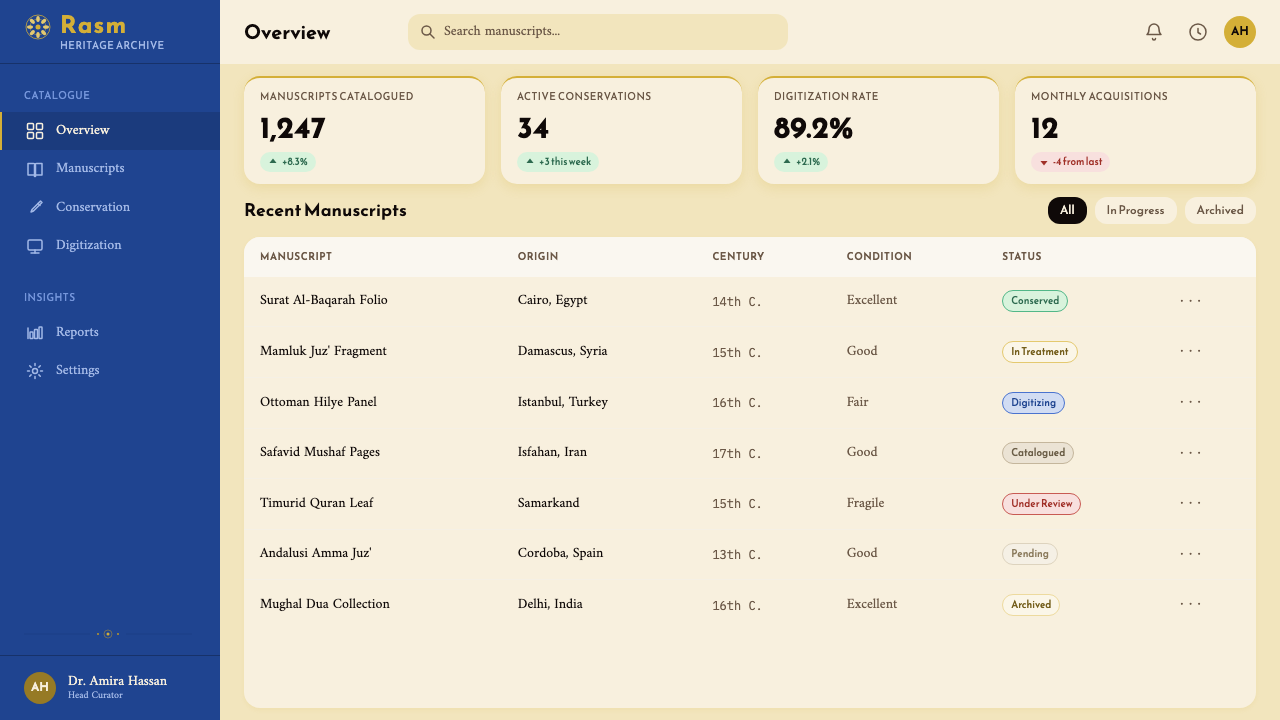
For web interfaces, the style is particularly well suited to dashboards, pricing pages, and documentation portals where the user needs to trust the information being presented. The approach is structural: set the page on a warm near-white ground, use a single column of well-spaced body text for content-heavy pages, and reserve the lapis and gold tones for interactive elements, labels, and state indicators. Borders matter in this style — card components benefit from ruled edges rather than soft shadows. Navigation should be typographic and deliberate, with adequate horizontal spacing between items. The characteristic Naskh margin — wide, intentional — translates directly into the padding systems of a UI component library.对于网页界面,这种风格特别适合用户需要信任所呈现信息的仪表板、定价页面与文档门户。方法是结构性的:在温暖的近白色底面上构建页面,为内容密集的页面使用宽松间距的单栏正文,将青金石蓝与金色调保留给交互元素、标签与状态指示器。边框在这种风格中很重要——卡片组件受益于带线框的边缘而非柔和阴影。导航应当字体化且审慎,项目间保持充足的水平间距。纳斯赫特有的宽阔、刻意的页边,直接转化为UI组件库的内距系统。
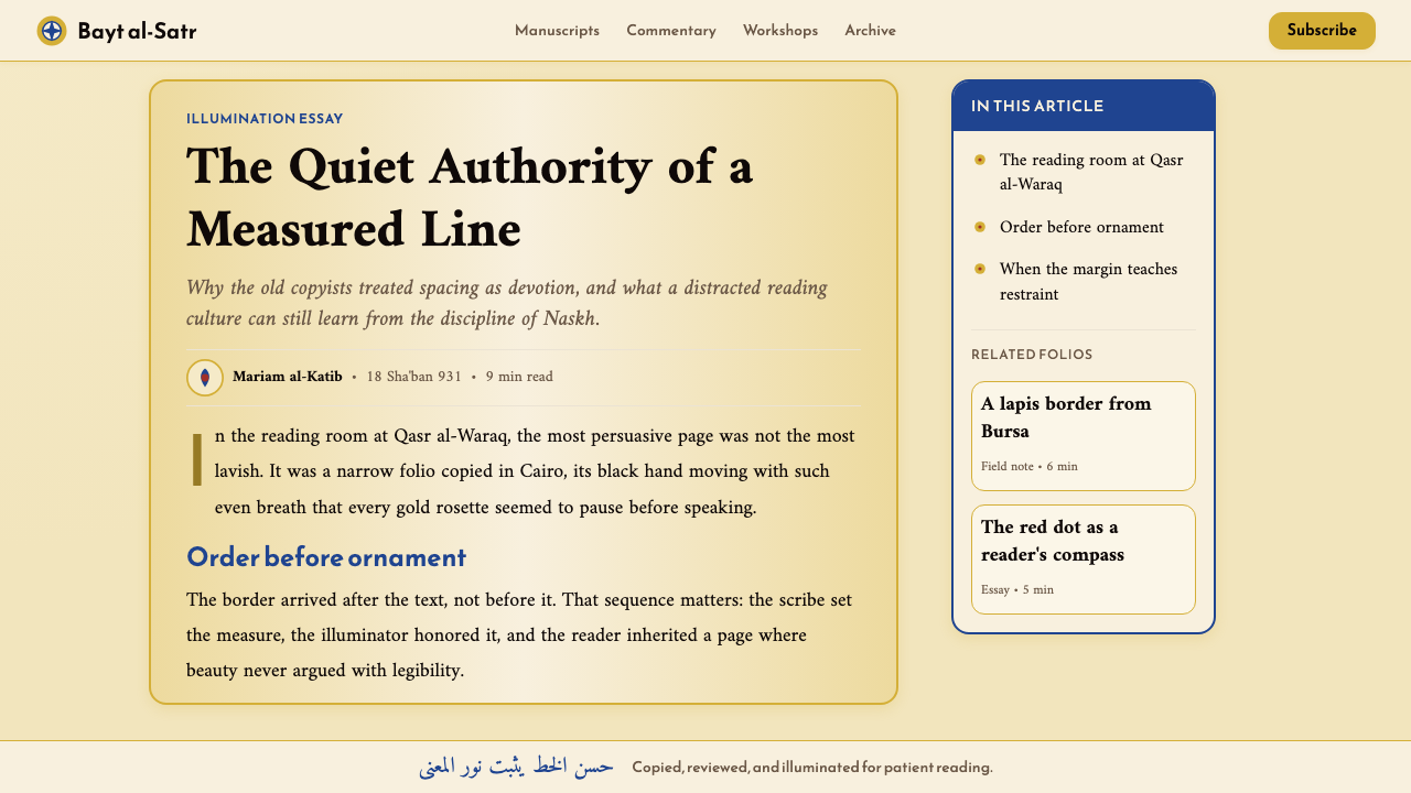
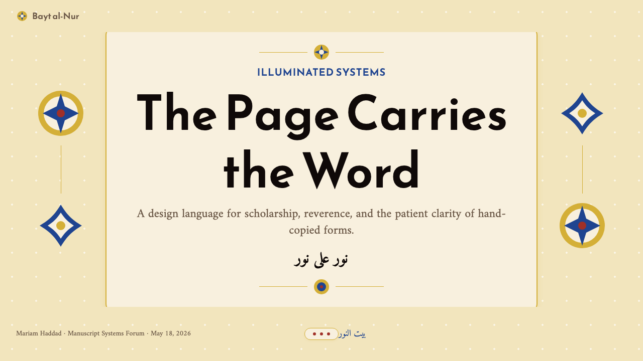
For editorial and marketing contexts, the style supports long-form reading experiences and premium positioning. A Naskh-derived article layout uses a moderate column width for body text, preserves a wide outer margin for annotations or pull quotes, and uses ruled horizontal bands — thin gold-tone lines — as the primary organizational device between sections rather than white space alone. Marketing pages work well with the style's compositional weight: a full-width hero with parchment ground and centered calligraphy-style headline, followed by feature sections that alternate between dense typographic blocks and illumination-inspired ornamental dividers. The restraint required by the tradition — no element exists without purpose — keeps marketing layouts from becoming cluttered.在编辑与营销语境中,这种风格支持长篇阅读体验与高端定位。纳斯赫衍生的文章版面为正文采用适中的栏宽,在外侧保留宽阔页边用于注释或引语,并以带规则的水平带——细金色调线条——作为段落间主要组织手段,而不仅依赖空白。营销页面适合这种风格的构图重量感:以羊皮纸底色与居中书法风格标题的全幅主视觉为开篇,随后以密集文字块与受照明启发的装饰分割线交替出现的特性区块跟进。传统所要求的克制——每个元素的存在都有目的——使营销版面不至于变得杂乱。
A common mistake when applying Naskh Quranic is treating gold as a general-purpose accent color rather than a semantic marker. In the source tradition, gold marks specific categories of information — verse endings, chapter headers, navigational markers — and its power comes from that specificity. When gold is applied freely to decorative borders, button backgrounds, and background patterns simultaneously, it loses its role as a signal and becomes noise. Similarly, the parchment ground should remain ground: using warm ivory as a content color over a dark background inverts the entire compositional logic. The style's warmth derives from depth and restraint, not from saturation.应用纳斯赫《古兰经》体时最常见的错误,是将金色视为通用强调色而非语义标记。在源头传统中,金色标记特定类别的信息——经文结尾、章节标题、导航标记——其力量正来自这种特殊性。当金色被自由地同时应用于装饰边框、按钮背景与背景图案时,它就失去了作为信号的角色,变成了噪音。同样,羊皮纸底色应保持作为底色的角色:在深色背景上将暖象牙色用作内容色会颠覆整个构图逻辑。这种风格的温暖感来自深度与克制,而非饱和度。
See the Naskh Quranic (1500) design system查看 Naskh Quranic (1500) 完整设计系统
Naskh Quranic (1500) — FAQNaskh Quranic (1500) · 常见问题
Is Naskh Quranic appropriate only for Arabic-language content, or can it work for other languages?纳斯赫《古兰经》体只适合阿拉伯语内容,还是也能用于其他语言?
The style is fully applicable to non-Arabic content. The design language of Naskh Quranic — parchment grounds, gold illumination, lapis borders, generous spacing — is architectural rather than linguistic. It does not require Arabic letterforms to function; it requires the compositional logic and the tonal palette. A Latin-type interface using this palette and spacing system will read as richly historical and trustworthy without any calligraphic letterforms at all. Where Arabic or Arabic-influenced scripts appear in the design, they reinforce the cultural specificity; where they do not, the illumination geometry and color system still carry the style's identity.这种风格完全适用于非阿拉伯语内容。纳斯赫《古兰经》的设计语言——羊皮纸底色、金色照明、青金石蓝边框、慷慨的间距——是建筑性的,而非语言性的。它不需要阿拉伯字形就能发挥作用;它需要的是构图逻辑与色调色板。一套使用此色板与间距系统的拉丁字体界面,即便没有任何书法字形,也会读来历史底蕴丰厚、值得信赖。设计中出现阿拉伯文或受其影响的书体时,会强化文化特殊性;若不出现,照明几何与色彩系统仍能承载这种风格的身份。
How do I use gold in this style without it looking cheap or decorative?如何在这种风格中使用金色而不显得廉价或流于装饰?
The key is semantic restriction. In the manuscript tradition, gold marks exactly three categories: verse endings, chapter headings, and navigational markers. Translate this into contemporary work by assigning gold to a specific category — key data labels, active navigation states, primary call-to-action — and using it nowhere else. The tonal quality matters as well: gold that leans toward deep amber reads as aged and material; gold that leans toward bright chrome reads as metallic decoration. The former belongs to this system; the latter undermines it. When in doubt, use less gold than feels sufficient — the style's visual weight comes from the parchment-lapis-black relationship, with gold as a precisely deployed third element.关键在于语义限制。在手抄本传统中,金色精确地标记三类内容:经文结尾、章节标题与导航标记。将此转化到当代设计:将金色分配给某一特定类别——关键数据标签、激活状态的导航项、主要行动号召——并在其他任何地方都不使用它。色调品质同样重要:偏向深琥珀的金色读来有年代感和材质感;偏向亮铬色的金色读来是金属装饰。前者属于这套体系;后者会破坏它。有疑问时,使用比感觉足够更少的金色——这种风格的视觉重量来自羊皮纸—青金石蓝—墨黑的关系,金色是精确部署的第三元素。
Can Naskh Quranic work in a dark-background or night-mode interface?纳斯赫《古兰经》体能用于深色背景或夜间模式界面吗?
A dark inversion is possible but requires careful rethinking rather than simple color reversal. The style's warmth comes from the parchment ground; inverting to black loses that warmth entirely and risks producing something cold and generic. A more successful dark adaptation uses a very deep warm brown or dark umber as the ground rather than pure black, preserving the sense of material depth. Lapis blue, which reads as a cool complement against parchment, becomes a primary element against dark grounds. Gold retains its role as semantic marker. The critical principle: the dark variant should feel like the inside of a manuscript cover at night, not like a night-mode interface that has applied the color palette without understanding its logic.深色反转是可能的,但需要审慎重构而非简单颠倒色彩。这种风格的温度来自羊皮纸底色;反转为黑色会完全失去这种温度,并可能产生冷漠而通用的效果。更成功的深色适配以非常深的暖棕色或深赭色作为底色,而非纯黑,以保留材质深度感。青金石蓝在羊皮纸底色上读作清冷的互补色,在深色底面上则成为主要元素。金色保留其作为语义标记的角色。关键原则:深色变体应该感觉像夜晚中打开的手抄本封面内里,而非一个在不理解其逻辑的情况下套用色板的夜间模式界面。
What kinds of typefaces work alongside this style for body text?什么样的字体适合在这种风格中用于正文?
The style calls for type that is upright, well-proportioned, and unhurried — qualities that align with high-quality traditional serif designs rather than contemporary geometric or humanist sans-serifs. For Latin scripts, typefaces with visible calligraphic heritage — those whose contrast between thick and thin strokes echoes the reed pen — read most authentically within this visual system. Very condensed, very wide, or heavily stylized letterforms conflict with the style's compositional gravity. For Arabic and Persian text, any of the major scholarly Naskh digital typefaces — designed for serious reading rather than for brand personality — are appropriate; avoid designs that lean toward decorative Thuluth-adjacent styles or toward contemporary geometric Arabic. What matters most is that the type feels considered and settled, not experimental.这种风格需要端正、比例匀称、从容不迫的字体——这些品质与高质量的传统衬线字体设计相符,而非当代几何或人文主义无衬线体。对于拉丁字体,那些具有可见书法传承的字形——粗细笔画对比呼应芦苇笔笔触的设计——在这套视觉系统中读来最为真实。极窄、极宽或过度风格化的字形与这种风格的构图庄重感相冲突。对于阿拉伯文与波斯文,任何主流学术纳斯赫数字字型——为严肃阅读而非品牌个性而设计——均为合适的选择;避免偏向装饰性苏鲁斯风格或当代几何阿拉伯体的设计。最重要的是:字体感觉经过审慎考量且沉稳笃定,而非实验性的。
How does this style differ from other Islamic or Middle Eastern inspired design styles?这种风格与其他伊斯兰或中东风格的设计有何不同?
The most important distinction is that Naskh Quranic is a manuscript tradition, not an architectural or surface-pattern tradition. Styles derived from Islamic geometric tilework, muqarnas, arabesque surface decoration, or Ottoman textile patterns have different compositional logics — they are primarily about the infinite repeat, the modular unit, and pattern density. Naskh Quranic is about the page: the single text block, the bounded margin, the hierarchical use of color as semantic marker. It is closer in compositional structure to a medieval European illuminated manuscript than it is to a geometric tile panel. This distinction matters in application: designs that combine both logics — tiling the background with a geometric pattern while also using the manuscript spacing and color system — usually fail because they are trying to be two different traditions simultaneously.最重要的区别在于:纳斯赫《古兰经》体是一种手抄本传统,而非建筑或表面图案传统。源自伊斯兰几何瓷砖、穆卡纳斯、阿拉伯花饰表面装饰或奥斯曼纺织图案的风格具有不同的构图逻辑——它们主要关注无限重复、模块单元与图案密度。纳斯赫《古兰经》体关注的是页面:单一文字块、有界页边、色彩作为语义标记的层级运用。在构图结构上,它比几何瓷砖板更接近中世纪欧洲彩饰手抄本。这一区别在实践中至关重要:将两种逻辑混合的设计——以几何图案铺设背景的同时又使用手抄本间距与色彩系统——通常会失败,因为它们试图同时成为两种不同的传统。
Related design styles相关设计风格
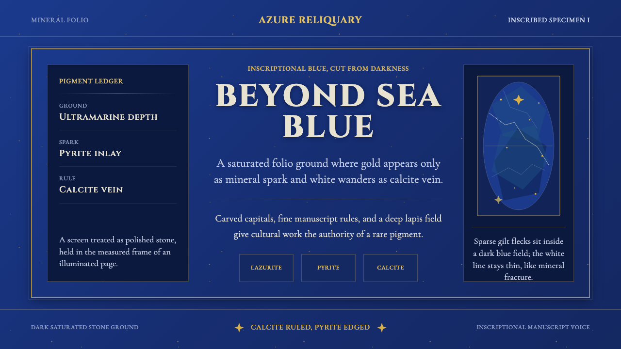 Badakhshan Lapis LazuliStone as manuscript. Ultramarine field, pyrite flecks, calcite veins, carved…以石为页:群青底、黄铁矿金点、方解石纹、铭文大写。
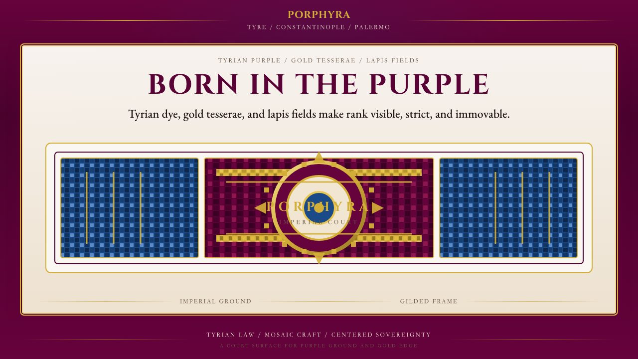 Byzantine Tyrian Purple (Imperial Court)Imperial rank made visible. Tyrian purple, gold tesserae, and centered symmet…帝国权威可见化:泰尔紫、金镶嵌与居中对称。
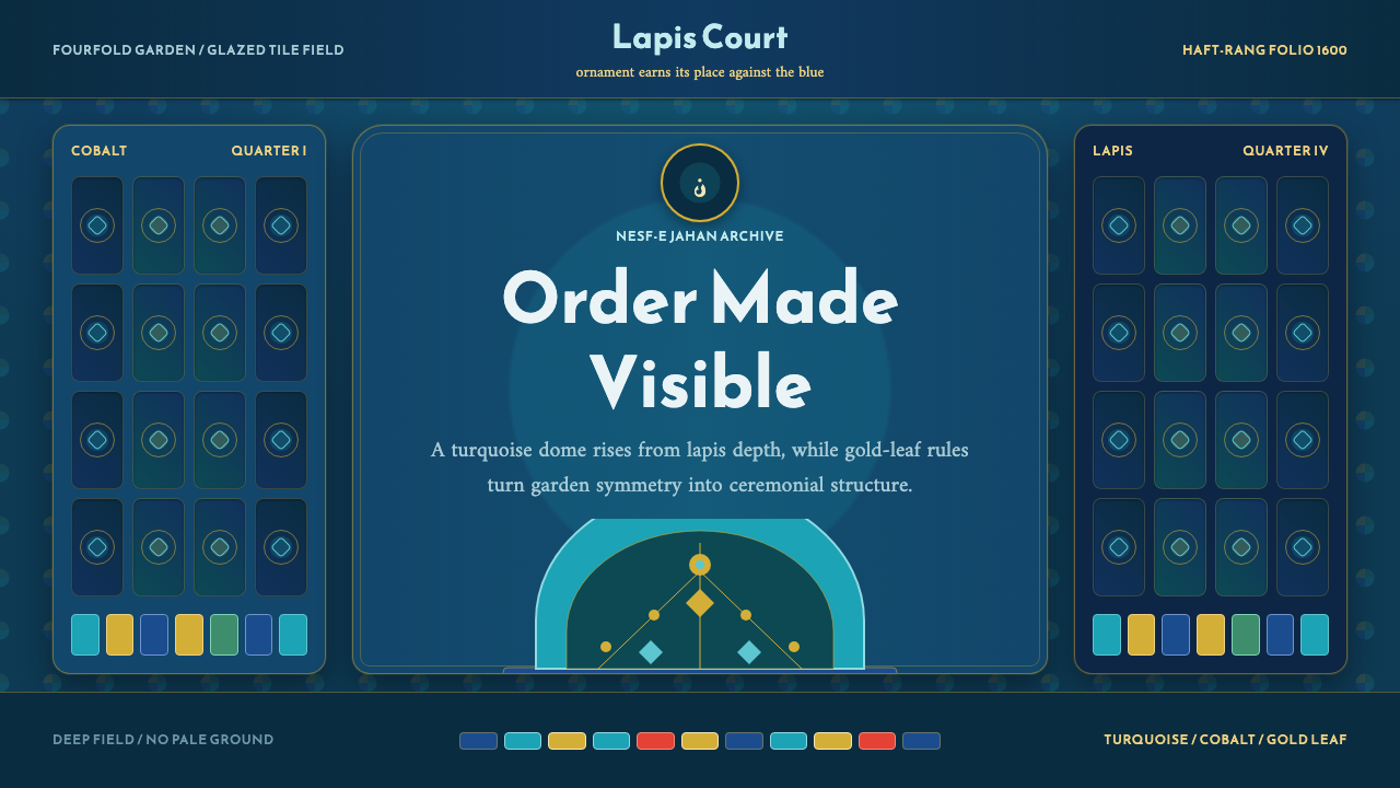 Safavid IsfahanOrnament is order. Turquoise domes and gold rules lock into a deep lapis grid.纹饰即秩序。绿松石穹顶与金线嵌入深青金石网格。
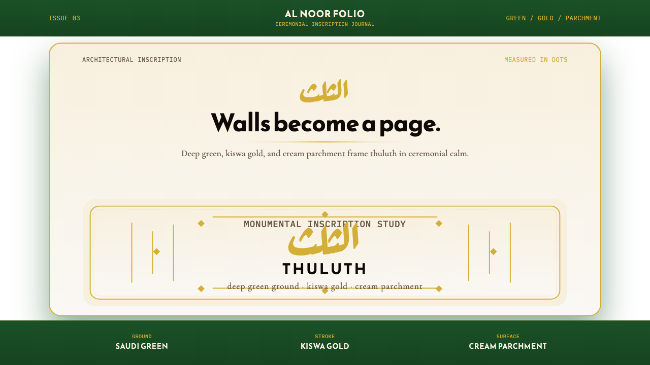 Saudi Thuluth CalligraphyMonumental calm in gold. Deep green, thuluth type, and cream parchment symmet…金色庄严。深绿底、苏鲁斯体与奶油纸面形成对称构图。
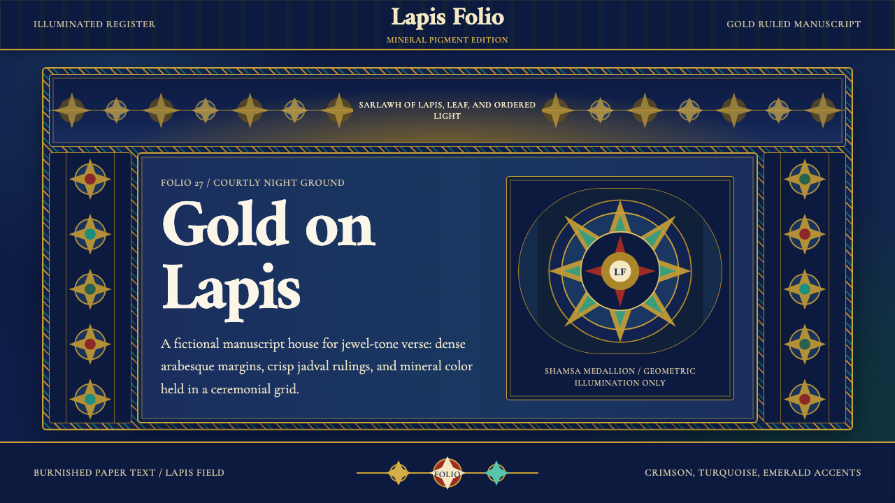 Timurid Manuscript (Herat)Courtly density glows. Lapis ground, Amiri type, and gold jadval geometry hol…宫廷密度在发光。青金石底、金线框与Amiri字体托起手抄本。
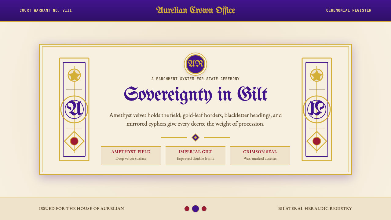 British Royal MonarchyCeremony becomes structure. Amethyst panels, gilt borders, blackletter, mirro…仪式成为结构:紫晶面板、鎏金边框、哥特黑体与镜像纹章。