What is Saudi Thuluth Calligraphy?什么是 Saudi Thuluth Calligraphy?
Saudi Thuluth Calligraphy transforms language into architecture — monumental strokes, sacred symmetry, and the deep green and imperial gold of a civilization that made scripture into design.沙特苏鲁斯书法将文字化为建筑——宏伟的笔触、神圣的对称,以及以经文为设计的文明所特有的深绿与帝王金。
Saudi Thuluth Calligraphy in briefSaudi Thuluth Calligraphy 速览
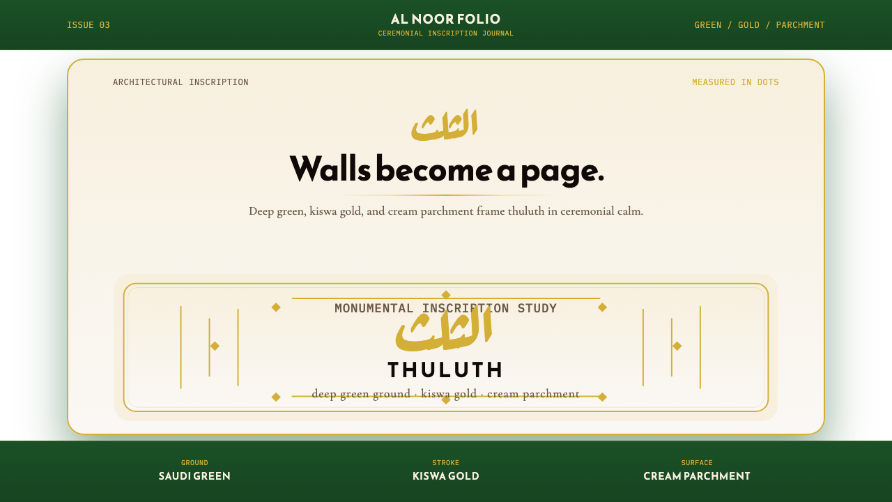
Thuluth is the great display script of the Islamic world — a calligraphic tradition in which each letter rises two to three times the height of the more common Naskh hand, with sweeping ascenders, elaborate interlocking forms, and decorative flourishes that transform a single word into a composition. The name derives from the Arabic for 'one third', referring to the proportion of the reed pen's cut that governs the stroke weight relative to the letter body. This proportional discipline, established by master calligraphers in Baghdad around the tenth century, is what gives Thuluth its characteristic combination of grandeur and precision.苏鲁斯体是伊斯兰世界最重要的展示书体——在这一书法传统中,每个字母的高度是更常见的纳斯赫体的两到三倍,竖笔舒展、字形繁复交叠、装饰性收尾化单个词语为完整构图。其名称源自阿拉伯语「三分之一」,指的是芦苇笔切口宽度与字母主体之间的比例关系,正是这一比例规范了笔触的粗细。这套比例法则由巴格达书法大师约于十世纪确立,正是它赋予苏鲁斯体那种宏伟与精准并存的独特气质。
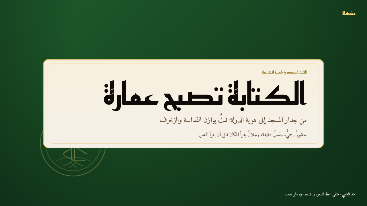
The Saudi state application of Thuluth draws on three visual anchors: the deep emerald green of the national flag, the warm imperial gold associated with the Kaaba's embroidered kiswa, and a cream parchment tone that functions as the reading surface. Together these three tones produce a palette that signals both religious sanctity and national authority — a design language of sacred grandeur that is simultaneously ornamental and institutional.沙特国家视觉对苏鲁斯体的应用建立在三个视觉锚点之上:国旗深翠绿、与天房帷幕相关联的温润帝王金,以及作为阅读底面的奶油羊皮纸色。三色合力营造出一套同时传递宗教神圣性与国家权威感的色彩语言——这是一种庄严的设计系统,装饰性与机构性并行不悖。
The result is a visual system unlike any in the global design canon. Where most display traditions choose between decoration and authority, Saudi Thuluth insists on both. The letters are genuinely complex — overlapping, stacked, and interwoven — yet the overall composition reads with commanding clarity because every elaborate element is in perfect symmetrical relation to the others. Understanding this style means understanding that ornament here is not added to structure: ornament is the structure.最终呈现出一套在全球设计史上独一无二的视觉体系。大多数展示性传统必须在装饰与权威之间二选一,而沙特苏鲁斯书法两者兼有。字母结构确实繁复——叠压、堆叠、相互穿插——然而整体构图却以令人信服的清晰度呈现,因为每一个精致的细节都与其他部分处于完美的对称关系之中。理解这种风格,意味着理解其中的装饰并非附加于结构之上:装饰本身就是结构。
See the Saudi Thuluth Calligraphy design system查看 Saudi Thuluth Calligraphy 完整设计系统
Where does Saudi Thuluth Calligraphy come from?Saudi Thuluth Calligraphy 从何而来?
The script known as Thuluth was codified in Baghdad around 940 CE by the vizier and calligrapher Ibn Muqla, who developed the first geometric theory of Arabic letterforms. Ibn Muqla's method — based on a rhombic dot unit derived from the pen's cut — established a proportional system in which every letter's height, width, and curvature could be expressed as a precise multiple of that foundational unit. This was not merely an aesthetic innovation; it was the creation of a grammar, a set of rules rigorous enough to be taught, standardized, and judged. Thuluth emerged as the grandest of the scripts legible under Ibn Muqla's system, reserved for monumental inscriptions on mosque facades, Quranic manuscripts of ceremonial importance, and official court documents.被称为苏鲁斯的书体约于公元940年在巴格达由宰相兼书法家伊本·穆格拉系统化确立。伊本·穆格拉发展出第一套阿拉伯字母的几何理论,其方法以源自笔尖切口的菱形点为基本单位,建立了一套比例体系:每个字母的高度、宽度与曲率均可表达为该基础单位的精确倍数。这不仅仅是一项美学创新,更是一套语法的创建——严格到足以被教授、标准化与评判的规则体系。苏鲁斯体由此成为伊本·穆格拉体系中最宏伟的书体,被专用于清真寺正立面的纪念性铭文、礼仪性《古兰经》抄本以及官方宫廷文书。
The tradition was advanced and refined across centuries. In thirteenth-century Baghdad, Yaqut al-Musta'simi — court calligrapher to the last Abbasid caliph — introduced a beveled cut to the reed pen that produced softer, more curved letterforms with richer tonal variation within a single stroke. His revision is considered the pivotal refinement that transformed Thuluth from a formal script into a true art form. The tradition then spread outward along trade and pilgrimage routes: Damascus, Cairo, and Istanbul each became major centers of calligraphic culture, and Ottoman Turkey in particular elevated the script to a state art form, with Sheikh Hamdullah and later Hafiz Osman setting the canonical standards that subsequent generations studied and emulated.这一传统历经数百年的推进与精炼。十三世纪的巴格达,末代阿拔斯哈里发的宫廷书法家亚古特·穆斯塔西米对芦苇笔的切口引入了斜角处理,使字形更为柔和圆润,单一笔触内的色调变化也更为丰富。他的修订被视为将苏鲁斯体从规范书体提升为真正艺术形式的关键转折。此后,这一传统沿贸易与朝圣路线向外传播:大马士革、开罗与伊斯坦布尔各自成为重要的书法文化中心,奥斯曼土耳其尤其将其提升为国家艺术形式,谢赫·哈姆杜拉和其后的哈菲兹·奥斯曼确立了后世学习与临摹的经典标准。
The encounter between this long-established calligraphic tradition and the modern Saudi state created a specific and distinctive visual language. When the Kingdom of Saudi Arabia was formally unified in 1932, the new state required a visual identity that could express both Islamic legitimacy and national sovereignty — Thuluth, as the script most associated with sacred inscription and royal decree, became the natural vehicle. The deep green of the national flag, derived from Islamic symbolic tradition, was paired with the gold associated with the Kaaba's kiswa, the embroidered black cloth that covers the sacred structure in Mecca and whose golden calligraphic bands of Quranic text are among the most recognized images in the Islamic world.这一历史悠久的书法传统与现代沙特国家的相遇,催生了一套特定而独特的视觉语言。1932年沙特阿拉伯王国正式统一时,这个新生国家需要一套能够同时表达伊斯兰合法性与国家主权的视觉形象——苏鲁斯体作为与神圣铭文及王室诏书最密切相关的书体,自然成为不二之选。国旗深绿源自伊斯兰象征传统,与天房帷幕所关联的金色相配——那块覆盖麦加圣殿的绣花黑布,其金色古兰经文楷书饰带是伊斯兰世界最具辨识度的图像之一。
The twentieth century brought calligraphers who worked at the intersection of traditional mastery and modern institutional design. Mohamed Abdul Qadir and his contemporaries adapted classical Thuluth letterforms for use in contexts that earlier generations could not have imagined: state emblems, banknotes, official signage, broadcast typography, and eventually digital screen environments. This adaptation required decisions about which aspects of the tradition were essential — the proportional logic, the weight relationships, the compositional symmetry — and which were contingent on hand-production in ways that could be translated without loss into new media. The result is a living tradition: technically demanding, rigorously governed, and actively evolving in contemporary Saudi cultural and institutional life.二十世纪涌现出一批工作于传统精通与现代机构设计交汇处的书法家。穆罕默德·阿卜杜勒·卡迪尔及其同代人将古典苏鲁斯字形改造适用于前几代人无法想象的场景:国家徽章、纸币、官方标识、广播排版,乃至最终的数字屏幕环境。这一改造要求决定传统中哪些方面是本质性的——比例逻辑、字重关系、构图对称——哪些方面只是手工生产的产物,可以在转译至新媒介时保持完整。结果是一个活着的传统:技术要求极高、规则严格,并在当代沙特文化与机构生活中持续演进。
What defines the Saudi Thuluth Calligraphy look?Saudi Thuluth Calligraphy 的视觉特征是什么?
Color Palette色彩体系
The palette is built on three tones of historical and symbolic specificity: deep emerald green, warm imperial gold, and cream parchment. The green carries the weight of national and religious identity — it is the green of the Saudi flag and of the Islamic symbolic tradition more broadly. The gold references the Kaaba's kiswa, the embroidered cloth covering that has used gold calligraphic banding for centuries. Cream functions as the neutral reading surface that allows both gold and green to assert their full visual weight without collision. Black appears as a fourth element, used for structural lines and fine detail within letterforms.色彩体系建立在三种具有历史与象征特殊性的色调之上:深翠绿、温润帝王金与奶油羊皮纸色。深绿承载着国家与宗教认同的分量——这是沙特国旗的绿色,也是伊斯兰象征传统更宏观意义上的绿色。金色援引天房帷幕的意象,那块覆盖圣殿的绣花布料数百年来以金色书法饰带为其标志。奶油色作为中性阅读底面,使金色与绿色均能充分展现视觉分量而不相互冲突。黑色作为第四元素出现,用于结构性线条和字形内部的精细细节。
Letterform Scale and Proportion字形尺度与比例
Thuluth letters are governed by a proportional system in which every dimension — stroke weight, ascender height, the depth of curves — derives from a single foundational unit: the rhombic dot formed by the reed pen's angled tip. In practice, this means that letters are substantially larger relative to their stroke weight than in most other scripts, producing a kind of monumental spaciousness within each character. The vertical ascenders of letters like alif and lam extend dramatically above the body line, creating a rhythmic alternation of height that gives Thuluth compositions their characteristic skyline quality.苏鲁斯体的字母受一套比例体系支配,其中每个尺寸——笔触粗细、竖笔高度、曲线深度——均源自同一基础单位:芦苇笔倾斜笔尖形成的菱形点。在实践中,这意味着字母相对于其笔触粗细而言比大多数其他书体都要宏大得多,在每个字符内部产生一种纪念碑式的开阔感。阿利夫和拉姆等字母的竖笔大幅高出字母主体线,制造出高低交替的节律,赋予苏鲁斯体构图那种特有的天际线品质。
Symmetry and Compositional Structure对称与构图结构
Thuluth compositions, particularly in their Saudi institutional form, are organized around strong bilateral symmetry. A phrase or title is arranged so that its visual mass is balanced left and right around a central vertical axis, with the most elaborate letterforms positioned at the extremities and the central letters serving as anchors. This symmetry does not produce static equality — the composition is alive with rhythmic variation in ascender height and the interplay of curved and straight strokes — but it creates a sense of formal completeness and authority that is immediately legible as monumental.苏鲁斯体构图,尤其是其沙特机构形式,围绕强烈的双边对称组织。短语或标题的排布使视觉重量在中央垂直轴左右两侧保持平衡,最繁复的字形置于两端,中心字母充当锚点。这种对称并不产生静止的均等——构图因竖笔高度的节律变化以及曲笔与直笔的交互而充满活力——但它营造出一种正式的完整感与权威感,可被立即识读为纪念性的。
Interlocking and Stacking穿插与叠压
One of Thuluth's most distinctive technical features is the practice of stacking letters vertically and interlocking them horizontally to achieve visual density and compositional unity within a constrained space. Where a simpler script would spread a phrase across a wide horizontal band, Thuluth contracts that phrase into a tighter, more compact mass by nesting shorter letters beneath longer ones, threading the curved terminals of one letter through the open space of another, and layering secondary words above or below the main line. This creates compositions of remarkable visual richness that read as unified objects rather than sequences of characters.苏鲁斯体最具特色的技术特征之一,是在有限空间内将字母纵向叠压、横向穿插,以获得视觉密度与构图统一性。在较简单的书体会将一个短语铺展为宽阔横带的地方,苏鲁斯体通过将较矮的字母嵌套于较高字母之下、将一个字母的弯曲收尾穿入另一个字母的开放空间、以及将次要词语层叠于主行上下,将该短语收缩为更紧凑、更集中的字形团块。由此形成的构图具有卓越的视觉丰富性,读来如同统一的物体而非字符的序列。
Stroke Calligraphy and Weight Variation笔触书法性与字重变化
The reed pen held at a consistent angle produces dramatic variation in stroke weight within a single letterform: the broad stroke cut perpendicular to the pen's direction is thick and authoritative, while the stroke running parallel to the cut is a hairline of near-invisibility. This modulation — which no mechanical typeface can fully replicate — is what gives Thuluth its visual energy at close range. The thick-to-thin transitions within each letter create a sense of controlled velocity, as though the stroke is accelerating through its curve. In digital and print applications that seek to honor this quality, the letterforms must be drawn or selected to preserve this weight contrast rather than standardizing to a uniform stroke.以固定角度握持的芦苇笔在单一字形内产生笔触粗细的戏剧性变化:垂直于笔尖方向的宽笔触粗重而权威,而沿笔尖方向运行的笔触则细若发丝、几近不可见。这种调制——任何机械字体都无法完全复制——正是近距离观看时赋予苏鲁斯体视觉活力的东西。每个字母内部从粗到细的过渡制造出一种受控的速度感,仿佛笔触在曲线中加速。在寻求致敬这一品质的数字与印刷应用中,字形必须被绘制或选择以保留这种字重对比,而非标准化为均匀的笔触。
Decorative Flourishes and Diacritics装饰性花饰与附加符号
Thuluth is the most ornamental of the classical Arabic scripts in its canonical form, and decorative flourishes are not optional additions but structural components of the visual system. Extended terminals sweep into wide arcs; short descender vowels are positioned with as much care as the letters themselves; and the interplay between the primary letterforms and secondary diacritical marks — the short vowel signs, the shadda and sukun — creates a visual texture of controlled complexity. In Saudi institutional applications, this ornamental richness is retained rather than simplified, because it is precisely the complexity that communicates the seriousness and legitimacy of the content.在其经典形式中,苏鲁斯体是古典阿拉伯书体中装饰性最强的,装饰性花饰并非可选的附加物,而是视觉系统的结构性组成部分。伸展的收笔扫出宽阔弧线;短降笔母音符号的定位与字母本身同样精心;主要字母形态与次级附加符号——短母音符号、重音符号与静止符——之间的互动创造出一种受控复杂性的视觉肌理。在沙特机构应用中,这种装饰丰富性被保留而非简化,正因为正是这种复杂性传达了内容的严肃性与合法性。
Sacred and Monumental Register神圣与纪念碑性语调
Beyond its technical characteristics, Saudi Thuluth Calligraphy operates in a register of meaning that is inseparable from its visual form. The script carries associations with the Quran, with royal decree, with architectural inscription in the holiest sites of the Islamic world. This means that applications of the style inherit these associations whether intended or not — the style cannot be made casually ironic or purely decorative without disturbing its semantic weight. Used correctly, this association is an asset: no other visual system conveys the same combination of religious gravity, national identity, and aesthetic grandeur. Used carelessly, it risks appearing either appropriative or trivializing.超越其技术特征,沙特苏鲁斯书法在一种与其视觉形式不可分割的意义语调中运作。这种书体承载着与《古兰经》、王室诏书、伊斯兰世界最神圣场所建筑铭文相关的联想。这意味着无论是否有意为之,对这种风格的应用都会继承这些联想——这种风格无法被使之随意反讽或纯粹装饰化,而不扰动其语义分量。正确使用时,这种联想是一种资产:没有其他视觉系统能够传递同等的宗教庄重感、国家认同与美学宏伟的组合。使用不当时,则有显得挪用或轻率化的风险。

See the Saudi Thuluth Calligraphy design system查看 Saudi Thuluth Calligraphy 完整设计系统
Who shaped Saudi Thuluth Calligraphy?谁塑造了 Saudi Thuluth Calligraphy?
Ibn Muqla served as vizier to three Abbasid caliphs and is credited with creating the first geometric theory of Arabic calligraphy — a proportional system based on the rhombic dot that made it possible to teach, standardize, and judge letterforms against an objective measure for the first time. Before Ibn Muqla, Arabic scripts were transmitted through informal apprenticeship with no consistent proportional framework. His codification elevated calligraphy from a skilled craft to a codified discipline, and the scripts he governed — including Thuluth — became the basis for all subsequent classical Arabic calligraphic tradition.伊本·穆格拉先后任三位阿拔斯哈里发的宰相,被认为是第一套阿拉伯书法几何理论的创建者——这套以菱形点为基础的比例体系首次使字母形态得以被教授、标准化,并以客观标准加以评判。在伊本·穆格拉之前,阿拉伯书体通过非正式师徒传承,没有一致的比例框架。他的系统化将书法从一门技艺提升为有章可循的学科,他所规范的书体——包括苏鲁斯体——成为此后所有古典阿拉伯书法传统的基础。
Yaqut served as court calligrapher to the last Abbasid caliph in Baghdad and is credited with a technical refinement that reshaped Thuluth permanently: he cut the reed pen at an angle rather than straight across, producing a beveled tip that allowed for softer curves, greater stroke-weight variation within a single letter, and a quality of fluid movement that earlier pens could not achieve. He survived the Mongol sack of Baghdad in 1258, and his work in the decades afterward is credited with preserving and transmitting the classical tradition through the destruction of its primary cultural center. He is often described as the master who completed what Ibn Muqla began.亚古特担任巴格达末代阿拔斯哈里发的宫廷书法家,被认为对苏鲁斯体进行了一项永久改变其面貌的技术革新:他将芦苇笔切口改为斜角而非直切,产生出一个斜面笔尖,使曲线更为柔和、单个字母内的笔触粗细变化更为丰富,并实现了此前笔具所无法达到的流动运笔质感。他在1258年蒙古人洗劫巴格达后幸存,此后数十年的工作被认为在其主要文化中心遭受破坏之际保存并传递了古典传统。他常被描述为完成了伊本·穆格拉所开创之事业的大师。
Sheikh Hamdullah is the figure most responsible for establishing Thuluth as a canonical Ottoman state art form. Working in Istanbul under the patronage of Sultan Bayezid II, he synthesized the earlier Iraqi and Egyptian Thuluth traditions and developed the clean, generous, highly refined letterforms that subsequent Ottoman calligraphers would study as the standard for nearly five centuries. His approach emphasized clarity within complexity — letters that are individually elaborate but collectively organized with a sense of inevitable rightness. The Ottoman canonization of his style meant that copies of his work were produced and circulated as models throughout the Islamic world, creating a shared aesthetic standard from Istanbul to Cairo to the Hijaz.谢赫·哈姆杜拉是将苏鲁斯体确立为奥斯曼帝国标准艺术形式的最关键人物。他在苏丹巴耶济德二世的庇护下工作于伊斯坦布尔,综合了此前的伊拉克与埃及苏鲁斯传统,发展出清晰、舒展、高度精炼的字母形态,此后的奥斯曼书法家将其作为近五个世纪的学习标准。他的方法强调繁复中的清晰——每个字母单独看来繁复精致,但整体组织具有一种必然的正确感。奥斯曼帝国对其风格的经典化使其作品的临摹本被制作传播至伊斯兰世界各地,从伊斯坦布尔到开罗到汉志,形成了一套共同的美学标准。
Mohamed Abdul Qadir represents the generation of Saudi and Arab calligraphers who faced the challenge of adapting the classical Thuluth tradition to the demands of modern institutional design — state emblems, printed currency, official signage, and broadcast media. Working in an era when the choice between hand-lettering and mechanical type was becoming urgent, Abdul Qadir and his contemporaries made critical decisions about which aspects of classical Thuluth were non-negotiable (the proportional logic, the specific weight relationships between thin and thick strokes, the symmetrical compositional structure) and which could be adapted to new production methods without loss of essential character. His work informs the way contemporary Saudi institutional typography reads today.穆罕默德·阿卜杜勒·卡迪尔代表着那一代面临将古典苏鲁斯传统适应现代机构设计需求挑战的沙特与阿拉伯书法家——国家徽章、印刷货币、官方标识与广播媒体。在手写与机械铅字之间的选择日趋紧迫的时代,阿卜杜勒·卡迪尔及其同代人就古典苏鲁斯体的哪些方面不可妥协(比例逻辑、细笔与粗笔之间的特定字重关系、对称构图结构)以及哪些方面可以在不失核心特质的情况下适应新的生产方式,做出了关键决定。他的工作影响着当代沙特机构排版的阅读方式。
The kiswa — the embroidered black cloth that covers the Kaaba in Mecca and is replaced annually — carries bands of Quranic text worked in gold-wrapped thread, and the calligraphers responsible for designing those letterforms occupy a unique position in the history of Thuluth. Because the kiswa is the most viewed and most reproduced piece of Arabic calligraphy in the world, its letterforms function as a de facto standard for monumental Thuluth, setting expectations for weight, curvature, and proportion that influence Saudi institutional typography and the broader visual culture of the Islamic world. The calligraphers who have worked on the kiswa across generations remain among the most consequential practitioners of the tradition, even when their individual names are less widely known than those of historical masters.天房帷幕——覆盖麦加天房并每年更换的绣花黑布——以金丝刺绣的《古兰经》文字为饰带,负责设计这些字母形态的书法家在苏鲁斯体史上占据独特地位。由于天房帷幕是世界上被观看和复制最多的阿拉伯书法作品,其字母形态在实际上成为纪念性苏鲁斯体的参照标准,对字重、曲率与比例设定了影响沙特机构排版及伊斯兰世界更广泛视觉文化的期望值。历代参与天房帷幕工作的书法家始终是这一传统最具影响力的实践者,即便他们的个人名字不如历史大师那般广为人知。
How do you use Saudi Thuluth Calligraphy today?今天怎么用 Saudi Thuluth Calligraphy?
Saudi Thuluth Calligraphy is a style of exceptional specificity — it carries deeply established cultural and religious associations that shape how every application will be received. Applying it effectively requires understanding not just the visual system but the contexts in which that visual system will be read. Used in appropriate contexts — cultural institutions, governmental or diplomatic communications, ceremonial and commemorative materials, publications addressing the Islamic world or Middle Eastern heritage — it is among the most powerful and distinctive design languages available. The first step is always to confirm that the context warrants the style's weight.沙特苏鲁斯书法是一种具有高度特殊性的风格——它承载着深厚确立的文化与宗教联想,这些联想塑造着每一次应用被接收的方式。有效应用它不仅需要理解视觉系统本身,还需要理解该视觉系统将在其中被阅读的场景。用于适当场景——文化机构、政府或外交传播、礼仪性与纪念性材料、面向伊斯兰世界或中东遗产的出版物——它是现有设计语言中最强大、最具辨识度的之一。第一步始终是确认场景是否能够承载这种风格的分量。
For presentation slides, the style works best in contexts of institutional gravity or cultural celebration. A cover slide built on this system places the title in symmetrically composed Thuluth letterforms against the deep green ground, with gold used for the display typography and cream for any secondary text. The composition should be centered and formally balanced — asymmetric Bauhaus-style tension is antithetical to Thuluth's aesthetic logic. Content slides should follow a similar restraint: generous margins, one strong typographic hierarchy, and the palette used at full saturation only for the most important elements. Data slides can take a diagrammatic quality where charts and visual elements are treated as geometric compositions on a parchment-toned field, with the deep green reserved for primary data series.对于演示文稿,这种风格在具有机构庄重感或文化庆典性质的场景中效果最佳。基于此系统构建的封面幻灯片将标题以对称构图的苏鲁斯字形置于深绿底面,金色用于展示性排版,奶油色用于次要文字。构图应当居中且正式平衡——包豪斯式的非对称张力与苏鲁斯体的美学逻辑背道而驰。内容幻灯片应遵循类似的克制:充裕的页边距,一个强烈的排印层级,调色板仅在最重要的元素上以全饱和度使用。数据幻灯片可以呈现出示意图式的品质,图表与视觉元素被视为羊皮纸色底面上的几何构图,深绿色保留给主要数据系列。
For web interfaces, the style is best suited to contexts where ceremonial dignity is an asset rather than a barrier: cultural heritage platforms, institutional landing pages, event microsites for religious or national occasions, and editorial publications addressing history and identity. Dashboard and pricing contexts are typically a poor fit — the style's ornamental richness works against the scannability that data-dense interfaces require. Where it is applied to web UI, the approach should favor restraint: the calligraphic elements as focal points, the palette as the primary system-wide signal, and the body content set in a complementary clean typeface rather than attempting to extend the calligraphic register into functional text.对于网页界面,这种风格最适合礼仪庄严性是资产而非障碍的场景:文化遗产平台、机构落地页、宗教或国家场合的活动微站,以及探讨历史与身份认同的编辑性出版物。仪表板与定价场景通常不适合——这种风格的装饰丰富性与数据密集界面所需的可扫描性相悖。将其应用于网页界面时,方法应倾向克制:书法元素作为焦点,色彩体系作为全系统范围的主要信号,正文内容以辅助性的简洁字体排设,而非试图将书法语调延伸至功能性文字。
For editorial and marketing work, the style supports strong single-image or full-spread compositions where the calligraphic element is treated as both typography and illustration simultaneously — the headline is the artwork. Book covers, cultural event posters, commemorative publications, and editorial spreads in publications addressing Islamic culture or Saudi heritage all benefit from the style's combination of visual richness and legible authority. In marketing contexts, the style works well for brands seeking to position themselves within Saudi national identity or Islamic cultural heritage, but requires sensitivity: the visual system's associations are not neutral branding choices but carry meaning that audiences will read carefully.对于编辑与营销工作,这种风格支持强烈的单图或全版构图,其中书法元素同时被视为排版与插图——标题即是艺术品。书籍封面、文化活动海报、纪念性出版物,以及探讨伊斯兰文化或沙特遗产的出版物编辑版面,都得益于这种风格的视觉丰富性与清晰权威性的结合。在营销场景中,这种风格适合希望将自身定位于沙特国家认同或伊斯兰文化遗产之中的品牌,但需要敏感性:视觉系统的联想并非中性的品牌选择,而是承载着受众会细读的意义。
A common mistake when applying this style is treating the calligraphic element as decorative overlay on an otherwise standard layout — a Thuluth title above a generic content grid, for instance. This approach creates a visual dissonance between the ceremonial register of the calligraphy and the ordinary register of everything around it, and the result reads as superficial rather than authoritative. The style works when the entire composition — color, proportion, spacing, the relationship between typographic and empty space — is organized around the same logic as the calligraphy itself. Another frequent error is reducing the palette by substituting approximate equivalents for the specific tones the system depends on: a bright lime green is not the deep national flag green, and a pale yellow is not imperial gold. The symbolic weight of the palette is inseparable from the accuracy of its tones.应用这种风格时最常见的错误,是将书法元素作为装饰性叠加物覆盖于其他方面普通的版面之上——例如在通用内容网格上方放置一个苏鲁斯体标题。这种方法在书法的礼仪性语调与周围一切的普通语调之间制造了视觉失调,结果读来是肤浅而非权威的。只有当整体构图——色彩、比例、间距、排版空间与空白空间之间的关系——均围绕与书法本身相同的逻辑组织时,这种风格才能真正发挥作用。另一个常见错误是通过用大致相近的色彩替代系统所依赖的特定色调来简化调色板:明亮的草绿色不是深沉的国旗绿,而苍白的黄色也不是帝王金。调色板的象征分量与其色调的准确性不可分割。
See the Saudi Thuluth Calligraphy design system查看 Saudi Thuluth Calligraphy 完整设计系统
Saudi Thuluth Calligraphy — FAQSaudi Thuluth Calligraphy · 常见问题
Can this style be used by non-Muslim or non-Saudi designers and brands?非穆斯林或非沙特的设计师和品牌可以使用这种风格吗?
Yes, but with care and cultural awareness. The style is not exclusive to Muslim or Saudi practitioners — it has been applied globally in the contexts of Islamic cultural institutions, international diplomacy, tourism, and cultural exchange. The key consideration is intent and context: applications that engage seriously with the tradition — that use it to communicate about Islamic heritage, Saudi culture, or the calligraphic tradition itself — are generally received differently from applications that use the visual surface without acknowledging its cultural depth. The style is not simply a font choice; it is a cultural statement, and it will be read as one.可以,但需要谨慎和文化自觉。这种风格并非穆斯林或沙特从业者的专属——它在伊斯兰文化机构、国际外交、旅游以及文化交流的场景中在全球范围内被广泛应用。关键考量是意图与场景:认真对待这一传统的应用——将其用于传达伊斯兰遗产、沙特文化或书法传统本身——通常与仅借用视觉表面而不承认其文化深度的应用有着截然不同的接收方式。这种风格不仅仅是字体选择,而是一种文化表态,并将被如此解读。
How does Thuluth work in bilingual Arabic-English layouts?苏鲁斯体在阿拉伯语与英语双语版面中如何运作?
Bilingual layouts pairing Thuluth with Latin text require careful attention to visual register. Thuluth is a display-weight, ceremonially elaborate script; pairing it with a generic Latin sans-serif at similar sizes produces jarring tonal dissonance. The most successful bilingual applications treat the Thuluth element as the primary typographic event — the feature, the title, the institution name — and the Latin text as a supporting element set in a typeface whose proportions and weight complement rather than compete with the calligraphic register. A Latin serif with strong stroke contrast will harmonize better than a flat-stroked geometric sans-serif. The two scripts should not be treated as equivalent; the hierarchy should be clear, and the Thuluth element should command the visual space.将苏鲁斯体与拉丁文字搭配的双语版面需要对视觉语调给予细致关注。苏鲁斯体是展示级字重、礼仪性繁复的书体;将其与相似尺寸的通用拉丁无衬线字体搭配会产生令人不适的语调失调。最成功的双语应用将苏鲁斯体元素视为主要的排印事件——特色内容、标题、机构名称——而将拉丁文字视为支撑性元素,以比例与字重能够补充而非与书法语调竞争的字体排设。具有强烈笔触对比的拉丁衬线字体比笔触均匀的几何无衬线字体更易产生和谐效果。两种书写系统不应被视为等同;层级应当清晰,苏鲁斯体元素应当主导视觉空间。
What distinguishes Thuluth from other classical Arabic scripts like Naskh or Diwani?苏鲁斯体与纳斯赫体或迪瓦尼体等其他古典阿拉伯书体有何区别?
Naskh is the script of continuous reading — smaller, more regular, optimized for legibility in extended text, and the basis for most printed Arabic today. Thuluth is its monumental counterpart: larger, more elaborate, with dramatic ascenders and a richness of decorative detail that makes it unsuitable for body text but commanding in display contexts. Diwani is the script of the Ottoman chancery — flowing, heavily connected, with extreme rightward lean and complex ligature systems that make it highly expressive but relatively difficult to read at speed. Thuluth occupies the middle position in terms of legibility: more readable than Diwani, more ceremonial than Naskh. The Saudi state uses all three in different contexts — Naskh for administrative text, Thuluth for emblems and ceremonial typography, and Diwani for certain historical and diplomatic documents.纳斯赫体是连续阅读的书体——较小、较规整,为长文本阅读的易读性而优化,也是当今大多数印刷阿拉伯文的基础。苏鲁斯体是其纪念碑性的对应物:更大、更繁复,具有戏剧性的竖笔延伸和装饰细节的丰富性,使其不适于正文,却在展示性场景中令人信服。迪瓦尼体是奥斯曼帝国御用书体——流动、高度连笔、向右极度倾斜,复杂的合字系统使其极具表现力但速读相对困难。苏鲁斯体在易读性方面居中:比迪瓦尼体更易读,比纳斯赫体更具礼仪性。沙特国家在不同场景中使用三种书体——纳斯赫体用于行政文本,苏鲁斯体用于徽章与礼仪性排版,迪瓦尼体用于某些历史性与外交性文件。
Is it necessary to use actual Thuluth calligraphy, or can the style be approximated with contemporary Arabic typefaces?是否必须使用真正的苏鲁斯书法,还是可以用当代阿拉伯字体来近似呈现?
Contemporary Arabic display typefaces exist that draw on the Thuluth tradition and can be used for digital and print applications where commissioning original hand calligraphy is not feasible. The important distinction is between typefaces that genuinely interpret the Thuluth proportional and stylistic tradition and those that merely borrow a few Thuluth-like curves while otherwise following a different structural logic. A typeface that preserves the characteristic stroke-weight contrast, the ascending letter heights, and the interlocking compositional logic of Thuluth will produce work that reads as authentically within the tradition. A typeface that simply has pointed terminals and rounded forms but lacks these structural qualities will read as a generic Arabic display face, not as Thuluth.当代阿拉伯展示字体中确实存在借鉴苏鲁斯传统的选择,可用于委托原创手写书法不可行的数字与印刷应用。重要的区别在于:真正诠释苏鲁斯比例与风格传统的字体,与那些仅借用几条类苏鲁斯曲线而其他方面遵循不同结构逻辑的字体之间的差异。能够保留苏鲁斯体特有的笔触粗细对比、竖笔延伸高度以及穿插式构图逻辑的字体,将产生在传统范围内被真实阅读的作品。仅有尖角收笔和圆润形态但缺乏这些结构品质的字体,读来只是一种通用阿拉伯展示字体,而非苏鲁斯体。
How should the green-gold-cream palette be balanced across a multi-page document or multi-screen interface?在多页文件或多屏幕界面中,绿-金-奶油调色板应如何平衡分配?
The three-tone palette works on a clear hierarchy: cream or parchment is the dominant ground — the largest area in any given composition — and should be used for all reading surfaces and background fields. Deep green functions as the structural accent, used for major headers, section markers, bordered elements, and backgrounds of featured or cover-level components. Imperial gold is the most precious tone and should be used most sparingly — for the calligraphic display element itself, for active or selected states in interactive contexts, or for a single high-emphasis call-to-action per view. When gold appears across too many elements, it loses its symbolic weight and the palette collapses into visual noise. A useful test: if you removed the gold from a layout and the hierarchy still read clearly, the gold is probably in the right places.三色调色板在清晰的层级中运作:奶油色或羊皮纸色是主导底面——任何给定构图中面积最大的区域——应用于所有阅读面与背景底场。深绿色作为结构性强调,用于主要标题、章节标记、有边框元素,以及特色或封面级组件的背景。帝王金是最珍贵的色调,应最为节制地使用——用于书法展示元素本身、交互场景中的激活或选中状态,或每个视图中单一的高强调行动号召。当金色出现在过多元素上时,它会失去象征分量,色彩体系也随之崩溃为视觉噪音。一个有用的测试:如果从版面中去除金色后层级依然清晰可读,那么金色很可能被放置在了正确的位置上。
Related design styles相关设计风格
 Badakhshan Lapis LazuliStone as manuscript. Ultramarine field, pyrite flecks, calcite veins, carved…以石为页:群青底、黄铁矿金点、方解石纹、铭文大写。
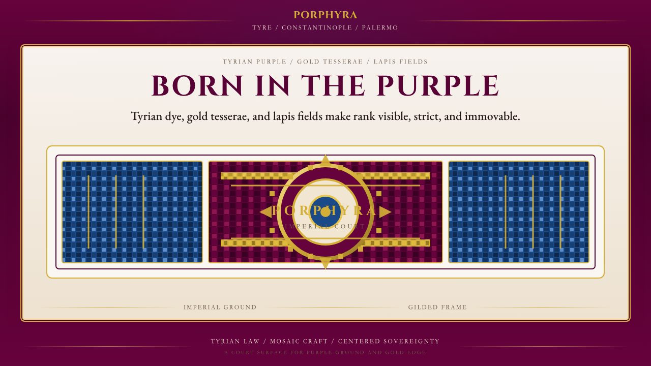 Byzantine Tyrian Purple (Imperial Court)Imperial rank made visible. Tyrian purple, gold tesserae, and centered symmet…帝国权威可见化:泰尔紫、金镶嵌与居中对称。
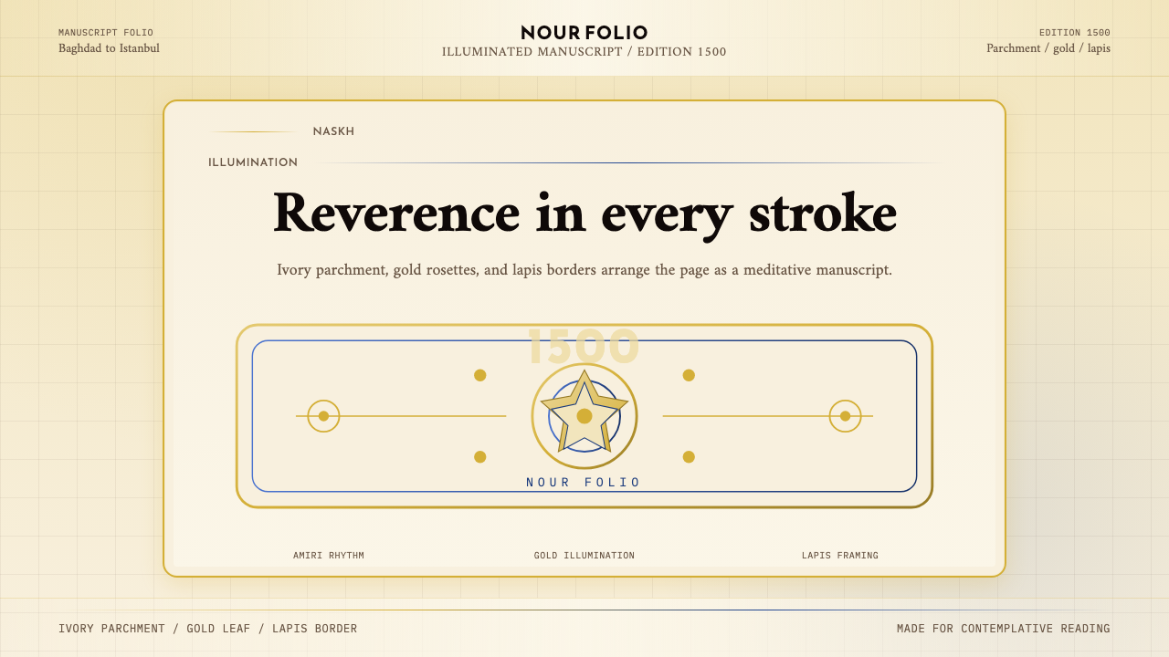 Naskh Quranic (1500)Reverence in every stroke. Ivory parchment, gold rosettes, and lapis framing.每一笔都庄重。象牙纸、金箔花饰与青金石边框。
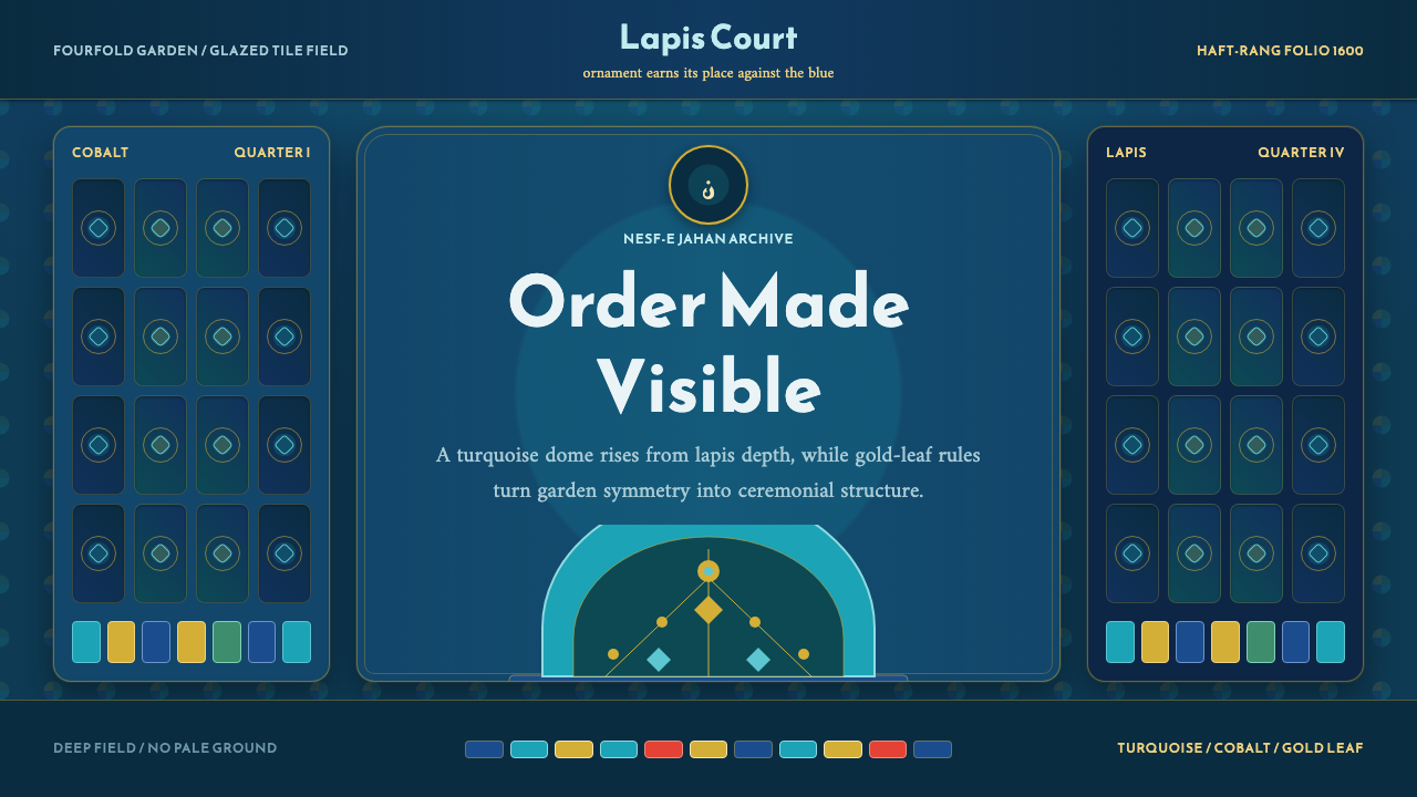 Safavid IsfahanOrnament is order. Turquoise domes and gold rules lock into a deep lapis grid.纹饰即秩序。绿松石穹顶与金线嵌入深青金石网格。
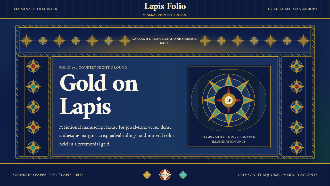 Timurid Manuscript (Herat)Courtly density glows. Lapis ground, Amiri type, and gold jadval geometry hol…宫廷密度在发光。青金石底、金线框与Amiri字体托起手抄本。
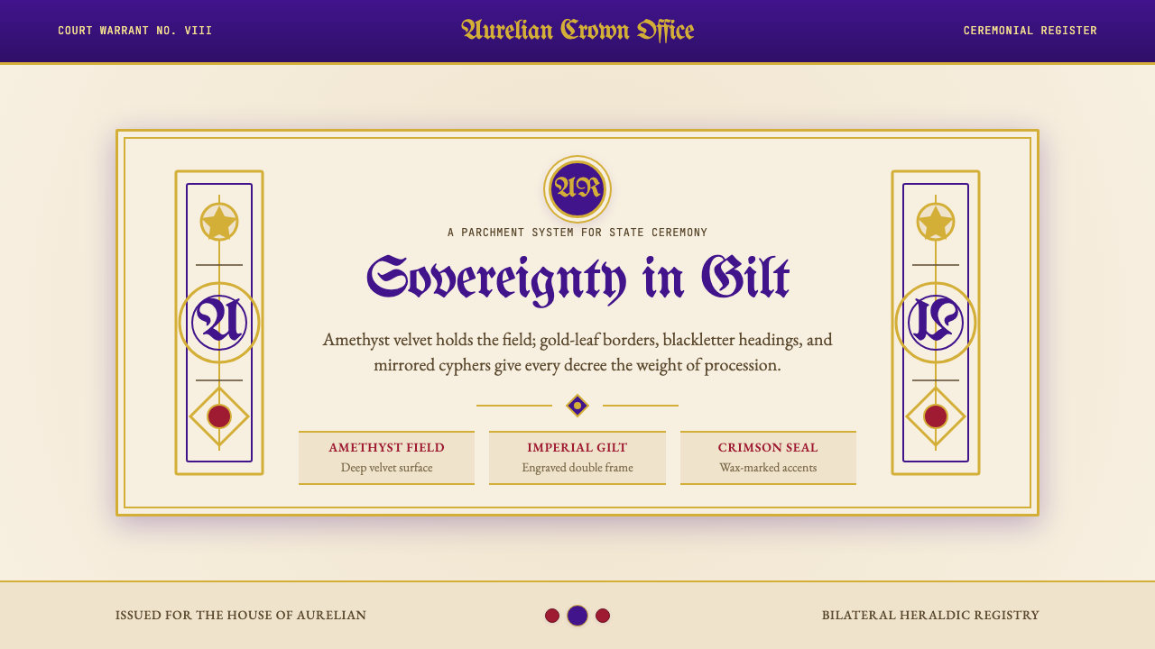 British Royal MonarchyCeremony becomes structure. Amethyst panels, gilt borders, blackletter, mirro…仪式成为结构:紫晶面板、鎏金边框、哥特黑体与镜像纹章。