What is Safavid Isfahan?
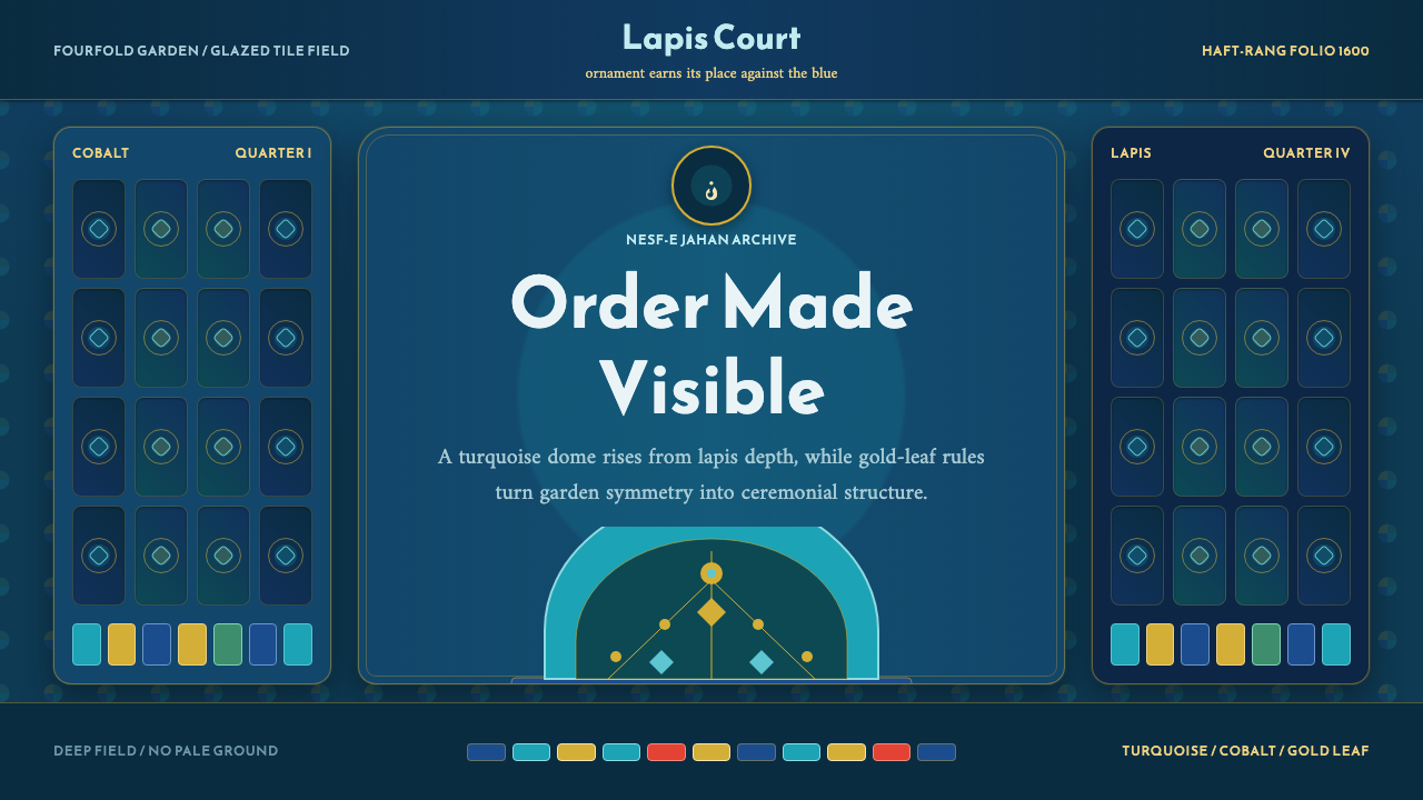
Safavid Isfahan is what happens when an empire decides that ornament itself can be a form of order — turquoise domes locked into a field of deep lapis blue, precise enough that contemporaries called the city half the world.
Safavid Isfahan in brief
Safavid Isfahan is the visual language of the Persian capital that Shah Abbas I rebuilt around the turn of the seventeenth century, a city whose splendor was famous enough in its own time that a Persian proverb declared Isfahan nesf-e jahān — 'Isfahan is half the world.' The system captures the specific chromatic signature of that city's mosques and palaces: a glazed turquoise-cyan dome set against a documented, deep cobalt and ultramarine field, the whole surface laced with gold-leaf arabesque.
Unlike design languages that treat ornament as an optional flourish layered onto a plain structure, this one treats ornament as the structure itself. Every wall, dome, and archway is conceived as a surface to be entirely covered — tessellating geometric star-patterns, calligraphic inscription bands, and vegetal arabesque interlock so tightly that there is no meaningful distinction between 'decoration' and 'architecture.' The pattern does not sit on top of the building; it is how the building is legible at all.
The palette is deliberately dark and jewel-toned throughout — deep lapis and cobalt blues, glazed turquoise, and gold accents — and it never resolves into cream or gold-grounded lightness the way some other historical ornament systems do. This is a system built for depth and richness rather than airiness: every element of ornament has to earn its place against a dense, saturated blue field, which is part of why the visual result feels so controlled despite its intricacy.
Where does Safavid Isfahan come from?
Shah Abbas I came to the throne of the Safavid dynasty in 1588 at a moment of real crisis: the empire was under pressure from Ottoman and Uzbek incursions, and the existing capital, Qazvin, was vulnerable and administratively strained. In 1598, Abbas moved the capital south to Isfahan, a city with better agricultural surroundings, greater distance from hostile borders, and — crucially for his ambitions — enough open land to be rebuilt essentially from scratch around a new civic and religious center.
That new center was Naqsh-e Jahan Square, an immense rectangular plaza that became the literal and symbolic heart of the rebuilt city. Around its perimeter, Abbas commissioned the buildings that define the style today: the Shah Mosque (also known as the Imam Mosque) with its soaring turquoise dome and monumental tiled iwan entrance; the smaller, more intimate Sheikh Lotfollah Mosque, built without minarets as a private royal chapel and famous for the way its interior dome ornament shifts in apparent color as the light changes through the day; and the Ali Qapu palace, from whose upper terrace the court watched polo matches and ceremonies in the square below.
The tilework technique most associated with this era is haft-rang, literally 'seven colors,' a method of painting multiple glaze colors directly onto a single large tile before firing — as opposed to the more labor-intensive earlier technique of cutting and assembling small mosaic fragments of single-fired color. Haft-rang was faster and cheaper to produce at the enormous scale Abbas's building program required, which let Safavid workshops cover entire domes and facades in continuous pattern rather than reserving such treatment for the most prestigious surfaces alone. The technique's efficiency is part of why the aesthetic could become so totalizing: covering every inch was, for the first time, genuinely affordable at imperial scale.
The design vocabulary itself — interlacing geometric star-and-polygon patterns, dense vegetal arabesque, and calligraphic inscription bands, usually in a formal angular or cursive Persian script — draws directly on the refined tradition of Persian miniature painting and manuscript illumination that had flourished at earlier Safavid courts. The same fourfold symmetry that organized the classical Persian charbagh garden, with its cross-axial water channels dividing a rectangular space into four quadrants, also organized architectural plans across the city, linking the decorative surface pattern to a much older and more fundamental Persian sense of ordered, paradisiacal space.
What defines the Safavid Isfahan look?
Ground Color
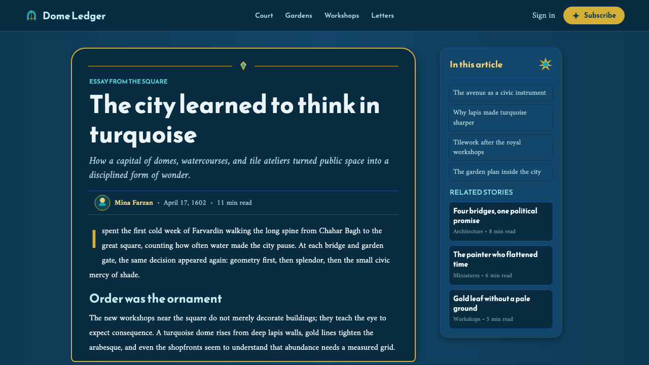
The dominant field color is a deep, saturated lapis or cobalt blue — never a light or pastel blue, and never cream, beige, or white. This dark ground is the constant against which every other color in the system is measured; turquoise, gold, and glaze-white are all understood as accents against this base rather than as equal partners in a balanced palette.
Turquoise Accent
Turquoise-cyan is the system's signature highlight color, most associated with the glazed domes that crown the era's great mosques. It appears as a distinct, glossy-reading color rather than a blue-green blend, and is typically reserved for the most prominent architectural focal points — a dome, a mihrab, a central medallion — rather than spread evenly across a surface.
Gold Line Work
Gold is used sparingly and precisely, as a lining and highlighting color rather than a fill color — tracing the edges of arabesque tendrils, framing inscription bands, and marking the transitions between pattern zones. Gold never dominates a surface the way it might in a gold-grounded ornamental tradition; it is a discipline of edges, not of mass.
Geometric Interlace
Eight- and ten-point star patterns interlock with strapwork bands to form the underlying geometric skeleton of most surfaces. These patterns are mathematically precise and infinitely tileable — they are designed to repeat seamlessly across any scale of surface, from a single tile to an entire dome, without ever revealing a visible seam or restart point.
Calligraphic Bands
Formal Persian and Arabic script, rendered in a strong angular or flowing cursive hand, runs in continuous horizontal or arched bands around domes, portals, and mihrabs. These inscription bands function architecturally as well as decoratively — they frame and separate zones of geometric or floral pattern, giving the eye clear resting lines within an otherwise dense field.
Fourfold Symmetry
Compositions at every scale, from a single tile medallion to a full building plan, tend to organize around a cross-axial, fourfold division — echoing the classical Persian charbagh garden's division of space into four quadrants around a central axis. This symmetry gives even the most visually dense surfaces an underlying legibility and calm.
Total Coverage
There is no meaningful concept of empty or negative space in this system's original architectural context — walls, domes, and archways are conceived to be covered edge to edge. Applied outside architecture, this translates into a design principle of density: a layout in this style should feel deliberately full and richly patterned rather than airy, with negative space treated as a rare, carefully placed exception rather than a default.
Who shaped Safavid Isfahan?
Abbas I ruled the Safavid Empire from 1588 to 1629 and is credited with both stabilizing the empire militarily and rebuilding Isfahan as a showcase capital. His decision to relocate the capital from Qazvin and commission the buildings around Naqsh-e Jahan Square drove the entire architectural and decorative program this style is named for; the scale and speed of his building campaign is part of why the haft-rang tile technique rose to prominence.
Reza Abbasi was the leading court painter of the Safavid era under Shah Abbas I, celebrated for elegant, fluid figure studies and refined manuscript illustration. Though best known for painting rather than architectural tilework, his generation's sophistication in line, color harmony, and compositional balance shaped the broader visual culture from which the tile and calligraphy programs of Isfahan drew their sense of refinement.
Sheikh Bahai (Baha' al-Din al-Amili) was a polymath scholar, theologian, and scientist at the Safavid court who is traditionally credited with contributing to the urban planning and engineering of Isfahan's rebuilt center, including aspects of its water management and the layout of the new city around Naqsh-e Jahan Square. His involvement reflects how the era's building projects drew on scientific as well as artistic expertise.
Traditionally identified as the master builder responsible for the Shah Mosque, one of the two great mosques flanking Naqsh-e Jahan Square, Ali Akbar Isfahani is associated with the structure whose turquoise dome and monumental tiled portal remain the single most recognizable image of this style. Building a dome and portal at this scale, fully covered in interlocking haft-rang tilework, required coordinating architecture and ornament as a single unified discipline rather than sequential trades.
How do you use Safavid Isfahan today?
This style is one of the most demanding historical languages to apply well, because its defining principle — total surface coverage with no meaningful negative space — runs directly against the instinct of most modern design systems, which lean on white space for clarity. Applying it successfully means accepting density as the organizing logic rather than fighting it.
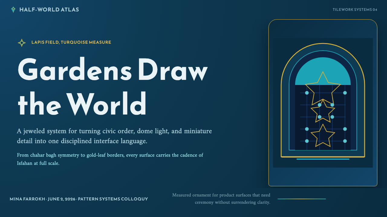
On presentation slide covers, the style reads powerfully when a deep lapis-blue field is treated as the entire canvas and a single turquoise or gold geometric medallion is placed as the visual anchor, with title type set inside or adjacent to that medallion rather than floating independently in empty space. Content slides should use bordered panels — echoing tile boundaries — to organize text blocks, with a thin gold or turquoise rule marking section transitions instead of plain whitespace gaps. Data visualizations translate well as radial or medallion-shaped charts rather than conventional bar charts, since the source material's geometric star patterns are themselves inherently radial.
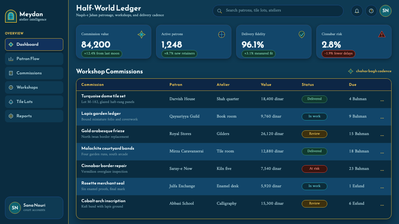
For web interfaces, this palette is well suited to premium, heritage, or cultural-brand positioning — a dark lapis background with turquoise and gold accent states signals richness and permanence rather than urgency. It is a poor fit for information-dense dashboards or utilitarian data tools, where the total-coverage principle would compete with the user's need to scan quickly; it works far better for a landing page, a brand story section, or a product that is itself about craft, heritage, or luxury.
In editorial and marketing work, this style excels at full-bleed section breaks and cover treatments — a deep blue field with a bordered geometric frame around a pull quote, or a gold-lined divider marking a new chapter, both read as intentional and considered rather than merely decorative. Marketing pages benefit from treating a hero section as a single ornamented panel rather than a conventional stacked layout of headline, subhead, and image.
A common mistake is using the turquoise-and-gold palette on a light or cream background, which immediately reads as an entirely different, lighter historical style and loses the jewel-toned depth that defines this one. Another common error is spacing pattern elements out with generous margins, as a Western minimalist instinct would suggest — this style depends on density and interlock, and thinning it out to look 'cleaner' erases the very quality that makes it recognizable.
Safavid Isfahan — FAQ
Is this the same as generic "Islamic geometric pattern" design?
It overlaps but is more specific. Geometric interlace and arabesque are shared across many centuries and regions of Islamic art, but this system is anchored to one particular time, place, and palette: Safavid Isfahan around 1600, with its signature deep lapis-and-cobalt ground, turquoise dome accents, and haft-rang tile technique. A pattern that is geometrically correct but rendered in, say, warm terracotta and cream tones would be drawing on a different regional tradition, even if the underlying star-and-strapwork geometry is similar.
Why is the palette always dark? Wasn't Persian art sometimes light and airy?
Persian visual culture as a whole includes lighter, cream-grounded traditions, particularly in some manuscript illumination and later Qajar-era decorative arts. But the specific architectural signature of Safavid Isfahan's great mosques and palaces is dark and jewel-toned by design — the deep lapis and cobalt ground is what makes the turquoise dome and gold linework read as luminous by contrast. Lightening the ground would flatten that contrast and produce a different, less dramatic effect than the one this style is built to capture.
How much negative space can I add before this stops reading as the style?
Very little. This is one of the least negative-space-tolerant styles in the library, since its defining historical logic is total surface coverage. Introducing generous white or empty margins around a pattern block does not make the style feel more refined — it makes it feel like a diluted reference to the style rather than the style itself. If a layout needs breathing room, it is better achieved by reserving one full section as densely patterned and a separate section as plain type, rather than by thinning the pattern itself.
Can this style work for a light-mode product interface?
Not faithfully as a full-surface treatment, since the dark ground is structural to the palette. A workable compromise is to reserve the dark lapis-and-gold treatment for a specific accent area — a header band, a hero section, a card border — while the surrounding interface stays neutral, rather than attempting to invert the whole system to a light background. Inverting the ground color changes the style's identity more than most other adaptations would.
What role does calligraphy play if I can't use real Persian or Arabic script?
The inscription bands are a structural element of the composition, not just decorative flourish, so removing them entirely leaves a visible gap in the system's logic. Where real script is not appropriate or available, the safest substitute is to preserve the band itself as a continuous horizontal or arched framing device — using placeholder rule lines, abstracted mark-making, or the brand's own typography set in a dense, continuous line — rather than skipping the band and leaving that framing function unaddressed.
Related design styles
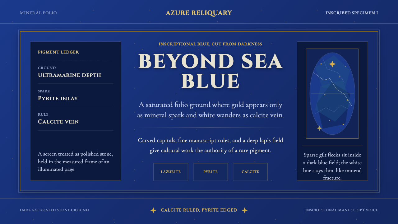 Badakhshan Lapis LazuliStone as manuscript. Ultramarine field, pyrite flecks, calcite veins, carved…
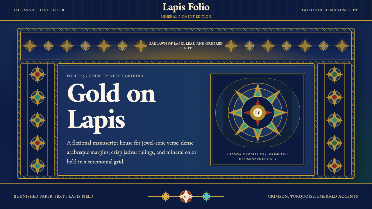 Timurid Manuscript (Herat)Courtly density glows. Lapis ground, Amiri type, and gold jadval geometry hol…
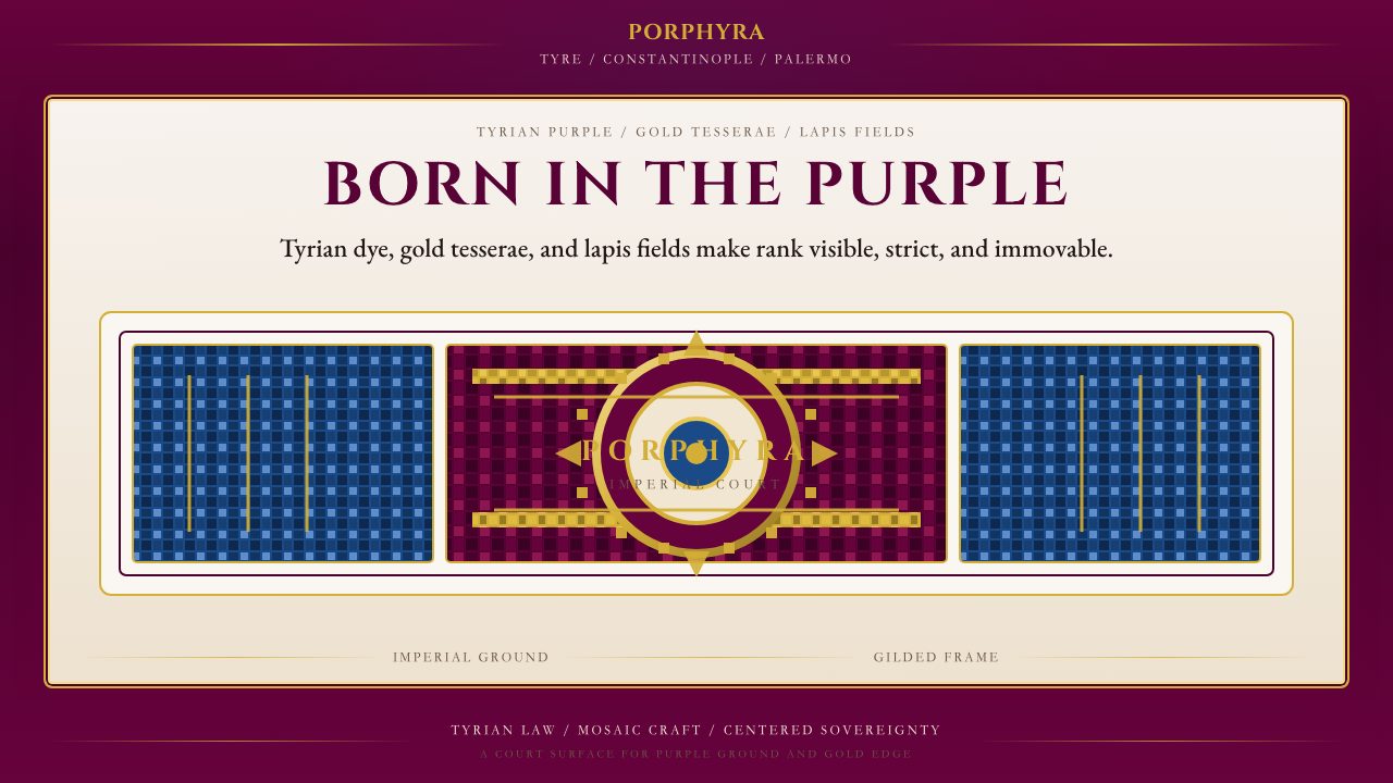 Byzantine Tyrian Purple (Imperial Court)Imperial rank made visible. Tyrian purple, gold tesserae, and centered symmet…
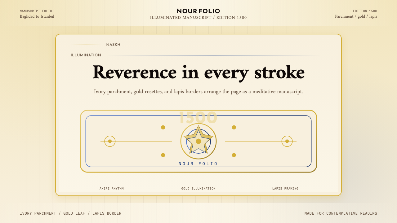 Naskh Quranic (1500)Reverence in every stroke. Ivory parchment, gold rosettes, and lapis framing.
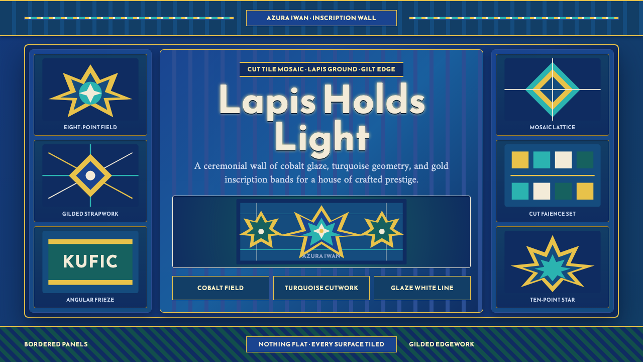 Samarkand TileworkOrnament is the architecture. Lapis panels, gold Kufic bands, and star geomet…
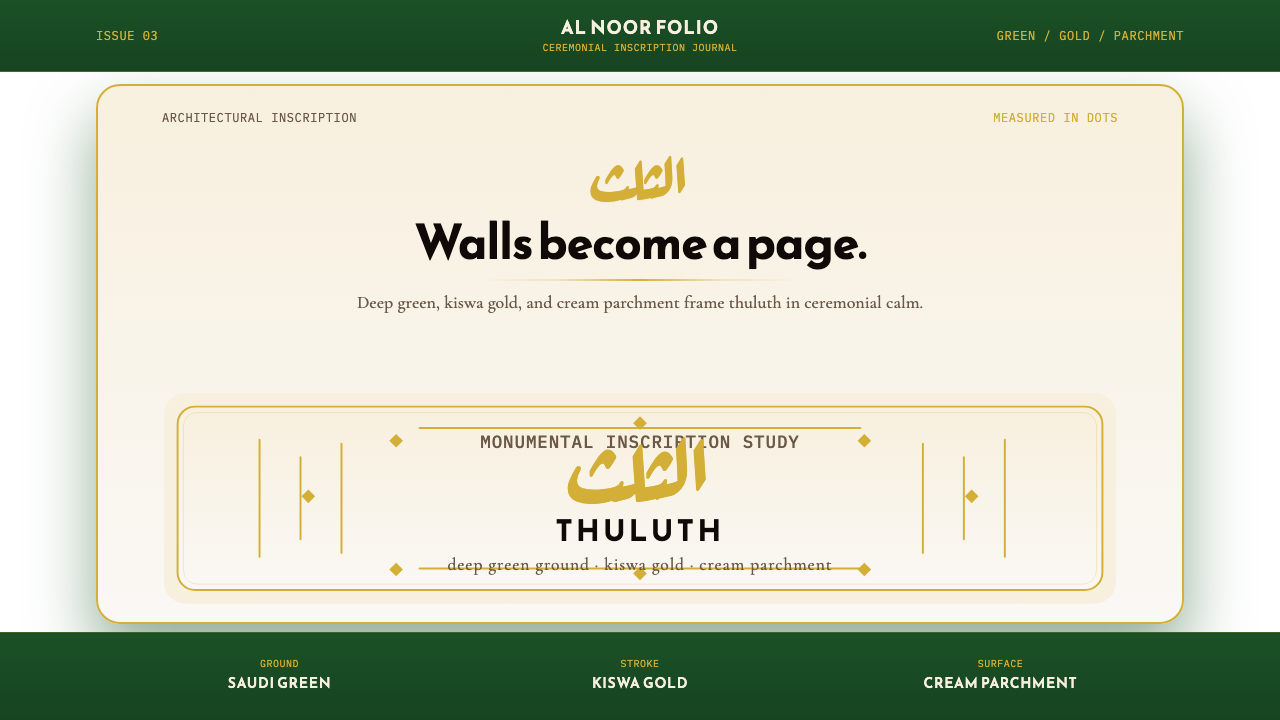 Saudi Thuluth CalligraphyMonumental calm in gold. Deep green, thuluth type, and cream parchment symmet…