What is Medieval Illuminated Manuscript?什么是 Medieval Illuminated Manuscript?
From the Book of Kells to the Très Riches Heures, medieval illuminated manuscripts treated every page as a sacred object — gold leaf, ground lapis, and blackletter script fused into the most labor-intensive book art the world has ever produced.从《凯尔经》到《贝里公爵豪华时祷书》,中世纪泥金手抄本将每一页都视为圣物——金箔、研磨青金石与哥特体书法交融,铸就了人类有史以来最为精工细作的书籍艺术。
Medieval Illuminated Manuscript in briefMedieval Illuminated Manuscript 速览
Medieval illuminated manuscripts are hand-produced books — principally religious texts, Books of Hours, bestiaries, and chronicles — whose pages were adorned with pigments of extraordinary richness: gold and silver leaf, lapis lazuli ground to an intense ultramarine, vermilion extracted from cinnabar, and verdant copper-based greens. The word 'illuminated' refers literally to the way gold leaf catches candlelight, making a page appear to radiate its own inner glow. These were not decorative afterthoughts; the visual program of a manuscript was as theologically intentional as its text.中世纪泥金手抄本是手工制作的书籍——主要涵盖宗教典籍、时祷书、动物寓言集与编年史——其页面以极度丰富的颜料加以装饰:金箔与银箔、研磨成浓郁群青的青金石、从辰砂中提取的朱砂红,以及基于铜绿的翠绿色。「泥金」(illuminated)一词的字面含义,正是金箔在烛光下捕捉光线、令页面仿佛自内发光的那种状态。这些视觉元素绝非事后添加的装饰;手抄本的图像方案与其文字一样,在神学上是经过深思熟虑的。
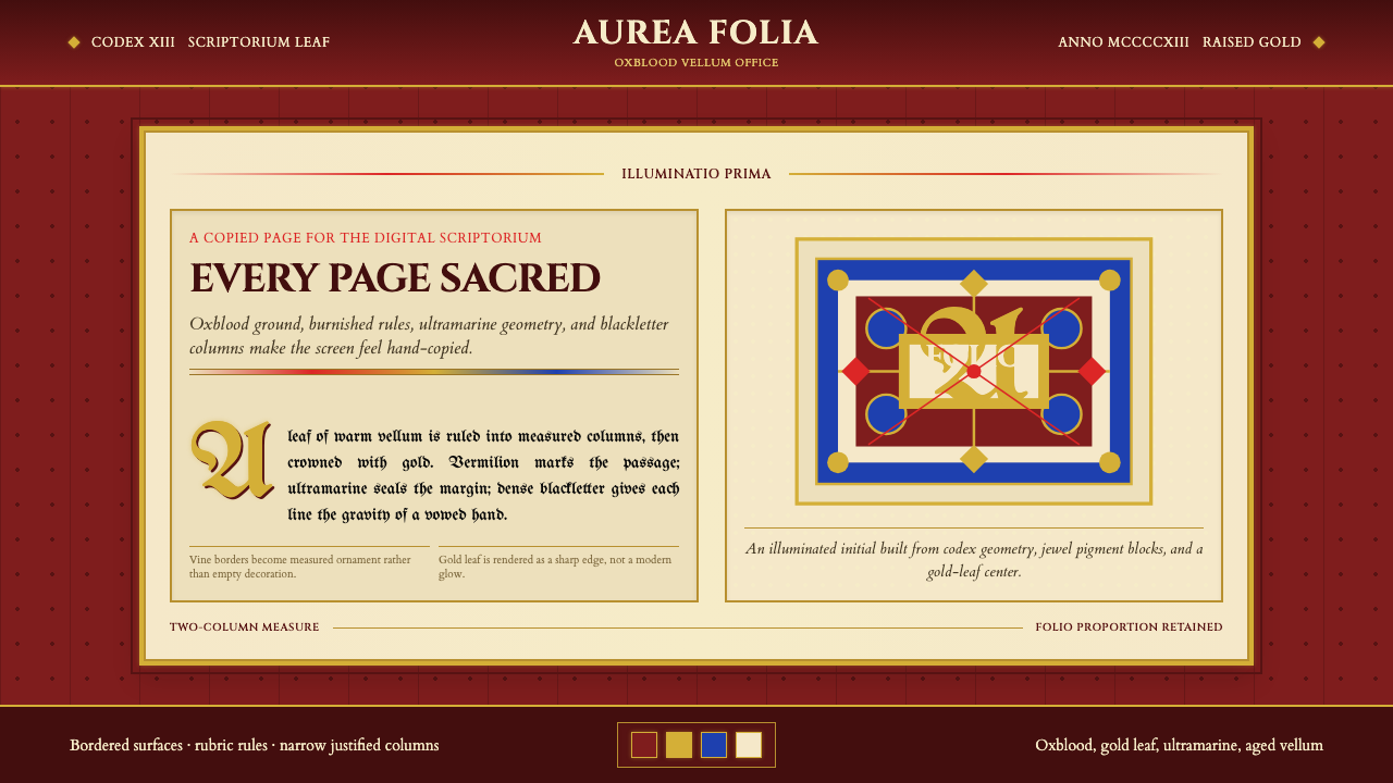
The aesthetic is immediately recognizable. Intricate interlace borders — knotwork patterns of zoomorphic creatures, vines, and geometric ribbons — frame text columns set in dense, compressed blackletter script. Miniature narrative paintings occupy historiated initials and full-page panels. Grounds are rich and saturated: deep oxblood crimson, burnished gold, and night-blue ultramarine dominate. Every surface is treated as space to be filled and honored — negative space as a concept did not exist in this tradition. Hierarchy was communicated through scale, color intensity, and the density of gold application rather than through emptiness.这种美学极易辨认。错综复杂的交织边框——由动物纹样生物、藤蔓与几何丝带构成的绳结图案——框围着以浓密紧凑哥特体书写的文字栏。叙事性微型绘画占据着装饰性首字母与整页图版。底色浓郁而饱和:深沉的牛血红、抛光的金色与夜空般的群青蓝主导一切。每一处表面都被视为需要填充与礼赞的空间——留白作为一种概念,在这一传统中并不存在。层级通过比例大小、色彩强度与金箔涂布的密度来传达,而非通过空旷来体现。
Because a single elaborately decorated folio could require a month of a trained illuminator's labor, manuscripts of this kind were among the most expensive objects in the medieval world. Commissions came from royalty, high clergy, and wealthy lay patrons who understood that the visual splendor of a devotional book was itself an act of piety — an offering of the finest materials and the most skilled craft to the glory of God or the commemoration of the powerful dead.由于一张精心装饰的对开页可能耗费一位训练有素的泥金师整整一个月的劳动,此类手抄本是中世纪世界最昂贵的物品之一。委托制作者来自王室、高级神职人员与富有的俗世赞助人——他们深知,一本祈祷书视觉上的辉煌本身就是一种虔诚行为,是以最上乘的材料与最精湛的工艺,向上帝的荣耀或权贵的追思献上的供奉。
See the Medieval Illuminated Manuscript design system查看 Medieval Illuminated Manuscript 完整设计系统
Where does Medieval Illuminated Manuscript come from?Medieval Illuminated Manuscript 从何而来?
The tradition of decorating manuscripts with pigment and precious metal stretches back to late antiquity, but the form we recognize as illuminated manuscript art reached its first flowering in the monastic scriptoria of Ireland and Northumbria during the 7th and 8th centuries. The Book of Kells — produced around 800, likely at the monastery of Iona before being brought to Kells in Ireland — represents the apex of this Insular tradition. Its carpet pages, full-page compositions of interlaced knotwork of almost hallucinatory complexity, show no precedent in Mediterranean book arts; they derive from metalwork traditions of the Celtic and Germanic peoples translated into an ink-and-pigment medium.以颜料与贵金属装饰手抄本的传统可追溯至晚期古代,但我们所熟悉的泥金手抄本艺术形式,在七至八世纪的爱尔兰与诺森布里亚修道院抄写室中迎来了第一次繁荣。《凯尔经》——约于800年制作,可能出自爱奥那修道院,后被带往爱尔兰的凯尔斯——代表了岛屿传统的巅峰。其「地毯页」,即由交织绳结构成的整页构图,复杂程度几近迷幻,在地中海书籍艺术中找不到任何先例;它们源自凯尔特与日耳曼民族的金属工艺传统,被转译为墨水与颜料的媒介语言。
The Lindisfarne Gospels, produced on the tidal island of Lindisfarne off the Northumbrian coast around 715–720 and attributed to the monk Eadfrith, demonstrate the same Insular ambition at a slightly earlier moment. Eadfrith worked alone, producing a book in which each evangelist portrait, each decorated incipit page, and each cross-carpet page represents a distinct visual program — a total of some 259 folios, of which the illuminated pages still astonish conservators who examine them under magnification and find no evidence of underdrawing, suggesting the patterns were executed directly and with total command.《林迪斯法恩福音书》约于715至720年间制作于诺森布里亚海岸外的潮汐岛林迪斯法恩,归属于僧侣伊德弗里思。它在稍早的时间点展示了同样的岛屿艺术雄心。伊德弗里思独自完成了这部作品,书中每幅福音书作者画像、每页装饰首页与每张十字地毯页,都代表一套独立的视觉方案——全书共约259张对开页,其中泥金页至今仍令文物保护者在放大镜下叹为观止,因为那些图案找不到任何底稿痕迹,说明它们是直接执行的,且驾驭得游刃有余。
The Carolingian Renaissance of the late 8th and early 9th centuries brought a different sensibility to manuscript production. Under Charlemagne and his successors, the court scriptoria at Aachen, Tours, and Reims produced books that fused the Insular interlace tradition with figural representation drawn from late Roman models — producing a new visual synthesis in which classical architectural frames enclose figures that move with some of the weight and gesture of late antique painting. This Carolingian synthesis would feed directly into the Romanesque manuscript tradition of the 11th and 12th centuries.八世纪末至九世纪初的加洛林文艺复兴为手抄本制作带来了截然不同的气质。在查理曼大帝及其继承者的主持下,亚琛、图尔与兰斯的宫廷抄写室将岛屿交织传统与取材于晚期罗马模型的人物表现融为一体,产生了一种新的视觉综合——古典建筑框架围裹着具有晚期古代绘画重量感与姿态感的人物形象。这一加洛林综合体将直接滋养十一至十二世纪的罗曼式手抄本传统。
The Gothic period — roughly the 13th through 15th centuries — saw illuminated manuscript production shift from monastic workshops to urban commercial ateliers employing specialist craftspeople: parchment makers, scribes, rubricators, illuminators of borders, illuminators of miniatures, and gilders, each working on separate campaigns that were later assembled into a single book. The Très Riches Heures du Duc de Berry, commissioned by John, Duke of Berry around 1413 and executed primarily by the Limbourg brothers, represents the summit of International Gothic illumination. Its calendar miniatures depicting the months of the year — peasants laboring in winter fields, aristocrats hawking against summer skies — brought a new naturalism and depth of observation to a tradition that had previously privileged symbolic over representational concerns. The introduction of printing by Gutenberg around 1450 did not immediately end manuscript production; luxury illuminated manuscripts continued to be commissioned well into the early 16th century, when the printed book finally displaced them entirely.哥特时期——大致涵盖十三至十五世纪——见证了泥金手抄本制作从修道院工坊向雇用各专项匠人的城市商业工作室转移:羊皮纸制作者、抄写士、红字师、边框泥金师、微型画泥金师与贴金师,各自分工完成不同阶段,最终汇聚成一册完整的书。《贝里公爵豪华时祷书》由贝里公爵约翰约于1413年委托制作,主要由林堡兄弟执笔,代表了国际哥特风格泥金艺术的顶峰。其描绘一年十二个月的日历微型画——在冬日田野劳作的农民、在夏日天空下放鹰行猎的贵族——为一个此前以象征优先于写实的传统,带来了全新的自然主义观察深度。约1450年古腾堡引入印刷术后,手抄本制作并未立即终结;直到十六世纪初,印刷书籍才最终将其完全取代,在此之前,豪华泥金手抄本的委托制作仍在持续。
What defines the Medieval Illuminated Manuscript look?Medieval Illuminated Manuscript 的视觉特征是什么?
Color色彩
The palette is built from pigments of extraordinary material value: lapis lazuli ground to a deep, luminous ultramarine that no synthetic pigment has fully replicated; vermilion of a warm, slightly orange red; verdigris and malachite-based greens; lead white; and lamp black. These are deployed against grounds of oxblood crimson, burnished gold, or the natural cream of prepared vellum. The color relationships are saturated and jewel-like — there are no neutrals, no muted tones, no deliberate understatement. Every hue is used at its most intense, because these pages were meant to overwhelm the viewer with the evidence of costly material devotion.色板由具有极高材料价值的颜料构成:研磨自青金石的深邃发光群青(至今没有任何合成颜料能完全复制);偏暖、略带橙调的朱砂红;铜绿与孔雀石绿;铅白;以及灯黑。这些颜料铺陈于牛血红、抛光金或天然奶油色羊皮纸底面之上。色彩关系如珠宝般浓烈——没有中性色,没有低调的色调,没有刻意的克制。每一种色相都以其最高强度出现,因为这些页面的目的,就是以昂贵材料虔诚供奉的证据,令观者心生震撼。
Gold Leaf and Gilding金箔与镀金
Gold is not merely a color in illuminated manuscripts — it is a theological statement. Applied as beaten leaf over a raised gesso ground, gold in a manuscript catches and redirects light, creating an effect that is physically different from any painted yellow: it moves as the reader moves, it shines in candlelight, and it signals the divine or the celestial in a way that paint cannot approximate. The quantity of gold used — in borders, in backgrounds, in the halos of saints, in the decorated initials — was a primary measure of a manuscript's value and the patron's devotion.在泥金手抄本中,金不仅仅是一种颜色——它是一种神学声明。以锤打金箔贴覆于凸起的石膏底层,手抄本中的金箔捕捉并重定向光线,产生一种与任何黄色颜料在物理上都截然不同的效果:它随读者的移动而游动,在烛光下发光,以一种颜料无法近似的方式指向神圣与天国。金箔的用量——在边框、背景、圣人光环与装饰首字母中——是衡量一部手抄本价值与赞助人虔诚程度的首要指标。
Interlace and Zoomorphic Ornament交织纹样与动物纹样
The most distinctive ornamental system of the Insular tradition is interlace: continuous ribbon-like bands that weave over and under each other in patterns of almost impossible geometric regularity. In the most complex examples — carpet pages from the Book of Kells or the Lindisfarne Gospels — a single page may contain thousands of individually drawn ribbon segments, each following the over-under rule without a single error visible to the naked eye. Zoomorphic interlace takes the additional step of making the ribbons into elongated animal bodies: birds with extended necks, serpents biting their own tails, dogs whose limbs dissolve into knotwork. These patterns were understood as symbolic — unending, self-referential form signifying the infinite and the divine.岛屿传统最具代表性的装饰体系是交织纹样:连续的丝带状条带以几乎令人难以置信的几何规律性相互穿越编织。在最复杂的案例中——《凯尔经》或《林迪斯法恩福音书》的地毯页——一张页面可能包含数千条单独绘制的丝带段落,每一条都遵循上下穿越的规则,肉眼可见范围内无一错误。动物交织纹样更进一步,将丝带变为细长的动物躯体:伸长脖颈的鸟类、咬住自身尾巴的蛇、四肢溶解为绳结的犬。这些图案被理解为具有象征意义——无尽、自我指涉的形态,象征无限与神圣。
Blackletter Script and Hierarchy of Script哥特体书法与书写层级
The scripts of illuminated manuscripts are themselves visual elements as much as linguistic ones. The formal Carolingian minuscule and its Gothic successors — textualis, rotunda — are scripts of exceptional consistency and density: each letterform is constructed from a small set of strokes repeated with metronomic regularity, producing a page of text that has a strong visual texture, almost like woven fabric. Within a single manuscript, multiple scripts of different formality levels might appear: the most ceremonial hand for liturgical text, a smaller and quicker hand for glosses and commentary, red rubrics marking divisions. This hierarchy of scripts communicates a layered reading experience before the reader has processed a single word.泥金手抄本的书写脚本本身既是视觉元素,也是语言元素。正式的加洛林小写体及其哥特后继者——textualis、rotunda——是一致性与密度极高的书体:每个字母形态由一组有限笔画以节拍器般的规律性重复构成,产生一种具有强烈视觉质感的文字页面,几乎如同织物。在单一手抄本中,可能出现多种正式程度不同的书体:礼仪文本采用最庄重的书法,注释与评语采用较小较快的书手,红字标记段落划分。这种书写层级在读者处理任何一个字词之前,便已传达出一种分层阅读体验。
Historiated Initials and Miniature Painting叙事首字母与微型绘画
Among the most technically demanding features of illuminated manuscripts are historiated initials — decorated letters whose interior spaces contain narrative scenes painted at a scale of sometimes only a few centimeters. The skill required is extraordinary: painters worked with single-hair brushes, their pigments mixed to precise consistencies, producing faces, drapery, and architectural backgrounds in spaces no larger than a thumbnail. Full-page miniatures — independent paintings occupying an entire folio — are painted with an equally fine touch, though at a scale that allows for more compositional ambition. The spatial conventions of these miniatures differ sharply from post-Renaissance painting: figures are hierarchically scaled, not perspectivally proportioned; backgrounds are gold or flat color rather than receding space.泥金手抄本技术要求最高的特征之一,是叙事首字母——装饰字母的内部空间包含着有时仅有数厘米大小的叙事场景绘画。所需技艺极为卓越:画师以单根毛发制成的细笔作画,颜料调配至精确稠度,在不大于拇指盖的空间内描绘人脸、衣褶与建筑背景。整页微型画——占据整张对开页的独立绘画——以同样精细的笔触完成,尽管其尺幅允许更具野心的构图。这些微型画的空间惯例与文艺复兴后的绘画迥然不同:人物依层级比例缩放而非依透视缩短;背景是金色或平涂的颜色,而非退入深处的空间。
Border Ornament and Total Surface Coverage边框装饰与全面覆盖
In the most elaborate manuscripts, every margin is filled: vine-scroll borders carry birds, snails, hybrid creatures, grotesque faces, and tiny genre scenes that comment — sometimes satirically — on the main text. This principle of horror vacui, the filling of all available surface, distinguishes illuminated manuscript aesthetics from nearly every other design tradition. There is no concept of white space as rest or breathing room; every empty area is an opportunity for ornament. The viewer's eye moves continuously across the page, never settling, always finding new detail. This all-over surface activation is one of the most challenging qualities to translate into digital work without producing visual chaos.在最为繁复的手抄本中,每一处页边都被填满:藤卷边框承载着鸟类、蜗牛、混合生物、狰狞面孔与微型风俗场景,有时以讽刺的方式对正文作出回应。这种恐惧留白(horror vacui)——填满所有可用表面的原则——使泥金手抄本的美学与几乎所有其他设计传统区别开来。没有将空白视为休憩或呼吸空间的概念;每一处空旷都是施加装饰的机会。观者的目光在页面上持续游移,从不停歇,总能发现新的细节。这种全面的表面激活,是将泥金手抄本转译为数字作品时最难把握的品质之一,稍有不当便会产生视觉混乱。
Vellum Ground and Material Presence羊皮纸底面与材质感
The physical substrate of a manuscript — vellum prepared from calf, sheep, or goat skin — is not neutral. It has a warm cream or ivory tone, a slight translucency when held to light, and a surface that accepts pigment and gold differently from paper. In design work drawing on this tradition, the material quality of the ground matters: a warm off-white or parchment tone rather than a cold clean white; a surface that feels weighted and precious rather than airy and frictionless. The sense of density and physical presence — the feeling that each page is an object, not a surface — is one of the tradition's most powerful atmospheric qualities.手抄本的物质基底——由牛犊、羊或山羊皮制成的羊皮纸——并非中性。它具有温暖的奶油或象牙色调,在光线下略显半透明,其表面接受颜料与金箔的方式也与纸张不同。在借鉴这一传统的设计作品中,底面的材质品质至关重要:应是温暖的米白或羊皮纸色调,而非冷峻清洁的白色;表面感觉应是沉重而珍贵的,而非轻盈无摩擦的。密度感与实物存在感——每一页都是一件物品而非一个平面的感觉——是这一传统最具感染力的氛围品质之一。
See the Medieval Illuminated Manuscript design system查看 Medieval Illuminated Manuscript 完整设计系统
Who shaped Medieval Illuminated Manuscript?谁塑造了 Medieval Illuminated Manuscript?
Eadfrith became Bishop of Lindisfarne in 698 and is credited by the 10th-century Aldred colophon as the sole creator of the Lindisfarne Gospels, though modern scholarship debates how much of the execution one person could have completed. The book's carpet pages — each a unique geometric and zoomorphic program — suggest not only extraordinary technical skill but a systematic visual intelligence that had internalized the full repertoire of Insular knotwork and could invent within it. Eadfrith represents the monastic illuminator at his most self-sufficient: theologian, scribe, and painter in one person.伊德弗里思于698年成为林迪斯法恩主教。十世纪的阿尔德雷德题记将他记载为《林迪斯法恩福音书》的唯一创作者,尽管现代学界对一个人能独力完成多少工作持保留态度。书中各地毯页——每张都是独一无二的几何与动物纹样方案——不仅显示出非凡的技术功底,更体现出一种系统性的视觉智识,能够将岛屿绳结全部曲目内化于心,并在其中进行创新。伊德弗里思代表着修道院泥金师最自足的形态:神学家、抄写士与画师三位一体。
Pol, Herman, and Johan Limbourg — three brothers from Nijmegen in present-day Netherlands — worked for John, Duke of Berry from around 1405 until their deaths, likely from plague, in 1416. Their masterwork, the Très Riches Heures, remained unfinished at their deaths and at the Duke's death the following year, and was completed by other hands decades later. The Limbourgs brought to manuscript illumination a new attention to observed reality: their calendar miniatures contain accurate depictions of specific chateaux, identifiable constellations, and agricultural practices rendered with an ethnographic precision that has made the manuscript a primary source for historians of medieval material culture. Their figure painting shows awareness of Italian panel painting — particularly the spatial innovations of Siena — absorbed and fused with the jewel-like surface brilliance of the northern tradition.波尔、赫尔曼与约翰·林堡——来自今荷兰奈梅亨的三兄弟——约自1405年起为贝里公爵约翰效力,直至1416年可能因鼠疫去世。他们的杰作《豪华时祷书》在他们去世时尚未完成,翌年公爵辞世后,由其他画师在数十年后续完。林堡兄弟为手抄本泥金艺术带来了对观察现实的全新关注:他们的月份微型画包含对特定城堡、可识别星座与农业劳作的精确描绘,其民族志般的精准性使这部手抄本成为中世纪物质文化史家的主要文献来源。他们的人物画显示出对意大利板上绘画的了解——尤其是锡耶纳的空间创新——并将其与北方传统珠宝般的表面光辉融为一体。
The Book of Kells was produced by an unknown number of artists — modern codicological analysis has identified at least four distinct illuminating hands — working probably at the monastery of Iona on the western coast of Scotland, with the book then brought to the monastery of Kells in County Meath after Viking raids on Iona in the early 9th century. These artists, whose names are entirely lost, produced the most complex ornamental program in the history of Western book art. The Chi-Rho page alone — a monogram of Christ's name — contains interlace, zoomorphic ornament, and hidden figurative detail at a density that rewards microscopic examination: angels, otters, cats, and a human face have been identified by scholars in passages that read as pure abstract pattern to the casual eye.《凯尔经》由数量不详的艺术家共同制作——现代书籍学分析已识别出至少四种不同的泥金画风——可能工作于苏格兰西海岸的爱奥那修道院,书籍随后在九世纪初维京人袭击爱奥那后被带往米斯郡的凯尔斯修道院。这些艺术家的姓名已完全湮没于历史,却留下了西方书籍艺术史上最为复杂的纹样方案。仅Chi-Rho页面——基督圣名的缩写组合——就在一张页面上以令人叹为观止的密度汇聚了交织纹样、动物纹样与隐藏的具象细节,值得用显微镜反复审视:学者们在那些对普通观者而言纯属抽象图案的段落中,辨认出了天使、水獭、猫与一张人脸。
Jean Pucelle was the leading Parisian illuminator of the early 14th century, active roughly between 1310 and 1334. His work in the Book of Hours of Jeanne d'Evreux — a tiny book painted almost entirely in grisaille, a monochromatic grey technique that simulates the appearance of carved ivory — introduced Parisian illumination to the spatial ideas of Italian painting, particularly the architecturally framed interiors of Duccio and Giotto. Pucelle's drolleries — the small grotesque creatures and hybrid figures that populate the borders of his manuscripts — are among the most inventive in the French Gothic tradition, and his integration of marginalia into coherent visual programs that relate to the main text established a standard that later Parisian workshops would follow for generations.让·皮塞尔是十四世纪初巴黎最重要的泥金师,活跃于约1310至1334年间。他在《让娜·德夫勒书》时祷书中的作品——一部几乎完全以灰色单色画(grisaille)绘制、模拟象牙雕刻外观的小型书籍——将意大利绘画的空间理念(尤其是杜乔与乔托以建筑为框架的室内空间)引入巴黎泥金艺术。皮塞尔的滑稽小画——散布于其手抄本边框的小型奇异生物与混合人物——是法国哥特传统中最富创意的作品之一;他将边注整合为与正文相关联的连贯视觉方案,确立了后世几代巴黎工坊所遵循的标准。
The anonymous illuminator known as the Master of the Rohan Hours — named for the Rohan family who owned the manuscript — was active in Paris and possibly Angers in the early 15th century. His style is the most emotionally extreme in the history of French illumination: figures are elongated, angular, and painted with an expressionistic energy that anticipates later Northern European traditions. His full-page miniature of the Dead Man before God — a skeletal figure lying beneath a vast divine presence — is among the most psychologically intense images produced in the manuscript tradition, combining gold-ground formality with a rawness of emotion that sits entirely outside the courtly refinement of his contemporaries the Limbourg brothers.被称为「罗昂时祷书大师」的匿名泥金师——以拥有该手抄本的罗昂家族命名——于十五世纪初活跃于巴黎,可能也在昂热工作。他的风格是法国泥金艺术史上情感最为极端的:人物细长、棱角分明,以一种表现主义的能量描绘,预示着后来的北欧传统。他的整页微型画《上帝面前的死者》——一具骷髅般的躯体仰卧于宏大神圣存在之下——是手抄本传统中心理强度最高的图像之一,将金底格式的庄严与一种完全超出其同时代人林堡兄弟那种宫廷精致风格的原始情感并置融合。
How do you use Medieval Illuminated Manuscript today?今天怎么用 Medieval Illuminated Manuscript?
Applying the illuminated manuscript aesthetic to contemporary design requires understanding what made the originals visually overwhelming — and being selective about which qualities to translate. The full medieval program, applied wholesale, produces visual noise rather than visual richness: every surface covered, every color at maximum saturation, borders competing with content for attention. Successful contemporary applications identify one or two key qualities — the jewel-toned palette, the gold-leaf accent, the interlace border motif, the blackletter typographic weight — and commit to those while exercising restraint everywhere else.将泥金手抄本美学应用于当代设计,需要理解原作在视觉上令人震撼的原因——并有选择性地决定转译哪些品质。将中世纪的完整方案全盘照搬,产生的是视觉噪音而非视觉丰富:每一处表面都被覆盖,每一种颜色都处于最高饱和度,边框与内容争夺注意力。成功的当代应用会识别出一两种关键品质——珠宝色调的色板、金箔装饰、交织边框母题、哥特体的字体分量——并对这些品质全力投入,同时在其他地方保持克制。
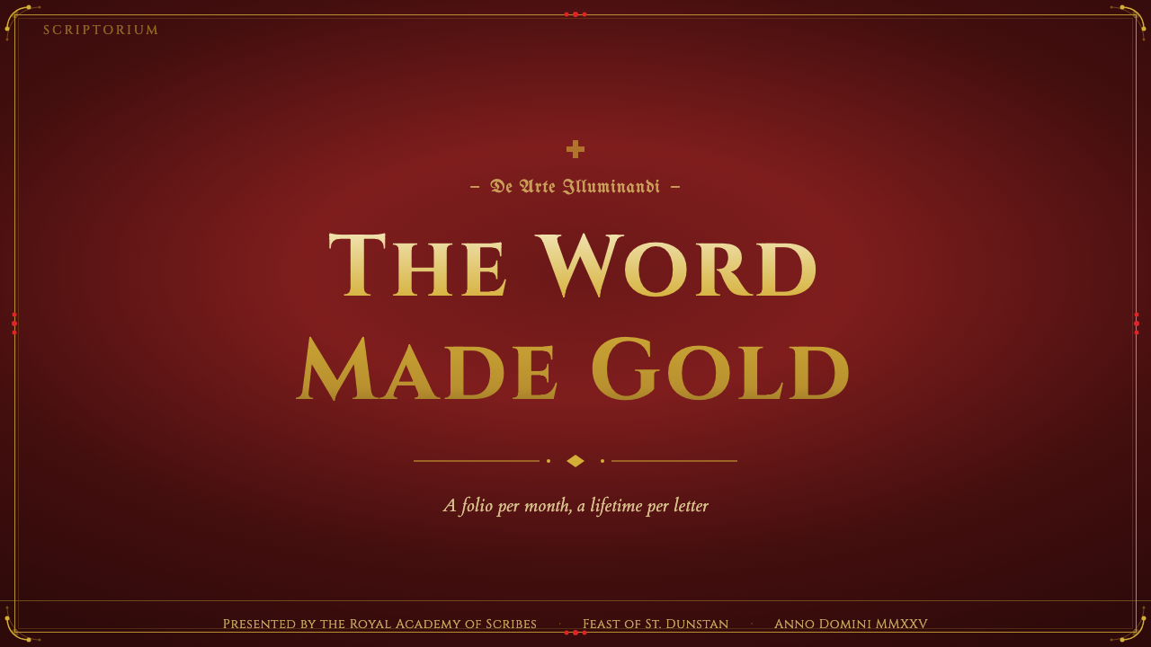
For presentation slides, the manuscript aesthetic works best as a theatrical device. A cover slide can carry the full visual weight: a rich oxblood or ultramarine ground, a single large ornamental motif or border element, a title set in a formal blackletter-influenced typeface, and a restrained gold accent. Content slides should immediately simplify — one key color from the palette used as an accent, a generous ground that reads as parchment-warm rather than cold white, and typographic hierarchy defined by weight and size alone. Data slides in this style work when charts and diagrams are treated as ornamental objects: a bar chart whose bars are filled in the manuscript palette, perhaps with a thin gold rule as axis line, reads as intentional and considered rather than decorated.对于演示文稿,手抄本美学最适合作为戏剧性手段使用。封面幻灯片可以承载完整的视觉分量:浓郁的牛血红或群青底色、一个大型纹样元素或边框、以受哥特体影响的正式字体排版的标题,以及克制的金色强调。内容幻灯片应立即简化——从色板中取一种色作为强调色,一个温暖如羊皮纸而非冷峻白色的底面,以及仅凭字重与字号定义的排版层级。这种风格的数据幻灯片,当图表被视为装饰性对象处理时效果最佳:一张柱状图,其柱条以手抄本色板填充,或许以细金线作为坐标轴,读起来像是有意为之而非堆砌装饰。
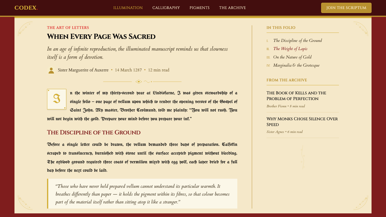
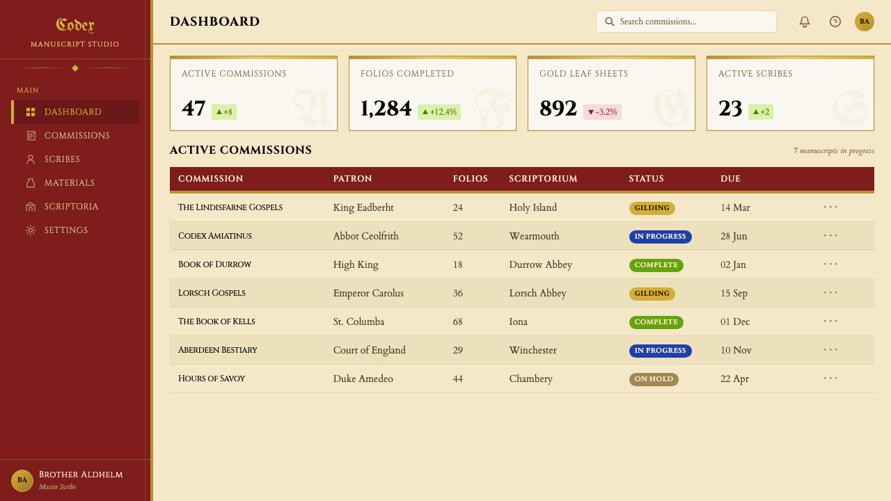
For web interfaces, the manuscript palette and surface richness suit editorial-forward contexts: literary publications, museum collection pages, cultural heritage platforms, premium brand storytelling, and any interface where slowing the reader down is a feature rather than a problem. A dashboard in this style sets a warm parchment-tone background, uses deep oxblood or ultramarine for primary navigation and headers, and applies gold sparingly — as hover states, as decorative rules, as the active indicator in a tab system. Pricing pages can use a tiered architecture where the premium tier is distinguished not by a highlighted border in the conventional sense but by a full gold or deep-color ground that signals material value directly.对于网页界面,手抄本色板与表面丰富性适合以编辑内容为主的场景:文学出版物、博物馆馆藏页面、文化遗产平台、高端品牌叙事,以及任何让读者放慢脚步本身就是特色而非问题的界面。这种风格的仪表板以温暖羊皮纸色调为背景,以深牛血红或群青用于主导航与标题,将金色稀疏运用——作为悬停状态、作为装饰性分割线、作为标签系统中的激活指示符。定价页面可以采用分层架构,高级档次不以惯常意义上的高亮边框区分,而是以整块金色或深色底面直接传达材料价值信号。
For editorial and marketing work, the style supports a sense of occasion and cultural weight that few other aesthetics can match. A magazine feature spread using this vocabulary might open with a full-bleed page in deep ultramarine, set the article title in a letterform with calligraphic weight, and use a narrow interlace border element as a running header marker. Marketing campaigns built on this aesthetic signal exclusivity, craft, and timelessness — appropriate for heritage brands, premium cultural institutions, and any product positioning itself against the disposability of contemporary mass-market design. Social card formats work well with a single dominant color ground, a central image or typographic statement, and a thin ornamental border as the primary compositional frame.对于编辑与营销内容,这种风格所传递的仪式感与文化分量,是其他美学体系难以匹敌的。使用这套视觉语言的杂志专题版面,可能以满版深群青页面开篇,将文章标题排为具有书法笔触分量的字体,以细交织边框元素作为通贯页眉标记。建立于这种美学之上的营销活动传达出独特性、工艺感与永恒性——适合传承品牌、高端文化机构,以及任何将自身定位为对抗当代大众市场设计可抛弃性的产品。社交卡片格式适合以单一主色调底面、一个中心图像或文字声明,加一圈细纹样边框作为主要构图框架来呈现。
A common mistake when working with this aesthetic is confusing richness with legibility. Medieval illuminators could afford to fill every surface because their audience was small, trained, and devotionally motivated — they would spend an hour with a single page. Contemporary audiences are scanning, not studying. The practical rule: keep the full ornamental density for images, covers, and moments of emphasis, but strip the interior of working content pages back to one or two palette colors, generous spacing, and a single typographic hierarchy. The manuscript tradition's greatest lesson for contemporary design is not its density but its conviction — the sense that every visual decision was intentional, considered, and made to honor the material and the reader alike.使用这种美学时最常见的错误,是将丰富感与可读性混为一谈。中世纪泥金师之所以能填满每一处表面,是因为他们的受众数量有限、受过专业训练,且出于虔诚的动机——他们会在一张页面上花费一个小时。当代受众是在扫读,而非研习。实践法则:将完整的纹样密度保留给图像、封面与重点强调的时刻,但将实际内容页面的内部剥离到一两种色板颜色、宽裕的间距与单一的排版层级。手抄本传统对当代设计最大的启示不在于其密度,而在于其信念——每一个视觉决定都是有意而为、深思熟虑的,并且是为了同时礼赞材料与读者而做出的。
See the Medieval Illuminated Manuscript design system查看 Medieval Illuminated Manuscript 完整设计系统
Medieval Illuminated Manuscript — FAQMedieval Illuminated Manuscript · 常见问题
Is this aesthetic appropriate for digital-first products, or does it only work in print?这种美学适合以数字为主的产品吗,还是只适用于印刷品?
It works in digital contexts when applied with restraint. The key challenge is that manuscript richness depends on material qualities — the physical weight of vellum, the movement of gold leaf in light — that digital screens approximate but cannot replicate. Digital work in this aesthetic succeeds when it captures the color relationships (deep jewel tones, warm parchment grounds) and the compositional logic (all-over surface intention, hierarchical scale) rather than trying to simulate the physical materials through texture overlays or fake parchment effects, which tend to read as costume rather than conviction.在克制运用的前提下,它在数字场景中同样有效。关键挑战在于,手抄本的丰富感依赖于实体品质——羊皮纸的物理重量、金箔在光线下的游动——数字屏幕能够近似但无法复制。数字作品在这种美学中成功的关键,在于捕捉色彩关系(浓郁的珠宝色调、温暖的羊皮纸底面)与构图逻辑(有意为之的全面表面处理、层级化的比例缩放),而不是试图通过纹理叠加或假羊皮纸效果来模拟实体材料——后者往往显得像是戏服,而非信念。
How do you balance the tradition's density with modern readability requirements?如何在这一传统的密度与现代可读性需求之间取得平衡?
By treating density as a foreground tool rather than a ground condition. In original manuscripts, density was everywhere because the devotional experience was the point and time was not a constraint. In contemporary work, density should appear where you want to signal importance, occasion, or visual arrest — covers, hero sections, chapter openers, special callouts — while the working body of the content uses the palette and typographic weight of the tradition but with modern spacing logic. The ornamental border, for instance, can frame a section header without filling the entire page margin.方法是将密度视为前景工具,而非背景条件。在原始手抄本中,密度无处不在,因为虔诚的阅读体验本身就是目的,时间不构成约束。在当代作品中,密度应出现在你希望传达重要性、仪式感或视觉冲击的地方——封面、主视觉区、章节开头、特殊引语——而内容正文则使用这一传统的色板与字体分量,但遵循现代的间距逻辑。例如,纹样边框可以框围章节标题,而无需填满整个页面页边。
Can the manuscript style work for secular or commercial brands, or does it feel exclusively religious?手抄本风格能用于世俗或商业品牌吗,还是感觉它专属于宗教场景?
The religious origin does not limit contemporary application. What the tradition communicates is not theology but a set of values: extreme craft, material richness, the sense that what is being presented is worth sustained attention and is irreplaceable. These are values that translate directly to heritage luxury brands, cultural institutions, premium publishing, and any brand positioning itself as handmade, rare, or historically grounded. The aesthetic would be out of place for a mass-market consumer product, but not because it is religious — because it communicates scarcity and deliberateness that contradicts mass-market positioning.宗教起源并不限制当代应用。这一传统所传达的不是神学,而是一套价值观:极致的工艺、材料的丰富性、所呈现之物值得持续关注且无可替代的感觉。这些价值观可以直接转译至传承奢侈品牌、文化机构、高端出版业,以及任何将自身定位为手工制作、稀有或具有历史根基的品牌。这种美学用在大众消费品上会显得格格不入,但原因不是它的宗教性——而是它所传达的稀缺感与刻意感,与大众市场定位相矛盾。
What is the single most common mistake when applying this aesthetic?应用这种美学时最常见的单一错误是什么?
Reaching for a faux-parchment texture as the first move. Texture overlays — simulated aging, vellum grain, ink bleed — are the design equivalent of a costume: they signal the style without embodying its logic. Authentic manuscript aesthetics is not primarily a texture system; it is a color system, a hierarchy system, and an attitude toward surface coverage. Getting the palette right — the specific warmth of an oxblood ground, the depth of an ultramarine, the weight of gold used as accent rather than fill — does more work than any texture overlay. Apply the texture last, if at all, and only to elements where material presence is the specific point.将假羊皮纸纹理作为第一步动作。纹理叠加——模拟的老化、羊皮纸颗粒感、墨水渗化——是设计中戏服的等价物:它们传递出风格的信号,却没有体现其逻辑。真正的手抄本美学首先不是一套纹理系统;它是一套色彩系统、一套层级系统,以及一种对待表面覆盖的态度。把色板做对——牛血红底色的特定温度、群青的深度、金色作为强调而非填充的分量——比任何纹理叠加都更有效。纹理应最后添加(如果确实需要的话),且仅用于实体存在感本身是重点的元素。
How does this style relate to other ornate historical aesthetics like Art Nouveau or Victorian decorative design?这种风格与新艺术运动或维多利亚装饰设计等其他繁复历史美学有何关联?
All three traditions share a commitment to surface decoration and a rejection of plain functionalism, but their ornamental logics are distinct. Art Nouveau derives its forms from organic nature — flowing plant stems, insect wings, the female figure — and uses continuous curved line as its primary generator. Victorian decorative design accumulates historical references eclectically, mixing Gothic, Moorish, Renaissance, and classical motifs in a single object. Illuminated manuscript ornament, by contrast, is geometrically generated: interlace follows strict mathematical rules, and even the zoomorphic elements are built from the same ribbon logic as the abstract knotwork. If Art Nouveau is lyrical and Victorian is encyclopedic, manuscript ornament is architectural — a system of rules generating infinite variation.三种传统都致力于表面装饰,都拒绝朴素的功能主义,但它们的纹样逻辑截然不同。新艺术运动从有机自然中提取形态——流动的植物茎蔓、昆虫翅膀、女性人体——以连续曲线作为主要生成器。维多利亚装饰设计折中地积累历史引用,在单一对象上混合哥特、摩尔、文艺复兴与古典母题。泥金手抄本纹样则相反,是几何生成的:交织纹样遵循严格的数学规则,即便是动物纹样元素,也与抽象绳结建立在同一丝带逻辑之上。如果说新艺术运动是抒情的,维多利亚风格是百科全书式的,那么手抄本纹样就是建筑性的——一套规则系统生成无穷变化。
Related design styles相关设计风格
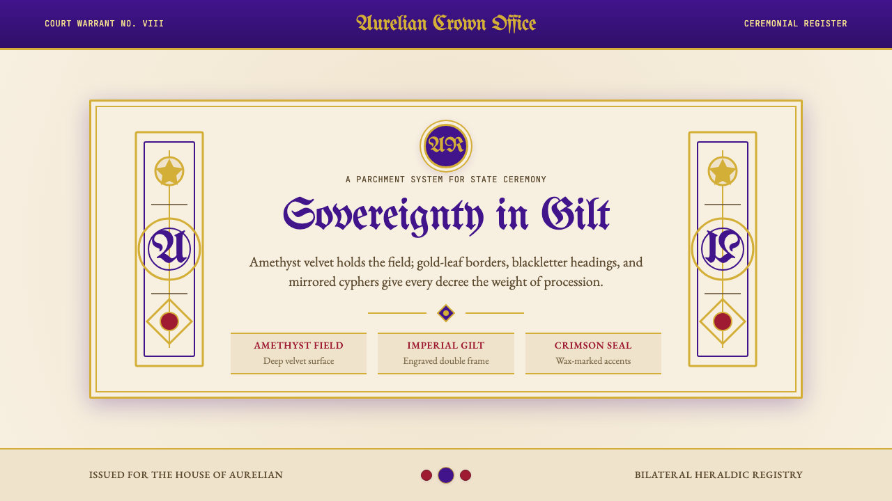 British Royal MonarchyCeremony becomes structure. Amethyst panels, gilt borders, blackletter, mirro…仪式成为结构:紫晶面板、鎏金边框、哥特黑体与镜像纹章。
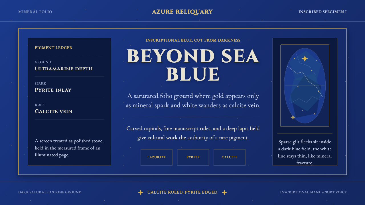 Badakhshan Lapis LazuliStone as manuscript. Ultramarine field, pyrite flecks, calcite veins, carved…以石为页:群青底、黄铁矿金点、方解石纹、铭文大写。
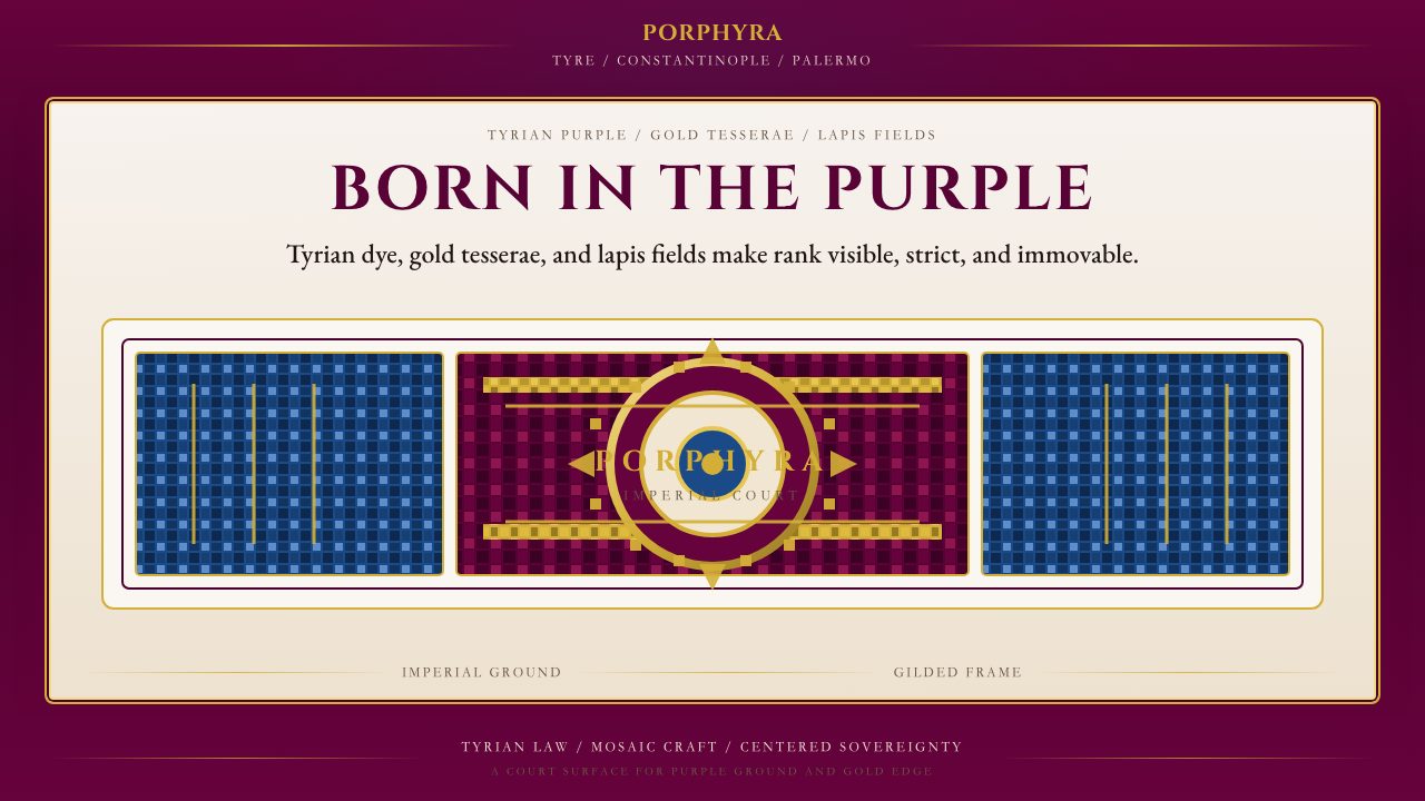 Byzantine Tyrian Purple (Imperial Court)Imperial rank made visible. Tyrian purple, gold tesserae, and centered symmet…帝国权威可见化:泰尔紫、金镶嵌与居中对称。
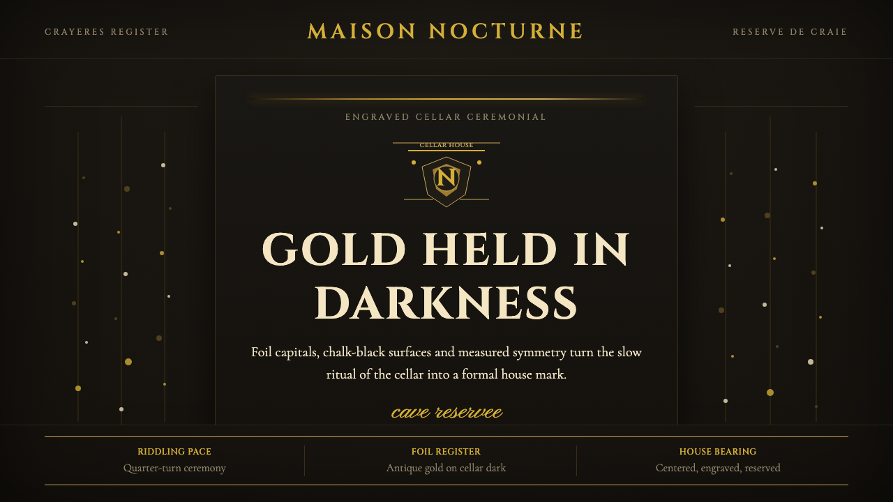 Champagne MaisonGrandeur without glitter. Cinzel capitals and gold foil rules glow in cellar…庄重不闪俗:Cinzel大写与金箔线在地窖黑中发光。
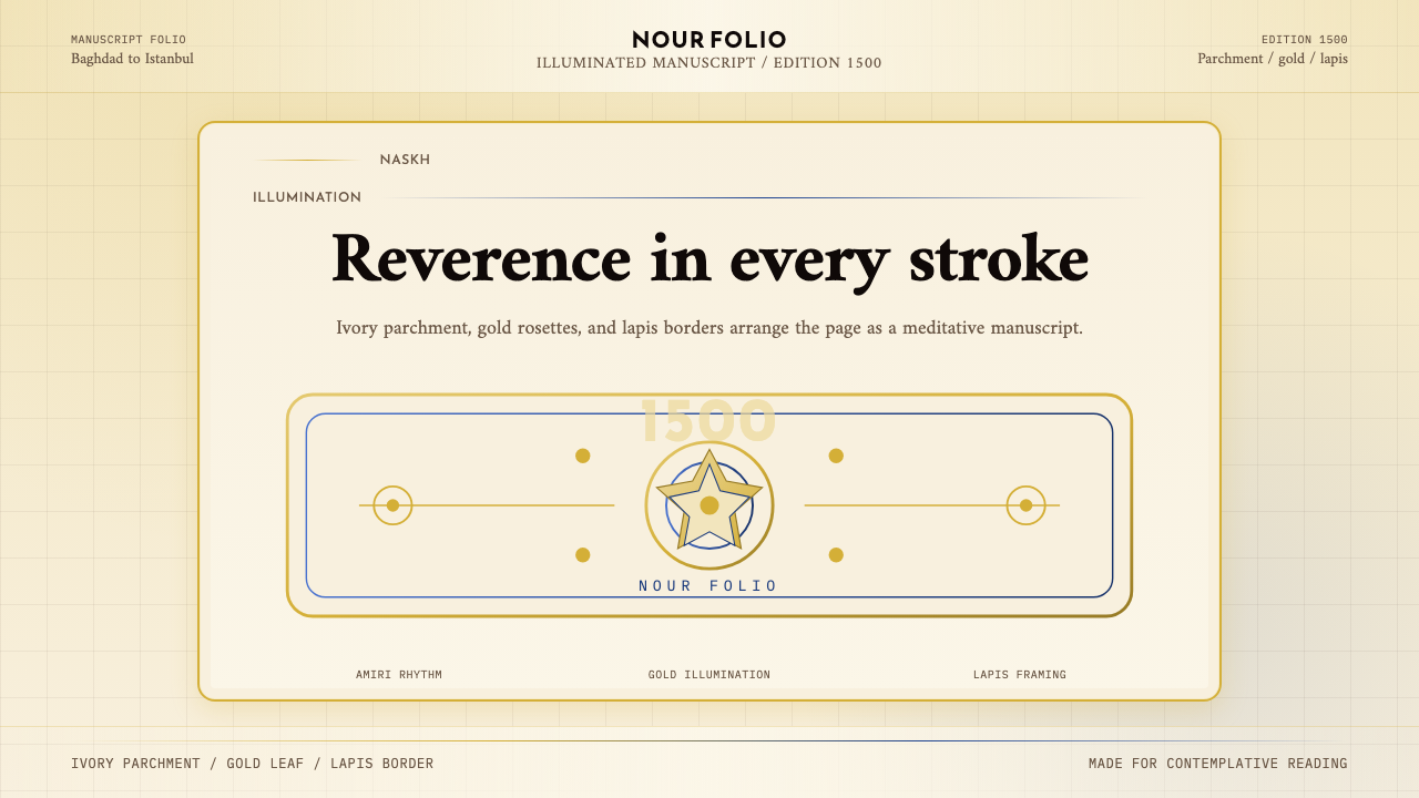 Naskh Quranic (1500)Reverence in every stroke. Ivory parchment, gold rosettes, and lapis framing.每一笔都庄重。象牙纸、金箔花饰与青金石边框。
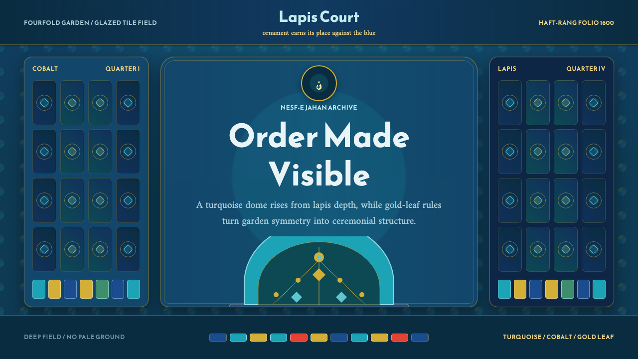 Safavid IsfahanOrnament is order. Turquoise domes and gold rules lock into a deep lapis grid.纹饰即秩序。绿松石穹顶与金线嵌入深青金石网格。