What is Champagne Maison?
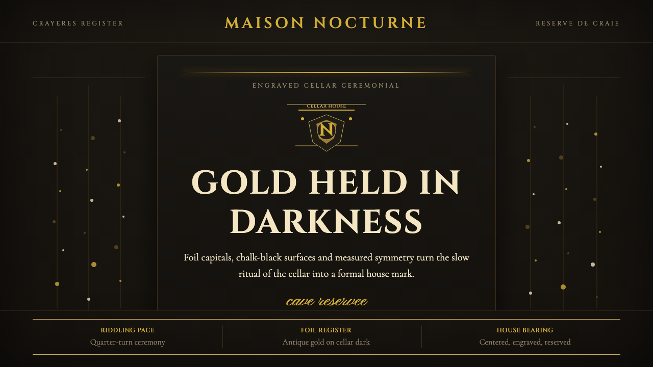
Champagne Maison is the visual language of the grande-marque house — a centuries-old system built on engraved heraldry, gilt capsules, and the solemn darkness of chalk cellars, where ceremony matters more than spectacle.
Champagne Maison in brief
Champagne Maison is a design system rooted in the visual heritage of Champagne's grande maisons — houses like Veuve Clicquot, Krug, Bollinger, and Pol Roger, whose label and packaging traditions stretch back to the eighteenth and nineteenth centuries. The system is defined by embossed coats-of-arms, Didone display type engraved in Roman capitals, gold-foil banding, and the deep, chalk-dark palette of the crayères, the cathedral-like tunnels beneath Reims where millions of bottles rest in riddling racks.
The aesthetic is built on grandeur through restraint rather than grandeur through excess. Where lesser luxury visual systems pile on glitter, reflection, and decorative richness, Champagne Maison achieves its sense of occasion through formal symmetry, weight, and the deliberate slowness of centered compositions. A coat-of-arms centered on a dark field, a gold rule above a Roman-caps logotype, a tissue-wrapped bottle in a black box — each gesture is ceremonial, each line earns its place.
Unlike the maximalist luxury codes of fashion houses or the warm organic textures of artisanal food brands, Champagne Maison reads as institutional and historical. Its authority comes from the depth of time it implies: the engraved line that looks as though it was cut into a copper plate, the capsule foil that catches candlelight in a cellar, the vintage date set in the same letterforms that would have appeared on a nineteenth-century label. The system does not shout; it announces.
Where does Champagne Maison come from?
The visual tradition that underpins Champagne Maison has its roots in the commercial and aristocratic culture of eighteenth-century France. Champagne as a distinct wine category emerged in the late 1600s, but the grande maison model — with its emphasis on consistent house style, branded labels, and prestige packaging — consolidated across the early to mid 1800s. The widow Clicquot's decision to develop the riddling table (pupitre) around 1816, standardizing the clarification process, is emblematic: it was a technical innovation that also carried a visual implication, the vertical rack of bottles becoming a lasting symbol of the méthode champenoise's labor and care.
The engraved label tradition owes a direct debt to heraldic and typographic conventions established centuries earlier. European noble houses had long used coats-of-arms as marks of identity and authentication, and the Champagne houses adopted and adapted this vocabulary, commissioning designs that signaled dynastic continuity and royal warrant. The use of Didone typefaces — with their extreme contrast between thick and thin strokes, derived from late eighteenth-century type designers like Firmin Didot and Giambattista Bodoni — gave the label aesthetic its characteristic blend of elegance and severity. These letterforms were designed to perform under the conditions of fine engraving and letterpress printing, and their high-contrast structure translated naturally into foil stamping and embossing.
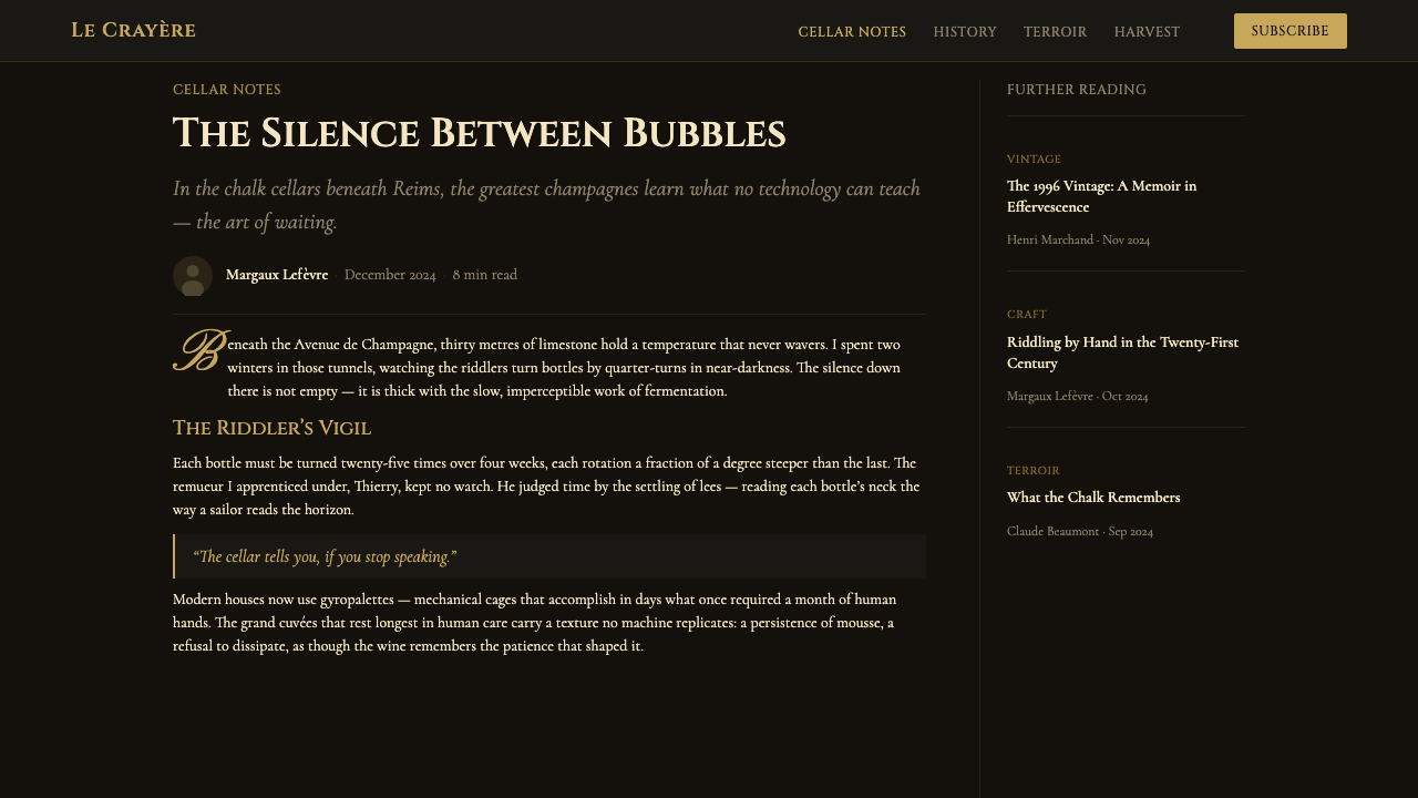
The dark palette of Champagne Maison is inseparable from the physical environment in which Champagne is made and stored. The crayères beneath Reims and Épernay — some dating to Roman quarrying operations, later expanded by the Champagne houses — are cool, dark, and vast. The visual imagery of these spaces (winding chalk tunnels, arched ceilings, rows of bottles in candlelit darkness) has shaped the houses' marketing for well over a century, with Krug and Moët & Chandon among those who have made the cellar's atmosphere central to their brand identity. The deep navy, near-black, and charcoal grounds of classic Champagne labels are not arbitrary luxury choices; they echo the chalk dark of those underground galleries.
By the late nineteenth and early twentieth centuries, the grande maison aesthetic had crystallized into the conventions still recognizable today: centered heraldic crest, gold or cream type on dark ground, gold capsule and foil banding, and an overall formality that distinguished prestige Champagne from other sparkling wines. The postwar decades saw some modernization — simplified crests, cleaner type — but the core grammar remained stable. It is this stability that gives the Champagne Maison visual system its particular authority: it does not feel like a trend. It feels like an institution.
What defines the Champagne Maison look?
Color
The palette is anchored by deep grounds — near-black, dark navy, and the particular charcoal of chalk and candlelight — against which gold, cream, and ivory type and ornament are set. The darkness is not merely aesthetic; it evokes the crayères, the cellar environment central to the Champagne house's identity. Gold functions as the primary accent: not the flat gold of contemporary metallics but an engraved, warm, slightly antiqued gold that reads as precious rather than flashy. Cream and ivory appear as secondary grounds within label panels, softening the formal severity while maintaining the historical register.
Typography
Roman capitals — the engraved, high-contrast letterforms of the Didone tradition — are the defining typographic voice. These letterforms were not chosen for modernity but for authority: they carry the visual weight of official documents, coinage, and aristocratic correspondence. Type is almost always centered, in a hierarchy that moves from a large maison name at the top through vintage date, appellation, and cuvée name, to the fine-print legals at base. Lowercase letterforms, when they appear at all, are subordinate — descriptors and body copy only. Letterspacing in the headline register is generous, giving each capital room to breathe and reinforcing the sense of formal announcement.
Symmetry and Centering
Where Bauhaus and Swiss modernism prize asymmetric balance as a sign of rational dynamism, Champagne Maison insists on strict bilateral symmetry. Everything is centered on a vertical axis: the crest above the maison name above the vintage date above the appellation. This is not compositional laziness but a deliberate invocation of heraldic and ecclesiastical authority — the formal language of proclamations, charters, and diplomas. The composition does not create reading direction; it creates arrival. The eye finds the center and settles there.
Ornament and Heraldry
Champagne Maison is one of the few luxury design systems that treats ornament as structurally legitimate rather than cosmetically applied. Coats-of-arms, crests, laurel borders, engraved vines, and royal warrant badges are not decoration for decoration's sake — they are identity claims and provenance markers, functional in the same way that a hallmark on silverware is functional. The ornament is always formal and heraldic rather than romantic or illustrative. A vine motif appears because vines are the raw material of the product; a crown appears because a warrant has been granted. Every element justifies itself historically.
Foil, Emboss, and Material Ceremony
Champagne Maison's physicality is essential to its meaning. Gold-foil stamping, blind embossing, and the tactile weight of heavy label stock are not finishing touches but core vocabulary. The foil that covers the cork and neck is itself a signal: it must be removed before the bottle can be opened, making its removal a ritual act. In digital translation, this principle becomes the challenge of implying material luxury without actual material — through the use of textures that suggest engraving, type treatments that read as stamped rather than screened, and transitions that have the slowness and deliberateness of a foil peel.
Darkness and Candlelight
The light condition that informs this visual system is not daylight or studio lighting but the low, warm, directional candlelight of the cellar. In this environment, gold reads differently — it has warmth and flicker rather than cold brilliance. Cream separates from near-black with a softness that high-contrast daylight would eliminate. The darkness is deep but not flat; within it, objects glow rather than shine. This is why Champagne Maison palettes are rarely cold or bluish-dark: the reference environment is subterranean and warm. Even in contemporary digital translations, the system tends toward brown-blacks and amber-influenced golds rather than pure black and bright yellow.
Rhythm of Ceremony
Champagne Maison compositions have a vertical rhythm that mirrors the stages of a formal ceremony: entry (the maison name and crest at top), authority (the appellation and vintage), and conclusion (the legals and producer address at base). This rhythm is slow and deliberate — nothing rushes the eye. Wide margins, generous leading between lines, and a resistance to crowding elements together all contribute to an overall sense that what is being communicated is worth lingering over. In motion or interaction design, this translates to deliberate pacing: fades rather than snaps, slow reveals rather than instant appearances.
Who shaped Champagne Maison?
The Benedictine monk at the Abbey of Hautvillers whose work in the late seventeenth century is credited — somewhat mythologically — with developing the méthode champenoise. While historical accounts suggest the role of bubbles in Champagne was more complicated and collective than the founding myth implies, Dom Pérignon's name has been central to the Champagne narrative for centuries, and his portrait appears on labels and in cellar imagery across the region. He represents the archetype of the cellar master: patient, learned, devoted to craft over spectacle.
Widowed in 1805 at age twenty-seven, Barbe-Nicole Ponsardin Clicquot took over the Champagne house that would bear her title as 'the widow' (veuve) and transformed it into one of the world's most recognized luxury brands. Her invention of the riddling table around 1816 — a system of angled wooden racks that allowed sediment to be collected and expelled without disturbing the wine — gave Champagne its modern visual clarity. The distinctive yellow label she introduced became one of the earliest examples of consistent visual brand identity in the wine world, a direct ancestor of the Champagne Maison design logic.
The founder of Krug Champagne in 1843, Joseph Krug was a German-born wine broker who set out to create Champagne of the highest possible quality, regardless of vintage variation. His approach — blending wines from multiple years rather than selling vintage-specific bottles — was radical for its time. The house he founded became synonymous with extreme prestige and correspondingly extreme restraint in its visual identity: the Krug label is dense with engraved text, crests, and fine-ruled borders, and has changed remarkably little over 180 years, making it a near-perfect expression of the Champagne Maison visual system at its most formal.
Founded in 1829 in Aÿ, Bollinger represents the style of Champagne made for the British market — fuller-bodied, more oxidative, more austere in its label design than the lighter, more floral grandes marques. The Bollinger aesthetic is particularly instructive: its label design is spare by Champagne standards (black type, minimal ornament, a small crest) in a way that intensifies rather than diminishes its formality. Bollinger demonstrates that the Champagne Maison visual system can achieve its authority through reduction as much as through accumulation of heraldic elements.
Winston Churchill's favoured Champagne house, Pol Roger holds a particular place in the Champagne visual canon for the black-bordered bottle it released after Churchill's death in 1965 — a mark of mourning that transformed an ordinary packaging convention into an enduring brand signal. The story is a precise illustration of the Champagne Maison system's logic: a formal heraldic convention (mourning borders) adapted into a brand distinction, which then acquired its own layer of historical meaning. Pol Roger's design language is studied and careful, with strong use of the cellar's dark palette and restrained gold detailing.
How do you use Champagne Maison today?
Champagne Maison is a context-specific style: its authority derives from its historical coherence, and that coherence only holds when the formal conventions are maintained consistently. Applying it well means understanding why each element exists — the centered crest signals dynastic continuity, the dark ground signals the cellar, the gold foil signals the uncorking ritual — and preserving those implications rather than decorating with their surface forms.
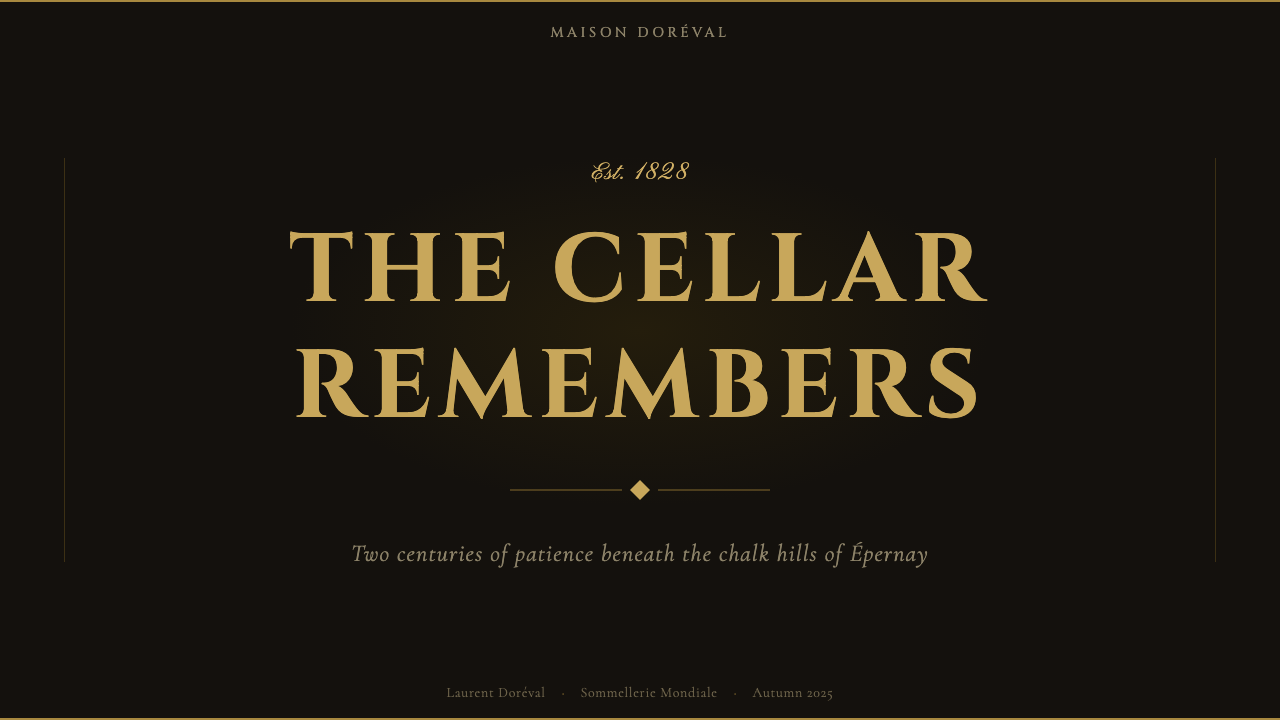
For presentation slides, the style is best suited to covers, section dividers, and high-stakes announcement moments rather than content-heavy information pages. A cover slide in this register uses a single centered crest or logotype at large scale on a near-black ground, with the title in widely letterspaced Roman capitals below it and a fine gold rule separating hierarchy levels. The composition should feel like a proclamation, not a deck. Content slides should strip back to the most restrained version of the system — cream ground, black Didone type, generous whitespace — because the full heraldic treatment overwhelms continuous reading.
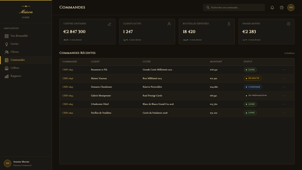
For web and digital UI, the system translates most naturally to prestige landing pages, invitation-only access screens, and premium account tiers where the user experience is meant to feel like receiving a formal welcome rather than onboarding into a product. Navigation should be typographic and minimal; interactive states should use the gold accent sparingly, reserved for primary calls to action. Dark-mode interfaces align well with this system's natural ground color. Avoid using the full heraldic ornament set in UI contexts — a single fine horizontal rule carries the same authority that a full crest border carries in print, without overpowering the interface.
For editorial and marketing work, the style rewards restraint: a feature headline in centered Didone caps with generous letterspacing on a dark ground, a single gold decorative rule, and deep margins does more than any maximalist approach. The most effective marketing application of Champagne Maison is the gift or unboxing context — event invitations, packaging inserts, luxury e-commerce confirmation emails — where the material ceremony of the style directly mirrors the ceremony of the physical object being given or received.
The most common mistake in applying this style is confusing its palette with generic dark luxury. Many dark-background, gold-text designs aspire to Champagne Maison and achieve only hotel-lobby generic. The difference is in the formal grammar: strict vertical symmetry, Roman caps used for their engraved weight rather than for style, gold deployed as a structural line rather than a fill color, and ornament that is heraldic (earned by history) rather than decorative (applied for richness). A design that uses the dark palette but replaces centered symmetry with editorial asymmetry, or swaps Roman caps for a contemporary serif, has left the system entirely — it is luxury design, but not Champagne Maison.
Champagne Maison — FAQ
How is Champagne Maison different from generic luxury design?
Generic luxury design borrows surface signals — dark backgrounds, gold text, thin letterforms — and arranges them in ways that feel premium but lack historical grounding. Champagne Maison is distinguished by its formal grammar: bilateral symmetry rather than editorial asymmetry, Roman engraved capitals rather than contemporary thin serifs, heraldic ornament that references specific traditions rather than decorative flourishes applied for richness, and a color palette derived from a specific physical environment (the chalk cellar) rather than from a general 'luxury' mood. The distinction matters in practice: a designer applying Champagne Maison must make the same formal decisions a label engraver made in 1850, not the same visual choices a modern branding agency makes for a premium product today.
Can this style work for digital products, or is it inherently print and packaging?
Champagne Maison is rooted in print and packaging, but it translates to digital contexts with care. The key is to preserve the formal logic rather than the specific materials. On screen, the engraved quality of Didone type is still perceptible; centered symmetry works as well digitally as in print; dark grounds with warm gold accents render clearly on modern displays. What does not translate directly is the tactile dimension — embossing, foil, paper weight. In digital contexts, these must be implied through typographic weight, deliberate pacing of transitions, and restraint in animation. The style works best in prestige digital contexts (premium onboarding, luxury e-commerce, invitation systems) where the slower, more ceremonial pace of the design matches the experience being designed.
Is the gold in this system always warm, or does cool gold work?
The reference gold of Champagne Maison is warm — derived from the candlelight conditions of the cellar rather than from contemporary metallic design conventions. Cool or greenish gold tends to read as corporate rather than ceremonial, and bright yellow-gold can veer toward generic luxury rather than aged-metal richness. The most authentic register is a slightly amber-influenced, warm gold that has some of the quality of antique engraving: it looks like it has been on the label for decades rather than applied at a digital workstation. In practice, this means avoiding pure-yellow-spectrum gold and working instead in the range of aged foil, antique coin, or warm candlelight reflection.
Does Champagne Maison work for non-beverage brands?
Yes, but with an important caveat: the style carries strong associations with French luxury, aristocratic lineage, and the specific ceremony of uncorking. When applied to a non-beverage brand, these associations travel with it. For a luxury hospitality brand, a private members club, a heritage fashion house, or a prestige financial institution, those associations are assets — they signal age, exclusivity, and cultural capital. For a technology product, a consumer app, or a brand positioning itself on democratized access, those same associations become liabilities. The style's power comes from the weight of what it implies; that weight can anchor a brand or sink it, depending entirely on whether the brand has earned the implications.
What is the most important single principle to get right when using this style?
Symmetry. The entire Champagne Maison system is organized around a central vertical axis, and departing from it — even subtly — shifts the register from ceremonial to editorial, from institutional to contemporary. Every other element (dark ground, gold foil reference, Roman caps, heraldic ornament) can be present in a design and still fail if the composition is asymmetric. Conversely, a very sparse design — just a centered crest, a maison name in widely spaced Roman caps, and a fine rule — achieves full Champagne Maison authority through symmetry alone. When in doubt, center everything, let the vertical axis do the work, and resist the contemporary instinct toward dynamic asymmetric balance.
Related design styles
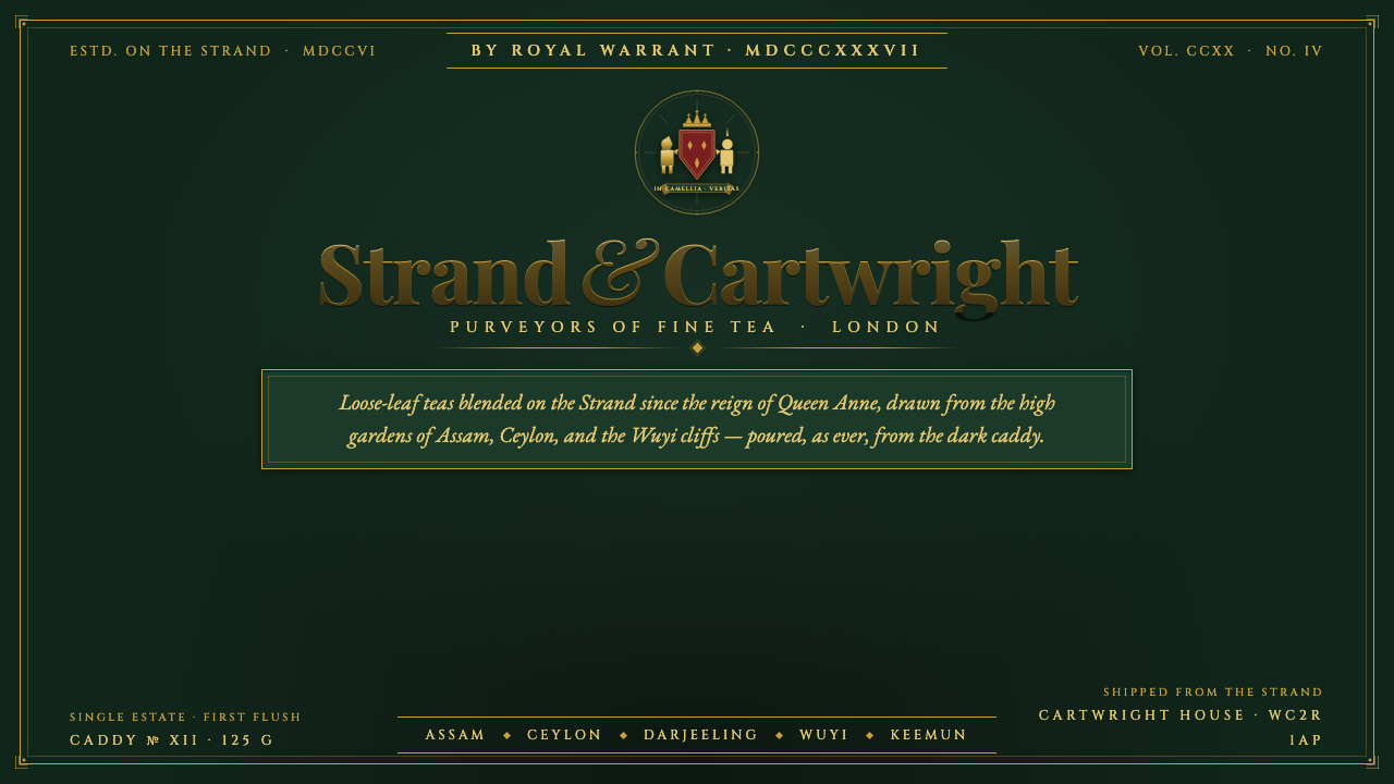 Tea TinThree centuries of caddy luxe. Matte gilt serifs and a heraldic crest on dark…
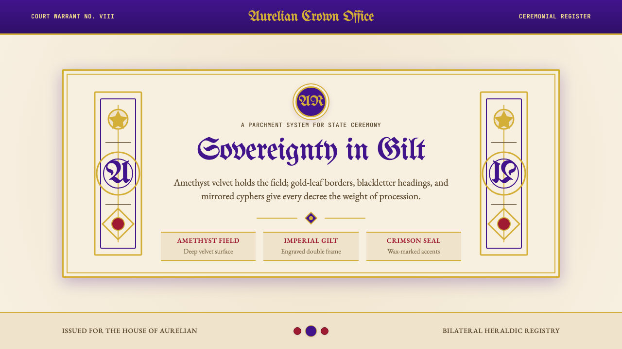 British Royal MonarchyCeremony becomes structure. Amethyst panels, gilt borders, blackletter, mirro…
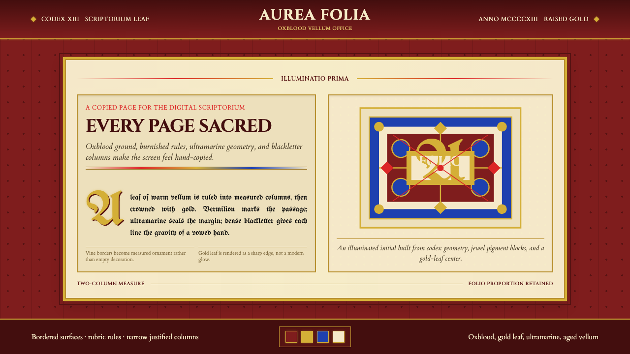 Medieval Illuminated ManuscriptTreats every page as sacred. Oxblood vellum, Cinzel capitals, gold-rule borde…
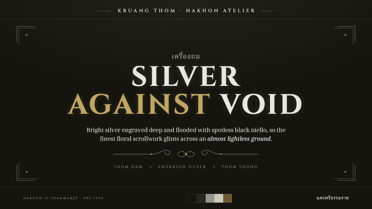 Thai NiellowareSpotless black, one bright line. Silver scrollwork engraved into near-lightle…
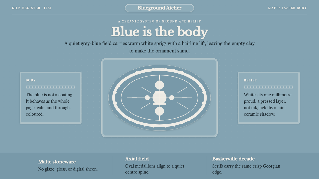 Wedgwood JasperwareMatte authority. Blue-grey clay ground carries raised white Baskerville relie…
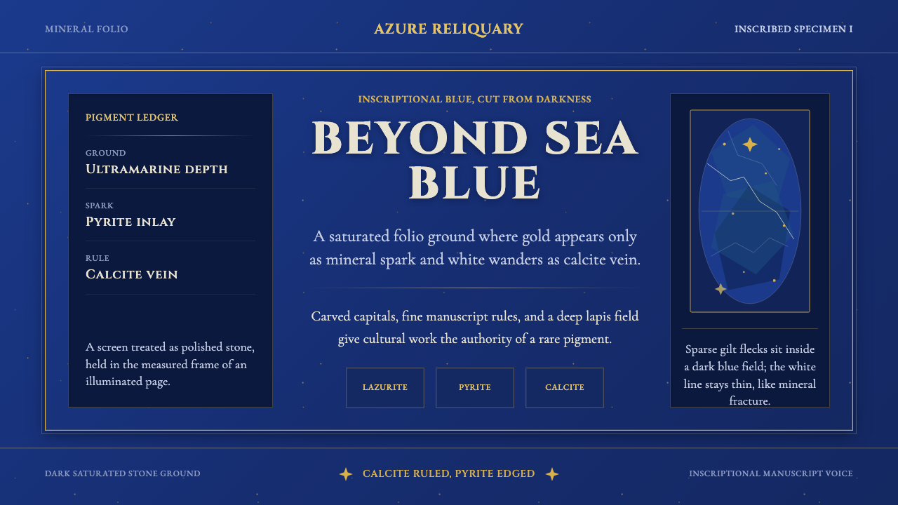 Badakhshan Lapis LazuliStone as manuscript. Ultramarine field, pyrite flecks, calcite veins, carved…