What is Samarkand Tilework?
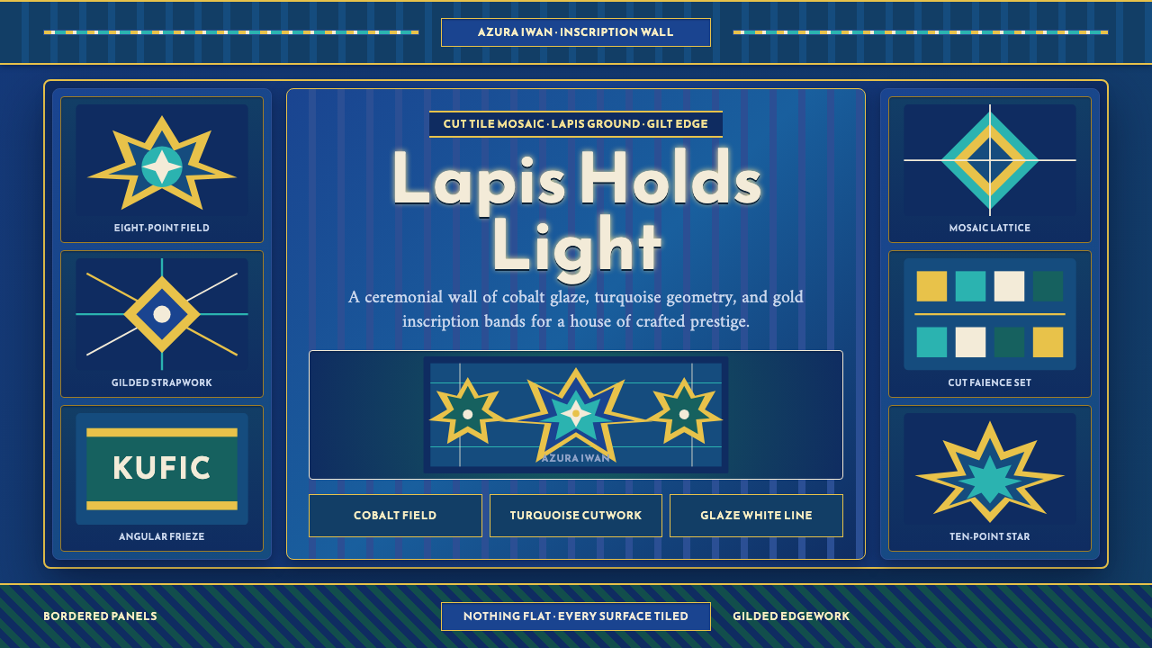
Samarkand Tilework treats ornament as architecture itself — every wall of the Shah-i-Zinda necropolis is a saturated lapis panel, cut and pieced together until the building and its pattern become the same object.
Samarkand Tilework in brief
Samarkand Tilework takes its surface language from Shah-i-Zinda, the 'Living King' necropolis in Samarkand whose Timurid-era mausoleums, built mainly across the fourteenth and fifteenth centuries, are sheathed floor to dome in deep cobalt faience-mosaic. Unlike a design system that reserves ornament for accents or highlights, this one treats the entire visible surface as a canvas that must be covered: the page itself is imagined as a tiled wall.
The core visual unit is the cut and pieced tile fragment, assembled into eight- and ten-point star patterns, interlacing strapwork bands, and angular Kufic inscription friezes, rendered in a tight palette of turquoise, gold, and glaze-white against a saturated lapis ground. Nothing sits alone; every star interlocks with the strapwork around it, every inscription band frames a field of geometric pattern, and every border reads as a strip of cut mosaic rather than a plain structural line.
Density is the whole point. Borders are mosaic, headers are inscription bands, highlights are gilded edges catching light against the blue — there is no equivalent of a plain, empty background anywhere in the source material. A designer applying this style is not choosing how much ornament to add; the entire discipline is about how to organize a surface that is, by definition, completely full.
Where does Samarkand Tilework come from?
Shah-i-Zinda's name refers to a legend that Qusam ibn Abbas, a cousin of the Prophet Muhammad said to have brought Islam to the region, still lives on within the site rather than having died there — the 'Living King' whose presence sanctified the ground and made it an especially favored place for later Timurid rulers to build royal mausoleums nearby. Over time, the site grew into a dense corridor of tomb structures built up along a narrow processional walkway, each competing in surface richness with its neighbors.
The dynasty responsible for most of the surviving structures was founded by Timur, known in the West as Tamerlane, who built a Central Asian empire centered on Samarkand in the late fourteenth century and made the city his capital. Timur's conquests brought craftsmen, including skilled tile-cutters, from across his vast territory back to Samarkand, concentrating an unusual density of technical expertise in one place and fueling an extraordinarily ambitious building program under his patronage and that of his successors.
Several of the most richly decorated mausoleums at Shah-i-Zinda were commissioned by women of Timur's family rather than by Timur himself — most notably Tuman Aqa, one of Timur's wives, who sponsored construction there in the early fifteenth century. Later, Timur's grandson Ulugh Beg, better remembered today as an astronomer who built one of the era's most sophisticated observatories, also continued patronage of building and scholarship in Samarkand, reflecting how the Timurid court treated architectural and scientific ambition as closely related pursuits.
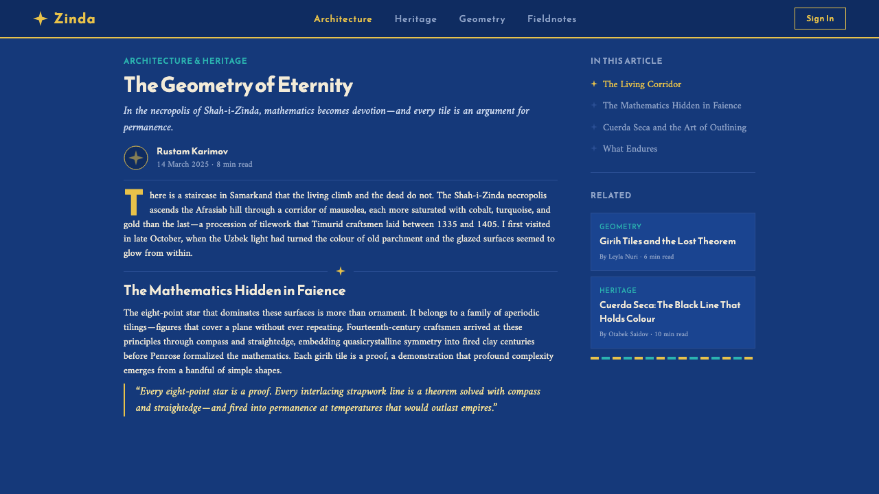
The technical backbone of the site's ornament is the work of master tile-cutters, known in the regional craft tradition as kashi-tarosh, who practiced a labor-intensive cut-tile mosaic technique: rather than painting multiple colors onto a single fired tile, as later Safavid workshops would do more efficiently, Timurid craftsmen fired tiles in single, saturated colors and then cut each one into small precise shapes by hand, assembling the fragments like a jigsaw into the star-and-strapwork patterns that cover the walls. A related technique, cuerda seca ('dry cord'), used a greasy resist line to keep adjacent glaze colors from bleeding into one another during firing, allowing several colors to be fired together on a single tile without the older piece-by-piece assembly. The underlying geometric system organizing all of this — known as girih — is a rigorous method for constructing interlocking star-and-polygon patterns using a small set of standard tile shapes, letting craftsmen generate immensely complex-looking designs from a disciplined, repeatable geometric method rather than freehand invention.
What defines the Samarkand Tilework look?
Saturated Lapis Ground
The dominant field color is a deep, saturated cobalt or lapis blue that covers essentially the entire visible surface. It is not a background in the sense of empty space — it is itself a fully worked field, densely patterned rather than left plain, and every other color in the system is understood as sitting on top of it.
Cut-Mosaic Texture
Surfaces should read as assembled from small, precisely cut, single-color pieces fitted together, rather than as a single continuous painted or printed field. This gives even large areas of pattern a faint, deliberate seam-and-joint quality — a sense that the surface was pieced together rather than laid down in one pass.
Star-and-Strapwork Geometry
Eight- and ten-point star patterns, generated through the girih system of interlocking standard tile shapes, form the primary geometric skeleton, connected by ribbon-like strapwork bands that weave over and under one another. This interlace should feel mathematically disciplined and infinitely repeatable, never arbitrary or freehand.
Angular Kufic Bands
Inscription bands use a strong, angular, geometric script style (Kufic) rather than a flowing cursive hand, running as horizontal or arched friezes that function structurally as headers, framing devices, or section dividers within a densely patterned surface.
Turquoise and Gold Accent
Turquoise and gold are used as the two principal accent colors against the lapis ground, with gold specifically reserved for edging and highlight work — tracing borders and catching implied light — rather than for large fill areas. Turquoise, by contrast, can occupy somewhat larger fields within the star-and-strapwork pattern.
Total Surface Density
There is no equivalent of plain negative space anywhere in this system's source material — walls, domes, and borders alike are conceived to be completely covered. A layout in this style should feel deliberately dense and richly patterned throughout, treating any area of true emptiness as a significant exception rather than a default resting point.
Panel Logic
Every discrete surface — a wall section, a border, a header — is treated as its own bounded tile panel with a defined edge, rather than as part of one continuous, unbroken field. This panel-based structure gives an otherwise overwhelming density an underlying organizational clarity: dense, but never disorganized.

Who shaped Samarkand Tilework?
Timur founded the Timurid Empire in the late fourteenth century and made Samarkand his capital, drawing craftsmen from across his conquered territories into the city and concentrating the technical expertise that made the era's ambitious tile-mosaic building program possible. His patronage set the political and material conditions from which the Shah-i-Zinda complex's surviving structures grew.
Tuman Aqa, one of Timur's wives, sponsored construction of some of the most richly decorated mausoleums at Shah-i-Zinda in the early fifteenth century. Her patronage is a reminder that many of the site's finest surviving surfaces were commissioned by women of the Timurid court rather than by the dynasty's male rulers alone.
Ulugh Beg, Timur's grandson, is best known today as an astronomer who built a major observatory in Samarkand, but he also continued the family's architectural patronage in the city. His dual identity as scientist and builder reflects how the Timurid court treated rigorous, systematic knowledge — whether astronomical or geometric — as a unifying value across disciplines, a value visible in the mathematically precise girih patterns covering the mausoleum walls.
The kashi-tarosh were the specialized craftsmen responsible for cutting single-fired, single-color tiles into the precise small fragments assembled into Shah-i-Zinda's star-and-strapwork mosaics. Their labor-intensive technique, distinct from the faster painted-glaze methods that would later dominate Safavid workshops, is why the surfaces carry the faint, deliberate seam-and-joint texture that distinguishes this style from smoother, single-fired tile traditions.
How do you use Samarkand Tilework today?
This style asks a designer to abandon the instinct to reserve ornament for special moments and instead treat density and full coverage as the default state of any surface — the discipline is organizing complexity, not adding it sparingly.
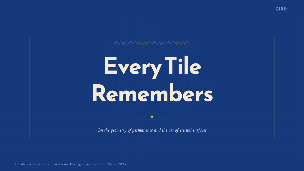
On presentation slide covers, the style works well when a saturated lapis field is treated as a fully patterned panel from edge to edge, with title type set inside a bordered inscription-band area rather than floating freely. Content slides should use bordered, mosaic-edged panels to organize every block of text, since a plain unbordered text block reads as unfinished in this system; data visualizations translate well into radial, star-shaped, or medallion charts that echo the underlying girih geometry rather than conventional bar or line charts.
For web interfaces, this palette is best suited to premium, heritage, or culturally rich brand positioning rather than utilitarian tools — a dashboard or data-dense product would struggle to accommodate the total-coverage principle without becoming difficult to scan. It performs best in a landing page, a brand story section, or a product whose subject matter is itself about craft, history, or luxury, where density reads as richness rather than clutter.
In editorial and marketing work, this style supports dramatic full-bleed section breaks and cover treatments: a densely patterned lapis field bordered by a strip of Kufic-style lettering reads as a considered chapter marker rather than mere decoration. Pull quotes work well set inside a bordered medallion or star-shaped frame rather than a plain rectangular callout box.
A common mistake is applying the turquoise-and-gold color palette to a light, sparsely patterned layout with generous white space — this immediately reads as a lighter, unrelated historical style and loses the density that defines this one. Another common error is treating the star-and-strapwork geometry as a single decorative motif to be used once, rather than as a repeating, tileable system meant to cover an entire surface continuously.
Samarkand Tilework — FAQ
How is this different from the Safavid Isfahan tile style?
The two share a deep lapis-and-turquoise-and-gold color family and a Persianate geometric tradition, but they differ in era, technique, and texture. This style is anchored to the earlier Timurid period and the cut-tile mosaic technique, in which single-color tiles were fired separately and hand-cut into small pieces before assembly — giving surfaces a faint seam-and-joint texture. The Safavid style, roughly two centuries later, relied more on the faster haft-rang technique of painting multiple glaze colors onto a single large tile before firing, producing a smoother, more continuous surface. Kufic angular script also features more prominently here, compared to the more flowing calligraphic hand often seen in later Safavid work.
Is there any acceptable amount of empty space in this style?
Very little, and what does appear should be intentional and rare — for instance, a single plain panel used deliberately as a moment of contrast against an otherwise fully patterned layout. Treating empty space as a routine organizing tool, the way many modern design systems do, works directly against this style's foundational logic of total surface coverage.
Can this style be applied without literal star-and-strapwork geometry?
The star-and-strapwork pattern is close to the load-bearing element of this system, since it is what the girih method specifically generates and what distinguishes this style from other dense ornamental traditions. Removing it entirely and keeping only the color palette produces something closer to a generic jewel-toned dark theme rather than a recognizable reference to Samarkand tilework. If a literal star pattern cannot be reproduced, the safer substitute is another interlocking, mathematically regular geometric motif rather than an organic or freeform one.
Does this style require dark backgrounds, or can it work in a light interface?
The saturated lapis ground is structural to the palette's identity, so a full-surface light adaptation loses much of what makes the style recognizable. A workable compromise, as with related Persianate tile styles, is to reserve the dense, dark, fully patterned treatment for specific accent zones — a header band, a card border, a section divider — while the surrounding interface remains a plain, neutral light background, rather than attempting to invert the entire system.
What role does the Kufic-style inscription band play if I cannot use real Arabic or Persian script?
The inscription band functions as a structural framing device — a horizontal or arched strip that organizes and separates zones of pattern — not merely as decorative lettering. Where real script is not appropriate, the safest substitute is to preserve the band's angular, geometric rhythm using an abstracted repeating mark or the brand's own typography set densely within a defined strip, rather than omitting the band and leaving that organizing function unaddressed.
Related design styles
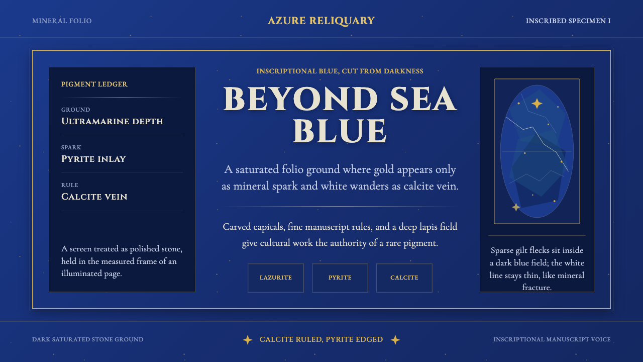 Badakhshan Lapis LazuliStone as manuscript. Ultramarine field, pyrite flecks, calcite veins, carved…
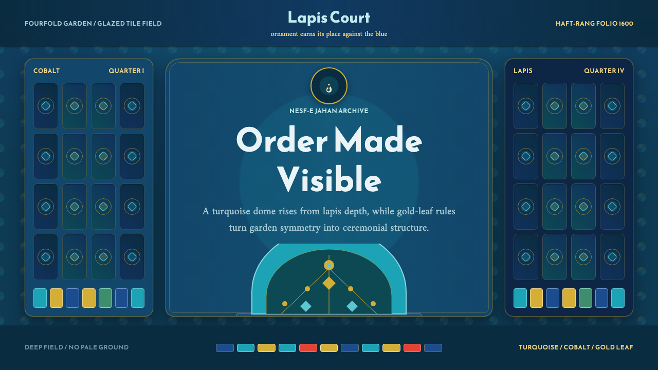 Safavid IsfahanOrnament is order. Turquoise domes and gold rules lock into a deep lapis grid.
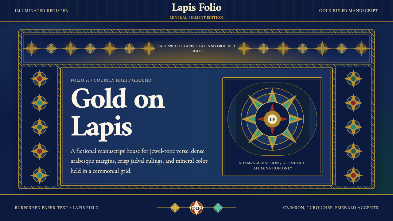 Timurid Manuscript (Herat)Courtly density glows. Lapis ground, Amiri type, and gold jadval geometry hol…
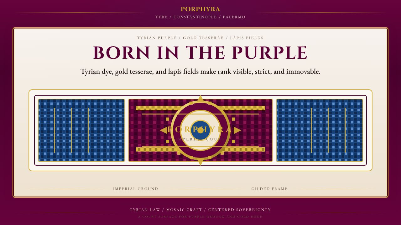 Byzantine Tyrian Purple (Imperial Court)Imperial rank made visible. Tyrian purple, gold tesserae, and centered symmet…
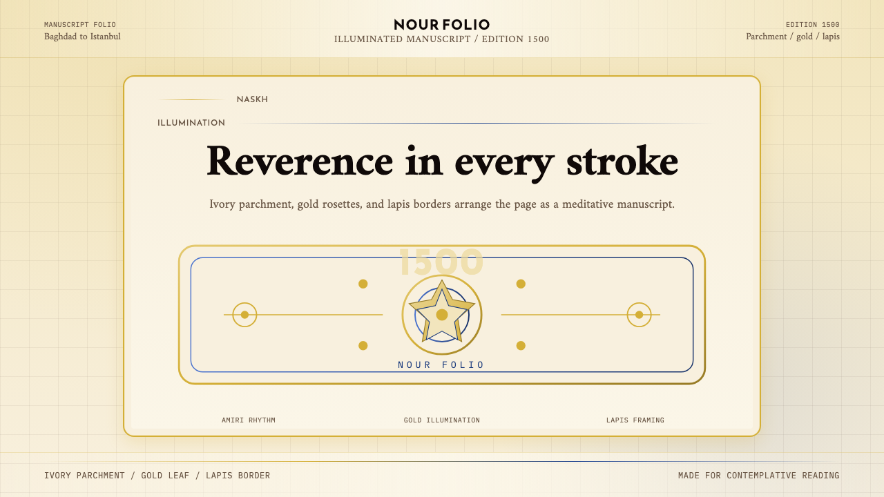 Naskh Quranic (1500)Reverence in every stroke. Ivory parchment, gold rosettes, and lapis framing.
 Saudi Thuluth CalligraphyMonumental calm in gold. Deep green, thuluth type, and cream parchment symmet…