What is Caravaggio Tenebrism?什么是 Caravaggio Tenebrism?
Caravaggio abolished the background — he replaced it with nothing, and let one raking slash of candlelight do all the work.卡拉瓦乔废除了背景——他用虚无取而代之,让一道斜切的烛光独自完成一切。
Caravaggio Tenebrism in briefCaravaggio Tenebrism 速览
Tenebrism — from the Italian tenebroso, meaning murky or shadowed — is a mode of painting, and by extension a design sensibility, defined by extreme contrast between a single concentrated light source and a near-total surrounding darkness. Unlike chiaroscuro, which models form through a gradual tonal transition from light to shadow, tenebrism makes darkness an active agent: the void is not merely the absence of light but a presence in its own right, pushing the illuminated subject forward with almost physical force.明暗对照法——源自意大利语 tenebroso,意为阴暗或幽暗——是一种绘画模式,也是一种设计感知方式,其特征是单一集中光源与近乎全面黑暗之间的极端对比。与以渐进色调过渡塑造形体的明暗渐变法(chiaroscuro)不同,明暗对照法将黑暗设定为主动力量:虚空不仅仅是光的缺席,而是一种自身存在的实体,以近乎物质的力量将被照亮的主体向前推出。
Where most Western painting before 1600 used background, landscape, or architectural setting as compositional support, Caravaggio simply deleted them. The figures in his mature Roman canvases — the calling of Matthew, the martyrdom of Peter, the supper at Emmaus — emerge from a ground that is not dusk or interior shadow but something closer to absolute night. The light arrives from a single unseen source, usually positioned above and to the side of the canvas, and it selects with ruthless specificity: a knuckle, a brow ridge, the weave of a linen sleeve. The rest of the world does not exist.1600年以前的西方绘画大多以背景、风景或建筑环境作为构图支撑,而卡拉瓦乔简单地将这一切删去。他成熟期罗马画作中的人物——马太的蒙召、圣彼得的殉难、以马忤斯的晚餐——从一片不是黄昏也不是室内阴影的底色中浮现出来,那是接近绝对黑暗的东西。光从单一的不可见光源射入,通常位于画布的上方偏侧,以残酷的选择性照亮:一个指节、一道眉骨、亚麻袖子的织纹。世界的其余部分不复存在。
Translated into contemporary design practice, tenebrism produces a visual vocabulary of unusual emotional authority. Vast warm-black or near-black fields anchor the composition. Content surfaces from the dark like an object emerging from polished walnut. Accent tones — deep crimson, ochre, the color of lit skin and aged paper — function as the sole points of warmth in an otherwise severe field. The diagonal implied by the light source becomes the layout's organizing axis, replacing the conventional horizontal or grid alignment with something more dynamic and theatrical.转化到当代设计实践中,明暗对照法产生了一套具有罕见情感权威的视觉词汇。宽阔的暖调黑色或近黑色场域锚定构图,内容从暗处浮现,如同从抛光胡桃木中显露的物体。点缀色调——深血红、赭石、被光照亮的肤色与旧纸的暖色——是这片严峻底色中仅有的温度来源。光源所暗示的斜线成为版面的组织轴线,以比常规水平线或网格对齐更具动感和戏剧性的方式统领整体。
See the Caravaggio Tenebrism design system查看 Caravaggio Tenebrism 完整设计系统
Where does Caravaggio Tenebrism come from?Caravaggio Tenebrism 从何而来?
Michelangelo Merisi da Caravaggio was born in Milan in 1571 and arrived in Rome around 1592, working initially as an assistant in the studio of Giuseppe Cesari. His earliest independent works showed a precocious interest in naturalism — the wilting leaves in a basket of fruit, the grime under a fingernail — but his first major public commissions, for the Contarelli Chapel in San Luigi dei Francesi beginning around 1599, introduced the technique that would define his legacy. The Calling of Saint Matthew placed sacred subject matter in an identifiably Roman tavern interior, lit from a source outside the picture plane, generating a theatrical confrontation between divine light and ordinary human darkness that scandalized and riveted contemporary viewers in equal measure.米开朗基罗·梅里西·达·卡拉瓦乔于1571年生于米兰,约1592年抵达罗马,起初在朱塞佩·切萨里的工坊担任助手。他最早的独立作品已显示出对自然主义的早熟兴趣——果篮中枯萎的叶片、指甲缝里的污垢——但真正为他奠定历史地位的技法,出现在约1599年圣路易吉·德·弗朗切西教堂孔塔雷利礼拜堂的首批重要公共委托中。《圣马太蒙召》将神圣题材置于一间可辨认的罗马酒馆内部,光从画面外的光源射入,在神圣之光与普通人类黑暗之间产生了一种戏剧性的对峙,令当时的观者既感震惊又无法移目。
The technique was not invented from nothing. Caravaggio absorbed the tonal darkness of Lombard painting — particularly the sfumato and shadow traditions inherited from Leonardo — and pushed them toward an extreme his predecessors had not reached. His innovation was not the shadow itself but the completeness of it: where earlier painters allowed reflected light to model forms within the shadow, Caravaggio suppressed that modeling to the point of near-abstraction. The dark areas in his late works are genuinely close to flat. What survives in the light is lit with an intensity bordering on violence.这种技法并非无中生有。卡拉瓦乔吸收了伦巴第绘画的调性黑暗——尤其是继承自达·芬奇的晕涂法与阴影传统——并将其推向前人未曾抵达的极端。他的创新不在于阴影本身,而在于阴影的彻底性:早期画家允许反射光在阴影中塑造形体,卡拉瓦乔则将这种形体塑造压制到近乎抽象的程度。他晚期作品中的暗部区域在事实上已接近平面。在光中幸存的部分,则以近乎暴烈的强度被照亮。
Between 1606 and his death in 1610, Caravaggio was a fugitive, having killed a man in a brawl in Rome. He worked in Naples, Malta, and Sicily, producing late paintings — the Beheading of Saint John the Baptist in Valletta, the Nativity with Saints Francis and Lawrence in Palermo — that pushed his tenebrism further still: larger dark fields, more isolated figures, a compositional austerity that anticipates the emptiness of much later modernist work. These late works were seen by many subsequent painters, and their influence spread rapidly.1606年至1610年去世前,卡拉瓦乔一直是亡命之徒,因在罗马的一场斗殴中杀人而出逃。他先后辗转那不勒斯、马耳他和西西里,创作了一批晚期画作——瓦莱塔的《施洗约翰被斩首》、巴勒莫的《圣弗朗西斯与劳伦斯伴随的圣诞》——将明暗对照法推向更远的境地:更大面积的暗场,更孤立的人物,一种在构图上预示着后来现代主义虚空感的肃穆。这些晚期作品被众多后继画家所见,影响迅速扩散。
The school that followed Caravaggio — loosely called the Caravaggisti — spread tenebrism across Europe within a generation. In Naples, Jusepe de Ribera developed a Spanish variant that was rougher, harder, and even more confrontational in its treatment of suffering bodies. In France, Georges de La Tour refined the formula into nocturnal candlelit devotional scenes of extraordinary stillness. In Italy, Artemisia Gentileschi brought to the technique a concentrated psychological intensity — particularly in her repeated treatments of Judith — that exceeded even her teacher Orazio's facility. By the mid-seventeenth century, Rembrandt in Amsterdam was absorbing the lessons of the Caravaggisti through Dutch intermediaries, producing the Northern European tenebrism that most contemporary viewers associate with dramatic chiaroscuro. The influence did not fully exhaust itself until the Rococo period displaced Baroque gravity with levity in the early eighteenth century.追随卡拉瓦乔的流派——松散地被称为卡拉瓦乔派(Caravaggisti)——在一代人之内将明暗对照法传播至整个欧洲。在那不勒斯,胡塞佩·德·里贝拉发展出一种西班牙变体,在对受苦身体的处理上更为粗粝、更为刚硬,甚至更具对抗性。在法国,乔治·德·拉图尔将这一范式提炼为以蜡烛光照明的夜间虔诚场景,宁静感超乎寻常。在意大利,阿尔泰米西亚·真蒂莱斯基为这一技法注入了高度集中的心理强度——尤其体现在她对朱迪思题材的反复处理中——其深度甚至超越了她的老师奥拉齐奥。到十七世纪中叶,阿姆斯特丹的伦勃朗通过荷兰中间人吸收了卡拉瓦乔派的教义,发展出大多数当代观者与戏剧性明暗对照相联系的北欧明暗对照法。直到洛可可时期在十八世纪初以轻盈取代巴洛克的庄重,这一影响才基本耗尽。
What defines the Caravaggio Tenebrism look?Caravaggio Tenebrism 的视觉特征是什么?
Dominant Darkness支配性黑暗
The ground of a tenebrism composition is not a background color but an active void — a deep, warm-toned black that reads as infinite depth rather than flat surface. This darkness is not neutral; it has the temperature of unlit interior space, slightly warmer than cool blue-black, carrying the feel of old oak, wax, and stone. The darkness occupies the majority of the composition — often seventy percent or more — and everything that emerges from it does so because the darkness permits it.明暗对照法构图的底色不是背景色,而是主动的虚空——一种深邃、温调的黑色,读来是无限深度而非平面。这种黑暗并非中性;它具有未被照亮的室内空间的温度,比冷调蓝黑略暖,携带着旧橡木、蜡烛与石头的质感。黑暗占据构图的大部分——通常在七成以上——一切从中浮现的事物,都是因为黑暗允许它存在。
Single Raking Light单一斜射光
One light source, always unseen, enters the composition from an upper corner — typically upper right — and rakes across the subject at a diagonal. This raking angle means the light does not illuminate broadly but catches edges, textures, and planes that face it directly: the ridge of a nose, the fold of a sleeve, the top of a knuckle. Planes that face away fall immediately back into the black. The light does not blend softly into shadow; it stops.单一光源,始终不可见,从构图的上方一角——通常是右上角——以对角线方向斜切而入。这种斜射角度意味着光并非广泛照明,而是捕捉到直接面向它的边缘、纹理与平面:鼻梁的棱脊、袖子的褶痕、指节的顶面。背向光线的平面立即退回黑暗。光不柔和地渐变为阴影,它直接停止。
Warmth of the Illuminated被照亮的温度
What the light reveals is warm — the ochre and raw-sienna of candlelit flesh, the deep crimson of fabric and blood, the aged cream of illuminated linen. These are the only hues permitted: the palette of firelight, not daylight. There are no cool blues, no greens, no lavenders in the lit areas. The warmth of the lit subject against the depth of the dark ground creates the style's characteristic emotional temperature — intimate, urgent, slightly threatening.光所揭示的是温暖的——烛光下肌肤的赭石与生赭,布料与血液的深血红,被照亮的亚麻的旧纸米白。这些是仅被允许的色调:火光的色板,而非日光。光亮区域中没有冷蓝,没有绿,没有薰衣草紫。被照亮的主体的温度与暗底的深邃共同造就了这种风格标志性的情感温度——亲密、紧迫、略带威胁。
Suppressed Modeling被抑制的形体塑造
In the shadow areas, traditional tonal modeling is almost entirely suppressed. Earlier painters had used gradual mid-tones within shadows to describe the volume of forms even in their unlit portions. Tenebrism refuses this — the transition from lit to unlit is abrupt, close to binary. Figures and objects partly in shadow simply cease to be described. The eye cannot reconstruct what the dark has swallowed. This is not a technical limitation but an aesthetic choice with profound compositional consequence: depth is implied, not modeled.在阴影区域,传统的调性形体塑造几乎被完全抑制。早期画家曾用阴影内部的渐进中间调来描述形体在未受光照部分的体积。明暗对照法拒绝这一点——从受光到不受光的过渡是突然的,近乎二元的。部分处于阴影中的人物与物体单纯地停止被描述。眼睛无法重建黑暗已吞没的东西。这不是技术局限,而是一种具有深刻构图后果的美学选择:深度被暗示,而非被塑造。
Diagonal Composition对角线构图
Because the light source is positioned off-axis — upper corner rather than frontal or overhead — every composition organized by tenebrism inherits a strong diagonal. This diagonal is the axis of dramatic tension: movement along it implies revelation or concealment, approach or withdrawal. Symmetry becomes structurally impossible; the style demands asymmetry as a formal condition. Horizontals and verticals exist only in tension with the dominant diagonal, never as organizing principles in their own right.因为光源被置于偏轴位置——位于上方一角而非正面或顶部——每一个以明暗对照法组织的构图都继承了一条强烈的对角线。这条对角线是戏剧张力的轴线:沿它的运动暗示揭示或遮蔽、接近或退离。对称在结构上成为不可能;这种风格将非对称作为形式条件加以要求。水平线与垂直线只能在与主导对角线的张力中存在,而不能自为组织原则。
Peasant Realism平民现实主义
Caravaggio's tenebrism is inseparable from his insistence on depicting sacred figures as ordinary people — dirty feet, calloused hands, working-class faces placed in the positions of saints and apostles. This democratic subject matter was as scandalous to contemporary critics as the technique. In design terms, the lesson is that the style confers gravity and significance on whatever it illuminates, regardless of whether that subject is conventionally elevated. The style is not elitist; it is theatrical.卡拉瓦乔的明暗对照法与他坚持将神圣人物描绘为普通人的立场密不可分——脏脚、老茧双手、工人阶级面孔被置于圣人与使徒的位置。这种平民化的题材对当时的批评者而言,与技法本身一样触犯众怒。在设计语言中,这里的启示是:这种风格为它所照亮的任何事物赋予庄重感和重要性,无论该主体是否属于传统意义上的高贵题材。这种风格不是精英主义的,它是戏剧性的。
Theatrical Stillness戏剧性静止
Tenebrism compositions are often intensely dramatic in subject matter but remarkable for their frozen quality — the moment before or immediately after violent action, suspended. This stillness is a product of the technique: when so much of the visual field is suppressed by darkness, what remains is heightened to an almost unreal clarity. The eye cannot scan freely; it is directed by the light to a small number of elements, and those elements carry enormous weight. In design, this principle translates to extreme restraint in the number of active elements per composition.明暗对照法的构图在题材上往往高度戏剧化,但以其凝固质感而引人注目——暴力行动前一刻或正后方的瞬间,悬停不动。这种静止是技法的产物:当视觉场域的如此大部分被黑暗压制,留存的部分就被提升至近乎超现实的清晰度。眼睛无法自由扫视,它被光引导到少数几个元素上,而这些元素承载着巨大的重量。在设计中,这一原则转化为对每个构图中活跃元素数量的极度克制。
See the Caravaggio Tenebrism design system查看 Caravaggio Tenebrism 完整设计系统
Who shaped Caravaggio Tenebrism?谁塑造了 Caravaggio Tenebrism?
Caravaggio (1571–1610) is the originating figure of tenebrism, though he never used the term and worked within the broader category of naturalist painting. His Roman period — the Contarelli and Cerasi chapel commissions in particular — established the compositional and tonal vocabulary that subsequent painters across Europe adapted. His personal turbulence, including a killing in 1606 that sent him into years of fugitive exile across Naples, Malta, and Sicily, intensified rather than diminished his output. The late works produced during this exile are among the most formally radical paintings of the seventeenth century.卡拉瓦乔(1571—1610年)是明暗对照法的开创者,尽管他本人从未使用过这个术语,而是在更广泛的自然主义绘画范畴内工作。他的罗马时期——尤其是孔塔雷利与切拉西礼拜堂的委托——建立了随后欧洲各地画家纷纷借鉴的构图与调性词汇。1606年,他在一场斗殴中杀人,此后在那不勒斯、马耳他与西西里长年亡命,这种个人动荡不但未减损其创作,反而使其愈加深烈。这段流亡期间创作的晚期作品,是十七世纪形式最为激进的绘画之列。
Gentileschi (1593–c.1656) is the most significant woman painter of the Baroque period and one of the most psychologically penetrating of all the Caravaggisti. Trained initially by her father Orazio, himself a capable tenebrist, she brought to the style a concentration on female interiority and physical agency that distinguishes her work sharply from her contemporaries. Her multiple treatments of Judith Slaying Holofernes — combining tenebrism's dramatic contrast with an unsparing attention to the mechanics of violent action — remain among the most analyzed paintings of the seventeenth century.真蒂莱斯基(1593—约1656年)是巴洛克时期最重要的女性画家,也是所有卡拉瓦乔派画家中心理洞察最为深刻的一位。她最初由父亲奥拉齐奥培训,后者本人便是一位能力出众的明暗对照法画家。她为这种风格注入了对女性内心世界与身体能动性的专注,使其作品在同时代人中鲜明脱颖。她对《朱迪思斩杀赫罗弗尼斯》的多次处理——将明暗对照法的戏剧对比与对暴力行为机制的毫不留情的关注相结合——至今仍是十七世纪被分析最多的画作之列。
La Tour (1593–1652) represents the contemplative strain of tenebrism — French rather than Italian, devotional rather than violent, candlelit rather than dramatically raked. His nocturnal scenes, typically showing a single figure or small group gathered around a visible candle flame, reduce the technique to its most essential elements: one warm point of light, one or two illuminated faces, and a surrounding darkness that is genuinely peaceful rather than menacing. His work demonstrates that tenebrism need not imply drama; it can equally imply intimacy and concentration.拉图尔(1593—1652年)代表了明暗对照法中的沉思性一脉——法国的而非意大利的,虔诚的而非暴烈的,以可见烛光照明而非戏剧性侧光。他的夜间场景通常展示一个人物或一小群人围绕一支可见烛焰聚拢,将这一技法还原为最本质的元素:一个温暖的光点,一两张被照亮的面孔,以及围绕四周真正平静而非威胁性的黑暗。他的作品证明,明暗对照法不必然暗示戏剧性;它同样可以暗示亲密与专注。
Ribera (1591–1652) was a Spanish painter who spent his career in Naples under Spanish viceregal rule, and his tenebrism represents the harshest and most physically unsparing branch of the Caravaggisti. Where Caravaggio illuminated peasant realism with an almost miraculous concentration of light, Ribera pushed his aging, suffering, and martyred figures into conditions of extreme physical specificity — wrinkled skin, distended veins, the precise anatomy of pain. His influence on subsequent Spanish painting, including Velázquez and Zurbarán, was profound and long-lasting.里贝拉(1591—1652年)是一位在西班牙总督统治下的那不勒斯度过职业生涯的西班牙画家,他的明暗对照法代表了卡拉瓦乔派中最粗粝、对肉身最不留情的一支。卡拉瓦乔以几近奇迹的光线集中照亮了平民现实主义,而里贝拉则将他那些衰老、受苦与殉难的人物推入极端的身体特殊性之中——皱纹皮肤、膨胀的静脉、痛苦的精确解剖。他对后来西班牙绘画(包括委拉斯开兹与苏尔瓦兰)的影响深远而持久。
Rembrandt (1606–1669) absorbed tenebrism through Dutch intermediaries who had studied in Rome — the Utrecht Caravaggisti including Hendrick ter Brugghen and Gerard van Honthorst — and developed it into a distinctly Northern European idiom. His adaptation is warmer, more golden, and more interested in psychological interiority than in physical drama. Where Caravaggio's light is hard and selective, Rembrandt's tends to suffuse slightly, to pick out surfaces without completely annihilating adjacent ones. The result is tenebrism softened by sympathy, and it produced the version of dramatic chiaroscuro that most of the contemporary world recognizes first.伦勃朗(1606—1669年)通过曾在罗马学习的荷兰中间人——乌得勒支卡拉瓦乔派,包括亨德里克·特尔·布鲁根与赫拉德·范·洪特霍斯特——吸收了明暗对照法,并将其发展为一种鲜明的北欧语汇。他的改造更为温暖,更为金黄,对心理内在性的兴趣胜过对身体戏剧性的关注。卡拉瓦乔的光是硬而有选择性的,伦勃朗的光则倾向于略微漫溢,在照亮某个表面的同时不完全消灭邻近的表面。结果是被同情心柔化的明暗对照法,而这正是当代世界大多数人最先认出的戏剧性明暗对照版本。
How do you use Caravaggio Tenebrism today?今天怎么用 Caravaggio Tenebrism?
Tenebrism is among the most emotionally potent historical aesthetics available to contemporary designers, precisely because it works against expectation. Most digital design reaches toward brightness, open space, and generous light; tenebrism reverses this entirely, treating darkness as the primary surface and light as the exception. Applied correctly, it does not read as merely dark-mode design — it reads as intentional, authoritative, and weighted. The difference lies in the warmth of the dark ground, the specificity of what is lit, and the diagonal tension that drives the composition.明暗对照法是当代设计师可用的情感最具力度的历史美学之一,恰恰因为它反预期而行。大多数数字设计追求明亮、开阔空间与充足光线;明暗对照法将这一切完全颠倒,以黑暗为主体表面,以光为例外。正确应用时,它读来不仅仅是深色模式设计——它读来是有意为之、权威而有分量的。区别在于暗底的温度、被照亮之物的特定性,以及驱动构图的对角张力。
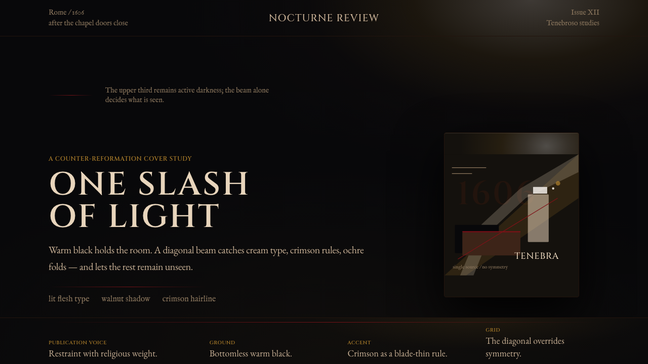
For presentation slides — covers and content pages alike — tenebrism works as a directorial style: it makes the audience feel they are being shown something rather than told something. A cover slide built on tenebrism principles places a single central image or typographic element in a cone of warm light against a surrounding near-black, with the light entering from above and to one side. The title should sit in a warm cream or ochre-tinted tone — the color of candlelit text — never in pure white. Content slides should resist the temptation to illuminate everything: one or two elements per slide receive the full tenebrism treatment; the remainder fade toward the dark. Data visualizations — charts and diagrams — can adopt the style's accent palette of deep crimson, ochre, and warm ivory to distinguish series and tiers, with the chart itself appearing to emerge from a very dark field.对于演示文稿——无论封面还是内容页——明暗对照法是一种导演式风格:它让观众感觉自己是被展示某物,而非被告知某物。以明暗对照法原则构建的封面页,将单一的中心图像或字体元素置于一束温暖光锥之中,四周以近黑色环绕,光从上方偏侧射入。标题应以温暖的米白色或赭石色调呈现——烛光文字的颜色——而绝非纯白。内容页应抵制照亮一切的诱惑:每张幻灯片只有一两个元素接受完整的明暗对照处理,其余元素向暗处淡出。数据可视化——图表与示意图——可以采用这种风格的强调色板(深血红、赭石、暖象牙白)来区分系列与层级,图表本身看起来从一片极深的底色中浮现出来。
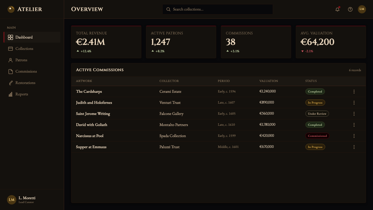
For web interfaces, tenebrism is best suited to high-stakes contexts where gravitas and luxury positioning are primary goals: premium pricing pages, editorial features, brand launch pages, and portfolio showcases in architecture, fashion, film, and fine art. The approach requires commitment to a very dark background — not the medium gray of conventional dark mode, but something close to genuine black, warmed with the temperature of candlelight. Surface elements — cards, modals, navigation — should emerge from this ground with only a subtle increase in tone, not by becoming dramatically lighter. Interactive states use the warm accent palette — a crimson hover, an ochre focus ring — rather than bright blue or white highlights. Dashboard interfaces can adopt tenebrism for analytical drama: key metrics illuminated, secondary data in near-shadow.对于网页界面,明暗对照法最适合庄重感与奢华定位是首要目标的高端场景:高端定价页面、编辑特稿、品牌发布页,以及建筑、时装、电影与纯艺术领域的作品集展示。这种方式需要对极深的背景做出承诺——不是常规深色模式的中灰,而是接近真正黑色的东西,以烛光的温度加热。表面元素——卡片、模态框、导航——应从这片底色中以仅微妙提升的色调浮现,而非通过大幅变亮来呈现。交互状态使用暖调强调色板——深血红悬停、赭石聚焦环——而非明亮蓝色或白色高亮。仪表板界面可以采用明暗对照法制造分析戏剧性:关键指标被照亮,次要数据处于近阴影之中。
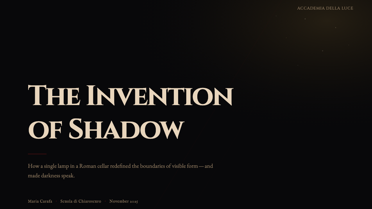
For editorial and marketing applications, tenebrism rewards scale. A full-page magazine spread or a hero section on a marketing landing page benefits from the style's theatrical quality: one large element pulled into light, everything else receding. The style supports strong typographic hierarchy when type weight and size are used to replicate the light-and-dark contrast — large, warm-toned headlines against very dark fields, fine-weight supporting text barely lifted from the ground tone. In social media cards and poster formats, the diagonal tension of the style translates directly: a composition organized on a diagonal implies movement and urgency in a format that is otherwise static.对于编辑与营销应用,明暗对照法在大尺度下回报丰厚。杂志全页跨版或营销落地页的英雄区,受益于这种风格的戏剧性品质:一个大型元素被拉入光中,其余一切退隐。当字重与字号被用来复制光与暗的对比时,这种风格支持强烈的字体层级——在极深底色上的大型暖调标题,细字重的支撑文字仅从底色中微微浮起。在社交媒体卡片与海报格式中,这种风格的对角张力可直接转化:以对角线组织的构图在原本静止的格式中暗示运动与紧迫。
A common mistake when attempting tenebrism is treating it as a simple dark-color-scheme decision. The tell is an even, flat dark background combined with white or bright-colored foreground elements — which produces conventional dark mode, not tenebrism. Authentic tenebrism requires that the dark ground have warmth and depth, that the lit elements be carefully limited in number and area, that accent colors draw from the candlelight palette rather than from saturated brand primaries, and that the composition organize itself along a diagonal axis. Equally problematic is illuminating too much: if more than roughly a third of the composition is actively lit, the darkness loses its authority and the style collapses into generic dark design. The discipline of restraint — deciding what does not get light — is the central creative act.尝试明暗对照法时最常见的错误,是将其视为简单的深色配色方案决定。露馅之处是:均匀、平坦的深色背景配以白色或明亮彩色前景元素——这产生的是常规深色模式,而非明暗对照法。真实的明暗对照法要求:暗底须有温度与深度,被照亮的元素在数量与面积上须受到严格限制,强调色须从烛光色板而非饱和品牌主色中汲取,构图须沿对角轴线自我组织。同样有问题的是照亮太多:如果构图中超过大约三分之一被主动照亮,黑暗就失去了其权威,这种风格就崩溃为普通的深色设计。克制的自律——决定什么不获得光——是核心的创作行为。
See the Caravaggio Tenebrism design system查看 Caravaggio Tenebrism 完整设计系统
Caravaggio Tenebrism — FAQCaravaggio Tenebrism · 常见问题
Is tenebrism just another name for dark mode design?明暗对照法只是深色模式设计的另一个名称吗?
No — the distinction is fundamental. Dark mode is a system-level color scheme that substitutes dark surfaces for light ones across all interface elements, typically with no compositional intent. Tenebrism is a deliberate compositional approach in which darkness is the primary subject and light is used with extreme selectivity to create dramatic hierarchy. In tenebrism, the dark is warm, active, and spatially deep; in dark mode, it is usually a neutral gray or blue-black serving as a background convention. The two can coexist — a dark-mode interface can apply tenebrist compositional logic — but they are not the same thing, and most dark-mode design is not tenebrism.不——这一区别是根本性的。深色模式是一种系统级配色方案,在所有界面元素上以深色表面替换浅色表面,通常没有构图意图。明暗对照法是一种刻意的构图方式,其中黑暗是主体,光以极端的选择性被使用以创造戏剧性层级。在明暗对照法中,黑暗是温暖的、主动的、具有空间深度的;在深色模式中,它通常是中性灰或蓝黑色,作为一种背景惯例服务。两者可以共存——一个深色模式界面可以应用明暗对照法的构图逻辑——但它们不是同一回事,大多数深色模式设计都不是明暗对照法。
Can tenebrism work for bright, consumer-friendly products?明暗对照法适合明亮、面向消费者的友好产品吗?
Rarely, and only with significant adaptation. The style's fundamental qualities — darkness as primary field, warmth as accent, asymmetric diagonal tension — produce an atmosphere of weight, gravity, and controlled intensity that is the opposite of the lightness, openness, and accessibility that consumer-friendly products typically need to communicate. Tenebrism is most at home in contexts where the user is meant to feel that they are engaging with something serious, valuable, or rare: luxury retail, premium content platforms, high-end portfolio work, cinematic interfaces. Applying it to a productivity app or a children's educational tool will produce friction between style and purpose that no amount of technical execution can resolve.很少,且只能在大幅改造的情况下。这种风格的基本品质——以黑暗为主要场域,以温度为点缀,以非对称对角张力为结构——产生一种重量感、庄重感与受控强度的氛围,与面向消费者的友好产品通常需要传达的轻盈、开放与可及性正好相反。明暗对照法最在家的语境,是用户被设计感受到自己在接触某种严肃、有价值或珍稀事物的地方:奢侈品零售、高端内容平台、顶级作品集、电影感界面。将其应用于生产力应用或儿童教育工具,将在风格与目的之间产生任何技术执行都无法化解的摩擦。
How does tenebrism handle color beyond its warm accent tones?明暗对照法如何处理暖调点缀色之外的色彩?
Strictly — which is to say, it mostly does not. The authentic tenebrism palette is narrow by design: the dark ground, one or two warm accent tones drawn from the candlelight register (ochre, crimson, aged cream, the color of lit flesh), and nothing else. Cool tones, saturated brand primaries, or multiple competing accent colors all violate the internal logic of the style. In contemporary applications, modest extensions are possible — a deep teal or slate used as a secondary accent can work if it remains considerably darker than the main lit tone — but the key constraint is that no color should be lighter or more saturated than the principal lit element. The moment two colors compete for the position of the light, the composition loses its center.严格地——也就是说,它基本上不处理。真实的明暗对照法色板设计上就是狭窄的:暗底,一两种从烛光音域汲取的暖调强调色(赭石、深血红、旧纸米白、被光照亮的肤色),仅此而已。冷色调、饱和的品牌主色,或多种相互竞争的强调色,都违背了这种风格的内在逻辑。在当代应用中,适度的扩展是可能的——深青色或石板色作为次级强调色可以奏效,前提是它比主要受光色调明显更暗——但关键约束是:没有任何颜色应比主受光元素更亮或更饱和。一旦两种颜色争夺光的位置,构图就失去了它的中心。
What is the difference between tenebrism and chiaroscuro?明暗对照法与明暗渐变法(chiaroscuro)有何区别?
Chiaroscuro — the Italian term for light-dark — describes the general technique of using tonal contrast to model three-dimensional form on a flat surface. It is a broad category that encompasses everything from the subtle tonal modeling of the Flemish masters to the dramatic contrasts of Baroque painting. Tenebrism is a specific, extreme form of chiaroscuro in which the darkness is so dominant and the suppression of mid-tones so thorough that the technique stops functioning as a modeling tool and starts functioning as a compositional principle. The shorthand: chiaroscuro describes how light and shadow model form; tenebrism describes what happens when the shadow wins.明暗渐变法——意大利语意为明暗——描述的是使用调性对比在平面上塑造三维形体的一般技法。它是一个宽泛的范畴,涵盖从佛兰德斯大师的细腻调性塑造到巴洛克绘画的戏剧性对比。明暗对照法是明暗渐变法的一种特定、极端形式,其中黑暗如此主导、中间调的抑制如此彻底,以至于这种技法停止作为塑造工具运作,开始作为构图原则运作。简而言之:明暗渐变法描述光与影如何塑造形体;明暗对照法描述当阴影获胜时会发生什么。
Does the style suit data-dense interfaces or is it purely atmospheric?这种风格适合数据密集型界面,还是纯粹的氛围性设计?
It can work for data-dense interfaces, but requires careful discipline. The central tenebrist constraint — that only a small portion of the composition receives active light — maps surprisingly well onto information hierarchy: the most important metric or data point receives the full accent treatment, less critical information lives in mid-dark zones, and truly secondary data recedes toward the dark ground. The risk is that dense data environments naturally require many elements at similar emphasis levels, which conflicts with the style's demand for a single dominant light. The solution is to think in clusters: a card or panel is the unit that receives tenebrism treatment; within the card, conventional hierarchy applies. The darkness lives between cards, not within them.它可以用于数据密集型界面,但需要谨慎的自律。明暗对照法的核心约束——构图中只有小部分受到主动光照——出人意料地与信息层级形成对应:最重要的指标或数据点获得完整的强调处理,不那么关键的信息处于中暗区,真正次要的数据退向暗底。风险在于:密集的数据环境自然需要许多元素处于相近的强调层级,这与这种风格对单一主导光的要求相冲突。解决方案是以簇为单位思考:卡片或面板是接受明暗对照处理的单元;在卡片内部,应用常规层级。黑暗存在于卡片之间,而非卡片内部。
Related design styles相关设计风格
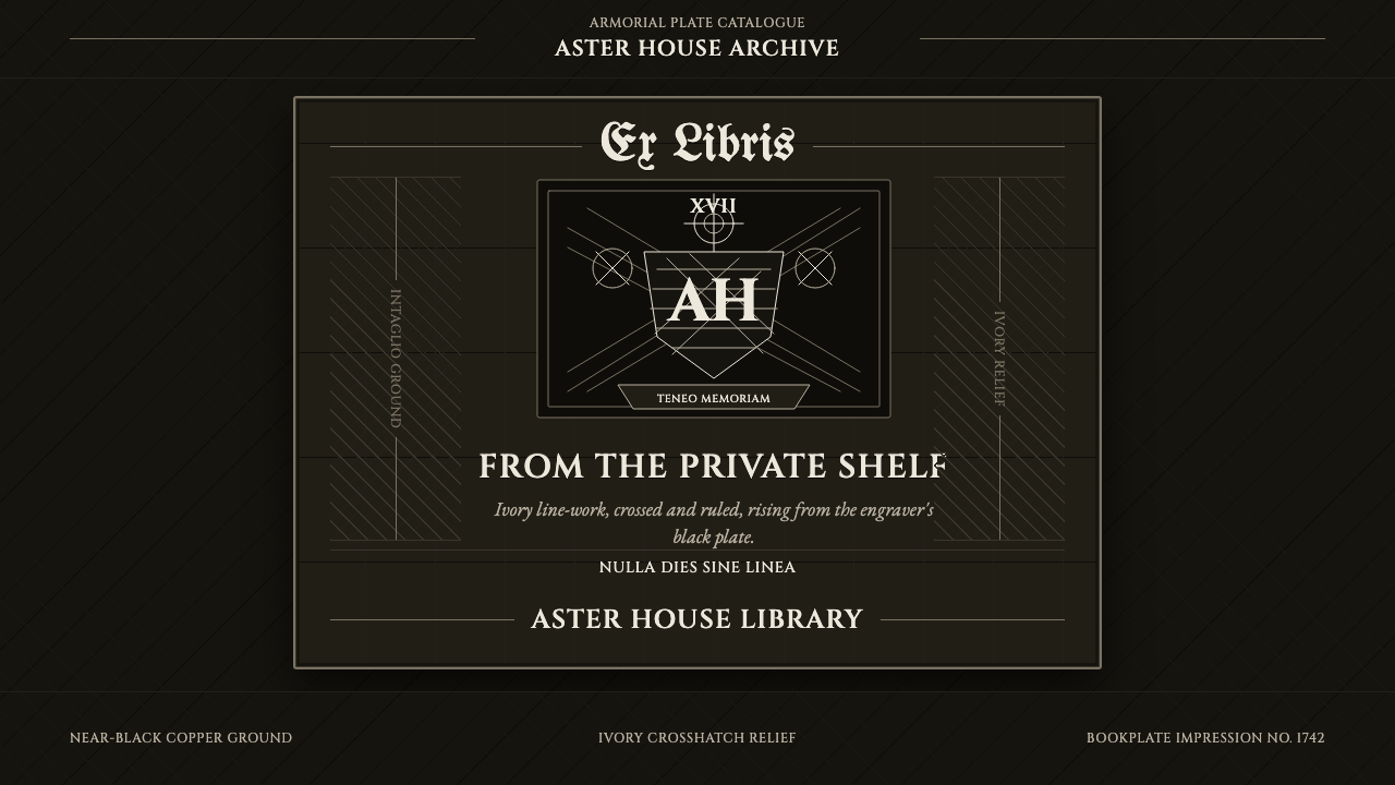 Ex Libris BookplateScholarly ownership, cut in ivory. Cinzel caps and crosshatch rules rise from…学者藏书的象牙刻痕。Cinzel 大写与交叉排线浮出黑版。
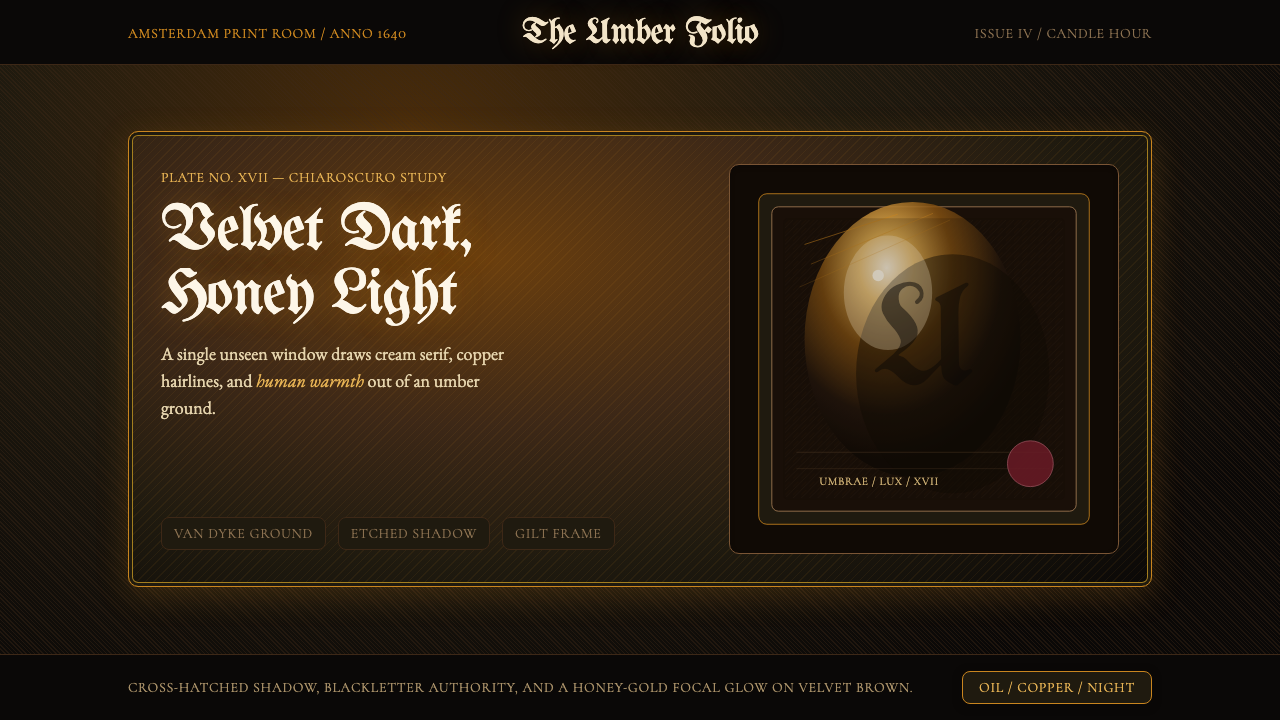 Rembrandt BaroqueDarkness becomes theatre. Honey-gold spotlight and blackletter rise from Van…黑暗成为剧场:蜂蜜金聚光与哥特黑体从范戴克棕浮现。
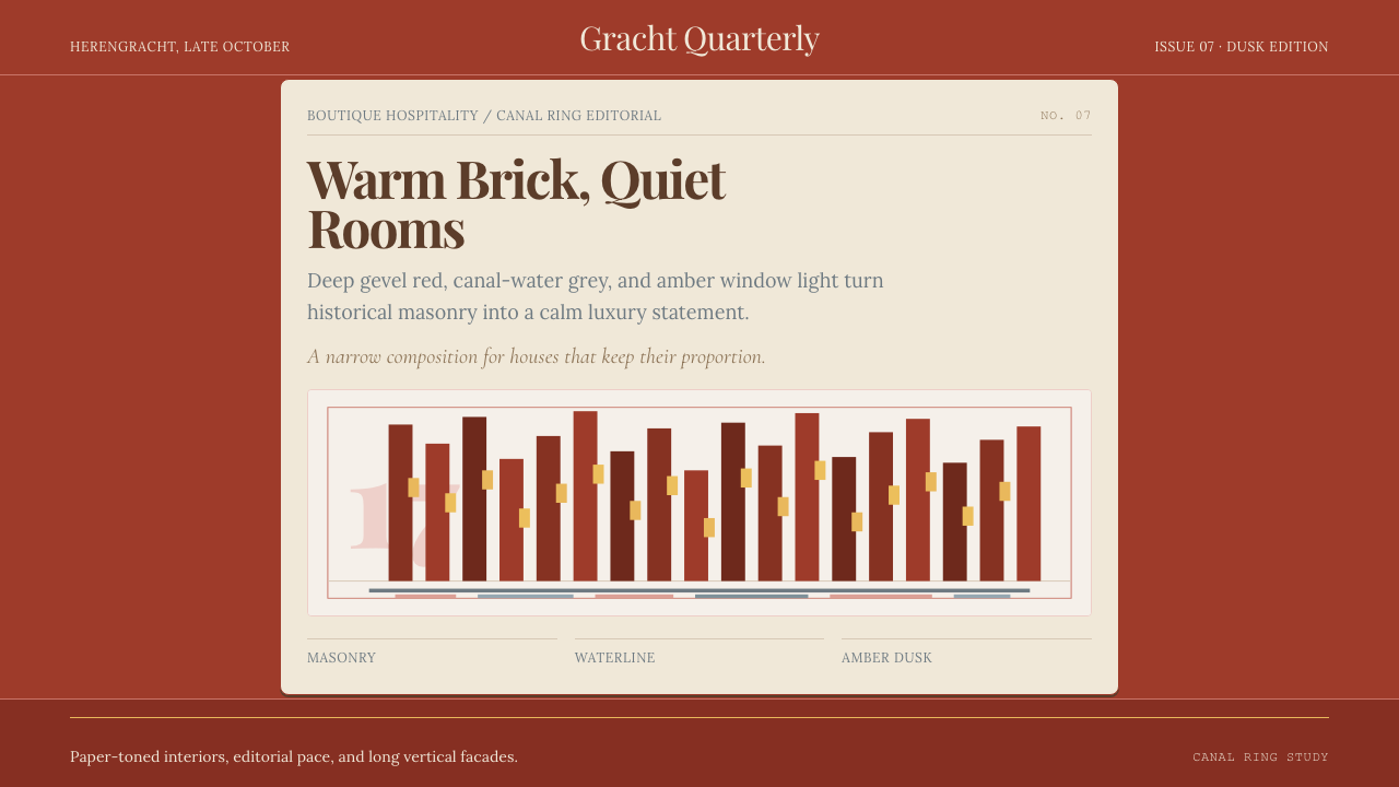 Amsterdam Canal HouseQuiet luxury in brick and cream. Playfair serif, narrow columns, amber window…克制的奢华。砖红配奶油纸面,窄列与琥珀窗光。
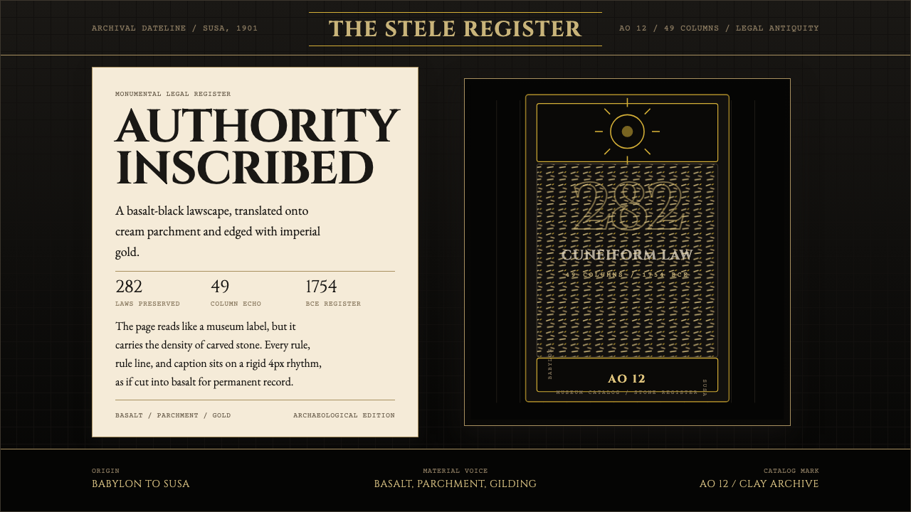 Babylonian Hammurabi SteleAuthority carved in stone. Basalt-black grids, parchment panels, and imperial…权威刻于石上。玄武岩黑底、羊皮纸面板、帝王金点缀。
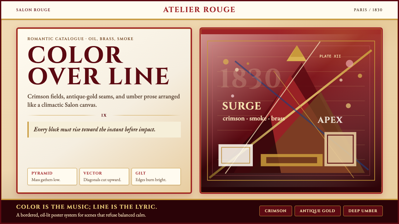 Delacroix French RomanticismOperatic color erupts. Crimson parchment, gilt borders, and diagonal pyramids…歌剧般爆裂:羊皮纸底、深红与鎏金边框,以对角金字塔推向高潮。
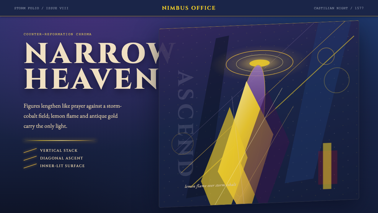 El Greco — Toledo MannerismMysticism strains upward. Storm cobalt, lemon flame, and gold halos pull the…神秘感向上拉伸。风暴钴蓝、柠檬火焰与金色光环令画面纵向紧绷。