What is El Greco — Toledo Mannerism?什么是 El Greco — Toledo Mannerism?
El Greco bent the human figure toward heaven and set the sky on fire — and every choice he made became a design system three centuries before anyone called it that.埃尔·格列柯把人体向天空拉伸,将天际点燃——他做出的每一个选择,都在三百年后被人们称为设计系统。
El Greco — Toledo Mannerism in briefEl Greco — Toledo Mannerism 速览
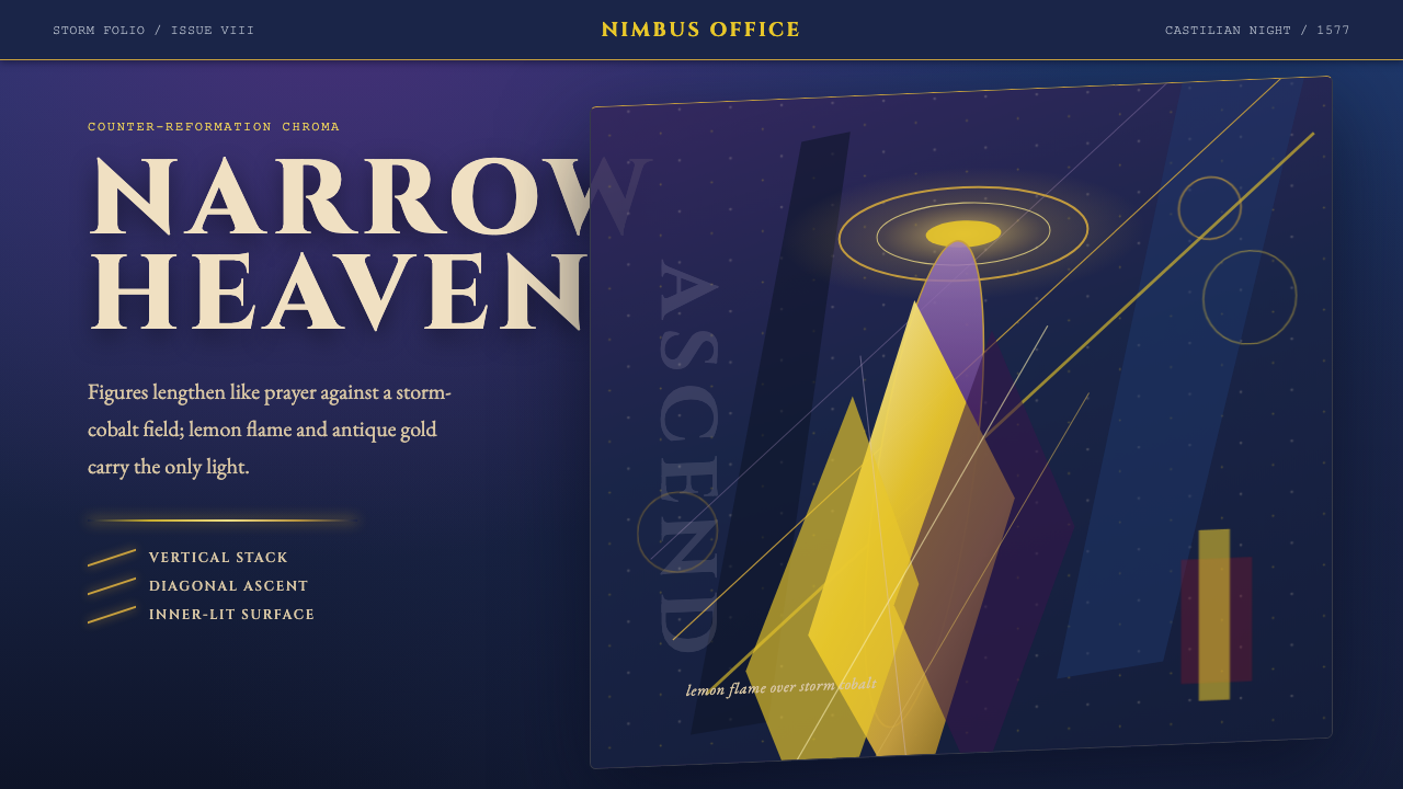
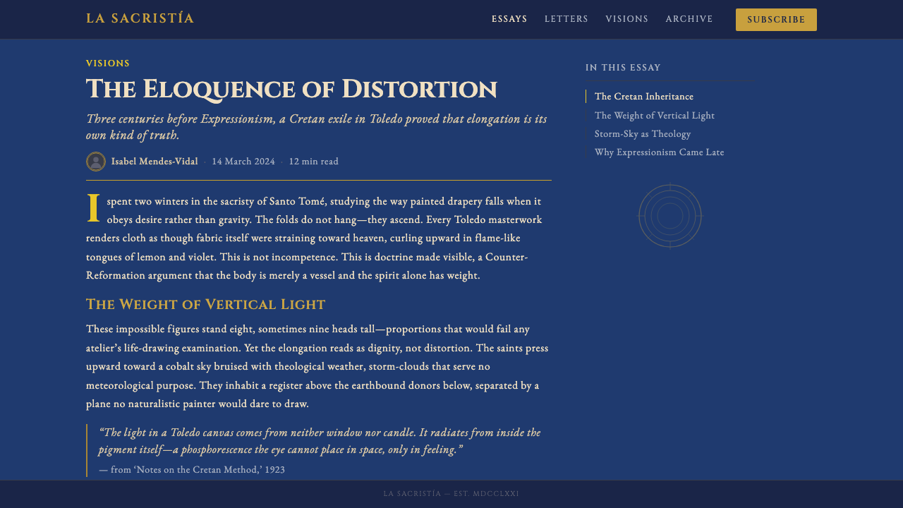
El Greco — Toledo Mannerism is a visual style derived from the late-sixteenth-century painting of Doménikos Theotokópoulos, known as El Greco, during his Toledo period from 1577 until his death in 1614. The style is defined by extreme vertical elongation of figures, a palette anchored by storm-bruised cobalt and charged with lemon-flame yellow and electric violet, and a light source that seems to originate inside the canvas rather than from any external sky or sun. The effect is simultaneously ecstatic and unsettling — devotional art pushed so far toward the visionary that it ceased to belong to its own century.埃尔·格列柯——托莱多手法主义是一种视觉风格,源自多梅尼科斯·提奥托科普洛斯(即埃尔·格列柯)于1577年定居西班牙托莱多至1614年辞世期间的晚期绘画。这种风格以人物的极端纵向拉伸为核心,以瘀伤般的风暴钴蓝为底色,点燃柠檬火焰般的黄色与电光紫罗兰,光源仿佛从画面内部自燃,而非来自任何外部天空或太阳。效果既狂喜又令人不安——献祭性的艺术被推向幻象的极限,以至于不再属于它自己的世纪。
Unlike Renaissance systems grounded in classical proportion, Mannerism deliberately violated those rules as an expressive strategy. El Greco's figures stretch to eight, nine, or even ten heads tall — proportions no anatomy textbook would endorse — because spiritual urgency, not physical accuracy, was the point. Drapery behaves like flame, twisting and rising rather than falling under gravity. Color is used not to describe daylight but to carry emotional and symbolic charge: the cobalt sky is not weather but atmosphere, the gold halo not ornament but the residue of Byzantine icon-making discipline absorbed during his Cretan training.与奠基于古典比例的文艺复兴体系不同,手法主义刻意打破这些规则,将违规本身作为表达策略。埃尔·格列柯的人物拉伸至八头、九头乃至十头身——没有任何解剖学教科书会认可这些比例——因为精神的紧迫感,而非肉体的准确性,才是创作的目的所在。衣袍如火焰般扭转上升,而非在重力下垂坠。色彩不用于描述日光,而是承载情感与象征的重量:钴蓝的天空不是天气,而是氛围;金色的光环不是装饰,而是他在克里特受训时内化的拜占庭圣像绘制纪律的遗迹。
Applied to contemporary design, the Toledo Mannerism system translates these principles into UI and visual communication: deep, bruised cool darks establish the page ground; flame-saturated warm highlights mark every point of action or emphasis; antique Byzantine gold serves as a halo — a ring of accent around the element that matters most. Compositions strain upward and diagonally rather than centering or balancing. Nothing rests. The style is appropriate wherever a design needs to communicate intensity, spiritual or secular seriousness, and a refusal of the ordinary.应用于当代设计时,托莱多手法主义系统将这些原则转化为界面与视觉传达:深沉的、瘀伤式冷暗色调建立页面的底层基调;火焰般饱和的暖色高光标记每一个动作或强调点;拜占庭古金充当光环——环绕最重要元素的强调光圈。构图向上、向对角方向张紧,而非居中或平衡。没有任何东西是静止的。这种风格适用于设计需要传达强度、精神或世俗的严肃性,以及对平庸的拒绝的一切场合。
See the El Greco — Toledo Mannerism design system查看 El Greco — Toledo Mannerism 完整设计系统
Where does El Greco — Toledo Mannerism come from?El Greco — Toledo Mannerism 从何而来?
Doménikos Theotokópoulos was born around 1541 on the island of Crete, then a possession of the Venetian Republic. His earliest training was in the Byzantine icon tradition — a discipline of gold grounds, flat frontal figures, and a color grammar derived from early Christian theology rather than from observation of the natural world. This foundation proved indelible: even at the height of his Toledo career, his figures retain the otherworldly luminosity and the upward pull of the icon, however dramatically transformed by everything that came after.多梅尼科斯·提奥托科普洛斯约于1541年生于克里特岛——当时隶属威尼斯共和国。他最早受训于拜占庭圣像绘制传统,这是一门以金色底面、正面平铺的人物形象和源自早期基督教神学而非自然观察的色彩语法为核心的纪律。这一根基被证明是不可磨灭的:即便在他托莱多生涯的巅峰,他的人物依然保留了圣像的超凡亮度与向上的引力,无论之后叠加了多少戏剧性的转变。
In his twenties, El Greco traveled to Venice, where he entered the orbit of Titian and, more decisively, of Tintoretto. From Titian he absorbed the Venetian mastery of glazed, layered color and the capacity of paint surface to generate atmospheric light. From Tintoretto he absorbed something more radical: the diagonal composition, the dramatically foreshortened figure, the sense that a painting could be organized around a bolt of energy rather than a stable classical armature. He then spent time in Rome, where he encountered the Mannerist paintings of Michelangelo's followers and the antiquities that Renaissance artists had spent a century arguing over. By the time he left Italy, he had absorbed three distinct visual traditions and begun fusing them into something none of them separately could produce.二十多岁时,埃尔·格列柯前往威尼斯,进入提香、尤其是丁托列托的影响轨道。从提香处,他吸收了威尼斯对上光、分层色彩的驾驭,以及画面表面生成大气光线的能力。从丁托列托处,他获得了更激进的东西:对角线构图、戏剧性缩短的人体、以及一幅画可以围绕一道能量闪电而非稳定的古典骨架组织起来的感知。此后他在罗马停留,接触了米开朗基罗追随者的手法主义绘画,以及文艺复兴艺术家争论了一个世纪的古典遗迹。离开意大利时,他已吸收了三种截然不同的视觉传统,并开始将它们熔合成任何一种单独无法产生的东西。
El Greco arrived in Toledo in 1577, initially to work on commissions for the new cathedral of El Escorial under Philip II. The royal commission fell through — legend holds that Philip disliked the work — but El Greco remained in Toledo for the rest of his life. The city suited him. Toledo was the ecclesiastical capital of Spain, seat of the Archbishop, a city of Counter-Reformation intensity and theological ambition. The patrons El Greco found there — religious orders, cathedral chapters, private nobles of intense piety — wanted art that conveyed not the calm authority of the Renaissance but the anguished devotion of the post-Tridentine church. El Greco gave them exactly that, and in doing so found the context that allowed his most extreme formal experiments to be received as visionary rather than merely eccentric.埃尔·格列柯于1577年抵达托莱多,最初受菲利普二世之邀为新建的埃斯科里亚尔大教堂承接委托。皇家委托最终落空——传说国王不喜欢他的作品——但埃尔·格列柯在托莱多度过了余生。这座城市适合他。托莱多是西班牙的教会首都,大主教的驻地,充满天特会议后宗教改革的紧迫感与神学抱负。他在此找到的赞助人——宗教团体、大教堂教士会、虔诚的私人贵族——所要求的艺术不是文艺复兴的平静权威,而是天特后教会的痛苦虔诚。埃尔·格列柯恰好给了他们这些,并在此过程中找到了一个语境:使他最极端的形式实验被接受为幻象式的,而非单纯古怪的。
His great Toledo works — the 'Burial of the Count of Orgaz' (1586–1588), the 'View of Toledo' (1596–1600), the late 'Laocoön' (1610–1614), and the many elongated Apostle series — each pushed his style further from any precedent. Figures grew taller with each decade. The palette cooled and intensified simultaneously: more cobalt, more acid yellow, more electric blue-white in the highlights. The sky in 'View of Toledo' is not sky at all but a theatrical backdrop lit from a source that does not exist in nature, a sky that would not make sense to a seventeenth-century viewer raised on Flemish landscape painting but that a twentieth-century viewer would immediately recognize as modern. El Greco died in 1614, largely forgotten by the Spanish mainstream. His rediscovery began in the nineteenth century with Manet, deepened with Cézanne's structural analysis of his distortions, and culminated with Picasso, who credited the elongated figures of Toledo directly as a source for the fractured bodies of 'Les Demoiselles d'Avignon' (1907) and the Cubist project that followed.他的托莱多重要作品——《奥尔加斯伯爵的葬礼》(1586—1588年)、《托莱多风景》(1596—1600年)、晚期的《拉奥孔》(1610—1614年),以及多幅纵向拉伸的使徒系列——每一件都将他的风格推离任何先例更远。人物随着每个十年愈加高挑。色板同时冷却与强化:更多钴蓝,更多酸黄,更多电光蓝白的高光。《托莱多风景》中的天空根本不是天空,而是由自然界不存在的光源照亮的戏剧性背景幕布——一片对十七世纪弗兰德斯风景画传统中成长的观者毫无意义的天空,但对二十世纪的观者而言则立刻显得现代。埃尔·格列柯于1614年辞世,基本上被西班牙主流遗忘。他的重新发现始于十九世纪的马奈,因塞尚对其变形的结构分析而深化,并随毕加索达到顶峰——毕加索承认,托莱多那些拉伸的人物直接是《亚维农少女》(1907年)中破碎身体的来源,也是随后展开的立体主义项目的根基。
What defines the El Greco — Toledo Mannerism look?El Greco — Toledo Mannerism 的视觉特征是什么?
Palette: Storm and Flame色板:风暴与火焰
The palette is built on a structural opposition between cool and warm at extreme saturation. A deep, bruised cobalt — neither navy nor pure blue, but something between storm cloud and deep bruise — dominates large ground areas. Against this, lemon-flame yellow and electric violet ignite as figure accents. Antique Byzantine gold functions separately, as a halo or boundary rather than a primary field. The coolness of the cobalt is not neutral or restful; it is charged, the color of a sky about to break open. The warmth of the flame yellows and acid greens in drapery is equally pressurized. Nothing in the palette recedes into comfort.色板建立在极度饱和的冷暖对抗之上。深沉的、瘀伤般的钴蓝——既非海军蓝也非纯蓝,而是介于暴风云与深色瘀伤之间的某种颜色——主导大面积的底层区域。与此对抗,柠檬火焰黄与电光紫罗兰作为人物强调色被点燃。拜占庭古金单独发挥作用,充当光环或边界,而非主要色域。钴蓝的冷意并不中性或安宁,而是充满张力——那是一片随时将要崩裂的天空的颜色。衣袍上火焰黄与酸绿的温度同样处于高压之下。色板中没有任何颜色退回到舒适之中。
Vertical Elongation纵向拉伸
Every compositional decision favors height over width. Figures are stretched well beyond anatomical norms, creating a visual vocabulary of spiritual aspiration — the body straining upward as an act of faith. In design terms, this translates to tall, narrow containers; portrait-oriented layouts even when landscape formats are available; text blocks that run vertically rather than spreading horizontally; and a general aversion to anything that reads as settled, wide, or horizontal. The eye should always feel pulled upward.每一个构图决定都偏向高度而非宽度。人物被拉伸至远超解剖学正常比例之外,创造出一种精神渴望的视觉词汇——身体作为信仰的行为向上张紧。在设计语言中,这转化为:高而窄的容器;即便横向格式可用时也偏爱竖向布局;垂直延伸而非横向铺展的文字块;以及对任何显得平稳、宽阔或水平的东西的普遍排斥。视线应当始终感到被向上牵引。
Interior Luminosity内发光
El Greco's figures seem lit from within — highlights appear on surfaces that have no external light source to justify them, as though the subjects themselves are generating radiance. This is not chiaroscuro in the Caravaggio sense, with a single identifiable beam of light; it is distributed, sourceless, mystical. In design, this principle appears as glows that emerge from within elements rather than casting shadows outward, highlights placed against logic, and a sense that the most important element on a page is self-illuminated rather than spotlit from above.埃尔·格列柯的人物仿佛从内部被照亮——高光出现在没有任何外部光源可以解释的表面上,好像主体自身在发光。这不是卡拉瓦乔意义上的明暗法,有着可识别的单一光束;而是弥散的、无源头的、神秘主义的光。在设计中,这一原则表现为从元素内部向外散发的光晕,而非向外投射阴影;违反逻辑放置的高光;以及页面上最重要的元素是自我发光而非从上方被聚光灯照亮的感觉。
Diagonal Tension对角线张力
Toledo Mannerism refuses the stable horizontal-vertical grid of Renaissance composition. Figures lean, drapery spirals, clusters of bodies surge diagonally across the picture plane. In design, this means compositions that introduce diagonal movement — through tilted elements, asymmetric placement, or text that reads across an angle — to prevent the layout from settling into static calm. The diagonal is not decoration; it is structural tension that keeps the composition alive and forward-moving.托莱多手法主义拒绝文艺复兴构图的稳定水平—垂直网格。人物倾斜,衣袍螺旋,人物群落沿对角线涌过画面。在设计中,这意味着通过倾斜元素、非对称放置或斜向文字引入对角线运动,防止版面陷入静态的平静。对角线不是装饰,而是让构图保持生命力与前进感的结构张力。
Byzantine Gold as Accent Architecture拜占庭金作为强调建筑
El Greco never fully abandoned the icon-maker's gold. In his Toledo canvases, gold appears as halos, as embroidery on liturgical vestments, as the rims of vessels — always as a boundary or a crown rather than a fill. It is the color of the sacred threshold. Applied to design, antique gold functions as the highest-priority accent: the ring around the active state, the rule above the most important heading, the border of the element that must not be missed. It should appear rarely and carry absolute weight when it does.埃尔·格列柯从未完全放弃圣像画师的金色。在他的托莱多画布上,金色以光环、礼仪服饰上的刺绣、器皿的边缘出现——始终作为边界或冠冕,而非填充色。它是神圣门槛的颜色。应用于设计时,古金作为最高优先级的强调色发挥作用:激活状态的光环、最重要标题上方的分割线、绝不能被忽视的元素的边框。它应当极少出现,一旦出现便承载绝对的分量。
Drapery as Energy, Not Gravity衣袍即能量,而非重力
In Toledo Mannerism, fabric does not hang — it moves, twists, and rises as though charged with the same spiritual energy as the figure beneath it. Lemon yellow and acid green draperies flame upward; cobalt cloaks whip sideways. This principle, translated to design, means that secondary elements — background shapes, supporting graphics, decorative motifs — should feel agitated and directional rather than settled and decorative. Motion is implied, not animated; the still image should look as though it was captured mid-movement.在托莱多手法主义中,织物不是下垂的——它移动、扭转、上升,仿佛带有与下方人物同等的精神能量。柠檬黄与酸绿衣袍向上燃烧;钴蓝斗篷横向甩动。这一原则转化到设计中,意味着次要元素——背景形状、辅助图形、装饰母题——应当感觉是躁动的、有方向性的,而非安定的、装饰性的。运动是暗示的而非动态的;静止图像应当看起来像是在运动中途被捕获的瞬间。
Chromatic Compression and Darkness色彩压缩与黑暗
The deepest areas of a Toledo Mannerist composition are not merely dark — they are almost airless, compressed into a near-black that makes the illuminated passages feel explosive by contrast. There is no gentle mid-tone transition between shadow and light; the shift is abrupt, almost violent. In design, this means the background dark should be committed and deep, not softened into charcoal or dark grey. When the dark is dark enough, the warm accents need less saturation to achieve the same visual impact — the contrast itself amplifies the color.托莱多手法主义构图中最深的区域不仅仅是黑暗——它们几乎是无气的,被压缩成近乎纯黑,使得被照亮的部分在对比之下显得爆炸性地耀眼。阴影与光亮之间没有柔和的中间调过渡;转变是突然的,近乎暴力的。在设计中,这意味着背景的深色应当是坚定而深沉的,而非被软化为炭灰或深灰。当深色足够深时,暖色强调需要更少的饱和度就能达到同等的视觉冲击力——对比本身就在放大色彩。
See the El Greco — Toledo Mannerism design system查看 El Greco — Toledo Mannerism 完整设计系统
Who shaped El Greco — Toledo Mannerism?谁塑造了 El Greco — Toledo Mannerism?
Born in Crete around 1541, trained in Venice and Rome, and settled in Toledo in 1577, El Greco synthesized Byzantine icon discipline, Venetian colorism, and Mannerist formal extremity into a style so singular it appeared incomprehensible to mainstream taste for three centuries. His most ambitious Toledo works — the 'Burial of the Count of Orgaz,' the 'View of Toledo,' and the late Apostle series — compressed multiple visual traditions into a chromatic and compositional language that would influence Manet, Cézanne, and Picasso. He died in Toledo in 1614.约1541年生于克里特,经威尼斯和罗马训练,1577年定居托莱多。埃尔·格列柯将拜占庭圣像纪律、威尼斯色彩主义与手法主义的形式极端性熔合为一种如此独特的风格,以至于在主流审美看来,这种风格三百年来都难以理解。他最具野心的托莱多作品——《奥尔加斯伯爵的葬礼》、《托莱多风景》及晚期使徒系列——将多种视觉传统压缩成一套色彩与构图语言,最终影响了马奈、塞尚与毕加索。他于1614年在托莱多辞世。
The Venetian painter whose dramatic diagonal compositions, foreshortened figures, and urgent spatial energy were the most direct Italian influence on El Greco's mature style. Where Titian offered color craft, Tintoretto offered structural drama — the sense that a painted surface could be organized around a charge of kinetic energy rather than a stable classical arrangement. El Greco absorbed this lesson thoroughly, and it becomes the structural engine beneath all his Toledo compositions.这位威尼斯画家的戏剧性对角线构图、缩短的人体形象与紧迫的空间能量,是对埃尔·格列柯成熟风格影响最直接的意大利来源。提香给予了色彩的技艺,丁托列托则给予了结构性的戏剧感——一种画面可以围绕动能的冲击而非稳定的古典安排来组织的意识。埃尔·格列柯彻底吸收了这一课题,它成为他所有托莱多构图之下的结构引擎。
Picasso's engagement with El Greco in the years leading to 'Les Demoiselles d'Avignon' (1907) is documented and acknowledged by Picasso himself. The elongated, fractured bodies of the Toledo Apostle series provided one model for the distorted figures of early Cubism. More broadly, El Greco's demonstration that anatomical distortion could be not a failure but an expressive choice — a way of accessing truth unavailable to accurate representation — validated the twentieth century's entire project of formal experimentation. The Toledo period is, in this sense, a hinge point between Renaissance naturalism and modernism.毕加索在创作《亚维农少女》(1907年)前数年与埃尔·格列柯的深入接触有充分文献记录,并由毕加索本人承认。托莱多使徒系列那些拉伸、破碎的身体,为早期立体主义变形人物提供了一个范本。更广泛地说,埃尔·格列柯证明了解剖学变形不是一种失败,而可以是一种表达性选择——一种通达准确再现所无法抵达之真实的方式。这一示范为二十世纪整个形式实验项目提供了合法性。托莱多时期在这个意义上是文艺复兴自然主义与现代主义之间的一个枢纽。
The Spanish Inquisitor and Archbishop of Seville, whose portrait by El Greco (painted around 1600) is among the most psychologically acute paintings of the Counter-Reformation period. The cardinal sits in an ecclesiastical chair, robed in scarlet and white, the eyes behind small spectacles radiating a cold, contained intensity that makes the portrait feel almost disturbing. For design purposes, this work is a lesson in how color contrast — the acid red of the robes against a neutral ground — can carry all the weight of hierarchy and authority without needing additional decoration.西班牙宗教裁判所官员、塞维利亚大主教,其约1600年由埃尔·格列柯所绘的肖像是反宗教改革时期心理洞察最为深刻的绘画之一。枢机主教坐在教会椅上,身着红白法衣,小眼镜后的双眼散发出冷静、克制的强度,使这幅肖像几乎令人不安。对于设计目的而言,这件作品是一堂关于色彩对比的课程——袍服的酸性红衬托中性底面——如何无需任何额外装饰就能承载全部的层级感与权威感。
El Greco's son and studio assistant, who collaborated on many of the larger Toledo commissions and continued his father's practice after 1614. Jorge Manuel's involvement means that several works attributed to El Greco are at least partially collaborative, and that the Toledo visual language was transmitted as a workshop practice rather than only as a personal vision. This collaborative dimension makes the style more a system than a pure expression of individual genius — exactly the quality that makes it useful as a design reference.埃尔·格列柯之子与工作室助手,参与了许多较大型的托莱多委托创作,并在1614年后延续其父的创作实践。豪尔赫·曼努埃尔的参与意味着若干归于埃尔·格列柯名下的作品至少是部分合作完成的,也意味着托莱多视觉语言是作为工坊实践而非仅仅作为个人视象被传授下去的。这一协作维度使这种风格更像一个系统而非个人天才的纯粹表达——恰恰是使它作为设计参考具有价值的那种品质。
How do you use El Greco — Toledo Mannerism today?今天怎么用 El Greco — Toledo Mannerism?
Toledo Mannerism is a high-intensity style, and applying it requires accepting that premise rather than softening it. The design system works when the dark is genuinely dark, the warm accents are genuinely saturated, and the gold appears sparingly enough to retain its weight. Attempts to make the palette more accessible by reducing contrast or adding mid-tone buffers tend to produce something that reads as neither El Greco nor anything else — a diluted drama that satisfies no one. Commit fully or choose a different style.托莱多手法主义是一种高强度风格,应用它需要接受而非软化这一前提。当深色真正深沉、暖色强调真正饱和、金色稀少到足以保持其分量时,这套设计系统才能发挥作用。试图通过降低对比度或添加中间调缓冲来使色板更易接受的尝试,往往产生出一种既不像埃尔·格列柯也不像任何东西的结果——一种让所有人都不满足的稀释的戏剧感。全力投入,或者选择不同的风格。
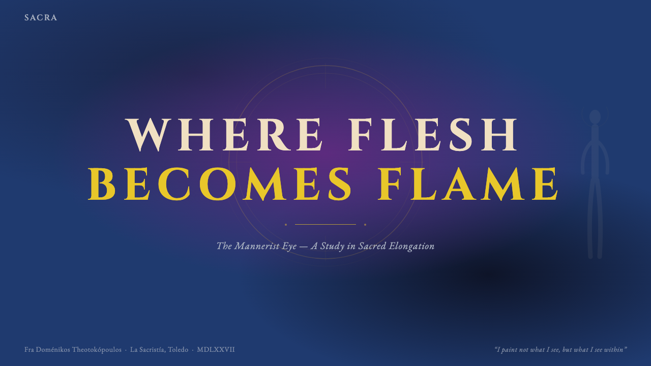
For presentation slides, the style works best on dark-ground layouts. A cover slide benefits from the full compositional tension: a tall, asymmetrically placed title in warm antique-gold or lemon-flame against the deep cobalt ground, supporting text receding into a cooler, less saturated version of the ground color. Content slides should use the palette economically — one warm accent marks the single most important concept per slide; everything else is presented in near-neutral tones. Data slides take on an almost icon-like quality: charts become luminous objects against the dark, with bars or segments lit as though from within, the key data point marked in gold.对于演示文稿,这种风格在深色底面布局上效果最佳。封面幻灯片受益于完整的构图张力:一个高挑的、非对称放置的标题,以温暖的古金色或柠檬火焰色呈现于深钴蓝底面之上,辅助文字退入较冷、饱和度较低的底色变体。内容幻灯片应当节俭地使用色板——每张幻灯片仅以一种暖色强调标记最重要的单一概念;其余一切以近似中性的色调呈现。数据幻灯片呈现出近乎圣像般的品质:图表在深色底面上成为发光的物体,柱条或扇区仿佛从内部被照亮,关键数据点以金色标注。
For web interfaces, Toledo Mannerism suits dark-mode dashboards, premium analytics products, and any platform where depth and seriousness are brand values. The approach: establish a near-black cobalt as the page ground, use a slightly lighter cobalt for surface containers (cards, panels), reserve the lemon-flame yellow for primary call-to-action elements and alert states, and use antique gold exclusively for the highest-priority indicator — the active navigation item, the primary metric, the featured tier in a pricing layout. Typography should feel tall and compressed in its proportions, favoring condensed letterforms over wide or neutral ones. Navigation labels and headings gain presence through vertical spacing rather than decorative treatment.对于网页界面,托莱多手法主义适合深色模式仪表板、高端分析产品,以及任何以深度与严肃性为品牌价值的平台。方法如下:以近黑的钴蓝建立页面底色,以略浅的钴蓝用于表面容器(卡片、面板),将柠檬火焰黄保留给主要行动号召元素与警示状态,古金专门用于最高优先级的指示器——激活的导航项、主要指标、定价布局中的特色等级。字体排印应当在比例上感觉高挑而紧凑,偏向窄体字形而非宽体或中性字形。导航标签与标题通过垂直间距而非装饰性处理来获得存在感。
For editorial and marketing work, the style supports dark-editorial layouts with strong visual presence. A Toledo-derived article layout uses the deep cobalt as the page background, section openers with full-width cobalt-to-near-black gradients as visual breaks, and pull quotes or key statistics rendered in lemon-flame yellow for maximum contrast. Marketing pages work well when the hero section commits to the full palette intensity — a tall, vertically oriented hero with the product or concept framed against storm cobalt, the key benefit line in the warmest accent — while subsequent sections modulate the palette slightly to give the eye relief. The Byzantine gold can mark a premium tier, a featured testimonial, or a boundary between sections.对于编辑与营销内容,这种风格支持具有强烈视觉存在感的深色编辑布局。托莱多风格的文章布局以深钴蓝作为页面背景,章节开篇使用全宽钴蓝到近黑渐变作为视觉分段,拉出引语或关键统计数据以柠檬火焰黄呈现以获得最大对比度。营销页面在英雄区块全力投入完整色板强度时效果最佳——高挑的、纵向取向的英雄画面,产品或概念框在风暴钴蓝之上,关键利益说明以最温暖的强调色呈现——而后续章节则略微调节色板,给视线提供喘息空间。拜占庭金可以标注高级套餐、特色推荐语,或章节之间的边界。
A common mistake when applying Toledo Mannerism is treating the warm accents as interchangeable — using lemon yellow, electric violet, and antique gold simultaneously throughout the layout as though they carry equal weight. In El Greco's actual work, the warmest and most saturated tones are used for the most spiritually significant figure in the composition; everything else is subordinate. In design terms, this means establishing a strict hierarchy: one primary warm accent for the most important interactive or informational element; a secondary warm tone for supporting elements; gold reserved for singular moments of highest emphasis. When every element competes at the same intensity, the system collapses into visual noise.应用托莱多手法主义时最常见的错误,是将暖色强调视为可互换的——在整个布局中同时使用柠檬黄、电光紫罗兰和古金,仿佛它们承载同等的分量。在埃尔·格列柯的实际作品中,最温暖、最饱和的色调被用于构图中精神意义最重大的人物;其他一切都是从属的。在设计语言中,这意味着建立严格的层级:一种主要暖色强调用于最重要的交互或信息元素;一种次要暖色调用于辅助元素;金色保留给最高强调的单一时刻。当每个元素都以同等强度竞争时,系统便崩溃为视觉噪音。
See the El Greco — Toledo Mannerism design system查看 El Greco — Toledo Mannerism 完整设计系统
El Greco — Toledo Mannerism — FAQEl Greco — Toledo Mannerism · 常见问题
Is Toledo Mannerism only suited to dark-mode designs?托莱多手法主义只适合深色模式设计吗?
The historic palette is emphatically dark-ground — El Greco's cobalt skies and near-black shadow zones are structural, not incidental. A light-ground inversion is possible but requires fundamental adjustments: the storm cobalt must shift to a clear, pale blue ground, the flame yellows deepen to amber or ochre, and the near-black accents become the primary structural color. The result reads more like a stained-glass or medieval manuscript interpretation than the original Toledo drama. For most applications where the style is chosen for its intensity and visionary quality, the dark ground is not optional — it is the source of the effect.历史色板明确以深色为底面——埃尔·格列柯的钴蓝天空与近乎纯黑的阴影区域是结构性的,而非偶然的。浅色底面的反转版本是可能的,但需要根本性的调整:风暴钴蓝必须转变为清澈、浅淡的蓝色底面,火焰黄加深为琥珀色或赭石色,近黑强调色成为主要结构色。结果读起来更像彩色玻璃或中世纪手抄本的诠释,而非托莱多原作的戏剧感。对于大多数因其强度与幻象品质而选择这种风格的应用场景,深色底面不是可选项——它是效果的来源。
How does this style differ from other dark-palette styles like vaporwave or noir?这种风格与蒸汽波或黑色电影风格等其他深色色板风格有何不同?
The distinction lies in the quality and intention of the darkness and the accents. Vaporwave uses deep purples and magentas with neon accents in a palette that is fundamentally about synthetic nostalgia and surface pleasure. Noir uses desaturated near-monochrome with high-contrast spot lighting, emphasizing shadow as threat. Toledo Mannerism uses a darkness that is not moody or synthetic but pressurized and theological — the deep cobalt is not atmospheric in a cinematic sense but charged with the same quality of intensity as the warm accents that oppose it. The antique gold accent is the key differentiator: it is not ironic, not retro, not decorative — it is hieratic, a mark of the sacred or the supremely important.区别在于黑暗与强调色的品质与意图。蒸汽波使用深紫与洋红,搭配霓虹强调色,色板根本上关于合成的怀旧与表面的愉悦。黑色电影使用去饱和的近似单色,搭配高对比度的点光照明,将阴影强调为威胁。托莱多手法主义使用的黑暗不是阴郁的或合成的,而是被压缩的、具有神学意味的——深钴蓝在电影意义上不是氛围性的,而是与对立的暖色强调具有同等强度品质的充电感。古金强调色是关键区分因素:它不是反讽的,不是复古的,不是装饰性的——它是神圣仪式性的,是神圣或至高重要事物的标记。
Why does the style use diagonal composition rather than centered symmetry?为什么这种风格使用对角线构图而非居中对称?
Centered symmetry was the compositional grammar of Renaissance authority — it implies stability, completeness, and the resolution of tension. Mannerism, including El Greco's Toledo work, deliberately chose instability as an expressive tool. A composition in diagonal tension is one that feels unresolved, still in motion, still aspiring rather than achieved. For design, this is a meaningful choice: centered symmetry tells the viewer the experience is complete and contained; diagonal tension tells the viewer something is happening, something demands attention, the moment is not settled. The style is therefore more useful for landing pages, onboarding flows, and moments of conversion or emphasis than for documentation, settings interfaces, or any context where calm authority is the desired feeling.居中对称是文艺复兴权威的构图语法——它暗示稳定性、完整性与张力的化解。手法主义,包括埃尔·格列柯的托莱多作品,刻意选择了不稳定性作为表达工具。处于对角线张力中的构图是一种感觉未解决的、仍在运动的、仍在渴望而非已然实现的构图。对于设计而言,这是一个有意义的选择:居中对称告诉观看者体验是完整且包含的;对角线张力告诉观看者某件事正在发生,某件事需要注意,这一时刻尚未尘埃落定。因此,这种风格对于登陆页、引导流程以及转化或强调的时刻,比对于文档、设置界面或任何以平静权威为期望感受的场合更为有用。
Can Toledo Mannerism work for consumer-facing products, or is it too severe?托莱多手法主义适合面向消费者的产品吗,还是说它过于严苛?
It depends entirely on what the consumer is being invited to feel. Toledo Mannerism is not warm, not playful, not reassuring — it is intense, serious, and demands engagement. This makes it poorly suited for consumer contexts that depend on approachability, warmth, or ease: food and beverage, family products, wellness applications, children's education. It works well for premium consumer contexts where aspiration and seriousness are part of the value proposition: high-end audio, luxury timepieces, performance sportswear, collectors' editions, investment platforms, and any product whose consumer identity is built around excellence rather than comfort. The style implicitly promises that the product is not ordinary — which is a powerful message when the product earns it and an alienating one when it does not.这完全取决于邀请消费者感受什么。托莱多手法主义不温暖、不俏皮、不令人安心——它是强烈的、严肃的,要求投入。这使它不适合依赖亲切感、温度或轻松感的消费者场景:食品饮料、家庭产品、健康应用、儿童教育。它在渴望感与严肃性是价值主张一部分的高端消费者场景中效果良好:高端音响、奢华腕表、竞技运动服装、收藏版产品、投资平台,以及任何消费者身份建立在卓越而非舒适之上的产品。这种风格隐含地承诺该产品并不平凡——当产品名副其实时,这是一个强有力的信息;当产品无法兑现时,则会令人疏离。
How should typography be handled in this style — are condensed or serif typefaces appropriate?这种风格中的字体排印应该如何处理——窄体或衬线字体合适吗?
Typography in Toledo Mannerism should echo the style's fundamental compositional instinct: tall, compressed, and upward-pulling. Condensed or semi-condensed letterforms complement the elongated vertical figures; they reinforce the dominant direction of the composition without competing with the palette's intensity. Serifs can be appropriate — particularly high-contrast, slightly archaic display serifs that carry historical weight — but they should be sharp and vertical rather than calligraphic or rounded. Wide, geometric sans-serifs work against the style by introducing horizontal stability. The least appropriate choices are typefaces associated with warmth, friendliness, or technical neutrality. Letter-spacing should be tight; line-height generous enough to allow the vertical column of text to read as an upward rhythm rather than a dense block.托莱多手法主义中的字体排印应当呼应这种风格根本的构图本能:高挑的、压缩的、向上牵引的。窄体或半窄体字形补充了拉伸的纵向人物;它们强化了构图的主导方向,而不与色板的强度竞争。衬线字体可以是合适的——尤其是高对比度、略带古风的展示衬线字体,携带着历史分量——但它们应当是锐利且垂直的,而非书法式或圆润的。宽体几何无衬线字体通过引入水平稳定性而与这种风格相悖。最不合适的选择是与温暖、友好或技术中性相关联的字体。字母间距应当紧凑;行高则要足够宽松,使垂直文字柱以向上的韵律而非密集的文字块来阅读。
Related design styles相关设计风格
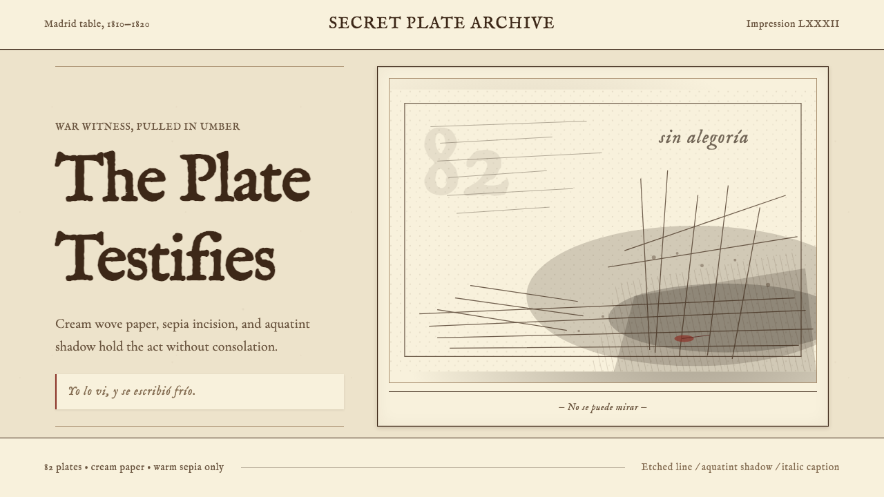 Goya — Disasters of WarWitness without ornament. Cream paper, umber line, aquatint shadow, italic ca…无装饰的见证:米色纸、赭褐线、飞尘暗影与斜体短注。
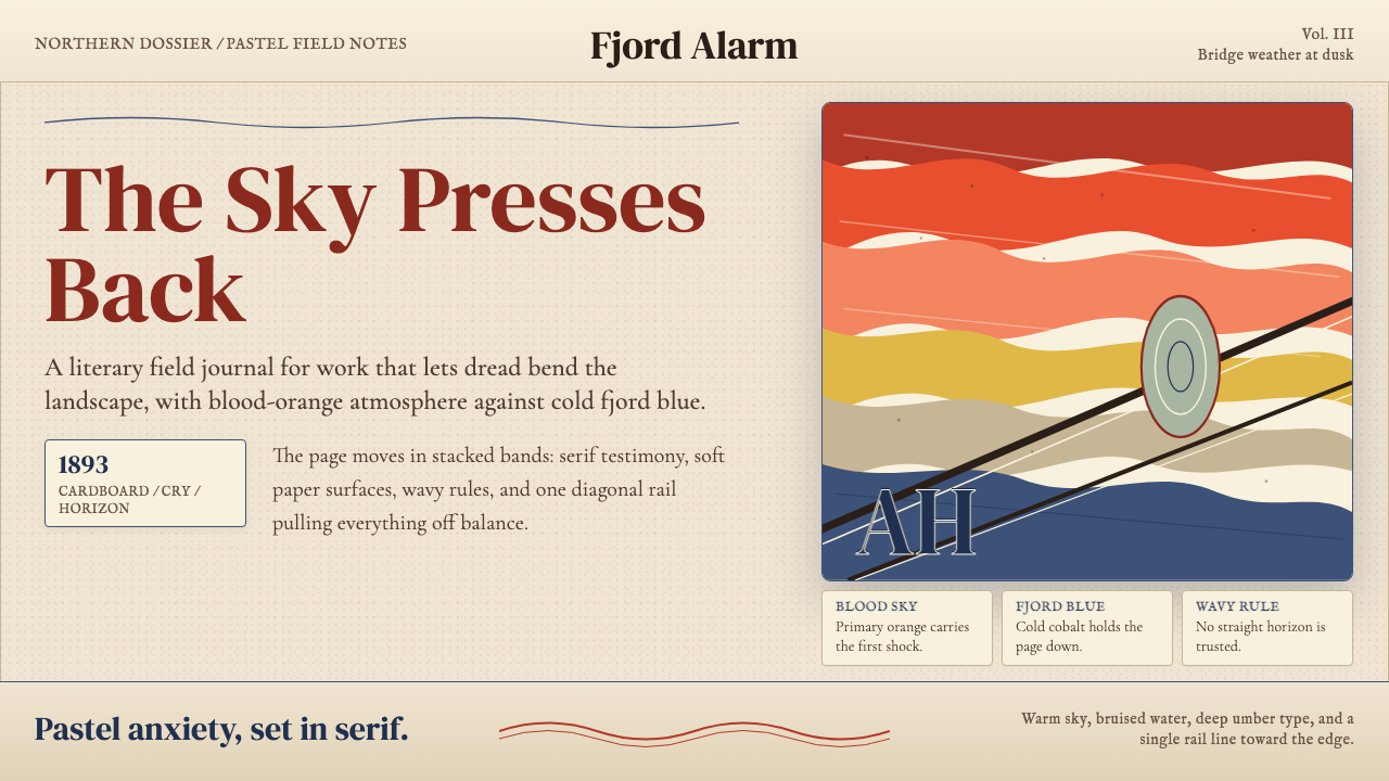 Munch — The ScreamAnxiety bends the page. Blood orange bands, cobalt fjord, and serif type tilt…焦虑弯曲页面:血橙色带、峡湾钴蓝与衬线字一起倾斜。
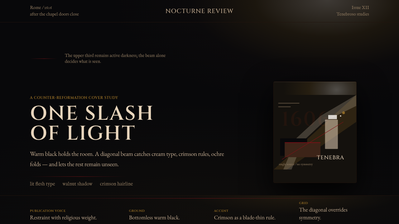 Caravaggio TenebrismDarkness acts first. Warm-black voids, Cinzel capitals, and one ochre raking…黑暗先发声:暖黑空场、Cinzel 大写与赭石斜光。
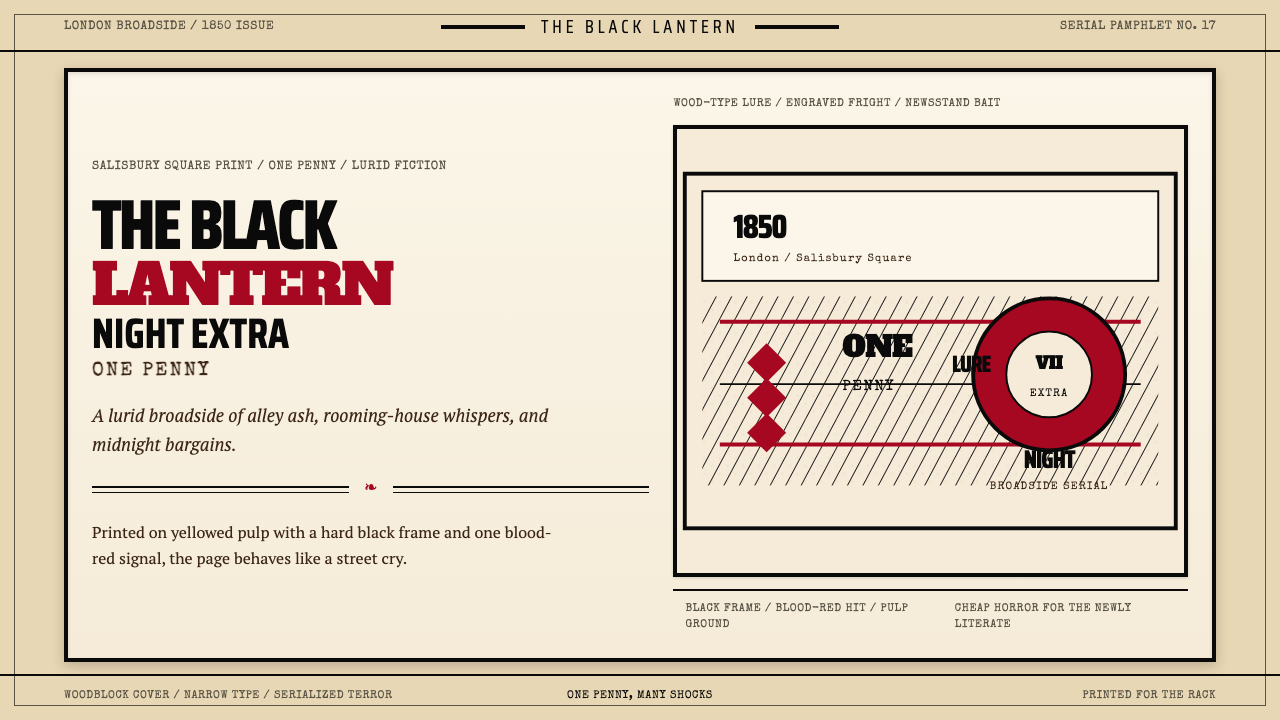 Penny Dreadful Victorian Headline (1850)Cheap terror in full cry. Condensed wood-type, black borders, and one blood-r…廉价恐怖全速开喊。窄体木活字、黑框和血红点染钉在泛黄纸上。
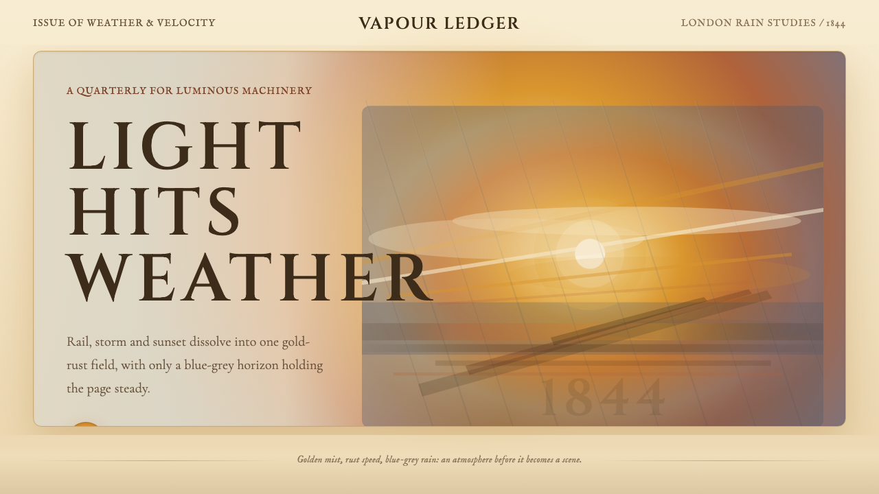 Turner — Rain, Steam and SpeedEdges dissolve into weather. Amber mist, rust smears and blue-grey horizon ca…边缘化入天气。琥珀雾、金锈涂痕与蓝灰地平线托住画面。
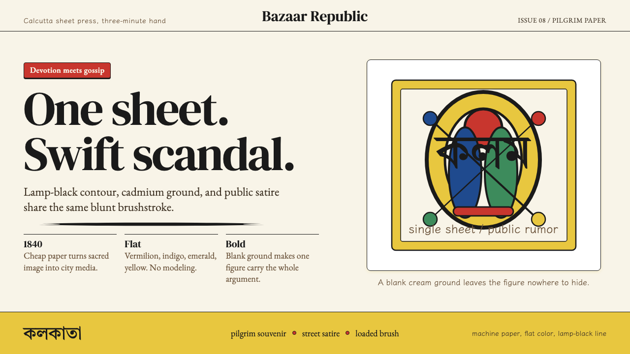 Kalighat Patua (Bengal)Satire swings fast. Cadmium yellow, vermilion and lamp-black line on cream pa…讽刺一笔挥出:奶油纸上明黄、朱红与墨黑轮廓线。