What is Penny Dreadful Victorian Headline (1850)?什么是 Penny Dreadful Victorian Headline (1850)?
A penny bought you murder, vampires, and spring-heeled demons — and the condensed wood-type headline screaming from the newsstand told you exactly what you were getting.一便士买来谋杀、吸血鬼和弹簧腿恶魔——报摊上那行窄体木活字标题朝你怒吼,让你一眼看清自己正在购买什么。
Penny Dreadful Victorian Headline (1850) in briefPenny Dreadful Victorian Headline (1850) 速览
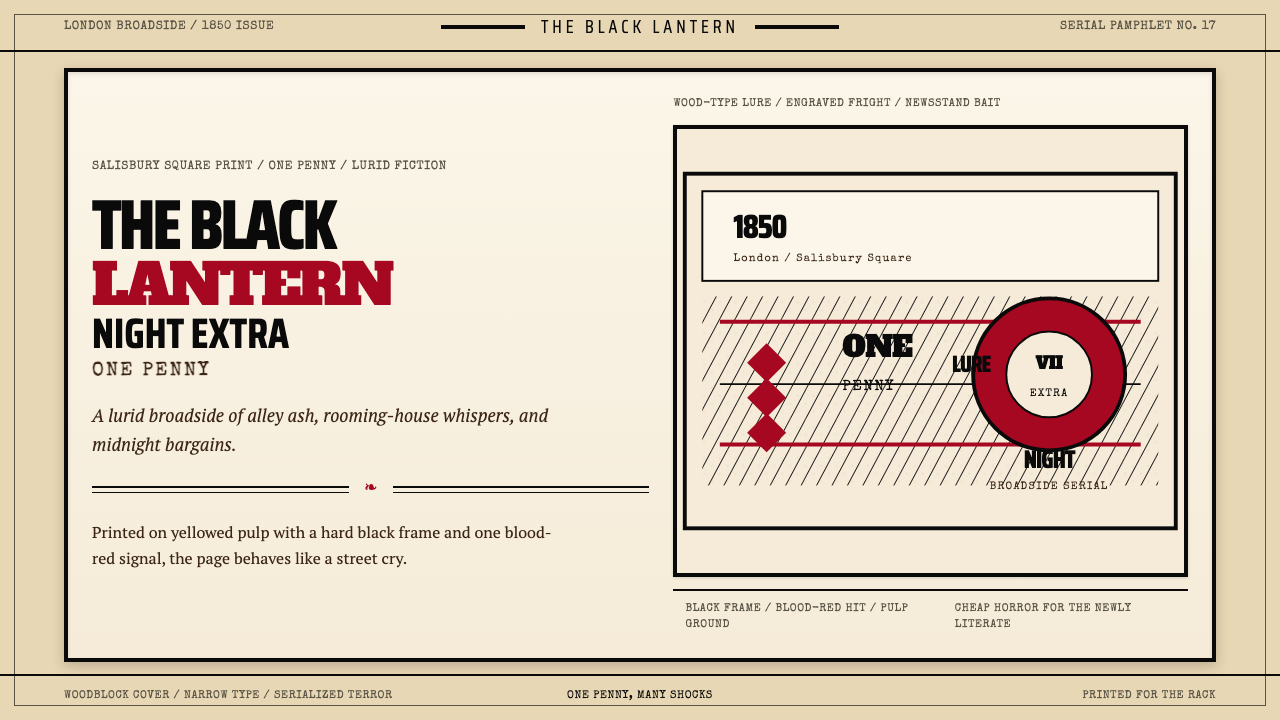
Penny Dreadful Victorian Headline is the design language of Victorian England's cheapest popular fiction — the one-penny serial pamphlets sold to newly literate working-class readers from roughly 1830 through the 1880s. Its visual identity was forged entirely by economic constraint and competitive necessity: every compositional decision was made to outshout the adjacent pamphlet on a crowded newsstand rack.便士恐怖维多利亚标题是维多利亚时代英国最廉价通俗小说的设计语言——那些大约从1830年代延续至1880年代、以一便士一册形式出售给新识字工人阶级读者的连载小册子。它的视觉身份完全由经济约束与竞争需求所塑造:每一个构图决定,都是为了在人声鼎沸的报摊上压倒旁边那本竞争对手的小册子。
The system is built around a small number of high-tension elements. Extra-condensed wood-type headlines stack vertically in maximum-weight bold, compressing as much drama as possible into a narrow column. A single blood-red spot color punctuates the otherwise black-and-sepia composition — used sparingly on a key word, a woodblock illustration detail, or a border rule — and becomes the signal for something lurid. Ornamental border rules divide the page like a broadside bill-poster, and the substrate itself — rough, yellowed pulp paper — is as much a part of the aesthetic as any ink on it.这套视觉系统建立在少数几个高张力元素上。超窄体粗黑木活字标题垂直堆叠,以最大字重将尽可能多的戏剧性压缩进一根窄柱里。一抹血红点缀色在黑色与深褐色的底调中穿刺而出——克制地用在某个关键词、木刻插图的某处细节,或一条边框线上——成为骇人刺激的信号。装饰性线框将页面分割得如同张贴于街头的大幅广告帖子,而纸张本身——粗糙、泛黄的廉价纸浆纸——与上面的每一滴油墨同等重要地构成了这套美学。
The effect is poster-in-miniature: every page functions as a broadside, and every broadside is designed to arrest the eye from a distance before the reader has committed to picking it up. This is a design vocabulary of pure sensationalism — not as a failing, but as a consciously deployed commercial and communicative strategy.最终效果是"缩微版海报":每一页都像一张招贴,每一张招贴都被设计成在读者尚未决定是否拿起它之前,就从远处夺走目光。这是一套纯粹耸动主义的设计语言——不是作为一种缺陷,而是一种被有意识部署的商业与传达策略。
Where does Penny Dreadful Victorian Headline (1850) come from?Penny Dreadful Victorian Headline (1850) 从何而来?
The penny dreadful emerged in the 1830s as a direct response to a new social reality: a working-class readership that had acquired basic literacy through Sunday schools and charity education but had no access to the three-volume novels circulated among the middle and upper classes. Publishers centered around London's Salisbury Square — an area that became synonymous with cheap print production — recognized this market and moved to fill it. The format was standardized quickly: eight to sixteen pages per installment, printed in a small upright format that fit inside a coat pocket, sold for one penny each.便士恐怖小说在1830年代作为对一种新社会现实的直接回应而兴起:工人阶级读者群体通过主日学校和慈善教育获得了基本的读写能力,却无缘接触中上阶层流通的三卷本小说。聚集在伦敦索尔兹伯里广场周边的出版商——这一地区逐渐与廉价印刷生产同义——看到了这片市场并着手填补它。出版格式迅速标准化:每辑八至十六页,印成能塞进外套口袋的小型竖版开本,每册售价一便士。
The key publishers were entrepreneurs who understood that the content and the design were inseparable commercial propositions. Edward Lloyd, who operated from Fleet Street and later Salisbury Square, became the most prolific producer of penny fiction in the 1840s, publishing weekly serials in enormous print runs. James Malcolm Rymer and Thomas Peckett Prest were among the most productive authors working in this space, responsible for the canonical texts that defined the genre: Rymer is credited with 'Varney the Vampire' (1847), and Prest with an early version of the Sweeney Todd story. James Catnach of Seven Dials was another major figure — he came from the broadsides and street-ballad trade and brought that tradition's visual grammar directly into cheap fiction publishing.关键出版商都是懂得内容与设计在商业上密不可分的实干家。爱德华·劳埃德在舰队街、后来在索尔兹伯里广场经营,成为1840年代最多产的便士小说出版商,以惊人印量出版周刊连载。詹姆斯·马尔科姆·赖默与托马斯·佩克特·普雷斯特是这一领域最高产的作者,他们创作了界定这一类型的经典文本:赖默被认为是《吸血鬼瓦尼》(1847年)的作者,普雷斯特则创作了理发师托德故事的早期版本。七角区的詹姆斯·卡特纳奇是另一位重要人物——他来自街头广告帖子与街头歌谣的行当,将那个传统的视觉语法直接带入了廉价小说出版。
The typography was determined entirely by what was available and affordable. Wood type — large letterforms carved in end-grain wood — had been developed in the 1820s primarily for poster use, because metal type at large sizes was prohibitively heavy and expensive. For penny dreadful publishers, wood type became the headline instrument of choice: it could be set quickly, it could be printed at the same time as body text on a common press, and the condensed display faces available in wood came with the visual weight and drama that the sensational content demanded. Extra-condensed variants, which could fit a long title into a narrow column, were especially prized.排版选择完全由现有条件与成本决定。木活字——刻在端面纹理木料上的大字形——在1820年代主要为海报用途而开发,因为金属活字在大尺寸时笨重且昂贵得令人却步。对便士恐怖小说出版商来说,木活字成为首选的标题工具:排版迅速,可与正文在同一台印刷机上同时付印,而木活字中可用的窄体展示字形恰好具备那种耸动内容所需的视觉份量与戏剧性。超窄体变体——能将一个长标题塞进一根窄柱——尤受青睐。
The woodblock engravings that accompanied most penny dreadfuls were produced by a network of commercial engravers working to tight deadlines. These illustrations were frequently reused across different titles — the same image of a struggling figure might illustrate a pirate story one week and a vampire tale the next — which contributed to a visual vocabulary that felt generic in the best sense: immediately legible to readers across many different storylines. The blood-red spot color, where used, was applied as a second ink pass, making it a deliberate production investment that signaled the publisher's commitment to the most lurid effect possible.大多数便士恐怖小说所附的木刻版画由一批在紧迫截止期前工作的商业雕版师网络制作。这些插图频繁在不同书目间复用——同一幅挣扎人物的图像,这周可能为海盗故事配图,下周又出现在吸血鬼故事里——这造就了一套最佳意义上的通用视觉词汇:跨越不同故事线,对读者立即可读。血红色点缀色(在使用时)作为第二次上墨处理施加,这意味着一项刻意的生产投资,标志着出版商追求尽可能骇人效果的决心。
What defines the Penny Dreadful Victorian Headline (1850) look?Penny Dreadful Victorian Headline (1850) 的视觉特征是什么?
Extra-Condensed Wood-Type Headline超窄体木活字标题
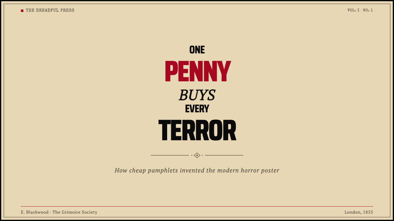
The defining element of the style is the headline typeface: a drastically condensed bold letterform that compresses maximum visual mass into a narrow vertical column. In authentic penny dreadful design, the headline consumes nearly the full width of the text block, stacks across two or three lines, and is set at a size that dwarfs the body copy beneath it. The condensed proportion is not a stylistic flourish — it is the most efficient way to get a long, dramatic title into a confined format without reducing legibility. The letterforms have strong vertical stress, flat or minimal bracketing on serifs, and ink-trapping corners that give the type a slightly battered, high-pressure quality consistent with fast commercial printing.这一风格的决定性元素是标题字形:一种极度压缩的粗黑字体,将最大视觉质量压入一根窄小的垂直柱体。在真正的便士恐怖小说设计中,标题几乎占据文字区域的全部宽度,跨越两到三行堆叠,字号远大于其下的正文。窄体比例并非风格花饰——它是在不损害易读性的前提下,将一个冗长、富于戏剧性的标题塞进受限版式的最有效方式。字形具有强烈的垂直应力、平齐或最小化的衬线过渡,以及在快速商业印刷中形成的略显磨损的高压油墨感。
Blood-Red Spot Color血红点缀色
A single accent color — a deep, vivid crimson applied as a second ink pass — is the most immediate visual signal of the penny dreadful tradition. Its use is deliberately restrained: one word in the headline, one element in the woodblock illustration, or one border rule. Because it is a production cost beyond the base single-color print run, its presence signals intent. The red is never used as a background fill or a structural tone; it punctuates, it highlights, it marks the most dangerous word on the page. In contemporary applications, matching this logic means treating the accent color with the same economy — one hit per composition, positioned at the point of maximum narrative tension.单一强调色——作为第二次上墨处理施加的深沉鲜艳朱红——是便士恐怖传统最直接的视觉信号。其使用被刻意克制:标题中的某一个词、木刻插图中的某一处元素,或某一条边框线。由于这是基础单色印刷成本之外的额外生产投入,它的出现本身就传达着意图。这抹红色绝不作为背景填充或结构性色调使用;它是点缀,是高亮,标记着页面上最危险的那个词。在当代应用中,匹配这一逻辑意味着以同等的节制对待强调色——每个构图一处着落,定位在叙事张力最大的那个点。
Ornamental Border Rules装饰性线框规则
Thick-and-thin border rules — often composed of multiple parallel lines of varying weight — frame the composition and divide internal sections in the manner of a broadside bill-poster or theater playbill. These rules serve both structural and atmospheric functions: they contain and organize the dense typographic content, and they signal that the reader is holding something in the tradition of street advertising rather than a literary publication. The borders are typically printed in the same black ink as the body text but at a weight heavy enough to read as a distinct visual element from a distance.粗细相间的边框线——往往由多条不同粗细的平行线组成——以大幅广告帖或剧场节目单的方式框架构图并在内部分节。这些线框同时服务于结构性与氛围性功能:它们包容并组织密集的字体内容,同时示意读者所持之物属于街头广告的传统,而非文学出版物。线框通常以与正文相同的黑色油墨印刷,但粗度足以在远距离被识别为一个独立的视觉元素。
Yellowed Pulp Ground泛黄纸浆底调
The substrate of the penny dreadful is cheap wood-pulp paper — off-white when new, aging quickly to a warm straw-yellow or tobacco tone under exposure to light and air. This yellowing is not incidental: it is the chromatic signature of the form. Contemporary applications of this aesthetic treat the background as a warm, aged off-white rather than a clean neutral, giving the entire composition a sense of material history even in digital or high-quality print contexts. The yellow tone also functions as a middle ground that allows both the black typography and the red accent to read at maximum contrast without competing with each other.便士恐怖小说的印刷基材是廉价木浆纸——新时呈灰白色,在光线与空气的作用下迅速老化为温暖的稻草黄或烟草色。这种泛黄并非偶然:它是这一形式的色调标志。当代对这一美学的应用将背景处理为温暖、老化的米白,而非干净的中性色,即便在数字或高质量印刷语境中也赋予整个构图一种材质历史感。这层黄色调同时充当中间值,使黑色排版与红色强调色都能以最大对比度呈现,而不相互竞争。
Woodblock Illustration Register木刻版画调性
Illustrations in the penny dreadful tradition are woodblock engravings — high-contrast, heavily cross-hatched, with stark black areas and coarse white-line detail. Figures are dramatically posed, frozen at the moment of maximum action or horror. The engraving technique naturally produces an image that reads as flat and graphic rather than three-dimensional and painterly, which keeps it coherent with the typographic material surrounding it. Contemporary design influenced by this tradition uses illustration or image treatment that shares these qualities: high contrast, limited mid-tones, graphic outline emphasis, and a slight coarseness that references hand-production.便士恐怖传统中的插图是木刻版画——高对比度,大量交叉阴影线,有着鲜明的黑色实块与粗粒白线细节。人物被戏剧性地定格,凝冻在最大动作或恐怖的那一瞬间。雕版技术自然产生一种读起来平面而图形化、而非立体绘画感的图像,使其与周围的字体材料保持视觉一致。受这一传统影响的当代设计,使用分享这些品质的插图或图像处理:高对比度、有限中间调、图形轮廓强调,以及一丝参照手工制作的粗粒感。
Stacked Vertical Typography垂直堆叠排版
The layout logic of the penny dreadful is vertical and hierarchical in a way borrowed directly from the trade-card and broadside poster tradition. The headline breaks across multiple short lines — each line a complete phrase or even a single emphatic word — creating a stacked rhythm that drives the eye downward rapidly. Subtitle lines follow in a slightly smaller size but still dramatically larger than body text. This vertical stacking maximizes the impact of a narrow-format page and creates a reading tempo that mimics the urgency of the content.便士恐怖小说的版面逻辑是垂直的、层级分明的,直接借自商业名片与大幅广告帖传统。标题跨越多行短句排列——每行是一个完整短语,甚至是一个单独的强调词——制造一种驱动视线迅速向下的堆叠节奏。副标题行以稍小的字号跟随,但仍远大于正文。这种垂直堆叠最大化了窄格式页面的冲击力,并制造了一种与内容紧迫感相呼应的阅读节奏。
Restrained Palette of Maximum Contrast极度克制的高对比度色板
The penny dreadful palette is not rich — it is extreme. Ink-black type and rules on a yellowed warm ground, with a single crimson accent, constitutes the complete tonal and chromatic range. There are no mid-weight grays, no background textures in color, no additional accent tones. The restriction is partly economic (every additional ink is an additional cost) and partly rhetorical (contrast is the visual equivalent of a shout). The restraint also means that any departure from the three-element palette — black, warm ground, blood-red — reads immediately as a violation of the system.便士恐怖小说的色板不丰富——它是极端的。泛黄暖底上的墨黑文字与线条,配以单一朱红点缀,构成完整的色调与色彩范围。没有中等灰度,没有带颜色的底纹,没有额外的强调色调。这种限制一半出于经济(每增加一种油墨就是一笔额外成本),一半出于修辞(对比度是视觉意义上的呐喊)。这种克制也意味着,任何对三元素色板——墨黑、暖底、血红——的偏离都会立即被读作对系统的违背。
Who shaped Penny Dreadful Victorian Headline (1850)?谁塑造了 Penny Dreadful Victorian Headline (1850)?
Lloyd was the most commercially successful publisher of penny fiction in Victorian England, operating first from Fleet Street and later from Salisbury Square. In the 1840s he ran weekly penny serials in print runs that dwarfed those of mainstream literary publishers, targeting a working-class readership that had never been served by the established book trade. His design approach — bold headline typography, woodblock illustration on the cover page, and a consistent visual identity across all his titles — established the template that competitors imitated for decades. Lloyd later transitioned to respectable newspaper publishing, founding Lloyd's Weekly Newspaper, which became one of the highest-circulation papers in Victorian England.劳埃德是维多利亚时代英国最具商业成功的便士小说出版商,先在舰队街、后在索尔兹伯里广场经营。1840年代,他以远超主流文学出版商的印量出版每周便士连载,面向从未被既有图书贸易服务过的工人阶级读者群体。他的设计方式——粗黑标题排版、封面页木刻插图,以及贯穿所有书目的一致视觉身份——确立了竞争对手模仿数十年的模板。劳埃德后来转型为体面的报业出版商,创办《劳埃德周报》,该报成为维多利亚时代英国发行量最高的报纸之一。
Rymer was one of the most prolific authors in the penny dreadful genre, credited with 'Varney the Vampire, or The Feast of Blood' (1847), a serial that ran to 220 installments and introduced many of the conventions that would later define Victorian vampire fiction. Rymer understood the genre's visual contract as well as its narrative one: the stories were written to generate maximum headline-worthy moments — scenes of transformation, pursuit, and revelation — that could be illustrated with woodblock engravings designed to arrest attention on the newsstand. His work demonstrated that sensational typography and sensational narrative were designed as a unified system.赖默是便士恐怖类型中最多产的作者之一,被认为是《吸血鬼瓦尼,或鲜血盛宴》(1847年)的作者——这部连载持续了220辑,确立了许多后来界定维多利亚吸血鬼小说的惯例。赖默像理解这一类型的叙事契约一样理解其视觉契约:这些故事被写就是为了产生最多具有标题价值的时刻——蜕变、追逐与揭示的场景——可以被设计成在报摊上夺人眼球的木刻版画配图。他的作品证明,耸动排版与耸动叙事是作为一个统一系统被设计的。
Prest was a prolific author and adapter who worked extensively for Edward Lloyd, producing penny fiction at astonishing speed. He is associated with early versions of the Sweeney Todd narrative — the demon barber of Fleet Street whose murders fed a neighboring pie shop — which became one of the most recognizable characters in Victorian popular culture. Prest's craft was the craft of the penny dreadful as a whole: compression, escalation, and the sustained delivery of shock installment after installment. His work helped define what the visual design of the format was asked to deliver — a promise of ongoing sensation, renewed with each weekly issue.普雷斯特是一位多产的作者与改编者,为爱德华·劳埃德大量工作,以惊人速度创作便士小说。他与理发师托德故事的早期版本相关联——那位舰队街的恶魔理发师,其谋杀为隔壁馅饼店提供原料——这一人物成为维多利亚通俗文化中最广为人知的形象之一。普雷斯特的技艺就是便士恐怖小说作为整体的技艺:压缩、升级,以及辑接一辑地持续输出震撼。他的工作有助于界定这一版式的视觉设计被要求传递什么——一个持续感官刺激的承诺,每周新刊续火。
Catnach operated from Seven Dials in London, one of the most densely printed districts in the city, and built his reputation on broadsides — single-sheet printed documents sold for a halfpenny or penny that reported sensational news, executions, and disasters. His contribution to the penny dreadful aesthetic was the direct inheritance of broadside visual grammar: the heavy border rules, the stacked headline typography, the use of stock woodcut illustrations repurposed across different stories. Catnach demonstrated that the design language of cheap sensation was continuous from street ballads and execution broadsides to serialized horror fiction — a single commercial print tradition with shifting content.卡特纳奇在伦敦七角区经营,那是全城印刷业最密集的地区之一,他以广告帖子建立声誉——以半便士或一便士出售的单张印刷品,报道耸人听闻的新闻、处决与灾难。他对便士恐怖美学的贡献,是对广告帖子视觉语法的直接传承:厚重的边框线、堆叠的标题排版、在不同故事间反复借用的存货木刻插图。卡特纳奇证明,廉价耸动的设计语言从街头歌谣与处决广告帖一路延续至连载恐怖小说——是一个随内容转换的单一商业印刷传统。
Salisbury Square, just off Fleet Street in the City of London, became the center of cheap serial fiction publishing from the 1830s onward. The concentration of printers, publishers, engravers, and paper suppliers in this small area created an industrial ecosystem for penny fiction production that operated at speeds and volumes impossible elsewhere. The design language that emerged from Salisbury Square was collaborative rather than authored: typesetters, engravers, and press operators each contributed to the visual identity of the penny dreadful, and the resulting aesthetic was a collective production standard rather than the vision of any single designer. This collective origin is part of why the style has such consistency — it was optimized by commercial repetition across dozens of competing publishers rather than designed from first principles.索尔兹伯里广场,位于伦敦城区舰队街旁侧,从1830年代起成为廉价连载小说出版的中心。这片小小区域内印刷商、出版商、雕版师与纸张供应商的聚集,为便士小说生产创造了一个工业生态系统,以别处不可能实现的速度与规模运转。从索尔兹伯里广场浮现的设计语言是集体协作的产物,而非个人创作:排字工人、雕版师与印刷工人各自为便士恐怖小说的视觉身份做出贡献,由此形成的美学是集体生产标准,而非任何单一设计师的愿景。这一集体起源在一定程度上解释了为何这种风格如此一致——它是通过数十家竞争出版商的商业重复而被优化的,而非从第一性原理被设计出来。
How do you use Penny Dreadful Victorian Headline (1850) today?今天怎么用 Penny Dreadful Victorian Headline (1850)?
Penny Dreadful Victorian Headline is a style of maximum rhetorical intensity — it is not suited to subdued, balanced, or multi-topic layouts. Applied correctly, it transforms a design surface into something that functions like a broadside: a single dominant message delivered with theatrical urgency. The correct application question is not 'does this look Victorian?' but 'does this communicate with the same directness and compression that a newsstand cover had to achieve in 1855?'便士恐怖维多利亚标题是一种最大修辞强度的风格——它不适合柔和、平衡或多主题的版面。正确应用时,它将一个设计界面转化为类似广告帖子的东西:以戏剧性的紧迫感传递单一主导信息。正确的应用问题不是「这看起来像维多利亚时代吗?」,而是「这是否以1855年的报摊封面必须实现的直接性和压缩感在传达?」
For presentation slides, the style is most powerful on cover and section-divider slides. A cover in this aesthetic uses the entire slide as a broadside: a stacked extra-condensed headline across the upper two-thirds, a woodblock-style illustration or decorative woodcut motif in the lower third, a single blood-red word or rule as the accent, and the whole composition on a warm yellowed ground. Content slides should be used sparingly with this style — it is a high-intensity treatment that fatigues if applied uniformly. Where content slides do carry the aesthetic, they work best with one strong statement per slide rather than dense bullet lists, and section headers set in condensed bold that visually echoes the cover.对于演示文稿,这种风格在封面页和章节分隔页上最为有力。这一美学下的封面将整张幻灯片当作广告帖子使用:超窄体粗黑标题堆叠在上三分之二处,木刻风格插图或装饰木刻母题占据下三分之一,一个血红词或一条血红线作为强调色,整体构图置于温暖的泛黄底调上。内容页应谨慎使用这种风格——它是高强度处理,若全程一致应用会令人疲倦。在内容页确实承载这一美学的情况下,每页一个强观点比密集的项目符号列表更有效,而节标题以窄体粗黑排版,与封面形成视觉呼应。
For web interfaces, this design language maps most naturally to landing pages, event pages, campaign microsites, and horror or thriller genre platforms where personality is more important than corporate legibility. Dashboard and data-heavy UI is poorly suited to this treatment — the ornamental border rules and headline-dominant hierarchy work against the scannable, information-dense layouts that functional UI requires. The exception is marketing overlays, splash screens, or promotional banner elements within a larger UI system, where the Penny Dreadful treatment can be confined to a contained zone without disrupting surrounding functionality.对于网页界面,这一设计语言最自然地映射到落地页、活动页、营销专题网站,以及个性比企业可读性更重要的恐怖或惊悚类型平台。仪表盘与数据密集型用户界面不适合这一处理方式——装饰性线框与标题主导的层级结构,与功能性界面所需的可扫描、信息密集版面相悖。例外是营销覆盖层、启动屏,或更大界面系统中的促销横幅元素,便士恐怖处理可以被限制在一个受控区域内,而不干扰周边功能。
For editorial and marketing work, the style is well matched to book cover design, event posters, Halloween or horror-themed seasonal campaigns, and any context where a brand wants to signal authenticity within the gothic, horror, or Victorian sensational tradition. Magazine spreads can use it for chapter openers or feature lede pages — the woodblock register for illustration and the condensed headline hierarchy give these pages strong visual identity without requiring the entire publication to adopt the aesthetic. The key discipline is restraint in color: the blood-red accent works because it is used once per composition, not repeatedly as a highlight system.对于编辑与营销内容,这种风格与书籍封面设计、活动海报、万圣节或恐怖主题季节性营销活动,以及任何品牌想在哥特、恐怖或维多利亚耸动传统中传达真实性的场景,都高度匹配。杂志跨页可将其用于章节开篇或特稿首页——木刻调性的插图与窄体标题层级赋予这些页面强烈的视觉身份,而无需整本出版物采纳这一美学。关键纪律是色彩的克制:血红强调色之所以有效,是因为它在每个构图中仅使用一次,而非作为反复出现的高亮系统。
A common mistake when applying this style is treating it as a general Victorian or steampunk aesthetic and adding decorative complexity — additional ornament, multiple color tones, textured backgrounds with visible grain patterns, or illustrations with soft rendering styles. Authentic penny dreadful design is spare by necessity: it has three tonal values (black ink, warm ground, blood-red accent), a dominant headline with everything else subordinate, and no element present that does not serve the single message. Adding visual complexity undermines the compressed urgency that defines the style. Another error is rounding the edges — softening the border rules, using serifed text for body copy in a lighter weight, or applying the red as a warm glow rather than a flat hit. The style requires hardness: hard rules, hard contrast, flat ink.应用这种风格时的常见错误,是将其当作一般维多利亚或蒸汽朋克美学,并添加装饰复杂性——额外的装饰元素、多种色调、带可见纹理的底纹背景,或具有柔和渲染风格的插图。真正的便士恐怖设计因必要性而简约:它有三个色调值(墨黑、暖底、血红强调色),一个主导标题加上其他所有从属元素,没有任何不服务于单一信息的元素存在。增加视觉复杂性会破坏定义这种风格的压缩紧迫感。另一个错误是「圆润化」处理——软化边框线、在较轻字重的正文中使用衬线字体、或将红色作为温暖光晕而非平涂色块使用。这种风格需要硬度:硬线条、硬对比、平涂油墨。
The style transfers well to physical print — it was born in print and retains a physical quality that digital reproduction sometimes flattens. On coated or uncoated warm paper stocks, with real ink weight in the headline type and a genuine second-color pass for the red, the penny dreadful aesthetic recovers a material presence that digital mockups only approximate. For designers working in physical media — event programs, zines, limited-edition publications, or packaging — committing to the original production logic of the format (heavy ink, warm stock, minimal color) will produce results closer to the source than any digital simulation.
Penny Dreadful Victorian Headline (1850) — FAQPenny Dreadful Victorian Headline (1850) · 常见问题
Is this style appropriate for non-horror content, or is it locked to the horror genre?这种风格适用于非恐怖内容吗,还是它被锁定在恐怖类型中?
The penny dreadful aesthetic carries strong genre associations with horror, crime, and the macabre, but its underlying design logic — condensed bold headline, high contrast, spot color on a warm ground, ornamental rules — is not inherently genre-specific. It works for any content that benefits from theatrical urgency: event announcements, music concerts, limited-edition releases, brand campaigns built around bold personality, or editorial work that wants to signal a working-class or populist register. The key test is whether the content can sustain the promise of intensity that the design makes — if the content is actually mundane, the high-drama visual treatment creates ironic distance rather than genuine impact.便士恐怖美学与恐怖、犯罪和阴暗题材有强烈的类型关联,但其底层设计逻辑——窄体粗黑标题、高对比度、暖底上的点缀色、装饰性线框——本质上并非类型专属。它适用于任何受益于戏剧性紧迫感的内容:活动公告、音乐演唱会、限量版发布、建立在强烈个性之上的品牌营销活动,或想要传达工人阶级或平民主义气质的编辑内容。关键测试是:内容能否承载设计所做出的强度承诺——如果内容实际上平淡无奇,高戏剧性的视觉处理制造的是讽刺距离而非真正的冲击力。
How do I avoid this looking like a costume rather than a coherent design language?如何避免这看起来像服装道具而非一套连贯的设计语言?
The costume trap comes from applying surface markers — a vaguely Victorian-looking typeface, some hatching texture, a sepia tone — without understanding the structural logic behind them. Authentic penny dreadful design works because every element is doing a specific job: the condensed headline is maximizing legibility at small sizes in a narrow column; the warm ground is the cheapest available paper, not a stylistic choice; the red accent is a second-ink investment, not a decorative flourish. When you understand why each element exists, your applications will have the same internal consistency as the source material. Conversely, if you add elements because they feel Victorian — a decorative initial cap, a soft vignette background, a worn texture applied universally — you are costuming rather than designing.掉入服装道具陷阱,来自于施加表面标记——一种隐约具有维多利亚感的字体、一些交叉阴影线纹理、一个深褐色调——而不理解其背后的结构逻辑。真正的便士恐怖设计之所以奏效,是因为每个元素都在完成一项特定工作:窄体标题是在窄柱中以小字号最大化易读性;暖底是最廉价的可用纸张,而非风格选择;红色强调色是一笔第二次上墨的生产投资,而非装饰花饰。当你理解每个元素存在的原因,你的应用就会与源材料具有同等的内在一致性。相反,如果你因为某些东西感觉像维多利亚时代而添加它——一个装饰性首字大写、一个柔和的晕影背景、全面施加的磨损纹理——你是在做服装道具,而非在设计。
Can I use multiple accent colors instead of just blood-red?我可以使用多种强调色而不只是血红色吗?
In the historical source, the economics of letterpress printing meant that a second ink color was already a significant cost — a third was rare to the point of nonexistence in the penny dreadful format. The single-accent rule is therefore not an arbitrary aesthetic preference but a production constraint that became an aesthetic principle. You can adapt it — a deep forest green or a bruised purple could work in a modern application while maintaining the spirit of the single-accent logic — but introducing two accent colors simultaneously undermines the system. The power of the blood-red in the original comes entirely from its singularity: one hit of saturated color against a near-monochrome composition.在历史来源中,活版印刷的经济性意味着第二种油墨颜色已是一项重大成本——第三种在便士恐怖小说版式中稀少到几乎不存在。因此,单一强调色规则不是任意的美学偏好,而是一项成为美学原则的生产约束。你可以改编它——深森林绿或瘀伤紫在保持单一强调色逻辑精神的同时,可以在现代应用中奏效——但同时引入两种强调色会破坏这一系统。原作中血红色的力量完全来自其唯一性:一抹饱和色彩对抗近乎单色的构图。
How does this style relate to later horror design traditions — film posters, pulp magazine covers, punk typography?这种风格与后来的恐怖设计传统有何关联——电影海报、低俗杂志封面、朋克字体?
The penny dreadful is the direct ancestor of several later popular print traditions. American pulp magazines of the 1920s and 1930s inherited the condensed headline, warm-ground color, and woodblock-register illustration directly, scaling them up to full-color magazine format. Mid-twentieth century horror film poster design — Universal, Hammer — maintained the blood-red accent and the high-contrast black treatment while adding painted illustration. Punk typography of the 1970s inverted some elements (rough cutting, photocopier texture) but kept the compressed urgency and the refusal of elegant spacing. Understanding the penny dreadful as the original form makes it easier to distinguish authentic applications from revivalist pastiches that borrow surface elements without the underlying commercial logic that generated them.便士恐怖小说是后来几个通俗印刷传统的直接祖先。1920至30年代的美国低俗杂志直接继承了窄体标题、暖底色彩与木刻调性插图,并将其放大至全彩杂志格式。二十世纪中期的恐怖电影海报设计——环球、锤子公司——在加入绘制插图的同时保留了血红强调色与高对比度黑色处理。1970年代的朋克字体反转了部分元素(粗糙裁剪、复印机纹理),但保留了压缩的紧迫感与对优雅间距的拒绝。将便士恐怖理解为原始形式,有助于将真正的应用与借用表面元素、却没有生成它们的底层商业逻辑的复古仿制品区分开来。
What makes a headline feel authentically penny dreadful rather than just condensed and bold?什么让一个标题感觉真正属于便士恐怖风格,而不只是窄体和粗黑?
Three factors beyond condensed bold type define the authentic headline character. First, the line breaks: penny dreadful headlines were broken across multiple short lines to maximize vertical stacking, with each line carrying a complete dramatic phrase or a single emphatic word — not broken for hyphenation convenience. Second, the weight relationship: the headline should feel categorically heavier than everything else on the page, not just slightly larger. The gap between headline weight and the next text level should feel like a shout versus a speaking voice. Third, the context: the headline should be framed by the complete system — warm ground, ornamental border, subordinate subheads, the promise of the blood-red accent — not floating on a neutral white background. A condensed bold headline on a clean white ground is a modern design choice; the same headline on a warm yellowed ground inside a thick rule border becomes penny dreadful.在窄体粗黑字之外,三个因素界定了真正的便士恐怖标题特质。第一,换行方式:便士恐怖标题被拆分为多个短行以最大化垂直堆叠效果,每行承载一个完整的戏剧性短语或单独的强调词——而非为了连字符便利而断行。第二,字重关系:标题应感觉在分类上比页面上其他所有内容更重,而不仅仅是稍大一些。标题字重与下一层级文字之间的落差,应感觉像呐喊对比说话声。第三,语境:标题应被完整系统所框架——暖底、装饰线框、从属副标题、血红强调色的承诺——而非漂浮在中性白色背景上。干净白底上的窄体粗黑标题是一个现代设计选择;同一标题置于粗线框内的温暖泛黄底调上,就成了便士恐怖风格。
Related design styles相关设计风格
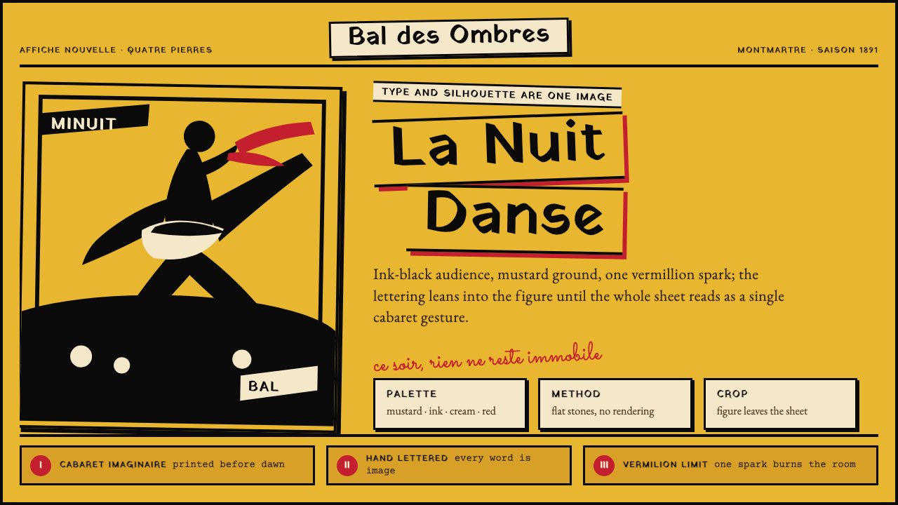 Toulouse-Lautrec Belle ÉpoqueNight becomes gesture. Mustard ground, black silhouette, hand lettering, one…夜色化作手势:芥末底、墨黑剪影、手绘字与一抹朱红。
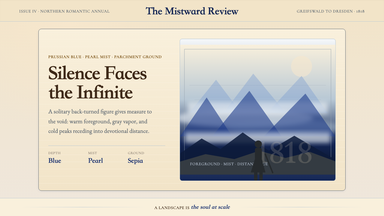 Caspar David FriedrichSilence becomes vast. Prussian blue depth, pearl mist, and parchment framing…寂静变得辽阔:普鲁士蓝纵深、珍珠雾与羊皮纸框层层后退。
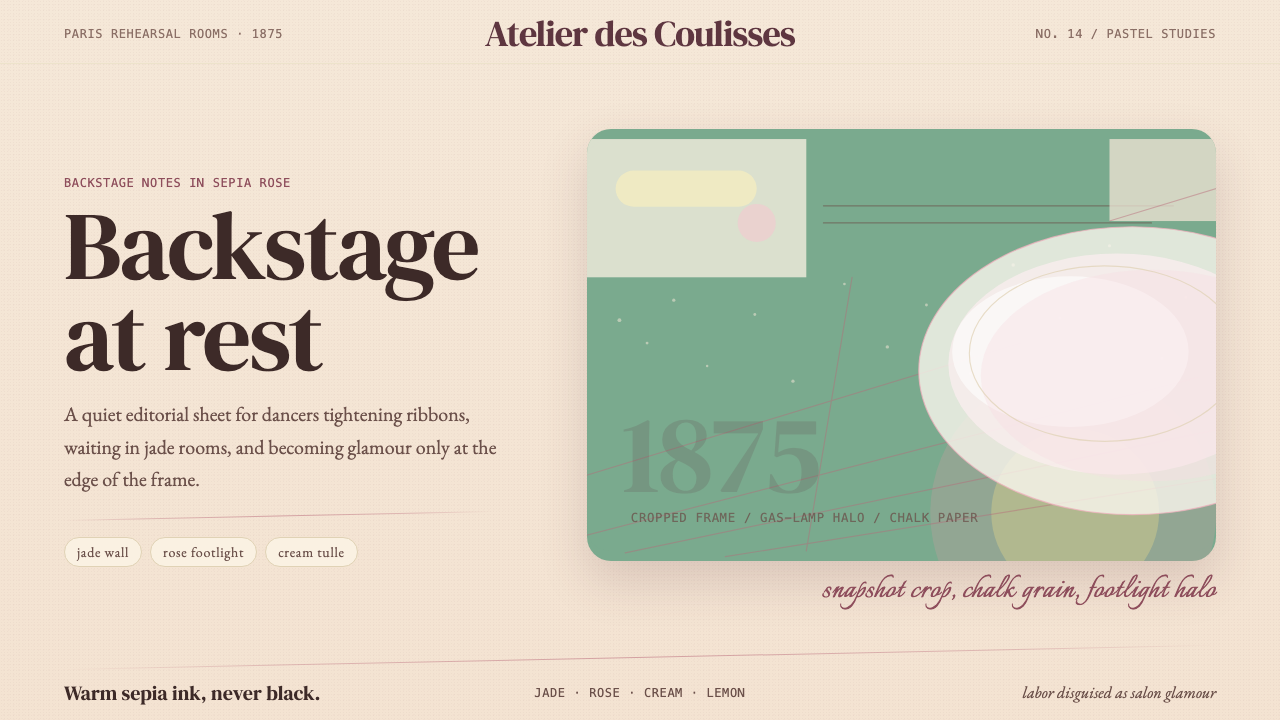 Degas Ballet PastelsBackstage glamour is labor. Jade walls, rose footlights, cropped serifs on cr…后台华丽即劳动。玉墙、玫瑰脚灯与裁切衬线落在奶油纸上。
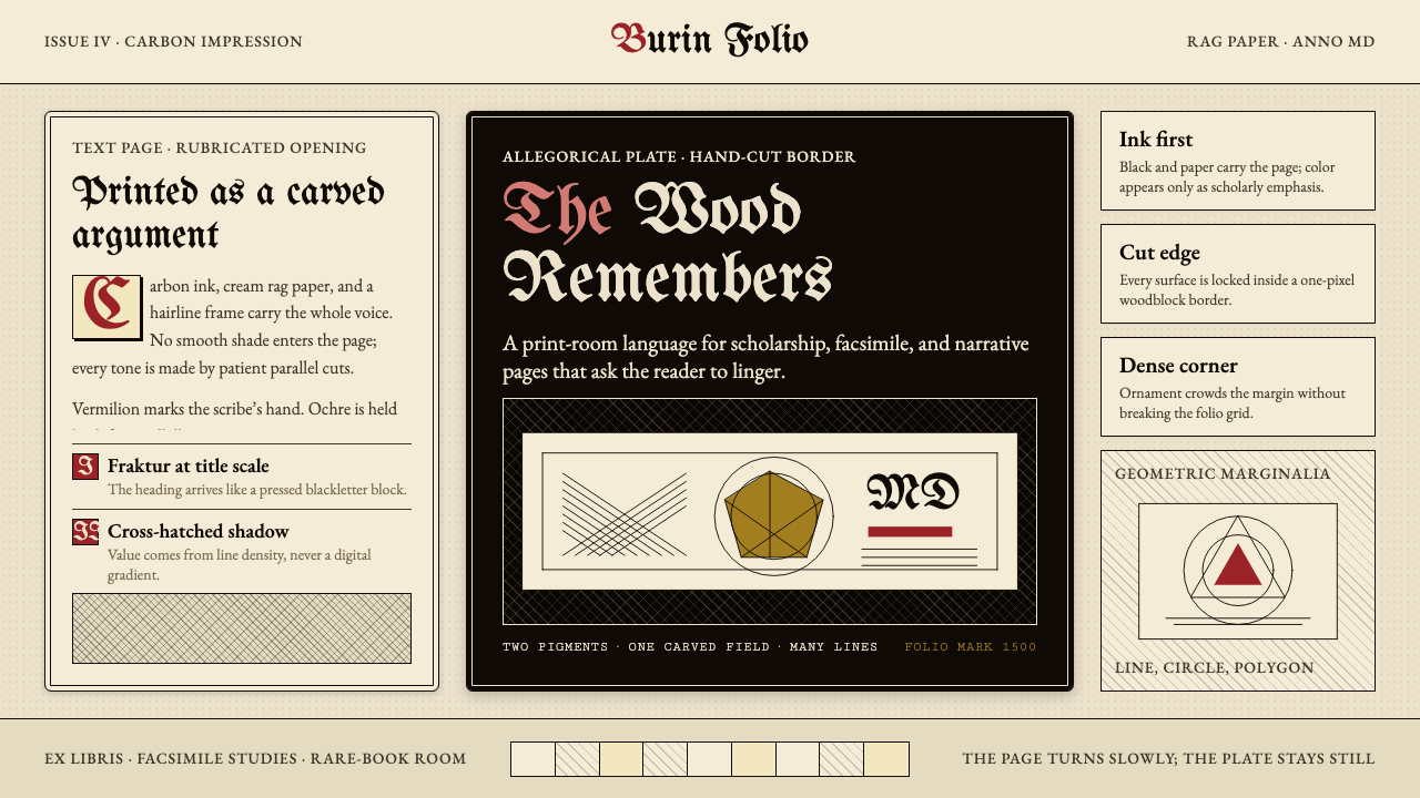 Dürer WoodcutInk remembers everything. Fraktur titles, rag-paper cream, and cross-hatched…木刻记住一切:哥特标题、破布纸奶油色与交叉排线。
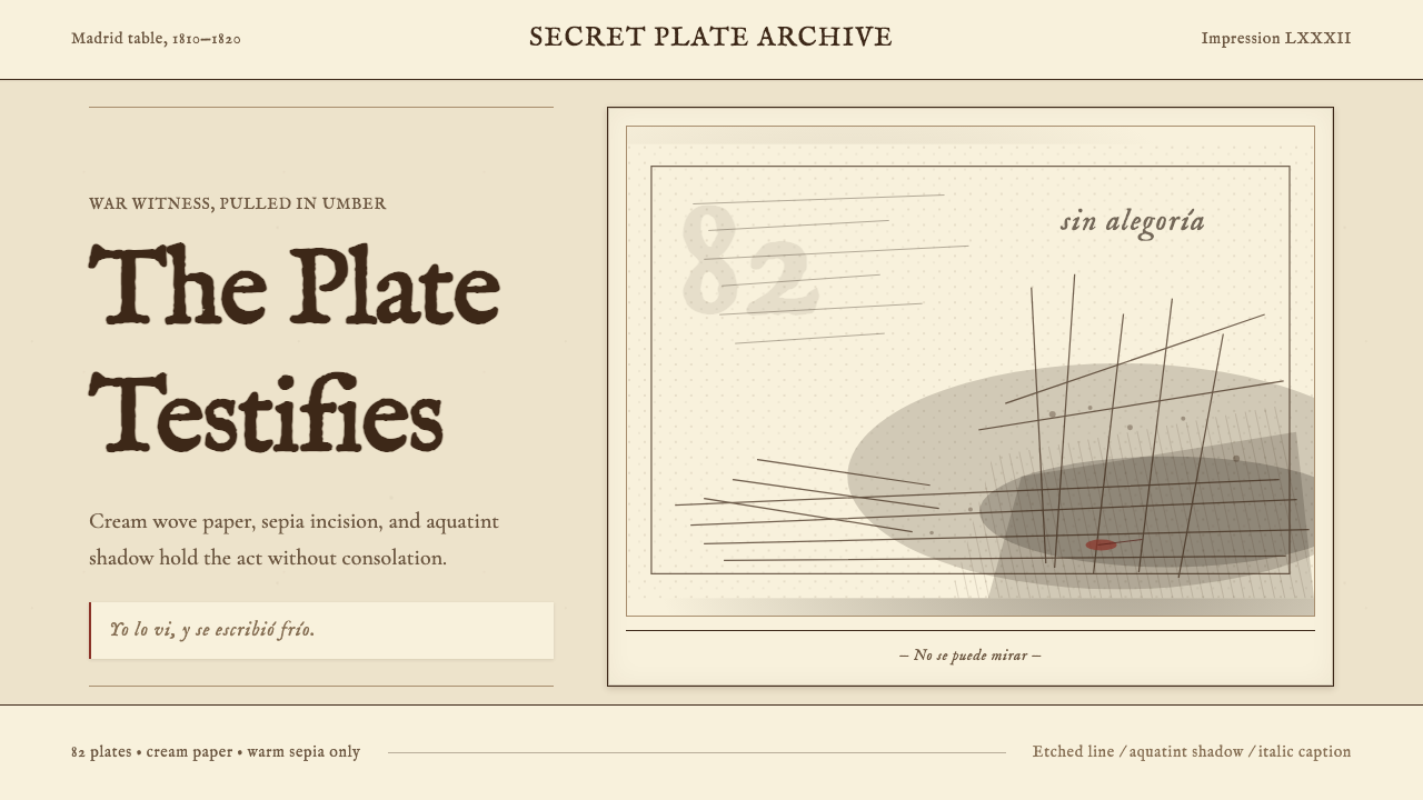 Goya — Disasters of WarWitness without ornament. Cream paper, umber line, aquatint shadow, italic ca…无装饰的见证:米色纸、赭褐线、飞尘暗影与斜体短注。
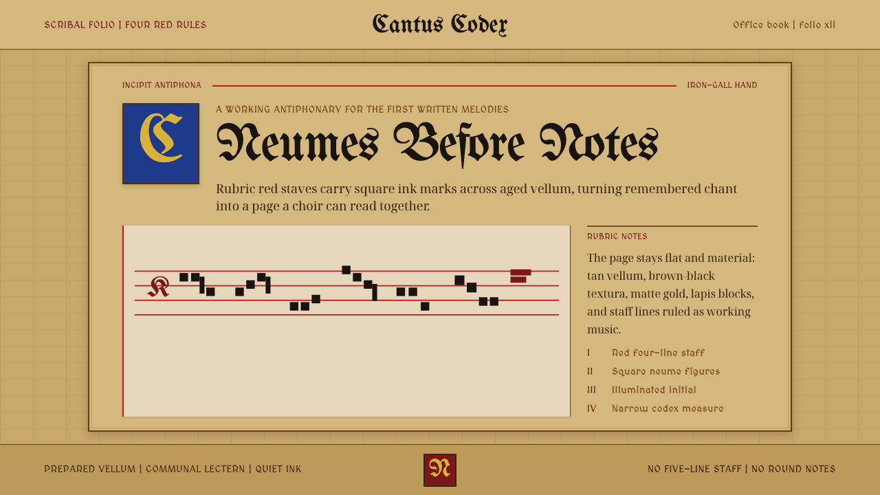 Gregorian Chant NeumesNotation becomes scripture. Rubric red staff lines and square neumes sit on t…记谱如经卷:棕褐羊皮纸上,红谱线承托黑色方形纽姆。