What is Goya — Disasters of War?什么是 Goya — Disasters of War?
Goya's war etchings turned printmaking into journalism — raw, monastic, and so brutal that Spain dared not publish them for thirty-five years.哥雅的战争蚀刻版画将印刷术变成了新闻报道——赤裸、克制、残酷,以至于西班牙用了三十五年才敢将其付印。
Goya — Disasters of War in briefGoya — Disasters of War 速览
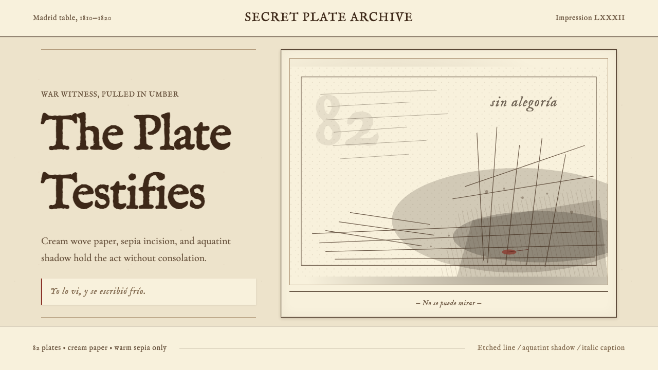
Goya — Disasters of War is a design system distilled from Francisco Goya's *Los Desastres de la Guerra*, a series of 82 etchings created in secret between 1810 and 1820 during Napoleon's invasion of Spain. The aesthetic is built on the vocabulary of intaglio printmaking: cream laid paper as the ground, warm umber-sepia for every line and edge, dense aquatint pools for shadow, and a short italic caption positioned beneath each image as the only text element. Nothing is gilded, symbolic, or allegorical. The visual language is that of witness.哥雅《战争的灾难》设计系统,从弗朗西斯科·哥雅的《Los Desastres de la Guerra》中提炼而来。那是一套82幅蚀刻版画,1810至1820年间秘密创作,记录拿破仑入侵西班牙期间的暴行。这套美学建立在凹版印刷的语汇之上:米白棉麻纸作底,暖褐赭色构成每一条线与轮廓,浓郁的飞尘腐蚀法处理阴影,每幅画面下方留一行斜体短注,那是唯一的文字元素。没有镀金,没有象征,没有寓言。视觉语言属于见证者。
What distinguishes this system from other historical print aesthetics is its relationship to restraint-as-statement. Goya stripped away the rhetoric of Neoclassical allegory and Romantic grandeur to produce images of devastating directness. The same principle governs the design system: a near-monochrome palette of warm darks and warm lights, the physical trace of the etching plate as a compositional frame, and captions that comment rather than explain. The result is authoritative without being decorative, grave without being cold.这套系统区别于其他历史印刷美学的,是它把克制本身变成了陈述。哥雅剥掉了新古典主义寓言与浪漫主义宏大叙事的全部修辞,制造出令人窒息的直接性。同样的原则支配着这套设计系统:暖色调深浅构成的近似单色色板、铜版边痕作为构图框架、评注而非解释的旁注。结果是权威的,而非装饰性的;是沉重的,而非冷漠的。
The system is not historical cosplay. The plate-mark border, the sepia line work, the aquatint shadow, and the italic footnote are all translatable to screen and print contexts — they produce a coherent visual identity that reads as unflinching, credible, and editorially serious. It suits contexts where the audience is assumed to be adult, informed, and uninterested in reassurance.这套系统并非历史仿制品。版痕边框、赭褐色线描、飞尘阴影与斜体注脚,全都可以移植到屏幕与印刷场景中——它们产生连贯的视觉身份,读来令人感到不回避、可信赖、具备编辑严肃性。它适合那些默认受众是成年人、有判断力、不寻求安慰的场景。
See the Goya — Disasters of War design system查看 Goya — Disasters of War 完整设计系统
Where does Goya — Disasters of War come from?Goya — Disasters of War 从何而来?
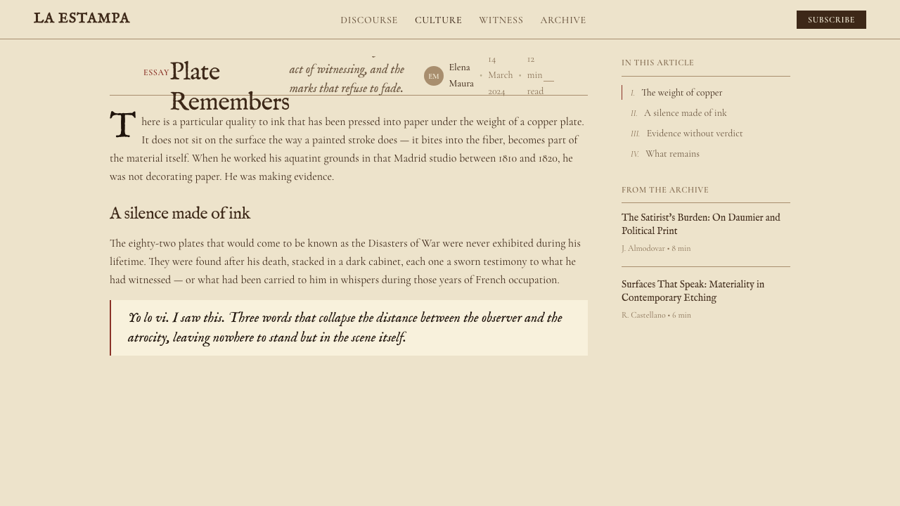
Francisco de Goya y Lucientes was already sixty-four years old and entirely deaf when Napoleon's forces crossed the Pyrenees and swept into Spain in 1808. He had spent decades as court painter to the Spanish Crown, producing tapestry cartoons, aristocratic portraits, and festive genre scenes. The Peninsular War shattered that world. Goya witnessed or received direct accounts of executions, mass graves, famine, and the systematic destruction of villages across Aragon — the region where he had been born. Between roughly 1810 and 1820 he worked in secret, etching and aquatinting a series of plates he never showed publicly and never titled. He may have called them simply *Fatal consequences of Spain's bloody war with Bonaparte, and other emphatic caprices* — the title *Disasters of War* was affixed posthumously.弗朗西斯科·哥雅·卢西恩特斯在拿破仑军队越过比利牛斯山涌入西班牙时,已是六十四岁的完全失聪老人,正值1808年。此前数十年,他一直是西班牙王室的宫廷画家,创作挂毯底稿、贵族肖像与节庆风俗画。半岛战争打碎了那个世界。哥雅目睹或直接听闻了阿拉贡各地——他的出生地——的处决、万人坑、饥荒与村庄的系统性摧毁。大约从1810年到1820年,他秘密工作,蚀刻并以飞尘腐蚀法处理一系列铜版,从未公开展示,也从未正式命名。他或许将其称为《波拿巴血腥战争对西班牙的致命后果,及其他意味深长的随想》——《战争的灾难》这一标题是身后所加。
The technique Goya used was itself a statement. Aquatint — a form of intaglio printing that produces tonal areas resembling ink wash — had been adopted by printmakers for its ability to reproduce the subtleties of drawing and watercolor. In Goya's hands it became something else entirely: the aquatint grounds are heavy and atmospheric, pooling like shadow or smoke, refusing to prettify the forms beneath them. The etchings are not polished reportage. They are raw, deliberately unfinished in places, with visible reworking and the physical evidence of the plate itself — its beveled edges leaving a mark on the paper — incorporated as part of the image's honesty.哥雅使用的技法本身就是一种陈述。飞尘腐蚀法——一种能产生类似水墨渲染效果的凹版印刷技法——因其再现素描与水彩微妙层次的能力而被版画家广泛采用。在哥雅手中,它变成了完全不同的东西:飞尘底色沉重而富有气氛,像阴影或烟雾一样聚积,拒绝美化其下的形体。这些蚀刻版画不是精致的报道图像。它们是生猛的,有些地方刻意留白,可见修改的痕迹,以及铜版本身留在纸面上的坡面印记——这一切都被纳入图像诚实性的一部分。
The written captions are as important as the images. Goya wrote them in a clipped, often ambiguous Spanish that resists easy interpretation. *Yo lo vi* — I saw this. *Con razon o sin ella* — With reason or without. *Para eso habeis nacido* — This is what you were born for. The captions are not journalistic identification; they are moral provocations, addressed simultaneously to the viewer, to the perpetrators, to history, and to no one. This interplay between image and laconic text became a defining structural element of the design system that bears the series' name.手写说明文字与图像同等重要。哥雅以一种简短、往往模棱两可的西班牙文写就,拒绝轻易被解释。《我看见了》(Yo lo vi)、《有没有道理》(Con razon o sin ella)、《你们就是为此而生》(Para eso habeis nacido)。这些文字不是新闻式的图片说明;它们是道德挑衅,同时指向观看者、施害者、历史,以及无人。图像与简短文字之间的张力,成为这套以该系列命名的设计系统的决定性结构要素。
The plates passed into the possession of the Real Academia de Bellas Artes de San Fernando after Goya's death in Bordeaux in 1828. For thirty-five years they sat unpublished — the images were considered too inflammatory for the political climate of Restoration Spain. The first edition of 80 plates finally appeared in 1863. Subsequent scholarship, notably the catalogue work of Tomás Harris in the twentieth century and the exhibition and interpretive essays by Eleanor Sayre at the Boston Museum of Fine Arts, established the series as the foundational document of modern war reportage in visual art and one of the most consequential bodies of work in the history of printmaking.铜版在哥雅1828年于波尔多去世后归属西班牙圣费尔南多皇家美术学院。此后三十五年,它们静静躺在那里,无人付印——在王政复辟时代的西班牙政治氛围下,这些图像被视为过于危险。80块铜版的首版终于在1863年面世。此后的学术研究——尤其是托马斯·哈里斯在二十世纪的目录整理工作,以及埃莉诺·赛尔在波士顿美术博物馆的展览与阐释文章——确立了这套系列作品的地位:它是现代视觉艺术中战争报道的奠基性文本,也是版画史上最具影响力的创作之一。
What defines the Goya — Disasters of War look?Goya — Disasters of War 的视觉特征是什么?
Palette色板
The color range is deliberately narrow and warm: cream or aged-ivory as the ground, a single warm umber-sepia for all lines and marks, and deep brown-black for the heaviest shadow areas. There is no cool black, no blue-gray, no neutral white. Every tone sits on the warm side of the spectrum, evoking the sulfurous chemistry of the etching process and the yellowed paper of aged prints. Accent color — if it appears at all — is a muted ochre or rust, never a saturated hue. The absence of color is itself information: this is a world stripped of spectacle.色彩范围刻意狭窄而偏暖:米白或陈年象牙色作底,单一的暖褐赭色构成所有线条与笔迹,深棕近黑用于最重的阴影区域。没有冷黑,没有蓝灰,没有中性白。每一个色调都处于色谱的暖侧,唤起蚀刻工艺的硫磺化学感与老旧印刷纸的泛黄感。强调色——若出现——是沉敛的赭黄或锈棕,绝不是饱和色相。色彩的缺席本身就是信息:这是一个被剥去奇观的世界。
Line and Mark线条与笔迹
All linework reads as hand-drawn and slightly imperfect — a quality inherited directly from the etching needle. Lines are not mechanical; they carry the slight variation in weight that comes from the hand pressing into a resist-coated plate. Hatching and cross-hatching build tone where aquatint shadow does not reach. Outlines are not uniform contours; they are drawn as observed, thickening where form turns away from light and thinning where surfaces catch it. This humanized line quality is non-negotiable — any crisp, mechanical stroke reads immediately as a forgery of the system.所有线描都应读来像手绘的、略有瑕疵——这种品质直接传承自蚀刻针。线条不是机械的;它们带有手压防腐涂层铜版时产生的细微粗细变化。排线与交叉排线在飞尘阴影未及之处构建色调。轮廓线不是均匀的边缘;它们是如实观察后画出的,形体背光处加重,迎光面变细。这种人性化的线条品质不可妥协——任何尖锐、机械的笔触,都会立即被识破为对这套系统的仿冒。
Aquatint Shadow飞尘阴影
Shadow in this system is rendered as aquatint tone — a granular, slightly uneven atmospheric field rather than a crisp geometric shape or smooth gradient. Shadows pool and mass; they do not define edges cleanly. This distinguishes the system sharply from both hard-shadow Bauhaus work and soft-shadow contemporary UI. The shadow is environmental, almost airborne, suggesting the haze of gunpowder or the dimness of a scene lit by uncertain light. Where shadows are darkest they become nearly opaque, and this extreme tonal contrast — bright cream against near-black — is the system's primary compositional engine.这套系统中的阴影以飞尘色调呈现——一种颗粒感的、略显不均匀的大气性面域,而非尖锐的几何形或平滑的渐变。阴影聚积、蔓延;它们不清晰界定边缘。这将本系统与包豪斯式硬边阴影和当代界面的柔和阴影明确区分开来。这种阴影是环境性的,几乎飘浮于空气中,令人联想到火药的烟雾或光线不确定的场景中的昏暗。最深处的阴影近乎不透明,而这种极端的明暗对比——明亮米白对近乎纯黑——是这套系统的主要构图引擎。
Plate-Mark Frame版痕边框
Etched prints carry a characteristic plate mark: the impressed rectangular border left by the edge of the copper plate pressing into damp paper. In this design system, that plate mark is translated into a compositional device — a visible rectangular frame, slightly inset from the outer edge of the composition, that contains the image while simultaneously revealing itself as a made artifact. The border is not decorative; it is a reminder that what is seen has been mediated through a physical process. It signals handmade, particular, and unrepeatable — the opposite of the seamless digital surface.蚀刻版画带有一种特有的版痕:铜版边缘压入湿纸留下的矩形凹印。在这套设计系统中,版痕被转化为构图装置——一道可见的矩形边框,略向内缩于构图外缘,既框住图像,又坦白地呈现自己是一件被制造的物品。这道边框不是装饰性的;它提醒观看者:所见之物是经由一个物理过程中介过的。它传达出手工的、特殊的、不可重复的信号——与无缝数字表面的感受截然相反。
Italic Caption斜体注脚
Each composition is accompanied by a short caption positioned beneath the image, set in a humanist italic that echoes the hand-lettered originals. The caption does not describe the image; it comments, questions, or accuses. This means the typographic register is fundamentally different from a label or headline — it is closer to a marginal note or a spoken aside. The italic is always small relative to the image, never centered, and set close to the lower edge of the plate mark. It is the only place body-weight type appears in the system. Everything else communicates through image, shadow, and the weight of line.每个构图图像下方配有一行短注,使用呼应手写原版的人文主义斜体。注脚不描述图像;它评注、提问或指控。这意味着排印的语气与标签或标题从根本上不同——它更接近页边批注或低声旁白。斜体始终相对于图像偏小,不居中,紧贴版痕边框的下缘。这是整套系统中唯一使用正文字重字体的地方。其他一切都通过图像、阴影与线条的重量来传达。
Monastic Restraint修道院式克制
The system contains no decorative element that cannot be traced to the original printmaking process. No ornamental borders, no color washes beyond the umber-sepia range, no geometric shapes added for visual interest, no photographic backgrounds. Every element present is necessary and accountable. This is not minimalism in the contemporary sense — contemporary minimalism often achieves visual interest through generous whitespace and refined proportion. Goya's system achieves its power through density and darkness, packing tone and line into a constrained field and withholding relief until the caption.这套系统不包含任何无法追溯至原始版画工艺的装饰元素。没有花纹边框,没有超出褐赭色系的色彩渲染,没有为视觉趣味而添加的几何形,没有摄影背景。每一个存在的元素都是必要的、可追溯的。这不是当代意义上的极简主义——当代极简主义往往通过充裕的留白和精炼的比例来创造视觉趣味。哥雅的系统通过密度与黑暗获得力量,将色调与线条压入有限的版面,将所有宽慰感留到注脚那一行。
Witness Stance见证者姿态
The system's defining non-visual characteristic is its implied point of view: the design is constructed as if by someone who was present. There is no editorial smoothing, no compositional heroism, no color-coded moral judgment. Events are recorded in the order they were witnessed, without ranking or resolution. Applied to contemporary contexts, this means the system resists reassuring conclusions — charts do not trend optimistically upward, calls to action do not promise transformation. The visual register is that of testimony, which requires that the designer resist the impulse to comfort.这套系统决定性的非视觉特征是其隐含的视角:设计是以一种好像有人在场的方式构建的。没有编辑性的平滑处理,没有构图上的英雄主义,没有用颜色编码的道德判断。事件按目击的顺序记录,没有排序,没有解决。应用于当代语境意味着:这套系统抵制令人安慰的结论——图表不会乐观地向右上方攀升,行动呼吁不许诺变革。视觉语气是证词的语气,这要求设计者抵制给人安慰的冲动。
See the Goya — Disasters of War design system查看 Goya — Disasters of War 完整设计系统
Who shaped Goya — Disasters of War?谁塑造了 Goya — Disasters of War?
Goya (1746–1828) created the Disasters series while serving as First Court Painter to the Spanish Crown — a position that gave him access to events and the social protection to observe them without immediate censorship. His earlier career in tapestry design and portraiture gave him technical mastery of tone and composition; the Peninsular War gave him the subject that would define his late work. Deaf since a serious illness in 1792, Goya developed a visual language uncoupled from the aural world, increasingly interior and uncompromising. The Disasters plates were made for no patron and with no expectation of publication — they represent the clearest instance in his career of art made under no obligation but to record.哥雅(1746—1828年)在担任西班牙王室首席宫廷画师期间创作了《灾难》系列——这一职位给了他接触事件的渠道,也给了他在没有立即遭受审查的情况下观察的社会保护。他早年在挂毯设计与肖像画上的生涯赋予了他对色调与构图的精湛掌握;半岛战争则给了他定义其晚年创作的主题。自1792年一场重病后完全失聪的哥雅,发展出一套脱离听觉世界的视觉语言,越来越内向,越来越不妥协。《灾难》铜版没有委托人,也不期待出版——它们代表了他职业生涯中最清晰的一个例证:为记录而创作的艺术,不承担任何义务。
Harris (1908–1964) was a British art dealer, intelligence officer, and Goya scholar whose 1964 catalogue raisonné of the complete prints remains the standard scholarly reference. Harris's cataloguing work established the chronology of the Disasters plates, identified the different printing states, and documented the provenance of surviving impressions. Before Harris, the series existed largely as legend and partial reproductions; his systematic account gave designers, historians, and educators a reliable corpus from which to work. His intelligence career during the Second World War — he ran the double-agent GARBO — gave him an unusual personal understanding of the gap between official narrative and witnessed reality that runs through the Disasters.哈里斯(1908—1964年)是英国艺术商人、情报官员与哥雅学者,他1964年出版的全版画目录至今仍是标准学术参考文献。哈里斯的目录工作确立了《灾难》铜版的年代顺序,鉴别了不同的印刷状态,并记录了现存印张的来源。哈里斯之前,这套系列在很大程度上只是传说与局部复制品;他的系统性整理给设计师、历史学家与教育者提供了一个可靠的文本基础。他在二次世界大战期间的情报生涯——他运营了双重间谍「加博」——给了他对官方叙事与目击现实之间落差的独特个人理解,而这种落差正贯穿于《灾难》始终。
Sayre (1916–2001) was curator of prints and drawings at the Boston Museum of Fine Arts and organized the landmark 1974 exhibition *Goya and the Spirit of Enlightenment*, which brought the Disasters to international public attention as a unified artwork rather than a collection of historical illustrations. Her scholarly essays argued that the series should be read sequentially and as a moral argument, not merely as documentation. This interpretive shift — from archive to artwork, from record to statement — is foundational to the design system that takes the series' name. Sayre's insistence on the captions as integral to meaning, not secondary to the images, is directly reflected in the system's typographic hierarchy.赛尔(1916—2001年)是波士顿美术博物馆版画与素描部门的策展人,1974年策划了具有里程碑意义的展览《哥雅与启蒙精神》,将《灾难》以统一艺术作品而非历史插图集的面貌带入国际公众视野。她的学术文章主张,这套系列应当被顺序阅读,被视为一个道德论证,而非单纯的文献记录。这一诠释性转变——从档案到艺术品,从记录到陈述——是以该系列命名的设计系统的基础。赛尔坚持认为,图注是意义不可分割的组成部分,而非图像的附属——这一观点直接体现在本系统的排印层级之中。
López was the secretary of the Real Academia de Bellas Artes de San Fernando who oversaw the first 1863 printing of the Disasters plates, nearly thirty-five years after Goya's death. Working from 80 of the 82 original plates — two had been lost — López's edition defined how the world would first encounter the series: the print quality, the caption placement, and the ordering of the images. The decisions made in 1863 established aesthetic conventions that subsequent editions, scholarly reproductions, and ultimately the design system all inherit. López is largely invisible in popular Goya literature, but the visual form in which the series is known is substantially his responsibility.洛佩斯是西班牙圣费尔南多皇家美术学院的秘书长,主持了1863年《灾难》铜版的首次付印——距哥雅去世已近三十五年。他从82块原版中现存的80块着手——另外两块已遗失——洛佩斯的版本界定了世界与这套系列的初次相遇方式:印刷质量、注脚位置与图像顺序。1863年的这些决定确立了美学惯例,此后的各种版本、学术复制品,乃至这套设计系统,都承继了这些惯例。洛佩斯在大众哥雅文献中几乎隐形,但世人所知的这套系列的视觉形态,在很大程度上是他的责任。
How do you use Goya — Disasters of War today?今天怎么用 Goya — Disasters of War?
Goya — Disasters of War is not a versatile all-purpose style. It is a specific instrument suited to specific work: editorial, analytical, documentary, and any context in which unvarnished credibility is more valuable than approachability. Understanding its strengths means understanding its refusals — it refuses decoration, refuses optimism-signaling, and refuses the visual conventions of reassurance. Applied correctly, it communicates that the designer trusts the audience to face difficult material without prettification.哥雅《战争的灾难》不是一种万能的通用风格。它是一种特定的工具,适合特定的工作:编辑类、分析类、纪实类,以及任何朴素可信度比亲近感更有价值的场景。理解它的优势,意味着理解它的拒绝——它拒绝装饰,拒绝乐观感信号,拒绝安慰性的视觉惯例。正确应用时,它传达出设计者信任受众有能力直面困难材料,无需粉饰。
For presentation slides, the system operates in a register quite different from conventional deck design. A cover built in this aesthetic uses the cream-ground plate-mark composition as its container, with the presentation title in a humanist italic at modest scale and an aquatint-style tonal image or texture occupying most of the field — no hero gradient, no large display typeface at maximum weight. Content slides use a sparse grid: one or two text blocks in a narrow measure with generous margin, a single visual element framed by the plate-mark convention, and a one-line italic caption below it. Data slides treat charts as engravings — rendered in the umber-sepia range with heavy axis lines and no color-coded highlights. The absence of color in the data serves as a discipline: information must organize itself through labeling and scale, not through hue.在演示文稿中,这套系统的运作方式与常规幻灯片设计截然不同。以这种美学构建的封面,以米白底版痕构图为容器,演示标题以人文主义斜体呈现,字号适中;大部分版面由飞尘风格的色调图像或肌理占据——没有英雄渐变,没有以最大字重呈现的展示字体。内容页使用稀疏网格:一到两个窄行距文字块,留有充裕页边,一个以版痕惯例框住的单一视觉元素,下方是一行斜体注脚。数据页将图表视为铜版雕刻——以褐赭色系渲染,坐标轴线粗重,无色彩编码的高亮。数据中色彩的缺席本身是一种约束:信息必须通过标注与比例组织自身,而非依赖色相。
For web interfaces and dashboards, the style is suited to serious analytical tools, investigative journalism platforms, research archives, and institutional documentation sites — contexts where the user arrives already motivated and where visual sobriety signals depth. Apply the cream-ground palette to the page background and umber tones to borders, rules, and typographic markers. Interactive elements are distinguished by line weight and position rather than by fill color changes; hover states deepen the umber rather than introducing a new hue. Data visualization in this system relies on density and contrast rather than color differentiation. For pricing or marketing pages, the style works when the product itself is framed as serious, evidence-based, or protective — research services, legal tools, medical information systems — and fails when the product needs to project warmth, accessibility, or playfulness.对于网页界面与仪表板,这种风格适合严肃的分析工具、调查性新闻平台、研究档案馆与机构文件站点——用户带着明确动机到来、视觉的庄重感暗示深度的场景。将米白底色板应用于页面背景,赭褐色调用于边框、分隔线与排印标记。交互元素通过线条粗细与位置来区分,而非通过填充色变化;悬停状态是加深的赭褐,而非引入新色相。这套系统中的数据可视化依赖密度与对比,而非色彩差异。对于定价或营销页面,当产品本身被定位为严肃的、以证据为基础的或具有保护性的——研究服务、法律工具、医疗信息系统——这种风格有效;当产品需要传递温暖、可及性或趣味性时则失效。
For editorial and long-form content, the system's natural habitat is the serious magazine spread, the annual report for an organization comfortable with gravity, the monograph, or the exhibition catalogue. Column widths are narrow and the measure disciplined; the type set in a humanist face with minimal leading variation. Section breaks are marked by a bold umber horizontal rule rather than decorative ornaments or color bands. Pull quotes, if used, are set in the same italic register as the original captions — small, marginal, not large and centered. The plate-mark framing device applies to any contained visual: photographs, charts, and maps are all given the same inset rectangular border, bringing them visually into the printmaking register. The effect is that the entire layout reads as a considered artifact rather than a rendered surface.对于编辑类与长篇内容,这套系统最自然的栖息地是严肃杂志的版面、乐于承担庄重感的机构年报、专论或展览图录。栏宽较窄,行宽受到约束;字体选用人文主义字面,行距变化极小。段落分隔以粗重的赭褐色水平线标记,而非装饰性花饰或色块。引文(若使用)以与原始注脚相同的斜体语气排印——小而置于页边,不居中放大。版痕框架装置适用于任何被框住的视觉元素:照片、图表与地图全部给予相同的内缩矩形边框,将它们视觉上纳入版画的语域。整体效果是,整个版面读来像一件经过深思熟虑的制造物,而非一个被渲染的表面。
The most common mistake when applying this system is misjudging its emotional register and using it where sympathy and warmth are required. The Goya aesthetic communicates witness, not comfort — it is credible and serious, but it does not invite the viewer in. A second common error is softening the palette toward beige-and-gray neutrality in an attempt to modernize it; this strips out the warmth that distinguishes the system from generic muted editorial design and produces something that reads as neither historical nor contemporary. A third mistake is using the plate-mark frame as pure decoration — placing it around content that does not justify the seriousness the frame implies. The frame is a truth-claim; use it only when the content can support that claim.应用这套系统时最常见的错误,是误判其情感语气,将它用于需要同情与温暖的场景。哥雅美学传达的是见证,而非安慰——它可信而严肃,但它不邀请观看者进入。第二个常见错误是为了让它现代化而将色板软化成米色与灰色的中性调;这剥夺了区别本系统与一般沉敛编辑设计的暖意,最终产出的东西既不像历史风格,也不像当代风格。第三个错误是将版痕边框作为纯粹的装饰使用——将它围在并不能支撑框架所隐含的严肃性的内容周围。那道边框是一种真实性宣言;只在内容能够支撑这一宣言时才使用它。
See the Goya — Disasters of War design system查看 Goya — Disasters of War 完整设计系统
Goya — Disasters of War — FAQGoya — Disasters of War · 常见问题
Is this style appropriate for consumer-facing products?这种风格适合面向消费者的产品吗?
Rarely, and with significant caveats. The Goya Disasters aesthetic is built on emotional sobriety and the refusal of reassurance — qualities that serve investigative journalism, research tools, institutional memory, and documentary work, but that actively resist the warmth and invitation that most consumer products need. It can work for consumer-facing contexts where the brand identity is deliberately serious: certain financial products that want to signal integrity rather than growth-optimism, some medical information platforms, legal research tools. It does not work for e-commerce, social applications, lifestyle products, or anything that needs to communicate joy, ease, or welcome. When in doubt: if the product needs to make the user feel good about using it, this style will work against you.极少,且有相当大的限制条件。哥雅《灾难》美学建立在情感的庄重与拒绝安慰之上——这些品质服务于调查性新闻、研究工具、机构记忆与纪实工作,却主动抵制大多数消费产品所需要的温暖感与邀请感。它能在品牌身份刻意严肃的面向消费者场景中发挥作用:某些希望传递诚信而非增长乐观主义的金融产品、部分医疗信息平台、法律研究工具。它不适用于电商、社交应用、生活方式产品,或任何需要传达喜悦、轻松或欢迎感的产品。若有疑虑,可以这样判断:如果产品需要让用户对使用它感到愉快,这种风格会适得其反。
How does this style handle color photography or full-color images?这种风格如何处理彩色摄影或全彩图像?
Color photography is handled by desaturation or duotoning, not by exclusion. A full-color photograph placed into a Goya Disasters layout without treatment will read as a foreign element — its naturalistic color logic conflicts with the near-monochrome field. The correct approach is to render photographic images as warm-toned duotones, using the umber-sepia range as the print color, or to convert them to a high-contrast near-grayscale that is then tinted slightly warm. This treatment does not destroy the photographic information; it translates the image into the register of the system. Maps, diagrams, and data visualizations are treated similarly: any color they originally carried is replaced by the umber-sepia tonal range.彩色摄影通过去饱和或双色调处理,而非排除在外。将一张未经处理的全彩照片放入哥雅《灾难》版面,它会读来像一个外来元素——其自然主义的色彩逻辑与近似单色的底色场冲突。正确的做法是将摄影图像渲染为暖色调双色调,以褐赭色系作为印刷色;或将其转换为高对比度的近灰阶,然后整体偏暖处理。这种处理不会破坏摄影的信息量;它将图像翻译进这套系统的语域。地图、图解与数据可视化的处理方式相同:它们原有的任何色彩都被褐赭色系的色调范围替代。
Can the plate-mark frame be omitted to simplify the layout?可以省略版痕边框来简化版面吗?
It can, but doing so removes one of the system's core structural signals. The plate-mark frame is not a decorative border; it is a reminder that the image has been mediated — that someone chose to record this, pressed a plate into paper, and accepted the evidence of that physical act. Removing it does not break the system, but it does shift the register from printmaking toward generic editorial. If the plate-mark is retained for images and removed for text blocks, the contrast between framed visuals and unframed text can actually reinforce the system's distinction between witnessed image and interpretive word. The frame should never be reduced to a thin decorative rule; it needs to carry enough visual weight to read as a physical impression rather than a design choice.可以省略,但这样做会去掉这套系统最核心的结构信号之一。版痕边框不是装饰性边线;它是一个提醒,说明图像经过了中介——有人选择记录这件事,将铜版压入纸面,并接受了那个物理行为留下的证据。省略它不会破坏这套系统,但它确实会将语域从版画向通用编辑设计偏移。如果图像保留版痕而文字块省略,那么被框住的视觉元素与未被框住的文字之间的对比,实际上可以强化这套系统对目击图像与诠释性文字的区分。边框绝不应被简化成细细的装饰性线条;它需要足够的视觉重量,读来像一个物理印迹,而非一个设计选择。
What kind of typeface works within this system, described in qualitative terms?从定性角度描述,什么样的字体适合这套系统?
The system calls for type that reads as hand-drawn in origin rather than mechanically constructed — humanist faces in the italic cut are the primary register. The ideal type for captions has slightly variable stroke width, a calligraphic axis, and letterforms that feel penned rather than plotted. For body text, a humanist roman with moderate contrast between thick and thin strokes works well: the variation in stroke weight echoes the variation in the etching line without imitating it directly. Geometric sans-serif faces are incompatible with this system — their mechanical regularity and uniform stroke weight read as a different technological moment entirely. Transitional or modern serifs with high contrast and sharp hairlines are also discordant; they belong to the printing conventions of a later century and introduce anachronistic precision.这套系统需要读来源自手绘而非机械构造的字体——斜体切割的人文主义字面是主要语气。注脚的理想字体应有略显可变的笔画粗细、书法式的字轴,以及感觉是笔书而非描绘出来的字形。对于正文,笔画粗细有适度对比的人文主义衬线罗马体效果良好:笔画粗细的变化呼应蚀刻线条的变化,而不直接模仿。几何无衬线字体与这套系统不兼容——其机械性的规整与均匀的笔画粗细,读来属于完全不同的技术时代。高对比度、细笔画锋利的过渡型或现代型衬线字体同样不协调;它们属于后来一个世纪的印刷惯例,引入了格格不入的精准感。
Is the Goya Disasters style related to other dark or gothic editorial aesthetics?哥雅《灾难》风格与其他暗色或哥特编辑美学有何关联?
There are superficial similarities but fundamental differences. Dark editorial aesthetics — the kind associated with luxury fashion, certain music publications, or high-end cultural journals — use blackness and high contrast for visual drama and sensory richness. They are designed to attract and hold attention, and they rely on sophisticated type treatments, high-contrast photography, and carefully controlled emptiness. The Goya Disasters aesthetic uses its darkness differently: the near-black of the aquatint shadow is atmospheric and slightly unstable, not sleek. The system does not seek drama; it seeks accuracy. The comparison to gothic or black-metal visual culture is even more distant — those aesthetics are interested in the sublime, the transgressive, and the theatrical. Goya's is interested in the actual. The closest contemporary analogs are investigative documentary design, photojournalism publication design, and the more austere end of institutional memorial design.有表面相似之处,但存在根本差异。暗色编辑美学——与奢侈时尚、某些音乐刊物或高端文化期刊相关联的那种——使用黑色与高对比度追求视觉戏剧感和感官丰富性。它们的目的是吸引并留住注意力,依赖精密的排印处理、高对比度摄影与精心控制的空白。哥雅《灾难》美学以不同的方式使用黑暗:飞尘阴影的近黑是大气性的,略显不稳定,而非光滑流畅。这套系统不寻求戏剧性;它寻求准确性。与哥特或黑金属视觉文化的比较距离更远——那些美学关注的是崇高、越界与剧场感。哥雅关注的是现实。最接近的当代类比是调查性纪录片设计、新闻摄影出版物设计,以及机构纪念设计中最为简朴的一端。
Related design styles相关设计风格
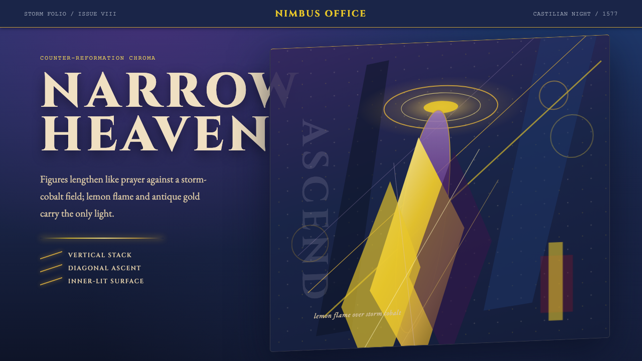 El Greco — Toledo MannerismMysticism strains upward. Storm cobalt, lemon flame, and gold halos pull the…神秘感向上拉伸。风暴钴蓝、柠檬火焰与金色光环令画面纵向紧绷。
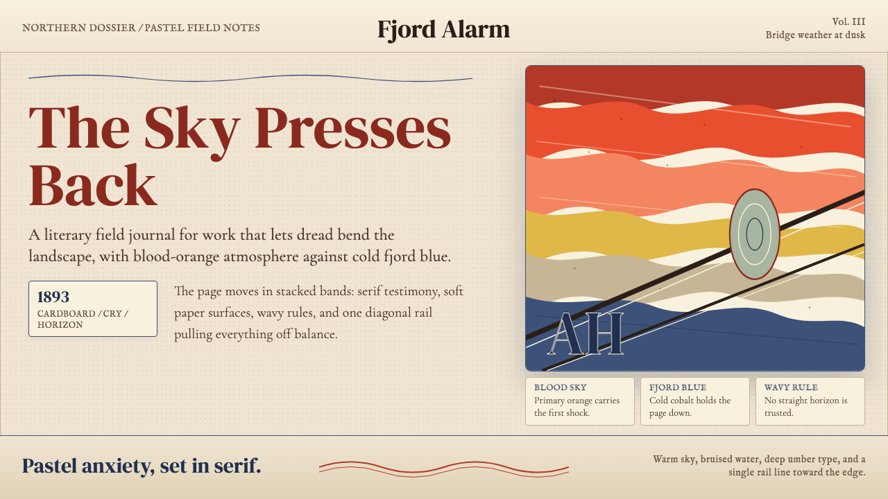 Munch — The ScreamAnxiety bends the page. Blood orange bands, cobalt fjord, and serif type tilt…焦虑弯曲页面:血橙色带、峡湾钴蓝与衬线字一起倾斜。
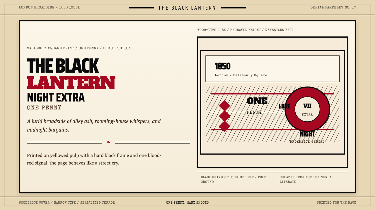 Penny Dreadful Victorian Headline (1850)Cheap terror in full cry. Condensed wood-type, black borders, and one blood-r…廉价恐怖全速开喊。窄体木活字、黑框和血红点染钉在泛黄纸上。
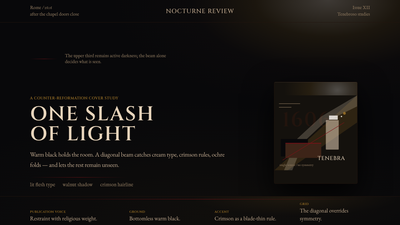 Caravaggio TenebrismDarkness acts first. Warm-black voids, Cinzel capitals, and one ochre raking…黑暗先发声:暖黑空场、Cinzel 大写与赭石斜光。
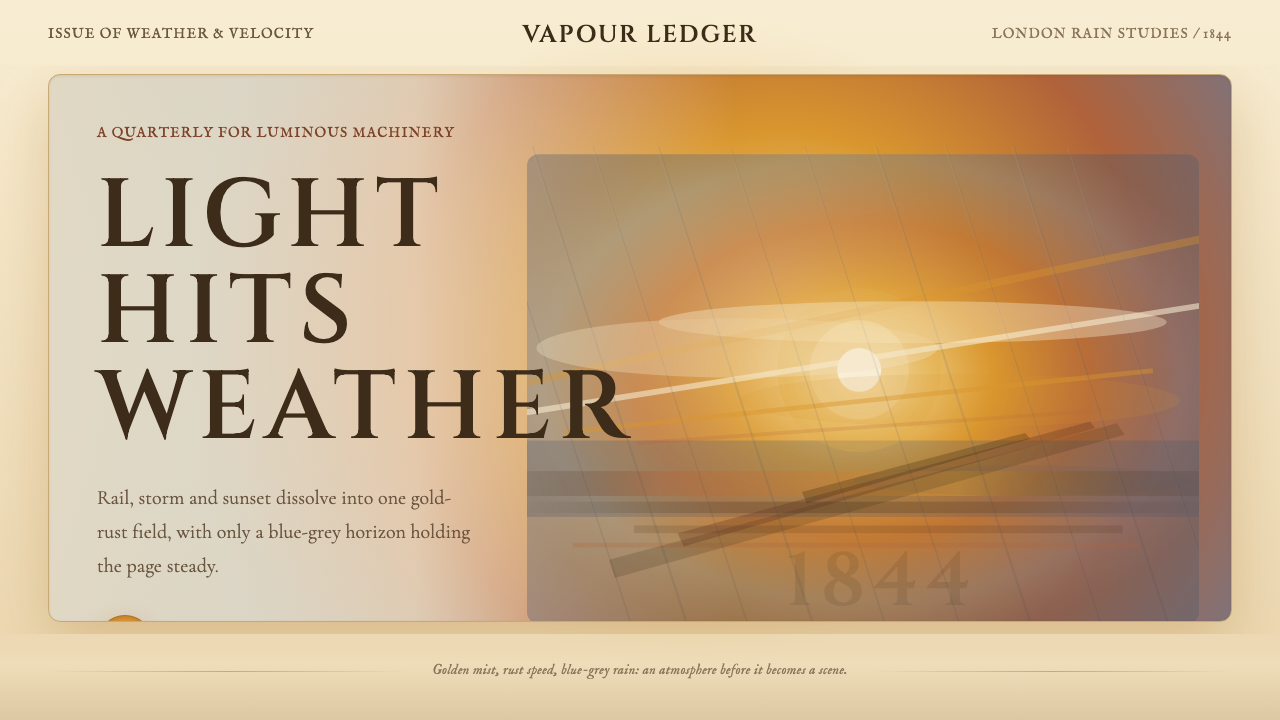 Turner — Rain, Steam and SpeedEdges dissolve into weather. Amber mist, rust smears and blue-grey horizon ca…边缘化入天气。琥珀雾、金锈涂痕与蓝灰地平线托住画面。
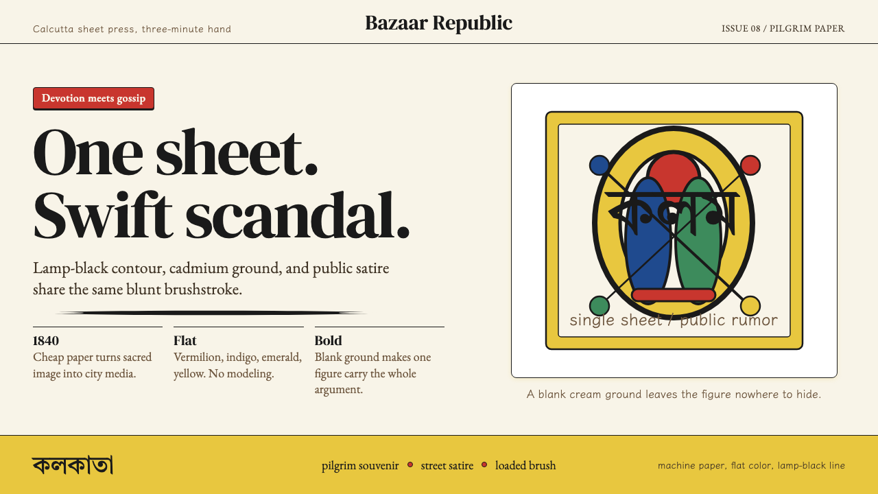 Kalighat Patua (Bengal)Satire swings fast. Cadmium yellow, vermilion and lamp-black line on cream pa…讽刺一笔挥出:奶油纸上明黄、朱红与墨黑轮廓线。