What is Munch — The Scream?什么是 Munch — The Scream?
Anxiety bent the sky over a Norwegian fjord in 1893 — and the visual tremor has never stopped.1893年,焦虑弯曲了挪威峡湾上空的天际线——那道视觉震颤至今未曾平息。
Munch — The Scream in briefMunch — The Scream 速览
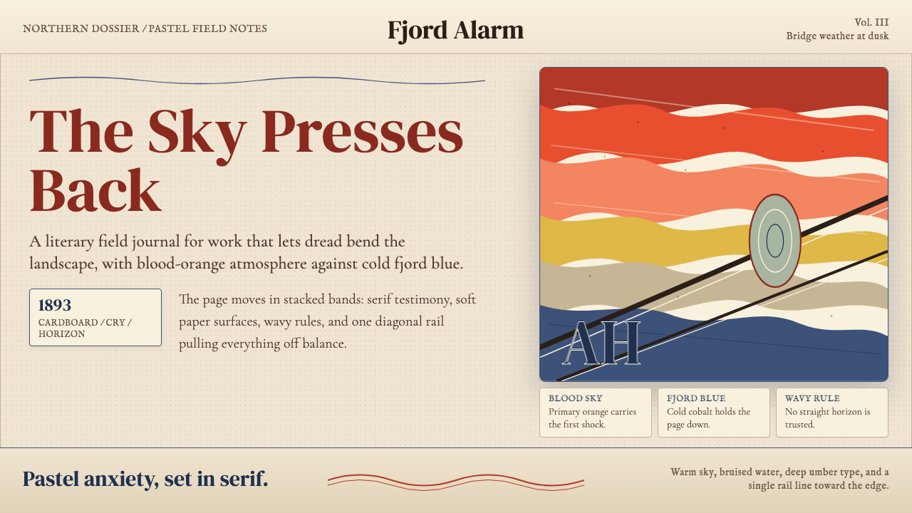
The Scream design system draws its entire visual logic from Edvard Munch's 1893 pastel-on-cardboard painting Skrik — a work in which landscape and psychology become inseparable. Sky, water, and air do not sit still; they undulate in shared dread with the agonized figure at the bridge railing. That instability is the aesthetic: warm blood-orange bands press down from above while cold bruise-blue water recedes into the distance, and the boundary between them is never a straight line.《呐喊》设计系统的全部视觉逻辑源自爱德华·蒙克1893年的蜡笔硬纸板作品《Skrik》——在那幅画中,风景与心理彼此无法分割。天空、峡湾与空气并不安静;它们随着桥头那个痛苦人物的焦虑一同颤抖。正是这种不稳定性构成了系统的美学内核:温热的血橙色带自上方压下,冷冽的青蓝色水面向远处退去,而两者之间的边界从不是一条直线。
Unlike design systems built around geometry or typographic clarity, this one is built around emotional atmosphere. The organizing principle is not the grid or the module but the wave — the horizontal undulation that runs through Munch's sky, through his water, through the figural contour itself. Fin-de-siècle serif letterforms reinforce the period: heavy, ink-drenched, slightly off-kilter, as though the type itself has been caught in the same vortex as the landscape. The palette is warm against cold, anxious against inert.不同于以几何或排印清晰度为基础构建的设计系统,这套系统建立在情感氛围之上。组织原则不是网格或模块,而是波浪——那道贯穿蒙克天空、水面与人物轮廓的水平起伏。世纪末的衬线字体强化了时代感:笔触厚重、浸透墨色、微微倾斜,仿佛文字本身也被卷入了与风景相同的漩涡。整体色调是暖与冷、焦虑与静止的对峙。
The result is a design language suited to content where emotional resonance matters more than functional neutrality — literary platforms, art archives, exhibition catalogues, psychological publications, and cultural editorial work that wants to feel inhabited rather than merely organized. It is expressive without being chaotic, and unsettling without being illegible.由此形成的设计语言适合情感共鸣重于功能中性的内容场景——文学平台、艺术档案、展览图录、心理学读物,以及那些希望呈现出生命气息而非仅仅井井有条的文化编辑产品。它是表现性的而非混乱的,令人不安而非难以辨读的。
See the Munch — The Scream design system查看 Munch — The Scream 完整设计系统
Where does Munch — The Scream come from?Munch — The Scream 从何而来?
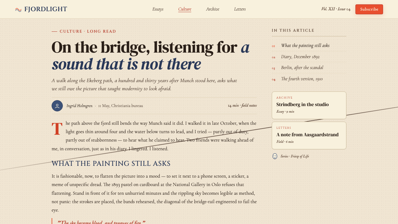
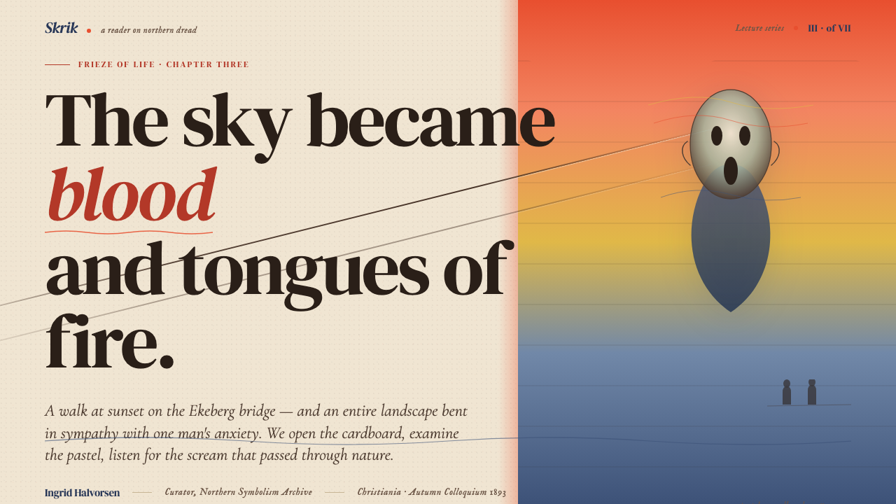
Edvard Munch painted the first version of Skrik in 1893, working in pastel and oil on cardboard in the studio he kept in Christiania, the city that would later be renamed Oslo. The painting's genesis is documented in his diary entry of January 22, 1892, in which he describes walking with friends along the Ekeberg road — a ridge path above the Oslofjord — when the sky turned, in his words, 'blood and tongues of fire.' His companions walked on; Munch stopped. He felt an 'infinite scream passing through nature.' The painting is not of a person screaming. It is of a person who has heard the scream that nature itself is producing.爱德华·蒙克于1893年创作了《Skrik》的第一个版本,在克里斯蒂安尼亚(后改名奥斯陆)的工作室里以蜡笔和油彩在硬纸板上完成。这幅画的起源记录在他1892年1月22日的日记里:他与友人沿奥斯陆峡湾上方的埃克贝里山脊小路散步,天空突然变成了他所写的「血与火舌」。朋友们继续前行;蒙克停了下来。他感到「一声无尽的呐喊穿过自然」。这幅画描绘的不是一个人在尖叫,而是一个人听到了自然本身发出的呐喊。
Munch created four versions of the composition between 1893 and 1910 — two in paint and two in pastel — as well as a lithograph that gave the image its mass circulation. The undulating sky and the vertiginous diagonal of the bridge railing were consistent across all versions; what varied was the intensity of the color and the degree to which the figure was rendered as a specific person versus a universal psychic state. By the time of the 1895 lithograph, the figure had become essentially a skull-faced archetype, stripped of individual identity and readable as the modern subject confronting industrialization, urbanization, and the dissolution of meaning.蒙克在1893年至1910年间创作了四个版本的这一构图——两幅油画,两幅蜡笔画——以及一幅让该图像得以大规模流传的石版画。起伏的天空与桥栏那道令人眩晕的对角线在所有版本中保持一致;变化的是色彩强度,以及人物被呈现为特定个体抑或普遍心理状态的程度。到1895年石版画问世时,那个人物已基本成为一个骷髅面孔的原型,剥去了个体身份,可被解读为面对工业化、城市化与意义消解的现代主体。
The painting emerged from a specific cultural moment: Norwegian proto-Expressionism in the 1880s and 1890s, shaped by the radical bohemian circle around the anarchist writer Hans Jæger in Christiania. Munch was part of this milieu, which advocated for the frank expression of inner life against bourgeois propriety. He also spent formative years in Berlin between 1892 and 1896, where he exhibited with the Berlin Secession and encountered the work of August Strindberg and the Polish writer Stanisław Przybyszewski. These Berlin years were intellectually decisive: the city's fin-de-siècle anxiety — nervous, modern, politically charged — reinforced and deepened the emotional register Munch had developed in Norway.这幅画诞生于一个特定的文化时刻:挪威1880至1890年代的原始表现主义,由克里斯蒂安尼亚无政府主义作家汉斯·耶格尔身边的激进波西米亚圈子所塑造。蒙克是这一圈子的成员,该圈子倡导以坦率表达内心生活来对抗资产阶级的礼教约束。他还在1892年至1896年间在柏林度过了形塑性的岁月,在那里参加柏林分离派展览,并接触到奥古斯特·斯特林堡与波兰作家斯坦尼斯瓦夫·普日贝谢夫斯基的创作。这些柏林岁月在思想上至关重要:这座城市世纪末的焦虑——神经质的、现代的、充满政治张力的——强化并深化了蒙克在挪威已然发展出的情感音域。
The movements surrounding Munch — Symbolism, proto-Expressionism, and the early Secession networks — all shared a conviction that visible reality was insufficient: that the task of the artist was to make internal states externally legible. In Munch's case, this meant bending the landscape itself to conform to feeling. The sky does not merely reflect the figure's anguish; it participates in it. The fjord does not recede; it recoils. The bridge railing does not vanish perspectivally; it pulls. This principle — that form should be distorted by emotion rather than constrained by representation — became the founding logic of German Expressionism, which flourished in the decade after Skrik was completed, and of much subsequent twentieth-century art that placed psychological truth above perceptual accuracy.围绕蒙克的运动——象征主义、原始表现主义与早期分离派网络——都共享着一种确信:可见的现实是不充分的,艺术家的任务是使内在状态在外部变得可读。对蒙克而言,这意味着弯曲风景本身,使其符合感受。天空不只是反映人物的痛苦;它参与其中。峡湾并非退去,而是退缩。桥栏并不只是透视消失,而是在牵引。这一原则——形式应被情感扭曲而非被再现所约束——成为德国表现主义的创立逻辑,而德国表现主义在《Skrik》完成后的十年间蓬勃发展,并深刻影响了此后将心理真实置于知觉准确之上的二十世纪艺术。
What defines the Munch — The Scream look?Munch — The Scream 的视觉特征是什么?
Color Temperature Clash冷暖色温对峙
The defining chromatic move is a collision between warm and cold: blood-orange and ochre bands in the upper sky press against deep cobalt and bruised teal in the water below. Neither field is allowed to rest — warm pushes forward while cold recedes, and the eye is kept in a constant state of mild spatial vertigo. This tension is not decorative; it is structural. The warm-cold boundary is where the emotional charge of the composition lives.最核心的色彩动作是冷暖碰撞:血橙与赭黄色带在上方天空中俯压,而深钴蓝与淤青绿则在下方水面退缩。没有任何一个色域得以静止——暖色前推,冷色后退,视线始终保持一种轻微的空间眩晕感。这种张力不是装饰性的,而是结构性的。冷暖边界正是构图情感张力的所在。
Undulating Horizontal Bands起伏的水平色带
Straight horizontal rules are replaced throughout by gently undulating bands that mirror the waves Munch painted across his sky and fjord. These rippling dividers are never agitated to the point of chaos; they maintain a low, persistent oscillation — more anxious than calm, but never unreadable. They function as section breaks, decorative rules, and background textures, always reminding the viewer that the ground beneath the content is not stable.直线水平线在整个系统中被轻柔起伏的波浪状色带所取代,呼应蒙克在天空与峡湾中画下的波纹。这些涟漪状分割线从不激越至混乱;它们维持着低沉而持续的震荡——比平静更焦虑,却从不失去可读性。它们充当章节分隔、装饰线条与背景纹理,始终提醒观者:内容之下的地面并不平稳。
Vertiginous Diagonal令人眩晕的对角线
The bridge railing in Skrik plunges from the foreground toward an off-canvas vanishing point, pulling the eye in a direction that feels more like falling than reading. This diagonal is formalized in the design system as an organizing axis: page layouts tilt slightly off the orthogonal, type columns sit at a barely perceptible angle, and compositional weight is distributed along a falling rather than a horizontal line. The effect is kinetic — things feel as though they are in motion, arrested mid-slide.《Skrik》中的桥栏从前景急坠向画框之外的消失点,以一种更像坠落而非阅读的方式牵引视线。这条对角线在设计系统中被正式化为组织轴:页面版面微微偏离正交,文字栏以几乎不易察觉的角度倾斜,构图重量沿坠落而非水平方向分布。效果是动态的——事物仿佛正在运动,被定格于下滑途中。
Fin-de-Siècle Serif Type世纪末衬线字体
Where Bauhaus reached for the geometric sans-serif, this system turns to the heavy, slightly dramatic serifs of late nineteenth-century Northern European book culture. The serifs carry historical weight — they evoke the printed page of the 1890s, the literary magazine, the exhibition catalogue. Set in deep umber rather than pure black, and used at pronounced hierarchical contrast between display and body sizes, they give text a material, ink-on-paper presence that reinforces the system's period atmosphere.包豪斯转向几何无衬线字体,而这套系统则转向十九世纪末北欧书籍文化中那种厚重、略带戏剧感的衬线字体。这些衬线字承载着历史重量——它们唤起1890年代的印刷页面、文学杂志、展览图录。以深棕墨色而非纯黑呈现,在展示字号与正文字号之间形成鲜明的层级对比,赋予文字一种纸墨触感,强化了系统的时代氛围。
Atmospheric Depth Without Flatness大气层深度,而非平面性
Unlike Bauhaus, which insists on flatness as a structural principle, this system allows a degree of atmospheric haze and tonal blending, particularly in background fields. The sky in Skrik is not a flat wash of color; it is a layered atmosphere. Background treatments in this system may blend from one tonal temperature to another in the manner of a painted sky rather than a digital gradient — soft, directional, and never posterized. The effect is depth without simulation of three-dimensional objects.与坚持平面性为结构原则的包豪斯不同,这套系统允许一定程度的大气朦胧感与色调融合,尤其在背景色域中。《Skrik》的天空并非平涂的单色;而是层叠的大气层。系统中的背景处理可以用画面天空而非数字渐变的方式,从一种色温融入另一种——柔和、有方向性,从不色调分离。效果是深度感,而非对三维物体的模拟。
Deep Umber Ground深棕底色
Where true black would read as graphic assertion, the system uses a rich, dark umber — the color of old oil paint, aged wood, or the shadows in Northern European oil paintings — for text, structural lines, and primary dark fields. This color is warm-dark rather than neutral-dark, and it harmonizes with the warm-orange sky tones while providing enough contrast for body text legibility. The umber ground gives the system a material, almost archival character that distinguishes it from purely digital aesthetic vocabularies.在纯黑会被解读为图形性断言的地方,系统使用一种浓郁的深棕墨色——旧油画颜料、风化木材或北欧油画阴影的颜色——用于文字、结构线条与主要深色色域。这种颜色是暖深而非中性深,它与温热的橙色天空色调和谐共处,同时为正文可读性提供足够的对比度。深棕底色赋予系统一种物质性、近乎档案性的气质,使其有别于纯粹的数字美学词汇。
Figure as Void虚空中的人形
The central figure in Skrik is notable for what it lacks: individual features, specific identity, grounded weight. It is a hollow, skull-like face in a featureless dark cloak, defined more by its contour than its substance. This formal principle translates into the design system as a preference for silhouette over detail, for outline over fill, for implied presence over explicit rendering. Iconography in this system is contour-driven and deliberately incomplete — suggesting rather than depicting, outlining rather than filling.《Skrik》中的核心人物以其所缺乏的东西著称:个体特征、具体身份、扎根于地面的重量。它是一张空洞的骷髅般的面孔,裹在无特征的深色斗篷里,以轮廓而非实体来界定自身。这一形式原则转化为设计系统中对剪影胜过细节、轮廓胜过填充、隐含在场胜过明确描绘的偏好。系统中的图标以轮廓为驱动,故意保持不完整——暗示而非描绘,勾勒而非填满。

See the Munch — The Scream design system查看 Munch — The Scream 完整设计系统
Who shaped Munch — The Scream?谁塑造了 Munch — The Scream?
Munch (1863–1944) was a Norwegian painter and printmaker whose entire body of work can be read as an extended investigation of anxiety, mortality, and desire. Born in Loten and raised in Christiania, he lost his mother and a sister to tuberculosis in childhood, experiences that haunted his imagery throughout his career. He studied under the naturalist Christian Krohg and fell into the radical bohemian circle around Hans Jæger before developing the emotionally distorted landscape language that would define his mature work. Beyond Skrik, his Frieze of Life cycle — including The Sick Child, Melancholy, and Madonna — established him as the primary visual poet of the Northern European fin de siècle. His Berlin years (1892–1896) were crucial for bringing his work to an international audience and planting the seeds of what would become German Expressionism.蒙克(1863—1944)是挪威画家与版画家,其全部创作可被解读为对焦虑、死亡与欲望的持续探索。他生于勒滕,在克里斯蒂安尼亚成长,童年时母亲与一位姐妹相继死于肺结核,这段经历贯穿了他一生的视觉意象。他师从自然主义画家克里斯蒂安·克罗格,后加入汉斯·耶格尔身边的激进波西米亚圈子,最终发展出那种情感扭曲的风景语言,定义了他的成熟期创作。除《Skrik》之外,他的「生命的饰带」系列——包括《病童》《忧郁》《圣母》——确立了他作为北欧世纪末首席视觉诗人的地位。1892至1896年的柏林岁月对于将他的作品带向国际观众、并播下后来成为德国表现主义的种子至关重要。
The Swedish playwright and writer August Strindberg (1849–1912) was one of Munch's closest intellectual companions during the Berlin years. They met through the circle at the Black Piglet tavern in Berlin, a gathering point for Scandinavian and central European avant-garde artists, writers, and musicians. Strindberg's theatrical work — particularly his development of expressionistic dream plays and his radical dissolution of realistic stage conventions — ran parallel to Munch's visual project: both were making inner psychological states the primary subject of their art, and both were willing to distort external reality to achieve that aim. Strindberg also attempted painting and photography during this period, and his visual experiments share with Munch's work a tendency toward the ominous and the psychologically charged.瑞典剧作家奥古斯特·斯特林堡(1849—1912)是蒙克柏林岁月中最亲密的思想伴侣之一。两人在柏林「黑猪」酒馆的圈子里相识,那里是斯堪的纳维亚与中欧前卫艺术家、作家和音乐家的聚集地。斯特林堡的戏剧创作——尤其是他对表现主义梦幻剧的发展与对现实主义舞台惯例的激进解构——与蒙克的视觉计划并行:两人都将内在心理状态作为艺术的主要主题,都愿意为了这一目标而扭曲外部现实。斯特林堡在这一时期也尝试了绘画与摄影,其视觉实验与蒙克的作品共享一种趋向阴郁与心理张力的倾向。
Hans Jæger (1854–1910) was a Norwegian anarchist writer and the center of the Christiania Bohème — the radical intellectual circle to which the young Munch belonged in the late 1880s. Jæger's program, summarized in his nine commandments for the bohemian life, called for the frank public confession of inner experience, the abolition of conventional morality, and the right of the individual to live according to feeling rather than social convention. His novel Fra Kristiania-Bohêmen was prosecuted for obscenity in 1885. The Jæger circle gave Munch a philosophical framework for the confessional, autobiographically charged art he would develop through the 1890s: the idea that private anguish was legitimate public subject matter, and that the artist's duty was to record it without softening.汉斯·耶格尔(1854—1910)是挪威无政府主义作家,也是克里斯蒂安尼亚波西米亚圈子的核心人物——年轻的蒙克在1880年代末便属于这一激进知识分子圈。耶格尔的纲领——以其「波西米亚生活九诫」为总结——呼吁坦率地公开表达内心体验,废除传统道德,以及个人按感受而非社会习俗生活的权利。他的小说《来自克里斯蒂安尼亚的波西米亚人》于1885年以淫秽罪被起诉。耶格尔圈子为蒙克提供了一套哲学框架,支撑他在整个1890年代发展的那种坦白式、带有自传色彩的艺术:私人痛苦是合法的公共主题,而艺术家的职责是不加软化地将其记录下来。
The Polish writer Stanisław Przybyszewski (1868–1927) was a central figure in the Black Piglet circle in Berlin, and wrote one of the earliest sustained critical analyses of Munch's work — the 1894 essay collection Das Werk des Edvard Munch. Przybyszewski argued that Munch was doing something unprecedented: making the naked soul of modern experience visible through paint. His writing helped frame Munch's reputation at a formative moment, positioning Skrik and the other paintings of the Frieze of Life cycle not as Scandinavian curiosities but as universal statements about the psychological condition of modern humanity. The language Przybyszewski used — nakedness, exposure, the soul stripped of convention — influenced how Munch's work was received across Europe.波兰作家斯坦尼斯瓦夫·普日贝谢夫斯基(1868—1927)是柏林「黑猪」圈子的核心人物,并撰写了最早对蒙克作品进行系统性批评分析的文章之一——1894年的文集《爱德华·蒙克的作品》。普日贝谢夫斯基认为,蒙克正在做一件前所未有的事:通过颜料使现代体验的裸露灵魂变得可见。他的写作在关键时刻帮助塑造了蒙克的声誉,将《Skrik》和「生命的饰带」系列的其他画作定位不是斯堪的纳维亚奇品,而是关于现代人类心理状况的普世陈述。普日贝谢夫斯基所使用的语言——裸露、曝光、剥去习俗的灵魂——影响了蒙克作品在整个欧洲被接受的方式。
How do you use Munch — The Scream today?今天怎么用 Munch — The Scream?
The Scream system works best when the content it frames is itself concerned with inner life, emotional complexity, or cultural seriousness — and when a degree of atmospheric unease is a feature rather than a liability. Applying it correctly requires committing to the system's emotional register rather than simply borrowing its surface palette. Warm-blood sky colors against cold-bruise water colors only work if the undulating horizontal logic runs through the whole layout; isolated on a neutral grid, they become costume rather than language.《呐喊》系统最适合那些内容本身关乎内心生活、情感复杂性或文化严肃性的场景——以及在某种程度上,大气层不安感是特征而非缺陷的场合。正确应用它,需要承诺于系统的情感音域,而不仅仅是借用其表面色板。血橙天空与冷蓝水面的对比,只有在起伏水平逻辑贯穿整个版面时才有效;孤立于中性网格之上,它们将沦为服装而非语言。
For presentation slides, this system performs exceptionally well on covers and transitional pages where atmosphere matters more than data density. A cover built on this system anchors an off-diagonal title in heavy serif type against a sky-to-water color transition, with the bridge-railing diagonal implied by a compositional lean rather than drawn explicitly. Section opener slides use a single undulating band to divide a warm upper field from a cool lower field, with the section title floating just above the boundary — suspended, not grounded. Data slides require the most restraint: charts and graphs should be treated as objective islands in an atmospheric sea, using the umber dark for axis lines and the warm-orange family for positive values, the cobalt family for comparative or negative values.在演示文稿中,这套系统在封面与过渡页上表现尤为出色——在那些氛围重于数据密度的地方。依据此系统构建的封面,将倾斜的标题以重衬线字体锚定于从天空色到水面色的渐变过渡之上,桥栏对角线通过构图倾斜而非明确绘制来暗示。章节开启页以单条起伏色带将温热的上方色域与冷冽的下方色域分隔,章节标题悬浮于边界正上方——悬而不落。数据页面需要最多的克制:图表应被视为大气层之海中客观的孤岛,以深棕墨色绘制坐标轴,以暖橙家族表达正向数值,以钴蓝家族表达比较性或负向数值。
For web interfaces, this system suits editorial products, long-form reading environments, dashboards for cultural institutions, and any platform where the user is expected to dwell rather than transact. The approach: use the deep umber as the primary text color against cream or pale warm ground, reserve warm-orange accents for navigation states and primary calls to action, and use undulating separator lines between major content sections. Pricing pages and tier differentiation work well here by assigning each tier a distinct temperature — warm for premium, cool for standard — rather than a numerical color code. Interactive cards should use a barely-perceptible warm-tinted drop, not a geometric hard shadow.对于网页界面,这套系统适合编辑类产品、长篇阅读环境、文化机构的仪表板,以及任何期望用户驻留而非交易的平台。方法:以深棕墨色为主要文字色,铺于奶油或浅暖底面之上;保留温热橙色强调色用于导航状态与主要行动号召;在主要内容区段之间使用起伏分割线。定价页与等级区分在此系统中的有效做法是为每个等级分配不同的色温——暖色用于高级,冷色用于标准——而非用数字色码区分。交互卡片应使用几乎难以察觉的暖调投影,而非几何硬边阴影。
For editorial and marketing work, the system's strongest application is feature-length digital articles, exhibition microsites, literary event promotion, and cultural brand identity. A long-form article layout benefits from the system's atmospheric depth: wide margins in warm cream, running body text in umber serif, pull quotes lifted into a warm-orange band that undulates across the full column width, and section transitions marked by a slow fade from warm to cool across a full-bleed atmospheric strip. Marketing pages for cultural products should use full-width atmospheric transitions between sections — sky-temperature headers giving way to fjord-temperature detail sections — with the diagonal axis implied by compositional weight rather than drawn rule.对于编辑与营销内容,系统最强劲的应用场景是长篇数字文章、展览微型网站、文学活动推广与文化品牌身份设计。长篇文章版面得益于系统的大气深度:宽阔的暖奶油边距,正文以深棕衬线字排印,引用语提升进一条贯穿整个栏宽起伏的暖橙色带,章节过渡以跨全幅大气色带的缓慢暖冷渐变来标记。文化产品的营销页面应在区段之间使用全幅大气过渡——天空色温的顶部标题区让位于峡湾色温的细节内容区——对角线轴通过构图重量来暗示,而非依靠绘制的线条。
A common mistake when applying this system is treating the warm-orange palette as permission to use bright, highly saturated accent colors throughout. The warm-orange in Skrik is not cheerful; it is lurid, almost threatening — closer to the color of a bruise under artificial light than to a sunset. Applied at full saturation across large areas, it becomes aggressive. The correct application uses the warm-orange concentrated in narrow bands or small accent areas, with the broader composition held in the more restrained umber-cream-cobalt range. Similarly, the undulating band motif should be used sparingly — it is a structural signature, not a repeating pattern, and overuse dissolves the atmospheric tension that makes the system distinctive.应用这套系统时最常见的错误,是将暖橙色板理解为在整个版面使用明亮、高饱和强调色的许可。《Skrik》中的暖橙并不欢快;它是刺眼的,几乎带有威胁性——更接近人工光线下淤伤的颜色,而非夕阳。以全饱和度大面积铺开,它将变得咄咄逼人。正确的应用是将暖橙集中于窄色带或小强调区域,而更广泛的构图则维持在更为克制的深棕-奶油-钴蓝范围内。同样,起伏色带图案应节制使用——它是结构性签名,而非重复图案;过度使用将溶解使这套系统与众不同的大气张力。
See the Munch — The Scream design system查看 Munch — The Scream 完整设计系统
Munch — The Scream — FAQMunch — The Scream · 常见问题
Is this style suitable for professional or corporate contexts, or only for artistic ones?这种风格适合专业或企业场景,还是仅限于艺术类场景?
It suits a narrower band of professional contexts than styles like Bauhaus or Swiss International. It works best in fields where cultural authority, emotional depth, and period gravitas are genuine brand values — publishing houses, art institutions, literary platforms, mental health and psychology services, premium cultural journalism, and heritage brands. It is not well-suited to SaaS dashboards, financial services, consumer e-commerce, or any context where the primary user goal is efficiency rather than immersion. The test is simple: does the product want the user to feel something, or to do something quickly? If the former, this system may fit. If the latter, look elsewhere.它适用的专业场景范围比包豪斯或瑞士国际风格更窄。它最适合那些文化权威性、情感深度与时代庄重感是真实品牌价值的领域——出版社、艺术机构、文学平台、心理健康服务、优质文化新闻媒体与历史遗产品牌。它不适合SaaS仪表板、金融服务、消费者电商,或任何用户主要目标是效率而非沉浸的场景。测试方法很简单:产品希望用户感受到什么,还是快速完成某件事?若是前者,这套系统可能适合。若是后者,请另寻他法。
How does this system differ from other Expressionist-influenced styles?这套系统与其他受表现主义影响的风格有何不同?
Expressionism as a broad category encompasses several distinct visual temperaments. German Expressionism — the Die Brücke and Der Blaue Reiter movements — tends toward acidic, clashing complementaries, heavy woodcut-like contours, and an almost aggressive primitivism. The Scream system is more specifically Northern European fin-de-siècle: its palette is more atmospheric and less chromatic, its type is serifed and literary rather than hand-drawn and graphic, and its emotional register is closer to melancholic dread than to combative rage. The distinction matters in application: German Expressionist-derived styles read as confrontational; this one reads as elegiac.表现主义作为一个宽泛类别,涵盖了几种截然不同的视觉气质。德国表现主义——「桥」社与「蓝骑士」运动——倾向于酸性的、相互碰撞的补色,沉重的木刻式轮廓,以及近乎攻击性的原始主义。《呐喊》系统更特定于北欧世纪末:其色板更具大气感而非色彩对抗,其字体是衬线的、文学性的,而非手绘的、图形的,其情感音域更接近忧郁的恐惧而非战斗性的愤怒。这一区别在应用中至关重要:源自德国表现主义的风格读起来是对抗性的;而这一套读起来是挽歌式的。
Can this system work in a light, airy layout, or does it require a heavy, atmospheric treatment?这套系统能用在轻盈通透的版面上吗,还是必须使用厚重的大气处理?
A lighter variant is possible but requires careful management. The system's characteristic tension depends on the interplay between warm and cold color temperatures; if both are diluted to pastels, the tension dissolves into something that reads more as a general Northern palette than as Skrik specifically. A successful light variant retains the warm-cool polarity but shifts the values upward — using a pale warm cream against a pale cool blue-grey, with the umber dark reserved for type and the undulating bands kept very low in contrast. The danger is that without sufficient tonal weight somewhere in the composition, the atmospheric depth collapses and the result looks like a generic soft editorial style rather than a Munch-derived one.较轻盈的变体是可能的,但需要谨慎处理。系统的特征张力依赖于冷暖色温之间的相互作用;若两者都被稀释为粉彩色,张力将消解为更接近一般北欧色板而非特定《Skrik》的东西。成功的轻盈变体保留冷暖极性,但将明度整体上移——以浅暖奶油对照浅冷蓝灰,深棕墨色保留用于文字,起伏色带保持极低的对比度。危险在于:若构图中某处没有足够的色调重量,大气层深度将崩塌,结果看起来像通用的柔和编辑风格,而非蒙克衍生风格。
How should photography be used — or avoided — in this system?在这套系统中,摄影应如何使用——或回避?
Photography requires careful handling. Naturalistic, full-color documentary photography sits awkwardly against the system's atmospheric and historical register — a crisp modern photograph can puncture the period atmosphere entirely. The most coherent approach is to process photography through a warm-toned or desaturated treatment that brings it into the system's tonal family: high-contrast duotone using the umber and warm-cream range, or a heavily warmed-and-desaturated treatment that strips images of their contemporaneity. Silhouette photography — figures against atmospheric sky — is the most natural fit. Avoid product photography, bright lifestyle imagery, or any image whose color palette introduces clean modern neutrals that the system's warm-dark ground cannot absorb.摄影需要谨慎处理。自然主义的、全彩纪实摄影与系统的大气感与历史感并不相称——一张清晰的现代照片可能彻底刺穿时代氛围。最连贯的方法是通过暖调或去饱和处理将摄影带入系统的色调家族:使用深棕与暖奶油范围的高对比度双色调,或大幅度暖化与去饱和处理,剥去图像的当代性。轮廓摄影——人物在大气层天空前的剪影——是最自然的契合。避免产品摄影、明亮的生活方式图像,或任何色板引入系统的暖深底色无法吸收的清洁现代中性色的图像。
Does this system work for dark-mode layouts?这套系统适合深色模式版面吗?
A dark variant is the more natural home for this system than it is for most historical styles, because Skrik itself has a dark ground — the fjord and the lower landscape are deeply shadowed. A dark-mode variant works by inverting the temperature logic rather than simply inverting the values: place a deep cobalt-dark or near-black umber ground behind the content, and use the warm-orange family as the luminous accent against it — the way the blood-sky reads against the dark water. Cream and pale warm tones serve as body text. The system's undulating bands, in this inversion, read as ribbons of warm light crossing a dark atmospheric field. What must be avoided is a flat black ground with neon-bright warm accents; the result loses all atmospheric depth and reads as generic dark-mode UI rather than Northern Expressionist atmosphere.深色变体是这套系统比大多数历史风格更自然的栖居地,因为《Skrik》本身具有深色基调——峡湾与下方风景处于深重的阴影之中。深色模式变体的实现方式是反转色温逻辑,而非简单地反转明度:将深钴蓝暗色或近黑色的深棕底色置于内容之后,以暖橙家族作为其上的发光强调色——就像血色天空在深色水面前的读法。奶油色与浅暖色调充当正文。在这种反转中,系统的起伏色带读起来像穿越深色大气层色域的暖光丝带。必须避免的是以平涂纯黑底色配霓虹明亮暖色强调;结果将失去所有大气层深度,读起来像通用深色模式UI而非北欧表现主义氛围。
Related design styles相关设计风格
 El Greco — Toledo MannerismMysticism strains upward. Storm cobalt, lemon flame, and gold halos pull the…神秘感向上拉伸。风暴钴蓝、柠檬火焰与金色光环令画面纵向紧绷。
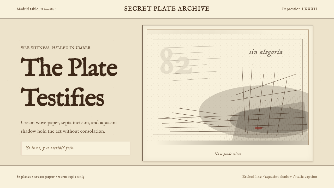 Goya — Disasters of WarWitness without ornament. Cream paper, umber line, aquatint shadow, italic ca…无装饰的见证:米色纸、赭褐线、飞尘暗影与斜体短注。
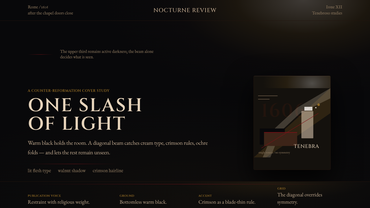 Caravaggio TenebrismDarkness acts first. Warm-black voids, Cinzel capitals, and one ochre raking…黑暗先发声:暖黑空场、Cinzel 大写与赭石斜光。
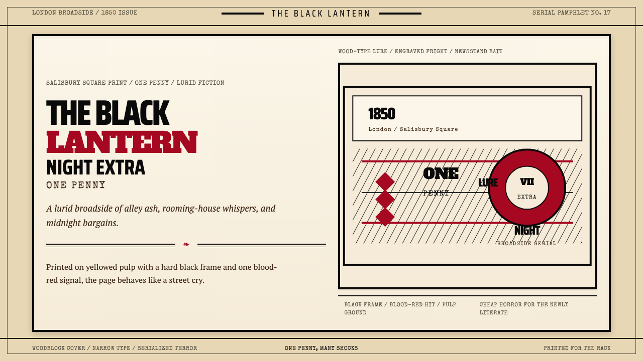 Penny Dreadful Victorian Headline (1850)Cheap terror in full cry. Condensed wood-type, black borders, and one blood-r…廉价恐怖全速开喊。窄体木活字、黑框和血红点染钉在泛黄纸上。
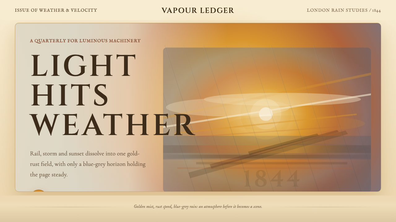 Turner — Rain, Steam and SpeedEdges dissolve into weather. Amber mist, rust smears and blue-grey horizon ca…边缘化入天气。琥珀雾、金锈涂痕与蓝灰地平线托住画面。
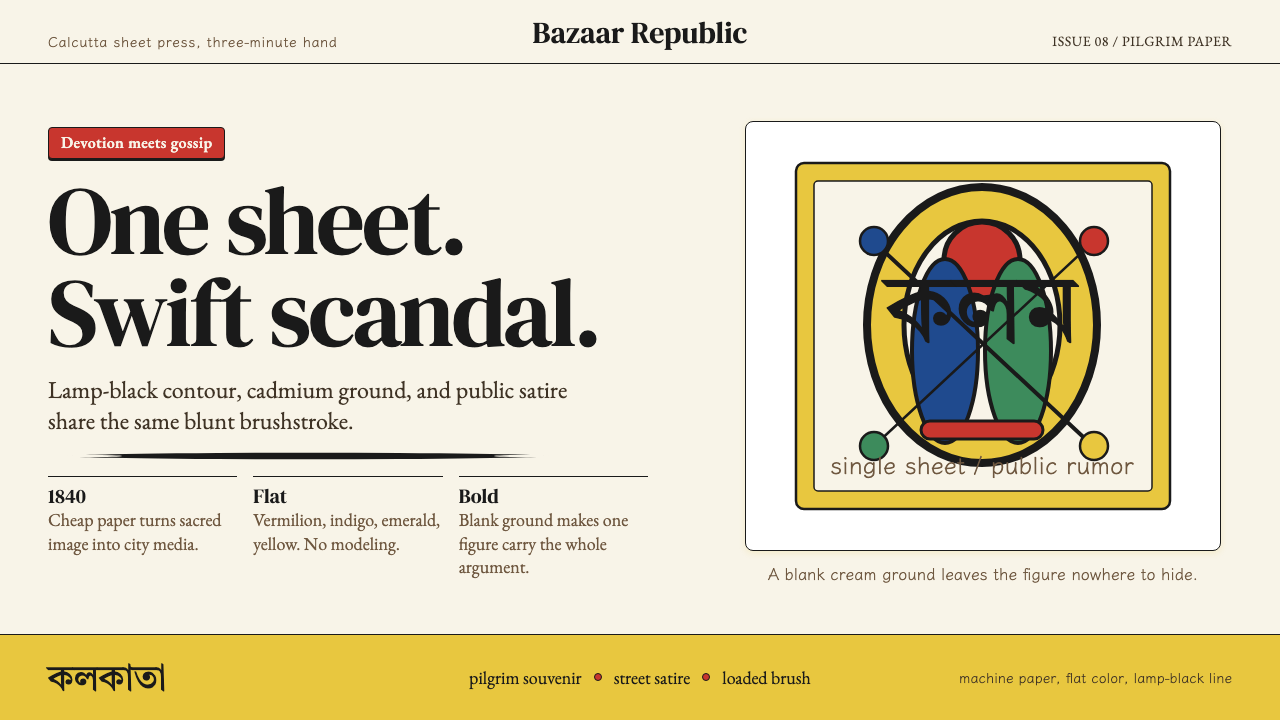 Kalighat Patua (Bengal)Satire swings fast. Cadmium yellow, vermilion and lamp-black line on cream pa…讽刺一笔挥出:奶油纸上明黄、朱红与墨黑轮廓线。