What is Turner — Rain, Steam and Speed?什么是 Turner — Rain, Steam and Speed?
Turner dissolved the Industrial Age into luminous haze — edges, engines, and storms all melting into the same amber light.透纳把工业时代化进了发光的薄雾——边缘、机车与暴风雨,全都融入同一片琥珀光里。
Turner — Rain, Steam and Speed in briefTurner — Rain, Steam and Speed 速览
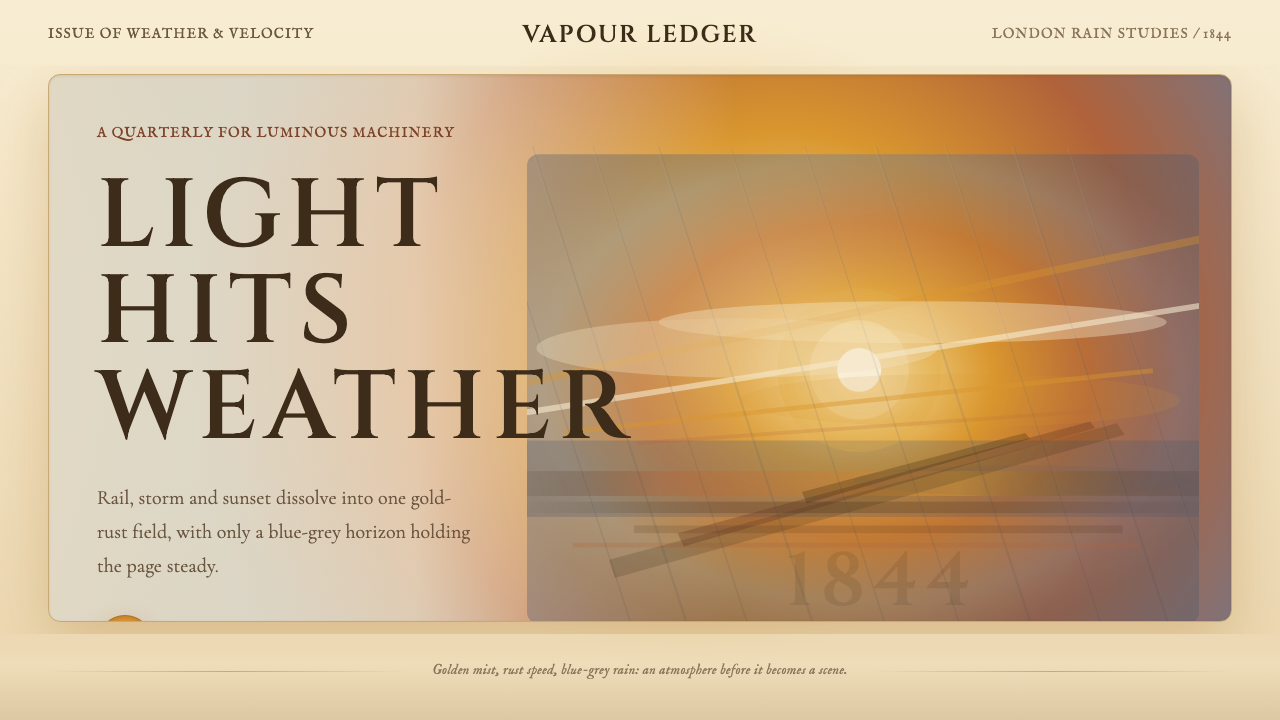
Turner's late atmospheric style — crystallized in Rain, Steam and Speed, exhibited at the Royal Academy in 1844 — is among the most radical visual ideas in the history of Western painting. Where earlier landscape art prized clear contours, local color, and legible detail, Turner's mature work does the opposite: it sacrifices definition to light. The painting depicts a locomotive crossing Maidenhead Railway Bridge on Brunel's Great Western Railway during a rainstorm, yet the train is barely visible — a dark smear inside a vortex of gold, rust, cream, and blue-grey vapor. The subject is not the train. The subject is atmospheric sensation.透纳的晚年气氛风格——在1844年皇家学院展出的《雨、蒸汽和速度》中达到顶点——是西方绘画史上最激进的视觉构想之一。早期风景画重视清晰的轮廓、固有色与可辨读的细节,而透纳成熟期的作品恰恰相反:它为了光而放弃了清晰度。这幅画描绘的是一列火车在暴风雨中穿越布鲁内尔大西部铁路上的梅登黑德铁路桥,然而火车几乎看不见——不过是金色、锈色、奶白与蓝灰色蒸汽漩涡中一道黑暗的涂痕。主题不是火车,而是大气的感官冲击。
Aesthetically, the system is built around dissolution. Edges are not drawn — they are absorbed into surrounding mist. Color is organized not by local identity but by the temperature and density of light: warm amber and saffron dominate the sun-struck center, bleeding outward into cooler blue-violet at the horizon. Horizontal smears of ochre and cream suggest the bridge without defining its masonry. The locomotive announces itself through darkness and forward thrust rather than through outline. Every visual element is held in suspension, as if the scene exists at the exact moment before it becomes something else.在美学上,这套体系建立在「消融」之上。边缘不是被画出来的,而是被周围的雾气吸收进去。色彩的组织依据不是固有色,而是光的温度与密度:温暖的琥珀色与藏红花色主导着阳光照射的画面中心,向外渐渗为地平线处更冷的蓝紫。赭石色与奶白色的横向涂抹暗示着铁桥,却从不描绘其砌体细节。机车以黑暗和向前的冲力宣告自身,而非依靠轮廓线。每一个视觉元素都悬浮在半途——仿佛眼前的场景正处于变成别的什么之前的那个精确瞬间。
This aesthetic sits at the intersection of British Romanticism, the Sublime landscape tradition, and what later critics would recognize as proto-Impressionism. It is not a style of clarity or structure — it is a style of atmosphere, imminence, and emotional intensity. Applied to contemporary design work, it conveys historical weight, literary mood, and a quality of drama that clean, geometric systems cannot produce.这种美学处于英国浪漫主义、崇高风景传统与后来批评家所称的「原始印象主义」的交汇处。它不是清晰与结构的风格,而是气氛、紧迫感与情感强度的风格。应用于当代设计时,它传递历史厚度、文学气质,以及干净几何体系所无法产生的戏剧性张力。
See the Turner — Rain, Steam and Speed design system查看 Turner — Rain, Steam and Speed 完整设计系统
Where does Turner — Rain, Steam and Speed come from?Turner — Rain, Steam and Speed 从何而来?
Joseph Mallord William Turner was born in London in 1775, the son of a barber. He entered the Royal Academy Schools at fourteen and exhibited his first oil painting there at the age of sixteen. His early work was conventional topographical watercolor, carefully observed and precisely rendered. But over the decades that followed — traveling through Wales, Scotland, the Alps, Venice, and the coastal town of Margate — his style underwent a transformation that his contemporaries found alternately visionary and incomprehensible. By the 1820s, his canvases had begun to dissolve into light in ways that no precedent in British painting quite explained.约瑟夫·马洛德·威廉·透纳于1775年出生在伦敦,父亲是一名理发师。他十四岁进入皇家学院学校,十六岁便在那里展出了第一幅油画。早年的作品是规矩的地形水彩画,观察细致、描绘精确。然而在此后数十年里,随着他游历威尔士、苏格兰、阿尔卑斯山、威尼斯和滨海小镇马盖特,他的风格经历了一场蜕变——那种蜕变在同时代人眼中时而是预言式的天才,时而是全然无法理解的晦涩。到了1820年代,他的画布已开始以一种英国绘画传统中毫无先例的方式消融于光中。
The intellectual and artistic context for Turner's late style comes from multiple directions. The tradition of the Sublime — formulated by Edmund Burke in 1757 and popularized in British landscape culture — held that experiences of overwhelming natural power (storms, mountainous vastness, oceanic depth) produced a particular species of elevated terror that was aesthetically valuable. Turner spent his career pursuing and depicting such experiences. His travels to Switzerland in the 1840s, after the opening of the Mont Cenis railway route, brought him face to face with both the grandeur of Alpine weather and the new industrial infrastructure cutting through it — a confrontation between geological time and mechanical speed that energized his final decade of work.透纳晚年风格的思想与艺术背景来自多个方向。「崇高」这一美学传统——由埃德蒙·伯克于1757年阐述,随后在英国风景文化中普及——主张,压倒性的自然力量(风暴、山岳的辽阔、海洋的深邃)所产生的那种特殊的崇高恐惧,具有重要的美学价值。透纳毕生都在追寻并描绘这类体验。1840年代数次赴瑞士之旅(恰在蒙赛尼铁路线开通之后),让他同时面对阿尔卑斯天气的壮阔与穿越其间的新工业基础设施——地质时间与机械速度的这场正面交锋,为他最后十年的创作注入了源源不断的能量。
John Ruskin, the most influential art critic of the Victorian era, became Turner's most ardent champion. In the first volume of Modern Painters (1843), published just a year before Rain, Steam and Speed was exhibited, Ruskin argued that Turner's atmospheric truth-telling surpassed the literalism of Dutch and Flemish landscape painters. Ruskin saw in Turner's mists and luminosities an almost moral fidelity to natural experience — the claim that painting should capture how the world actually appears to a sensitive observer, not how it might be diagrammed by a surveyor. This defense gave Turner's dissolution of form intellectual legitimacy precisely when critics most questioned it.约翰·拉斯金——维多利亚时代最具影响力的艺术评论家——成了透纳最热忱的拥护者。在1843年出版的《现代画家》第一卷中(仅比《雨、蒸汽和速度》的展出早了一年),拉斯金论证道,透纳对大气真实的把握超越了荷兰与佛兰德斯风景画家的字面主义。拉斯金在透纳的雾气与光辉中看见了一种近乎道德意义上的对自然体验的忠实——这种主张认为,绘画应当捕捉世界在一个敏感观察者眼中真实呈现的样貌,而非测量师的勘测图式。正当批评界对透纳的形体消融最多质疑之际,这篇辩护赋予了他的做法充分的思想合法性。
Walter Fawkes, Turner's friend and patron at Farnley Hall in Yorkshire, was an important early supporter whose collection of Turner watercolors became one of the finest in England. Through Fawkes and other collectors including Sir George Beaumont (who eventually came around to Turner's vision after years of opposition), Turner had access to private patronage that insulated him from the swings of public taste. He was elected a full Royal Academician in 1802 at the age of twenty-six — the youngest painter to achieve that distinction at the time — and served as Professor of Perspective there from 1807, a position that gave him institutional authority to develop his ideas in public. By the time of Rain, Steam and Speed, Turner was seventy years old, working largely in isolation in Chelsea, and had fully arrived at the atmospheric style for which he is now remembered.沃尔特·福克斯是透纳的好友与资助人,其在约克郡法恩利庄园的透纳水彩收藏跻身英国最精之列,是早年最重要的支持者之一。通过福克斯和包括乔治·博蒙特爵士在内的其他收藏家(博蒙特在多年反对后最终接纳了透纳的艺术愿景),透纳获得了足以抵御公众口味起伏的私人赞助。他于1802年二十六岁时当选皇家学院正式院士,是彼时最年轻的当选者;并从1807年起担任透视学教授一职,这一职位赋予他以机构权威公开发展自身理念的空间。到《雨、蒸汽和速度》问世时,透纳已年届七十,大部分时间在切尔西独自工作,并已完全抵达如今令他永远被人铭记的那种气氛风格。
What defines the Turner — Rain, Steam and Speed look?Turner — Rain, Steam and Speed 的视觉特征是什么?
Atmospheric Dissolution大气消融
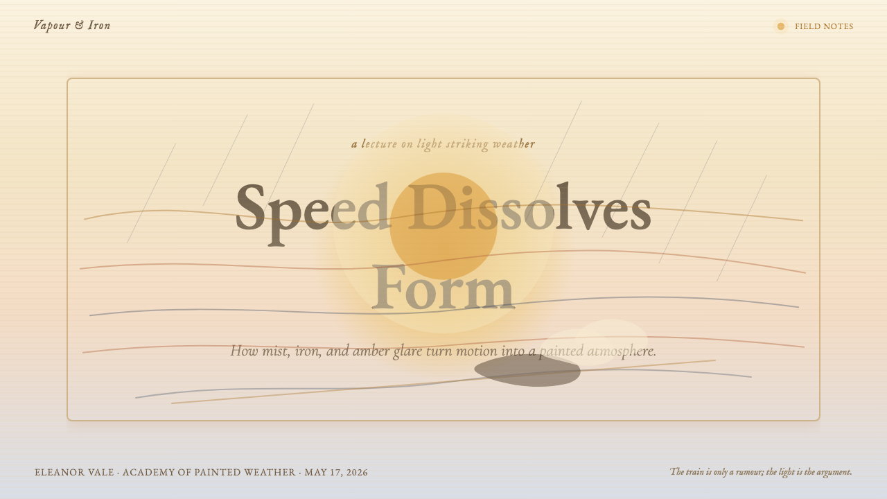
The defining gesture of Turner's late style is the deliberate dissolution of sharp edges into surrounding atmosphere. Forms are suggested rather than stated: a bridge, a locomotive, a distant tree line all emerge from the same luminous vapor that surrounds them. The eye is given just enough information to recognize the subject and no more. This is not imprecision but a different kind of precision — the precision of how light actually behaves when it strikes mist, steam, or wet air.透纳晚年风格最核心的手势,是刻意将清晰的边缘消融进周围的大气。形体是被暗示出来的,而非被陈述出来的:一座桥、一列机车、远处的树线,全都从包裹着它们的同一片发光蒸汽中浮现出来。眼睛只被给予足够辨认主体的信息,仅此而已。这不是不精确,而是另一种精确——光在打到雾气、蒸汽或湿润空气时实际上如何运动的那种精确。
Warm-to-Cool Color Drama暖冷色戏剧性
Turner's palette in Rain, Steam and Speed is structured around a dialogue between warm and cool tones rather than around hue contrast. A glowing amber and saffron core — the sun disc burning through storm — radiates outward and cools progressively into blue-grey, blue-violet, and eventually deep shadow at the far edges. Rust and ochre smears occupy the transitional zone where warm light meets cool distance. The result is a color field that feels luminous from within rather than lit from a single external source.《雨、蒸汽和速度》中,透纳的色彩结构建立在冷暖色调的对话之上,而非色相的对比。一个发亮的琥珀与藏红花色核心——穿透风暴的日轮——向外辐射,逐渐冷却为蓝灰、蓝紫,最终在画面远端化为深邃的阴影。金锈色与赭石色的涂抹占据过渡地带,那是暖光与冷远景交会之处。最终的效果是一片从内部发光的色域,而非被单一外部光源照亮的场景。
Horizontal Velocity水平速度感
The painting's composition is built around horizontal momentum. Broad, directional smears of paint run left to right across the canvas, paralleling the movement of the train and the sweeping of the storm. This horizontal energy compresses vertical information — the height of the bridge, the weight of the sky — into lateral motion. In design terms, this translates to a preference for wide, low-proportion formats, sweeping horizontal gradations of tone, and compositional elements that lead the eye steadily across the frame rather than anchoring it vertically.这幅画的构图建立在水平动势之上。宽阔而有方向感的涂痕从画布左侧横扫向右,与火车的运动和风暴的横扫方向平行。这股水平能量将垂直信息——桥的高度、天空的重量——压缩进侧向运动之中。转化为设计语言,这意味着偏爱宽而低矮的画幅比例、横向扫过的色调渐变,以及引导眼睛稳定穿越画面而非垂直锚定的构图元素。
Vortex Composition漩涡构图
Despite the dominant horizontality, Turner structures his late paintings around a vortex — a central luminous point from which color and energy spiral outward, or into which the surrounding atmosphere appears to be drawn. In Rain, Steam and Speed, the sun disc and the advancing train share this vortex function: they are the point of maximum intensity around which the rest of the composition swirls. This creates a composition that feels simultaneously expansive and centripetal, immersive rather than scenic.尽管有着主导性的水平性,透纳却将晚年画作的结构建立在漩涡之上——一个中心发光点,色彩与能量从那里向外螺旋扩散,或者说周围的大气似乎被那里吸引汇聚。在《雨、蒸汽和速度》中,日轮与前进的火车共同承担这个漩涡功能:它们是构图的最强烈度点,其余一切在它们周围旋转。这造就了一种既膨胀又向心的构图——是沉浸式的,而非风景式的。
Impasto and Surface Incident厚涂与表面肌理
Turner's late technique involved building up paint in thick, irregular layers — impasto strokes applied with brush, palette knife, and reportedly even his fingers and thumbnail — so that the painted surface itself carries physical incident. Lighter, thicker passages of paint reflect more light; thinner scumbled passages allow underlayers to show. The surface is never smooth or homogeneous. In contemporary design, this quality translates to textured overlays, paper or canvas grain, layered washes, and the deliberate avoidance of the frictionless flatness that digital tools produce by default.透纳晚年的技法包括在厚而不规则的颜料层上叠加——据说以画笔、调色刀、甚至手指和拇指指甲涂抹——使画面本身携带物理性的偶发事件。较厚、颜料堆积更多的区域反射更多光线;较薄的磨擦层让底层色彩透出。画面永远不是平滑或均质的。在当代设计中,这种品质转化为纹理叠加、纸张或画布颗粒、分层晕染,以及刻意避免数字工具默认产生的那种无摩擦的平滑感。
Indeterminate Light Source不确定的光源
In Turner's late paintings, light does not emanate from a single, locatable source. The luminosity is atmospheric — suffused through vapor and mist so that the whole scene is lit from within. This is fundamentally different from the directional lighting of most academic painting, which creates a clear shadow side and a clear light side on every object. Turner's diffuse luminosity eliminates hard shadow almost entirely, replacing it with gradations of intensity and warmth. The effect is enveloping rather than dramatic in the theatrical sense — the viewer is inside the light, not observing it from outside.在透纳的晚年画作中,光不从单一的、可定位的光源发出。那种发光感是大气性的——弥漫穿透蒸汽与雾气,使整个场景从内部发亮。这与大多数学院派绘画的方向性打光根本不同——学院派在每个物体上制造清晰的阴影面和受光面。透纳漫射的发光感几乎彻底消除了硬阴影,代之以强度与温度的渐变。效果是包裹式的,而非戏剧意义上的戏剧性——观者处于光的内部,而不是从外部观察它。
Industrial Sublime工业崇高
Rain, Steam and Speed is notable as one of the first major paintings to place industrial technology within the tradition of the Sublime. The locomotive is not celebrated as a feat of engineering — it is absorbed into the same overwhelming atmosphere that, in earlier Turner canvases, would have been occupied by an Alpine avalanche or a sea storm. The machine becomes sublime by being made small within weather. For contemporary design, this is the tension the style holds: monumental scale and historical weight on one side, the fragility and contingency of any particular moment on the other.《雨、蒸汽和速度》以将工业技术置于崇高传统之内而著称——这是最早的几幅此类重要画作之一。机车并未被作为工程壮举来颂扬,而是被吸收进同一种压倒性的大气之中——在透纳早期的画作里,占据那片大气的,原本是阿尔卑斯雪崩或海上风暴。机器因在天气中被渺小化而变得崇高。对于当代设计而言,这正是这种风格所承载的张力:一边是宏大的尺度与历史的重量,另一边是任何特定时刻的脆弱性与偶然性。
See the Turner — Rain, Steam and Speed design system查看 Turner — Rain, Steam and Speed 完整设计系统
Who shaped Turner — Rain, Steam and Speed?谁塑造了 Turner — Rain, Steam and Speed?
Turner (1775–1851) is the originating figure of this entire aesthetic. Born in Covent Garden, he entered the Royal Academy Schools at fourteen and spent six decades relentlessly expanding the expressive range of landscape painting. His late works — produced largely at his studio in Chelsea and during travels to Venice, Switzerland, and the Margate coast — moved steadily away from topographical accuracy toward pure atmospheric sensation. Rain, Steam and Speed was exhibited in 1844 when he was sixty-eight; he continued painting until near his death in 1851. He left the bulk of his estate and several hundred finished oil paintings to the British nation; the core collection is now held at Tate Britain in London.透纳(1775—1851)是这整套美学的源头人物。生于科文特花园,十四岁进入皇家学院学校,此后六十年间不断拓展风景画的表现边界。他的晚年作品——大部分在切尔西的画室及赴威尼斯、瑞士和马盖特海岸的旅途中完成——稳步从地形学的精确性走向纯粹的大气感官。《雨、蒸汽和速度》展出于1844年,彼时他已六十八岁;他一直创作到1851年临近辞世之前。他将大部分遗产及数百幅油画赠予英国国家,核心收藏现存于伦敦泰特不列颠美术馆。
Ruskin (1819–1900) was the defining critical voice of Victorian-era art and architecture, and Turner's most eloquent champion. His multi-volume Modern Painters — the first volume published in 1843, the year before Rain, Steam and Speed was shown — argued systematically that Turner's atmospheric truth surpassed the documentary literalism of earlier landscape traditions. Ruskin's concept of 'truth to nature' reframed Turner's dissolution of form not as incompetence or eccentricity but as a higher fidelity to visual experience. Without Ruskin's intervention, Turner's late work might have remained a critical curiosity rather than the foundational influence it became.拉斯金(1819—1900)是维多利亚时代艺术与建筑领域最具决定性的批评声音,也是透纳最雄辩的拥护者。他的多卷本《现代画家》——第一卷出版于1843年,《雨、蒸汽和速度》展出的前一年——系统地论证了透纳对大气真实的把握超越了早期风景传统的文献式字面主义。拉斯金的「真实于自然」这一概念重新诠释了透纳对形体的消融——不是无能或怪僻,而是对视觉体验更高层次的忠实。若无拉斯金的介入,透纳的晚年作品或许只会停留为一种批评奇谈,而非后来成为的那种奠基性影响。
Fawkes (1769–1825) was a Yorkshire landowner, Whig politician, and Turner's closest friend and patron over more than two decades. His estate at Farnley Hall in Yorkshire became a second home to Turner, who visited almost annually between 1808 and 1824. Fawkes assembled one of the finest private collections of Turner watercolors in England, including studies of Alpine scenery, Rhine travels, and the Yorkshire landscape, and exhibited them publicly in his London house in 1819 — one of the earliest major public showings of Turner's work in an accessible, non-academy setting. The depth of Fawkes's personal and financial support gave Turner the freedom to experiment that his later atmospheric work required.福克斯(1769—1825)是约克郡地主、辉格党政治家,也是透纳二十余年间最亲密的朋友与资助人。他位于约克郡法恩利庄园的庄园几乎成了透纳的第二个家,透纳在1808至1824年间几乎每年到访。福克斯收藏了英国最精的透纳水彩收藏之一,包括阿尔卑斯风景研究、莱茵河旅途记录和约克郡风景,并于1819年在伦敦的私宅公开展出——这是透纳作品最早在学院以外的可及场所举办的重要公开展览之一。福克斯在个人与经济上的深度支持,赋予了透纳晚年气氛作品所需的那种实验自由。
Brunel (1806–1859) was the engineer who designed the Great Western Railway and its Maidenhead Railway Bridge — the very bridge depicted in Rain, Steam and Speed. His design of the Maidenhead Bridge, completed in 1839, used the widest and flattest brick arches then built in the world, and critics had predicted at the time of construction that it would collapse. It did not; it still carries trains today. The bridge's combination of engineering audacity and subtle elegance made it an ideal subject for a painting about industrial speed, and the choice to paint Brunel's bridge rather than a more conventional viaduct aligns Turner's aesthetic with a particularly ambitious moment in British engineering.布鲁内尔(1806—1859)是大西部铁路及其梅登黑德铁路桥的设计者——正是《雨、蒸汽和速度》所描绘的那座桥。他设计的梅登黑德桥于1839年竣工,采用了当时世界上最宽、最平的砖拱,建造之初批评者曾预言它会坍塌。它没有;至今仍在承载列车通行。这座桥的工程大胆与微妙优雅的结合,使其成为一幅描绘工业速度的画作的理想主题;选择画布鲁内尔的桥而非更常规的高架桥,将透纳的美学与英国工程史上一个格外雄心勃勃的时刻联结在一起。
How do you use Turner — Rain, Steam and Speed today?今天怎么用 Turner — Rain, Steam and Speed?
Turner's atmospheric style is among the most distinctive and least copied of the canonical historical design vocabularies, which means it carries genuine distinctiveness when applied well. Its correct application is not about reproducing the look of a painting — it is about importing the specific tension the painting holds: warmth and power in the center, dissolution at the edges, horizontal momentum, and a pervading sense that the scene is lit from within rather than from above. Designers who understand this tension can apply it far beyond the obvious (amber backgrounds, misty overlays) into layout structure, typographic weight, and the ratio of defined to undefined space.透纳的气氛风格是各大经典历史设计语汇中最具辨识度、也最少被模仿的之一——这意味着,当它被恰当运用时,能带来真正的独特性。正确的应用不是复现一幅画的外观,而是引入那幅画所承载的特定张力:中心的温暖与力量、边缘的消融、水平动势,以及一种从内部而非从上方发光的弥漫感。理解这种张力的设计师,可以将它应用到远超显而易见之处(琥珀色背景、雾气叠加)——延伸进版面结构、字体重量,以及有定义空间与无定义空间之间的比例。
For presentation slides, this style excels in contexts that require historical gravitas and emotional atmosphere rather than data density. A cover slide built in Turner's register works best with a single dominant tonal field — amber, rust, or deep gold — into which type is set in a contrasting tone rather than a high-contrast color. The title may be partially obscured by a lighter overlay, as if emerging from mist, rather than sitting cleanly on a flat background. Content slides should avoid hard grid edges: let text columns breathe into surrounding space, use tinted or washed section dividers instead of ruled lines, and treat any data visualization as an atmospheric gradient field rather than a hard-edged chart.对于演示文稿,这种风格在需要历史庄重感和情感气氛而非数据密度的场合最为出色。以透纳语调构建的封面页,最适合以单一主色调领域为主——琥珀、金锈或深金——文字以对比色调而非高对比度色彩置于其上。标题可以被较浅的叠加层部分遮掩,仿佛从雾中浮现,而非干净地落在平坦背景上。内容页应避免硬朗的网格边缘:让文字栏自然呼吸进周围空间,以色调晕染或水洗式分段符替代刻线,将任何数据可视化处理为大气渐变色域而非硬边图表。
For web UI and dashboards, Turner's palette and dissolution logic apply best to editorial and immersive contexts — long-form reading experiences, cultural or arts organization sites, heritage brand interfaces, or any product where the emotional quality of the user's experience matters as much as task efficiency. The approach: warm ground tones, typographic hierarchy established through weight and size rather than color contrast, generous open space that functions as the compositional equivalent of mist, and imagery treated with warm tonal overlays that reduce contrast and push photographs toward the amber-rust register of the painting itself.对于网页UI与仪表板,透纳的色彩与消融逻辑最适合编辑与沉浸式场景——长篇阅读体验、文化或艺术机构网站、传统品牌界面,或任何用户情感体验与任务效率同等重要的产品。方法如下:温暖的底色调,通过字重与尺寸而非色彩对比建立字体层级,充裕的留白充当构图上与雾气等价的角色,图像以温暖的色调叠加处理,降低对比度,将照片推向画作本身的琥珀-锈色语域。
For editorial and marketing design — book covers, event posters, cultural institution campaigns, premium brand materials — the style has direct applicability. A Turner-register poster uses a warm, luminous background with a centered or slightly off-center focal element that radiates outward into increasingly diffuse tone. Typography should feel weighted and substantial but sit in the atmosphere rather than dominating it; condensed letterforms in a warm near-white or cool blue-grey read well against amber grounds. The horizontal compositional emphasis suits wide-format work — billboard, panoramic social card, widescreen video title card — better than square or portrait formats.对于编辑与营销设计——书封、活动海报、文化机构宣传、高端品牌物料——这种风格有直接的适用性。透纳语调的海报,使用温暖发光的背景,以一个居中或略偏离中心的焦点元素向外放射,色调逐渐扩散变得漫射。字体应感觉有重量、有厚度,但处于大气之中而非主宰大气;凝缩字形以温暖的近白色或冷蓝灰色置于琥珀底面上,效果极佳。水平构图重点更适合宽画幅——广告牌、全景社交图、宽屏视频片头卡——而非方形或纵向画幅。
The most common mistake when applying this style is conflating atmospheric dissolution with vagueness or incompleteness. Turner's paintings are not unfocused — they are precisely organized around a luminous core from which energy and color radiate outward in controlled gradations. The equivalent in design is not blurring everything or reducing contrast indiscriminately, but rather establishing a clear center of intensity and allowing surrounding elements to subordinate themselves to it. A second common mistake is using cool or neutral ground tones: the warmth of amber, gold, and rust is not a surface choice but the structural logic of the style, and substituting grey or blue grounds produces something that reads as fog rather than as Turner.应用这种风格时最常见的错误,是将气氛消融等同于模糊或不完整。透纳的画作并非失焦——它们精确地围绕着一个发光核心组织,色彩与能量从那里以受控的渐变向外辐射。设计中的等价物不是模糊一切或不分青红皂白地降低对比度,而是确立清晰的强度中心,让周围元素臣服于它。第二个常见错误是使用冷色或中性底色:琥珀、金色与锈色的温暖感不是表面选择,而是这种风格的结构逻辑;用灰色或蓝色底面替换,产生的东西读起来像雾,而不像透纳。
See the Turner — Rain, Steam and Speed design system查看 Turner — Rain, Steam and Speed 完整设计系统
Turner — Rain, Steam and Speed — FAQTurner — Rain, Steam and Speed · 常见问题
Is this style appropriate for corporate or business design, or is it too painterly?这种风格适合企业或商业设计吗,还是太像绘画了?
It depends heavily on the kind of corporate context. Turner's atmospheric style is well-suited to premium, heritage, or culturally positioned brands — financial institutions with long histories, arts and cultural organizations, publishing houses, architecture firms, hospitality groups operating in the upper-luxury register. It struggles in contexts that demand immediacy, data density, or rational clarity — SaaS dashboards, fast-moving consumer products, or any context where the user needs to extract information quickly. The style communicates depth and gravitas; it does not communicate speed or efficiency. Use it when those values align with the brand.这在很大程度上取决于企业场景的类型。透纳的气氛风格非常适合高端、传统或具有文化定位的品牌——有悠久历史的金融机构、艺术与文化机构、出版社、建筑事务所、在顶级奢侈领域运营的酒店集团。在需要即时性、数据密度或理性清晰度的场景中,它则力不从心——SaaS仪表板、快速消费品,或任何用户需要快速提取信息的场景。这种风格传递深度与庄重感;它不传递速度或效率。只有当这些价值观与品牌价值观一致时,才使用它。
How do you handle readable typography in a style that is built around atmospheric diffusion?在一种建立于大气漫射之上的风格里,如何保持字体的可读性?
The key is to reserve the atmospheric dissolution for backgrounds and supporting visual fields, not for the typographic layer. Turner's own paintings have a clear compositional hierarchy: the most defined elements in the painting — the train's dark silhouette, the forward-facing arch of the bridge — are also the most structurally important. Typography should function the same way: high contrast between text and its immediate ground, even if that ground is itself a diffuse tonal field. The most effective approach is to place text on a zone where the background tone is relatively uniform — the amber core, for instance — and allow the dissolution to happen in the margins and transitions. Text set in deep warm tones on a lighter field, or in near-white on a mid-amber field, reads cleanly while remaining inside the style's atmosphere.关键是将大气消融保留给背景和辅助视觉区域,而非字体层。透纳的画作本身有清晰的构图层级:画面中最清晰的元素——机车的深色轮廓、铁桥向前的拱形——也是结构上最重要的元素。字体应以同样方式发挥作用:文字与其直接底面之间保持高对比度,即使那个底面本身是漫射的色调场。最有效的方法是将文字置于背景色调相对均匀的区域——比如琥珀色核心——让消融发生在边缘和过渡地带。深暖色调文字置于较浅底面上,或近白色文字置于中琥珀色底面上,都能在保持风格气氛的同时清晰可读。
How does this style relate to Impressionism, and why does that distinction matter for designers?这种风格与印象主义有什么关系?这种区别对设计师为何重要?
Turner predates the French Impressionists by a generation — Monet was born in 1840, four years before Rain, Steam and Speed was exhibited — and the relationship is one of anticipation rather than influence, though Monet reportedly visited London specifically to study Turner's work. The visual distinction matters for designers because Turner's atmospheric dissolution is organized around a dramatic, often singular light source and a clear compositional hierarchy, whereas Impressionism distributes attention more evenly across the picture surface and uses broken color strokes throughout. A Turner-derived design has a center of gravity; an Impressionist-derived design tends toward allover pattern. Knowing this helps designers avoid the common error of importing Impressionist visual logic (scattered, equal-weight color incidents) under the assumption that it reads as Turner.透纳比法国印象派早了整整一代——莫奈生于1840年,比《雨、蒸汽和速度》展出还早四年——两者的关系是预示而非影响,尽管据说莫奈曾专程赴伦敦研究透纳的作品。这种区别对设计师很重要,因为透纳的大气消融围绕着一个戏剧性的、往往是单一的光源和清晰的构图层级组织;而印象主义则将注意力更均匀地分布于画面,并在整体上使用碎点色彩笔触。透纳衍生的设计有重心;印象主义衍生的设计倾向于全面图案化。理解这一点有助于设计师避免一个常见错误:在以为那读起来像透纳的假设下,引入印象主义的视觉逻辑(散点式、等重量的色彩事件)。
Can this style work in dark mode, and if so, how?这种风格能用于深色模式吗?如果可以,应该怎么做?
A dark-mode Turner variant is possible but requires rethinking the light logic rather than simply inverting the original palette. The canonical Turner is a light-emitting style — the warmth radiates from a bright center outward. On a dark ground, the equivalent is a deep charcoal or near-black field with a luminous amber or deep gold center that glows rather than blazes. The warm tones should remain but be compressed toward the center, with the dark margins serving the function that mist serves in the original — a zone of dissolution rather than a hard edge. Avoid the temptation to use bright white or high-contrast blue as a counterpoint; instead, let cool dark tones do the work of recession. The result should feel like looking at a lantern through fog at night, not like a standard light-on-dark interface with amber accent colors applied.深色模式的透纳变体是可行的,但需要重新思考光的逻辑,而不仅仅是反转原有色板。经典透纳是一种从内部发光的风格——温暖感从明亮的中心向外辐射。在深色底面上,等价物是一片深炭灰或近黑底面,中心有一个发光的琥珀色或深金色——是「发亮」而非「燃烧」。暖色调应保留但向中心压缩,深色边缘承担原作中雾气的功能——消融地带而非硬边。避免用亮白色或高对比度蓝色作为对位;相反,让冷暗色调承担后退的工作。最终效果应当像是在夜晚透过雾气看一盏灯笼,而不是一个标准的深色背景界面加上琥珀色强调色。
What kinds of imagery work best alongside Turner's atmospheric palette, and what should be avoided?哪类图像与透纳的气氛色板搭配最好?哪些应该避免?
Imagery that works best in this register shares three qualities: tonal unity, atmospheric subject matter, and a warm color temperature that can be harmonized with the amber-rust palette through overlay or tonal treatment. Landscape photography shot in golden-hour or overcast light, architectural photography emphasizing mass and surface rather than structural clarity, and any imagery with inherent mist, smoke, or water vapor integrate naturally. Avoid crisp, high-definition product photography, technical diagrams, and any image whose primary value is informational precision — these fight the atmospheric logic of the style. Portraiture can work if treated with a warm duotone overlay that subordinates skin tones to the amber register and reduces background detail to near-abstraction. The rule: if the image has a strong sense of a specific, well-lit, clearly defined moment in time, it will resist the style. If it has an ambient, enveloping quality, it will strengthen it.在这种语域中最相配的图像共享三种品质:色调统一性、大气性的拍摄主题,以及能通过叠加或色调处理与琥珀-锈色色板协调的温暖色温。在黄金时段或阴天拍摄的风景摄影、强调体量与表面而非结构清晰度的建筑摄影,以及任何本身含有雾气、烟雾或水蒸气的图像,都能自然融入。避免清晰、高清晰度的产品摄影、技术图表,以及任何其主要价值在于信息精确性的图像——这些都与风格的大气逻辑相抵触。人像可以奏效,前提是以温暖的双色调叠加处理,将肤色臣服于琥珀语域,并将背景细节降低至近乎抽象。规则是:如果图像强烈地传达出某个特定的、光线充足的、轮廓清晰的时间瞬间,它就会抗拒这种风格;如果它具有弥漫的、包裹性的品质,它就会强化这种风格。
Related design styles相关设计风格
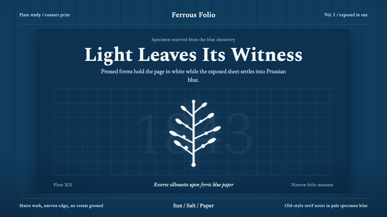 Anna Atkins CyanotypeScience turns spectral. Prussian blue ground, white reserves, Victorian serif…科学显影成幽灵:普鲁士蓝底、白色留影、维多利亚衬线宽边。
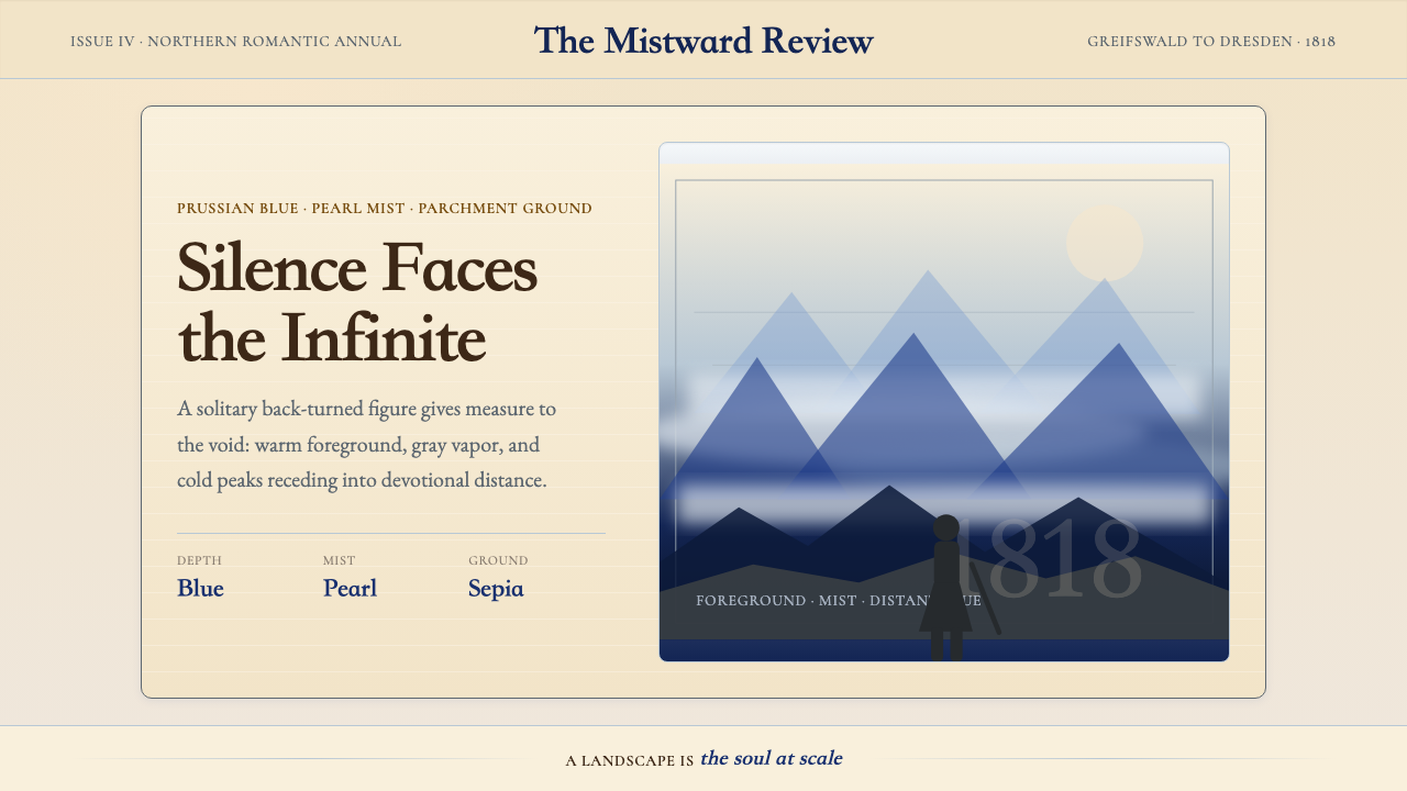 Caspar David FriedrichSilence becomes vast. Prussian blue depth, pearl mist, and parchment framing…寂静变得辽阔:普鲁士蓝纵深、珍珠雾与羊皮纸框层层后退。
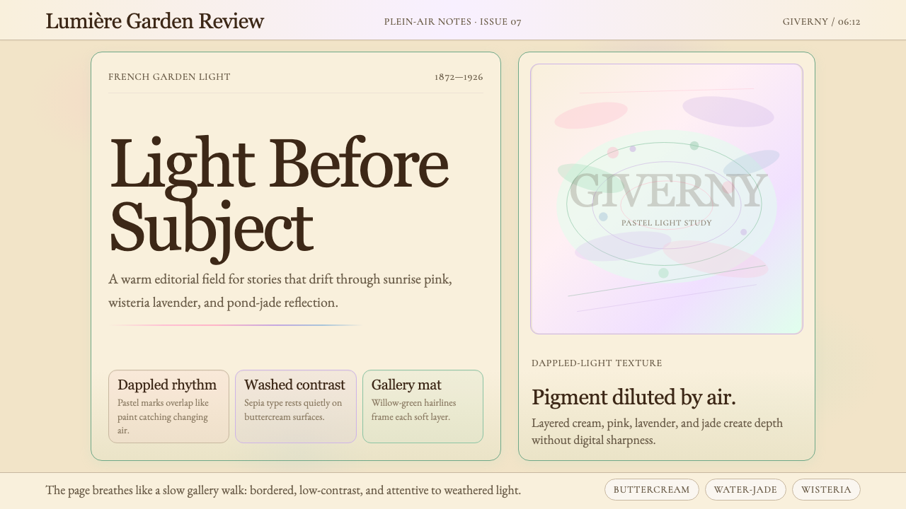 Claude Monet ImpressionistLight becomes the subject. Buttercream, pastel dapples, and Cormorant serif s…光成为主题。奶油底、粉彩斑点与Cormorant衬线柔化画面。
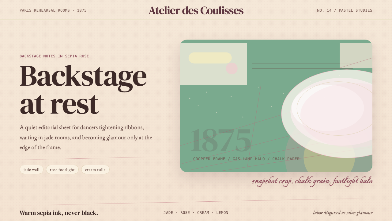 Degas Ballet PastelsBackstage glamour is labor. Jade walls, rose footlights, cropped serifs on cr…后台华丽即劳动。玉墙、玫瑰脚灯与裁切衬线落在奶油纸上。
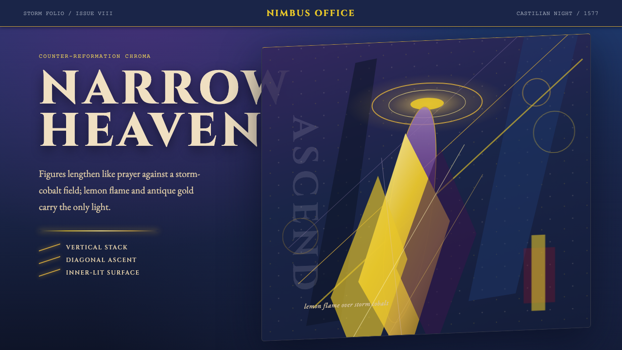 El Greco — Toledo MannerismMysticism strains upward. Storm cobalt, lemon flame, and gold halos pull the…神秘感向上拉伸。风暴钴蓝、柠檬火焰与金色光环令画面纵向紧绷。
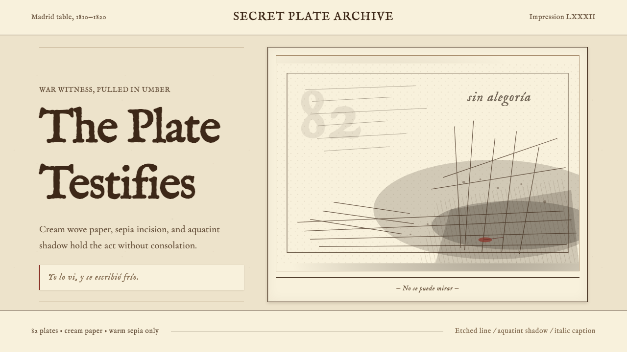 Goya — Disasters of WarWitness without ornament. Cream paper, umber line, aquatint shadow, italic ca…无装饰的见证:米色纸、赭褐线、飞尘暗影与斜体短注。