What is Anna Atkins Cyanotype?
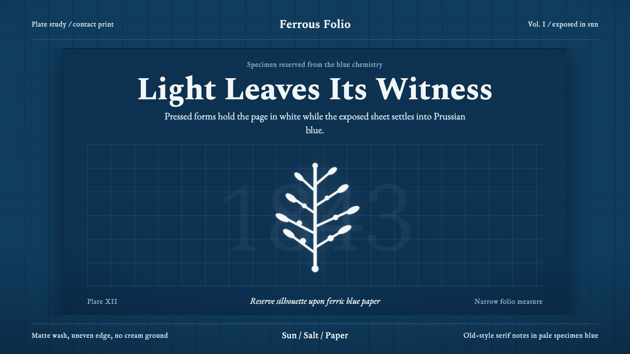
In 1843 a botanist turned sunlight into ink. Anna Atkins laid seaweed onto iron-salted paper and let the Victorian sky do the printing — leaving behind a visual system of deep Prussian blue grounds and luminous white silhouettes that feels, nearly two centuries later, both scientifically precise and hauntingly spectral.
Anna Atkins Cyanotype in brief
The Anna Atkins Cyanotype style is rooted in the earliest years of photographic history: the contact-print method that Atkins used to produce the first book illustrated with photographs. The ground is always a saturated, ferrous blue — the exact tone that iron salts produce when exposed to ultraviolet light. Against it, every specimen, every letter, every ruled margin appears as a reserved white shape, the photogram's ghost impression of the original object.
Unlike most historical photographic styles that trade on nostalgia or sepia warmth, this system is cool and precise. Its visual logic is essentially negative: what you see is not what was there, but what was not exposed. Fronds of algae, pressed flowers, feathers, or lace become luminous outlines rather than solid forms. The eye reads the blue field as presence and the white as light itself breaking through.
The style carries the gravity of Victorian scientific illustration: wide botanical-plate margins, old-style serif book faces, restrained caption text set in small sizes with generous leading. It is at once a document of natural history and a purely abstract composition — each plate is simultaneously a specimen record and a tone poem in indigo and white.
Where does Anna Atkins Cyanotype come from?
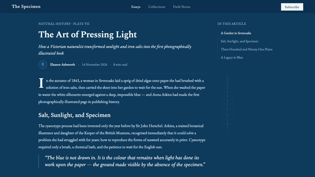
The cyanotype process was invented in 1842 by the English astronomer and chemist Sir John Herschel — the same scientist who coined the terms 'photography', 'negative', and 'positive'. His discovery that a mixture of ferric ammonium citrate and potassium ferricyanide, when coated onto paper and exposed to light, produces an insoluble Prussian-blue compound gave early photographers a cheap, simple alternative to the more technically demanding silver processes of the day. Herschel initially explored it as a way to reproduce technical drawings and notes — what we would now call blueprint prints — rather than as a fine art medium.
Anna Atkins was not merely a gifted amateur borrowing a scientist's recipe. She was trained in botany by her father, the natural philosopher John George Children, who was a Fellow of the Royal Society and a close friend of Herschel's. Atkins learned the cyanotype process directly from Herschel, almost certainly before it was published. Beginning in October 1843, she began issuing parts of her monumental work 'Photographs of British Algae: Cyanotype Impressions' — distributing hand-made fascicles to subscribers over a period of more than a decade. In doing so, she became the first person to produce a book illustrated with photographic images.
The plates themselves were contact prints: Atkins placed dried, pressed algae specimens directly onto sensitized paper, covered them with a sheet of glass, and set the whole assembly in sunlight. Where the specimen blocked the light, the paper remained white; everywhere else, the iron salts oxidized to the brilliant blue of Prussian blue pigment. The resulting image is simultaneously a scientific record and a compositional decision — Atkins arranged her specimens with evident care, achieving arrangements that read as both rigorous taxonomy and delicate visual design.
The work fell into obscurity for much of the twentieth century. The Royal Society's copy went unrecognized in storage for decades. Revival began in the 1980s as photography historians began situating Atkins's contribution alongside Talbot and Daguerre rather than treating her as a footnote. Today her original fascicles are held by the New York Public Library, the British Library, and the Royal Society, and the cyanotype process has undergone a renaissance among fine-art photographers, textile designers, and digital artists who prize its economy and otherworldly blue.
What defines the Anna Atkins Cyanotype look?
Ground Color
The defining characteristic of the cyanotype system is that the background is never neutral. It is a deep, saturated blue — specific, mineral, and immediately recognizable as ferrous rather than digital. This blue is not a designer's choice of cool tone; it is the color produced by a chemical reaction and carries that sense of inevitability. In contemporary applications, it anchors the entire composition: every other element is either blue (absorbed into the ground) or white (reserved against it). There is no room for a mid-ground third color.
White as Light
White in the cyanotype system does not function as a neutral or blank. It reads as the presence of light — the thing that was shielded from oxidation. This reversal of conventional figure-ground relationships gives the style its spectral quality. Silhouettes and letterforms glow rather than sit. When deploying the style, restraint with white is essential: the fewer white marks, the more each one reads as radiant rather than merely uncolored.
Silhouette and Specimen Logic
The visual grammar of cyanotype is that of the photogram — objects defined entirely by outline and internal shadow rather than by modeled tone or color fill. Fronds, stems, and skeletal structures read as precise white line drawings on blue, without shading or rendering. In design applications, this means that imagery is always reduced to high-contrast silhouette: the detail lives in the outline, not in the fill. Photographs, if used, should be converted to extreme contrast or duotone blue-and-white.
Botanical-Plate Typography
Atkins's original plates used Victorian book typefaces — old-style serifs with relatively high x-heights and gentle optical modulation, set small and placed far from the specimen image in generous lower margins. This typographic restraint is intrinsic to the style: text announces species name and collection date without competing with the image. In contemporary use, this translates to a strong separation between the image field and the text field, with labels and captions rendered in a classical serif at small sizes and wide line spacing.
Generosity of Margin
The Victorian scientific folio tradition from which the cyanotype derives was formally structured around wide, even margins that framed the plate as an object of study. The image was never bled to the edge; it floated in a field of off-white or cream paper, physically separated from the text. Applied to screen or print, this principle translates to substantial breathing room around all elements — the blue composition should sit within visible margins, not stretch to the viewport's edge. The margin is not wasted space; it is part of the composition's authority.
Scientific Restraint
Despite the apparent visual drama of its deep blue ground, the cyanotype aesthetic is ultimately one of restraint and objectivity. Atkins was not making art for the sake of beauty; she was making a scientific record. The beauty arose as a consequence of precision. Applied to design, this means the system should never feel expressive or emotional in a decorative sense — it should feel rigorous. Decorative flourishes, vignettes, or illustration that departs from silhouette logic breaks the spell entirely.
Tone Polarity
The cyanotype system is strictly binary in its tonal logic: deep saturated blue and near-pure white, with very little in between. The original chemistry allowed for some mid-tones where specimens were translucent, but the design system extracts only the pure poles — full blue or full white. This binary quality gives the work its graphic impact and also imposes a discipline on complexity: every element must be committed to one or the other. Graduated tones, soft shadows, and mid-gray passages dissolve the logic entirely.

Who shaped Anna Atkins Cyanotype?
Botanist, scientist, and the first person to publish a book illustrated with photographs. Educated by her father in botany and natural philosophy, she learned the cyanotype process directly from Herschel and applied it with scientific rigor and unexpected compositional sensitivity. Her 'Photographs of British Algae' ran to at least three known copies and was distributed in fascicles over more than a decade. She later produced cyanotype books of ferns and other flora, as well as botanical portraits using photograms of feathers and lace. Her work was largely unknown outside specialist circles until the late twentieth century, when it was re-evaluated as a founding moment in both photography and the history of the book.
The polymath astronomer who invented the cyanotype process in 1842 as one of several photographic chemistries he explored. Herschel also fixed the terminology of the new medium — the words 'photography', 'negative', and 'positive' are all his coinages. His friendship with Atkins's father and his direct communication of the cyanotype method to Atkins placed him, somewhat indirectly, as the technical enabler of the world's first photobook. Herschel himself used the cyanotype mainly for scientific documentation; it was Atkins who first recognized its aesthetic and communicative potential as a book medium.
The landmark work itself warrants treatment as a key figure in the tradition. Issued in at least thirteen parts over a decade, it documented hundreds of British algal species using contact-print photograms — each plate made by hand in natural light. No two copies are identical: variation in exposure time, specimen condition, and paper sensitization means each extant copy is effectively a unique object. The work sits at the intersection of scientific taxonomy, botanical illustration, and photographic art. Its plates established the visual grammar that the cyanotype style continues to draw on: deep blue ground, white reserve, generous margin, minimal text.
The cyanotype process migrated from botanical science into two unexpected domains during the nineteenth and early twentieth centuries: textile printing and architectural drafting. The same Prussian-blue-on-white chemistry that Atkins used for algae was adopted by cotton printers in England and West Africa, producing resist-dyed indigo-effect fabrics. In architecture and engineering, the blueprint — a cyanotype contact print of technical drawings — became the universal standard for distributing building plans from the 1870s until the widespread adoption of photocopying in the 1970s. These parallel lives of the process in material culture give the style its unexpectedly broad resonances.
Since the 1980s, fine-art photographers including Man Ray's inheritors and artists like Christian Marclay, Barbara Kasten, and numerous textile and surface designers have returned to the cyanotype process, prizing its accessibility, its distinctive blue, and its insistence on direct physical contact between object and image surface. In the 2010s, the process entered digital design through filters, presets, and templates that approximated its visual grammar. The revival has also coincided with renewed interest in slow, material-focused processes as a counterpoint to screen-based ephemerality — making Atkins's nineteenth-century method unexpectedly resonant in contemporary visual culture.
How do you use Anna Atkins Cyanotype today?
The Anna Atkins Cyanotype style transfers cleanly to contemporary design when its underlying logic is respected rather than just its surface appearance. The core principle is contact-print thinking: every element should appear as though it was physically placed against a sensitized surface and revealed by light. This means working primarily in flat silhouette, letting the deep blue ground do the visual work, and reserving white for the elements that matter most — titles, key labels, specimen imagery.
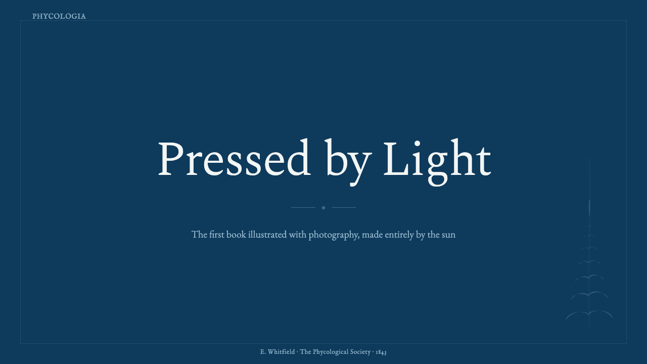
For presentation slides, the style works best as a full commitment: deep saturated blue backgrounds throughout, white type and imagery reserved cleanly against them. Cover slides benefit from a single strong botanical-style silhouette — an enlarged frond, a pressed flower, an architectural plan — centered or asymmetrically anchored within generous margins. Content slides should use the old-style serif typographic register: a hierarchy of text sizes with generous leading, all in white, with minimal supporting marks. Resist the impulse to add color accents; the entire palette is blue and white, and that constraint is the source of the style's power.
For web and digital UI, the style suits contexts where authority, precision, and a sense of historical weight are appropriate: scientific visualization tools, archival platforms, exhibition microsites, and editorial publications dealing with natural history, botany, or Victorian material culture. In these contexts, deep blue backgrounds with white typographic elements and high-contrast silhouette imagery feel entirely at home. For dashboard or data contexts, charts and graphs should be treated as specimen plates: flat white marks on blue ground, with thin ruled lines replacing conventional grid lines.
For editorial and marketing applications, the style has a natural affinity with printed matter — book covers, exhibition catalogues, posters, and event materials where a sense of material gravity and historical depth is an asset. A Bauhaus-derived layout would impose a rational grid; a cyanotype-derived layout imposes a folio logic: a wide text margin, the image floating in its own reserved field, the caption set small and distant from the main composition. The effect reads simultaneously as scholarly and strikingly contemporary.
The most common mistake when applying this style is treating the blue as merely an atmospheric background and then building an ordinary color palette on top of it. Once a secondary color enters — green, red, gold — the contact-print logic collapses. The entire visual system depends on the discipline of exactly two tones: the exposed blue and the unexposed white. A second common error is using a soft, gradient blue rather than a flat, deeply saturated one: the cyanotype blue is specific in its intensity, and diluting it into a wash or gradient removes the sense of photochemical process that gives the style its character.
Anna Atkins Cyanotype — FAQ
Is cyanotype blue always the same shade, or does it vary?
In the original photographic process, the blue varies with exposure time, the concentration of the iron salts in the sensitizing solution, and the paper substrate. Longer exposure produces a deeper, more saturated blue; shorter exposure yields a lighter, greyer tone. Atkins's originals show this variation across plates in the same fascicle. For design purposes, the canonical tone is the fully-exposed, deeply saturated version — the blue that results when iron salts have completely oxidized. Lighter or more muted blues read as underexposed or degraded rather than as intentional design choices, and they lose the chemical specificity that makes the style visually distinctive.
Can photography or realistic illustration be incorporated into this style?
Yes, but only if converted to the style's tonal logic. Realistic photography with continuous tones, multiple colors, and naturalistic lighting is incompatible with the cyanotype system. However, photographs processed as high-contrast duotone — all shadows rendered as deep blue, all highlights as white — integrate convincingly. Similarly, illustration that uses only flat white line or silhouette on a blue ground fits the grammar. The test: remove the blue background, and what remains should be either white shapes or blank paper. If anything mid-gray or intermediate in tone survives, the conversion is not complete.
How does cyanotype style relate to other blue-dominant historical aesthetics like indigo resist-dyeing or blueprint drafting?
All three share the same chemical ancestry — Prussian blue and the broader family of iron-salt blues — and all three operate on a similar tonal logic of deep blue against reserved white or pale ground. Indigo resist-dyeing, such as Japanese katazome or West African adire, uses wax or paste to block the dye rather than light to block oxidation, but the visual result — an intricate white pattern on blue — is compositionally related. Blueprint drafting is the most direct cousin: the same cyanotype chemistry applied to technical drawings, producing white lines on blue ground. In contemporary design, these traditions are often used interchangeably or in combination, though they carry different cultural weights — Atkins's cyanotype reads as Victorian scientific precision, resist-dyeing as artisanal warmth, and blueprints as industrial authority.
Is this style suitable for dark-mode or screen-based interfaces?
Unusually among historically-derived styles, cyanotype is inherently dark-mode by nature — its canonical form is a dark blue ground with white foreground elements. This means it transfers to screen with fewer adaptations than a style whose original form was light-ground. The main challenge is reproducing the specific quality of the blue: on screen, pure blue tends toward a hard, electrical feel that reads differently from the mineral, slightly muted quality of real cyanotype paper. Shifting the blue marginally toward indigo or adding the faintest grey-green undertone brings it closer to the photographic original without losing the depth needed for legibility.
What kinds of content or brands should avoid this style?
The cyanotype style communicates scientific detachment, historical precision, and a certain archival remove — it positions the viewer as a careful observer of something preserved. This makes it poorly suited to contexts requiring warmth, spontaneity, or immediacy: consumer food and beverage brands, social platforms, entertainment products, or any context where the goal is to feel current, playful, or emotionally accessible. Its Victorian roots also mean it can inadvertently signal elitism or inaccessibility when used carelessly. Brands whose identity depends on being approachable, diverse, or inclusive should use this style only in highly specific, contextualized ways — an archival or heritage sub-brand, a limited editorial series — rather than as a primary visual system.
Related design styles
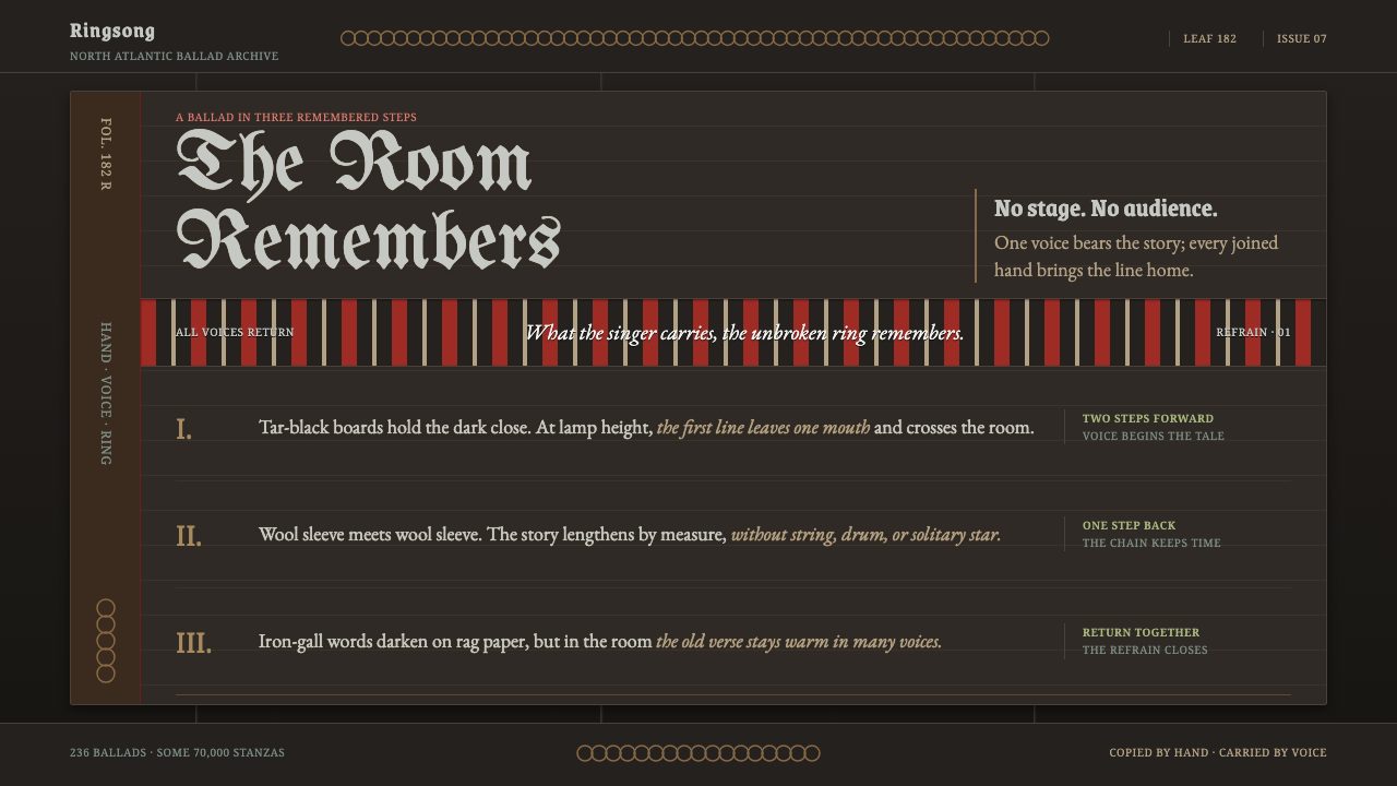 Faroese KvæðiThe room sings as one. Silver type and red refrain bands rule a tar-black man…
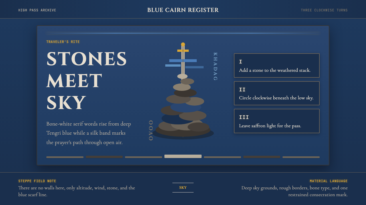 Mongolian Ovoo (Cairn Prayer Site)Sacred austerity. Steppe-blue ground, bone serif type, and one silk-blue pray…
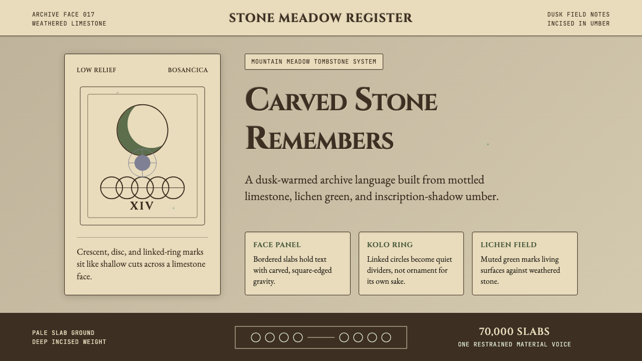 Bosnian Stećak Medieval TombstoneStone remembers quietly. Lichen green and Cinzel cuts sit on weathered limest…
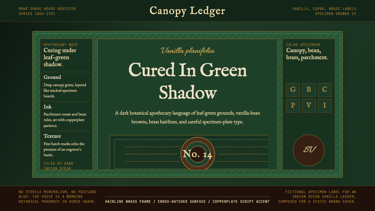 Seychellois Vanilla TakamakaBotanical apothecary in shadow. Deep green, brass hairlines, and copperplate…
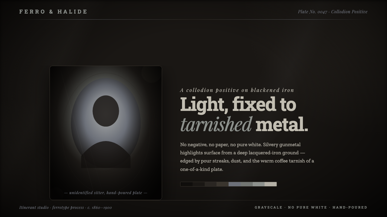 Tintype Wet PlateLight fixed to tarnished metal. Gunmetal grays rise from blackened iron, capp…
 Étretat Chalk CliffsStone becomes light. Chalk-white forms dissolve through blue-gray mist and li…