Design style guide设计风格指南
What is Seychellois Vanilla Takamaka?什么是 Seychellois Vanilla Takamaka?
Deep in the shade of takamaka canopies, where vanilla vines spiral upward and brass-fitted bottles of rum age in silence, a design language rooted in the Indian Ocean's colonial botanical trade quietly insists that luxury is a matter of precision, not abundance.在塔卡马卡树冠的深荫下,香草藤缓缓攀升,铜扣朗姆酒瓶静静熟成——一套植根于印度洋殖民时代植物贸易的设计语言,低声宣告:奢华是精准的事,而非丰盛的事。
Seychellois Vanilla Takamaka in briefSeychellois Vanilla Takamaka 速览
Seychellois Vanilla Takamaka is a design aesthetic rooted in the botanical apothecary culture of nineteenth-century Seychelles. It draws on the visual world of colonial-era copperplate engravings, hand-labeled specimen bottles, and the slow craft of vanilla curing — translating those references into a digital design language built on deep leaf greens, warm brass accents, and vanilla-cream typographic surfaces.塞舌尔香草塔卡马卡是一套根植于十九世纪塞舌尔植物药房文化的设计美学。它援引殖民时期铜版印刷、手写标签标本瓶,以及香草缓慢发酵的手工工艺,将这些视觉参照转化为一套以深叶绿、温暖黄铜与香草奶油色为基础的数字设计语言。
The defining quality is controlled darkness. Where many nature-inspired systems reach for bright tropical palettes, this one insists on shadow — the understorey of the forest floor rather than the sun-lit canopy, the interior of a curing shed rather than the open beach. Against that deep ground, fine hairline rules and cream-toned letterforms carry the precision of a Kew Gardens specimen plate: everything is labeled, measured, and placed with the gravity of scientific documentation.其核心品质是克制的深沉。许多自然系风格系统选择明亮的热带色板,这套系统却坚持阴影——是森林地层的幽暗,而非阳光直射的树冠;是发酵棚内侧,而非开阔的海滩。在深色底面上,纤细的黄铜细线与奶油色文字承载着皇家植物园标本画的精准气质:一切都有标注、有测量、有重量,如同科学文献般庄重。
The system sits at the intersection of botanical illustration and colonial pharmacopoeia. It is simultaneously lush and austere — dense with tactile reference (bark texture, parchment weight, oxidized brass) yet visually restrained in the sense that every element earns its place by contributing to a cumulative sense of provenance and expertise. The result is a dark-ground aesthetic that reads as knowledgeable and deliberate rather than merely dramatic.这套系统处于植物插图与殖民地药典的交汇处——既丰茂又简练。它充满触觉参照(树皮肌理、羊皮纸厚度、氧化黄铜),却在视觉上保持克制:每一个元素都凭借其对整体溯源感与专业感的贡献而占据位置。最终呈现的深色底面美学,读来是博学而深思熟虑的,而非单纯地戏剧化。
See the Seychellois Vanilla Takamaka design system →查看 Seychellois Vanilla Takamaka 完整设计系统 →
Where does Seychellois Vanilla Takamaka come from?Seychellois Vanilla Takamaka 从何而来?
The Seychelles archipelago — Mahé, Praslin, La Digue, and their surrounding islands scattered across the western Indian Ocean — came under sustained French colonial administration from the 1770s and passed to British control after the Napoleonic Wars. The islands' economy in the nineteenth century was organized around two botanical commodities: vanilla and copra. Vanilla, originally native to Mexico, had been introduced to the Indian Ocean islands in the 1840s through the efforts of French naturalist and colonial administrator Pierre Poivre and his successors. The hand-pollination technique developed on the island of Réunion made large-scale cultivation viable, and the Seychelles became one of the world's significant producers.塞舌尔群岛——马埃岛、普拉兰岛、拉迪格岛及周边散布于印度洋西部的诸岛——自十八世纪七十年代起经历了法国持续的殖民统治,拿破仑战争后转入英国管辖。十九世纪,群岛的经济围绕两种植物商品运转:香草与椰干。香草原产于墨西哥,十九世纪四十年代经法国博物学家及殖民地行政官皮埃尔·普瓦夫尔及其继任者的努力引入印度洋岛屿。留尼汪岛发展出的人工授粉技术使大规模种植成为可能,塞舌尔由此成为世界重要的香草产地之一。
The material culture of this economy was rich with the visual references that now define the aesthetic. Vanilla beans were dried and cured on wooden trays in open-sided sheds, their progress tracked in ledgers with copperplate handwriting. Export shipments were packed in crates labeled with engraved paper seals. Rum distilled from molasses — today carried forward by Takamaka Rum, one of the islands' best-known contemporary products — was bottled in brass-fitted glass, its labels modeled on the apothecary traditions of the colonial pharmacopoeia. The entire trade operated through a visual register of documentation, provenance, and expertise rendered in ink, brass, and dark-stained wood.这套经济体系的物质文化蕴含着如今定义这一美学的丰富视觉参照。香草豆荚在开敞棚屋的木质托盘上晾干发酵,进程以铜版笔迹记录在账本上。出口货物装入印有雕版纸封的板条箱中。用糖蜜蒸馏而来的朗姆酒——如今由群岛最知名的当代品牌之一塔卡马卡朗姆酒延续这一传统——灌入铜扣玻璃瓶,标签仿照殖民地药典的药剂师传统制作。整个贸易体系通过文献记录、溯源证明与专业权威的视觉语言运转,以墨水、黄铜与深色木材为媒介。
The botanical illustration tradition that provides the system's most direct visual ancestor was formalized not in Seychelles but in Britain. The painter Marianne North made a celebrated journey through the Indian Ocean in the early 1880s, producing detailed oil paintings of the islands' flora — takamaka trees, coco de mer palms, endemic orchids — that now hang in the Marianne North Gallery at Kew Gardens. Her work exemplifies the cross-hatched, densely detailed approach to botanical documentation that the Seychellois Vanilla Takamaka system abstracts and systemizes: a combination of rigorous observation and an aesthetic pleasure in the complexity of plant form.为这套系统提供最直接视觉先驱的植物插图传统,并非形成于塞舌尔,而是在英国。画家玛丽安·诺斯于十九世纪八十年代初完成了一次著名的印度洋之旅,创作了一批精细的油画,记录群岛植物——塔卡马卡树、海椰子、特有兰花——这些画作如今悬挂于邱园的玛丽安·诺斯画廊。她的作品集中体现了那种交叉阴影线、细节密集的植物文献化方式,塞舌尔香草塔卡马卡系统正是将这种方式加以抽象与系统化:严格的观察与对植物形态复杂性的美学享受合二为一。
The contemporary revival of artisan craft production in the Seychelles, gathering momentum since the early 2000s, has reinvigorated these visual references. Small-batch vanilla producers, artisan distilleries, and eco-lodge hospitality brands on the islands have returned to the design language of the plantation era as a marker of authenticity and craft quality — hand-stamped labels, wax-sealed packaging, typography in the copperplate tradition. The Seychellois Vanilla Takamaka system takes this contemporary artisan revival as its immediate design context and extends it into a coherent digital vocabulary.二十一世纪初以来,塞舌尔手工工艺生产的当代复兴逐渐聚拢势头,重新激活了这些视觉参照。群岛上的小批量香草生产商、手工蒸馏厂与生态度假地品牌纷纷重拾种植园时代的设计语言,以此标示工艺真实性与品质——手工压印标签、封蜡包装、铜版传统的字体排印。塞舌尔香草塔卡马卡系统以这一当代手工艺复兴为直接设计语境,并将其延伸为一套连贯的数字词汇。
What defines the Seychellois Vanilla Takamaka look?Seychellois Vanilla Takamaka 的视觉特征是什么?
Palette色彩
The palette is anchored in deep forest greens — the understorey of the takamaka canopy — offset by vanilla-bean browns, parchment creams, and the warm oxidized tone of aged brass. Against these ground colors, fine lines and typographic elements appear in cream or pale gold. The system is built for dark backgrounds: the greens are near-black in density, and the overall impression is of depth and shadow rather than brightness. Accent colors are restrained and warm; nothing reads as cool, synthetic, or saturated.色板锚定于深邃的森林绿——塔卡马卡树冠下的幽暗底层——与香草豆荚棕、羊皮纸奶油色以及老旧黄铜的温暖氧化调相互映衬。在这些底色之上,细线与字体元素以奶油色或淡金色呈现。这套系统为深色背景而生:绿色的浓度接近黑色,整体印象是深度与阴影,而非明亮。强调色克制而温暖;没有任何元素显得冷峻、合成或高饱和。
Line Work线条工艺
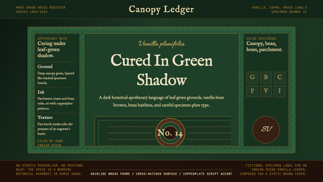
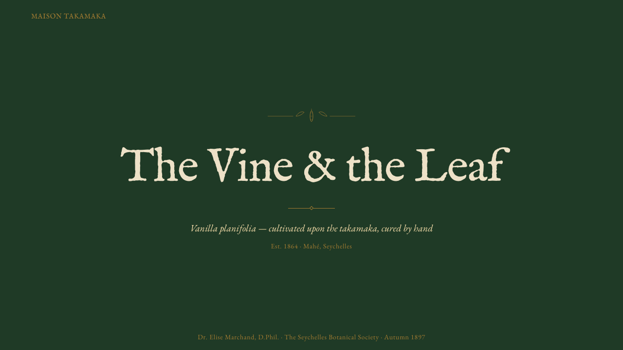
Hairline rules — the thinnest legible line weight — are among the system's most distinctive formal elements. They appear as border frames, section dividers, and decorative infill in the manner of copperplate engraving margins. Cross-hatching and fine parallel lines evoke the shading conventions of botanical illustration. These line elements are not ornamental in the sense of being arbitrary; they carry the visual logic of a medium (copperplate engraving) that communicated precision and expert knowledge.极细的发丝线——最纤细的可辨线条——是这套系统最具标志性的形式元素之一。它们以边框、分节线的形式出现,也以铜版印刷边饰的方式填充装饰细部。交叉阴影线与平行细线唤起植物插图的阴影惯例。这些线条元素并非随意的装饰;它们承载着一种媒介(铜版印刷)的视觉逻辑——那种媒介曾是精准与专业知识的视觉载体。
Typography字体排印
Type references the copperplate script and engraving letterforms of nineteenth-century botanical publishing. Headlines carry formal weight and slight cursive character; the overall typographic register is that of an expert scientific document or a hand-lettered apothecary label — authoritative and meticulous. Body text is set with generous leading to evoke the legibility standards of printed specimen plates. Hierarchy is established through the contrast between formal display letterforms and more restrained text-weight companions, never through color saturation.字体参照十九世纪植物出版物的铜版字迹与雕版字形。标题字带有庄重的分量与轻微的草书气质;整体排印语域是专业科学文献或手写药剂师标签——权威而精细。正文行距宽松,唤起印刷标本画的可读性标准。层级通过正式展示字形与更克制的文本字重之间的对比来建立,而非依赖色彩饱和度。
Texture and Material Reference质感与材料参照
The system carries persistent material references even in digital contexts: parchment grain in background fields, the subtle oxidation pattern of aged brass in accent elements, the tactile quality of dried botanical material in texture overlays. These references are handled with restraint — evoked rather than simulated, present enough to ground the aesthetic in material culture without competing with content legibility. The effect is that of a surface with evident provenance rather than a flat digital screen.这套系统即便在数字语境中也持续携带物质参照:背景区域的羊皮纸纹理,强调元素中老旧黄铜的细微氧化图案,纹理叠加中干燥植物材料的触感。这些参照以克制的方式处理——是唤起而非模拟,足以将美学扎根于物质文化,却不与内容的可读性相竞争。效果是一个有着明显溯源感的表面,而非一块平整的数字屏幕。
Composition and Hierarchy构图与层级
Layouts favor the asymmetric compositions of specimen plates and apothecary label design: a dominant textual block (the botanical name, the product designation) sits within a carefully measured frame, surrounded by ruled borders, smaller classification text, and fine decorative line work. The center of the composition is often the densest point; margins are generous and used for secondary information. This approach produces a sense of deliberate curation — nothing is left to accident.版面倾向于标本画与药剂师标签设计的非对称构图:一个主导性文字块(植物学名、产品名称)置于精心测量的框架内,四周环绕有线框边界、小号分类文字与精细装饰线条。构图的中心往往是密度最高的区域;留白宽裕,用于次要信息。这种方式产生一种刻意策展的感觉——没有任何东西是偶然留存的。
Contrast Logic对比逻辑
The system relies on a specific contrast relationship: the cream and pale gold of text and line work against the near-black depth of the ground color. This is not a high-legibility contrast in the conventional sense — it is a warm, antiquated contrast that trades the crispness of pure black-on-white for the richness of candlelight on parchment. Accessibility considerations require attention here; the warm contrast ratio must be tested against minimum legibility thresholds in digital implementations.这套系统依赖一种特定的对比关系:文字与线条的奶油色、淡金色,对照底色的近黑色深度。这不是常规意义上的高可读性对比——而是一种温暖、古旧的对比,以纯粹黑白的清晰锋利换取烛光映照羊皮纸的丰润质感。数字实现中需关注无障碍访问:这种温暖对比度需针对最低可读性门槛进行测试。
Ornament Discipline装饰纪律
Unlike systems that claim botanical reference while deploying ornament indiscriminately, Seychellois Vanilla Takamaka restricts decorative elements to those with a clear precedent in the source tradition: engraving borders, cross-hatched shadows, specimen labels, and the occasional small botanical motif. Every ornamental element should be traceable to the copperplate and apothecary repertoire. Decorative elements that belong to unrelated craft traditions — filigree, floral swashes, watercolor splashes — are disqualifying intrusions.不同于那些声称援引植物参照却随意堆砌装饰的系统,塞舌尔香草塔卡马卡严格将装饰元素限定于源传统中有明确先例的范畴:雕版边框、交叉阴影、标本标签,以及偶尔出现的小型植物母题。每一个装饰元素都应可追溯至铜版与药剂师的视觉库。属于无关工艺传统的装饰元素——金银细丝工艺、花卉飞白、水彩晕染——均为破坏系统一致性的侵入。
See the Seychellois Vanilla Takamaka design system →查看 Seychellois Vanilla Takamaka 完整设计系统 →
Who shaped Seychellois Vanilla Takamaka?谁塑造了 Seychellois Vanilla Takamaka?
Poivre was an eighteenth-century French naturalist, administrator, and prolific botanical smuggler whose efforts to break the Dutch spice monopoly brought cloves, nutmeg, and the conditions for subsequent vanilla cultivation to the Indian Ocean islands. As intendant of Île de France (Mauritius) from 1767, he established the Pamplemousses botanical garden and oversaw the transfer of spice plants throughout the region. His legacy is foundational to the economic and botanical history that the Seychellois Vanilla Takamaka system draws upon.皮埃尔·普瓦夫尔是十八世纪的法国博物学家、殖民地行政官与大规模植物走私者,他打破荷兰香料垄断的努力将丁香、肉豆蔻带到了印度洋岛屿,并为后来香草种植创造了条件。1767年起担任法兰西岛(毛里求斯)行政长官期间,他建立了棕榈树植物园并监督了香料植物在整个地区的移植推广。他的遗产是塞舌尔香草塔卡马卡系统所援引的经济与植物学历史的基础。
North was a Victorian-era botanical painter who traveled the Indian Ocean in the early 1880s and produced a substantial body of oil paintings documenting the flora of Seychelles, including takamaka trees, coco de mer palms, and endemic species. Her work — now housed in the gallery purpose-built for her collection at Kew Gardens — represents the nineteenth-century botanical illustration tradition at its richest: densely observed, formally composed, and suffused with the specific quality of Indian Ocean light. The cross-hatching and detailed linework of copperplate botanical engraving, which the Takamaka system directly references, was the print medium equivalent of North's painted approach.玛丽安·诺斯是维多利亚时代的植物画家,十九世纪八十年代初游历印度洋,留下了大量记录塞舌尔植物的油画,包括塔卡马卡树、海椰子及特有物种。她的作品——如今收藏于邱园专门为其画集建造的画廊——代表了十九世纪植物插图传统的巅峰:观察密集,构图严谨,浸透着印度洋特有的光线质感。铜版植物雕版印刷的交叉阴影线与精细线条工艺,是塔卡马卡系统直接援引的视觉语言,也是诺斯绘画方式在印刷媒介上的对应物。
Takamaka is a contemporary Seychellois rum brand founded by the d'Offay family on Praslin island that has become one of the most visible international representatives of Seychellois craft production. Its bottle design, label typography, and brand visual language — dark grounds, brass detailing, handcraft references — directly instantiate the aesthetic vocabulary that the design system codifies. Takamaka demonstrates that the botanical apothecary reference is not merely historical nostalgia but an active contemporary design register for premium Seychellois goods.塔卡马卡是由普拉兰岛上的德奥费家族创立的当代塞舌尔朗姆酒品牌,已成为塞舌尔手工生产最具国际知名度的代表之一。其瓶身设计、标签字体与品牌视觉语言——深色底面、黄铜细节、手工艺参照——直接呈现了这套设计系统所编码的美学词汇。塔卡马卡证明,植物药房的视觉参照并非单纯的历史怀旧,而是当代塞舌尔优质产品活跃使用的设计语域。
The Royal Botanic Gardens at Kew, established in its current form in 1840, became the institutional home of the finest botanical illustration tradition in the English-speaking world. The Kew model — rigorous scientific documentation rendered with aesthetic care in engraving and watercolor — defined the visual register of authoritative botanical knowledge for over a century. The Seychellois Vanilla Takamaka system draws explicitly on the visual grammar of Kew-style specimen plates: the fine line work, the labeling conventions, the compositional gravitas of a document that is simultaneously a scientific record and an aesthetic object.皇家植物园邱园以其现有形式确立于1840年,成为英语世界最精良植物插图传统的机构依托。邱园模式——以雕版与水彩在审美层面精细呈现的严格科学文献记录——在超过一个世纪的时间里定义了权威植物学知识的视觉语域。塞舌尔香草塔卡马卡系统明确援引邱园风格标本画的视觉语法:精细的线条工艺、标注惯例,以及一份既是科学记录又是美学对象的文件所具有的构图庄重感。
How do you use Seychellois Vanilla Takamaka today?今天怎么用 Seychellois Vanilla Takamaka?
Seychellois Vanilla Takamaka is most powerful when applied to contexts where provenance, craft quality, and expert knowledge are core to the communication. Presentation cover slides designed in this system benefit from treating the entire slide as a framed specimen: a single subject centered or asymmetrically anchored within hairline borders, formal type giving the subject its full botanical or product name, and the deep green ground establishing the register of serious documentation. This is a system for contexts where authority matters — it should not be used for content that wants to feel approachable or casual.塞舌尔香草塔卡马卡在溯源性、手工品质与专业知识是核心传达内容的语境中最具力量。以这套系统设计的演示文稿封面页,最佳做法是将整张幻灯片视为一张裱框标本:单一主题居中或非对称锚定于发丝线边框内,正式字体赋予主题其完整的植物学或产品名称,深绿色底面确立严肃文献记录的语域。这是一套适用于权威感至关重要的语境的系统——不应用于希望传达亲切或随意感的内容。
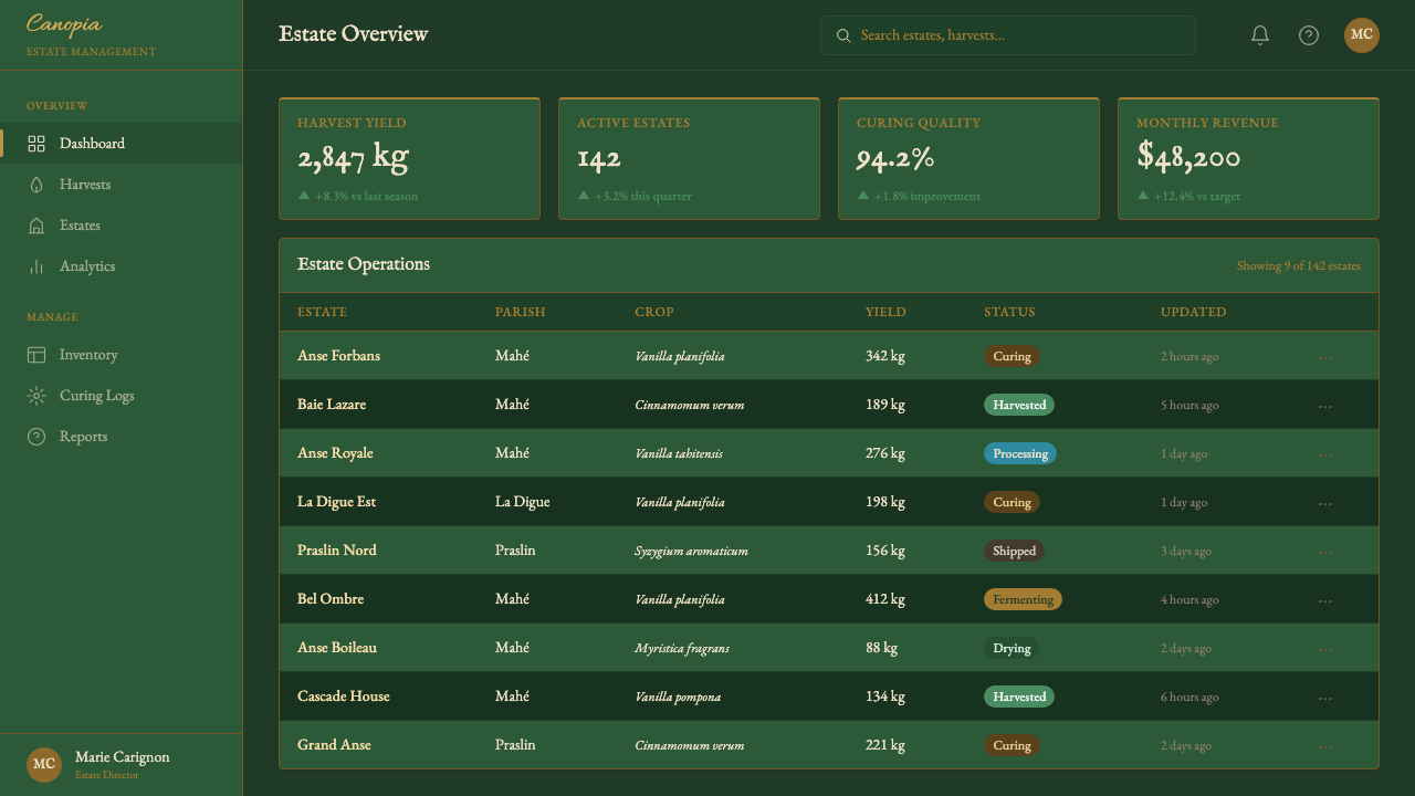
For content slides in presentations, the system works best with a disciplined single-column layout inside a ruled frame. Data should be presented as if it were specimen measurements: precise, labeled, hierarchically organized, with no decorative chart elements beyond what the data itself requires. Infographics and process diagrams take on the character of hand-drawn botanical cross-sections — line-based, with fine labeling rather than color-coded call-outs. The palette's warmth means that color-coded categorical differentiation needs care; the system handles sequential data well but struggles with multi-hue categorical color schemes.对于演示文稿的内容页,这套系统在线框边界内以严格的单栏布局运作得最好。数据应以标本测量值的方式呈现:精准、有标注、层级清晰,图表元素以数据本身所需为限,无多余装饰。信息图与流程图呈现出手绘植物横截面图的气质——以线条为基础,使用精细标注而非色码标注。色板的温暖特质意味着色彩编码的类别区分需要谨慎处理;这套系统处理顺序数据表现良好,但在多色相类别配色方案中表现欠佳。
For web interfaces, Seychellois Vanilla Takamaka is best suited to premium product pages, editorial landing pages, and any context where a dark, rich, materially-grounded aesthetic will reinforce the brand proposition. Dashboard applications can adopt the system's structural vocabulary — ruled section dividers, fine type hierarchy, warm brass-toned interactive states — without fully committing to the dark ground, using a deep green or parchment-cream surface selectively for feature areas. Pricing and conversion pages can use the system's authority to establish confidence, with cream-on-dark call-to-action blocks carrying the visual weight of a signed document.对于网页界面,塞舌尔香草塔卡马卡最适合高端产品页、编辑型落地页,以及任何深色、丰润、物质感扎实的美学能强化品牌主张的语境。仪表板应用可以采用这套系统的结构词汇——有线框的分节线、精细的字体层级、温暖黄铜调的交互状态——而不必全面采用深色底面,可将深绿色或羊皮纸奶油色底面选择性地用于特性区域。定价与转化页面可借助这套系统的权威感建立信心,奶油色底深色字的行动号召区块携带着签署文件的视觉分量。
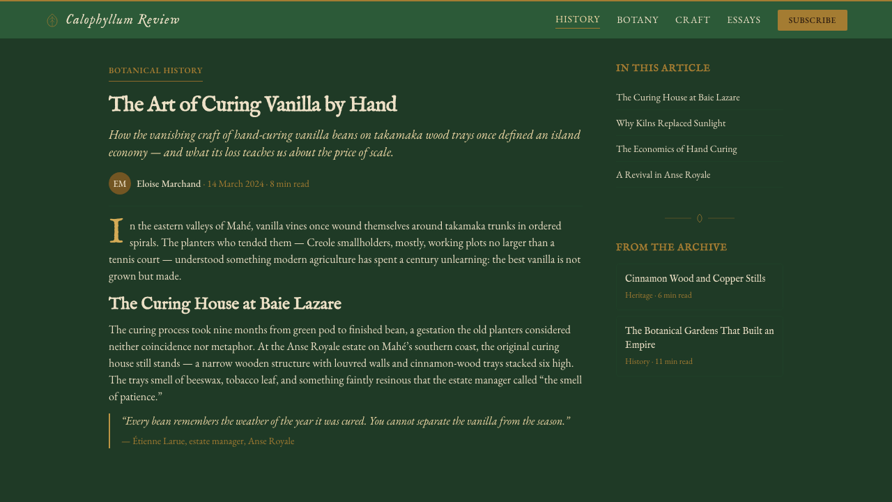
In editorial and marketing contexts, the system excels at luxury product marketing, heritage brand storytelling, and any content positioned around craft, authenticity, or the knowledge economy. An editorial layout in this register uses wide outer margins for specimen-style caption and metadata, with body text in a warm near-white against the deep ground. Marketing pages for artisan, hospitality, or botanical brands gain immediate visual credibility from the system's precision and material richness. The system also works well for academic or reference content that benefits from a visual register of documented authority.在编辑与营销语境中,这套系统在奢侈品营销、历史品牌叙事,以及任何围绕手工艺、真实性或知识经济定位的内容中表现出色。以这种语域呈现的编辑版面,在宽阔的外侧留白处排列标本式图注与元数据,正文以温暖近白色铺在深色底面上。手工艺、酒店款待或植物品牌的营销页面,凭借这套系统的精准性与物质丰润感立即获得视觉公信力。这套系统也非常适合学术或参考类内容——那类内容受益于文献权威的视觉语域。
A common mistake when applying this system is over-decorating. The copperplate reference invites embellishment — additional hairline frames within frames, clusters of botanical motifs, excessive cross-hatching texture overlays — but the source tradition was disciplined and purposeful, not decorative for its own sake. Each specimen plate contained exactly what the specimen required and no more. In digital application, the same discipline applies: a single ruled border frame, one or two small line-work ornaments in alignment with the copperplate vocabulary, and the restraint to stop there. A related error is using this system's darkness as license for low contrast; the cream-on-deep-green relationship should be tested for readability in every implementation, and the warmth of the palette should not compromise functional legibility.应用这套系统时最常见的错误是过度装饰。铜版参照容易引发华丽冲动——框中套框的多重细线边框、成簇的植物母题、过量的交叉纹理叠加——但原传统是有纪律、有目的的,而非为装饰而装饰。每张标本画只包含标本所需之物,不多一分。在数字应用中,同样的纪律适用:一个线框边界,一或两个符合铜版词汇的小型线条装饰,然后在那里止步。另一个相关错误是将这套系统的深色作为降低对比度的许可;奶油色对深绿色的对比关系在每次实现中都应测试可读性,色板的温暖不应损害功能性易读性。
See the Seychellois Vanilla Takamaka design system →查看 Seychellois Vanilla Takamaka 完整设计系统 →
Seychellois Vanilla Takamaka — FAQSeychellois Vanilla Takamaka · 常见问题
Is this system only appropriate for Seychellois or Indian Ocean brands?这套系统只适合塞舌尔或印度洋品牌吗?
No. The system's visual logic — dark botanical grounds, hairline precision, copperplate typography, warm brass accents — is a design register that communicates craft expertise and documented authority, regardless of geographic specificity. It is well suited to any premium brand, heritage product, artisan producer, or knowledge-economy context that needs to establish credibility and depth. The Seychellois and Indian Ocean references are the historical origin of the aesthetic, not a usage requirement. A Scottish whisky brand, a Japanese botanical apothecary, or a Swiss scientific publisher could all apply the system credibly.不。这套系统的视觉逻辑——深色植物学底面、发丝线精准度、铜版字体排印、温暖黄铜点缀——是一种传达手工专业知识与文献权威的设计语域,与地理特殊性无关。它适合任何需要建立可信度与深度的高端品牌、历史产品、手工艺生产者或知识经济语境。塞舌尔与印度洋的参照是这一美学的历史起点,而非使用前提。苏格兰威士忌品牌、日本植物药剂师,或瑞士科学出版商,都可以将这套系统运用得令人信服。
How does this system differ from general dark botanical or apothecary aesthetics?这套系统与一般的深色植物或药剂师美学有何不同?
Many brands reference the apothecary or botanical illustration tradition, but most do so loosely — borrowing the dark backgrounds and serif typography without the formal discipline that makes the source tradition coherent. Seychellois Vanilla Takamaka is specifically grounded in the copperplate engraving medium, which means the line work has a particular character: hairline weight, cross-hatching conventions, and the compositional logic of a document designed to communicate scientific authority. The Seychellois geography adds a specific palette (deep tropical greens rather than the grey-greens of European botanical illustration) and the warm brass accents of Indian Ocean colonial trade culture.许多品牌援引药剂师或植物插图传统,但大多数做法松散——借用深色背景与衬线字体,却缺乏使原传统连贯的形式纪律。塞舌尔香草塔卡马卡明确扎根于铜版雕刻媒介,这意味着线条工艺有其特定气质:发丝线的线重、交叉阴影的惯例,以及一份旨在传达科学权威的文件的构图逻辑。塞舌尔的地理属性增添了特定的色板(热带深绿,而非欧洲植物插图中的灰绿),以及印度洋殖民贸易文化中温暖黄铜点缀。
Can this system work in a light-background version?这套系统可以做成浅色背景版本吗?
The system was designed from the ground up as a dark-background aesthetic; inverting it to a light ground changes the fundamental register. A parchment-cream background with deep green type and brass accents is possible and can work for secondary surfaces — interior page sections, table backgrounds, data panels — but it will read as the quieter, more administrative cousin of the full dark-ground system rather than as its equal. If a consistently light-background application is required, a different design system that was built around light grounds will generally produce more coherent results.这套系统从一开始就被设计为深色背景美学;将其反转为浅色底面会从根本上改变其语域。羊皮纸奶油色背景搭配深绿色文字与黄铜点缀是可行的,可用于次级表面——内页区块、表格背景、数据面板——但它读来会是这套完整深色底面系统更安静、更行政化的表亲,而非其等价替代。若需要完全一致的浅色背景应用,以浅色底面为基础构建的不同设计系统通常会产生更连贯的结果。
How should imagery be handled in this system?这套系统中应如何处理图像?
Photographic imagery should be treated with a degree of formality consistent with the system's documentary character. High-contrast, close-cropped botanical photography works well — vanilla beans, bark textures, brass details — because it echoes the observational precision of botanical illustration. Lifestyle photography with soft gradients or naturalistic color renders poorly against the dark ground and warm palette; it should be treated with a warm duotone or heavy contrast grade to bring it into register with the system. The system does not welcome casual or candid photography — the compositional logic favors the deliberate and the documented over the spontaneous.摄影图像的处理应具备与这套系统的文献气质相符的正式度。高对比度、紧密裁切的植物摄影效果良好——香草豆荚、树皮纹理、黄铜细节——因为它呼应了植物插图的观察精准性。带有柔和渐变或自然主义色彩的生活风格摄影,在深色底面与温暖色板上呈现效果不佳;应以温暖的双色调处理或重度对比度调整将其带入系统的语域。这套系统不欢迎随意或抓拍式摄影——其构图逻辑偏向刻意与文献化,而非自发性。
Does the system suit digital products aimed at younger or more casual audiences?这套系统适合面向年轻或较休闲受众的数字产品吗?
Rarely, and with considerable adaptation. The system's formality, darkness, and reference to nineteenth-century document culture communicate expertise and heritage — qualities valued by audiences who associate quality with history and craft. Younger audiences oriented toward digital-native aesthetics may read the same formal register as inaccessible or dated. Where the system is used for a mixed audience, the structural vocabulary (grid discipline, fine type hierarchy, ruled dividers) can be retained while softening the material texture references and warming the palette slightly toward the vanilla and cream end. The copperplate script accents are typically the first element to adjust — replacing them with a contemporary serif or humanist letterform preserves the authority register while reducing the period specificity.极少情况下可以,且需要大幅调整。这套系统的正式感、深色调以及对十九世纪文件文化的援引,传达着专业知识与历史底蕴——这些品质受到将质量与历史和手工艺相关联的受众青睐。以数字原生美学为导向的年轻受众可能将同样的正式语域解读为难以亲近或过时。若将这套系统用于混合受众,可以保留结构词汇(网格纪律、精细字体层级、线框分节线),同时软化材质纹理参照,并将色板略微向香草色与奶油色端调暖。铜版草书字体点缀通常是最先需要调整的元素——以当代衬线体或人文主义字形替换它,可以在保留权威语域的同时降低时代特殊性。
Related design styles相关设计风格
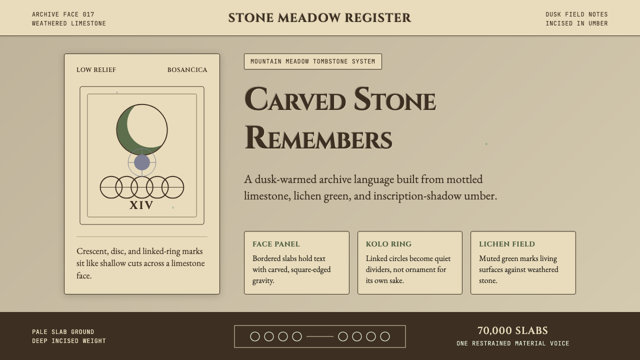 Bosnian Stećak Medieval TombstoneStone remembers quietly. Lichen green and Cinzel cuts sit on weathered limest…石头静默记忆。苔藓绿与Cinzel刻痕落在风化石灰岩上。
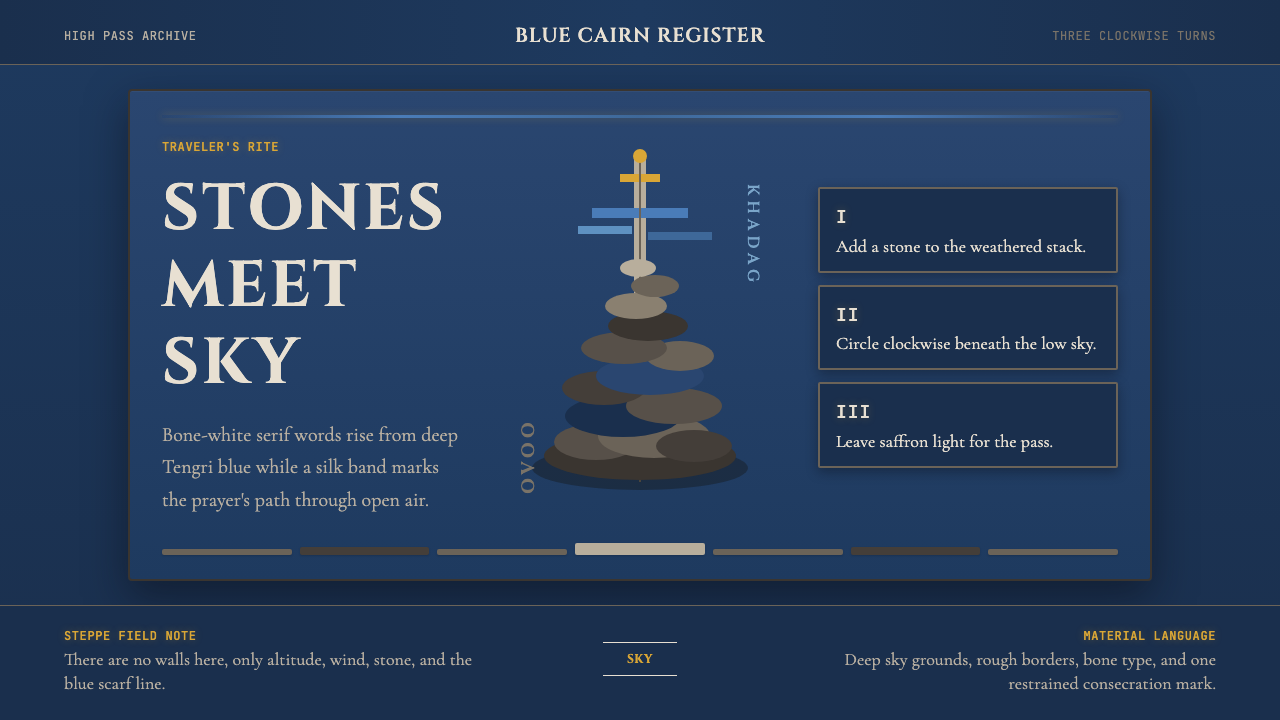 Mongolian Ovoo (Cairn Prayer Site)Sacred austerity. Steppe-blue ground, bone serif type, and one silk-blue pray…神圣而肃穆:草原蓝底、骨白衬线字与一线哈达蓝。
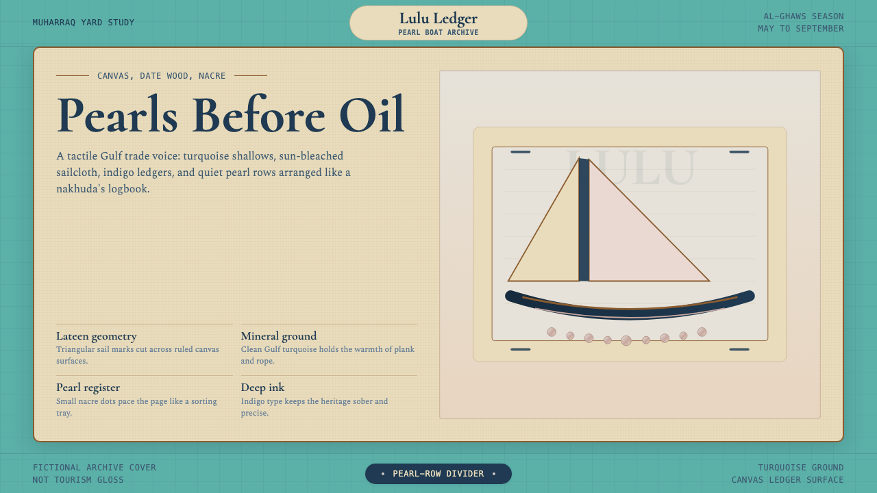 Bahraini Dhow Pearl-Diving BoatMineral and sun-bleached. Gulf turquoise, canvas cream, and pearl rows frame…矿物感且日晒褪色。海湾蓝绿、帆布奶油与珍珠点列成册。
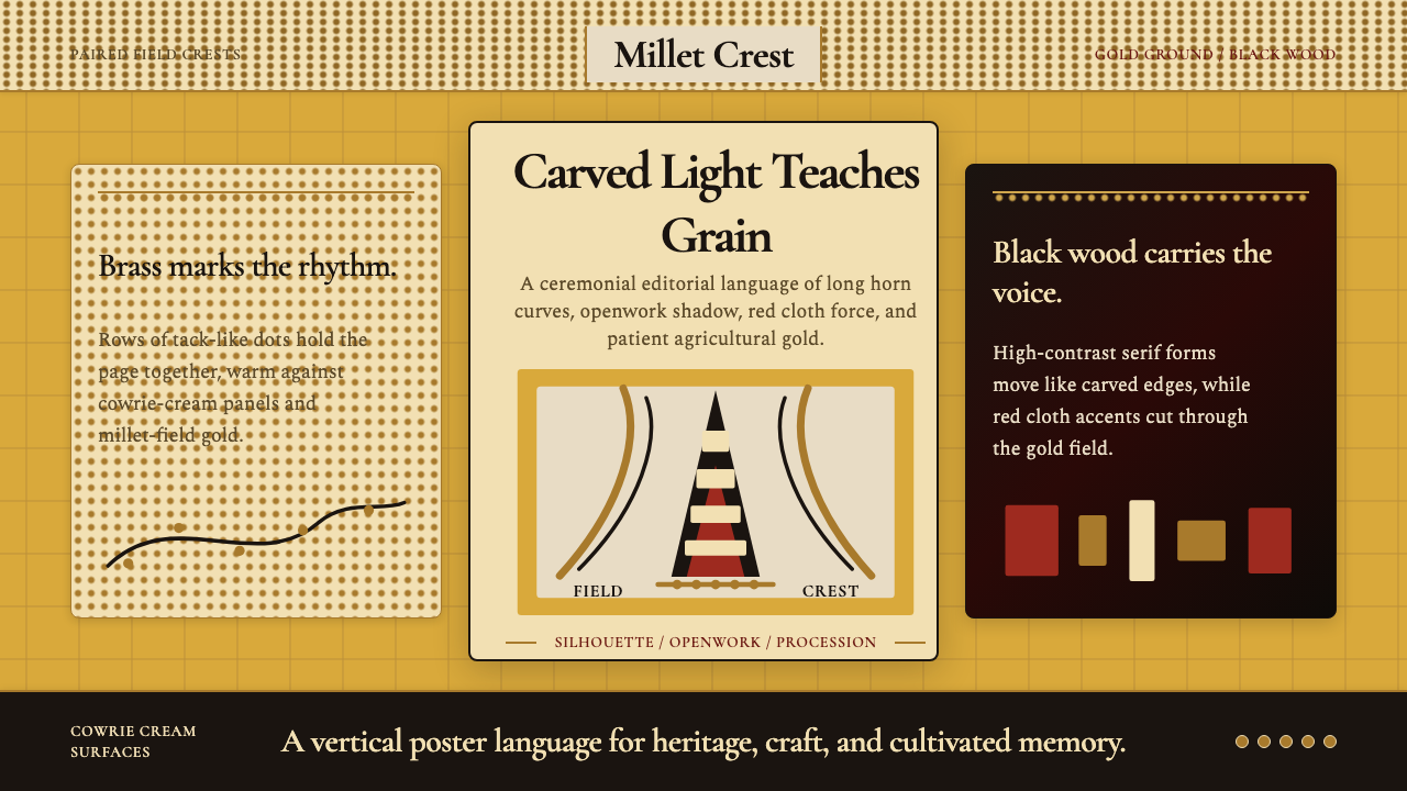 Bambara Chi Wara AntelopeCarved memory in gold. Black serif silhouettes and brass-dot borders carry th…金色中的雕刻记忆。黑色衬线剪影与黄铜点边框承载田野仪式。
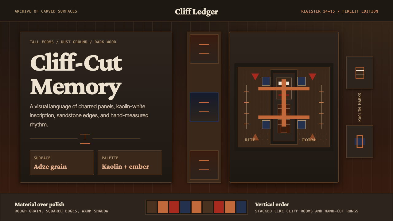 Dogon Bandiagara Cliff MaskHand-hewn gravity. Charred wood, kaolin type, and sandstone geometry stack li…手凿般沉稳:炭木底、高岭土字与砂岩几何层层堆叠。
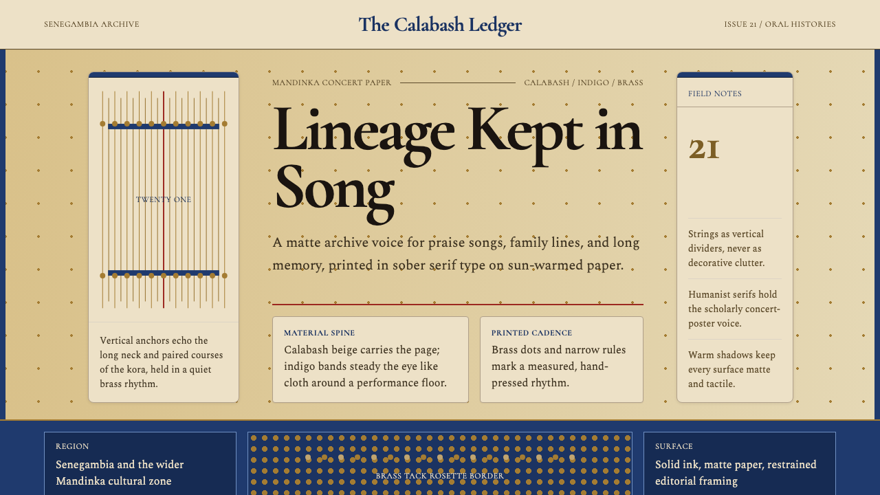 Gambian Griot Kora (21-string)Oral history feels tactile. Calabash beige, indigo bands, and 21 brass string…口述史有触感。葫芦米色、靛蓝带与21道黄铜弦线。