Design style guide设计风格指南
What is Gambian Griot Kora (21-string)?什么是 Gambian Griot Kora (21-string)?
The kora's 21 strings carry centuries of West African oral history — and this design system translates that warmth, gravitas, and hand-pressed craft into every interface surface.科拉琴的21根琴弦承载着西非口述史的几个世纪——这套设计体系将那份温度、厚重与手工印压的质感,带进每一个界面表面。
Gambian Griot Kora (21-string) in briefGambian Griot Kora (21-string) 速览
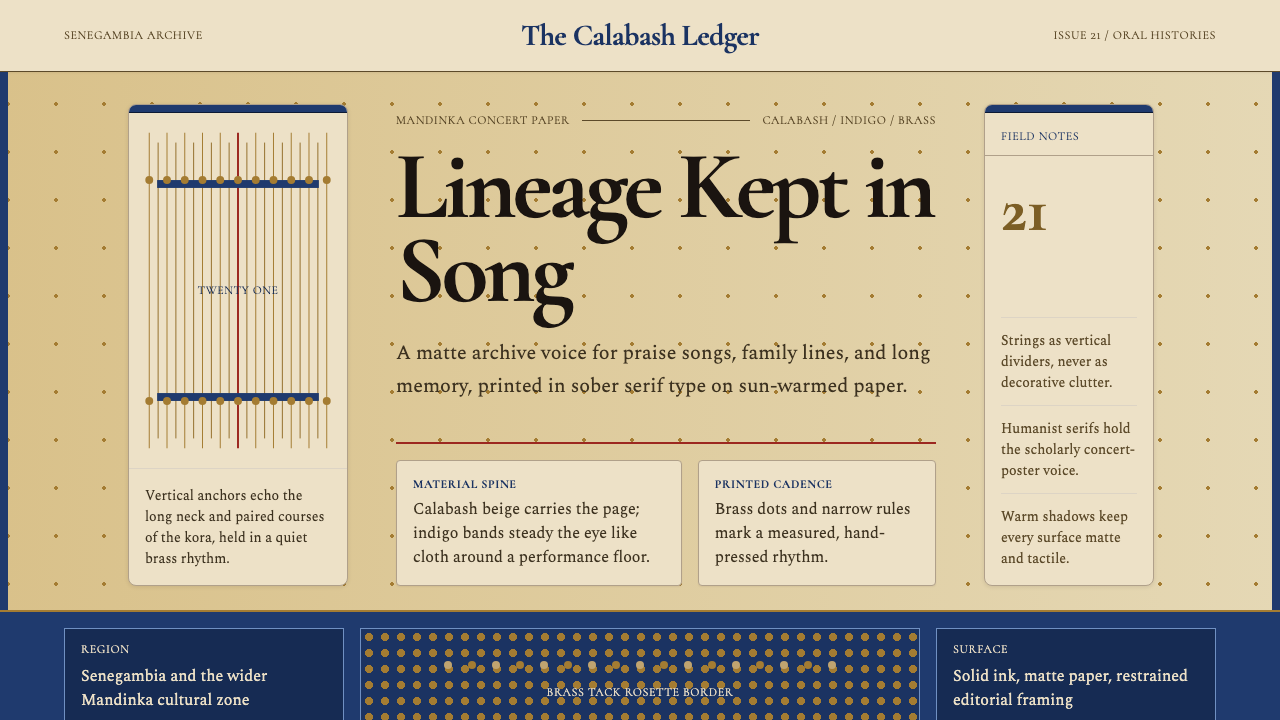
Gambian Griot Kora (21-string) is a design style rooted in the material world of the Mandinka jali — the hereditary griot musicians of the Senegambia region who have served as living archives of West African kingdoms for centuries. The visual vocabulary draws directly from the kora instrument itself: the sun-warmed beige of a halved calabash gourd, deep indigo from the hand-embroidered cloth wrapped around the instrument's neck, the quiet gleam of brass tack rosettes, and the sober warmth of matte, hand-pressed ink.冈比亚格里奥科拉琴(21弦)是一套植根于曼丁卡贾利物质世界的设计风格——贾利是塞内冈比亚地区世代相传的格里奥艺人,几个世纪以来一直充当西非王国的活态档案馆。这套视觉词汇直接取材于科拉琴本身:半截葫芦瓢在日光下晒出的暖米色、缠裹琴颈的手工刺绣布料的深靛蓝、黄铜钉花饰的静谧微光,以及粗纹纸面上手工压印油墨的哑光温度。
Where many world-music-inspired aesthetics lean into exoticism or decorative surface pattern, the Kora style is fundamentally archival in character. Its layouts carry the weight of preservation — not celebration in the festive sense, but the slower, more deliberate act of keeping something alive across generations. The typographic choices echo the dignified serif lettering found on 1970s Mandinka concert flyers from Banjul and Dakar, where announcements of a jali performance were set with the same careful seriousness as a legal notice.许多以世界音乐为灵感的美学倾向于异域情调或表面纹样的堆砌,而科拉琴风格从根本上是一种档案式的气质。它的版面承载着保存的重量——不是节庆意义上的欢庆,而是那种更缓慢、更深思熟虑的、跨越世代守护某物的姿态。字体排印的选择呼应了1970年代班珠尔与达喀尔曼丁卡巡演海报上那种庄重的衬线体——贾利演出的公告被以与法律文书同等的慎重排印。
This is not a style about spectacle. The kora is an instrument of intimate transmission — played at ceremonies, naming days, and royal courts, not in arenas. The design system inherits that intimacy. Generous negative space, warm matte grounds, and carefully weighted type create layouts that feel like they are speaking directly to one person rather than broadcasting to a crowd.这不是一种关于奇观的风格。科拉琴是一件亲密传递的乐器——在婚礼、命名礼和王室宫廷演奏,而非在竞技场。这套设计体系继承了那份亲密感。慷慨的留白、温暖的哑光底面与精心称量过的字体,构成的版面像是在直接与一个人交谈,而非向人群广播。
See the Gambian Griot Kora (21-string) design system →查看 Gambian Griot Kora (21-string) 完整设计系统 →
Where does Gambian Griot Kora (21-string) come from?Gambian Griot Kora (21-string) 从何而来?
The kora's documented history traces back at least to the seventeenth century within the Mandé-speaking world — the broad cultural belt stretching from present-day Gambia and Senegal east through Mali and Guinea. The instrument's precise origin is contested, as is true of most oral-culture artifacts, but the Kouyaté, Diabaté, and Jobarteh family lineages have long been central to its transmission. The kora is not simply a musical instrument; it is the material embodiment of the jali's social role, and only members of jali families were traditionally permitted to play it.科拉琴的可考历史至少可上溯至十七世纪的曼丁哥语文化圈——这片宽阔的文化地带从今日的冈比亚与塞内加尔向东延伸至马里和几内亚。这件乐器的确切起源如同大多数口述文化的器物一样存在争议,但科亚特、贾巴特与约巴尔特家族世系长期处于其传承的核心。科拉琴不仅仅是一件乐器;它是贾利社会角色的物质化身,传统上只有贾利家族成员才被允许演奏。
The role of the griot in Mandinka society is far older than the kora itself. Griots — called jali in Mandinka — are a caste of hereditary knowledge keepers, genealogists, praise singers, and oral historians. A skilled jali could recite the genealogies of noble families across seven centuries and dozens of generations, inserting contemporary events into a living narrative thread. This was not performance for entertainment; it was a form of governance, diplomacy, and cultural continuity. The jali who performed at a ruler's court carried the weight of diplomatic memory — knowing which alliances had been made, which insults had been given, which debts of honor remained unpaid.格里奥在曼丁卡社会中的角色远比科拉琴本身更为古老。格里奥——曼丁卡语称之为贾利——是世袭的知识守护者、谱系学家、赞歌吟唱者与口述史学家所构成的一个阶层。技艺精湛的贾利能够背诵跨越七个世纪、数十代人的贵族家族谱系,将当代事件嵌入一条活着的叙事线索。这不是为了娱乐的表演;它是一种治理、外交与文化延续的形式。在统治者宫廷演出的贾利承载着外交记忆的重量——记得哪些联盟已缔结、哪些冒犯已发生、哪些荣誉债务尚未偿还。
The visual materials associated with the kora tradition — the instrument's physical form, the cloth wrappings, the concert publicity materials — underwent their most coherent modernization during the independence era of the 1960s and 1970s. As Gambia (1965) and Senegal (1960) achieved independence, national arts councils and radio stations began producing printed publicity for griot performances in a style that married the formal dignity of the oral tradition with the mid-century commercial printing aesthetics available in Dakar and Banjul. The result was a distinctive graphic idiom: cream or ivory paper stock, deep indigo and ochre ink, serif typefaces set with wide letter-spacing, and geometric decorative borders derived from kente-adjacent weaving patterns.与科拉琴传统相关联的视觉材料——乐器的物质形态、布料包裹、演出宣传品——在1960至70年代的独立时期经历了最为系统的现代化。随着冈比亚(1965年)与塞内加尔(1960年)相继独立,国家艺术委员会与广播电台开始为格里奥演出制作印刷宣传品,风格上将口述传统的庄严感与达喀尔和班珠尔当时可用的中世纪商业印刷美学融为一体。由此形成了一套独特的平面语汇:奶油色或象牙色纸张、深靛蓝与赭色油墨、宽字距的衬线字体,以及源自肯特相关编织纹样的几何装饰边框。
This design system treats that 1970s concert-flyer moment as its primary typographic and color reference — not as nostalgia, but as the point where the tradition's visual representation achieved its most legible and transferable form. The calabash's warm beige, the indigo cloth, the brass hardware, and the matte ink on textured paper are the material palette from which every color, surface, and weight decision is derived.这套设计体系将七十年代巡演海报的那个时刻作为其首要的字体排印与色彩参照——不是出于怀旧,而是因为那是这一传统的视觉表达获得其最清晰、最具可移植性形态的节点。葫芦瓢的暖米色、靛蓝布料、黄铜五金件,以及粗纹纸上的哑光油墨,是每一个色彩、表面与字重决策所依据的物质色板。
What defines the Gambian Griot Kora (21-string) look?Gambian Griot Kora (21-string) 的视觉特征是什么?
Color Palette色彩系统
The palette is built from four grounded, non-synthetic sources: calabash beige (a warm, slightly dusty off-white carrying the warmth of sun-dried gourd), deep indigo (a saturated blue-violet suggesting hand-dyed cloth rather than digital blue), brass gold (a muted, oxidized amber rather than a bright or chrome yellow), and a near-black ink tone that reads as charcoal rather than pure black. These four tones cover the full range of the system — backgrounds, text, accents, and borders — without requiring any secondary colors. Saturation is never amplified; every hue has the quality of pigment absorbed into fibrous material rather than light emitting from a screen.色板由四种有根基的、非合成的来源构成:葫芦米色(一种温暖、略带尘感的灰白,携带日晒葫芦瓢的温度)、深靛蓝(一种饱和的蓝紫,暗示手染布料而非数字蓝)、黄铜金(一种偏哑的氧化琥珀色,而非明亮或镀铬的黄)、以及一种近乎炭黑而非纯黑的墨色调。这四种色调涵盖整个系统的全部范围——背景、文字、强调色与边线——无需任何辅助色。饱和度从不被放大;每一种色相都具有颜料被纤维材料吸收的质感,而非屏幕发出的光。
Typography字体排印
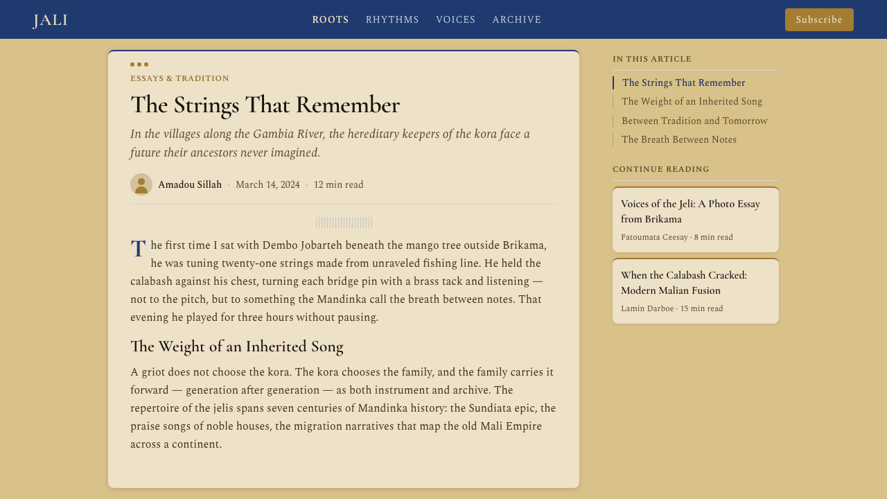
The typographic register is rooted in the dignified, slightly compressed serif letterforms found on West African concert announcements and official documents of the postcolonial era. Headlines carry considerable weight and are set with deliberate letter-spacing — wide enough to feel ceremonial without feeling airy. Body text is dense and purposeful, set at a measure that rewards careful reading rather than skimming. There is a clear two-level hierarchy: a formal, authoritative heading register and a quieter, more intimate text register below it. Ornamental scripts and decorative faces are avoided entirely; the style's warmth comes from proportion and weight, not from letterform elaboration.字体排印的格调植根于后殖民时期西非演出公告与官方文件上那种庄重、略带收束感的衬线字形。标题具有相当的分量,以刻意的字距排印——宽到足以产生礼仪感,却又不至于显得轻飘。正文紧凑而有目的,行宽设置为奖励细读而非速扫。层级清晰地分为两个维度:一个正式、权威的标题格调,以及其下更安静、更亲密的文本格调。装饰性手写体与花哨字体被完全回避;这种风格的温度来自比例与字重,而非字形的繁饰。
Surface and Texture表面与质感
Every surface in this system carries the memory of physical material. Backgrounds suggest matte paper with slight tooth — not the cold flatness of a digital canvas, but the warm absorption of ink into uncoated stock. This is achieved through restraint rather than simulation: no photographic textures, no grain overlays, but a deliberate avoidance of any element that would read as glossy, luminous, or high-contrast in the digital sense. Even interactive elements carry this material weight — buttons feel pressed rather than hovered, borders feel ruled with a physical instrument.这套系统中的每一个表面都携带着物质材料的记忆。背景暗示着略有纹理的哑光纸张——不是数字画布的冷峻平滑,而是油墨被非涂布纸张温暖吸收的质感。这是通过克制而非模拟实现的:没有摄影纹理,没有颗粒叠层,只是刻意回避任何在数字意义上显得光亮、发光或高对比度的元素。即便是交互元素也携带这种材质重量——按钮感觉是被压下而非被悬停,边线感觉是用物理工具划出的。
Ornament and Structure装饰与结构
Unlike purely austere modernist systems, the Kora style permits a carefully circumscribed category of ornament — specifically, geometric border elements derived from Mandinka weaving patterns: narrow bands of repeating diamond, chevron, or step motifs used to frame sections, separate headers from body, or mark the edge of a card or container. These ornamental bands are always linear and geometric, never figurative or floral. They function structurally — the way a ruled line does in a ledger — rather than decoratively in the European sense. The restraint is in their scale and placement: used at the edge of a layout rather than spread across a surface.与纯粹的禁欲现代主义体系不同,科拉琴风格允许一类经过仔细划定的装饰——具体而言是源自曼丁卡编织纹样的几何边框元素:重复的菱形、V形或阶梯母题组成的窄带,用于框住章节、分隔标题与正文,或标记卡片与容器的边缘。这些装饰带始终是线性几何的,从不具象或植物纹样。它们在功能上像账本中的划线一样起结构作用,而非欧洲意义上的装饰。克制在于它们的尺度与位置:用于版面边缘而非铺陈在整个表面。
Spacing and Rhythm间距与节奏
The spacing logic mirrors the kora's musical character: deliberate, unhurried, with meaningful pauses between phrases. Margins are generous — content never crowds the edge of a container. Between typographic elements, the vertical rhythm is slow and stately rather than compressed. This creates a reading experience that resists skimming and rewards attention. In multi-column layouts, the gutter is wide enough to read as a breathing zone rather than a mere divider. The overall effect is of a document that respects the reader's time by giving each element its own space to be encountered.间距逻辑映照着科拉琴的音乐性格:从容、不急促,在乐句之间有意义的停顿。页边距慷慨——内容从不逼近容器边缘。在字体排印元素之间,垂直韵律缓慢而庄重,而非紧缩。这创造了一种阻止速扫、奖励专注的阅读体验。在多栏版面中,分栏间距宽到足以被读作一个呼吸区域,而非单纯的分隔线。整体效果是一份文件在用为每个元素留出独立的被遭遇的空间来尊重读者的时间。
Imagery and Illustration图像与插图
Photography, when used, is treated with the same restraint as the typographic system: desaturated toward the warm end of the spectrum, cropped simply, and given wide white or beige margins so that the image reads as a considered object rather than a bleed element. Illustration favors flat, silhouetted forms over rendered naturalism — a kora player reduced to a clean geometric profile, a calabash gourd outlined against cream. Photographic backgrounds are avoided; images carry information, not atmosphere. The style resists the contemporary tendency to use large hero photography as emotional wallpaper.摄影在使用时与字体排印系统同样克制:去饱和度向暖色端偏移,裁切简洁,四周留有宽阔的白色或米色边距,使图像被读作一件经过深思的对象而非出血元素。插图倾向于平面剪影形式而非写实渲染——科拉琴演奏者被简化为干净的几何轮廓,葫芦瓢以线条呈现于米色底面上。摄影背景被回避;图像传递信息,而非氛围。这种风格抵制当代将大幅主视觉摄影用作情感壁纸的倾向。
Hierarchy and Weight层级与字重
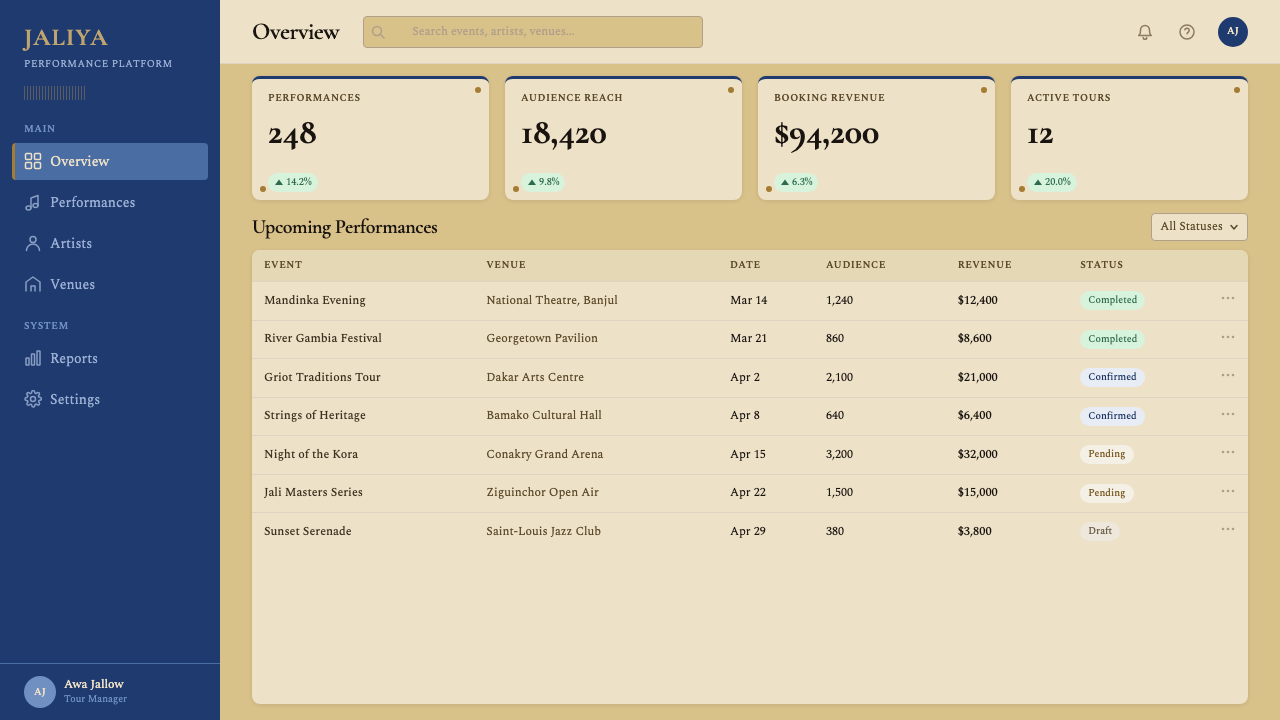
Information hierarchy in this system is expressed primarily through typographic weight and scale — not through color fills, background panels, or icon badges. A more important piece of information is physically larger and heavier; a less important piece is smaller and lighter. Color enters the hierarchy only to mark a single, specific category of signal: the brass accent tone marks interactive or actionable elements, the indigo marks structural navigation or section markers. Everything else is expressed in the warm near-black ink against the calabash-beige ground. The result is a hierarchy that feels earned and permanent rather than digitally applied.这套系统中的信息层级主要通过字体排印的字重与尺度来表达——而非通过色彩填充、背景板块或图标徽章。更重要的信息在物理上更大、更重;不那么重要的信息更小、更轻。色彩进入层级只为标记单一的、特定类别的信号:黄铜强调色标记交互或可操作元素,靛蓝标记结构性导航或章节分隔。其余所有内容都以温暖的近墨黑色呈现于葫芦米色底面上。结果是一种感觉像是赢得而非数字应用的层级。
See the Gambian Griot Kora (21-string) design system →查看 Gambian Griot Kora (21-string) 完整设计系统 →
Who shaped Gambian Griot Kora (21-string)?谁塑造了 Gambian Griot Kora (21-string)?
Sidiki Diabaté (1922–1996) is widely regarded as the patriarch of modern kora performance. Born into the illustrious Diabaté jali family of Mali, he transformed the kora from a primarily ceremonial instrument into one capable of complex melodic and harmonic development. His recordings with the Ensemble Instrumental National du Mali established the sonic vocabulary — deliberate, ornamented, stately — that defines the musical character from which this design system draws. His authority within the tradition is directly analogous to the typographic gravitas the system seeks to convey.西迪基·贾巴特(1922—1996年)被广泛认为是现代科拉演奏的祖师。他出身于马里显赫的贾巴特贾利家族,将科拉琴从主要是礼仪性的乐器转变为能够进行复杂旋律与和声发展的乐器。他与马里国家乐团的录音确立了音乐性格的声响词汇——从容、有装饰性、庄重——这正是本设计体系所汲取的特质。他在传统中的权威感与这套体系所寻求传递的字体排印庄严感直接相通。
Toumani Diabaté, son of Sidiki, brought the kora to global audiences through recordings and collaborations spanning jazz, flamenco, and electronic music from the 1980s onward. His work is significant to this design system not because of crossover, but because of how he demonstrated that the kora's core aesthetic — its warmth, its deliberate timing, its intimacy — could function in radically different contexts without losing its essential character. The design principle of cultural integrity within formal adaptation comes directly from his example.西迪基之子图马尼·贾巴特,从1980年代起通过横跨爵士乐、弗拉门戈与电子音乐的录音与合作,将科拉琴带向全球听众。他的工作之所以对本设计体系有意义,不在于跨界,而在于他展示了科拉琴核心美学——其温度、从容的时机感、亲密性——如何能在截然不同的语境中运作,而不失去其本质特征。在形式适配中保持文化完整性的设计原则直接来自他的示范。
Sona Jobarteh is the first woman to have achieved recognition as a professional kora virtuoso — a significant fact in a tradition where the instrument was reserved exclusively for men of jali lineage. Her presence in the tradition represents the most significant formal evolution of the griot system in the contemporary era and signals that a tradition's essential character can be maintained while its inherited restrictions are examined and revised. For this design system, she represents the principle that historical authenticity and contemporary relevance are not in opposition.索娜·约巴尔特是第一位获得职业科拉琴演奏家认可的女性——在这件乐器历来专属于贾利男性血统成员的传统中,这是一个重要的事实。她在传统中的存在代表了当代格里奥制度最具重要性的形式演变,也表明一个传统的本质特征可以在其既有限制被审视与修正的同时得以维系。对于本设计体系而言,她代表的原则是:历史真实性与当代相关性并不对立。
Foday Musa Suso, born in The Gambia and later based in Chicago and New York, was among the first kora players to work extensively with Western composers and electronic musicians, collaborating with Philip Glass and Herbie Hancock. His particular contribution is the demonstration that the kora's tonal character — its resonance, its overtone complexity, its relationship between silence and sound — could serve as a structural organizing principle for cross-cultural composition. The design system's approach to negative space and measured silence between elements draws from this compositional sensibility.福代·穆萨·苏索出生于冈比亚,后定居芝加哥与纽约,是最早大量与西方作曲家及电子音乐人合作的科拉琴演奏者之一,曾与菲利普·格拉斯和赫比·汉科克合作。他的特殊贡献在于证明科拉琴的音色特质——其共鸣、泛音复杂性、声音与静默之间的关系——可以作为跨文化创作的结构性组织原则。本设计体系对负空间与元素间有度静默的处理,正是从这种创作感性中汲取灵感。
How do you use Gambian Griot Kora (21-string) today?今天怎么用 Gambian Griot Kora (21-string)?
The Kora style is well-suited to any context where warmth, authority, and careful human attention are the primary values being communicated — as opposed to speed, efficiency, or technical sophistication. Understanding this alignment is more important than any specific technique. Applied in the right context, it is an immediately distinctive and legible system; applied in the wrong one, it risks reading as slow or archaic.科拉琴风格最适合那些温度、权威与细心的人文关怀是主要传递价值的语境——而非速度、效率或技术精密度。理解这种对齐比任何具体技法都更重要。在正确的语境中应用,这是一套立即具有辨识度的清晰体系;在错误的语境中应用,则可能被读作迟缓或陈旧。
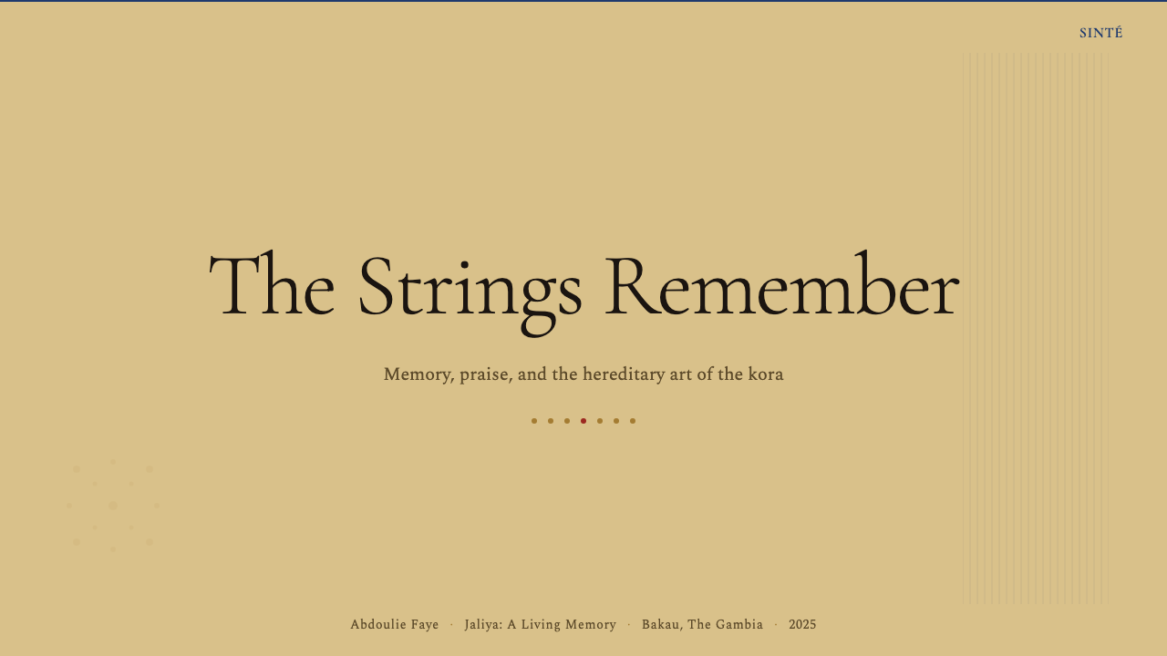
For presentation slides, the style works most powerfully on cover pages and section dividers, where its typographic weight and restrained palette can make a strong first impression before detailed content begins. A cover benefits from a large, heavily-weighted headline set in the serif register, anchored against the calabash beige ground with a narrow decorative band running along the lower edge. Content slides should be treated as documents rather than billboards: text hierarchies defined purely by scale and weight, generous margins, and no background imagery. Data slides in this style take a ledger-like character — numbers large and clearly hierarchized, category labels in the dignified serif, with the brass accent tone used sparingly to mark a single highlighted value.在演示文稿中,这种风格在封面与章节分隔页上最为有力,在详细内容开始前,其字体排印的分量与克制的色板能制造强有力的第一印象。封面适合以衬线格调排印粗重标题,锚定于葫芦米色底面,沿下边缘配以一条窄装饰带。内容页应被当作文件而非广告牌来处理:仅以尺度与字重定义文字层级,留足边距,不用背景图像。这种风格的数据页具有账本式的气质——数字硕大且层级清晰,类别标签用庄重的衬线体,黄铜强调色谨慎地仅标记单一高亮数值。
For web interfaces, the style is most at home in contexts that reward deliberate reading: editorial long-form pages, archival or library interfaces, cultural institution websites, and documentation. Dashboard applications can use the system if the data density is moderate — the wide margins and slow typographic rhythm work against high-density information displays where users need to scan dozens of data points simultaneously. Pricing pages in this style carry a particular quiet confidence: a single feature listed per line in generous type, with the brass accent marking the recommended tier and the indigo used for structural section headers.对于网页界面,这种风格在奖励细读的语境中最为自在:长篇编辑页面、档案馆或图书馆界面、文化机构网站以及文档。如果数据密度适中,仪表板应用可以使用这套体系——但宽边距与缓慢的字体排印节奏不适于用户需要同时扫视几十个数据点的高密度信息展示。这种风格的定价页散发着一种特别的静谧自信:每行以慷慨的字号列出单项功能,黄铜强调色标记推荐方案,靛蓝用于结构性章节标题。
For editorial and marketing work, the Kora style supports a kind of authority that contemporary sans-serif systems often cannot achieve: it signals that the content is worth the reader's careful attention rather than demanding it through visual urgency. Long-form articles work well with the system's naturally wide margins, which can accommodate pull-quotes or annotations in a smaller weight of the same face. Marketing materials — posters, event announcements, program covers — are the form this system most directly references; they benefit from bold typographic hierarchy, the four-color palette used at full restraint, and the geometric ornamental borders as framing devices.对于编辑与营销内容,科拉琴风格支持一种当代无衬线体系往往无法实现的权威感:它传递出内容值得读者细心关注,而非通过视觉紧迫感强索关注。长篇文章与这套体系自然宽阔的页边距配合良好,边距可容纳以同一字体较小字重排印的引文或注释。营销材料——海报、演出公告、节目封面——是这套体系最直接参照的形式;它们受益于大胆的字体排印层级、四色色板的充分克制,以及作为框架手段的几何装饰边框。
A common mistake when applying this style is conflating warmth with softness. The Kora system is warm but not casual — its warmth is the weight of ceremonial authority, not domestic comfort. Rounded corners, playful illustrations, or desaturated pastels all undermine the system's essential character. Similarly, adding photographic hero imagery to backgrounds introduces a representational naturalism that the style deliberately avoids. The palette is matte by nature; any element that introduces gloss, luminosity, or gradient-based depth will read as a category error within the system.应用这种风格时常见的错误是将温度与柔和混为一谈。科拉琴体系是温暖的,但不是随意的——它的温度是礼仪权威的分量,而非家居舒适感。圆角、俏皮插图,或去饱和度的粉彩色,都会损害这套体系的本质特征。同样,在背景中加入摄影主视觉图像,引入了这种风格刻意回避的具象自然主义。这套色板本质上是哑光的;任何引入光泽、发光效果或基于渐变的深度的元素,在这套体系内都会被读作范畴错误。
See the Gambian Griot Kora (21-string) design system →查看 Gambian Griot Kora (21-string) 完整设计系统 →
Gambian Griot Kora (21-string) — FAQGambian Griot Kora (21-string) · 常见问题
Is this style appropriate for digital products, or is it too rooted in physical print?这种风格适合数字产品吗,还是它太植根于实体印刷了?
The style translates well to digital contexts, but the translation requires understanding what makes it work: the warmth comes from color temperature and typographic weight, not from literal paper texture. Digital implementations should lean into the matte quality of the palette — avoiding glossy UI patterns like frosted glass backgrounds, luminous shadows, or gradient fills — while the wide margins and deliberate typographic hierarchy work naturally in responsive layouts. The style is particularly well-suited to long-form digital reading experiences: editorial articles, documentation, cultural archives. It is less suited to high-speed interaction contexts like messaging apps or real-time dashboards where the slow rhythm of the system becomes a liability.这种风格能在数字语境中顺利转译,但转译需要理解是什么让它起作用:温度来自色彩温度与字体排印的分量,而非字面意义上的纸张纹理。数字实现应倾向于色板的哑光质感——回避光泽感的界面模式,如磨砂玻璃背景、发光阴影或渐变填充——而宽边距与从容的字体排印层级在响应式版面中自然适用。这种风格尤其适合长篇数字阅读体验:编辑文章、文档、文化档案馆。它不太适合高速交互语境,如即时通讯应用或实时仪表板——在那些场景中,这套体系缓慢的节奏会成为负担。
How does this style differ from other African-inspired design aesthetics?这种风格与其他以非洲为灵感的设计美学有何不同?
Many design systems described as 'African-inspired' draw on kente cloth patterns, Ankara prints, or generalized pan-African color associations — typically high-saturation primaries in bold repeat patterns. The Kora system is more specific and more austere. It is rooted in a particular material tradition (the kora instrument and its performance context), a particular cultural moment (the postcolonial concert publicity of the 1970s), and a particular social function (archival preservation and ceremonial authority). The result is a style that reads as dignified and particular rather than festive and generic. It draws from West African tradition without borrowing surface pattern.许多被描述为「非洲灵感」的设计体系借鉴的是肯特布纹样、安卡拉印花,或泛化的泛非色彩联想——通常是大胆重复纹样中的高饱和三原色。科拉琴体系更为具体,也更为简朴。它植根于一个特定的物质传统(科拉琴乐器及其演出语境)、一个特定的文化时刻(七十年代后殖民时期的演出宣传品),以及一个特定的社会功能(档案保存与礼仪权威)。结果是一种被读作庄重而特定、而非喜庆而泛化的风格。它汲取自西非传统,却不借用表面纹样。
Can the style work for a brand that has no connection to West African culture?这种风格适合与西非文化没有关联的品牌使用吗?
It can, provided the application is driven by genuine resonance with the style's values rather than surface borrowing. The Kora system communicates archival authority, careful human attention, oral-culture warmth, and the weight of transmitted knowledge. A publishing house, a legal firm, a heritage institution, a craft brand, or a research organization might find deep alignment between those values and their own positioning — regardless of geographic or cultural connection. What the style cannot do is function as mere exotic visual decoration; its ornamental elements and typographic choices are structurally meaningful, not interchangeable surface motifs.可以,前提是应用出于对这种风格价值观的真正共鸣,而非表面借用。科拉琴体系传递的是档案式权威、细心的人文关怀、口述文化的温度,以及传承知识的分量。一家出版社、一家律师事务所、一座遗产机构、一个手工艺品牌,或一家研究机构,无论地理或文化关联如何,都可能发现这些价值观与自身定位的深度契合。这种风格无法做到的,是充当纯粹的异域视觉装饰;其装饰性元素与字体排印选择具有结构性意义,而非可互换的表面母题。
What is the biggest risk of applying this style incorrectly?错误应用这种风格最大的风险是什么?
The greatest risk is producing something that looks merely aged or nostalgic rather than authoritative and warm. This typically happens through two failure modes: over-texturing, where designers add photographic grain or paper textures in an attempt to enhance the analog quality, resulting in something that reads as retro pastiche rather than grounded gravitas; and under-restraining the palette, where all four tones are used at equal visual weight across every surface, eliminating the hierarchy that gives the system its clarity. The style's warmth is structural — it comes from the ratio between the beige ground, the near-black ink, and the restrained accents, not from adding more visual material. Less is almost always more in this system.最大的风险是产出看起来仅仅是陈旧或怀旧的东西,而非权威而温暖的东西。这通常通过两种失败模式发生:过度添加纹理——设计师添加摄影颗粒或纸张纹理以试图增强模拟质感,结果被读作复古拼贴而非扎根的庄重感;以及对色板缺乏克制——四种色调在每个表面以相同的视觉权重使用,消除了赋予这套体系清晰度的层级。这种风格的温度是结构性的——它来自米色底面、近墨黑色油墨与克制强调色之间的比例关系,而非添加更多视觉材料。在这套体系中,少几乎永远优于多。
How should the geometric ornamental borders be used without becoming decorative overload?如何使用几何装饰边框,而不让它变成装饰过载?
The rule is simple: ornamental bands appear at structural boundaries only, never as filler or background pattern. One band along the bottom of a cover page, one band separating a header zone from content, a framing border around a call-out block — these are appropriate uses. The band's visual weight should be lighter than the body text weight; it is a ruled separator, not a headline. Using more than two ornamental bands on a single layout surface almost always produces overload. The test is whether removing the band would leave a functional gap in the layout's structure: if the answer is no, the band is decorative and should be omitted.规则很简单:装饰带只出现在结构边界,从不作为填充物或背景纹样。封面底部一条装饰带、标题区与内容之间的一条分隔带、围绕引文区块的一条边框——这些是恰当的用法。这条带的视觉重量应轻于正文字重;它是一条分隔线,而非标题。在单一版面上使用超过两条装饰带几乎必然产生过载。检验方法是:如果去掉这条带,版面结构是否会留下一个功能性空缺——如果答案是否,这条带就是装饰性的,应当省去。
Related design styles相关设计风格
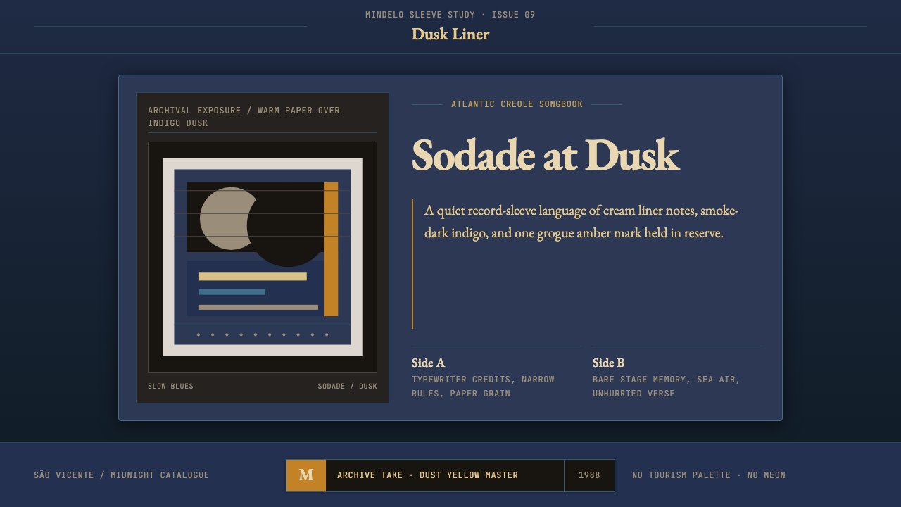 Cape Verdean Morna (Cesária Era)Longing in dusk. Indigo sleeve framing, Garamond liner notes, and one amber e…暮色里的乡愁:靛蓝唱片框、Garamond内页字与一抹琥珀火点。
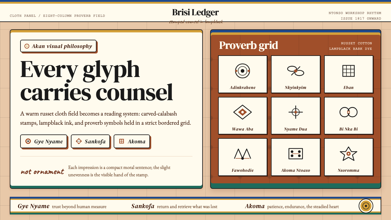 Akan Adinkra (Ghana)Proverbs become cloth. Russet grids, lampblack serif marks, and gold-edge ban…箴言化为布面:赭红网格、灯烟黑印纹与金边带盖出意义。
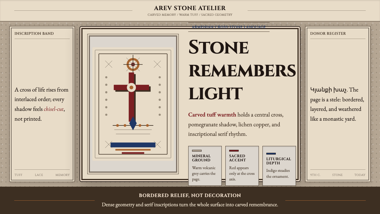 Armenian Khachkar Cross-StoneStone becomes memory. Tuff grey, pomegranate red, and carved borders hold the…石头成为记忆:凝灰岩灰、石榴红与刻痕边框托住十字中轴。
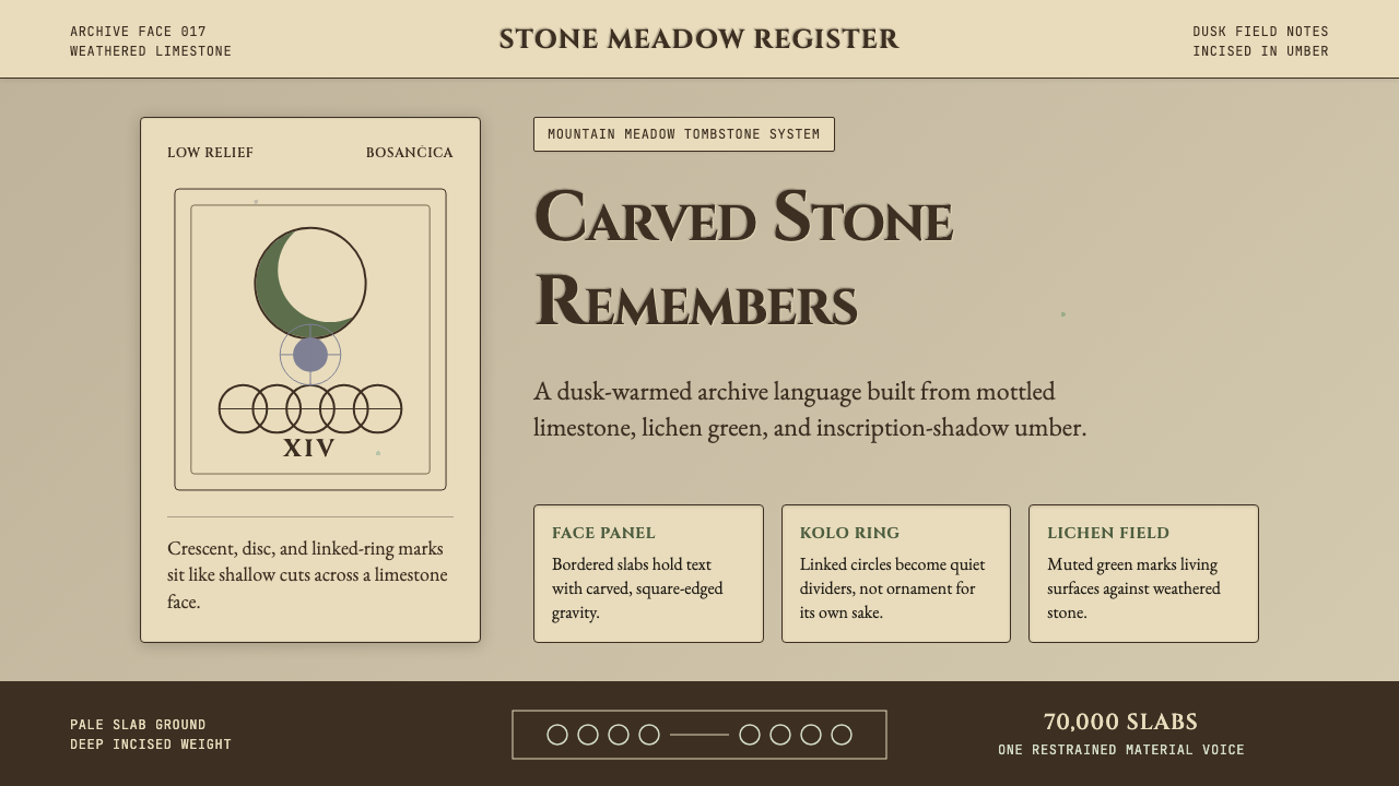 Bosnian Stećak Medieval TombstoneStone remembers quietly. Lichen green and Cinzel cuts sit on weathered limest…石头静默记忆。苔藓绿与Cinzel刻痕落在风化石灰岩上。
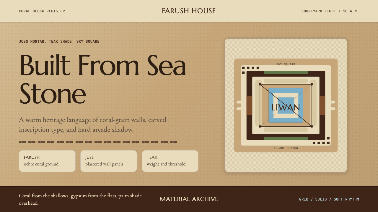 Emirati Bait Al Naboodah Coral HouseFeels built, not styled. Coral ochre, teak brown, and a sky-square courtyard…像被建造而非装饰。珊瑚赭、柚木棕与天井方格定调。
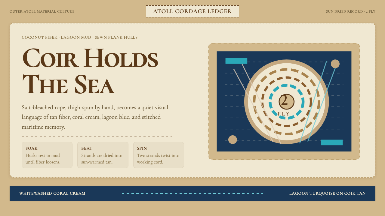 Maldivian Coir (Coconut Rope)Ocean-tested craft. Coir tan, coral cream, Cormorant type, and dashed seam ge…经海考验的手工感:椰棕褐、珊瑚乳白、Cormorant 字体与虚线缝合几何。