What is Emirati Bait Al Naboodah Coral House?
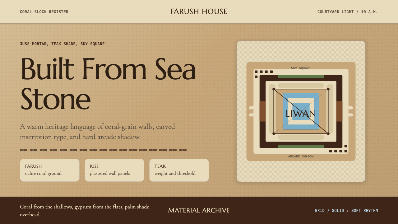
Bait Al Naboodah turns coral stone, gypsum mortar, and courtyard shadow into a design language that feels hewn from the Gulf itself.
Emirati Bait Al Naboodah Coral House in brief
The Emirati Bait Al Naboodah Coral House style takes its visual and structural logic from a single surviving building: Bait Al Naboodah, an 1845 courtyard merchant dwelling in the Heart of Sharjah heritage district. The house was built of farush — coral blocks quarried from the shallow Persian Gulf floor — bonded with juss, a gypsum-rich mortar that was smoothed into interior wall surfaces. Danchal palm-frond ceilings filtered light from above; barjeel wind towers drew air through the rooms. The courtyard, or liwan, was the spatial and social heart of the structure.
As a design system, it translates those material facts into a typographic and color language. The palette echoes the warm pale-ochre of sunlit coral stone, the cooler shadowed tones found beneath liwan arcades, and the deep warm brown of carved teak doors and window shutters. Nothing is bright; nothing is synthetic. This is the visual register of surfaces shaped by hand, sun, salt air, and centuries of use.
What distinguishes this style from generic warm-neutral aesthetics is its architectural specificity. Cards and panels carry the quiet authority of juss-plastered walls. Headings are set with the wide-tracked deliberateness of carved stone inscriptions. The page itself reads as a courtyard: an open, light-filled central space bounded by structured elements that cast clear, hard shadows. The whole system carries the sensibility of something built to last, not styled to trend.
Where does Emirati Bait Al Naboodah Coral House come from?
Bait Al Naboodah was built in 1845 for the merchant family of Obaid bin Eissa Al Naboodah in what is now the Heart of Sharjah, the historic core of Sharjah city. The house is one of the finest surviving examples of Trucial coast coral-stone urbanism — the domestic architectural tradition that prevailed across the southern Arabian Gulf littoral from roughly the eighteenth through the early twentieth century. In this tradition, the primary building material was farush: coral blocks cut from reef formations in the shallow Gulf shallows, which were abundant, easily worked, and provided natural thermal mass to moderate the region's extreme heat.
The structural system was based on juss, a gypsum mortar made from locally calcined gypsum rock. Juss bonded the coral blocks, was used to render interior and exterior wall surfaces, and was carved into decorative plasterwork where ornament was permitted — typically in the more formal reception rooms. Wind towers, known as barjeel, were a defining feature of Gulf vernacular architecture: tall square shafts open on one or more sides that captured prevailing breezes and directed cooled air down into the living quarters below. The courtyard plan concentrated natural ventilation and daylight while providing a private outdoor space shielded from the street.
The house passed into disrepair during the rapid modernization that followed the oil boom of the 1960s and 1970s, when traditional building techniques were largely abandoned in favor of concrete construction. The building was acquired by the government of Sharjah under Sheikh Sultan Al Qasimi, who initiated a broad heritage restoration program across the historic city center in the 1990s. The 1995 restoration, overseen in part by heritage specialist Salah Hassan Salah, returned the structure to its pre-oil condition, reinstating farush walls, juss plasterwork, teak joinery, and danchal ceilings. It opened as a heritage museum, allowing the public to see the interior spatial logic and material character of pre-oil Emirati domestic life.
The Trucial coast coral-stone tradition represented by Bait Al Naboodah is distinct from the mud-brick architecture of the UAE interior (as seen in Al Ain) and from the later rendered-concrete vernacular revival. Its specific character — warm pale stone, deep arcade shadows, restrained carved ornament, heavy teak detail — reflects the merchant trading culture of the Gulf littoral: prosperous but not ostentatious, cosmopolitan through Indian Ocean trade connections, and deeply adapted to an extreme climate. The barjeel wind tower became an internationally recognized symbol of Gulf heritage, and the coral-stone palette of these houses has come to represent a visual identity for the pre-modern Gulf that is distinct from both the desert interior and the contemporary steel-and-glass skyline.
What defines the Emirati Bait Al Naboodah Coral House look?
Color
The palette is anchored in warm pale ochre — the color of farush coral limestone in afternoon sunlight — paired with the cooler shadowed tones found in arcade recesses and courtyard corners. A deep warm brown drawn from teak wood provides the darkest anchor. White gypsum plaster contributes a near-white tone that reads as relief rather than ground. No bright primaries appear; saturation is consistently muted. The effect is of a surface that has absorbed decades of light rather than one that has been freshly painted.
Texture and Surface
Bait Al Naboodah's walls have an inherent granularity — coral stone is porous and uneven, while juss plaster smooths it to a matte, slightly chalky finish. This interplay of rough substrate and smooth finish is the defining surface quality of the style. In digital applications, this translates to a preference for slightly textured or matte-reading backgrounds over glossy or completely flat ones, and for shadow effects that suggest mass and weight rather than floating or glowing.
Typography
Headings carry wide letter-spacing — recalling the deliberate cadence of carved inscriptions in stone or plaster. Body text is set at a comfortable measure, unhurried, with generous line-spacing that echoes the proportions of the courtyard: open at the center, bounded but not compressed. Serif forms suit the style's historical register, though well-spaced geometric sans-serifs work equally well. The key is restraint in weight contrast — transitions between heading and body are gradual, not abrupt.
Shadow and Light
Bait Al Naboodah at midmorning is an architecture of hard shadow. The arcade columns cast precise dark bands across the courtyard floor; the barjeel openings frame rectangles of bright sky. This quality — sharp, defined shadows against warm lit surfaces — is the light logic of the style. Cards and panels carry pronounced, offset shadows that appear solid and architectural rather than diffuse or glowing. There are no soft-shadow halos; every shadow implies a wall or column, something structural.
Spatial Openness
The liwan courtyard is defined by its openness — a large void surrounded by structured elements. This spatial logic informs the style's use of white space: generous margins, clear breathing room between content blocks, and a central area that never feels crowded. Layouts avoid the dense, card-heavy packing common in modern web design. The page should feel like entering a shaded arcade and stepping into a sunlit courtyard — a movement from structure into open air.
Ornament
Bait Al Naboodah uses ornament sparingly and only where it is architecturally located: carved juss plasterwork appears in the formal reception rooms, geometric mashrabiya screens filter light in upper-level openings. Ornament is never applied as surface pattern across a whole wall — it is placed, framed, and purposeful. The style follows the same discipline: decorative detail, when it appears, is contained and specific rather than ambient.
Material Honesty
The building's beauty arises from its materials being used straightforwardly: coral stone is left visible at the base; plaster is smoothed where smoothness is needed; wood is left as wood. There is no simulation — no plaster made to look like marble, no wood painted to look like stone. The digital system inherits this principle: backgrounds that read as backgrounds, shadows that read as structural rather than decorative effects, type that reads as type rather than as graphic form.
Who shaped Emirati Bait Al Naboodah Coral House?
The merchant who commissioned and occupied Bait Al Naboodah in 1845. His name is carried by the building and serves as a reminder that the house's sophisticated spatial and material organization — courtyard cooling, wind-tower ventilation, teak joinery, carved plasterwork — was the achievement of a prosperous trading family, not a royal commission. The merchant class of the Trucial coast drove the development of coral-stone urban architecture across the region.
Ruler of Sharjah and the initiator of the heritage restoration program that saved Bait Al Naboodah and many surrounding buildings in the Heart of Sharjah district from demolition. Beginning in the 1990s, his government undertook the restoration of a large area of historic Sharjah as a living heritage zone, commissioning architectural surveys, funding restorations, and establishing museum uses for significant buildings. Without this program, the physical record of Trucial coast coral-stone architecture in Sharjah would have been substantially lost.
Heritage specialist involved in the 1995 restoration of Bait Al Naboodah. Heritage restoration work of this kind requires deep knowledge of pre-industrial building techniques — how to source and work farush coral stone, how to prepare and apply juss mortar, how to replicate danchal palm-frond ceiling construction. Such specialists serve as the technical bridge between surviving historical fabric and its careful reintegration, and their work is what makes a restored building legible as architecture rather than simply as a reconstructed object.
The craftsmen who built and maintained structures like Bait Al Naboodah were specialists in a localized building tradition whose knowledge was transmitted through apprenticeship rather than formal education. They understood the properties of farush — its porosity, its workability, the way it absorbs moisture and then re-radiates it — and of juss, which requires careful calcination and mixing to achieve the right set time and surface hardness. This collective technical knowledge constituted the real design intelligence behind the Trucial coast vernacular, and its near-total loss after the oil boom represents one of the defining architectural losses of the modern Gulf.
How do you use Emirati Bait Al Naboodah Coral House today?
The Bait Al Naboodah Coral House style is among the rarer historical palettes in contemporary design — not because it is difficult to apply, but because its warmth and material specificity are so different from the cool, synthetic neutrals that dominate modern interfaces. Applied well, it brings the quality of something handmade and time-worn to digital contexts without tipping into nostalgia or pastiche. The discipline is in staying true to the material logic: warm without being orange, textured without being busy, shadowed without being dark.
For presentation slides, the style works best when the background is given genuine warmth — a pale ochre or warm off-white that reads as coral stone in light, not as a standard beige template. Cover slides benefit from an asymmetric layout that mirrors the courtyard's spatial geometry: a generous open zone paired with a compact area of structured information. Content slides should use the teak-brown and arcade-shadow tones sparingly, as section markers or emphasis elements rather than background fills. Data visualizations become more coherent when restricted to the palette's natural range — warm and cool ochres, deep brown, near-white — rather than importing colors from outside the system.
For web interfaces, the style suits brand homepages, cultural institution sites, heritage and hospitality contexts, and any product positioning itself as craft-made, considered, or rooted in a specific place or tradition. Dashboard and SaaS applications can use it, but require careful attention to ensure that interactive states and data differentiation remain legible within the muted palette. The approach: set the base background at the warmest tone, use the deep teak-brown for type and critical interactive elements, and deploy the arcade-shadow tone for component boundaries and secondary information. Navigation benefits from generous spacing and typographic restraint — the style supports wordmark and label navigation well, without icon clutter.
For editorial and marketing work, Bait Al Naboodah gives long-form content an unhurried authority. Article layouts should use wide margins and generous line-spacing — the rhythm of the courtyard rather than the density of a news column. Pull quotes and call-outs work well set in the deeper ochre or teak tones against the warm pale ground. Marketing pages can use the style's contrast between lit surface and arcade shadow as a compositional device: alternating content blocks between warm-pale and deep-warm tones. The style avoids the boldness of poster design; it achieves emphasis through scale and proportion rather than saturation.
A common mistake when applying this style is reaching for an actual terracotta or clay-red to inject more visual energy — these are not part of the palette and import the wrong cultural associations (Mediterranean or Southwest American vernacular rather than Gulf). The ochres in this system are stone-pale, not saturated. A second mistake is softening the shadows into ambient glows, which destroys the architectural specificity that defines the style. Shadows in Bait Al Naboodah are cast by solid objects under bright light — they are hard, precise, and structural. Retain that quality and the design reads as Gulf; lose it and the design reads as generic warm-neutral.
Emirati Bait Al Naboodah Coral House — FAQ
How does this style differ from other warm-neutral Middle Eastern aesthetics?
The key difference is architectural specificity. Many warm-neutral aesthetics draw on generalized desert or sand-dune imagery — broad ochres, soft gradients, dusty haze. Bait Al Naboodah is derived from a specific building and a specific material tradition: coral stone, gypsum plaster, teak, courtyard shadow. The palette is warmer and more granular than desert sand; the shadows are harder and more precise than haze; the proportions reflect the geometry of courtyard architecture rather than open landscape. The style carries a civic, mercantile character — a prosperous trading city, not a nomadic camp.
Can this style work for a technology product or startup?
Yes, with the right product positioning. The style works well for any product that wants to communicate craft quality, considered design, and cultural rootedness — regardless of the industry. A fintech product aimed at Gulf markets, a design or architecture tool, a cultural platform, or a premium service business could all benefit from the style's warmth and material authority. It does not suit products that need to project speed, technical cutting-edge, or global-neutral corporate identity. The style implies time, care, and place — if those are values the product wants to carry, the aesthetic fits.
Is the barjeel wind tower a design element that should be referenced visually?
Caution is warranted. The barjeel is a powerful and culturally specific symbol, and using it as a decorative motif risks reducing a functional architectural innovation to mere ornament. The style already captures the wind-tower's contribution — the quality of light and shadow it creates in the courtyard — through its palette and shadow logic. Actual representations of barjeel as graphic elements should be reserved for projects with a direct cultural or heritage brief, where the reference is intentional and substantiated, not applied as surface decoration.
How do you maintain legibility when the palette is this muted?
By relying on the same contrast mechanism the building uses: the difference between sunlit and shadowed surface. In Bait Al Naboodah, the bright-lit courtyard floor and the dark arcade interior define a legibility system entirely within the warm-ochre range — no pure white needed, no pure black needed. In digital application, the deep teak-brown provides sufficient contrast for body text against a pale-ochre ground without introducing a foreign neutral. Where maximum contrast is needed — primary calls to action, critical data labels — the near-white gypsum tone against the deep teak-brown achieves it without leaving the system.
Does this style work in dark mode?
The style has a natural dark equivalent rooted in the building itself: the interior of the arcade at night, or the deep shadow of a barjeel shaft, is almost the same deep warm brown as the teak doors. A dark-mode variant built on this tone — deep teak-brown as the base, pale ochre for primary text, near-white for high-emphasis elements — maintains the system's material logic rather than simply inverting it. What does not work is converting the design to a generic near-black with desaturated grey text: that loses the warmth that defines the style. The dark mode should read as the same building after sunset, not as a different building.
Related design styles
 Beni Ourain Berber CarpetRestraint feels tactile. Greige wool field, Oswald type, and a loose charcoal…
 Egyptian Hassan Fathy Vernacular (1945)Earth remembers craft. Burnt brick, sand-gold vaults, and indigo doors carry…
 Adobe Pueblo SouthwestFeels made by hand. Earthen tan, turquoise trim, and viga rhythm shape the fr…
 Afar Nomad TextileWeight lives at the edge. Rust and madder selvedges cut across a quiet cotton…
 Ainu Attus RobeProtection is cut, not painted. Indigo bands and square-ended thread hold elm…
 Audubon Birds of AmericaAged natural history breathes. Buff rag paper, sepia rules, and italic binomi…