What is Egyptian Hassan Fathy Vernacular (1945)?
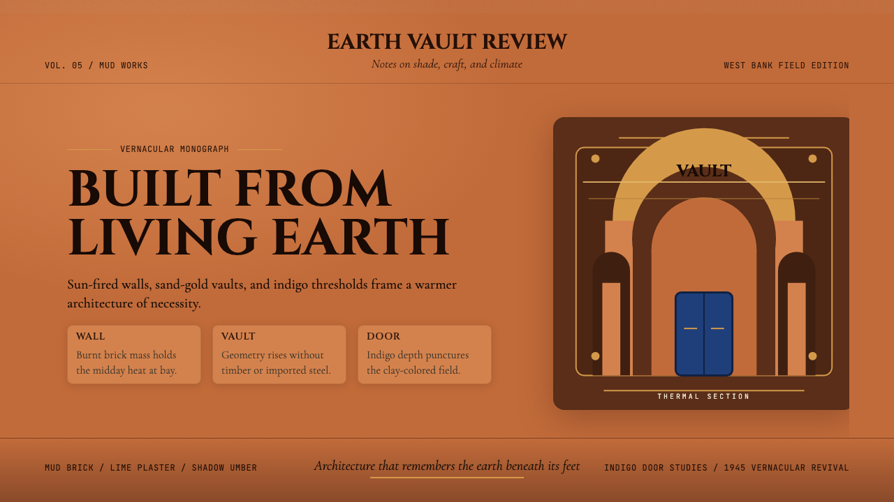
Hassan Fathy built palaces from mud and proved that the oldest material in Egypt was also its most sophisticated.
Egyptian Hassan Fathy Vernacular (1945) in brief
Egyptian Hassan Fathy Vernacular is a design language rooted in the traditional domestic architecture of the Nile Valley, revived and theorized by architect Hassan Fathy beginning in the 1940s. It draws on centuries of Nubian and Upper Egyptian building practice — domed mud-brick rooms, carved wooden screens, colonnaded inner courtyards, and a palette derived entirely from the landscape itself: the warm terracotta of fired brick, the pale gold of desert sand, the dense blue-black of shadowed archways, and the vivid indigo of hand-painted doors.
Where many vernacular traditions survive as unconscious habit, Fathy's contribution was to document, analyze, and deliberately revive this aesthetic as a conscious architectural and design philosophy. His 1973 book, published in English as Architecture for the Poor, argued that indigenous building knowledge held thermal, social, and aesthetic solutions that twentieth-century modernism — obsessed with concrete and glass — had abandoned at great cost. The visual system that emerged from his practice is not nostalgic pastiche but a rigorous formal grammar, as internally consistent as any modernist movement.
At its core, this design language is about the eloquence of earthen materials and the geometry of shade. The forms — domes, vaults, arches, mashrabiyya lattices — are not ornamental choices but climatic ones: each shape manages heat, light, and airflow in a region where temperatures routinely exceed forty degrees. Beauty, in this tradition, is inseparable from performance. An arch is beautiful precisely because it works.
See the Egyptian Hassan Fathy Vernacular (1945) design system
Where does Egyptian Hassan Fathy Vernacular (1945) come from?
Hassan Fathy was born in Alexandria in 1900 into a landowning family. He trained as an architect at the Cairo School of Fine Arts and graduated in 1926 into a professional environment dominated by European colonial eclecticism — Italian neoclassical banks, British neo-Pharaonic government buildings, and French-inflected apartment facades that bore no relationship to the Egyptian climate or to the traditions of the people who would live in them. Fathy spent the following two decades growing increasingly restless with this imported vocabulary.
The turning point arrived in 1937 when Fathy visited villages in Upper Egypt and encountered the Nubian tradition of building mud-brick barrel vaults and domes without centering — without the timber formwork that conventional masonry required. This technique, known as Nubian vaulting, had been practiced continuously in isolated communities along the Nile for over a thousand years. It was structurally sophisticated and required almost no imported materials. Fathy recognized in it not a primitive survival but an advanced engineering response to the specific conditions of arid North Africa, and he spent years learning to build this way from master craftsmen, notably the Nubian builder Aladdin Mustafa.
In 1945, the Egyptian government's Department of Antiquities commissioned Fathy to design a new village, New Gourna, to rehouse the Gourna community on the West Bank of Luxor — families who had been living informally in and around the ancient Theban necropolis. Over three years, Fathy designed and partially built a complete village using Nubian vaulting techniques, mud brick, and the spatial organization of traditional Upper Egyptian domestic life: houses organized around central courtyards, sleeping areas under domed roofs, women's quarters screened by ornamental mashrabiyya woodwork. The project was never fully completed — resistance from the Gourna community itself, who had economic ties to the antiquities trade that the relocation threatened, combined with government indifference to halt construction. But what was built became internationally famous as a proof of concept.
Fathy spent the remainder of his long career — he died in Cairo in 1989 at the age of eighty-nine — refining, teaching, and writing about his architectural philosophy. His international recognition grew slowly: Architecture for the Poor was published in Arabic in 1969 and in English in 1973, attracting a global audience at precisely the moment when the appropriate-technology and post-colonial architecture movements were gaining intellectual traction. He received the Aga Khan Award for Architecture in 1980 and the United Nations Human Settlements Award in 1984. His pupils, most notably the Egyptian-British architect Abdel-Wahed El-Wakil, carried his formal language into mosque and palace design across the Arab world and beyond.
What defines the Egyptian Hassan Fathy Vernacular (1945) look?
Earthen Palette
The color field is derived entirely from the natural materials of the Nile Valley. Walls read as warm terracotta — the saturated orange-brown of fired mud brick. Dome surfaces catch light and shift toward pale gold, the color of desert sand in afternoon sun. Deep archways and recessed cavities fall into cool shadow that reads almost as charcoal. Painted woodwork — doors, shutters, window screens — carries vivid indigo or turquoise as the only applied color in an otherwise mineral palette. The overall effect is warm without being aggressive: a controlled richness grounded in material honesty.
Domed and Vaulted Form
The dominant formal vocabulary consists of barrel vaults, pendentive domes, and pointed arches — all derived from Nubian structural traditions that Fathy documented and revived. These forms are not applied decoration but the natural outcome of building in compressive masonry without timber. Each dome is constructed in a rising spiral of leaning courses, self-supporting from the first course, using only a plumb line and the mason's eye. The resulting surfaces are never perfectly geometric in the industrial sense: they carry the slight irregularity of handwork, which lends warmth and life to what might otherwise read as austere.
Mashrabiyya Screens
Carved wooden latticework — mashrabiyya — appears at windows, on balcony projections, and as interior partitions. The screen performs multiple functions simultaneously: it filters sunlight into dappled patterns across interior floors, creates airflow through its voids, and maintains visual privacy from the street while allowing inhabitants to observe from within. Aesthetically, the mashrabiyya introduces intricate geometric shadow-play into an otherwise plain plaster surface. The patterns are drawn from a long lineage of Islamic geometric ornament, but their placement is dictated by climate logic first.
Courtyard Spatial Logic
Rooms in Fathy's designs are organized around a central courtyard — the qa'a — that serves as the thermal engine of the house. The courtyard captures cool night air and releases it slowly through the day; upper-floor wind catches direct breezes and channels them downward. As a spatial experience, the courtyard inverts the relationship between inside and outside: the interior is open to sky but protected from sun, while the exterior walls present a largely blank face to the street. The drama of the architecture is internal — a sequence of compressed passages opening suddenly into light and air.
Texture and Surface Relief
Surfaces in this tradition are never uniformly smooth. Mud plaster is applied in multiple coats by hand, leaving a finish that records the tool marks of its making. Carved plaster panels — often geometric or calligraphic — appear above doorways and in the upper registers of courtyard walls. The interplay of rough and refined, matte and slightly reflective, plain expanse and concentrated ornament creates visual rhythm without relying on color contrast alone. Imperfection is legible as craft rather than as failure.
Shadow as Architectural Material
In a climate defined by excess sunlight, shadow functions as a positive material rather than an absence. Deep loggia, recessed arched entrances, and projecting upper floors all manufacture shade with the same precision that a northern architect manages light. The visual effect is one of high contrast — brilliantly lit surfaces beside dense pools of shade — which gives Fathy-influenced work an inherent drama and depth even in still imagery. The dark voids of archways are as compositionally active as the lit walls beside them.
Indigenous Material Logic
The entire system is built on the premise that building materials should be found within a day's journey of the building site. Mud brick, lime plaster, and local timber — palm and sycamore — are the primary structural elements. This constraint is not poverty but principle: materials native to a place carry the colors, textures, and thermal properties that make architecture feel at home in its landscape. Imported materials — cement, glass, aluminum — are not forbidden but are treated as disruptive interruptions to a coherent surface language, to be used only where no local equivalent exists.
See the Egyptian Hassan Fathy Vernacular (1945) design system
Who shaped Egyptian Hassan Fathy Vernacular (1945)?
Fathy is the central figure of the tradition — its theorist, practitioner, and evangelist in equal measure. His New Gourna project (1945–1948) remains the foundational demonstration of what he called the 'architecture of the poor': technically ambitious buildings constructed by local labor from local materials according to a spatial logic derived from centuries of local adaptation. His writing, especially Architecture for the Poor, created the intellectual framework that allowed his practice to be understood as a movement rather than as individual eccentricity. His influence on appropriate-technology architecture globally, and on Islamic revivalist architecture specifically, persisted through his many students and admirers well after his death in 1989.
A Nubian master builder from the village of Gharb Aswan, Mustafa was one of the key craftsmen from whom Fathy learned the Nubian vaulting technique. His knowledge represented an unbroken chain of practical building wisdom stretching back over a millennium. Fathy's great insight was to recognize that this knowledge was not merely folk craft but constituted a technically sophisticated engineering tradition that had simply been rendered invisible by the colonial preference for European building forms. Mustafa and craftsmen like him were the living archive of the tradition that Fathy sought to revive.
El-Wakil studied under Fathy in Egypt and became the most internationally recognized practitioner of the tradition. Working in Saudi Arabia, the United Kingdom, and elsewhere from the 1970s onward, he demonstrated that Fathy's vocabulary — Nubian vaults, courtyard plans, mashrabiyya screens, earthen color palettes — could be adapted to mosque and residential architecture at a range of scales and climates without losing its formal integrity. His commissions for the King Fahd Mosque in Jeddah and several private villas brought the tradition to an affluent clientele, significantly expanding its visibility.
The British architectural historian Curtis wrote extensively on Fathy and on the broader question of modernity and tradition in non-Western architecture. His critical framing helped position Fathy not as a regionalist nostalgist but as a genuinely modern thinker who had identified something the mainstream of international modernism had missed: that climate, culture, and material tradition were not obstacles to good design but its richest raw materials. Curtis's writing brought Fathy to the attention of architectural historians and critics who might otherwise have dismissed vernacular revival as sentimental.
How do you use Egyptian Hassan Fathy Vernacular (1945) today?
Hassan Fathy Vernacular is among the most immediately evocative historical styles available for contemporary design work, because its visual cues — warm terracotta walls, arched voids, indigo accents, dappled shadow patterns — carry strong cultural and sensory associations. Applying it well requires respecting the internal logic of the system: the palette exists because of the materials, the forms exist because of the climate, and the spatial organization exists because of social life. Importing the surface without the logic produces decoration; understanding the logic produces something with genuine presence.
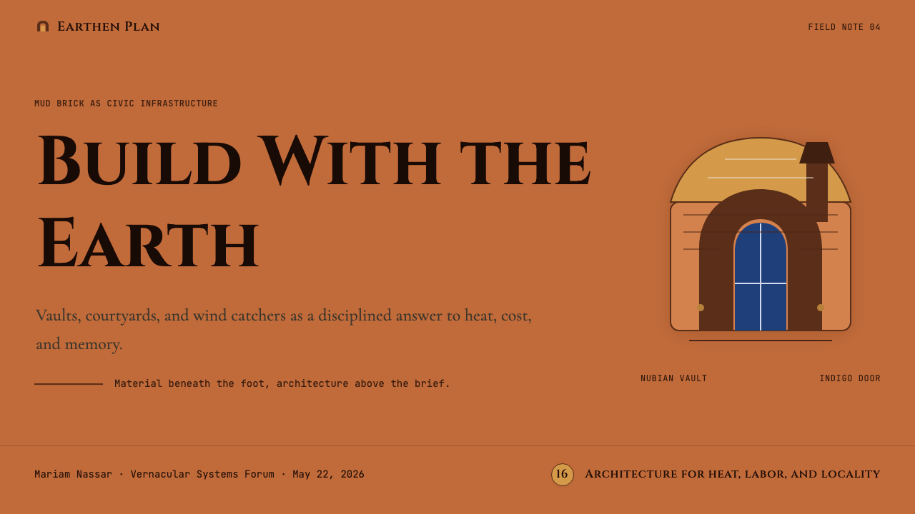
For presentation slides, this style works beautifully on cover and atmospheric pages. A cover built on this vocabulary uses a warm mid-tone ground — the color of sun-dried earth — with a dominant arched or domed shape rendered as a flat silhouette, and display type set in a weighted serif that echoes the carved inscriptions above Fathy's doorways. The palette should stay within the earthen range for backgrounds and structural elements, reserving indigo or turquoise for a single accent: a rule, a label, a highlighted word. Content slides are best treated as document-like: generous margins, a warm off-white field, and type hierarchy defined by size and weight rather than by color.
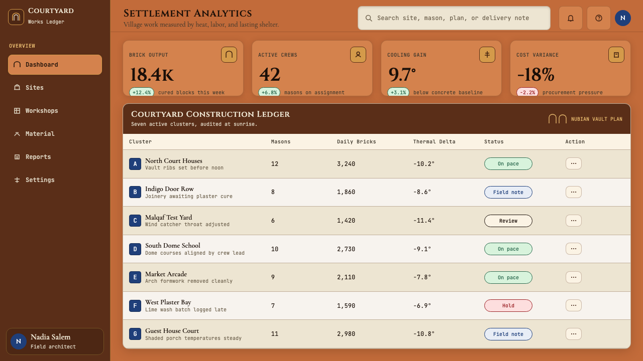
For web interfaces, the style suits contexts where craft, warmth, and cultural depth are primary values: hospitality brands, cultural institutions, artisan marketplaces, architectural and interior design platforms. Dashboard and data-heavy contexts are a difficult fit — the palette's warmth and the forms' organicism resist the hard-edged clarity that analytical interfaces require. Where the style does work in digital UI, it works best in editorial zones: hero headers, feature stories, About sections, and onboarding flows where the goal is atmosphere and trust rather than rapid information scanning.
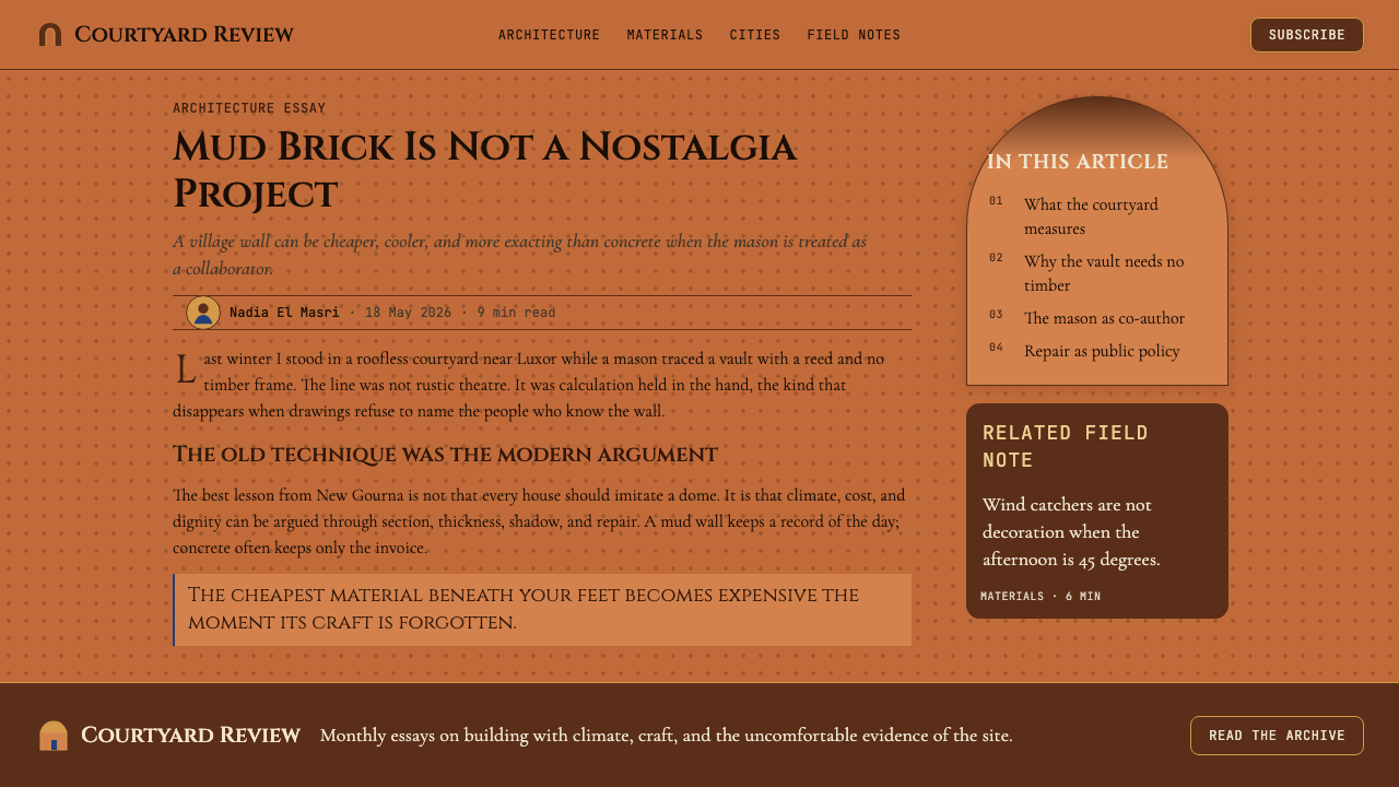
For editorial and marketing work, this vocabulary is exceptionally strong. A full-spread editorial layout using this system might set body text in a warm white field against which terracotta pull-quotes act as the primary punctuation, with arched or lobed frames appearing as image containers rather than rectangular crops. Marketing pages benefit from the style's inherent drama: the contrast between a deeply shadowed background section and a light foreground element creates the same visual tension that Fathy achieved architecturally between recessed arch and sunlit wall. Headline type should feel monumental — drawn from a serif tradition with historical gravity rather than contemporary digital neutrality.
A common mistake when applying this style is overloading the indigo or turquoise accent. In Fathy's actual buildings, the painted door or window screen is exceptional within a field of earthy neutral — it draws the eye precisely because it is singular. When every interactive element, every link, and every call-to-action is saturated indigo, the accent loses its power entirely and the palette reads as merely ethnic decoration rather than as a coherent system. The discipline is: commit to earth tones for ninety percent of the surface, and let the single vivid accent carry the emotional weight of the whole.
See the Egyptian Hassan Fathy Vernacular (1945) design system
Egyptian Hassan Fathy Vernacular (1945) — FAQ
Is Hassan Fathy Vernacular limited to Middle Eastern or North African contexts?
The formal vocabulary — domes, arches, earthen tones, carved screens — does carry strong regional associations, and applying it outside those contexts requires cultural sensitivity. That said, the underlying principles of climate-responsive form, material honesty, and the use of shadow as a positive compositional element are universal and transferable. The style works well in any context where warmth, craft heritage, and a connection to place are desired values — Mediterranean hospitality brands, South Asian artisan platforms, or any project that wants to signal cultural depth and pre-industrial craft quality. What should be avoided is using the surface vocabulary as generic 'exotic' decoration without reference to the system's logic.
How does this style relate to contemporary Islamic geometric design?
There is overlap but the two are distinct traditions. Contemporary Islamic geometric design typically foregrounds the intricate mathematical patterning of Arabesque ornament — star polygons, interlocking tessellations, continuous knot patterns — often applied to surfaces as decoration. Fathy's vernacular tradition treats Islamic geometric ornament as one element within a larger spatial and climatic system: the mashrabiyya screen is geometric but its primary function is environmental, and the carved plaster panel above a doorway is as much about tactile richness as about pattern. Fathy was deliberately non-sectarian in his architectural philosophy, emphasizing the rationality and environmental appropriateness of the building tradition rather than its religious identity.
Why does Fathy's palette feel warm rather than the bright, saturated colors of other Middle Eastern traditions?
Because the palette is derived from unfinished materials rather than from applied pigment. The terracotta orange of the walls is the natural color of Nile mud brick after firing. The pale gold of dome surfaces is the color of lime plaster aged under the sun. The deep charcoal of archway shadows is the absence of direct light in a recessed space. Only the door or window screen introduces an applied color, and that applied element is deliberately exceptional — it reads as accent precisely because everything else is material. Traditions that use bright saturated color across large surfaces — Moroccan tile work, Persian faience — are doing something fundamentally different: applying colorant to materials that would otherwise be neutral. Fathy's system is about revealing what is already there.
Can this style work for digital products aimed at a younger, contemporary audience?
It can, but it requires a light touch and a clear reason. Young contemporary audiences respond to authenticity and craft heritage, and this style carries both in abundance. The challenge is avoiding the twin failure modes: archaeological pastiche (so loyal to historical reference that it feels like a museum exhibit) and surface exoticization (borrowing the visual texture without the underlying logic, producing something that reads as costume rather than language). A successful contemporary application might use the earthen palette and the arched form language in a highly simplified, flattened way — reducing the mashrabiyya to a subtle background texture, using the arch as a framing device rather than a structural motif — while keeping the overall composition in dialogue with contemporary layout conventions. The goal is to feel informed by the tradition, not trapped inside it.
What distinguishes authentic use of this style from generic 'Middle Eastern aesthetic' clichés?
The key distinguishing factor is structural logic versus surface borrowing. Fathy's tradition is specific in time, place, and material: New Gourna, 1945, Nile mud brick and Nubian vaulting. The clichés of 'Middle Eastern aesthetic' tend to be ahistorical aggregations — mixing Moroccan tile patterns with Ottoman arched windows and Egyptian gold ornament without reference to the specific cultural or climatic logic of any of them. Authentic engagement with this tradition means understanding that the dome is domed because of how mud brick distributes compressive load, that the courtyard is open because of how hot air rises, and that the mashrabiyya exists because women needed visual privacy while maintaining ventilation. When the forms in a design serve a purpose — even metaphorically, even in a digital context — they read as coherent. When they are simply assembled for visual exoticism, they read as pastiche.
Related design styles
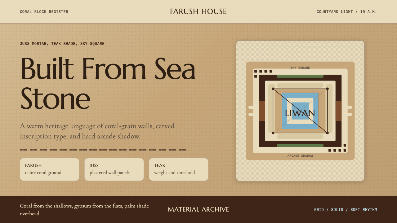 Emirati Bait Al Naboodah Coral HouseFeels built, not styled. Coral ochre, teak brown, and a sky-square courtyard…
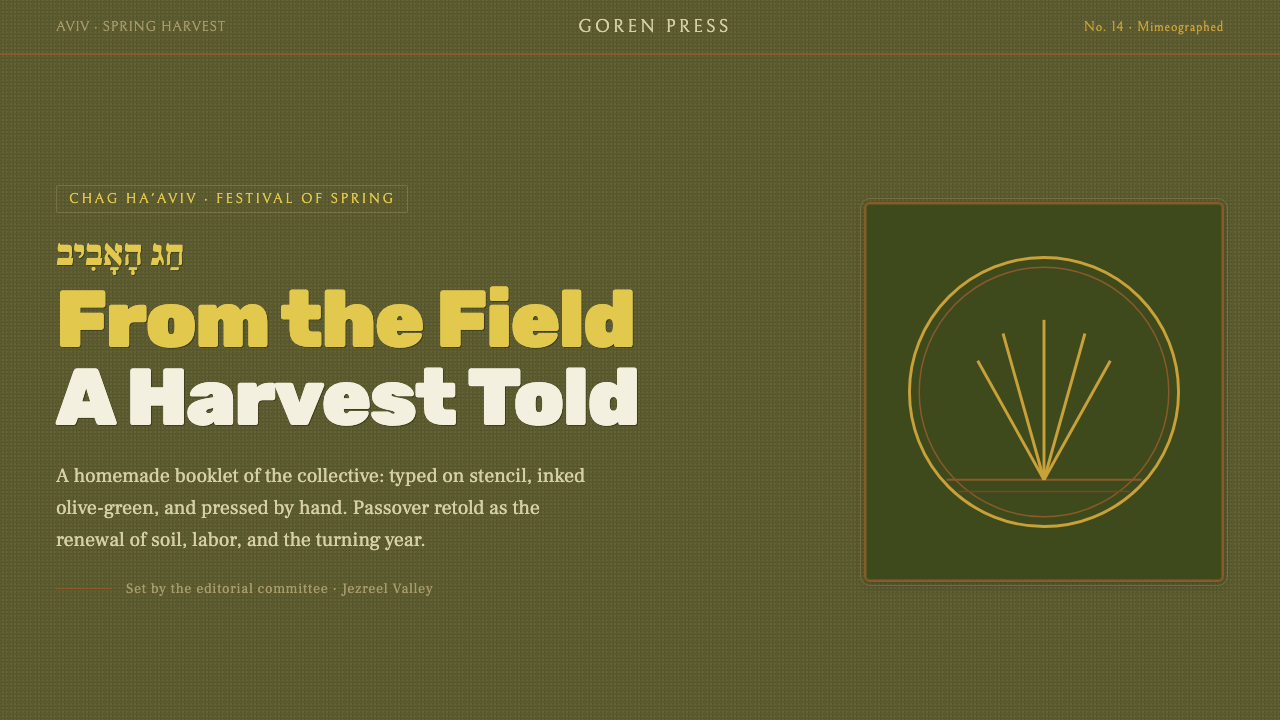 Kibbutz HaggadahHandmade harvest page. Olive stencil stock, wheat serif, deckled linocut geom…
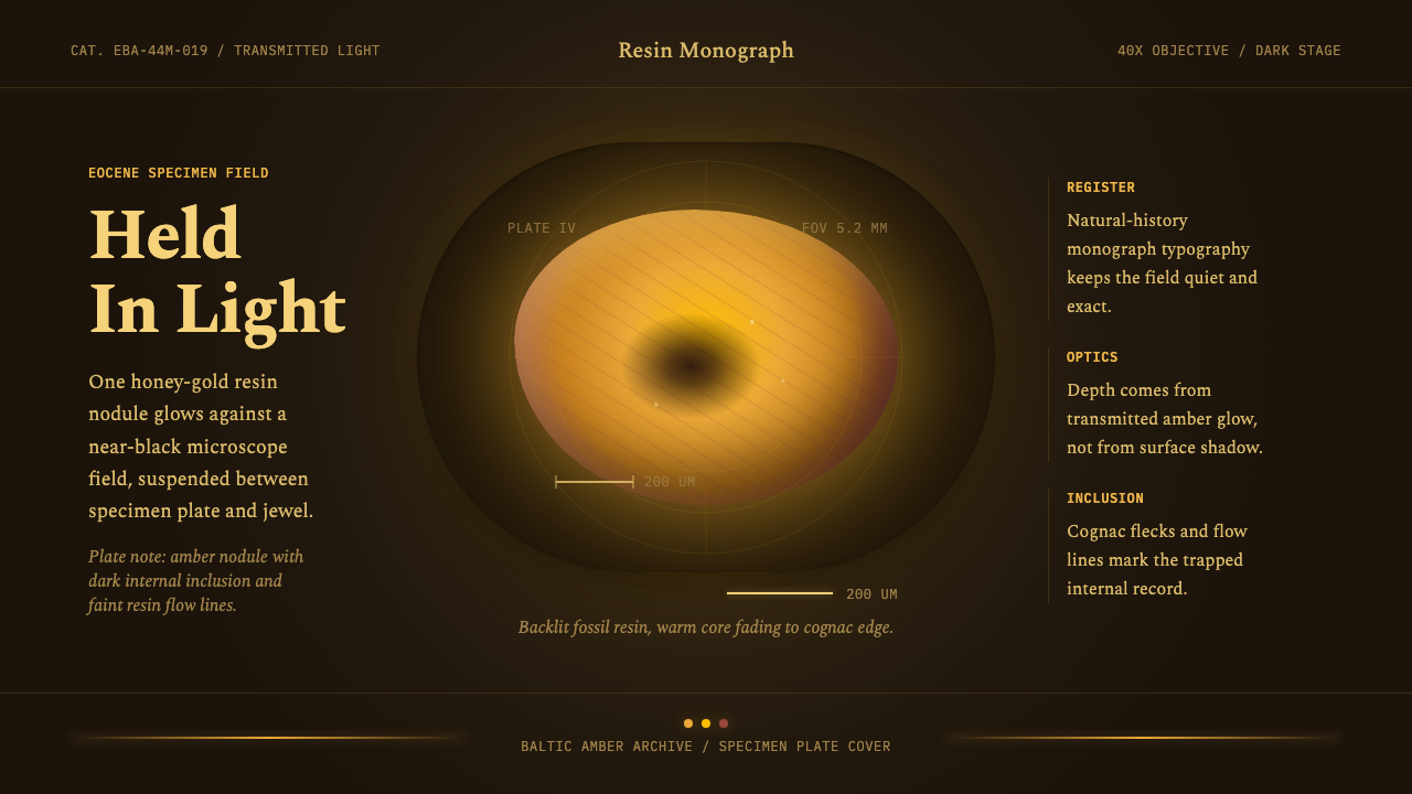 Amber Inclusion SpecimenAncient light, catalogued. Honey-gold resin glows in a black field with mono…
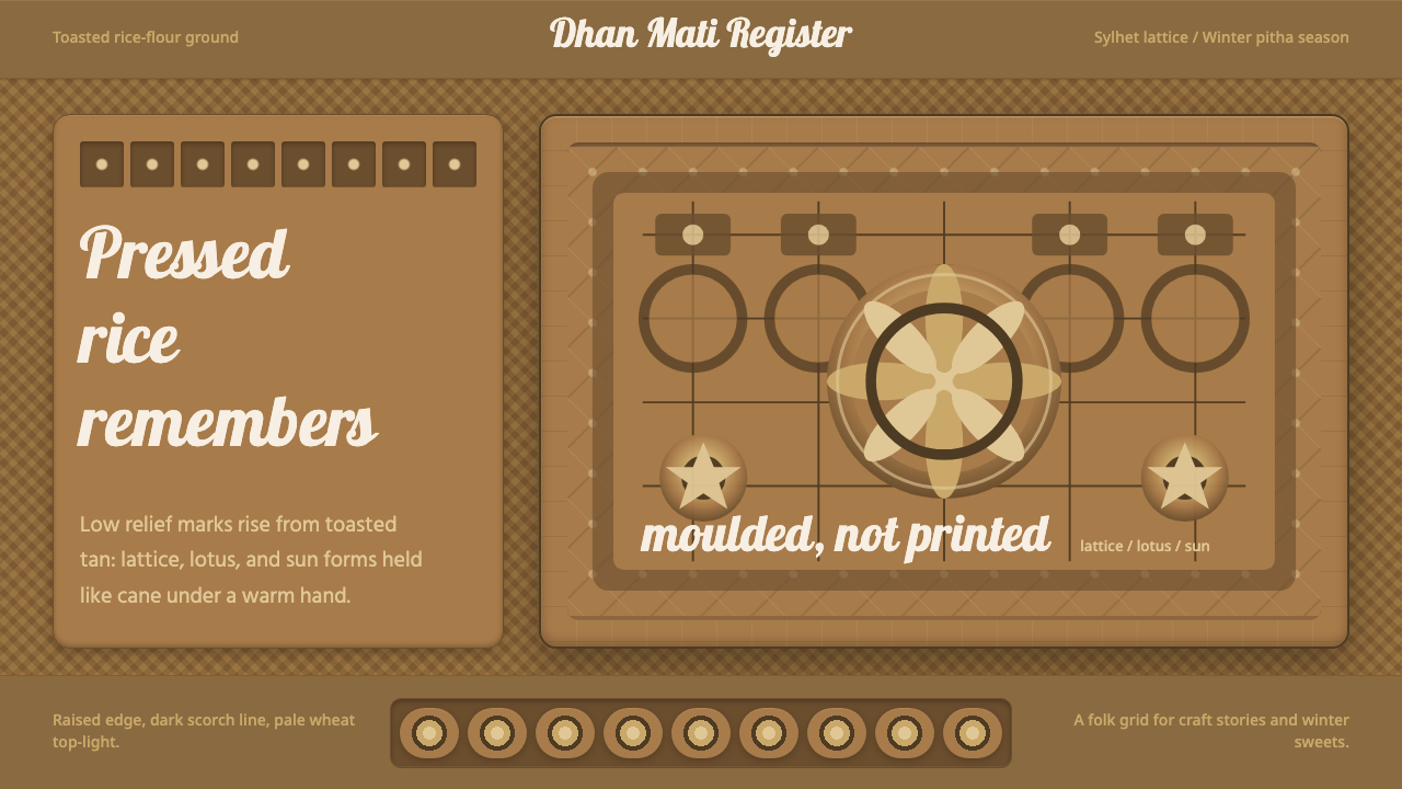 Bangladeshi Nakshi Pitha MotifsWarm relief, never print. Galada type and tan lattice press rice-flour craft…
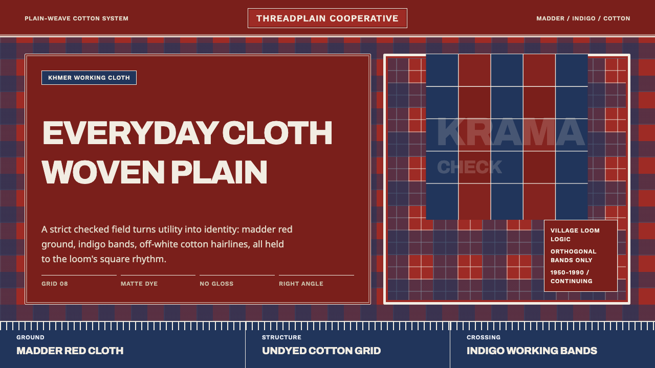 Cambodian Krama CheckPlain cloth has authority. Madder red, indigo bands, and cotton grid lines do…
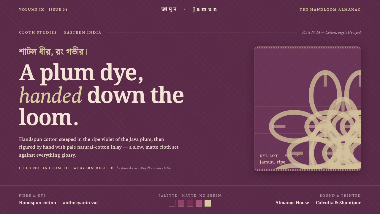 Indian Jamun Violet HandloomHandspun, never glossy. Jamun-violet dyed cotton figured with pale natural-th…