Design style guide设计风格指南
What is Irish Aran Island Cable Knit?什么是 Irish Aran Island Cable Knit?
Born from Atlantic wool and islanders' hands, Irish Aran cable knit transforms the act of weaving into a three-dimensional visual language of raised texture, quiet shadow, and material honesty.爱尔兰阿伦绞花编织诞生于大西洋的羊毛与岛民的双手,将编织这一行为转化为凸起纹理、沉静阴影与材料诚实的立体视觉语言。
Irish Aran Island Cable Knit in briefIrish Aran Island Cable Knit 速览
Irish Aran Island cable knit is a textile tradition from the three small islands — Inis Mór, Inis Meáin, and Inis Oírr — perched at the mouth of Galway Bay on Ireland's rugged Atlantic coast. It transforms undyed cream or off-white wool, called bánín, into sculpted fabric through interlocking stitch families: cable twists that mimic rope, honeycomb cells that echo beehive geometry, blackberry clusters that read as dense nodes, and trinity stitches that repeat in tight triangular rhythm. The result is a surface with genuine topography — not a pattern printed on cloth, but depth pressed outward through the labor of two needles.爱尔兰阿伦群岛绞花编织是一门来自三座小岛——因尼斯莫尔、因尼斯梅恩与因尼斯欧尔——的纺织传统,这三座岛屿矗立于爱尔兰崎岖大西洋海岸的戈尔韦湾口。它通过交错的针法族群,将未染色的奶白色羊毛(称为bánín)转化为立体织物:模拟绳索的绞花扭转、呼应蜂巢几何的蜂窝针、读来如密集结点的黑莓针,以及以紧凑三角节奏重复的三位一体针。成果是一种拥有真实地形的表面——不是印在布料上的图案,而是通过两根针的劳作向外挤出的深度。
As a design system, Aran cable knit operates on principles of structured repetition and tactile depth. Every visual element references the physical act of knitting: borders read like bound edges, column structures mirror the vertical run of a cable repeat, and surface variation is achieved not by changing color but by changing stitch — shifting from a raised cable to a recessed purl ground, from tight braid to open lattice. The palette is intentionally monochrome, drawn from the five natural colors that undyed Atlantic wool and the island landscape provide: bone white, warm oat, muted sage, soft peat brown, and slate grey. No dye, no ornament added from outside the material itself.作为一套设计系统,阿伦绞花编织以结构性重复和触觉深度为核心原则运作。每个视觉元素都指向编织的实体行为:边框如绑缚的边缘,柱状结构映照绞花重复的垂直走向,而表面变化不靠换色而靠换针——从凸起的绞花转向凹陷的反针底地,从紧密辫花转向开放网格。色板刻意保持单色,取自未染色大西洋羊毛与岛屿景观所提供的五种天然色:骨白、暖燕麦、静苔绿、柔泥炭棕与板岩灰。无染料,无来自材料本身以外的装饰。
This design language values restraint and textural richness equally. Where other traditions reach for color contrast or geometric boldness, Aran knit achieves visual complexity entirely through surface modulation — the way a stitch catches or releases light, the depth of a cable shadow, the rhythm of a repeat at scale. The effect is quiet, deeply craft-rooted, and carries an unmistakable sense of handmade labor that mass reproduction can approximate but never fully erase.这套设计语言将克制与纹理丰富置于同等重要的位置。其他传统靠色彩对比或几何大胆取胜的地方,阿伦编织完全通过表面调制实现视觉复杂性——针法捕捉或释放光线的方式、绞花阴影的深度、重复节奏在不同尺度上的呈现。效果安静、深植于工艺根源,并承载着一种手工劳动的鲜明感——这是大规模复制可以近似却永远无法完全抹去的东西。
See the Irish Aran Island Cable Knit design system →查看 Irish Aran Island Cable Knit 完整设计系统 →
Where does Irish Aran Island Cable Knit come from?Irish Aran Island Cable Knit 从何而来?
The Aran Islands are three limestone outcroppings swept by Atlantic gales, separated from the Connemara coast by a narrow but often treacherous strait. For the small fishing and farming communities who made their lives there, wool was not a luxury — it was structural material. Fishermen's ganseys (tight-knit work jerseys) were worn at sea not for their appearance but for their warmth, water resistance, and durability under physical strain. The intricate stitch patterns that became commercially recognized as distinctly 'Aran' emerged gradually from this functional base, with knitters on each island, and even each family, developing particular pattern combinations as signature vocabulary. The craft existed in the community long before it became internationally visible.阿伦群岛是三块被大西洋狂风横扫的石灰岩突出地,与科内马拉海岸之间隔着一道狭窄却往往危机四伏的海峡。对于在那里谋生的小型捕鱼与农耕社区而言,羊毛不是奢侈品——而是结构性材料。渔民的甘西(紧密编织的工作套头衫)穿戴在海上,不是为了外观,而是为了保暖、防水以及在体力劳动下的耐久性。那些后来被商业上认可为独特「阿伦风格」的繁复针法,是从这一功能基础上逐渐生长出来的——每座岛上的编织者,乃至每个家族,都发展出特定的图案组合作为标志性词汇。这门手艺在进入国际视野之前,早已在社区中生生不息。
The story of Aran as a recognizable global style is inseparable from two external forces that arrived in the twentieth century. The first was Robert Flaherty's 1934 documentary film Man of Aran, which brought the islands' austere life — and the distinctive knitwear worn on screen — to international audiences. The film's visual power, however romanticized, fixed the image of the cable-knit sweater as an emblem of rugged Atlantic identity. The second force was Heinz Kiewe, an Oxford-based textile historian who in his 1967 book The Sacred History of Knitting made the romantic and largely unsubstantiated claim that specific cable patterns carried codified family meanings — that a cable represented a fisherman's rope, a diamond pattern his fields, a honeycomb the bees of a good harvest. Though historians have since challenged this reading as largely invented folklore, the story proved commercially irresistible and became embedded in how Aran knitwear was marketed worldwide.阿伦作为可辨识全球风格的故事,与二十世纪到来的两股外部力量密不可分。第一股是罗伯特·弗拉哈迪1934年的纪录片《阿伦岛人》,它将群岛严酷的生活——以及银幕上穿着的独特针织品——带到了国际观众面前。影片的视觉张力,无论多么浪漫化,都将绞花毛衣的形象固定为崎岖大西洋身份的象征。第二股力量是海因茨·基维,一位牛津的纺织史学家,他在1967年出版的《编织的神圣历史》中提出了一个浪漫而大体未经证实的主张:特定的绞花图案携带着编码的家族含义——绞花代表渔民的绳索,菱形代表他的田地,蜂窝代表丰收的蜜蜂。尽管历史学家此后对这一解读提出质疑,认为它基本上是后来编造的民俗,但这个故事在商业上却无可抵抗,并深深嵌入了阿伦针织品在全球的营销叙事中。
The commercial emergence of Aran knitwear as an export product gathered force from the late nineteenth century onward, particularly through the Congested Districts Board, a British agency tasked with developing cottage industries in Ireland's most economically marginal western regions. Women on the islands were organized into cooperative knitting groups and paid for their output, which was then sold to buyers in Dublin and London. This economic structure ensured the tradition's survival through periods when emigration might otherwise have hollowed out the skilled knitting population entirely.阿伦针织品作为出口产品的商业崛起,从十九世纪末起逐步增强,尤其是通过「拥挤地区委员会」——一个负责在爱尔兰经济最边缘的西部地区发展家庭手工业的英国机构。岛上女性被组织成合作编织小组,按产出计酬,成品随后卖给都柏林与伦敦的买家。这一经济结构确保了这门传统在移民浪潮可能彻底掏空熟练编织人口的时期得以存续。
The revival of Aran craft in a contemporary design register is most closely associated with the Inis Meáin Knitting Company, founded on the middle island in 1976 by Tarlach de Blacam and his wife Áine. Rather than marketing Aran knitwear as heritage souvenir, de Blacam repositioned it as slow luxury — island-made, naturally dyed where color was used, and designed to be worn by people who valued craft quality and material origin over fashion novelty. The company's aesthetic approach influenced a broader international conversation about the meaning of artisan textiles and authentic place-based production, and remains the defining contemporary authority on what Aran as a design and craft tradition can be outside its historical context.阿伦工艺在当代设计语境中的复兴,与1976年由塔拉赫·德·布拉卡姆及其妻子埃内在中间那座岛上创立的因尼斯梅恩编织公司关联最为密切。德·布拉卡姆没有将阿伦针织品作为遗产纪念品营销,而是将其重新定位为慢奢侈——岛屿制造,使用天然染料,专为重视工艺品质与材料来源胜于时尚新奇的人而设计。这家公司的美学取向影响了关于手工纺织品意义与真实地方性生产的更广泛国际对话,并至今仍是阿伦作为历史语境之外的设计与工艺传统的权威当代定义者。
What defines the Irish Aran Island Cable Knit look?Irish Aran Island Cable Knit 的视觉特征是什么?
Cable and Rope Structures绞花与绳索结构
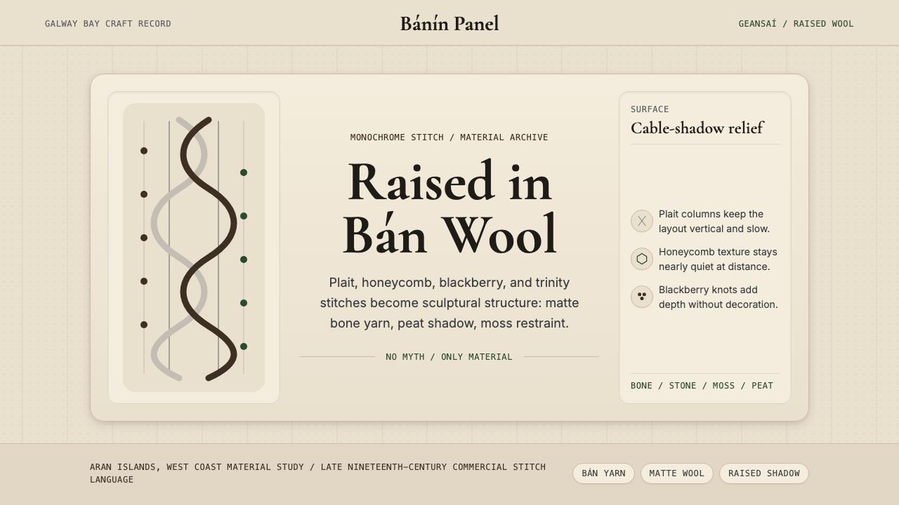
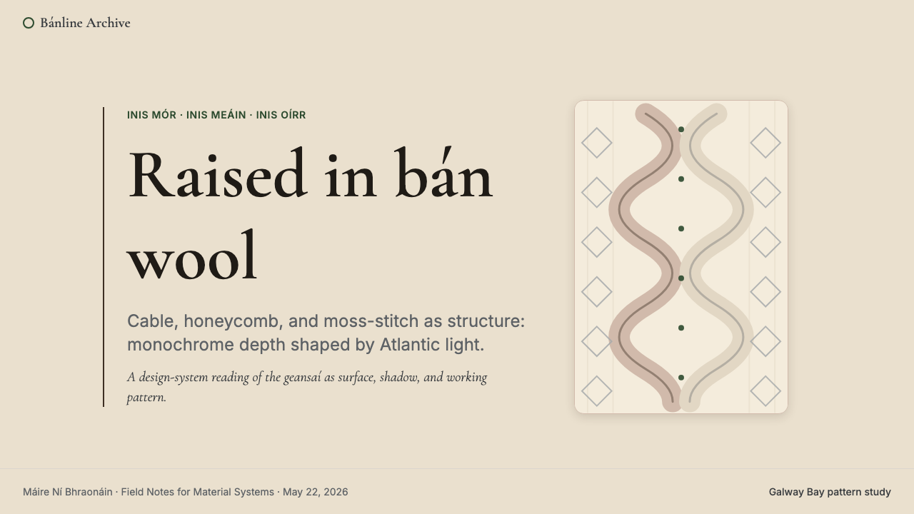
The defining characteristic of Aran design is the cable column: groups of stitches that are periodically crossed over each other to produce a twisted, rope-like braid standing above the fabric surface. Cable repeats establish strong vertical rhythms that structure the overall composition, analogous to columns in classical architecture but rendered in wool and shadow. The visual weight of a cable is determined by how many stitches are included in the crossing and how frequently the cross recurs — a tight four-stitch cable creates dense, urgent rhythm; a wide twelve-stitch cable reads as slow and monumental. Cables are never merely decorative; their structural logic mirrors the function of rope in the island's fishing economy.阿伦设计的标志性特征是绞花柱:一组针目被周期性地交叉叠压,产生一条凸出于织物表面的扭转绳状编花。绞花重复建立起强烈的垂直节奏,构建整体构图,类似于古典建筑中的柱子,但以羊毛与阴影呈现。一段绞花的视觉重量取决于交叉中包含的针目数量以及交叉频率——紧密的四针绞花制造密集而紧迫的节奏;宽阔的十二针绞花读来缓慢而宏伟。绞花从不仅仅是装饰;其结构逻辑映照着绳索在岛屿渔业经济中的功能。
Monochrome Natural Palette单色天然色板
Aran's palette is built from the natural colors of undyed wool rather than from dye choices. Bone white and warm oat are the most prevalent grounds, reflecting the cream of raw Atlantic fleece. Muted sage, soft peat brown, and cool slate grey appear as accent tones derived from the island's own landscape — cliff lichen, bog earth, and winter sea. Because all these tones share a matte, fiber-softened quality and stay within a narrow value range, the eye reads the surface as essentially tonal, not colorful. Visual richness comes entirely from texture modulation, not hue contrast. This constraint transforms the monochrome palette from limitation into principle.阿伦的色板建立于未染色羊毛的天然颜色,而非来自染料选择。骨白与暖燕麦是最常见的底地色,反映着原生大西洋羊毛的奶油色。静苔绿、柔泥炭棕与冷板岩灰作为强调色出现,源自岛屿自身的景观——崖壁地衣、沼泽泥土与冬日海面。由于所有这些色调都共享一种哑光、纤维柔化的质感,并保持在窄小的明度范围内,眼睛将表面读作本质上的色调性,而非丰富的色彩性。视觉丰富性完全来自纹理调制,而非色相对比。这一约束将单色色板从限制转化为原则。
Tactile Surface Depth触觉表面深度
What distinguishes Aran from flat-pattern textiles is genuine physical relief: the fabric has topography. Raised cable columns cast soft lateral shadows on the purl grounds between them; honeycomb cells create rhythmic depressions that catch and release light as the fabric moves. This play of highlight and shadow generates visual complexity without color, relying instead on the angle of light and the depth of stitch relief. In design applications, this tactile depth is translated through careful use of subtle shadow systems — soft consistent drop shadows, layered card surfaces, and textured backgrounds that approximate the fabric's tonal variation without literal imitation.将阿伦与平面纹样纺织品区分开来的,是真实的物理浮雕:织物拥有地形。凸起的绞花柱在它们之间的反针底地上投下柔和的侧向阴影;蜂窝针眼制造出有节奏的凹陷,随织物移动捕捉和释放光线。这种高光与阴影的游戏在无需色彩的情况下生成视觉复杂性,依赖的是光线角度与针迹浮雕的深度。在设计应用中,这种触觉深度通过精心使用微妙的阴影系统来转译——柔和一致的投影、分层卡片表面,以及近似织物色调变化而非字面模仿的纹理背景。
Structural Repetition and Pattern Rhythm结构性重复与图案节奏
Aran knitwear achieves its visual coherence through disciplined repetition of stitch families within a clearly defined vertical column structure. A traditional sweater might contain three or five vertical panels, each carrying a distinct stitch pattern — cables, lattice, blackberry — but the panels relate through shared ground texture and consistent height of stitch relief. The rhythm of a pattern repeat within a panel creates reading pace: a tight repeat feels dense and active, a wide repeat feels expansive and slow. Mixing rhythms within the same field is managed carefully through separating panels with narrow rope or seed stitch dividers, ensuring adjacent rhythms do not compete but rather modulate against each other.阿伦针织品通过在清晰定义的垂直柱状结构中对针法族群进行有节制的重复,实现其视觉连贯性。一件传统毛衣可能包含三至五条垂直面板,每条承载不同的针法图案——绞花、网格、黑莓针——但各面板通过共享的底地纹理与一致的针迹浮雕高度相互关联。面板内图案重复的节奏制造阅读步调:紧密的重复感觉密集而活跃,宽阔的重复感觉舒展而缓慢。同一区域内不同节奏的混合,通过细窄绳花或种子针分隔条加以管理,确保相邻节奏不相互竞争,而是相互调制。
Material Honesty材料诚实
Aran's aesthetic does not simulate anything it is not. The surface signals its own process: every raised stitch is there because two needles crossed behind or in front, not because of a print or an embossing tool. The undyed wool color is the color of the animal and the wash, not of a dye vat. The borders and edges are formed by cast-on and bind-off techniques, not by cutting and hemming. This total material transparency — which has been compared to the Modernist principle that a building's structure should be readable on its surface — gives the tradition its moral weight. It is a design language that refuses to pretend to be something easier or cheaper to make.阿伦的美学不模拟任何它本身不是的东西。表面传递着自身的制作过程:每一个凸起的针目都在那里,因为两根针在背后或前面交叉过,而不是因为印刷或压花工具。未染色的羊毛色是动物本身和清洗的颜色,而非染缸的颜色。边框与边缘由起针和收针技法形成,而非经由裁剪和卷边。这种完全的材料透明性——曾被比作现代主义「建筑结构应在表面可读」的原则——赋予了这门传统其道德分量。这是一种拒绝假装自己是更容易或更廉价制造之物的设计语言。
Geometric Stitch Vocabulary几何针法词汇
Beneath the organic texture, Aran's stitch vocabulary is fundamentally geometric. Honeycomb patterns are built from regular diamond or hexagonal cell structures; lattice patterns create diagonal grid overlays; the blackberry stitch organizes small bobbles into consistent square modules. Even the irregular-seeming cable braids follow precise mathematical rules about crossing intervals and stitch counts. This hidden geometry gives the surface its underlying order — the reason that complex Aran fabric reads as organized rather than chaotic despite its visual richness. When Aran principles are applied to interface or print design, this geometric discipline is the structural logic that prevents the approach from becoming mere decoration.在有机纹理之下,阿伦的针法词汇在根本上是几何性的。蜂窝图案由规则的菱形或六边形单元结构建成;网格图案创造斜向格栅叠加;黑莓针将小球针组织成一致的方形模块。即便是看似不规则的绞花编辫,也遵循关于交叉间隔与针目计数的精确数学规则。这种隐藏的几何性赋予表面底层秩序——正是这个原因,使得复杂的阿伦织物尽管视觉丰富却读来有序而非混乱。当阿伦原则应用于界面或印刷设计时,这种几何纪律是防止该方法沦为纯粹装饰的结构性逻辑。
Atlantic Regional Character大西洋地域性格
Aran carries an unmistakable sense of geographic origin. The palette is the color of limestone pavement, Atlantic fog, and coastal lichen. The stitch patterns reference the daily economy of island life — ropes and nets, fields and bees, the blessed trinity of weather, sea, and soil. This rootedness in place is not nostalgic or decorative but structural: the tradition developed in response to real environmental and economic conditions, and those conditions are legible in every design decision. Applying Aran in contemporary work without acknowledging its Atlantic, Irish, and working-class roots risks reducing a living craft tradition to surface texture — aesthetically coherent but culturally hollow.阿伦承载着一种无可误认的地理来源感。色板是石灰岩铺地、大西洋雾气与海岸地衣的颜色。针法图案指向岛屿生活的日常经济——绳索与渔网、田地与蜜蜂、天气、海洋与土壤的神圣三一。这种对地方的根植性不是怀旧的或装饰性的,而是结构性的:这门传统是在响应真实的环境与经济条件中发展起来的,而这些条件在每一个设计决定中都清晰可读。在当代创作中应用阿伦而不承认其大西洋、爱尔兰与工人阶级的根源,有将一门活着的工艺传统降格为表面纹理的风险——在美学上连贯,在文化上却是空洞的。
See the Irish Aran Island Cable Knit design system →查看 Irish Aran Island Cable Knit 完整设计系统 →
Who shaped Irish Aran Island Cable Knit?谁塑造了 Irish Aran Island Cable Knit?
Flaherty's 1934 documentary Man of Aran was the primary vehicle that brought Aran knitwear to international attention. Though the film has been criticized for staging and romanticizing island hardship, its visual documentation of the garments worn by islanders — particularly the cream-colored cable-knit sweaters — fixed the aesthetic in the international imagination. Flaherty's work was less about fashion than about survival and landscape, but the film's wide distribution created the first global market for Aran goods, transforming a local craft into an exportable cultural product.弗拉哈迪1934年的纪录片《阿伦岛人》是将阿伦针织品带入国际视野的主要媒介。尽管这部影片因搬演和浪漫化岛屿艰辛而受到批评,它对岛民所穿服装的视觉记录——尤其是奶油色绞花编织毛衣——将这种美学固定在了国际想象中。弗拉哈迪的工作与其说关于时尚,不如说关于生存与景观,但影片的广泛发行为阿伦商品创造了第一个全球市场,将一门地方手艺转变为可出口的文化产品。
De Blacam co-founded the Inis Meáin Knitting Company in 1976 on the middle island, repositioning Aran knitwear not as a cottage souvenir but as contemporary artisan luxury. His approach emphasized slow production, natural materials, and design integrity — insisting that garments be shaped and finished with as much care as a tailored piece. Under his direction, the company became a reference point for the international slow-fashion movement and proved that a regional craft tradition could be economically viable in the global marketplace without sacrificing its material and cultural specificity.德·布拉卡姆于1976年在中间岛上联合创立了因尼斯梅恩编织公司,将阿伦针织品重新定位为当代手工奢侈品,而非家庭式纪念品。他的方法强调缓慢生产、天然材料与设计完整性——坚持服装的造型与完工应与剪裁定制品同等用心。在他的主导下,这家公司成为国际慢时尚运动的参照点,并证明一门地区工艺传统可以在不牺牲其材料与文化特殊性的前提下,在全球市场中保持经济上的可行性。
Kiewe was the Oxford-based textile historian whose 1967 book The Sacred History of Knitting popularized the claim that Aran stitch patterns carry encoded family meanings — that specific cables and diamonds were heraldic identifiers passed down through generations. Historians have largely disputed this account as romantic invention, finding no evidence that such a system existed before commercial interest in the tradition arose. Yet Kiewe's narrative proved commercially powerful, providing the story that marketing needed. His influence demonstrates how a designed tradition's public meaning can be shaped more by written interpretation than by the practice of its makers.基维是牛津的纺织史学家,其1967年著作《编织的神圣历史》普及了阿伦针法携带编码家族含义的说法——特定绞花与菱形是代代相传的纹章标识。历史学家们大体上对这一说法提出质疑,认为它是浪漫化的发明,在商业利益介入传统之前找不到这套系统存在的证据。然而基维的叙事在商业上极为有力,为营销提供了它所需要的故事。他的影响力证明:一门设计传统的公共意义,可以更多地被书写的诠释而非制作者的实践所塑造。
Ó Síocháin was an Irish lawyer and writer whose popular guides to Aran knitwear helped codify the symbolism narrative for a mid-twentieth-century tourist audience. His writings translated Kiewe's scholarly romanticism into accessible consumer storytelling, particularly for the North American market during the Irish heritage tourism boom of the 1960s and 1970s. Though his accounts sit firmly in the popular rather than the scholarly tradition, they were instrumental in establishing the emotional and cultural framing through which millions of buyers first encountered Aran knitwear.奥谢汉是一位爱尔兰律师与作家,其关于阿伦针织品的通俗指南帮助为二十世纪中叶的旅游受众规范化了象征主义叙事。他的著作将基维的学术浪漫主义转化为面向消费者的易懂故事,尤其面向1960至70年代爱尔兰遗产旅游热潮中的北美市场。尽管他的记述牢牢坐落于通俗而非学术传统,但它们对于建立数百万买家初次接触阿伦针织品时的情感与文化框架至关重要。
How do you use Irish Aran Island Cable Knit today?今天怎么用 Irish Aran Island Cable Knit?
Aran cable knit is among the most texturally specific historical styles in design, which means its strengths and limitations are unusually well defined. The style excels when the goal is to communicate warmth, craft heritage, material authenticity, and slow-made quality. It struggles when the context demands clinical clarity, sharp geometric precision, or high-contrast visual impact. Understanding this alignment is more important than any technical decision about how to apply the texture.阿伦绞花编织是设计领域中纹理特征最鲜明的历史风格之一,这意味着它的长处与局限都异常清晰。当目标是传达温暖、工艺传承、材料真实性与慢制造品质时,这种风格表现出色。当语境要求临床般的清晰度、锐利的几何精确性或高对比度视觉冲击时,它则力不从心。理解这种价值对齐,比任何关于如何应用纹理的技术决策都更为重要。
For presentation slides, the Aran register works best on covers and section dividers where atmosphere matters more than information density. A cover built on the style uses the bone-white or warm oat ground as the slide field, sets the title in a sturdy serif or slab-serif typeface with genuine weight, and introduces textural depth through a subtle woven-surface background pattern. The cable column motif — a series of vertical raised braids — can anchor a left or right panel without competing with the text. Content slides should be restrained: one or two tones from the natural palette, generous white space, no decorative borders. Data slides benefit from the style's tonal approach — bars and areas rendered in the natural palette's range of oat to slate, with distinctions achieved through value rather than hue.对于演示文稿,阿伦风格最适合封面与章节分隔页——在那里氛围比信息密度更重要。以这种风格构建的封面以骨白或暖燕麦作为幻灯片底面,以具有真实重量感的衬线或板衬线字体排设标题,并通过细腻的编织纹路背景图案引入纹理深度。绞花柱的母题——一系列垂直凸起的编花——可以锚定左侧或右侧面板而不与文字竞争。内容页应保持克制:来自天然色板的一至两个色调、充裕的留白、无装饰边框。数据页受益于这种风格的色调方法——柱条与区域在燕麦至板岩灰的天然色板范围内呈现,以明度而非色相实现区分。
For web interfaces, the Aran system adapts well to artisan retail, wellness, heritage hospitality, and editorial platforms where the brand promise involves genuine craft, provenance, or slow production values. The approach: use the bone-white or warm oat as the primary background, introduce the muted sage or peat as secondary surface tones, and reserve the slate grey for text hierarchy. Card components should use subtle but consistent drop shadows — not borders — to create the sense of layered surface depth that references the fabric's physical relief. Navigation and typographic elements should have weight and presence; fine, airy type undermines the style's handcraft gravity.对于网页界面,阿伦系统适合手工零售、健康养生、遗产款待与编辑性平台——在那些品牌承诺涉及真实工艺、产地溯源或慢生产价值的地方。方法如下:以骨白或暖燕麦作为主背景,引入静苔绿或泥炭棕作为次级表面色调,保留板岩灰用于文字层级。卡片组件应使用微妙但一致的投影——而非边框——来创造参照织物物理浮雕的分层表面深度感。导航与排版元素应有分量与存在感;细腻、轻盈的字体会削弱这种风格的手工重力。
For editorial and marketing work, Aran references translate powerfully into mood-board-adjacent content: brand storytelling pages, origin narratives, craftsmanship spotlights, and seasonal lookbooks. The key is restraint in color and generosity in space — large breathing margins, unhurried paragraph rhythm, images that emphasize material texture over styled composition. Marketing headlines should carry weight in the typographic sense: a solid, well-spaced word set against a warm field communicates the brand's deliberateness. Abstract cable motifs — used as section markers or dividing elements — should remain geometric and structural, never decorative flourishes.对于编辑与营销内容,阿伦参照在与情绪板相邻的内容中转译得极为有力:品牌故事页、来源叙事、工艺聚焦与季节性视觉册。关键是色彩上的克制与空间上的慷慨——宽大的呼吸留白、不急促的段落节奏、强调材料质感而非风格化构图的图像。营销标题应在排版意义上具有重量:一个扎实、间距适宜的词汇置于温暖底面上,传达出品牌的审慎态度。抽象绞花母题——用作章节标记或分隔元素——应保持几何性与结构性,绝不成为装饰性花饰。
The most common mistake in applying Aran aesthetics is conflating texture with busyness. Authentic Aran fabric achieves its richness through the disciplined repetition of a few stitch families within a clear vertical structure — not by layering many different patterns in close proximity without organizing logic. The design equivalent is using too many textural elements simultaneously: rough background, patterned border, embossed type, and layered shadows all competing for attention. Aran's principle is depth through discipline, not through accumulation. If a layout feels cluttered with texture, remove layers until the structure beneath becomes legible again.应用阿伦美学时最常见的错误,是将纹理与繁忙混为一谈。真实的阿伦织物在清晰垂直结构中通过对少数针法族群的有节制重复来实现其丰富性——而不是在没有组织逻辑的情况下将许多不同图案层叠于近距离内。等效的设计错误是同时使用过多纹理元素:粗糙背景、图案边框、浮雕字体与分层阴影全都在争夺注意力。阿伦的原则是通过纪律而非积累来获得深度。如果一个版面感觉充斥着纹理,就移除层次,直到其下的结构再次变得清晰可读。
See the Irish Aran Island Cable Knit design system →查看 Irish Aran Island Cable Knit 完整设计系统 →
Irish Aran Island Cable Knit — FAQIrish Aran Island Cable Knit · 常见问题
Is every Aran pattern a family crest with encoded meaning?每种阿伦图案都是带有编码含义的家族纹章吗?
This is the most persistent myth about Aran knitwear, and the answer is: almost certainly not, at least not in the way the story is usually told. The claim that specific stitch patterns identified particular island families — and could be used to identify drowned fishermen washed ashore — was popularized by Heinz Kiewe in 1967 and by subsequent travel writers and knitwear marketers. Textile historians and folklorists have searched the documentary record and found no evidence of this system predating the commercial tourist era. The patterns were real, the skill was real, but the heraldic coding appears to be a romantic invention that proved commercially irresistible. This does not diminish the tradition's value; it simply locates that value where it actually lives — in the craft itself, not in a back-story.这是关于阿伦针织品最顽固的神话,答案是:几乎可以肯定不是——至少不是以通常讲述的方式。特定针法图案标识特定岛屿家族——可用于辨认冲上岸的溺亡渔民——这一说法由海因茨·基维于1967年及此后的旅游作家与针织品营销者推广开来。纺织史学家与民俗学者检索了文献记录,找不到这套系统早于商业旅游时代存在的证据。图案是真实的,技艺是真实的,但纹章式编码看起来是一个浪漫化的发明,在商业上极具吸引力。这并不贬低这门传统的价值;它只是将那种价值定位于其真正所在之处——手艺本身,而非一个背景故事。
Can the Aran palette work in digital interfaces, or is it too warm and muted?阿伦色板能在数字界面中发挥作用吗,还是说它太温暖、太低饱和了?
It can work, but it requires discipline and the right product context. The bone-white and warm-oat tones read well on screen because they are not pure white — the slight warmth reduces eye fatigue on long reading sessions, which makes them particularly effective for editorial, wellness, and heritage retail interfaces. The muted sage and peat tones provide sufficient contrast for secondary text and interactive states when used carefully. Where the palette struggles is in high-competition digital contexts — SaaS dashboards, financial tools, anything where contrast ratios must meet strict accessibility standards and the interface requires immediate hierarchy legibility. In those contexts, the muted tones need to be pushed toward higher contrast pairs or supplemented with a darker neutral. The palette is not too warm; it is too subtle for contexts that demand urgency.它可以发挥作用,但需要纪律和正确的产品语境。骨白与暖燕麦色调在屏幕上读来很好,因为它们不是纯白——那一点点温度在长时间阅读时减少眼睛疲劳,这使它们对编辑、健康养生与遗产零售界面特别有效。当谨慎使用时,静苔绿与泥炭棕色调能为次级文字和交互状态提供足够的对比度。色板表现欠佳的地方在于高竞争性数字语境——SaaS仪表板、金融工具,任何对比度比率必须满足严格无障碍标准且界面需要即时层级可读性的地方。在那些语境中,低饱和色调需要被推向更高对比度的配对,或补充以更深的中性色。这个色板不是太温暖;它对于要求紧迫感的语境来说太微妙了。
How do you reference Aran textile depth in a flat digital medium without making it look like a stock-photo sweater background?如何在扁平数字媒介中呈现阿伦织物的深度感,而不让它看起来像毛衣图库图片背景?
The key is abstraction over representation. A literal photograph of Aran knitwear used as a background imports the craft but also imports dated visual clichés — it reads as a 1990s heritage brand catalog page, not as a considered design decision. The better approach is to extract structural principles rather than surfaces: use subtle vertical rhythm (the shadow of a cable column) as a layout organizing device, apply tonal variation in backgrounds by shifting between the natural palette's close values rather than adding photographic texture, and use shadow depth on card components to suggest tactile relief without any fiber texture present. The goal is that a viewer familiar with the tradition recognizes the reference, while a viewer who is not simply experiences a warm, structured, quietly complex visual system.关键在于抽象而非具象。将阿伦针织品的真实照片用作背景,引入了这门工艺,但也引入了过时的视觉陈规——它读来像一本1990年代遗产品牌目录页,而非一个深思熟虑的设计决定。更好的方法是提取结构原则而非表面:将微妙的垂直节奏(绞花柱的阴影)作为版面组织装置,通过在天然色板的相近明度之间切换来在背景中应用色调变化,而非添加摄影质感,并在卡片组件上使用阴影深度来暗示触觉浮雕而无需任何纤维纹理的出现。目标是:熟悉这门传统的观看者能认出这一参照,而不熟悉的观看者则单纯地感受到一套温暖、有结构、安静复杂的视觉系统。
Is Aran appropriate for brands that have no connection to Irish or Atlantic heritage?阿伦风格适合与爱尔兰或大西洋传承毫无关联的品牌吗?
It can be used respectfully by brands with no geographic connection to the islands, provided the values alignment is genuine rather than superficial. Aran's core values — material honesty, craft depth, slow quality, restrained palette — are transferable to any context where those values are real and not merely claimed. A small-batch ceramics studio, a natural-fiber clothing brand, a heritage bookseller, or a farm-to-table restaurant can draw on the Aran visual register because their production ethos genuinely rhymes with it. What the style cannot support is being used as decorative heritage wallpaper by a brand whose actual values are speed, volume, and low cost — the dissonance between the reference and the reality becomes legible to attentive audiences. Use the tradition because its principles match your work, not because the aesthetic is attractive in isolation.只要价值对齐是真实而非表面的,与群岛没有地理联系的品牌也可以恭敬地使用它。阿伦的核心价值——材料诚实、工艺深度、慢质量、克制色板——可迁移到任何这些价值是真实的而非仅仅被声称的语境中。一家小批量陶瓷工作室、一个天然纤维服装品牌、一家遗产书商,或一家农场直送餐厅,可以借鉴阿伦的视觉语境,因为它们的生产伦理与之真正共鸣。这种风格无法支持的,是被一个实际价值是速度、规模与低成本的品牌用作装饰性遗产壁纸——参照与现实之间的不协调对细心的受众来说是清晰可辨的。使用这门传统,是因为它的原则与你的工作相符,而非仅仅因为美学在孤立状态下具有吸引力。
What separates Aran-influenced design from generic 'cozy' or 'rustic' aesthetics?受阿伦影响的设计与泛泛的「温馨」或「乡村」美学有何区别?
The distinction lies in structural discipline. Generic cozy or rustic aesthetics reach for warmth through soft, organic, irregular elements — rounded shapes, imperfect textures, hand-lettered type, warm amber tones. Aran-derived design achieves warmth through an entirely different route: through the vertical logic of the cable column, the mathematical regularity of the stitch repeat, and the tonal restraint of the natural undyed palette. The result is warm but ordered, tactile but disciplined. It does not look hand-lettered or irregular — it looks handmade but precise. This is the crucial difference: Aran is a craft tradition with geometric rigor at its core, not a loosely rural visual mood. Designs that drift into rustic informality have lost the structural spine that makes the reference meaningful.区别在于结构纪律。泛泛的温馨或乡村美学通过柔软、有机、不规则的元素来寻求温暖——圆润的形状、不完美的纹理、手写字体、温暖的琥珀色调。阿伦衍生的设计通过完全不同的路径实现温暖:通过绞花柱的垂直逻辑、针迹重复的数学规律性,以及天然未染色色板的色调克制。结果是温暖而有序的,有触感而有纪律的。它不像是手写的或不规则的——它看起来是手工制作的但又是精确的。这是关键区别:阿伦是一门以几何严谨性为核心的工艺传统,而非一种松散的乡村视觉情绪。飘向乡村随意性的设计已经失去了使参照有意义的结构脊梁。
Related design styles相关设计风格
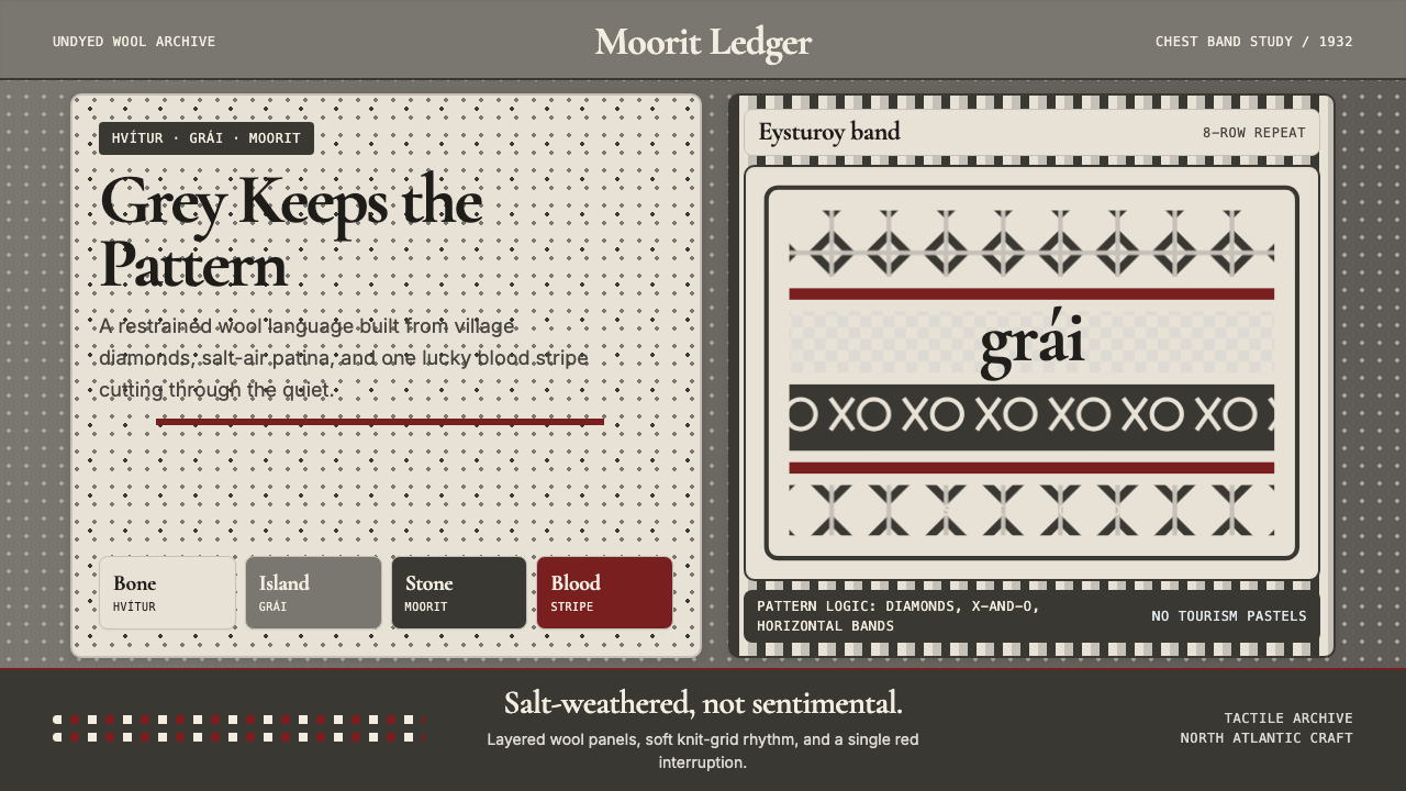 Faroese Knit Pattern Island GreyWeathered wool, not cozy kitsch. Island greys, Cormorant serif, one blood-red…风化羊毛,不是旅游暖意。岛屿灰、Cormorant衬线与一道血红横纹。
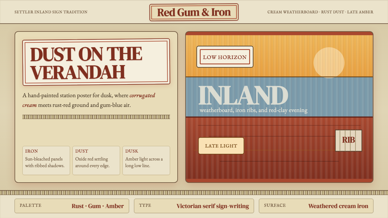 Australian Outback VernacularWeather is the voice. Rust dust, gum-blue bands, and serif sign-writing age t…风化就是声音:锈红尘土、桉蓝横带与衬线招牌让页面有年岁。
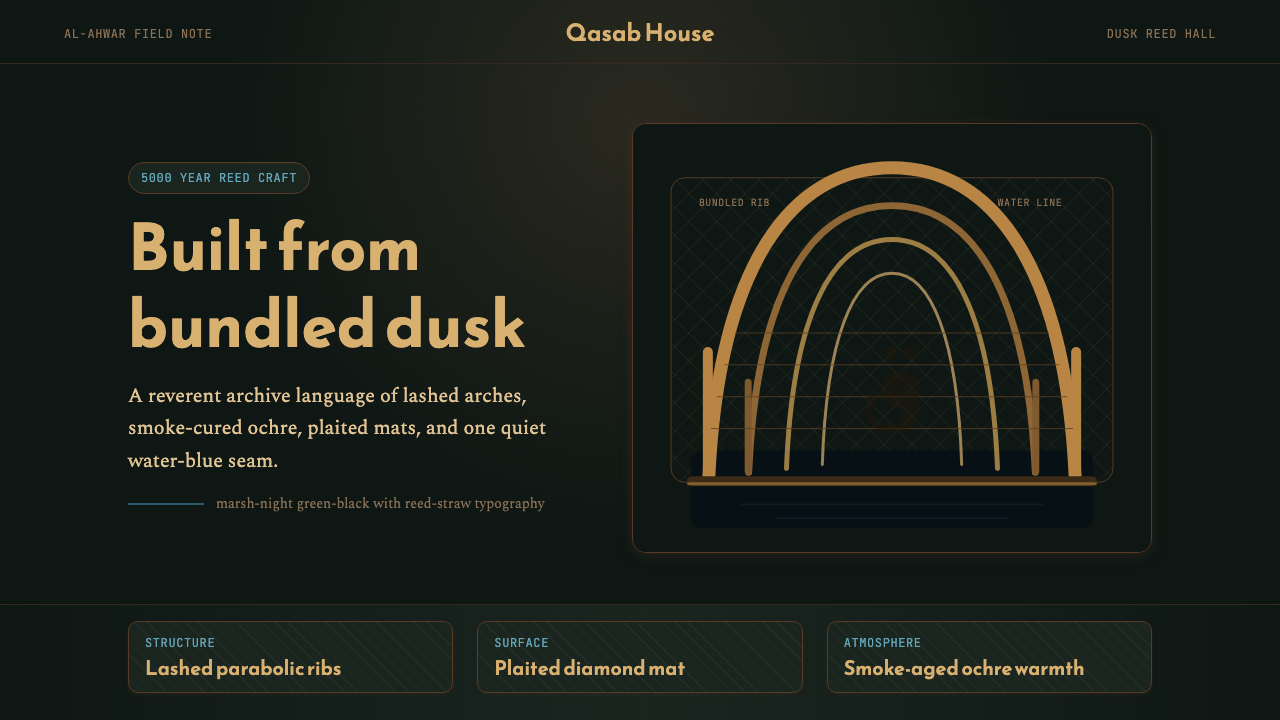 Iraqi Marsh Arab Mudhif ReedReverent reed darkness. Kufi arches, ochre lattice, and one water-blue line h…庄重的芦苇夜色。库菲拱线、赭黄格纹与一笔水蓝托住黄昏。
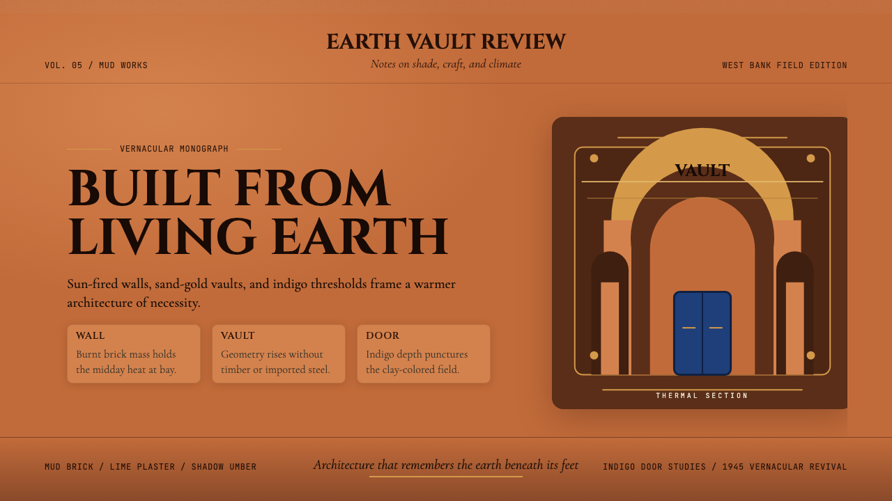 Egyptian Hassan Fathy Vernacular (1945)Earth remembers craft. Burnt brick, sand-gold vaults, and indigo doors carry…土地记住手艺。烧砖橙、沙金拱顶与靛蓝门带出温度。
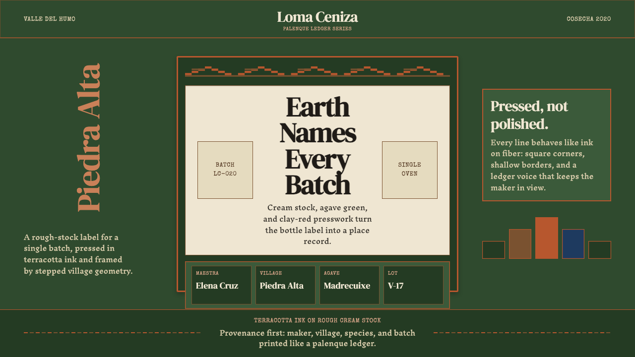 Mexican Mezcal CraftRooted and exact. Agave green, terracotta borders, and DM Serif labels tell t…质朴且精确。龙舌兰绿、赤陶边框与DM Serif标签记录批次。
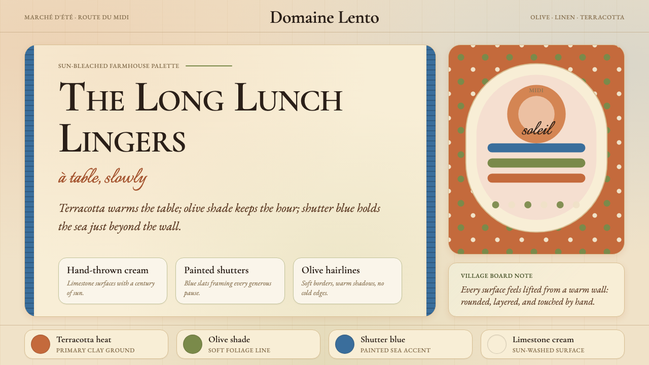 Provençal MediterraneanWarmth refuses the clock. Terracotta, olive lines, and shutter blue frame slo…温暖拒绝计时:陶土、橄榄线与百叶窗蓝框住奶油墙面。