Design style guide设计风格指南
What is Mexican Mezcal Craft?什么是 Mexican Mezcal Craft?
Mexican craft mezcal bottle design transformed the humble spirits label into a provenance document — part field record, part village portrait, part declaration of ancestral craft.墨西哥手工梅斯卡尔酒瓶设计将朴素的烈酒标签变成了一份产地档案——既是田野记录,也是村庄肖像,更是对祖传工艺的郑重宣告。
Mexican Mezcal Craft in briefMexican Mezcal Craft 速览
Mexican craft mezcal bottle design is a visual system born from a renaissance in artisanal spirits production centered in Oaxaca, Mexico. Beginning in earnest around 2010 and accelerating through the early 2020s, a generation of small-batch producers, maestros mezcaleros, and independent bottlers developed a label language that prioritized specificity over marketing gloss. Each bottle became a document: the agave species, the maestro's name, the village of distillation, the batch number, and the harvest year all appear as primary information rather than fine-print afterthoughts.墨西哥手工梅斯卡尔酒瓶设计是一套诞生于工匠烈酒生产复兴浪潮中的视觉体系,其核心在墨西哥瓦哈卡州。从2010年前后开始,经过2020年代初期的快速发展,一代小批量生产商、梅斯卡尔大师(maestro mezcalero)和独立装瓶商共同发展出一套标签语言——这套语言将产品特异性置于营销光泽之上。每一瓶酒都成为一份文献:龙舌兰品种、酿酒师姓名、蒸馏村庄、批次编号与采收年份,均以主要信息呈现,而非缩印于角落。
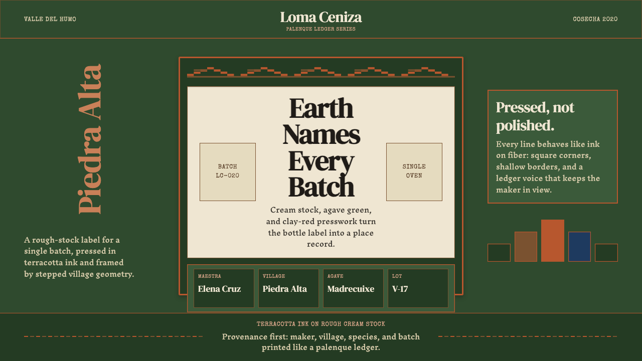
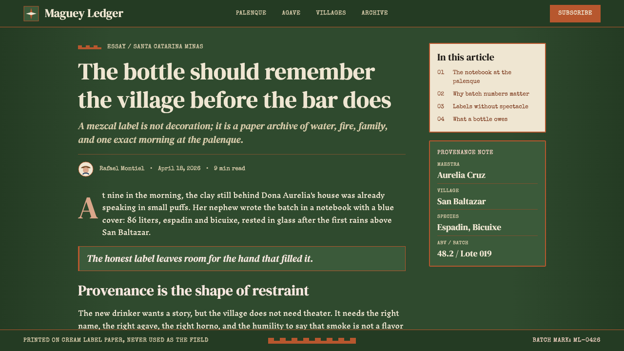
The aesthetic vocabulary draws from several layered sources. Letterpress printing on rough, unbleached cream stock gives labels their characteristic tactile depth. Terracotta tones — the warm, fired-clay ochres and reds of Oaxacan ceramics — appear as border treatments and background fields. Deep, muted greens derived from the agave plant itself establish the palette's most distinctive note. Geometric patterns derived from Zapotec stepped-fret motifs, known as greca, weave through many labels as framing devices, connecting the commercial object to pre-Columbian visual tradition.这套美学词汇来自多个叠合的源头。粗糙未漂白奶油色纸张上的活字印刷赋予标签特有的触感深度;赤陶色调——瓦哈卡陶器那种温暖的烧土赭色与红色——出现在边框处理与背景色块中;从龙舌兰植物本身提炼出的深沉、低饱和绿色,构成色板中最具辨识度的一笔。源自萨波特克阶梯纹(greca)的几何图案穿织于众多标签,作为框架元素将商业物品与前哥伦布时代的视觉传统相连接。
The result is a style that reads as simultaneously archaic and precisely contemporary. It rejects the slick gradient-and-photo language of mass spirits marketing in favor of hand-drawn letterforms, stamp-like insignia, and a deliberate roughness that signals authenticity without performing rustic nostalgia. The mezcal label at its best is a piece of functional typography that earns its weight through specificity.这种风格的结果是同时呈现出古老与精准当代的双重气质。它拒绝大批量烈酒营销的光滑渐变与摄影图像,转而选用手绘字形、印章式徽标,以及一种刻意的粗粝感——这种粗粝传达真实性,却并不表演乡土怀旧。在最好的状态下,梅斯卡尔标签是一件功能性排版作品,以其特异性赢得自身的分量。
See the Mexican Mezcal Craft design system →查看 Mexican Mezcal Craft 完整设计系统 →
Where does Mexican Mezcal Craft come from?Mexican Mezcal Craft 从何而来?
Mezcal — distilled from the cooked hearts, or piñas, of various agave species — has been produced in Oaxaca for centuries, with roots reaching into pre-Columbian fermented agave beverages and the colonial-era introduction of distillation technology. For most of the twentieth century, mezcal occupied a marginal commercial position relative to tequila, produced by village palenqueros — small operators working with clay or copper pot stills — and sold locally with minimal labeling. The visual identity of mezcal, where it existed at all, borrowed from the generic spirits vocabulary: sombreros, cactus silhouettes, and hand-lettered product names.梅斯卡尔——由多种龙舌兰植物的烤熟心茎(piña)蒸馏而成——在瓦哈卡已有数百年酿造历史,其根源可追溯至前哥伦布时代的发酵龙舌兰饮料,以及殖民时期引入的蒸馏技术。二十世纪的大部分时间里,梅斯卡尔在商业上始终处于龙舌兰酒的阴影之下,由村庄里的帕伦克酿酒师——使用陶土或铜锅蒸馏的小作坊经营者——生产,以极简标签在本地销售。梅斯卡尔的视觉形象(如果有的话)借用了通用烈酒词汇:宽檐帽、仙人掌剪影,以及手写产品名称。
The turning point came with a combination of regulatory reform and cultural re-evaluation. In 1994, Mexico established the Denominación de Origen Mezcal, creating a protected designation that confined legal mezcal production to defined regions and began distinguishing it formally from tequila. More consequentially for the visual language, the 2016 revision of the NOM-070-SCFI standard introduced a formal classification system — Mezcal, Artesanal, and Ancestral — that required producers to specify agave species, production method, and geographic origin. This regulatory specificity demanded a label language capable of carrying that information legibly and credibly.转折点来自监管改革与文化重估的合流。1994年,墨西哥确立了梅斯卡尔原产地命名(Denominación de Origen Mezcal),创建了一个受保护的产地指定,将合法梅斯卡尔的生产限定在特定区域,并开始正式将其与龙舌兰酒区分。对视觉语言而言,影响更为深远的是2016年修订的NOM-070-SCFI标准,它引入了正式分级体系——梅斯卡尔、工匠级(Artesanal)与祖传级(Ancestral)——要求生产商注明龙舌兰品种、生产方法与地理来源。这种监管特异性要求标签语言能够清晰、可信地承载上述信息。
The craft revival accelerated around producers and advocates who understood that the label was itself a marketing and cultural argument. Figures like Aquilino García López, working with traditional tobalá and espadín agaves in the villages of the Central Valleys, and Romeo Sánchez Reyes, whose work helped champion single-village, single-species bottlings, brought a documentary ethos to production that the best designers then translated into graphic form. Asis Cortés and Joel Santiago represent a generation of maestros whose names now appear on labels as guarantors of method and provenance, in the same way a single-estate wine might credit its winemaker.工艺复兴在懂得将标签本身视为营销与文化论据的生产商和倡导者推动下加速。阿基利诺·加西亚·洛佩斯(Aquilino García López)在中央谷地的村庄以传统托巴拉和埃斯帕丁龙舌兰工作;罗密欧·桑切斯·雷耶斯(Romeo Sánchez Reyes)的工作有助于推广单一村庄、单一品种的装瓶。他们将纪录片式的精神带入生产,最优秀的设计师随后将这种精神转化为图形形式。阿西斯·科尔特斯(Asis Cortés)与乔尔·桑地亚哥(Joel Santiago)代表着一代梅斯卡尔大师,他们的名字如今以方法与产地担保人的身份出现在标签上,一如单一庄园葡萄酒标注酿酒师。
The influence of Oaxacan material culture — particularly the black clay ceramics of San Bartolo Coyotepec, the woven textiles of Teotitlán del Valle, and the carved wooden alebrijes of Arrazola — permeated the graphic vocabulary of the revival. Designers working on mezcal packaging during the 2010s drew explicitly from regional craft traditions, creating a visual ecosystem where terracotta border treatments, hand-carved woodblock-style illustration, and Zapotec stepped-fret geometry became the shared grammar of authenticity. This was not appropriation but integration: Oaxacan designers and producers were themselves the authors of the revival aesthetic.瓦哈卡物质文化的影响——尤其是圣巴托洛·科约特佩克的黑陶、特奥蒂特兰德尔瓦列的编织纺织品,以及阿拉索拉的木雕奇幻兽(alebrijes)——渗透进复兴运动的图形词汇。2010年代从事梅斯卡尔包装设计的设计师明确取法地区工艺传统,创造出一个视觉生态系统:赤陶边框处理、木刻风格手绘插图,以及萨波特克阶梯纹几何图案,成为真实性的共同语法。这不是挪用,而是整合——瓦哈卡本地的设计师和生产商本身就是复兴美学的作者。
What defines the Mexican Mezcal Craft look?Mexican Mezcal Craft 的视觉特征是什么?
Color Palette色彩体系
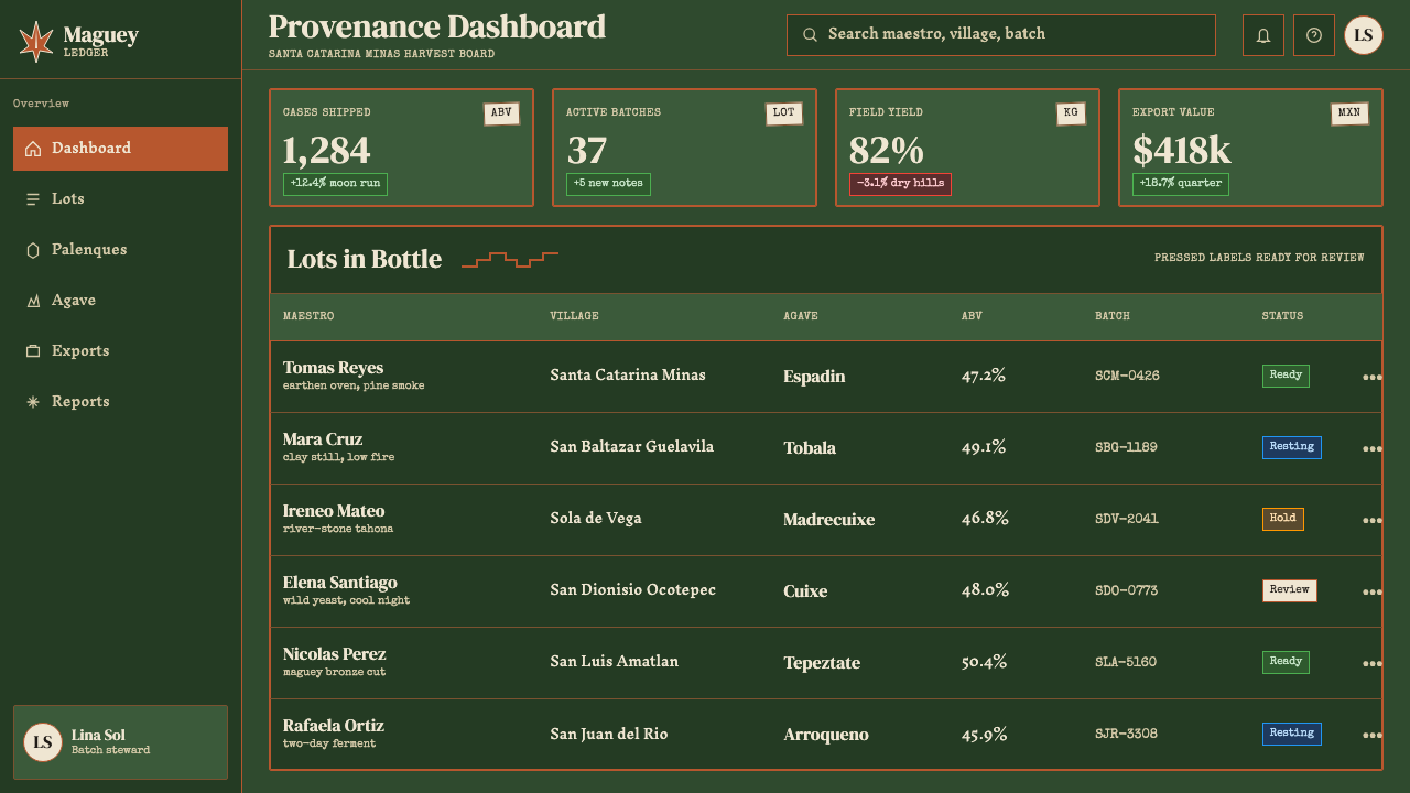
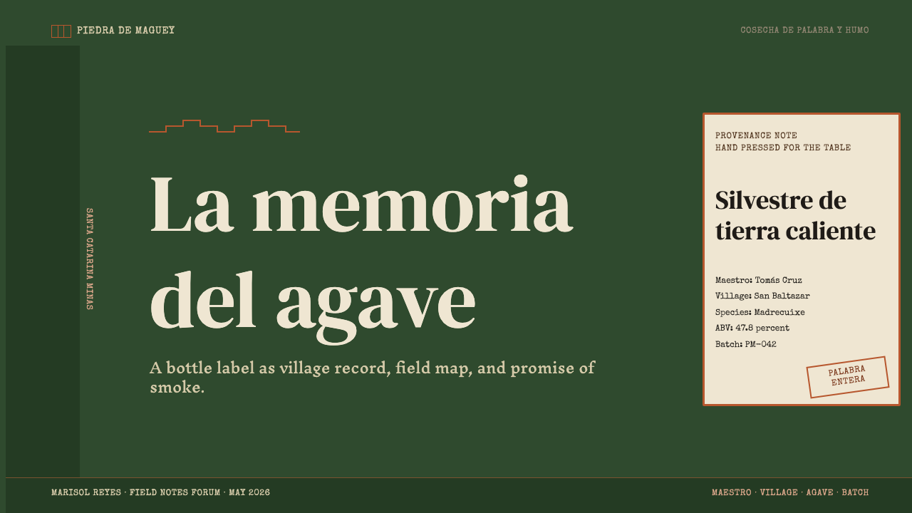
The palette is earthy and restrained. Agave-field greens — deep, slightly grey-shifted, the tone of a mature espadín plant at dusk — anchor many labels as primary grounds or dominant border colors. Terracotta ochres and warm fired-clay reds provide secondary structure, evoking Oaxacan ceramics and sun-baked adobe. Cream and unbleached natural paper tones serve as the baseline field on which everything sits. Black is used sparingly and functionally, primarily for type and key graphic elements. High-saturation accent colors, metallic foils, and cool blues are conspicuously absent — the palette communicates soil, fire, and plant rather than luxury or novelty.色板朴实而节制。龙舌兰田的绿色——深沉、略带灰调、如黄昏时分成熟埃斯帕丁植株的色调——作为主色底面或主导边框色锚定众多标签。赤陶赭色与温暖的烧土红色提供次级结构,唤起瓦哈卡陶器与日晒土坯的联想。奶油色与未漂白天然纸张色调构成一切元素所处的基础底面。黑色被节制而功能性地使用,主要用于文字与核心图形元素。高饱和强调色、金属箔烫印以及冷调蓝色明显缺席——这套色板传达的是土壤、火焰与植物,而非奢华或新奇。
Typography and Lettering字体与手写字
Labels typically combine two or three typographic registers. A primary display letterform — often drawn from classical serif faces with strong ink-trap characteristics that read well when letterpress-printed on rough stock — carries the brand name or agave species. Secondary information (batch number, village, maestro name) appears in smaller, tighter-set type that reads as a data field. Hand-lettered or brush-script elements appear in some labels as personal signatures from the maestro, reinforcing the artisanal provenance claim. Type is set in tight, high-contrast hierarchies: the agave species name might be given prominence rivaling the brand name itself, a hierarchy that would be unusual in any other spirits category.标签通常融合两到三种排版层次。主显示字体——往往取自具有强烈油墨陷阱特征的古典衬线字体,在粗糙纸张上活字印刷时依然清晰易读——承载品牌名称或龙舌兰品种名。次级信息(批次编号、村庄、大师姓名)以更小、更紧凑的字体排设,读来如同数据字段。手写或毛笔书法元素在部分标签中出现,作为酿酒大师的个人签名,强化工匠产地的主张。排版以紧凑、高对比度的层级呈现:龙舌兰品种名称有时获得与品牌名并驾齐驱的突出地位——这种层级在任何其他烈酒品类中都十分罕见。
Geometric Ornament几何装饰
Zapotec stepped-fret patterns — known in Spanish as greca — appear on borders, dividers, and background textures throughout craft mezcal packaging. Unlike purely decorative border treatments in other spirits categories, these patterns carry genuine cultural weight: the stepped-fret motif is one of the most widely distributed symbols in Mesoamerican visual culture, appearing in the archaeological record from Mitla and Monte Albán. Their presence on a label signals geographic and cultural specificity rather than generic exoticism. The patterns are typically rendered in a single tonal register against the ground — they frame rather than dominate, offering texture without visual noise.萨波特克阶梯纹——西班牙语称为greca——出现在手工梅斯卡尔包装的边框、分隔线与背景纹理中。与其他烈酒品类中纯装饰性边框处理不同,这些图案承载着真实的文化重量:阶梯纹母题是中美洲视觉文化中分布最广的符号之一,在米特拉和蒙特阿尔班的考古遗存中均可见到。它们出现在标签上,传达的是地理与文化的特异性,而非泛泛的异域风情。这些图案通常以单一色调层次在底面上呈现——起框架作用而非主导视觉——提供质感而无视觉噪音。
Texture and Print Materiality质感与印刷物质性
The physical substrate matters as much as the graphic content. Labels are printed on uncoated, often slightly rough paper stocks that retain ink in ways smooth coated papers do not — ink bleeds slightly at letterpress impression, leaving a halo of pigment at the edges of strokes that signals hand-production. Some labels incorporate embossing, debossing, or tactile varnish to emphasize dimensional elements without adding color. The overall tactile register communicates that something has been made with hands, not extruded from a digital production pipeline. This is not accidental: the materiality of the label is a direct argument for the materiality of the liquid inside.物理基材与图形内容同样重要。标签印刷在未涂布、往往略带粗糙感的纸张上,这种纸张保留油墨的方式与光滑涂布纸截然不同——活字印刷时油墨在笔画边缘略微洇染,留下一圈颜料光晕,显示手工生产的痕迹。部分标签加入压凸、压凹或触感上光,以不增加色彩的方式强调立体元素。整体触感传达出某种用手制作而成、而非从数字生产流水线挤出的信息。这并非偶然:标签的物质性,是对瓶中液体物质性的直接论据。
Provenance as Layout Logic产地信息作为版式逻辑
What distinguishes craft mezcal labels from other artisan spirits packaging is the systematic elevation of provenance data to first-tier visual prominence. The agave species (espadín, tobalá, tepextate, arroqueño, cirial, and dozens more) often appears at near-headline scale. The village of production — Santiago Matatlán, Santa Catarina Minas, San Luis del Río — is given geographic and cultural dignity rather than tucked into regulatory fine print. Batch numbers, distillation dates, and maestro names are treated as signatures rather than codes. The layout performs the argument that origin is the product, not merely an attribute of it.手工梅斯卡尔标签区别于其他工匠烈酒包装的关键,在于将产地数据系统性地提升为第一层级视觉要素。龙舌兰品种(埃斯帕丁、托巴拉、特佩克斯塔特、阿罗克尼奥、西里亚尔及数十种其他品种)往往以接近标题的尺度出现。生产村庄——圣地亚哥·马塔特兰、圣卡塔利娜·米纳斯、圣路易斯德尔里奥——被赋予地理与文化上的尊严,而非塞入监管细则的小字。批次编号、蒸馏日期与大师姓名被当作签名而非代码处理。版式本身就在论证:产地即是产品,而非产品的一个属性。
Illustration Register插图风格
When illustration appears on craft mezcal labels, it favors two registers: botanical and architectural. Botanical illustration — the agave plant rendered in the naturalist tradition, with careful attention to the rosette form, leaf spine detail, and piña cross-section — appears frequently, echoing the scientific documentation of Oaxacan flora. Architectural or topographic elements — palenque structures, mountain profiles, village maps — appear on more narrative labels, situating the liquid in its physical landscape. Both registers are rendered in a slightly worn, woodblock-adjacent idiom that reinforces the letterpress-and-rough-stock aesthetic rather than competing with it through photo-realistic rendering.当插图出现在手工梅斯卡尔标签上时,它倾向于两种风格:植物学与建筑学。植物学插图——以博物学传统描绘龙舌兰植株,仔细刻画莲座形态、叶片脊刺细节与心茎横截面——频繁出现,呼应瓦哈卡植物志的科学记录传统。建筑或地形元素——帕伦克蒸馏坊结构、山脉轮廓、村庄地图——出现在叙事性更强的标签上,将液体置于其物理地景之中。两种风格均以略显磨损的木刻近似语法呈现,以强化活字印刷与粗糙纸张的整体美学,而非以写实渲染与之竞争。
Restraint and Negative Space克制与留白
Despite the richness of available cultural material, the most resolved craft mezcal labels practice deliberate restraint. Not every label uses every element — the great ones typically commit to one or two visual strategies and execute them with precision. Generous negative space on cream or natural-paper grounds allows typographic and illustrative elements to breathe. The restraint is what separates the documentary aesthetic from craft-tourism pastiche: a label trying to signal everything at once reads as anxious; a label that trusts a single strong element reads as confident and real.尽管可借鉴的文化素材极为丰富,最完整的手工梅斯卡尔标签依然践行刻意的克制。并非每张标签都使用所有元素——最出色的作品通常只承诺一两种视觉策略,并以精准执行之。奶油色或天然纸张底面上慷慨的留白,让字体与插图元素得以呼吸。正是这种克制,将纪录片式美学与工艺旅游仿制品区分开来:试图一次传达所有信息的标签显得焦虑;信任单一强烈元素的标签读来自信而真实。
See the Mexican Mezcal Craft design system →查看 Mexican Mezcal Craft 完整设计系统 →
Who shaped Mexican Mezcal Craft?谁塑造了 Mexican Mezcal Craft?
Aquilino García López is among the most respected ancestral mezcal maestros working in the Central Valleys of Oaxaca, producing small-batch mezcal from wild and semi-cultivated tobalá and other non-espadín agave species using purely ancestral methods — clay pot distillation, in-ground roasting, and mule-powered stone tahona milling. His work became central to international advocacy for the ancestral classification, and his name on a label came to function as a certification of method as much as a signature. The detailed production documentation that serious importers required of producers like García López directly shaped the information-forward label language of the craft revival.阿基利诺·加西亚·洛佩斯是在瓦哈卡中央谷地工作的最受尊重的祖传级梅斯卡尔大师之一,使用纯粹的祖传方法——陶土蒸馏、地坑烘烤、骡子驱动石磨塔霍纳——以野生和半培育托巴拉及其他非埃斯帕丁品种生产小批量梅斯卡尔。他的工作成为推动祖传分级国际认可的核心力量,他的名字出现在标签上,既是签名,也是工艺认证。严肃进口商对加西亚·洛佩斯等生产商提出的详细生产记录要求,直接塑造了工艺复兴运动中以信息为前提的标签语言。
Joel Santiago is a maestro mezcalero whose work with wild agave species in remote Oaxacan communities has been particularly influential in demonstrating the ecological and cultural stakes of the craft mezcal category. His production, which emphasizes the slow maturation cycles of wild plants (tobalá matures over twelve to fifteen years before harvest), made the single-agave-species label a statement not merely of flavor profile but of land stewardship and temporal patience. This added a conservationist dimension to the visual language: labels bearing wild-agave designations carry an implicit argument about sustainability that their aesthetic register reinforces.乔尔·桑地亚哥是一位梅斯卡尔大师,他在瓦哈卡偏远社区以野生龙舌兰品种工作,在揭示手工梅斯卡尔品类所涉及的生态与文化风险方面尤具影响力。他的生产强调野生植物漫长的成熟周期(托巴拉在采收前需要十二至十五年的生长),使得单一龙舌兰品种标签不仅是对风味轮廓的陈述,更是对土地管理与时间耐心的宣言。这为视觉语言增添了一个保育维度:标注野生龙舌兰品种的标签隐含着一个关于可持续性的论据,其美学风格也强化了这一论据。
Asis Cortés represents the intersection of deep traditional knowledge and contemporary export awareness. Working with multiple agave varieties and production methods, Cortés became known for a documentary approach to production that saw every batch as a distinct event to be recorded — a philosophy that map onto the design language of craft mezcal with particular precision. His collaboration with importers and distributors who understood international spirits markets helped establish the vocabulary of what authentic, premium Oaxacan mezcal labeling should communicate, shaping expectations for typography, information hierarchy, and material presentation across the category.阿西斯·科尔特斯代表着深厚传统知识与当代出口意识的交汇。科尔特斯以多种龙舌兰品种和生产方法工作,以纪录片式的生产方法著称——他将每一批次视为需要记录的独特事件。这种哲学与手工梅斯卡尔设计语言的契合尤为精准。他与了解国际烈酒市场的进口商和经销商的合作,帮助确立了真实、优质瓦哈卡梅斯卡尔标签应当传达什么的词汇,塑造了整个品类对于字体、信息层级与材料呈现的期待。
Romeo Sánchez Reyes was instrumental in the advocacy and international recognition of single-village, single-agave-species bottlings as a distinct category of quality and provenance. His work helped establish the principle that the village of production is not administrative information but a genuine determinant of character — a position that fundamentally shaped how designers and producers thought about what a mezcal label was obligated to communicate. The village-as-primary-identity framework that now characterizes the best craft mezcal labels owes much to his advocacy in both production and export channels.罗密欧·桑切斯·雷耶斯在倡导和推动单一村庄、单一龙舌兰品种装瓶作为独特品质与产地品类获得国际认可方面发挥了关键作用。他的工作有助于确立这样一个原则:生产村庄不是行政信息,而是产品特性的真实决定因素——这一立场从根本上塑造了设计师和生产商对于梅斯卡尔标签应当传达什么的思考。如今体现在最优秀手工梅斯卡尔标签上的「村庄作为首要身份」框架,在很大程度上得益于他在生产与出口渠道中的倡导。
How do you use Mexican Mezcal Craft today?今天怎么用 Mexican Mezcal Craft?
Mexican craft mezcal bottle design is among the most transferable artisan-spirits aesthetics to adjacent creative contexts because its underlying logic is documentary rather than decorative. Applying it effectively means understanding what the style is actually arguing: that specificity is the product, that materials tell the truth about process, and that restraint in the graphic register signals confidence in the underlying substance. Any project that benefits from those arguments — a small-batch food brand, an independent publishing imprint, a cultural institution, a professional services firm emphasizing depth over breadth — can draw on this vocabulary productively.墨西哥手工梅斯卡尔酒瓶设计是可移植性最强的工匠烈酒美学之一,可广泛应用于相邻的创意领域,原因在于其底层逻辑是纪录片式的,而非装饰性的。有效应用它意味着理解这套风格实际上在论证什么:特异性即是产品,材料讲述工艺的真相,图形层面的克制传达对底层实质的自信。任何能从这些论据中受益的项目——小批量食品品牌、独立出版社、文化机构、强调深度胜于广度的专业服务公司——都能从这套词汇中汲取有益养分。
For presentation slides, the style works especially well on covers and section-opening pages where a strong identity statement is needed. A cover treated with agave-green as the dominant ground, terracotta as a border treatment, and a headline set in a high-contrast serif at generous scale achieves the distinctive warmth and authority of the style immediately. Content slides should lean into the information-as-hierarchy principle: present provenance data (author, date, methodology, source) with the same visual dignity as headline findings, using scale and weight to communicate what matters most. Data slides benefit from the palette's earth tones applied to chart elements — bar and area charts in the agave-green and terracotta register read as warm and authoritative rather than generic.在演示文稿中,这种风格尤其适合封面与章节开篇页——需要强有力身份陈述的地方。以龙舌兰绿作为主导底色、赤陶色作为边框处理、标题以高对比度衬线字体宽裕排布的封面,能够立即呈现这种风格特有的温暖与权威感。内容页应充分运用「信息即层级」原则:以与标题发现同等的视觉尊严呈现产地数据(作者、日期、方法论、来源),用尺度与字重传达轻重缓急。数据页可从色板的大地色调中受益——龙舌兰绿与赤陶色系的柱状图和面积图,读来温暖而权威,而非千篇一律。
For web interfaces, this aesthetic suits contexts that want to communicate craft, depth, and trustworthiness rather than speed, innovation, or scalability. A portfolio site, a small-press platform, a cultural archive, or a specialist consultancy can use the terracotta-and-cream palette, rough-edged typographic elements, and stepped-fret geometric borders to differentiate from the generic startup UI. Applied to dashboards, the earth-tone palette creates a distinctive and legible data environment — avoid high-contrast saturated accent colors in favor of desaturated warm tones for non-critical states. Navigation should be typographic, with generous sizing for labels and minimal use of icons.对于网页界面,这套美学适合希望传达工艺感、深度与可信赖性——而非速度、创新或规模化——的场景。作品集网站、小型出版平台、文化档案库或专业咨询公司,可使用赤陶与奶油色色板、粗粝边缘的字体元素以及阶梯纹几何边框,与通用创业公司界面风格形成差异化。应用于仪表板时,大地色系色板创造出一种独特而清晰的数据环境——避免高对比度高饱和强调色,而以低饱和暖色调处理非关键状态。导航应是字体性的,标签尺寸宽裕,图标使用极简。
For editorial and marketing work, the style's strength is its directorial confidence. A print or digital publication using this aesthetic commits to serif type, generous margins, and a layout that treats provenance information (byline, date, publication, context) as primary rather than subsidiary. Pull quotes and callouts should be set in a complementary weight and size, not in a contrasting color or decorative border. Marketing materials for products or services with genuine craft credentials benefit from resisting the impulse to add more: a single strong illustration in the botanical-naturalist register, a carefully set hierarchy of specificity-first copy, and a palette that refuses metallic or neon supplements will communicate authenticity more effectively than a busier approach.对于编辑与营销内容,这种风格的优势在于其导演式的自信。使用这套美学的平面或数字出版物,承诺采用衬线字体、宽裕页边距,以及将产地信息(署名、日期、出版物、语境)置于首位而非次要的版式。引文和呼出框应以互补的字重和尺寸排设,而非以对比色或装饰边框处理。对于拥有真实工艺信誉的产品或服务,营销材料应抵制添加更多元素的冲动:一幅植物博物学风格的强有力插图、精心排设的特异性优先文案层级,以及拒绝金属色或霓虹色补充的色板,将比更繁复的方案更有效地传达真实性。
The most common mistake when applying this aesthetic is conflating roughness with sloppiness. The craft mezcal label works because its apparent roughness is precisely controlled — the letterpress impression is deliberate, the paper choice is researched, the stepped-fret border is geometrically exact despite its hand-drawn affect. Designers who apply this aesthetic by simply choosing a distressed brush font, adding a sepia filter, or layering unrelated folk motifs produce work that reads as costume rather than character. The discipline the style demands is invisible when executed well: the label looks like something that could only have come from one place at one time.应用这套美学时最常见的错误,是将粗粝感与马虎混淆。手工梅斯卡尔标签之所以有效,是因为其表面上的粗粝是被精确控制的——活字印刷的压印是刻意的,纸张的选择是经过研究的,阶梯纹边框尽管呈现手绘质感却在几何上精准无误。那些仅仅通过选择一款做旧毛笔字体、添加棕褐色滤镜或叠加毫不相干的民俗图案来应用这套美学的设计师,产出的作品读来是服装,而非性格。这种风格所要求的自律,在执行精良时是隐形的:那张标签看起来只可能来自某一特定地点的某一特定时刻。
See the Mexican Mezcal Craft design system →查看 Mexican Mezcal Craft 完整设计系统 →
Mexican Mezcal Craft — FAQMexican Mezcal Craft · 常见问题
What makes craft mezcal label design distinct from other artisan spirits categories?手工梅斯卡尔标签设计与其他工匠烈酒品类有何区别?
The primary distinction is the systematic elevation of production data to first-tier visual prominence. In most spirits categories, provenance information — distillery location, grain variety, cask type — is secondary text buried in fine print. Craft mezcal labels treat the agave species, the village, and the maestro's name as headline information. This is partly regulatory (the NOM-070-SCFI standard mandates disclosure) and partly cultural: the mezcal revival was explicitly an argument that origin is value, and the label is the place where that argument is made most visibly. No other mainstream spirits category makes production methodology this central to the graphic identity.首要区别在于将生产数据系统性地提升为第一层级视觉要素。在大多数烈酒品类中,产地信息——蒸馏厂位置、谷物品种、桶型——是埋藏在小字中的次要文本。手工梅斯卡尔标签将龙舌兰品种、村庄与大师姓名视为标题级信息。这一部分源于监管要求(NOM-070-SCFI标准规定了信息披露),一部分源于文化:梅斯卡尔复兴明确是一场「产地即价值」的论辩,而标签是这场论辩最醒目的呈现之处。没有其他主流烈酒品类将生产方法论如此核心地纳入图形身份。
Is the roughness and hand-made quality of these labels authentic or a marketing strategy?这些标签的粗粝感与手工质量是真实的,还是营销策略?
Both, and the honest answer is that this ambiguity is part of what makes the aesthetic interesting. Many early craft mezcal labels were printed on actual letterpress equipment and used genuinely uncoated stock because letterpress was accessible, economical, and suited to small-run production. As the category attracted premium-market interest, some producers adopted the letterpress aesthetic using digital printing processes that simulate the impression and ink spread of the original technology. The question is whether the simulation is honest: a label that deploys letterpress aesthetics on a product genuinely made by a named maestro using a documented ancestral method is making a coherent argument. A label that borrows the roughness without the underlying authenticity is making a different kind of claim entirely.两者兼而有之——诚实的回答是,这种模糊性本身就是这套美学令人感兴趣的部分原因。许多早期手工梅斯卡尔标签确实在真实的活字印刷设备上印制,使用货真价实的未涂布纸张,因为活字印刷既易于获取、经济实惠,又适合小批量生产。随着这一品类吸引到高端市场的关注,一些生产商开始使用数字印刷工艺采用活字印刷美学——这些工艺模拟了原始技术的压印与油墨洇染效果。问题在于这种模拟是否诚实:一张在真实使用具名大师、以有文献记录的祖传方法生产的产品上运用活字印刷美学的标签,正在提出一个连贯的论据。一张借用粗粝感却缺乏底层真实性的标签,则在提出一种完全不同的主张。
How does the Zapotec stepped-fret pattern function in this design system?萨波特克阶梯纹在这套设计体系中发挥什么作用?
The stepped-fret, or greca, functions simultaneously as a geographic signal and a framing device. As a signal, it tells the viewer that this product comes from a specific cultural geography — Oaxacan Mesoamerican tradition — not from a generically exoticized version of Mexico. The stepped-fret appears at Mitla, at Monte Albán, in Zapotec textile and ceramic traditions; its presence on a label from Santiago Matatlán is geographically coherent in a way that a sombrero or a cactus is not. As a framing device, it creates visual structure at the label's borders without adding figuration or color weight — it is geometric pattern used in the way architectural molding functions, defining edges and providing rhythm. The best craft mezcal labels use it with precision, not as wallpaper.阶梯纹(greca)同时发挥地理信号与框架装置的双重作用。作为信号,它告知观者这款产品来自特定的文化地理——瓦哈卡中美洲传统——而非墨西哥的泛化异域化版本。阶梯纹出现在米特拉遗址、蒙特阿尔班,出现在萨波特克纺织与陶瓷传统中;它出现在圣地亚哥·马塔特兰的标签上,具有地理连贯性——这是宽檐帽或仙人掌所不具备的。作为框架装置,它在不增加具象元素或色彩负担的前提下,在标签边缘创造视觉结构——它是几何图案以建筑线脚功能的方式使用,界定边缘并提供节奏。最优秀的手工梅斯卡尔标签以精准而非壁纸式的态度使用它。
Can this aesthetic work for products that have nothing to do with mezcal or Oaxaca?这套美学能否应用于与梅斯卡尔或瓦哈卡毫无关联的产品?
Yes, but with an important condition: the transfer works when a project shares the underlying values, not merely the surface markers. The craft mezcal aesthetic is fundamentally about provenance specificity, artisanal process, and the documentary function of packaging. Applied to a small-batch hot sauce from a named farm, a single-origin coffee from a specific cooperative, an independent publisher's edition of a specific historical text, or a cultural archive documenting a particular community's visual heritage — the vocabulary is coherent because the argument is coherent. Applied to a mass-produced product or a company with no genuine craft credentials, the same visual language reads as costume. The question to ask before reaching for these elements is: does my project actually have the provenance story this aesthetic promises?可以,但有一个重要前提:当某个项目共享底层价值观而非仅仅表面标记时,这种移植才有效。手工梅斯卡尔美学从根本上关乎产地特异性、工匠过程以及包装的纪录片功能。应用于具名农场的小批量辣酱、特定合作社的单一产地咖啡、独立出版社某特定历史文本的版本,或记录特定社区视觉遗产的文化档案——这套词汇是连贯的,因为其论据是连贯的。应用于大批量生产的产品或没有真实工艺信誉的公司,同样的视觉语言则读来是服装。在伸手取用这些元素之前需要问的问题是:我的项目是否真的拥有这套美学所承诺的产地故事?
How should this aesthetic handle digital-first contexts where paper texture and letterpress impression can't be reproduced?在无法复制纸张质感与活字印刷压印效果的数字优先场景中,这套美学应如何处理?
The typographic and compositional principles translate more directly to digital contexts than the material qualities, and that is where to focus. The earth-tone palette, the information hierarchy that elevates provenance data, the stepped-fret geometric border, and the commitment to serif type with high-contrast scale variation all work on screen without requiring simulated texture. What does not translate well is adding digital filters that simulate aged paper or letterpress impression — this tends to read as nostalgic affectation rather than authentic reference on digital surfaces. The better approach is to commit to the underlying values in medium-appropriate terms: generous whitespace on a warm near-white ground, a serif display typeface set with confidence, provenance information presented at genuine visual prominence, and geometric border elements drawn with precision rather than simulated roughness.排版与构图原则比材料质感更能直接移植到数字场景,这正是应当聚焦之处。大地色系色板、提升产地数据地位的信息层级、阶梯纹几何边框,以及对高对比度尺度变化衬线字体的承诺,都能在屏幕上有效运作,无需模拟纹理。不适合移植的,是添加模拟老化纸张或活字印刷压印效果的数字滤镜——这在数字表面往往读来是怀旧做作,而非真实参照。更好的方法是以媒介适当的方式承诺底层价值观:温暖近白底面上慷慨的留白、自信排设的衬线展示字体、以真实视觉突出度呈现的产地信息,以及以精准而非模拟粗粝绘制的几何边框元素。
Related design styles相关设计风格
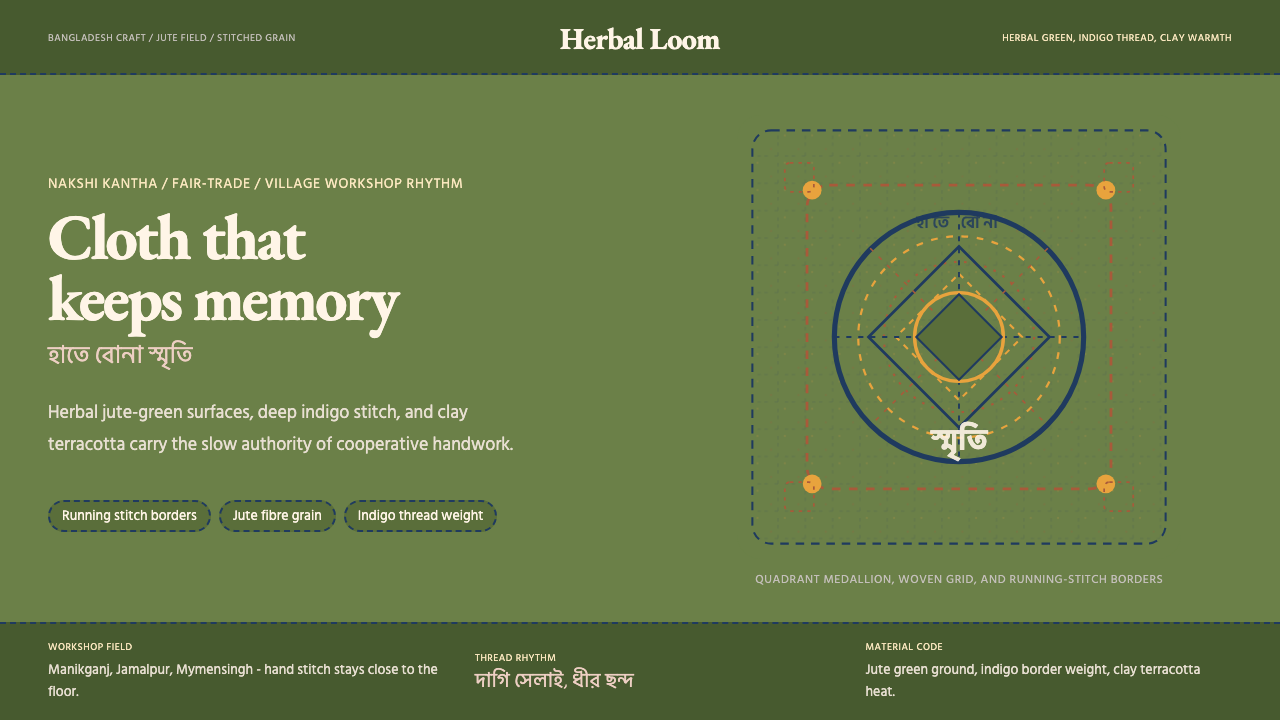 Bangladeshi Jute CraftMemory stays stitched. Jute green, indigo borders, terracotta warmth.记忆被缝进画面。黄麻绿、靛蓝虚线、陶土暖调。
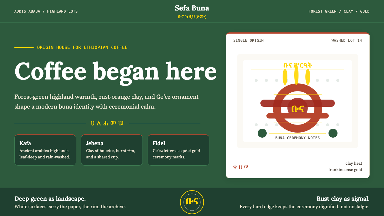 Ethiopian Coffee BunaOrigin feels ceremonial. Forest green, rust clay, Lora serif, and Geʽez gold…起源感庄重:森林绿、陶土橙、Lora 衬线与金色吉兹分隔。
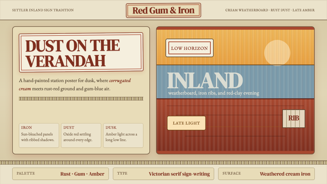 Australian Outback VernacularWeather is the voice. Rust dust, gum-blue bands, and serif sign-writing age t…风化就是声音:锈红尘土、桉蓝横带与衬线招牌让页面有年岁。
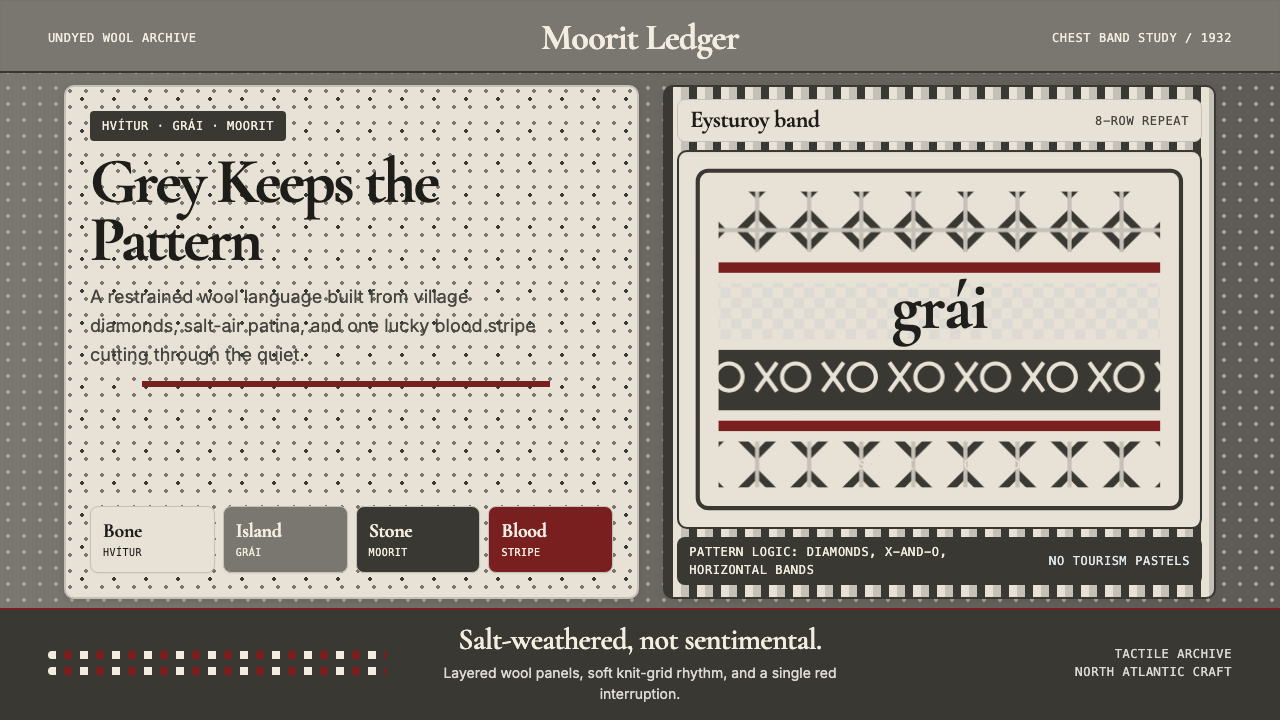 Faroese Knit Pattern Island GreyWeathered wool, not cozy kitsch. Island greys, Cormorant serif, one blood-red…风化羊毛,不是旅游暖意。岛屿灰、Cormorant衬线与一道血红横纹。
 Iraqi Marsh Arab Mudhif ReedReverent reed darkness. Kufi arches, ochre lattice, and one water-blue line h…庄重的芦苇夜色。库菲拱线、赭黄格纹与一笔水蓝托住黄昏。
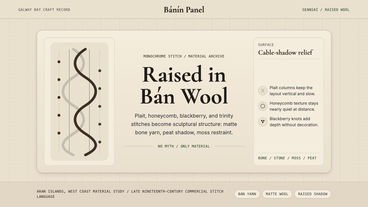 Irish Aran Island Cable KnitMaterial honesty raised in wool. Bone ground, moss ink, and cable columns cas…材料诚实成形:骨白底、苔绿字与绞花柱投下静影。