What is Bangladeshi Jute Craft?什么是 Bangladeshi Jute Craft?
Bangladesh's craft cooperatives transformed jute and embroidery thread into a design language that feels handmade, grounded, and unmistakably alive.孟加拉国手工艺合作社将黄麻与刺绣线转化为一套设计语言——手作感、沉根性,充满生命力。
Bangladeshi Jute Craft in briefBangladeshi Jute Craft 速览
Bangladeshi Jute Craft Modern is a visual design system drawn from the living practice of Bangladesh's artisan cooperatives — Aarong, Tarango, and Kumudini chief among them. These cooperatives, many led by women in rural workshops across Manikganj, Jamalpur, and Mymensingh, have over decades refined a visual identity built from jute weaving, nakshi kantha hand-embroidery, and indigo-dyed cotton. The design language emerging from this tradition is emphatically not a folk pastiche: it is a coherent, contemporary aesthetic that has been shaped by fair-trade market demands, international craft exhibitions, and the deliberate branding choices of socially conscious cooperatives.孟加拉国黄麻手工艺现代风格是一套源自活态手工艺合作社实践的视觉设计系统——Aarong、Tarango与Kumudini是其中最具代表性的机构。这些合作社,许多由马尼格甘杰、贾马尔普尔与迈门辛农村工坊中的女性主导,数十年来打磨出一套由黄麻编织、纳克西·坎塔手工刺绣与靛蓝染棉共同构建的视觉身份。从这一传统中生长出来的设计语言绝非民间艺术的拼贴:它是一套连贯的、当代性的美学体系,由公平贸易市场需求、国际工艺展览以及具有社会意识的合作社刻意的品牌决策共同塑造。
The palette anchors itself in muted herbal jute-green — the color of raw, processed jute fiber — rather than the beige that Western audiences might expect from natural-material craft. Deep indigo, drawn from centuries of Bangladeshi cloth-dyeing tradition, carries structural and typographic weight. A warm clay-terracotta red-brown grounds the accent register, evoking the fired-earth tones of riverside Bengal. Surfaces carry the memory of handwork: running-stitch dashed borders replace drop shadows; jute-fibre grain replaces glass-effect surfaces; Bengali script is given generous vertical breathing room to honor its organic rhythm.这套色板以沉稳的草本黄麻绿为锚点——原料黄麻纤维的颜色,而非西方观众对天然材质手工艺的预设米色。深靛蓝,源自孟加拉国数百年布料染色传统,承载着结构性与字体性的分量。暖陶土红棕色作为点缀,唤起孟加拉河岸地带烧制陶土的色调。每个界面都带有手工的记忆:虚线走针边框取代投影,黄麻纤维纹理取代玻璃效果,孟加拉文字获得充足的行高,以呼应其有机节奏。
What distinguishes this system from generic 'artisan craft' aesthetics is its specificity and restraint. The textures are not decorative noise — they are structural. The embroidery references are not surface ornament — they are layout logic. The result is a design language that can be applied to a digital product, a printed report, or a slide deck without losing its cultural grounding or becoming mere exoticization.将这套系统与泛化的「手工艺风格」区分开来的,是它的具体性与克制。质感不是装饰性噪声,而是结构性元素。刺绣的引用不是表面装饰,而是版面逻辑。其结果是一套可以应用于数字产品、印刷报告或演示文稿的设计语言——而不会失去文化根基,也不会沦为单纯的异域化消费。
See the Bangladeshi Jute Craft design system查看 Bangladeshi Jute Craft 完整设计系统
Where does Bangladeshi Jute Craft come from?Bangladeshi Jute Craft 从何而来?
Nakshi kantha embroidery is one of the oldest continuous textile traditions of the Bengal delta. The word 'nakshi' derives from the Bengali term for decorative pattern, and 'kantha' refers to the layered cloth — typically recycled saris or dhotis — stitched together with running-stitch thread to create both warmth and imagery. Historical kanthas depicted scenes from village life, mythological narratives, and geometric patterns drawn from the natural environment: fish, birds, the lotus, the sun. The practice was widespread across the delta region that now comprises Bangladesh and the Indian state of West Bengal, and it was primarily a domestic art passed from mother to daughter across generations.纳克西·坎塔刺绣是孟加拉三角洲地区历史最悠久的持续性纺织传统之一。「纳克西」一词源自孟加拉语中装饰图案的说法,「坎塔」则指将多层布料——通常是回收的纱丽或多蒂——用平针线迹缝合在一起,同时制造保暖与图像的物件。历史上的坎塔描绘村庄生活场景、神话叙事与从自然环境中提取的几何纹样:鱼、鸟、莲花、太阳。这一技艺广泛分布于今孟加拉国与印度西孟加拉邦所在的三角洲地区,主要是一种由母亲代代传授给女儿的家庭艺术。
The partition of Bengal in 1947 and the emergence of Bangladesh as an independent nation in 1971 gave the nakshi kantha tradition a new political and cultural significance. In the years immediately following independence, cultural institutions and development organizations began identifying traditional crafts as both a source of national identity and a vehicle for rural economic development. The devastation of the Liberation War had displaced enormous numbers of women, and craft cooperatives became a practical and dignified means of economic reconstruction. It was in this context that BRAC — one of the world's largest development organizations, founded by Sir Fazle Hasan Abed — established Aarong in 1978. Aarong was not conceived as a handicraft souvenir shop: it was designed as a structured market channel connecting rural artisans, primarily women, to urban and eventually international buyers, with quality standards and fair pricing enforced along the supply chain.1947年孟加拉的分治与1971年孟加拉国独立,赋予了纳克西·坎塔传统新的政治与文化意义。独立后最初几年,文化机构与发展组织开始将传统手工艺视为民族认同的来源与农村经济发展的载体。解放战争的破坏使大量女性流离失所,手工艺合作社成为经济重建的务实而有尊严的途径。正是在这一背景下,BRAC——世界上最大的发展组织之一,由法兹勒·哈桑·艾贝德爵士创立——于1978年建立了Aarong。Aarong的构想不是手工艺纪念品商店:它被设计为一个结构化的市场渠道,将农村工匠(主要是女性)与城市乃至国际买家连接起来,并在供应链中强制执行质量标准与公平定价。
Bibi Russell, the Bangladeshi model and fashion designer who trained and worked in Europe, returned to Bangladesh in the 1990s and began working directly with weavers and embroiderers across the country. Her collections — shown at international fashion weeks from Paris to Delhi — brought nakshi kantha and handloom jamdani cloth to global attention, positioning Bangladeshi craft not as heritage curiosity but as material for contemporary high fashion. Russell's work contributed to a repositioning of the craft's visual language: the hand-stitched running line was no longer a village practice but a signature mark of quality and ethical production. Her collaborator and successor in craft advocacy, Tahsinah Ahmed, continued this work of connecting artisan skill to contemporary design.孟加拉国模特与时装设计师碧碧·拉塞尔在欧洲接受培训并工作多年后,于1990年代回到孟加拉国,开始直接与全国各地的织工和绣工合作。她的系列作品——在从巴黎到德里的国际时装周上发布——将纳克西·坎塔与手工贾姆达尼布料带入全球视野,将孟加拉国手工艺定位为当代高级时装材料而非遗产猎奇。拉塞尔的工作促成了手工艺视觉语言的重新定位:手针走线不再只是村庄实践,而是质量与道德生产的标志性印记。她在手工艺倡导方面的合作者与继任者塔西纳·艾哈迈德继续推动工匠技艺与当代设计的对接。
The global attention on Bangladeshi garment manufacturing following the Rana Plaza factory collapse in 2013 produced an unexpected consequence for the craft sector: a surge of consumer and brand interest in ethical, handmade alternatives to fast fashion. This post-Rana-Plaza repositioning brought Bangladeshi jute craft, kantha embroidery, and jamdani weaving into conversations about sustainable design and ethical sourcing. Cooperatives that had long operated in the development sector found themselves approached by international lifestyle and design brands. The visual identity conventions that had developed organically within the cooperatives — the jute-green and indigo palette, the running-stitch border, the generous use of natural texture — were increasingly recognized internationally as a coherent aesthetic system with both commercial appeal and cultural authenticity.2013年拉纳广场工厂倒塌事件使全球对孟加拉国服装制造业的关注,对手工艺领域产生了意外影响:消费者和品牌对快时尚的道德替代品——手工制造品——的兴趣激增。后拉纳广场时代的重新定位将孟加拉国黄麻工艺、坎塔刺绣与贾姆达尼编织带入了可持续设计与道德采购的讨论。长期在发展领域运营的合作社发现自己受到国际生活方式与设计品牌的主动接洽。在合作社内部有机形成的视觉身份惯例——黄麻绿与靛蓝色板、走针边框、天然质感的慷慨运用——在国际上日益被认作一套连贯的美学系统,兼具商业吸引力与文化真实性。
What defines the Bangladeshi Jute Craft look?Bangladeshi Jute Craft 的视觉特征是什么?
Color色彩
The palette is built from three anchors: muted herbal jute-green as the dominant ground, deep indigo as the structural and typographic color, and warm clay-terracotta as the accent. None of the three is saturated or bright — they carry the slightly dusty, light-absorbed quality of natural dyes. A near-neutral warm white or undyed cotton serves as the resting ground between these colors. This palette is not 'earthy' in the generic sense; it is specifically referential to jute processing, indigo-vat dyeing, and fired clay, all of which are material realities of the Bengal delta.色板由三个锚点构成:沉稳的草本黄麻绿作为主导底色,深靛蓝作为结构性与字体性色彩,暖陶土红棕色作为点缀。三者均不饱和、不鲜亮——带有天然染料那种略显沉朴、吸收光线的质感。近中性的暖白色或本色棉布作为三者之间的休止底色。这套色板并非泛化意义上的「大地色」,而是具体指涉黄麻加工、靛蓝染缸与烧制陶土——这些都是孟加拉三角洲真实的物质现实。
Texture and Surface质感与界面
Every surface in this system carries the suggestion of woven or stitched fiber. Backgrounds use a subtle jute-fiber grain — a loose, directional weave pattern visible under close inspection — rather than solid flat color or digital gradients. This texture is applied at low opacity so that it reads as material memory rather than decorative noise. The effect is warm and slightly tactile: a presentation slide or web card built in this system should feel like it could be touched.这套系统的每个界面都带有编织或缝制纤维的暗示。背景使用细腻的黄麻纤维纹理——一种稀疏、有方向性的编织肌理,近看可辨——而非单纯的平面色或数字渐变。这种质感以低透明度应用,使其读作材料记忆而非装饰噪声。效果温暖而略有触感:用这套系统制作的演示文稿页面或网页卡片应该让人感觉可以被触摸。
Border and Line边框与线条
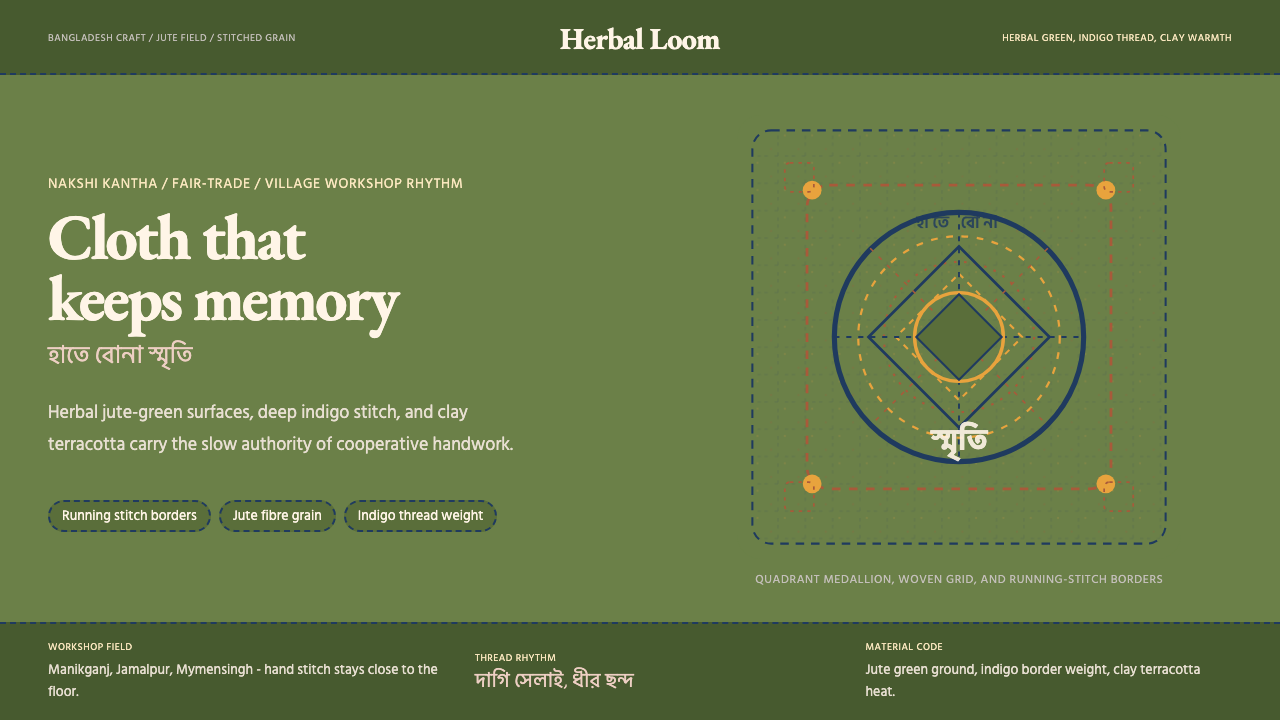
The running-stitch dashed border is the system's signature structural element, replacing the drop shadows or hard rules that perform the same organizational function in other systems. These dashed lines evoke the hand-embroidered edge of a kantha and carry the spacing rhythm of actual needlework — gaps and dashes roughly equal in width, suggesting a needle moving at human pace. They appear as section dividers, card edges, and field boundaries. Where a heavier boundary is needed, a double running-stitch row stands in for a rule.虚线走针边框是这套系统标志性的结构元素,取代了其他系统中执行相同组织功能的投影或硬线。这些虚线唤起坎塔手绣边缘的质感,带有真实针脚的间距节奏——间隙与线段宽度大致相等,暗示针头以人的速度穿行。它们作为段落分隔线、卡片边缘与字段边界出现。需要更重边界时,双走针行取代粗线条。
Typography字体排印
Bengali script is treated as a first-class visual element, not an afterthought. Its naturally tall ascenders and complex conjunct characters require generous line spacing — more so than Latin equivalents — and this requirement is honored rather than minimized. Latin type choices favor rounded, humanist forms over geometric or grotesque alternatives; the warmth of humanist letterforms sits more comfortably alongside the organic quality of embroidery. Headlines are set at substantial scale with minimal weight contrast, allowing the letterform itself to carry presence without competing with the textural background.孟加拉文字被当作第一级视觉元素,而非事后补充。其自然偏高的上伸笔画与复杂的连字需要充足的行距——远多于拉丁对应形式——这一需求被尊重而非最小化。拉丁字体偏向圆润的人文主义形态,而非几何或怪诞风格;人文主义字形的温度与刺绣的有机质感更为和谐。标题以较大尺寸设置,字重对比克制,让字形本身在不与质感背景竞争的前提下传递存在感。
Motif and Pattern母题与图案
Nakshi kantha iconography — fish, lotus, radial sun, peacock tail — appears in this system as structural motifs rather than decorative flourishes. A lotus grid organizes a dashboard; a radial sun divides a cover into sections; a stylized fish form becomes a data point marker. These motifs are simplified to their essential geometry: not photographically reproduced embroidery, but line-drawn forms that read as part of the typographic system. The key discipline is that every motif must perform a function — wayfinding, hierarchy, or emphasis — to earn its place on the surface.纳克西·坎塔图像志——鱼、莲花、辐射状太阳、孔雀尾羽——在这套系统中以结构性母题而非装饰花饰的形式出现。莲花网格组织仪表板;辐射状太阳将封面分为若干区域;程式化的鱼形成为数据点标记。这些母题被简化为其基本几何形:不是摄影复现的刺绣,而是读作字体系统一部分的线描形态。关键自律是:每个母题必须执行功能——导航、层级或强调——才能在界面上占有一席之地。
Rhythm and Spacing节奏与间距
The system's pacing is slow and deliberate, reflecting the tempo of handwork rather than digital speed. Generous white space — or rather, warm-ground space — separates elements. Dense information blocks are avoided in favor of breathing room between sections. This is not minimalism imposed from outside but a rhythm native to the cooperative workshop context: women working in long sessions, producing objects that take time, valuing the interval between gestures as much as the gestures themselves.这套系统的节奏缓慢而从容,反映手工劳作的速度而非数字产品的节奏。充足的留白——或者说,暖调底色空间——将元素分隔开来。避免密集信息块,倡导段落间的呼吸空间。这不是从外部施加的极简主义,而是合作社工坊语境内在的节奏:女性在漫长的工作时段中制作需要时间的物件,珍视动作之间的间隔与动作本身同等重要。
Ethical and Cooperative Framing道德与合作社叙事框架
Unlike many historical design systems, this one carries an explicit social context that is part of its meaning. The visual choices — handwork references, cooperative-scale production, women's labor visibility — are not nostalgic ornamentation but deliberate communication of values. Organizations applying this system signal a commitment to ethical sourcing, artisan skill, and slow production. The style is therefore especially well-suited to fair-trade organizations, impact-reporting documents, non-profit annual reports, and brands whose identity is inseparable from the communities that make their products.与许多历史性设计系统不同,这套系统携带明确的社会语境,而这是其意义的组成部分。视觉选择——手工参考、合作社规模生产、女性劳动的能见度——不是怀旧装饰,而是对价值观的刻意传达。应用这套系统的组织在表明对道德采购、工匠技艺与慢生产的承诺。因此,这种风格特别适合公平贸易组织、影响力报告文件、非营利年度报告,以及身份认同与产品制造社区不可分割的品牌。
See the Bangladeshi Jute Craft design system查看 Bangladeshi Jute Craft 完整设计系统
Who shaped Bangladeshi Jute Craft?谁塑造了 Bangladeshi Jute Craft?
Fazle Hasan Abed founded BRAC in 1972, one year after Bangladeshi independence, as a relief organization for war-displaced populations. Over the following decades, BRAC became the world's largest non-governmental organization by number of employees, operating in more than a dozen countries. Aarong, BRAC's craft enterprise, was established in 1978 with a direct mandate to channel income to rural artisans — particularly women embroiderers and weavers — through a sustainable market model. Abed's insistence that economic development required dignity and market access, not charity, shaped the cooperative model that gave the jute craft visual system its social grounding. He received the World Food Prize in 2015 and was knighted by the British Crown.法兹勒·哈桑·艾贝德于1972年——孟加拉国独立一年后——创立了BRAC,最初作为战争流离失所人口的救援组织。此后数十年,BRAC成为全球员工人数最多的非政府组织,在十多个国家开展工作。Aarong,BRAC的手工艺企业,于1978年成立,明确授命通过可持续市场模式将收入输送给农村工匠——尤其是女性绣工和织工。艾贝德坚持认为经济发展需要的是尊严与市场准入,而非慈善施舍,这一理念塑造了赋予黄麻手工艺视觉系统社会根基的合作社模式。他于2015年荣获世界粮食奖,并被英国王室授予爵士头衔。
Bibi Russell is a Bangladeshi model and fashion designer who worked extensively in Europe — appearing in campaigns for major international fashion houses — before returning to Bangladesh in the 1990s to advocate for the country's artisan weavers and embroiderers. Her label 'Fashion for Development' became a framework for bringing handloom and kantha work to international fashion weeks, including presentations in Paris and Dhaka. Russell's work reframed nakshi kantha not as a rural domestic practice but as a contemporary design material worthy of the highest global stages. Her approach — working directly with artisan communities, respecting their production methods, and scaling through quality rather than volume — became a template for ethical craft fashion internationally.碧碧·拉塞尔是一位孟加拉国模特和时装设计师,曾在欧洲广泛工作——出现在多家国际时装屋的广告中——之后于1990年代返回孟加拉国,为该国工匠织工和绣工发声。她的品牌「发展时装」成为将手工织物和坎塔作品带上国际时装周的框架,包括在巴黎和达卡的发布。拉塞尔的工作将纳克西·坎塔重新定义——不再是农村家庭实践,而是值得登上全球最高舞台的当代设计材料。她的方式——直接与工匠社区合作、尊重其生产方式、以质量而非数量扩大规模——在国际上成为道德手工艺时装的模板。
Tahsinah Ahmed has worked at the intersection of Bangladeshi craft advocacy, design education, and international cultural diplomacy. As a figure connecting artisan cooperatives to design schools and international craft networks, she represents a generation of practitioners who translate the visual knowledge embedded in nakshi kantha, jamdani, and jute craft into frameworks that designers outside Bangladesh can engage with critically and respectfully. Her work emphasizes that the design system's textures, motifs, and color logics are not available for free appropriation but carry specific cultural meaning that requires acknowledgment when used outside their originating context.塔西纳·艾哈迈德在孟加拉国手工艺倡导、设计教育与国际文化外交的交汇处工作。作为连接工匠合作社与设计院校及国际手工艺网络的人物,她代表了一代实践者——将嵌入纳克西·坎塔、贾姆达尼和黄麻工艺中的视觉知识转化为孟加拉国以外的设计师可以批判性、负责任地参与的框架。她的工作强调,这套设计系统的质感、母题与色彩逻辑并不可供自由挪用,而是携带特定的文化意义,在原生语境之外使用时需要明确致意。
Kumudini Welfare Trust, founded in Mirzapur in 1944 and predating Bangladeshi independence by nearly three decades, is among the oldest institutionalized craft and welfare organizations in the region. Its embroidery and handicraft programs have employed tens of thousands of women across several generations, making it both a living repository of traditional kantha technique and a demonstration that artisan cooperatives can achieve financial sustainability across the long term. Kumudini's visual identity — warm grounds, hand-stitched borders, natural dye palettes — preceded Aarong's by decades and contributed to establishing the color and texture conventions that now define the broader Bangladeshi jute craft aesthetic.库穆迪尼福利信托,1944年创建于米尔扎普尔,比孟加拉国独立早近三十年,是该地区历史最悠久的机构化手工艺与福利组织之一。其刺绣与手工艺项目已历数代为数万名女性提供就业,使其既是传统坎塔技艺的活态宝库,也是工匠合作社可以实现长期财务可持续性的明证。库穆迪尼的视觉身份——暖调底色、手绣边框、天然染料色板——比Aarong早数十年确立,对今日定义孟加拉国黄麻手工艺美学的色彩与质感惯例的形成作出了贡献。
The embroidery cooperatives of Jamalpur district represent the grassroots organizational layer of the craft system — hundreds of small working groups, many operating from home compounds or shared community spaces, producing kantha panels and jute goods for aggregation by larger organizations. The visual patterns developed collectively in Jamalpur workshops — particularly the grid-and-border compositions using running-stitch in indigo and terracotta on natural jute ground — became reference points for the contemporary design system. These cooperatives are less visible internationally than Aarong or Kumudini but are the source from which the visual conventions ultimately flow.贾马尔普尔区的刺绣合作社代表了这套手工艺系统的草根组织层次——数百个小型工作小组,许多在家庭院落或共享社区空间中运营,生产坎塔绣片与黄麻制品,供大型组织汇聚。在贾马尔普尔工坊中集体发展出来的视觉纹样——尤其是在本色黄麻底色上以靛蓝和陶土红绣制虚线走针的网格与边框构图——成为当代设计系统的参照点。这些合作社在国际上的能见度不及Aarong或库穆迪尼,但它们才是视觉惯例最终流向的源头。
How do you use Bangladeshi Jute Craft today?今天怎么用 Bangladeshi Jute Craft?
Bangladeshi Jute Craft Modern is a design system built for warmth, specificity, and ethical communication — and its best applications lean into all three. Applying it well means understanding what it is actually doing: the jute-green ground is not a trendy earth tone, it is a material reference; the running-stitch border is not a decorative doodle, it is a layout device that carries cultural meaning. Designers who understand these distinctions produce work that feels genuine; those who treat the system as surface texture produce work that reads as appropriation.孟加拉国黄麻手工艺现代风格是一套为温度、具体性与道德传播而构建的设计系统——最佳应用充分发挥这三者。正确应用意味着理解它实际在做什么:黄麻绿底色不是时髦的大地色,而是材料引用;走针边框不是装饰性涂鸦,而是携带文化意义的版面装置。理解这些区别的设计师创作出真实感的作品;将这套系统当作表面质感的人,创作出的是挪用感的作品。
For presentation slides, the system works at both cover and content levels with distinct but complementary approaches. A cover slide benefits from the full weight of the visual vocabulary: a jute-fiber-textured ground in muted green, a large nakshi motif — simplified lotus or radial sun — functioning as the compositional anchor, and a title set in warm rounded type with generous spacing. The running-stitch border frames the slide edge, not as decoration but as the equivalent of a formal presentation edge. Content slides should simplify: clean jute-ground background, dashed running-stitch section dividers, type hierarchy defined through scale rather than competing colors. Data visualizations take on an almost textile quality — bar charts with terracotta and indigo segments, line charts whose curves suggest embroidery thread rather than sharp vector lines.对于演示文稿,这套系统在封面与内容页面上各有侧重但互为补充。封面页适合充分发挥视觉词汇的全部分量:黄麻纤维质感底色、沉稳草绿,一个大型纳克西母题——简化的莲花或辐射状太阳——作为构图锚点,标题以圆润暖调字体宽松排设。走针边框框定幻灯片边缘,不是装饰,而是正式展示框架的等价物。内容页应简化:干净的黄麻底色背景、虚线走针段落分隔线、以尺度而非竞争色彩定义的字体层级。数据可视化带有近乎织物的质感——柱状图以陶土红和靛蓝区分,折线图的曲线暗示刺绣线而非锐利的矢量线条。
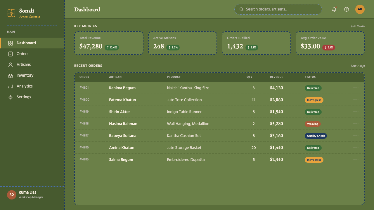
For web interfaces, the system is especially effective on dashboards, impact-reporting pages, and pricing tiers where hierarchy and trustworthiness matter more than conversion-rate optimization. The approach: a warm near-white or muted green ground, indigo for all navigation and primary labels, running-stitch dividers between content zones, lotus-grid or radial motifs as section wayfinding icons. Card components should use the jute-fiber texture at low opacity as their background, with dashed borders replacing the soft drop shadows typical of contemporary card patterns. Form inputs work best with visible borders — consistent with the system's emphasis on material honesty — rather than ghost or floating-label styles that dissolve boundaries.对于网页界面,这套系统在仪表板、影响力报告页面与定价层级等信任感与层级清晰度比转化率优化更重要的场景中尤为有效。方案如下:暖调近白色或沉稳草绿底色,靛蓝用于所有导航与主要标签,走针分隔线划分内容区域,莲花网格或辐射状母题作为区域导航图标。卡片组件应以低透明度的黄麻纤维质感作为背景,用虚线边框取代当代卡片样式常见的柔和投影。表单输入框以可见边框最为合适——与系统对材料诚实的强调一致——而非消解边界的幽灵或浮动标签样式。
For editorial and marketing work, the system supports a poster-like directness that suits impact reports, NGO annual reports, fair-trade product brochures, and craft-market catalogs. A long-form article layout uses a warm ground, a wide outer margin for pull-quotes and Bengali annotations, and running-stitch horizontal rules between sections. Full-width feature blocks can alternate between jute-green-on-warm-white and indigo-on-jute-green for visual rhythm, with terracotta reserved for calls to action or key statistics. The system is particularly well-suited to contexts where the reader's trust is earned through transparency and craft-community storytelling rather than through sleek digital optimism.对于编辑与营销内容,这套系统支持一种海报式的直接感,适合影响力报告、非政府组织年度报告、公平贸易产品册与手工艺市场目录。长篇文章版面使用暖调底色,宽阔外页边距容纳引用语与孟加拉语注释,走针水平线分隔各节。全宽特性区块可在「暖白底黄麻绿字」与「黄麻绿底靛蓝字」之间交替,产生视觉节奏,陶土红保留给行动号召或关键数据。这套系统特别适合读者信任通过透明度和手工艺社区叙事而非光滑数字乐观主义来赢得的语境。
A common mistake when applying this system is treating the jute-fiber texture and running-stitch motifs as interchangeable decorative elements — adding them to any surface for visual interest without structural justification. The textures should appear on grounds and backgrounds; the running-stitch borders should define edges and divisions; the nakshi motifs should function as wayfinding or emphasis markers. Stacking all three on the same element creates visual noise that contradicts the system's essential quality: the slow, deliberate rhythm of a practice where every mark is made one stitch at a time. Similarly, mixing the jute-green-indigo-terracotta palette with unrelated accent colors dilutes the specificity that gives this system its cultural credibility.应用这套系统时最常见的错误,是将黄麻纤维质感和走针母题当作可互换的装饰元素——为了视觉趣味而无结构理由地叠加在任何界面上。质感应出现在底色和背景上;走针边框应定义边缘和分区;纳克西母题应作为导航或强调标记发挥功能。在同一元素上叠加三者,制造的视觉噪声恰恰与这套系统最本质的品质相悖:一种每个标记都是一针一线缝制出来的缓慢而从容的节奏。同样,将黄麻绿-靛蓝-陶土红色板与不相关的强调色混用,会稀释赋予这套系统文化公信力的具体性。
See the Bangladeshi Jute Craft design system查看 Bangladeshi Jute Craft 完整设计系统
Bangladeshi Jute Craft — FAQBangladeshi Jute Craft · 常见问题
Is this system appropriate for organizations outside Bangladesh to use?这套系统适合孟加拉国以外的组织使用吗?
Yes, with deliberateness. The visual system was developed in a specific cultural and social context — Bangladesh's craft cooperatives, their histories, and the communities that built them — and that context is part of what gives the aesthetic its authority and warmth. Organizations outside Bangladesh can use the system respectfully when they have a genuine connection to the values it represents: ethical production, artisan craft, cooperative economics, or direct partnerships with Bangladeshi communities. Using the system purely for aesthetic appeal, without acknowledging its origins or having any relationship to its source communities, risks a form of visual appropriation that undermines the cooperative ethos embedded in the design choices. The more explicit the connection between the organization's work and the system's values, the more naturally the visual language fits.可以,但需要审慎自觉。这套视觉系统在特定文化与社会语境中发展而来——孟加拉国的手工艺合作社、它们的历史以及建造它们的社区——而这一语境是赋予这套美学权威与温度的部分原因。孟加拉国以外的组织在与它所代表的价值观有真实联结时,可以负责任地使用这套系统:道德生产、工匠手工艺、合作经济,或与孟加拉国社区的直接伙伴关系。若纯粹为了美学效果而使用这套系统,不致意其起源,也与源头社区毫无关系,则有视觉挪用之嫌,这与设计选择中内嵌的合作社精神相悖。组织的工作与这套系统的价值观之间联结越明确,这套视觉语言就越自然地适用。
How does this system handle dark-mode or dark-background layouts?这套系统如何处理暗色模式或深色背景版面?
The canonical palette is light-ground: the jute-green, warm white, and muted cotton tones are the foundational surfaces. A dark inversion is possible but requires careful handling. On a deep indigo ground — the most natural dark variant for this system — jute-green reads as a mid-tone rather than a dominant ground, and terracotta becomes the warmest and most active color. The running-stitch borders in this inversion work well in a warm near-white or undyed cotton tone. Avoid inverting to pure black: it loses the material warmth that is the system's defining quality and produces a generic dark-mode aesthetic rather than a contextually grounded one. A deep indigo or dark jute-brown ground preserves the connection to the textile and dye traditions the system references.标准色板以浅色底面为基础:黄麻绿、暖白色与沉稳本色棉布是基础界面。深色反转版本是可行的,但需要仔细处理。在深靛蓝底色上——这套系统最自然的深色变体——黄麻绿呈现为中间色调而非主导底色,陶土红成为最温暖、最活跃的色彩。这种反转下的走针边框以暖调近白色或本色棉布色调处理效果最佳。避免反转为纯黑:这会失去使系统具有定义性品质的材料温度,产生泛化的暗色模式美学而非有语境根基的美学。深靛蓝或深黄麻棕底色保留了与系统所引用的纺织和染色传统的联结。
Can nakshi kantha motifs be simplified for digital use without losing their meaning?纳克西·坎塔母题可以为数字应用而简化而不失去其意义吗?
Yes — simplification is actually consistent with the tradition's own history. Nakshi kantha motifs have always been adapted to the materials and tools at hand: a kantha made with thicker thread produces bolder, more abstracted forms than one made with fine thread. Digital simplification that reduces a lotus to its essential radial structure or a fish to its core oval-and-tail silhouette is analogous to the abstraction that happens when a skilled embroiderer works at coarser scale. The important boundary is intentionality: a simplified motif should still be recognizably derived from its source form and should function structurally in the layout. A lotus reduced to five radiating lines performs the same wayfinding function as a fully detailed lotus. A lotus reduced to a generic asterisk does not.可以——简化实际上与这一传统自身的历史相符。纳克西·坎塔母题历来都被调适到手头的材料与工具:用粗线制作的坎塔比用细线制作的产生更粗犷、更抽象的形态。将莲花简化为其基本辐射结构,或将鱼简化为其核心椭圆加尾鳍轮廓的数字简化,与技艺精湛的绣工以较粗尺度工作时发生的抽象化类似。重要的边界是意图性:简化的母题仍应可辨认地来源于其原始形态,并应在版面中发挥结构性功能。将莲花简化为五条辐射线条,执行与完整细节莲花相同的导航功能。将莲花简化为通用星号,则不然。
What makes this system different from other South Asian craft-inspired design approaches?这套系统与其他南亚手工艺启发的设计方法有何不同?
Specificity is the key distinction. South Asian craft-inspired design often aggregates motifs and palettes from multiple traditions — mixing block-print patterns from Rajasthan with brocade palettes from Varanasi and embroidery line weights from Gujarat — producing a generic 'Indian artisan' aesthetic that belongs to no tradition precisely. This system draws exclusively from the Bengali delta tradition: jute, kantha, indigo, the cooperative model, and the specific social history of Bangladesh's artisan organizations. The jute-green is not a generic earth tone; it is the color of processed jute. The running-stitch border is not decorative stitching; it is nakshi kantha technique. This precision is both an aesthetic and an ethical choice: it ensures that the design work stays in genuine relationship with the communities and practices that produced it.具体性是关键区别。南亚手工艺启发的设计常常聚合多个传统的母题与色板——将拉贾斯坦的木版印花与瓦拉纳西的锦缎色板以及古吉拉特的刺绣线重混合——产生一种泛化的「印度工匠」美学,严格来说不属于任何传统。这套系统专一地源自孟加拉三角洲传统:黄麻、坎塔、靛蓝、合作社模式,以及孟加拉国工匠组织的特定社会历史。黄麻绿不是泛化的大地色,而是加工黄麻的颜色。走针边框不是装饰性针脚,而是纳克西·坎塔技法。这种精确性既是美学选择,也是道德选择:它确保设计工作与产生它的社区和实践保持真实的联结关系。
Does this system work for commercial brands, or is it primarily suited to non-profit contexts?这套系统适用于商业品牌吗,还是主要适合非营利语境?
It works well for commercial contexts where the brand's identity is genuinely connected to craft, ethics, sustainability, or artisan production. Brands in fair-trade food, handmade textile and homeware, slow fashion, ethical travel, and impact investment can apply the system with authenticity. It is less suited — and risks visual dishonesty — when applied to brands whose operations have no relationship to the values the system expresses. A technology product that wants to look 'warm and human' but is otherwise disconnected from craft communities will produce an uneasy combination: the aesthetic signals something the product does not deliver. Where the brand story and the visual system's values genuinely align, the system produces distinctive and trustworthy visual identity that stands out from both the generic digital minimalism and the generic luxury craft aesthetics that dominate contemporary design.对于品牌身份与手工艺、道德、可持续性或工匠生产真实联结的商业语境,这套系统表现出色。公平贸易食品、手工纺织品与家居用品、慢时尚、道德旅行与影响力投资等领域的品牌可以真实地应用这套系统。当应用于运营与系统所表达价值观毫无关系的品牌时,它则适用性较差——且有视觉不诚实的风险。一个想要看起来「温暖而有人情味」但与手工艺社区毫无关联的科技产品,会产生令人不安的组合:美学传递的信号是产品无法兑现的承诺。当品牌故事与视觉系统的价值观真正对齐时,这套系统产生独特而可信的视觉身份,在当代设计中主导的泛化数字极简主义与泛化奢侈手工艺美学之间脱颖而出。
Related design styles相关设计风格
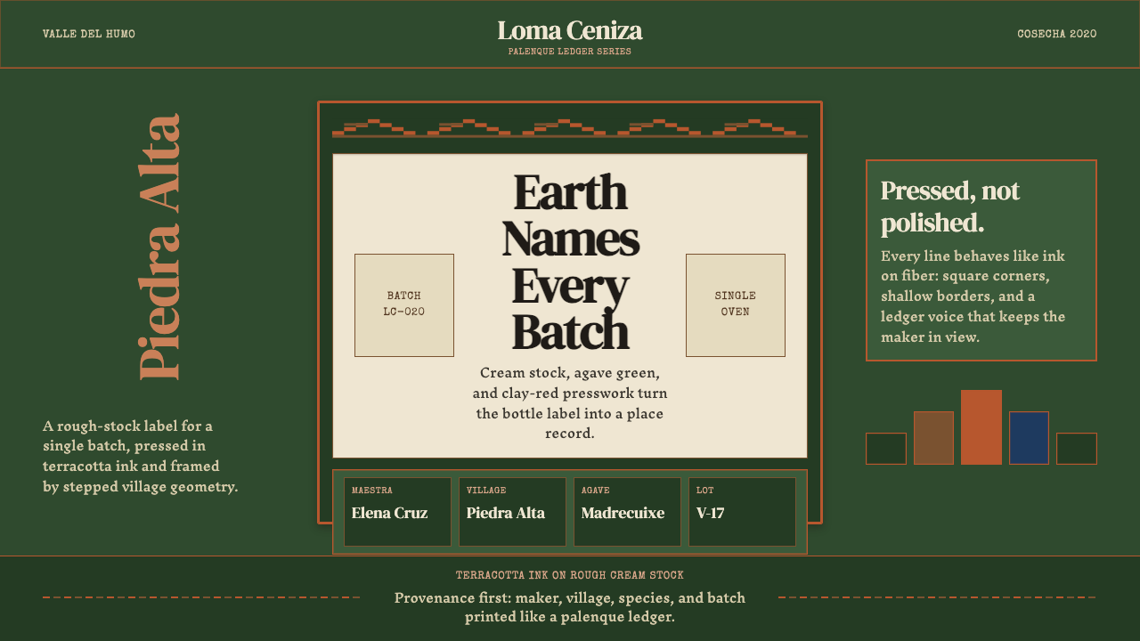 Mexican Mezcal CraftRooted and exact. Agave green, terracotta borders, and DM Serif labels tell t…质朴且精确。龙舌兰绿、赤陶边框与DM Serif标签记录批次。
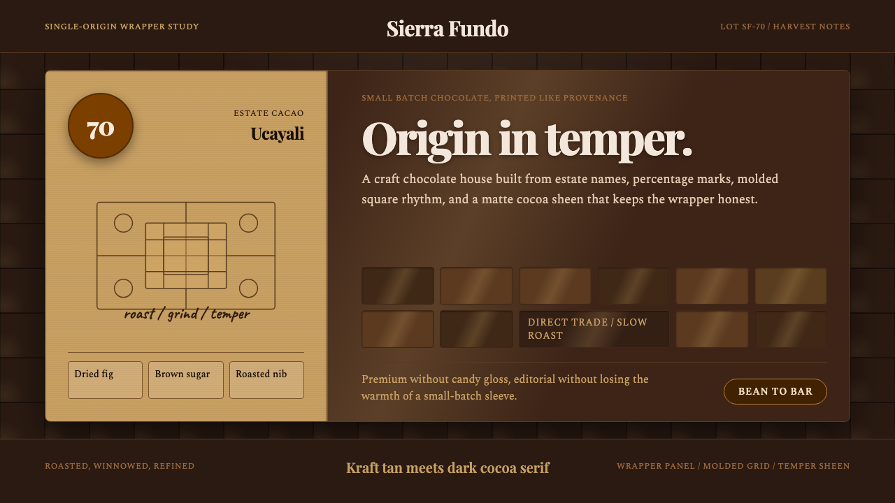 Bean-to-Bar ChocolateOrigin tastes tactile. Cocoa serif, kraft panel, and molded squares carry the…产地感可触:可可衬线、牛皮纸面板与巧克力方格讲述手作。
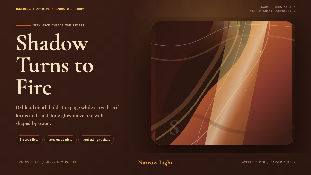 Antelope Slot CanyonGlows from shadow. Oxblood ground, sandstone S-curves, and one warm gold shaf…从阴影中发光:酒红褐底、砂岩 S 曲线与金色光柱。
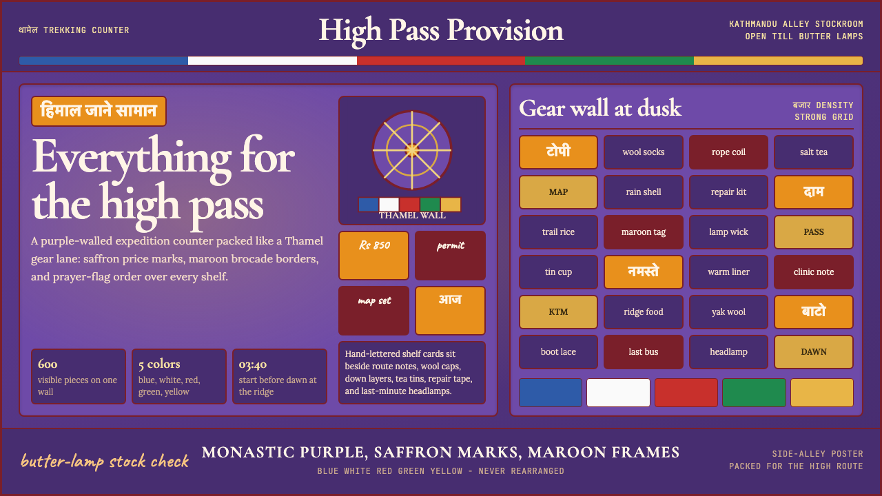 Kathmandu Thamel TrekkingSacred clutter sells the climb. Purple walls, saffron type, prayer-flag bands…神圣拥挤贩卖登山:紫墙、藏红花字与经幡色带填满画面。
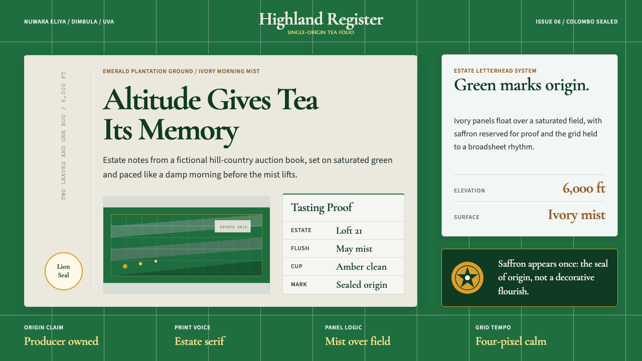 Sri Lanka Ceylon Tea ModernProvenance is emerald. Ivory mist panels and one saffron seal make origin fee…产地感是翡翠绿。象牙雾面板与一枚藏红花印章确认证明感。
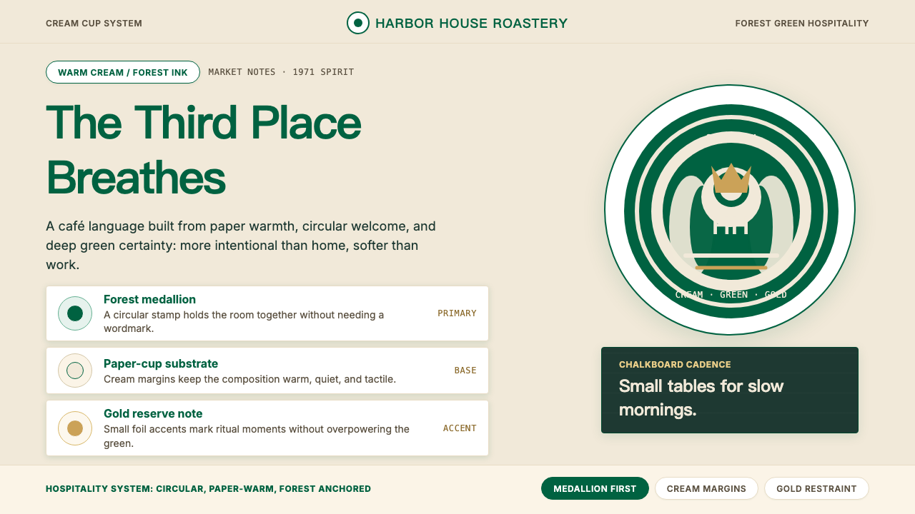 Starbucks (Siren)Hospitality becomes an emblem. Forest green medallion on cream paper, with re…待客之道化为徽章:奶油纸底托起森林绿圆章,金色克制点亮。