Design style guide设计风格指南
What is Kathmandu Thamel Trekking?什么是 Kathmandu Thamel Trekking?
Kathmandu Thamel Trekking captures the layered, unapologetically saturated visual world of Nepal's most famous trekking bazaar — where Tibetan-Buddhist iconography and mountaineering commerce have coexisted in productive chaos since the 1980s.加德满都泰米尔徒步风格,捕捉了尼泊尔最著名徒步集市那层叠而毫不收敛的饱和视觉世界——自1980年代起,藏传佛教图像与登山商业便在此以富有生命力的混沌共存至今。
Kathmandu Thamel Trekking in briefKathmandu Thamel Trekking 速览
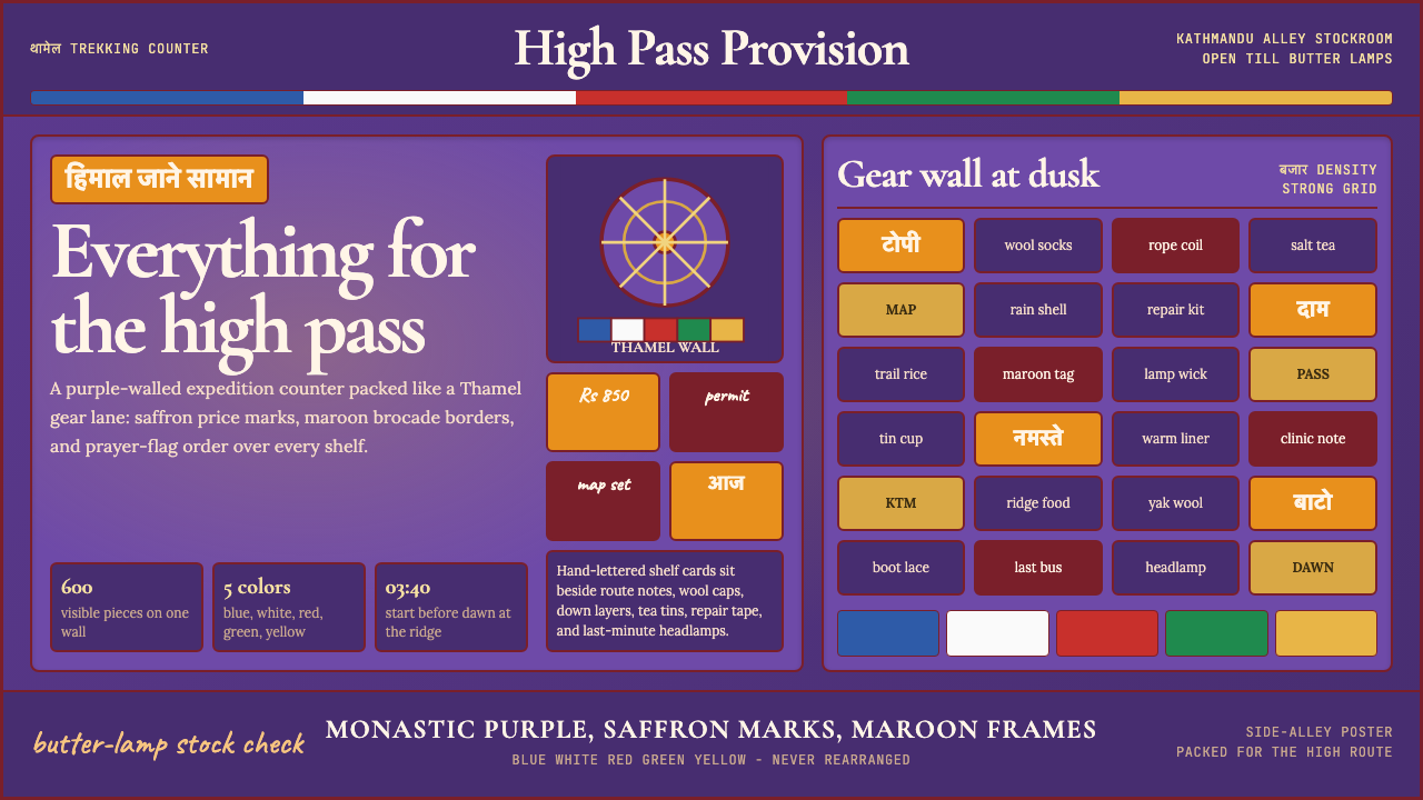
Kathmandu Thamel Trekking is a design style rooted in the visual culture of Thamel, a compact trekking district in central Kathmandu where Buddhist monastery aesthetics and the commercial energy of a global outdoor-gear market have merged into something wholly unique. The style is defined by deep monastic purple walls, saffron-toned accent elements, the five sacred colors of Tibetan prayer flags used as rhythmic dividers, and Devanagari script treated as a primary visual texture rather than supplementary signage.加德满都泰米尔徒步风格植根于泰米尔区的视觉文化。泰米尔是加德满都市中心一片紧凑的徒步商业区,佛教寺院的美学与全球户外装备市场的商业活力在此交汇融合,形成了独一无二的视觉生态。这套风格的标志性元素包括:深紫色僧袍色调的墙面、藏红花色系的强调元素、作为节律性分隔线使用的藏式经幡五圣色,以及被视为主要视觉纹理(而非辅助标识)的天城文字体。
The layouts are deliberately dense, echoing the sensory abundance of a Thamel gear shop that stocks hundreds of items on a single wall. Where many contemporary design systems prize restraint and negative space, this style treats visual fullness as a cultural virtue — every surface carries meaning, every divider carries color, and the total effect is one of generous, almost overwhelming richness.布局刻意保持高密度,呼应着泰米尔装备店在一面墙上陈列数百件商品的感官丰盈。当许多当代设计系统以克制与留白为美德时,这套风格将视觉的饱满视为一种文化价值观——每一个界面都承载意义,每一条分隔线都携带色彩,整体效果呈现出慷慨、近乎压倒性的丰富感。
The typography pairs warm humanist letterforms with Devanagari script, grounding the design in Himalayan cultural specificity. This bilingual typographic approach is not a stylistic choice layered over a neutral base; it is the backbone of the system, ensuring that the cultural context of the Kathmandu bazaar remains legible even when the style is applied to digital interfaces far from Nepal.排版将温暖的人文主义字形与天城文字体配对,使设计牢牢扎根于喜马拉雅的文化具体性。这种双语排版方式并非叠加在中性底色上的风格选择,而是整个系统的骨架——它确保加德满都集市的文化语境始终清晰可辨,即便这套风格被应用于远离尼泊尔的数字界面。
See the Kathmandu Thamel Trekking design system →查看 Kathmandu Thamel Trekking 完整设计系统 →
Where does Kathmandu Thamel Trekking come from?Kathmandu Thamel Trekking 从何而来?
Thamel's visual identity emerged from the convergence of two powerful forces in the late twentieth century. The first is Tibetan-Buddhist iconographic tradition — one of the most codified and spiritually charged visual systems in the world, with roots stretching back many centuries. The prayer flag's five colors (blue for sky, white for air, red for fire, green for water, yellow for earth) represent a cosmological order that precedes modern design by millennia. The second force is the dramatic growth of Himalayan trekking tourism, which accelerated sharply after Nepal opened to foreign visitors in 1950 and expanded into a major industry through the 1970s and 1980s.泰米尔的视觉身份源于二十世纪末两股强大力量的交汇。第一股力量是藏传佛教图像传统——世界上编码最为严密、精神意涵最为深厚的视觉体系之一,根脉可上溯数百年。经幡的五色(蓝代天空、白代空气、红代火焰、绿代水、黄代大地)呈现着一套比现代设计古老数千年的宇宙秩序。第二股力量是喜马拉雅徒步旅游业的急剧增长——1950年尼泊尔向外国游客开放后,这一产业在1970至80年代迅速扩张成为重要经济支柱。
By the 1980s and into the 1990s, Thamel had crystallized into a one-square-kilometer district that served as the mandatory departure point for virtually every major Himalayan expedition. Gear shops, teahouses, thangka painting galleries, and currency-exchange windows competed for visual attention on every street. The hand-painted Devanagari signage of those years — typically rendered in warm earth tones and saffron against deep purple or brick-red backgrounds — was not designed according to any system; it evolved organically as shopkeepers responded to one another's visual strategies, and as Buddhist decorative conventions filtered down from the monastery walls that surrounded and interpenetrated the commercial district.到1980年代至90年代,泰米尔已演变为一片仅一平方公里的区域,成为几乎所有重要喜马拉雅探险队的必经出发地。装备店、茶馆、唐卡画廊与货币兑换窗口在每一条街道上争夺视觉注意力。那个年代的手绘天城文招牌——通常以暖土色和藏红花色绘于深紫或砖红背景上——并非依照任何体系设计,而是由店主们相互响应彼此视觉策略、以及佛教装饰传统从周围寺院墙壁向商业区域自然渗透而有机演化形成。
Key figures in codifying and transmitting this visual culture include Tashi Sherpa and Sonam Lama, whose work in Himalayan trekking commerce helped establish the aesthetic conventions that would later be recognized as distinctively Thamel. Robert Beer, a British scholar and artist who has spent decades documenting Tibetan iconography, provided crucial academic frameworks for understanding how Buddhist visual motifs traveled from sacred to commercial contexts without losing their symbolic weight. The broader movements that shaped the style include Himalayan trekking tourism as a global industry, Tibetan-Buddhist diaspora visual culture (dispersed but intensified after 1959), and the Nepali fair-trade artisan export economy, which brought monastery aesthetics into contact with international markets.在编码和传播这一视觉文化方面,达希·夏尔巴与索南·喇嘛通过在喜马拉雅徒步商业中的实践,帮助确立了后来被认定为泰米尔特色的美学惯例。英国学者兼艺术家罗伯特·比尔数十年来致力于记录藏族图像学,为理解佛教视觉母题如何从神圣语境迁移至商业语境而不失其象征分量提供了重要的学术框架。塑造这一风格的更广泛运动包括:作为全球产业的喜马拉雅徒步旅游、藏传佛教离散视觉文化(1959年后扩散而愈发凝聚),以及尼泊尔公平贸易手工艺出口经济——正是这一经济将寺院美学带入了与国际市场的接触。
The style's relationship to authenticity is complex. Thamel's visual culture is simultaneously deeply rooted in centuries-old Himalayan spiritual tradition and a product of commercial improvisation responding to the tastes of Western trekkers. This productive tension — between the sacred and the commercial, between ancient symbol and modern market — is not a contradiction to be resolved but a defining characteristic of the style. The prayer flag stripes that divide a Thamel gear shop's signage carry the same sacred color order as those strung between monastery rooftops; the context has changed, but the cosmological structure has not.这套风格与真实性的关系是复杂的。泰米尔的视觉文化既深深扎根于数百年历史的喜马拉雅精神传统,也是商业即兴创造对西方徒步者口味的回应产物。这种富有生产力的张力——神圣与世俗之间、古老符号与现代市场之间——不是需要消解的矛盾,而是这套风格的定义性特征。区隔泰米尔装备店招牌的经幡色条,与悬挂于寺院屋顶之间的经幡携带着同样神圣的色序;语境已然改变,但宇宙秩序的结构并未随之消亡。
What defines the Kathmandu Thamel Trekking look?Kathmandu Thamel Trekking 的视觉特征是什么?
Color色彩
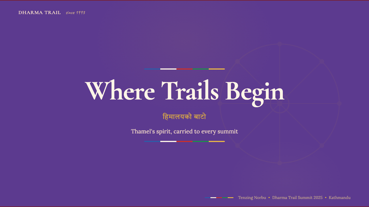
The palette is structured around a deep monastic purple that functions as the dominant wall tone, paired with saffron as a warm, luminous accent. The five sacred colors of the Tibetan prayer flag — sky blue, wind white, fire red, water green, and earth yellow — appear in their prescribed sequential order as stripe dividers and rhythmic banding elements. Color is never neutral here; every hue carries cultural and cosmological weight. The overall effect is saturated and warm, with deep shadows that feel like candlelight rather than harsh illumination.色板以深紫色调为主导,构成主要的墙面基调,搭配藏红花色作为温暖而明亮的强调色。藏式经幡的五圣色——天蓝、风白、火红、水绿、土黄——按其规定的顺序出现,作为条纹分隔线与节律性色带元素。这里的色彩从不中性;每一种色调都承载着文化与宇宙意涵。整体效果饱和而温暖,深处的阴影令人联想到烛光而非刺眼的照明。
Typography字体排印
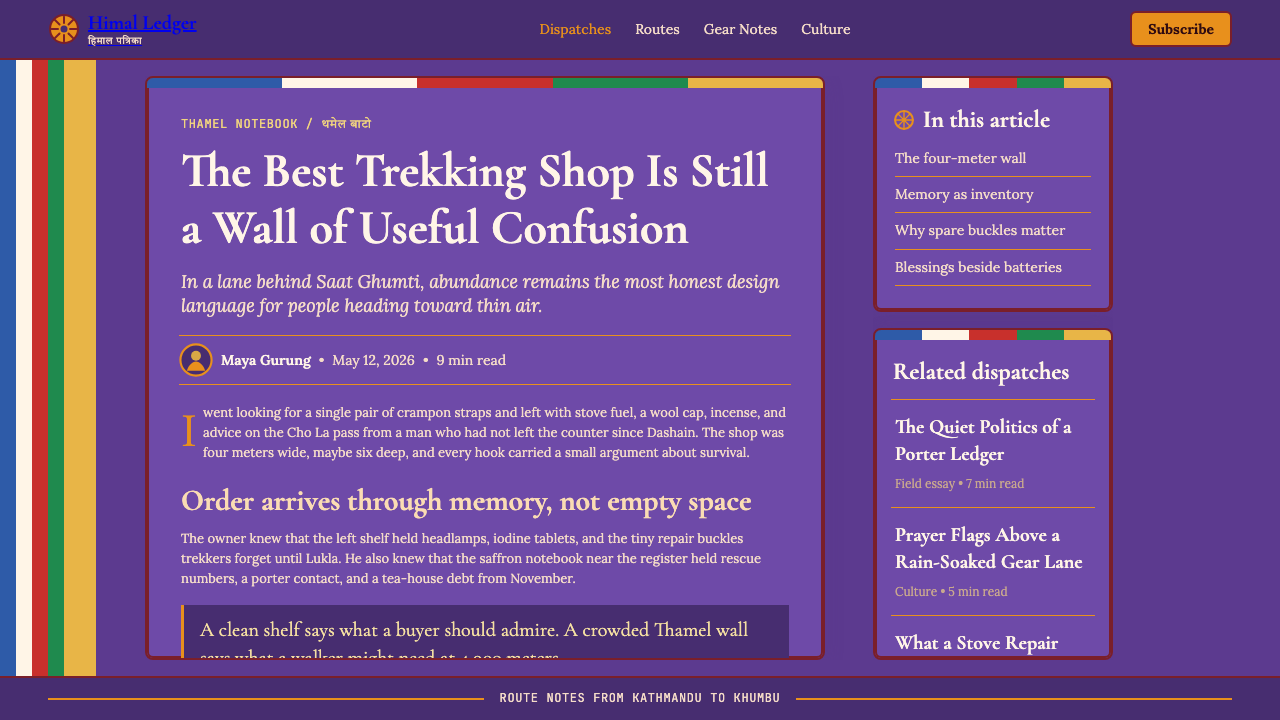
Devanagari script serves as a primary visual rhythm, not supplementary annotation — it occupies headline positions alongside Latin letterforms and is treated with equal graphic weight. The Latin type leans toward warm humanist serifs that carry a hand-crafted quality reminiscent of hand-lettered shop signage. Type is set with generous leading and warm optical spacing that reflects the organic, hand-painted origins of the Thamel sign tradition. The bilingual pairing is structural rather than decorative.天城文字体充当主要视觉韵律,而非辅助注解——它与拉丁字母并列占据标题位置,获得同等的图形分量。拉丁字体偏向温暖的人文衬线体,带有手工质感,令人联想到泰米尔手绘招牌的传统。排版采用宽松的行距与温暖的视觉字距,反映出泰米尔招牌传统手绘起源的有机特质。双语配对是结构性的,而非装饰性的。
Layout Density布局密度
Thamel Trekking layouts embrace deliberate visual fullness as a cultural expression rather than an organizational failure. Where Swiss-derived systems treat empty space as an asset, this style treats every available surface as an opportunity for meaning. Sections are separated by prayer-flag stripe bands rather than whitespace. Product information is layered — price, category, cultural note, and visual sample coexist in close proximity. This density is not clutter; it is the visual equivalent of a bazaar's productive abundance.泰米尔徒步风格的布局以刻意的视觉饱满作为文化表达,而非组织失败。当以瑞士体系为代表的设计将空白视为资产时,这套风格将每一个可用界面视为承载意义的机会。段落之间以经幡色条分隔,而非留白。产品信息以分层方式呈现——价格、类别、文化注记与视觉样本在近距离中共存。这种密度不是杂乱;它是集市丰盈生产力的视觉等价物。
Iconography and Motif图像与母题
Buddhist iconographic motifs — the endless knot, the lotus, mandala geometries, mountain silhouettes — appear as texture and structural ornament throughout the system. Unlike styles that borrow surface patterns from non-Western traditions without regard for meaning, Thamel Trekking preserves the symbolic specificity of each motif. Mountain silhouettes anchor compositions and provide visual hierarchy; lotus forms soften corners and dividers. These elements are not interchangeable decoration — they carry a specific cultural vocabulary.佛教图像母题——无尽结、莲花、坛城几何、山峰剪影——以纹理与结构性装饰的形式贯穿整个系统。与那些借用非西方传统表面图案而不顾其意涵的风格不同,泰米尔徒步风格保留了每种母题的象征特殊性。山峰剪影锚定构图并提供视觉层级;莲花形态柔化角落与分隔元素。这些元素不是可随意互换的装饰——它们携带着特定的文化词汇。
Texture and Material Quality质感与材料质量
The style evokes hand-made and artisan material surfaces: rough plaster walls, aged wood, woven textile patterns. In digital application this translates to gentle surface variation that avoids clinical flatness — backgrounds carry a slight material warmth, borders feel hand-drawn rather than perfectly ruled. This textural quality distinguishes the style from any kind of minimal or flat-design tradition, aligning it instead with the physical richness of the Himalayan craft environment.这套风格唤起手工与工匠材料表面的质感:粗糙的灰泥墙、旧木、编织纺织图案。在数字应用中,这转化为避免临床式平整的轻微表面变化——背景携带一丝材料温度,边框感觉像手绘而非完美的尺规线条。这种质感特质使这套风格有别于任何极简或扁平设计传统,将其与喜马拉雅手工艺环境的物质丰富性对齐。
Sacred-Commercial Balance神圣与商业的平衡
Perhaps the most distinctive characteristic of this style is its comfort with the coexistence of sacred symbol and commercial function. A prayer flag stripe can divide a price list; a mandala geometry can organize a product grid; Devanagari script can headline a discount promotion. This is not irreverence — it reflects the actual visual ecology of Thamel, where commercial and sacred have interpenetrated for decades. The style handles this tension by preserving the symbolic color order and motif integrity of the Buddhist elements, even when their context is transactional.这套风格最独特的特征,或许是它对神圣符号与商业功能共存的自在态度。经幡色条可以分隔价目表;坛城几何可以组织产品网格;天城文字体可以为折扣促销作标题。这不是不敬——它反映了泰米尔真实的视觉生态,在那里,商业与神圣已相互渗透数十年。这套风格通过保留佛教元素的象征色序与母题完整性来处理这种张力,即便其语境是交易性的。
Warmth and Illumination温暖与光感
The style's light quality is warm and amber-toned, evoking butter lamps and lantern light at dusk rather than daylight or artificial white illumination. This warm cast affects how all other colors are experienced: the purples lean toward red, the whites warm toward cream, the saffrons glow rather than simply appearing bright. Shadow is treated softly and organically, recalling the irregular illumination of a candlelit alleyway rather than the hard geometry of a designed drop shadow.这套风格的光线质感温暖而带有琥珀色调,唤起的是黄昏时酥油灯与灯笼的光线,而非日光或人工白色照明。这种暖调影响着所有其他色彩的体验感:紫色偏向红意,白色暖化为奶油色,藏红花色呈现光晕而非单纯明亮。阴影以柔和有机的方式处理,令人想起烛光小巷不规则的照明,而非设计感十足的硬边投影。

See the Kathmandu Thamel Trekking design system →查看 Kathmandu Thamel Trekking 完整设计系统 →
Who shaped Kathmandu Thamel Trekking?谁塑造了 Kathmandu Thamel Trekking?
A figure whose work in Himalayan trekking commerce helped establish the aesthetic conventions that define the Thamel visual identity. Through the operation of trekking businesses in the Kathmandu district, Sherpa's commercial practice embodied the fusion of Sherpa cultural heritage with the practical demands of an international mountaineering market — a fusion that lies at the heart of the Thamel aesthetic.达希·夏尔巴在喜马拉雅徒步商业中的实践,帮助确立了定义泰米尔视觉身份的美学惯例。通过在加德满都经营徒步旅行业务,夏尔巴的商业实践体现了夏尔巴族文化遗产与国际登山市场实际需求的融合——这种融合正是泰米尔美学的核心所在。
Sonam Lama represents the strand of Thamel's visual culture rooted in Tibetan-Buddhist diaspora practice. The Lama tradition of thangka painting, temple decoration, and iconographic craft entered Thamel's commercial visual environment through practitioners like Sonam Lama, who carried monastery aesthetics into the bazaar without stripping them of their symbolic structure. This transmission is what gives the Thamel style its religious and cultural depth beyond mere surface pattern.索南·喇嘛代表了泰米尔视觉文化中植根于藏传佛教离散实践的那一脉。唐卡绘画、寺院装饰与图像工艺的喇嘛传统,通过索南·喇嘛这样的从业者进入了泰米尔的商业视觉环境——他们将寺院美学带入集市,却未剥离其象征结构。正是这种传承赋予了泰米尔风格超越表面图案的宗教与文化深度。
A British scholar and artist who has spent decades documenting Tibetan iconography, Beer provided essential academic frameworks for understanding how Buddhist visual motifs travel from sacred to commercial contexts while retaining their symbolic coherence. His meticulous cataloguing of Tibetan symbols — the eight auspicious signs, the endless knot, the wheel of dharma — allows designers working in this tradition to use these elements with informed respect rather than superficial borrowing. Beer's work bridges the scholarly and the practical, making the Tibetan visual canon accessible without flattening it.英国学者兼艺术家罗伯特·比尔数十年来致力于记录藏族图像学,为理解佛教视觉母题如何在保留象征连贯性的同时从神圣语境迁移至商业语境提供了重要的学术框架。他对藏族符号的精细分类——八吉祥、无尽结、法轮——使在这一传统中工作的设计师能够以知情的尊重而非肤浅的借用来使用这些元素。比尔的工作架通了学术与实践之间的桥梁,使藏族视觉典范得以被广泛接触而不被简化。
The true authors of the Thamel visual style are not a single individual but the aggregate of hundreds of shopkeepers who, from the 1980s onward, made visual decisions in response to one another — painting their walls a deeper purple to stand out from a neighbor, choosing saffron for their price tags because it read well in lantern light, arranging prayer flag stripes across their awnings because the tourists recognized and trusted them. This collective, uncoordinated authorship produced a coherent visual identity through market dynamics rather than design intent, making Thamel one of the rare design languages genuinely evolved rather than designed.泰米尔视觉风格真正的作者不是某一个体,而是数百位店主的集体——自1980年代起,他们相互回应彼此的视觉决策:把墙涂得更深的紫色以区别于邻居,选择藏红花色标价签因为它在灯笼光线下清晰可辨,在遮篷上排列经幡色条因为游客对其有辨识感与信任感。这种集体的、无协调的作者身份通过市场动态而非设计意图产生了连贯的视觉身份,使泰米尔成为少有的真正由演化而非设计产生的视觉语言之一。
How do you use Kathmandu Thamel Trekking today?今天怎么用 Kathmandu Thamel Trekking?
Kathmandu Thamel Trekking is a style that rewards application in contexts where cultural richness, warmth, and a sense of authentic place are primary values. It is most naturally suited to products and brands connected to travel, adventure, cultural heritage, artisan goods, outdoor equipment, and wellness — any context where evoking the feeling of a specific, meaningful place matters more than projecting clinical efficiency. The key to applying it correctly is understanding its fundamental principle: fullness is the virtue, not a failure of restraint.加德满都泰米尔徒步风格在文化丰富性、温暖感与真实地域感是首要价值的语境中,最能发挥其威力。它最自然地适合与旅行、探险、文化遗产、手工艺品、户外装备和健康相关的产品与品牌——任何唤起特定、有意义地域感比展示临床效率更重要的语境。正确应用它的关键在于理解其根本原则:饱满是美德,而非克制的失败。
For presentation slides, the style works powerfully on cover pages anchored by a deep purple field, prayer-flag stripe banding at the top or bottom edge, and headline type set in a warm humanist serif alongside a secondary Devanagari line. Content slides should embrace layered information — two or three elements occupying the same spatial zone, separated by color rather than white space, with mountain silhouette motifs used to provide visual hierarchy. Data slides take on a thangka-like quality when bar elements are colored in the five sacred hues in their prescribed sequential order, transforming utilitarian charts into culturally grounded visual objects.在演示文稿中,这套风格在以深紫色底面为主的封面页上效果极佳——经幡色条作为顶部或底部边饰,标题以温暖的人文衬线体设置,辅以天城文字体的次要行。内容页应拥抱信息的层叠——两到三个元素占据同一空间区域,以色彩而非留白分隔,以山峰剪影母题提供视觉层级。当柱状图元素按规定顺序以五圣色着色时,数据页呈现出唐卡式的品质,将实用图表转化为具有文化根基的视觉对象。
For web interfaces, the style suits discovery-oriented surfaces — product galleries, cultural collections, travel booking flows, and marketplace dashboards where browsing and ambient richness are more important than task efficiency. A Thamel-inspired pricing or comparison page uses saffron for the recommended tier, prayer-flag stripe dividers between plan columns, and deep purple for section headers. The style does not suit stripped-down transactional interfaces where cognitive load reduction is paramount — it is built for exploration, not for form-filling.对于网页界面,这套风格适合以探索为导向的界面——产品画廊、文化藏品、旅行预订流程,以及浏览性与环境丰富度比任务效率更重要的市场仪表板。受泰米尔启发的定价或比较页面以藏红花色标注推荐方案,以经幡色条分隔套餐列,以深紫色标注章节标题。这套风格不适合极简的交易型界面——那类界面以降低认知负荷为首要目标,而这套风格是为探索而生,不是为填表而生。
For editorial and marketing work, the style creates immediate visual differentiation in crowded fields. A Thamel-inflected editorial layout uses a prayer-flag stripe as the primary running header, deep purple pull-quotes against cream body text, and Devanagari display type as a graphic element in feature spreads. Marketing pages benefit from the style's poster energy: full-width purple hero sections carry saffron headlines and white body text, with sacred motif textures providing surface variation. The style's cultural specificity makes it credible for brands with genuine connections to Himalayan or Buddhist heritage — applying it to unrelated products risks appearing appropriative.对于编辑与营销内容,这套风格在拥挤的视觉领域中创造出立即的差异化。受泰米尔启发的编辑排版以经幡色条作为主要页眉通栏,以深紫色引语搭配奶油色正文,以天城文展示字体作为专题跨页的图形元素。营销页面受益于这种风格的海报能量:全宽深紫色主视觉区域承载藏红花色标题与白色正文,神圣母题纹理提供表面变化。这套风格的文化特殊性使其对与喜马拉雅或佛教传统有真实渊源的品牌具有公信力——将其应用于无关产品则有文化挪用之虞。
A common mistake when applying this style is reducing it to its most legible elements — the purple and saffron palette — while discarding the typographic and structural features that give it depth. Purple and saffron alone become generic bohemian decoration. The style requires the prayer-flag color sequence, the Devanagari typographic presence, the deliberate density, and the warm light quality working together. Similarly, designers accustomed to negative-space-driven systems often instinctively add breathing room where the style calls for productive compression — resist this impulse. The fullness is the message.应用这套风格时最常见的错误,是将其简化为最易识别的元素——紫色与藏红花色调色板——而舍弃赋予其深度的排版与结构特征。仅有紫色与藏红花色会沦为通用的波西米亚装饰。这套风格需要经幡色序、天城文字体的存在感、刻意的密度与温暖光线质感共同发力。同样,习惯于负空间驱动系统的设计师常常会本能地在这套风格要求富有生产力的压缩之处添加呼吸空间——请抵制这种冲动。饱满本身就是信息。
See the Kathmandu Thamel Trekking design system →查看 Kathmandu Thamel Trekking 完整设计系统 →
Kathmandu Thamel Trekking — FAQKathmandu Thamel Trekking · 常见问题
Is this style appropriate for brands with no connection to Nepal or Himalayan culture?这套风格适合与尼泊尔或喜马拉雅文化毫无关联的品牌吗?
This requires careful judgment. The Thamel Trekking style draws directly on Tibetan-Buddhist iconographic traditions that carry deep spiritual and cultural meaning for living communities — it is not a historical style safely abstracted from its origins, like Art Deco or Bauhaus. Brands with genuine connections to Nepal, Tibet, Himalayan travel, Buddhist practice, or artisan craft traditions can use it authentically. Brands with no such connection risk appearing appropriative, particularly when they use the prayer flag color sequence, Devanagari script, or mandala geometries as mere surface decoration. A safer approach for unrelated brands is to draw on the style's structural principles — dense layering, warm saturation, bazaar-like fullness — without deploying its most culturally specific iconographic elements.这需要审慎判断。泰米尔徒步风格直接借鉴藏传佛教图像传统,这些传统对当今仍然活跃的社群承载着深厚的精神与文化意涵——它不像装饰艺术或包豪斯那样是一种可以安全地从起源中抽象出来的历史风格。与尼泊尔、西藏、喜马拉雅旅行、佛教实践或手工艺传统有真实渊源的品牌可以真实地使用它。毫无此类关联的品牌则有文化挪用之虞,尤其是当他们将经幡色序、天城文字体或坛城几何作为纯粹的表面装饰使用时。对于无关品牌,更安全的做法是借鉴这套风格的结构原则——密集的层叠、温暖的饱和感、集市式的丰盈——而不部署其最具文化特殊性的图像元素。
How does this style handle dark mode or dark-background variants?这套风格如何处理深色模式或深色背景变体?
The Thamel Trekking style is naturally dark-ground-compatible because its canonical palette already features deep monastic purple as the dominant wall tone. A dark variant shifts the lightest elements — cream body text, saffron highlights, prayer flag whites — forward against near-black or deep aubergine backgrounds, while the purple, which was already a dark midtone, becomes a structural mid-field element rather than the dominant background. The warm amber light quality remains essential in the dark variant; resist the temptation to introduce cool blue-black backgrounds, which would clash with the style's fundamentally warm, lantern-lit atmosphere. The prayer flag stripe sequence reads well against dark grounds because the five colors maintain their individual legibility.泰米尔徒步风格天然兼容深色底面,因为其经典色板本已以深紫色调作为主导墙面色调。深色变体将最浅的元素——奶油色正文、藏红花色高光、经幡白——推向近黑或深茄色背景的前景,而紫色(本已是深调中间调)则成为结构性中场元素而非主导背景。温暖的琥珀色光线质感在深色变体中仍然至关重要;请抵制引入冷蓝黑底的诱惑,那会与这套风格根本上温暖、灯笼式的氛围产生冲突。经幡色条序列在深色底面上清晰可读,因为五种颜色各自保持了独立的辨识度。
What is the prayer flag color order and why does it matter in this style?经幡的色彩顺序是什么?为何在这套风格中如此重要?
The five colors of the Tibetan prayer flag follow a prescribed order — blue, white, red, green, yellow — corresponding to sky, air, fire, water, and earth. This sequence is not arbitrary; it encodes a cosmological model that has been consistent across Tibetan Buddhist practice for centuries. In the Thamel Trekking style, using this color sequence in its correct order preserves the symbolic integrity of one of the system's most culturally specific elements. Using the five colors in a different order — to suit a design's hierarchy or aesthetic preference — breaks the symbolic structure and reduces a cosmological statement to mere colorful striping. If the symbolic weight of the prayer flag sequence is important to a project, the order should be respected; if the project only needs the visual rhythm of multicolor banding without the cultural specificity, a different color system should be used instead.藏式经幡的五色遵循规定顺序——蓝、白、红、绿、黄——分别对应天空、空气、火焰、水与大地。这一顺序并非随意;它编码着一套在藏传佛教实践中延续数百年的宇宙论模型。在泰米尔徒步风格中,以正确顺序使用这一色序,保留了系统中最具文化特殊性的元素之一的象征完整性。以不同顺序使用这五种颜色——为了迎合设计的层级或美学偏好——会打破象征结构,将一个宇宙论陈述降格为单纯的彩色条纹。如果经幡色序的象征分量对某个项目至关重要,该顺序应当得到尊重;如果项目只需要多色条纹的视觉韵律而无需文化特殊性,则应改用其他色彩系统。
Can this style work for digital products aimed at Western audiences unfamiliar with Himalayan culture?这套风格能用于面向不熟悉喜马拉雅文化的西方受众的数字产品吗?
Yes, with the right framing. Western trekking culture has been engaging with Thamel's visual environment since the 1970s — the style's iconographic elements are legible to a much wider audience than their geographic origin would suggest. Prayer flag color stripes, Devanagari script, and deep purple-and-saffron combinations read as culturally specific and exotic-in-a-positive-sense to Western audiences who associate them with adventure, spiritual depth, and authentic craftsmanship. The risk is not illegibility but rather flattening: Western audiences may respond to the style's surface warmth without engaging with its symbolic depth. For products where cultural authenticity is a selling point, the depth is an asset; for products where it is not, the style can still deliver its aesthetic qualities while the cultural specificity becomes ambient rather than central.可以,但需要恰当的框架。自1970年代起,西方徒步文化便持续与泰米尔的视觉环境接触——这套风格的图像元素对远比其地理起源所暗示的更广泛的受众是可读的。对于将其与探险、精神深度和正宗手工艺相联系的西方受众而言,经幡色条、天城文字体、深紫与藏红花的组合具有「正面意义上的异域感」这一文化特殊性的可读性。风险不在于难以理解,而在于扁平化:西方受众可能响应这套风格的表面温暖感,而不深入其象征深度。对于文化真实性是卖点的产品,这种深度是资产;对于无此诉求的产品,这套风格仍能传递其美学品质,而文化特殊性则成为背景氛围而非核心。
How does this style differ from other Asian-influenced design traditions like Japanese wabi-sabi or Chinese ink-brush aesthetics?这套风格与日本侘寂或中国水墨等其他亚洲影响的设计传统有何不同?
The differences are fundamental rather than superficial. Japanese wabi-sabi values deliberate incompleteness, restraint, and the beauty of impermanence — its aesthetic is quiet, monochromatic, and spatially generous. Chinese ink-brush aesthetics prize negative space, gestural mark-making, and the philosophical weight of emptiness. Thamel Trekking operates on entirely opposite principles: it is saturated rather than restrained, dense rather than spacious, and commercially exuberant rather than meditative. The Tibetan-Buddhist visual tradition from which it draws is itself distinct from East Asian Buddhist aesthetic traditions — it is more iconographically explicit, more color-saturated, and more architecturally ornamental. Mixing elements from these traditions produces cultural incoherence rather than synthesis.这些差异是根本性的,而非表面性的。日本侘寂重视刻意的不完整、克制,以及无常之美——其美学是安静的、近乎单色调的、空间上慷慨的。中国水墨美学重视留白、笔墨的书写性,以及「空」的哲学分量。泰米尔徒步风格则遵循完全相反的原则:饱和而非克制,密集而非宽旷,商业上欣欣向荣而非沉思冥想。它所借鉴的藏传佛教视觉传统本身就有别于东亚佛教美学传统——它在图像上更为明确,色彩更为饱和,建筑装饰性更强。混合这些传统的元素产生的是文化上的不连贯,而非融合。
Related design styles相关设计风格
 Pakistani Truck ArtBlessing crowds every inch. Fuchsia, kelly green, and gold stack into scallop…祝福挤满每寸空间:玫红、凯利绿与金色叠成扇贝边面板。
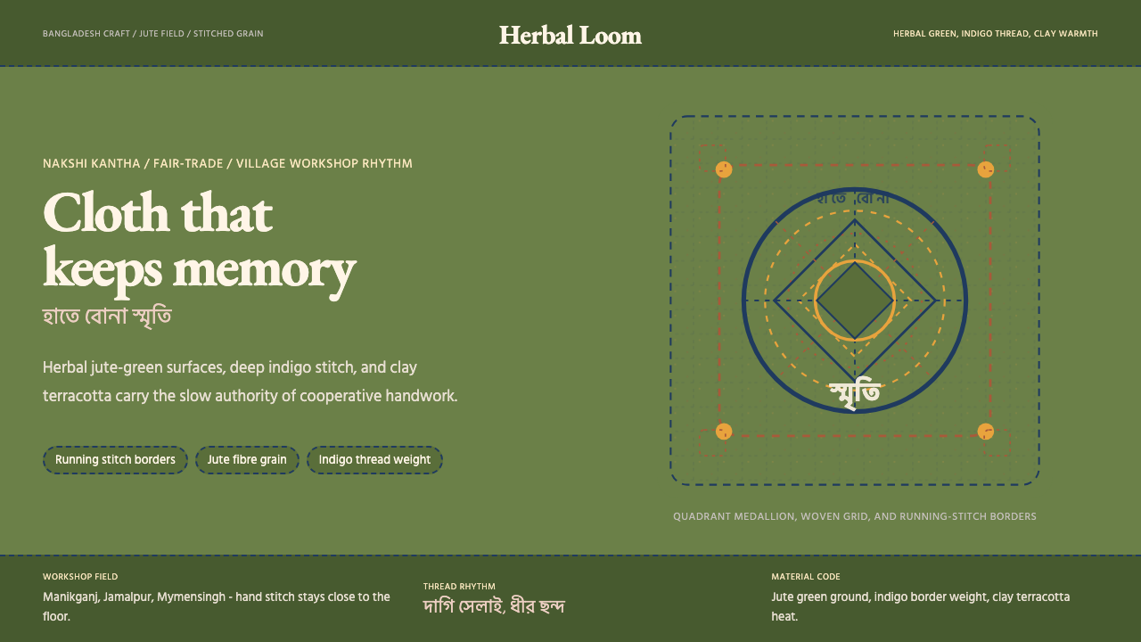 Bangladeshi Jute CraftMemory stays stitched. Jute green, indigo borders, terracotta warmth.记忆被缝进画面。黄麻绿、靛蓝虚线、陶土暖调。
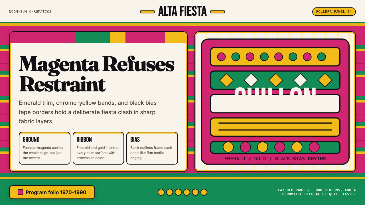 Bolivian Pollera Fiesta MagentaChromatic defiance. Magenta ground, emerald bands and black outlines clash li…色彩拒绝克制:品红底、翡翠带、黑滚边制造节庆撞色。
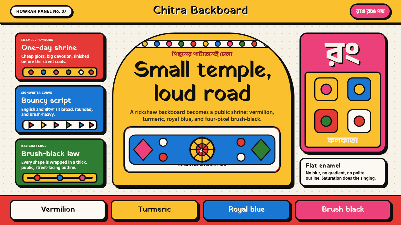 Bengali Rickshaw ArtStreet devotion shouts. Vermilion-haldi panels and brush-black arches turn pl…街头虔敬在喊。朱红姜黄板面与粗黑拱框让胶合板成庙。
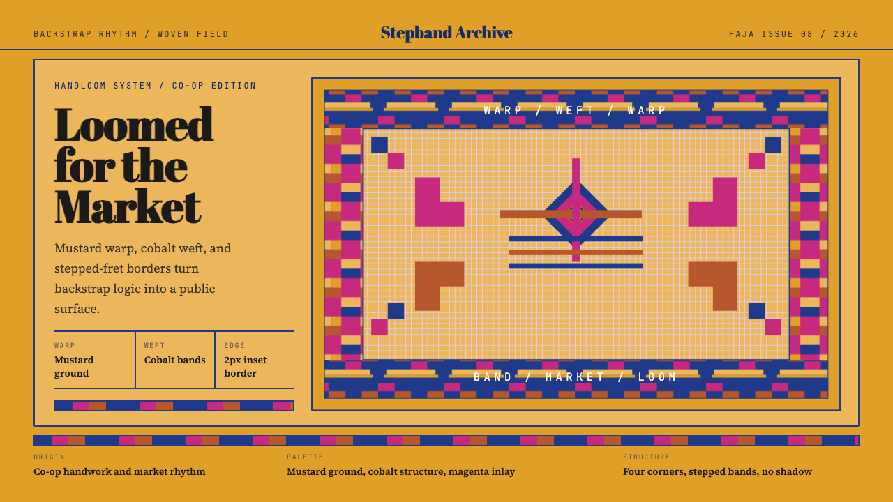 Otavalo Andean TextileThe loom stays vivid. Mustard ground, cobalt bands, stepped-fret borders.织机依旧鲜活。芥末底、钴蓝带纹与阶梯边框。
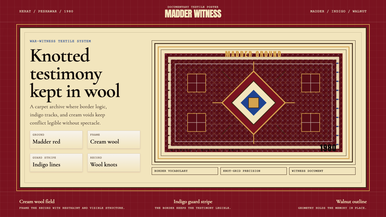 Afghan War Rug (1980)Witness in wool. Madder red, indigo, and cream borders knot testimony into a…羊毛中的见证。茜草红、靛蓝与奶油边框编出结网证词。