Design style guide设计风格指南
What is Bolivian Pollera Fiesta Magenta?什么是 Bolivian Pollera Fiesta Magenta?
Bolivian Pollera Fiesta Magenta is chromatic defiance in dress form — a visual system born from Aymara celebration culture that weaponizes clashing color as an act of cultural pride.玻利维亚波列拉节庆品红是以服饰为形的色彩反叛——一套从艾马拉庆典文化中生长出来的视觉体系,将撞色化为文化自豪的武器。
Bolivian Pollera Fiesta Magenta in briefBolivian Pollera Fiesta Magenta 速览
Bolivian Pollera Fiesta Magenta is a design system rooted in the vibrant, unapologetically loud visual identity of Aymara celebration dress from Bolivia's highland cities. It takes the festive pollera — the multi-layered skirt worn by cholitas, the indigenous and mestiza women of the Andes — as its organizing metaphor and its source of chromatic logic.玻利维亚波列拉节庆品红是一套植根于玻利维亚高原城市艾马拉庆典服饰那种鲜艳、毫不妥协的视觉身份的设计系统。它以节庆波列拉——乔利塔(安第斯高原土著与混血女性)所穿的多层裙——作为组织隐喻与色彩逻辑的来源。
Where many historical design styles pursue restraint, this aesthetic actively refuses it. Magenta saturates the ground itself, so that every other element exists in dialogue with an already dominant hue. Cards and content panels float as off-white islands — evoking the pale pollera underslips that peek beneath the outer skirts — outlined in the bold black trim that real tailor families stitch along every seam and hem. Accent surfaces carry the warm shimmer of fiesta ribbon and embroidered gold banding.许多历史风格以克制为追求,这套美学却主动拒绝克制。品红浸透底面本身,使其他一切元素都与一个已然强势的色调展开对话。卡片与内容面板如米白色小岛漂浮其上——唤起从外裙下方露出的波列拉衬裙——四周以粗黑滚边勾勒,恰如真实裁缝家族沿每条缝线与裙摆缝制的镶边。装饰面带着节庆缎带与刺绣金带的温暖光泽。
This is not chaos for its own sake. The aesthetic system has its own internal order: the magenta ground provides a consistent dominant field, the black outlines create crisp containment, and the accent colors — saturated greens, warm golds, and clear whites — are deployed at specific weights and positions to guide the eye in the same way that contrast banding on a traditional skirt draws attention to layers, motion, and craftsmanship.这不是为混乱而混乱。这套美学体系有其内在秩序:品红底面提供一致的主导色域,黑色轮廓创造清晰的包容,而饱和翠绿、暖金与纯白等强调色则以特定的重量和位置引导视线——正如传统裙裾上的对比镶边将注意力引向层次、动态与工艺。
See the Bolivian Pollera Fiesta Magenta design system →查看 Bolivian Pollera Fiesta Magenta 完整设计系统 →
Where does Bolivian Pollera Fiesta Magenta come from?Bolivian Pollera Fiesta Magenta 从何而来?
The pollera itself has a contested origin. Spanish colonial authorities in the eighteenth century imposed the garment on indigenous women as a marker of subordinate social status — a way of visually distinguishing the colonized from the colonial elite. What happened next is one of the more remarkable reversals in the history of dress: Andean women, particularly among the Aymara-speaking communities of the altiplano, adopted the form and transformed it into an emblem of identity and pride. By the nineteenth century, the pollera had become inseparable from cholita identity in cities like La Paz, Cochabamba, and Oruro.波列拉本身有着充满争议的起源。十八世纪,西班牙殖民当局将这种服装强加给土著女性,作为标示从属社会地位的符号——一种在视觉上区分被殖民者与殖民精英的方式。接下来发生的事,是服饰史上最值得记录的反转之一:安第斯女性,尤其是高原艾马拉语社区的成员,接受了这一形式,并将其转化为身份认同与自豪的徽章。到十九世纪,波列拉已与拉巴斯、科恰班巴、奥鲁罗等城市的乔利塔身份密不可分。
The chromatic intensity that defines this design system took its modern form after Bolivia's 1952 National Revolution, which abolished indigenous servitude and formally extended citizenship rights to Bolivia's indigenous majority. In La Paz, the tailor families concentrated on Avenida Buenos Aires — the street that became the center of pollera production and trade — began responding to a newly emboldened clientele. The garments grew louder, the contrasts sharper. Fuchsia and magenta grounds appeared trimmed with bands of emerald, chrome yellow, and black bias tape. These were not modest accommodations to fashion; they were chromatic declarations of presence and belonging.定义这套设计系统的色彩强度,在玻利维亚1952年国家革命后获得了现代形态。那场革命废除了对土著人的劳役制度,正式将公民权利赋予玻利维亚土著多数群体。在拉巴斯,集中于布宜诺斯艾利斯大道的裁缝家族——那条成为波列拉生产与贸易中心的街道——开始回应一批重新振奋的客户。服装变得更响亮,对比更锐利。品红与洋红底面出现了翡翠绿、铬黄与黑色斜纹布镶边。这些不是对时尚的温和顺应,而是存在与归属的色彩宣言。
The Oruro Carnaval, held annually in the weeks before Lent in the city of Oruro, became the most spectacular arena for fiesta-pollera aesthetics. Oruro's carnival traditions draw from both pre-Columbian religious practice and Spanish Catholic overlay, and the visual intensity of the celebrations — processions of thousands of dancers in elaborate costumes, moving for hours through narrow streets — created a competitive environment in which color and craftsmanship became measures of social standing. The polleras worn at Carnaval were the most elaborate and expensive garments their owners possessed, and the color combinations pushed toward maximum contrast and saturation.每年在四旬期前数周于奥鲁罗市举行的奥鲁罗狂欢节,成为节庆波列拉美学最壮观的竞技场。奥鲁罗的狂欢节传统兼融哥伦布前的宗教仪式与西班牙天主教叠加,庆典的视觉强度——数千名盛装舞者的队列在狭窄街道中行进数小时——创造了一个以色彩与工艺衡量社会地位的竞争环境。狂欢节上所穿的波列拉是其主人最精工最昂贵的服装,色彩搭配向最大对比度与饱和度推进。
The key figures associated with this visual tradition include Luisa Dörr, whose photographic documentation of cholita culture brought the aesthetic to international attention; Eliana Paco Paredes, a fashion designer who elevated pollera construction to fine-craft status and brought the form into contemporary fashion conversation; Rosario Aguilar, whose tailoring work for Oruro's Carnaval dancers became a reference point for fiesta-pollera aesthetics; and Andrés Gómez Vela, a writer and cultural journalist whose chronicling of Bolivian highland culture provided historical grounding for understanding how the visual traditions of the pollera developed across the twentieth century.与这一视觉传统相关的关键人物包括:摄影师路易莎·德尔,她对乔利塔文化的影像记录将这套美学带入国际视野;时装设计师埃利亚娜·帕科·帕雷德斯,她将波列拉制作提升至精工艺术地位,并将其带入当代时尚对话;罗萨里奥·阿吉拉尔,她为奥鲁罗狂欢节舞者所做的裁缝工作成为节庆波列拉美学的参照基准;以及作家兼文化记者安德烈斯·戈麦斯·维拉,他对玻利维亚高原文化的编年记录为理解波列拉视觉传统在二十世纪的发展脉络提供了历史依据。
What defines the Bolivian Pollera Fiesta Magenta look?Bolivian Pollera Fiesta Magenta 的视觉特征是什么?
Dominant Ground Color主导底色
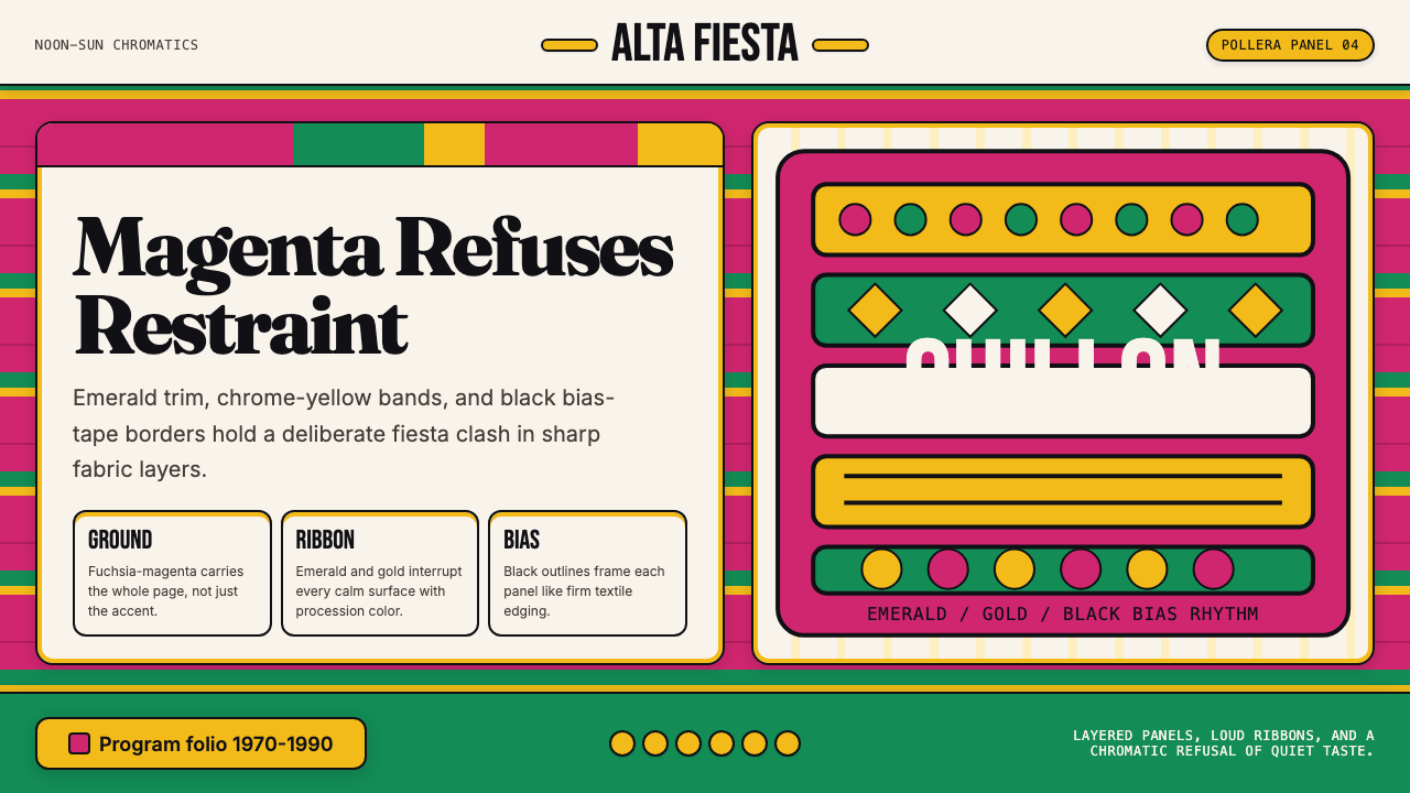
The system is built on a single, intensely saturated magenta ground that occupies the full background field. This is not a background in the conventional sense — an understated surface that defers to foreground content. It is itself a statement: vivid, warm, and demanding. Everything placed on top of it must either harmonize through contrast or be absorbed by it. This approach mirrors the way a fiesta pollera works: the skirt's ground color is the dominant visual fact, and all trim and embellishment exist in relation to it.这套系统建立在一个单一的、高度饱和的品红底面上,它占据整个背景色域。这不是传统意义上的背景——那种谦逊地退让给前景内容的衬底。它本身就是一种宣言:鲜艳、温暖、强势。置于其上的一切,必须通过对比形成和谐,否则将被它吞没。这种方式映照了节庆波列拉的运作逻辑:裙裾的底色是主导性的视觉事实,所有镶边与装饰都在与它的关系中存在。
Black Outline Structure黑色轮廓结构
Every panel, card, and content block is contained by a bold black outline. This outline is not subtle — it is drawn with the same emphatic weight as the bias tape that finishes the edges of a real pollera skirt. The effect is to make each element pop cleanly off the magenta ground, reading as a discrete, finished object. Black outlines also serve a structural function: they enforce containment and hierarchy in a palette where the dominant ground color might otherwise overwhelm distinctions between elements.每个面板、卡片与内容块都被粗黑轮廓包围。这条轮廓毫不含蓄——它以与真实波列拉裙缘斜纹布镶边同样强调的分量绘制。效果是让每个元素从品红底面上干净地弹出,读作一个独立的、完整的对象。黑色轮廓也承担结构功能:在一个主导底色可能淹没元素间差异的色板中,它们强制执行包容性与层级。
Contrasting Accent Bands对比强调带
Saturated secondary colors — most prominently a deep emerald green and a warm gold — appear as accent bands, borders, or surface highlights. These correspond directly to the emerald trim and gold ribbon characteristic of the fiesta pollera. The accent colors are not used as fills for large surfaces; they appear at the edges and margins of elements, functioning exactly as decorative banding on fabric does: marking transitions, emphasizing structure, and adding visual richness without displacing the dominant color logic.饱和的辅助色——最突出的是深翠绿与暖金——以强调带、边框或表面高光的形式出现。这些直接对应节庆波列拉特有的翠绿镶边与金色缎带。强调色不用于大面积填充,它们出现在元素的边缘与边界,恰如织物上的装饰镶边:标示过渡,强调结构,在不取代主色逻辑的前提下增加视觉丰富性。
Off-White Panel Float米白面板漂浮
Content-bearing panels — those that hold text, data, or images — are rendered in a warm off-white rather than pure white. This tone is close to the undyed cotton or pale silk of the pollera's interior lining and underslips. Placed against the magenta ground with black outlines, these panels read as physical objects — cloth panels cut and arranged — rather than as digital surfaces. The slight warmth of the off-white prevents the composition from reading as simply oppositional black-and-white against a colored background.承载内容的面板——那些包含文字、数据或图像的——以温暖的米白色而非纯白呈现。这种色调接近波列拉内衬和衬裙所用的未漂白棉或淡色丝绸。在品红底面上以黑色轮廓包围,这些面板读作实体物件——裁切排列的布料面板——而非数字表面。米白色的微微暖意防止整体构图被读作仅仅是彩色底面上的黑白对立。
Layered Depth Through Arrangement通过排列产生的层次深度
The aesthetic communicates depth not through gradients or soft shadows but through layering of flat elements at different compositional weights. A full-bleed magenta ground sits beneath off-white panels, which in turn frame smaller accent-colored bands. This mirrors the physical construction of the pollera itself, which achieves its visual volume through the layering of multiple petticoats and skirts. The depth is structural and literal — one layer on top of another — rather than illusionistic.这套美学通过不同构图重量的平面元素叠加来传达深度,而非依赖渐变或柔和阴影。满版品红底面托住米白面板,面板再框住更小的强调色带。这映照了波列拉本身的物理构造:通过多层衬裙与外裙的叠加获得视觉体量。深度是结构性的、字面意义上的——一层置于另一层之上——而非幻觉式的。
Typography as Bold Declaration字体排印作为大胆宣言
Type in this system is set with the same directness and confidence as the color palette. Headlines are large, weighted, and unambiguous. Body text sits comfortably within the off-white panels, using the panel's warm ground as contrast rather than the magenta field. The typographic hierarchy mirrors the visual hierarchy of the overall composition: dominant, then contained, then detailed — the same progression as ground color, then panel, then accent band.这套系统中的字体排印与色板具有同样的直接性与自信。标题粗大、有力、清晰无歧义。正文安适地置于米白面板中,以面板的暖底面形成对比,而非与品红色域直接对话。字体排印层级映照整体构图的视觉层级:主导、包容、细节——与底色、面板、强调带的层递完全一致。
Celebratory Intensity as Principle节庆强度作为原则
Unlike design systems that treat restraint as virtue, this aesthetic treats festive intensity as the governing value. Color is not deployed sparingly; it is deployed abundantly, with the understanding that abundance is itself the message. This has a specific cultural meaning in the context of Bolivian cholita culture: the loudness of the fiesta pollera is an assertion of visibility and pride by communities that colonial history tried to make invisible. Using this system well means accepting its fundamental premise — that more can be more, and that maximum chromatic presence is a legitimate design goal.与将克制视为美德的设计系统不同,这套美学将节庆强度作为主导价值。色彩不是节制地使用,而是充裕地使用,并以丰盛本身即是信息的理解为前提。在玻利维亚乔利塔文化的语境中,这有着特定的文化含义:节庆波列拉的张扬是那些曾被殖民历史试图抹去的族群对可见性与尊严的宣示。善用这套系统,意味着接受其根本前提——多可以是多,最大色彩存在感是一个合理的设计目标。
See the Bolivian Pollera Fiesta Magenta design system →查看 Bolivian Pollera Fiesta Magenta 完整设计系统 →
Who shaped Bolivian Pollera Fiesta Magenta?谁塑造了 Bolivian Pollera Fiesta Magenta?
A La Paz-based fashion designer who became one of the most prominent voices elevating the pollera from everyday dress to fine-craft fashion. Paco Paredes brought cholita aesthetics onto runways and into fashion media, framing the garment's chromatic boldness as a deliberate artistic choice rather than folk convention. Her work helped establish the fiesta-pollera visual vocabulary as a coherent design tradition worthy of international attention.这位拉巴斯时装设计师成为将波列拉从日常服装提升至精工时尚最具影响力的声音之一。帕科·帕雷德斯将乔利塔美学带上秀台和时尚媒体,将这件服装的大胆色彩定性为有意为之的艺术选择,而非民俗惯例。她的工作帮助确立了节庆波列拉视觉词汇作为值得国际关注的连贯设计传统的地位。
A documentary photographer whose sustained attention to cholita culture in Bolivia brought its visual language to global audiences. Dörr's photographs — with their careful attention to the layering, color, and movement of the pollera in everyday and ceremonial contexts — provided an accessible visual archive for understanding how the garment's color system works in practice. Her work demonstrated that the fiesta-pollera aesthetic was not a historical artifact but a living, contemporary visual culture.一位纪录片摄影师,她对玻利维亚乔利塔文化持续的关注将其视觉语言带给全球受众。德尔的照片——在日常与仪式语境中对波列拉的层次、色彩与动态的细心关注——提供了一个理解这件服装色彩系统在实践中如何运作的可及视觉档案库。她的工作证明了节庆波列拉美学不是历史遗物,而是一种鲜活的当代视觉文化。
A tailor whose work for Oruro Carnaval dancers became a reference point for the fiesta-pollera aesthetic at its most elaborate. The Oruro Carnaval is the context in which pollera design is pushed to its expressive limits, and the tailors who supply garments for the procession's lead dancers are recognized as craftspeople of the highest order. Aguilar's command of color combination, embroidery, and structural layering helped define what fiesta-pollera intensity looked like at its peak expression.一位裁缝,她为奥鲁罗狂欢节舞者所做的工作成为节庆波列拉美学在最精工形态下的参照基准。奥鲁罗狂欢节是波列拉设计被推至表现极限的场域,为队列领舞者供应服装的裁缝被视为最高级别的工艺人。阿吉拉尔在色彩搭配、刺绣与结构分层方面的造诣,帮助界定了节庆波列拉强度在其巅峰表达形态下的面貌。
A Bolivian writer and cultural journalist whose chronicles of highland Bolivian society documented the social and political dimensions of cholita dress. Gómez Vela's writing provided historical grounding for understanding the pollera not just as a garment but as a carrier of social meaning — tracing how the forced imposition of colonial-era dress became, over generations, an act of cultural reclamation. His work is essential context for understanding why this design system's intensity is not decorative excess but principled statement.一位玻利维亚作家兼文化记者,他对玻利维亚高原社会的编年记录记录了乔利塔服饰的社会与政治维度。戈麦斯·维拉的文字为将波列拉不仅理解为服装、而是理解为社会意义载体提供了历史依据——追溯殖民时代强制服装如何经过数代人的演变,成为一种文化夺回的行动。他的工作是理解这套设计系统的强度为何不是装饰性过度,而是有原则的宣言的重要背景。
How do you use Bolivian Pollera Fiesta Magenta today?今天怎么用 Bolivian Pollera Fiesta Magenta?
Bolivian Pollera Fiesta Magenta is a high-intensity style that rewards commitment. It is not a background system or a neutral vessel — it is an argument. Using it effectively means accepting its premises: that the dominant ground color is the visual fact around which everything else organizes, that black outlines give structure rather than reduce energy, and that accent colors appear in bands and edges rather than as fills. Half-applying it — using the accent colors without the magenta ground, or using the black outlines without the off-white panels — produces confusion rather than vibrancy.玻利维亚波列拉节庆品红是一种高强度风格,回报以全情投入。它不是背景系统,不是中性容器,而是一种主张。有效使用它,意味着接受其前提:主导底色是其他一切围绕其组织的视觉事实;黑色轮廓提供结构而非削减能量;强调色以带状与边缘形式出现,而非作为大面积填充。半途而废地应用——使用强调色而不用品红底面,或用黑色轮廓而不用米白面板——产生的是混乱而非活力。
For presentation slides, this system creates unforgettable cover pages and section dividers. A cover built on the magenta ground with a large off-white panel bearing the title, outlined in black and trimmed with a gold accent band, communicates confidence and cultural specificity immediately. Content slides should commit to the panel structure: text lives inside clearly delineated off-white blocks, not floating directly on the magenta. Data visualizations benefit from using the emerald and gold accent tones for chart elements, with black for axis lines and labels — the result reads as controlled and intentional even at high chromatic intensity.对于演示文稿,这套系统创造令人难忘的封面页与章节分割页。以品红底面为基础、大面积米白面板承载标题、黑色轮廓金色强调带点缀的封面,立刻传达自信与文化特殊性。内容页应当坚持面板结构:文字生活在清晰划定的米白块中,而非直接漂浮于品红底面。数据可视化可将翠绿与金色强调色用于图表元素,黑色用于坐标轴线与标签——即便在高色彩强度下,结果仍读作受控且有意为之。
For web interfaces, this style is best suited to landing pages, campaign microsites, cultural platforms, and editorial experiences where strong visual identity matters more than quiet legibility. Navigation and interactive elements should use the black-outline treatment consistently — buttons framed in black on the magenta ground, or inverse black buttons with off-white text for the primary call to action. A dashboard or productivity tool built entirely in this system would be overwhelming; however, deploying it for a hero section, splash screen, or promotional banner within a more neutral overall interface can be highly effective.对于网页界面,这种风格最适合落地页、活动微站、文化平台以及强视觉身份胜于安静易读性的编辑体验。导航与交互元素应一致地采用黑色轮廓处理——品红底面上黑色框架按钮,或主要行动号召使用米白文字的反色黑色按钮。完全以这套系统构建的仪表板或生产力工具会令人不堪重负;然而,在更为中性的整体界面中,将其部署于英雄区、启动画面或推广横幅,则可以极为有效。
For editorial and marketing work, the style excels at posters, campaign covers, social media graphics, and event collateral where maximum visual impact is the goal. The fiesta-pollera palette communicates celebration, pride, and cultural confidence — making it well-suited to cultural institutions, festivals, community organizations, and brands that want to signal warmth, boldness, and identity. Marketing copy placed within this system should be short and declarative; the visual intensity speaks loudly enough that text needs to be equally direct rather than discursive.对于编辑与营销内容,这种风格在海报、活动封面、社交媒体图形以及以最大视觉冲击力为目标的活动周边上表现卓越。节庆波列拉色板传达庆典、自豪与文化自信——使其非常适合文化机构、节庆活动、社区组织,以及希望传递温暖、大胆与身份认同的品牌。置于这套系统中的营销文案应当简短而宣言式;视觉强度已足够响亮,文字需要同等直接,而非娓娓道来。
A common mistake when applying this system is treating the magenta ground as just another background color and allowing elements to float on it without the anchoring black outlines and structured off-white panels. Without these structural elements, the composition loses the layered-garment quality that gives it depth and meaning, and the result reads as simply a very pink design rather than as a culturally grounded visual system. Another error is introducing additional colors beyond the core palette — particularly cool tones like lavender or slate — which disrupt the warm chromatic logic and produce a muddled result. Stay within the system: magenta, off-white, black, emerald, and gold are sufficient for every compositional need.应用这套系统时的常见错误,是将品红底面仅仅视为又一种背景颜色,让元素在没有锚定性黑色轮廓与结构化米白面板的情况下漂浮其上。缺少这些结构元素,构图就失去了赋予其深度与意义的层叠服装质感,结果读作只是一个非常粉的设计,而非有文化根基的视觉系统。另一个错误是引入核心色板之外的额外色彩——尤其是薰衣草或石板蓝等冷色调——这会打破暖色系的色彩逻辑,产生混浊的结果。坚守这套系统:品红、米白、黑色、翠绿与金色,足以满足一切构图需求。
See the Bolivian Pollera Fiesta Magenta design system →查看 Bolivian Pollera Fiesta Magenta 完整设计系统 →
Bolivian Pollera Fiesta Magenta — FAQBolivian Pollera Fiesta Magenta · 常见问题
Isn't using this style in a digital product appropriating Bolivian Indigenous culture?在数字产品中使用这种风格,是否构成对玻利维亚土著文化的挪用?
Cultural appropriation concerns are most acute when a style is used to profit from a community's identity while that community remains marginalized and uncredited. The Bolivian cholita tradition is a living, growing culture — not a historical artifact — and the women who carry it have actively sought international visibility for their aesthetic. The ethical path when using this system is to understand its history, acknowledge its sources, and deploy it in ways that celebrate rather than diminish its cultural meaning. Using fiesta-pollera aesthetics for a platform serving Latin American communities, or for a project with explicit cultural ties, is a very different act from using it as an arbitrary 'exotic' visual flavor with no connection to its origins.当一种风格被用于从某个社区的身份认同中获益,而该社区仍处于边缘化且未获致谢的状态时,文化挪用的担忧最为尖锐。玻利维亚乔利塔传统是一种鲜活的、仍在成长的文化——而非历史遗物——而承载这一传统的女性们已积极寻求其美学的国际可见性。使用这套系统的道德路径,是理解其历史、承认其来源,并以颂扬而非贬低其文化含义的方式部署它。将节庆波列拉美学用于服务拉美社区的平台,或用于有明确文化关联的项目,与毫无来源联结地将其作为任意「异域」视觉风味使用,是截然不同的行为。
Can this style work for products that have nothing to do with Bolivia or Latin America?这种风格能否用于与玻利维亚或拉丁美洲毫无关联的产品?
Yes, though with care. Design systems travel — that is what makes them useful. The fiesta-pollera aesthetic's formal properties (bold ground color, high contrast, structured layering, celebratory intensity) are applicable to any product that wants to communicate confidence, warmth, and visual boldness. The style works particularly well for creative industries, cultural organizations, event branding, and consumer products where energy and differentiation matter. It would be out of place in contexts requiring clinical neutrality: medical software, financial compliance tools, or enterprise infrastructure platforms. The visual vocabulary is too specific and too warm for those contexts.可以,但需谨慎。设计系统会旅行——这正是它们有用之处。节庆波列拉美学的形式特性(大胆底色、高对比度、结构化分层、节庆强度)适用于任何希望传递自信、温暖与视觉大胆感的产品。这种风格尤其适合创意产业、文化组织、活动品牌,以及能量感与差异化至关重要的消费品。它在需要临床中性的语境中会显得格格不入:医疗软件、金融合规工具或企业基础设施平台。对那些语境来说,这套视觉词汇过于特定,过于温暖。
How is this different from other Latin American design traditions?这与其他拉丁美洲设计传统有何不同?
Latin America contains enormous visual diversity, and this system is specifically Andean Bolivian — not Mexican, Caribbean, or generically Latin American. The distinction matters. Mexican folk design traditions (Oaxacan textiles, Talavera, papel picado) use a different chromatic logic, different compositional structures, and carry different cultural references. This system's specific qualities — the magenta dominant ground, the black bias-tape outlining, the emerald and gold accent banding, the off-white panel float — come from the Aymara highland city context and the particular social history of the pollera. Using it as a generic stand-in for 'Latin American' visual identity erases the specificity that makes it meaningful.拉丁美洲蕴含巨大的视觉多样性,这套系统特属于安第斯玻利维亚——而非墨西哥、加勒比或泛化的拉丁美洲。这一区分至关重要。墨西哥民间设计传统(瓦哈卡纺织品、塔拉韦拉、镂空彩纸)使用不同的色彩逻辑、不同的构图结构,承载不同的文化参照。这套系统的特定品质——品红主导底面、黑色斜纹布轮廓、翡翠绿与金色强调带、米白面板漂浮——来自艾马拉高原城市语境与波列拉特定的社会历史。将其作为「拉丁美洲」视觉身份的通用替代品使用,会抹去赋予它意义的特殊性。
What is the right context for the intensity of this style — when is it too much?这种风格的强度在什么语境下是合适的?何时会过度?
The intensity is right when the product or experience is itself intense — celebrations, launches, campaigns, cultural events, promotions, or any moment of heightened significance. It becomes too much when applied to experiences requiring sustained concentration over long periods: reading-heavy editorial content where the magenta ground competes with text legibility, task management tools where users need visual calm to prioritize work, or any context where the user's cognitive load is already high. The key question is whether the design's energy serves the user's purpose at that moment. For a splash screen or event poster, maximum energy is appropriate. For a three-hundred-page document viewer, it is not.当产品或体验本身就充满强度时,这种强度是恰当的——庆典、发布、活动、文化事件、促销,或任何意义提升的时刻。当它被应用于需要长时间持续专注的体验时,就变得过度:大量阅读的编辑内容(品红底面与文字易读性竞争)、任务管理工具(用户需要视觉平静来排序工作),或任何用户认知负荷已然很高的语境。关键问题是:设计的能量是否在那个时刻服务于用户的目的?对于启动画面或活动海报,最大能量是恰当的。对于三百页的文档阅读器,则不然。
Does the style work in a light mode only, or can it be adapted to a dark interface?这种风格只适合浅色模式,还是可以改编为深色界面?
The canonical form of this style is built on the magenta ground, which is a warm, mid-value color — neither light nor dark in the conventional sense. A dark-mode adaptation is possible but requires significant restructuring. Simply inverting the palette produces murky results: magenta on dark backgrounds loses its warmth and reads as cool and acidic. A more successful approach to a dark variant would use a deep burgundy or near-black ground, promote the gold and emerald accents to greater prominence, and use the magenta as an accent rather than the dominant field. This is a related but distinct aesthetic — the fiesta-pollera influence remains legible, but the overall register shifts from midday brightness to evening festival warmth.这种风格的标准形态建立在品红底面上,品红是一种温暖的中间值颜色——在传统意义上既非浅也非深。深色模式改编是可能的,但需要显著的结构重组。简单反转色板会产生浑浊的效果:深色背景上的品红失去其温暖,读作冷调与刺眼。深色变体更成功的做法是使用深勃艮第红或近黑底面,将金色与翡翠绿强调色提升至更突出的位置,并将品红用作强调色而非主导色域。这是一套相关但有别的美学——节庆波列拉的影响仍清晰可辨,但整体气质从正午的明亮转向了夜晚节庆的暖光。
Related design styles相关设计风格
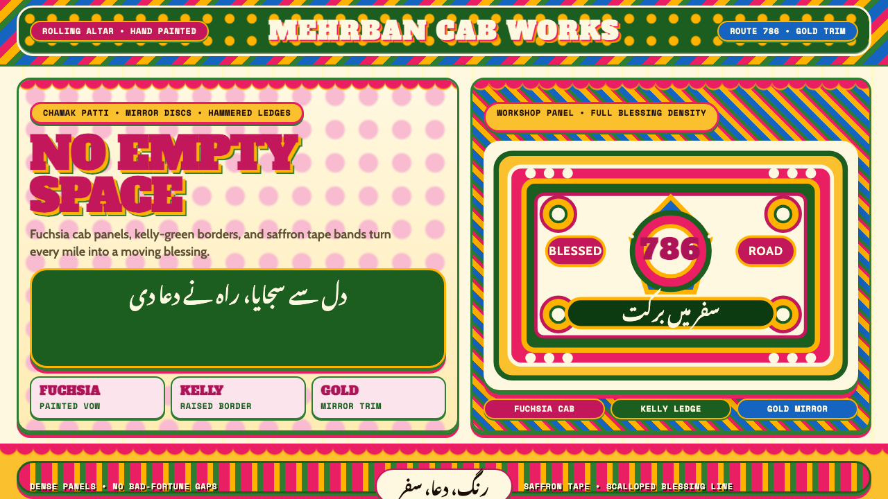 Pakistani Truck ArtBlessing crowds every inch. Fuchsia, kelly green, and gold stack into scallop…祝福挤满每寸空间:玫红、凯利绿与金色叠成扇贝边面板。
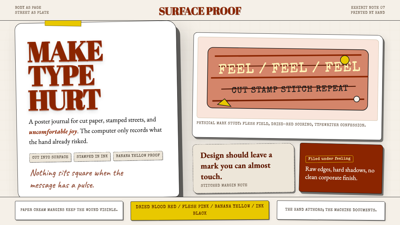 Stefan SagmeisterPain becomes typography. Flesh pink, dried blood red, banana yellow; broken p…痛感变成字体:肉粉、血红与香蕉黄堆成破格纸面。
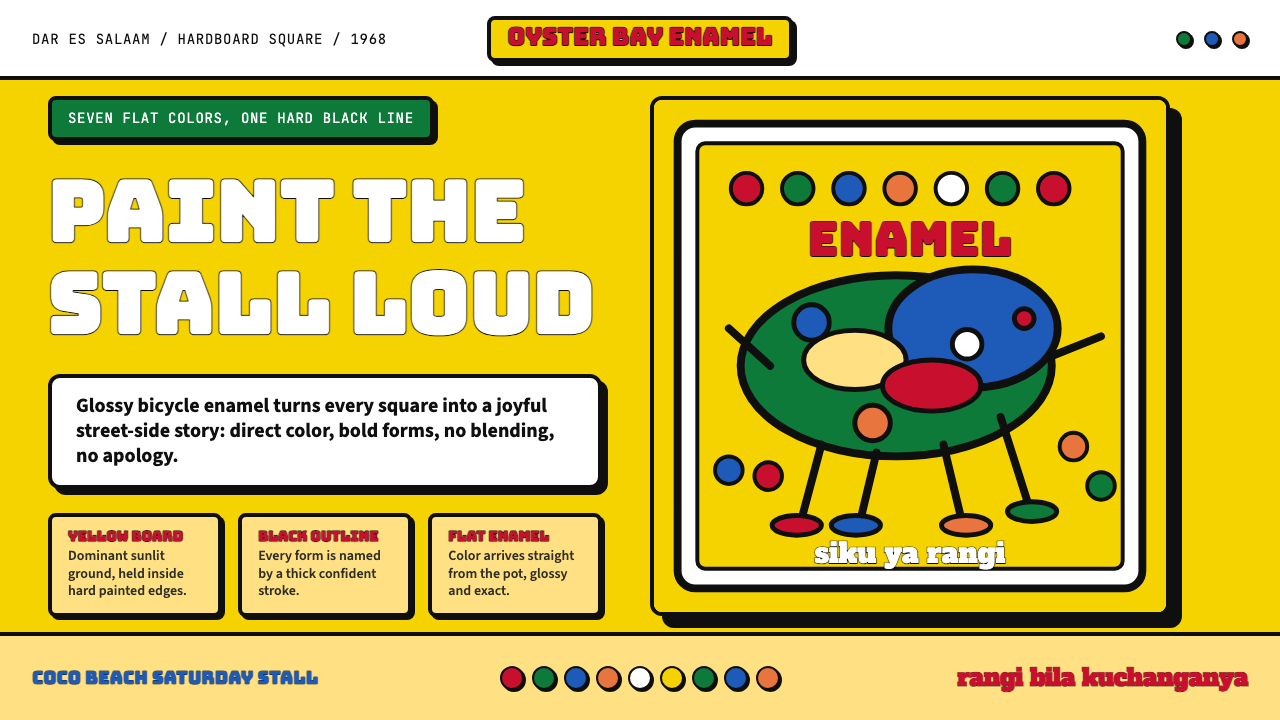 Tingatinga PaintingJoy refuses blending. Enamel yellow, Bungee strokes, and black-outlined flat…快乐拒绝调色:搪瓷黄、Bungee粗字与黑描边平涂。
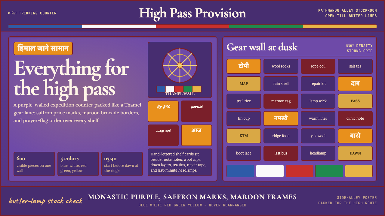 Kathmandu Thamel TrekkingSacred clutter sells the climb. Purple walls, saffron type, prayer-flag bands…神圣拥挤贩卖登山:紫墙、藏红花字与经幡色带填满画面。
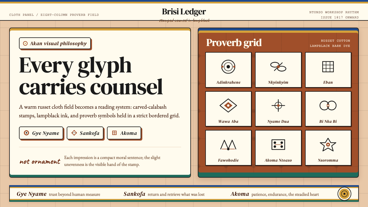 Akan Adinkra (Ghana)Proverbs become cloth. Russet grids, lampblack serif marks, and gold-edge ban…箴言化为布面:赭红网格、灯烟黑印纹与金边带盖出意义。
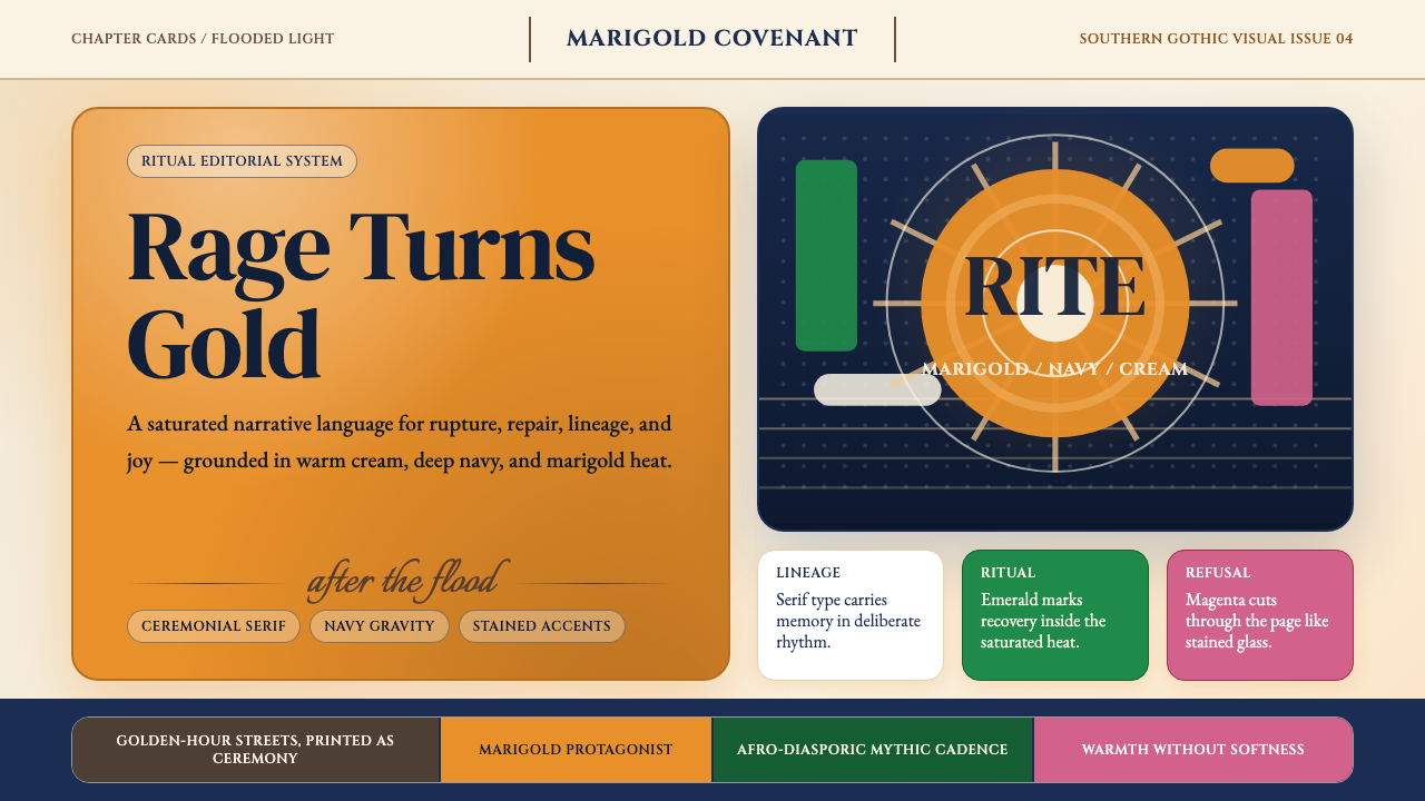 Beyoncé — LemonadeMythic heat refuses restraint. Marigold blocks, navy gravity, serif ceremony.神话般热度拒绝收敛。金盏黄块面、深海军蓝与仪式衬线成形。