What is Beyoncé — Lemonade?什么是 Beyoncé — Lemonade?
Lemonade drowns the frame in marigold and ceremony — saturated Southern Gothic heat that refuses to be quiet, modest, or contained.《Lemonade》用金盏黄与仪式感淹没画面——那是饱和的南方哥特热度,拒绝安静、克制或收敛。
Beyoncé — Lemonade in briefBeyoncé — Lemonade 速览
The Beyoncé — Lemonade aesthetic is the visual language of the 2016 visual album of the same name, the most influential piece of music-film crossover art of the 2010s. It is built on a palette of saturated marigold yellow, warm cream, deep navy, and vivid accents of emerald and magenta, rendered through editorial-photographic composition that draws equally from Southern Gothic painting, Afro-Diasporic spiritual iconography, and high-fashion runway imagery. The result feels simultaneously mythic and intimate — a fever dream rooted in a specific Black Southern landscape.碧昂丝《Lemonade》美学,是2016年同名视觉专辑所构建的视觉语言体系——这是2010年代最具影响力的音乐与影像跨界艺术作品。它建立在饱和金盏黄、暖奶油色、深海军蓝,以及翡翠绿与玫红色鲜明点缀的色板之上,通过编辑式摄影构图呈现——这套构图同等地汲取南方哥特绘画、泛非裔灵性图像志与高级时装T台的养料。最终结果兼具神话性与亲密感——一场扎根于特定黑人南方风土的热病幻梦。
Unlike many design systems defined by restraint, Lemonade is defined by controlled excess. Color is pushed to the edge of saturation without crossing into visual noise. Fabric and natural textures — ruffled silk, Spanish moss, Louisiana floodwater — are treated as compositional mass rather than surface decoration. Ceremony and ritual are encoded into the framing: figures appear enthroned, processional, anointed. The aesthetic does not present Black female experience as subordinate to a mainstream gaze; it stages it as the center of its own mythology.与许多以克制为定义的设计体系不同,《Lemonade》以有控制的过度为定义。色彩被推到饱和度的边缘,却不越过视觉噪音的临界点。织物与自然肌理——荷叶边真丝、西班牙苔藓、路易斯安那洪水——被当作构图体量而非表面装饰来处理。仪式与礼典被编码进画面构图:人物以登基、列队、受膏的姿态出现。这套美学并不将黑人女性经验呈现为从属于主流凝视的客体,而是将其置于自身神话的中心加以建构。
Across slides, web design, editorial layouts, and brand campaigns, the Lemonade visual language has become a reference point for work that wants warmth, power, and cultural specificity without sacrificing visual sophistication. It is neither minimal nor maximalist in the conventional sense — it is ceremonial, and ceremony has its own precise grammar.在幻灯片、网页设计、编辑版面与品牌活动中,《Lemonade》的视觉语言已成为那些寻求温度、力量与文化特殊性、同时又不牺牲视觉精密度的作品的重要参照。它既不是惯常意义上的极简,也不是极繁——它是仪式性的,而仪式自有其精确的语法。
See the Beyoncé — Lemonade design system查看 Beyoncé — Lemonade 完整设计系统
Where does Beyoncé — Lemonade come from?Beyoncé — Lemonade 从何而来?
Beyoncé Knowles-Carter launched her solo career in 2003 following her departure from Destiny's Child, but the visual language now called Lemonade did not crystallize until more than a decade later. The groundwork was laid by her 2013 self-titled visual album, which pioneered the format of releasing a full-length album accompanied by a film for every track. That project established that Beyoncé's creative output would operate simultaneously as music, cinema, fashion editorial, and cultural statement — not one medium at a time but all at once.碧昂丝·诺尔斯-卡特于2003年离开天命真女后开始个人演艺生涯,但如今被称为《Lemonade》的视觉语言直到十余年后才最终成形。2013年同名视觉专辑为此奠基——那张专辑开创了为每首曲目配套一部短片、以整体影像呈现完整唱片的形式,确立了碧昂丝的创作将同时以音乐、电影、时装编辑与文化宣言的形态运作——不是逐一呈现,而是同时展开。
Lemonade arrived on April 23, 2016, as an HBO film before it became an album available on Tidal. The hourlong film was directed collaboratively by a group that included Kahlil Joseph, Melina Matsoukas, Dikayl Rimmasch, Mark Romanek, and Jonas Åkerlund, with Beyoncé herself as the overarching creative director. Production designer Hannah Beachler was central to translating the film's emotional architecture into physical space: the flooded streets of New Orleans, the plantation house interiors reclaimed as spaces of Black feminine power, the open-air ceremony scenes shot in a Louisiana field at golden hour. Beachler's work on Lemonade later informed her Oscar-winning production design for Black Panther.《Lemonade》于2016年4月23日作为HBO电视电影首发,随后作为专辑在Tidal独家上线。这部时长约一小时的影片由卡利尔·约瑟夫(Kahlil Joseph)、梅丽娜·松冢(Melina Matsoukas)、迪卡伊尔·里马什(Dikayl Rimmasch)、马克·罗曼内克(Mark Romanek)与乔纳斯·奥克伦德(Jonas Åkerlund)联合执导,碧昂丝本人担任总创意总监。制作设计师汉娜·比彻勒(Hannah Beachler)是将影片情感架构转化为实体空间的核心人物:新奥尔良漫水的街道、被重新占据为黑人女性力量空间的种植园庄园内部、在路易斯安那金色黄昏下拍摄的露天仪式场景。比彻勒在《Lemonade》中的工作,后来为她赢得了奥斯卡最佳制作设计奖(《黑豹》)提供了重要积累。
The visual sources the film drew upon were deliberately wide-ranging. West African Yoruba spiritual tradition supplied the figure of Oshun — goddess of rivers, love, and fertility — whose iconography of yellow, gold, and flowing water runs through the Hold Up sequence, where Beyoncé wears the now-iconic marigold Roberto Cavalli ruffled gown while walking through floodwaters. Toni Morrison's prose, the poetry of Warsan Shire, Julie Dash's 1991 film Daughters of the Dust, and the visual archive of the American South were all acknowledged as sources. The aesthetic was explicitly positioned as an act of cultural reclamation.影片汲取的视觉资源刻意宽泛。西非约鲁巴灵性传统提供了奥顺(Oshun)的形象——河流、爱与生育女神——其黄金与流水的图像志贯穿《Hold Up》一节:碧昂丝身着那条如今已成标志的金盏黄罗伯托·卡瓦利荷叶边长裙,在洪水中徐行。托尼·莫里森的散文、华尔桑·夏尔(Warsan Shire)的诗歌、朱莉·达什1991年的电影《灰尘的女儿》(Daughters of the Dust),以及美国南方视觉档案,均被明确承认为来源。这套美学被明确定位为一种文化夺回的行动。
Since 2016, the Lemonade visual language has spread far beyond its original context. Fashion brands, editorial photographers, music video directors, and digital designers have absorbed its color logic, its staging of ceremony, and its conviction that saturated warmth can carry serious intellectual and emotional weight. The style has influenced an entire generation's understanding of how to represent Black femininity, Southern landscape, and collective ritual in visual media without reduction or exoticism.自2016年以来,《Lemonade》的视觉语言已远超其原初语境向外蔓延。时尚品牌、编辑摄影师、MV导演与数字设计师纷纷吸收其色彩逻辑、仪式性舞台调度,以及饱和暖色调同样能承载严肃思想与情感重量的信念。这种风格影响了整整一代人对如何在视觉媒介中呈现黑人女性气质、南方风景与集体礼仪的理解——不简化,不猎奇。
What defines the Beyoncé — Lemonade look?Beyoncé — Lemonade 的视觉特征是什么?
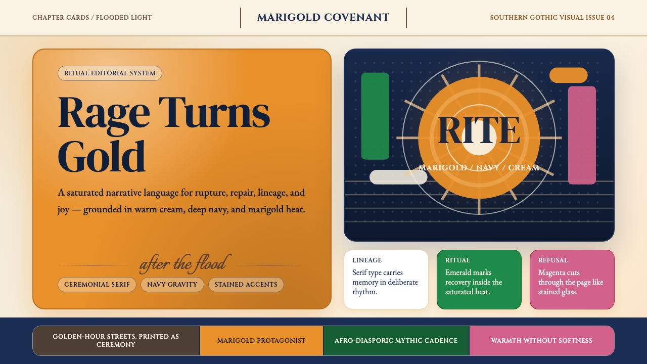
Color Palette色彩体系
The governing color is a warm, deeply saturated marigold yellow — the specific hue of the Roberto Cavalli dress and of afternoon sun through Louisiana humidity. It sits against warm cream or off-white grounds rather than pure white, giving the overall field a luminous quality rather than a clinical one. Deep navy functions as the gravitational anchor: it grounds compositions that would otherwise float on warm light. Emerald green and magenta appear as ceremonial accents, used sparingly for moments of heightened significance. The palette never goes cool, never goes gray, never retreats to neutrality.主导色彩是一种温暖、深度饱和的金盏黄——那条罗伯托·卡瓦利长裙与路易斯安那潮湿空气中午后阳光的特定色相。它铺设于暖奶油色或米白底面之上,而非纯白,使整体底色呈现出发光的质感而非临床的冷白。深海军蓝充当重力锚点:它使那些否则会漂浮于暖光之中的构图落地。翡翠绿与玫红色作为仪式性点缀出现,克制地用于高度关键的时刻。这套色板从不走向冷调,从不走向灰,从不退入中性。
Ceremonial Staging仪式性调度
Figures in Lemonade compositions are rarely casual. They are enthroned, processional, or posed in attitudes borrowed from religious painting and royal portraiture. Women appear crowned, veiled, draped, or surrounded by attendants. This staging transforms documentary space — a field, a street, a rooftop — into ritual space. The implication is consistent: these bodies and experiences are not peripheral, not exotic, not observed from outside; they are the center and the subject of their own mythology.《Lemonade》构图中的人物鲜少呈现随意姿态。她们以登基、列队或借鉴宗教绘画与王室肖像的仪态现身。女性以戴冠、蒙面、披裹或被侍从簇拥的形象出现。这种舞台调度将纪录性空间——田野、街道、屋顶——转化为仪式空间。其内在含义始终如一:这些身体与经验不是边缘的、奇异的、被外部凝视的;她们是自身神话的中心与主体。
Texture as Volume肌理即体量
Where many design systems treat texture as surface embellishment, Lemonade treats it as compositional mass. Ruffled silk carries visual weight equivalent to a solid color block. Spanish moss hanging from cypress trees fills negative space with organic depth. Floodwater acts as a mirror plane that doubles the composition vertically. These textures are Southern and specific — they root the work in a place — but they function structurally, not decoratively. In design applications, this means organic textures can be used with the same intentionality as geometric shapes.许多设计体系将肌理视为表面点缀,而《Lemonade》将其视为构图体量。荷叶边真丝承载着与纯色块相当的视觉重量。悬垂于柏树上的西班牙苔藓以有机深度填满负空间。洪水充当镜面,在垂直方向上将构图翻倍。这些肌理是南方的、具体的——它们将作品扎根于一个特定地方——但其功能是结构性的,而非装饰性的。在设计应用中,这意味着有机肌理可以与几何形状以同等的意图性来使用。
Golden-Hour Luminosity黄金时刻的光辉质感
The characteristic light of Lemonade is warm, directional, and deeply golden — the quality of sunlight in the late afternoon in the American South, where heat thickens the air and the angle of the sun saturates every surface. This is not ambient light; it is specific light that has a direction, a temperature, and an emotional register. Shadows are warm rather than cool. Skin tones glow rather than reflect. In designed applications, this translates to warm-tinted backgrounds, golden accent values rather than neutral yellows, and an overall avoidance of cool-toned contrast.《Lemonade》的标志性光线是温暖的、有方向感的、深度金黄的——美国南方午后光线的质感,热气使空气变得粘稠,阳光的角度让每一个表面都充盈饱和。这不是漫射的环境光;它是有方向、有温度、有情感刻度的特定光线。阴影是暖色调而非冷色调的。肤色在发光而非在反光。在设计应用中,这转化为暖色调背景、金色系而非中性黄色的强调值,以及对冷调对比的整体规避。
Typography as Proclamation字体排印即宣言
When Lemonade uses type — in the film's title cards, in the album's visual materials — it chooses serif letterforms with historical weight and editorial authority, set large, with generous leading and tight tracking at the headline level. Type is not a navigation system or an interface element; it is a statement. The scale relationship between headline and body text is dramatic. Type and image do not compete; they are arranged so that each has its own territory, with type often floating over a field of solid color or deep shadow rather than sitting on top of imagery.当《Lemonade》使用文字——影片字幕卡、专辑视觉材料——它选择具有历史厚重感与编辑权威性的衬线字体,设置在大尺度下,配以宽松的行距与标题级别的紧密字距。文字不是导航系统或界面元素;它是声明。标题与正文之间的尺度关系是戏剧性的。文字与图像不相竞争;它们被安排为各自拥有独立领地,文字常常漂浮于纯色底面或深暗阴影之上,而非叠压在图像之上。
Collective and Communal Composition集体性与共同体构图
One of Lemonade's most distinctive compositional choices is its frequent use of multiple figures in a single frame, arranged not randomly but choreographically. Groups of women appear in synchronized gesture, forming living geometry. This is not documentary photography of a gathering; it is the visual grammar of ritual, parade, and congregation. The effect communicates that the individual experience being narrated belongs to and is validated by a community — a formal choice with profound content implications for any designer working with themes of solidarity, belonging, or collective identity.《Lemonade》最具特色的构图选择之一,是频繁在单一画面中使用多个人物,以编舞而非随机的方式排列。女性群体以同步姿态出现,构成活生生的几何形。这不是聚会的纪录摄影;它是仪式、游行与会众的视觉语法。其效果传达出:所叙述的个体经验属于并被一个共同体所认可——这是一个形式选择,对任何处理团结、归属或集体认同主题的设计师而言,具有深刻的内容含义。
Controlled Excess有控制的过度
Lemonade operates at a level of visual intensity that would tip into chaos if it were not governed by rigorous compositional discipline. The saturation is maximal, but every element earns its place. The ruffled fabric fills the frame because it is the subject, not because the frame needed filling. The ceremony is elaborate because the content demands ceremony. This principle — controlled excess, where abundance is structural rather than decorative — distinguishes the aesthetic from visual noise and from the safer, more muted interpretations that drain it of its essential character.《Lemonade》在一种视觉强度水平上运作,若非严格构图纪律的约束,这种强度将滑入混乱。饱和度是极限的,但每一个元素都获得了其位置的正当理由。荷叶边织物填满画框,是因为它是主体,而非因为画框需要被填满。仪式是繁复的,因为内容要求繁复。这一原则——有控制的过度,其中丰盈是结构性的而非装饰性的——将这套美学与视觉噪音,以及与那些将其核心特质榨干的更保守、更低沉的诠释区别开来。
See the Beyoncé — Lemonade design system查看 Beyoncé — Lemonade 完整设计系统
Who shaped Beyoncé — Lemonade?谁塑造了 Beyoncé — Lemonade?
As performer, co-writer, co-director, and executive producer, Beyoncé was the primary creative force behind Lemonade. Her decision to release the project simultaneously as a visual film and a music album — exclusively on Tidal before wider release — was itself a strategic statement about how Black creative work should be valued and distributed. Her on-screen presence established the visual grammar: the marigold dress, the processional poses, the shift between intimate vulnerability and commanding authority. Lemonade is inseparable from her embodied performance of its aesthetic.作为表演者、联合词曲作者、联合导演与执行制作人,碧昂丝是《Lemonade》背后的主要创意力量。她决定将这个项目同步以视觉电影与音乐专辑的形式发布——在更广泛发行前于Tidal独家上线——这本身就是一个关于黑人创意作品应当如何被评价与传播的战略声明。她在银幕上的存在确立了视觉语法:金盏黄长裙、列队式姿态、亲密脆弱与威严权威之间的切换。《Lemonade》与她对这套美学的身体化演绎不可分割。
Kahlil Joseph directed several of the film's most visually arresting sequences, including the Don't Hurt Yourself and Forward segments. His background in documentary and experimental film gave the Lemonade visual language much of its tension between the raw and the ceremonial. Joseph was already known for his 2013 short film m.A.A.d — a companion piece to Kendrick Lamar's good kid, m.A.A.d city — which demonstrated his ability to use visual texture and pacing to convey interiority rather than narrative. His contribution to Lemonade pushed the film toward the elliptical and the associative rather than the linear.卡利尔·约瑟夫执导了影片中视觉上最震撼的若干段落,包括《Don't Hurt Yourself》与《Forward》片段。他在纪录片与实验影像领域的背景,为《Lemonade》视觉语言注入了原生与仪式之间的大量张力。约瑟夫因其2013年短片《m.A.A.d》——肯德里克·拉马尔《good kid, m.A.A.d city》的影像伴侣——而已广为人知;那部作品展示了他以视觉肌理与节奏传达内心世界而非叙事的能力。他对《Lemonade》的贡献将影片推向了椭圆形的、联想性的,而非线性的方向。
Production designer Hannah Beachler was responsible for translating the emotional and cultural content of Lemonade into physical environments. Her choices — flooding the streets of New Orleans, transforming plantation interiors into spaces of Black feminine sovereignty, constructing the field ceremony scenes at precise hours of natural light — were architectural and political simultaneously. Each location was selected and dressed to carry specific historical and emotional meaning without exposition. Beachler subsequently became the first Black woman to win the Academy Award for Best Production Design, for her work on Black Panther, and she has cited Lemonade as foundational to her practice.制作设计师汉娜·比彻勒负责将《Lemonade》的情感与文化内容转化为实体环境。她的选择——淹没新奥尔良街道、将种植园内部改造为黑人女性主权空间、在特定自然光时刻构建田野仪式场景——同时是建筑学的与政治学的。每个地点都被选择并布置为承载特定历史与情感含义,无需阐释。比彻勒此后以《黑豹》的工作成为首位获得奥斯卡最佳制作设计奖的黑人女性,她将《Lemonade》列为自身实践的奠基性工作。
Melina Matsoukas directed the Hold Up sequence — the single most iconic visual moment in Lemonade, and arguably one of the most influential music video images of the decade. Her direction of Beyoncé walking through sunlit floodwater in the marigold dress, wielding a baseball bat, established the style's central icon. Matsoukas had previously directed Beyoncé's Formation video, which premiered the day before the Super Bowl 50 halftime show, and was already known for videos that used visual spectacle to carry political content without diminishing either. She later co-created the television series Insecure, extending the visual sensibility of Lemonade into long-form narrative.梅丽娜·松冢执导了《Hold Up》片段——《Lemonade》中最具标志性的视觉时刻,也可以说是这十年间最具影响力的MV画面之一。她执导碧昂丝身着金盏黄长裙、手持棒球棍、在阳光照耀的洪水中行走的场景,确立了这套风格的核心图腾。松冢此前已执导碧昂丝的《Formation》MV——那支MV在超级碗50中场秀前夜首发——并以使用视觉奇观承载政治内容而两者互不削弱而著称。她后来联合创作了电视剧《不安全感》(Insecure),将《Lemonade》的视觉感性延伸至长篇叙事。
Warsan Shire, a British-Somali poet, wrote the spoken-word text that provides Lemonade's structural and emotional spine. Her poetry — read by Beyoncé in voice-over across the film — divides the work into its eleven chapters, each named for a stage of emotional processing: Intuition, Denial, Anger, Apathy, Emptiness, Accountability, Reformation, Forgiveness, Resurrection, Hope, Redemption. Shire's language established the register in which the visuals operate: specific, incantatory, emotionally unsparing. The precision of her imagery set the standard for the specificity of the visual choices, and the collaboration demonstrated how literary voice and visual design can function as a unified system rather than parallel tracks.英国-索马里裔诗人华尔桑·夏尔撰写了为《Lemonade》提供结构与情感支柱的口语诗文本。她的诗歌——由碧昂丝在影片中以画外音朗读——将作品划分为十一个章节,每章以情感处理的一个阶段命名:直觉、否认、愤怒、冷漠、空虚、担责、改革、宽恕、复苏、希望、救赎。夏尔的语言确立了视觉画面所运作的语域:具体的、念咒般的、情感上毫不留情的。她的意象精确性为视觉选择的具体性设定了标准,这次合作证明了文学声音与视觉设计如何作为统一系统而非平行轨道来运作。
How do you use Beyoncé — Lemonade today?今天怎么用 Beyoncé — Lemonade?
The Lemonade visual language is well-suited to design work where warmth, cultural authority, and ceremonial weight are desired — but applying it effectively requires understanding what the system is actually doing. The palette works because saturation is controlled and purposeful: every color earns its intensity by carrying meaning. Before adopting the style, ask what the warm golden anchor, the deep navy gravity, and the magenta or emerald accent each signify in your specific context. If the answer is decorative rather than semantic, the style will feel like costume rather than conviction.《Lemonade》视觉语言非常适合那些寻求温度、文化权威性与仪式重量的设计工作——但有效应用它,需要理解这套体系实际在做什么。这套色板之所以有效,是因为饱和度是受控且有目的的:每一种颜色都通过承载意义来获得其强度的正当性。在采用这种风格之前,先问清楚:温暖的金黄锚点、深沉的海军蓝重力、玫红或翡翠绿的点缀,在你的具体语境中各自意味着什么。如果答案是装饰性的而非语义性的,这种风格将呈现为戏服而非信念。
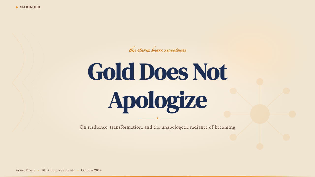
For presentation slides, the Lemonade aesthetic elevates cover pages into genuine statements. A full-bleed warm-cream or deep-navy background, a headline set in a large editorial serif with generous breathing room, and a single marigold accent shape or border creates immediate presence without complexity. Content slides work best when they resist the temptation to crowd: one dominant image treated as a compositional mass, body text given its own uninterrupted territory, and data presented as bold, colored figures rather than conventional chart types. The ceremonial quality of the style requires that nothing look accidental or approximate — every element should appear chosen.对于演示文稿,《Lemonade》美学能将封面页提升为真正的声明。满幅暖奶油色或深海军蓝背景、以大尺度编辑衬线体设置的标题配以宽裕的呼吸空间、一个金盏黄强调形或边框,无需复杂便可建立即刻的存在感。内容页在抵抗拥挤诱惑时效果最佳:一张以构图体量方式处理的主导图像、正文获得不受干扰的独立领地、数据以粗壮的彩色数字而非常规图表类型呈现。这种风格的仪式感要求没有任何东西看起来是偶然或粗略的——每个元素都应看起来是经过选择的。
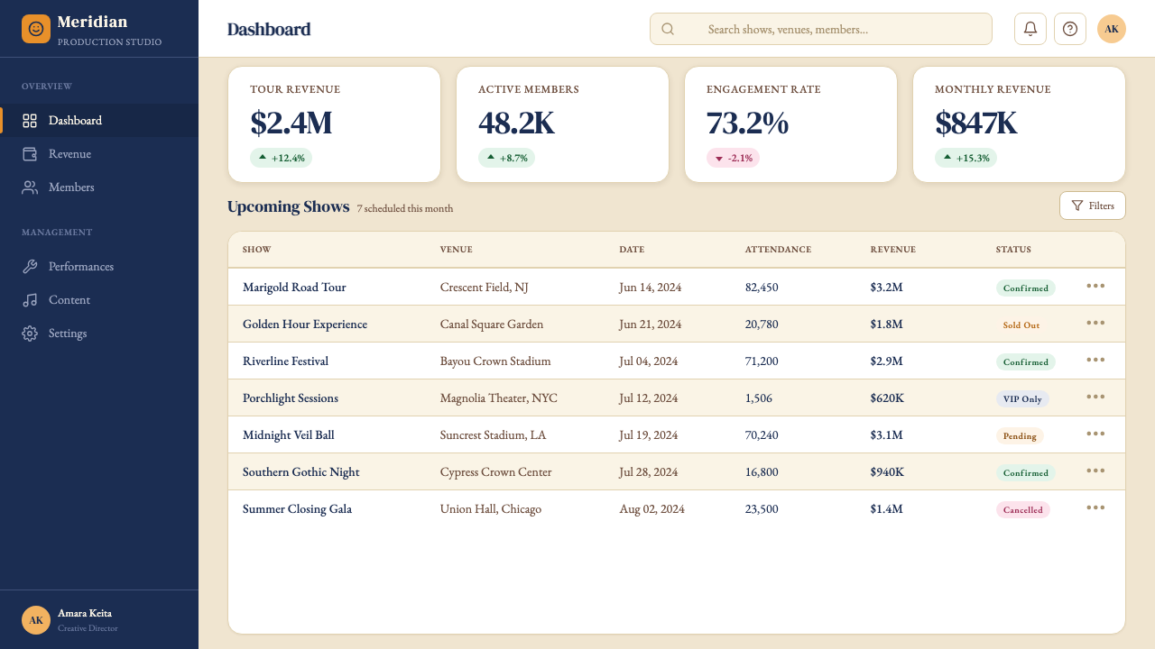
For web dashboards and pricing pages, the style introduces an alternative to the cool, gray-dominant aesthetics that characterize most enterprise software. A Lemonade-influenced dashboard uses a warm cream or near-white ground, with navy for structural dividers and data-axis labels, marigold for primary interactive elements and highlighted states, and a deep warm shadow for card components rather than a soft neutral one. Pricing tier differentiation works especially well: the visual weight of the palette naturally establishes hierarchy, so premium tiers receive the marigold or emerald accent while baseline tiers recede into cream and navy. Navigation and wayfinding should be typographic, with an editorial serif at headline scale and a clean readable secondary face for body and labels.对于网页仪表板与定价页面,这种风格为那些主导大多数企业软件的冷灰美学提供了替代方案。受《Lemonade》影响的仪表板以暖奶油色或近白色为底,海军蓝用于结构性分割线与数据轴标签,金盏黄用于主要交互元素与高亮状态,深暖色阴影用于卡片组件而非柔和中性阴影。定价等级区分尤为适合:这套色板的视觉重量自然建立层级,高级等级获得金盏黄或翡翠绿点缀,而基础等级退入奶油色与海军蓝。导航与路径引导应当是字体性的,以编辑衬线体用于标题尺度,以简洁可读的次要字体用于正文与标签。
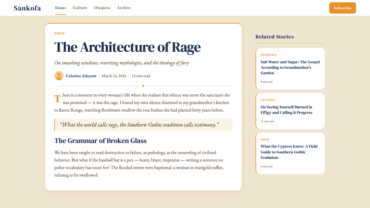
For editorial and marketing applications, the Lemonade system behaves like a high-fashion photograph with editorial ambition: it rewards full-width treatment, bold typographic scale, and the patience to let a single strong image anchor an entire layout. Marketing pages built in this mode use alternating full-width sections of warm cream and deep navy rather than generic light-dark splits, with the marigold accent used consistently for calls to action and section transitions. Long-form editorial layouts give body text generous leading and a warm ground rather than pure white, with pull quotes and chapter headings set in a large editorial serif that reads as authoritative rather than merely decorative.对于编辑与营销应用,《Lemonade》体系的行为方式类似于具有编辑抱负的高级时装摄影:它回报满幅处理、大胆的排版尺度,以及让单张强图锚定整个版面的耐心。以这种模式构建的营销页面,使用暖奶油色与深海军蓝的交替满幅区块,而非通用的明暗分割,金盏黄强调色一贯地用于行动号召与段落过渡。长篇编辑版面为正文提供宽松的行距与暖色底面而非纯白,引言与章节标题以大尺度编辑衬线体设置,读起来是权威性的而非仅仅是装饰性的。
The most common mistake when working with Lemonade visuals is importing the saturation without the discipline. The style is intense precisely because it is controlled: every color decision is load-bearing. Applying marigold as a background color across multiple competing sections, combining the warm palette with cool-toned photography, or using the editorial serif as a decorative element disconnected from meaningful hierarchy all produce work that looks loud rather than powerful. A second common error is treating the ceremonial aesthetic as costume — adding ruffled or organic textures as surface decoration rather than compositional structure. The style asks that texture serve mass and weight, not mood alone.使用《Lemonade》视觉元素时最常见的错误,是引入饱和度而缺失纪律。这种风格之所以强烈,恰恰是因为它受控:每一个色彩决定都是承重的。将金盏黄用作多个竞争区块的背景色、将暖色调色板与冷色调摄影结合、或将编辑衬线体用作与有意义层级脱节的装饰元素,都会产生听起来嘈杂而非有力的作品。第二个常见错误是将仪式性美学当作戏服——将荷叶边或有机肌理作为表面装饰而非构图结构来添加。这种风格要求肌理服务于体量与重量,而非仅仅服务于氛围。
See the Beyoncé — Lemonade design system查看 Beyoncé — Lemonade 完整设计系统
Beyoncé — Lemonade — FAQBeyoncé — Lemonade · 常见问题
Is Lemonade a design style or just a mood board?《Lemonade》是一种设计风格,还是仅仅是一块情绪板?
It is a coherent visual system with identifiable structural principles — not just a mood board. The palette is consistent and rule-governed: marigold as the primary saturated anchor, navy as gravitational counterweight, cream as the warm ground, emerald and magenta as ceremonial accents. The compositional logic of ceremonial staging, texture as mass, and golden-hour luminosity are reproducible across different media and contexts. What makes it a system rather than a mood is that its choices are load-bearing: remove the saturated marigold and the system loses its heat; remove the navy and compositions float without anchor. Understanding the logic of each element is what separates principled application from pastiche.它是一套具有可识别结构原则的连贯视觉体系——而不仅仅是一块情绪板。色板是一致且受规则约束的:金盏黄作为主要饱和锚点,海军蓝作为重力对应,奶油色作为暖色底面,翡翠绿与玫红色作为仪式性点缀。仪式性舞台调度、肌理即体量、黄金时刻光辉质感的构图逻辑,可在不同媒介与语境中被复现。使它成为体系而非情绪的,是其选择的承重性:移除饱和金盏黄,体系失去热度;移除海军蓝,构图漂浮无锚。理解每个元素的逻辑,是有原则的应用与拙劣模仿之间的分界。
Can this aesthetic work for brands that are not related to Black American culture?这套美学能用于与黑人美国文化无直接关联的品牌吗?
The Lemonade visual language carries specific cultural origins that should be acknowledged rather than ignored. Using the style thoughtfully means understanding what it references — Afro-Diasporic spiritual iconography, Southern Black experience, the visual tradition of Black feminist art — and ensuring that the application does not flatten these origins into generic warmth or exoticism. For brands and contexts where the cultural resonance is irrelevant or disconnected, it may be more honest to draw on the structural principles — warm saturation, ceremonial staging, golden light — while being transparent that these principles were crystallized in a specific cultural context. The worst outcome is adopting the surface texture while evacuating the meaning.《Lemonade》视觉语言携带着特定的文化起源,应当被承认而非忽视。周全地使用这种风格,意味着理解它所指涉的内容——泛非裔灵性图像志、南方黑人经验、黑人女性主义艺术的视觉传统——并确保应用不将这些起源平铺为通用的温暖感或异域情调。对于文化共鸣无关或脱节的品牌与语境,更诚实的做法或许是汲取其结构性原则——暖色饱和、仪式性调度、黄金光线——同时对这些原则在特定文化语境中被结晶这一事实保持透明。最坏的结果是采用表面肌理而抽空其意义。
How does Lemonade differ from other warm, saturated palettes like Memphis or Art Nouveau?《Lemonade》与孟菲斯或新艺术运动等其他暖色饱和色板有何不同?
Memphis (1980s Milan) uses similarly high saturation but organizes it around geometric pattern, postmodern irony, and deliberate kitsch — the warmth is playful and anti-serious. Art Nouveau uses warm, jewel-toned palettes but channels them through organic, curvilinear forms derived from botanical and biological sources; it tends toward the decorative and the delicate. Lemonade's warmth is neither ironic nor delicate. It is ceremonial and authoritative. The compositional devices — enthroned figures, processional groups, ritual staging — give the saturation a gravity that Memphis refuses and Art Nouveau lacks. The golden palette in Lemonade signals consecration, not decoration.孟菲斯风格(1980年代米兰)同样使用高饱和度,但将其组织在几何图案、后现代讽刺与刻意媚俗周围——那种温暖是嬉戏的、反严肃的。新艺术运动使用暖色、珠宝色调的色板,但通过源自植物与生物的有机曲线形态来引导它们;它倾向于装饰性与精巧性。《Lemonade》的温暖既不讽刺,也不精巧。它是仪式性的、权威性的。其构图手段——登基的人物、列队的群体、仪式性舞台调度——赋予饱和色调一种孟菲斯拒绝而新艺术运动缺乏的重力。《Lemonade》中的金色系色板意味着祝圣,而非装饰。
Does the style require photography, or can it be executed with illustration or pure graphic elements?这种风格需要摄影吗,还是可以用插图或纯图形元素来实现?
The original Lemonade work is deeply photographic — its power is partly inseparable from the presence of specific bodies in specific places. However, the structural principles of the style can be executed without photography. Illustration in this system should be figurative, warm-toned, and ceremonially composed — not gestural or abstract. Flat graphic work can use the palette, the bold editorial serif typography, and the compositional logic of enthroned or processional arrangements to invoke the aesthetic without imagery. What the style cannot absorb is cold geometry, cool color, or purely abstract form — these strip away the warmth and ceremony that define it. When photography is used, it should be editorial and warm-lit rather than documentary or cool.《Lemonade》原版作品具有深度摄影性——其力量部分不可分割于特定身体在特定场所中的存在。然而,这种风格的结构性原则可以在没有摄影的情况下实现。这套体系中的插图应当是具象的、暖色调的、以仪式性方式构图的——而非手势性的或抽象的。平面图形作品可以使用色板、大胆的编辑衬线排版,以及登基或列队安排的构图逻辑,来在无图像的情况下唤起这套美学。这种风格无法吸收的,是冷峻的几何形、冷色调或纯粹的抽象形态——这些会剥去定义它的温度与仪式感。当摄影被使用时,它应当是编辑性的、暖光照明的,而非纪录性的或冷调的。
What are the clearest signs that a Lemonade-style design has gone wrong?《Lemonade》风格设计出错的最明显信号是什么?
Several patterns reliably indicate a failed application. First, the marigold reads as a cheerful accent rather than a sacred anchor — this happens when it is used at small scale or surrounded by competing warm tones rather than given room to dominate. Second, the composition feels busy rather than ceremonial — this happens when multiple high-saturation elements compete without a clear hierarchy or when the navy counterweight is absent. Third, the typography is ornamental rather than authoritative — editorial serifs set at small scale or used as decorative borders rather than as primary communicative vehicles. Fourth, textures are applied as surface overlays rather than compositional masses — ruffled or organic elements that sit on top of the image rather than being part of its structure. Fifth, and most critically, the warmth is without gravity — the palette is imported but the ceremonial staging that gives it weight is absent, producing something that reads as warm and pleasant rather than powerful.有几种模式可靠地表明应用失败了。第一,金盏黄读起来像欢快的点缀而非神圣的锚点——当它被用于小尺度或被竞争性暖色调包围而非获得主导空间时,就会发生这种情况。第二,构图感觉拥挤而非仪式性——当多个高饱和度元素在没有清晰层级的情况下相互竞争,或当海军蓝对应重量缺席时,就会发生这种情况。第三,排版是装饰性的而非权威性的——编辑衬线体以小尺度设置或用作装饰边框而非主要传达载体。第四,肌理被用作表面覆层而非构图体量——荷叶边或有机元素叠压在图像之上而非成为其结构的一部分。第五,也是最关键的,温暖缺乏重力——色板被引入,但赋予其重量的仪式性舞台调度缺席,产生出读起来温暖宜人而非有力的东西。
Related design styles相关设计风格
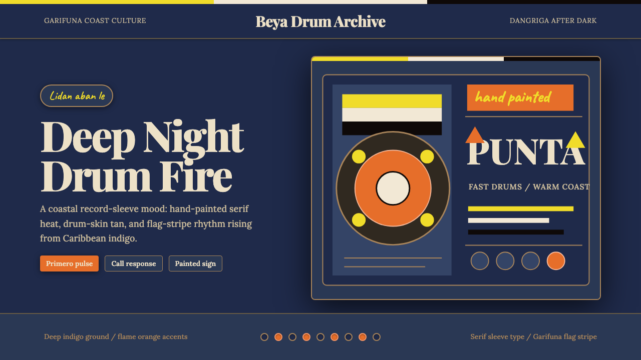 Belizean Garifuna PuntaNight rhythm burns. Indigo fields, flame-orange serif type, and flag stripes…深夜节奏燃起:靛蓝场、火焰橙衬线字与旗纹推进鼓点。
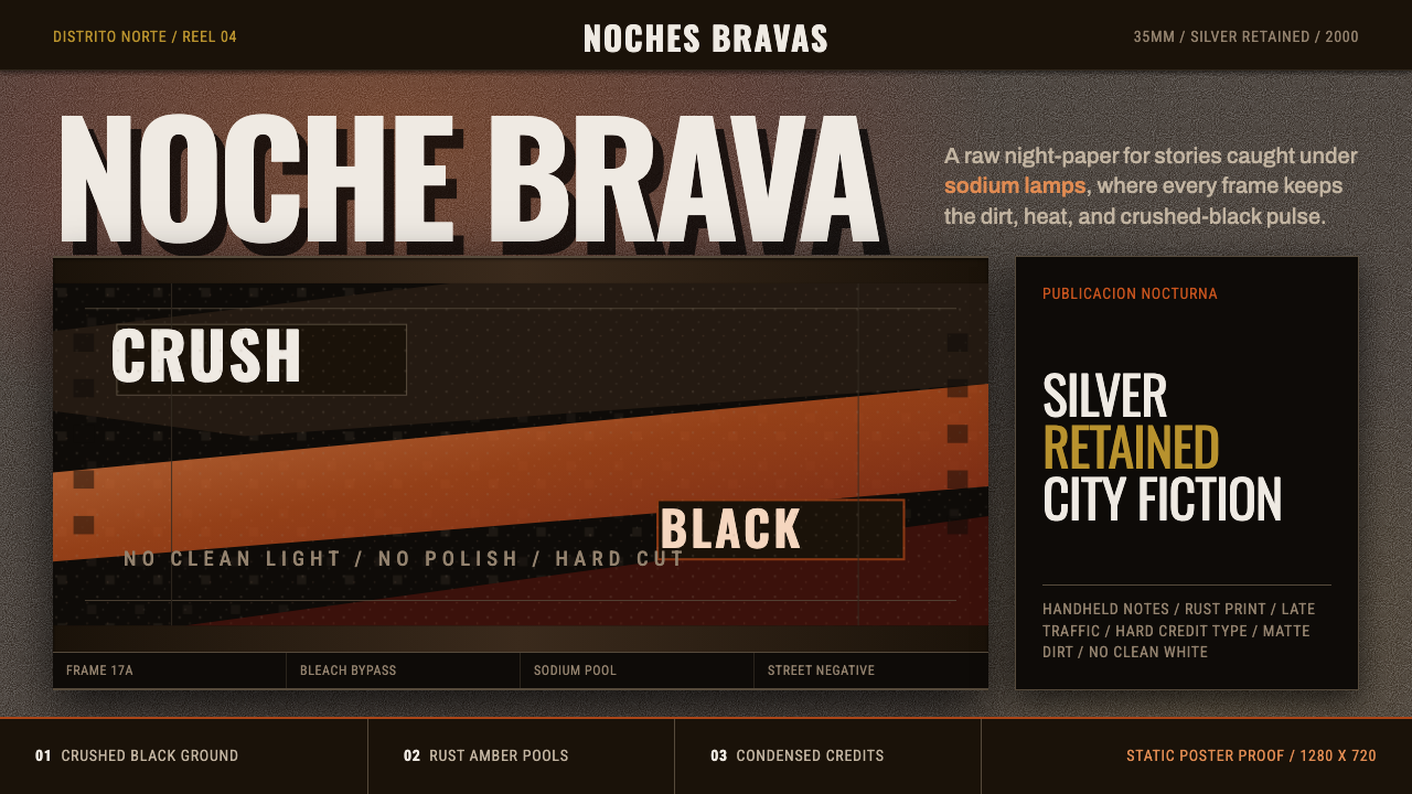 Amores Perros New WaveRaw street cinema. Crushed black, sodium amber, Oswald credits, heavy 35mm gr…粗粝街头电影感。压黑底、钠灯琥珀与 Oswald 窄体片头。
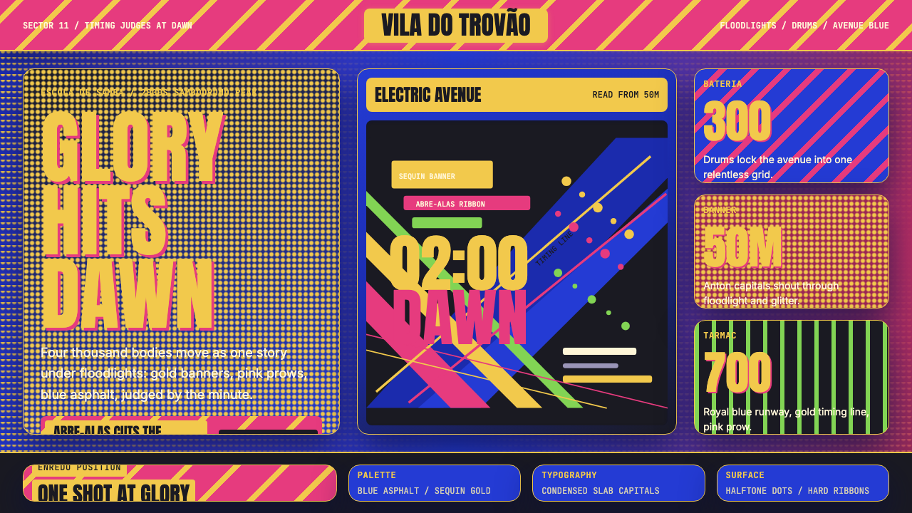 Brazilian Samba School (2000s Carnaval)Parade at floodlight volume. Royal blue asphalt, sequin gold type, pink ribbo…泛光灯音量的游行。宝蓝路面、亮片金字、玫红斜带。
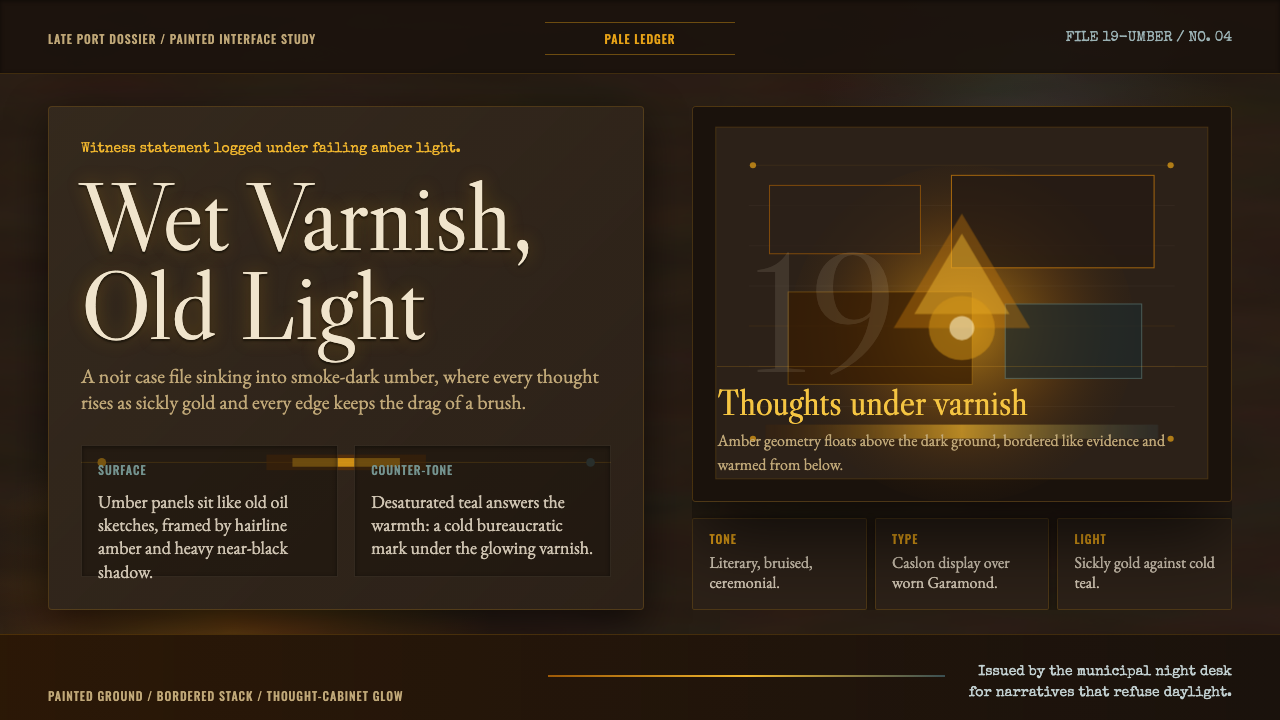 Disco ElysiumNoir rot glows from within. Amber Caslon type cuts through varnish-dark umber.黑色腐朽自内发光。琥珀Caslon切入清漆暗赭。
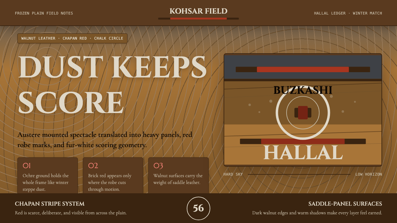 Hazara Buzkashi (Goat-Carcass Polo)The steppe endures. Ochre dust, walnut panels, and chapan-red stripes score t…草原只求持久:赭尘底、核桃皮革面板与袍红条纹定调。
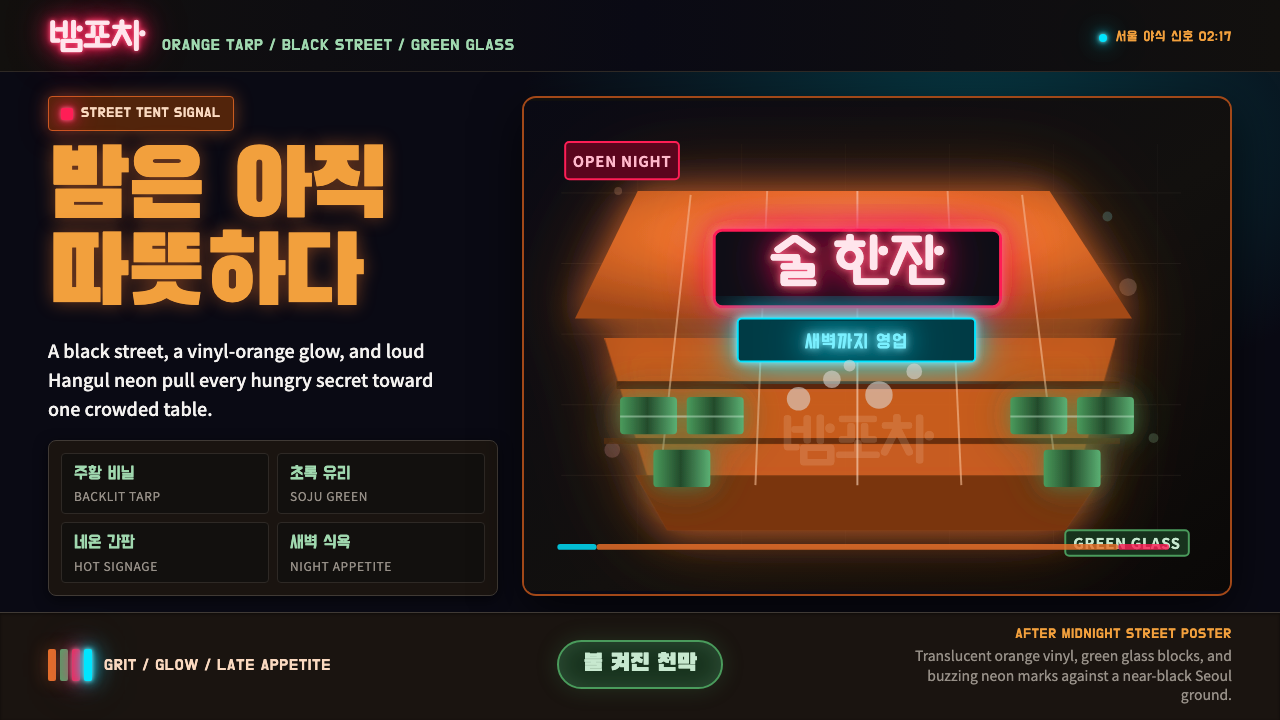 Pojangmacha Soju TentNight appetite glows. Orange tarp panels burn over black, cut by Hangul neon…深夜食欲在发光:黑底橙色帐篷,韩文霓虹与烧酒绿切入。