What is Disco Elysium?
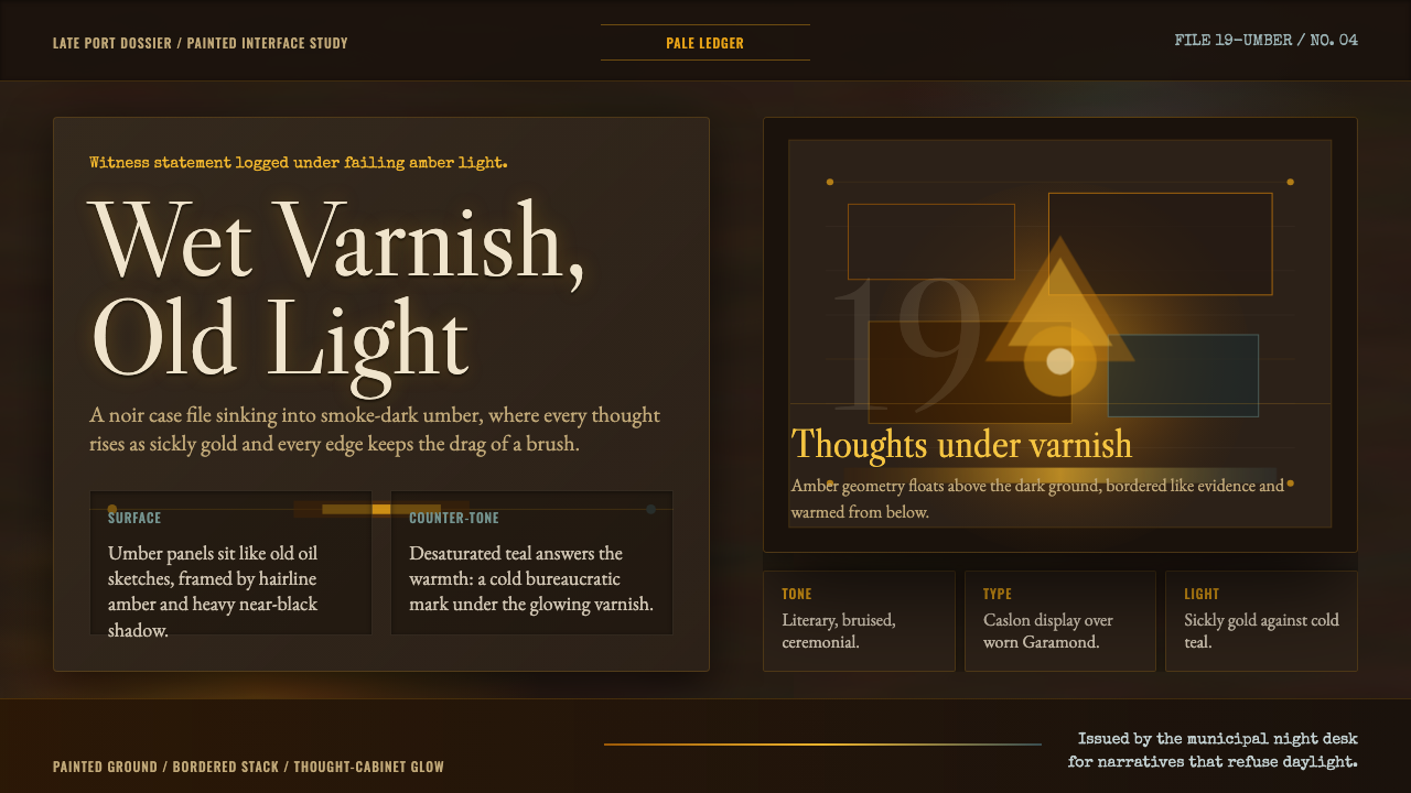
Disco Elysium's visual world is built from wet oil paint, amber light, and the feeling that every surface has been accumulating soot for decades — a design language that treats darkness as material rather than absence.
Disco Elysium in brief
Disco Elysium Oil is a painterly dark interface aesthetic derived from the visual language of the 2019 role-playing game Disco Elysium, art-directed by Aleksander Rostov. Its defining quality is a ground of near-black warm umber — the color of an aged oil sketch — over which panels and type elements glow from within like embers, using a palette of sickly amber-gold, desaturated teal, and the deep warmth of varnished lacquer.
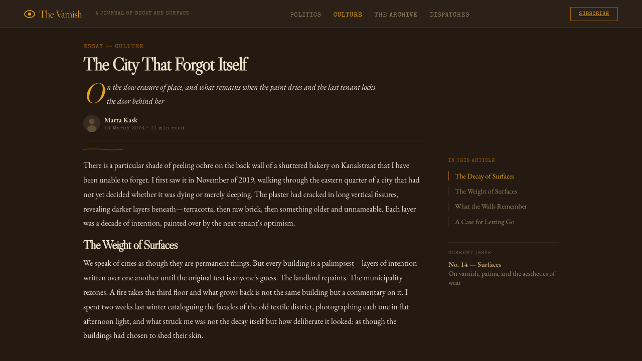
The style belongs to the tradition of painterly digital concept art rather than to conventional UI design. Visible brushstroke texture, gestural edges, and the sense of physical paint applied to canvas are embedded into interface surfaces. Nothing is flat or crisp in the contemporary sense; every boundary carries a slight irregularity, as though the designer's hand were still present in the work.
As a design system it represents a counter-position to clean minimalism. Where most dark-mode interfaces use neutral blacks and cooler grays, Disco Elysium Oil insists on warmth — a brown-black that reads as lacquer or tobacco rather than void, tempered by cold teal counterpoint. The overall effect is of an interface that feels aged, handcrafted, and slightly deteriorating, which makes it exceptionally suited to noir, literary, and atmospheric creative work.
Where does Disco Elysium come from?
Disco Elysium was developed by the Estonian studio ZA/UM and released in October 2019. The game's setting — the decaying fictional port city of Revachol, a place built atop the ruins of failed revolutions — demanded a visual register that felt simultaneously literary, painterly, and psychologically unstable. Art director Aleksander Rostov drew on the tradition of oil painting as a medium of decay, weight, and accumulated time rather than on the then-dominant schools of game UI design, which leaned toward flat, vector-clean interfaces.
The foundational visual reference was the work of Craig Mullins, the American concept artist whose digital oil studies — built from loose, luminous brushstrokes over warm umber grounds — demonstrated that digital tools could achieve the material weight and atmospheric depth of Old Master painting. Jenny Saville's visceral figurative painting also informed the aesthetic, contributing a sense that surfaces were flesh-like: layered, discolored, and alive in their deterioration.
The game's art team translated this painterly tradition into an actual playable interface: the in-game Thought Cabinet — a menu where characters can 'internalize' ideas — was rendered as a glowing amber panel emerging from darkness, and the overall UI embraced the same logic as the environment art, treating the interface as an extension of the world's physical surface rather than a neutral container for information. The style's visual DNA was locked to the specific palette and texture choices made for Revachol's decaying architecture.
Post-release, the game's visual identity proved highly influential in independent game development, tabletop RPG design, and literary digital products. Its demonstration that a UI could carry genuine painterly weight — that darkness could be warm and textured rather than neutral — opened a lane for atmospheric dark-mode aesthetics that distinguished themselves from both gamer-dark and corporate-dark conventions.
What defines the Disco Elysium look?
Ground Color
The foundational surface is a warm near-black umber — the color associated with an aged oil sketch or darkened varnish, not the neutral charcoal of typical dark-mode design. This warmth is essential: it is what separates the style from generic darkness. The umber ground absorbs light the way old lacquer does, with a suggestion of depth and age rather than the flatness of a pure black.
Painterly Glow
Panels, interactive zones, and key typographic elements do not simply sit on the background — they glow from within, as though a faint amber light source were burning behind them. This is the system's primary way of establishing hierarchy: illumination rather than contrast. The glow reads as organic and warm, recalling the amber of a low lamp or a flame seen through smoked glass.
Brushstroke Texture
Surfaces carry the impression of physical paint — visible directional strokes, slight tonal variation within a single color area, and edges that are gestural rather than razor-clean. This is not a filter or overlay in the decorative sense; it is a structural quality that makes every element feel handmade. The texture prevents the digital flatness that most interfaces fall into and anchors the aesthetic firmly in the tradition of analog painting.
Amber and Teal Counter-Tone
The primary accent is a sickly amber-gold — warm, slightly yellow-green in its sickness, suggesting something between candle light and bile. Against the umber ground, it reads as the primary signal color. The cold counter-tone is a desaturated teal, used sparingly as an emotional brake on the warmth. These two colors in tension — warm amber and cold teal, never fully saturated — define the palette's character: neither beautiful nor reassuring, but atmospheric and morally complex.
High-Contrast Noir Serif
Typography in this system uses a high-contrast serif — a letterform with a pronounced difference between thick and thin strokes, the kind associated with old book printing and broadsheet journalism. This is a deliberate turn away from the sans-serif legibility conventions of UI design and toward the literary, almost journalistic tone that Disco Elysium itself channeled. The type feels like it belongs on a newspaper page or a detective's case file rather than on a software product.
Gestural Borders and Uneven Edges
Dividing lines, panel borders, and section boundaries are slightly irregular, as though drawn by hand with a loaded brush. They do not achieve the geometric precision of a vector rule. This imprecision is intentional: it reinforces the painterly quality and signals that the system values craft and atmosphere over technical perfection. The effect is especially visible in decorative border elements that frame hero sections or separate zones of content.
Decay as Aesthetic Principle
The system does not aspire to newness or polish. Its ideal surface is one that appears to have aged, weathered, and perhaps slightly deteriorated. Color desaturation, subtle discoloration, and the impression of wear embedded in textures are features, not bugs. This positions the aesthetic at the opposite extreme from the premium-shiny conventions of consumer tech — it is an interface that looks like it has a history.
Who shaped Disco Elysium?
Art director of Disco Elysium and the primary architect of its visual language. Rostov built the aesthetic by constructing the decaying city of Revachol as a painted environment, using visible brushstrokes over near-black umber grounds. His key decision was to treat the UI as continuous with the environment rather than as a neutral overlay — the interface glows from within just as the world's architecture does. This integration of world-building and interface design produced a visual system unusually coherent for a video game.
American digital concept artist whose oil-study approach to digital painting — loose brushwork, warm umber grounds, luminous focal points emerging from darkness — served as a direct visual reference for Disco Elysium's aesthetic. Mullins demonstrated across decades of work in game and film concept art that digital tools could achieve the material depth of traditional oil painting, and his influence on ZA/UM's art direction is acknowledged in the game's visual DNA.
British figurative painter known for large-scale canvases depicting flesh with raw, layered paint application. Saville's approach to surface — treating skin as accumulation, as palimpsest, as material rather than representation — influenced the way Disco Elysium's art team thought about textures and surfaces. The sense that every painted area in the game might be concealing or revealing something beneath it echoes Saville's pictorial logic of layered disclosure.
Lead writer and creative director of Disco Elysium. While Kurvitz's primary contribution was narrative, his literary sensibility — noir fiction, existentialist philosophy, post-Soviet melancholy — established the emotional register that the visual system had to serve. The painterly aesthetic was built to match the writing's density and moral ambiguity: bright, cheerful visuals would have contradicted the tone that the text demanded. The coherence between prose and image is part of what makes the system transferable as a design language.
The Estonian studio that created Disco Elysium, ZA/UM was founded as a cultural movement before it became a game studio — the name references the Situationist concept of 'zaum', a Russian avant-garde poetic mode of transrational language. This avant-garde lineage shaped the studio's willingness to treat a commercial RPG as an aesthetic project rather than a product, enabling visual choices (warm umber darkness, painted textures, literary typography) that would have been commercially unusual in mainstream game development.
How do you use Disco Elysium today?
Disco Elysium Oil is best deployed in contexts where emotional atmosphere and literary weight are design goals rather than liabilities. This is not a universal-purpose aesthetic: it is a style that makes strong claims about tone, and it will overwhelm content that does not match those claims. The ideal application is a creative project — a game, a literary publication, a storytelling platform, a cultural organization — where the interface itself is expected to carry meaning rather than simply organize information.
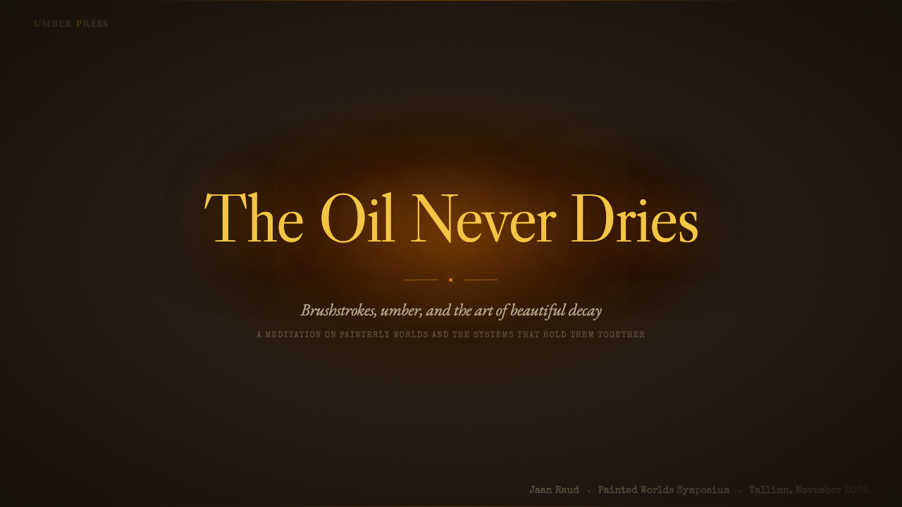
For presentation slides, the system works powerfully for introductory covers and atmospheric section dividers. A cover built in this style positions the presentation as a serious, considered artifact — the near-black umber ground with a glowing amber headline signals depth before a word is read. Content slides require more care: the low-brightness palette makes dense body text harder to read, so slides should be kept to single ideas, large type, and minimal data density. Data visualization in this style works best when treated as objects with weight — charts built from elements that feel substantial rather than lightweight, with minimal axis labeling and dark grid backgrounds.
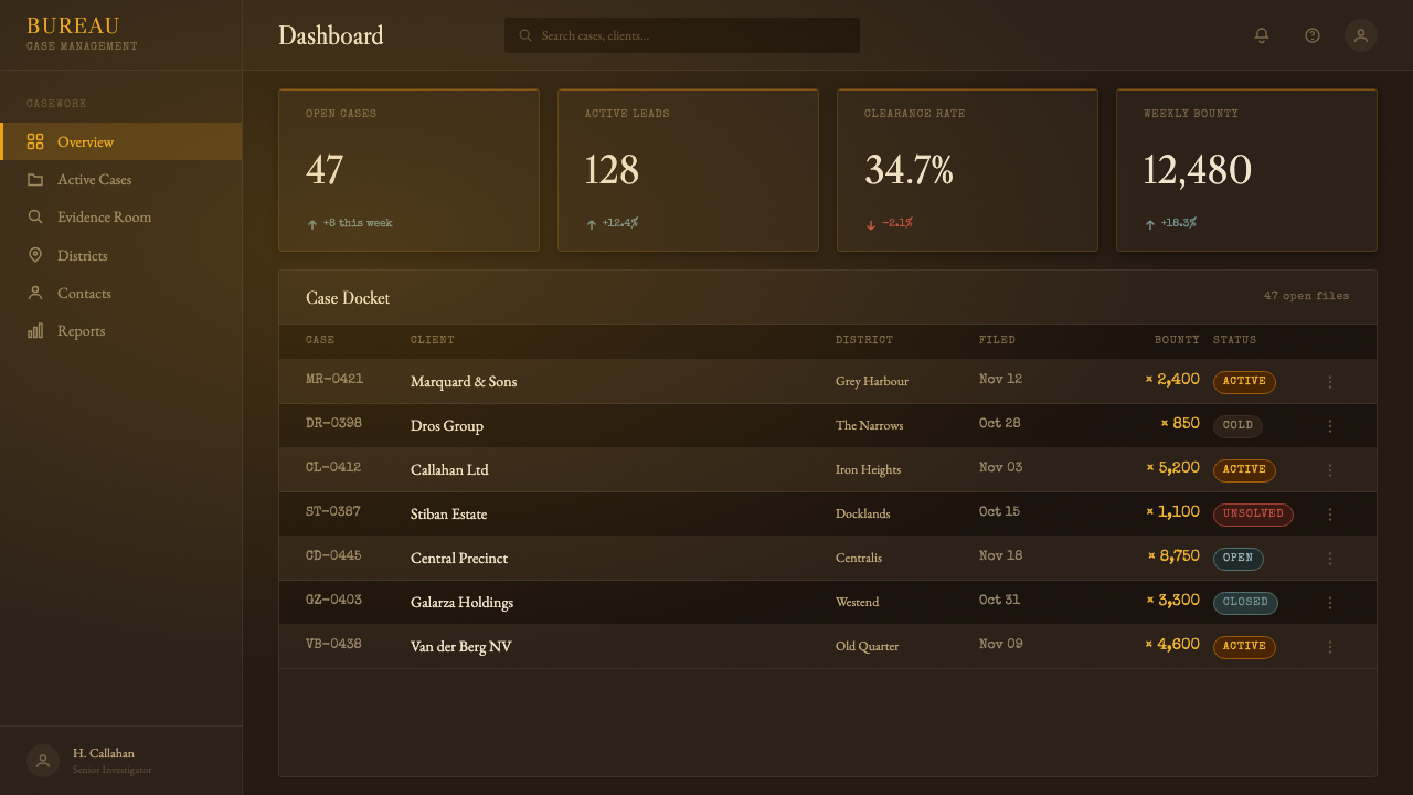
For web UI, this system is suited to landing pages, editorial platforms, and any experience where dwelling and reading are the intended behaviors rather than rapid task completion. Dashboard applications are not natural territory — the warmth and texture work against scannable data density. Navigation and action elements should emerge from darkness through illumination rather than through color contrast alone; hover states and active states read best when they intensify the glow effect rather than changing hue entirely.
For editorial and marketing work, the style is most effective when it is allowed to occupy the full visual field. Partial applications — a Disco Elysium-style header over a clean white body — tend to look incongruous. The aesthetic is holistic: the ground color, the texture, the typography, and the glow all work together or none of them work. Marketing materials for literary, music, film, or cultural products benefit most directly; consumer tech products risk looking pretentious unless the product genuinely operates in a creative or artisan-facing category.
The most common mistake with this style is applying it while leaving surfaces clean. The aesthetic depends on texture and imperfection; adding amber on black without the brushwork and glow produces something that looks like a generic dark theme with yellow accents, not like Disco Elysium. The second most common mistake is using fully saturated amber or gold, which tips into fantasy-game cliché. The amber should be slightly sickly, slightly desaturated, suggesting illness or age rather than luxury.
Disco Elysium — FAQ
Is this style suitable for commercial SaaS products?
Rarely. SaaS interfaces depend on scannable data, clear call-to-action hierarchy, and the confidence of a product that looks capable. Disco Elysium Oil communicates atmosphere, literary weight, and a certain productive unease — qualities that work against the reassurance SaaS typically needs to project. There are exceptions: developer tools or platforms targeting creative professionals might use the aesthetic for a landing page or marketing context. But for the core product UI — dashboards, tables, forms — the warmth and texture actively impede readability and may undermine user trust.
How does this system handle light mode or high-brightness environments?
It does not. The visual system's entire logic depends on the near-black warm ground: the amber glow only reads as a glow against darkness, and the teal counter-tone only functions as a cold accent when surrounded by warmth. A 'light mode' version of Disco Elysium Oil would require an almost entirely different design system — you would keep the serif typography and gestural texture, but the color logic would have to be rebuilt from the ground up around a warm cream or aged-paper ground. The result would be adjacent in spirit but not recognizably the same style.
What is the difference between this style and a generic dark mode?
The difference is warmth, texture, and the logic of illumination. Generic dark mode uses neutral dark backgrounds — cool, flat, precise — with light text and color for accent. Disco Elysium Oil uses a warm umber ground, not a neutral one; its surfaces carry painterly texture rather than being flat; and its hierarchy system is built around glowing from within rather than around contrast ratios. A generic dark mode looks like a screen turned down; Disco Elysium Oil looks like a painting lit by a lamp.
Can this aesthetic work in print, or is it screen-specific?
It can work in print, but it requires attention to the limitations of ink on paper. The amber glow effect depends on luminosity — the actual emission of light from a backlit display. In print, the equivalent is achieved through contrast: a warm amber or gold ink against deep brown or black. The textural quality transfers well to print, particularly to offset printing on uncoated or lightly textured paper. Editorial publications like literary journals, zines, or music programs are natural homes for the aesthetic in print; product packaging is more challenging because the style's darkness reads as fragility rather than luxury at retail scale.
Is there a risk of this style reading as 'video game UI' rather than as a serious design system?
Yes, and managing that risk is about material seriousness. The amber-on-dark palette has precedents in both gaming and noir film, and if the typography is not literary enough — if it uses a sans-serif or a fantasy-inflected serif — the association will tip toward game UI. The safeguards are: committing to high-contrast old-style or transitional serif type, keeping the amber slightly muted and undersaturated rather than vivid, maintaining brushwork texture that reads as painting rather than as a game asset, and anchoring the content itself in serious written or visual material. The association with Disco Elysium is actually a partial asset: the game is widely regarded as a work of literary ambition, not as a typical product.
Related design styles
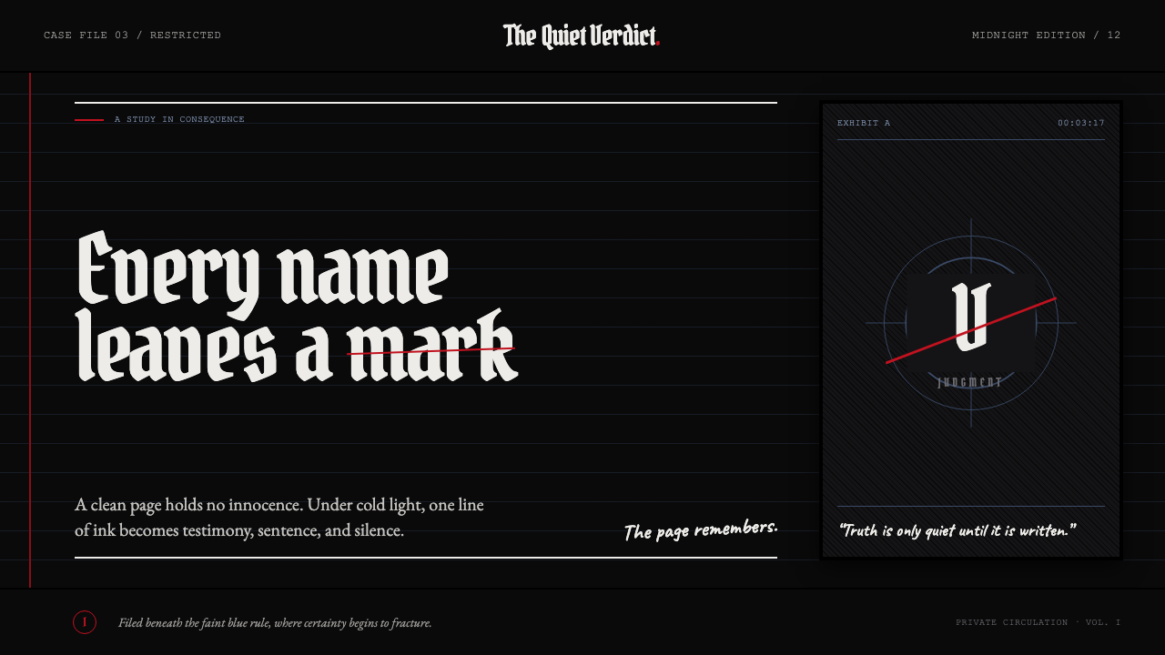 Death Note (2003)Silence becomes judgment. Bone-white blackletter and blue rules break under o…
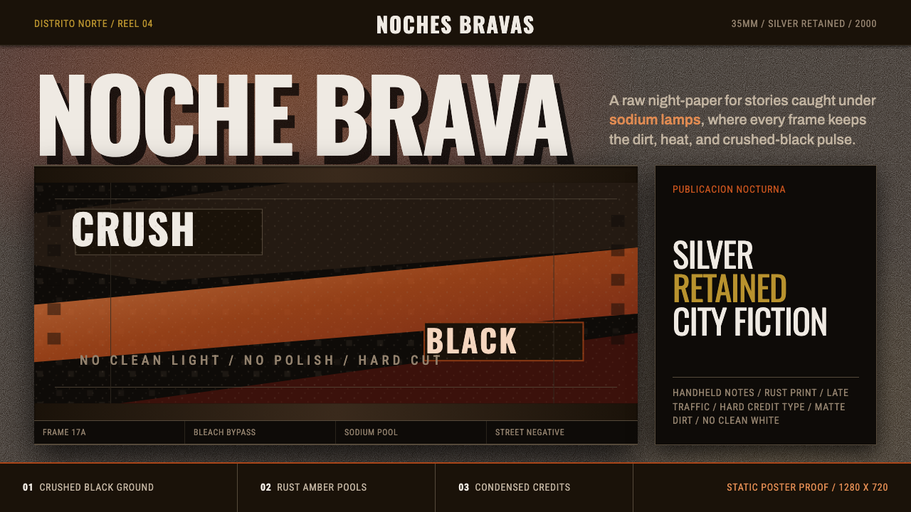 Amores Perros New WaveRaw street cinema. Crushed black, sodium amber, Oswald credits, heavy 35mm gr…
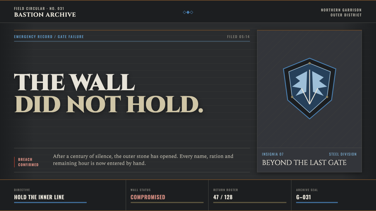 Attack on Titan (2013)Dread becomes duty. Stone-gray bands, engraved caps and one steel-blue crest…
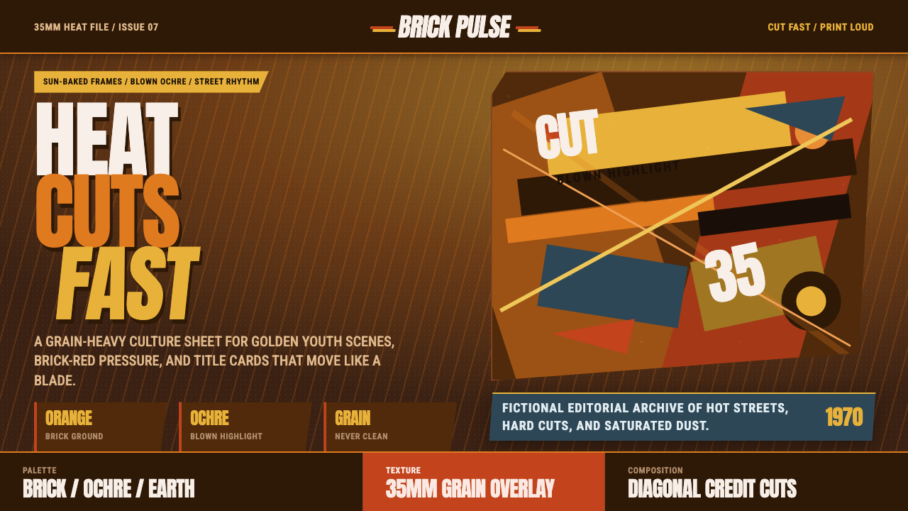 City of God FavelaHeat refuses polish. Orange brick, ochre glare, diagonal cuts, and grain do t…
 Demon Slayer (2019)Quiet craft, sudden force. Pine-black checks split beneath a water-teal strik…
 Game of Thrones (2011)Power is forged cold. Chiseled Roman capitals divide ember from glacial ice o…