What is Takashi Murakami Superflat?什么是 Takashi Murakami Superflat?
Takashi Murakami collapsed the boundary between high art and commercial pop culture into a single lacquered-flat surface — where smiling flowers, anime eyes, and luxury brand logic coexist without contradiction.村上隆将高雅艺术与商业流行文化的边界压缩为一个漆器般平整的平面——微笑的花朵、动漫大眼与奢侈品牌逻辑在其上毫无矛盾地共存。
Takashi Murakami Superflat in briefTakashi Murakami Superflat 速览
Superflat is an art and design movement coined by Japanese artist Takashi Murakami around the year 2000, taking its name from the radical flatness of its visual language — a surface without shadow, without illusionistic depth, without the perspective conventions that Western academic painting spent five centuries perfecting. Every element exists on the same plane: background and foreground merge into a continuous decorative field.超扁平是日本艺术家村上隆于2000年前后提出的艺术与设计运动,其名称源于其视觉语言的根本性平面化——一个没有阴影、没有幻觉深度、没有西方学院派绘画花了五个世纪打磨的透视法则的表面。每个元素存在于同一平面:背景与前景融合为连续的装饰性图像场域。
The movement draws equally from two traditions that Western critics once kept strictly apart. On one side, the refined lineage of Japanese Edo-period woodblock prints (ukiyo-e), with their bold contour lines, flat color fills, and cropped compositions. On the other, the mass-produced imagery of postwar Japanese manga and anime — characters with disproportionately large eyes, candy-saturated palettes, and designs engineered for maximum emotional impact at minimal visual complexity. Murakami's insight was that these two traditions were not opposites but expressions of the same underlying Japanese visual sensibility.该运动同等地汲取自两种传统——西方批评界曾将它们严格区分。一方面是日本江户时代浮世绘的精炼谱系:粗黑轮廓线、平涂色块与裁切式构图;另一方面是战后日本大量生产的漫画与动漫图像——五官比例夸张的大眼角色、糖果般饱和的色彩,以及以最低视觉复杂度追求最大情感冲击力的设计。村上隆的洞见在于:这两种传统并非对立,而是同一种日本视觉感性的两种表达。
Superflat is also a cultural critique. Murakami argued that postwar Japanese society had itself become 'superflat' — that the trauma of defeat and occupation had produced a culture in which depth, ambiguity, and historical gravity were suppressed beneath an endless surface of kawaii (cute), consumer goods, and entertainment. The smiling flowers are not innocent; they are knowingly synthetic. The glossy finish is armor as much as decoration.超扁平同时也是一种文化批评。村上隆认为,战后日本社会本身已变得「超扁平」——战败与被占领的创伤催生了一种将深度、模糊性与历史重量压抑在可爱(kawaii)商品和娱乐消费的无尽表面之下的文化。那些微笑的花朵并非天真无邪,而是刻意的合成物。光滑的漆面既是装饰,也是盔甲。
See the Takashi Murakami Superflat design system查看 Takashi Murakami Superflat 完整设计系统
Where does Takashi Murakami Superflat come from?Takashi Murakami Superflat 从何而来?
The immediate trigger for the Superflat movement was Murakami's 2000 exhibition of the same name, held at the Parco Gallery in Tokyo. The accompanying catalogue — a small paperback Murakami co-edited — functioned as the movement's manifesto. It placed Murakami's own paintings alongside Edo woodblock masters, anime production cels, and examples of contemporary otaku collector culture, arguing for a continuous lineage rather than a series of discrete art-historical ruptures. The exhibition toured to Los Angeles and Minneapolis in 2001, bringing the movement to international attention.超扁平运动的直接导火索是村上隆于2000年在东京PARCO画廊举办的同名展览。随展出版的小册子——由村上隆联合主编的薄薄文集——充当了运动的宣言。它将村上隆自己的绘画与江户木版画大师作品、动漫原稿和当代御宅族收藏文化并置,主张一种连续谱系而非一系列断裂的艺术史节点。展览随后于2001年巡回至洛杉矶和明尼阿波利斯,引起国际社会的关注。
Murakami was born in 1962 in Tokyo and trained within the traditional Japanese system, eventually earning a doctoral degree in Nihonga — the form of Japanese painting that self-consciously preserves pre-Western techniques, mineral pigments, and pictorial conventions. This rigorous classical training gave him both a command of the historical materials he was deconstructing and a certain institutional credibility that allowed critics to take his mass-culture references seriously. He founded his production studio Kaikai Kiki in 2001 — initially in Asaka, Saitama, later expanding to New York — organizing it deliberately on the model of Andy Warhol's Factory, with teams of assistants executing works to exacting specifications.村上隆1962年生于东京,接受传统日本体制的艺术训练,最终获得日本画博士学位——日本画是自觉保留前西洋化技法、矿物颜料与图像惯例的日本绘画形式。这一严格的古典训练赋予他既能驾驭所解构的历史材料、又具备足够学术公信力的双重能力,使批评界得以认真对待他对大众文化的援引。2001年,他创立了カイカイキキ(Kaikai Kiki)工作室——初设于埼玉县朝霞市,后扩展至纽约——并刻意以安迪·沃霍尔的工厂(The Factory)为蓝本,由助手团队按精确规范执行作品。
The intellectual foundation of Superflat draws on a longer Japanese critical tradition. The art critic Koji Taki had argued in the 1960s that Japanese visual culture possessed an inherent flatness rooted in the absence of the chiaroscuro tradition. Murakami pushed this argument in a new direction: rather than treating flatness as a limitation to be overcome, he claimed it as an aesthetic resource and a form of cultural resistance — a refusal to import Western depth conventions that carried their own ideological freight.超扁平的思想根基汲取自更长的日本批评传统。艺术评论家瀧幸治在1960年代曾论证,日本视觉文化因缺乏明暗对照(chiaroscuro)传统而天然具备一种内在的平面性。村上隆将这一论点推向新方向:与其将平面性视为有待克服的局限,不如将其确立为一种审美资源与文化抵抗形式——拒绝引入携带着其自身意识形态重量的西方深度惯例。
The movement's international breakthrough came partly through Murakami's collaborations with the luxury fashion industry. His 2003 partnership with Marc Jacobs for Louis Vuitton — producing the multicolored monogram canvas and the Cherry Blossom bag — demonstrated that Superflat's visual vocabulary could operate at the highest levels of commercial luxury without losing its identity. This was the practical proof of Murakami's theoretical claim that no meaningful boundary separated fine art from commercial design. Subsequently, his collaboration with Kanye West on the album artwork and music videos for 'Graduation' (2007) extended the movement's reach into music and global youth culture. Yoshitomo Nara, though never formally a Superflat member, developed a parallel practice in the same period — solitary children with large eyes and unsettling expressions — that became internationally associated with the movement's sensibility.该运动的国际突破,部分得益于村上隆与奢侈时尚产业的合作。他2003年与马克·雅可布为路易威登展开的合作——推出多彩字母帆布与樱花手袋——证明了超扁平的视觉语汇可以在最高商业奢侈品层面运作,而不失去自身身份。这是村上隆理论主张的实践证明:纯艺术与商业设计之间不存在任何有意义的边界。此后,他与坎耶·韦斯特在专辑《Graduation》(2007年)封面及音乐录影带上的合作,进一步将运动影响力延伸至音乐领域与全球青年文化。奈良美智虽从未正式加入超扁平,却在同一时期发展出平行的创作实践——孤独的大眼儿童带着令人不安的表情——并与该运动的感性在国际上紧密相连。
What defines the Takashi Murakami Superflat look?Takashi Murakami Superflat 的视觉特征是什么?
Radical Flatness彻底的平面性
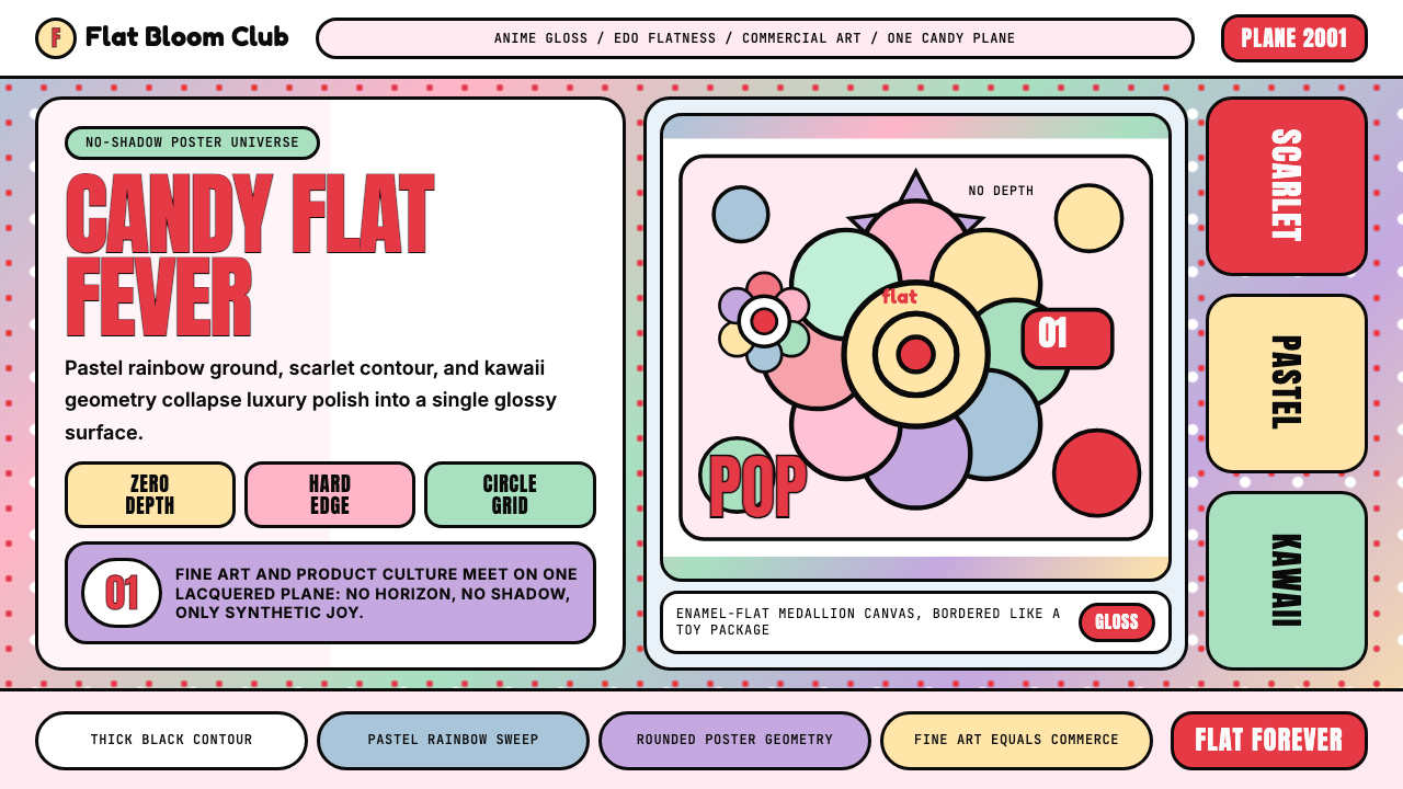
The defining formal property of Superflat is the total elimination of illusionistic depth. There are no cast shadows, no atmospheric perspective, no vanishing points, no gradients that suggest receding space. Every element — foreground figure, background fill, decorative pattern — occupies the same visual plane. This flatness is not a simplification but a positive aesthetic claim: the surface is the whole truth of the image.超扁平最核心的形式特征是对幻觉深度的彻底消除。没有投影,没有大气透视,没有消失点,没有暗示空间后退的渐变。每个元素——前景人物、背景填充、装饰图案——都占据同一视觉平面。这种平面性不是简化,而是积极的审美主张:表面就是图像的全部真相。
Thick Contour Lines粗黑轮廓线
Every form in Superflat is bounded by a firm, unmodulated outline — a direct inheritance from ukiyo-e woodblock tradition as well as anime cel animation, where the ink contour defines the character and allows flat color to be filled within it. The line weight is consistent and confident, never tapered or brush-sensitive. These contours give the style its enamel-like, hard-edge quality: shapes look cut out and placed rather than drawn or painted.超扁平中的每个形态都被一条坚定、不调制的轮廓线所界定——这是从浮世绘木版画与动漫赛璐珞动画直接继承而来的传统,墨线轮廓定义角色,平涂色块填充其内。线的粗细一致而自信,从不细如发丝或随笔触变化。这些轮廓赋予这种风格珐琅般的硬边品质:形状看起来像被剪切摆放,而非描绘或绘制。
Candy-Saturated Palette糖果般的饱和色彩
Superflat color is intensely saturated and deliberately synthetic — pastel rainbow grounds layered with vivid primaries, punctuated by a signature scarlet red. The palette references the bright printing inks of manga and anime production rather than any natural or painterly color tradition. Colors read as signals rather than representations: they denote category, mood, and energy rather than depicting light falling on a surface. The overall effect is simultaneously festive and slightly unreal.超扁平的色彩强烈饱和、刻意合成——粉彩彩虹底色上叠加鲜艳的主色,以标志性的猩红色作为点睛之笔。这套色板参照的是漫画与动漫制作的鲜艳印刷油墨,而非任何自然或绘画性色彩传统。色彩作为信号而非再现来运作:它们标示类别、情绪与能量,而非描绘光线落在表面上的样态。整体效果既像节日庆典,又略带一丝超现实感。
Kawaii Iconography可爱图像学
The visual vocabulary of Superflat is populated by characters and motifs drawn from the kawaii aesthetic: Mr. DOB (Murakami's signature character, a hybrid of Mickey Mouse and Japanese yokai), smiling multi-petaled flowers with faces, large-eyed figures expressing uncanny cuteness, and mushrooms with exaggerated proportions. These icons operate simultaneously as commercial branding and as art-historical gestures — they are designed objects that also carry critical content about the nature of design.超扁平的视觉语汇充满了源自可爱(kawaii)美学的角色与母题:DOB先生(村上隆的标志性角色,是米老鼠与日本妖怪的混合体)、带有表情的多瓣微笑花朵、表达着诡异可爱感的大眼人物,以及比例夸张的蘑菇。这些图标同时作为商业品牌符号与艺术史姿态运作——它们是被设计的对象,同时携带着关于设计本质的批判性内容。
Seamless Pattern Fields无缝图案铺底
Superflat compositions frequently use a repeating or near-repeating decorative field as the background — flowers tiling edge to edge, rainbow gradients stacked in equal bands, or abstract organic forms densely packed without negative space. This pattern logic comes from both textile design and wallpaper traditions and from the visual density of manga pages. The pattern is not subordinate to the central figure; it is a co-equal element of the composition.超扁平构图频繁使用重复或近乎重复的装饰性图案作为背景——边对边铺砌的花朵、以等宽色带叠加的彩虹渐变,或密集填充无负空间的抽象有机形态。这种图案逻辑来自纺织品设计、墙纸传统与漫画页面的视觉密度。图案并不从属于中心人物,而是构图中同等重要的元素。
Art-Commerce Equivalence艺术与商业的等价性
One of Superflat's most distinctive operating principles is the deliberate erasure of any hierarchy between fine-art production and commercial design. A Murakami painting produced in a limited edition for a gallery and a Murakami pattern printed on a luxury handbag are treated as categorically equivalent — not as compromise or contamination, but as proof that the supposed boundary was always fictional. This principle has direct implications for how the visual language behaves across different media and scales.超扁平最独特的运作原则之一,是刻意抹去纯艺术生产与商业设计之间的任何等级差异。限量版画廊版画与印在奢侈手袋上的村上隆图案被视为类别上等同的事物——不是妥协或污染,而是证明那条所谓的边界从来就是虚构的。这一原则对视觉语言在不同媒介与尺度上的运作方式具有直接的影响。
Glossy, Lacquered Surface Quality光滑的漆器式表面质感
Whether realized as a large-scale painting, a printed object, or a digital asset, Superflat work carries a sense of high-gloss finish — surfaces that reflect rather than absorb, that appear coated rather than textured. This quality is achieved through the combination of clean color fills, the absence of painterly marks, and the use of contours that read as crisp and decisive. The effect is simultaneously industrial and precious, recalling both mass-produced plastic goods and traditional Japanese lacquerware.无论是大型绘画、印刷品还是数字资产,超扁平作品都携带着一种高光泽的完成感——表面反射而非吸收光线,看起来是涂层而非有质感的。这种品质通过干净的色块填充、绘画性笔触的缺席,以及读来清晰决断的轮廓线共同实现。效果同时带有工业感与珍贵感,既令人联想到大量生产的塑料商品,又令人联想到日本传统漆器。
See the Takashi Murakami Superflat design system查看 Takashi Murakami Superflat 完整设计系统
Who shaped Takashi Murakami Superflat?谁塑造了 Takashi Murakami Superflat?
Murakami is the originator and most prominent practitioner of Superflat. His dual career — as a gallery artist whose works sell for millions at auction and as a commercial collaborator with luxury houses and pop musicians — is itself the demonstration of the movement's central thesis. His studio Kaikai Kiki, organized on an industrial production model, has trained a generation of Japanese artists and operates as both a production facility and an artist-management organization. His Mr. DOB character, first developed in the early 1990s, remains the most recognized icon of the Superflat visual language.村上隆是超扁平运动的创始人与最重要的实践者。他双线并行的职业生涯——既是拍卖价格高达数百万的画廊艺术家,又是奢侈品牌与流行音乐人的商业合作者——本身就是该运动核心命题的证明。他的カイカイキキ工作室按工业生产模式运营,培养了一代日本艺术家,同时作为创作工坊与艺术家管理机构运作。他在1990年代初开发的DOB先生角色,至今仍是超扁平视觉语言中最具认知度的图标。
As creative director of Louis Vuitton in the early 2000s, Marc Jacobs initiated the collaboration with Murakami that produced some of the most commercially successful luxury goods of the decade. The multicolored LV monogram and the Cherry Blossom collection demonstrated that Superflat's visual language was not merely an art-world proposition but a viable commercial aesthetic at the highest level of consumer markets. Jacobs's willingness to treat an artist's visual system as a design system — rather than simply licensing an image — validated Murakami's theoretical framework in practice.作为路易威登2000年代初的创意总监,马克·雅可布发起了与村上隆的合作,催生了该十年间部分最具商业成功的奢侈品。多彩LV字母与樱花系列证明,超扁平的视觉语汇不仅是艺术界的命题,更是最高消费市场层面可行的商业美学。雅可布将艺术家的视觉体系当作设计系统而非单纯图像授权来对待的意愿,在实践中验证了村上隆的理论框架。
Nara, born in 1959 in Aomori Prefecture, developed an independent body of work in the same period as Murakami that is frequently grouped with Superflat in critical discussion. His iconic motifs — solitary children with oversized heads, large unfocused eyes, and expressions hovering between innocence and menace — share Superflat's debt to manga iconography and its strategy of deploying kawaii imagery as a vehicle for ambivalent emotional content. Nara has maintained a more clearly personal and lyrical practice than Murakami's studio operation, but his international profile has been inseparable from the movement's critical framing.奈良美智,1959年生于青森县,与村上隆同期发展出独立的创作主体,在批评讨论中频繁与超扁平并列。他的标志性母题——头部硕大、大眼失焦、表情游走于天真与威胁之间的孤独儿童——与超扁平对漫画图像学的借鉴以及将可爱图像作为模糊情感内容载体的策略一脉相承。奈良保持了比村上隆工作室运作更为鲜明的个人性与抒情性创作,但他的国际地位始终与这一运动的批评框架密不可分。
West's invitation to Murakami to design the artwork and animated sequences for the 'Graduation' album (2007) extended Superflat's reach from the gallery and luxury-goods contexts into global popular music and youth culture. The bear mascot Murakami designed for West — rendered in full Superflat visual language — became one of the most widely circulated images associated with the movement outside Japan. The collaboration demonstrated that Superflat's visual grammar was legible and compelling to audiences with no art-historical background, confirming Murakami's claim that the supposed divide between high and popular culture was a Western critical construction.坎耶·韦斯特邀请村上隆为《Graduation》专辑(2007年)设计封面及动画序列,将超扁平的影响力从画廊与奢侈品领域延伸至全球流行音乐与青年文化。村上隆为韦斯特设计的熊吉祥物——以完整的超扁平视觉语言呈现——成为日本以外与该运动相关联的最广泛传播的图像之一。这次合作证明,超扁平的视觉语法对没有艺术史背景的受众同样清晰有力,印证了村上隆所言:高雅文化与大众文化之间的所谓鸿沟,不过是西方批评界的建构。
Hokusai (1760–1849) is not a Superflat figure but an essential ancestor. His woodblock series, including the celebrated Thirty-Six Views of Mount Fuji, established the visual conventions that Murakami explicitly cites as Superflat's lineage: bold contour lines defining flat areas of unmodulated color, compositional cropping that treats the picture edge as an active decision, and the treatment of natural forms (waves, clouds, mountains) as stylized decorative patterns rather than naturalistic representations. Understanding Hokusai clarifies what Superflat is claiming about the continuity of Japanese visual culture.葛饰北斋(1760—1849年)并非超扁平人物,而是一位不可或缺的先驱。他的木版画系列,包括著名的《富岳三十六景》,确立了村上隆明确引为超扁平谱系的视觉惯例:以粗黑轮廓线界定平涂的无调制色块区域,以将画面边缘视为主动决定的裁切式构图,以及将自然形态(波浪、云彩、山脉)处理为程式化装饰图案而非自然主义再现。理解北斋,有助于厘清超扁平关于日本视觉文化连续性所提出的主张。
How do you use Takashi Murakami Superflat today?今天怎么用 Takashi Murakami Superflat?
Superflat is a high-energy, high-identity style — applying it well means committing to its logic rather than borrowing its surface appearance. The style works best when a project can sustain its characteristic density and color intensity across all touchpoints, and when the brand or content benefits from a sense of controlled synthetic joy. It is not a neutral background style; it carries strong cultural associations with Japanese pop art, youth culture, and the deliberate collapse of high-low distinctions.超扁平是一种高能量、高识别度的风格——恰当地运用它,意味着投身于其内在逻辑,而非仅仅借用其表面外观。这种风格在项目能够在所有触点上维持其特有的密度与色彩强度,且品牌或内容受益于一种可控的合成愉悦感时,表现最为出色。它不是中性的背景风格,而是与日本流行艺术、青年文化以及有意打破雅俗区分的姿态带有强烈文化关联的风格。
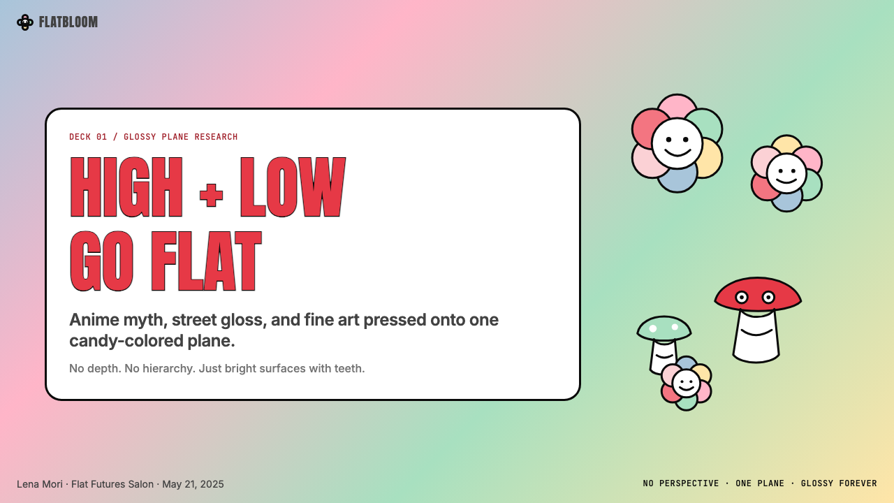
For presentation slides, Superflat offers a genuinely distinctive approach to both cover and content design. A cover slide benefits from a single iconic centered motif — a large smiling flower, a bold rounded mascot, a repeating pattern field — surrounded by a saturated flat color ground, with title typography set in a rounded, heavy face at substantial size. The thick-outline, flat-color aesthetic means titles read clearly even against patterned backgrounds. Content slides should embrace the visual density rather than fight it: use bold rounded card containers for data points, let charts read as flat geometric objects within the composition, and define hierarchy through scale and outline weight rather than shadow or subtle gradient. Data slides are particularly well served by the style's enamel-like clarity — bars and segments colored from the candy palette are immediately legible and visually memorable.在演示文稿中,超扁平为封面和内容页设计提供了真正独特的方案。封面页受益于一个居中的单一标志性母题——一朵硕大的微笑花朵、一个粗黑轮廓的圆润吉祥物、一个重复图案场域——被饱和的平涂色底所环绕,标题以粗圆字体大号排列。粗轮廓、平涂色的美学意味着标题即便在图案底色上也清晰易读。内容页应当拥抱视觉密度而非刻意回避:为数据点使用粗圆角卡片容器,让图表作为构图中的平面几何对象存在,通过尺度与轮廓粗细而非阴影或微妙渐变来定义层级。数据页在这种珐琅般清晰的风格中受益尤多——采用糖果色板着色的柱条与扇区既清晰易读,又在视觉上令人印象深刻。
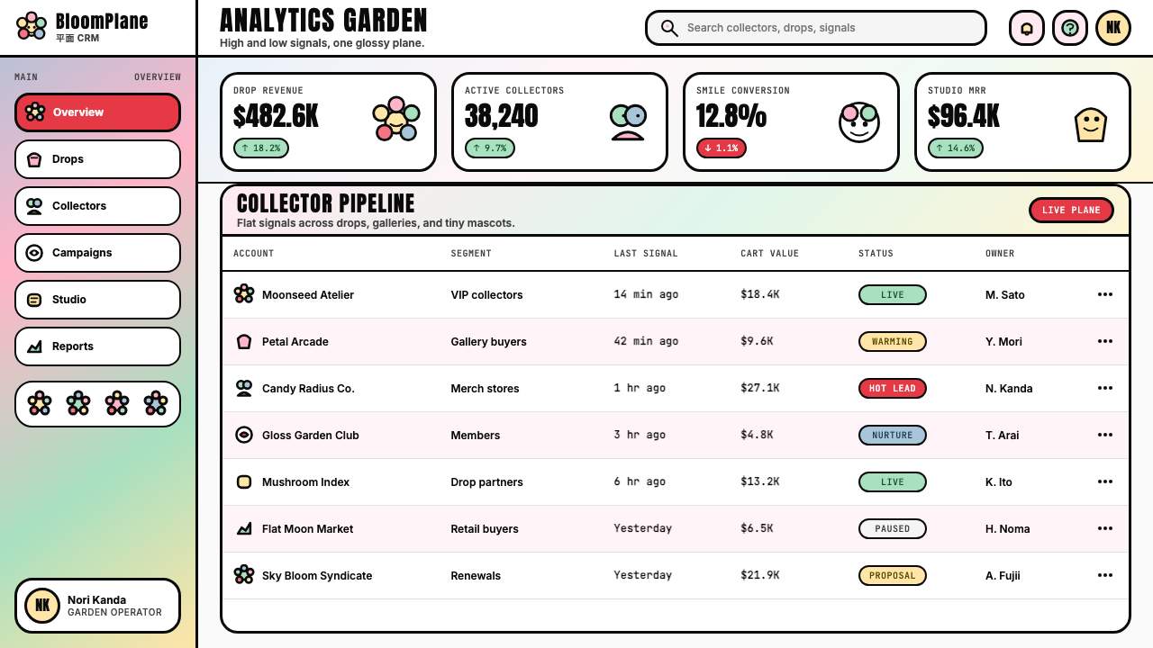
For web interfaces and digital products, Superflat is most effective in contexts where expressive identity is a primary goal — consumer-facing apps, creative platforms, gaming interfaces, youth-oriented commerce, and cultural or entertainment brands. The approach should be consistent: flat card components with visible borders and rounded corners replace elevation-based shadows; accent color is used boldly for interactive states and calls to action; navigation uses rounded pill shapes and high-contrast type; illustration and iconography follow the flat-fill, thick-outline grammar. Dashboards built in this style benefit from the palette's natural category differentiation — multiple data series can be distinguished by pure color without ambiguity, because the hues are distinct enough to be unambiguous even without secondary cues.对于网页界面与数字产品,超扁平在表现性身份是首要目标的语境中最为有效——面向消费者的应用、创意平台、游戏界面、面向青年的电商,以及文化或娱乐品牌。方法应保持一致:有可见边框与圆角的平面卡片组件替代基于高度的阴影;强调色大胆用于交互状态与行动号召;导航使用圆润胶囊形状与高对比度文字;插图与图标遵循平涂填充、粗线轮廓的语法。以这种风格构建的仪表板受益于色板天然的类别区分能力——多个数据系列可以通过纯色区分而不产生歧义,因为这些色相足够鲜明,即便没有辅助线索也毫无混淆。
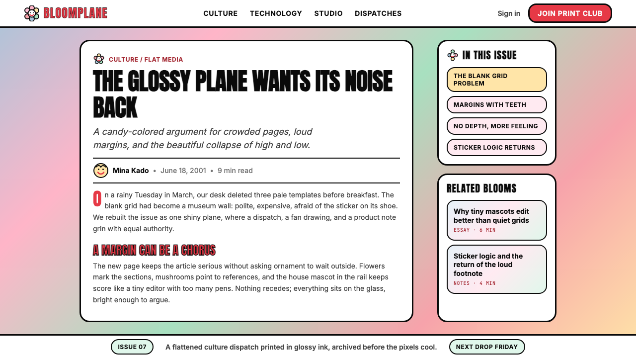
For editorial and marketing applications, Superflat's poster-like quality makes it highly effective for visual hierarchy. A Superflat-influenced editorial layout uses full-bleed color fields to separate sections, places pull quotes or key statistics inside bold rounded containers that read as standalone graphic elements, and treats any illustration or photography as a flat element — removing backgrounds, applying consistent contour treatment, or cropping to remove spatial depth cues. Marketing pages work well with alternating full-width blocks in different saturated ground colors from the palette, with consistent use of the signature rounded motifs as graphic punctuation. Event posters, social cards, and campaign visuals particularly benefit from the style's combination of visual density and instant readability at small sizes.对于编辑与营销应用,超扁平的海报式品质使其在视觉层级上极为有效。受超扁平影响的编辑版面使用全出血色块分隔章节,将引用语或关键数据置于读来像独立图形元素的粗圆角容器内,并将任何插图或摄影视为平面元素处理——去除背景、应用一致的轮廓处理,或裁切以消除空间深度线索。营销页面适合以色板中不同饱和底色交替排布全宽区块,以标志性的圆润母题作为图形标点符号一致运用。活动海报、社交卡片与营销视觉素材在小尺寸下也能充分发挥这种风格兼具视觉密度与即时可读性的优势。
A common mistake when applying Superflat is treating the style as simply 'colorful and cute' and applying it without structural discipline. Authentic Superflat has a rigorous internal logic: every element has a clear contour, color is flat and unmodulated (no soft blends within a shape), and the overall composition is intentionally dense rather than airy. Designers who borrow the palette but retain soft shadows, gradient fills, or delicate thin-line typography undermine the style's core character. Similarly, mixing many different icon or illustration styles within a single application breaks the consistency that gives Superflat its distinctive lacquered unity. The style demands commitment: either the surface is fully flat and fully saturated, or it is something else.应用超扁平时最常见的错误,是将这种风格简单理解为「色彩丰富且可爱」,从而在缺乏结构纪律的情况下随意应用。真正的超扁平有严格的内在逻辑:每个元素都有清晰的轮廓,色彩是平涂且不调制的(形状内部没有柔和过渡),整体构图是有意为之的密集感而非通透轻盈。借用色板但保留了柔和阴影、渐变填充或精细细线字体的设计师,会损害这种风格的核心性格。同样,在单一应用中混用多种不同的图标或插图风格,会破坏赋予超扁平其独特漆器统一感的一致性。这种风格要求承诺:要么表面完全平涂且完全饱和,要么就是别的什么。
See the Takashi Murakami Superflat design system查看 Takashi Murakami Superflat 完整设计系统
Takashi Murakami Superflat — FAQTakashi Murakami Superflat · 常见问题
How is Superflat different from general anime or manga aesthetics?超扁平与一般动漫或漫画美学有何不同?
Anime and manga are production categories with highly variable aesthetics — there is no single anime visual style, and manga ranges from precise realistic draftsmanship to abstract minimalism. Superflat is a specific critical and artistic position that uses selected elements of anime and manga iconography (large eyes, thick outlines, flat color, kawaii characters) as material for a gallery art and design practice that also draws on ukiyo-e, Warhol-era commercial art, and luxury brand strategy. Superflat is self-conscious about its sources in a way that anime production is not; it is simultaneously inside and outside pop culture, commenting on it while participating in it. Practically, Superflat work is characterized by a specific density, color intensity, and contour discipline that distinguishes it from casual anime-inspired design.动漫与漫画是具有高度多样美学的制作类别——不存在单一的动漫视觉风格,漫画的风格跨度从精确写实到抽象极简不等。超扁平是一个具体的批评性艺术立场,它将动漫与漫画图像学中的特定元素(大眼、粗轮廓、平涂、可爱角色)作为素材,用于同时借鉴浮世绘、沃霍尔时代商业艺术与奢侈品牌策略的画廊艺术与设计实践。超扁平对自身来源具有动漫制作所不具备的自觉意识;它同时置身于流行文化内外,一边参与其中一边对其加以评论。在实践层面,超扁平作品以特定的密度、色彩强度与轮廓纪律为特征,使其区别于随意的动漫风格设计。
Can Superflat work for serious or professional contexts, or is it inherently playful?超扁平能用于严肃或专业的场景,还是本质上只适合娱乐性内容?
Superflat's origins in both fine art and luxury commerce demonstrate that 'playful' and 'serious' are not mutually exclusive in this visual language. The style has appeared in major gallery exhibitions, internationally recognized publications, and global luxury campaigns simultaneously. That said, it does carry strong associations with joy, youth culture, and pop energy, which means it is not well suited to contexts that require conveying institutional gravity, clinical neutrality, or somber subject matter. A financial services firm communicating risk, a medical information platform, or a government regulatory body would find the style's energy misaligned with its communication needs. The key question is whether the product's values and the style's values overlap — not whether the category is 'serious' in the abstract.超扁平同时根植于纯艺术与奢侈商业的出身,证明了「娱乐性」与「严肃性」在这种视觉语言中并不相互排斥。这种风格同时出现在大型画廊展览、国际公认的出版物与全球奢侈品活动中。尽管如此,它确实带有与快乐、青年文化和流行能量的强烈关联,这意味着它不适合需要传达机构庄重感、临床中立性或沉重主题的场景。传达风险的金融服务机构、医疗信息平台或政府监管机构,都会发现这种风格的能量与其传播需求不符。核心问题是产品的价值观与风格的价值观是否重叠——而不是这个类别在抽象层面是否「严肃」。
What makes Superflat different from other flat design styles like Material Design or Swiss Style?超扁平与材料设计或瑞士国际主义风格等其他平面设计风格有何不同?
All three share the label 'flat' but have fundamentally different values. Material Design uses flatness as a system for communicating interactive affordance and hierarchy across digital interfaces, retaining subtle elevation shadows and a restrained color system. Swiss Style uses flatness in service of rational grid-based information organization, with typography as the primary expressive tool. Superflat uses flatness as an aesthetic and cultural statement — it is not primarily a functional system but an artistic position. Where Material Design and Swiss Style are reductive, Superflat is additive: it fills the surface with pattern, character, and color rather than clearing the surface for content. The cultural references are also entirely different: Superflat points toward Japanese art history and global pop culture; Swiss Style points toward European modernist rationalism; Material Design points toward physics and tactile intuition.这三者都贴有「平面」的标签,但有着根本不同的价值取向。材料设计(Material Design)将平面性用作在数字界面中传达交互功能与层级关系的系统,保留了微妙的高度阴影与克制的色彩系统。瑞士风格将平面性服务于基于理性网格的信息组织,以排版为主要表现工具。超扁平则将平面性用作美学与文化声明——它首先不是功能系统,而是艺术立场。材料设计与瑞士风格是减法,超扁平是加法:它用图案、角色与色彩填满表面,而非为内容腾空表面。文化参照也完全不同:超扁平指向日本艺术史与全球流行文化;瑞士风格指向欧洲现代主义理性主义;材料设计指向物理规律与触觉直觉。
Is Superflat only appropriate for East Asian audiences, or does it translate globally?超扁平只适合东亚受众,还是能够跨文化传播?
Superflat has demonstrated significant cross-cultural legibility since the early 2000s, primarily through the global penetration of Japanese anime and manga, which gave audiences worldwide a baseline familiarity with the visual vocabulary. The Louis Vuitton collaboration, the Kanye West album, and the subsequent adoption of kawaii iconography in Western streetwear and social media culture all suggest that the style communicates effectively far beyond its culture of origin. However, some nuances carry differently: Western audiences may read the style primarily as energetic and decorative without recognizing the critical subtext about postwar Japanese cultural identity. For most commercial design applications, this loss of critical depth is not a significant problem — the style's surface energy is its primary practical value in those contexts.自2000年代初以来,超扁平已展现出显著的跨文化易读性,这主要得益于日本动漫与漫画的全球渗透,使世界各地的受众对这套视觉语汇具备了基础熟悉度。路易威登合作、坎耶·韦斯特专辑,以及可爱(kawaii)图像学随后在西方街头文化与社交媒体文化中的采纳,都表明这种风格在其文化原产地之外同样能够有效传播。不过,某些层次的意涵会有所流失:西方受众可能主要将这种风格理解为充满能量的装饰性语言,而未能识别其关于战后日本文化身份的批判性潜文本。对于大多数商业设计应用而言,这种批判性深度的流失并不构成重大问题——这种风格的表面能量在这些语境中就是其主要的实践价值。
How should photography be handled in a Superflat design system?在超扁平设计系统中应如何处理摄影图像?
Photography presents a challenge for Superflat because naturalistic photographs import depth, shadow, and representational complexity that directly contradict the style's flatness principle. The most consistent solutions are: removing backgrounds and placing subjects against flat color fields, which isolates the subject and allows it to exist on the same plane as other flat elements; applying high-contrast or duotone treatment that reduces tonal complexity to two or three distinct color values; or tracing and converting photographic subjects into flat vector illustrations with contour outlines — treating the photograph as source material for an illustration rather than a finished element. Photographs used without treatment tend to read as foreign objects within a Superflat composition and break the surface unity that gives the style its distinctive quality.摄影对超扁平构成挑战,因为自然主义照片引入了深度、阴影与再现性复杂度,直接与这种风格的平面性原则相矛盾。最为一致的解决方案是:去除背景,将主体置于平涂色块之上,使其与其他平面元素存在于同一平面;应用高对比度或双色调处理,将色调复杂度简化为两到三个截然分明的色值;或者对摄影主体进行描摹与矢量化,加上轮廓线转化为平面插图——将照片作为插图的素材来源而非成品元素。未经处理直接使用的照片往往在超扁平构图中显得格格不入,并破坏赋予这种风格其独特品质的表面统一性。
Related design styles相关设计风格
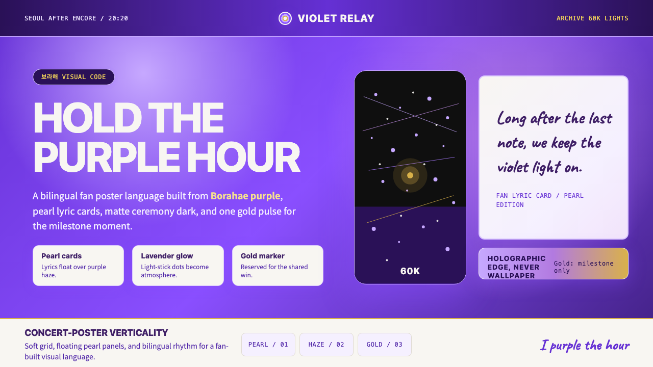 BTS Army Purple 2020Fandom becomes atmosphere. Borahae purple, pearl cards, lavender glow, one go…粉丝成为气氛:Borahae紫、珍珠歌词卡、薰衣草光晕与一束金光。
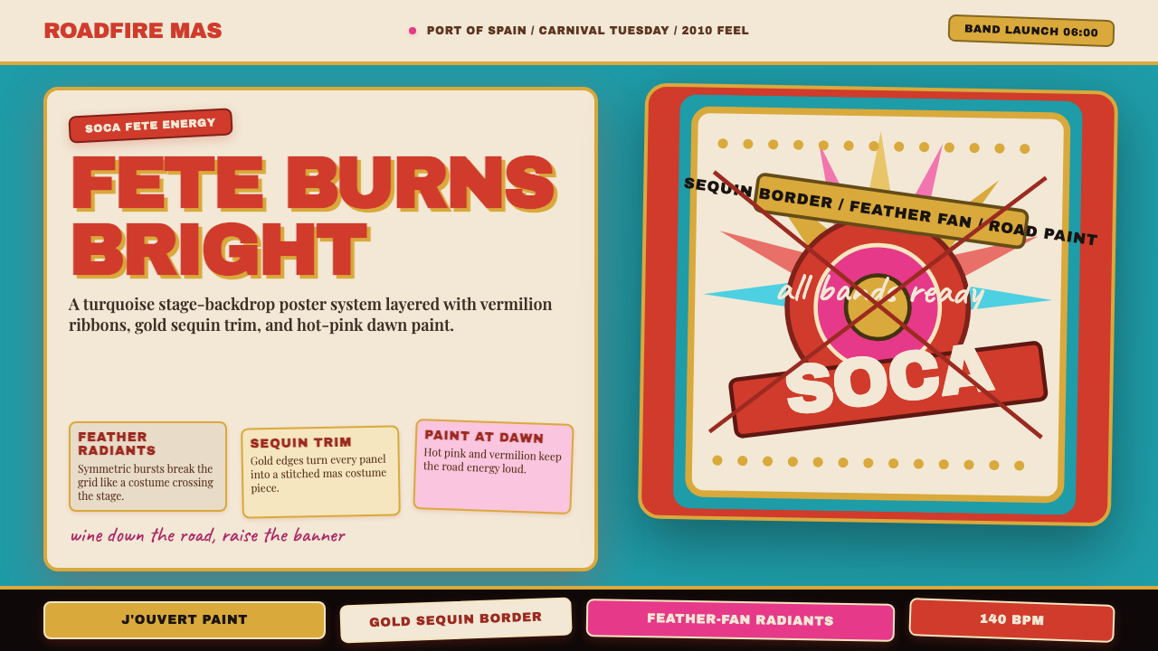 Trinidad Carnival Soca (2010)Joy overload. Turquoise field, vermilion banners, gold sequins, feather-fan g…快乐过载:绿松石底、朱红横幅、金色亮片与羽扇几何。
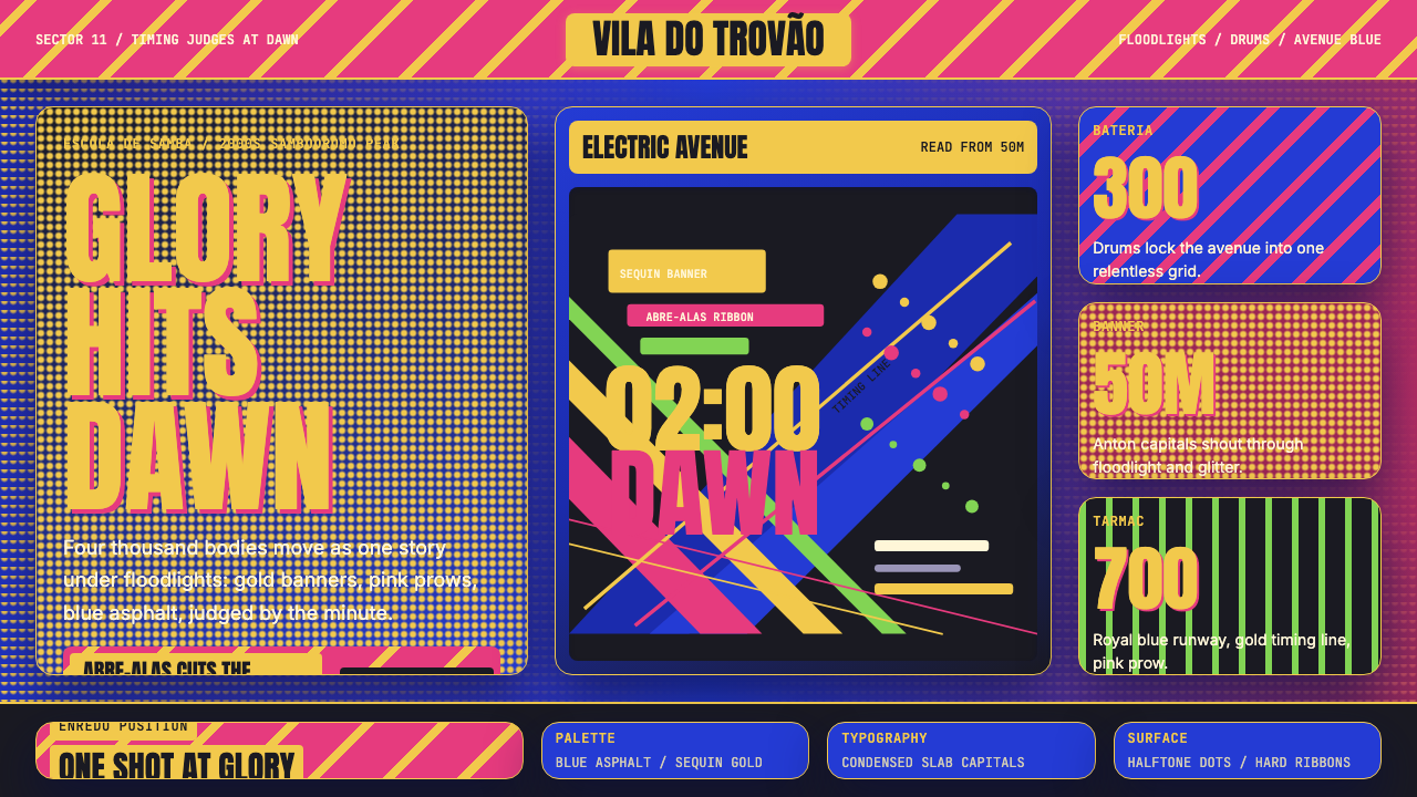 Brazilian Samba School (2000s Carnaval)Parade at floodlight volume. Royal blue asphalt, sequin gold type, pink ribbo…泛光灯音量的游行。宝蓝路面、亮片金字、玫红斜带。
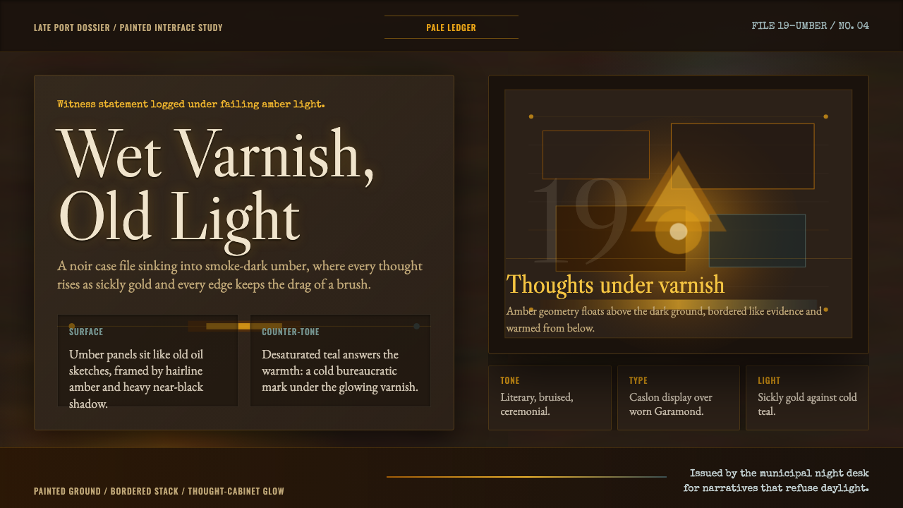 Disco ElysiumNoir rot glows from within. Amber Caslon type cuts through varnish-dark umber.黑色腐朽自内发光。琥珀Caslon切入清漆暗赭。
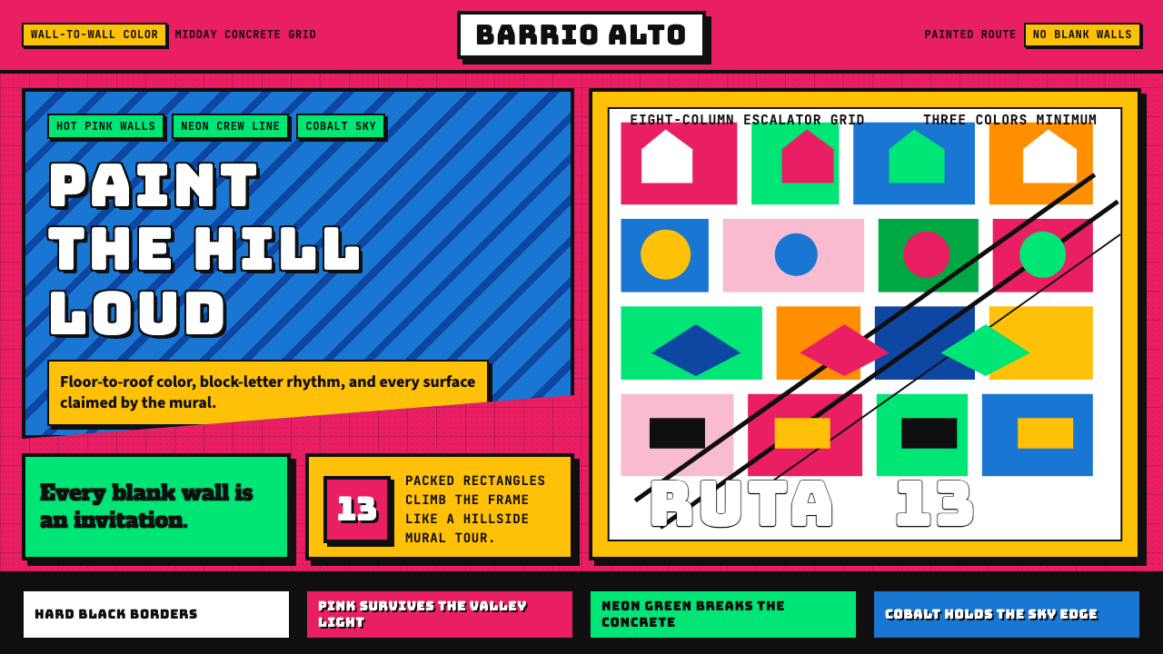 Medellín Comuna 13 MuralsRefuses blank walls. Hot pink, neon green, and cobalt blocks pack the grid li…拒绝空白墙:玫红、霓虹绿与钴蓝块面挤满网格。
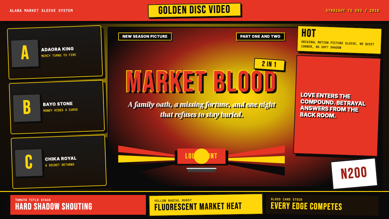 Nigerian Nollywood DVD Poster (2010)Market-stall cinema shouts. Tomato red type and yellow burst collide on jet b…市场摊位式电影在喊:番茄红大字与黄色爆裂撞上黑底。