Design style guide设计风格指南
What is Trinidad Carnival Soca (2010)?什么是 Trinidad Carnival Soca (2010)?
Trinidad Carnival circa 2010 is controlled chaos made gorgeous — sequined feathers, turquoise fields, vermilion banners, and the overwhelming confidence of a people who decided joy is an art form.2010年前后的特立尼达狂欢节,是将混沌变为壮美的艺术——亮片羽毛、绿松石底色、朱红横幅,以及一个将欢乐视为艺术形式的民族所特有的压倒性自信。
Trinidad Carnival Soca (2010) in briefTrinidad Carnival Soca (2010) 速览
Trinidad Carnival Soca (2010) is a design aesthetic rooted in the visual culture of Port of Spain's annual carnival celebration at the height of its modern pretty-mas era. It translates the theatrical excess of mas band costume design into a coherent graphic language: a dominant turquoise-and-gold palette, feather-fan radiant geometry, sequin border textures, and a layered maximalism that feels earned rather than accidental.特立尼达狂欢节索卡(2010)是一套植根于西班牙港年度狂欢节视觉文化的设计美学,代表了现代「漂亮马斯」时期(pretty-mas)的高峰。它将面具乐队服装设计的戏剧性过剩转化为一套连贯的图形语言:以绿松石与金色为主色调,融入羽扇放射状几何图案、亮片边框肌理,以及一种层层堆叠却显得自然而然而非偶然为之的极繁主义风格。
Where many festive aesthetics tip into visual noise, this one maintains internal logic. The compositions are densely layered but organized around strong radiating structures — burst forms and fan silhouettes that create natural focal points within the complexity. Bold vermilion and gold read as celebratory signals against the cooler turquoise ground, and everything is coated in the implied shimmer of rhinestone and sequin — a tactile quality that digital surfaces can evoke through surface treatment and contrast patterning.许多节庆美学容易滑入视觉噪音,而这套体系却保有内在逻辑。构图层次繁复,但围绕强烈的放射状结构组织——爆发形与扇形轮廓在复杂性中创造出自然的视觉焦点。大胆的朱红色与金色在较冷的绿松石底色映衬下,成为节庆的视觉信号,整体笼罩在水钻与亮片的隐含闪耀之中——一种数字界面可通过表面处理与对比图案加以唤起的触觉质感。
This is emphatically not a shy or restrained aesthetic. It belongs to a tradition that views visual restraint as a failure of imagination. The design philosophy behind it is closer to theatrical costume than to modernist graphic design: the goal is to overwhelm the senses in a structured, intentional way, so that the viewer feels the heat and sound of the Savannah stage even when encountering it on a screen.这套美学绝非含蓄或克制之物。它属于一种将视觉上的收敛视为想象力失败的传统。其背后的设计哲学更接近于舞台服装而非现代主义平面设计:目标是以结构化、有意为之的方式让感官应接不暇,令观者即便在屏幕前也能感受到萨凡纳舞台的热度与声浪。
See the Trinidad Carnival Soca (2010) design system →查看 Trinidad Carnival Soca (2010) 完整设计系统 →
Where does Trinidad Carnival Soca (2010) come from?Trinidad Carnival Soca (2010) 从何而来?
The roots of Trinidad Carnival reach back to the late eighteenth century, when French Creole planters brought masquerade traditions from Europe to the island. After emancipation in 1838, formerly enslaved Africans transformed the celebration into their own — the Canboulay torch processions of the 1830s, later suppressed by colonial authorities, became the symbolic origin story of a festival whose very existence was an act of cultural resistance. By the 1880s, carnival had settled into its modern street parade form, governed by mas bands competing in costume and music.特立尼达狂欢节的根源可追溯至十八世纪末,当时法裔克里奥尔种植园主将欧洲的化装舞会传统带到了这座岛屿。1838年废奴之后,昔日被奴役的非洲人将这一庆典改造成属于自己的节日——1830年代遭殖民当局镇压的「坎布雷」(Canboulay)火炬游行,成为这个以其存在本身就是文化抵抗行动的节日的象征性起源。到1880年代,狂欢节已发展成现代街头游行的形式,由各面具乐队在服装与音乐上相互竞争。
The visual aesthetic of the 2010 era descends directly from the mas design renaissance of the late twentieth century. Peter Minshall, widely regarded as the most significant carnival designer in the tradition's history, began his groundbreaking work in the 1970s and 1980s, introducing theatrical narrative, wire-bending sculpture, and a conceptual seriousness that elevated mas to fine art. His influence can be seen in the large-scale geometric forms and the sense that each costume section is part of a larger visual argument. Brian Mac Farlane, another major figure of the period, brought exuberant color fields and featherwork to prominence, contributing to what became the dominant pretty-mas vocabulary.2010年前后这一时代的视觉美学,直接继承自二十世纪末的面具设计复兴。彼得·明沙尔被普遍认为是这一传统中最重要的狂欢节设计师,他从1970至80年代开始了突破性的创作——引入戏剧性叙事、铁丝弯折雕塑,以及将面具设计提升至纯艺术高度的概念严肃性。他的影响体现在大尺度几何形态之中,体现在一种感知——每一节服装都是更宏大视觉论述的组成部分。另一位重要人物布莱恩·麦克法兰让奔放的色块与羽毛工艺大放异彩,为后来成为主流的「漂亮马斯」视觉词汇奠定了基础。
Soca music, the sonic engine of modern carnival, was formalized by Ras Shorty I in the 1970s as a fusion of soul and calypso. By the 2000s, it had evolved into the fast, bass-heavy road march sound associated with artists like Machel Montano, who became the face of the genre and whose fete posters and stage productions directly shaped the era's visual identity. The energy of soca — relentlessly forward, physically demanding, collectively euphoric — maps directly onto the aesthetic: nothing hesitates, nothing recedes.索卡音乐是现代狂欢节的声音引擎,由拉斯·肖提一号(Ras Shorty I)于1970年代将灵魂乐与卡利普索融合而正式确立。到2000年代,它已演变为与马切尔·蒙塔诺等艺人相关联的快节奏、重低音路边游行(road march)音乐——蒙塔诺成为这一流派的代言人,其派对海报与舞台演出直接塑造了这一时代的视觉身份认同。索卡音乐的能量——毫不犹疑地向前冲、对身体极具要求、集体性的狂喜——与这套美学体系形成直接映射:没有什么在迟疑,没有什么在退缩。
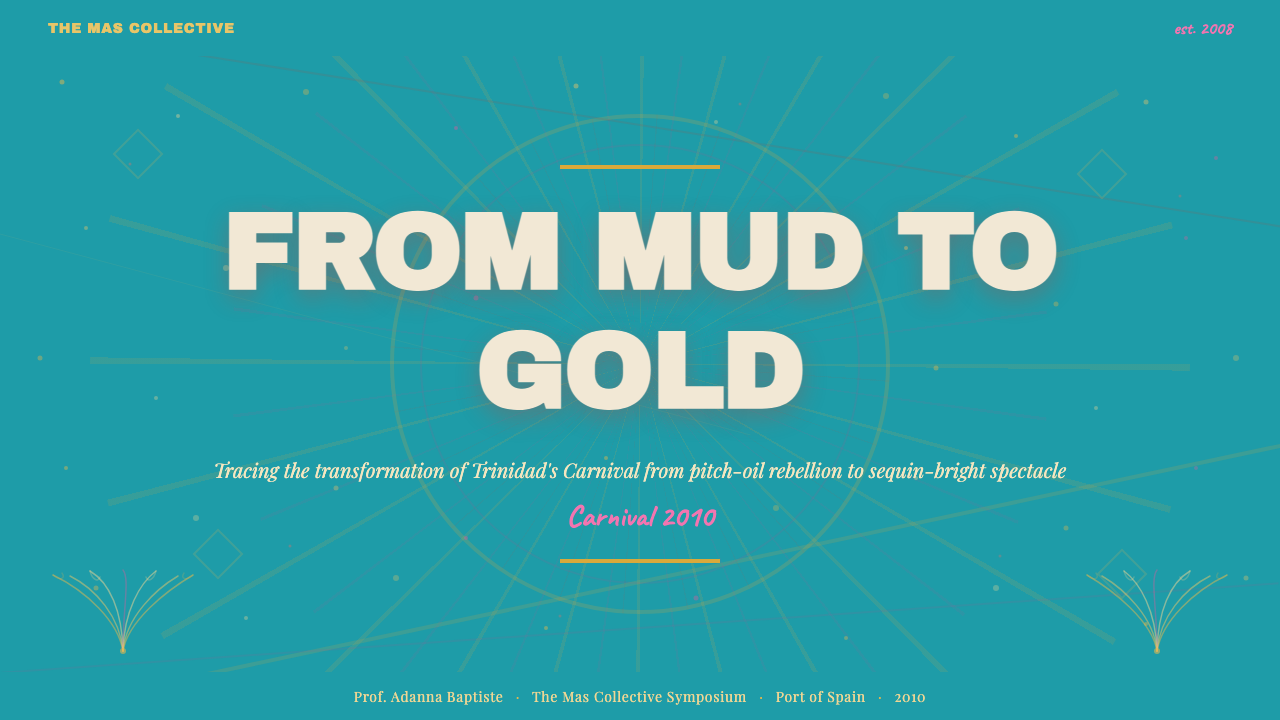
The years between roughly 2005 and 2015 represent the visual peak of this tradition, the moment when costume construction techniques, dye and sequin technology, and the commercial scale of the mas bands converged to produce the most elaborately beautiful costumes in the festival's history. The J'ouvert tradition — the pre-dawn street celebration where revelers cover themselves in paint, mud, and oil — provided a counterpoint within the same cultural moment: raw, dark, deliberately anti-pretty. The 2010 aesthetic this system captures is the daytime Tuesday parade side of that duality, the glittering apex that makes J'ouvert's rawness meaningful by contrast.大约2005年至2015年间,是这一传统的视觉高峰期——服装制作技术、染料与亮片工艺,以及面具乐队的商业规模在此时汇聚,催生了该节日历史上最为精美华丽的服装。J'ouvert传统——黎明前的街头庆典,狂欢者以颜料、泥浆和油彩涂抹全身——在同一文化时刻提供了对位:粗粝、暗沉、刻意地反「漂亮」。本系统所捕捉的2010年美学,正是这对双面体的白天星期二游行一侧——那熠熠生辉的顶点,以其壮观使J'ouvert的粗粝在对比中更具意义。
What defines the Trinidad Carnival Soca (2010) look?Trinidad Carnival Soca (2010) 的视觉特征是什么?
Color Field色域
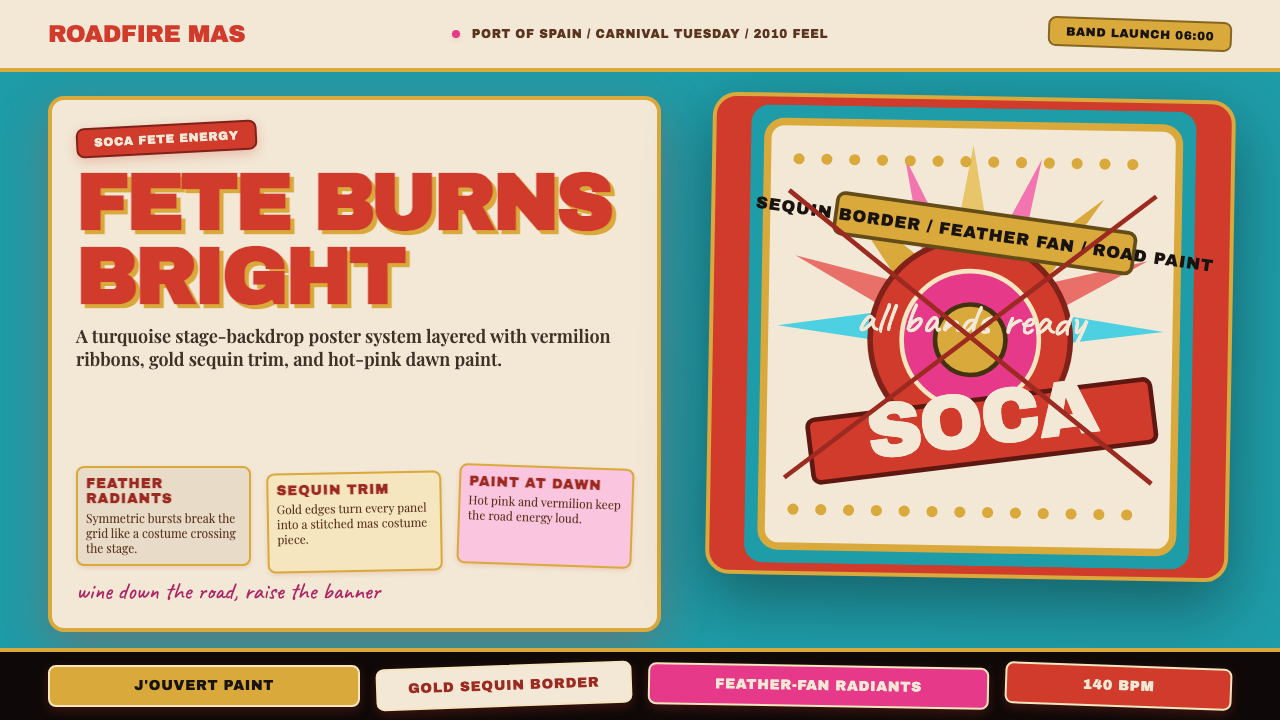
The palette is organized around a warm-cool tension: a vivid tropical turquoise serves as the dominant ground, against which hot vermilion, deep gold, and bright white compete for attention. These are not subtle colors — they are chosen for maximum visibility in direct sunlight at a distance of tens of meters, which is the original context for which carnival costumes are designed. In digital applications, this palette retains its intensity; colors are saturated and unmodulated, applied in broad, confident fields rather than as gradients or washes.色板围绕冷暖对比组织:鲜艳的热带绿松石色作为主导底色,灼热的朱红、深沉的金色与明亮的白色在其上争夺视线。这些绝非细腻含蓄的色彩——它们为在数十米之外的直射阳光下依然最大限度可见而生,那正是狂欢节服装最初被设计的语境。在数字应用中,这套色板保持其强度;色彩饱和而不加调和,以宽阔、自信的色块铺陈,而非以渐变或晕染呈现。
Radiant Geometry放射状几何
The organizing visual structure of the style is the burst or fan — forms that radiate outward from a central point in a display of directed energy. This comes directly from the feather-fan headdresses and backpacks of pretty-mas costuming, where enormous semicircular fan structures extend behind and above the wearer. In graphic applications, this translates to layouts that use radial or sunburst patterns as compositional anchors, with elements arranged to suggest explosive outward movement from a center of gravity.这套风格的视觉组织结构是「爆发形」或「扇形」——从中心点向外放射、展示定向能量的形态。这直接来源于「漂亮马斯」服装的羽毛扇形头饰与背包,那些巨大的半圆形扇面从穿戴者的背后和头顶延伸而出。在图形应用中,这转化为以放射状或旭日图案作为构图锚点的版面,各元素的排列暗示着从重心向外的爆炸性展开动势。
Sequin Surface Texture亮片表面肌理
Trinidad Carnival costumes are covered in sequins, rhinestones, metallic thread, and glitter — surfaces that catch and scatter light in constant motion. This shimmer quality is one of the most distinctive characteristics of the visual style. In static design work, it is evoked through high-contrast repeated pattern — dense fields of small geometric units, scalloped borders, mosaic-like texture overlays, and surface treatments that imply reflectivity without literally being reflective. The overall effect is one of radiant, energetic surface — nothing sits flat.特立尼达狂欢节服装覆满亮片、水钻、金属丝线与闪粉——在持续运动中捕捉和散射光线的表面。这种闪耀质感是这套视觉风格最具辨识度的特征之一。在静态设计作品中,它通过高对比度重复图案来唤起——小型几何单元的密集铺陈、扇贝形边框、马赛克式的肌理叠加,以及暗示反光性而非字面意义上反光的表面处理。整体效果是一种辐射状的、充满能量的表面——没有任何东西是静止平铺的。
Layered Maximalism层叠极繁主义
Where modernist aesthetics eliminate layers to reach clarity, this style adds layers to reach fullness. A carnival costume might include a base bodysuit, sequined briefs, wire-frame wings, feather collar, jeweled headpiece, and accessories — each element complete in itself and yet part of an integrated whole. In graphic terms, this means compositions willingly carry multiple simultaneous pattern registers: a background field, a midground border system, and a foreground focal element can all be visually active at the same time without any one reading as decorative noise, because each layer operates at a different scale.现代主义美学通过去除层次来达到清晰,而这套风格则通过添加层次来达到丰盈。一套狂欢节服装可能包含底部紧身衣、亮片短裤、铁丝框架翅膀、羽毛领圈、宝石头饰和各种配件——每个元素自身完整,同时又是整体的一部分。在图形语言中,这意味着构图自愿承载多个同时运转的图案层级:背景色域、中景边框系统与前景焦点元素可以同时保持视觉活跃,而不会有任何一层被读作装饰性噪音,因为每一层都在不同的尺度上运作。
Banner and Proclamation Typography横幅与宣言式字体排印
Text in this visual tradition is never quiet. Mas band names, soca song titles, and fete posters all employ bold, compressed letterforms at maximum scale — type that announces rather than informs. The typographic register is closer to a fair banner or a movie title card than to editorial body text. Letters are often given decorative treatment: outlined in contrasting colors, filled with gradient or texture, or given dimensional depth through shadow stacking. Type exists in this system to be seen from a distance and felt immediately, not read carefully.在这一视觉传统中,文字从不低调。面具乐队的名称、索卡歌曲标题与派对海报都采用最大尺寸的粗重、窄体字形——是宣告性的文字,而非告知性的文字。这种字体排印风格更接近集市横幅或电影片名字幕,而非编辑性正文。字母常被赋予装饰性处理:以对比色勾轮廓,填充纹理,或通过阴影叠加获得立体深度。在这套系统中,文字存在的意义是被远距离看见、被即刻感知,而非被仔细阅读。
Warm Gold Accents暖金强调色
Gold functions as the system's premium signal — it appears on borders, jewelry motifs, filigree details, and crown elements within costume design. Against the turquoise ground, gold reads as both warm contrast and as cultural prestige, evoking the crown, the trophy, and the sun simultaneously. In digital design, gold is used sparingly as the accent that marks hierarchy and emphasis within an already saturated composition — it is the last layer added, the element that says this is the most important thing here.金色在这套系统中充当高级信号——出现在边框、珠宝母题、金银丝装饰细节以及服装设计中的皇冠元素上。在绿松石底色的映衬下,金色既被读作温暖对比,也被读作文化威望,同时唤起皇冠、奖杯与太阳的意象。在数字设计中,金色被节制地用作在已然饱和的构图中标示层级与强调的强调色——它是最后添加的那一层,是那个说「这是这里最重要的东西」的元素。
Bilateral Symmetry with Festive Excess双边对称与节庆过剩
Unlike the deliberate asymmetry prized by modernist traditions, carnival costume design is fundamentally symmetrical — the human body as armature demands bilateral balance. Wings spread equally on both sides; feather fans mirror left and right; headpieces rise symmetrically from the center. This symmetry is not corporate or static, however — it is the symmetry of a butterfly or a peacock display, alive with bilateral ornament and motion. Graphic applications can honor this by organizing compositions around a strong vertical axis while loading both sides with equal but visually rich detail.与现代主义传统所推崇的刻意非对称不同,狂欢节服装设计从根本上是对称的——以人体作为骨架,要求双边平衡。翅膀在两侧等量展开;羽毛扇左右镜像;头饰从中心对称升起。然而这种对称并非企业式或静态的——它是蝴蝶或孔雀展示的对称,充满双边装饰与动感。图形应用可以通过将构图组织在一条强烈的垂直轴线周围、同时在两侧填充等量但视觉丰富的细节来致敬这一特征。

See the Trinidad Carnival Soca (2010) design system →查看 Trinidad Carnival Soca (2010) 完整设计系统 →
Who shaped Trinidad Carnival Soca (2010)?谁塑造了 Trinidad Carnival Soca (2010)?
Minshall is the most conceptually ambitious designer the Trinidad Carnival tradition has produced. Beginning in the 1970s, he reimagined the mas band presentation as a form of total theater — each band a narrative, each section a chapter, each costume a character with psychological depth. His designs introduced large-scale wire sculptures, kites, and mobile constructions to the parade ground, and his work on the 1992 Barcelona Olympics opening ceremony brought the aesthetic vocabulary of carnival to a global audience. His influence on the 2010 era is indirect but foundational: the idea that a mas band should have a point of view, and that carnival design deserves the same seriousness as fine art, is his legacy.明沙尔是特立尼达狂欢节传统所孕育的概念上最为雄心勃勃的设计师。从1970年代开始,他将面具乐队的呈现重新构想为一种总体戏剧形式——每支乐队是一个叙事,每一节是一个章节,每套服装是一个具有心理深度的角色。他的设计将大尺度铁丝雕塑、风筝和可移动装置引入游行场地,他为1992年巴塞罗那奥运会开幕式所做的工作将狂欢节的美学词汇带给了全球观众。他对2010年时代的影响是间接却基础性的:面具乐队应当有自己的观点,狂欢节设计值得与纯艺术同等严肃对待——这是他留下的遗产。
If the visual aesthetic of 2010-era carnival has a sonic equivalent, it is the road march music of Machel Montano. Beginning his career as a child performer in the 1980s, Montano became the dominant soca artist of his generation, winning the Road March title multiple times and shaping what contemporary carnival sounds like at every level — from fete stage lighting rigs to the banner graphics plastered across Port of Spain in the weeks before carnival. His fete posters and stage production designs, with their explosive color fields, bold photographic portraits, and maximum-energy typography, are direct visual antecedents of this design system.如果2010年代狂欢节视觉美学有一个声音对应物,那便是马切尔·蒙塔诺的路边游行音乐。蒙塔诺的职业生涯始于1980年代的童星阶段,后来成为同代人中最具统治力的索卡艺人,多次赢得路边游行冠军,并在各个层面上塑造了当代狂欢节的声音面貌——从派对舞台灯光架到狂欢节前数周铺满西班牙港的横幅图形。他的派对海报与舞台制作设计,以其爆炸性的色块、大胆的摄影肖像与最大能量的字体排印,是这套设计系统直接的视觉先驱。
Mac Farlane is one of the central architects of the pretty-mas visual vocabulary that defines the 2010 aesthetic. His mas bands — particularly Barbarossa, which he founded — became renowned for their lavish featherwork, jeweled bikini costuming, and the sheer opulence of their color fields. Where Minshall sought conceptual weight, Mac Farlane sought sensory abundance, and the tension between these two traditions shapes the design culture of the era. His productions demonstrated that extreme visual richness and structural coherence were not mutually exclusive — that a costume could be both overwhelming and organized.麦克法兰是定义2010年美学的「漂亮马斯」视觉词汇的核心缔造者之一。他的面具乐队——尤其是他创立的「巴巴罗萨」(Barbarossa)——以其奢华的羽毛工艺、宝石比基尼服装以及色域的纯粹富丽而闻名。明沙尔追求概念分量,麦克法兰则追求感官丰盈,这两种传统之间的张力塑造了这一时代的设计文化。他的作品证明了极度的视觉丰富性与结构连贯性并非相互排斥——一套服装可以既令人应接不暇,又组织有序。
Born Garfield Blackman, Ras Shorty I is the acknowledged inventor of soca music, which he developed in the early 1970s by fusing the lyrical traditions of calypso with the rhythmic energy of soul and funk. Though he later embraced a spiritual life and moved away from commercial carnival, his foundational work established the genre that would become the driving soundtrack of the aesthetic era this system represents. The qualities of soca — communal, kinetic, relentlessly forward-moving, built for crowds rather than individual listening — are precisely the qualities that characterize the visual system it inspired.拉斯·肖提一号,原名加菲尔德·布莱克曼,是索卡音乐公认的发明者。他于1970年代初将卡利普索的歌词传统与灵魂乐和放克的节奏能量融合,创立了这一流派。尽管他后来转向灵性生活、逐渐远离商业狂欢节,他的奠基性工作确立了一种类型,这种类型将成为本系统所代表的美学时代的驱动性配乐。索卡的特质——集体性、动觉性、毫不犹疑地向前奔涌、为人群而非个人聆听而生——正是这套受其启发的视觉系统的特质所在。
How do you use Trinidad Carnival Soca (2010) today?今天怎么用 Trinidad Carnival Soca (2010)?
The Trinidad Carnival Soca (2010) aesthetic is best deployed in contexts that call for uninhibited celebration, cultural warmth, and maximum visual energy. It is not a background style — it demands to be the primary visual event. This means it works best for hero moments: a conference keynote title slide, an event landing page header, a product launch announcement, or a brand campaign where the goal is to stop the scroll and generate an immediate emotional response.特立尼达狂欢节索卡(2010)美学最适合部署在需要无拘无束的庆典感、文化温度与最大视觉能量的场景中。这不是一种背景性风格——它要求成为主要的视觉事件。这意味着它最适合英雄时刻:会议主题演讲的封面幻灯片、活动落地页的头部区域、产品发布公告,或以阻止滑动拇指、即刻触发情感反应为目标的品牌活动。
For presentation slides, the approach differs between cover and content pages. A cover built in this style uses a full-bleed turquoise or deep gold field, a central burst or fan motif as the compositional anchor, and title type set large enough to read across a room — outlined or given shadow treatment for maximum presence. Content slides should simplify dramatically: use the color palette for headers and accent elements, but work on a near-white ground so the content breathes. Data slides can adopt carnival geometry for chart accents and dividers — arc shapes and fan segments make pie charts feel native to the style — but keep data labels legible by ensuring adequate contrast against the vivid backgrounds.对于演示文稿,封面页与内容页的处理方式截然不同。用这套风格构建的封面采用满幅的绿松石色或深金色底面,以一个中央爆发形或扇形母题作为构图锚点,标题字体设定为足够在整间房间里清晰可读的尺寸——并施以轮廓或阴影处理以获得最大存在感。内容页则应大幅简化:将色板用于标题和强调元素,但在近白色底面上操作,让内容有呼吸空间。数据页可将狂欢节几何图案用于图表装饰和分隔线——弧形和扇形分段让饼图与这套风格天然契合——但须确保数据标签在鲜艳背景上有足够对比度以保持可读性。
For web interfaces, this aesthetic suits event ticketing pages, cultural organization homepages, music streaming landing pages, and entertainment brands. The practical approach: reserve the full palette intensity for the hero section and allow it to reduce in saturation as the user scrolls deeper into utility content. Navigation should be crisp and functional — let the hero carry the visual weight so that the user is not fatigued by the time they reach pricing or contact forms. Interactive states (hover, active) are an opportunity to introduce the shimmer quality through brief animation or a shift to a more saturated variant of the base color.对于网页界面,这套美学适合活动购票页面、文化机构主页、音乐流媒体落地页以及娱乐品牌。实用方案:将完整色板的高强度保留给英雄区域,随着用户向下滚动至功能性内容时让饱和度逐渐降低。导航应当清晰利落——让英雄区域承载视觉重量,使用户在抵达定价或联系表单时不至于产生视觉疲劳。交互状态(悬停、激活)是通过短暂动画或转向基色更饱和变体来引入闪耀质感的机会。
For editorial and marketing work, this style excels at event programs, festival posters, cultural magazine spreads, and social content. A poster built in this vocabulary uses a symmetrical burst composition with the subject at the center, surrounded by increasingly ornate concentric rings of pattern and color. Social content benefits from the palette's native high contrast — images and graphics in these colors read well against both light and dark feed backgrounds. In marketing copy and headlines, the typographic register should match the visual energy: bold, compressed, declarative. Qualifiers and hedges have no place in a headline designed to feel like a carnival banner.对于编辑和营销工作,这套风格在活动节目册、节日海报、文化杂志版面与社交内容方面表现出色。用这套词汇构建的海报采用对称爆发式构图,主体位于中央,被层层递进、越来越繁复的同心环图案与色彩所环绕。社交内容受益于这套色板原生的高对比度——这些颜色的图像与图形在明色和暗色信息流背景下均清晰可读。在营销文案与标题中,字体排印风格应与视觉能量相匹配:粗重、紧凑、宣言式。设计成狂欢横幅感觉的标题里,没有限定语和保留性措辞的位置。
A common mistake is applying the palette while suppressing the layering. Turquoise, gold, and vermilion on a white field without the structural density of the style looks incomplete — like carnival without the feathers. The other frequent error is treating this as an all-purpose loud aesthetic and deploying it in contexts that require trust, calm, or precision: medical interfaces, financial dashboards, productivity tools. This style communicates festivity and cultural pride with great clarity, but it communicates analytical rigor with none. Match the aesthetic to the emotional register of the use case before applying it.一个常见错误是应用了色板却压制了层叠密度。在白色底面上的绿松石、金色与朱红色,若缺少这套风格的结构性密度,看起来是不完整的——就像没有羽毛的狂欢节。另一个频繁出现的错误是将其当作万能的喧嚣美学,部署在需要信任感、平静或精确度的场景中:医疗界面、金融仪表板、生产力工具。这套风格以极强的清晰度传达节庆感与文化自豪,却丝毫不传达分析性严谨。在应用之前,请先将美学与使用场景的情感基调对齐。
See the Trinidad Carnival Soca (2010) design system →查看 Trinidad Carnival Soca (2010) 完整设计系统 →
Trinidad Carnival Soca (2010) — FAQTrinidad Carnival Soca (2010) · 常见问题
Is this style only appropriate for Caribbean or festival-themed content?这套风格只适用于加勒比海主题或节庆内容吗?
Cultural specificity is a feature, not a limitation. The style carries authentic visual authority precisely because it comes from a real, living tradition rather than a generic tropical aesthetic. That said, it is not exclusive to Caribbean content — it works well for any context that benefits from its core qualities: communal celebration, uninhibited joy, cultural confidence. A global brand launch, a music event, an art exhibition, a sports campaign — all of these can carry the visual register of this style credibly. The key is that the content's emotional register should match: do not apply this to a context that requires restraint, formality, or analytical detachment.文化特殊性是这套风格的特征,而非局限。它之所以具有真实的视觉权威感,正是因为它来自一个真实的、仍在生长的传统,而非泛泛的热带美学。话虽如此,它并不局限于加勒比海内容——它适用于任何受益于其核心特质的场景:集体性庆典、无拘无束的欢乐、文化自信。一场全球品牌发布、一个音乐活动、一次艺术展览、一场体育运动——所有这些都可以有可信度地承载这套风格的视觉基调。关键在于内容的情感基调应当相匹配:不要将其应用于需要克制、正式感或分析性超然的场景。
How do I reference this aesthetic without it reading as cultural appropriation?如何借鉴这套美学而不让人感觉是文化挪用?
The most useful distinction is between appropriation and appreciation. Appropriation extracts visual surface while erasing or ignoring the source culture; appreciation acknowledges the source while applying the visual language honestly. If you use this style, be direct about where it comes from — in project documentation, in presentations, in any context where the reference is relevant. Avoid hollow pastiche: do not use the palette and geometry while removing all the energy that makes the style meaningful. The worst outcome is a design that borrows the colors but loses the joy. The best outcome is work that genuinely honors the tradition by applying its principles with care and specificity.最有用的区分是挪用与欣赏之别。挪用是提取视觉表面,同时抹去或忽视源文化;欣赏是在承认来源的同时诚实地应用视觉语言。如果你使用这套风格,请直接说明它的来源——在项目文档中、在演示中、在任何参考关联到位的场景中。避免空洞的仿制:不要使用这套色板和几何图案,却去除了使这套风格有意义的全部能量。最糟糕的结果是一个借用了颜色却丢失了欢乐的设计。最好的结果是通过认真、具体地应用其原则,真正向这一传统致敬的作品。
Can this style work in a dark-background version?这套风格能做成深色背景版本吗?
Yes, and the tradition actually supports it through J'ouvert aesthetics — the pre-dawn carnival celebration that deliberately inverts the day parade's glamour with raw, dark, paint-covered energy. A dark variant of this system places the palette on a near-black or very deep navy ground, where gold and vermilion read as incandescent accents against the darkness. Turquoise on black has a luminous, almost neon quality that captures a different phase of the carnival experience. The key difference from the light variant: dark versions work best when the radiant geometry is kept tight and contained — enormous burst forms on a black field tend to feel diffuse rather than energetic, so the compositions should be more concentrated.可以,而且这一传统实际上通过J'ouvert美学为此提供了支持——那场刻意以粗粝、暗沉、涂满颜料的能量颠覆白天游行华美感的黎明前狂欢庆典。这套系统的深色变体将色板铺展在近黑色或极深海军蓝底面上,金色与朱红在黑暗中被读作炽热的强调色。黑底上的绿松石色具有一种明亮的、近乎霓虹的质感,捕捉了狂欢节体验的另一个维度。与浅色变体的关键区别在于:深色版本在放射状几何图案保持紧凑集中时效果最佳——黑色底面上的巨大爆发形容易显得发散而非充满能量,因此构图应当更为聚焦。
How much layering is too much when applying this style digitally?在数字环境中应用这套风格时,层叠到什么程度算过头?
The practical test is whether the functional content — the information the user needs to act on — remains legible and findable within the visual richness. Carnival costumes work at maximum layering because the costume itself is the content; there is nothing to read, only something to see. Digital interfaces always have a second layer of purpose: getting users to click, read, understand, or complete a task. The rule of thumb is to use maximum layering intensity in decorative zones (headers, hero sections, borders, backgrounds) and to reduce it significantly in functional zones (body text, form fields, data displays, navigation). Treat the layered maximalism as the frame, not the painting.实用的检验标准是:功能性内容——用户需要据此行动的信息——是否在视觉丰富性中依然保持可读性和可查找性。狂欢节服装在最大层叠度下仍然有效,因为服装本身就是内容;没有什么需要阅读,只有需要观看的东西。数字界面始终有第二层目的:引导用户点击、阅读、理解或完成任务。经验法则是:在装饰性区域(标题、英雄区域、边框、背景)使用最大层叠强度,并在功能性区域(正文、表单字段、数据展示、导航)显著降低层叠密度。将极繁主义的层叠视为画框,而非画作本身。
What is the difference between this style and other Caribbean or tropical aesthetics?这套风格与其他加勒比海或热带美学有何区别?
The most important distinction is structural: this style's organizing principle is radiant geometry and layered theatrical excess, not the loose organic curves and watercolor washes associated with generic tropical aesthetics. Generic tropical design uses palm fronds, flamingos, and soft gradients — organic, holiday-resort imagery with no particular cultural depth. Trinidad Carnival Soca comes from a specific artistic tradition with named designers, documented history, and precise visual conventions developed over decades of competitive mas design. It is dense, structured, bilateral, and built around a specific cultural moment in a specific place. The palette overlaps with other Caribbean traditions but the formal vocabulary — the burst forms, the sequin texture, the banner typography, the radiant symmetry — is distinctly its own.最重要的区别在于结构:这套风格的组织原则是放射状几何与层叠的戏剧性过剩,而非与泛泛的热带美学相关联的松散有机曲线和水彩晕染。通用热带设计使用棕榈叶、火烈鸟与柔和渐变——有机的、度假村式的图像,没有特别深厚的文化底蕴。特立尼达狂欢节索卡来自一个具体的艺术传统,有具名的设计师、有据可查的历史,以及经过数十年竞争性面具设计实践发展出的精确视觉惯例。它密集、结构化、双边对称,围绕一个特定地点、一个特定文化时刻而建立。色板与其他加勒比海传统有所重叠,但形式词汇——爆发形、亮片肌理、横幅式字体排印、放射状对称——是它独有的。
Related design styles相关设计风格
 Medellín Comuna 13 MuralsRefuses blank walls. Hot pink, neon green, and cobalt blocks pack the grid li…拒绝空白墙:玫红、霓虹绿与钴蓝块面挤满网格。
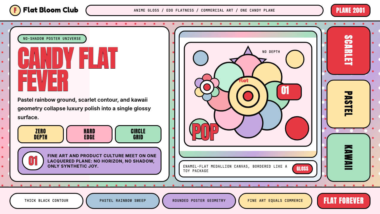 Takashi Murakami SuperflatJoy has no depth. Pastel rainbow, scarlet accents, and black contours flatten…快乐没有纵深:粉彩彩虹、猩红点缀与黑色粗描边压平成花。
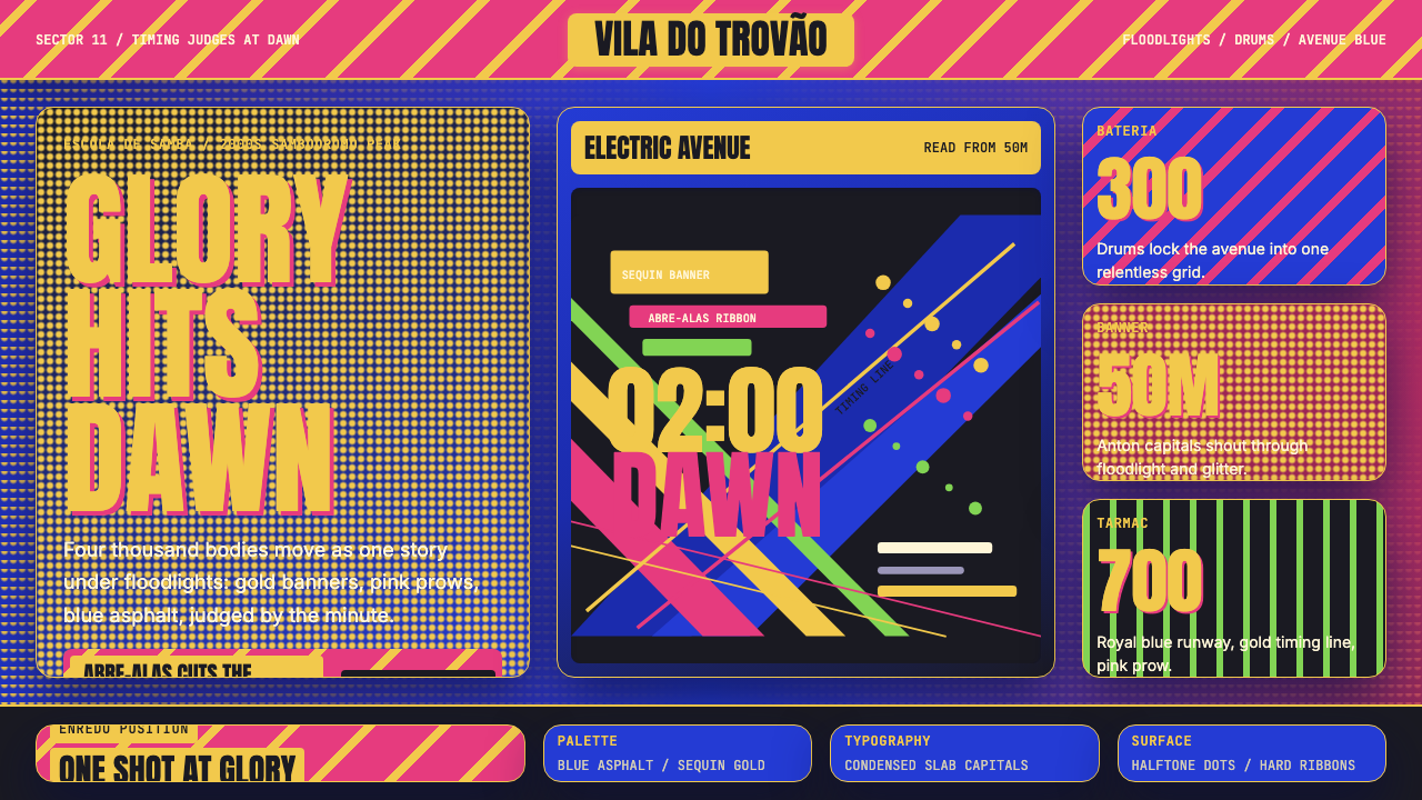 Brazilian Samba School (2000s Carnaval)Parade at floodlight volume. Royal blue asphalt, sequin gold type, pink ribbo…泛光灯音量的游行。宝蓝路面、亮片金字、玫红斜带。
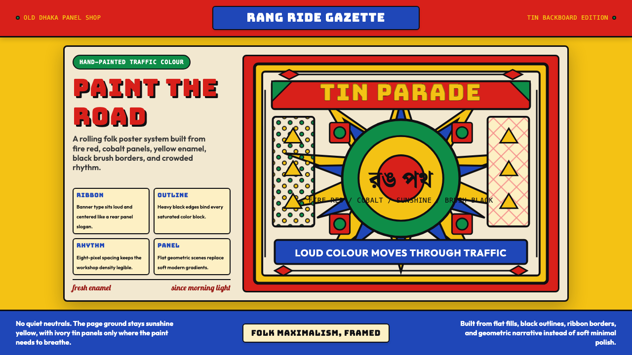 Bangladeshi Rickshaw Painting (Dhaka)Traffic shouts in color. Fire red, cobalt blue, and yellow panels lock into b…交通用色彩呐喊:火红、钴蓝与日光黄被黑边框锁住。
 Behance Maximalist PortfolioPortfolio volume at max. Electric blue, coral and lime stack into a full-blee…作品集音量拉满:电光蓝、珊瑚橙与酸橙绿堆成全出血案例板。
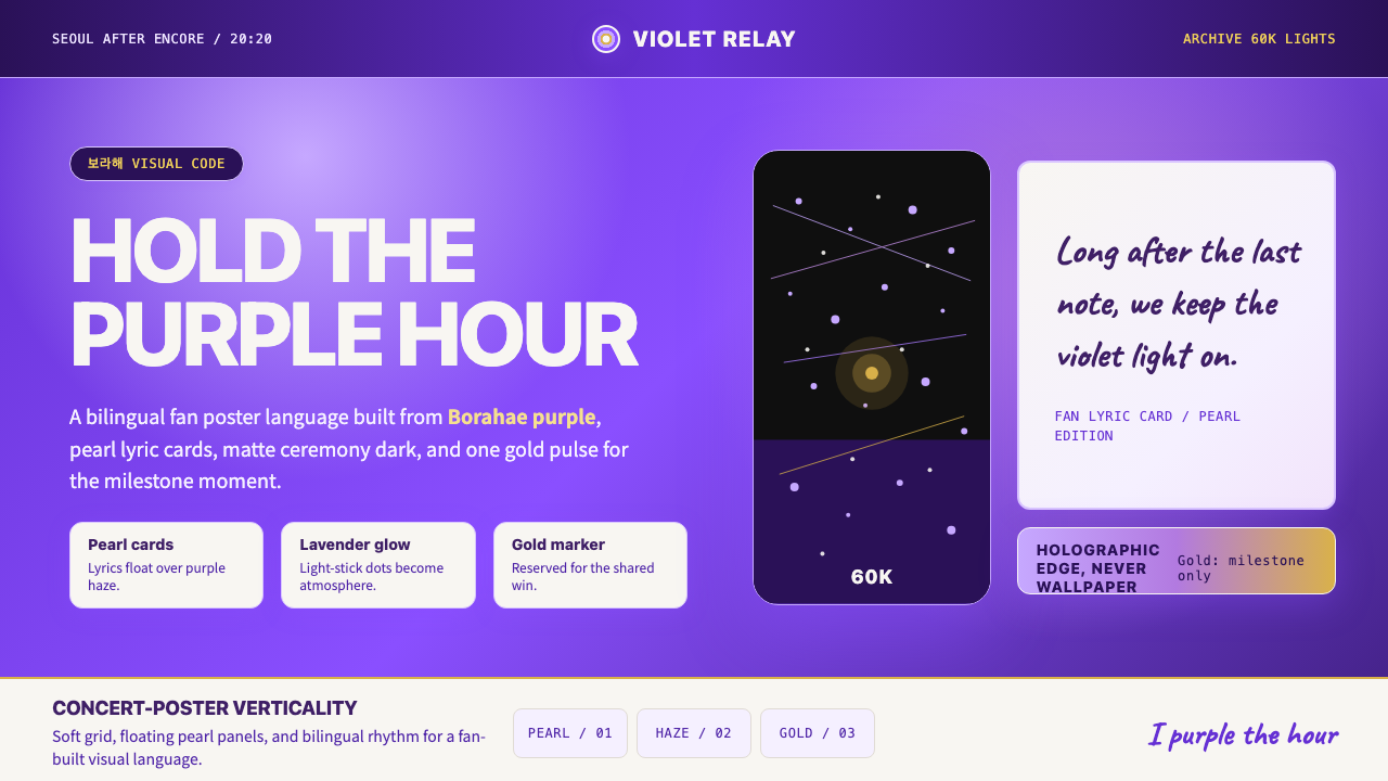 BTS Army Purple 2020Fandom becomes atmosphere. Borahae purple, pearl cards, lavender glow, one go…粉丝成为气氛:Borahae紫、珍珠歌词卡、薰衣草光晕与一束金光。