What is Behance Maximalist Portfolio?什么是 Behance Maximalist Portfolio?
Behance Maximalist Portfolio turns the creative case study into a full-bleed spectacle — vivid brand palettes, extreme type contrast, and glossy mockup photography stacked fifteen screens deep.Behance 极繁主义把创意案例变成一场全出血奇观——鲜艳品牌色板、极端字体对比与光泽样机摄影,层层叠叠绵延十五屏。
Behance Maximalist Portfolio in briefBehance Maximalist Portfolio 速览
Behance Maximalist Portfolio is the dominant visual aesthetic of Adobe's flagship creative showcase platform. It describes the way designers present completed projects to the global design community: as long, scrollable case-study decks that unfold hero imagery, brand-color swatches, process sketches, real-world mockup photography, and generous credits sections, one after another, at full browser width. It is graphic-design-school capstone energy reproduced at internet scale.Behance 极繁主义是 Adobe 旗舰创意展示平台的主导视觉美学。它描述的是设计师向全球设计社群呈现完成项目的方式:以滚动式长页案例的形式,依次铺开全幅主视觉、品牌色板、手绘过程稿、实物场景样机摄影以及慷慨的团队致谢区。这是设计院校毕业展级别的视觉张力,在互联网尺度上无限复制。
The style is defined by abundance rather than restraint. Where minimalist portfolio schools strip away everything non-essential, Behance Maximalism adds — more colors, more typeface contrast, more surface texture in the mockup photography, more contextual depth in the process documentation. The white or near-white canvas is not a statement of austerity; it is a neutral stage whose sole function is to make the saturated brand-board colors detonate against it.这种风格以丰盈而非克制为基调。极简主义作品集流派删去一切非必要元素,Behance 极繁主义则反其道而行——更多色彩、更大的字体对比、更丰富的样机摄影表面质感、更深入的过程文档情境。白色或近白色画布不是朴素主义的宣言,而是一块中性舞台,其唯一功能是让饱和品牌色板在其上尽情引爆。
Visually, the aesthetic reads as controlled loudness. Display type set at an enormous scale sits above body text set at a whisper, creating a contrast ratio that would be considered aggressive in editorial contexts but is expected and celebrated on the platform. Electric blue — the signature color of Behance's own interface — appears throughout as a navigational and interactive anchor, lending even highly individualized project presentations a faint family resemblance.在视觉上,这种美学呈现出受控的喧嚣感。以超大比例排版的展示字体置于低语般细小的正文之上,制造出一种在编辑语境中会被视为过激的对比度——但在这个平台上,这种对比不仅被接受,更被视为亮点。电光蓝——Behance 自身界面的标志色——贯穿始终,作为导航与交互的锚点,使哪怕高度个性化的项目展示也带有一丝家族相似性。
See the Behance Maximalist Portfolio design system查看 Behance Maximalist Portfolio 完整设计系统
Where does Behance Maximalist Portfolio come from?Behance Maximalist Portfolio 从何而来?
Behance was founded in New York City in 2006 by Scott Belsky and Matias Corea, who set out to solve what they saw as a structural problem in the creative professions: talented designers had no reliable, permanent online home for their work. Portfolios lived on personal websites that went offline, on PDFs that circulated by email, or on agency sites that buried individual credits. Behance proposed a platform — openly searchable, free to join, and linked to a professional network — where every project could be discovered by art directors, clients, and peers alike.Behance 于2006年由斯科特·贝尔斯基(Scott Belsky)与马蒂亚斯·科雷亚(Matias Corea)在纽约市创立,旨在解决他们眼中创意行业的一个结构性问题:才华横溢的设计师没有可靠、持久的在线作品家园。作品集散落在随时可能下线的个人网站、通过邮件流转的 PDF,或将个人署名淹没其中的公司网站。Behance 提出了一种平台方案——开放搜索、免费加入、链接至职业网络——让每个项目都能被创意总监、客户和同行发现。
In its early years, Behance was a relatively sparse environment. Projects were uploaded as image galleries, and the visual conventions were heterogeneous — whatever the designer chose to photograph or export. The shift toward the maximalist case-study format accelerated roughly between 2012 and 2016, driven by several converging forces: the rise of high-resolution retina displays that rewarded high-quality mockup photography, the proliferation of free and premium mockup templates that made product photography accessible to designers without studio budgets, and the competitive dynamics of the platform itself, where Featured Projects needed to arrest a viewer's attention within the first two screens or be scrolled past entirely.Behance 早期是一个相对朴素的环境,项目以图片画廊形式上传,视觉惯例参差不齐,完全取决于设计师自己选择拍摄或导出的内容。极繁主义案例格式的演化在2012年至2016年间大幅提速,由多重力量汇聚推动:高分辨率视网膜屏幕的兴起使高品质样机摄影更具价值;免费与付费样机模板的大量涌现让没有摄影棚预算的设计师也能呈现产品摄影效果;平台本身的竞争逻辑更是关键——精选项目必须在前两屏内抓住观看者的注意力,否则便会被一划而过。
Adobe acquired Behance in 2012 for a reported one hundred million dollars and integrated it tightly into Creative Cloud, making a Behance presence nearly automatic for subscribers. This dramatically expanded the platform's user base and introduced the electric blue of Adobe's interface language into the shared visual vocabulary of Behance portfolios — an ambient branding that, over time, became part of the style's signature palette rather than merely a navigational affordance.2012年,Adobe 以据报道约一亿美元收购 Behance,并将其深度整合进 Creative Cloud,使 Behance 主页几乎成为订阅用户的标配。这极大地扩展了平台用户基数,同时也将 Adobe 界面语言中的电光蓝引入了 Behance 作品集的共享视觉词汇——这一环境性品牌色彩久而久之成为该风格标志性色板的一部分,而不仅仅是一种导航符号。
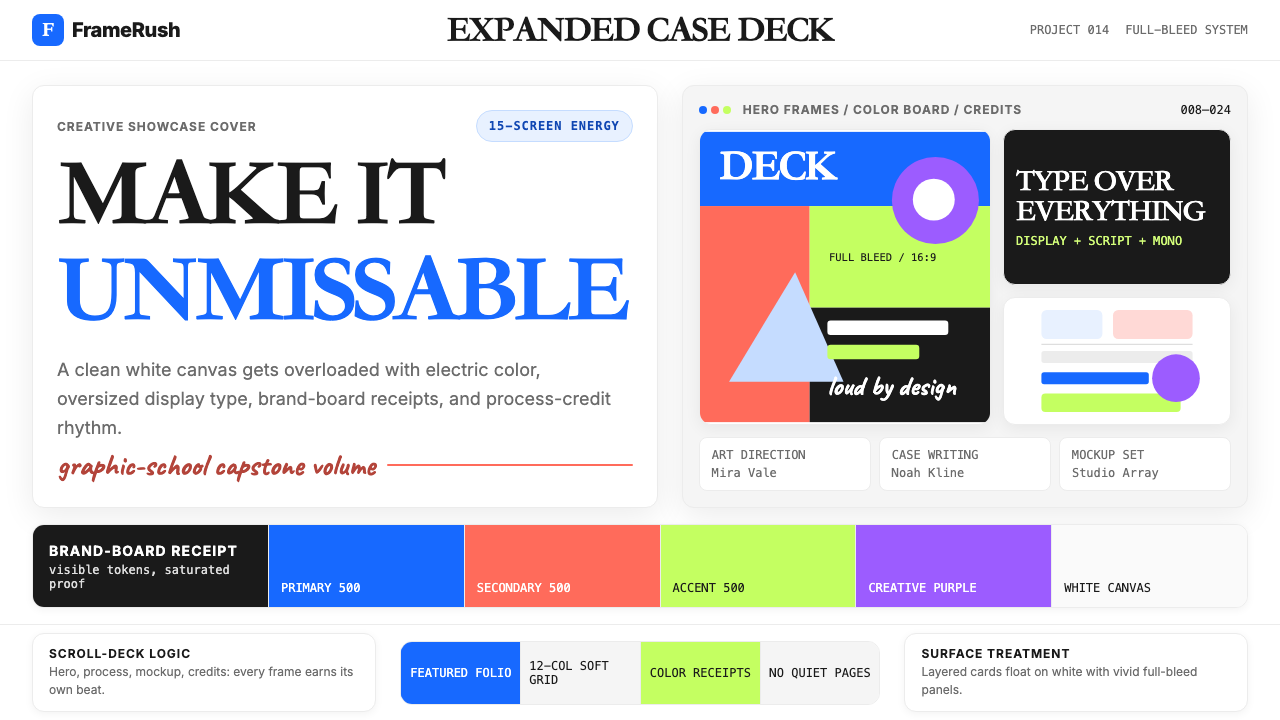
By the mid-2010s, a set of informal conventions had calcified into something close to a standard. The Featured Projects that earned the most appreciation and top designer recognition shared consistent traits: full-bleed hero images cropped to exacting aspect ratios, brand-board spreads that displayed color swatches, logotype lockups, and typography specimens side by side, lifestyle mockup photography staged on natural-material surfaces — raw wood grain, pale concrete, linen — and a consistent rhythm of alternating full-width imagery with tighter text and process sections. This format was not mandated by Adobe; it emerged from the community's collective optimization for visual impact and comprehensiveness.到2010年代中期,一套非正式惯例逐渐固化为近乎标准的格式。赢得最多赞赏与顶尖设计师认定的精选项目拥有一致的特征:按精确比例裁切的全出血主视觉、将色板、标识字形与字体标本并排陈列的品牌展示板、在天然材质表面——原木纹理、浅色混凝土、亚麻布——上取景的生活方式样机摄影,以及全幅图像与紧凑文字及过程区块交替出现的节奏感。这一格式并非 Adobe 的强制要求,而是设计社群集体优化视觉冲击力与内容完整性的自然结果。
What defines the Behance Maximalist Portfolio look?Behance Maximalist Portfolio 的视觉特征是什么?
Vivid Multi-Color Brand Palettes鲜艳多色品牌板
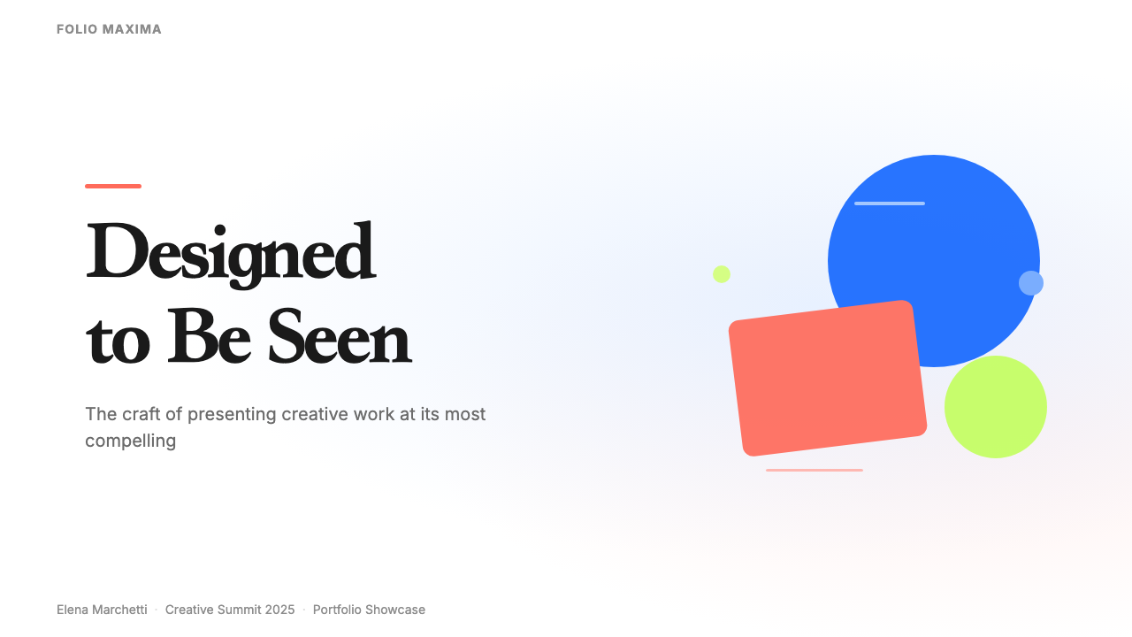
Unlike styles that restrict themselves to a single accent color, Behance Maximalism celebrates the brand-board spread: three to six colors displayed as large swatches, typically ranging from an electric or cobalt blue anchor through warm coral or terracotta and an acidic lime or chartreuse. These palettes are presented as explicit design decisions, not ambient backgrounds. The colors are saturated to the point of visual pressure, meant to communicate the energy and distinctiveness of the brand being presented, and they appear both in the brand-board section and echoed throughout the mockup photography and typographic treatments.与将自己限定于单一强调色的风格不同,Behance 极繁主义推崇品牌展示板的铺陈:三到六种色彩以大面积色块呈现,通常从电光蓝或钴蓝锚点延伸,经过温暖的珊瑚橙或陶土色,再到酸性的青柠或黄绿。这些色彩以明确的设计决策而非环境背景的面貌出现,饱和度高到产生视觉压迫感,旨在传达被呈现品牌的能量与独特性。它们既出现在品牌展示板区域,也在样机摄影和字体处理中反复呼应。
Extreme Typographic Contrast极端字体对比
The defining typographic move in Behance Maximalism is scale contrast pushed to its outer limit. A project title or section header rendered at display size — occupying much of the screen's vertical height — sits immediately above or beside body text set several grades smaller, with no intermediate hierarchy to soften the jump. A second layer of contrast comes from style mixing: a heavy, geometric display sans paired with a fluid cursive or script face, where the two typefaces share space on the same line or the same spread. This combination is borrowed from contemporary brand identity practice and signals the kind of client work that earns platform recognition.Behance 极繁主义最具代表性的字体手法是将尺度对比推至极限。以展示字号排版的项目标题或章节标题——占据屏幕垂直高度的大部分——紧接着比正文大几个级别的文字,中间没有任何缓冲层级来软化这一跳跃。第二层对比来自字体混搭:粗重的几何展示无衬线字体与流动的花体手写字在同一行或同一展开页上共存。这种组合借鉴自当代品牌识别实践,是能在平台上赢得认可的高质量客户项目的标志。
Glossy Lifestyle Mockup Photography光泽感生活方式样机摄影
Mockup photography is the engine of Behance Maximalism's persuasive power. Designs are presented not as flat exports but as objects inhabiting real surfaces: a brand identity appears on business cards fanned across raw oak; a packaging design is photographed against pale concrete with soft natural side-lighting; a mobile app interface glows inside a device resting on linen. The photography itself is crafted to suggest premium production values — sharp focus, rich but not oversaturated tones, and a deliberate material palette of wood, stone, paper, and fabric that connotes craft and quality.样机摄影是 Behance 极繁主义说服力的引擎。设计作品不以平面导出图呈现,而是作为栖居于真实表面的物件:品牌识别出现在铺散于原色橡木上的名片上;包装设计在柔和自然侧光下映衬淡色混凝土拍摄;移动应用界面在搁置于亚麻布上的设备屏幕中发光。摄影本身被精心打磨以传达高端制作质感——精准对焦、浓郁而不过饱和的色调,以及有意为之的木、石、纸、布材质组合,传递工艺感与品质感。
Full-Bleed Compositional Rhythm全出血构图节奏
A Behance case study is structured as a rhythmic sequence of compositional registers. Full-bleed images — extending edge to edge without margin — alternate with contained text sections; wide-format brand spreads give way to tight process grids showing sketches and iterations. This rhythm is not accidental; it mirrors the pacing conventions of editorial design, giving the viewer peaks of visual richness followed by quieter passages that convey methodological depth. The full-bleed moments carry the emotional charge; the process sections carry the professional credibility.Behance 案例的结构是一系列构图层次的节奏序列。无边距延伸至画面边缘的全出血图像与封闭式文字区块交替出现;宽幅品牌展示板让位于展示草图与迭代过程的紧凑网格。这种节奏并非偶然——它镜像了编辑设计的节奏惯例,给观看者以视觉丰盛的高峰期,继之以传递方法论深度的安静段落。全出血时刻承载情感冲击,过程部分承载职业公信力。
White Canvas as Neutral Amplifier白色画布作为中性放大器
Despite its association with maximalism, Behance portfolio work typically places saturated content against a white or near-white background rather than stacking vivid elements against dark grounds. The white canvas functions as a neutral amplifier: it makes the brand palette read at maximum brightness, keeps the mockup photography from competing with the interface chrome, and signals the clean, professional presentation expected by the art directors and clients who browse the platform as a talent-discovery tool. The whiteness is not a restrained aesthetic choice — it is a strategic one.尽管与极繁主义相关联,Behance 作品集通常将饱和内容置于白色或近白色背景上,而非在深色底面上叠加鲜艳元素。白色画布作为中性放大器发挥作用:使品牌色板以最高亮度显现,防止样机摄影与界面框架产生竞争,同时传递将平台作为人才发现工具的创意总监和客户所期待的干净、专业呈现。这种白底并非克制的美学选择,而是一种策略性选择。
Process Documentation as Credibility Signal过程文档作为公信力信号
A complete Behance Maximalist case study includes not just polished final deliverables but visible evidence of the thinking behind them: hand-drawn ideation sketches, logo construction grids, color-exploration boards, and before-and-after comparisons. This documentation serves a dual purpose. For the audience, it demonstrates strategic and conceptual ability, not just execution skill. For the visual composition, the process materials — their organic lines, imperfect edges, and handmade quality — provide textural contrast against the high-polish mockup photography, preventing the presentation from becoming purely a glossy catalog.一份完整的 Behance 极繁主义案例不仅包含精修后的最终交付物,还包含其背后思考过程的可见证据:手绘创意草图、标志构建网格、色彩探索板以及前后对比图。这种文档具有双重目的。对于受众而言,它展示了策略与概念能力,而不仅仅是执行技巧。对于视觉构图而言,过程素材——其有机线条、不完美的边缘与手工质感——与高度精修的样机摄影形成质感对比,防止作品集沦为纯粹光鲜的产品目录。
Credits and Context Generosity致谢与情境的慷慨呈现
Behance Maximalist presentations typically conclude with an expansive credits section that names every contributor — art directors, copywriters, photographers, motion designers, developers — along with client context, timeline, and sometimes measurable outcomes. This convention distinguishes the format from traditional portfolio presentation, where credits were often buried or omitted. On Behance, generosity with attribution is both a professional norm and a practical strategy: named collaborators share the project to their own networks, compounding the presentation's reach and driving the platform's social mechanics.Behance 极繁主义作品集通常以详尽的致谢区域作结,逐一点名每位贡献者——创意总监、文案、摄影师、动态设计师、开发者——同时附上客户背景、项目时间线,有时还包括可量化的成果。这一惯例将该格式与传统作品集呈现区别开来——后者往往将署名埋藏甚至省略。在 Behance,慷慨致谢既是职业规范,也是实际策略:被点名的协作者会将项目分享至自己的网络,成倍扩大展示的触达范围,驱动平台的社交机制。
See the Behance Maximalist Portfolio design system查看 Behance Maximalist Portfolio 完整设计系统
Who shaped Behance Maximalist Portfolio?谁塑造了 Behance Maximalist Portfolio?
Belsky co-founded Behance in 2006 with the mission of organizing the creative world's work and making it universally discoverable. His book 'Making Ideas Happen' (2010) articulated the philosophy behind the platform: that creative professionals needed systems and visibility, not just talent. After the Adobe acquisition, Belsky served as Adobe's Chief Product Officer, steering the integration of Behance into Creative Cloud and expanding the platform's reach to tens of millions of creatives globally. His vision of portfolio as professional infrastructure rather than personal archive shaped the platform's culture of comprehensive, highly produced case studies.贝尔斯基于2006年联合创立 Behance,使命是整理创意世界的作品并使其被普遍发现。他的著作《让创意成真》(2010年)阐明了平台背后的哲学:创意专业人士需要的是系统与可见度,而不仅仅是才华。Adobe 收购后,贝尔斯基出任 Adobe 首席产品官,主导 Behance 与 Creative Cloud 的整合,将平台的触达范围扩展至全球数千万创意工作者。他将作品集视为职业基础设施而非个人档案的愿景,塑造了平台追求全面、高度精制案例的文化基调。
Corea served as Behance's co-founder and Creative Director, and was responsible for shaping the platform's own visual identity and user experience during its formative years. His background as a designer meant that Behance's interface was conceived by someone who understood the needs of the community it was built for. The platform's clean white interface, its emphasis on large imagery, and the featured-project grid that rewards high-production presentation were all design decisions made under Corea's creative direction. In this sense, the visual conventions of Behance Maximalism were partly seeded by the platform's own aesthetic choices.科雷亚担任 Behance 联合创始人兼创意总监,负责在平台成形期塑造其视觉识别与用户体验。他作为设计师的背景意味着 Behance 的界面由一个真正理解服务对象需求的人构思。平台干净的白色界面、对大图的强调,以及奖励高制作水准展示的精选项目网格,都是科雷亚创意指导下的设计决策。从这个意义上说,Behance 极繁主义的视觉惯例部分由平台自身的美学选择播种而成。
The informal cohort of designers awarded Adobe's top platform recognition — Featured on Behance, Adobe Design Achievement Awards recognition, and invitations to the Behance Review boards — form a kind of distributed creative faculty whose collective output defined the aesthetic norms of the platform. These practitioners, concentrated in design hotbeds including New York, São Paulo, London, Warsaw, and Mumbai, absorbed and re-exported the visual conventions of Behance Maximalism through their own highly circulated projects. The aesthetic did not emanate from a single school or manifesto but from the aggregate influence of several hundred designers whose work the platform's algorithm consistently surfaced.获得 Adobe 平台顶级认可——Behance 精选、Adobe 设计成就奖认可以及受邀参与 Behance 评审委员会——的设计师非正式群体,构成了一支分布式的创意教师队伍,他们的集体产出定义了平台的美学规范。这些从业者集中于纽约、圣保罗、伦敦、华沙与孟买等设计热点城市,通过各自广泛流传的项目吸收并再输出 Behance 极繁主义的视觉惯例。这种美学并非源自某一学校或宣言,而是来自平台算法持续推送的数百位设计师的集体影响。
A largely uncredited but structurally decisive contributor to Behance Maximalism was the emergence, from roughly 2011 onward, of a commercial ecosystem of photorealistic mockup templates sold through marketplaces such as Creative Market, Envato Elements, and later Gumroad. These templates — smart-object PSD files that allow a designer to drop flat artwork into a photograph of a product in a styled scene — democratized a type of presentation that had previously required either a real product, a commercial photographer, and a prop stylist, or exceptional retouching skill. By making studio-quality mockup photography available to every designer with a Creative Cloud subscription, the mockup industry normalized and then mandated the visual language of high-production portfolio presentation.对 Behance 极繁主义做出重要贡献却几乎未被署名的推手,是从2011年前后兴起的商业化样机模板生态——通过 Creative Market、Envato Elements 及后来的 Gumroad 等平台销售的照片写实样机模板。这些模板(允许设计师将平面作品置入风格化场景产品照片中的智能对象 PSD 文件)使一种此前需要真实产品、商业摄影师与道具造型师,或出色修图技术才能实现的呈现方式走向大众化。通过向每位拥有 Creative Cloud 订阅的设计师提供工作室品质的样机摄影,样机行业将高制作水准作品集呈现的视觉语言先是规范化,继而使其成为默认标准。
How do you use Behance Maximalist Portfolio today?今天怎么用 Behance Maximalist Portfolio?
Behance Maximalist Portfolio translates most naturally into any context where the goal is to communicate creative range, production craft, and brand confidence simultaneously. The style is inherently demonstrative — it shows rather than argues — which makes it well suited to visual-first presentations where the audience is already design-literate and expects to be impressed rather than persuaded with words.Behance 极繁主义作品集最自然地应用于那些目标是同时传达创意广度、制作工艺与品牌自信的场合。这种风格本质上是展示性的——它展示而非论证——因此特别适合受众已具备设计素养、期待被打动而非被文字说服的视觉优先型展示场景。
For presentation slides, the style works across both cover and case-study content pages. A cover slide benefits from a full-bleed hero image at the top third of the canvas, with a display-scale project title dropped below in a contrasting type treatment — a bold geometric sans against a flourishing script, or an oversized wordmark in the primary brand color. Content slides should adopt the same full-bleed-then-contained rhythm of a Behance scroll: one slide carries a single large mockup image with minimal text, the next contains a tight grid of process thumbnails or color swatches, the next returns to a full-bleed lifestyle photograph. Data slides — particularly for brand metrics or campaign results — work well in this style when charts are treated as graphic objects: bars colored in the brand palette, backgrounds swapped to a deep version of the primary color so the data reads as part of the brand world rather than a separate reporting layer.对于演示文稿,这种风格在封面页和案例内容页上都能发挥作用。封面幻灯片适合在画布上三分之一处使用全出血主视觉图像,在其下方以对比强烈的字体处理放置展示字号的项目标题——粗重几何无衬线字体配上花体手写字,或用主品牌色呈现的超大字形标识。内容幻灯片应沿用 Behance 滚动页面的全出血-封闭式节奏:一张幻灯片承载单个大型样机图像与极简文字,下一张收纳过程缩略图或色板的紧凑网格,再下一张回归全出血生活方式摄影。对于数据幻灯片——特别是品牌指标或活动成果——当图表被视为图形对象时,这种风格效果最佳:条形图以品牌色板着色,背景替换为主色的深色版本,使数据读起来像品牌世界的一部分,而非独立的报告层。
For web interfaces, Behance Maximalism is most at home in portfolio landing pages, agency homepages, and creative tool dashboards where visual richness signals competence. Applied to a pricing or feature page, the style works when each tier or feature block is distinguished by a full-bleed band of a different brand color, with the product interface or mockup photography embedded within. Navigation should be typographic and confident — large, clearly weighted wordmarks and labels — with interactive states communicated by a shift to the platform's electric blue or a saturated complementary color rather than by icon-heavy decoration. On dashboard interfaces, the maximalist palette functions best when it is reserved for status indicators, data highlights, and calls to action, while structural chrome stays near-white.对于网页界面,Behance 极繁主义最适合作品集落地页、创意机构主页以及视觉丰富性本身即代表专业能力的创意工具仪表板。应用于定价或功能页面时,当每个层级或功能区块由不同品牌色的全出血色带区分、产品界面或样机摄影嵌入其中,效果最佳。导航应当字体性且自信——大号、清晰有字重的文字标识与标签——交互状态通过切换至平台电光蓝或饱和互补色来传达,而非依赖图标密集的装饰。在仪表板界面上,极繁主义色板最好保留给状态指示器、数据高亮与行动号召,而结构性框架保持近白色。
For editorial and marketing work, the full-bleed compositional vocabulary of Behance Maximalism produces strong visual anchors. A marketing hero section built in this style leads with an image that bleeds to all four edges, overlaid by a headline at display scale in a color pulled directly from the brand palette — never a generic black or gray. Section breaks use the brand palette boldly: a full-width band of electric blue or coral, reversed-out in white, announces a new chapter rather than relying on a thin rule. For editorial article layouts, the style suggests wide outer margins used for pull quotes or metadata, body text set at a comfortable reading measure, and section openers that combine a large numeral or initial capital with a brand-color geometric shape behind it.对于编辑与营销内容,Behance 极繁主义的全出血构图词汇能产生强劲的视觉锚点。以这种风格构建的营销主视觉区块,以四边全出血图像打头,叠加一行直接取自品牌色板的展示字号标题——绝不使用通用的黑色或灰色。章节分隔大胆运用品牌色板:一条电光蓝或珊瑚橙的全宽色带,以白色反显文字,宣示新章节的开启,而非依赖细线。对于编辑文章版面,这种风格建议使用宽阔外边距放置引用语或元数据,正文以舒适的行宽排版,章节开头将大号数字或首字母大写与其后方的品牌色几何形相结合。
The most common mistake when applying Behance Maximalism is mistaking quantity for quality. The style rewards deliberate excess, not random accumulation. Stacking six brand colors without a compositional hierarchy produces noise rather than richness; mixing three typefaces without a clear logic creates clutter rather than contrast. The underlying structure of a successful Behance case study is as disciplined as a Swiss grid — the maximalism operates within a firm skeleton of full-bleed zones, contained text sections, and a limited palette used at maximum saturation. Remove the discipline and the loudness becomes incoherence. Apply the discipline and the loudness becomes authority.应用 Behance 极繁主义时最常见的错误,是将数量等同于质量。这种风格奖励有意而为的过度,而非随机堆砌。在没有构图层级的情况下叠加六种品牌色,产生的是噪音而非丰盈;在没有清晰逻辑的情况下混用三种字体,产生的是杂乱而非对比。一份成功的 Behance 案例的底层结构与瑞士网格一样严谨——极繁主义在全出血区域、封闭文字区段和以最高饱和度使用的有限色板所构成的坚实骨架之内运作。去掉这份纪律,喧嚣变成混乱;保留这份纪律,喧嚣变成权威。
See the Behance Maximalist Portfolio design system查看 Behance Maximalist Portfolio 完整设计系统
Behance Maximalist Portfolio — FAQBehance Maximalist Portfolio · 常见问题
Is Behance Maximalism a coherent design movement or just a platform convention?Behance 极繁主义是一个连贯的设计运动,还是只是一种平台惯例?
It sits somewhere between the two. It lacks the theoretical foundation of a movement — there is no manifesto, no founding school, and no named set of principles — but it is far more than an arbitrary collection of trends. The conventions of Behance Maximalism are self-reinforcing: the platform's algorithm rewards high-production work, high-production work sets the visual standard that newcomers emulate, and the emulation deepens the convention. This feedback loop has produced something functionally equivalent to a house style — coherent enough to be immediately recognizable, stable enough to have evolved through several phases since the early 2010s, and influential enough to shape how brand presentations are pitched in client meetings well beyond the platform itself.它介于两者之间。它缺乏运动的理论基础——没有宣言、没有创立学校、没有命名的原则集——但远不止是一堆随意的趋势集合。Behance 极繁主义的惯例是自我强化的:平台算法奖励高制作水准的作品,高制作水准的作品树立起新来者效仿的视觉标准,效仿行为加深了惯例。这一反馈回路产生了功能上等同于机构风格的东西——连贯到可被立即识别,稳定到自2010年代初以来经历了数个演化阶段,且影响力足以塑造客户会议中品牌提案的呈现方式,远超平台本身。
How does Behance Maximalism differ from Memphis or other maximalist design styles?Behance 极繁主义与孟菲斯或其他极繁设计风格有何不同?
Memphis and Behance Maximalism share high color saturation and a rejection of restraint, but their logics are opposite. Memphis (1980s Milan) was deliberately anti-functional, using pattern, surface decoration, and color irony to subvert the earnest utility of modernist design. Behance Maximalism is deeply earnest — every element exists to demonstrate professional skill, communicate brand values, or establish credibility. Its excess is in service of persuasion, not subversion. Memphis celebrates surface; Behance Maximalism celebrates process. Memphis is ironic; Behance Maximalism is sincere to the point of self-seriousness.孟菲斯与 Behance 极繁主义都具有高色彩饱和度与对克制的拒绝,但两者的逻辑截然相反。孟菲斯(1980年代米兰)是刻意反功能性的,用图案、表面装饰和色彩反讽来颠覆现代主义设计的认真实用性。Behance 极繁主义则极度认真——每个元素都是为了展示专业技能、传达品牌价值或建立公信力而存在的。它的过度服务于说服,而非颠覆。孟菲斯颂扬表面;Behance 极繁主义颂扬过程。孟菲斯是反讽的;Behance 极繁主义是真诚的,真诚到近乎自我严肃。
Can this style work outside the creative industry context — for example, for a tech product or a financial service?这种风格能在创意行业语境之外发挥作用吗——例如用于科技产品或金融服务?
It can, with selective adaptation. The full-bleed compositional structure, the typographic scale contrast, and the use of bold brand-palette color blocks all transfer cleanly to tech and financial contexts. What does not transfer without careful editing is the lifestyle mockup aesthetic — raw wood and linen surfaces carry craft-studio connotations that can undermine authority in financial or enterprise contexts. A tech or financial application of this style works best when the mockup photography is replaced by device-in-context photography on neutral or architectural surfaces, and when the multi-color brand palette is reduced to two: one primary saturated color and one neutral. The visual energy of the style remains; the artisanal coding is removed.可以,但需要有选择地适配。全出血构图结构、字体尺度对比以及大胆品牌色块的运用,都能干净地迁移到科技与金融语境中。不经仔细编辑就无法迁移的,是生活方式样机美学——原木纹理与亚麻布表面携带着工作室工艺感的符号意义,在金融或企业场景中可能削弱权威感。将这种风格应用于科技或金融时,最好将样机摄影替换为在中性或建筑表面上的设备场景摄影,同时将多色品牌色板缩减为两色:一种主要的饱和色与一种中性色。风格的视觉能量保留,匠人感编码得以去除。
What is the difference between a Behance Maximalist case study and a design portfolio slide deck?Behance 极繁主义案例与设计作品集幻灯片有何不同?
The core difference is narrative structure. A slide deck is designed for linear, presenter-driven delivery — each slide advances a sequential argument, and the presenter controls pace and emphasis with spoken commentary. A Behance case study is designed for autonomous, viewer-driven scroll — it must communicate at multiple speeds simultaneously, because a viewer might pause on a hero image for thirty seconds or skim the entire project in five. This produces different compositional demands: the slide deck can afford context established verbally; the Behance case study must embed every layer of context visually. When adapting a Behance case study into slides, the key transformation is converting implicit visual narrative into explicit sectional structure.核心区别在于叙事结构。幻灯片为线性的演讲者驱动式呈现设计——每张幻灯片推进一个序贯论点,演讲者用语言解说控制节奏与重点。Behance 案例为自主的观看者驱动式滚动设计——它必须同时在多种速度下传达信息,因为观看者可能在主视觉图上停留三十秒,也可能在五秒内浏览整个项目。这产生了不同的构图要求:幻灯片可以依赖口头建立的情境;Behance 案例必须将每一层情境以视觉方式嵌入。将 Behance 案例改编为幻灯片时,关键转化是将隐性视觉叙事转换为显性区段结构。
Does this style age well, or does it risk looking dated quickly?这种风格是否经得住时间考验,还是存在迅速过时的风险?
The structural conventions of Behance Maximalism — full-bleed composition, typographic scale contrast, brand-board presentation — are durable because they are grounded in communication logic rather than surface trend. What ages quickly within the style are the specific mockup aesthetics: the raw-wood surface that was fresh in 2014 began to feel familiar by 2018 and can now read as a period marker. Similarly, specific typeface pairings cycle in and out of currency with the broader type landscape. The practical implication is that a Behance Maximalist presentation built on structural conventions will age slowly; one built primarily around a trending mockup surface or a fashionable script pairing will carry a timestamp. Invest in the composition; treat the surface choices as variables.Behance 极繁主义的结构性惯例——全出血构图、字体尺度对比、品牌展示板呈现——是持久的,因为它们建立在传达逻辑而非表面趋势之上。在这种风格内部老化最快的,是特定的样机美学:2014年还感觉清新的原木纹理表面,到2018年已开始显得熟悉,如今可能被读作一个时代标记。同样,特定的字体组合也随着更广泛的字体潮流起起落落。实际启示是:建立在结构性惯例上的 Behance 极繁主义作品集老化缓慢;主要围绕某种流行样机表面或时髦手写字体组合构建的作品集则会携带时间戳。投资于构图;将表面选择视为变量。
Related design styles相关设计风格
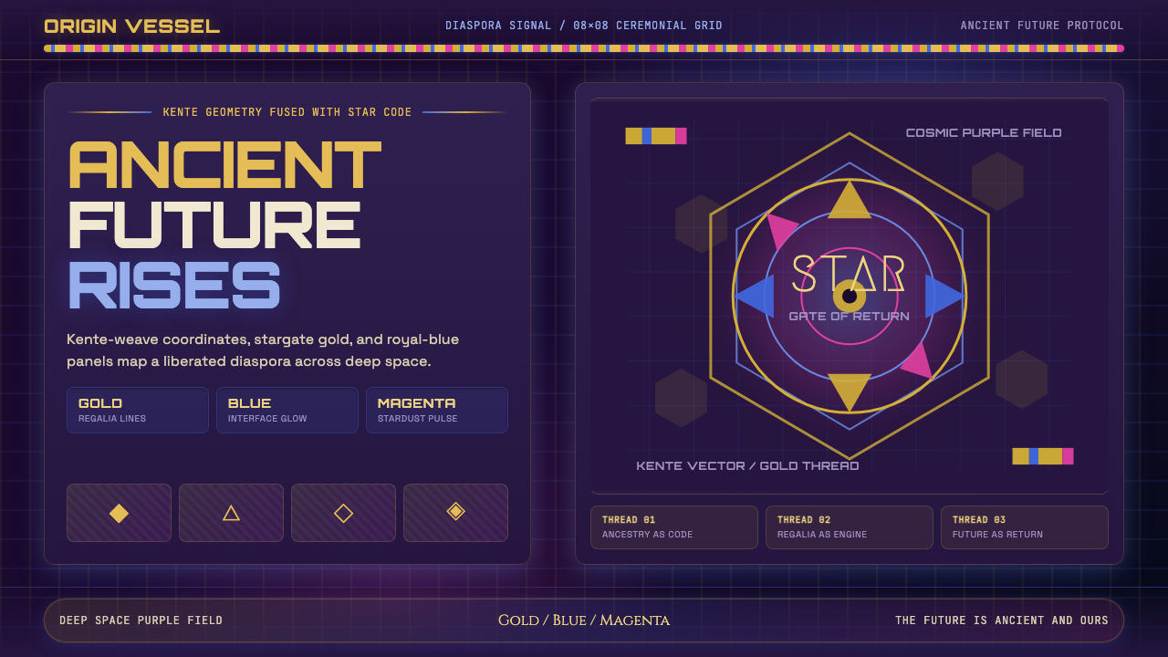 AfrofuturismAncient future, fully luminous. Gold kente grids cut through cosmic purple an…古老未来自带光芒:金色肯特网格切开宇宙紫与蓝色辉光。
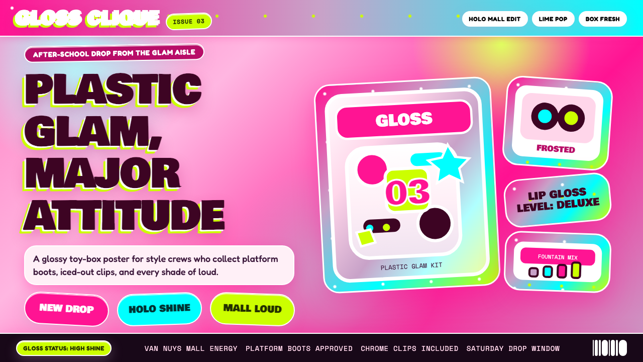 Bratz Doll 2003Y2K maximalism, mall-glossy. Hot-pink gradients, holographic lavender, chunky…Y2K 极繁的商场美学:热粉渐变、全息薰衣草紫、厚重展示字体——拆开 Brat…
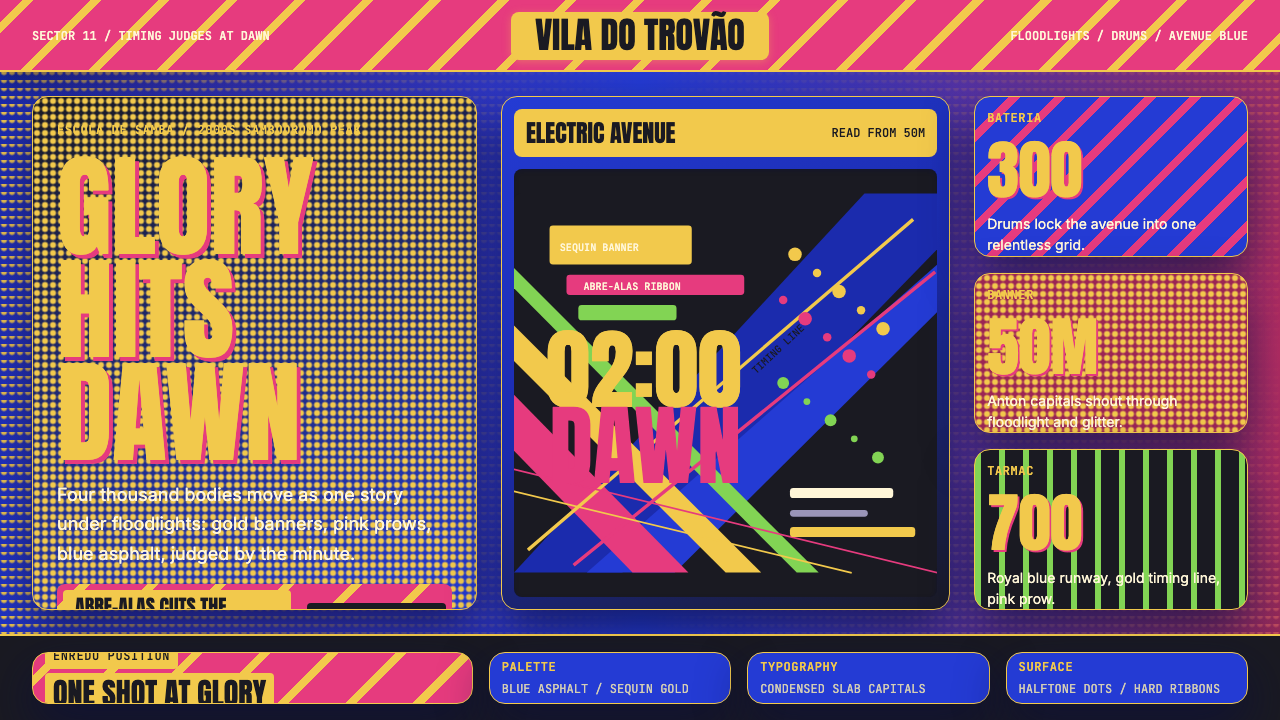 Brazilian Samba School (2000s Carnaval)Parade at floodlight volume. Royal blue asphalt, sequin gold type, pink ribbo…泛光灯音量的游行。宝蓝路面、亮片金字、玫红斜带。
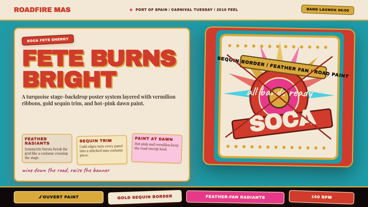 Trinidad Carnival Soca (2010)Joy overload. Turquoise field, vermilion banners, gold sequins, feather-fan g…快乐过载:绿松石底、朱红横幅、金色亮片与羽扇几何。
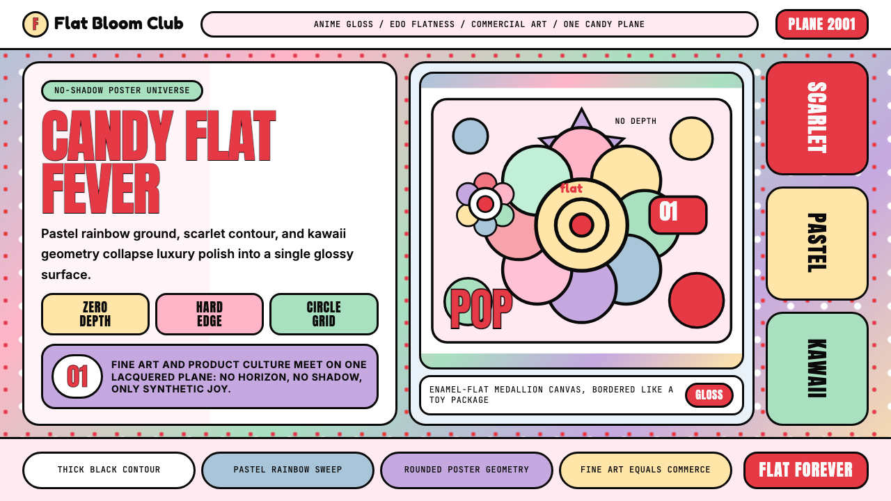 Takashi Murakami SuperflatJoy has no depth. Pastel rainbow, scarlet accents, and black contours flatten…快乐没有纵深:粉彩彩虹、猩红点缀与黑色粗描边压平成花。
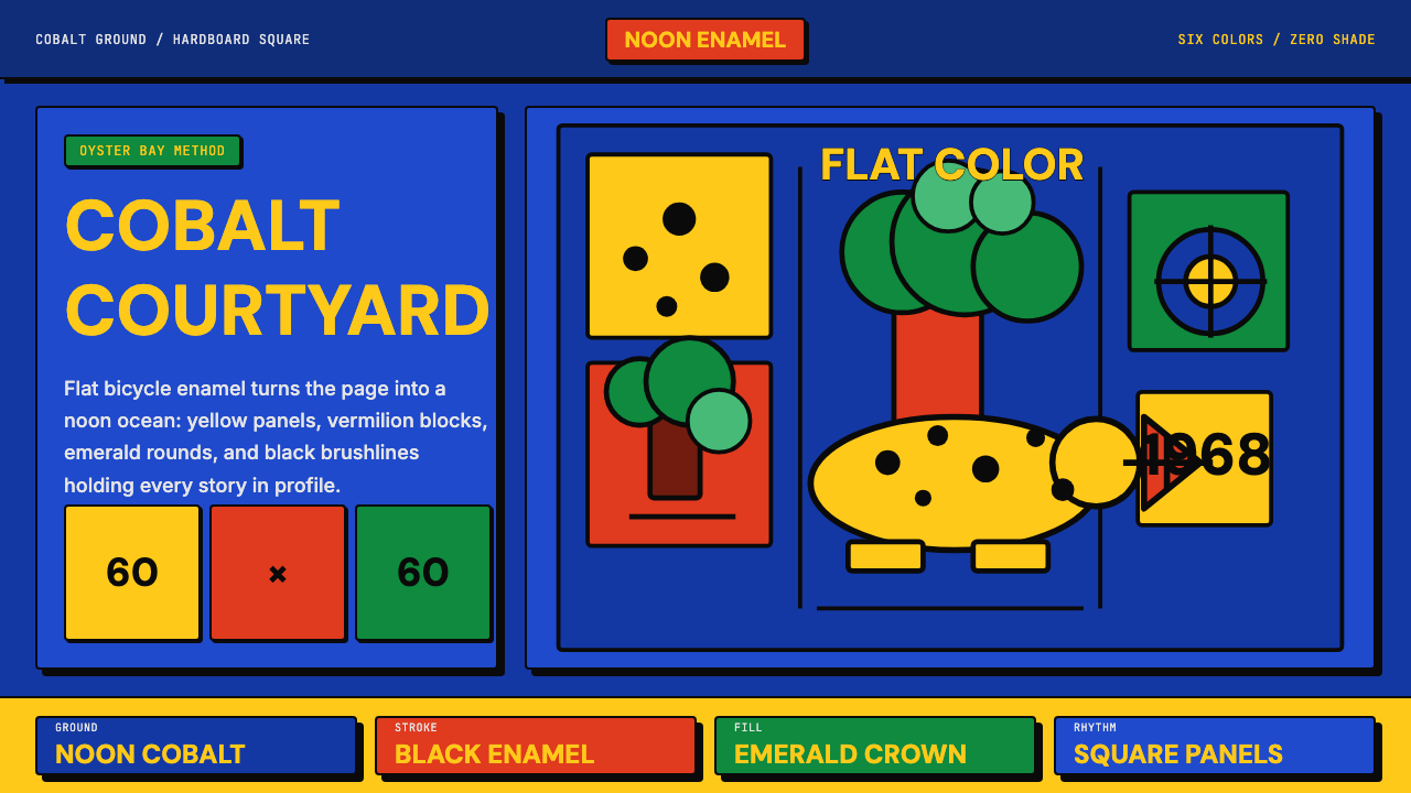 Tanzanian Tingatinga on Cobalt Canvas (1968)Cobalt sings flat. Yellow, vermilion and emerald panels snap under black enam…钴蓝平面会歌唱:黄、朱红、翠绿方格被黑色搪瓷线咬住。