What is Brazilian Samba School (2000s Carnaval)?
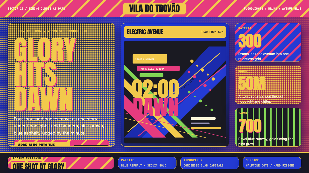
Brazilian Samba School design is parade at floodlight volume — nocturnal electric color, sequin-dot surfaces, and diagonal energy that moves like a float splitting the Sambódromo avenue.
Brazilian Samba School (2000s Carnaval) in brief
Brazilian Samba School design captures the visual grammar of Rio de Janeiro's Carnaval parade as it reached its 2000s Sambódromo peak: a nocturnal palette of electric royal blue, sequin gold, and hot pink; condensed slab-capital lettering that shouts from float banners; diagonal stripes that cut across every surface like the prow of an abre-alas float; and a faint halftone of sequin dots that gives even flat fields a sense of glittering, moving light.
Unlike daytime beach aesthetics or the warmer tropical palettes associated with Brazilian folk art, this system is entirely night-lit — designed to read under banks of floodlights at high speed, at distance, in front of tens of thousands of spectators. Saturation is turned to maximum. Every color choice is a competitive decision: samba schools are literally scored on visual impact, and the design language reflects that high-stakes, no-subtlety mandate.
The result is one of the most legible and emotionally charged visual systems in world celebration culture. Floats, costumes, banners, and printed materials all speak the same dialect: bold diagonal movement, hierarchical gold accents, a blue ground that reads as both night sky and blacktop asphalt under artificial light, and a relentless sense of kinetic forward momentum.
See the Brazilian Samba School (2000s Carnaval) design system
Where does Brazilian Samba School (2000s Carnaval) come from?
The escola de samba — samba school — is not a school in any academic sense. It is a neighborhood mutual-aid and performance institution rooted in Rio's working-class and Afro-Brazilian communities, whose founding is conventionally dated to 1928 with the formation of Deixa Falar in the Estácio district. The schools were organized around the annual composition of an enredo — a narrative theme — set to new samba-enredo music, and executed through the coordinated spectacle of allegorical floats, costumed wings of dancers, and percussion battalions.
The modern parade format took shape in stages over the twentieth century. The construction of the Sambódromo — a purpose-built parade avenue designed by Oscar Niemeyer and inaugurated in 1984 — transformed Carnaval from a street event into a stadium-scale television spectacle. The Sambódromo's fixed grandstands, television cameras, and scoring judges created new visual demands: imagery had to read legibly from elevated bleachers and through broadcast lenses, at the pace of a moving float. This pressure drove the visual escalation that peaked in the 1990s and 2000s.
Key figures in shaping the 2000s visual peak include Joãosinho Trinta, the legendary carnavalesco of Beija-Flor, who pioneered the use of electric lighting effects and theatrically excessive ornamentation as deliberate aesthetic positions. Paulo Barros, working primarily with Unidos da Vila Isabel and then other schools, pushed figurative sculpture on floats to kinetic extremes, filling the avenue with mechanically animated bodies and faces. Rosa Magalhães brought an art-historical sensibility that grounded even the most exuberant floats in scholarly enredo research. Neguinho da Beija-Flor, as one of the defining voices of samba-enredo, set the sonic register to which the visual register had to respond.
The carnavalesco — the artistic director of a samba school — occupies a role analogous to a creative director, production designer, and brand manager simultaneously. They are responsible for the enredo narrative, the selection of a color world for the entire school that year, the design and construction of floats often reaching several stories in height, the coordination of thousands of individual costumes across dozens of wings (alas), and the sequencing of the entire 80-minute presentation to maximize the score in each of the judged categories. The visual system that results from this process is not art-for-art's-sake — it is a scored competition artifact, which gives it an unusual purposefulness.
What defines the Brazilian Samba School (2000s Carnaval) look?
Color
The palette is nocturnal and electric, anchored by a royal blue that reads simultaneously as night sky and floodlit asphalt. Against this blue ground, sequin gold provides the primary hierarchy signal — it marks titles, borders, and structural accents with a metallic warmth that catches artificial light. Hot pink appears as the energizing third voice, concentrated in ribbon-like diagonal bands and costume details. White is used surgically as a light source simulation, never as a neutral background. Black is structural rather than tonal — it defines hard edges and containment frames. This is not a palette for daylight; every color decision assumes artificial floodlighting and the need to read across hundreds of meters of open avenue.
Typography
Lettering in samba school visual culture is unapologetically loud. Condensed slab capitals — thick strokes with squared serifs, compressed horizontally to fit banner widths — dominate float signage and printed materials. The compression is functional: more letters across a given width means the enredo title can read as a complete phrase at parade speed. Letterforms are outlined in contrasting color, typically gold against blue or black against gold, creating a halo effect that makes them legible at extreme distances. There is no place for quiet body text in this system; even secondary information is set at headline scale. The typographic register is announcement, not conversation.
Diagonal Energy
The defining compositional move of samba school design is the diagonal. Diagonal stripes — wide, bold, cutting from corner to corner — appear on float aprons, costume wings, banners, and printed programs. They evoke the prow of the abre-alas floats that open each school's parade, slicing through the avenue at an angle. In static compositions, diagonals create the sensation of movement and urgency that the parade atmosphere demands. They also function as division lines between color fields, allowing two or three palette colors to coexist on a single surface without merging into visual noise. A composition without at least one strong diagonal reads as static and structurally incomplete in this system.
Sequin Texture
Sequins are the defining material of samba costume culture, and their visual logic translates into the design system as a halftone dot pattern — small circular points distributed across flat color fields, denser in shadows, sparser in highlights. This sequin-dot texture does several things simultaneously: it implies the material reality of the costumes; it breaks up large areas of saturated color without reducing their intensity; and it gives flat digital or printed surfaces the sense that light is moving across them. Applied as a subtle overlay on the blue ground, it distinguishes this system from any other bold color-forward aesthetic. The texture is never so dense as to obscure text or imagery — it is a shimmer, not a pattern.
Gold Hierarchy
Gold — specifically a warm, metallic, sequin-reflective gold rather than a muted or earthy amber — functions as the primary hierarchy signal throughout the system. Titles, borders, trophy motifs, crown details, and structural framing elements all default to gold. This is consistent with the competitive culture of Carnaval: schools that win the championship parade are awarded with trophies, and the golden championship aesthetic permeates every level of the visual system. Gold is used generously but with purpose — it marks what matters most, creating a reading path through compositions that might otherwise feel overwhelmingly busy. When used sparingly, it elevates; when overused, the hierarchy collapses.
Float Scale and Verticality
Samba school floats routinely reach the height of four- or five-story buildings, and this extreme verticality is baked into the design system's compositional logic. Compositions are structured to read from bottom to top — a wide, stable base of dancing bodies and rolling wheels giving way to increasingly elaborate mid-tier tableaux and a climactic top-tier sculptural centerpiece. In translated form, this bottom-to-top reading order maps to hero sections in web layouts, slide builds in presentations, and the arrangement of content levels in editorial layouts. The most visually dominant element belongs at the apex, not centered or distributed.
Symbolic Ornamentation
Where Bauhaus forbids ornament on principle, samba school design embraces it — but never arbitrarily. Every decorative element carries symbolic weight tied to the enredo narrative: feathers evoke the indigenous heritage woven into Brazilian identity; crowns signal royalty and championship; stars mark the sky and the divine; serpents, eagles, and jaguars carry specific Afro-Brazilian and indigenous iconographic meaning. The decoration is encyclopedic rather than gratuitous. Understanding which symbols belong to which narrative context is essential for anyone using this system for real-world applications — arbitrary mixing of motifs reads as culturally illiterate rather than bold.
See the Brazilian Samba School (2000s Carnaval) design system
Who shaped Brazilian Samba School (2000s Carnaval)?
Joãosinho Trinta was the carnavalesco of Beija-Flor de Nilópolis for decades and is widely regarded as the figure who transformed Carnaval aesthetics from elaborate but artisanal to cinematically spectacular. His famous declaration — 'intellectuals love misery; the people want luxury' — is both a class manifesto and a design brief. He pioneered the use of electric lighting built into floats, the deployment of mirror surfaces to multiply apparent scale, and the introduction of narrative ambition into float construction that pushed the Sambódromo competition into an art-direction arms race. His influence on the gold-and-spectacle register of 2000s samba school visual culture is foundational.
Paulo Barros emerged in the 2000s as the carnavalesco most associated with kinetic mechanical innovation. Working initially with Unidos da Vila Isabel and later with multiple schools, he replaced traditional static sculpture with mechanically animated figures — giant hands that opened and closed, faces that transformed mid-parade, bodies that separated and recombined. His work established that the most arresting visual moment in the Sambódromo was a float element in motion, not in stillness, and this insight pushed the visual system toward movement as its primary compositional value. He won multiple championship titles and became a model for the generation of carnavalescos that followed.
Rosa Magalhães brought an art-historical and scholarly dimension to samba school visual culture that distinguished her from carnavalescos known primarily for spectacle. Her enredo research was rigorously documented, and her floats reflected genuine iconographic literacy — she worked through primary sources and museum collections to ground her imagery in historically accurate symbolism. Multiple championship titles attest to the competitive success of her approach. Her influence established that visual ambition and intellectual rigor were not opposites in Carnaval design, and her legacy is visible in the layers of symbolic meaning that characterize the best 2000s samba school work.
Neguinho da Beija-Flor is one of the defining voices of samba-enredo — the genre of samba specifically composed as the musical vehicle for a school's annual parade theme. His interpretations set a sonic standard of emotional intensity and rhythmic authority against which the entire Sambódromo presentation is calibrated. The relationship between music and visual design in Carnaval is structural: the samba-enredo's rhythm determines the pace of float movement and the choreography of the dancer wings, and its emotional arc shapes the audience's reception of the visual sequence. Understanding Neguinho's contribution is understanding why the visual system is calibrated for emotional extremes rather than neutral elegance.
Oscar Niemeyer did not design samba school floats — he designed the Sambódromo itself, the purpose-built parade avenue inaugurated in 1984 that transformed Carnaval from a street event into a scored stadium spectacle. His design established the fixed spatial constraints that every carnavalesco has worked within ever since: the avenue width, the grandstand sightlines, the television camera positions, and the timing markers that determine how long each school's presentation can last. The Sambódromo is the canvas; Niemeyer defined its dimensions. The visual language of 2000s samba school design is inseparable from the architectural frame he provided.
How do you use Brazilian Samba School (2000s Carnaval) today?
Samba school design is one of the most emotionally immediate visual systems available to a designer — it communicates celebration, competition, and cultural pride at maximum legibility. Applying it correctly requires understanding that every choice in this system was originally made for extreme-distance, high-speed, artificial-light legibility, and that those original conditions should inform how you calibrate saturation, scale, and contrast in any derived application.
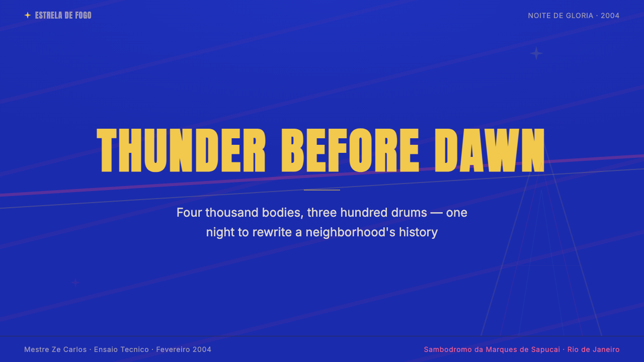
For presentation slides, this style transforms a cover page into an announcement. The electric blue ground at full saturation, a gold-outlined title in condensed capitals across the full width, a diagonal hot-pink band cutting through the lower third, and a subtle sequin-dot overlay on the background creates immediate impact. Content slides work best when the blue recedes to a deep frame and text sits in a cream or white field — using the full samba palette for every slide will exhaust the viewer. Reserve the most electric compositions for section breaks and key reveals; treat content slides as supporting material within a parade, not as floats themselves.
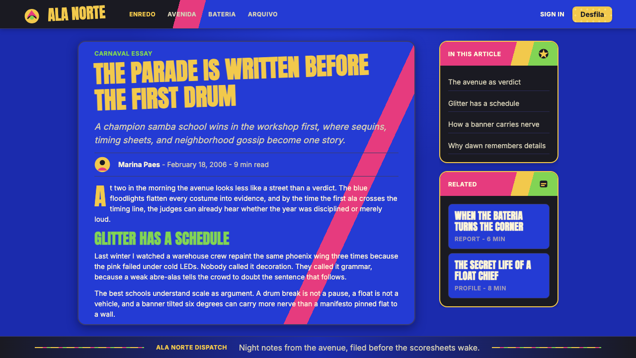
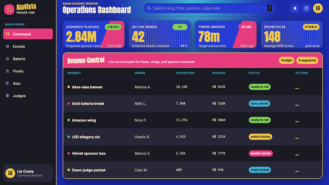
For web interfaces, the system is most effective for event pages, cultural institution landing pages, festival ticketing flows, and any context celebrating a specific occasion or identity. Dashboard and data visualization contexts benefit from a stripped-back version: the blue ground as a sidebar or header, gold as the primary accent for active states and key metrics, diagonal rules as section dividers. The sequin texture, applied as a subtle CSS pattern, gives the interface a material quality that distinguishes it from generic bold-color palettes without adding visual noise.
For editorial and marketing work, the samba school palette excels in contexts that need to feel both authoritative and festive — award announcements, cultural event programs, heritage brand campaigns. A full-page editorial spread benefits from treating the blue ground as the primary canvas and letting gold type run large across it; body text should step back into white or cream blocks to remain readable. Marketing materials for night events, concerts, or entertainment platforms can use the full nocturnal palette without adaptation. The diagonal compositional logic works particularly well on vertical mobile formats, where a diagonal band divides hero from body content with energy and direction.
A common mistake when applying this style is desaturating the palette to make it feel 'more sophisticated' or 'more minimal.' The saturation is not incidental — it is the system's primary communicative instrument. Reducing it to muted tones produces something that reads as a generic festival brand rather than the specific, culturally anchored visual language of Carnaval. A second mistake is using the decorative vocabulary — feathers, crowns, geometric star patterns — without grounding them in specific symbolic intent. In the source culture, every motif earns its place through narrative. In derived applications, motifs used purely as decoration lose their authority and begin to read as costume rather than as a design system.
See the Brazilian Samba School (2000s Carnaval) design system
Brazilian Samba School (2000s Carnaval) — FAQ
Is samba school design appropriate for non-Brazilian or non-festival contexts?
Yes, with calibration. The visual system's core logic — nocturnal electric palette, diagonal compositional energy, hierarchical gold accents, material-texture overlays — is transferable to any context requiring high-impact celebration aesthetics: entertainment platforms, live event branding, awards ceremonies, cultural festivals from any tradition. The cultural specificity comes from the symbolic vocabulary of feathers, crowns, and Afro-Brazilian iconography; those motifs should only be used when the context genuinely connects to their cultural origins. The color and compositional logic, however, can be applied broadly. The key is ensuring that the visual system's intensity matches the emotional register of the context — this is not a palette for understated professionalism.
How does this style handle dark backgrounds differently from other dark-palette design systems?
Most dark design systems use darkness as a neutral or premium signal — a deep charcoal or near-black as a sophisticated backdrop for white text and accent colors. Samba school design uses darkness as an active color: the royal blue is not simply 'dark,' it is the specific color of a floodlit avenue at two in the morning. It reads as both atmospheric and structural. The gold and pink that appear against it are not just accent colors — they are light sources within the composition, simulating the behavior of sequins and spotlights. The darkness is the stage; the other colors are performers on it. This distinction — darkness as venue rather than darkness as restraint — is what separates the system's emotional register from minimalist dark interfaces.
Can this palette work for a brand that needs to feel authoritative, not just festive?
The palette can carry authority, but through a different mechanism than the quiet authority of muted tones. Samba school design asserts authority through scale, confidence, and competitive excellence — the visual equivalent of a championship. Gold used as a hierarchical signal, not as decoration, reads as achievement and institutional weight. The blue ground, when held consistently across a system, creates the kind of recognition and coherence that brands authority over time. The system struggles with the kind of authority that signals restraint, expertise, or quiet confidence — a law firm or wealth management brand would be poorly served. It excels where authority and celebration are not opposites: sports organizations, cultural institutions, entertainment platforms, and award-giving bodies.
What is the role of narrative in making this design system work, and how does that translate to non-parade applications?
In the source context, every samba school parade is a single 80-minute visual argument for a specific enredo theme — a story told through the sequence of float tableaux, costume wings, and musical development. The design system is not a collection of aesthetic elements; it is a narrative delivery mechanism. This has a direct implication for non-parade applications: the system works best when there is also a story to tell. A brand launch, a product reveal, an annual report, a cultural event program — these are all inherently narrative contexts, and the samba school visual language's sequential, build-toward-a-climax logic maps naturally onto them. Applied to contexts without a narrative spine — generic website templates, utility apps, form-heavy enterprise interfaces — the system's intensity reads as noise rather than signal.
How should imagery and photography be treated within this design system?
Photography in samba school visual culture is action photography: long exposure on a moving float, wide-angle on a dancer battalion, close focus on a sequined costume detail. In derived applications, photography should be treated as a living, kinetic element — cropped for movement, placed diagonally, or masked within geometric shapes that echo the compositional energy. Static, centrally composed, studio-lit portrait photography reads as alien within this system. Color photography benefits from pushed contrast and saturation rather than desaturation or filmic grain. Black-and-white photography can work if paired with the full-saturation palette around it, treating the monochrome image as a historical document within a living tradition — the archive embedded in the spectacle.
Related design styles
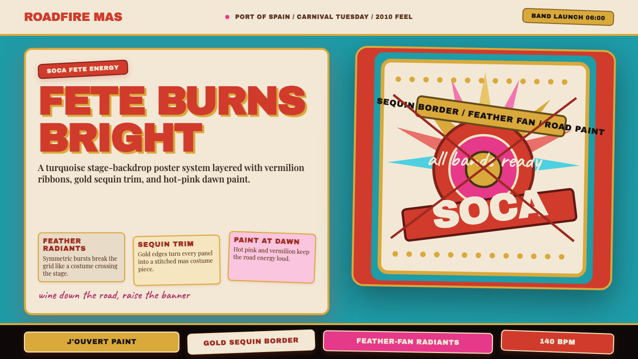 Trinidad Carnival Soca (2010)Joy overload. Turquoise field, vermilion banners, gold sequins, feather-fan g…
 Behance Maximalist PortfolioPortfolio volume at max. Electric blue, coral and lime stack into a full-blee…
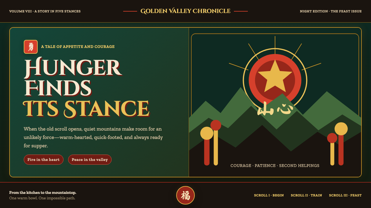 Kung Fu Panda (2008)Ancient calm meets comic momentum. Vermilion, gold and paper-cut peaks glow i…
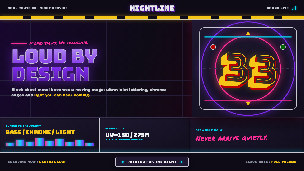 Nairobi Matatu ArtBuilt to be unmissable. Neon airbrush and chrome blaze across night-black hor…
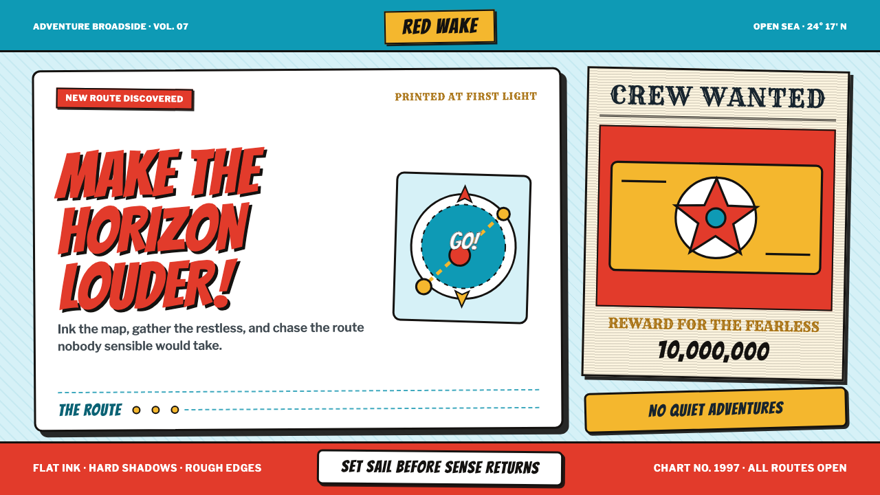 One Piece (Grand Line Adventure)Adventure shouts first. Vermilion splash type and cyan charts collide in hard…
 Takashi Murakami SuperflatJoy has no depth. Pastel rainbow, scarlet accents, and black contours flatten…