Design style guide设计风格指南
What is Mexican Frida Blue House (Coyoacán 1930)?什么是 Mexican Frida Blue House (Coyoacán 1930)?
Casa Azul distills a century of Mexican color, folk devotion, and revolutionary pride into a single vibrant courtyard — and every element of its palette speaks before a word is read.蓝房子把一个世纪的墨西哥色彩、民间信仰与革命骄傲凝聚进一座庭院,每一块颜色在文字开口之前便已开始讲述。
Mexican Frida Blue House (Coyoacán 1930) in briefMexican Frida Blue House (Coyoacán 1930) 速览
Mexican Frida Blue House (Coyoacán 1930) is a design system rooted in the visual world of Casa Azul — the house at Londres 247, Coyoacán, where Frida Kahlo was born, lived, and died. Its palette centers on an assertive cobalt blue that coats the exterior walls like a declaration, set against cream interior panels, terracotta tile rhythms, bougainvillea magenta, and jade-leaf green. The result is a visual language that feels simultaneously ancient and intimate, like a hand-painted altar lit by afternoon sun.墨西哥弗里达蓝房子(科约阿坎,1930年代)是一套植根于蓝房子视觉世界的设计系统——那所位于科约阿坎伦敦街247号的房屋,弗里达·卡洛在此出生、生活并与世长辞。其色板以一种强势的钴蓝为中心,像宣言一样涂满外墙,与奶油色内壁面板、赤陶瓷砖节奏、三角梅品红以及翡翠叶绿相互映衬。最终呈现出一种既古老又私密的视觉语言,如同午后阳光照亮的一座手绘神龛。
The style belongs to the broader tradition of Mexicanidad — the post-revolutionary cultural project that celebrated indigenous craft, pre-Hispanic material culture, and mestizo identity as the foundations of a new national aesthetic. Kahlo and her partner Diego Rivera were central figures in this movement, living among retablo ex-votos, Tehuana textiles, folk ceramic vessels, and papel-picado banners. Their home was not a museum but a working proof that everyday objects from Mexican craft traditions carried the same formal dignity as any European fine-art object.这种风格归属于更广泛的墨西哥性(Mexicanidad)传统——一个革命后的文化运动,以原住民手工艺、前西班牙物质文化与混血认同作为新国家美学的基石。卡洛与伴侣迭戈·里维拉是这场运动的核心人物,他们生活在锡制还愿画、特旺娜纺织品、民间陶瓷器皿与剪纸横幅之间。他们的家不是博物馆,而是一个正在运转的证明:墨西哥民艺传统中的日常物件与任何欧洲美术品拥有同等的形式尊严。
Visually, the style is abundant without being chaotic. Color is used at maximum saturation but never randomly — each hue occupies a clear spatial role. The cobalt acts as a structural field, the cream as a breathing ground for text and content, terracotta as a grid accent, and the warmer accent colors — magenta, gold, and green — as points of focus. Typography carries the energy of Kahlo's diary handwriting while remaining legible; ornamental details draw from cut-paper silhouettes, floral motifs, and geometric tile patterns rather than European decorative traditions.在视觉上,这种风格丰盛而不混乱。色彩以最高饱和度使用,但从不随意——每种色调占据清晰的空间角色。钴蓝作为结构性底面,奶油色为文字与内容提供呼吸空间,赤陶色充当网格重音,而更温暖的强调色——品红、金黄与绿——则是目光的落点。字体传递着卡洛日记手写体的能量,同时保持可读性;装饰细节来自剪纸剪影、花卉纹样与几何瓷砖图案,而非欧洲装饰传统。
Where does Mexican Frida Blue House (Coyoacán 1930) come from?Mexican Frida Blue House (Coyoacán 1930) 从何而来?
Casa Azul was built in 1904 by Frida Kahlo's father, the German-Hungarian photographer Guillermo Kahlo, who settled in Mexico and became one of the country's foremost architectural photographers. Frida was born in the house in 1907. The cobalt-blue color that gives the house its name was applied in the 1930s at Diego Rivera's direction — a choice rooted in pre-Hispanic practice, where indigo and mineral blue pigments were associated with Tlaloc, the rain deity, and with protective spiritual power. The blue was not merely decorative; it was a cultural argument about which tradition the household belonged to.蓝房子由弗里达·卡洛的父亲、德裔匈牙利摄影师吉列尔莫·卡洛建于1904年。吉列尔莫定居墨西哥后成为该国最重要的建筑摄影师之一。弗里达于1907年在此出生。赋予房屋名字的钴蓝色涂装出现在1930年代,由迭戈·里维拉主导——这个选择植根于前西班牙传统:靛蓝与矿物蓝色素在那里与雨神特拉洛克及灵性保护力量相关联。这种蓝色不仅仅是装饰,它是一个关于这个家庭归属于哪种传统的文化宣言。
Rivera and Kahlo returned to Casa Azul definitively in the early 1940s after turbulent years that included their divorce and remarriage. Rivera began systematically filling the rooftop with pre-Hispanic stone sculptures, idols, and ceramic figurines — eventually assembling one of the largest private collections of ancient Mexican objects in the country. Kahlo, meanwhile, layered the interior with Tehuana dress, Catholic retablos, folk toys, dried flowers, and her own paintings. The house became the total artwork of two lives spent arguing, creating, and loving in the same contested space.里维拉与卡洛在经历了离婚与复婚的动荡岁月之后,于1940年代初期决定性地回到蓝房子。里维拉开始系统性地在屋顶摆放前西班牙石雕、神像与陶瓷小像,最终聚集了全国规模最大的私人古代墨西哥文物收藏之一。与此同时,卡洛将室内铺满特旺娜服饰、天主教还愿画、民间玩具、干花与自己的绘画。这所房子成为两个人一生的总体艺术作品——他们在同一个充满张力的空间里争吵、创作、相爱。
The Mexicanidad movement that shaped Casa Azul's aesthetic had its political roots in the aftermath of the Mexican Revolution (1910–1920). The revolutionary government commissioned enormous public murals — Rivera's work at the Ministry of Public Education and the National Palace being the most celebrated — to create a shared visual mythology for a newly unified nation. This indigenista project deliberately elevated folk craft, pre-Hispanic iconography, and regional textile traditions to the level of high art, rejecting the Europeanized bourgeois taste that had dominated Mexican culture under Porfirio Díaz.塑造蓝房子美学的墨西哥性运动,其政治根基在于墨西哥革命(1910—1920年)之后。革命政府委托制作了大量公共壁画——里维拉在公共教育部与国家宫的作品最为著名——为一个新统一的国家建立共同的视觉神话。这场本土主义运动刻意将民间手工艺、前西班牙图像志与地区纺织传统提升至高艺术的地位,拒绝在波菲里奥·迪亚斯执政期间主导墨西哥文化的欧化资产阶级趣味。
Casa Azul became a public museum in 1958, four years after Kahlo's death in 1954 and one year before Rivera's death in 1957. Rivera donated the house and its contents to the Mexican people. Today it is one of the most visited sites in Mexico City, and its chromatic vocabulary — cobalt exterior, terracotta courtyard, cream-painted rooms, marigold plantings — has influenced everything from Mexican restaurant design to contemporary brand identity work seeking warmth, cultural specificity, and unapologetic color.蓝房子于1958年对外开放,成为公共博物馆,彼时卡洛已于1954年辞世四年,里维拉也将在一年后的1957年去世。里维拉将房屋及其全部内容捐赠给墨西哥人民。如今它是墨西哥城参观人数最多的场所之一,其色彩词汇——钴蓝外墙、赤陶庭院、奶油粉刷的房间、万寿菊花坛——影响了从墨西哥餐厅设计到当代品牌视觉的方方面面,任何寻求温度、文化特殊性与无所顾虑色彩感的设计都能从中找到源头。
What defines the Mexican Frida Blue House (Coyoacán 1930) look?Mexican Frida Blue House (Coyoacán 1930) 的视觉特征是什么?
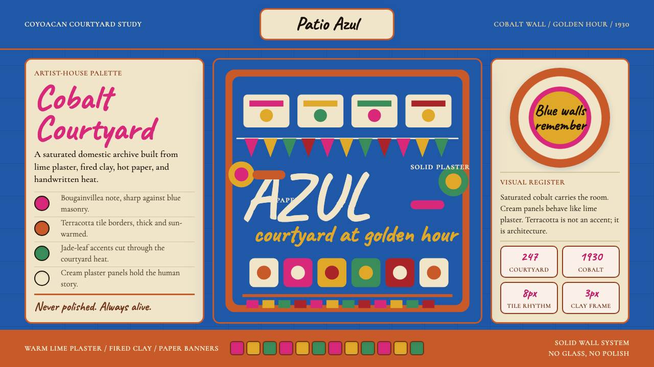
Cobalt Wall Color钴蓝墙色
The dominant note of the entire system is a saturated, slightly warm cobalt blue — not the cool distance of cerulean, not the gravity of navy, but a blue that reads as celebratory and grounded at the same time. It is used at full saturation for large structural fields: backgrounds, hero sections, sidebar panels. The color carries an air of protection and declaration, as it did on the original lime-plastered walls that have faced Coyoacán's streets for nearly a century.整套系统最主导的音符是一种饱和且略带暖意的钴蓝——不是天蓝的冷淡远离,不是深蓝的庄重沉压,而是一种同时令人感到欢欣与踏实的蓝。它以最高饱和度用于大面积结构性区域:背景、主视觉区域、侧边面板。这种颜色带有保护与宣告的气息,一如它在那些已经面向科约阿坎街道近一个世纪的石灰粉墙上所呈现的那样。
Terracotta Grid Accents赤陶网格重音
Terracotta — the warm, fired-earth tone of Mexican clay pots and Talavera tile — functions as the structural grid accent of the system. It appears as borders, divider lines, card edges, and rhythmic decorative bands. Against cobalt it reads as warmth and contrast; against cream it reads as grounding and craft. This interplay between the cool dominance of blue and the warm punctuation of terracotta is the fundamental tension that gives the style its energy.赤陶色——墨西哥陶罐与塔拉韦拉瓷砖那种温暖的烧制土色——是系统中结构性网格重音的承担者。它出现在边框、分隔线、卡片边缘与有节律的装饰条带上。在钴蓝衬托下,它传递温度与对比;在奶油色衬托下,它传递落地感与手工气息。蓝色的冷静主导与赤陶的温暖点缀之间的这种相互作用,是赋予这种风格能量的根本张力。
Cream Content Panels奶油色内容面板
Where blue dominates structure, cream provides relief. Content panels, card bodies, and text-heavy areas use a warm off-white that suggests unbleached cotton, aged paper, or the interior walls of a Mexican colonial house — never the clinical sharpness of pure white. This warmth ensures that long-form reading remains comfortable even when surrounded by intensely saturated color. The cream also makes the overall composition feel handmade rather than digital: it has the quality of something lived-in.蓝色主导结构的地方,奶油色提供喘息。内容面板、卡片主体与文字密集区域采用一种温暖的近白色,令人联想到未经漂白的棉布、陈年纸张或墨西哥殖民地风格房屋的内壁——从不是纯白的临床冷峻。这种温度确保即使在被高饱和色彩包围时,长篇阅读依然舒适。奶油色也让整体构图感觉像是手工制作而非数字生成:它拥有一种被人生活过的质地。
Bougainvillea Accent and Folk Warm Tones三角梅强调与民间暖色调
Beyond the core triad of cobalt, terracotta, and cream, the system draws on a secondary palette of bougainvillea magenta, marigold gold, and jade green — the colors of Kahlo's courtyard plantings. These appear as highlight colors, call-to-action elements, and celebratory decorative touches. They are used sparingly and never compete with the dominant cobalt; a single magenta button or a marigold icon is sufficient to bring the full warmth of the courtyard into a digital interface.在钴蓝、赤陶、奶油三色核心之外,系统还调用了一组辅助色板:三角梅品红、万寿菊金黄与翡翠绿——这些都是卡洛庭院植物的颜色。它们出现在高亮色、行动号召元素与庆典式装饰点缀中。用量克制,从不与主导的钴蓝竞争;一个品红按钮或一枚金黄图标,就足以将整座庭院的温度引入数字界面。
Papel Picado and Cut-Paper Rhythm剪纸横幅与剪纸节奏
One of the most distinctive decorative signatures of the style is derived from papel picado — the Mexican tradition of cutting intricate geometric and floral patterns into tissue paper banners that are strung across courtyards for festivals. Translated into digital surfaces, this gives rise to border treatments, divider patterns, and decorative frames that feel perforated, layered, and festive. The patterns are geometric in underlying structure but organically rounded at the edges — the opposite of Swiss precision.这种风格最具辨识度的装饰特征之一来自剪纸(papel picado)——一种将复杂几何与花卉图案剪入薄纸横幅、并在节日时悬挂于庭院上空的墨西哥传统。将其转化为数字界面,便产生了带有穿孔感、层叠感与节庆氛围的边框处理、分隔图案与装饰框架。这些图案在底层结构上是几何的,但边缘有机地圆润——与瑞士精确性恰恰相反。
Handwritten and Serif Type Mix手写体与衬线字的混搭
Typography in this system lives between two registers: the intimate energy of Kahlo's diary handwriting — expressive, personal, with irregular baseline and flourished terminals — and the composed authority of classical Garamond-style serif body text. Display text leans into the handwritten register, giving headlines and labels a human presence; body text opts for legible elegance. Neither extreme is purely decorative or purely functional — they meet at a point of warm literacy.这套系统的字体排印活在两种语域之间:卡洛日记手写体那种私密的能量——表达性强、个人感浓,有不规则基线与装饰性收笔——以及古典加拉蒙风格衬线体的沉稳权威。展示性文字倾向手写语域,赋予标题与标签以人的在场感;正文则选择清晰的优雅。两种极端都不纯粹装饰,也不纯粹功能——它们在一种温暖的文字感上相遇。
Tactile Surface Quality触感表面质地
The style consciously evokes physical materials: sun-warmed lime plaster, fired clay, cut paper, embroidered cotton. In digital use, this manifests as subtle texture overlays on solid color fields, slightly rough-edged decorative elements, and shadows that suggest depth without full skeuomorphism. The goal is not to simulate a photograph of a wall but to evoke the sensory memory of one — a warmth you associate with a place rather than a production technique.这种风格有意唤起物理材料:被阳光晒暖的石灰粉墙、烧制陶土、剪纸、绣花棉布。在数字应用中,这体现为纯色区域上的微妙肌理叠加、边缘略带粗粝感的装饰元素,以及暗示深度但不滑入完全拟物化的投影处理。目标不是模拟一张墙面的照片,而是唤起对它的感官记忆——一种与一个地方而非一种生产技术相关联的温度。
Who shaped Mexican Frida Blue House (Coyoacán 1930)?谁塑造了 Mexican Frida Blue House (Coyoacán 1930)?
Kahlo (1907–1954) was born in Casa Azul, returned to it after her injury and medical struggles, and died there at forty-seven. Her self-portraits — painted largely while bedridden — are inseparable from the visual world of the house: Tehuana headdresses, pre-Hispanic necklaces, tropical foliage, and the bold flat color planes that also characterized her home's interior. She kept a diary in the final decade of her life whose handwritten pages, mixing poetry, illustration, and color, constitute one of the most vivid documents of any artist's inner life. The diary's visual sensibility — intimate, maximalist, and technically unashamed — is the emotional register that this design system aims to honor.卡洛(1907—1954年)在蓝房子出生,伤病困扰之后回到这里,并于四十七岁在此辞世。她的自画像——大多在卧床期间完成——与这所房子的视觉世界密不可分:特旺娜头饰、前西班牙项链、热带植物,以及同样见于她家室内的大胆平涂色块。她在生命最后十年坚持写日记,手写页面混合诗歌、插图与色彩,构成任何艺术家内心生活中最生动的文献之一。日记的视觉感性——私密、极致、技术上毫无羞怯——是这套设计系统所力图致敬的情感语域。
Rivera (1886–1957) was the most celebrated muralist in Mexican history, and it was his hand that painted Casa Azul cobalt blue. His monumental public murals at the Ministry of Public Education and the National Palace established the visual language of the post-revolutionary Mexican state: large flat color planes, indigenous figures treated with heroic dignity, pre-Hispanic symbols woven into scenes of contemporary labor and struggle. Rivera's compositional approach — bold color masses, clear human silhouettes, rhythmic patterning — is one of the structural ancestors of this design system's approach to layout and figure.里维拉(1886—1957年)是墨西哥历史上最负盛名的壁画家,正是他亲手将蓝房子刷成钴蓝色。他在公共教育部与国家宫绘制的宏大公共壁画确立了墨西哥革命后国家的视觉语言:大面积平涂色块、以英雄主义尊严呈现的原住民形象、编织进当代劳动与斗争场景的前西班牙符号。里维拉的构图方式——大胆的色彩块面、清晰的人物剪影、有节律的图案——是这套设计系统在版面与图形处理方法上的结构性先祖之一。
Hayden Herrera's 1983 biography of Frida Kahlo is largely responsible for the global canonization of both Kahlo's life and the visual world of Casa Azul. Before Herrera's book, Kahlo was known primarily in Mexican art circles; after it, she became one of the most recognizable artist-figures in the world. Herrera's work catalyzed the broader cultural appetite for Kahlo's aesthetic — the colors, the self-presentation, the house itself — that has continued to grow for four decades and that gives this design system its contemporary cultural resonance.海登·埃雷拉1983年出版的卡洛传记,很大程度上推动了卡洛的一生与蓝房子视觉世界的全球经典化。埃雷拉的书出版之前,卡洛主要在墨西哥艺术圈内为人所知;书出版之后,她成为世界上最具辨识度的艺术家形象之一。埃雷拉的工作催化了更广泛的文化对卡洛美学的渴望——那些颜色、那种自我呈现、那所房子本身——这种渴望持续生长了四十年,也赋予这套设计系统以当代的文化共鸣。
Modotti (1896–1942) was an Italian-born photographer and political activist who lived in Mexico City during the late 1920s and was close to Kahlo and Rivera's circle. Her photographs of Mexican workers, Tehuana women, and folk objects — shot with formal precision but emotional warmth — helped establish the visual archive that the Mexicanidad movement drew on. Modotti's eye for the dignity of ordinary Mexican material culture, and her technical commitment to strong tonal contrast and geometric composition, prefigure several of the visual instincts that the Blue House style embodies.莫多蒂(1896—1942年)是意大利裔摄影师与政治活动家,1920年代末旅居墨西哥城,与卡洛和里维拉的圈子关系密切。她拍摄的墨西哥工人、特旺娜女性与民间器物的照片——形式精准而情感温暖——帮助建立了墨西哥性运动所依赖的视觉档案。莫多蒂对墨西哥普通物质文化尊严的目光,以及她对强烈色调对比与几何构图的技术投入,预示了蓝房子风格所体现的数种视觉本能。
Frida's father Guillermo Kahlo (1871–1941) was a German-Hungarian immigrant who settled in Mexico and became one of the country's foremost architectural photographers, commissioned by the Díaz government to document colonial-era buildings. His careful, respectful attention to Mexican vernacular architecture and craftsmanship established a visual sensibility in the Kahlo household that valued Mexican built culture long before it became fashionable. He also suffered from epilepsy and passed periods of fragility to his daughter, which shaped her understanding of the body as both material object and site of meaning — a theme that runs through her painting and, by extension, through the intimate, embodied quality of the Blue House aesthetic.弗里达的父亲吉列尔莫·卡洛(1871—1941年)是一位德裔匈牙利移民,定居墨西哥后成为该国最重要的建筑摄影师之一,受迪亚斯政府委托记录殖民时期建筑。他对墨西哥乡土建筑与工艺的细心、尊重的关注,在卡洛家庭中建立起一种视觉感性,早在这种风格变得时髦之前便珍视墨西哥的建成文化。他还患有癫痫,将身体的脆弱感传递给了女儿,这塑造了弗里达对身体作为物质对象与意义场所的理解——这一主题贯穿于她的绘画,并由此延伸进蓝房子美学那种私密、具身的气质之中。
How do you use Mexican Frida Blue House (Coyoacán 1930) today?今天怎么用 Mexican Frida Blue House (Coyoacán 1930)?
The Blue House palette is one of the most immediately recognizable and emotionally resonant historical design systems available to contemporary practitioners — but its richness demands discipline. The cobalt and terracotta at full saturation will dominate any composition they enter; the system works when these heavy colors are given large, confident fields, not scattered as small accents across a neutral background. Applying it well means committing to the palette's logic: cobalt for structure, cream for content, terracotta for accent rhythm, and the warm secondary colors used sparingly as points of celebration.蓝房子色板是当代设计师可用的历史设计系统中辨识度最高、情感共鸣最强的之一——但它的丰盛需要纪律。全饱和度的钴蓝与赤陶会主导它们进入的任何构图;当这些重量级颜色被给予宽阔、自信的色块区域时,系统才能运作,而不是将它们分散成中性背景上的细小点缀。应用得好意味着委身于色板的逻辑:钴蓝用于结构,奶油色用于内容,赤陶用于重音节奏,温暖的辅助色克制地用于庆典性的焦点。
For presentation slides, Casa Azul works powerfully on cover pages where the cobalt blue can fill the entire background, with a cream or white text field positioned asymmetrically and a terracotta decorative band or border grounding the composition. The handwritten or expressive display typeface belongs in headlines only; body text on content slides should shift to the composed serif register for legibility across screen distances. Data slides benefit from the terracotta-and-gold palette applied to charts and diagrams — bars and segments feel like ceramic tile rather than software defaults — while the cobalt field can be reserved for section headers or category labels.对于演示文稿,蓝房子在封面页上效果卓著——钴蓝可以填满整个背景,奶油色或白色文字区域非对称地落位,赤陶装饰条带或边框为构图提供落脚点。手写或表达性展示字体仅属于标题;内容页正文应转换为沉稳的衬线语域,以确保在屏幕距离下的可读性。数据页面适合将赤陶与金黄色板应用于图表——柱状条和扇区感觉像陶瓷瓷砖而非软件默认色——钴蓝底面则可保留给章节标题或类别标签。
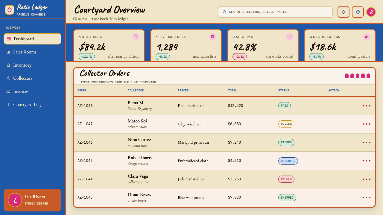
For web UI, the style is best suited to contexts that benefit from warmth, cultural specificity, and confident color: a brand landing page for a Mexican or Latin American product, a cultural institution's public-facing site, a food or hospitality brand, or any project where the goal is to evoke a specific place and time. Dashboard applications are possible but require the cobalt to be used more sparingly — perhaps only in the sidebar and key metric tiles — with cream and warm neutrals carrying the content-heavy areas. Pricing pages can use the bold color contrast effectively for tier differentiation, with the most premium tier rendered in deep cobalt.对于网页界面,这种风格最适合那些能从温度感、文化特殊性与自信色彩中获益的场景:墨西哥或拉丁美洲产品的品牌落地页、文化机构的公共网站、餐饮或酒店品牌,或任何以唤起特定地点与时代为目标的项目。仪表板应用也可行,但需要更克制地使用钴蓝——或许只用于侧边栏与关键指标磁贴——以奶油色和温暖中性色承担内容密集区域。定价页面可以有效利用大胆的色彩对比区分层级,最高级别以深钴蓝呈现。
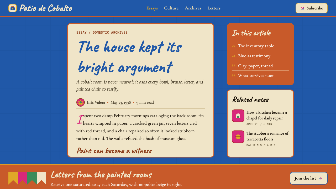
For editorial and marketing work, the style excels at magazine-style feature pages where visual rhythm and generous margins allow the palette to breathe. The papel picado-derived border treatments work well as section dividers or pull-quote frames. A marigold or magenta call-to-action element against a cobalt background is one of the most visually arresting combinations in the system. Marketing headers that mix the display handwritten font with a large cobalt color field immediately signal warmth, cultural depth, and specificity — the opposite of generic brand minimalism.对于编辑与营销内容,这种风格在视觉节律与充裕留白共同存在的杂志式专题页面上出类拔萃。源自剪纸的边框处理适合作为章节分隔或引文框架。万寿菊金黄或品红的行动号召元素在钴蓝背景上的组合,是整套系统中视觉冲击力最强的搭配之一。将展示性手写字体与大面积钴蓝色块结合的营销标题,立即传达出温度感、文化深度与特殊性——与通用品牌极简主义恰恰相反。
A common mistake is treating this system as license for indiscriminate color maximalism. Casa Azul itself is disciplined: the courtyard has one dominant color (cobalt), a few large secondary presences (terracotta tile, cream wall surfaces, marigold beds), and small punctuations of magenta and green. Digital applications that deploy all five colors at comparable saturation across the same composition quickly become overwhelming. Similarly, mixing the handwritten display face into body text loses the system's typographic contrast — the handwritten register must remain reserved for the short, high-impact moments where Kahlo's diary energy is the point, not a running texture.一个常见错误是将这套系统视为随意色彩极大主义的许可证。蓝房子本身是有纪律的:庭院只有一种主导色(钴蓝),几种大面积的次级存在(赤陶瓷砖、奶油色墙面、万寿菊花坛),以及品红和绿色的小面积点缀。将全部五种颜色以相近饱和度同时部署在同一构图中的数字应用,很快就会让人窒息。同样,将手写展示字体混入正文会消耗系统的排版对比——手写语域必须保留给那些短暂、高冲击的时刻,在那里卡洛日记的能量是目的本身,而不是一种持续的肌理。
Mexican Frida Blue House (Coyoacán 1930) — FAQMexican Frida Blue House (Coyoacán 1930) · 常见问题
Is this style appropriate for brands with no connection to Mexico?这种风格适合与墨西哥毫无关联的品牌使用吗?
It can be, but the question deserves honest attention. Casa Azul's visual language carries specific cultural weight — it is rooted in post-revolutionary Mexican identity, indigenista politics, and the particular biography of two artists. Using it superficially, as a source of vibrant color without engaging its cultural meaning, risks reducing a rich tradition to mere decoration. The most defensible approach for brands without a Mexican connection is to engage the style's principles — abundant color, tactile warmth, folk-craft pattern rhythm — while building on the specific cultural iconography lightly and transparently, crediting the tradition in communication where relevant.可以,但这个问题值得诚实地面对。蓝房子的视觉语言承载着特定的文化分量——它植根于墨西哥革命后的国家认同、本土主义政治,以及两位艺术家各自的生平。如果只是把它当作鲜艳色彩的来源、而不触及其文化意义地表面使用,会有将丰厚传统简化为纯粹装饰的风险。对于没有墨西哥关联的品牌,最站得住脚的做法是:接纳这种风格的原则——丰盛的色彩、触感温度、民间工艺的图案节奏——同时轻盈而透明地运用具体的文化图像志,在相关的传播场合说明传统的来源。
How does this style differ from other Latin American or folk-art-influenced palettes?这种风格与其他拉丁美洲或民间艺术影响的色板有何不同?
The key distinctions are structural rather than purely chromatic. Many folk-art-influenced palettes use bright colors but without the underlying spatial logic of Casa Azul's system. The Blue House approach has a clear hierarchy: one dominant structural color (cobalt), a breathing neutral (cream), a grid accent (terracotta), and then sparing warm accents. This hierarchy makes the system readable and scalable rather than merely festive. Additionally, the Blue House style carries specific historical and artistic references — Kahlo's diary handwriting, retablo imagery, papel picado geometry — that are more precisely situated than generic folk-art inspiration.关键区别是结构性的,而非纯粹色彩上的。许多受民间艺术影响的色板使用鲜艳颜色,但缺乏蓝房子系统所具有的底层空间逻辑。蓝房子的方式拥有清晰的层级:一种主导的结构色(钴蓝)、一种呼吸性中性色(奶油)、一种网格重音(赤陶),然后是克制的温暖强调色。这种层级让系统具有可读性与可扩展性,而不仅仅是节庆感。此外,蓝房子风格承载着更为精确定位的历史与艺术参照——卡洛的日记手写体、还愿画图像志、剪纸几何——而非泛泛的民间艺术灵感。
Can the Blue House style work for professional or institutional contexts, or is it too festive?蓝房子风格能用于专业或机构场景吗,还是说它过于节庆化?
The style is more versatile than it might first appear. Frida Kahlo herself was a serious professional artist navigating a largely male art world, and Casa Azul was both a personal sanctuary and a professional workspace. The visual system can carry authority when the cobalt is deployed at large scale and the warmer accent colors are used sparingly — the result reads as confident and culturally grounded rather than frivolous. Cultural institutions, universities with Latin American studies programs, government tourism communications, food and hospitality brands, and health and wellness brands with a place-based identity are all plausible institutional contexts. It struggles in settings that require cold neutrality, such as legal services, financial products, or enterprise software.这种风格比初看时更为多用途。弗里达·卡洛本人是一位在以男性为主的艺术世界中求存的严肃职业艺术家,蓝房子既是私密庇护所,也是专业工作空间。当钴蓝以大面积部署、温暖强调色克制使用时,这套视觉系统能够承载权威感——结果读来是自信而有文化根基的,而非轻佻的。文化机构、设有拉丁美洲研究项目的大学、政府旅游传播、餐饮与酒店品牌、以及有地方身份认同的健康与养生品牌,都是合理的机构性使用场景。它在需要冷静中立的场景中则力不从心——例如法律服务、金融产品或企业软件。
How should imagery and photography be handled in this style?在这种风格中,图像与摄影应当如何处理?
Photography works well in this system when it shares the palette's warmth and tactility — images shot in golden-hour light, with warm tonal casts, in physical spaces that feel lived-in rather than staged. Still-life photography of craft objects, textiles, ceramics, or food fits naturally. Architectural photography of vernacular Mexican buildings and courtyard spaces aligns directly with the style's sources. What to avoid: cold-toned or desaturated photography that fights the cobalt and terracotta; highly processed images with heavy vignettes or artificial bokeh that undermine the style's commitment to surface warmth; and stock photography with generic office or technology settings that the palette will always overwhelm rather than enhance.当摄影与色板的温度感与触感相呼应时,它在这套系统中效果最佳——在黄金时段的光线下拍摄、有温暖色调偏移、在感觉有人生活过而非经过布景的实体空间中取景的图像。工艺品、纺织品、陶瓷或食物的静物摄影天然契合。墨西哥乡土建筑与庭院空间的建筑摄影直接与这种风格的来源对齐。需要避免的是:与钴蓝和赤陶相抗衡的冷调或去饱和摄影;带有厚重暗角或人工虚化、破坏风格表面温度感的重度后处理图像;以及通用办公室或科技场景的图库照片——色板只会压过它们,而非提升它们。
What distinguishes an authentic application of this style from a superficial one?对这种风格的真实应用与流于表面的应用,区别在哪里?
The difference lies in whether the spatial logic and emotional register are honored, not just the colors. A superficial application puts cobalt and terracotta on a layout that is otherwise governed by generic digital minimalism — the colors are present but the system's warmth, hierarchy, and craft sensibility are absent. An authentic application commits to the cream panels as breathing grounds for content, uses the handwritten type register at the right emotional moments rather than as a blanket treatment, deploys terracotta as a structural rhythm rather than a random accent, and allows the composition to be generous and layered rather than minimal and sparse. The question to ask is: does this feel like something made by hand in a specific place, or does it feel like a color filter applied to a template?区别在于空间逻辑与情感语域是否被尊重,而不仅仅是颜色是否在场。流于表面的应用是把钴蓝与赤陶放在一个其他部分仍由通用数字极简主义支配的版面上——颜色在那里,但系统的温度感、层级与手工感性却缺席。真实的应用是:委身于奶油色面板作为内容的呼吸空间,在正确的情感时刻而非作为全覆盖处理使用手写字体语域,将赤陶部署为结构性节奏而非随意的点缀,允许构图丰盛而有层次,而非极简而稀疏。可以自问的问题是:这看起来像是在某个特定地方由人手工制作的东西,还是像是对一个模板施加了一个色彩滤镜?
Related design styles相关设计风格
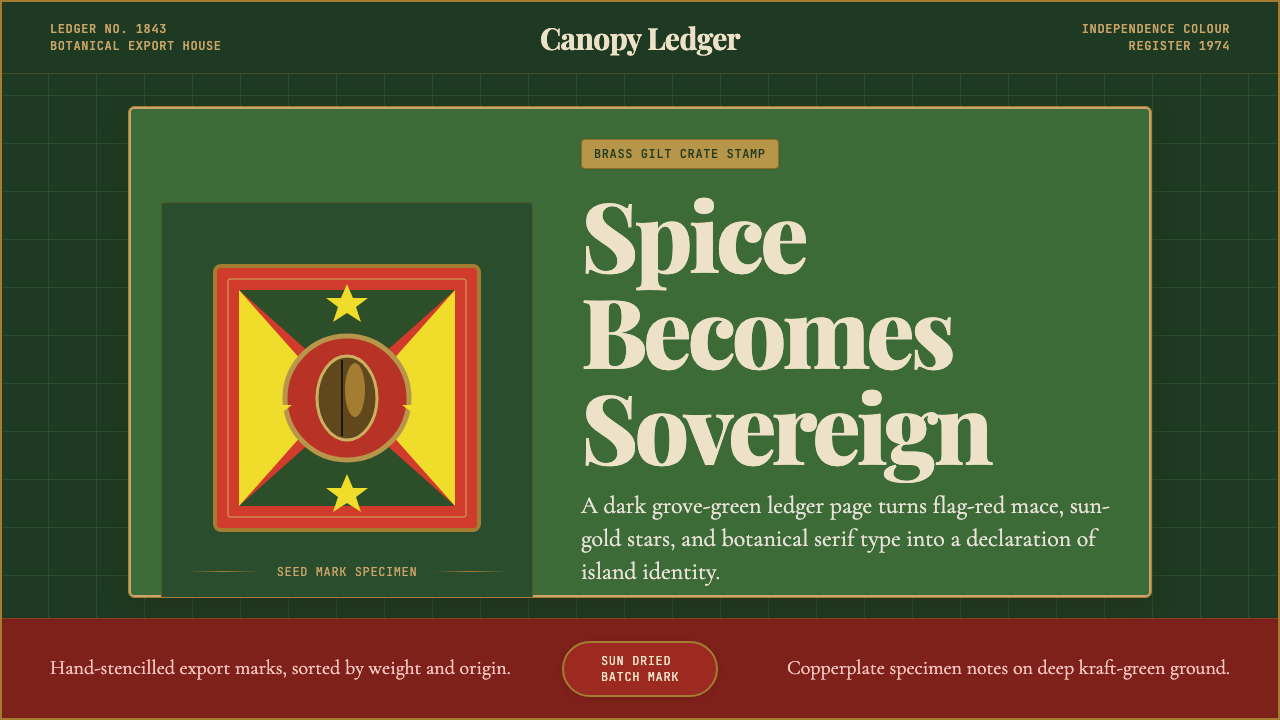 Grenadian Spice & Nutmeg FlagSpice becomes sovereign. Grove green, flag red, brass borders, and serif ledg…香料成为主权宣言:林冠绿、旗红、黄铜边框与账本衬线。
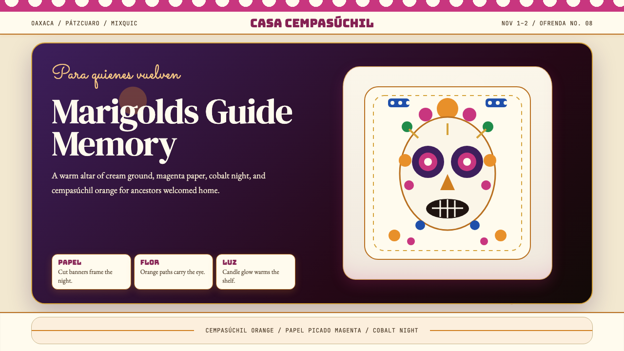 Día de los MuertosRemembrance glows. Marigold orange, magenta papel picado, and cream altar tie…记忆被点亮:万寿菊橙、洋红剪纸与奶油祭坛层叠。
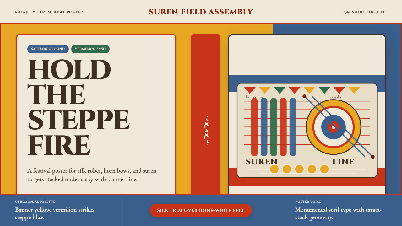 Mongolian Naadam ArcheryFestival heat at full draw. Saffron ground, vermilion trim, suren circles.满弓的节庆热度。藏红花黄底、朱红镶边、苏仁圆靶。
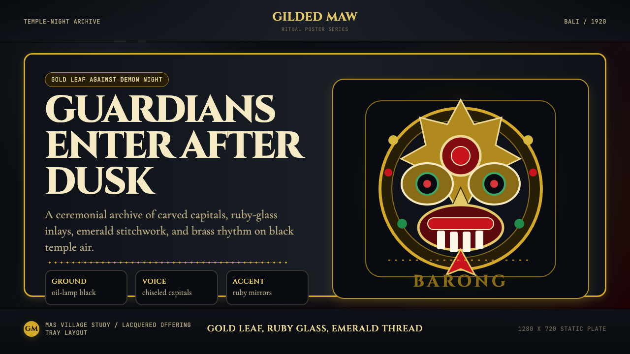 Balinese Barong Mask (1920)Protection glows after dark. Cinzel capitals frame gold, ruby, and emerald ge…守护在夜色中发光:Cinzel碑刻字围住金、红宝石与翡翠几何。
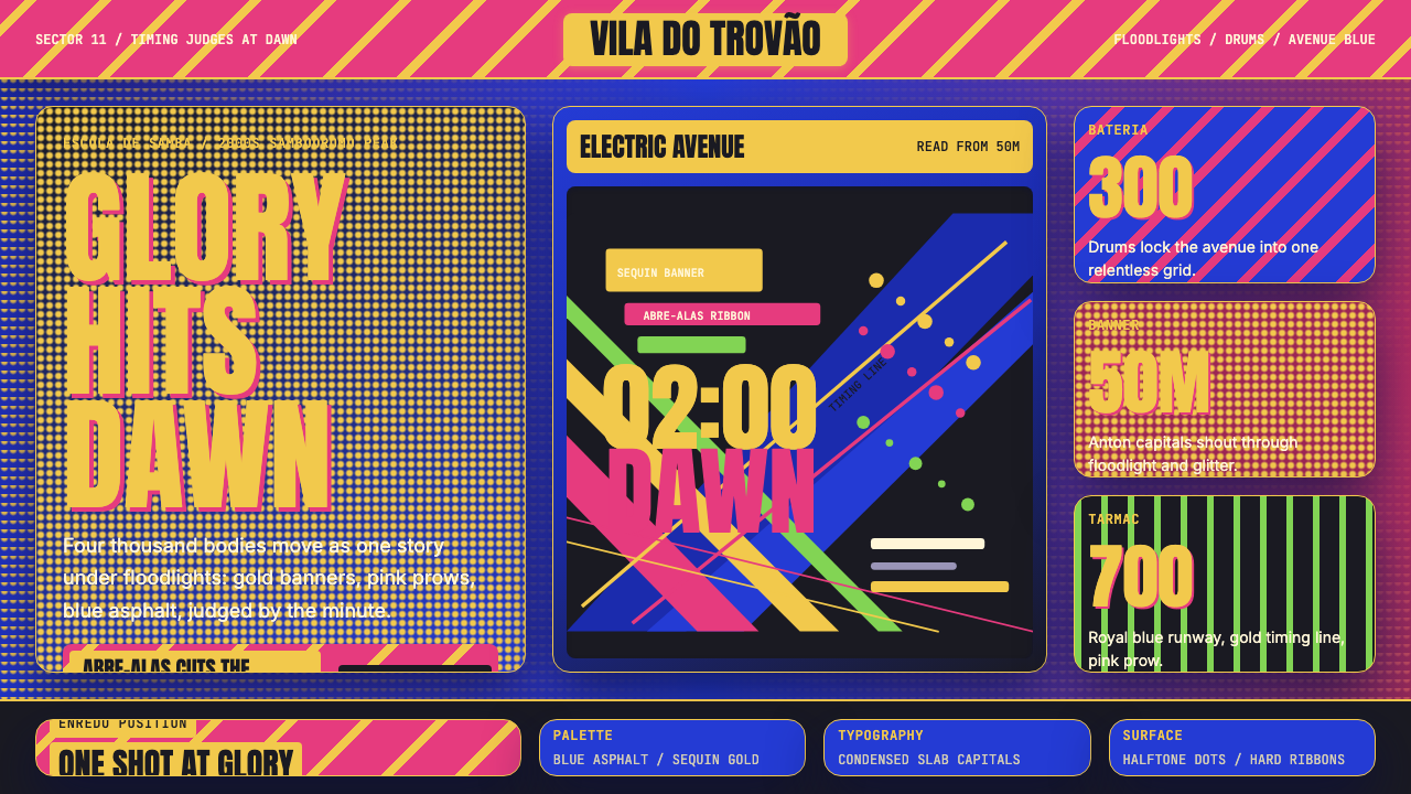 Brazilian Samba School (2000s Carnaval)Parade at floodlight volume. Royal blue asphalt, sequin gold type, pink ribbo…泛光灯音量的游行。宝蓝路面、亮片金字、玫红斜带。
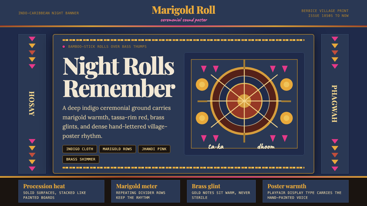 Guyanese Tassa DrumCeremony carries the beat. Indigo banners, Playfair type, and marigold rows g…仪式感击出鼓点:靛蓝旗面、Playfair 标题与万寿菊分隔线发光。