What is Día de los Muertos?什么是 Día de los Muertos?
Día de los Muertos turns grief into a festival of blazing marigold, hand-cut paper banners, and candlelit altars where the living celebrate alongside the dead.亡灵节将哀思化为节庆——万寿菊的火焰、手工剪纸彩旗、烛光祭坛,生者与亡者共欢。
Día de los Muertos in briefDía de los Muertos 速览
Día de los Muertos is Mexico's November 1–2 celebration of deceased ancestors, recognized by UNESCO in 2008 as an Intangible Cultural Heritage of Humanity. Its visual world is one of the most distinctive and emotionally charged folk-art vocabularies on earth: saturated marigold orange, magenta, cobalt, and emerald sit against a deep purple night sky, anchored by the cream-white of skull forms that serve as breathing space rather than morbid symbol.亡灵节是墨西哥每年11月1日至2日缅怀先人的盛大节日,2008年被联合国教科文组织列入人类非物质文化遗产名录。其视觉世界是地球上最具辨识度、最富情感张力的民间艺术语汇之一:饱和的万寿菊橙、洋红、钴蓝、翠绿铺陈于深紫夜空之上,以骷髅奶油白作为呼吸空间——这是生命感的底色,而非死亡的符号。
The tradition is celebratory, not mournful — this is its most important design truth. The imagery of skeletons and skulls is treated with warmth, humor, and intricate ornamentation: calavera sugar skulls are covered in hand-piped floral decoration, Catrina figures wear elaborate hats and lace, and ofrenda altars are dressed in layers of marigold petals, photographs, food, and candlelight. Every element invites the spirit of the departed back, not into shadow, but into light.这一传统是庆典性的,而非哀悼性的——这是理解其设计语言最重要的前提。骷髅与头骨的意象被赋予温情、幽默与精细的装饰:糖骷髅(calavera)以手工裱花覆满花卉图案,卡特里娜(Catrina)人物戴着繁复的帽饰与蕾丝,祭坛(ofrenda)以万寿菊花瓣、遗像、食物与烛光层层铺设。每一个元素都在邀请亡者的灵魂归来——不是归入阴影,而是归入光明。
Visually, the system was forged in the late nineteenth and early twentieth centuries by printmaker José Guadalupe Posada, whose skeleton figures transformed death into social commentary. It was absorbed and amplified by Diego Rivera and Frida Kahlo into a pillar of Mexican national identity. Today, the visual language spans handmade craft and large-scale public murals, festival street decoration and contemporary graphic design, remaining unmistakably rooted in folk tradition while evolving with each generation.这套视觉体系在十九世纪末至二十世纪初由版画家何塞·瓜达卢佩·波萨达奠基,他的骷髅形象将死亡转化为社会评论。后经迭戈·里维拉与弗里达·卡罗吸收并放大,成为墨西哥民族身份认同的核心支柱。今天,这套视觉语言横跨手工艺品与大型公共壁画、节日街头装饰与当代平面设计,在每一代人的演进中始终不失其民间传统的根基。
See the Día de los Muertos design system查看 Día de los Muertos 完整设计系统
Where does Día de los Muertos come from?Día de los Muertos 从何而来?
The roots of Día de los Muertos reach back more than three thousand years to pre-Columbian Mesoamerica, where the Aztec, Toltec, and other indigenous peoples held elaborate multi-day festivals honoring the dead, presided over by Mictecacihuatl, the Lady of the Dead. In the Aztec ritual calendar, death was not the end of a cycle but a transformation — the deceased joined one of several afterlife realms depending on the manner of their death, and the living maintained ongoing relationships with ancestors through offerings, ritual feasting, and ceremony. Marigold flowers, known in Nahuatl as cempasúchil, were associated with the sun and used to guide spirits; this connection persists intact into contemporary ofrenda practice.亡灵节的根源可上溯至三千年前的前哥伦布时期中美洲。阿兹特克人、托尔特克人及其他原住民族群举行多日祭祀亡者的盛典,由冥界女神米克特卡西瓦特尔(Mictecacihuatl,亡者女主)主持。在阿兹特克的仪式历法中,死亡不是周期的终结,而是一种转化——亡者依据死亡方式进入不同的来世领域,生者则通过供品、祭宴与仪式与祖先保持持续的关系。以纳瓦特尔语称为cempasúchil的万寿菊与太阳相关联,被用来为灵魂引路;这一联结在当代祭坛实践中一脉相承,完整保留至今。
The Spanish colonial encounter beginning in 1519 layered Catholic All Saints' Day (November 1) and All Souls' Day (November 2) over the existing indigenous festivals, producing a syncretic hybrid that drew from both traditions. The colonial church could not eradicate deep-seated ancestor veneration, and the indigenous communities could not be separated from their seasonal ritual calendar. The result was a genuine cultural fusion: the timing shifted to align with the Catholic calendar, but the offerings, marigold paths, skull iconography, and the belief in a temporary reunion between the living and dead remained essentially continuous with pre-Columbian practice.1519年西班牙殖民统治的到来,将天主教的万圣节(11月1日)与追思节(11月2日)叠加在原有的原住民节日之上,形成一种真正的文化混合体。殖民教会无法根除深入人心的祖先崇拜,原住民社群也无法脱离其季节性仪式历法。结果是一次真实的文化融合:时间节点向天主教历法靠拢,但供品、万寿菊引魂之路、骷髅图像学,以及生者与亡者短暂团聚的信念,与前哥伦布时期的实践本质上一脉相承。
The modern visual identity of Día de los Muertos was crystallized in the decades surrounding the Mexican Revolution of 1910. José Guadalupe Posada, working in Mexico City as a political caricaturist and printmaker, created a figure called La Calavera Garbancera — a skeleton woman in an elaborate European-style hat — as a satire of Mexican upper-class aspirations to European fashion. After Posada's death, Diego Rivera incorporated the figure into his 1947 mural Dream of a Sunday Afternoon in Alameda Park, dressed her in full Catrina garb, and placed her alongside Posada himself, Frida Kahlo, and Rivera as a child. This act of mural canonization transformed a political cartoon into the central icon of a national tradition.亡灵节现代视觉身份的确立,发生在1910年墨西哥革命前后的数十年间。何塞·瓜达卢佩·波萨达作为墨西哥城的政治漫画家与版画家,创作了一个名为「La Calavera Garbancera」的女骷髅形象——戴着精致欧式帽饰的骷髅女士——用以讽刺墨西哥上层阶级对欧洲时尚的仿效。波萨达身后,迭戈·里维拉在其1947年的壁画《阿拉梅达公园星期日午后的梦》中将这一形象吸纳,为她穿上完整的卡特里娜盛装,并将她与波萨达本人、弗里达·卡罗及儿时的里维拉自己并列。这一壁画级别的经典化行为,将一幅政治漫画转化为民族传统的核心图腾。
The post-Revolution Mexican muralist movement — Rivera, José Clemente Orozco, David Alfaro Siqueiros — deliberately elevated folk and indigenous cultural forms as a political statement against colonial cultural hierarchies. Día de los Muertos imagery, previously confined to regional folk practice, entered the national cultural canon as a symbol of authentic Mexican identity. The late twentieth century brought further globalization: the 1994 NAFTA era increased cultural exchange across the U.S.–Mexico border, while Pixar's 2017 film Coco introduced the visual language to a global audience of hundreds of millions, accelerating both appreciation and the ongoing debates about cultural commercialization.墨西哥革命后的壁画运动——里维拉、荷塞·克莱门特·奥罗斯科、大卫·阿尔法罗·西盖罗斯——刻意将民间与原住民文化形式提升为对抗殖民文化等级的政治宣言。原本局限于地方民间实践的亡灵节图像,由此进入国家文化正典,成为真实墨西哥身份的象征。二十世纪末,更大范围的全球化接踵而至:1994年《北美自由贸易协定》时代加速了美墨边境的文化交流;2017年皮克斯动画电影《寻梦环游记》将这套视觉语言带入全球数亿观众的视野,既推动了更广泛的文化欣赏,也引发了关于商业化与文化挪用的持续讨论。
What defines the Día de los Muertos look?Día de los Muertos 的视觉特征是什么?
Color Palette色彩体系
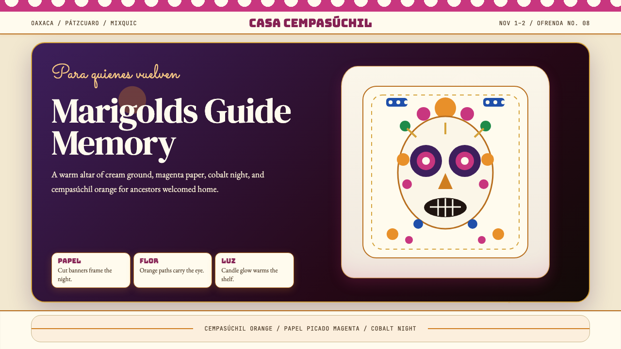
The palette is intensely saturated and multi-hued, built around marigold orange as its anchor — a warm, luminous orange that reads as both joyful and sacred. Magenta pink and deep violet provide complementary contrast. Cobalt blue and jewel-toned emerald appear as secondary fields. The deep purple-blue of a night sky serves as a unifying background in more dramatic compositions. Against this saturation, cream and off-white skull forms and altar tiers function as essential resting points, preventing visual overload. Black outlines and lettering define boundaries without dulling the surrounding color.色板浓烈饱和、多色并置,以万寿菊橙为核心锚色——这是一种温暖发光的橙,同时传递喜悦与神圣感。洋红粉与深紫提供互补对比。宝石调钴蓝与翠绿作为次级色域出现。深紫蓝的夜空色调在戏剧性构图中充当统一性背景。在这种饱和度之中,奶油与米白的骷髅形与祭坛层级发挥着关键的视觉休止作用,防止整体视觉过载。黑色轮廓与文字界定边界,同时不削弱周边色彩的力量。
Skull and Skeleton Iconography骷髅与骸骨图像
The calavera — decorated skull — is the central recurring motif. Unlike morbid or horror-coded skull imagery, the Día de los Muertos calavera is covered in elaborate floral decoration, rendered with symmetrical patterns, often given expressive features such as roses for eyes or ornate headdresses. The Catrina skeleton figure, derived from Posada's prints, appears in full period dress — top hat or feathered bonnet, lace collars, ornate clothing — treating the skeleton as a fully social, even elegantly attired, presence. The iconography communicates that death is not the opposite of life but its continuation.卡拉维拉(calavera)——装饰骷髅头——是核心的反复出现的母题。与阴森或恐怖编码的骷髅图像不同,亡灵节的卡拉维拉被繁复的花卉装饰所覆盖,以对称图案呈现,常被赋予富有表情的特征,如玫瑰眼眶或华丽头饰。源自波萨达版画的卡特里娜骷髅形象则身着完整的时代盛装——高礼帽或羽饰女帽、蕾丝领、华服——将骷髅视为完全社交化乃至衣饰优雅的存在。这套图像体系传达的是:死亡不是生命的对立面,而是其延续。
Papel Picado剪纸彩旗
Papel picado — hand-cut tissue paper banners — are hung in layered rows across streets, altars, and event spaces. The technique involves cutting intricate lace-like patterns through stacked layers of colored tissue, producing translucent designs that catch both light and wind. Visually, they introduce the concept of negative space as decorative element: the cut-away portions are as important as the remaining paper. In design application, the paper-cut aesthetic translates to layered, perforated, or lattice-pattern graphic elements that carry the same festive lightness.剪纸彩旗(papel picado)是手工剪制的薄纸横幡,成排悬挂于街道、祭坛与节庆空间。工艺上,通过叠层裁剪彩色薄纸,形成镂空蕾丝般的半透明图案,既捕捉光线,又随风飘动。在视觉上,它引入了负空间作为装饰元素的概念:被剪去的部分与留存的纸张同等重要。在设计应用中,这种剪纸美学转化为具有同样节庆轻盈感的镂空、穿孔或格栅图案图形元素。
Ofrenda Layering祭坛的层叠结构
The ofrenda — altar assembled for the deceased — is built in tiers, typically two to seven levels, each holding photographs, food offerings, candles, marigold arrangements, and personal objects belonging to the departed. This tiered, layered structure is central to the aesthetic: elements are stacked vertically, framed by arch forms of marigold or paper flowers, with no area left bare. The compositional logic is one of abundance and intentional density — every horizontal and vertical zone is activated. Applied to design, this translates into richly layered compositions where multiple visual hierarchies coexist without reducing to a single focal point.祭坛(ofrenda)以层叠形式搭建,通常为两至七层,每层陈列亡者的照片、供奉食品、蜡烛、万寿菊花环及遗物。这种层叠竖向的结构是整体美学的核心:元素垂直堆叠,以万寿菊或纸花拱门为框,无一处留白。构图逻辑是丰盈与刻意的密度——每一个水平与垂直区域都被激活。应用到设计中,这转化为多重视觉层级共存的丰富叠层构图,而不收敛为单一焦点。
Hand-Drawn and Folk-Art Texture手绘与民间艺术质感
Día de los Muertos visual culture consistently resists mechanical perfection. Hand-drawn outlines with slight variation, imperfect symmetry in skull decoration, brush-lettered text, uneven floral arrangements — these qualities communicate the tradition's handmade, community-craft origins. In typography, lettered scripts with visible flourishes and calligraphic strokes are preferred over clean digital sans-serifs for display and headline use. In graphic elements, a visible hand — slightly irregular, organically patterned — is a mark of authenticity rather than error.亡灵节视觉文化始终抵制机械式的完美。手绘轮廓的细微变化、骷髅装饰中不完全对称的花样、手写体文字、疏密不均的花卉排列——这些特质传达了传统的手工艺与社区集体创作起源。在字体运用上,带有可见花饰与书法笔触的手写体被优先选用于展示与标题场合,而非整洁的数字无衬线字体。在图形元素中,略显不规则、带有有机图案感的手工痕迹是真实性的标志,而非错误。
Floral Abundance繁花盛景
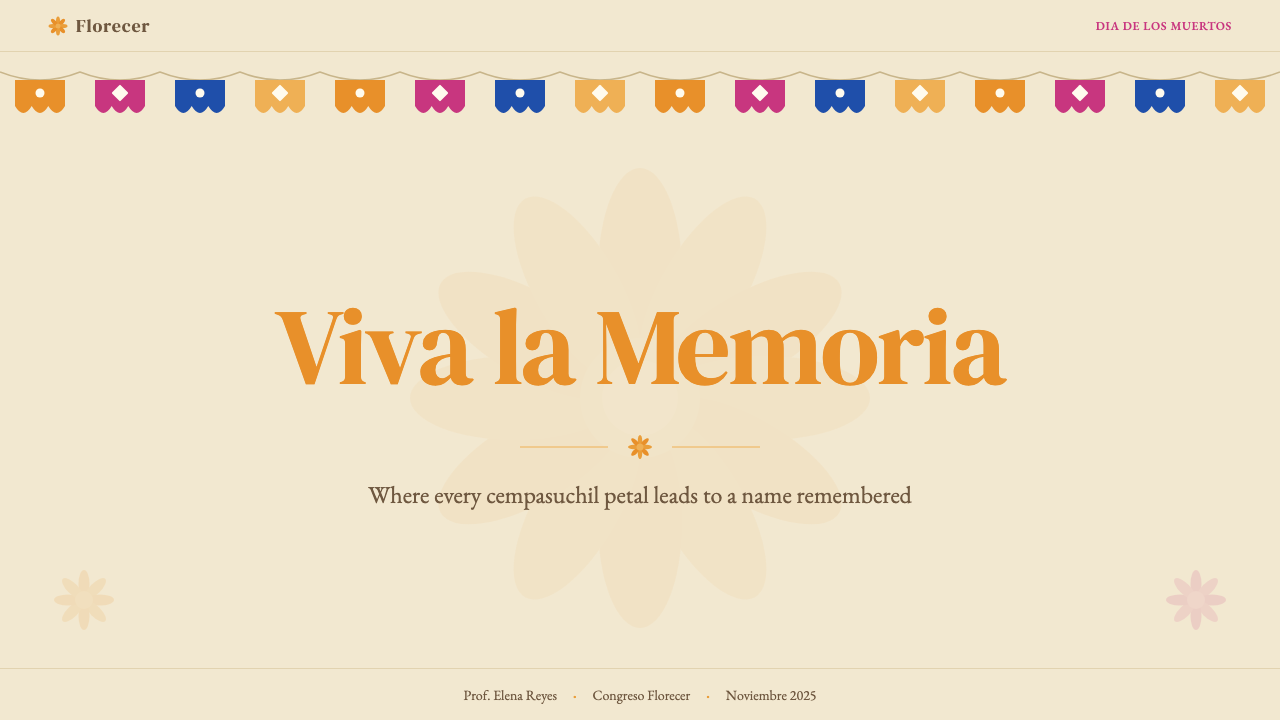
Marigold (cempasúchil) flowers — vivid orange-yellow, densely petaled — are the dominant floral motif, appearing as full blooms, scattered petals forming paths, and stylized graphic renderings. They are supplemented by white cempasúchil varieties, red cockscomb (mano de León), and paper flowers in all the palette's range. Floral forms are used in borders, frames, backgrounds, and as infill elements rather than isolated focal accents. The overall effect is one of lush, generous decoration — the opposite of sparse or minimalist approaches.万寿菊(cempasúchil)——色泽鲜亮的橙黄色、花瓣繁密——是主导性的植物母题,以完整花朵、铺陈成路的散落花瓣、以及风格化图形等形式出现。白色万寿菊品种、红色鸡冠花(mano de León)及整个色板色域的纸花对其加以补充。花卉形态被用于边框、装饰框、背景填充,而非孤立的焦点强调。整体效果是繁盛慷慨的装饰——与稀疏或极简风格截然相反。
Typography with Cultural Weight具有文化分量的字体排印
Lettering in the Día de los Muertos tradition spans several registers. Formal serif typefaces carry the cultural gravitas appropriate for names inscribed on ofrendas and commemorative materials. Chunky, bold display faces echo the street-festival poster tradition, where legibility at distance and visual impact are primary. Script and brush-lettered faces carry the hand-flourished warmth of handwritten ofrenda labels and market signage. All three registers can coexist within a single layout, provided each is clearly assigned a distinct hierarchy level. Decorative letterforms are acceptable and even expected — ornate initial caps or bordered text panels are consistent with the tradition.亡灵节传统中的文字书写横跨数种表达层次。正式的衬线字体承载着刻写于祭坛与纪念材料上的名字所需的文化庄重感。厚重粗犷的展示字体呼应街头节庆海报传统,远距离可读性与视觉冲击力是首要诉求。手写体与毛笔字体则携带着手写祭坛标签与集市招牌的手工花饰温情。三种层次可以在同一版面中共存,前提是每一层次都被清晰赋予不同的层级角色。装饰性字形不仅可以接受,甚至是期待中的元素——华丽的首字母大写或带边框的文字板块与这一传统完全一致。
See the Día de los Muertos design system查看 Día de los Muertos 完整设计系统
Who shaped Día de los Muertos?谁塑造了 Día de los Muertos?
Posada (1852–1913) was a Mexico City printmaker and political caricaturist whose skeleton figures — calaveras — appeared as social satire in broadsheets and illustrated newspapers during the Porfiriato era. His most enduring creation, La Calavera Garbancera (later renamed Catrina by Diego Rivera), depicted a skeleton woman in an elaborate European hat, mocking the aspiration of Mexican elites to adopt European aristocratic fashions. Posada died in poverty, but his visual vocabulary — the expressive, decorative skeleton as social commentary — became the foundation of the entire Día de los Muertos visual canon. His influence is visible in every decorated calavera and Catrina costume produced since.波萨达(1852—1913)是墨西哥城的版画家与政治漫画家,在波菲里亚托时期,其骷髅形象——卡拉维拉——作为社会讽刺出现在传单与图文报纸上。他最持久的创作「La Calavera Garbancera」(后由迭戈·里维拉改名为「卡特里娜」),描绘了一位戴着精致欧式帽子的女骷髅,嘲讽墨西哥精英阶层仿效欧洲贵族风尚的渴望。波萨达在贫困中辞世,但他的视觉词汇——将表情丰富、装饰繁复的骷髅作为社会评论媒介——成为整个亡灵节视觉正典的基础。此后每一个装饰骷髅头与卡特里娜服装中,都可见其影响。
Rivera (1886–1957) was the dominant figure of the Mexican muralist movement and the artist most responsible for elevating Día de los Muertos imagery from regional folk tradition to national icon. His 1947 mural Dream of a Sunday Afternoon in Alameda Park formally introduced the Catrina into the national canon, placing her as the symbolic center of Mexican cultural identity across four centuries. Rivera's murals in the National Palace and the Ministry of Education wove pre-Columbian, colonial, and revolutionary imagery into a single visual argument for a uniquely Mexican national culture — one in which indigenous folk forms were not inferior to European high art but prior to and foundational for it.里维拉(1886—1957)是墨西哥壁画运动的核心人物,也是将亡灵节图像从地方民间传统提升为国家图腾的最重要艺术家。他1947年的壁画《阿拉梅达公园星期日午后的梦》正式将卡特里娜纳入国家文化正典,使其成为横跨四个世纪墨西哥文化身份的象征中心。里维拉在国家宫与教育部创作的壁画,将前哥伦布时期、殖民时期与革命时期的图像编织为一个关于独特墨西哥国家文化的视觉论证——在这个论证中,原住民民间形式不是劣于欧洲精英艺术的,而是先于并奠基于后者的。
Kahlo (1907–1954) did not work primarily in the Día de los Muertos tradition specifically, but her painting practice was saturated with the same visual sources — ex-voto retablo painting, pre-Columbian symbolism, Mexican folk dress — that define the holiday's aesthetic. Her self-portraits established the possibility of a Mexican woman's face as the site of mythological, political, and spiritual meaning. Her personal adoption of Tehuana dress and pre-Columbian jewelry in daily life was a deliberate act of cultural reclamation. Posthumously, her image has become inseparable from contemporary representations of Día de los Muertos, particularly Catrina-themed portraiture.卡罗(1907—1954)的创作并非直接针对亡灵节传统,但她的绘画实践与同样定义这一节日美学的视觉源头深度交融——还愿画板(retablo)、前哥伦布时期象征符号、墨西哥民间服饰。她的自画像确立了将墨西哥女性面孔作为神话、政治与精神意义载体的可能性。她在日常生活中刻意穿着特旺纳服饰、佩戴前哥伦布时期珠宝,是一种蓄意的文化夺回行为。在她身后,她的形象已与当代亡灵节表现——尤其是卡特里娜主题肖像——不可分割。
Linares (1906–1992) was a Mexico City papier-mâché artisan who, following a feverish dream in which he witnessed fantastical hybrid creatures, began creating alebrije — brilliantly painted, wildly imagined sculptural animals combining features of multiple species. He introduced the term and the form, which subsequent generations of artisans, particularly in Oaxaca, have made central to the Día de los Muertos visual tradition. Alebrije now appear on ofrenda altars, in street processions, and as a recurring design motif representing the guide animals said to accompany souls through the underworld.利纳雷斯(1906—1992)是墨西哥城的纸浆雕塑工匠。在一次发烧噩梦中,他梦见了奇异的混合生物,此后开始创作阿莱布里赫(alebrije)——色彩绚烂、充满奇想的雕塑动物,融合多种生物特征于一身。他创造了这一术语与艺术形式,后续几代工匠——尤其是瓦哈卡的匠人——将其发展为亡灵节视觉传统的核心元素。阿莱布里赫如今出现在祭坛、街头巡游以及设计母题中,代表着据说引领灵魂穿越冥界的引路神兽。
Vilchis Roque is a contemporary Mexico City retablo painter who has revived and extended the ex-voto tradition — small devotional paintings on tin depicting miraculous interventions — by creating Día de los Muertos themed retablos that incorporate contemporary social subjects alongside traditional iconography. His work demonstrates how the visual tradition actively evolves: the formal constraints of the retablo format (naive perspective, flat color, handwritten text panels, bordered composition) provide a stable aesthetic container into which new subjects and concerns are continuously absorbed, keeping the tradition generative rather than merely archival.比尔奇斯·罗克是当代墨西哥城还愿画(retablo)画家,他复兴并延伸了马口铁还愿画传统——在锡片上描绘奇迹干预的小型宗教祈愿画——通过创作融合当代社会主题与传统图像学的亡灵节主题还愿画。他的工作展示了这一视觉传统如何保持活跃演进:还愿画格式的形式约束(素朴透视法、平涂色彩、手写文字板块、带框构图)提供了一个稳定的美学容器,不断吸纳新的主题与关切,使传统保持生机而非仅仅作为档案存在。
How do you use Día de los Muertos today?今天怎么用 Día de los Muertos?
Día de los Muertos is one of the most visually rich and culturally specific design vocabularies available for contemporary work. Applying it well requires more than reaching for an orange palette and adding skull motifs: it requires engaging with the aesthetic logic of the tradition — layered abundance, celebratory warmth, hand-craft texture, and a palette where every color is intentional and saturated. The tradition's emotional register is joy mixed with reverence, never horror or irony. Any application that drifts toward Halloween adjacency has missed the essential point.亡灵节是当代设计中最具视觉丰富性与文化特殊性的设计词汇之一。将其运用得当,不仅仅是选取橙色调色板再添加几个骷髅图案:它要求深入理解这一传统的美学逻辑——丰盛的层叠、庆典式的温情、手工艺质感,以及一套每一种颜色都是有意为之且饱和浓烈的色板。这一传统的情感基调是喜悦与敬意的交融,绝非恐怖或戏谑。任何漂移向万圣节风格的应用都已偏离了其核心要旨。
For presentation slides, the style rewards bold, layered cover pages. A cover built in this tradition might feature a large Catrina or calavera illustration as the visual anchor, framed with a marigold-petal border against a deep violet or night-sky background. The title can be set in a display serif or ornamental script in cream or warm gold, with the event or organization name in a smaller complementary weight below. Content slides work best with a strong visual hierarchy: marigold orange or magenta reserved for section headers and callouts, cream or white for body text fields, and the dark background used sparingly as a full-bleed accent for high-impact moments. Data visualizations can adopt the palette's colors to differentiate series — using the full saturation of the tradition rather than muted chart defaults — treating bar charts and ring charts as celebratory objects in their own right.在演示文稿中,这种风格适合大胆、层叠的封面页。按照这一传统构建的封面,可以以大尺寸卡特里娜或卡拉维拉插画作为视觉锚点,以万寿菊花瓣边框装饰,衬以深紫或夜空色背景。标题可采用展示衬线或装饰性手写体,以奶油色或暖金色呈现,活动或机构名称以较小的配套字重置于其下。内容页最适合强烈的视觉层级结构:万寿菊橙或洋红保留用于章节标题与重点引用,奶油色或白色用于正文区域,深色背景仅在高冲击力的关键时刻作为全出血强调使用。数据可视化可以采用整个色板的颜色区分数据系列——使用传统的完整饱和度而非惯常的柔和图表默认色——将柱状图与环形图本身视为庆典性对象。
For web interfaces, the style suits event landing pages, cultural institution websites, festival program guides, and any brand positioned around heritage craft, Mexico-adjacent hospitality, or celebratory consumer experiences. The approach: set a warm cream or very deep violet as the page ground, use marigold orange as the primary action color for buttons and links, and introduce magenta as a secondary highlight. Navigation benefits from ornamental border treatments — a simple patterned or scalloped horizontal rule rather than a plain line. Card components work well with visible borders in a contrasting warm color, without shadows softening the edges. Illustration-heavy layouts where decorative calavera or floral elements fill negative space are characteristic of the style at full intensity.在网页界面中,这种风格适合活动登录页、文化机构网站、节庆项目指南,以及任何以传统工艺遗产、墨西哥相关待客之道或庆典消费体验定位的品牌。方法如下:以温暖的奶油色或极深的紫罗兰色作为页面底色,以万寿菊橙作为按钮与链接的主要动作色,洋红作为次级高亮色。导航栏适合装饰性边框处理——以简单的图案或扇贝状水平分割线代替普通直线。卡片组件适合以对比暖色的可见边框处理,而不以阴影柔化边缘。在负空间中以装饰性卡拉维拉或花卉元素填充的插画密集型版面,是这种风格全力施展时的典型面貌。
For editorial and marketing work, the tradition's poster heritage makes it exceptionally well-suited to large-format visuals. A Día de los Muertos editorial spread might anchor on a full-bleed illustration — a decorated skull, a Catrina figure, a marigold-covered ofrenda — with type set over or around it in a way that acknowledges rather than competes with the illustration's complexity. Marketing campaigns for cultural events, food brands with Mexican heritage, and seasonal activations in October and November can draw directly from the visual vocabulary: papel picado-inspired banner graphics, ofrenda-tier compositions for product showcases, and marigold-scatter patterns as texture backgrounds.在编辑与营销领域,这一传统的海报遗产使其在大幅视觉呈现上表现卓越。一个亡灵节编辑展开页可以以全出血插画为锚——一个装饰骷髅、一个卡特里娜形象、一座铺满万寿菊的祭坛——文字以承认而非竞争于插画复杂性的方式叠放其上或环绕其外。文化活动、有墨西哥传承的食品品牌以及十月至十一月的季节性推广营销,可以直接取材于这套视觉词汇:剪纸彩旗启发的横幅图形、以祭坛层叠结构展示产品的构图、以及万寿菊花瓣散落纹样作为质感背景。
A common mistake is treating the palette as Halloween-compatible by combining the deep purples and oranges with bats, haunted-house imagery, or spooky horror fonts. This collapses two entirely distinct cultural traditions into visual noise. The skulls and skeletons of Día de los Muertos are decorated, warm, and social; they are never grotesque, dripping, or associated with fear. A second frequent error is reducing the tradition to a single repeated skull motif without the surrounding context — the flowers, candles, layered altars, paper banners — that gives the skull its meaning. The skull alone, decontextualized, reads as generic rather than as Día de los Muertos. The richness of the tradition depends on the full visual ecosystem, not any single extracted element.一个常见错误是将这套色板与万圣节混同,将深紫与橙色和蝙蝠、鬼屋图像或恐怖风格字体组合使用。这将两种完全不同的文化传统压缩成视觉噪音。亡灵节的骷髅与骸骨是装饰性的、温情的、社交性的,从不令人作呕、滴血或与恐惧相关联。第二个常见错误是将这一传统简化为单一重复的骷髅母题,而缺少其周边语境——花卉、蜡烛、层叠祭坛、纸质横幡——正是这些赋予了骷髅以意义。被剥离语境的骷髅,读来只是通用图案,而非亡灵节。这一传统的丰富性依赖于完整的视觉生态系统,而非任何单一被抽取的元素。
See the Día de los Muertos design system查看 Día de los Muertos 完整设计系统
Día de los Muertos — FAQDía de los Muertos · 常见问题
Is it culturally appropriate to use Día de los Muertos imagery outside Mexican contexts?在墨西哥文化语境之外使用亡灵节图像,在文化上是否得当?
The question is live and contested. The tradition is recognized by UNESCO as a shared human heritage, and its imagery has been in global circulation for decades — accelerated significantly since 2017. The key distinction is between appreciative engagement and reductive appropriation. Appreciative engagement means understanding the tradition's origins, using its full visual vocabulary rather than extracting skull motifs as generic spooky decoration, crediting Mexican artists and craft traditions, and avoiding Halloween adjacency. Reductive appropriation means using skull imagery as costume or shock aesthetic without context, or commodifying the tradition in ways that erase its cultural specificity. For commercial work, partnering with Mexican artists or cultural advisors and being transparent about sourcing strengthens the case for respectful use.这是一个仍在活跃争论中的问题。这一传统被联合国教科文组织列为人类共同遗产,其图像在全球已流通数十年——2017年后尤为加速。关键区别在于欣赏性参与与简化性挪用之间:欣赏性参与意味着理解这一传统的起源,使用其完整的视觉词汇而非将骷髅图案抽取为通用恐怖装饰,注明墨西哥艺术家与工艺传统的来源,并避免与万圣节混同。简化性挪用则是将骷髅图像作为无语境的服装或震惊美学使用,或以抹除其文化特殊性的方式将这一传统商品化。对于商业创作,与墨西哥艺术家或文化顾问合作、在来源问题上保持透明,是尊重性使用的有力支撑。
How does Día de los Muertos differ visually from Halloween?亡灵节在视觉上与万圣节有何不同?
The two share surface-level imagery — skulls, skeletons, dark backgrounds — but their visual registers are opposite in intent. Halloween aesthetics are oriented toward fear, shock, and the grotesque: dripping wounds, decayed forms, spiderweb textures, cold green or sickly yellow lighting, horror-film typography. Día de los Muertos aesthetics are oriented toward celebration, beauty, and warm remembrance: intricate floral decoration on skulls, vivid saturated warm colors, abundance of marigold orange and magenta, hand-craft texture, and typographic warmth. Where Halloween leans into ugliness to provoke, Día de los Muertos leans into decoration and color to honor. Confusing the two produces work that is offensive to the tradition and visually incoherent.两者在表面图像上有交叠——骷髅、骸骨、深色背景——但其视觉基调的意图恰好相反。万圣节美学以恐惧、震惊与怪诞为导向:滴血伤口、腐朽形态、蜘蛛网质感、冷绿或病黄的光线、恐怖电影风格字体。亡灵节美学则以庆典、美丽与温暖追思为导向:骷髅上精致的花卉装饰、饱和鲜亮的暖色、丰盛的万寿菊橙与洋红、手工艺质感、以及字体上的温情感。万圣节依赖丑陋来引发刺激,亡灵节依赖装饰与色彩来致敬缅怀。混淆两者会产生对这一传统不敬、视觉上也自相矛盾的作品。
What typographic approach best fits this tradition?哪种字体排印方式最契合这一传统?
Three registers work well, each for different purposes. For display and headlines, ornamental serif or script faces with visible calligraphic flourishes are most authentic — they echo the hand-lettered labels found on ofrendas and the bold block lettering of festival posters. Avoid sterile geometric sans-serifs for display use, as they work against the tradition's hand-craft warmth. For body text, a warm serif with visible stroke variation is appropriate, providing the cultural gravity needed for names and commemorative language. Avoid light-weight or ultra-thin cuts, which read as contemporary minimalist rather than folk-art rooted. The third register is purely decorative lettering used as a graphic element — bordered, floriated, monogram-style initial caps — treated as illustration rather than pure typography.三种表达层次各有其适合的用途。展示与标题场合,最为真实的是带有可见书法花饰的装饰衬线体或手写体——它们呼应祭坛上的手写标签与节庆海报上的粗体方块字。应避免在展示用途中使用冷静的几何无衬线体,因为它与这一传统的手工艺温情相悖。正文排版适合笔触粗细变化可见的暖调衬线体,为人名与纪念性文字提供所需的文化庄重感。应避免细字重或超细字重,因为它们读来属于当代极简主义,而非民间艺术根源。第三种层次是纯装饰性书写文字,作为图形元素使用——带边框、带花饰、花体首字母大写风格——作为插图而非纯粹排版处理。
Can the Día de los Muertos palette be used on a light background?亡灵节色板是否适合用在浅色背景上?
Yes, and the tradition supports this well. The ofrenda altar and daytime street festival contexts both use cream and white grounds extensively, with the saturated colors of flowers, papel picado, and sugar skull decoration reading against a light field. A cream or warm white background keeps the palette's intensity legible without requiring a dark ground. On a light ground, marigold orange and magenta tend to carry well without overpowering the composition, while the deep purples and cobalts serve better as accent or detail colors. The nighttime, candlelit deep-purple palette is an equally valid option but represents the more dramatic, ceremonial register of the tradition — appropriate for premium, formal, or high-impact applications.是的,而且这一传统对此有充分支撑。祭坛与白天街头节庆的场景都大量使用奶油色与白色底面,鲜花、剪纸彩旗与糖骷髅装饰的饱和色彩在浅色底面上清晰呈现。奶油色或暖白色背景使色板的强烈度在不需要深色底面的情况下保持可读性。在浅色底面上,万寿菊橙与洋红通常表现良好,不会压制整体构图,而深紫与钴蓝则更适合作为强调或细节色使用。夜间、烛光氛围的深紫调色板同样是有效的选择,但它代表这一传统中更戏剧化、更仪式感的表达层次——适合高端、正式或高冲击力的应用场合。
How should the Catrina figure be used responsibly in design?在设计中应当如何负责任地使用卡特里娜形象?
The Catrina is among the most globally recognized symbols of Mexican visual culture, which makes both her power and her misuse potential high. Used responsibly, the figure references a century of artistic lineage — from Posada's satirical print through Rivera's mural canonization — and can carry significant cultural resonance. The responsible approach: treat her as a character with historical depth rather than a generic skull-woman costume; preserve the ornamental complexity of her signature hat and dress rather than stripping her to a skeleton silhouette; and situate her within contexts that acknowledge the tradition she represents. Commercially, the figure should not be used to sell products whose brand associations would be incongruous with the tradition's commemorative dignity — purely shock-value contexts or unrelated Halloween merchandise among them.卡特里娜是墨西哥视觉文化中全球认知度最高的符号之一,这既赋予了她强大的力量,也使误用的风险相应增高。负责任地使用,意味着这一形象承载着自波萨达讽刺版画经里维拉壁画经典化百年的艺术谱系,可以传递深厚的文化共鸣。负责任的方式:将她作为具有历史深度的角色对待,而非通用的骷髅女服装;保留其标志性帽饰与服装的繁复装饰,而非将其简化为骷髅剪影;并将她置于能够承认其所代表传统的语境中。在商业层面,这一形象不应被用于推销品牌联想与这一传统的纪念庄重感相悖的产品——纯粹追求震惊效果的语境或无关联的万圣节商品均属其列。
Related design styles相关设计风格
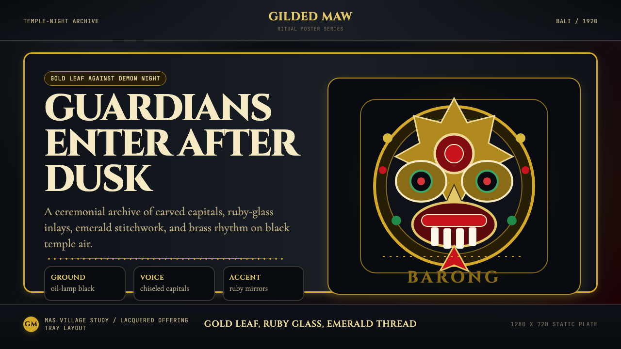 Balinese Barong Mask (1920)Protection glows after dark. Cinzel capitals frame gold, ruby, and emerald ge…守护在夜色中发光:Cinzel碑刻字围住金、红宝石与翡翠几何。
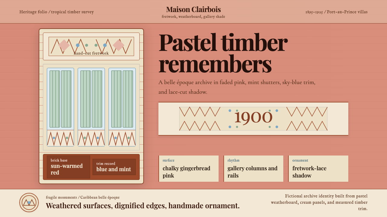 Haitian Gingerbread House (1900)Fragile elegance endures. Faded pink walls carry mint shutters and fretwork-l…脆弱而优雅:褪粉墙面承载薄荷百叶与镂花节奏。
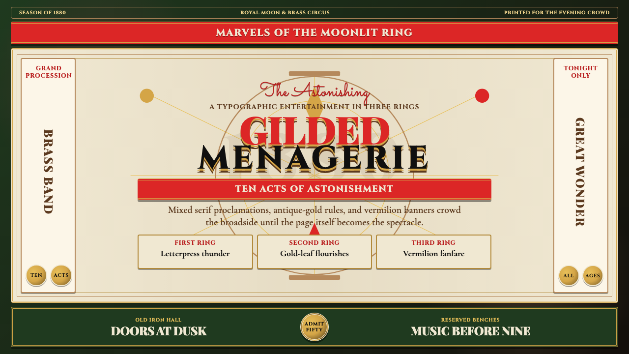 Victorian Circus Poster (1880)Spectacle leaves no inch quiet. Forest green, antique gold borders, mixed ser…寸寸皆戏。深林绿、古金双线、混排衬线与朱红横幅。
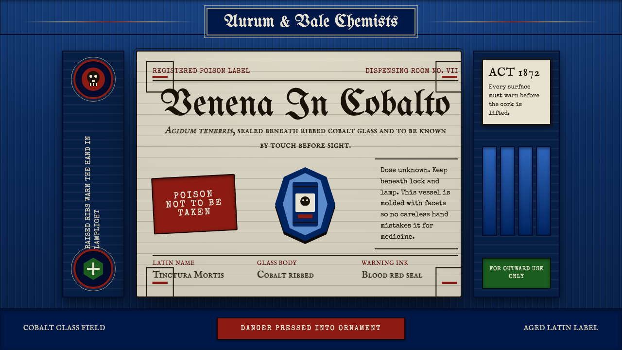 Apothecary Poison LabelDanger made ornate. Cobalt ribs, aged paper, and red POISON rules make fear t…危险被做成装饰:钴蓝凸棱、旧纸标签与红色警示让恐惧可触。
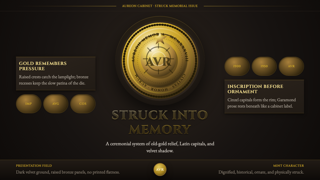 Commemorative CoinAuthority struck in metal. Old-gold relief, denticled rims, and Cinzel capita…权威如金属铸成:旧金浮雕、齿纹币缘与天鹅绒暗场。
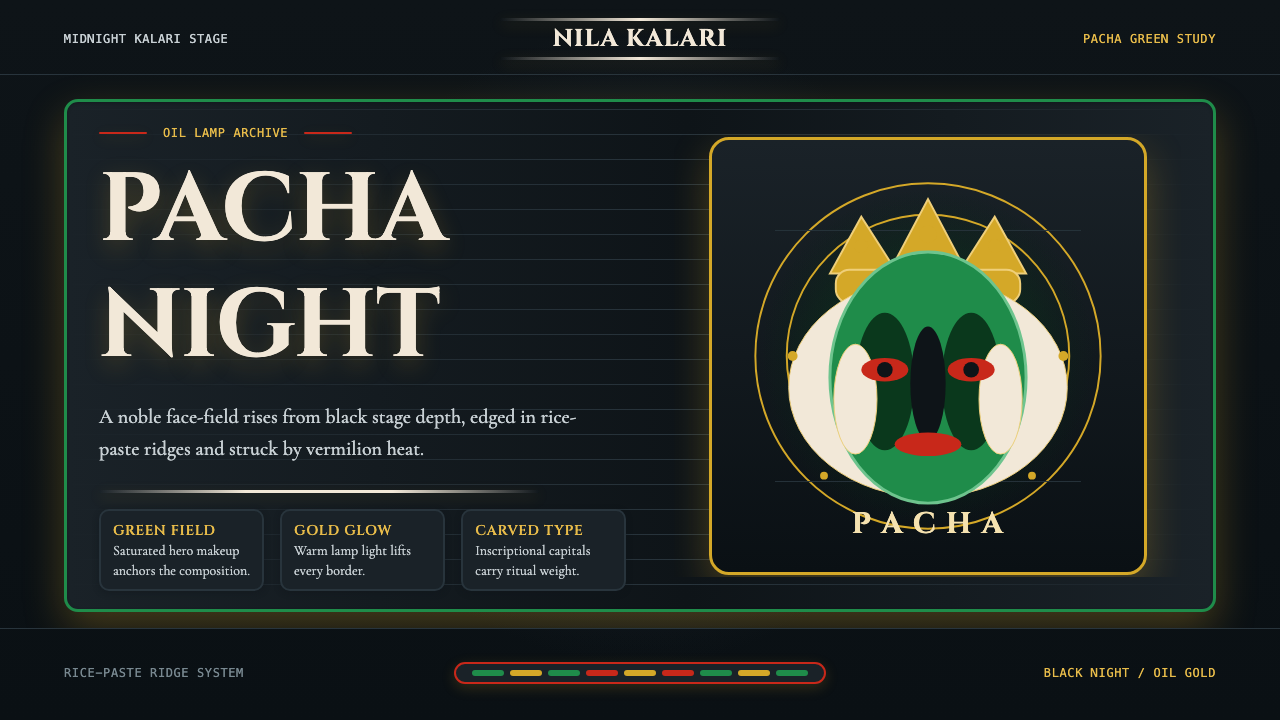 Kerala Kathakali (Pacha Green Makeup)Fierce ceremonial night. Pacha green, vermilion, and oil-gold frame monumenta…庄严夜台。帕查绿、朱砂红与油灯金框住碑刻衬线。