What is Apothecary Poison Label?
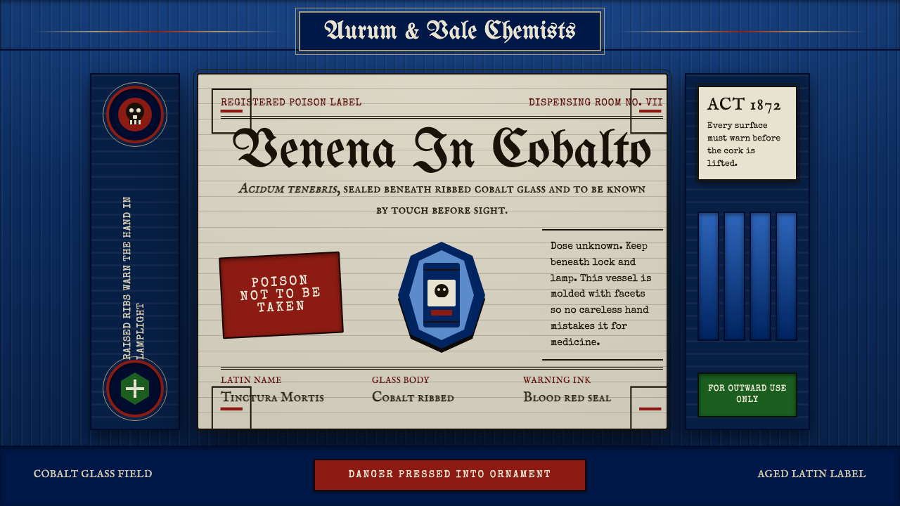
Victorian pharmacy turned safety into spectacle: a cobalt-blue ribbed bottle embossed with skulls, a serif-framed label crowded with Latin warnings, and doubled rules that made fear as ornate as a calling card.
Apothecary Poison Label in brief
The Apothecary Poison Label aesthetic is rooted in the Victorian pharmaceutical visual system developed roughly between 1870 and 1899, when regulatory bodies across Britain, Germany, and the United States mandated that poisons be not merely labeled but unmistakably felt. The result was a design language of deliberate dread: deep cobalt-blue glass, surface ribbing and embossed skulls that could be identified by touch in total darkness, and paper labels so laden with typographic hierarchy and ornamental warning rules that illiteracy was barely an obstacle to understanding the danger inside.
Unlike most historical design movements, this aesthetic did not emerge from a school, a manifesto, or a single influential designer. It arose from a practical crisis — the alarming frequency of accidental poisoning in households where medicines, cleaning compounds, and foodstuffs shared the same dark shelf — and from a Victorian cultural instinct that made ornament inseparable from communication. The label is not decorative despite being a warning; it is decorative because it is a warning. Beauty here is pressed into the service of survival.
Visually, the style is a compressed Victorian Gothic pharmacy: aged or cream paper grounds, dense serif typefaces with strong contrast between thick and thin strokes, multiple nested border rules in red and black, and central motifs — the skull and crossbones, the rampant serpent, the pointed hand — drawn from a shared iconographic stock. Colors are few but saturated: the black of ink, the deep red of danger rules, and the cobalt ground of the bottle itself, which when combined produce a palette of theatrical severity.
Where does Apothecary Poison Label come from?
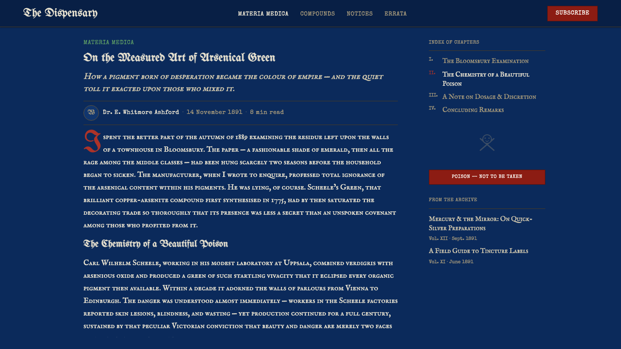
The origins of the poison bottle as a distinct visual and tactile category trace to a series of coroners' inquiries in Britain during the 1850s and 1860s, in which recurring verdicts noted that victims had mistaken poisons for medicines or household liquids because the containers were identical. The British Pharmaceutical Society began lobbying for distinctive packaging, and in 1863 the Pharmacy Act introduced obligations around the labeling of scheduled poisons. Similar regulatory pressure emerged in the United States in the 1870s and in German states shortly after. By the 1870s, a loosely standardized visual vocabulary for poison packaging had crystallized on both sides of the Atlantic.
The ribbed or faceted cobalt-blue glass bottle became the dominant form for several converging reasons. Cobalt glass was already associated with medicinal use and was cheap to produce in quantity; the blue obscured the color of the liquid inside, preventing false reassurance from clear appearance; and the molded ribbing — later supplemented with embossed skulls, crossbones, and the word POISON in relief — provided the tactile distinctiveness that allowed identification without reading. In lamplight, which was the dominant domestic light source throughout this period, a druggist or patient reaching into a cabinet in dim conditions could distinguish a poison bottle from a medicine bottle by feel alone.
The paper labels that accompanied these bottles drew from the full typographic arsenal of Victorian commercial printing. Victorian compositors prided themselves on hierarchical variety — a single label might combine a blackletter banner headline, two or three roman body faces at different sizes, italic subheadings, and a woodcut illustration, all contained within nested rules and ornamental borders. For poison labels specifically, the conventions tightened: the word POISON in large, usually red or red-printed blackletter type appeared prominently at head or foot; a skull-and-crossbones woodcut occupied the center or a corner; the drug's Latin name, dispensing instructions, and apothecary's details filled the field in smaller compressed type. Red ink, expensive and reserved for emphasis, was used liberally because its urgency was understood even by those with limited literacy.
The peak of this visual vocabulary in Britain coincided with the era's broader Gothic Revival enthusiasm — the same cultural moment that produced pointed-arch architecture, medieval-revival decorative arts, and the ornate typography of the Arts and Crafts movement. Poison label design was not influenced by these movements in any conscious way, but it shared their sensibility: the conviction that gravity and beauty were not opposites, that objects dealing with life and death deserved to look like it, and that ornament was a legitimate mode of emphasis rather than mere decoration.
What defines the Apothecary Poison Label look?
Glass Color and Texture
The canonical poison bottle is molded in deep cobalt blue — a hue dark enough to obscure contents while projecting an unmistakable air of chemical seriousness. The surface carries deliberate texture: longitudinal ribs run the full height of the bottle, sometimes supplemented with diamond or crosshatch faceting. This texturing serves a dual function: it gives the bottle a distinctive hand feel, and the way light catches the molded surface lends it a visual weight that plain glass cannot achieve. Contemporary applications translate this principle as richly textured or patterned dark surfaces with a sense of physical materiality.
Typography and Hierarchy
The label is a study in controlled typographic excess. A large blackletter or bold condensed serif announces POISON at maximum scale; below it, the Latin pharmacopoeia name appears in a contrasting roman face; dispensing instructions occupy a compressed italic; the apothecary's imprint runs in the smallest size at foot. No element is set at a size adjacent to another — each tier is separated by a dramatic jump in scale. The net effect is a label that communicates a complete hierarchy of information: the danger, the substance, the instructions, and the authority, each in its proper visual register.
Warning Iconography
The skull and crossbones occupies a central or prominent corner position on most Victorian poison labels, rendered as a woodcut or lithographed engraving rather than a diagrammatic icon. Victorian poison iconography also includes the coiled serpent, the pointing skeletal hand, and occasionally a simplified coffin motif. These images are drawn with the same dense crosshatching and fine linework as other Victorian commercial illustration — they are fully realized graphic objects, not simplified symbols. Their darkness and detail reinforce the label's overall tone of grave authority.
Border Rules and Framing
Victorian poison labels rarely have a single border. The standard construction nests three to five rules — plain hairline, thick solid, ornamental dash or dot — arranged concentrically, with the outermost rule meeting the edge of the paper. Red is used for the heaviest rule, black for the thinner ones. This layered framing serves as both a visual container and an escalating emphasis: the more rules, the more serious the content. Applied to contemporary work, this translates as multiple nested frames, layered borders, or inset panels with varying weight — each layer adding a sense of contained intensity.
Color Palette
The palette is extremely constrained. The ground is either the deep cobalt blue of the bottle itself or aged cream paper. Ink is black for the bulk of text and ornament. Red appears in the border rules, the POISON heading, and sometimes the skull — never as a background or field color, always as emphasis. The restraint is not minimalism but pragmatism: Victorian commercial printing was expensive, and each additional ink color added cost. The visual power of the style comes from the stark contrast between the dark ground, the black ink, and the concentrated red emphasis, amplified by the physical weight of embossed or deeply impressed elements.
Aged and Tactile Materiality
The style carries a strong sense of physical age and material weight. Paper labels show foxing, yellowing, and irregular edges. Ink has slight inconsistencies of impression — deeper where the type is heaviest, feathering at hairlines. The glass itself has minor impurities and a handmade quality to the mold seam. This materiality is not incidental; it signals that the object is serious, functional, and real — the opposite of disposable. In contemporary applications, this translates as deliberate texture overlays, imperfect type rendering, visible grain, and compositional elements that suggest something made by hand and aged in a drawer.
Dense Information Architecture
Victorian poison labels are maximally informative within a small surface area. The label must contain the drug name in multiple registers (Latin pharmacopoeia name, common name, chemical family), the concentration, the dispensing instructions, the antidote if known, and the apothecary's name and address — all in a space rarely larger than a playing card. The solution is typographic compression: small leading, narrow tracking, condensed faces, and a willingness to use every available fraction of the label's surface. Negative space is not a value; density is. This principle distinguishes the style sharply from contemporary minimalism and must be understood as intentional rather than merely old-fashioned.

Who shaped Apothecary Poison Label?
The druggists and dispensing chemists of Victorian Britain were the primary users and commissioners of the poison label system. Operating from behind ornate mahogany counters stocked floor-to-ceiling with labeled bottles, they were responsible under law for ensuring that poisons were correctly packaged, labeled, and recorded in the poison register. Their professional culture — formal, hierarchical, and proud of their pharmacopoeia Latin — directly shaped the label's typographic conventions, including the prestige given to dense Latin nomenclature and the authority signaled by the apothecary's imprint at the label's foot.
The specialized manufacturers who produced the distinctive ribbed and embossed cobalt bottles — firms operating primarily in the West Midlands of England, in the Rhineland, and in New Jersey — developed their mold-making into a technical art form. Each new safety design required fresh mold cutting, and the glassmakers competed to produce bottles whose tactile distinctiveness was most reliable in poor light conditions. Their iterative refinement over the 1870s and 1880s produced the canonical forms — the hexagonal-ribbed bottle, the coffin-shaped bottle, the hobnail surface — that defined the visual and tactile vocabulary of the style.
The jobbing compositors who set Victorian commercial labels — working from cases of lead type that might include dozens of faces in multiple sizes and styles — were responsible for translating the apothecary's requirements into the tightly hierarchical, ornamentally bordered label layouts that defined the style. Their approach was additive and improvisational: they worked with whatever type and ornaments were in the case, combining faces with a freedom that would seem chaotic by modernist standards but produced the layered density that characterizes the poison label at its most elaborate.
Founded in 1841, the British Pharmaceutical Society was the professional body that lobbied for, and helped draft, the regulatory frameworks that made the distinctive packaging of poisons a legal requirement. Their publications, including the Pharmaceutical Journal, disseminated approved label layouts and packaging standards across the profession, acting as a de facto style guide for poison label design. The Society's influence meant that the visual conventions of British poison packaging were relatively consistent across the country, even before formal national standardization.
The Apothecary Poison Label aesthetic survives today partly because of a robust collector community that formed in the mid-twentieth century around the distinctive bottles. Collectors documented, photographed, and catalogued hundreds of regional variations — coffin bottles, skull bottles, hobnail bottles, figure-eight bottles — preserving what would otherwise have been discarded as obsolete packaging. This collector literature became the primary source for contemporary designers and illustrators working in the style, ensuring that the aesthetic is transmitted with reasonable fidelity to its original tactile and visual logic rather than purely from memory or stylistic shorthand.
How do you use Apothecary Poison Label today?
The Apothecary Poison Label style is unusually specific in its emotional register — it reads as gothic, archaic, authoritative, and slightly unsettling — which means it is exceptionally well-suited to a narrow range of applications but poorly suited to many others. The style works where the product wants to signal danger, rarity, craft, age, or a kind of theatrical seriousness. Horror and dark fantasy games, artisan spirits and bitters brands, independent perfume houses, botanical supplement packaging, and Halloween or immersive event design are all natural fits. The style fails wherever warmth, accessibility, or contemporary clarity are needed.
For presentation slides — particularly in contexts like game design pitches, horror brand decks, or immersive experience proposals — the Apothecary style creates a strong atmospheric cover. A dark cobalt-ground cover slide with a skull motif centered in a nested rule frame, the title in a high-contrast condensed serif, and the presenter's name in the smallest available size in the bottom rule band immediately establishes tonal authority. Content slides should use the rule-and-frame logic but restrain the density: two levels of type hierarchy rather than five, wide margins that echo the label's framing, and a single graphic element per slide rather than the original style's cluttered fullness.
For web interfaces, the style is appropriate for dark-mode products in the craft spirits, collectible, horror, or specialty botanical categories. The approach: a near-black or deeply saturated blue-black background, cream or aged-white type, a single red accent for interactive states or calls to action, and UI components that use multiple nested borders rather than single-hairline outlines. Cards and modals benefit from a slight texture overlay suggesting aged paper or frosted glass. Navigation should be dense and typographically hierarchical, echoing the label's stacking of type sizes rather than the spacious, icon-led navigation of contemporary consumer software.
For editorial and marketing work — packaging in particular — the style supports a rich layering of type, rule, and motif that contemporary flat design rarely achieves. An artisan tonic water label, a craft bitters bottle, or a limited-edition Halloween packaging range can all adopt the nested border rules, the condensed serif at headline scale, and the skull or serpent motif without irony, because these objects genuinely are vessels of concentrated, potentially dangerous substances. The style signals chemical seriousness and craft provenance simultaneously.
The most common mistake when applying this style is treating it as purely visual — borrowing the skull motif and aged-paper texture while ignoring the typographic density and structural logic of the original labels. Authentic poison label design is maximally informative: every available space is used, every type size is distinct from its neighbors, every rule frame serves as both container and emphasis. A sparse version of the style — a lone skull on a dark background with minimal type — reads as generic gothic rather than apothecary. The style earns its visual drama through information density, not atmosphere alone.
Apothecary Poison Label — FAQ
Is the Apothecary Poison Label style just the same as Victorian gothic?
They overlap but are not identical. Victorian gothic in the broad sense encompasses a wide range of ornamental darkness — from funeral card typography to penny dreadful illustrations to Gothic Revival architecture. The Apothecary Poison Label style is a specific subset: it is defined not just by dark color and gothic letterforms but by a very particular information architecture (the nested rule frames, the stacked type hierarchy, the mandatory warning iconography) and by the physical presence of the bottle itself. The style also has a peculiar double logic — it is beautiful because it is dangerous, not despite being dangerous — that sets it apart from decorative Victorian gothic, which tends toward the melancholic or the supernatural rather than the specifically functional.
Can this style work for a light-background layout?
Yes, with some loss of character. The original poison label on aged cream paper — rather than mounted on a cobalt bottle — already demonstrates a light-ground version of the style. The key elements that survive a light inversion are the nested rule borders, the dense typographic hierarchy, the condensed serif letterforms, and the skull or serpent iconography. What changes is the palette: on a cream ground, red becomes the dominant danger signal and black provides all the structural weight. The cobalt blue of the bottle becomes an accent rather than the ground. The result is still recognizably apothecary but loses the deep visual drama that the dark ground provides. It tends to read as more antiquarian and less gothic.
How do you distinguish authentic apothecary design from generic 'old-timey' pastiche?
The test is information density and structural logic. Authentic apothecary-derived work is maximally informative within its given space: type hierarchies are distinct and purposeful, every rule frame contains and separates rather than merely decorating, and the iconography (skull, serpent, pointing hand) carries specific meaning rather than being deployed as atmospheric decoration. Pastiche tends to apply the visual surface — distressed type, aged texture, skull motif — to sparse, contemporary-structured layouts where the density and hierarchical logic of the original is absent. Authentic work feels like it is trying to communicate something urgent; pastiche feels like it is trying to look dangerous.
Is the skull-and-crossbones motif still appropriate to use in contemporary design?
In contexts where it carries clear historical or categorical meaning — actual hazardous product packaging, poison-themed food and spirits brands, horror entertainment, Halloween contexts — the skull-and-crossbones reads as a knowing reference rather than an alarming signal. Its contemporary ISO standardized hazard symbol (the GHS skull) is rendered in a flat, diagrammatic style so different from the Victorian woodcut version that there is little risk of confusing the two. Where the motif becomes problematic is in contexts that have nothing to do with danger or the macabre — using a skull in a wellness brand, a children's product, or a medical platform introduces tonal confusion that is rarely worth the stylistic choice. The motif is powerful precisely because it has a stable, deeply embedded meaning; deploying it in the wrong context does not subvert that meaning, it just creates dissonance.
How does this style relate to the broader Arts and Crafts movement?
The connection is cultural rather than direct. Both the Apothecary Poison Label aesthetic and the Arts and Crafts movement emerged from the same Victorian moment — the 1870s through the 1890s — and shared a common typographic inheritance: the dense, ornamentally bordered, hierarchically rich commercial printing that Victorian compositors had developed over the preceding half-century. Where Arts and Crafts deliberately invoked medieval craft traditions as a response to industrial degradation, the poison label was shaped by regulatory necessity rather than aesthetic ideology. The visual similarity — both value dense ornament, hierarchical letterpress typography, and handcraft-inflected surfaces — is a product of shared tools and shared cultural assumptions rather than direct influence in either direction.
Related design styles
 St. Patrick's Day ParadeParade energy, manuscript discipline. Bottle green, gold uncials, and closed-…
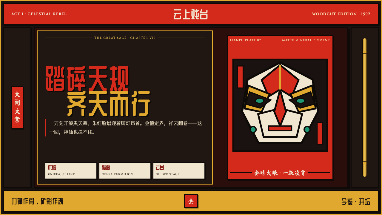 Journey to the West (Monkey King)A god roars off the block. Vermilion opera paint and gilt rules ignite a lacq…
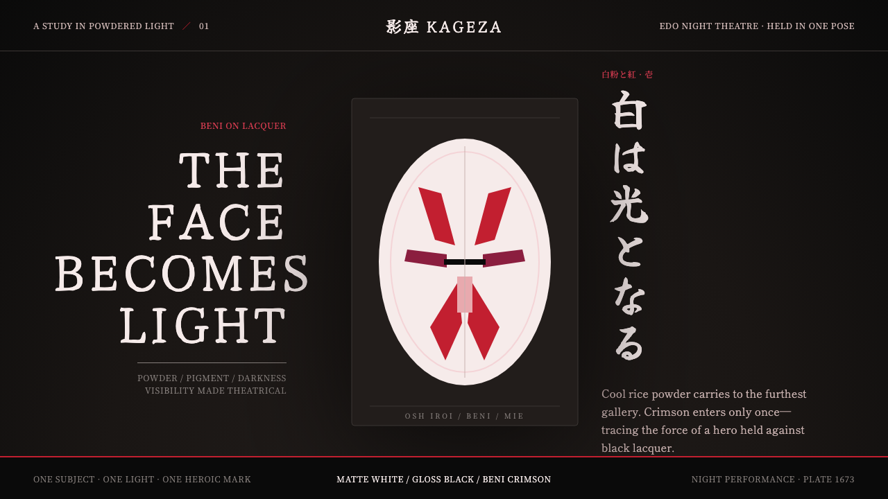 Kabuki Oshiroi WhitefacePowder becomes stage light. Cool white cuts through black lacquer with one he…
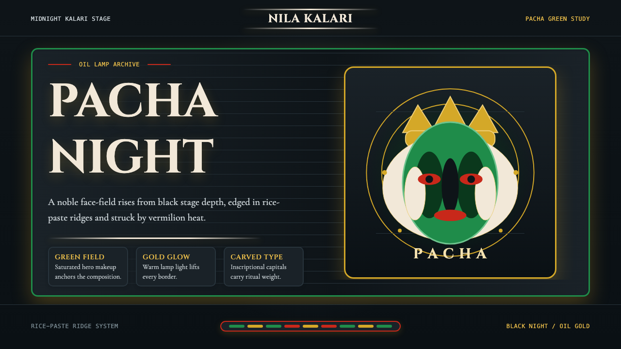 Kerala Kathakali (Pacha Green Makeup)Fierce ceremonial night. Pacha green, vermilion, and oil-gold frame monumenta…
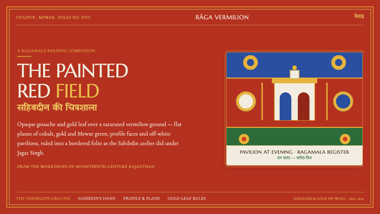 Mewar Rajput MiniatureThe ground is the painting. Vermilion fields, cobalt, gold-leaf rules, profil…
 Mon Hongsa EmblemRepetition outranks the hero. Gold paired emblems tile down a lacquer-red ban…