What is Phags-pa Seal Script?
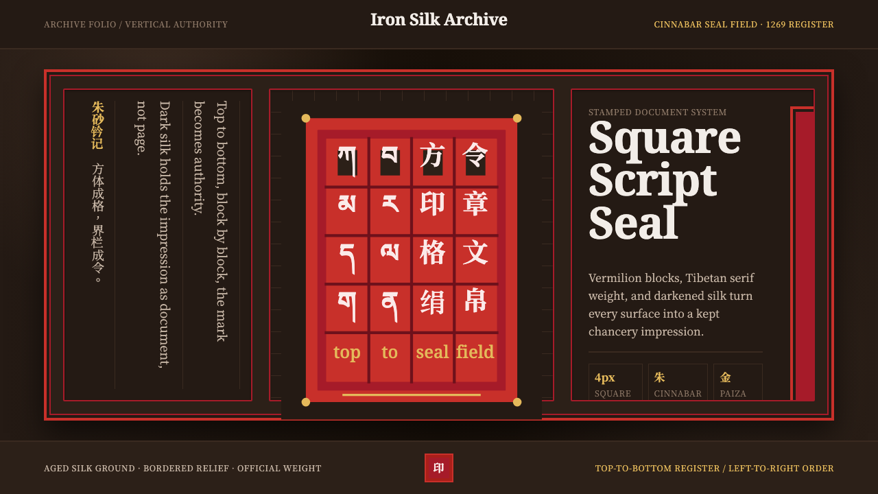
Phags-pa Seal Script reads authority as a stamp, not a page — square blocks of script pressed in cinnabar red against the deep brown of aged silk.
Phags-pa Seal Script in brief
Phags-pa Seal Script is a design system built around the 'Phags-pa alphabet, a square, block-form writing system devised in 1269 by the Tibetan monk Drogön Chögyal Phagpa at the order of Kublai Khan, intended to write every language of the Mongol empire in a single, unified hand. Its glyphs stack into rigid vertical blocks read top-to-bottom and left-to-right — a script that looks less like handwriting and more like architecture, each character a small square building block rather than a flowing stroke.
The system's central visual event is the imperial seal rather than the printed page. On official Yuan-dynasty documents, blocks of 'Phags-pa text were cut in relief and pressed in cinnabar vermilion ink into darkened silk — a red mark that functioned simultaneously as signature, authentication, and sovereign authority. This design language treats every composition the same way: as a stamped document rather than a printed one, with vermilion seal-boxes framing the page and the deep brown of aged silk as the constant ground beneath everything.
Gold appears, but sparingly — a visual echo of paiza, the metal tablets of authority carried by Yuan officials and envoys. Because gold in this system signals imperial sanction specifically, it is never used as a general highlight or decorative accent; it appears only where the composition needs to assert that something carries the emperor's own authority, which keeps its rarity — and therefore its meaning — intact.
Where does Phags-pa Seal Script come from?
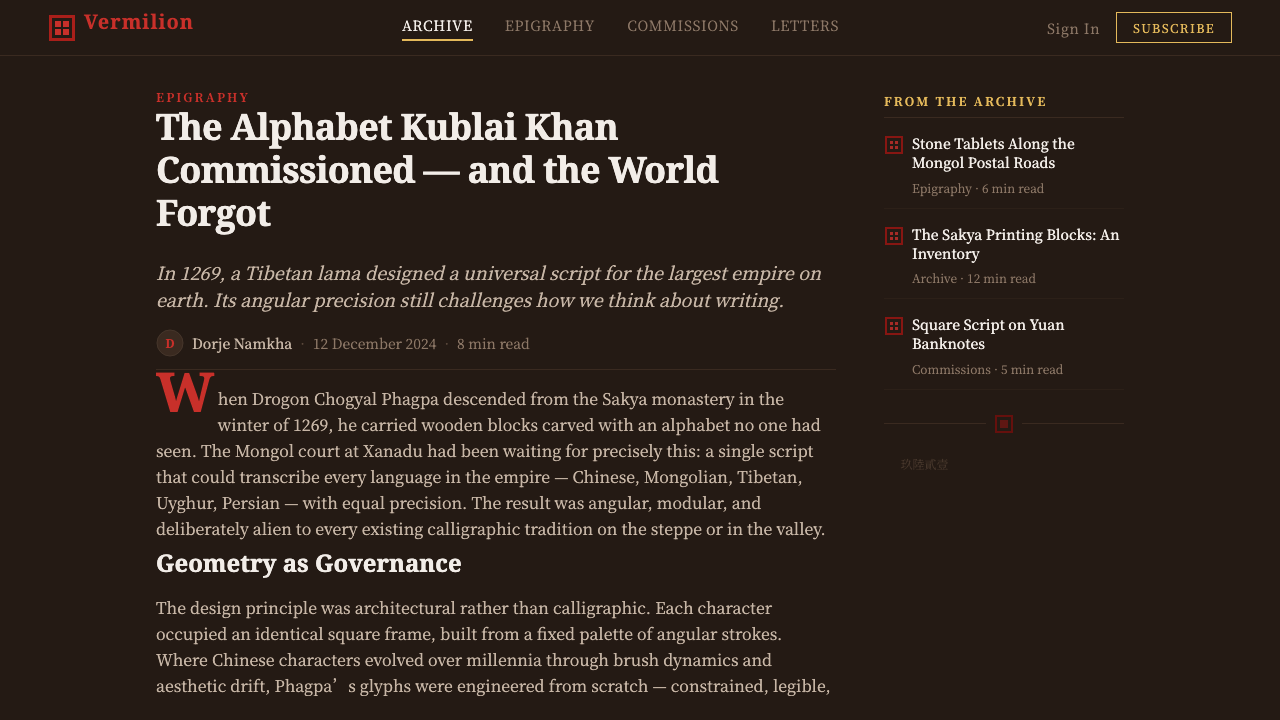
'Phags-pa was created in 1269 at the direct order of Kublai Khan, founder of the Yuan dynasty and grandson of Genghis Khan. The task fell to Drogön Chögyal Phagpa, a Tibetan Buddhist lama who held the position of Imperial Preceptor at the Yuan court — a role combining religious authority with direct influence over imperial policy. Kublai's ambition was strikingly modern in scope: a single script capable of transcribing every language spoken across the vast, multiethnic Mongol empire, from Mongolian and Chinese to Tibetan and Sanskrit, replacing the patchwork of scripts each culture had used independently.
Phagpa built the new alphabet on a Tibetan foundation, itself ultimately descended from Brahmic scripts of the Indian subcontinent, but reshaped its letterforms into a distinctive squared geometry and — notably — switched its writing direction. Where Tibetan is read horizontally, 'Phags-pa was arranged to be written top-to-bottom in vertical columns proceeding left to right, matching the vertical writing convention already used for Mongolian script, so that the new universal alphabet would feel native to the empire's ruling culture even though its letterforms came from a conquered one.
The script entered official use across the Yuan bureaucracy from 1271 onward, appearing on imperial decrees, on paiza — the metal tablets of authority issued to officials and envoys, some cast in gold or gilded silver, granting the bearer access to the empire's postal relay network and other privileges of state — and, centrally to this design system, on Yuan imperial and official seals. Seal-carving itself continued a much older Chinese sigillographic tradition, but 'Phags-pa's blocky square forms gave Yuan seals a distinctly different visual character from the flowing curves of traditional Chinese seal script.
'Phags-pa never fully displaced the scripts it was meant to unify, and it lost its official status when the Yuan dynasty fell in 1368. Its use faded outside specialized or ceremonial contexts thereafter, but the surviving seals, decrees, and paiza it appears on remain some of the most direct physical evidence of Mongol imperial authority — documents and objects where a single stamped mark, rather than a page of prose, carried the full weight of the state.
What defines the Phags-pa Seal Script look?
Color
The ground is the deep, warm brown of aged silk, against which cinnabar vermilion appears as the system's primary accent — the color of an official seal impression, never a decorative red. Gold is reserved even further, used only to signal imperial-grade authority, as on a paiza tablet.
Script and Typography
Letterforms follow the square, block-stacked geometry of 'Phags-pa script — glyphs read as small architectural units rather than flowing calligraphic strokes. Where Latin type is required, it is set to echo that blockiness: squared proportions, vertical emphasis, and a rigid stacking rhythm rather than a cursive one.
Vertical Reading Direction
Composition reads top-to-bottom, columns proceeding left to right, matching the historic writing convention. This vertical logic should govern layout structure generally, not just literal text — hierarchy flows downward within a column before moving to the next.
Seal-Box Framing
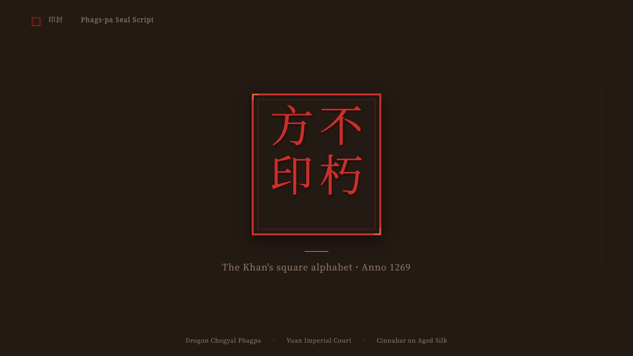
A hard rectangular border, echoing the edge of a carved seal, frames key compositional elements. This framing signals authenticity and finality — the visual equivalent of a document being officially closed by a stamp rather than left open-ended.
Impressed Depth
Rather than flat printed lines, elements suggest the relief of a carved seal pressed into a surface — a slight sense of being stamped or embossed rather than drawn, distinguishing this from an ordinary manuscript or print aesthetic.
Sparing Gold Accent
Gold appears rarely and only at moments of highest significance — echoing the paiza tablets of imperial authority. Its scarcity is what gives it meaning; used liberally, it would read as generic luxury rather than sanctioned power.
Who shaped Phags-pa Seal Script?
The Tibetan Buddhist lama who held the position of Imperial Preceptor at Kublai Khan's court, Phagpa was tasked in 1269 with designing a single script to unify writing across the Mongol empire. His alphabet reshaped Tibetan letterforms into a squared, block-form geometry that gave the script — and everything derived from it — its distinctive architectural character.
Founder of the Yuan dynasty and grandson of Genghis Khan, Kublai commissioned the 'Phags-pa script as part of a broader ambition to administer his vast, multiethnic empire with unified systems. The script's official use on decrees, paiza, and seals reflects his direct imperial patronage — this was never a folk or scholarly invention, but a tool of state.
The craftsmen who cut 'Phags-pa blocks in relief for official Yuan seals worked within a much older Chinese sigillographic tradition, adapting its centuries-old carving techniques to the new script's square geometry. Their work produced the seals whose cinnabar impressions are this design system's most direct visual source.
Officials and envoys of the Mongol postal relay system carried paiza — metal tablets, some in gold or gilded silver, inscribed in 'Phags-pa — as physical proof of imperial authority, granting access to relay stations and state privileges across the empire. Their sparing use of gold is the origin of this system's own restraint with the color.
How do you use Phags-pa Seal Script today?
Phags-pa Seal Script works best wherever a design needs to communicate finality, sanctioned authority, or verified status — the sense that something has been officially stamped rather than merely printed. Applying it well means treating vermilion and gold as events rather than palette choices: red marks completion or authentication, gold marks imperial-grade significance, and neither should be used casually.
On a presentation cover slide, a deep aged-silk brown field with a single vermilion seal-box framing the title, set in squared, block-stacked lettering, reads immediately as an official document rather than a casual deck. Content slides should organize hierarchy in vertical columns rather than horizontal rows where possible, with a single gold accent reserved for the one most important figure or claim on the slide. Data visualizations suit a stamped, diagrammatic quality — think of a chart as something impressed into the page rather than drawn on top of it.
For web interfaces, the system suits products built around certification, credentials, or verified authority — digital signature platforms, compliance dashboards, or premium tiers meant to feel officially sanctioned rather than merely 'upgraded.' A dashboard can use the aged-silk brown as its base surface, vermilion as the color for confirmed or authenticated actions, and gold exclusively for the single highest tier or the platform's own mark of authority. Pricing pages benefit from framing the top-tier plan in a literal seal-box border, signaling it as the option the system itself vouches for.
In editorial and marketing contexts, the style supports content about history, authority, governance, or heritage particularly well. Long-form articles read well with vertical rhythm and seal-box framed pull-quotes; marketing pages can use a single vermilion stamp-like mark beside a call to action as an implicit certificate of legitimacy, provided it appears once rather than repeated as a border pattern.
A common mistake is treating vermilion and gold as a generic 'red and gold' festive palette and using both liberally across a layout — this collapses the system's actual logic, which depends on gold's rarity to carry meaning. Another frequent error is defaulting to horizontal, Latin-style reading rhythm throughout a layout instead of respecting the script's vertical, column-based structure, which undercuts the architectural, stamped quality that distinguishes this style from ordinary East Asian calligraphic aesthetics.
Phags-pa Seal Script — FAQ
Why does the system read top-to-bottom instead of left-to-right?
Because 'Phags-pa itself was deliberately arranged that way — Phagpa matched its writing direction to the vertical convention already used for Mongolian script, so the new universal alphabet would feel native to Yuan imperial culture. Preserving that vertical rhythm in layout is what keeps the style architecturally distinct rather than reading as generic East Asian design.
How much gold should appear in a composition?
Very little, and only at the single most significant point — echoing how paiza, the metal tablets of imperial authority, were rare and reserved for the highest-ranking officials and envoys. If gold appears throughout a layout, it stops signaling special authority and starts reading as generic decoration.
Is this the same as general Chinese seal-script aesthetics?
Related but distinct. Yuan seal-carving continued a much older Chinese sigillographic tradition, but 'Phags-pa's letterforms are square and block-stacked rather than the flowing, curved strokes of traditional Chinese seal script. The result is visually blockier and more architectural — closer to stamped masonry than to brushwork.
Can this style work on a light background instead of dark silk brown?
It can, but the seal-box framing and single vermilion accent should stay the anchor regardless of ground tone — the identity comes from the stamped, framed composition and the restrained red-and-gold logic, not strictly from a dark background. A lighter ground should still read as aged material rather than clean modern white.
What's a common mistake when applying this style?
Using vermilion and gold together liberally as a festive 'red and gold' palette rather than as two separate, rare signals — one for authentication, one for imperial-grade significance. Diluting either color's rarity collapses the accountability logic the entire system is built on.
Related design styles
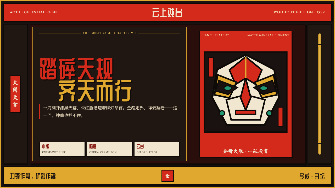 Journey to the West (Monkey King)A god roars off the block. Vermilion opera paint and gilt rules ignite a lacq…
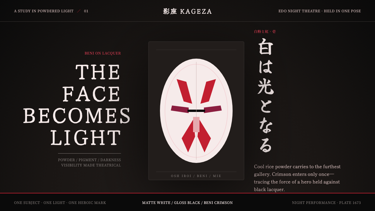 Kabuki Oshiroi WhitefacePowder becomes stage light. Cool white cuts through black lacquer with one he…
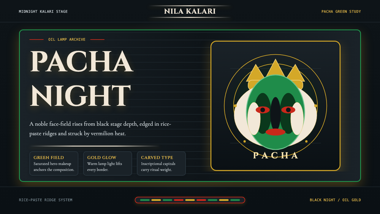 Kerala Kathakali (Pacha Green Makeup)Fierce ceremonial night. Pacha green, vermilion, and oil-gold frame monumenta…
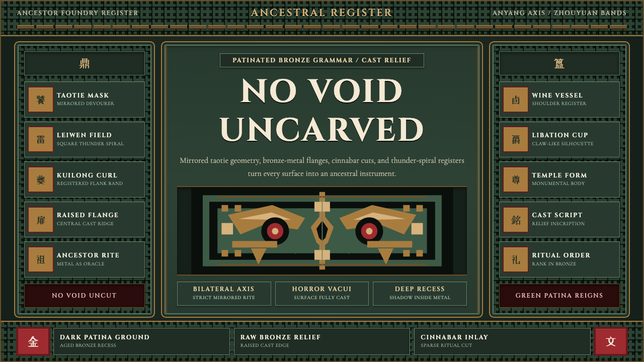 Shang-Zhou Ritual BronzeAncient terror fills every surface. Patina green, bronze relief, mirrored tao…
 Sri Lankan Kandyan Mask & DanceRitual carries weight. Gold serif type and ruby-emerald filigree burn on blac…
 Mewar Rajput MiniatureThe ground is the painting. Vermilion fields, cobalt, gold-leaf rules, profil…