Design style guide设计风格指南
What is Kerala Kathakali (Pacha Green Makeup)?什么是 Kerala Kathakali (Pacha Green Makeup)?
Kerala Kathakali's pacha makeup transforms the face into a living temple sculpture — a visual language of saturated green, flickering vermilion, and oil-lamp gold that has disciplined artists for over four centuries.喀拉拉卡塔卡利的帕查面谱将人脸变为活的庙宇雕塑——一套由饱和绿色、跳动朱砂与油灯金构成的视觉语言,四百年来历经磨砺从未散场。
Kerala Kathakali (Pacha Green Makeup) in briefKerala Kathakali (Pacha Green Makeup) 速览
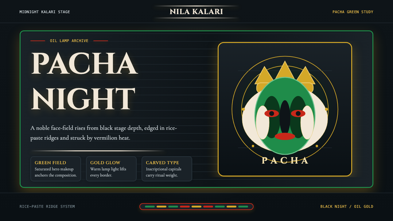
Kerala Kathakali (Pacha Green Makeup) is a design system rooted in the ancient dance-drama tradition of Kerala, India, where performers spend hours applying layers of rice paste, natural pigments, and mineral compounds to transform their faces into elaborate character masks. The pacha — meaning green in Malayalam — face is the highest register of this visual grammar, reserved exclusively for noble heroes and divine kings. Against a stage illuminated only by the warm, unsteady glow of oil lamps, the pacha face radiates with an almost supernatural intensity: deep saturated green fields framed by stark white chutti reliefs, fiery vermilion accents, and gold details that catch and amplify lamplight.喀拉拉卡塔卡利(帕查绿色面谱)是一套植根于印度喀拉拉邦古典舞剧传统的设计系统。表演者耗费数小时,以米糊、天然颜料与矿物质层层叠加,将人脸转化为精密的角色面谱。「帕查」在马拉雅拉姆语中意为绿色,这张绿色面孔是视觉语法中最高级别的表达,专属高贵英雄与神圣君王。在仅靠油灯温热、摇曳的光芒照亮的舞台上,帕查面孔散发出近乎超自然的强烈光泽:深沉饱和的绿色底面,由纯白米糊浮雕边框收束,配以炽烈的朱砂强调与捕捉并放大灯光的金色细节。
As a design language, Kathakali translates this ceremonial intensity into a structured visual system. The governing logic is darkness-as-ground: a near-black background that functions less as emptiness and more as the night sky of a sacred performance space, a canvas that makes every color simultaneously more luminous and more weighted. Against this ground, the pacha green is not decorative but declarative — it announces presence, nobility, and otherness. Vermilion and ochre gold do not soften the composition but sharpen it, functioning as controlled fire within an otherwise monumental and solemn field.作为一套设计语言,卡塔卡利将这种仪式性的强烈感转译为结构化的视觉系统。其核心逻辑是以暗色为地:近乎黑色的背景不是空无,而是神圣演出空间的夜空——一块让每一种颜色同时变得更加明亮、更具分量的画布。在这片底色之上,帕查绿不是装饰性的,而是宣告性的——它昭示着存在、高贵与异质。朱砂与赭金不是用来柔化构图,而是用来锐化它,像受控的火焰燃烧于一片庄严厚重的领域之中。
The typography that complements this system draws from Kerala's stone-carving tradition: forms that are grand, deliberate, and carved rather than drawn. Serifs are not delicate or humanist; they are architectural, echoing the stepped gopuram towers and intricately carved pillars of Keralan temple complexes. The result is a design vocabulary that feels simultaneously ancient and theatrically urgent — impossible to overlook, impossible to mistake for anything else.与这套系统相配的字体源于喀拉拉石刻传统:形态宏大、从容而凿刻而出,而非用笔描绘。衬线不纤细、不人文主义,而是建筑性的,回应着喀拉拉庙宇建筑群中层叠的塔楼与繁密雕刻的石柱。由此形成的设计词汇,同时散发着古老的气息与戏剧的紧迫感——无法忽视,无可混淆。

Where does Kerala Kathakali (Pacha Green Makeup) come from?Kerala Kathakali (Pacha Green Makeup) 从何而来?
Kathakali as a codified performance form emerged in Kerala around the mid-seventeenth century, with its systematization traditionally credited to Kottarakkara Thampuran, a royal patron who reputedly composed some of the earliest Kathakali performance pieces. The form synthesized several older traditions — including Krishnanattam, the devotional dance-drama performed in honor of Krishna at Guruvayur temple, and Ramanattam, an earlier narrative dance form — into a new theatrical language that placed the elaborately costumed and made-up performer at the center of the dramatic experience.卡塔卡利作为一套成文化的表演形式,约在十七世纪中叶于喀拉拉邦成形,其系统化整理传统上归功于皇室赞助人科塔拉卡拉·坦普兰,据说他创作了最早的一批卡塔卡利剧目。这一形式综合了多个更古老的传统——包括在古鲁瓦尤尔庙宇供奉克里希纳的奉献舞剧「克里希纳纳坦」,以及更早期的叙事舞蹈形式「拉玛纳坦」——将其整合成一种以精心装扮的表演者为戏剧体验核心的新剧场语言。
The makeup system itself draws from a much deeper well. The practice of applying rice-paste reliefs and natural-pigment colorings to the face has roots in Kerala's ancient ritual arts, including the Theyyam possession rituals of northern Kerala and the Koodiyattam Sanskrit theater tradition, which UNESCO recognizes as among the oldest continuously performed theater forms in the world. What Kathakali's codifiers did was systematize these practices into a legible character grammar: the pacha face for heroes, the kathi (knife) face for complex antiheroes, the thadi (beard) variants for demons and forest spirits, and the minukku face for women and sages. Each face type maps directly to a moral and dramatic category.面谱系统本身有着更深的渊源。在脸上涂抹米糊浮雕与天然颜料的做法,根植于喀拉拉邦的古代仪式艺术,包括喀拉拉北部的「提雅姆」降神仪式,以及被联合国教科文组织认定为世界上持续演出最久的戏剧形式之一的梵文剧场「库迪亚坦」。卡塔卡利的整理者们所做的,是将这些实践系统化为一套可读的角色语法:英雄用帕查(绿色)面孔,复杂反英雄用卡提(刀)面孔,恶魔与林地精灵用塔迪(胡须)变体,女性与圣人用米努库面孔。每种面孔类型直接对应一个道德与戏剧类别。
The modern revival and international visibility of Kathakali owes a great deal to Vallathol Narayana Menon, the poet and cultural reformer who founded Kerala Kalamandalam in 1930 — now a deemed university and the primary institution for training in Kathakali and other classical Kerala performance arts. Vallathol recognized that Kathakali was at risk of dying out as a living practice: its traditional patron system had collapsed with the decline of the old aristocratic order, and the elaborate training required — a minimum of twelve years of intensive, full-body physical conditioning and makeup study — meant few families could afford to dedicate a child to the art. Kalamandalam created an institutional framework that preserved and formalized the tradition, producing generations of master performers including Kalamandalam Krishnan Nair, who was awarded the Padma Bhushan and remained one of the defining male dancers of the form, and Kalamandalam Gopi, whose interpretations of noble-hero roles became benchmarks for the pacha makeup register.卡塔卡利的现代复兴与国际能见度,很大程度上归功于诗人兼文化改革家瓦拉托尔·纳拉扬纳·梅农。他于1930年创立了喀拉拉卡拉曼达兰——如今是一所认定大学,也是训练卡塔卡利及其他喀拉拉古典表演艺术的主要机构。瓦拉托尔意识到,随着旧贵族赞助体系的瓦解,加之这门艺术所要求的严苛训练——至少十二年全身性体能调适与面谱学习——卡塔卡利正面临失传的危险。卡拉曼达兰建立了一套制度性框架,使这一传统得以保存与规范化,培养出了一代又一代的大师级表演者:卡拉曼达兰·克里希纳·纳伊尔获得帕德玛·布沙纳勋章,是这一形式最具定义性的男性舞者之一;卡拉曼达兰·戈皮对高贵英雄角色的诠释,成为帕查面谱表演的基准。
The design philosophy embedded in Kathakali makeup reflects the Hindu cosmological framework within which the tradition operates. Color in this system is not aesthetic preference but ontological category: green is the color of divine heroism and cosmic order, red signals aggression and moral ambiguity, black marks demonic forces, and white the spiritually elevated or the pure. The rice-paste chutti borders that frame the face are not ornamental additions but load-bearing structural elements — they enlarge the performer's apparent facial surface area to fill the vast open-air performance spaces where Kathakali was traditionally staged, functioning like architectural molding that gives scale and legibility to the face at a distance. Every element of the makeup system serves a communicative function legible to a traditionally informed audience without any verbal explanation.卡塔卡利面谱中蕴含的设计哲学,反映了这一传统所依存的印度教宇宙论框架。这套系统中的色彩不是审美偏好,而是本体论类别:绿色是神圣英雄主义与宇宙秩序的颜色,红色标示攻击性与道德模糊,黑色标记恶魔力量,白色则代表精神升华或纯净。框定面孔的米糊「楚提」边框不是装饰性的添加物,而是承载意义的结构性元素——它们扩大了表演者面部在视觉上的表面积,使其在传统卡塔卡利所在的大型露天演出空间中也能被远处观众清晰辨读,其功能类似于建筑线脚,在远距离给面孔提供尺度与可读性。面谱系统的每一个元素都服务于一个传达功能,对于受传统熏陶的观众而言,无需任何语言解说即可读懂。
What defines the Kerala Kathakali (Pacha Green Makeup) look?Kerala Kathakali (Pacha Green Makeup) 的视觉特征是什么?
Color Field色域
The pacha system operates on a strict color hierarchy with darkness as its foundation. A near-black ground — the ceremonial night of the stage — anchors the entire composition. Against it, the dominant saturated green occupies the broadest fields, declaring heroic presence without competition. Vermilion enters as a focused accent, concentrated at dramatic facial features to signal intensity and vitality. Ochre gold appears at the highest points of detail, functioning like lamplight caught on carved temple surfaces. White is structural rather than neutral: the rice-paste relief borders define the face's outer boundary and create negative-space channels between color fields.帕查系统在以暗色为基础的严格色彩层级中运作。近乎黑色的底色——舞台上仪式性的夜——锚定了整体构图。在此之上,主导性的饱和绿色占据最宽阔的色域,无与竞争地宣告英雄的存在。朱砂作为集中的强调色出现,聚焦于面孔的戏剧性特征,传递强度与活力。赭金仅在细节最高点出现,如同油灯光芒捕捉于庙宇雕刻表面。白色是结构性的而非中性的:米糊浮雕边框定义面孔的外部边界,在各色域之间创造负空间通道。
Darkness as Ground以暗为地
Unlike design systems built on light or neutral backgrounds, the Kathakali visual language treats extreme darkness as a generative field rather than an absence. The black background does not recede behind the composition — it actively amplifies every color placed against it. This governing principle means the system is constitutionally unsuited for pale or washed-out contexts; it requires commitment to depth. The payoff is a visual intensity that cannot be achieved on lighter grounds: colors appear to radiate rather than reflect, giving the design an almost three-dimensional luminosity.与建立在浅色或中性背景上的设计系统不同,卡塔卡利视觉语言将极度的暗色视为生成性的场域而非空缺。黑色背景不是隐退于构图之后,而是主动放大置于其上的每一种颜色。这一核心原则意味着这套系统在结构上不适合苍白或暗淡的语境,它需要对深度的承诺。回报是无法在较浅底色上实现的视觉强度:颜色看起来像是在辐射而非反射,赋予设计一种近乎三维的光泽感。
Monumental Typography碑刻字体
The typefaces that serve this visual system are drawn from Kerala's stone-carving tradition: serifs that are structural and architectural rather than humanist or calligraphic. They share qualities with inscriptional letterforms — weight distributed for visual authority at scale, with details that reward proximity but do not require it to read. These letterforms carry historical gravity without becoming archaic; they assert permanence without stiffness. Large-scale display type in this system functions as a carved declaration, not a typeset sentence.服务于这套视觉系统的字体汲取自喀拉拉石刻传统:衬线是结构性的、建筑性的,而非人文主义或书法风格的。它们与碑铭字形共享某些品质——重量分布赋予尺度上的视觉权威,细节经得起近观,但也不依赖近观才能阅读。这些字形承载历史分量,却不流于陈旧;宣示永恒,却不失于僵硬。这套系统中的大号展示文字,像一句凿刻的宣言,而非一行排版的句子。
Geometric Ornamentation几何装饰
Though intense in its decorative richness, Kathakali's visual vocabulary is governed by geometric discipline. The chutti border systems, the concentric arcs and angular extensions that frame the performer's face, follow rule-based patterning derived from temple architectural ornamentation. Repeated chevrons, interlocking stepped forms, and radially symmetrical accents reflect the same formal logic found in Kerala's wooden ceiling carvings and copper-plate manuscript borders. Ornament is never improvisational; it is always structural — a language of pattern that could theoretically extend infinitely following the same generative rule.尽管装饰极为丰富,卡塔卡利的视觉词汇却受几何纪律支配。楚提边框系统、框定表演者面孔的同心弧线与角度延伸,遵循的是源自庙宇建筑装饰的规则性构型。重复的人字形、相互咬合的台阶形、放射对称的强调,反映的是与喀拉拉木制天花板雕刻及铜版手稿边框相同的形式逻辑。装饰从不即兴,始终是结构性的——一套理论上可以依照同一生成规则无限延伸的图案语言。
Lamplight and Flicker灯焰与跳动
Traditional Kathakali was performed by lamplight — the kalivilakku, a tall bronze oil lamp — which gave all colors a warmth, variability, and directional specificity impossible to replicate with fixed electric light. The design system honors this by incorporating gold and ochre tones not as flat accent colors but as evocations of that living, shifting luminosity. Gradients in this context are not the smooth digital gradients of contemporary UI; they are the organic luminance variations of oil-lamp reflection — subtle, warm, and directional.传统的卡塔卡利在灯光下演出——一种高挑的铜质油灯卡利维拉库——给所有颜色带来一种固定电灯无法复现的温度、可变性与方向感。这套设计系统通过将金色与赭色处理为对那种活的、流动的光泽的唤起,而非平面强调色,来向这一传统致敬。这个语境中的渐变,不是当代界面设计中光滑的数字渐变,而是油灯反射的有机亮度变化——微妙、温暖而有方向感。
Bilateral Symmetry双侧对称
Kathakali makeup and its design derivatives operate on strict bilateral symmetry as the default compositional principle — a reflection of the tradition's roots in ritual and temple art, where symmetry signals divine order and cosmic balance. Unlike the dynamic asymmetry of Western modernist design, Kathakali-derived layouts tend toward centered, mirrored structures that communicate stability and authority. Asymmetry is the exception, deployed deliberately to signal disruption or transition rather than as a baseline compositional preference.卡塔卡利面谱及其设计派生物以严格的双侧对称作为默认的构图原则——这反映了这一传统植根于仪式和庙宇艺术的本质,在那里,对称意味着神圣秩序与宇宙平衡。与西方现代主义设计的动态非对称不同,卡塔卡利衍生版面倾向于居中、镜像的结构,传递稳定感与权威感。非对称是例外,经刻意运用,用于标示断裂或转变,而非作为基本构图偏好。
Ritual Layering仪式层叠
The Kathakali makeup process requires between four and eight hours of careful, sequential layering — each stage chemically and formally prerequisite to the next. This logic of ritual layering translates into design as compositional depth: backgrounds, mid-ground structural elements, and foreground details occupy distinct planes, each legible in isolation but collectively producing an effect of density and intricacy that no single-plane composition can achieve. The depth is not illusionistic; it is structural, readable as distinct layers even at a glance.卡塔卡利面谱的涂抹过程需要四到八小时的逐层叠加——每一阶段在化学与形式上都是下一阶段的前提。这种仪式性叠加的逻辑,在设计中转化为构图深度:背景、中景结构元素与前景细节各占独立的平面,每层单独可读,合力却产生出任何单平面构图都无法实现的密度与繁复效果。这种深度不是幻觉性的,而是结构性的,一目之下即可辨出各个独立层次。

Who shaped Kerala Kathakali (Pacha Green Makeup)?谁塑造了 Kerala Kathakali (Pacha Green Makeup)?
A seventeenth-century Kerala prince and patron credited with foundational contributions to codifying Kathakali as a distinct performance form. He is traditionally regarded as the composer of the Ramanatham, an early narrative cycle that helped establish the dramatic structures and character typology — including the pacha hero archetype — that would define Kathakali for subsequent centuries. His patronage represented the aristocratic support system without which the tradition's elaborate training and costuming demands could not have been met.十七世纪的喀拉拉王子与赞助人,被认为对卡塔卡利作为独特表演形式的成文化做出了奠基性贡献。他传统上被视为《罗摩纳坦》的创作者——这一早期叙事组曲帮助确立了戏剧结构与角色类型学,包括帕查英雄原型,并为此后数个世纪的卡塔卡利定下格局。他的赞助代表了贵族赞助体系,若无这一体系,这一传统所需的繁复训练与服装装扮便无从实现。
The poet and cultural reformer who founded Kerala Kalamandalam in 1930, saving Kathakali from near-extinction by creating an institutional training framework to replace the collapsed traditional gurukula patronage system. Vallathol recognized that Kathakali's survival required both institutional support and cultural reframing — presenting it not as folk entertainment but as a classical art form worthy of serious study and international attention. His advocacy directly led to Kathakali's recognition as a major Indian classical art and to its international touring visibility in the mid-twentieth century.诗人兼文化改革家,1930年创立喀拉拉卡拉曼达兰,以制度化训练框架取代已瓦解的传统古鲁库拉赞助体系,将卡塔卡利从近乎失传的边缘拯救出来。瓦拉托尔意识到卡塔卡利的存续需要制度支撑与文化重塑——将其呈现为值得认真研究与国际关注的古典艺术形式,而非民间娱乐。他的倡导直接促成了卡塔卡利被认定为重要的印度古典艺术,并推动了它在二十世纪中叶的国际巡演能见度。
One of the twentieth century's defining Kathakali performers, particularly celebrated for his portrayal of heroic pacha-makeup roles. A product of the Kalamandalam training system, he was awarded the Padma Bhushan — one of India's highest civilian honors — in recognition of his contributions to the form. His interpretations set technical and expressive standards that subsequent generations of performers trained against, and his decades of performance consolidated the visual and gestural vocabulary of the pacha hero as it is understood today.二十世纪最具定义性的卡塔卡利表演者之一,尤以饰演帕查面谱英雄角色著称。出自卡拉曼达兰训练体系,因其对这一艺术形式的贡献获授印度最高平民荣誉之一帕德玛·布沙纳勋章。他的诠释为后代表演者确立了技术与表现力的标准,数十年的演出生涯巩固了帕查英雄的视觉与肢体语汇,使之成为今日所理解的样貌。
A Kalamandalam-trained master performer whose interpretations of noble-hero roles — particularly figures from the Mahabharata and Ramayana — became benchmark readings of the pacha makeup's expressive possibilities. His performances are noted for the precision with which he uses the elaborately made-up face's limited range of visible movement — the eyes, eyebrows, and cheek muscles — to convey complex emotional and dramatic states. His work demonstrates the design logic of the pacha system at its most refined: constraint producing intensity rather than limiting it.卡拉曼达兰培养的大师级表演者,其对高贵英雄角色的诠释——尤其是《摩诃婆罗多》与《罗摩衍那》中的人物——成为帕查面谱表现力可能性的基准读本。他的演出以一种精准著称:在精心妆扮的面孔有限的可见运动范围内——眼睛、眉毛与面颊肌肉——传递复杂的情感与戏剧状态。他的工作展示了帕查系统在最精炼状态下的设计逻辑:约束带来强度,而非限制强度。
How do you use Kerala Kathakali (Pacha Green Makeup) today?今天怎么用 Kerala Kathakali (Pacha Green Makeup)?
Applying the Kathakali pacha system requires genuine commitment to its core inversion: darkness is the ground, not the figure. This is not a style that works at half-measure on a white or light background. The system's full visual logic only activates when the foundation is deep and absorptive — a near-black or very deep navy that makes the saturated green feel luminous rather than heavy, and lets gold accents register as light rather than decoration. Designers who attempt to port the color palette onto a pale background will find the system's distinctive intensity dissolves into something merely colorful.运用卡塔卡利帕查系统,需要对其核心倒置真正承诺:暗色是地,而非图。这不是一种在白色或浅色背景上减半使用就能奏效的风格。这套系统完整的视觉逻辑,只有在底色深沉而吸收时才会激活——近乎黑色或极深的深蓝,能让饱和绿色显得明亮而非沉重,让金色强调像光而非装饰。试图将色板移植到浅色背景上的设计师会发现,系统独特的强度消散为仅仅是色彩丰富。
For presentation slides, the Kathakali system is ideally suited to cover slides that need to command a room — keynote openers, section dividers, executive briefings where immediate authority matters. A cover built on this system uses the full dark ground, places the title in monumental serif type at substantial scale, and reserves the saturated green for a single structural element — a framing block, a geometric border, or a category label — that anchors the composition without competing with the text. Content slides should be handled with greater restraint: dark background maintained, but color reduced to a single accent tier (green or gold, not both simultaneously), with body text in a warm near-white that reads cleanly against the dark ground. Data slides work exceptionally well when chart elements are rendered in the pacha palette against a dark field, creating a visual quality reminiscent of illuminated manuscript illustration.对于演示文稿,卡塔卡利系统最适合需要掌控全场的封面页——主题演讲开场、章节分隔页、即时权威感至关重要的高管简报。基于这套系统构建的封面,使用完整的深色底,以碑刻衬线大字放置标题,将饱和绿色保留给单一结构元素——一个框架色块、一道几何边框或一个类别标签——锚定构图而不与文字竞争。内容页应以更大的克制处理:保持深色背景,但将色彩减少到单一强调层级(绿色或金色,不同时使用两者),正文用温暖的近白色,在深色底上读取清晰。当图表元素以帕查色板渲染于深色底上时,数据页表现极为出众,产生出一种令人联想到彩绘手稿插图的视觉质感。
For web interfaces and dashboards, the Kathakali system is best deployed in contexts where gravitas and cultural distinctiveness are deliberate signals — premium product showcases, cultural institution websites, portfolio sites for performance or visual arts, heritage brand identities. Dashboard implementations should maintain the dark ground as the primary surface, using the saturated green for active states and primary data series, vermilion for alerts or high-priority indicators, and gold for completion states or success signals. Navigation elements should be typographically bold and architecturally structured — the system does not accommodate light or ghost UI elements without losing its essential character. Pricing pages can use the color hierarchy to create tier differentiation: the highest tier rendered in the full pacha combination, lower tiers in progressively reduced color intensity.对于网页界面与仪表板,卡塔卡利系统最适合那些庄重感与文化独特性是刻意信号的场景——高端产品展示、文化机构网站、表演或视觉艺术的作品集网站、文化遗产品牌识别。仪表板实现应将深色底维持为主要表面,以饱和绿色用于激活状态和主要数据系列,朱砂用于警示或高优先级指标,金色用于完成状态或成功信号。导航元素应在字体上粗壮有力,在结构上具有建筑感——这套系统无法容纳轻巧或幽灵式界面元素,否则就会失去其本质特征。定价页可用色彩层级来创造等级区分:最高等级以完整的帕查组合呈现,较低等级以递减的色彩强度呈现。
For editorial and marketing work, the Kathakali system is a powerful vehicle for cultural storytelling and premium positioning. Long-form editorial layouts should treat the dark ground as a canvas, using pull quotes set in monumental serif type at large scale as visual anchors, with the green reserved for thematic callouts and the gold for ornamental section markers. Marketing materials benefit from the system's inherent poster-logic: high contrast, immediate legibility at distance, and a visual temperature that reads as both ancient and contemporary — particularly effective for festival promotion, performing arts marketing, luxury cultural tourism, and any brand that wants to communicate heritage without nostalgia. The style's bilateral symmetry makes it especially well-suited to cover designs and hero-section layouts where centered composition signals formality and ceremony.对于编辑与营销内容,卡塔卡利系统是文化叙事与高端定位的有力载体。长篇编辑版面应将深色底视为画布,以大字号碑刻衬线排版的引语作为视觉锚点,绿色保留给主题性引述,金色用于装饰性章节标记。营销物料受益于这套系统内在的海报逻辑:高对比度、远距离即时可读、视觉温度既古老又当代——对于节庆推广、表演艺术营销、奢华文化旅游,以及任何希望传达传承而非怀旧的品牌,尤为有效。这种风格的双侧对称使其特别适合封面设计与英雄区版面,在那里,居中的构图传递正式与仪式感。
A common mistake when working with this system is treating the saturated green as a background color rather than a foreground declaration. Authentic pacha-system compositions use the green at full saturation only in contained fields — a header block, a category badge, a structural panel — never as a full-page wallpaper. Similarly, the gold and vermilion accents are most powerful when used sparingly; filling large areas with either color dilutes the lamplight-flicker logic that gives them their intensity. The visual system is built on scarcity and contrast: the more restraint applied to the accent colors, the more luminous each appearance becomes.使用这套系统时常见的错误,是将饱和绿色当作背景色而非前景宣言。真实的帕查系统构图,只在有限的色域中以全饱和度使用绿色——一个标题色块、一枚类别徽章、一个结构面板——从不作为整页的底色铺满。同样,金色与朱砂强调色在节制使用时最具力量;将大面积区域填满任一颜色,都会稀释赋予其强度的灯焰跳动逻辑。这套视觉系统建立在稀缺与对比之上:对强调色的约束越强,每一次出现就越明亮。
Kerala Kathakali (Pacha Green Makeup) — FAQKerala Kathakali (Pacha Green Makeup) · 常见问题
Does this system work for products with Western audiences unfamiliar with Kathakali?这套系统适用于对卡塔卡利不熟悉的西方受众产品吗?
The visual system communicates independently of Kathakali knowledge — the dark-ground, saturated-green, gold-accent logic reads as ceremonial, premium, and theatrically intense to any viewer, regardless of cultural background. What changes between culturally informed and uninformed audiences is depth of resonance, not basic legibility. A viewer who knows Kathakali will read the green as specifically heroic and divinely ordered; a viewer who does not will read it as dramatically bold and richly storied. Both readings are valid, and both produce the intended emotional register of authority and intensity. The system is therefore cross-cultural in its application, though its specific references reward cultural proximity.这套视觉系统可以独立于卡塔卡利知识之外传达——深色底、饱和绿色、金色强调的逻辑,对任何观者而言都读作仪式性的、高端的、戏剧化强烈的,无论其文化背景。在有文化背景与没有文化背景的观众之间变化的,是共鸣的深度,而非基本的可读性。了解卡塔卡利的观者会将绿色读作特定的英雄性与神圣秩序;不了解的观者则会将其读作戏剧性的大胆与丰富的故事积淀。两种解读都是有效的,都能产生预期的权威与强烈的情感基调。因此这套系统在应用上具有跨文化性,尽管其特定指涉对文化亲近者更有回报。
How does this style differ from other dark-background, jewel-tone design systems?这种风格与其他深色背景、宝石色调设计系统有什么区别?
The key differentiators are the structural role of white and the geometric discipline of ornamentation. Many dark-background jewel-tone systems use rich colors as decorative wallpaper against a dark void. The Kathakali system is more architecturally precise: white functions as a load-bearing structural element (the chutti-border logic), creating channels and boundaries between color fields rather than appearing as text-on-dark. The geometric ornamentation follows rule-based, repeating systems derived from temple architecture — not organic, flowing, or freely expressive decoration. And the bilateral symmetry preference distinguishes it sharply from the dynamic asymmetry of most contemporary dark-mode UI systems.关键区别在于白色的结构性角色与装饰的几何纪律。许多深色背景宝石色调系统将丰富色彩作为装饰性底色铺设于暗色虚空之上。卡塔卡利系统在建筑感上更为精准:白色作为承重的结构性元素发挥作用(楚提边框逻辑),在色域之间创造通道与边界,而非仅仅以深色背景上的文字形式出现。几何装饰遵循源自庙宇建筑的规则性、重复性系统——不是有机的、流动的或自由表达的装饰。双侧对称的偏好也使其与大多数当代深色模式界面系统的动态非对称明确区分。
Can this system accommodate color-blind users or accessibility requirements?这套系统能否适应色盲用户或无障碍要求?
The system's reliance on the green-red contrast between pacha green and vermilion presents challenges for users with red-green color blindness, which is the most common form. The standard mitigation is to ensure that the pacha green and vermilion never carry meaning as the sole differentiator — any distinction conveyed by color should also be conveyed by form, pattern, or typographic weight. The system's dark ground provides strong luminance contrast for text legibility, which actually aids accessibility. The gold tones are the most universally legible accent in the palette, as they contrast sharply with both the dark ground and the saturated green across most color-vision variations.这套系统对帕查绿与朱砂之间绿红对比的依赖,对红绿色盲用户(最常见的色盲类型)带来挑战。标准的缓解方法是确保帕查绿与朱砂永不作为唯一的区分标识符——任何通过颜色传达的区分,都应同时通过形态、图案或字体字重来传达。这套系统的深色底为文字可读性提供了强烈的亮度对比,实际上有助于无障碍访问。金色调在整套色板中是普遍可读性最强的强调色,因为在大多数色觉变异中,它与深色底和饱和绿色都形成鲜明对比。
Is this style appropriate for light or playful brand contexts?这种风格适合轻快或趣味性的品牌语境吗?
This is among the more ceremonially weighted design systems in the Curio library — its emotional register is gravity, intensity, and formal authority rather than warmth, playfulness, or accessibility. It is well-suited to contexts where the product wants to signal heritage, craft mastery, cultural depth, or premium positioning. It is poorly suited to children's products, casual consumer apps, food and beverage brands seeking approachability, or any context where lightness and friendliness are the primary emotional targets. Attempting to soften the system — introducing pastel variants, reducing contrast, adding informal typefaces — will typically produce incoherence rather than adaptation, because the system's logic depends on its extremes.这是库里诺设计库中仪式感最重的设计系统之一——其情感基调是庄重、强烈与正式的权威,而非温暖、趣味或亲和。它非常适合希望传达文化传承、工艺精湛、文化深度或高端定位的产品场景。它不适合儿童产品、休闲消费应用、寻求亲和力的食品饮料品牌,或任何轻快与友好是主要情感目标的场景。试图柔化这套系统——引入粉蜡笔色变体、降低对比度、添加非正式字体——通常会产生混乱而非适应,因为这套系统的逻辑依赖于其极端性。
How should this style handle motion and animation?这种风格应如何处理动效与动画?
The Kathakali tradition has a deep relationship with deliberate, controlled movement — every gesture in classical Kathakali performance is codified and carries specific meaning, and rapid or improvised movement is antithetical to the form. This logic translates into animation principles: transitions should be measured, weighted, and intentional rather than quick, bouncy, or playful. Reveals should feel like curtains drawing back or lamps being lit — slow enough to build anticipation, weighted enough to feel consequential. Micro-interactions should be precise and minimal: a state change is a declaration, not an animation opportunity. The system does not accommodate kinetic playfulness; it rewards dignified restraint.卡塔卡利传统与从容、受控的运动有着深刻的关系——古典卡塔卡利表演中的每一个手势都经过成文化处理并承载特定含义,快速或即兴的动作与这一形式格格不入。这种逻辑转译为动效原则:过渡应当是从容的、有分量的、刻意的,而非快速的、弹跳的或趣味化的。揭示感应当像幕帘拉开或油灯点燃——足够缓慢以积蓄期待,足够厚重以感受到后果。微交互应精准而克制:一次状态变化是一次宣告,而非一个动画机会。这套系统不容纳动感的趣味性;它奖励有尊严的克制。
Related design styles相关设计风格
 Sri Lankan Kandyan Mask & DanceRitual carries weight. Gold serif type and ruby-emerald filigree burn on blac…仪式自带重量:金色衬线与红绿银饰在黑漆上燃亮。
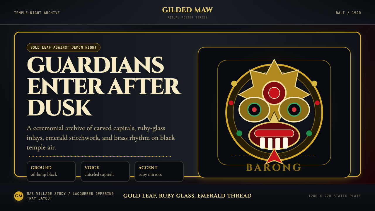 Balinese Barong Mask (1920)Protection glows after dark. Cinzel capitals frame gold, ruby, and emerald ge…守护在夜色中发光:Cinzel碑刻字围住金、红宝石与翡翠几何。
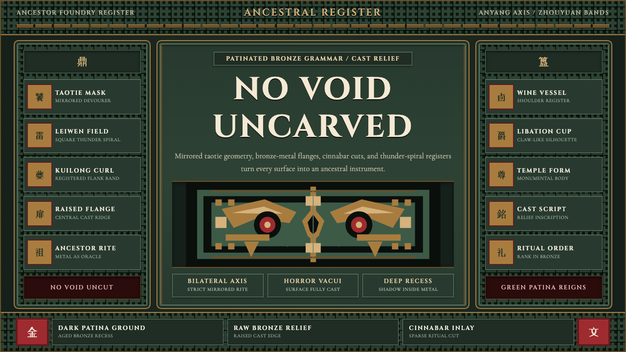 Shang-Zhou Ritual BronzeAncient terror fills every surface. Patina green, bronze relief, mirrored tao…古老森严填满表面:铜绿底、青铜浮雕与镜像饕餮锁住网格。
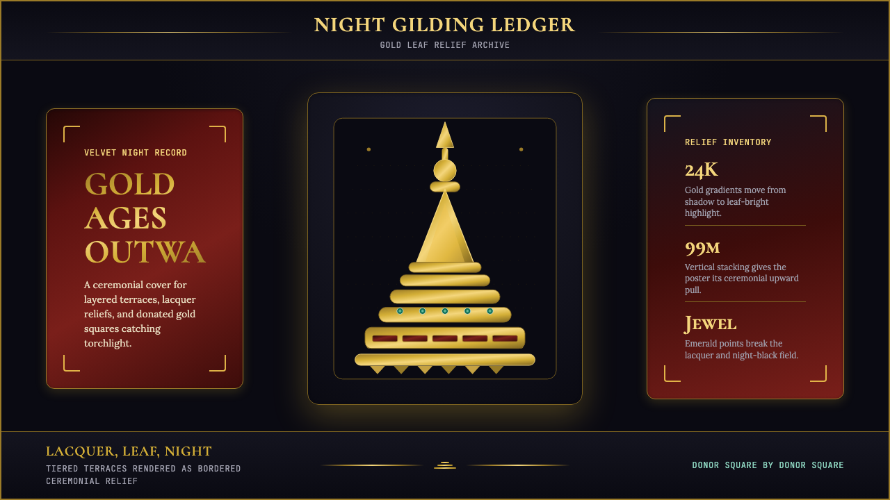 Burmese Shwedagon Stupa ReliefGold refuses restraint. Velvet black, teak-red lacquer, and tiered gradients…金色拒绝克制:黑夜、柚木红漆与层叠渐变堆出神圣密度。
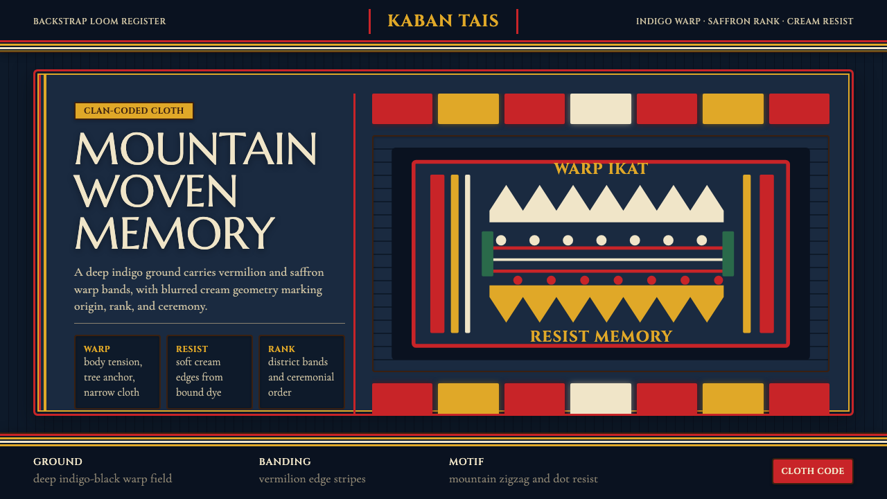 Timorese Tais (Backstrap Loom)Identity woven in darkness. Indigo ground, vermilion bands, saffron stripes,…暗色中织出身份。靛蓝黑底、朱砂与藏红花条纹、米白晕边。
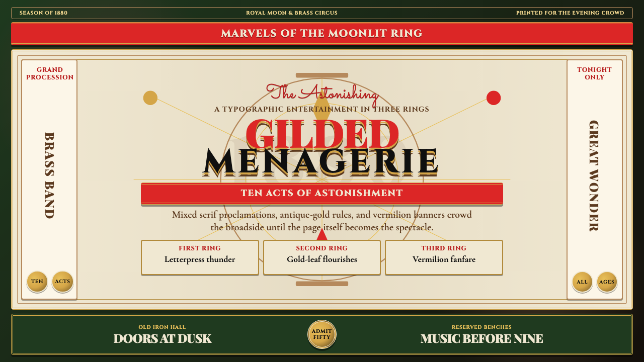 Victorian Circus Poster (1880)Spectacle leaves no inch quiet. Forest green, antique gold borders, mixed ser…寸寸皆戏。深林绿、古金双线、混排衬线与朱红横幅。