What is Victorian Circus Poster (1880)?什么是 Victorian Circus Poster (1880)?
Victorian circus posters from the 1880s packed every square inch with layered type, gold-leaf flourishes, and ink-saturated color — turning the street corner into a theatre.1880年代的维多利亚马戏团海报将每一寸画面塞满层叠字体、金箔卷草与饱和色墨——把街角变成一座剧场。
Victorian Circus Poster (1880) in briefVictorian Circus Poster (1880) 速览
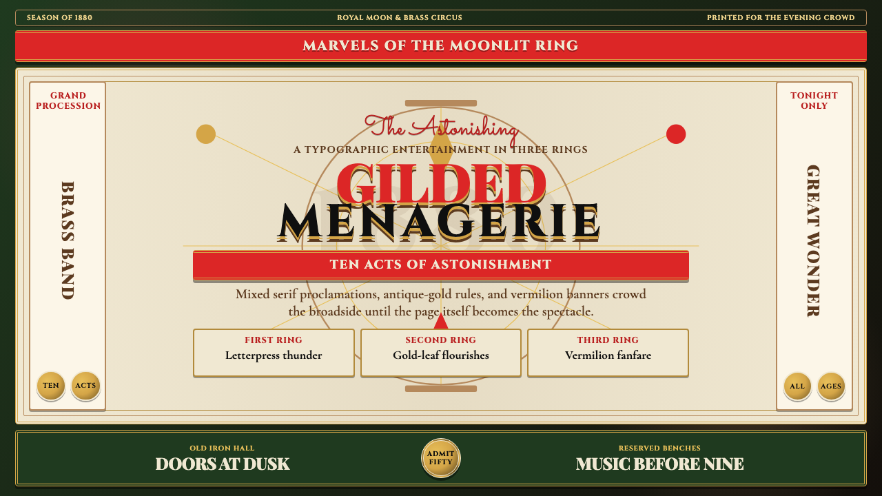
Victorian Circus Poster (1880) is a design language drawn from the broadside lithography tradition that dominated American and British popular entertainment advertising between roughly 1860 and 1900. Its visual hallmarks are deep, jewel-saturated grounds — forest green, midnight blue, or burgundy — overlaid with antique gold ornamental borders, stacked headline type in mixed serif weights, and bold vermilion or scarlet sash banners that cut diagonally or horizontally across the composition. Everything competes for attention, and that competition is precisely the point.维多利亚马戏团海报(1880)是一套源自宽幅石版印刷传统的设计语言,这一传统在约1860至1900年间主导了美英两国大众娱乐的广告形式。其视觉标志是深邃的宝石饱和色底面——森林绿、午夜蓝或勃艮第酒红——上面叠印着古金装饰边框、混排衬线字重的堆叠标题,以及斜切或横穿画面的朱红色或深红色横幅缎带。每一个元素都在争夺注意力,而这种竞争正是这门语言的核心所在。
Unlike austere modernist traditions that prize silence and negative space, the Victorian circus poster treats every blank area as a missed opportunity. Woodcut display faces alternate with swash italics and condensed slab serifs within a single headline; ornamental rules and corner flourishes frame interior panels; tiny woodcut vignettes of acrobats or exotic animals fill gaps between text columns. The result is maximalist in the purest sense — not chaotic, but orchestrated cacophony. There is a visual hierarchy, but it is theatrical rather than rational: the most spectacular claim commands the largest type.与推崇留白与静默的简约现代主义传统截然不同,维多利亚马戏团海报将每一处空白都视为错失的机会。木刻展示字体与花体斜体、紧缩粗衬线字并排出现在同一行标题中;装饰性线条与角落花饰将内部版块框起;杂技演员或奇珍异兽的小型木刻插图填满文字栏之间的空隙。结果是最纯粹意义上的极繁主义——不是混乱,而是精心编排的喧嚣。视觉层级是存在的,但它是戏剧性的而非理性的:最壮观的宣称占据最大的字号。
This aesthetic carries unmistakable emotional associations. It signals spectacle, rarity, and the promise of something genuinely extraordinary. Applied today, it evokes nostalgia, craftsmanship, and an almost defiant exuberance — the sense that the thing being advertised is worth shouting about. In digital contexts, the style translates through layered texture, hard drop shadows reminiscent of letterpress impression, aged paper or canvas ground tones, and ornamental framing devices that echo Victorian engraving.这种美学承载着无可混淆的情感联想:它传递奇观、稀有感与某种真正非凡之物的期许。今天再次运用这套语言,它唤起怀旧感、手工艺价值,以及一种近乎无所顾忌的昂扬热情——让人感到被广告的事物确实值得大声宣告。在数字语境中,这种风格通过分层肌理、模仿凸版印刷重压感的硬边投影、做旧的纸张或帆布底色,以及呼应维多利亚版画传统的装饰框架元素来实现。
See the Victorian Circus Poster (1880) design system查看 Victorian Circus Poster (1880) 完整设计系统
Where does Victorian Circus Poster (1880) come from?Victorian Circus Poster (1880) 从何而来?
The Victorian circus poster emerged from the collision of two technologies: the steam-powered press and chromolithography. Before the 1840s, theatrical bills were single-color letterpress productions, largely typographic and modest in scale. The introduction of steam printing dramatically increased output capacity, while chromolithography — the technique of building a color image from multiple separately inked stones — made it possible to produce posters with six, twelve, or even thirty-six colors at commercial scale. The result was a visual arms race among competing circuses and variety halls: each season's bills had to be louder, more colorful, and more compositionally extravagant than the last.维多利亚马戏团海报诞生于两种技术的碰撞:蒸汽印刷机与彩色石版印刷术。1840年代以前,戏院广告多是单色凸版印刷品,以文字为主,尺幅有限。蒸汽印刷机的引入大幅提升了产能,而彩色石版术——通过多块分别上墨的石版层叠构建彩色图像的技术——使得以六色、十二色乃至三十六色商业规模印刷海报成为可能。由此引发了竞争马戏团与综艺剧院之间的视觉军备竞赛:每一季的广告单必须比上一季更响亮、色彩更丰富、构图更奢华。
The dominant force in American circus lithography was the Strobridge Lithographing Company, founded in Cincinnati, Ohio, in 1867 by Hines Strobridge. From their factory on the north side of Cincinnati, Strobridge's craftsmen produced the broadsides for nearly every major American circus over the following four decades, including Barnum and Bailey's Greatest Show on Earth, Adam Forepaugh and Sells Brothers, and the Ringling Bros. Circus. At their peak, Strobridge employed hundreds of stone grinders, color-separation artists, and press operators; a single large-format poster might require thirty-six stones, one for each color layer, with each stone hand-drawn by a specialized lithographic artist. The company's output defined what a circus poster looked like for an entire generation.美国马戏团石版印刷的主导力量是斯特罗布里奇石印公司,由海恩斯·斯特罗布里奇于1867年在俄亥俄州辛辛那提创立。从辛辛那提北区的工厂出发,斯特罗布里奇的工匠们在随后四十年间为几乎所有美国主要马戏团制作宽幅海报,包括巴纳姆与贝利的「世上最伟大的演出」、亚当·福里波与塞尔斯兄弟马戏团以及林林兄弟马戏团。全盛时期,斯特罗布里奇雇用了数百名石版研磨工、色彩分色艺术家与印刷机操作员;一张大幅海报可能需要三十六块石版,每种颜色各一块,每块石版均由专业石版艺术家手工描绘。公司的出品为整整一代人定义了马戏团海报的面貌。
In Britain and Europe, a parallel tradition developed through London's leading theatrical lithographers and, later, Parisian ateliers. British bills tended toward denser typographic composition, influenced by the woodcut broadside tradition, while French posters — particularly those produced for the Cirque Fernando and later the Cirque d'Hiver — began incorporating the looser, more illustrative sensibility that would eventually flow into Art Nouveau. Buffalo Bill Cody's Wild West Show, which toured Europe extensively in the late 1880s and 1890s, brought American-style maximalist lithography to British and Continental audiences, cross-pollinating the two traditions.在英国与欧洲,一套平行传统经由伦敦顶级戏院石印商、后经巴黎工坊发展而成。英国广告单受木刻宽幅印刷传统影响,倾向于更密集的文字构图;而法国海报——尤其是为费尔南多马戏团及后来的冬季马戏团制作的那些——开始融入更宽松、更富插图感的表达方式,这种倾向最终流入新艺术运动。水牛比尔·科迪的西部荒野秀在1880至90年代大量巡回欧洲,将美式极繁主义石版印刷带给了英国与欧洲大陆的观众,使两种传统产生交叉授粉。
The posters were designed to be pasted in stacks — a single wall might carry six or eight sheets tiled together to form an image several feet wide. This pasting tradition shaped the design logic: each individual sheet had to read as a complete unit from a distance, while also contributing to the larger composite image. Colors were chosen for maximum legibility at distance and in low light, which explains the preference for deep, high-contrast grounds with bright metallic and warm accent colors. The bills were typically replaced weekly during a circus's run, meaning designers and printers operated under intense production pressure and developed a vocabulary of reusable ornamental elements — stock borders, standard vignettes, interchangeable headline blocks — that could be rapidly assembled and varied.这些海报被设计为分层张贴——一面墙上可能贴有六到八张拼合而成、宽达数英尺的整体图像。这种张贴传统塑造了设计逻辑:每张单独的纸张必须在远处读来是一个完整单元,同时也要与更大的拼合图像相融合。色彩的选取以在远处和弱光条件下的最高可读性为标准,这正是海报偏好深邃高对比度底面搭配明亮金属色与暖调强调色的原因。广告单通常在马戏团演出期间每周更换一次,这意味着设计师和印刷商在极强的生产压力下工作,由此发展出一套可复用装饰元素词汇库——库存边框、标准小插图、可互换的标题版块——以便快速拼装与变化。
What defines the Victorian Circus Poster (1880) look?Victorian Circus Poster (1880) 的视觉特征是什么?
Color Palette色彩体系
The ground is typically a saturated dark tone — deep forest green, oxblood red, midnight blue, or a warm near-black — chosen to make the overprinted colors sing with maximum brilliance. Against this ground, antique gold and bright warm yellow carry the ornamental layer; vermilion or scarlet red commands the most urgent call-to-action banners; cream and off-white handle legible body text. The overall effect is of saturated, slightly aged richness rather than the clean brightness of modern primary palettes. Every color is pushed toward warmth and density.底色通常是一种饱和的深色调——深森林绿、牛血红、午夜蓝或一种温暖的近黑色——以便让叠印于其上的色彩以最大亮度呈现。在这一底色之上,古铜金与明亮暖黄承载装饰层;朱红或深红主导最迫切的行动号召横幅;奶油与米白处理正文的可读性。整体效果是饱和而略带岁月沉淀感的富丽,而非现代主色板那种清洁明亮。每一种颜色都被推向温暖与厚重。
Typography字体排印
Mixed serif hierarchy is the defining typographic characteristic. A single poster might deploy three or four distinct display typefaces within the headline alone — a condensed slab for the name of the act, a swash italic for the descriptive subtitle, a bold woodcut face for the location and date. The type is stacked vertically in descending size, with each line occupying its own band of the composition. Type size is used as a direct index of importance: the main attraction gets the largest letters, often several times the height of everything else. Letter-spacing is generous on the widest lines and tight on the narrowest, creating a banner-like fill of each horizontal register.混排衬线层级是这种风格最具决定性的字体排印特征。一张海报的标题区域内可能同时使用三到四种截然不同的展示字体——紧缩粗衬线用于表演者姓名,花体斜体用于描述性副标题,粗重木刻字体用于地点与日期。字体从上至下垂直堆叠,尺寸依次递减,每一行占据构图中独立的水平带状区域。字号被直接用作重要性的指标:主角节目获得最大的字母,往往是其他所有文字高度的数倍。最宽的行字距宽松,最窄的行字距紧凑,使每条水平分带都呈现出横幅式的填满感。
Ornamental Framing装饰框架
Every compositional unit — the main headline, the secondary acts list, the venue information block — is enclosed within an ornamental frame. These frames are drawn from Victorian engraving conventions: double-rule borders with corner rosettes, rope-and-tassel motifs, acanthus scroll edges, or geometric interlace panels. The frames serve two purposes simultaneously: they establish clear hierarchy by separating content zones, and they carry the aesthetic register of the craft tradition, signaling that the object in your hands is produced with care and authority. Gold is the dominant color for these frames, reinforcing associations with wealth and spectacle.构图中的每个单元——主标题、次要节目列表、场地信息栏——都被包裹在装饰边框之内。这些边框取材自维多利亚版画的惯例:带角部玫瑰花结的双线边框、绳结与流苏母题、莨苕叶卷草边缘,或几何交织面板。边框同时服务于两个目的:通过分隔内容区域建立清晰层级,同时承载手工艺传统的美学语域,传达出此物是经过精心、权威制作的信号。金色是这些边框的主导色彩,强化了与财富和奇观的联想。
Illustration and Vignette插图与小图饰
Large dramatic illustrations — a lion mid-leap, an aerialist suspended above a crowd, an elephant in parade regalia — anchor the upper or central portion of the composition and provide the emotional spectacle that type alone cannot deliver. These central images are typically rendered in a highly detailed, naturalistic style influenced by woodcut and engraving traditions, with strong tonal contrast and minimal background detail. Surrounding them, smaller woodcut vignettes fill any compositional gap: a clown's face, a heraldic crest, a banner-carrying herald. The vignettes are often stock elements reused across multiple posters, giving the tradition a recognizable visual vocabulary.大幅戏剧性插图——跃空中的雄狮、悬于人群之上的空中飞人、盛装游行的大象——锚定构图的上部或中部,提供仅凭文字无法传递的情感奇观。这些中心图像通常以受木刻与版画传统影响的高度写实风格绘制,强烈的明暗对比,背景细节极简。围绕中心图像,较小的木刻图饰填满构图中的任何空隙:小丑面孔、纹章盾牌、手持横幅的传令者。这些图饰往往是在多张海报中反复使用的库存元素,赋予了这一传统高度可辨识的视觉词汇库。
Diagonal Sash and Banner斜幅绶带与横幅
A key compositional device is the sash or banner — a broad ribbon of saturated vermilion or scarlet that cuts across the poster at a diagonal or sweeps horizontally through the middle of the composition. Text set within these sashes is typically reversed out in cream or gold, creating maximum contrast. The sash provides visual dynamism in an otherwise heavily vertical and symmetrical layout, and it signals urgency — these are the words the printer most wants you to read: 'Two Weeks Only,' 'The World's Greatest,' 'Positively Last Performance.'斜幅绶带或横幅是关键的构图装置——一条饱和朱红或深红的宽阔缎带斜穿海报,或以弧线横扫构图中部。设置于这些绶带内的文字通常以奶油色或金色反白,形成最大对比度。绶带在本已高度垂直且趋于对称的版面中提供了视觉动感,同时传递紧迫感——这些是印刷者最希望你首先读到的词语:「仅演两周」、「世界最伟大」、「最后一场,绝对压轴」。
Texture and Impression肌理与印压感
Victorian lithographs carry the texture of their making: the slight grain of the stone, the imprecise registration where two color layers do not align perfectly, the visible impression where a heavy woodblock meets paper. In digital interpretations, this quality is reproduced through subtle noise overlays on ground colors, slight misregistration effects on drop shadows, and a general preference for slightly warm, aged tones rather than pure saturated digitally clean colors. The texture is not decoration — it is a signal of physical craft and materiality, the reminder that something was actually made rather than simply rendered.维多利亚石版印刷品承载着其制作方式的肌理:石版的细微纹理、两层色彩因对位不精而产生的轻微错位、重型木版压触纸张时留下的可见印压。在数字诠释中,这种质感通过底色上的细腻噪点叠加、投影上轻微的错位效果,以及整体上对略微温暖、做旧色调而非数字纯净饱和色的偏好来再现。这种肌理不是装饰——它是实体手工艺与物质性的信号,提醒观者某物是被真正制作出来的,而非仅仅被渲染。
Symmetry and Central Axis对称与中轴线
Unlike the asymmetric dynamism of Bauhaus or Swiss design, Victorian circus posters are typically organized around a strong central vertical axis. Headlines are centered, decorative frames are mirrored, and the overall composition reads as formally balanced even when individual elements are asymmetric at the detail level. This centering tradition derives from both the broadside typographic heritage and the practical reality that posters were pasted side by side — a centered composition reads well whether it is the leftmost or rightmost sheet in a run. The symmetry also carries cultural weight: it communicates official grandeur, as if the poster itself were a heraldic proclamation.与包豪斯或瑞士设计的非对称动感不同,维多利亚马戏团海报通常围绕强烈的中央垂直轴组织。标题居中,装饰框架镜像对称,整体构图读来正式平衡,即便在细节层面个别元素是不对称的。这种居中传统同时源于宽幅排印遗产与实际需要:海报往往并排张贴,居中构图无论是一排中最左还是最右的那张都读来完整。这种对称也承载着文化重量——它传递出官方的壮观感,仿佛海报本身就是一份纹章式的公告。
See the Victorian Circus Poster (1880) design system查看 Victorian Circus Poster (1880) 完整设计系统
Who shaped Victorian Circus Poster (1880)?谁塑造了 Victorian Circus Poster (1880)?
Founded in Cincinnati in 1867, Strobridge Lithographing became the preeminent producer of American circus and theatrical advertising for over four decades. Under Hines Strobridge and later his successors, the company developed the visual conventions that defined the genre — multi-color stone lithography, mixed serif display typography, ornamental gold-rule framing — and produced work for Barnum and Bailey, Ringling Bros., Buffalo Bill, and virtually every major entertainment touring act of the era. At their production peak, Strobridge operated multiple large-format presses capable of printing sheets several feet across, and their craftsmen were specialists in the exacting art of color registration across dozens of stone layers. The company's archive, now held by the Cincinnati Art Museum, documents one of the most technically ambitious commercial printing operations in American history.斯特罗布里奇石印公司于1867年在辛辛那提创立,在四十余年间成为美国马戏团与戏院广告的最重要生产商。在海恩斯·斯特罗布里奇及其后继者的领导下,公司发展出定义了这一类型的视觉惯例——多色石版印刷、混排衬线展示字体、古金线条装饰框架——并为巴纳姆与贝利、林林兄弟、水牛比尔以及几乎那个时代所有主要巡演娱乐节目制作海报。在产能高峰期,斯特罗布里奇运营着多台能印刷数英尺宽大幅纸张的印刷机,其工匠是在数十层石版中精确套色这门严苛艺术上的专家。公司档案现藏于辛辛那提艺术博物馆,记录了美国历史上技术野心最宏大的商业印刷作业之一。
Phineas Taylor Barnum was the era's supreme showman and, indirectly, one of the most consequential patrons of commercial graphic art in American history. His understanding that spectacle must be promised before it can be delivered drove the escalating visual ambition of circus advertising from the 1840s onward. Barnum's partnership with James Bailey from 1881 — producing the Greatest Show on Earth — represented the commercial and promotional peak of the Victorian circus era. The bills produced for their joint enterprise by Strobridge set the graphic template that competitors spent the next two decades trying to match or surpass. Barnum's instinct that advertising should itself be an act of showmanship made Victorian circus posters something more than commercial communication: they were performances in print.菲尼亚斯·泰勒·巴纳姆是那个时代最卓越的演艺人,也间接成为美国历史上商业平面艺术最具影响力的赞助者之一。他深知奇观必须先被承诺才能被兑现,这一理解从1840年代起推动了马戏团广告视觉野心的不断升级。1881年,巴纳姆与詹姆斯·贝利合伙,打造了「世上最伟大的演出」,代表着维多利亚马戏团时代在商业与宣传两方面的高峰。斯特罗布里奇为这场合伙事业制作的广告单设立了平面模板,竞争者在随后二十年间都在试图追赶或超越它。巴纳姆认为广告本身就应当是一种演艺行为的直觉,使维多利亚马戏团海报超越了商业传播的范畴:它们是以印刷为媒介的表演。
William Frederick Cody — Buffalo Bill — brought the maximalist circus poster tradition to European audiences through his Wild West Show's extensive tours of Britain, France, Germany, and Italy in the late 1880s and 1890s. The bills produced for these tours were among the most ambitious lithographic productions of the era, with large-format chromolithographs depicting charging cavalry, roping cowboys, and dramatic Native American scenes. Their reception across Europe helped spread the conventions of American commercial lithography — the rich ground colors, the mixed display type, the central dramatic illustration — into markets that had previously known only the denser, more typographic British and Continental broadside traditions.威廉·弗雷德里克·科迪——水牛比尔——通过其西部荒野秀在1880至90年代对英国、法国、德国和意大利的大范围巡演,将极繁主义马戏团海报传统带给了欧洲观众。为这些巡演制作的广告单是那个时代最雄心勃勃的石版印刷品之一,大幅彩色石印描绘着冲锋的骑兵、套绳的牛仔与戏剧性的原住民场景。这些海报在欧洲的广泛接受,帮助将美式商业石印的惯例——丰富的底色、混排展示字体、中央戏剧性插图——传播到了此前只熟悉更密集、更重视字体排印的英国与欧洲大陆宽幅印刷传统的市场中。
Adam Forepaugh ran one of Barnum and Bailey's most aggressive competitors through the 1870s and 1880s, and his circus's advertising campaigns were instrumental in pushing the visual stakes of the genre ever higher. The rivalry between Forepaugh and Barnum drove both operations to commission increasingly elaborate poster campaigns, each attempting to out-spectacle the other on the street corner before a single performance had taken place. Forepaugh's use of exaggerated claims — billing his attractions as the largest, the fastest, the most dangerous in the world — established a rhetoric of superlatives that Victorian circus poster typography was uniquely suited to express, with each claim assigned its own headline block and ornamental treatment.亚当·福里波在1870至80年代运营着与巴纳姆和贝利竞争最激烈的马戏团之一,他的马戏团广告活动对推动这一类型视觉赌注不断提高至关重要。福里波与巴纳姆之间的竞争驱使双方委托制作日益精心的海报活动,各自试图在任何一场演出发生之前就在街角以视觉战胜对方。福里波使用夸大宣言的惯例——将其节目宣传为世界上最大、最快、最危险的——确立了一种夸张最高级的修辞,而维多利亚马戏团海报的字体排印天生就适于表达这种修辞:每条宣言都被赋予独立的标题版块与装饰处理。
The five Ringling brothers — Albert, Otto, Alfred, Charles, and John — built their circus empire from a small Wisconsin touring show in the 1880s into one of the largest entertainment operations in the world by the turn of the century. Their poster campaigns, produced predominantly by Strobridge, exemplified the late Victorian maximalist aesthetic at its most refined: the compositions grew larger, the color count higher, and the illustrative quality more ambitious through the 1890s as the brothers invested in their visual presentation as a direct competitive asset. The Ringling organization eventually acquired Barnum and Bailey in 1907, consolidating the greatest archive of Victorian circus lithography under one roof and preserving the tradition well into the twentieth century.五位林林兄弟——阿尔伯特、奥托、阿尔弗雷德、查尔斯与约翰——在1880年代从威斯康星州的一个小型巡演马戏班起步,到世纪之交时已将其马戏帝国扩展为世界最大的娱乐运营之一。他们的海报活动主要由斯特罗布里奇制作,体现了维多利亚晚期极繁主义美学的最精致形态:随着兄弟们将视觉呈现作为直接竞争资产进行投资,整个1890年代构图尺幅越来越大,用色数量越来越多,插图品质越来越精湛。林林机构最终于1907年收购了巴纳姆与贝利,将最伟大的维多利亚马戏团石版印刷档案整合于同一旗下,将这一传统延续至二十世纪深处。
How do you use Victorian Circus Poster (1880) today?今天怎么用 Victorian Circus Poster (1880)?
Victorian Circus Poster (1880) is a style that announces itself immediately and without apology. Its correct application begins with accepting that restraint is not the goal — but that restraint in service of intentionality still matters. Every element must earn its presence not by being quiet, but by contributing to the theatrical whole. A layout that simply piles ornament without compositional logic produces clutter rather than spectacle. The discipline of the original tradition was precisely in how much was packed into how legible a hierarchy.维多利亚马戏团海报(1880)是一种立刻宣告自身存在、毫不歉疚的风格。正确应用它的起点是接受克制并非目标——但服务于意图性的克制依然重要。每一个元素都必须通过对戏剧整体的贡献而赢得自己的存在,而不是通过安静。一个仅仅堆砌装饰而缺乏构图逻辑的版面产生的是杂乱而非奇观。原始传统的自律恰恰体现在如何将如此多的内容塞进如此清晰的层级之中。
For presentation slides, this style works with exceptional force on cover and section opener pages. A cover built in this mode pairs a deep jewel-toned ground with a centered title stack in contrasting serif weights, bordered by an ornamental rule frame and anchored by a sash or banner element carrying the event name or date. The effect is immediately communicative of occasion and significance. Content slides require more restraint: limit ornamental elements to a consistent header rule and corner marks, use the rich ground color as a sidebar or accent band rather than the full background, and rely on high contrast between the ground tone and a cream or gold text layer to maintain legibility across projector variation.在演示文稿中,这种风格在封面与章节开篇页上发挥出强大的力量。以这种方式构建的封面将深宝石色底面与居中的对比衬线字重标题堆叠配对,以装饰线条边框围合,并以承载活动名称或日期的绶带元素锚定。效果立即传递出场合感与重要性。内容页面则需要更多克制:将装饰元素限制在统一的页眉线与角标上,将丰富的底色用于边栏或强调色带而非全背景,依靠底色与奶油色或金色文字层之间的高对比度在投影机色差变化中维持可读性。
For web interfaces, the style is most appropriate for landing pages promoting events, special campaigns, limited-time offers, or brand launches that genuinely benefit from a sense of spectacle and occasion. Dashboard and product interfaces are generally not suited to this treatment — the ornamental density competes with information legibility. Where it is applied to web contexts, key decisions are: a dark jewel ground for the hero section with gold or cream type, a sash-style banner element for the primary call to action, and restrained use of the full palette (gold for ornamental layer, vermilion for the single most urgent action, cream for readable body text). Pricing or tier differentiation pages can use the style's native habit of assigning each headline block its own ornamental frame to visually separate tier columns.在网页界面中,这种风格最适合推广活动、特殊营销活动、限时优惠或品牌发布的落地页——那些真正能从奇观感与场合感中获益的场景。仪表板与产品界面通常不适合这种处理——装饰密度会与信息可读性相互竞争。若将其应用于网页语境,关键决策包括:英雄区域使用深宝石色底面配合金色或奶油色字体;主要行动号召使用绶带式横幅元素;克制地运用全色板(金色用于装饰层,朱红色用于唯一最紧迫的行动,奶油色用于可读正文)。定价或层级区分页面可以借鉴这种风格为每个标题版块分配独立装饰边框的天然习惯,从视觉上分隔各层级列。
For editorial and marketing work — event posters, brand campaigns, packaging, social cards — Victorian Circus Poster is perhaps most naturally at home. The style's origins are in print advertising at the largest physical scale, and it translates directly to formats where impact and recall are the primary objectives. An event poster built in this mode should use the full compositional toolkit: centered headline stack, dramatic central illustration or large decorative initial, ornamental frame, and a sash carrying the date and location. Marketing collateral benefits from maintaining a consistent ground color across a campaign, varying only the headline type arrangement and central illustration, so that individual pieces read as a coherent series while each retains the tradition's signature compositional energy.对于编辑与营销工作——活动海报、品牌活动、包装、社交卡片——维多利亚马戏团海报或许是最自然的归宿。这种风格起源于最大实体尺幅的印刷广告,直接转译到以冲击力与记忆度为首要目标的各类格式中。以这种方式制作的活动海报应运用完整的构图工具集:居中标题堆叠、戏剧性中央插图或大型装饰首字母、装饰边框,以及承载日期与地点的绶带。营销物料受益于在整个活动系列中保持统一的底色,仅变化标题字体排列与中央插图,使各单件读来是连贯系列的同时,每件作品都保留这一传统标志性的构图活力。
A common mistake when applying this style is substituting visual noise for visual richness. The original posters were compositionally controlled despite their surface density — every ornamental element served to frame, separate, or emphasize a specific piece of information. A contemporary application that scatters textures, gradients, and decorative elements without this underlying structural logic produces work that reads as messy rather than theatrical. Equally common is misreading the color palette as an invitation to use many colors simultaneously at equal intensity; the originals almost always organized color hierarchically, with the ground tone, the gold ornamental layer, and a single warm accent (vermilion or scarlet) doing most of the work, and every other color used sparingly and purposefully.应用这种风格时最常见的错误是以视觉噪声替代视觉丰富性。原版海报尽管表面密度极高,构图上仍是受控的——每一个装饰元素都服务于框定、分隔或强调某条具体信息的功能。缺乏这种底层结构逻辑而随意散布肌理、渐变和装饰元素的当代应用,制作出的作品读来是凌乱而非戏剧性的。同样常见的错误是将色板误读为同时以等强度使用多种颜色的许可;原版海报几乎总是以层级方式组织色彩——底色调、金色装饰层以及单一暖调强调色(朱红或深红)承担了大部分工作,其他所有颜色都被克制而有目的地使用。
See the Victorian Circus Poster (1880) design system查看 Victorian Circus Poster (1880) 完整设计系统
Victorian Circus Poster (1880) — FAQVictorian Circus Poster (1880) · 常见问题
How is Victorian Circus Poster different from Art Nouveau, which comes from a similar era?维多利亚马戏团海报与同时代的新艺术运动有何不同?
They share a historical moment but differ in almost every visual value. Art Nouveau, emerging in the 1890s through artists like Alphonse Mucha and Jules Chéret, prized organic line, flowing curves, natural motifs — the vine, the female figure, the peacock feather — and an overall sinuousness that felt contemporary and forward-looking. Victorian circus posters look backward to engraving heritage: symmetry, geometric ornament, woodcut letterforms, the authority of centered composition. Art Nouveau typography is typically singular and elegant; circus poster typography is aggressively mixed and hierarchical. Both are maximalist, but one is a sinuous whisper and the other is a brass band.两者共享一个历史时刻,但在几乎所有视觉价值观上截然不同。新艺术运动在1890年代经由穆夏、谢雷等艺术家兴起,推崇有机线条、流动曲线、自然母题——藤蔓、女性形体、孔雀羽毛——以及整体上令人感到当代而前瞻的蜿蜒感。维多利亚马戏团海报则回望版画遗产:对称、几何装饰、木刻字体、居中构图的权威感。新艺术运动的字体排印通常是单一而优雅的;马戏团海报的字体排印则是激进混排且层级分明的。两者都是极繁主义,但一个是蜿蜒的低语,另一个是铜管乐队。
Can this style work for digital products that are not events or entertainment?这种风格能否用于非活动或娱乐类的数字产品?
It can, but the emotional associations of the style create natural friction in certain product categories. Victorian circus poster aesthetics communicate spectacle, exclusivity, and occasion — which suits launch moments, premium product reveals, limited collections, and heritage brand identities very well. It is far less suited to utility-first products where the user needs to focus on data or task completion rather than be impressed by the interface. The most successful non-entertainment applications of this style tend to be ones where the product itself is positioned as a performance or an event — a conference, a whisky brand, a high-end restaurant, a bespoke service — rather than a tool.可以,但这种风格的情感联想在某些产品类别中会产生自然的摩擦。维多利亚马戏团海报的美学传递奇观、独特性与场合感——这非常适合发布时刻、高端产品揭幕、限量系列与传统品牌形象塑造。它远不适合以实用性为首要考量的产品,用户在那些产品中需要专注于数据或任务完成,而不是被界面所震撼。这种风格最成功的非娱乐应用往往是那些产品本身被定位为一场表演或一个事件的场合——会议、威士忌品牌、高级餐厅、定制服务——而非工具类产品。
Is the dark ground essential, or can this style work on a light background?深色底面是不可缺少的吗?还是这种风格也能在浅色背景上运作?
The dark ground is historically characteristic but not definitively required. Many original Victorian posters used cream or light buff grounds, particularly for typography-dominated bills where the primary goal was legibility at distance rather than atmospheric richness. A light-ground interpretation of this style retains the mixed serif display typography, the ornamental border framing, and the sash elements, but shifts the emotional register from theatrical darkness toward something closer to a printed broadside or handbill — slightly less dramatic, slightly more legible. Both variants are historically grounded; the choice depends on whether spectacle or information clarity is the primary goal of the specific application.深色底面在历史上是典型特征,但并非绝对必要。许多原版维多利亚海报使用奶油色或浅黄褐色底面,尤其是在以字体排印为主导、首要目标是远处可读性而非氛围丰富性的广告单中。浅色底面的诠释版本保留了混排衬线展示字体、装饰边框与绶带元素,但将情感语域从戏剧性的深暗转向更接近印刷宽幅广告或散页的感觉——略少戏剧性,略多可读性。两种变体都有历史依据;选择取决于特定应用场景以奇观还是信息清晰度为首要目标。
How should illustration be handled when professional lithographic artwork is not available?当专业石版插图不可获取时,应如何处理插图部分?
The original illustrations were the work of highly specialized stone lithographers, and replicating their technical qualities directly is not realistic for most contemporary projects. Effective substitutes include high-contrast engravings and etchings from public domain archives (many are available through institutions like the Library of Congress and the British Museum), vintage photography treated with strong contrast and duotone color processing to approximate a woodcut quality, and contemporary illustration in a deliberately woodcut-influenced style with strong black outlines and limited flat color areas. The key quality to preserve is the tonal contrast and the sense that the image was constructed from marks rather than photographically captured — the illustration should look like it was made by hand, even if it was not.原版插图出自高度专业化的石版石印艺术家之手,在大多数当代项目中直接复制其技术品质并不现实。有效的替代方案包括:来自公共领域档案的高对比度版画与蚀刻画(国会图书馆、大英博物馆等机构提供了大量资源);经强对比处理和双色调着色以近似木刻质感的老式摄影;以及刻意受木刻影响风格创作的当代插图,具有强烈的黑色轮廓线和有限的平面色彩区域。需要保留的关键品质是明暗对比以及图像是由笔触构建而非摄影捕捉的感觉——插图应当看起来像是手工制作的,即便实际上并非如此。
What is the single most important thing to get right when applying this style?应用这种风格时,最重要的一件事是什么?
Typographic hierarchy. Everything else — the ground color, the ornamental borders, the sash elements, the illustration — exists to support and frame the type. Victorian circus posters are, at their core, persuasion machines built around a very clear verbal argument: here is the thing, here is why it is extraordinary, here is when and where to find it. Each of those three messages is assigned its own typographic treatment, its own size, its own weight, its own level of ornamental emphasis. If the type hierarchy is clear and legible, the decorative elements can be rich without becoming confusing. If the hierarchy is muddled, no amount of ornamental richness will save the composition. Start with a clear verbal hierarchy, assign a distinct typographic treatment to each level, and let the ornament frame what the type has already established.字体排印层级。其他所有元素——底色、装饰边框、绶带元素、插图——都是为了支撑和框定文字而存在的。维多利亚马戏团海报本质上是围绕一套极为清晰的言语论证构建的说服机器:这是什么,为什么它非凡,何时何地能找到它。这三条信息中的每一条都被赋予独属的字体处理方式、独属的字号、独属的字重、独属的装饰强调程度。如果字体层级清晰可读,装饰元素可以丰富而不至于造成混乱。如果层级模糊,再丰富的装饰也无法拯救构图。从清晰的言语层级出发,为每个层级赋予截然不同的字体处理,让装饰去框定文字已经确立的内容。
Related design styles相关设计风格
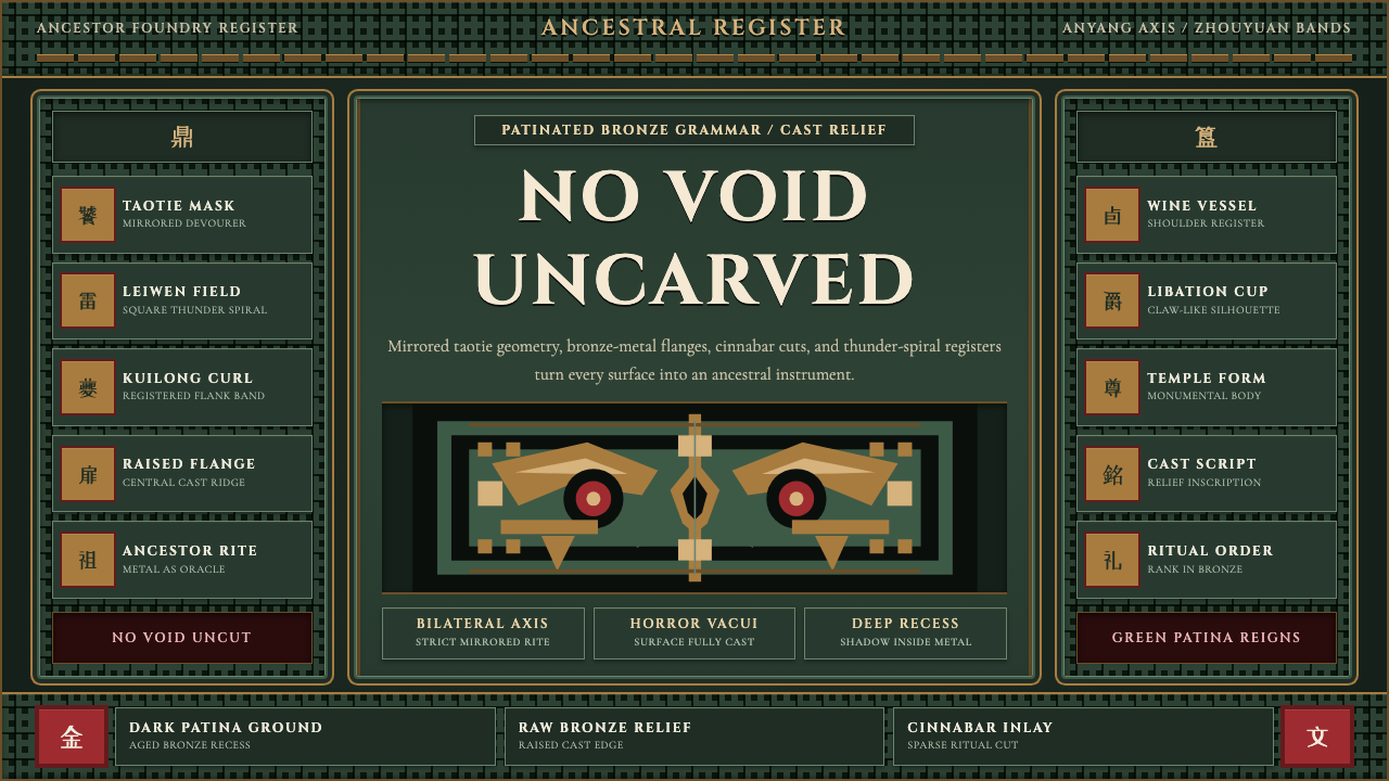 Shang-Zhou Ritual BronzeAncient terror fills every surface. Patina green, bronze relief, mirrored tao…古老森严填满表面:铜绿底、青铜浮雕与镜像饕餮锁住网格。
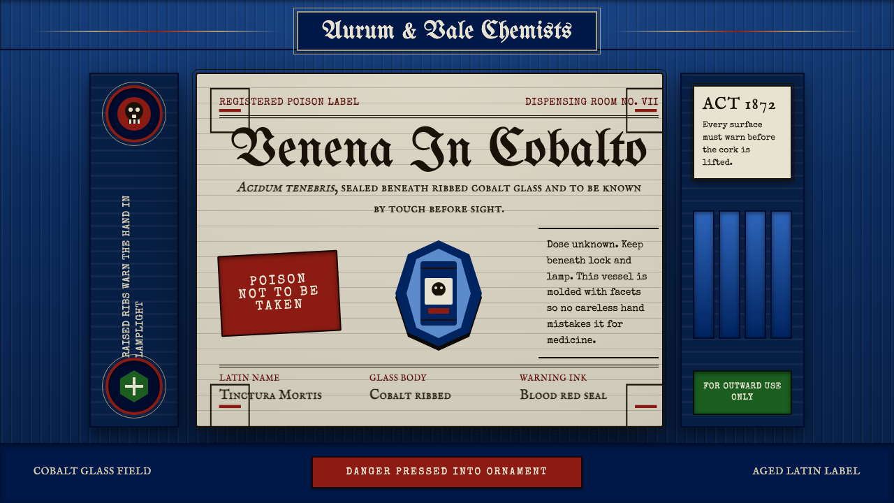 Apothecary Poison LabelDanger made ornate. Cobalt ribs, aged paper, and red POISON rules make fear t…危险被做成装饰:钴蓝凸棱、旧纸标签与红色警示让恐惧可触。
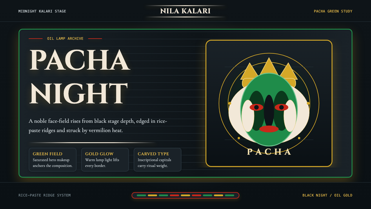 Kerala Kathakali (Pacha Green Makeup)Fierce ceremonial night. Pacha green, vermilion, and oil-gold frame monumenta…庄严夜台。帕查绿、朱砂红与油灯金框住碑刻衬线。
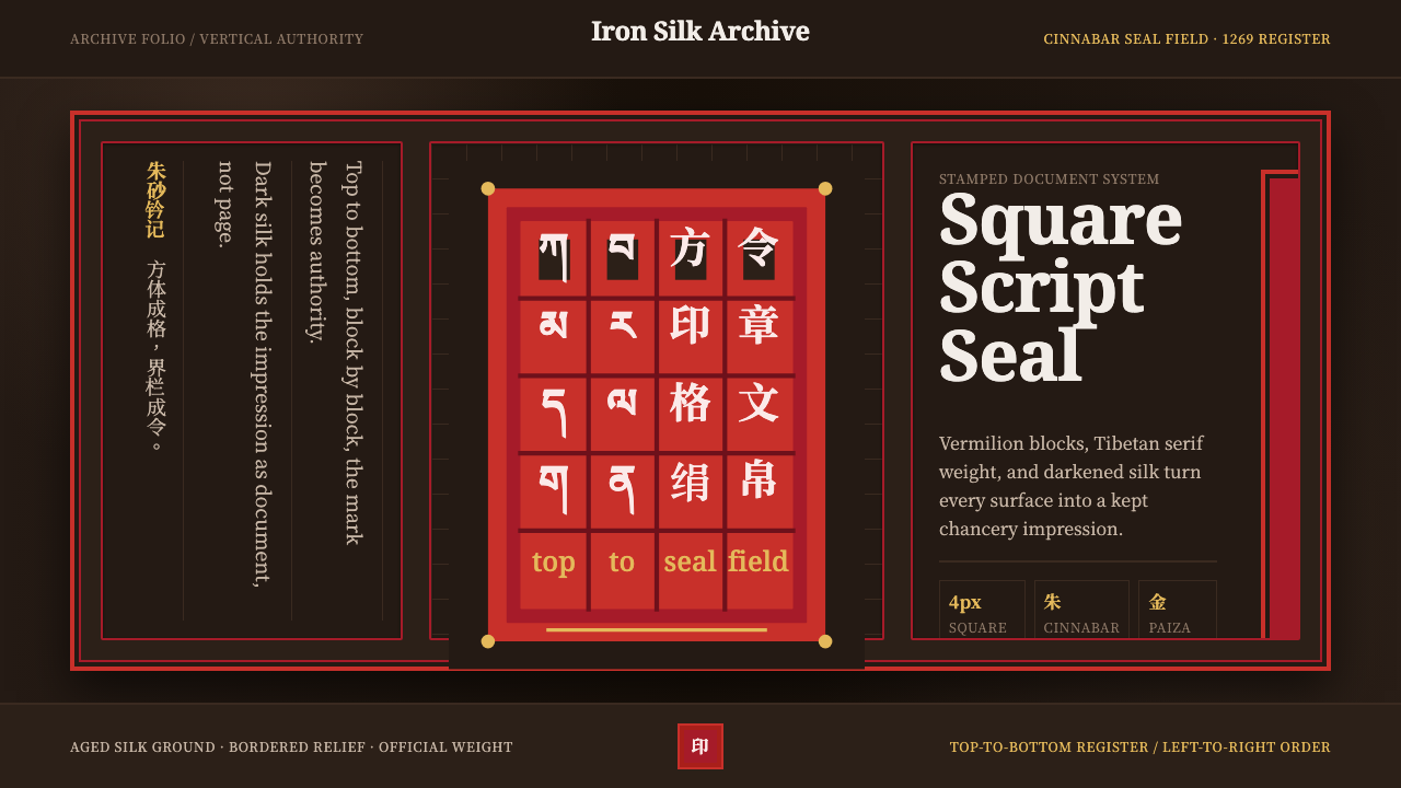 Phags-pa Seal ScriptAuthority, stamped vertical. Cinnabar borders press Tibetan serif blocks into…权威如印:朱砂界栏把藏式衬线方块压入暗绢。
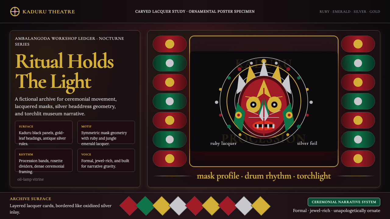 Sri Lankan Kandyan Mask & DanceRitual carries weight. Gold serif type and ruby-emerald filigree burn on blac…仪式自带重量:金色衬线与红绿银饰在黑漆上燃亮。
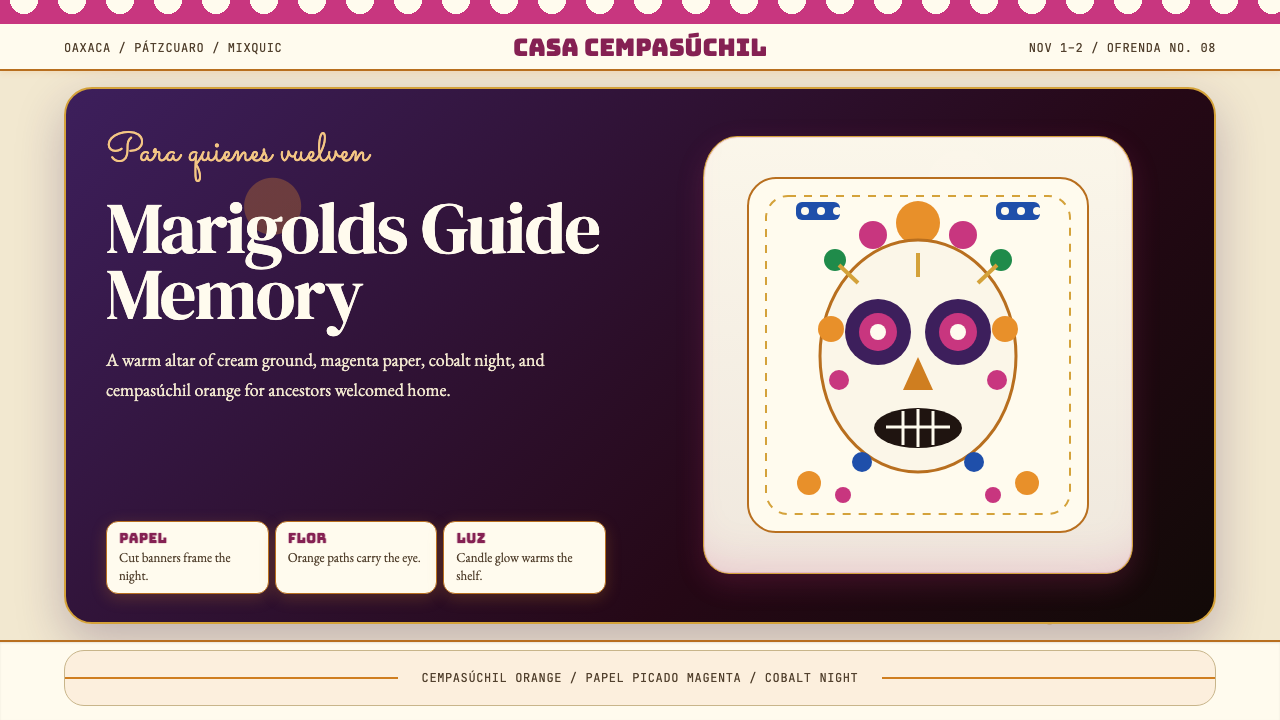 Día de los MuertosRemembrance glows. Marigold orange, magenta papel picado, and cream altar tie…记忆被点亮:万寿菊橙、洋红剪纸与奶油祭坛层叠。