What is Shang-Zhou Ritual Bronze?什么是 Shang-Zhou Ritual Bronze?
Three thousand years before the modern grid, Shang bronze-casters packed every square millimeter of sacred vessels with terrifying zoomorphic ornament — and invented a visual grammar still powerful enough to stop a room.在现代网格诞生三千年前,商代铸铜师已将每一寸礼器表面填满令人震慑的兽形纹饰——并由此创造出一套至今仍能震慑全场的视觉语法。
Shang-Zhou Ritual Bronze in briefShang-Zhou Ritual Bronze 速览
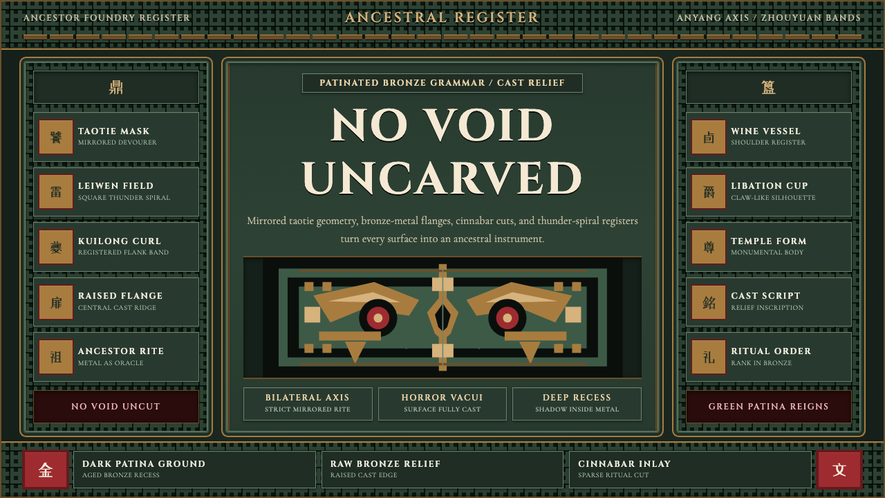
Shang-Zhou ritual bronze is the foundational visual language of Chinese ornament — cast in metal at royal foundries during the late Shang dynasty (c. 1300–1046 BCE) and refined through the Western Zhou period (1046–771 BCE). The aesthetic is defined by a single overriding principle: horror vacui, the terror of empty space. Every surface of a ritual vessel — its body, its handles, its foot ring, its lid — must bear layered ornament. Bare metal is unfinished metal.商周礼器青铜,是中国纹样最原初的视觉语法。它在商代晚期(约公元前1300至1046年)的王室铸坊中成型,经西周(公元前1046至771年)进一步精炼。这套美学由一条压倒一切的原则所定义:「满工」,对空白的极度拒绝。礼器的每一寸表面——器身、耳、圈足、器盖——都必须覆以层叠纹饰。裸露的铜面意味着未竟之器。
The vocabulary of motifs is narrow, precise, and cosmologically loaded. The taotie — a frontal beast mask, bilaterally symmetrical, with bulging eyes and no lower jaw — dominates the central registers of almost every vessel type. Flanking it are the leiwen, a thunder-spiral built from square hook-and-return lines, which fills the background field at dense, nearly mechanical regularity. Secondary registers carry the kuilong, a one-legged dragon in profile, and the cicada, a symbol of resurrection. Together these motifs construct a visual world that is simultaneously abstract and zoomorphic — you can read it as pure pattern or as a crowd of watching eyes.纹饰的词汇库窄而精准,每个元素都承载宇宙意涵。饕餮——一张正面兽面,严格左右对称,双目突出,无下颌——统治着几乎所有器型的核心纹带。围绕饕餮展开的是雷文:由方折的钩回线构成的回纹,以近乎机械的密度填满底地。次级纹带容纳夔龙(侧面独脚龙)与蝉纹(复活的象征)。这些母题共同构筑了一个既抽象又兽形的视觉世界——你可以将它读作纯粹的几何图案,也可以将它读作一双双正在注视你的眼睛。
The aesthetic differs from all later Chinese ornament in character as much as in form. Tang and Song dynasty decoration — lacquerwork, silk, ceramics — moves toward calligraphic fluency, organic curves, and decorative warmth. Bronze Age ornament is the opposite: angular, compressed, cast in rigid metal rather than painted or woven, and charged with ritual rather than aesthetic intent. These vessels were not made to be looked at. They were made to be used in ancestral sacrifice, to hold food and wine for the dead, to communicate between the human world and the numinous. Their terrifying density is a feature, not a style choice.这套美学与后世中国一切纹样在气质与形式上都判然有别。唐宋的漆器、丝织与陶瓷纹样走向书法式的流动、有机曲线与装饰性的温暖。青铜时代的纹饰恰恰相反:棱角分明、高度压缩,铸于坚硬金属而非描绘或编织,其驱动力是祭祀功能而非美学追求。这些器物不是用来欣赏的,而是用于祭祖——盛放献给亡灵的酒食,沟通人间与神明。那种令人战栗的繁密,是功能的显现,而非风格的选择。
See the Shang-Zhou Ritual Bronze design system查看 Shang-Zhou Ritual Bronze 完整设计系统
Where does Shang-Zhou Ritual Bronze come from?Shang-Zhou Ritual Bronze 从何而来?
The Shang dynasty bronze industry was centered at Anyang in present-day Henan province, where archaeologists have excavated the royal capital known as Yinxu — the Ruins of Yin. The foundries there operated at an industrial scale unprecedented in the ancient world: workshops covering hectares, organized teams of specialized craftsmen, and a piece-mold casting process of extraordinary technical sophistication. Bronze was not merely a material; it was the medium through which royal power and ancestral legitimacy were made visible and permanent.商代青铜工业的中心,在今河南省安阳,考古学家在那里发掘了王都遗址——殷墟。殷墟铸坊的生产规模在古代世界中前所未有:作坊绵延数公顷,分工明确的匠人团队有序协作,泥范法铸造工艺达到极高的技术水准。青铜不仅是一种材料,更是使王权与祖先合法性得以可见、得以永存的媒介。
The production method — called piece-mold casting — shaped the aesthetic as decisively as any artistic intention. Craftsmen carved ornament into clay section molds before casting; the metal simply filled the carved impressions. This means the taotie, the leiwen, and the flanges were not added to vessels but were integral to the casting itself, inseparable from the vessel's form. The raised flanges that bisect many Shang vessels along their vertical axes are registration guides — alignment features that held the clay molds in position during casting — that were absorbed into the aesthetic as structural ornament.泥范法的铸造方式,与任何艺术意图一样深刻地塑造了这套美学。工匠在浇铸之前先将纹饰刻入泥质分块范模;铜液填满刻好的凹槽,纹饰便随器而生。这意味着饕餮、雷文与扉棱,并非附加于器物之上,而是铸造本身的组成部分,与器形浑然一体。纵贯许多商代器物垂直轴线的突起扉棱,本是铸造时固定泥范位置的对合标记——一种技术性的定位装置——最终被美学系统吸收,成为结构性的装饰语言。
The Western Zhou dynasty (1046–771 BCE), which succeeded the Shang after King Wu's conquest, inherited the bronze tradition and gradually transformed it. Early Western Zhou vessels retain the horror-vacui density and zoomorphic vocabulary of their Shang predecessors, but the taotie progressively dissolves — its features pulled apart, the eyes drifting into isolated spirals, the body disarticulating into abstract bands. By the middle and late Western Zhou, long inscriptions cast in relief on vessel interiors record political appointments, military victories, and ritual gifts, transforming vessels from mute containers of numinous power into documents of historical record.西周(公元前1046至771年)继商而立,承袭了青铜传统并逐步加以改造。西周早期器物保留了商式满工密度与兽形词汇,但饕餮纹在此后的演进中逐渐解体——各部位被分离,双目退化为孤立的涡纹,躯体分解为抽象纹带。至西周中晚期,长篇铭文以阳文形式铸于器内,记录授职、征伐与祭赏,使器物从盛载神性力量的沉默容器,转变为书写历史的文字载体。
The Eastern Zhou period (770–476 BCE) saw the aesthetic soften and regionalize. Competing states developed their own bronze traditions — the Chu culture of the south produced elongated, almost surrealist forms, while the northern states continued more conservative vessel typologies. The Sanxingdui culture in present-day Sichuan, contemporaneous with the late Shang but geographically isolated, produced monumental bronze sculptures — standing human figures nearly two meters tall, masks with protruding eyes — that share the Shang horror-vacui intensity while operating in an entirely different formal register. Together, these regional variants define the outer boundaries of what Shang-Zhou ritual bronze can mean as a design tradition.东周时期(公元前770至476年),这套美学走向柔化与区域分化。各诸侯国发展出各自的青铜传统:南方楚文化产生了细长而近乎超现实主义的器型,北方诸国则延续更为保守的器型谱系。与商代晚期同时却地理隔绝的四川三星堆文化,铸造了体量惊人的青铜雕塑——近两米高的立人像、双目极度突出的面具——与商式满工的强度共鸣,却在截然不同的造型秩序中运作。这些区域变体共同划定了商周礼器青铜作为设计传统所能涵盖的外延边界。
What defines the Shang-Zhou Ritual Bronze look?Shang-Zhou Ritual Bronze 的视觉特征是什么?
Horror Vacui — The Filled Surface满工——填满的表面
The defining structural principle is the absolute refusal of empty ground. Background areas are filled with the leiwen thunder-spiral at such density that the primary motif — the taotie or kuilong — appears to emerge from a field of controlled visual noise rather than from bare metal. This layering creates a figure-ground ambiguity: the more you look, the more forms resolve and dissolve. The filled surface is not horror vacui as pathology but as cosmological statement — void is absence of the sacred.满工是这套美学最根本的结构原则:对空白底地的绝对拒绝。背景区域以极高密度填满雷文回纹,使主体纹样——饕餮或夔龙——看起来从一片受控的视觉噪声中浮现,而非从裸露的金属底面中显现。这种层叠创造了图底两义性:凝视越久,形态越在聚合与消解之间往复。满工不是一种病态的恐惧,而是宇宙论的陈述——空白意味着神圣的缺席。
Bilateral Symmetry and the Taotie Axis双轴对称与饕餮中轴
Every primary motif is organized along a strict vertical axis of bilateral symmetry. The taotie mask is the most extreme expression: two profile dragons face each other across a central axis, their bodies merging into a single frontal face with shared eyes, shared horns, shared — but absent — lower jaw. This is not decorative symmetry but structural cosmology: the vessel's vertical axis is a world-axis, and the mirrored beasts are guardians of the passage between worlds. Deviation from bilateral symmetry in a Shang vessel is almost always a signal of regional or period variation.每一件主体纹饰都沿严格的垂直轴线双向对称展开。饕餮纹是其最极端的表达:两条侧面夔龙隔轴相向而立,躯体在中轴处融合为一张正面兽面,共享双目、共享角冠,却无下颌。这不是装饰性的对称,而是宇宙论的结构:器物的垂直轴线是贯通天地的世界轴,镜像兽面是守护两界通道的神灵。商代器物上若出现偏离双轴对称的纹饰,几乎总是区域差异或时代变迁的标志。
Registered Bands and Vertical Flanges分段纹带与垂直扉棱
Vessel surfaces are divided into horizontal registers — decorative bands of fixed height — by sharp raised ridges. These bands impose a strict typographic-like hierarchy: a dominant central band carries the primary zoomorphic motif at maximum size; narrower upper and lower bands carry secondary motifs at reduced scale. Vertical flanges bisect the vessel at cardinal axes, acting as visual caesuras that divide the composition into discrete panels while also reinforcing the bilateral symmetry of each. The grid they create is rigid and load-bearing — not a decorative afterthought but the armature on which all ornament is mounted.器物表面由锐利的凸棱划分为若干水平纹带,各纹带高度固定、边界清晰。这些纹带构建了一种类似字体排印的严格层级:最宽的核心纹带以最大尺寸承载主体兽形纹饰;上下更窄的纹带以缩减的比例承载次级纹饰。垂直扉棱沿器物四方轴线贯通而下,既是视觉上的间歇符——将构图切分为独立面板——也进一步强化了各面的双轴对称。由此形成的网格坚固而承重,不是装饰性的附加,而是一切纹饰得以依附的骨架。
Deep Relief and Cast Shadow深浮雕与铸影
Primary motifs are cast in high relief against a deeply recessed ground, producing shadow wells of considerable depth. In strong side-lighting — the kind produced by oil lamps in an ancestral hall — these shadows animate: the taotie's face appears to shift expression as the light source moves. This is not a happy accident but a designed property. The relief depth is calibrated to the ritual lighting conditions in which the vessels were used. Contemporary applications of this aesthetic translate the relief-and-shadow relationship into flat visual contrasts: dark backgrounds against which ornamental elements appear to float at a distinct elevation.主体纹饰以高浮雕形式铸于深陷的底地之上,产生相当深度的阴影槽。在强烈的侧光之下——祠堂油灯所产生的那种光线——这些阴影会随光源移动而变化:饕餮的面目似乎在改变表情。这并非偶然,而是经过设计的属性。浮雕的深度是针对礼器使用时的仪式光照条件精心校准的。当代对这种美学的应用,将浮雕与阴影的关系转化为平面视觉对比:深色底地衬托出纹饰元素,使其在视觉上呈现出悬浮于独特高度的错觉。
Patina as Visual Ground铜锈作为视觉底色
The color we associate with ritual bronzes — the mottled blue-green of archaeological patina — was not the original surface. Fresh-cast bronze is a warm, almost golden copper-orange. The green-blue patina is two to three millennia of oxidation layered onto the original metal surface, varying from vessel to vessel depending on burial conditions, soil chemistry, and bronze alloy composition. In contemporary design applications, this patina palette — deep verdigris, oxidized teal, malachite green, bronze gold — functions as a chromatic signature for the style. It is aged, legible from a distance, and carries weight without brightness.我们今天与礼器青铜相关联的颜色——考古铜锈的斑驳蓝绿——并非原始表面。新铸铜器呈温暖的铜橙色,近乎金色。蓝绿铜锈是两三千年的氧化层层叠加于原始金属表面之上的结果,因埋藏环境、土壤化学成分与铜合金配比不同而因器各异。在当代设计应用中,这套锈色谱系——深铜绿、氧化蓝绿、孔雀石绿、青铜金——构成这种风格的色彩签名。它带有岁月感,远观清晰,沉厚而不刺目。
Zoomorphic Abstraction兽形抽象
Shang-Zhou ornament occupies an unusual position on the spectrum from representation to abstraction. The taotie is recognizably a face — eyes, brows, horns, claws are legible — but it is also a geometric system: the whole composes from repeated angular hooks and spirals that could be read as pure pattern if you defocus your gaze. The leiwen is purely abstract — a recursive square spiral — but in context it vibrates with animal energy borrowed from the zoomorphic motifs it surrounds. This dual legibility, the simultaneous animal and geometric reading, is the most sophisticated property of the aesthetic and the most difficult to reproduce in digital application.商周纹饰在具象与抽象的光谱上占据一个罕见的位置。饕餮是可辨识的面孔——双眼、眉角、角冠、爪足清晰可读——但同时也是一个几何系统:整体由反复出现的折角钩回与涡卷构成,若将目光虚化,可以将其读作纯粹的图案。雷文是纯粹的抽象——一种递归的方折涡旋——但在语境中,它从周围的兽形母题借得生命的震颤。这种双重可读性——同时作为兽形与几何的解读——是这套美学最精妙的属性,也是数字应用中最难复现的品质。
Hierarchical Vessel Typology礼器等级体系
The ritual bronze system was not a single aesthetic but a ranked typology: the ding tripod cauldron for cooking meat sacrifices, the gui bowl for grain, the jue and zun goblets for wine, the you bucket for carrying wine. Each vessel type had a prescribed form, a prescribed scale, and a prescribed ornamental program. A ruler might be buried with nine ding; a minister with seven; a grand officer with five. The number and type of vessels present at a burial was the most legible statement of social rank in ancient Chinese aristocratic culture. Contemporary applications can echo this hierarchical thinking — treating different visual elements with graduated weight and density to signal importance.礼器青铜体系不是单一的美学,而是一套有等级的器型谱系:煮肉牲的鼎、盛黍稷的簋、饮酒的爵与尊、携酒的卣。每种器型都有规定的形制、规定的尺度与规定的纹饰方案。天子用九鼎,诸侯用七,大夫用五。墓葬中礼器的数量与种类,是古代中国贵族文化中最直接可读的社会等级声明。当代应用可以呼应这种层级思维——以递进的视觉分量与纹饰密度区分元素的重要程度。
See the Shang-Zhou Ritual Bronze design system查看 Shang-Zhou Ritual Bronze 完整设计系统
Who shaped Shang-Zhou Ritual Bronze?谁塑造了 Shang-Zhou Ritual Bronze?
Fu Hao was a consort of the Shang king Wu Ding (reigned c. 1250–1192 BCE), a military commander who led armies of tens of thousands, and one of the most important ritual figures in the Shang court. Her tomb, discovered at Yinxu in 1976 and uniquely intact, contained over 460 bronze vessels — the largest cache of inscribed Shang bronzes ever recovered from a single burial. The vessels in her tomb span the full Shang repertoire of forms and represent the mature Anyang style at its densest and most accomplished. Fu Hao's burial is the single richest dataset for understanding what Shang ritual bronze looked like in active ceremonial use.妇好是商王武丁(在位约公元前1250至1192年)的配偶,一位统率数万大军的女将,也是商廷最重要的祭祀主持者之一。她的墓葬于1976年在殷墟被发现,保存完整,出土青铜器逾460件——迄今为止单一墓葬出土铭文青铜器数量之最。墓中器物涵盖商代器型全谱,代表了安阳风格在成熟期最繁密、最精湛的面貌。妇好墓是我们理解商代礼器青铜在仪式使用语境中原貌的最重要的实物档案。
The Duke of Zhou, younger brother of King Wu and regent during the early reign of King Cheng (early Western Zhou, c. 1042–1036 BCE), is credited in the historical tradition with codifying the Zhou ritual system — the elaborate protocol of ceremonies, music, vessels, and court arrangements that organized aristocratic life for the next five centuries. Whether or not the attribution is fully accurate, the Western Zhou bronze tradition that flourished under his regency and its immediate aftermath shows a decisive shift: vessels become more varied in form, inscriptions become longer and more politically complex, and the ornamental program begins the long process of loosening from the Shang model toward the more abstract aesthetic of the later Zhou.周公旦,武王之弟,成王幼年时期的摄政(西周初年,约公元前1042至1036年),在历史传统中被视为周礼制度的制定者——那套规范贵族生活长达五百年的繁复礼仪体系,涵盖祭祀程序、礼乐编制、器用制度与朝廷秩序。无论这一归因是否完全确切,在他的摄政期及其后继时代蓬勃发展的西周青铜传统呈现出决定性的转变:器型愈加多样,铭文愈加冗长而政治内涵愈加复杂,纹饰方案也开始了从商式模板走向东周更为抽象风格的漫长松动过程。
The craftsmen who operated the Yinxu foundries are anonymous by the standards of art history — no individual names are recorded — but their collective technical achievement is extraordinary. Archaeological excavation has revealed workshop areas with intact clay mold fragments, casting pits, and bronze slag that allow reconstruction of the piece-mold process in detail. These craftsmen developed the technique of casting assembled multi-section molds to produce seamless, complex three-dimensional forms at a scale — some ding cauldrons weigh over eight hundred kilograms — that required coordinated teams, precisely calibrated alloy ratios, and multiple simultaneous pours. Their anonymous genius is embedded in every vessel surface.操持殷墟铸坊的匠人,按艺术史的标准是无名的——没有任何个人名字被记录下来——但他们集体的技术成就是非凡的。考古发掘揭示了保存完整的泥范碎片、浇铸坑与铜渣,使泥范法的详细工序得以重建。这些匠人发展出拼合多块分范浇铸的技术,以生产无缝的复杂立体形态;某些鼎的重量超过八百公斤,需要团队协作、精确配比的合金成分与多点同步浇铸。他们无名的天才,铸入了每一件器物的每一寸表面。
The Sanxingdui culture of present-day Sichuan province, which flourished contemporaneously with the late Shang (c. 1200–1000 BCE) but in geographic isolation from the central plains, produced bronze works that share the Shang horror-vacui intensity while operating in a completely different formal vocabulary. The standing bronze figures — up to 1.8 meters tall, with elongated bodies, oversized hands, and faces of otherworldly remoteness — and the massive face masks with bulging cylindrical eyes that project far beyond the face plane are unlike anything in the Shang canon. They suggest that the bronze age in China was not one tradition but a family of related experiments in using cast metal to materialize supernatural presence, each regional tradition finding its own grammar for the unspeakable.今四川省境内的三星堆文化,与商代晚期(约公元前1200至1000年)同时并存,却与中原地区地理隔绝,产生了在满工强度上与商式相通、却在造型语汇上截然不同的青铜作品。那些最高达1.8米的立人像——躯体修长、双手硕大、面容带着彼世般的疏离——以及双目呈圆柱体极度突出于面部平面之外的巨型面具,在商代谱系中找不到对应物。它们暗示,中国的青铜时代并非一种单一传统,而是一个以铸铜将超自然存在实体化的区域性实验家族,每一个区域传统都以自己的方式为难以言说之物寻找语法。
Wu Ding (reigned c. 1250–1192 BCE) presided over what historians regard as the high point of Shang civilization — a period of military expansion, intensive oracle-bone divination, and unprecedented bronze production. His reign correlates with the most technically accomplished and ornamentally dense vessels in the archaeological record. The oracle-bone inscriptions from his reign — questions posed to ancestral spirits and answered by reading cracks in heated bones — provide the earliest substantial body of written Chinese and reveal a court in which bronze vessels, ancestral ritual, and political authority were entirely intertwined. The vessels produced for his consort Fu Hao and his court remain the defining examples of the Anyang mature style.武丁(在位约公元前1250至1192年)统治着历史学家公认的商文明巅峰时期——一个军事扩张、密集占卜与空前青铜生产并行的时代。他的在位年代与考古记录中技术最精湛、纹饰最繁密的器物相对应。他在位时期的甲骨文卜辞——向祖先神灵提问、以灼烧骨骼的裂纹来解读答案——构成了最早的汉字书面语料库,揭示了一个青铜礼器、祖先祭祀与政治权威完全交织在一起的朝廷。为其妇好与朝廷制作的礼器,至今仍是安阳成熟风格的定义性范本。
How do you use Shang-Zhou Ritual Bronze today?今天怎么用 Shang-Zhou Ritual Bronze?
Shang-Zhou ritual bronze is an extreme aesthetic — dense, dark, zoomorphic, and charged with cosmological menace — which means it is both powerful and narrow in its appropriate applications. The designer's first task is to understand what the style actually communicates: antiquity of the deepest kind, sacred authority, the weight of ritual, and a beauty that is inseparable from terror. Products and presentations that align with those values can use the style with full intensity. Those that need warmth, accessibility, or approachability should look elsewhere.商周礼器青铜是一种极端的美学——繁密、幽暗、兽形交织,带有宇宙论层面的森严——这意味着它既强大,又在适用场景上极为收窄。设计师的首要任务是理解这种风格真正传递的是什么:最深沉的古老感、神圣的权威、礼仪的分量,以及一种与恐惧不可分离的美。产品与演示若能与这些价值观对齐,便可以以全部强度运用这种风格。而那些需要温暖感、亲和力或易接近性的场合,则应另寻它途。
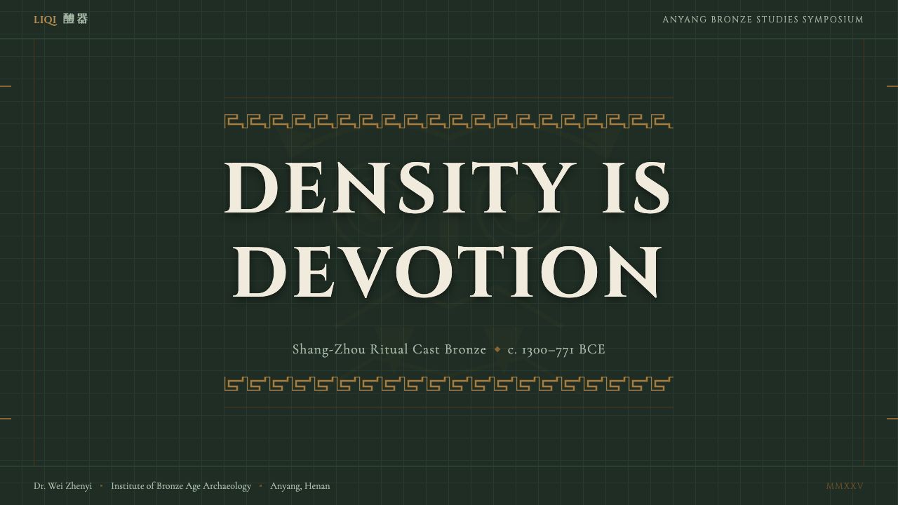
For presentation slides, the style is best deployed on high-stakes cover pages and ceremonial moments — an annual report opener, an institutional milestone announcement, a cultural heritage showcase. A cover built in this aesthetic centers a single taotie-derived motif or angular symmetrical device on a deep verdigris or near-black ground, with the title set in a typeface of appropriate weight — substantial, with strong stroke contrast — positioned in a designated clear zone within the composition. Content slides should observe strict typographic hierarchy against a dark ground, using the bronze-gold register for primary headings and muted verdigris tones for secondary content. Data visualizations translate naturally: the registered-band logic of bronze vessels maps onto stacked bar charts and banded table rows, with the primary color used to mark the dominant data category.在演示文稿中,这种风格最适合高规格的封面页与仪式性时刻——年报开篇、机构里程碑发布、文化遗产展示。以此风格构建的封面,将单一的饕餮衍生纹饰或角形对称图形居中置于深铜绿或近黑的底色之上,标题以分量适当、笔画对比强烈的字体设置,置于构图内预留的清晰区域。内容页应在深色底面上保持严格的字体层级,以铜金色调用于一级标题,以低饱和铜绿色调用于次级内容。数据可视化的转化相当自然:青铜器纹带的分段逻辑可映射到堆叠柱状图与横向条纹表格,以主色标记核心数据类别。
For web interfaces, the style suits institutional contexts with high gravitas requirements: museum collection portals, cultural institution homepages, luxury heritage brand websites, and financial platforms positioning themselves as multi-generational and trustworthy. The approach: deep near-black or dark teal background, bronze-gold for primary interactive elements and headings, muted blue-green for secondary labels and borders. Navigation can borrow the registered-band logic — horizontal rules of varying thickness dividing content zones, with motif-derived icon treatments for categorical markers. Pricing pages and feature-comparison tables work particularly well: the style's intrinsic hierarchy and visual weight make it easy to communicate tier differentiation without oversimplification.在网页界面方面,这种风格适合具有高规格庄重要求的机构性语境:博物馆藏品门户、文化机构主页、奢侈品传统品牌网站,以及将自身定位为跨代际、值得信赖的金融平台。具体做法:深近黑或暗蓝绿作为背景,铜金色用于主要交互元素与标题,低饱和蓝绿色用于次级标签与边框。导航可借鉴纹带分段逻辑——以粗细不同的水平线划分内容区域,以纹饰衍生的图标处理法作为分类标记。定价页与功能对比表尤为契合:这种风格固有的等级感与视觉分量,使层级区分的传达清晰有力,无需过度简化。
For editorial and marketing work, the style supports a specific kind of gravitas that pure minimalism cannot provide. A publication or brand communication in this aesthetic positions itself as custodian of something ancient and significant. Full-spread image treatments work when the imagery itself has archaeological or ceremonial resonance — rubbing prints of bronze surfaces, close-up texture studies, museum photography with dramatic raking light. Marketing headlines set in large, high-contrast type against dark grounds with a dense border treatment derived from leiwen thunder-spirals create immediate visual authority. The style is particularly effective for cultural tourism, museum retail, auction house communications, and any editorial context covering Chinese history, archaeology, or material culture.在编辑与营销内容方面,这种风格支持一种纯粹极简主义无法提供的特定庄重感——以此风格呈现的出版物或品牌传播,将自身定位为某种古老而重要之物的守护者。当图像本身具有考古或仪式共鸣时——青铜器拓印、表面纹理特写、博物馆强侧光摄影——全版图像处理效果卓越。以雷文回纹衍生的密集边框处理配合大号高对比度标题文字,在深色底面上建立即时的视觉权威。这种风格对文化旅游、博物馆零售、拍卖行传播,以及任何涉及中国历史、考古或物质文化的编辑语境,都具有特别的适配性。
A common mistake is treating the style as simply a dark color theme with some Chinese motifs applied as surface decoration. Authentic application requires internalizing the underlying logic: the filled surface, the bilateral axis, the layered hierarchy of registers, the figure-ground ambiguity of zoomorphic-geometric ornament. Using a single taotie illustration on an otherwise standard dark-mode layout is pastiche. The style coheres only when the structural principles — density, symmetry, registered bands, deep tonal contrast — govern the entire layout rather than appearing as applied ornament. Similarly, mixing this aesthetic with soft, rounded, or calligraphic Chinese visual traditions produces incoherence; the bronze age and the Tang dynasty are not interchangeable.最常见的错误是将这种风格简单理解为一套深色主题配上一些中国纹饰的表面装饰。真正的应用要求内化其底层逻辑:满工填面、双轴对称、多层纹带的等级秩序、兽形与几何之间的图底两义性。在一个其余部分都是标准深色模式的版面上贴上一个饕餮图案,是仿制而非应用。这套风格只有当其结构性原则——密度、对称、纹带分段、深沉的色调对比——统治整个版面而非作为附加装饰出现时,才能形成内在一致的整体。同样,将这套美学与柔和、圆润或书法性的中国视觉传统混搭,只会产生不协调:青铜时代与唐代不是可以互换的标签。
See the Shang-Zhou Ritual Bronze design system查看 Shang-Zhou Ritual Bronze 完整设计系统
Shang-Zhou Ritual Bronze — FAQShang-Zhou Ritual Bronze · 常见问题
How is this style different from general 'Chinese traditional' or 'oriental' design?这种风格与泛泛的「中国传统」或「东方」设计有何不同?
The difference is enormous and historically important. 'Chinese traditional design' as popularly understood typically draws from Tang dynasty floral scrolls, Song dynasty ink-wash painting, Ming dynasty porcelain blue-and-white, or Qing dynasty lacquerwork — all of which are roughly one to two millennia younger than Shang bronze, far more decorative in the Western sense, and associated with elegant courtly aesthetics rather than sacred terror. Shang-Zhou ritual bronze predates Chinese writing as a full literary system, predates Confucianism, predates Buddhism's arrival in China. It is China's oldest surviving design tradition, rooted in a world-view — ancestor worship, cosmological hierarchy, the vessel as divine medium — that later Chinese culture preserved in memory but did not practice. Applying this style signals depth and antiquity of a specific, archaeologically grounded kind, not generic 'Chinese-ness'.差异巨大,且具有重要的历史意义。大众理解中的「中国传统设计」通常援引唐代卷草纹、宋代水墨、明代青花瓷或清代漆器——这些传统比商代青铜晚一到两千年,在西方意义上更具装饰性,与典雅的宫廷美学相关联,而非神圣的恐惧。商周礼器青铜早于汉字成为完整书写系统之前,早于儒家思想成型之前,早于佛教传入中国之前。它是中国现存最古老的设计传统,植根于一种世界观——祖先崇拜、宇宙等级秩序、器物作为神明媒介——后世中国文化在记忆中保存了它,却不再实践它。使用这种风格,传递的是一种有具体考古根基的深度与古老感,而非泛化的「中国性」。
Can this style work in light or white-background contexts?这种风格能用于浅色或白色背景的场景吗?
It can, but it requires significant adaptation. The original aesthetic is inseparable from the dark, verdigris-and-bronze palette produced by patination; the depth of the recessed shadows depends on a dark ground to read correctly. A light-ground application of this style works best when the motifs are rendered as dark ink or bronze-line drawings on cream or pale paper — a format with historical precedent in bronze rubbings, where collectors pressed paper into vessel surfaces and rubbed ink across them to capture the ornament. This rubbing tradition produces a reversed image: dark ground ornament becomes white lines on black, or conversely, fine dark lines on ivory. Either version is authentic to the bronze visual culture; neither is the vessel itself.可以,但需要较大幅度的适配。原始美学与铜锈产生的深色铜绿-青铜色谱不可分割;浮雕阴影的深度有赖于深色底地才能正确呈现。在浅色底面上应用这种风格,最有效的方式是将纹饰以深色墨线或青铜线描的方式呈现于奶油色或浅米纸面之上——这种形式在历史上有拓印传统为依据:收藏者将纸铺于器物表面,以墨拓印,捕捉纹饰轮廓。拓印传统产生的是反转图像:深底纹饰变为黑底白线,或反之,变为象牙底上的细密深线。两种形式都忠实于青铜视觉文化的历史脉络,但都不是器物本身的样貌。
What is the taotie, and should I use it literally in contemporary design?饕餮是什么?当代设计中应该字面意义地使用它吗?
The taotie is a frontal zoomorphic mask — two confronted profile creatures sharing a central axis, producing a face with prominent eyes, brow ridges, horns or ears, and typically no lower jaw. Its exact zoological identity was debated even in ancient China, and no consensus exists: proposals include buffalo, owl, tiger, dragon, and composite supernatural creature. As a design element in contemporary work, the taotie can be used literally — as an illustrative motif — or abstracted into its structural logic: bilateral symmetry around a vertical axis, concentric framing of a focal point, the filled-surface principle applied to a bounded form. Literal use is most appropriate in cultural, heritage, and institutional contexts. Abstracted structural use is more versatile and less likely to risk misappropriation. In either case, understanding what the motif means — sacred, terrifying, hierarchical — should inform how it is deployed.饕餮是一种正面兽形面具——两只侧面对峙的生物共享中轴,合成一张拥有突出双眼、眉脊、角冠或耳朵、通常无下颌的面孔。关于它的确切动物原型,即便在古代中国也众说纷纭,至今无定论:提议涵盖水牛、鸮鸟、虎、龙与复合超自然生物。作为当代设计中的视觉元素,饕餮可以字面使用——作为插画性的纹饰母题——也可以将其结构逻辑提炼抽象:沿垂直轴的双向对称、对焦点的同心框架、满工原则在有界区域内的应用。字面使用最适合文化、遗产与机构性语境。结构性的抽象使用更具通用性,也较少触及文化挪用的风险。无论哪种方式,理解这个母题的含义——神圣、恐惧、等级——都应当指导它的部署方式。
Is this style appropriate for digital products targeting a global audience, or is it too culturally specific?这种风格适合面向全球受众的数字产品吗?还是文化特殊性太强?
Cultural specificity is not automatically a liability; it can be a precise competitive advantage when the product's identity benefits from anchoring in a deep, legible cultural tradition. The Shang-Zhou aesthetic is specific, but its expressive register — monumental, authoritative, ancient, terrifying in the sublime sense — translates across cultures because those are universal human responses to scale, density, and ritual. The aesthetic is more culturally specific in its motifs than in its structural logic, which means a global-audience product can apply the structural principles — bilateral symmetry, registered bands, horror vacui, dark tonal palette — while keeping literal zoomorphic motifs to moments of deliberate cultural statement. The risk to avoid is decontextualized surface ornament: taotie patterns applied as wallpaper texture with no structural intent communicate 'vaguely Asian decoration' rather than 'Bronze Age cosmological authority'.文化特殊性本身并不是一种劣势,当产品的身份认同能从锚定于某种深厚而清晰的文化传统中获益时,它可以是一种精准的竞争优势。商周美学是特定的,但它的表达性音域——宏伟、权威、古老、崇高意义上的令人畏惧——跨文化传递,因为这些都是人类对规模、密度与仪式的普遍反应。这套美学在纹饰层面的文化特殊性,强于其结构逻辑层面的特殊性。这意味着面向全球受众的产品,可以应用其结构性原则——双轴对称、纹带分段、满工、深沉色调——同时将字面兽形纹饰保留给有意为之的文化声明时刻。需要规避的风险是去语境化的表面装饰:将饕餮纹作为壁纸肌理平铺、没有任何结构意图,传递的是「模糊的亚洲装饰感」,而非「青铜时代的宇宙论权威」。
How does this aesthetic relate to contemporary Chinese design movements?这套美学与当代中国设计运动有何关系?
Since approximately 2010, a design movement variously called guochao (national tide) or xinzhongshi (new Chinese style) has drawn heavily on historical Chinese visual traditions as a source of contemporary identity and commercial appeal. Within this movement, Shang-Zhou bronze references tend to appear in luxury goods packaging, museum brand identity, and cultural tourism, where the depth and severity of the aesthetic signals authenticity and historical rootedness. Contemporary Chinese designers working in this space tend to be more restrained in their literal use of motifs than earlier revival periods — the preference is for structural principles and chromatic signatures rather than direct copying of vessel ornament. The global luxury market's appetite for Chinese cultural depth has accelerated this trend, and brands from high-end baijiu to auction houses to automotive marques have deployed bronze-age visual references as markers of civilizational prestige.大约自2010年前后,一股被称为「国潮」或「新中式」的设计运动大量援引中国历史视觉传统,作为当代身份认同与商业吸引力的来源。在这一运动中,商周青铜的参照往往出现于奢侈品包装、博物馆品牌形象与文化旅游,因为这套美学的深度与庄严感传递了真实性与历史根基。在这一领域深耕的当代中国设计师,在字面使用纹饰方面往往比早期复兴时期更为克制——偏好援引结构性原则与色彩签名,而非直接复制器物纹饰。全球奢侈品市场对中国文化深度的旺盛需求加速了这一趋势,从高端白酒到拍卖行,再到汽车品牌,均已以青铜时代的视觉参照作为文明性声望的标志。
Related design styles相关设计风格
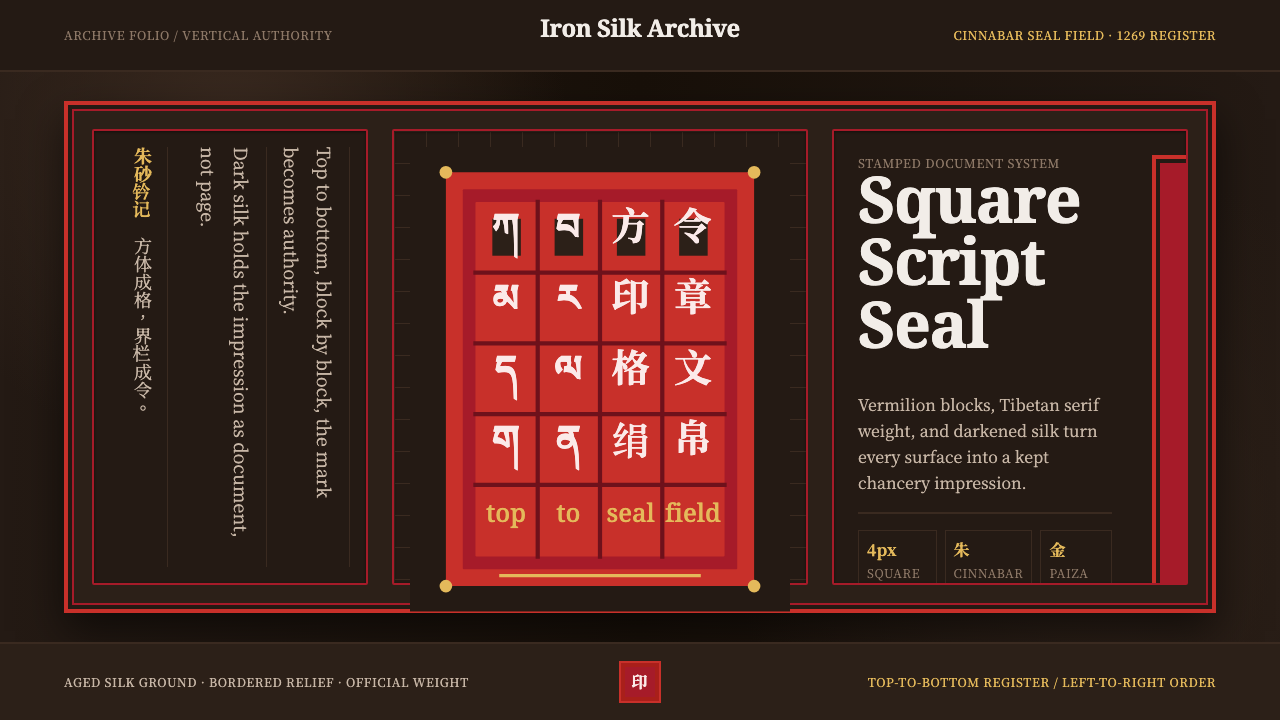 Phags-pa Seal ScriptAuthority, stamped vertical. Cinnabar borders press Tibetan serif blocks into…权威如印:朱砂界栏把藏式衬线方块压入暗绢。
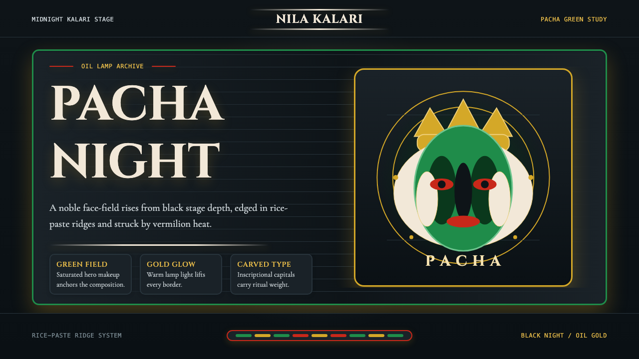 Kerala Kathakali (Pacha Green Makeup)Fierce ceremonial night. Pacha green, vermilion, and oil-gold frame monumenta…庄严夜台。帕查绿、朱砂红与油灯金框住碑刻衬线。
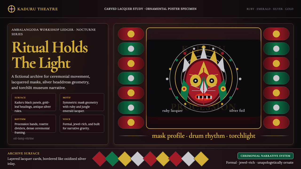 Sri Lankan Kandyan Mask & DanceRitual carries weight. Gold serif type and ruby-emerald filigree burn on blac…仪式自带重量:金色衬线与红绿银饰在黑漆上燃亮。
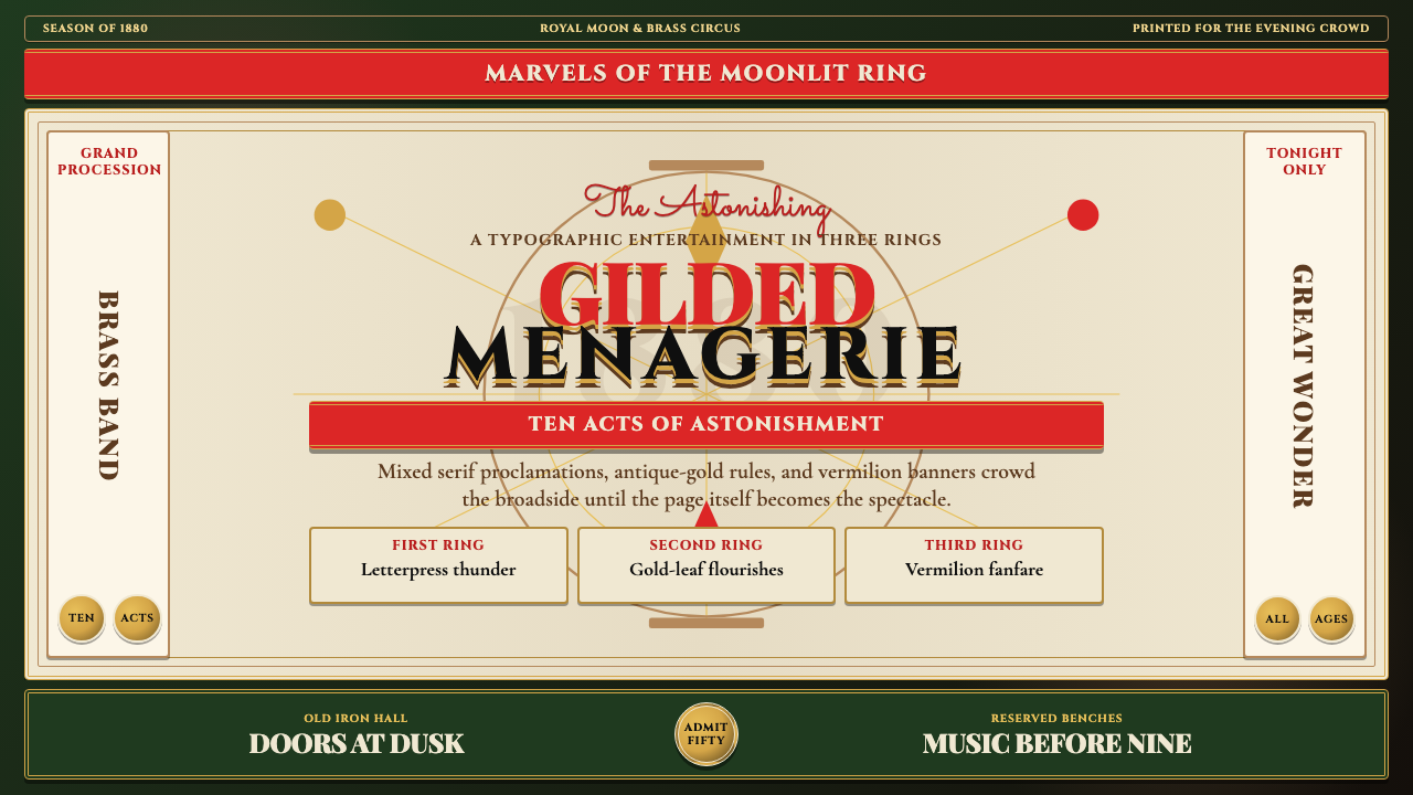 Victorian Circus Poster (1880)Spectacle leaves no inch quiet. Forest green, antique gold borders, mixed ser…寸寸皆戏。深林绿、古金双线、混排衬线与朱红横幅。
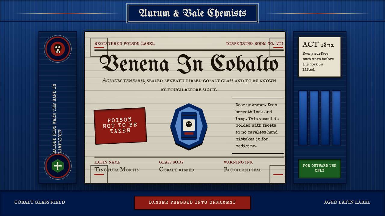 Apothecary Poison LabelDanger made ornate. Cobalt ribs, aged paper, and red POISON rules make fear t…危险被做成装饰:钴蓝凸棱、旧纸标签与红色警示让恐惧可触。
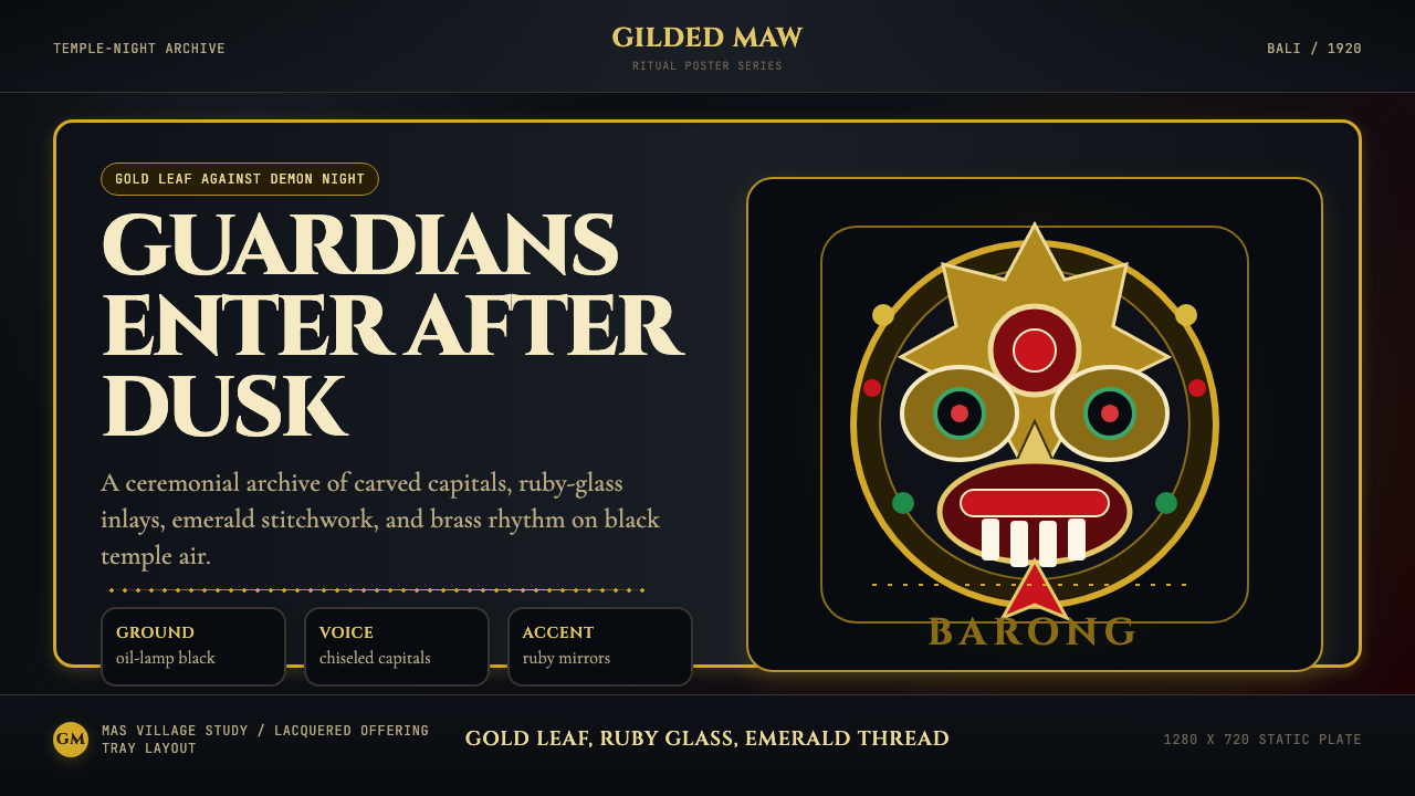 Balinese Barong Mask (1920)Protection glows after dark. Cinzel capitals frame gold, ruby, and emerald ge…守护在夜色中发光:Cinzel碑刻字围住金、红宝石与翡翠几何。