What is Balinese Barong Mask (1920)?
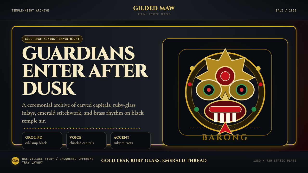
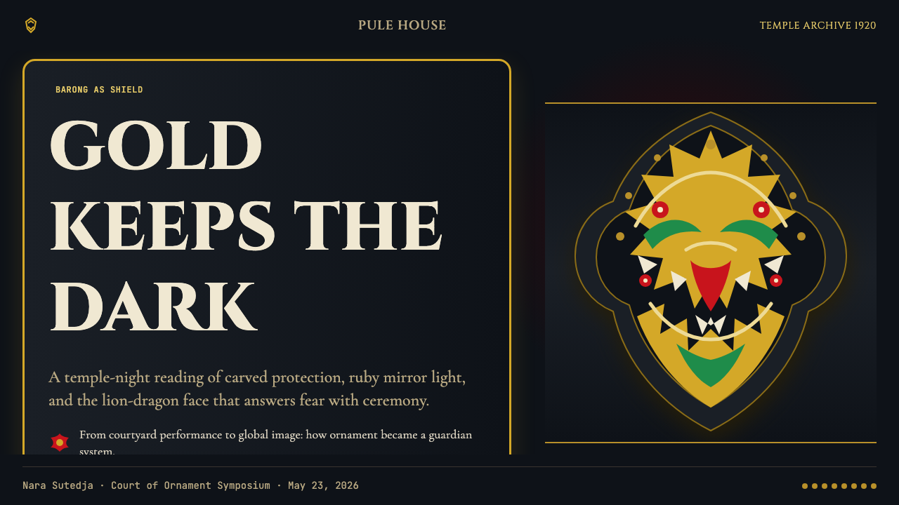
The Barong — Bali's gilded lion-dragon guardian — translates five centuries of sacred ritual into a design language of deep temple-night black, gold leaf, and gemstone color that makes protection visible.
Balinese Barong Mask (1920) in brief
Balinese Barong Mask (1920) is a design language derived from the most sacred object in Balinese Hindu ritual culture — the Barong, a lion-dragon mask of supernatural protective power, worn in ceremony to repel the demon queen Rangda. The 1920 in the name marks the decade when Dutch colonial photographers and Western artists first systematically documented the Barong's visual character, producing the canonical imagery that carries its iconography into the modern design imagination.
The visual system is built on a fundamental opposition: deep, absorbing darkness against luminous precious materials. A field of near-black evokes the oil-lamp-lit temple courtyard at night, the space where ritual drama unfolds. Against that ground, gold leaf, the red of ritual glass mirrors, and the saturated green of embroidered ceremonial cloth produce a chromatic language of concentrated intensity. These are not decorative choices — each material in the original mask carries specific spiritual meaning, and the design system preserves that weight.
Typography in this idiom takes its cues from the mask-carver's chisel: monumental, architectural letterforms carry the authority of inscription. Body text balances the severity with a ceremonial gravity, borrowing from the serif traditions of formal liturgical printing. The overall effect is of an aesthetic that exists at the threshold between the human world and the sacred — present at festivals, visible in darkness, never casual.
Where does Balinese Barong Mask (1920) come from?
The Barong is among the oldest continuous ritual traditions in Bali, with animist roots predating the island's absorption of Hindu culture from the Javanese Majapahit empire in the fourteenth century. The mask represents a protective ancestral spirit, sometimes identified with the god Banaspati Raja, who governs the forest and its creatures. The specific form — the shaggy lion-dragon body, the wide theatrical face with bulging eyes and protruding golden teeth, the elaborate headdress — was codified during the Majapahit cultural florescence and has remained remarkably stable across six centuries of continuous performance.
The ritual context that gives the Barong its visual character is the Calonarang, a dramatic performance tradition enacting the cosmic battle between protective and destructive forces. In this performance, the Barong — embodied by two dancers, one at the head and one at the tail — confronts Rangda, the widow-witch who commands an army of demons. The performances take place in temple courtyards after dark, lit by oil lamps and torches, which is why the visual aesthetic of the design system is anchored in deep darkness relieved by flickering precious light.
The 1920s brought a decisive shift in the Barong's cultural reach. A circle of Dutch colonial officials, Western artists, and Balinese aristocratic patrons — among them the German-Russian painter Walter Spies, the dance scholar Beryl de Zoete, and the Balinese prince Cokorda Gde Agung Sukawati — worked together to document and to some extent stage Balinese ritual arts for an international audience. Their photographs, writings, and performances brought the Barong's image to Europe and America, where it became the primary icon of a romanticized Bali in the Western imagination. This documentation also froze certain formal attributes, creating the canonical 1920s Barong image that the design system draws from.
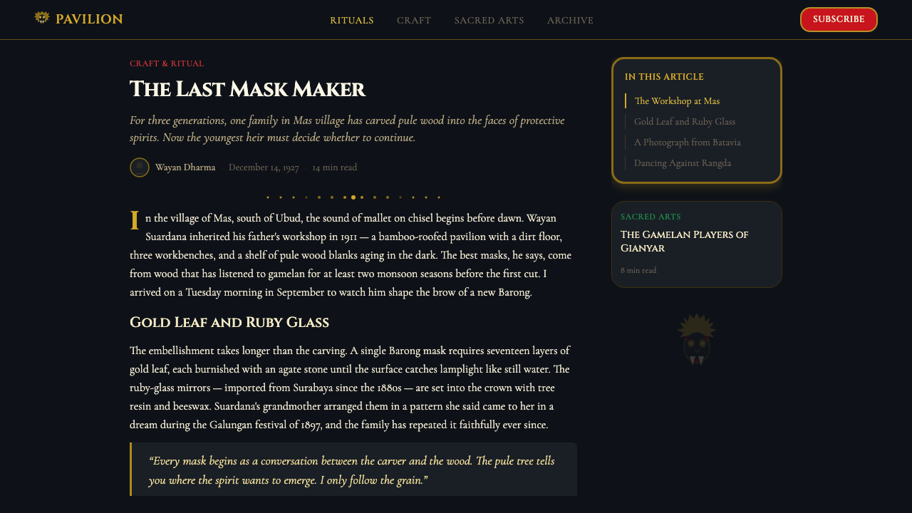
The craft tradition behind the Barong mask centers on the village of Mas, near Ubud, where hereditary carving guilds (the undagi) still produce masks using techniques passed across generations. The most celebrated twentieth-century practitioner, Ida Bagus Anom, brought an unprecedented sculptural refinement to Barong mask-carving, and his work from the 1960s onward is considered the gold standard of the form. The mask's materials — pule wood (considered sacred), gold leaf, red glass mirrors, and white boar's tusks — are not interchangeable: each is prescribed by ritual authority, and substitution would render the mask spiritually inert. The design system inherits this logic of material precision, treating its palette and textures as non-negotiable rather than stylistic options.
What defines the Balinese Barong Mask (1920) look?
Color
The palette is anchored in deep, near-absolute black — not a neutral or charcoal but a darkness that reads as infinite, evoking the temple night. Against this ground, three precious chromatic forces operate: gold, which carries the warmth and authority of leaf gilding; a deep gemstone red drawn from the ritual glass mirrors embedded in the original masks; and a saturated emerald green referencing the embroidered ceremonial cloth. These three colors are used with restraint and ceremony — never simultaneously at full force, always in deliberate hierarchy. White appears rarely, as an accent of severity rather than ground.
Typography
Display type draws from the tradition of monumental carved inscription — letterforms with the weight and authority of stone-cut capitals, each character occupying its space with deliberate presence. The model is the architectural inscription rather than the printed page: strokes are definitive, serifs (where they appear) are crisp and structural rather than decorative, and spacing between letters is generous enough to suggest ceremonial breath. Body text shifts register, adopting a more fluid, humanist character that carries the quality of liturgical manuscript — still formal, but warmer and more continuous in its rhythm.
Surface and Texture
The aesthetic registers material richness rather than flat graphic purity. Gold is not a color but a surface — catching and holding light differently depending on angle, suggesting the actual behavior of leaf gilding. Deep backgrounds carry a velvety depth rather than matte flatness. Embellishment is concentrated: ornamental detail — carved geometric banding, mirror-tile patterns, filigree borders — appears at focal points and structural edges, never diffused across the entire composition. The principle is additive ceremony: restrained fields punctuated by dense nodes of richness.
Composition and Hierarchy
Compositions are frontal and centered in their primary focal element, echoing the mask's own confrontational forward gaze. There is no casual asymmetry — balance is achieved through symmetrical weight in the central zone, with supporting elements arranged in formal registers above and below. This verticality reflects the mask's own stacked structure: headdress, face, jaw, and ornamental collar read as horizontal bands of increasing and decreasing intensity. Hierarchy is communicated through proximity to the center and through material richness rather than through scale alone.
Ornamentation Logic
Ornament in this system is not applied — it is structural. The geometric patterns that border the mask's face, the mirror-tile arrangements that catch light, and the filigree that frames the headdress are load-bearing elements in a visual architecture, not surface decoration added after the essential form is resolved. Similarly, in the design system, decorative elements are positioned at structural junctions: frame edges, section dividers, focal corners. The rule is that richness lives at the edges and nodes of the layout, not in the center of content zones. This creates visual breathing room that makes the ornamented moments read as sacred rather than as clutter.
Light and Dark
The foundational tension of the visual system is between deep darkness and concentrated luminosity — shadow as stage and light as event. This mirrors the original performance context: oil-lamp-lit courtyard, where darkness is the ambient condition and illumination falls in precise pools. In the design system, this means dark backgrounds are not neutral but intentional atmospheric fields; light elements are never ambient but always focal. Transitions between dark and light zones are handled with sharp, deliberate edges rather than gradients — the threshold is crossed, not dissolved.
Iconographic Vocabulary
The system draws on a specific set of visual motifs derived from Balinese sacred art: the frontal staring eye, the symmetrical flame and leaf forms of the perada (gilded cloth) tradition, the rosette and starburst patterns of mirror-tile arrangements, and the layered arc banding of the headdress. These motifs are not used literally as clip-art but as structural DNA — the underlying organizing geometries of borders, focal elements, and graphic marks are derived from them. The result is visual specificity that reads as culturally rooted rather than generically decorative.

Who shaped Balinese Barong Mask (1920)?
The most celebrated Balinese mask-carver of the twentieth century, Ida Bagus Anom came from a hereditary carving family in the village of Mas and elevated Barong mask-making to a level of sculptural refinement that transformed how the form was understood. His masks are distinguished by an extraordinary precision in the rendering of the facial architecture — the placement and carving of teeth, the modulation of the surface around the eyes, the relationship between the gilded headdress and the face below. His work established the visual standard that subsequent carvers and the wider tradition of Barong imagery have measured themselves against.
A German-Russian painter and musician who settled in Bali in 1927 and became the central figure in the Western artistic community that formed around Balinese ritual performance. Spies worked closely with Balinese performers and patrons to document and present Kecak, Calonarang, and Barong performances for visiting artists, scholars, and eventually tourists. His photographs and his network of connections were decisive in shaping the Western image of the Barong — he is largely responsible for the 1930s iconographic crystallization that the 1920-era design label invokes. His work raises enduring questions about the relationship between documentation and aestheticization of living ritual traditions.
A British dance scholar and critic who traveled to Bali with Walter Spies in the 1930s and produced, together with him, the foundational English-language study of Balinese performing arts: 'Dance and Drama in Bali' (1938). De Zoete's written descriptions of the Barong and Calonarang performances provided the Western world with its first detailed textual account of these ritual forms — their structure, their sacred logic, and their visual character. The book's photographs, many taken by Spies, established the dominant visual vocabulary through which the Barong entered international design and cultural consciousness.
A Balinese aristocrat and cultural patron based in Ubud who played a central role in the preservation and international presentation of Balinese performing arts during the colonial period. Cokorda Agung (as he was known) hosted Walter Spies on his compound, facilitated the work of visiting Western artists and scholars, and supported the development of Ubud as a center for traditional arts. His patronage created the conditions under which the Barong and related traditions were both maintained in their ritual integrity and made visible to an international audience — a balance that proved remarkably productive for the tradition's long-term survival.
A master painter from Batuan village whose work in the 1930s Batuan style contributed to the visual documentation of Balinese ritual scenes — including Barong performances — that reached Western audiences. The Batuan painters, working with ink and later watercolor on paper, developed a densely layered, high-contrast style of depicting ritual scenes that complemented the photographic documentation by Spies and others. Togog's treatment of the Barong in narrative compositions — showing the mask in its full performance context, surrounded by demons, priests, and worshippers — provided a Balinese visual perspective on the ceremonial world that shaped how the icon was understood beyond purely photographic representation.
How do you use Balinese Barong Mask (1920) today?
The Balinese Barong Mask visual language is among the most specific and culturally grounded of the available design idioms, which means its power and its risks run in parallel. Applied with understanding, it commands attention in any environment where authority, protection, and sacred intensity are the right emotional registers. Applied carelessly, it reads as costume or appropriation. The distinction lies in whether the system's internal logic — concentrated richness against darkness, ornament at structural edges, frontal gravity — is respected or merely borrowed.
For presentation slides, this system works best on materials where the content itself carries ceremony: product launches that warrant theatrical presentation, keynotes introducing ideas of significant weight, brand pitches where cultural depth and craftsmanship are the core proposition. A cover slide should be dark-grounded, with a single centered or architecturally composed title in monumental type, flanked by minimal gold or gem-toned geometric border elements. Content slides should maintain the dark field but open the layout: generous white space around text, structural gold lines as section markers rather than decorative fills. Data visualizations benefit from using the gem-tone palette — the deep red, gold, and emerald applied to chart elements against the dark ground, keeping each category to one color and never mixing all three at once.
For web interfaces, this language is well-suited to platforms and products where premium cultural positioning and ceremonial quality are genuine claims — luxury cultural institutions, high-end artisan brands, festival or event platforms. The approach prioritizes dark-ground layouts with concentrated light: navigation bars in near-black with gold typographic accents, card components with gemstone-colored top borders on a deep surface, modal windows and overlays that deepen the background rather than lightening it. Interactive states — hover, focus, active — should be expressed through a subtle gold intensification rather than the blue-tinted conventions of standard web UI. The system resists common web patterns like light-gray backgrounds and card grids with soft shadows; those belong to a different visual logic entirely.
For editorial and marketing work, the Barong aesthetic is most powerful when the subject matter has genuine cultural, ceremonial, or artistic weight. A magazine feature on traditional craft, a cultural institution's annual report, a festival program — these contexts activate the system's intensity without strain. The layout principle is architectural: a strongly structured page with clear vertical rhythm, decorative elements confined to page margins and section headers, and body text given a full measure with generous leading to create the sense of liturgical space. Marketing materials should lead with the dark-ground, gem-tone vocabulary in hero sections, reserving lighter passages for detail content lower in the page hierarchy.
A common mistake is treating this system as a general premium or luxury idiom — assuming that because it reads as opulent, it works wherever opulence is desired. It does not. The Barong visual language is specifically ceremonial and specifically nocturnal: its gold is candlelight gold, its darkness is sacred darkness, its richness is ritual richness. Applied to contemporary hospitality, financial services, or consumer technology, the system produces visual dissonance rather than premium positioning. The second common mistake is using too many of the system's elements simultaneously — every element at maximum richness, every surface ornamented, every margin detailed. The source tradition works precisely because darkness and restraint make the ornamented moments read as events. Without the restraint, the system collapses into visual noise.
Balinese Barong Mask (1920) — FAQ
Is this style appropriate for brands with no connection to Balinese or Indonesian culture?
It depends on how explicitly the source material is referenced and how the system's elements are deployed. Using the deeper structural logic — dark grounds, concentrated luminous accents, architectural typography, ornament at structural edges — without claiming cultural authenticity is a defensible aesthetic position, in the same way that designers borrow from Japanese, Byzantine, or Pre-Columbian traditions without misrepresenting their origins. The line is crossed when specific sacred symbols (the Barong face, the Calonarang iconography) are used decoratively without acknowledgment, or when marketing copy implies cultural authenticity the brand does not possess. When in doubt, the more abstract and structural the application, the safer and often the stronger the result.
How is this style different from other Southeast Asian or tropical design aesthetics?
The Barong Mask aesthetic is distinguished by its foundational darkness — it is not a warm, sunlit, tropical aesthetic but a nocturnal, ceremonial one. Where other Southeast Asian design traditions (Thai temple gilding, Javanese batik, Philippine weaving) tend toward warm mid-tones and complex pattern fields, the Barong system is built around deep black as the ground, with richness emerging as event against darkness. The specific color triad — gold, gem red, and emerald — and the frontal, architecturally centered compositional logic also distinguish it clearly from the rhythmic, all-over patterning of batik traditions or the narrative horizontal registers of classical Javanese court painting.
Can this style work in a light-background version?
Technically yes, but with significant loss of character. The system's entire emotional register depends on the contrast between deep darkness and concentrated luminosity. On a light background, gold loses its fire and reads as yellow; gem red becomes a conventional accent color; emerald becomes generic. A light-background inversion is possible as a secondary palette for print or environments where dark layouts are impractical, but it should be understood as a reduced version of the system — carrying the typographic and compositional logic but not the atmospheric intensity that distinguishes the idiom. If a light-background version is required, prioritize deep tones of the gem colors over their saturated versions, and allow the typographic architecture to carry the ceremonial weight.
How does the system handle illustration and photography?
Photography, when used, should be treated as a luminous element against darkness — high-contrast, with shadows deepened toward the system's near-black ground, and highlights preserved at full intensity. The approach mirrors the original documentation photography of the 1920s: dramatic lighting, subjects emerging from shadow. Illustration, when it draws directly from Balinese visual traditions, should honor the frontal, symmetrical compositional logic and the high ornamental density of the source — flat areas of color punctuated by dense surface patterning. Western-style naturalistic illustration is a poor fit; abstract geometric illustration that picks up the mirror-tile and flame motifs of the tradition is a better choice. In both cases, images should be treated as sacred objects placed within the layout rather than as background fields.
What makes this 1920 designation meaningful rather than arbitrary?
The 1920s mark a specific inflection point in the Barong's visual history. Before that decade, the mask existed as a living ritual object documented only within Balinese culture itself — its visual character was entirely fluid, varying from village to village, carver to carver, decade to decade. The systematic photographic and scholarly documentation of the 1920s and early 1930s created a fixed canon: certain masks, photographed at certain angles in certain lighting conditions, became the reference images that traveled globally and entered design consciousness. The 1920 designation thus refers not to the mask's invention but to the crystallization of its modern iconic form — the specific visual vocabulary that moved from ritual object to cultural symbol. It is this crystallized, photographically mediated version of the Barong that the design system draws from, not the full living complexity of the carving tradition.
Related design styles
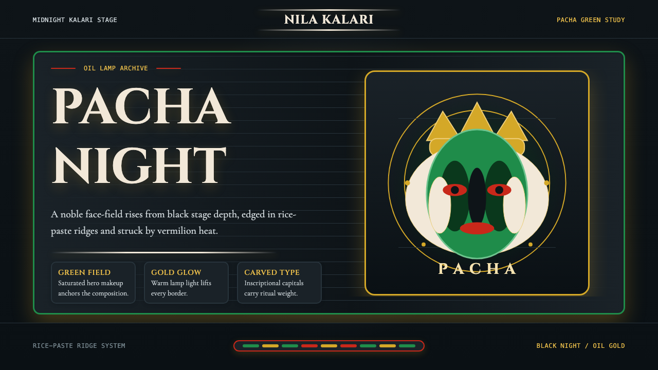 Kerala Kathakali (Pacha Green Makeup)Fierce ceremonial night. Pacha green, vermilion, and oil-gold frame monumenta…
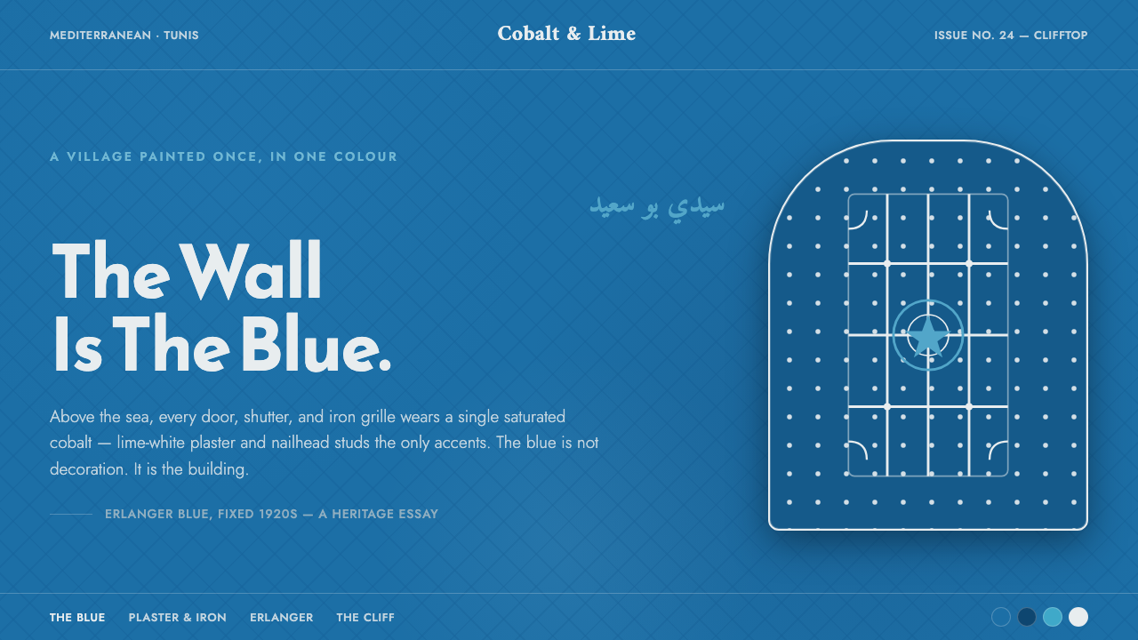 Sidi Bou Said BlueThe village is the blue. Saturated cobalt ground, white plaster frames, iron…
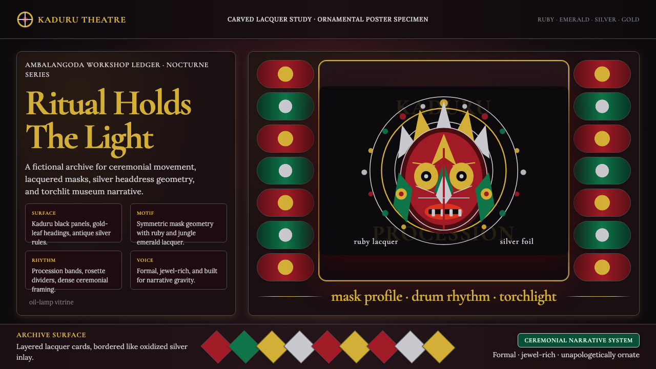 Sri Lankan Kandyan Mask & DanceRitual carries weight. Gold serif type and ruby-emerald filigree burn on blac…
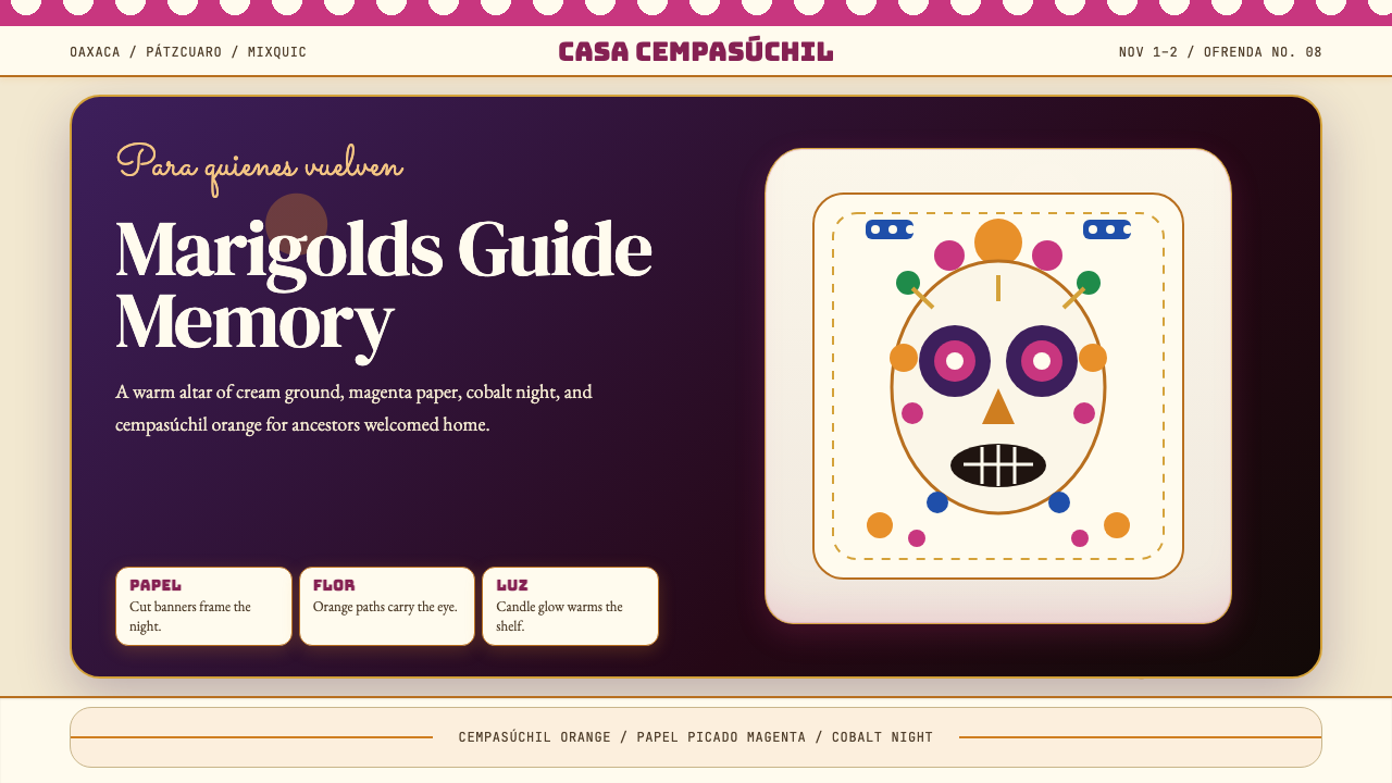 Día de los MuertosRemembrance glows. Marigold orange, magenta papel picado, and cream altar tie…
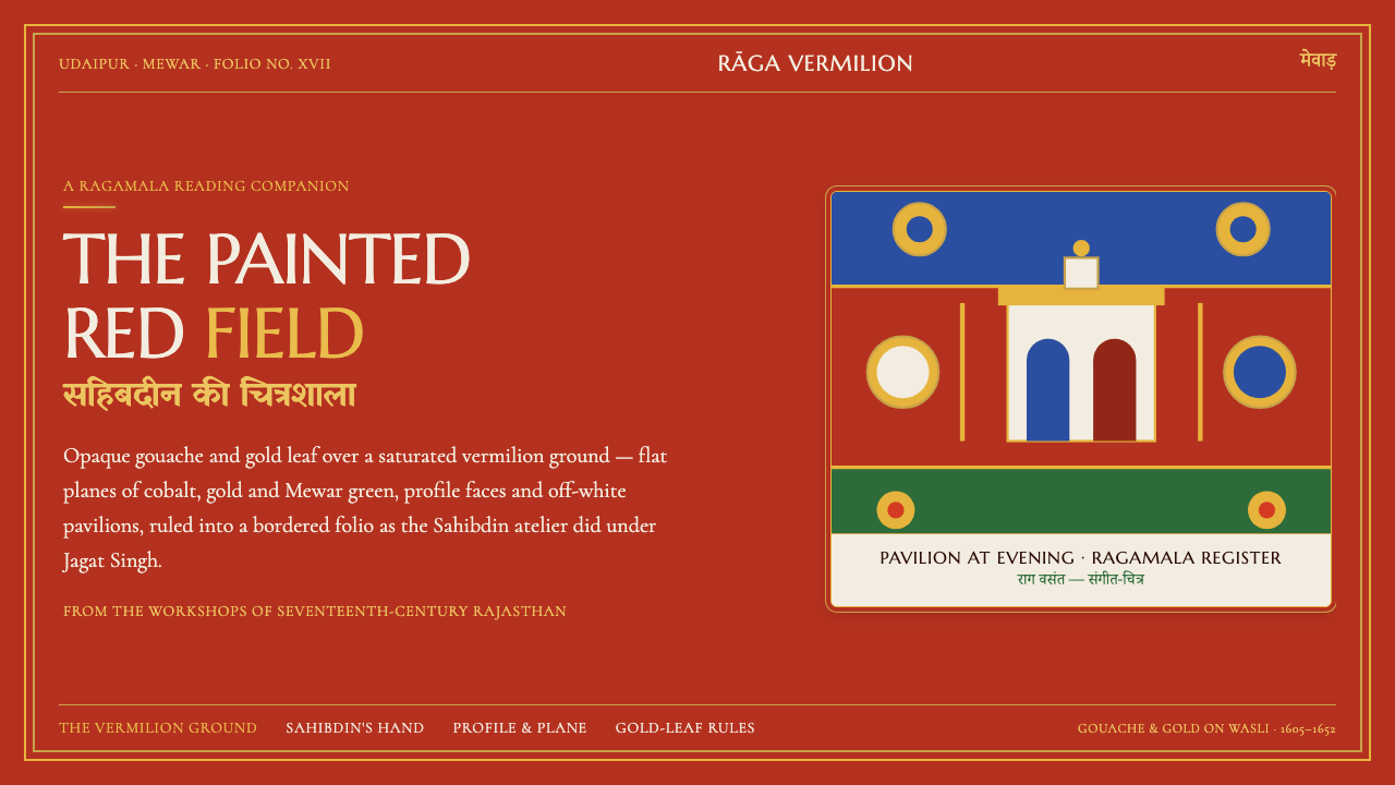 Mewar Rajput MiniatureThe ground is the painting. Vermilion fields, cobalt, gold-leaf rules, profil…
 Phags-pa Seal ScriptAuthority, stamped vertical. Cinnabar borders press Tibetan serif blocks into…