Design style guide设计风格指南
What is Russian Palekh Lacquer Miniature?什么是 Russian Palekh Lacquer Miniature?
When Soviet atheism shuttered Russia's churches, the icon painters of Palekh village turned their gilded devotion toward fairy tales — and invented one of the most visually opulent craft traditions of the twentieth century.苏维埃无神论关闭了俄罗斯的教堂,帕列赫村的圣像画师们将那份镀金虔诚转向了童话世界,由此开创了二十世纪视觉上最奢华的工艺传统之一。
Russian Palekh Lacquer Miniature in briefRussian Palekh Lacquer Miniature 速览
Russian Palekh lacquer miniature is a painting tradition born in 1924 from the fusion of medieval Russian icon technique and Soviet-era folk storytelling. Practiced by masters trained in the centuries-old methods of tempera painting on gessoed wood, the Palekh style migrated its visual vocabulary from saints and halos onto papier-mâché boxes, brooches, and panels — replacing sacred imagery with scenes from Russian fairy tales, Pushkin's poetry, troika processions, and mythological firebirds.俄罗斯帕列赫漆器细密画是一种诞生于1924年的绘画传统,由中世纪俄罗斯圣像技法与苏联时代民间叙事融合而成。帕列赫画师均接受过数百年传承的石膏底木板蛋彩画训练,他们将这套视觉语汇从圣人与光环迁移到纸浆漆盒、胸针与画板之上——以俄罗斯童话场景、普希金诗歌、三驾马车队列与神话火鸟取代了神圣图像。
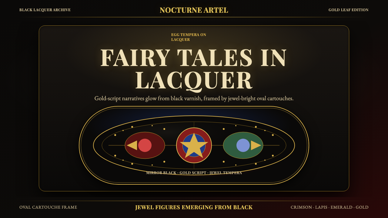
What distinguishes Palekh from other Russian lacquer schools is its absolute commitment to deep lacquer black as the compositional ground. This near-absolute darkness is not emptiness — it is the stage from which gold-leaf ornament, jewel-bright figures, and luminous highlights emerge with extraordinary vibrancy. The technique demands that every color be layered repeatedly in translucent egg-tempera washes, building up depth and luminosity that no single opaque application could achieve. The result is a surface that seems to glow from within.帕列赫有别于其他俄罗斯漆画流派之处,在于它对深邃漆黑底色的绝对坚守。这种近乎彻底的黑暗并非虚空——它是舞台,金箔装饰、宝石般明艳的人物与璀璨高光从中涌现,光彩异乎寻常。这一技法要求每一种色彩反复以透明蛋彩层层叠压,积累出任何单次不透明涂抹都无法企及的深度与光泽。最终的表面仿佛从内部发光。
The characteristic compositional device of the style is the oval cartouche frame — a gilt border that encloses the narrative scene like a locket or a stage proscenium. Within these frames, figures are rendered with elongated proportions borrowed directly from Byzantine icon conventions: long necks, tapering fingers, expressive tilted heads. The landscape setting, whether a forest of swirling birch trees or a stylized Slavic village, is rendered in similarly convention-bound forms, creating an unmistakable visual grammar that is simultaneously ancient and entirely distinctive.这一风格的标志性构图手法是椭圆卡图框——一道金箔边框将叙事场景包裹其中,宛如一枚锁形吊坠或剧场台口。框内人物继承了拜占庭圣像的修长比例:长颈、细指、富于表情的微倾头部。无论是螺旋白桦树林还是程式化的斯拉夫村庄,背景景观同样遵循约定俗成的形式,形成一套既古朴又独一无二的视觉语法。

See the Russian Palekh Lacquer Miniature design system →查看 Russian Palekh Lacquer Miniature 完整设计系统 →
Where does Russian Palekh Lacquer Miniature come from?Russian Palekh Lacquer Miniature 从何而来?
Palekh village, located in the Ivanovo Oblast northeast of Moscow, was a center of icon painting for at least three centuries before the Soviet revolution. During the seventeenth and eighteenth centuries, Palekh masters supplied painted icons to churches across Russia, developing a distinctive local variation of the Byzantine-derived Russian icon tradition that favored exceptionally fine brushwork, rich jewel-tone pigments, and intricate gold-leaf patterning. By the nineteenth century, Palekh's reputation was such that its painters received commissions from imperial patrons and restored icons in the Kremlin Armory and major cathedrals.帕列赫村位于莫斯科东北方伊万诺沃州,在苏维埃革命之前至少已有三个世纪的圣像绘画历史。十七至十八世纪间,帕列赫画师向俄罗斯各地教堂提供彩绘圣像,在源自拜占庭的俄罗斯圣像传统中发展出鲜明的地方流派风格——以极其精细的笔法、浓郁的宝石色调颜料和繁复的金箔图案见长。至十九世纪,帕列赫声誉卓著,其画师受到皇室贵族委托,并为克里姆林宫军械库及各大教堂修复圣像。
The Bolshevik revolution of 1917 and the subsequent anti-religious campaigns brought this centuries-old livelihood to an abrupt halt. Churches were closed or repurposed; the market for icons collapsed. The painters of Palekh faced a choice between abandoning their craft entirely or finding a secular form that Soviet cultural institutions might support. In 1924, Ivan Golikov — who had received classical icon training in the village — founded the Palekh Artel of Ancient Painting (Артель древней живописи) together with fellow masters including Aleksandr Kotukhin, Ivan Vakurov, and Pavel Bazhenov. Their solution was ingenious: they transferred the full technical apparatus of icon painting — egg tempera on a prepared black ground, gold-leaf application, the elongated Byzantine figure canon — onto lacquered papier-mâché objects, replacing saints with characters from Russian folklore and literature.1917年布尔什维克革命与随后的反宗教运动使这一延续数百年的生计戛然而止。教堂被关闭或改作他用,圣像市场崩溃。帕列赫画师面临一个选择:彻底放弃手艺,或寻找一种苏联文化机构可能支持的世俗形式。1924年,在村中接受过正统圣像训练的伊万·戈利科夫联合亚历山大·科图欣、伊万·瓦库罗夫、帕维尔·巴任诺夫等同道,创立了「古代绘画帕列赫劳动组合」(Артель древней живописи)。他们的解决方案堪称巧思:将圣像画的全套技术——黑底蛋彩、金箔镶嵌、拜占庭修长人体比例——完整移植到漆面纸浆器物上,以俄罗斯民间传说和文学人物取代圣人形象。
The choice of subject matter was diplomatically shrewd as well as artistically fertile. Russian fairy tales, Pushkin's narrative poems, folk legends, and scenes of peasant and village life were all sanctioned themes under Soviet cultural policy, which promoted a romanticized vision of Russian folk heritage. The Palekh Artel received official recognition from the Soviet state and was eventually incorporated into the broader system of state-sponsored craft enterprises. This institutional support allowed the tradition to flourish through the 1930s, 1940s, and into the postwar period, with the Palekh State Art School training successive generations of painters in the full technical and compositional vocabulary of the style.题材的选择既有外交上的精明,也具有艺术上的丰产性。俄罗斯童话、普希金叙事诗、民间传说以及农村生活场景,都是苏联文化政策允许的主题——政策鼓励对俄罗斯民间遗产的浪漫化呈现。帕列赫劳动组合获得了苏联国家的官方认可,并最终被纳入国家扶持的工艺企业体系。这一制度性支持使得这一传统在二十世纪三四十年代乃至战后时期蓬勃发展,帕列赫国立艺术学校向一代代画师传授这一风格完整的技术与构图语汇。
The peak decades of Palekh production ran roughly from the mid-1930s through the 1980s. During this period, Palekh boxes became prized collectibles and diplomatic gifts, distributed internationally as emblems of Soviet cultural achievement. The style evolved gradually over these decades — individual masters brought their own compositional innovations while maintaining the fundamental visual conventions — but the core aesthetic remained remarkably consistent: deep black grounds, gold ornamentation, oval cartouche frames, jewel-bright tempera figures, and the unmistakable elongation of the Byzantine figure tradition. After the collapse of the Soviet Union, the Palekh school continued as a living tradition, supported by collectors worldwide and by the Palekh village's designation as a historic center of folk art.帕列赫漆器生产的鼎盛时期大致从二十世纪三十年代中期延续至八十年代。这一时期,帕列赫漆盒成为珍贵的收藏品与外交礼品,作为苏联文化成就的象征广泛流通于国际。风格在这数十年间缓慢演进——各位大师在坚守基本视觉惯例的同时带入了各自的构图创新——但核心美学保持了惊人的一致性:深邃黑底、金色装饰、椭圆卡图框、宝石般明艳的蛋彩人物,以及拜占庭人体比例的标志性修长感。苏联解体后,帕列赫流派作为活态传统延续至今,由世界各地藏家与帕列赫村作为民间艺术历史中心的官方认定共同守护。
What defines the Russian Palekh Lacquer Miniature look?Russian Palekh Lacquer Miniature 的视觉特征是什么?
Ground Color底色
The absolute foundation of the Palekh aesthetic is its deep lacquer black ground — a darkness so dense and even that it functions less as a background color and more as an absence of light that makes every element placed upon it appear to radiate. This is not a neutral dark; it is the compositional basis on which all other visual decisions depend. The black is typically achieved through multiple applications of lacquer on papier-mâché, each layer sanded and polished until the surface achieves a near-mirror finish.帕列赫美学的绝对基础是其深邃的漆黑底色——这种黑暗之浓郁均匀,与其说是背景颜色,不如说是光线的缺席,使得其上的每一个元素都仿佛在自内而外地发光。这不是中性的暗色;它是所有其他视觉决策赖以依附的构图基础。这种黑色通常通过在纸浆底材上多次施漆、每层打磨抛光后实现,最终表面达到近乎镜面的光泽。
Palette and Pigment色板与颜料
Against the black ground, Palekh masters deploy a jewel-tone palette centered on crimson red, lapis lazuli blue, and deep emerald green — applied in egg-tempera, which allows for exceptional translucency and layered depth. These hues are used at near-maximum saturation but never appear harsh, because the black ground and the surrounding gold act as mediators, absorbing visual tension between adjacent saturated areas. White is used for the finest highlights — the gleam on a horse's flank, the edge of a wing — and appears as pure luminosity rather than as a flat tone.在黑色底色的映衬下,帕列赫画师展开一套以深红、青金石蓝与深翠绿为核心的宝石色调色板——以蛋彩绘制,允许出色的透明度与分层深度。这些色相在接近最高饱和度时使用,却从不显得刺眼,因为黑色底面与周围的金色起到了调节作用,吸收了相邻饱和色区之间的视觉张力。白色用于最精细的高光——马侧腹的光泽、羽翼的边缘——呈现为纯粹的光亮感而非平涂的色调。
Gold Leaf and Ornament金箔与装饰
Gold leaf is perhaps the most immediately recognizable element of the Palekh visual system. Applied both as structural framing — the oval cartouche borders, the scene's outer decorative band — and as surface detail within figures and landscapes, gold operates at multiple scales simultaneously. Fine gold lines trace the folds of garments, the branches of stylized trees, and the geometric patterns of architectural elements. Broad areas of gold form the cartouche frame itself and the ground on which inscriptions or titles appear. The gold in Palekh is never yellow paint; it is genuine leaf applied with patient precision and burnished to catch light directionally.金箔或许是帕列赫视觉体系中最直观可辨的元素。金箔既用作结构性框架——椭圆卡图框边框、场景外侧的装饰带——也作为人物与景观内部的表面细节,同时在多个尺度上发挥作用。细密的金线勾勒衣褶、程式化树枝与建筑元素的几何图案;大面积金色形成卡图框本身以及题字或标题所在的底面。帕列赫的金从不是黄色颜料——它是以耐心与精准施贴的真正金箔,经打磨后能定向捕捉光线。
Figure Style and Proportion人物风格与比例
Palekh figures inherit the elongated proportions of Byzantine icons directly. Heads are small relative to the body; necks are long and graceful; fingers taper to fine points; poses are simultaneously expressive and formally composed. Faces, rendered in the lightest tones of the composition, carry specific conventional expressions — serenity, heroic resolve, or gentle sorrow — rather than individualized portraiture. Movement is depicted through flowing drapery and the diagonal lean of figures, not through foreshortening or perspective tricks. Figures float weightlessly against the dark ground, organized by compositional rhythm rather than spatial logic.帕列赫人物直接继承了拜占庭圣像的修长比例。头部相对于身体偏小,颈部修长优雅,手指细尖,姿势兼具表现力与形式感。面部以构图中最浅的色调描绘,带有约定俗成的表情——宁静、英雄般的坚毅或温柔的忧伤——而非个性化肖像。运动感通过飘动衣褶与人物斜倚姿态呈现,而非借助透视缩短或空间技巧。人物在深色底面上轻盈漂浮,由构图韵律而非空间逻辑组织。
Landscape and Setting景观与场景
Palekh backgrounds are not naturalistic landscapes but highly stylized visual shorthand for natural environments. Birch trees appear as sinuous curving strokes with gold-leaf bark highlights; distant hills are rendered as rhythmic undulating forms without any attempt at atmospheric perspective. Water becomes a field of parallel wavy lines; sky is suggested by a band of tone rather than depicted. This approach to setting treats the landscape as a pattern system — formally integrated with the human figures — rather than as a spatial environment they inhabit.帕列赫背景并非写实景观,而是高度程式化的自然环境视觉速记。白桦树以蜿蜒的弧形笔触表现,树干以金箔点缀高光;远山以律动起伏的轮廓呈现,不作任何大气透视的尝试。水面化为一排排平行波纹;天空以色调过渡带暗示,而非实写。这种场景处理方式将景观视为图案体系——与人物形象在形式上融为一体——而非人物所居处的空间环境。
Cartouche and Framing卡图框与构图框架
The oval cartouche is the signature compositional unit of the Palekh tradition. Derived from the framing conventions of medieval illuminated manuscripts and icon borders, the cartouche creates a contained pictorial world — a narrative stage set apart from the outer surface of the object. The frame itself is typically built up from multiple registers of gold ornament: an inner edge of fine line, a band of stylized foliate or geometric ornament, and an outer border that terminates the composition. In more complex pieces, multiple cartouches may be arranged across the object's surface, each containing a separate scene from a continuous narrative.椭圆卡图框是帕列赫传统的标志性构图单元。这一形式源自中世纪彩饰手稿与圣像边框的构图惯例,创造出一个自足的图像世界——一个从器物外表面中划分出来的叙事舞台。框架本身通常由多层金色装饰叠构而成:细线内边、程式化卷叶或几何纹饰带、以及终结构图的外侧边框。在更复杂的作品中,多个卡图框可能分布于器物表面,各自容纳一段连续叙事的不同场景。
Finish and Surface Quality光洁度与表面品质
The final lacquer overcoating applied to a Palekh miniature produces a surface that is simultaneously protective and optically transformative. Multiple coats of clear lacquer, each polished between applications, create a depth-effect in which the painted image appears to recede behind a glassy surface — not unlike looking at a scene through a perfectly still pool of water. This finish is central to the aesthetic: it unifies the matte egg-tempera pigments and the reflective gold leaf under a single visual register, and it gives even small objects a weight and completeness that makes them feel like finished artworks rather than decorated containers.帕列赫细密画最终施加的面漆既具保护功能,又产生光学转化效果。多道清漆逐层抛光,制造出一种深度感——画面仿佛隐退于玻璃质表面之后,犹如透过一池静水观看场景。这种光洁度是美学的核心:它将哑光蛋彩颜料与反光金箔统一于同一视觉层次,并赋予即便是小件器物以份量感与完整性,使其感觉像是完成的艺术品,而非装饰性容器。

See the Russian Palekh Lacquer Miniature design system →查看 Russian Palekh Lacquer Miniature 完整设计系统 →
Who shaped Russian Palekh Lacquer Miniature?谁塑造了 Russian Palekh Lacquer Miniature?
Ivan Golikov was the founding figure of the Palekh Artel and the master most responsible for establishing the style's visual conventions. Trained as an icon painter in Palekh before the revolution, he brought to the secular subject matter of the Artel's early years a full command of Byzantine compositional grammar and tempera technique. His paintings of troika scenes, firebirds, and episodes from Russian epic poetry are characterized by exceptional dynamism — figures in motion, horses at full gallop — rendered within the controlled formal conventions of the icon tradition. Golikov's ability to infuse inherited technique with narrative vitality defined the aesthetic ambition of the Palekh school from its inception.伊万·戈利科夫是帕列赫劳动组合的创始人,也是最重要的风格奠基者。革命前他在帕列赫接受圣像画训练,将拜占庭构图语法与蛋彩技法的完整掌握带入了劳动组合早期的世俗题材创作。他笔下的三驾马车场景、火鸟与俄罗斯史诗插图以出色的动感著称——运动中的人物、全速奔驰的马匹——在圣像传统的严格形式惯例中获得生动呈现。戈利科夫将传承技法与叙事活力融为一体的能力,从一开始便界定了帕列赫画派的美学抱负。
Aleksandr Kotukhin was among the co-founders of the 1924 Artel and became known for his particularly refined handling of landscape elements and architectural settings within the Palekh compositional tradition. Where Golikov emphasized dynamic narrative action, Kotukhin developed a more meditative, lyrical quality — his scenes tend toward atmospheric stillness, with landscape elements rendered in fine interlocking patterns that carry the eye across the picture surface in a way that is as much decorative as narrative. His work helped establish the breadth of compositional approaches available within the Palekh idiom.亚历山大·科图欣是1924年劳动组合的共同创始人之一,以其在帕列赫构图传统中对景观元素与建筑场景的精妙处理著称。若说戈利科夫强调动态叙事动作,科图欣则发展出更具沉思性与抒情气质的风格——他的场景倾向于气氛宁静,景观元素以精细交织的图案呈现,引导目光游走于画面之上,既是装饰性的也是叙事性的。他的作品有助于确立帕列赫语汇内部构图方法的广度。
Ivan Vakurov brought to the founding group a particularly strong command of the gold-work traditions inherited from icon painting, and his contributions helped establish the Palekh Artel's reputation for technical excellence in gold-leaf application. Vakurov's figures tend to be more architecturally arranged than those of some contemporaries — compositions organized around stable geometric groupings that recall the compositional hierarchies of larger icon programs. His influence on subsequent generations of Palekh painters was significant in terms of technical discipline and compositional structure.伊万·瓦库罗夫为创始团队带来了从圣像画传承而来的精湛金箔工艺,其贡献有助于确立帕列赫劳动组合在金箔施贴技术方面的卓越声誉。瓦库罗夫笔下的人物比某些同辈更具建筑感——构图围绕稳定的几何组合布置,令人联想到大型圣像程序中的构图等级秩序。他在技术自律与构图结构方面对帕列赫后代画师的影响举足轻重。
Pavel Bazhenov was a founding member of the 1924 Artel who became particularly associated with scenes drawn from Russian literary sources — Pushkin's tales and narrative poems furnished many of his subjects. His contribution to the early Palekh tradition was in demonstrating the range of literary subjects that the style's visual conventions could accommodate, helping to secure the school's legitimacy within Soviet cultural policy as a vehicle for honoring Russia's literary heritage. Bazhenov's figures show a characteristic attentiveness to costume detail, with embroidered garments and decorative textile patterns rendered in meticulous fine brushwork.帕维尔·巴任诺夫是1924年劳动组合的创始成员,尤以取材于俄罗斯文学的场景著称——普希金的故事与叙事诗为其提供了大量题材。他对早期帕列赫传统的贡献在于证明了这套视觉惯例所能容纳的文学题材之广,有助于在苏联文化政策框架内为这一画派确立合法性,使其成为礼赞俄罗斯文学遗产的载体。巴任诺夫笔下的人物对服饰细节有着独特的关注,刺绣服装与装饰织物图案以细致入微的精细笔法呈现。
The Palekh State Art School, established in the late 1920s to train successive generations of miniature painters, is less a single figure than a collective force that has sustained the tradition across nearly a century of political and economic change. The school preserved the full technical curriculum — preparation of papier-mâché supports, application of gesso grounds, egg-tempera mixing and layering, gold-leaf gilding, and final lacquering — transmitting it intact from masters trained before the revolution to students who have never known anything but the secular Soviet and post-Soviet context. Its graduates continue to practice in Palekh village today.帕列赫国立艺术学校建立于二十世纪二十年代末,旨在培养一代代细密画画师。与其说它是单一人物,不如说是一股集体力量,使这一传统在将近一个世纪的政治与经济变迁中得以延续。学校保全了完整的技术课程体系——纸浆底材制备、石膏底层施涂、蛋彩调配与分层叠加、金箔贴金以及最终上漆——将这套体系从革命前受训的大师原封不动地传递给只知苏联及后苏联世俗语境的学生。其毕业生至今仍在帕列赫村继续从事创作。
How do you use Russian Palekh Lacquer Miniature today?今天怎么用 Russian Palekh Lacquer Miniature?
Palekh lacquer miniature is among the most visually intense historical styles available for contemporary design applications — which is precisely what makes it both rewarding and demanding to apply. Used correctly, it produces work of extraordinary richness and depth. Applied carelessly, it collapses into generic dark-and-gold ornamentation that misses the tradition's essential qualities. The first principle of applying this style is to commit to its logic: deep black grounds are not optional atmospheric elements, they are the foundation from which everything else derives its luminosity.帕列赫漆器细密画是当代设计应用中视觉强度最高的历史风格之一——这正是它既令人振奋又要求严苛的原因。运用得当,它能产出具有非凡丰富性与深度的作品;若施用草率,则会沦为泛泛的暗色配金装饰,错失这一传统的本质品质。应用这一风格的第一原则是承诺于其逻辑:深邃的黑色底色不是可选的气氛元素,它是一切光彩的来源之基础。
For presentation slides, Palekh is exceptionally well-suited to cover pages and section dividers where visual impact is the primary goal. A cover slide built on this tradition uses a near-black or fully black ground, a large compositional area for the key visual element — a stylized illustration, a single bold typographic treatment, or an ornamental cartouche form — and restrains supplementary text to the periphery where it can sit in legible contrast without competing with the central composition. Content slides should maintain the dark ground but pull back on ornamental density: a single thin gold border framing the slide area, body text in cream or pale tone against the black, and data visualizations whose color coding borrows from the jewel-tone palette — deep crimson for primary series, lapis for secondary, emerald for tertiary.在演示文稿中,帕列赫尤其适合以视觉冲击力为主要目标的封面页与章节分隔页。遵循这一传统构建的封面幻灯片使用近黑或全黑底面,为核心视觉元素——一幅程式化插图、一处大胆的字体处理或一个装饰性卡图框形式——留出大面积构图空间,将辅助文字约束于周边,使其以清晰可读的对比度存在而不与中心构图竞争。内容页应保留深色底面,但减少装饰密度:一道细金边框界定幻灯片区域,正文以奶油色或浅色调置于黑色之上,数据可视化的色彩编码借用宝石色调色板——深红用于主要系列,青金石蓝用于次要,翠绿用于第三级。
For web interfaces, Palekh finds its most natural application in contexts where luxury, depth, and ceremonial weight are desired values: premium product launch pages, cultural institution websites, editorial platforms covering art and history, or brand landing pages for heritage goods. A Palekh-derived dashboard would use the dark ground throughout, with information panels appearing as framed cartouche-like units rather than flat cards. Typographic hierarchy should rely on the contrast between gold-toned headings and cream body text, rather than on size differences alone. Interactive states — hover, active — are best expressed through a shift in the gold tone rather than through additive effects like glows or hard shadows.对于网页界面,帕列赫最自然的应用场景是奢华感、深度感与仪式性分量是期望价值的语境:高端产品发布页、文化机构网站、艺术与历史类编辑平台,或传统品牌的着陆页。帕列赫风格的仪表板整体使用深色底面,信息面板呈现为框架化的卡图框单元而非平面卡片。排版层级应依赖金色调标题与奶油色正文之间的对比,而非单纯依靠尺寸差异。交互状态——悬停、激活——最好通过金色调的转变来表达,而非通过光晕或硬阴影等叠加效果。
For editorial and marketing materials, the style supports imagery-heavy formats where visual narrative is central. A Palekh-derived editorial spread might pair a large illustrative area — a full-bleed dark ground with a central ornamental motif — against narrow columns of cream text. Marketing campaigns can deploy the oval cartouche frame as a recurring compositional signature, creating a series of visual containers that are immediately recognizable across media. The style translates well to print at high resolution, where the richness of the jewel tones and the precision of the gold-line work benefit from the full range of offset or fine-art printing.对于编辑与营销材料,这一风格支持以图像叙事为核心的重视觉格式。帕列赫衍生的编辑版式可将大面积插图区域——满幅深色底面加中央装饰母题——与细窄的奶油色文字栏并置。营销活动可将椭圆卡图框作为反复出现的构图标志,在各媒介中创造一系列即时可辨的视觉容器。这一风格在高分辨率印刷中表现出色,宝石色调的丰富性与金线细节的精确性在胶印或精品印刷的完整色域中得到充分发挥。
The most common mistake when working with this style is treating the gold and jewel tones as purely decorative, without committing to the black ground that gives them their function. Palekh palettes placed against white or light gray backgrounds lose their depth and luminosity — the jewel tones, which are calibrated to the darkness beneath them, read as merely saturated rather than glowing. A second common error is over-densifying the composition. Authentic Palekh miniatures are densely detailed, but the density is organized by a clear compositional hierarchy — figures in primary narrative positions, landscape as secondary setting, gold ornament as structural framing. Importing all this detail without the underlying hierarchy produces visual noise rather than richness.使用这一风格最常见的错误,是将金色与宝石色调视为纯粹的装饰元素,而不承诺于赋予它们功能的黑色底面。帕列赫色板置于白色或浅灰背景上会失去深度与光泽——那些针对其下方黑暗校准的宝石色调,只会显得饱和而非发光。第二个常见错误是过度填满构图。真正的帕列赫细密画细节繁密,但这种密度由清晰的构图层级组织——处于主要叙事位置的人物、作为次要背景的景观、作为结构性框架的金色装饰。若不经底层层级地引入所有细节,产生的是视觉噪声而非丰富感。
See the Russian Palekh Lacquer Miniature design system →查看 Russian Palekh Lacquer Miniature 完整设计系统 →
Russian Palekh Lacquer Miniature — FAQRussian Palekh Lacquer Miniature · 常见问题
What makes Palekh different from other Russian lacquer traditions like Mstera or Kholuy?帕列赫与姆斯焦拉、霍卢伊等其他俄罗斯漆器传统有何不同?
All three traditions emerged from icon-painting villages in the same region and converted to secular lacquer work in the same 1920s period, but they developed distinct visual identities. Palekh is the most formally strict: it commits absolutely to the black ground and the Byzantine elongated figure canon, and its compositions tend toward the most ornamental density. Mstera is characterized by lighter grounds — often blue or green — and a more open, lyrical landscape style with softer figure proportions. Kholuy developed in a more illustrative direction, with figures that are somewhat more naturalistic and landscapes that allow for greater spatial depth. Palekh is generally considered the most prestigious of the three, partly because of its rigorous adherence to the original icon-painting technical tradition.三种传统均源自同一地区的圣像画村落,同于二十世纪二十年代转向世俗漆器创作,但各自发展出不同的视觉面貌。帕列赫在形式上最为严格:绝对坚守黑色底面与拜占庭修长人体比例,构图趋向最高的装饰密度。姆斯焦拉以较浅的底色为特征——通常是蓝色或绿色——景观风格更为开阔、抒情,人物比例更柔和。霍卢伊则朝更具插图性的方向发展,人物较为写实,景观允许更大的空间深度。帕列赫通常被视为三者中最具声望的,部分原因在于其对圣像画原始技术传统的严格恪守。
Can the Palekh aesthetic work in digital contexts, given that it originated as a physical craft?帕列赫美学是否能在数字语境中发挥作用,毕竟它起源于实体工艺?
Yes, but the translation requires deliberate choices. The physical tradition's most important qualities — the depth of the black ground, the luminosity of the jewel tones against it, the precision of the gold-line ornament — can all be achieved in digital work if the designer commits to their underlying logic rather than simply importing visual motifs. A digital surface can render the near-mirror black ground effectively; it can produce jewel tones that hold their saturation; vector tools can achieve gold-line precision. What digital work cannot replicate is the physical depth of the lacquer overcoating — the sense that the image recedes behind a glassy surface. This depth can be approximated through layering and translucency, but it remains a fundamental difference between the source tradition and its digital applications.可以,但这种转化需要有意识的选择。实体传统中最重要的品质——黑色底面的深度、宝石色调在其上的光泽、金线装饰的精准——在数字作品中都可以实现,前提是设计师承诺于其底层逻辑,而非仅仅引入视觉母题。数字表面能有效呈现近乎镜面的黑色底色;能产出保持饱和度的宝石色调;矢量工具能实现金线精度。数字作品无法复制的是漆面罩光的物理深度——那种图像隐退于玻璃质表面之后的感觉。这种深度可以通过分层与透明度近似,但它仍然是源传统与数字应用之间的根本差异。
How should typography be handled in a Palekh-influenced design?在受帕列赫影响的设计中,字体排印应如何处理?
Typography is not a strong native component of the Palekh visual system — the tradition is primarily pictorial, with text appearing as peripheral labeling or titling rather than as an integrated compositional element. In contemporary applications, type choices should support the style's register rather than competing with it. Serif letterforms with some calligraphic quality — particularly those with visible contrast between thick and thin strokes — harmonize with the tradition's brushwork sensibility better than geometric sans-serifs. Type color should draw from the palette: gold tones for headings, cream or pale tones for body text against dark grounds. The most important typographic principle for this style is restraint in quantity: Palekh compositions are dense, and adding dense typography on top of rich visual material produces congestion rather than richness.字体排印不是帕列赫视觉体系的强项原生元素——这一传统主要是图像性的,文字以外围标注或标题的形式出现,而非作为融入构图的元素。在当代应用中,字体选择应支持这一风格的格调而非与之竞争。带有某种书法气质的衬线字形——尤其是笔画粗细对比明显的那些——比几何无衬线字体更与这一传统的笔触质感相协调。字体颜色应取自色板:金色调用于标题,奶油或浅色调用于深底上的正文。这一风格最重要的排印原则是数量上的克制:帕列赫构图本身已相当密集,在丰富视觉材料之上再叠加大量文字,产生的是拥塞而非丰富。
Is Palekh appropriate for contemporary brand identities, or is it too historicist?帕列赫是否适合用于当代品牌形象,还是说它过于历史主义?
The style is highly appropriate for brands whose identity genuinely aligns with its register of values: heritage, craftsmanship, ceremonial luxury, cultural depth, narrative richness. It works well for cultural institutions, luxury goods with artisan positioning, publishers of art books and literary fiction, hospitality brands in heritage contexts, and any brand that wishes to communicate that it takes both visual and cultural seriousness as core values. It is less appropriate for brands seeking to project approachability, technological forward-thinking, or everyday accessibility — the style's intensity and formality make it read as exceptional rather than everyday. The risk is not that it reads as old-fashioned, but that it reads as overspecified: using it signals a very particular set of values, and those signals will be received clearly by audiences with cultural literacy and less clearly by general audiences.这一风格非常适合那些品牌形象与其价值观格调真正契合的品牌:传承、工艺、仪式性奢华、文化深度、叙事丰富性。它适用于文化机构、具有工匠定位的奢侈品牌、艺术书籍与文学小说出版商、传统语境中的酒店品牌,以及任何希望传达其将视觉与文化严肃性视为核心价值的品牌。它不太适合寻求传达亲和力、技术前瞻性或日常可及性的品牌——这一风格的强度与正式感使其读来是非凡的而非日常的。风险不在于它看起来过时,而在于它看起来过度特定:使用它传递的是一套非常具体的价值信号,具有文化素养的受众能清晰接收,而一般受众则未必。
What is the relationship between Palekh and the broader tradition of Russian icon painting?帕列赫与俄罗斯圣像画更广泛传统之间是什么关系?
Palekh miniature is a direct secular descendant of the Russian icon tradition. The connection is not merely stylistic — it is technical, biographical, and institutional. The founders of the Palekh Artel were trained icon painters whose technique, material vocabulary, and compositional grammar came entirely from the icon workshop tradition. The elongated Byzantine proportions, the egg-tempera medium layered over a prepared dark ground, the gold-leaf gilding, the hierarchical arrangement of figures, the stylized landscape conventions — all of these derive directly from medieval icon practice without any significant break or transformation. What changed was the subject matter and the object type. The saints became firebirds; the devotional panel became a lacquered box. The visual system that carries these new subjects is the icon system, adapted but not fundamentally altered.帕列赫细密画是俄罗斯圣像传统的直系世俗后裔。这种联系不仅仅是风格上的——它在技术、传记与制度上都有深厚根基。帕列赫劳动组合的创始人都是受过训练的圣像画师,他们的技法、材料语汇与构图语法完全来自圣像工坊传统。拜占庭修长比例、在预备深色底层上分层叠涂的蛋彩媒介、金箔镀金、人物的等级性布置、程式化景观惯例——所有这些都直接来源于中世纪圣像实践,没有任何实质性的断裂或转变。改变的是题材与器物类型:圣人变成了火鸟,礼拜用的圣像板变成了漆盒。承载这些新题材的视觉体系依然是圣像体系——经过调适,但未被根本改变。
Related design styles相关设计风格
 Vietnamese Sơn Mài LacquerTwenty layers polished to glass. Cockroach-wing red-black ground, gold-leaf m…二十层漆磨成镜面:蟑螂翼红黑底、金箔月、碎蛋壳人物、螺钿水光。
 Benin Bronze Oba CourtCourt gravity in cast metal. Patinated brass grid, coral red panels, ivory se…宫廷重如铸金。氧化黄铜网格、珊瑚红板块与象牙色衬线成浮雕。
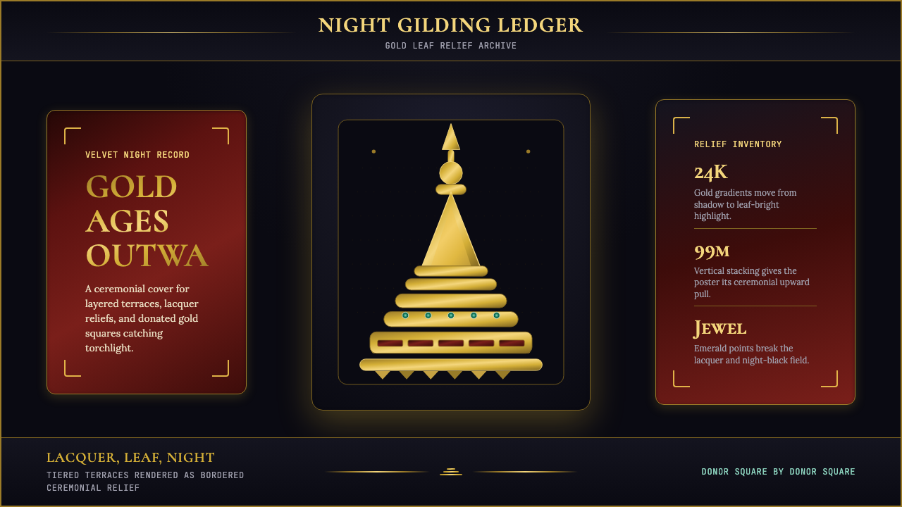 Burmese Shwedagon Stupa ReliefGold refuses restraint. Velvet black, teak-red lacquer, and tiered gradients…金色拒绝克制:黑夜、柚木红漆与层叠渐变堆出神圣密度。
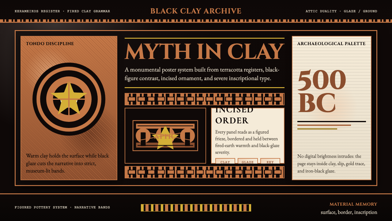 Greek Vase Attic (500 BC)Archaeological severity. Jet-black glaze, terracotta bands, and meander borde…考古般克制:黑釉底、赤陶饰带与回纹边框构成陶瓶式秩序。
 Argentine Bandoneón 1900 (Tango)Gaslit tango luxury. Midnight velvet, brass fileteado, and pearl-button geome…煤气灯下的探戈奢华:午夜绒底、黄铜卷草与珍珠琴键。
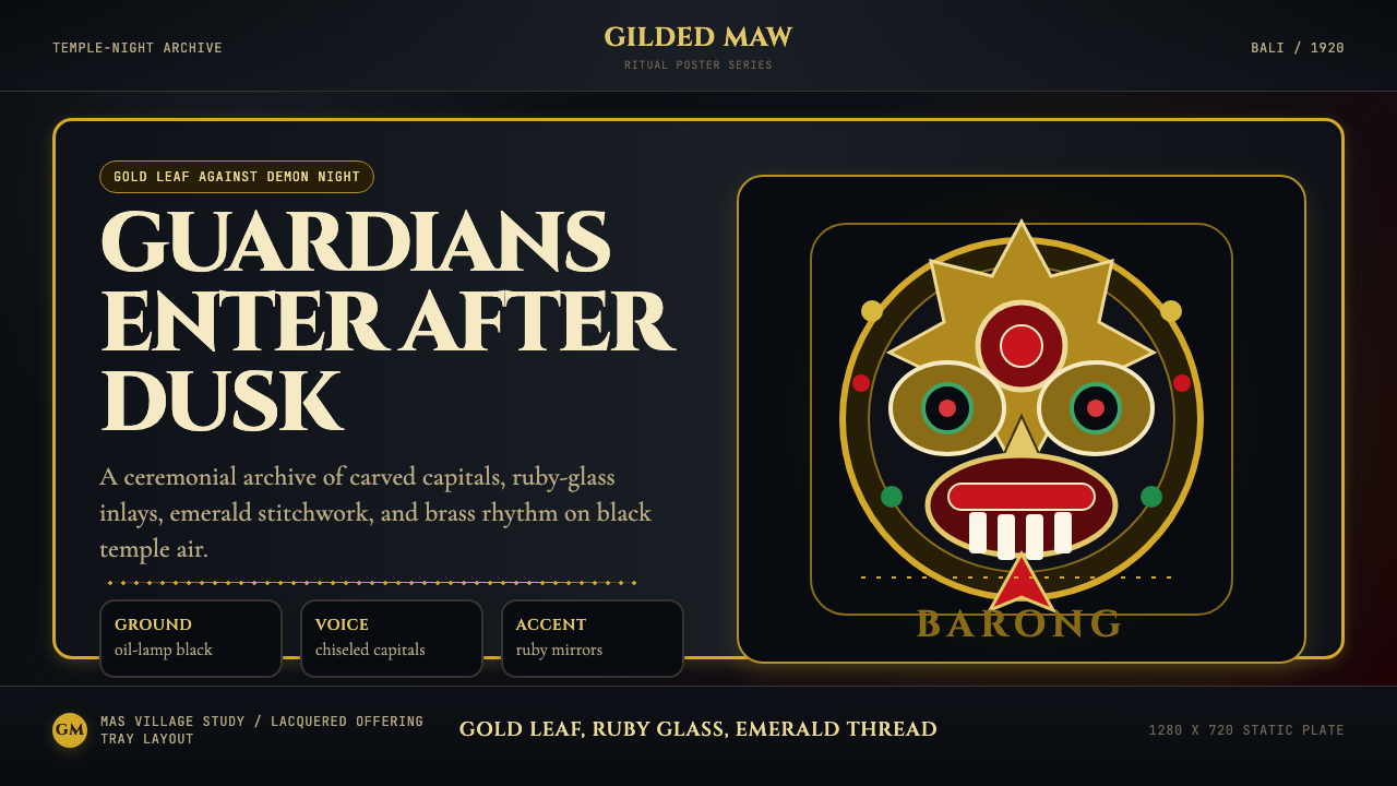 Balinese Barong Mask (1920)Protection glows after dark. Cinzel capitals frame gold, ruby, and emerald ge…守护在夜色中发光:Cinzel碑刻字围住金、红宝石与翡翠几何。