What is Greek Vase Attic (500 BC)?什么是 Greek Vase Attic (500 BC)?
Black glaze, terracotta ground, and incised silhouette — the visual language of Attic vase painting turns two fired pigments into one of antiquity's most enduring narrative systems.黑釉、赤陶底色与刻线剪影——阿提卡陶瓶绘画以两种烧制颜料,构建起古代最具生命力的叙事视觉体系。
Greek Vase Attic (500 BC) in briefGreek Vase Attic (500 BC) 速览
Greek Vase Attic (500 BC) is a design aesthetic drawn from the peak era of Athenian ceramic painting, a tradition that flourished in the Kerameikos pottery district of Athens between approximately 620 and 320 BCE, reaching its expressive height around 500 BCE. The visual system is defined by a radical binary: jet-black glaze set against a warm, orange-toned clay body — or, in the later red-figure technique, the inverse. Everything that exists in the composition is either fired black or left as terracotta; no intermediate colors intrude.希腊阿提卡陶瓶(公元前500年)是一种源自雅典陶瓷绘画巅峰时代的设计美学。这一传统在雅典凯拉米克斯陶器区兴盛于公元前620至320年间,并在约公元前500年前后达到其表现力的顶峰。这套视觉体系由一种极端的二元对立所定义:漆黑的釉色与温暖橙调的陶土底色相互对立——或在后来的红绘技法中呈现其逆反形式。构图中存在的一切,要么是烧制而成的黑色,要么是留白的赤陶色;没有任何中间色调介入。
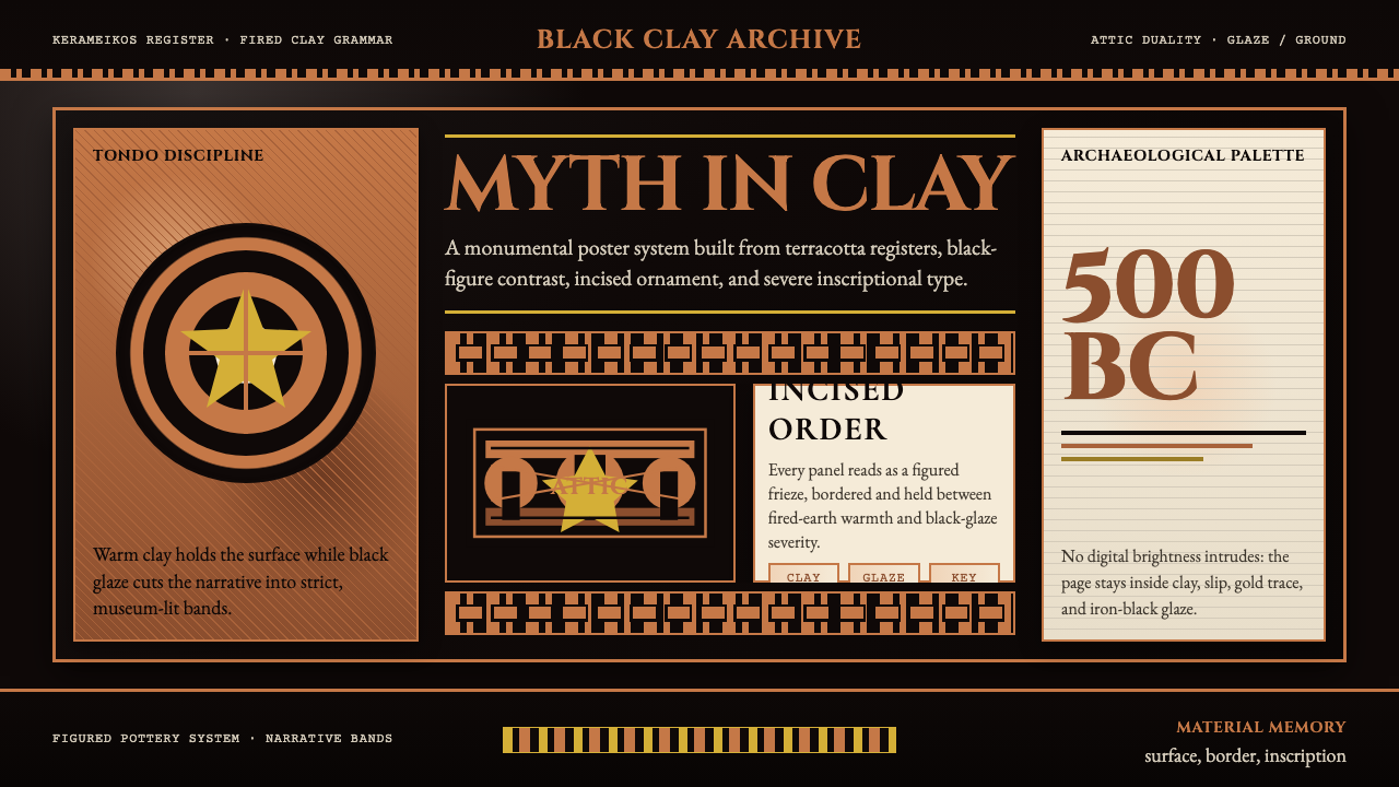
The aesthetic is simultaneously austere and narrative-rich. Figured friezes wrap cylindrical surfaces with processions of gods, athletes, warriors, and mythological scenes, each silhouette incised or reserved with extraordinary line precision. Meander borders — the endlessly repeating Greek-key pattern — frame compositions at top and bottom, functioning as a structural device that organizes pictorial space the way a page margin organizes text. The ornamental vocabulary extends to palmettes, lotus chains, and egg-and-dart molding at vessel rims.这种美学同时兼具严峻与叙事性。人物饰带环绕圆柱形器身,以神明、运动员、战士与神话场景的游行队列铺展开来,每一个剪影都以刻线或留白技法呈现出极高精度的线条。回纹边框——永无止境重复的希腊钥匙纹——在构图的上下两端形成框架,其结构性功能如同页边距组织文字一样组织着图像空间。装饰词汇还延伸至棕榈叶纹、莲花链和器缘处的卵箭饰线脚。
What makes this visual language distinctive as a design system is its discipline: a maximum of two dominant tones, severe geometric framing, and figures that communicate through pose and silhouette rather than shading or illusionistic depth. It is an aesthetic of contour, of the telling edge — closer in spirit to a woodblock print or a shadow-puppet tradition than to anything that requires tonal gradation.使这套视觉语言作为设计系统具有独特性的,是其内在的自律:最多两种主导色调、严格的几何框架,以及通过姿态与剪影而非阴影或透视深度来传达信息的人物形象。这是一种轮廓的美学——那个决定性的边缘线的美学——其精神气质更接近木刻版画或皮影艺术的传统,而非任何需要色调渐变的表现形式。
See the Greek Vase Attic (500 BC) design system查看 Greek Vase Attic (500 BC) 完整设计系统
Where does Greek Vase Attic (500 BC) come from?Greek Vase Attic (500 BC) 从何而来?
Attic vase painting emerged from an older Greek geometric tradition in which vessels were decorated entirely with abstract meander, zigzag, and lattice patterns, with the human figure absent or rendered as a pure silhouette schematic. By the seventh century BCE, contact with Egyptian and Near Eastern art introduced more figurative, narrative tendencies — the so-called Orientalizing period — and Athenian potters began populating their vessels with mythological scenes drawn from Homeric epic, Hesiodic theogony, and the cycles of Heracles and Theseus.阿提卡陶瓶绘画脱胎于一种更古老的希腊几何装饰传统——在那一传统中,陶器完全以抽象的回纹、锯齿纹和格格纹装饰,人物形象或付之阙如,或仅以纯粹的剪影图式呈现。进入公元前七世纪,与埃及和近东艺术的接触引入了更多具象叙事倾向——即所谓的「东方化时期」——雅典陶工开始在器身上描绘取材于荷马史诗、赫西俄德神谱以及赫拉克勒斯与忒修斯传说周期的神话场景。
The black-figure technique, developed by Corinthian potters and rapidly adopted and perfected in Athens from around 620 BCE, worked as follows: a potter shaped the vessel on a wheel, and a painter applied a slip of refined clay — which fired to an iron-rich black — to the areas that would become the dark figures. Details such as musculature, drapery folds, and inscriptions were incised through the slip with a pointed instrument before firing, revealing the warm terracotta beneath. A single firing at controlled temperatures produced the canonical two-tone result.黑绘技法由科林斯陶工首创,约自公元前620年起被雅典迅速采纳并发扬光大。其工艺流程如下:陶工在轮盘上塑形,画工将富含铁质、烧制后呈黑色的精炼陶浆(化妆土)涂覆于将成为深色人物的区域。肌肉纹理、衣褶与铭文等细节,则在烧制前用尖锐工具刻入陶浆,露出下方温暖的赤陶底色。在严格控温的单次烧制中,经典的双色效果由此产生。
Around 530 BCE, an anonymous Athenian potter known to scholars as the Andokides Painter — one of the key figures listed in the source materials — pioneered a reversal of the technique. In red-figure painting, the background was flooded with the black slip, leaving the figures in the natural terracotta color. Details were now painted on with a fine brush using diluted slip, allowing far greater fluidity of line and the depiction of foreshortening and interior anatomical detail. The transition from black-figure to red-figure occurred rapidly; by 480 BCE red-figure had essentially superseded the older method for narrative work, though black-figure continued in use for certain vessel types, particularly the Panathenaic amphora awarded as prize vessels at the Athenian games.约公元前530年,一位被学者称为安多基德斯画家的匿名雅典陶工——即史料中记载的关键人物之一——开创了技法的逆转。在红绘技法中,背景整体涂覆黑色陶浆,人物则留在天然赤陶色中。细节改用细笔蘸稀释陶浆直接描绘,由此赋予线条更高的流畅度,并能够表现透视缩短与内部解剖细节。从黑绘到红绘的转变来得迅速;至公元前480年,红绘技法在叙事性器物上已基本取代了旧有方式,但黑绘仍在某些特定器型上延续使用,尤以泛雅典娜节运动会奖品陶罐(Panathenaic amphora)为甚。
The peak era — roughly 530 to 400 BCE — produced the canonical masters. Exekias, active in the mid-sixth century BCE, is considered the supreme black-figure painter: his Achilles and Ajax Playing Dice and the Cup with Dionysus in a Ship demonstrate a compositional gravity, spatial economy, and psychological intensity that later traditions struggled to surpass. Euphronios, working at the turn of the fifth century, brought the red-figure technique to its expressive limit in works that depicted muscular anatomy with a precision that contemporaries recognized as revolutionary. The Brygos Painter produced work of lyric energy — revelers, symposia scenes, and mythological combats rendered with a fluid spontaneity that feels almost calligraphic. Together, these painters established a visual vocabulary that the Grand Tour collectors of the eighteenth century would rediscover, and that Josiah Wedgwood would translate into neoclassical ceramics for a new European market.巅峰时期——大致为公元前530至400年——孕育了经典大师。活跃于公元前六世纪中叶的埃克塞基亚斯,被视为黑绘艺术的至高典范:他的《阿喀琉斯与埃阿斯下棋》和《酒神在船中》杯,展示出后世传统难以逾越的构图张力、空间经济与心理深度。活跃于公元前五世纪之交的欧弗洛尼奥斯,以描绘肌肉解剖精度令同时代人叹为观止的红绘作品,将这一技法推至表现极限。布里戈斯画家的作品充满抒情能量——饮宴者、会饮场景与神话战斗以近乎书法般流动的自发性呈现。这些画家共同建立了一套视觉词汇,十八世纪大旅行收藏家将其重新发现,乔赛亚·韦奇伍德则将其转译为面向欧洲新兴市场的新古典主义陶瓷。
What defines the Greek Vase Attic (500 BC) look?Greek Vase Attic (500 BC) 的视觉特征是什么?
Binary Palette二元色调
The entire visual system operates on a strict two-tone foundation: fired black glaze against the warm, iron-rich orange of the natural clay body. No intermediate hues are introduced; the discipline of the kiln enforces it. In black-figure work, figures are dark on a light ground; in red-figure, the ground floods black and figures emerge in terracotta warmth. This radical chromatic economy means that every compositional decision — positive/negative, figure/ground, foreground/background — is expressed through the same binary opposition.整套视觉体系建立在严格的双色基础之上:烧制的黑色釉彩与天然陶土温暖的富铁橙色相互对立。没有任何中间色调被引入;窑炉的工艺本身就强制实施了这一自律。黑绘中,人物以深色呈现于浅色底面;红绘中,底面被黑色填满,人物以赤陶的温度浮现。这种极端的色彩经济意味着每一个构图决定——正/负、图/底、前景/背景——都通过同一种二元对立来表达。
Incised Line and Contour刻线与轮廓
In black-figure painting, internal detail — musculature, drapery, hair, armor — is incised through the applied black slip with a sharp instrument, revealing the warm clay beneath as a fine line. The result is a quality unique to the technique: the drawn line is simultaneously a cut, a revelation, and an edge. In red-figure, detail is instead painted on with a thin brush, allowing freer, more spontaneous linework. Both approaches privilege the contour above all else; form is defined by edge, not by tonal modeling or shading.在黑绘技法中,内部细节——肌肉纹理、衣褶、发丝、甲胄——通过尖锐工具刻入已涂覆的黑色陶浆,露出下方温暖陶土形成细线。由此产生的效果是这一技法独有的:所画的线同时是一道刻痕、一次揭示与一条边缘。红绘技法中,细节改以细笔直接描绘,赋予线条更自由、更自发的流动性。两种手法都将轮廓置于首位;形态由边缘而非色调塑模或阴影来定义。
Meander Border and Geometric Framing回纹边框与几何框架
The Greek-key meander — an endlessly turning right-angle spiral — appears at the top and bottom registers of virtually every figured vessel as a structural frame. It separates the narrative frieze from the vessel's functional zones (neck, foot, handle attachment) and provides a visual rhythm that the figured scenes play against. Additional geometric registers — tongue patterns at the vessel's shoulder, egg-and-dart at the rim, lotus-and-palmette chains at the handles — complete a layered ornamental architecture that is entirely non-representational and entirely structural.希腊钥匙回纹——一种永无止境转折的直角螺旋——几乎出现在每件人物装饰陶器的上下区带,作为结构性框架存在。它将叙事性饰带与器物的功能性区域(颈部、底足、柄附着点)分隔开来,并提供一种视觉节奏,供人物场景与之形成对位。器肩处的舌形纹、器缘的卵箭饰、柄部的莲花与棕榈叶链,共同完成一种层次分明的装饰建筑——全然非具象,全然具有结构性。
Silhouette and Pose剪影与姿态
Because there is no shading, no cast shadow, and no atmospheric perspective, figures must communicate entirely through silhouette and gesture. Attic painters developed a grammar of canonical poses — the archer in three-quarter profile, the fallen warrior in the arc of death, the symposiast reclining on a kline — that audiences could read instantly. This vocabulary of legible postures is analogous to an iconographic system: each pose carries semantic weight independent of facial expression or tonal nuance. It is design-through-convention, where clarity of communication is achieved not through novelty but through shared visual code.由于没有阴影、没有投影、没有空气透视,人物必须完全通过剪影与姿态来传达信息。阿提卡画家由此发展出一套经典姿态的语法——以四分之三侧面射箭的弓手、在死亡弧线中倒落的战士、斜倚于卧榻上的会饮者——观者可以即时解读。这套可读姿势的词汇类似于一套图像志体系:每种姿态承载着独立于表情或色调细微差别之外的语义重量。这是一种惯例式设计——通过共享的视觉代码而非新颖性来实现清晰的传达。
Narrative Frieze Organization叙事性饰带结构
Figured scenes are arranged in horizontal registers that wrap continuously around the vessel, a compositional strategy inherited from ancient Near Eastern cylinder seals and Egyptian tomb painting. The frieze format implies procession, sequence, and simultaneity: events that unfold in time are compressed into a band that the viewer reads by rotating the object. This is not illustration in the modern sense but a spatial notation of narrative — a way of encoding story in continuous horizontal space. The ground line beneath figures is abstract, not perspectival; figures stand on the same plane regardless of their depicted distance from one another.人物场景以水平饰带的形式连续环绕器身排布,这一构图策略承袭自古代近东滚筒印章与埃及墓室绘画。饰带格式暗示着游行、序列与同时性:在时间中展开的事件被压缩进一条带状空间,观者通过转动器物来阅读。这不是现代意义上的插图,而是叙事的空间记谱——一种在连续水平空间中编码故事的方式。人物脚下的地平线是抽象的,而非透视性的;人物站立于同一平面,无论其在画面中的描绘距离如何。
Material Warmth and Surface Memory材质温度与表面记忆
The terracotta ground is not a neutral background — it is itself the material of the vessel, and its warmth is inseparable from the object's identity as fired earth. The contrast between the lustrous, almost metallic black glaze and the matte, grainy clay body is a material contrast as much as a chromatic one. Attic vase painting is never purely visual; it carries the memory of specific earth, specific kilns, and specific fire. In design application, this quality translates to a preference for surfaces that feel tactile and grounded rather than digitally clean and immaterial.赤陶底色不是一个中性的背景——它本身就是器物的材质,其温度与陶器作为烧制之土的身份不可分割。富有光泽、近乎金属质感的黑釉与哑光、颗粒感的陶土胎体之间的对比,是一种材质对比,同样也是一种色调对比。阿提卡陶瓶绘画从来不是纯粹的视觉;它承载着特定土地、特定窑炉与特定火焰的记忆。在设计应用中,这种品质转化为一种对触感鲜明、扎根大地的表面的偏好,而非数字化的洁净与无质感。
Archaeological Restraint考古般的克制
The entire aesthetic operates under a principle of severe restraint. Color is limited to what the kiln allows. Decoration appears only in designated registers and never bleeds into functional zones. Figure scale is consistent within a register rather than hierarchical in the medieval sense. Nothing is added for optical richness or emotional warmth that is not already inherent in the technique itself. This restraint is not poverty of means — it is disciplined amplification: within extreme constraint, every incised line and every preserved contour carries disproportionate expressive weight.整套美学体系在一种极度克制的原则下运作。色彩局限于窑炉所允许的范围。装饰仅出现于指定区带,从不溢出至功能性区域。人物比例在同一区带内保持一致,而非中世纪意义上的等级性差异。没有任何东西被添加来增加视觉丰富性或情感温度,除非它本已内在于技法本身。这种克制不是手段的贫乏——而是自律的放大:在极端约束之内,每一道刻线与每一条保留的轮廓都承载着不成比例的表现重量。
See the Greek Vase Attic (500 BC) design system查看 Greek Vase Attic (500 BC) 完整设计系统
Who shaped Greek Vase Attic (500 BC)?谁塑造了 Greek Vase Attic (500 BC)?
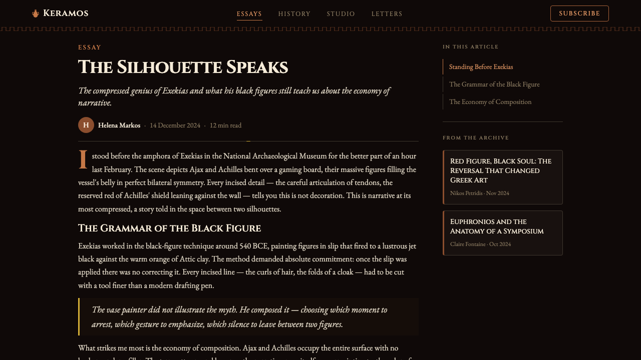
Active in Athens during the mid-sixth century BCE, Exekias is considered the supreme master of the black-figure technique. He worked both as a potter and a painter — an unusual dual role — and signed several of his vessels in both capacities. His Achilles and Ajax Playing Dice amphora captures two heroes at rest in a moment of concentrated stillness, their spears vertical, their eyes fixed on a game board between them, the weight of the Trojan War suspended in the pause. His Cup with Dionysus in a Ship — the god reclining in a vessel surrounded by dolphins, a vine laden with grapes growing from the mast — achieves a circular compositional perfection that exploits the kylix form as no painter before him had done. Exekias demonstrated that the black-figure technique, far from being a limitation, was a medium of profound gravity and psychological depth.埃克塞基亚斯活跃于公元前六世纪中叶的雅典,被视为黑绘技法的至高大师。他同时担任陶工与画家——这是一个不寻常的双重角色——并在多件器物上以两种身份署名。他的《阿喀琉斯与埃阿斯下棋》双耳瓶,捕捉了两位英雄在凝神静止一刻的休憩:长矛垂直,目光固定在两人之间的棋盘上,特洛伊战争的重量悬挂在这片停顿之中。他的《酒神在船中》杯——神祇斜倚在被海豚环绕的船中,一株挂满葡萄的藤蔓从桅杆生长而出——达到一种圆形构图的完美,以前所未有的方式利用了圆底浅杯的器型。埃克塞基亚斯证明,黑绘技法远非一种局限,而是一种蕴含深沉庄重感与心理深度的媒介。
Euphronios worked at the turn of the fifth century BCE and is the defining figure of the early red-figure technique. His Calyx-Krater depicting the Death of Sarpedon — in which Hypnos and Thanatos (Sleep and Death) carry the fallen Lycian king while Hermes watches — is among the most celebrated surviving examples of ancient Greek painting. The anatomical detail of the dying Sarpedon's body, with its rendered musculature and the careful foreshortening of limbs, represented a technical advance so striking that contemporaries inscribed their admiration on vessels. Euphronios was also a successful potter-entrepreneur; his name appears on vessels as both painter and dedicant, suggesting a workshop of considerable scale and commercial ambition.欧弗洛尼奥斯活跃于公元前五世纪之交,是早期红绘技法的决定性人物。他描绘《萨尔珀冬之死》的萼形混酒钵——许普诺斯与塔那托斯(睡眠与死亡)托举倒落的吕基亚王,赫尔墨斯在旁注视——是古希腊绘画中最广为称誉的存世作品之一。垂死的萨尔珀冬身体的解剖学细节,其肌肉纹理的描绘与四肢的透视缩短,代表了一种如此震撼的技术进步,以至于同时代人在陶器上铭刻了他们的赞叹。欧弗洛尼奥斯也是一位成功的陶工-企业家;他的名字以画家和奉献者两种身份出现在器物上,暗示着一个规模相当、商业野心不小的工坊。
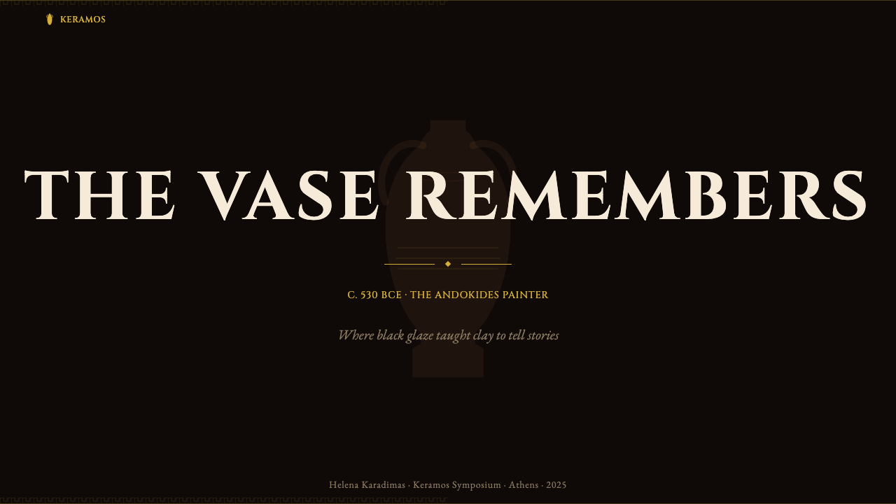
Known to scholars by the name of the potter Andokides, on whose vessels he painted, the Andokides Painter is credited with pioneering — or among the earliest practitioners of — the red-figure technique around 530 BCE. Several surviving vessels attributed to him are bilingual: one side painted in the older black-figure style, the other in red-figure, as though the painter were demonstrating the transition itself. This bilingual quality makes his work uniquely important for understanding the technical and conceptual shift from one tradition to the other. He represents a threshold figure, standing between two visual systems, working in both simultaneously, and establishing that the new technique was not a rejection of the old but a structural inversion of the same binary logic.学者以与其合作的陶工安多基德斯之名称此画家为安多基德斯画家,其约于公元前530年首创——或在最早实践者之列——红绘技法。归于其名下的数件存世器物具有双语性质:一面以旧有黑绘风格描绘,另一面以红绘呈现,仿佛画家在以器物本身演示这场转变。这种双语品质使他的作品在理解从一种传统到另一种传统的技术与概念转变方面具有独特的重要性。他是一个门槛性人物,立于两套视觉体系之间,同时操作两者,并确立了新技法不是对旧有技法的拒绝,而是同一二元逻辑的结构性反转。
The Brygos Painter, named after the potter Brygos who signed many of the cups on which he worked, was active in the early fifth century BCE and is celebrated for the lyric energy and emotional spontaneity of his line. Where Euphronios pursued anatomical authority, the Brygos Painter pursued movement and mood — his revelers tumble and sway with an almost calligraphic freedom, his maenads are fierce, his Iliadic scenes carry an urgency that contemporaneous black-figure work rarely achieved. He represents the strand of Attic vase painting that valued expressive gesture over systematic correctness, and his influence on subsequent painters of the severe style is visible in the way later artists balanced anatomical rigor with emotional legibility.布里戈斯画家以为其签名的众多杯器制作的陶工布里戈斯命名,活跃于公元前五世纪初,以其线条的抒情能量与情感自发性著称。若说欧弗洛尼奥斯追求的是解剖学的权威,布里戈斯画家追求的则是运动与情绪——他笔下的饮宴者以近乎书法式的自由倾斜摇曳,他的迈纳德仙女凶猛炽烈,他的伊利亚特场景携带着同期黑绘作品鲜少达到的紧迫感。他代表着阿提卡陶瓶绘画中重视表现性姿态而非系统正确性的一脉,他对后来严肃风格画家的影响,在后世艺术家如何平衡解剖学严谨与情感可读性之间清晰可见。
How do you use Greek Vase Attic (500 BC) today?今天怎么用 Greek Vase Attic (500 BC)?
Greek Vase Attic translates into contemporary design work as a system of extreme chromatic discipline and ornamental precision. Applying it well requires understanding its core logic: two dominant tones in high contrast, geometric framing as structural necessity rather than decoration, and figures or content elements that communicate through silhouette and edge rather than tonal gradation. It is a style for work that wants to feel archaeological, authoritative, and narratively rich without relying on color complexity.希腊阿提卡陶瓶在当代设计中转化为一套极度色彩自律与装饰精确性的系统。正确应用它需要理解其核心逻辑:高对比度的两种主导色调,作为结构必要性而非装饰的几何框架,以及通过剪影与边缘而非色调渐变来传达信息的人物或内容元素。这是一种适合希望呈现考古感、权威感与叙事丰富性而无需依赖色彩复杂度的设计风格。
For presentation slides, the style offers strong possibilities at both the cover and content levels. A cover slide benefits from the full-bleed terracotta-and-black treatment: warm orange ground with a large black silhouette shape or frieze-like illustration anchoring the composition, title text rendered in a weight and style that evokes monumental inscription. Content slides work well with a strict two-column structure where a narrow ornamental border — meander-inspired, purely geometric — frames the slide edge, and text sits within a clean field. Data visualization takes on a figured-frieze quality: charts and graphs rendered in the palette's two tones, with accent marks or category indicators drawn from the meander and palmette vocabulary.在演示文稿中,这种风格在封面与内容页面上都提供了强有力的可能性。封面幻灯片适合采用满版的赤陶-黑色处理:温暖的橙色底面配以大型黑色剪影形状或饰带式插图锚定构图,标题文字以唤起纪念碑铭文的字重和风格呈现。内容幻灯片适合严格的双栏结构,回纹启发的纯几何装饰性窄边框作为幻灯片边缘框架,文字置于洁净的区域内。数据可视化呈现出人物饰带般的品质:图表以这套色调的两种色彩呈现,类别指示符从回纹和棕榈叶纹词汇中提取。
For web interfaces and dashboards, the style suits contexts where gravity and historical weight are desired qualities — a luxury goods platform, a museum or archival product, an academic publisher, or any brand that wants to invoke permanence rather than novelty. The approach: use the dark ground as the primary surface, reserve the warm orange-terracotta as the key accent color for interactive states, active selections, and calls to action. Navigation elements and structural dividers should use meander-like geometric borders in reduced scale. Avoid drop shadows entirely; use flat bordered components instead. Pricing pages work well with the black-ground variant, where tier cards are distinguished by the presence or absence of terracotta accent, not by gradients or glow effects.对于网页界面和仪表板,这种风格适合庄重感与历史分量是期望品质的场景——奢侈品平台、博物馆或档案类产品、学术出版商,或任何希望唤起永久性而非新颖性的品牌。方法如下:以深色底面作为主要表面,保留温暖的橙色赤陶作为交互状态、激活选中和行动号召的关键强调色。导航元素与结构性分割线应使用缩小比例的回纹几何边框。完全避免投影;改用带边框的平面组件。定价页面适合黑底变体,等级卡片以赤陶强调色的有无来区分,而非渐变或发光效果。
For editorial and marketing work, the style's poster-like quality is its greatest asset. A full-spread editorial layout built on the black-and-terracotta binary, with text set in a classically proportioned typeface at high contrast against the ground, projects a confidence that few contemporary styles can match. Marketing materials — event posters, exhibition announcements, brand identity systems for heritage or luxury clients — benefit from the frieze convention: a narrow horizontal band of geometric or figured ornament across the bottom or top of the composition functions as a visual anchor that reads immediately as classical without being nostalgic. Pull-quotes and callout text work well set within a meander border box.对于编辑与营销工作,这种风格的海报式品质是其最大资产。基于黑色与赤陶二元对立构建的全版面编辑版式,配以在底色上高对比度呈现的经典比例字体,投射出当代大多数风格难以比拟的自信感。营销材料——活动海报、展览公告、传统或奢侈品客户的品牌识别系统——受益于饰带惯例:构图底部或顶部一道窄水平的几何或人物装饰带,作为视觉锚点,即刻呈现出古典感而不流于怀旧。引文和标注文字置于回纹边框盒内效果极佳。
A common mistake when applying this style is treating the terracotta warmth as an invitation to introduce additional earth tones — ochre, sienna, umber — in the interest of visual richness. Attic painting permits no such expansion; its power comes precisely from the refusal of a third tone. A second common error is over-populating the ornamental registers: the meander border works because it is contained, repetitive, and unvarying — the moment it is enlarged, embellished, or combined with other ornamental motifs at the same scale, the structural function collapses into decorative noise. Use the geometric framing elements at small scale and consistent weight, and resist the temptation to make them a design statement in themselves.应用这种风格时一个常见错误,是将赤陶的温暖视为引入更多大地色调——赭石、土黄、棕褐——以求视觉丰富性的邀请。阿提卡绘画不允许此类扩展;其力量恰恰来自对第三种色调的拒绝。第二个常见错误是过度填充装饰性区带:回纹边框之所以有效,在于其被限制、重复且不变——一旦被放大、加以装饰,或与其他同等比例的装饰母题组合,其结构功能便瓦解为装饰性噪音。以小比例和一致字重使用几何框架元素,抵制将其变成设计陈述本身的诱惑。
See the Greek Vase Attic (500 BC) design system查看 Greek Vase Attic (500 BC) 完整设计系统
Greek Vase Attic (500 BC) — FAQGreek Vase Attic (500 BC) · 常见问题
What is the difference between black-figure and red-figure, and does it matter for design application?黑绘与红绘有何区别?这对设计应用有影响吗?
Black-figure places dark figures on a light terracotta ground; red-figure inverts this, flooding the ground with black and leaving figures in the warm clay color. For design application, the distinction translates directly to two valid layout orientations: a light-ground variant feels warmer, more documentary, and slightly more approachable; a dark-ground variant carries more visual weight, feels more monumental, and reads as more contemporary. Both are historically authentic. Choose based on the emotional register of the product: dark-ground for authority and gravitas, light-ground for warmth and accessibility. Avoid mixing the two orientations on the same surface, as Attic painters only did so in the transitional bilingual vessels of the Andokides period.黑绘将深色人物置于浅色赤陶底面;红绘则将其反转,以黑色填满底面,人物留在温暖的陶土色中。对于设计应用,这一区别直接转化为两种有效的版面取向:浅色底面变体感觉更温暖、更具文献感、略显亲和;深色底面变体承载更大的视觉重量,呈现更具纪念感,也更接近当代审美。两者都具有历史真实性。根据产品的情感调性选择:深色底面用于权威与庄重,浅色底面用于温暖与亲和性。避免在同一表面混用两种取向,因为阿提卡画家仅在安多基德斯时期的过渡性双语器物上才如此操作。
How should the meander border be used without looking like a costume or pastiche?如何使用回纹边框而不显得像服装装饰或生硬的仿古?
The meander border works as a structural element only when it is small, consistent, and placed at a functional boundary — the edge of a slide, the top of a card, the divider between a header and body zone. It fails when it is enlarged to become a feature, when it is rendered with excessive weight relative to the content it frames, or when multiple ornamental registers are stacked. The historical vessels succeed because the meander is proportionally tiny relative to the figured scene it borders. In contemporary application, treat it as a hairline structural mark rather than a decorative statement. A single thin meander rule at the base of a text column is more effective than a wide ornamental band dominating the composition.回纹边框只有在细小、一致且放置于功能性边界处时才作为结构元素发挥作用——幻灯片边缘、卡片顶部、页眉与正文区域之间的分割线。当它被放大成为一个特征、以与其所框内容不成比例的过大字重呈现,或多个装饰性区带叠加时,它就会失效。历史器物之所以成功,是因为回纹相对于其所框定的人物场景在比例上极为微小。在当代应用中,将其视为发丝般的结构性标记而非装饰性陈述。文字栏底部的单条细回纹线,比主导构图的宽装饰带更为有效。
Can this style work for digital products aimed at younger or casual audiences?这种风格适用于面向年轻或休闲受众的数字产品吗?
It can, but requires careful modulation of its inherent severity. The terracotta warmth is the most accessible quality in the palette — leading with it, using the black sparingly as structural accent rather than dominant ground, and keeping the geometric ornamentation at hairline weight will soften the overall register significantly. The style also has a latent quality that resonates with contemporary aesthetics: its flat silhouette figures and high-contrast ground anticipate by two and a half millennia the visual logic of sticker packs, icon libraries, and motion graphics built from flat shapes. A youth-facing application that reinterprets the figured-frieze convention through contemporary iconography — using silhouette illustration in the terracotta-on-black palette — can feel fresh and referential simultaneously without reading as archival or academic.可以,但需要仔细调节其内在的严峻性。赤陶的温暖是色板中最具亲和力的品质——以此为主导,将黑色作为结构强调而非主导底面来节制使用,并将几何装饰保持在发丝字重,将显著软化整体调性。这种风格还有一种与当代审美产生共鸣的潜在品质:其平面剪影人物与高对比度底面,早于贴纸包、图标库和由平面形状构建的动态图形的视觉逻辑两千五百年。一个面向年轻受众的应用,通过当代图像志重新诠释人物饰带惯例——以赤陶-黑配色的剪影插图——可以同时呈现新鲜感与引用感,而不会被解读为档案或学术性质。
Is there a risk that this style reads as exclusively Western or Eurocentric?这种风格是否存在被解读为专属西方或欧洲中心主义的风险?
The question is worth holding. Attic vase painting is a specific artifact of ancient Mediterranean culture, and its most direct lineage runs through European Grand Tour collecting, Wedgwood neoclassicism, and nineteenth-century academic art history — all explicitly Eurocentric contexts. In design application, the risk of parochialism is mitigated by treating the style's formal properties — binary palette discipline, framing-as-structure, silhouette communication — as universal design principles that happen to be expressed through a specific historical vocabulary, rather than as markers of cultural ownership. The meander pattern, for instance, appears independently in ancient Chinese bronzes, pre-Columbian pottery, and Celtic metalwork; the black-on-terracotta binary resonates with Japanese lacquerware and West African resist-dyeing traditions. Frame the reference as formal and historical rather than claiming cultural centrality.这个问题值得认真对待。阿提卡陶瓶绘画是古代地中海文化的特定产物,其最直接的传承脉络经由欧洲大旅行收藏、韦奇伍德新古典主义和十九世纪学院艺术史——均是明确的欧洲中心主义语境。在设计应用中,通过将这种风格的形式属性——二元色调自律、框架即结构、剪影传达——视为通过特定历史词汇表达的普遍设计原则,而非文化所有权的标记,可以降低地方主义的风险。例如,回纹图案独立出现于中国古代青铜器、前哥伦布时期陶器和凯尔特金属制品中;黑色-赤陶的二元对立与日本漆器和西非防染工艺传统产生共鸣。将这种引用框定为形式性与历史性的,而非声张文化中心性。
How does this style relate to Neoclassicism and Art Deco, which also draw on ancient Greek sources?这种风格与同样取材于古希腊的新古典主义和装饰艺术有何关系?
All three traditions share a common source — ancient Greek visual culture — but they interpret it very differently. Neoclassicism (late eighteenth and early nineteenth century) filtered ancient Greece through Roman copies and Renaissance humanism, producing a style that emphasized sculptural roundness, full color, and the heroic figure. Art Deco (1920s–1940s) abstracted Greek ornamental motifs — meanders, palmettes, chevrons — into high-contrast geometric patterns, but combined them with jazz-age dynamism, metallic materials, and the full modern color spectrum. The Attic Vase source is more archaeologically strict than either: it is committed to the binary palette, the fired-material constraint, and the figured-frieze format as they actually existed in the fifth century BCE, not as filtered through later European aesthetic preferences. The result is rawer, more severe, and less domesticated than either Neoclassicism or Art Deco — closer to the artifact itself than to the interpretive traditions that followed.三种传统共享一个共同来源——古希腊视觉文化——但对其诠释截然不同。新古典主义(十八世纪末至十九世纪初)通过罗马复制品与文艺复兴人文主义过滤古希腊,产生了强调雕塑圆润感、全彩色和英雄人物的风格。装饰艺术(1920至1940年代)将希腊装饰母题——回纹、棕榈叶纹、之字纹——抽象为高对比度几何图案,但将其与爵士时代的活力、金属材质和完整的现代色谱相结合。阿提卡陶瓶来源比二者在考古学上更为严格:它承诺于二元色调、烧制材料的约束,以及公元前五世纪实际存在的人物饰带格式,而非经过后来欧洲美学偏好过滤的版本。由此产生的结果比新古典主义或装饰艺术都更为原始、更为严峻、更少被驯化——更接近器物本身,而非随后的诠释传统。
Related design styles相关设计风格
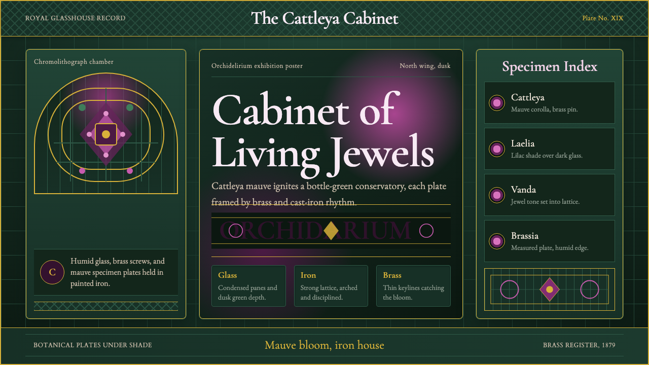 Orchid ConservatoryLush Victorian darkness. Cattleya mauve and brass sit inside bottle-green iro…繁茂的维多利亚暗调:卡特兰紫红与黄铜嵌入瓶绿铁格。
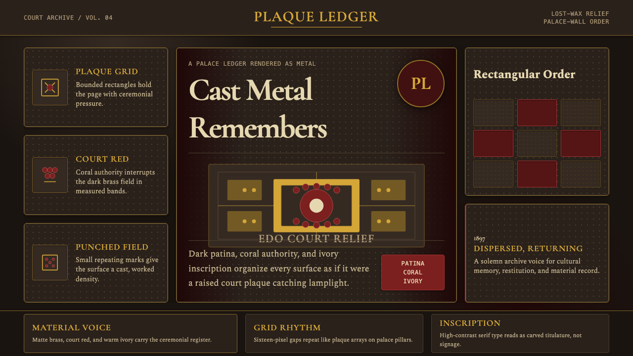 Benin Bronze Oba CourtCourt gravity in cast metal. Patinated brass grid, coral red panels, ivory se…宫廷重如铸金。氧化黄铜网格、珊瑚红板块与象牙色衬线成浮雕。
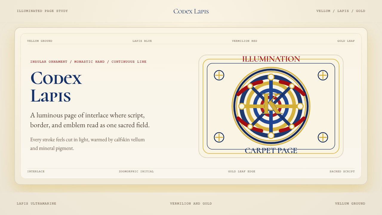 Book of Kells Celtic (800)Sacred and precise. Vellum cream, lapis, vermilion, and gold knotwork.神圣而精密。奶油羊皮底上铺陈青金石、朱砂与金色缠结纹。
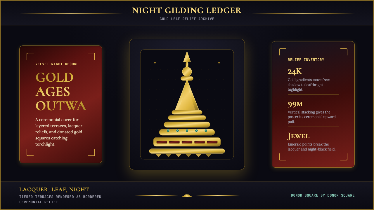 Burmese Shwedagon Stupa ReliefGold refuses restraint. Velvet black, teak-red lacquer, and tiered gradients…金色拒绝克制:黑夜、柚木红漆与层叠渐变堆出神圣密度。
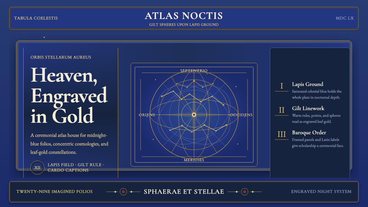 Cellarius Celestial AtlasCelestial luxury on lapis. Gilt serif type, star fields, and concentric chart…青金夜空里的天体奢华:鎏金衬线、星点与同心星图线。
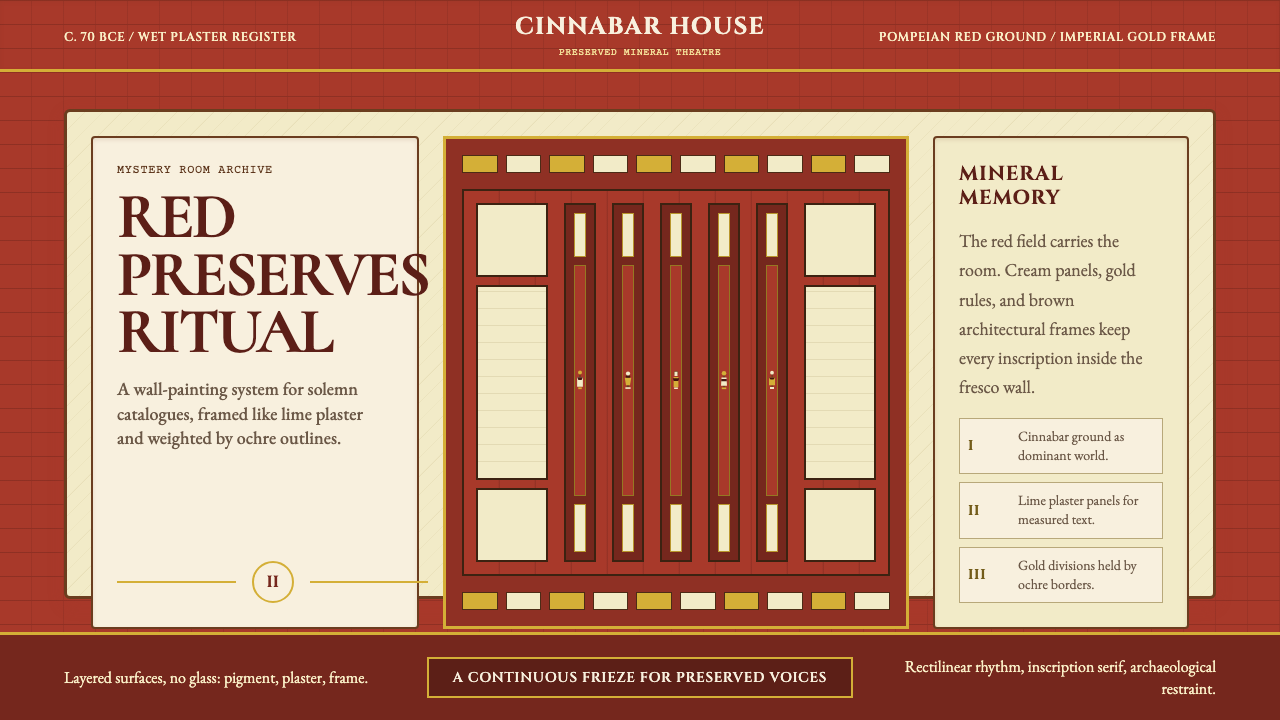 Pompeii Fresco Villa of MysteriesThe wall is the world. Pompeian red, cream plaster panels, and gold frames ho…墙面即世界。庞贝红、石灰奶油面板与金色框线托住仪式。