What is Book of Kells Celtic (800)?什么是 Book of Kells Celtic (800)?
The Book of Kells turns sacred manuscript into a design system — interlace knotwork, jewel pigments, and warm vellum cream woven into every border, initial, and accent.《凯尔经》将神圣手稿转化为设计系统——永恒之结、矿物颜料与温暖的犊皮奶油色,编织进每一条边框、每一个首字母与每一处强调色之中。
Book of Kells Celtic (800) in briefBook of Kells Celtic (800) 速览
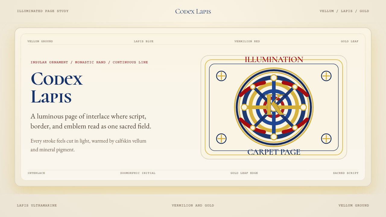
The Book of Kells Celtic (800) design system draws its entire visual vocabulary from one of the most extraordinary manuscripts ever produced — a gospel book created by Columban monk-artists around 800 CE, now held at Trinity College Dublin. Its palette is derived from four historically specific pigments: the deep sky-blue of lapis lazuli, the burning orange-red of vermilion, the sulfurous warm yellow of orpiment, and the radiant surface of hammered gold leaf — all applied over the warm ivory of calfskin vellum. Every color decision in this system refers back to those mineral and animal origins.《凯尔经》凯尔特(800)设计系统将其全部视觉词汇提炼自有史以来最非凡的手稿之一——一部由哥伦班修士艺术家们约于公元800年前后创作的福音书,现珍藏于都柏林三一学院。其色板源自四种历史上确有记载的颜料:青金石深邃的天空蓝、朱砂燃烧般的橙红、雌黄硫磺色的暖黄,以及锤打金箔的光辉表面——一切皆施于犊皮纸温暖的象牙色底面之上。这套系统中每一个色彩决策,都回溯到那些矿物与动物材料的源头。
What distinguishes the Insular illumination tradition from other ornamental systems is the centrality of interlace — continuous knotwork lines that loop, braid, and return without terminus. This is not pattern in the decorative sense; it is structured complexity, where every line can be traced to its origin and followed to its end. The zoomorphic elements — birds, fish, and serpent-forms whose bodies dissolve into the knotwork — add figural energy without ever breaking into representational illustration. The visual system is simultaneously abstract and alive.爱尔兰海岛照明传统有别于其他装饰体系的核心,在于缠结纹的主导地位——连续的纽结线条循环、编织、首尾相接,永无终点。这不是装饰意义上的图案,而是有结构的复杂性:每一条线都可以追溯到起点,跟随到终点。兽形元素——鸟类、鱼类与蛇形,它们的躯体消融于缠结纹之中——在不打破抽象性的前提下注入了具象的生命力。这套视觉系统同时是抽象的,又是鲜活的。
Applied to digital surfaces, this tradition becomes a framework for treating ornament as architecture. Borders are not decoration added after the fact; they are structural containers that define sacred space within the composition. The vellum ground is not a neutral white but a warm, slightly aged cream that carries the memory of the physical manuscript. Every accent is a jewel — used with the restraint appropriate to something precious, placed where the eye should linger, never scattered indiscriminately.应用于数字界面时,这一传统成为一种将装饰视为建筑的框架。边框不是事后添加的装饰;它们是结构性容器,在构图中界定神圣的空间。底面不是中性的白色,而是温暖、略带岁月感的奶油色,承载着实体手稿的记忆。每一处强调色都是一颗宝石——以与珍贵之物相称的克制使用,置于目光应当停驻之处,而非随意散布。
See the Book of Kells Celtic (800) design system查看 Book of Kells Celtic (800) 完整设计系统
Where does Book of Kells Celtic (800) come from?Book of Kells Celtic (800) 从何而来?
The manuscript now known as the Book of Kells was produced by a community of monks associated with the monastery founded by Saint Columba — Colum Cille — on the island of Iona off the western coast of Scotland, sometime around 800 CE. The exact place and date of production remain the subject of scholarly debate; the most widely accepted position holds that work began on Iona and may have continued at the monastery of Kells in County Meath, Ireland, after a Viking raid on Iona in 806 CE forced the community to relocate. The manuscript's 340 surviving folios are vellum — calfskin, prepared and stretched — and the scale of the labor required to produce them is almost incomprehensible. Estimates suggest the hides of over 185 calves were needed for the vellum alone.现今所称的《凯尔经》,由与圣高隆巴——即科伦·基列——所创立的爱奥那修道院相关的修士群体,约于公元800年前后制作完成。确切的创作地点与时间仍是学界争议所在;最广为接受的观点认为,抄写工作始于爱奥那岛,并可能在公元806年维京人突袭爱奥那、迫使修士社群迁往爱尔兰米斯郡凯尔斯修道院后继续进行。现存的340页羊皮纸——经过处理与绷制的小牛皮——所需工时规模几乎难以想象。估计光是制作羊皮纸就需要逾185头小牛的皮革。
The illumination techniques employed by the Columban monk-artists represent the fullest flowering of the Insular art tradition — a style that emerged from the encounter between early Christian manuscript practice imported from the Mediterranean and the pre-existing abstract decorative traditions of Iron Age Celtic metalwork. The spiral forms, trumpet curves, and interlace patterns found in La Tène metalwork from centuries earlier reappear in the pages of the Book of Kells, now rendered in ink and mineral pigment rather than hammered bronze. The four principal pigments — lapis lazuli imported from Afghanistan, vermilion ground from mercury sulfide, orpiment derived from arsenic trisulfide, and gold applied as beaten leaf — represent a material investment of extraordinary scope for a monastic scriptorium of the period.哥伦班修士艺术家们所采用的照明技法,代表了爱尔兰海岛艺术传统的最完整开花——这一风格源于从地中海引入的早期基督教手稿实践,与铁器时代凯尔特金属工艺既有抽象装饰传统之间的碰撞与融合。数百年前拉泰纳金属工艺中的螺旋形、喇叭曲线与缠结纹,如今以墨水与矿物颜料而非锤打青铜的形式,重现于《凯尔经》的页面之上。四种主要颜料——从阿富汗进口的青金石、研磨自硫化汞的朱砂、提炼自三硫化二砷的雌黄,以及以薄金箔敷设的金——代表了那个时代一座修道院抄写室所能调动的极为可观的物质投入。
The manuscript was acquired by Trinity College Dublin in 1661, presented by Henry Jones, then Bishop of Meath, who had obtained it from the Commonwealth commissioners during the turbulent years of the Cromwellian settlement of Ireland. It has been on continuous exhibition at Trinity College since the nineteenth century and is now among the most visited cultural artifacts in the world. The act of rebinding the manuscript in the 1950s unfortunately resulted in some cropping of the illuminations, but the overwhelming majority of the work survives in extraordinary condition. The manuscript's formal recognition as a cultural monument of world significance has made it the defining object of Insular illumination in the global imagination.这部手稿于1661年由时任米斯主教亨利·琼斯赠予都柏林三一学院——他在克伦威尔定居爱尔兰动荡岁月中,从共和国专员处获得了它。自十九世纪起,它在三一学院持续展出,如今已跻身全球参观者最多的文化文物之列。1950年代的重新装订工作遗憾地导致部分照明图案被裁切,但绝大多数内容以极为完好的状态留存至今。手稿作为世界重要文化纪念物的正式认可,使其成为全球想象中爱尔兰海岛照明艺术的标志性物件。
The Celtic Revival of the nineteenth century brought renewed popular attention to the manuscript's aesthetic vocabulary. Artists, typographers, and decorators of the Arts and Crafts movement drew on Insular knotwork and zoomorphic interlace as a counter to industrial mechanization — reclaiming hand-wrought complexity as a form of resistance. In the twentieth and twenty-first centuries, the Book of Kells has been invoked across graphic design, tattoo culture, architectural ornament, and digital illustration, demonstrating the extraordinary adaptability of a visual language first fully developed in the scriptoria of the early medieval North Atlantic world.十九世纪的凯尔特复兴运动使这部手稿的美学词汇重新获得大众关注。工艺美术运动的艺术家、字体设计师与装饰师,将爱尔兰海岛风格的缠结纹与兽形纹饰作为对抗工业机械化的利器——将手工制作的复杂性重新确立为一种抵抗形式。在二十与二十一世纪,《凯尔经》被援引于平面设计、纹身文化、建筑装饰与数字插画之中,展现了一套首先在中世纪早期北大西洋世界抄写室中完整发展起来的视觉语言的非凡适应性。
What defines the Book of Kells Celtic (800) look?Book of Kells Celtic (800) 的视觉特征是什么?
Color色彩
The palette is anchored by four jewel-like hues derived from historically specific mineral and organic sources: a deep sky-blue recalling lapis lazuli, a burning orange-red corresponding to vermilion, a warm sulfurous yellow echoing orpiment, and a luminous gold suggesting beaten leaf. These are deployed against a ground of warm vellum cream — never neutral white — that softens the entire composition and grounds it in the physical memory of parchment. Color is used with the restraint of something costly: each hue occupies its designated role and does not bleed into surrounding space. The effect is simultaneously rich and disciplined.色板由四种宝石般的色相锚定,均源自历史上确有据可查的矿物与有机来源:深邃天空蓝令人联想到青金石,燃烧橙红对应朱砂,温暖硫磺黄呼应雌黄,而明亮金色则暗示锤打金箔。这些色彩铺设于温暖犊皮奶油色的底面之上——绝非中性白——柔化了整体构图,将其根植于羊皮纸的物质记忆之中。色彩以与珍贵之物相称的克制使用:每一色相占据其指定角色,不向周围空间渗溢。效果同时兼具富丽与节制。
Interlace and Knotwork缠结纹与绳结纹
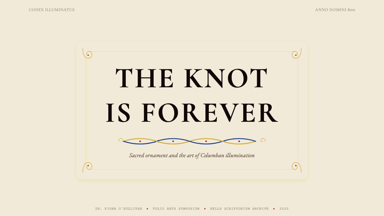
The defining structural element is continuous interlace — braided, looping lines that never terminate, encoding the idea of eternity in pattern form. In this design system, interlace appears at the borders of compositional areas, framing content rather than filling it. The knot lines have consistent width and follow strict over-under rules; the visual discipline of the system resides in this rule-governed complexity. A well-executed knotwork border is immediately legible as intentional structure, not random decoration.最具定义性的结构元素是连续缠结纹——编织、循环、永不终止的线条,以图案形式编码了永恒的概念。在这套设计系统中,缠结纹出现于构图区域的边框处,框定内容而非填充它。纽结线条宽度一致,遵循严格的上下交叉规则;系统的视觉纪律即寓于这种有规则的复杂性之中。一条精心执行的绳结纹边框,会被即刻解读为有意为之的结构,而非随机装饰。
Zoomorphic and Figurative Elements兽形与具象元素
Birds, fish, serpents, and hybrid creatures appear throughout the Insular tradition with their bodies dissolving into or emerging from knotwork. These forms are never representational in the naturalistic sense — they are abstract lifeforms rendered in profile or overhead, simplified to their most recognizable silhouette, and subordinated to the overall pattern logic. In contemporary application, zoomorphic accents function as focal-point decorations: placed at corners, initials, or key visual intersections to reward close inspection without disrupting the compositional whole.鸟类、鱼类、蛇形与混合生物遍布爱尔兰海岛传统,它们的躯体消融入或浮现自缠结纹之中。这些形态从不以自然主义意义上的具象方式呈现——它们是以侧面或俯视角度描绘的抽象生命形式,简化为最易辨认的剪影,并服从于整体图案逻辑。在当代应用中,兽形装饰元素作为焦点性装饰:置于角落、首字母或关键视觉交叉点,奖励近距离审视而不破坏整体构图。
Carpet Page and Compositional Density满版装饰页与构图密度
The carpet page — a full-folio illumination in which the entire surface is covered with dense interlace, zoomorphic forms, and geometric subdivisions — represents the tradition's most extreme compositional statement: sacred fullness, the abhorrence of empty ground. In contemporary use, this principle translates to a preference for richly bordered and internally structured layouts over sparse minimalism. The vellum ground is never treated as waste space; every margin is either actively occupied or defined by the structural geometry of the border.满版装饰页——整张对开页面覆满密集缠结纹、兽形图案与几何分割的全幅照明——代表了这一传统最极致的构图陈述:神圣的饱满感,对空旷底面的拒绝。在当代应用中,这一原则转化为对富于边框与内部结构的版面的偏好,而非稀疏的极简主义。犊皮底面从不被视为浪费的空间;每一处页边距,要么被主动占据,要么由边框的结构几何所界定。
Typography and Letterform字体排印与字形
The Insular tradition produced a distinctive script — the half-uncial and insular minuscule — characterized by rounded, compact letter bodies with distinctive wedge-shaped serifs and an organic quality unlike the rigid geometry of later humanist letterforms. Applied as a design principle rather than a literal typeface recommendation, this means favoring rounded, slightly organic letterforms over rigidly geometric ones, treating initial capitals as visual focal points that can bear ornamental weight, and understanding that type and image are not separate systems but can be woven together in the same compositional field.爱尔兰海岛传统孕育了独特的书写体——半安瑟尔体与海岛小写体——以圆润紧凑的字体主干、独特的楔形衬线以及有别于后期人文主义字形刚性几何感的有机品质为特征。作为设计原则而非字体具体推荐加以应用,这意味着:偏好圆润、略带有机感的字形而非严格几何字形;将首字母大写视为可承载装饰分量的视觉焦点;以及理解文字与图像并非分离的系统,而是可以在同一构图场域中相互编织。
Sacred Geometry and Symmetry神圣几何与对称
Unlike the deliberate asymmetry of Bauhaus or Swiss modernism, the Book of Kells tradition is rooted in bilateral and radial symmetry — the cross, the mandorla, the circular chi-rho monogram. This reflects the manuscript's theological program: symmetry here is not classical authority but divine order. In a contemporary digital layout, this means compositions may be formally centered and axially mirrored, with the visual tension generated by the density and intricacy of the ornament rather than by asymmetric placement of elements.与包豪斯或瑞士现代主义刻意追求的非对称性不同,《凯尔经》传统根植于双侧对称与放射对称——十字形、杏仁形光环、圆形基-罗花押字。这反映了手稿的神学意图:此处的对称不是古典权威,而是神圣秩序。在当代数字版面中,这意味着构图可以是正式居中与轴向镜像的,视觉张力由装饰的密度与精细程度产生,而非由元素的非对称摆放产生。
Gold and Luminosity金色与发光感
Gold in the manuscript tradition functions as light materialized — not a decorative color but the physical presence of divine radiance on the page. In this design system, gold-toned accents carry that same hierarchical weight: they mark what is most important, most permanent, most worthy of sustained attention. Gold should never be used as background fill or scattered as general emphasis; it is reserved for singular moments — a key figure, a primary call to action, a border accent — where its luminous quality creates genuine visual priority.手稿传统中的金色被理解为具体化的光——不是装饰性色彩,而是神圣光辉在页面上的物质存在。在这套设计系统中,金调强调色承载着同等的层级分量:它们标记最重要、最永恒、最值得持续注目之物。金色不应作为背景填充使用,也不应作为泛用强调色散布;它被保留给唯一性时刻——一个关键形象、一处主要行动号召、一道边框强调——在那里它的发光品质创造出真实的视觉优先级。
See the Book of Kells Celtic (800) design system查看 Book of Kells Celtic (800) 完整设计系统
Who shaped Book of Kells Celtic (800)?谁塑造了 Book of Kells Celtic (800)?
The sixth-century Irish abbot who founded the monastery on Iona around 563 CE is the spiritual patron of the manuscript tradition that produced the Book of Kells. Though Columba died more than two centuries before the manuscript was completed, his community of monk-artists — the Columban familia — carried his mission across the North Atlantic world. The manuscript was long believed, in pious tradition, to be Columba's own work, and this attribution shaped its veneration as a sacred relic as much as an artistic achievement. The manuscript's status as a cult object around his memory is inseparable from the visual intensity with which it was made.这位六世纪爱尔兰修道院长约于公元563年在爱奥那岛创立修道院,是产生《凯尔经》的手稿传统的精神守护人。尽管高隆巴在手稿完成前两个多世纪便已辞世,他的修士艺术家群体——哥伦班大家族——将其使命传播至整个北大西洋世界。虔诚传统长期以来认为手稿乃高隆巴亲作,这一归因使其作为神圣圣物而非仅仅艺术成就所受到的崇敬得到了塑造。手稿作为围绕他记忆而形成的圣祠器物的地位,与其制作的视觉强度密不可分。
The Book of Kells was produced not by a single illuminator but by a scriptorium team — scholars have identified at least four distinct hands in the manuscript's illuminations. These anonymous monk-artists were simultaneously theologians, craftsmen, and visual thinkers of remarkable sophistication. They developed the interlace grammar, the zoomorphic vocabulary, and the carpet-page compositional system to a degree of elaboration never surpassed in the Western manuscript tradition. Their anonymity is itself a form of statement: the work was not individual expression but communal devotion, each scribe and painter subordinating their identity to the larger sacred purpose.《凯尔经》并非由单一照明师制作,而是由一个抄写室团队共同完成——学者们在手稿照明图案中辨识出至少四种不同的笔迹。这些匿名修士艺术家同时是神学家、工匠与具有非凡精密性的视觉思想者。他们将缠结纹语法、兽形词汇与满版装饰页构图体系发展到了西方手稿传统中从未被超越的精细程度。他们的匿名性本身就是一种陈述:这项工作不是个人表达,而是集体奉献,每位抄写员与画师都将自身身份消融于更宏大的神圣目的之中。
The seventeenth-century Bishop of Meath whose presentation of the manuscript to Trinity College Dublin in 1661 established the institutional home that has protected and exhibited it for more than three and a half centuries. Jones obtained the manuscript during the Cromwellian settlement of Ireland, a period of profound political and religious disruption. His act of donation — whatever its complex political motivations — ensured the manuscript's survival at an institution with the resources to conserve, study, and exhibit it. The Book of Kells entered the consciousness of global design culture largely because Trinity's stewardship made it continuously accessible to scholars, artists, and eventually the general public.这位十七世纪的米斯主教于1661年将手稿赠予都柏林三一学院,由此确立了三个半世纪以来保护与展出它的机构归属。琼斯在克伦威尔定居爱尔兰期间——一个政治与宗教均极度动荡的时代——获得了这部手稿。他的捐赠行为——无论其复杂的政治动机如何——确保了手稿在一所拥有资源进行保护、研究与展览的机构中得以留存。《凯尔经》之所以进入全球设计文化的意识,在很大程度上是因为三一学院的管理使其持续向学者、艺术家乃至普通公众开放。
The nineteenth-century Celtic Revival — part of the broader Arts and Crafts reaction against industrial uniformity — was responsible for bringing the Book of Kells visual vocabulary into mainstream Western design consciousness. Artists associated with the movement, along with typographers who adapted Insular letterforms for print, transformed manuscript interlace and zoomorphic ornament from archival curiosity into living design language. Their interpretations ranged from scholarly facsimile to free adaptation, but collectively they established the visual conventions — warm grounds, knotwork borders, jewel-toned accents — that contemporary designers recognize as the Celtic illuminated style.十九世纪的凯尔特复兴运动——作为更广泛的工艺美术运动对工业统一性反应的一部分——将《凯尔经》视觉词汇带入了西方主流设计意识。与这一运动相关的艺术家们,以及将爱尔兰海岛字形改编为印刷用途的字体设计师们,将手稿缠结纹与兽形装饰从档案馆的珍奇之物转化为活跃的设计语言。他们的诠释从学术摹本到自由改编各有不同,但集体上确立了当代设计师所认知的凯尔特照明风格的视觉惯例——温暖底面、绳结纹边框、宝石色调强调色。
The visual grammar of the Book of Kells did not emerge from manuscript culture alone. Its spiral forms, trumpet curves, and abstract interlace descend directly from the La Tène metalworking tradition of Iron Age Celtic Europe — a design language first developed in hammered bronze, enamel inlay, and gold filigree. The Insular scribes who adapted this vocabulary for vellum and pigment were translating an already ancient and sophisticated abstract decorative system into a new medium. Understanding this lineage clarifies the distinction between Celtic ornament as a coherent structural tradition and its frequent superficial misappropriation as generic tribal pattern.《凯尔经》的视觉语法并非单独从手稿文化中涌现。其螺旋形、喇叭曲线与抽象缠结纹直接传承自铁器时代欧洲凯尔特人的拉泰纳金属工艺传统——一套最初以锤打青铜、珐琅镶嵌与金丝花纹发展起来的设计语言。将这套词汇改编为羊皮纸与颜料的爱尔兰海岛抄写员,是在将一套已然古老而精密的抽象装饰体系翻译入新的媒介。理解这一传承脉络,有助于厘清凯尔特装饰作为连贯结构性传统与其频繁被肤浅挪用为通用部落图案之间的本质区别。
How do you use Book of Kells Celtic (800) today?今天怎么用 Book of Kells Celtic (800)?
The Book of Kells Celtic (800) system works best in contexts where richness, cultural depth, and a sense of the sacred or monumental are desired values — and where the audience will reward visual complexity rather than retreating from it. Applying it correctly requires understanding that the style's ornament is not decoration layered on top of a layout, but the structural logic of the layout itself. Every border is a container, every accent is a jewel, and the warm cream ground is not blank space but inhabited surface.《凯尔经》凯尔特(800)系统在丰富性、文化深度以及神圣感或纪念碑感是期望价值的场景中表现最佳——并且受众会以欣赏而非回避的态度面对视觉复杂性。正确应用它需要理解:这套风格的装饰不是叠加于版面之上的外衣,而是版面本身的结构逻辑。每条边框都是容器,每处强调色都是宝石,温暖的奶油底面不是空白空间,而是被居住的表面。
For presentation slides, this system offers particularly strong cover and section-divider opportunities. A cover built on this vocabulary uses a formal centered or symmetrically axial composition: the title rendered in large, weighty letterforms within a knotwork-bordered field, with a jewel-toned accent — deep blue, vermilion, or gold — marking the most important typographic element. Section dividers benefit from a simplified carpet-page approach: a narrow horizontal band of interlace marking the transition, with the vellum cream as the dominant ground. Content slides should be restrained relative to the cover — the ornamental density of the system belongs at moments of ceremonial weight, not at every data bullet.在演示文稿中,这套系统为封面与章节分隔页提供了特别有力的表达机会。以这套词汇构建的封面采用正式居中或轴向对称构图:标题以粗重字形呈现于绳结纹边框围合的区域内,以宝石色调强调——深蓝、朱砂或金色——标记最重要的排印元素。章节分隔页适合运用简化的满版装饰页思路:一条窄幅水平缠结纹带标记过渡,以犊皮奶油色为主导底面。相较于封面,内容页应当保持克制——系统的装饰密度属于仪式性重量的时刻,而非每一条数据列表项。
For web interfaces, this vocabulary is most effective on heritage and cultural institution sites, luxury and craft-goods e-commerce, editorial platforms with strong identity, and any context where the brand promise involves depth, authenticity, or the handmade. Dashboard applications are not natural territory for this system, but where data must be presented within a branded environment, a light application works: vellum-toned backgrounds, jewel-colored status indicators, and knotwork-derived dividers that give the data table a sense of structural intention. Pricing and comparison pages benefit from the tradition's comfort with dense, richly bordered layout — each tier presented as a self-contained illuminated field.对于网页界面,这套词汇在文化遗产与文化机构网站、奢侈品与工艺品电商、具有强烈身份认同的编辑平台,以及任何品牌承诺涉及深度、真实性或手工制作的场景中最为有效。仪表板应用不是这套系统的自然领地,但当数据必须在品牌化环境中呈现时,轻量应用是可行的:犊皮色调背景、宝石色状态指示符,以及赋予数据表格结构意图感的缠结纹衍生分割线。定价与比较页面适合这一传统对密集、富于边框版面的亲和力——每一等级呈现为自成一体的照明区域。
For editorial and marketing work, the style supports both full-throttle richness and restrained application. A long-form article or editorial spread benefits from knotwork drop-caps or initial letters that announce chapter or section breaks with visual ceremony, body text on a warm cream ground that reduces eye fatigue in long reading sessions, and gold or vermilion pull-quote accents that reward the reader who pauses to scan. Marketing pages work well when the hero section uses the full visual vocabulary — dense border, jewel tones, gold accent — while subsequent sections pull back to simpler vellum-and-one-color treatments, creating a rhythm between ceremonial and functional.对于编辑与营销内容,这套风格支持从全力富丽到克制应用的各种层次。长篇文章或编辑版面适合运用绳结纹首字下沉或首字母,以视觉仪式感宣告章节或段落分隔;正文置于温暖奶油底面上,减轻长时阅读的视觉疲劳;金色或朱砂色的摘引强调色奖励停下来扫读的读者。营销页面在主视觉区域使用完整视觉词汇——密集边框、宝石色调、金色强调——而后续区块回退至更简洁的犊皮底加单色处理时,效果最佳,形成仪式性与功能性之间的节奏感。
A common mistake when applying this system is treating Celtic knotwork as surface texture rather than structural border logic. Tiling an interlace pattern as a background fill — the way a fabric print might be tiled — destroys the system's architectural meaning and produces visual noise rather than sacred order. Similarly, deploying the full jewel palette simultaneously at high saturation overwhelms the warm ground and eliminates the hierarchy that makes each accent legible. Authentic application uses deep blue as the dominant hue, vermilion as the primary accent, orpiment-yellow for the warmest emphasis, and gold only for singular moments of maximum importance. The vellum ground should do the quiet work of holding everything together.应用这套系统时最常见的错误,是将凯尔特缠结纹视为表面纹理而非结构性边框逻辑。像织物印花那样将缠结纹图案平铺为背景填充——破坏了系统的建筑学意义,产生视觉噪音而非神圣秩序。同样,同时以高饱和度部署完整宝石色板,会淹没温暖底面并消除使每处强调色清晰可读的层级关系。真实的应用以深蓝为主导色调,朱砂为主要强调色,雌黄黄用于最温暖的着重,金色仅用于极少数最高重要性的唯一时刻。犊皮底面应当悄然承担将一切凝聚在一起的工作。
See the Book of Kells Celtic (800) design system查看 Book of Kells Celtic (800) 完整设计系统
Book of Kells Celtic (800) — FAQBook of Kells Celtic (800) · 常见问题
Is this style appropriate for secular and commercial contexts, or only for heritage and cultural institutions?这套风格只适合文化遗产与文化机构,还是也适合世俗与商业场景?
The style has a long history of secular and commercial application — the Celtic Revival of the nineteenth century was explicitly a craft and commercial movement, and Insular ornament has appeared on everything from whiskey labels to luxury packaging to architectural ironwork. What matters is whether the context can sustain the style's visual weight and whether the brand values align with what the style communicates: depth, craft, age, and a certain reverence for the handmade. Consumer brands that carry heritage narratives, cultural institutions, academic publishers, premium hospitality, and artisan goods producers are natural homes. Fast-moving consumer goods, technology startups positioning on speed and disruption, and clinical healthcare contexts are not.这套风格在世俗与商业应用方面有着悠久历史——十九世纪的凯尔特复兴运动本身就是一场明确的工艺与商业运动,爱尔兰海岛装饰出现在从威士忌标签到奢侈包装再到建筑铁艺的各种载体上。关键在于场景能否承载这套风格的视觉分量,以及品牌价值观是否与风格所传达的内容对齐:深度、工艺、年代感,以及对手工制作的某种敬意。承载传承叙事的消费品牌、文化机构、学术出版商、高端酒店业与工匠商品生产者是自然的归属场景。快速消费品、以速度与颠覆性为定位的科技初创企业,以及临床医疗场景则不然。
How do you apply knotwork borders in a digital medium without them becoming visually overwhelming?在数字媒介中应用绳结纹边框,如何避免视觉上的压迫感?
The key is treating interlace as frame, not fill. The manuscript tradition used carpet pages — full-surface knotwork — only for the most ceremonially significant moments: the opening pages of gospel books, the chi-rho monogram. For everything else, knotwork appeared at borders and corners while the central field remained relatively open. Applied digitally, this means a knotwork border of moderate visual weight surrounding a calm interior with generous leading and white-space allocation. The border does the ornamental work so the interior does not have to. If the interior is also dense with pattern, the hierarchy collapses and the composition becomes fatiguing to read.关键在于将缠结纹视为框架而非填充。手稿传统仅在仪式意义最重大的时刻使用满版装饰页——全幅缠结纹——即福音书的开篇页面与基-罗花押字。其余情况下,缠结纹出现于边框与角落,而中央区域保持相对开阔。数字化应用时,这意味着中等视觉分量的缠结纹边框围合一个平静的内部空间,内部配以充裕的行距与留白分配。边框承担装饰性工作,使内部无需担负这一职责。如果内部同样充满纹样密度,层级关系将崩溃,构图将变得令人疲惫。
Can this style work effectively with a dark background?这套风格能在深色背景上有效运作吗?
The manuscript tradition is fundamentally a light-ground system — vellum is warm cream, not black — and inverting it requires care. A dark inversion is possible and can be effective for night-mode interfaces or premium contexts where the dark ground reads as richness rather than severity. On dark grounds, the gold accent becomes dramatically more luminous and should be used even more sparingly than on cream. The deep lapis blue tends to recede and may need to be lightened slightly to maintain its role. Vermilion holds better in dark contexts. The overall effect should feel like viewing illuminated manuscript by candlelight — warm, contained, glowing — rather than like a generic dark-mode interface with pattern applied.手稿传统从根本上是浅色底面系统——犊皮是温暖的奶油色,而非黑色——将其反转需要谨慎处理。深色反转是可能的,对于深色底面在语境中被解读为富丽而非严肃的夜间模式界面或高端场景,可以产生有效效果。在深色底面上,金色强调变得戏剧性地更加明亮,应比在奶油底面上使用得更为克制。深青金石蓝倾向于后退,可能需要略微提亮以维持其视觉角色。朱砂在深色场景中的表现更为稳定。整体效果应当给人以烛光下观赏照明手稿的感受——温暖、内敛、发光——而非在通用深色模式界面上叠加纹样的感觉。
How is this style different from generic Celtic or Viking ornament?这套风格与泛化的凯尔特或维京装饰有何区别?
The Book of Kells tradition is a specific, historically rooted design vocabulary with clear structural rules. Generic Celtic ornament — as it appears in popular culture — is often a mixture of La Tène knotwork, Norse Viking interlace, and modern invention, applied without attention to the compositional hierarchy or color discipline of the original sources. The distinguishing markers of the authentic Insular tradition are: the four historically specific pigments on a warm vellum ground; the formal architectural relationship between border, ground, and content; the subordination of zoomorphic elements to overall pattern logic; and the use of bilateral symmetry reflecting theological rather than decorative intent. A design that gets the knotwork motif right but uses a random color palette on a stark white ground, or tiles it as background fill, is borrowing the surface without engaging the system.《凯尔经》传统是一套具有明确结构规则的特定历史设计词汇。流行文化中的泛化凯尔特装饰往往是拉泰纳缠结纹、北欧维京缠结纹与现代创作的混合物,在应用时不顾及原始来源的构图层级或色彩纪律。真实爱尔兰海岛传统的辨别标志在于:温暖犊皮底面上历史上确有记载的四种颜料;边框、底面与内容之间正式的建筑性关系;兽形元素对整体图案逻辑的服从;以及反映神学而非装饰意图的双侧对称使用。一个绳结纹母题到位却在冷白底面上使用随机色板、或将其平铺为背景填充的设计,是在借用表面而未参与系统。
How should imagery and photography be used within this design system?在这套设计系统中,图像与摄影应如何使用?
The Insular tradition contains no photography and almost no naturalistic representation — all figural content is stylized, symbolic, and subordinate to the ornamental field. Contemporary application of this system works best when photography is either absent or treated with significant formal intervention: cropped to a strong silhouette, framed within an ornamental border that absorbs it into the compositional logic, desaturated and toned to the system's jewel palette, or reproduced in a duotone using two of the tradition's four canonical colors. A naturalistic photograph placed directly on a vellum ground without formal mediation will read as a collision of two different compositional logics rather than a coherent design statement. The system's strongest contemporary expression tends toward illustration, iconography, and typographic composition rather than photographic realism.爱尔兰海岛传统不包含摄影,几乎也没有自然主义表现——所有具象内容都是程式化的、象征性的,并服从于装饰场域。这套系统的当代应用在摄影缺席或经过重大形式干预时效果最佳:裁切为有力的剪影,在将其纳入构图逻辑的装饰性边框内呈现,去饱和并调色为系统的宝石色板,或以传统四种典型色彩中的两种进行双色调复制。一张自然主义摄影照片在没有形式媒介的情况下直接置于犊皮底面上,会被解读为两种不同构图逻辑的碰撞,而非连贯的设计陈述。这套系统在当代最有力的表达,往往倾向于插图、图像学与字体排印构图,而非摄影写实主义。
Related design styles相关设计风格
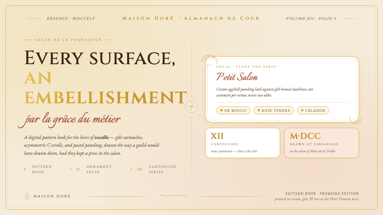 Versailles Rococo OrnamentEvery surface earns an embellishment. Cream paneling, ormolu gilt hairlines,…每一处表面都值得装饰:奶油护墙、鎏金细线、不对称 C 形涡卷卡图什。
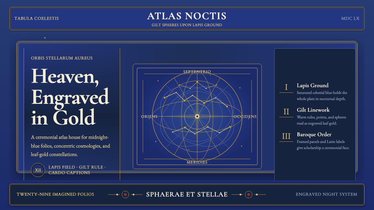 Cellarius Celestial AtlasCelestial luxury on lapis. Gilt serif type, star fields, and concentric chart…青金夜空里的天体奢华:鎏金衬线、星点与同心星图线。
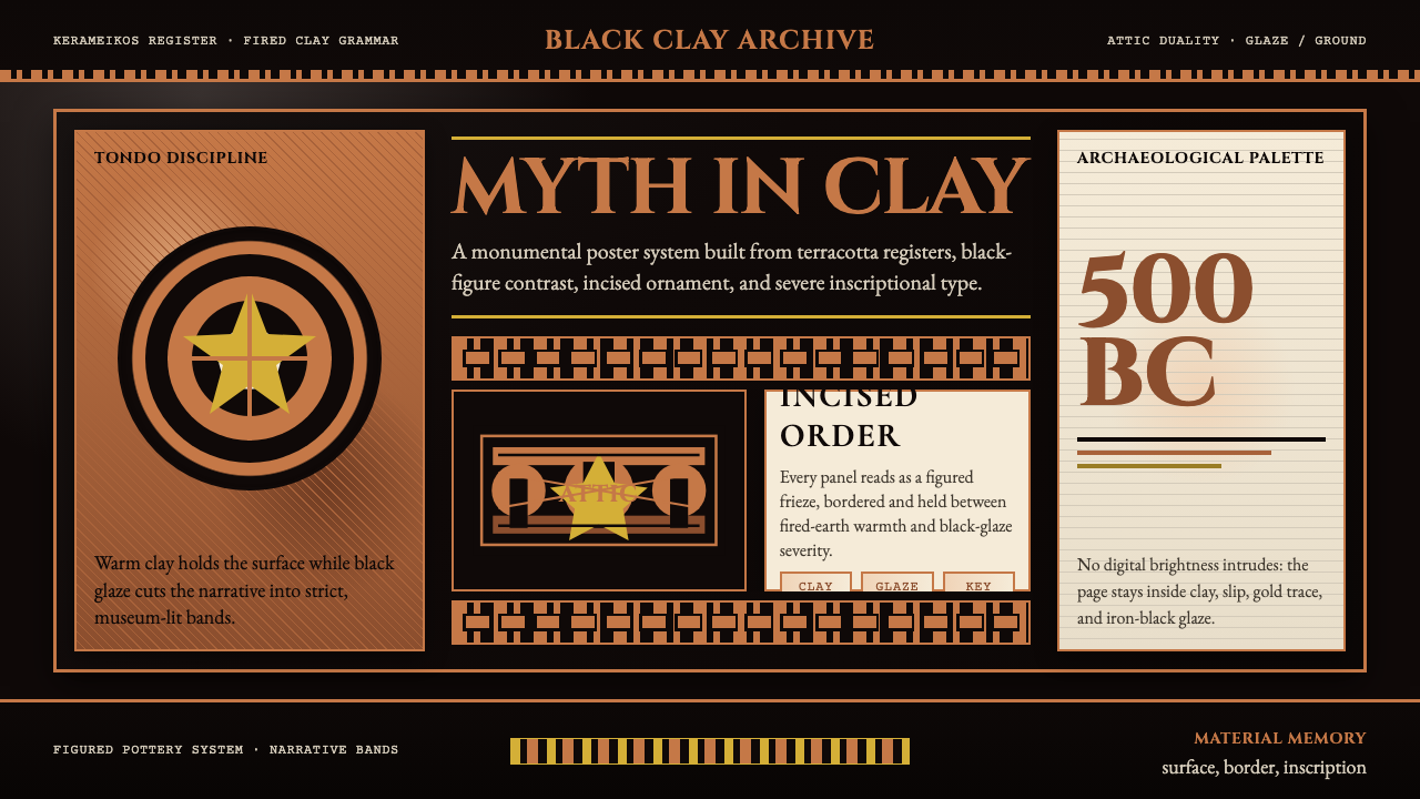 Greek Vase Attic (500 BC)Archaeological severity. Jet-black glaze, terracotta bands, and meander borde…考古般克制:黑釉底、赤陶饰带与回纹边框构成陶瓶式秩序。
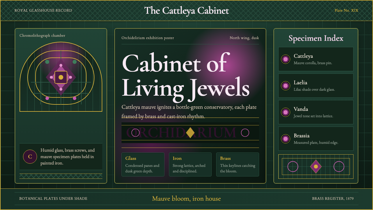 Orchid ConservatoryLush Victorian darkness. Cattleya mauve and brass sit inside bottle-green iro…繁茂的维多利亚暗调:卡特兰紫红与黄铜嵌入瓶绿铁格。
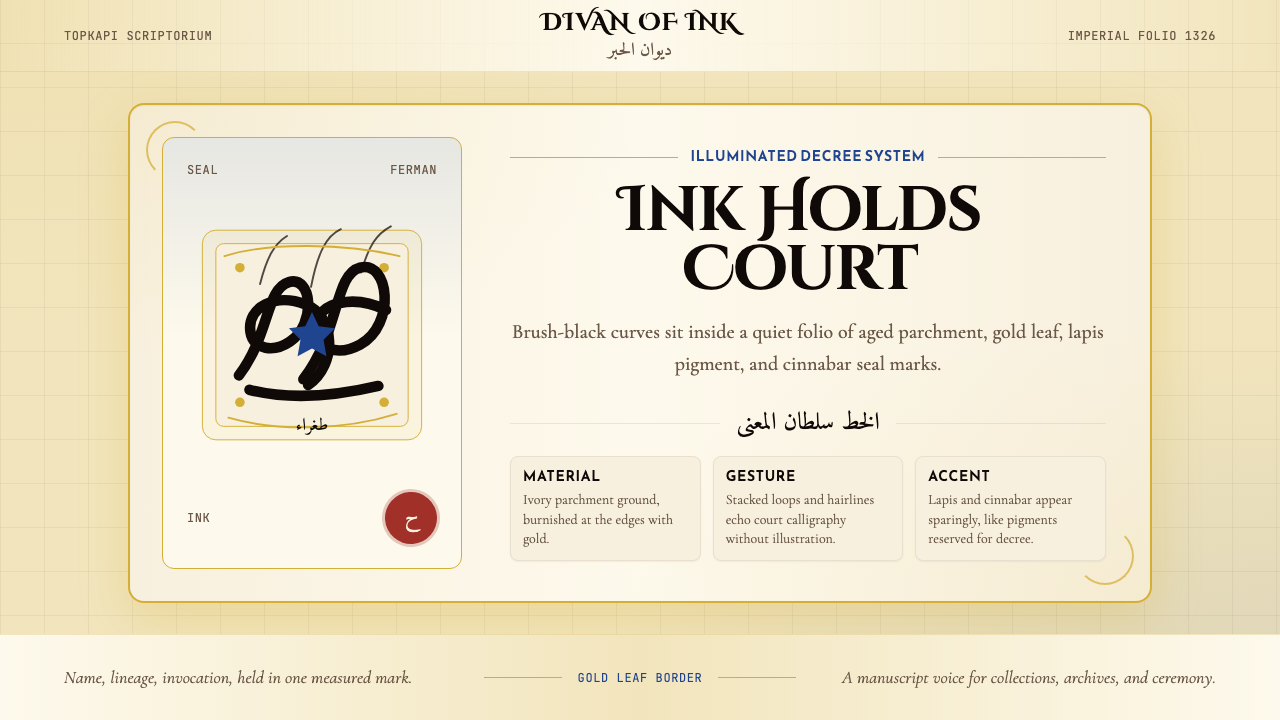 Ottoman Tughra CalligraphyImperial ink holds court. Gold borders, lapis panels, and Cinzel tughra-like…御墨自带威仪:金箔边框、青金石蓝与 Cinzel 花押式排版。
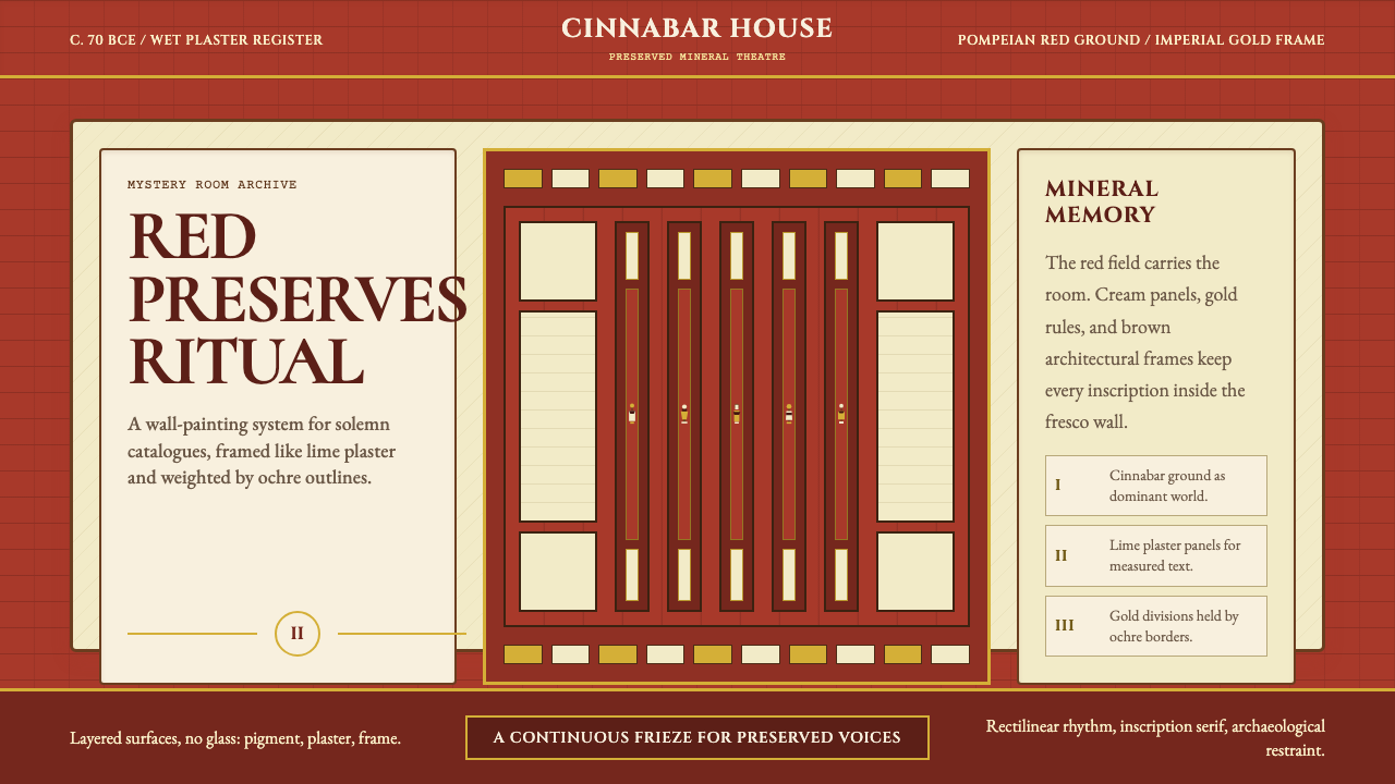 Pompeii Fresco Villa of MysteriesThe wall is the world. Pompeian red, cream plaster panels, and gold frames ho…墙面即世界。庞贝红、石灰奶油面板与金色框线托住仪式。