What is Ottoman Tughra Calligraphy?什么是 Ottoman Tughra Calligraphy?
Six centuries of imperial ink distilled into a single flourish — the Ottoman tughra is calligraphy as sovereign authority, where every stroke carries the weight of a dynasty.六百年御墨凝于一笔花押之中——奥斯曼图拉是以书法行使君权,每一笔触皆承载着王朝的分量。
Ottoman Tughra Calligraphy in briefOttoman Tughra Calligraphy 速览
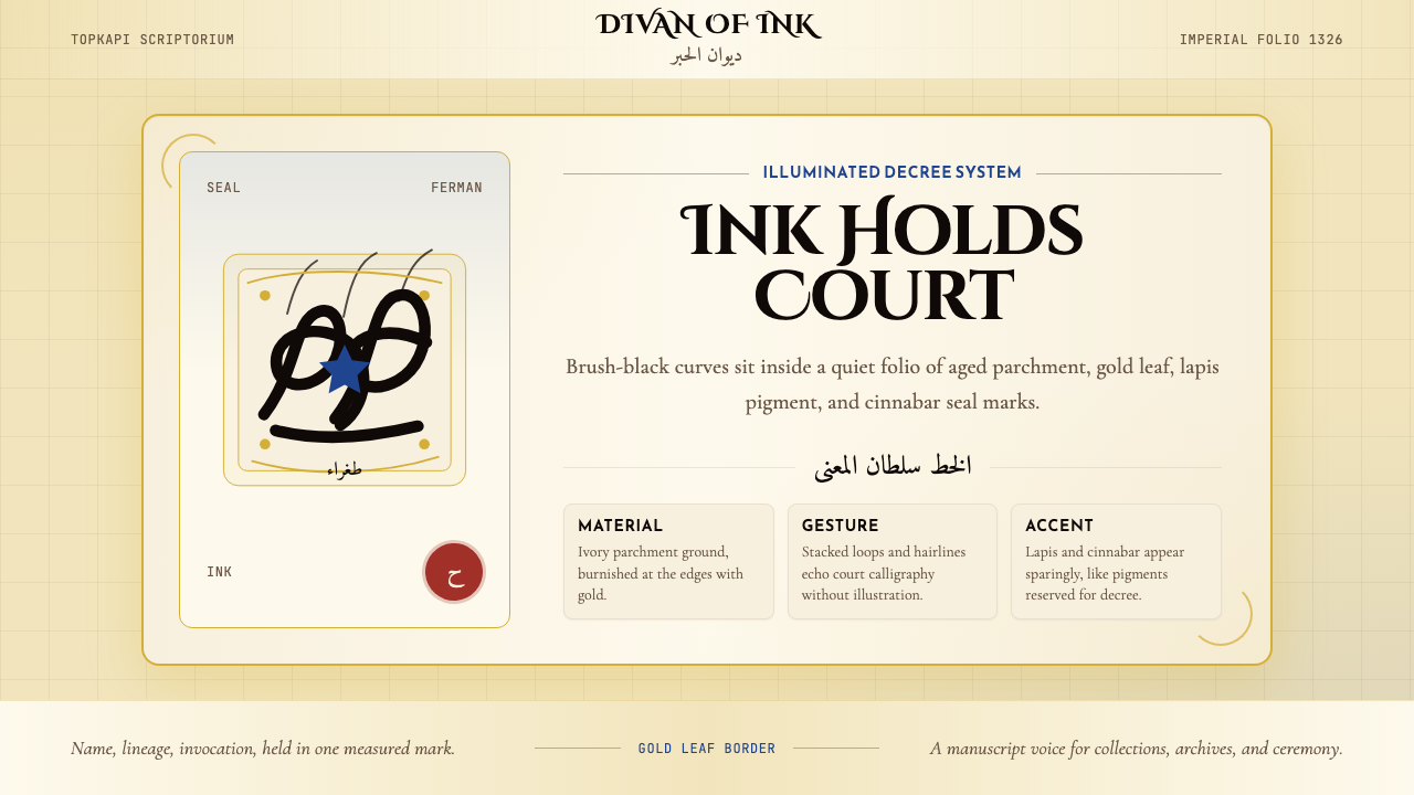
Ottoman Tughra Calligraphy is a design system rooted in the imperial monogram-sigils that identified and authenticated every decree, charter, and official document of the Ottoman sultans from the fourteenth century to the early twentieth. The tughra itself is a single elaborate compositional unit encoding the sultan's name, his father's name, and the invocatory phrase 'ever victorious,' rendered by specialist court calligraphers — the nişancı and their apprentices — in an interlocking grammar of loops, extended verticals, and radiating strokes that can take years to master.奥斯曼图拉书法是一套植根于帝国徽章签印的设计体系。这些签印从十四世纪至二十世纪初,标识并认证了奥斯曼苏丹所有的诏令、特许状与官方文书。图拉本身是一个精妙的组合构图单元,将苏丹姓名、其父之名以及祈愿短语「长胜不败」编织其中,由宫廷专职书法官——尼尚哲及其弟子——以交错的环形线圈、上伸竖笔与辐射笔触书写,穷数年之功方能掌握。
As a visual system, Ottoman Tughra Calligraphy channels the aesthetic of the imperial scriptorium (kitabhane) of Topkapı Palace in Istanbul: deep ink on aged ivory parchment, gold-leaf illumination borders framing the page, lapis-lazuli blue accent ornaments drawn from the manuscript tradition, and the crimson of the seal. The palette is deliberately restricted to the material substances of the court atelier — ink, parchment, gold, ground lapis, cinnabar — and every element of the system performs a role already established by six centuries of court practice.作为视觉体系,奥斯曼图拉书法汲取伊斯坦布尔托普卡帕宫御用书房(kitabhane)的美学精髓:深沉墨迹落于陈年象牙色羊皮纸,金箔泥金边框环绕页面,源自手抄本传统的青金石蓝点缀其间,朱砂印泥为印章添色。整套色彩刻意限定于宫廷画坊的材料实物——墨汁、羊皮纸、金箔、研磨青金石、朱砂——体系中的每个元素皆承担着六百年宫廷惯例早已确立的职能。
What distinguishes this aesthetic from generic 'Islamic calligraphy' is its specifically imperial character. The tughra form is not decorative script but administrative authority made visual — a royal signature so elaborated and conventionalized that forgery was structurally near-impossible. Adapted as a contemporary design language, it produces interfaces and layouts that feel simultaneously archaic and monumental: documents rather than screens, proclamations rather than pages.这套美学与泛化「伊斯兰书法」的根本区别,在于其鲜明的帝国属性。图拉形式不是装饰性文字,而是视觉化的行政权威——一枚经过高度精炼与惯例化的皇家签章,其结构复杂性使仿造在技术上几乎不可能。作为当代设计语言加以转化,它产生出兼具古朴感与纪念碑感的界面与版面:是文献而非屏幕,是公告而非页面。
See the Ottoman Tughra Calligraphy design system查看 Ottoman Tughra Calligraphy 完整设计系统
Where does Ottoman Tughra Calligraphy come from?Ottoman Tughra Calligraphy 从何而来?
The tughra tradition is conventionally traced to Orhan I, the second ruler of the Ottoman dynasty, whose administrative documents from around 1326 bear the earliest known examples of the form. At this stage the tughra was relatively simple — a stylized rendering of the ruler's name with a few distinctive flourishes — but the structural grammar was already present: the central name-block (sere), the looping extensions to the left (tuğ), and the sweeping rightward arc (hançer). Over the following two centuries, as the Ottoman state expanded from a minor Anatolian principality into a continental empire, the tughra grew proportionally in complexity and ceremonial weight.图拉传统通常追溯至奥斯曼王朝第二位统治者奥尔汗一世——其约1326年的行政文书上留有最早已知的图拉实例。彼时图拉相对简单,是对统治者姓名的程式化呈现,辅以少量特征性花饰——但基本结构语法已然成形:中央姓名主体(sere)、向左延伸的环形线圈(tuğ),以及向右扫出的弧线(hançer)。此后两个世纪,随着奥斯曼国家从安纳托利亚一隅小国扩张为横跨大陆的帝国,图拉的复杂程度与礼仪分量也同步递升。
The peak of tughra refinement arrived under Sultan Süleyman I, known in the West as Süleyman the Magnificent, who reigned from 1520 to 1566. His court at Topkapı was the cultural apex of the Ottoman world, employing hundreds of master craftsmen across dozens of ateliers. The calligraphic arts — hat sanatı — were organized under a formal hierarchy, with the nişancı (chancellor) holding ultimate responsibility for the royal cipher and teams of trained calligraphers producing the thousands of documents the imperial administration required annually. It was during Süleyman's reign that the tughra achieved its canonical proportions: the three tall vertical staffs (tuğ), the double oval of the serifed lower loops (beyze), and the long horizontal extension to the right that gave the form its characteristic profile.图拉精炼的巅峰出现在苏丹苏莱曼一世(西方称「壮丽者苏莱曼」,在位1520—1566年)治下。其托普卡帕宫廷是奥斯曼世界的文化顶点,旗下数十座工坊雇用了数百位手工艺大师。书法艺术(hat sanatı)按正式等级体系组织,由尼尚哲(宰相府长官)总负责皇家密押,受训书法师团队则每年生产帝国行政所需的数千份文书。图拉的经典比例正是在苏莱曼时代确立:三支高耸竖笔(tuğ)、带衬线下环的双椭圆(beyze),以及向右延伸的长横——共同赋予图拉其标志性轮廓。
The broader tradition of Ottoman court calligraphy drew on and synthesized several distinct Islamic script lineages. The Naskh and Thuluth scripts, refined over centuries in Abbasid and Mamluk ateliers, provided the structural foundation; Diwani — a specifically Ottoman development of the sixteenth century — offered a more cursive, interlocking style suited to the administrative documents and imperial edicts (ferman) that required both speed and visual authority. The great masters who defined these traditions — Hafız Osman in the seventeenth century, Mustafa Râkım Efendi in the late eighteenth and early nineteenth, and Sami Efendi into the early twentieth — each refined not only letterforms but the entire philosophy of spatial arrangement, ink density, and the relationship between positive stroke and ground.奥斯曼宫廷书法的广泛传统汲取并融合了数支不同的伊斯兰字体谱系。历经阿拔斯与马穆鲁克画坊数百年精炼的纳斯赫体(Naskh)与苏鲁斯体(Thuluth)奠定了结构基础;迪瓦尼体(Diwani)——十六世纪奥斯曼人的特有发展——提供了更为草书、线条交织的风格,适合需要兼具速度与视觉权威感的行政文书与帝国诏令(ferman)。确立这些传统的历代大师——十七世纪的哈菲兹·奥斯曼、十八世纪末至十九世纪初的穆斯塔法·拉基姆·埃芬迪、延续至二十世纪初的萨米·埃芬迪——各自不仅精炼字母形态,更完善了空间布局、墨色浓淡及正笔与底面关系的整体哲学。
The Ottoman calligraphic tradition ended with the Turkish Republic's script reform of 1928, which replaced the Arabic-script Ottoman Turkish with a Latin-alphabet Turkish. By that point the tughra had already become primarily a historical and decorative form — the last Sultan, Mehmed VI, had been deposed in 1922. But the tradition had already produced an enormous body of work housed in the Topkapı Palace archives, the Turkish and Islamic Arts Museum, and collections worldwide, and the visual vocabulary it established — the interplay of dense ink strokes against pale grounds, the gold-leaf ornamental borders, the structural dignity of the elongated vertical — proved deeply influential on subsequent generations of designers who drew on Ottoman material culture.奥斯曼书法传统随1928年土耳其共和国文字改革落幕,该改革以拉丁字母土耳其文取代阿拉伯字母奥斯曼土耳其文。彼时图拉早已主要成为历史性与装饰性形式——末代苏丹穆罕默德六世已于1922年被废黜。然而这一传统已留下大量藏于托普卡帕宫档案馆、土耳其伊斯兰艺术博物馆及全球各地收藏机构的作品,其确立的视觉词汇——浓墨笔触与浅色底面的张力、金箔泥金装饰边框、上伸竖笔的结构庄严感——对其后汲取奥斯曼物质文化的设计师产生了深远影响。
What defines the Ottoman Tughra Calligraphy look?Ottoman Tughra Calligraphy 的视觉特征是什么?
Palette色彩
The color system is anchored in manuscript materials rather than abstract theory. Jet-black ink — the primary mark-making substance — reads as absolute authority against the warm tone of aged parchment or ivory ground. Gold leaf provides the sole luminous accent, used for border illumination and ornamental fills rather than as a general highlight. Lapis-lazuli blue, derived from ground mineral pigment, appears in geometric ornament panels and decorative medallions; it is a rare, costly accent rather than a field color. Cinnabar red functions as the seal and authentication mark. Together these four accents against the parchment ground constitute the entire palette — each color earned by its material origin, not chosen for aesthetic preference.色彩体系以手抄本材料为锚,而非抽象理论。墨黑——主要的书写材料——在陈年羊皮纸或象牙色底面上呈现出绝对的权威感。金箔提供唯一的光泽强调,用于边框泥金装饰与纹样填充,而非通用高光。源自矿物颜料研磨的青金石蓝出现于几何纹饰板与装饰徽章中,是稀有昂贵的点缀色而非大面积铺底色。朱砂红发挥印鉴与认证标记的功能。这四种强调色与羊皮纸底面共同构成完整色板——每种色彩皆因其材料来源而存在,而非出于美学偏好的选择。
Calligraphic Line书法线条
The defining visual element is the broad, pressure-modulated calligraphic stroke. Thick vertical downstrokes contrast against fine hairline horizontals and diagonal connectors; each transition between thick and thin is an expression of the reed-pen's angle and the calligrapher's wrist pressure, not a mechanical interpolation. In the tughra itself, three tall vertical staffs (tuğ) tower above the body of the composition, creating dramatic negative space between their shafts. The sweeping horizontal tail (hançer) extends far to the right, balancing the vertical emphasis with horizontal counterweight. This asymmetric tension — massive verticals against a long horizontal — is the compositional engine of the entire style.最具标志性的视觉元素是宽幅、随压力变化的书法笔触。粗重的竖向下笔与纤细的横向发丝线及斜向连笔形成对比;粗细之间的每一次过渡,都是芦苇笔角度与书法家腕部压力的表达,而非机械插值。图拉本身有三支高耸竖笔(tuğ)挺立于构图主体之上,在笔杆之间形成戏剧性的负空间。向右大幅延展的横尾(hançer)以水平力量平衡竖向重心。这种不对称张力——巨大竖笔对抗长横——正是整套风格的构图引擎。
Illumination and Border泥金装饰与边框
Ottoman manuscripts are distinguished by the elaborate border illumination that frames the text — intricate geometric and floral interlace patterns executed in gold leaf, lapis blue, and cinnabar on a black or deep-ground field. These borders are not decorative afterthoughts but structural components: they demarcate the sacred or official zone of the text from the surrounding page, and their visual density signals the importance of the document. In a design system context, this translates to ruled borders of controlled weight and ornamental corner pieces that anchor the composition without competing with the primary textual content.奥斯曼手抄本的显著特征是围绕文字的精心泥金边框——以金箔、青金石蓝与朱砂在黑色或深色底面上绘制的复杂几何与花卉交织纹样。这些边框并非装饰性附属,而是结构组成部分:它们将文字的神圣或官方区域与周围页面加以分界,其视觉密度标示着文书的重要程度。在设计系统语境中,这转化为控制线重的框线规则与锚定构图而不干扰主体文字内容的装饰角件。
Script Hierarchy文字层级
Ottoman documents use a rigorous typographic hierarchy built on script selection rather than point-size variation. The tughra occupies an entirely separate register — an image-object rather than readable text, positioned at the top of the document as sovereign signature. Below it, principal text appears in large Thuluth or Diwani script; secondary text shifts to Naskh for readability at smaller scale; marginal notes and administrative annotations occupy yet another register. This multi-layer hierarchy — from monogram-image down through three or four script sizes — translates directly into modern design as a system of sharply differentiated type scales, where the largest heading element is structural and symbolic rather than simply the most important text.奥斯曼文书采用基于字体选择而非字号变化的严格排印层级。图拉占据完全独立的维度——它是图像对象而非可读文字,作为君主签章置于文书顶端。其下,主体文字以大号苏鲁斯体或迪瓦尼体呈现;次级文字转为纳斯赫体以保证小尺寸下的可读性;边注与行政批注又占据另一层级。这种从徽章图像向下延伸三至四个字体尺寸的多层级体系,在现代设计中直接转化为各层级差异鲜明的字体比例系统——其中最大的标题元素具有结构性与象征性,而不仅仅是最重要的文字。
Geometric Ornament几何纹饰
Beyond the calligraphic elements, Ottoman manuscript decoration employs a precise vocabulary of geometric interlace — star polygons, interlocking hexagons, eight-pointed rosettes, and continuous knot patterns derived from the broader tradition of Islamic geometric art. These ornamental forms obey strict mathematical rules of symmetry and repetition; they are constructed rather than drawn freehand. In a contemporary adaptation, these patterns function as textural fills, divider ornaments, and background elements that add visual richness without introducing representational imagery or photographic content.除书法元素外,奥斯曼手抄本装饰还运用精确的几何交织词汇——星形多边形、互锁六边形、八角玫瑰花结,以及源自伊斯兰几何艺术广泛传统的连续结绳纹样。这些装饰形式遵循严格的对称与重复数学法则,是构造出来的而非随手描绘的。在当代改编中,这些纹样作为纹理填充、分隔装饰与背景元素发挥作用,增添视觉丰富性,而不引入具象图像或摄影内容。
Spatial Gravity空间重力
Ottoman court documents are not balanced compositions in the Western academic sense. The tughra dominates the upper portion of the document with overwhelming visual weight; the text content below is deliberately subordinated — it exists to be authorized by the signature above it, not to compete with it. This creates a strong top-weighted vertical gravity. The practical consequence for contemporary layouts is a deliberate asymmetry of vertical emphasis: the most visually powerful element anchors the top, and the content area below gains authority by proximity and subordination rather than by its own visual mass.奥斯曼宫廷文书并非西方学院意义上的均衡构图。图拉以压倒性的视觉分量主导文书上部;其下的文字内容刻意处于从属地位——它的存在是为了获得上方签章的认证,而非与之竞争。这形成了强烈的上重型垂直重力。对当代版面设计的实际影响是刻意的纵向不对称:最具视觉力量的元素锚定顶部,其下的内容区域通过邻近感与从属关系获得权威性,而非凭借自身视觉质量。
Material Texture材料质感
Unlike Bauhaus flatness or Swiss grid sterility, Ottoman Tughra Calligraphy embraces material presence. Aged parchment has a warm, slightly uneven ground; gold leaf catches light unevenly; ink settles into the surface with varying absorption. In digital adaptation, this means the style permits and even encourages subtle textural grounds — a warm off-white with slight variation rather than a pure flat white, a gold-tinted surface that reads as reflective rather than as a flat fill color. The materiality is historical evidence: it communicates that what the viewer is seeing is a document of consequence, one that has survived.与包豪斯的平面感或瑞士网格的无菌感不同,奥斯曼图拉书法欣然接受材料的存在感。陈年羊皮纸底面温暖而略显不均匀;金箔的反光因角度而异;墨迹以不同的渗透深度沉入纸面。在数字化改编中,这意味着该风格许可甚至鼓励微妙的纹理底面——略有变化的暖色调米白而非纯粹的平面白色,带有金色调的底面读起来有反光感而非纯粹的填充色。这种材料感是历史证据:它传达出观者所见是一份有分量、经历了岁月流传的文书。
See the Ottoman Tughra Calligraphy design system查看 Ottoman Tughra Calligraphy 完整设计系统
Who shaped Ottoman Tughra Calligraphy?谁塑造了 Ottoman Tughra Calligraphy?
Hafız Osman (1642–1698) is considered the supreme codifier of Ottoman calligraphic style. He was the student of Dervish Ali and ultimately reformed the proportional system of the Naskh and Thuluth scripts, establishing the canonical letterform ratios that all subsequent Ottoman calligraphers took as their standard. His copies of the Quran and his single-sheet compositions (hilye-i şerif — descriptions of the Prophet) were so revered that they were reproduced and distributed across the empire. Dozens of later masters traced their lineage through him, and his proportional rules continued to govern Ottoman calligraphic education until the script reform of 1928.哈菲兹·奥斯曼(1642—1698年)被视为奥斯曼书法风格的最高典范确立者。他师从达尔维什·阿里,最终改革了纳斯赫体与苏鲁斯体的比例体系,确立了此后所有奥斯曼书法家奉为标准的经典字母形态比例。他的《古兰经》抄本与单页构图作品(hilye-i şerif——先知描述书)受到极度推崇,在帝国各地广泛复制流传。数十位后代大师追溯自其门下,其比例规则持续主导奥斯曼书法教育,直至1928年文字改革。
Mustafa Râkım Efendi (1757–1826) is credited with the final and definitive refinement of the tughra form itself. Working in the late eighteenth and early nineteenth centuries, he brought both the Jeli Thuluth monumental script and the tughra to what subsequent tradition regarded as their perfected state. His tughra compositions for Sultans Selim III and Mahmud II are still considered the canonical examples of the form. He also trained a generation of calligraphers who carried his refined system through the nineteenth century, and his influence on the visual grammar of official Ottoman documents was unmatched in his era.穆斯塔法·拉基姆·埃芬迪(1757—1826年)被誉为图拉形式本身最终权威精炼的完成者。活跃于十八世纪末至十九世纪初,他将大字苏鲁斯体(Jeli Thuluth)纪念碑式字体与图拉同时推进至后世传统所认定的完美状态。他为苏丹塞利姆三世与马哈茂德二世所作的图拉构图至今仍被视为该形式的经典范本。他还培养了一代书法师,使其精炼体系延续贯穿整个十九世纪,对官方奥斯曼文书视觉语法的影响在其时代无出其右。
Sami Efendi (1838–1912) was one of the last great masters of the classical Ottoman calligraphic tradition and the teacher of many calligraphers who would carry the tradition into the early Republic period. He excelled in the Ta'liq and Diwani scripts as well as Thuluth, producing both official documents and single-composition artworks. His calligraphic panels became prized collectibles, and his teaching lineage — through students such as Necmeddin Okyay — represents the final transmission of the unbroken classical Ottoman tradition before the script reform ended the living practice of the art.萨米·埃芬迪(1838—1912年)是古典奥斯曼书法传统最后的伟大宗师之一,也是众多书法师的老师,其弟子将这一传统延续至早期共和国时期。他精于塔利格体(Ta'liq)、迪瓦尼体及苏鲁斯体,既创作官方文书,也制作单幅构图艺术品。他的书法挂轴成为珍贵藏品,他的教学谱系——经由内吉梅丁·奥基亚依等弟子——代表了1928年文字改革终结这门活态艺术实践之前,不间断古典奥斯曼传统的最后传承。
Sultan Süleyman I (reigned 1520–1566), called the Magnificent in Western historiography and the Lawgiver (Kanunî) in Ottoman tradition, was not himself a tughra calligrapher but the patron under whose reign the form reached its canonical perfection. His court at Topkapı was the most sophisticated cultural center in the Mediterranean world: the Imperial Council produced thousands of firmans annually, each bearing a tughra drawn to the highest standard by the imperial chancellery's specialist calligraphers. Süleyman was also personally accomplished in goldsmithing, which may explain the particular emphasis his court placed on the integration of gold-leaf illumination with calligraphic text. The proportions and compositional balance established in his-era tughras became the model that Mustafa Râkım later codified.苏丹苏莱曼一世(在位1520—1566年),西方史学称「壮丽者」,奥斯曼传统称「立法者」(Kanunî),本人并非图拉书法师,却是图拉在其统治下达至经典完美境界的庇护者。他的托普卡帕宫廷是地中海世界最为精致的文化中心:帝国御前会议每年产出数千份诏令,每份均由帝国大法官衙门的专职书法师以最高规格书写图拉。苏莱曼本人精于金器工艺,这或许解释了他的宫廷为何特别强调金箔泥金装饰与书法文字的融合。其时代图拉确立的比例与构图平衡,成为穆斯塔法·拉基姆日后加以典范化的范本。
The nişancı was not a single historical individual but the title of the senior official responsible for drawing and authenticating the royal tughra on all imperial documents. The position ranked among the highest offices of the Ottoman bureaucracy. A nişancı served for years as an apprentice before being authorized to draw the sultan's tughra; the slightest deviation from the canonical proportions could invalidate a document. The role combined the functions of royal secretary, chief calligrapher, and legal authenticator. Understanding the nişancı as a role — rather than an individual artist — clarifies the tughra's nature: it was a reproducible standard, not a personal expression, and its authority derived from institutional regularity rather than individual genius.尼尚哲并非单一历史人物,而是负责在所有帝国文书上绘制并认证皇家图拉的高级官员职衔。该职位位列奥斯曼官僚体系的最高级别之中。一位尼尚哲在获授权书写苏丹图拉之前,须经年累月从学徒做起;对经典比例哪怕最细微的偏离,都可能使文书失效。这一职位集皇家书记、首席书法师与法律认证者的功能于一身。将尼尚哲理解为一种职能角色——而非个人艺术家——有助于厘清图拉的本质:它是可复制的标准,而非个人表达,其权威来自制度规范性,而非个人天才。
How do you use Ottoman Tughra Calligraphy today?今天怎么用 Ottoman Tughra Calligraphy?
Ottoman Tughra Calligraphy is among the most distinctive historical styles available to contemporary designers — its visual grammar is so singular that even a partial application reads as a clear reference to the tradition. But it is not a general-purpose aesthetic. Its authority comes from restraint, material specificity, and structural hierarchy; misapplied, it degrades into decorative exoticism. The first requirement for using it well is understanding what the system is communicating: weight, legitimacy, permanence.奥斯曼图拉书法是当代设计师可取用的最具辨识度的历史风格之一——其视觉语法如此独特,即便局部运用也能清晰指涉这一传统。但它并非通用美学。其权威感来自克制、材料特异性与结构层级;若运用不当,会沦为装饰性的猎奇异域风情。善用此风格的首要前提,是理解这套体系在传达什么:分量、合法性、永恒感。
For presentation slides, the style excels when the content itself carries institutional gravity — financial reports, legal or compliance presentations, heritage brand narratives, historical or archival material. A cover slide benefits from the tughra-derived composition: a large central calligraphic motif or ornamental medallion positioned in the upper third, the title set in display type that evokes ceremonial script proportions (tall, narrow, with controlled stroke contrast), against an ivory or aged-parchment ground. Content slides should treat the gold-ruled border as the organizing frame and use the parchment ground consistently. Data slides gain authority when charts and graphs are treated as structured documents rather than infographic elements — dark ink bars on a pale ground, with gold accent lines marking thresholds or key values.在演示文稿中,当内容本身具有机构庄重感时——财务报告、法律或合规演示、遗产品牌叙事、历史或档案材料——该风格最为出色。封面幻灯片适合运用源自图拉的构图逻辑:一个大型中央书法母题或装饰徽章置于上三分之一区域,标题采用呼应礼仪性书法比例(高挑、窄幅、受控笔触对比)的展示字体,底面为象牙色或陈年羊皮纸色调。内容页应将金色框线作为组织框架,并始终保持羊皮纸底面。数据页面在将图表处理为结构化文书而非信息图形元素时更具权威感——浅色底面上的深色墨条,以金色强调线标示阈值或关键数值。
For web interfaces, the style is most appropriate for luxury e-commerce, heritage institutions, cultural archives, and fintech products positioning around stability and trust. Dashboard applications benefit from the document-like quality: define clear structural borders around information panels, use an off-white or warm ground for the primary field, reserve the gold accent for the single most important interactive element or current-state indicator. Pricing pages built in this style communicate premium positioning through material richness rather than through feature lists — the visual weight of the layout itself signals that the product does not compete on price. Navigation should be typographically authoritative with generous spacing; geometric ornament can serve as section dividers.在网页界面中,该风格最适合奢侈品电商、遗产机构、文化档案馆,以及以稳定性与信任感为定位的金融科技产品。仪表板应用受益于文书般的质感:为信息面板定义清晰的结构边框,将主字段设为米白或暖色底面,将金色强调保留给唯一最重要的交互元素或当前状态指示器。以此风格构建的定价页面通过材料丰富性而非功能列表传达高端定位——版面本身的视觉分量暗示该产品不在价格维度上竞争。导航应在排印上具有权威感,间距充裕;几何纹饰可作为章节分隔符。
For editorial and marketing work, the style is well-suited to brand identity systems for heritage luxury goods, cultural institutions, and architectural firms. A brand identity built in this language uses the tughra's logic of compositional concentration — all the complexity resolved into a single dense motif rather than distributed across the layout. Marketing pages work best when the contrast between the dense ornamental header and the restrained, spacious content area below is exploited deliberately: the header earns attention through visual density; the content area earns trust through clarity and breathing room. Social cards and email headers in this style should treat the entire composition as a bordered document rather than a full-bleed image — the border is integral, not optional.在编辑与营销内容中,该风格尤其适合遗产奢侈品、文化机构与建筑事务所的品牌识别体系。以此语言构建的品牌识别运用图拉的构图集中逻辑——将所有复杂性凝聚于单一密集母题,而非分散至整个版面。营销页面最有效的做法是刻意利用密集装饰性标题区与其下克制、宽松内容区之间的对比:标题区凭视觉密度赢得注意力;内容区凭清晰与呼吸空间赢得信任。以此风格制作的社交卡片与邮件头图,应将整体构图视为有边框的文书而非全幅出血图像——边框是整体不可或缺的部分,而非可选装饰。
The most common mistake when applying Ottoman Tughra Calligraphy is overloading every element with ornamentation. In historical practice, the gold border and geometric ornament are present precisely because the calligraphic text itself is spare — one or two lines of large script on an otherwise empty ground. Contemporary misapplications tend to layer ornamental borders on top of already-dense content, producing visual noise rather than authority. The second common error is treating the palette as license to use gold as a general highlight color, spreading it across buttons, icons, and text links until it loses all signaling power. In the historical system, gold appears only in the border and the illuminated ornament — the text and body of the document remain in pure black ink. Maintain that discipline: gold is the frame, not the content.运用奥斯曼图拉书法时最常见的错误,是在每个元素上叠加过量装饰。在历史实践中,金箔边框与几何纹饰之所以存在,恰恰因为书法文字本身是简约的——一行或两行大字书法落于空旷底面。当代误用往往在本已密集的内容上再叠加装饰边框,产生视觉噪音而非权威感。第二个常见错误,是将色板理解为将金色用作通用高光色的许可——将其铺满按钮、图标与文字链接,直至丧失所有信号功能。在历史体系中,金色仅出现于边框与泥金纹饰——文书的文字主体始终保持纯黑墨色。保持这一纪律:金色是框架,而非内容。
See the Ottoman Tughra Calligraphy design system查看 Ottoman Tughra Calligraphy 完整设计系统
Ottoman Tughra Calligraphy — FAQOttoman Tughra Calligraphy · 常见问题
What exactly is a tughra, and how does it differ from other Islamic calligraphy?图拉究竟是什么?它与其他伊斯兰书法有何不同?
A tughra is the specific calligraphic monogram used as the royal cipher of Ottoman sultans — a fixed compositional form encoding the sultan's name, his father's name, and the phrase 'ever victorious,' rendered in a distinctive interlocking structure of loops, verticals, and a long horizontal extension. It is not simply 'decorative Arabic calligraphy' but a functional legal and administrative document element whose precise proportions were codified and enforced. Other Islamic calligraphic traditions — Quranic Naskh, Persian Nastaliq, North African Maghrebi script — are text-based writing systems; the tughra is an image-object that happens to encode readable text within a non-readable overall form. Its closest parallel in Western tradition would be a royal seal or a dynastic coat of arms, not a typeface.图拉是奥斯曼苏丹专用皇家密押的特定书法徽章——一种固定的构图形式,将苏丹姓名、其父之名以及「长胜不败」短语编码其中,以环形线圈、竖笔与长横延伸的独特交织结构呈现。它并非简单的「装饰性阿拉伯书法」,而是一个比例经过典范化与强制执行的功能性法律行政文书元素。其他伊斯兰书法传统——《古兰经》纳斯赫体、波斯纳斯塔利格体、北非马格里布体——是基于文字的书写体系;图拉则是一个图像对象,恰好在不可读的整体形态中编码了可读文字。它在西方传统中最接近的对应物,是皇家印玺或王朝纹章,而非字体。
Can this style work for digital products aimed at younger or casual audiences?这种风格能用于面向年轻或休闲受众的数字产品吗?
With significant adaptation, yes — but the adaptation required is substantial enough that the result may no longer read as Ottoman Tughra Calligraphy in any meaningful sense. The style's core visual properties — monumental weight, material richness, top-weighted vertical gravity, restricted palette — communicate institutional authority and permanence. These properties directly conflict with the lightness, playfulness, and accessibility that casual digital products require. A more honest approach would be to use the aesthetic as a controlled citation — a single tughra-derived motif as a logotype or hero element in an otherwise contemporary layout — rather than attempting to apply the full system to an audience for whom its reference culture is unfamiliar. The risk of cultural misappropriation also deserves acknowledgment: Ottoman calligraphy is a living aesthetic tradition still practiced in Turkey, the Arab world, and Muslim communities worldwide; using it as pure decoration without reference to its context can read as disrespectful.经过大幅改编后可以——但所需改编之大,可能使结果在任何实质意义上都不再呈现为奥斯曼图拉书法风格。该风格的核心视觉属性——纪念碑式的分量、材料丰富性、上重型垂直重力、受限色板——传达的是机构权威与永恒感。这些属性与休闲数字产品所需的轻盈感、趣味性与亲和力直接冲突。更为诚实的做法是将这套美学作为受控引用——将单个图拉衍生母题用作标志或主视觉元素,嵌入整体上属于当代风格的版面——而非试图将完整体系应用于对其参照文化并不熟悉的受众群体。文化挪用的风险也值得正视:奥斯曼书法是一门仍在土耳其、阿拉伯世界及全球穆斯林社区中活态传承的美学传统,将其纯粹作为装饰而不参照其语境使用,可能被视为不尊重。
How do I avoid the layout looking like a stereotyped 'Middle Eastern' cliché?如何避免版面沦为刻板化的「中东风情」陈词滥调?
The difference between informed citation and cliché lies in specificity. Clichéd 'Middle Eastern' design typically mixes elements from several unrelated traditions — Moorish arch shapes, generic Arabic-style type, North African geometric tile patterns, crescent-and-star motifs — without grounding in any specific practice. Ottoman Tughra Calligraphy is a precisely defined historical tradition with documented masters, a specific institutional context, and a codified visual grammar. Using it correctly means engaging with that specificity: the exact compositional logic of the tughra form, the particular palette of the Ottoman manuscript atelier, the hierarchical structure of court documents. Avoid mixing in elements from other Islamic or Middle Eastern traditions as though they were interchangeable; each tradition has its own integrity. When in doubt, reducing the application to a single well-executed citation element is more respectful and more visually powerful than a comprehensive pastiche.知情引用与陈词滥调之间的差异在于特异性。刻板化的「中东」设计通常混用来自多个无关传统的元素——摩尔式拱形、通用阿拉伯风格字体、北非几何瓷砖纹样、新月星月母题——而无任何特定实践的根基。奥斯曼图拉书法是有文献可查的宗师、特定机构语境与成文视觉语法的精确界定历史传统。正确使用意味着与这种特异性真诚接触:图拉形式精确的构图逻辑、奥斯曼手抄本画坊的特定色板、宫廷文书的层级结构。避免混入其他伊斯兰或中东传统的元素,将它们视为可互换的符号;每种传统都有其自身的完整性。若有疑虑,将应用缩减为单一执行精良的引用元素,比全面拼贴更为尊重,也更具视觉力量。
Is this style appropriate for dark-mode interfaces?这种风格适合深色模式界面吗?
A dark inversion — placing light calligraphic strokes and gold ornament against a deep ground — has historical precedent: some Ottoman lacquerwork, bookbinding, and architectural tile programs placed gold and light-colored ornament on dark grounds. However, the primary manuscript tradition was light-ground, and inverting it changes the character of the aesthetic significantly. On a dark ground, the gold ornament becomes the dominant element rather than a structural accent, and the calligraphic strokes lose some of the weight and authority that their darkness-against-light produces. A dark variant works best when the ground is a very deep ink tone — closer to black — and the calligraphic strokes are rendered in a warm near-white rather than pure white, maintaining the warm material character of the original. Avoid dark grounds with cool-gray tonality; they produce a generic dark-luxury feel rather than the specific material warmth of the Ottoman atelier.深色反转版本——将浅色书法笔触与金色纹饰置于深色底面——在历史上有其先例:部分奥斯曼漆器、装帧与建筑瓷砖程序将金色与浅色纹饰置于深色底面。然而,主要手抄本传统以浅色底面为基础,反转显著改变了这套美学的性格。在深色底面上,金色纹饰成为主导元素而非结构性强调,书法笔触也失去了「深色笔触对浅色底面」所产生的部分分量与权威感。深色变体最有效的做法是将底面设为极深的墨色调——接近纯黑——书法笔触以暖色近白而非纯白呈现,保持原有的温暖材料性格。避免带有冷灰色调的深色底面,那会产生泛化的深色奢华感,而非奥斯曼画坊特有的材料温度。
How does Ottoman Tughra Calligraphy relate to contemporary Arabic or Turkish typography?奥斯曼图拉书法与当代阿拉伯语或土耳其语排印学有何关联?
The relationship is historical and aesthetic rather than functional. Contemporary Arabic typography — optimized for digital rendering, user interface applications, and print at varied scales — is a technically modern discipline that shares the script system of classical Ottoman calligraphy but not its tools, constraints, or institutional context. Modern Arabic type design has its own masters and its own tensions (between readability and cultural expression, between regional script traditions, between desktop and mobile rendering). Ottoman calligraphy, conversely, was produced for large-format documents and manuscripts at a scale that allowed detail invisible in digital type. Turkey's 1928 script reform severed the practical continuity between Ottoman calligraphic practice and contemporary Turkish typography entirely; modern Turkish is written in the Latin alphabet, and Ottoman calligraphy is now a fine art and heritage practice rather than a functional communication medium. Designers using this aesthetic for Latin-script or Turkish-language interfaces are making a cross-script historical reference, not applying a native typographic tradition.这种关联是历史性与美学性的,而非功能性的。当代阿拉伯语排印学——针对数字渲染、用户界面应用及不同尺寸印刷进行优化——是一门技术上属于现代的学科,与古典奥斯曼书法共享字母体系,但不共享其工具、约束条件或机构语境。现代阿拉伯字体设计有其自身的宗师与内部张力(可读性与文化表达之间、各地区字体传统之间、桌面与移动渲染之间)。奥斯曼书法则相反,是为大幅文书与手抄本创作的,其尺度允许数字字体中不可见的细节。土耳其1928年的文字改革彻底切断了奥斯曼书法实践与当代土耳其排印学之间的实际传承;现代土耳其语以拉丁字母书写,奥斯曼书法现已是一门纯艺术与遗产实践,而非功能性传播媒介。在拉丁字母或土耳其语界面中运用这套美学的设计师,是在做跨字体的历史性引用,而非应用本土排印传统。
Related design styles相关设计风格
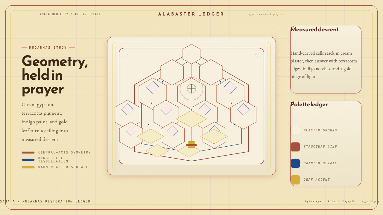 Yemeni Mukarras VaultSolemn geometry, warmed by plaster. Cream gypsum, terracotta, and indigo buil…庄严几何被温暖托起。奶油石膏、赤陶与靛蓝构成穹顶。
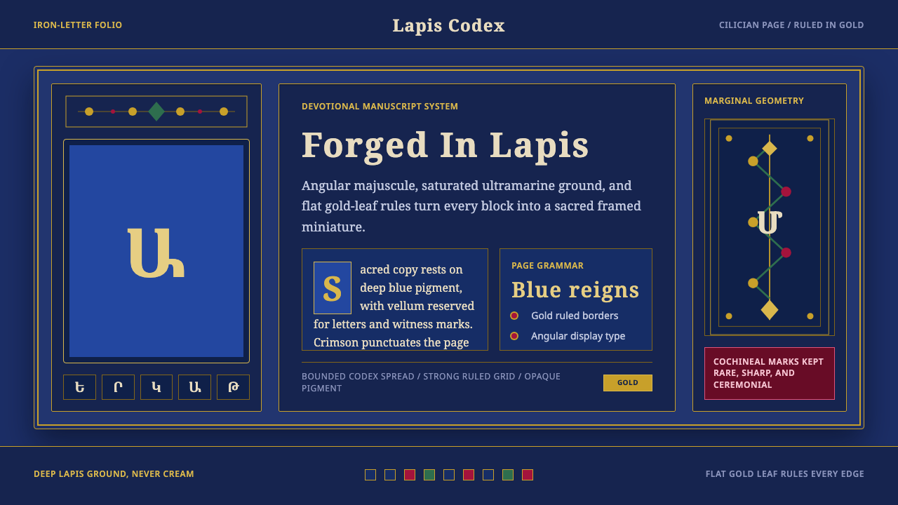 Armenian ErkatʿagirDevotional lapis reigns. Gold rules and angular serif glyphs frame a sacred g…虔敬青金石主宰:金色线框与棱角字形围合神圣网格。
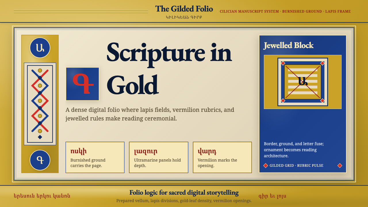 Armenian Illuminated ManuscriptGilded maximalism. Burnished gold, lapis frames, and vermilion initials build…鎏金极繁。金箔底、青金框与朱砂首字构成密实书页。
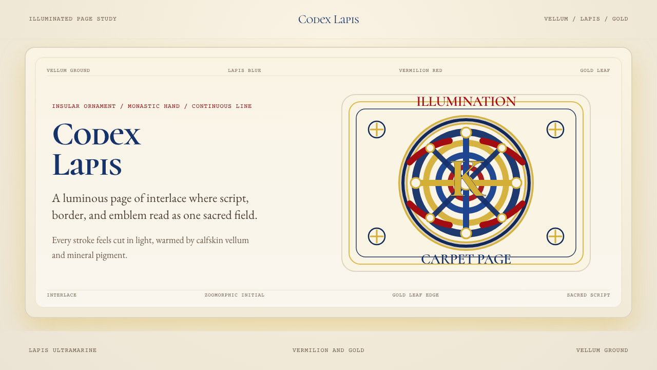 Book of Kells Celtic (800)Sacred and precise. Vellum cream, lapis, vermilion, and gold knotwork.神圣而精密。奶油羊皮底上铺陈青金石、朱砂与金色缠结纹。
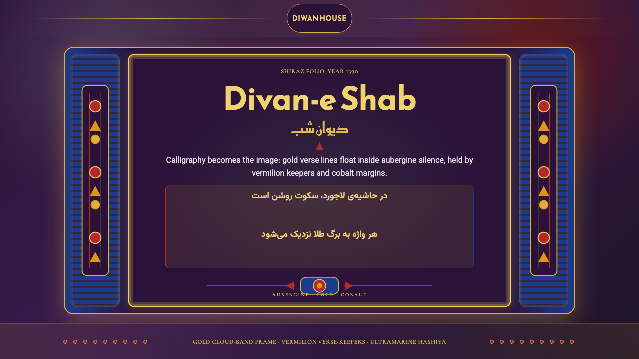 Iranian Shiraz Poetry Divan 1390Midnight manuscript glow. Aubergine fields, gold Kufi type, cobalt margins.午夜手稿般发光:茄紫底、金色库法体、钴蓝边框。
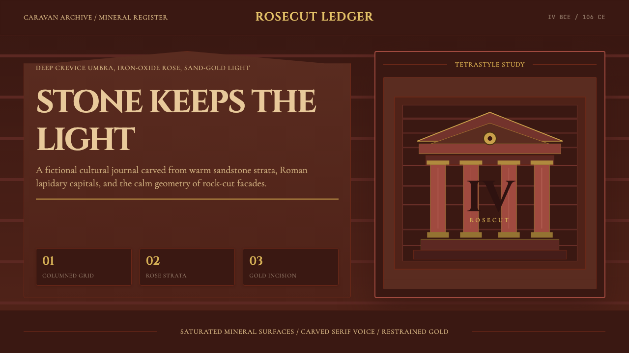 Jordanian Petra Rose NabataeanGeology feels monumental. Crevice umbra, rose strata, and Cinzel capitals car…地质感如纪念碑。暗峡底、玫瑰岩层与Cinzel碑铭体凿出页面。