What is Armenian Erkatʿagir?
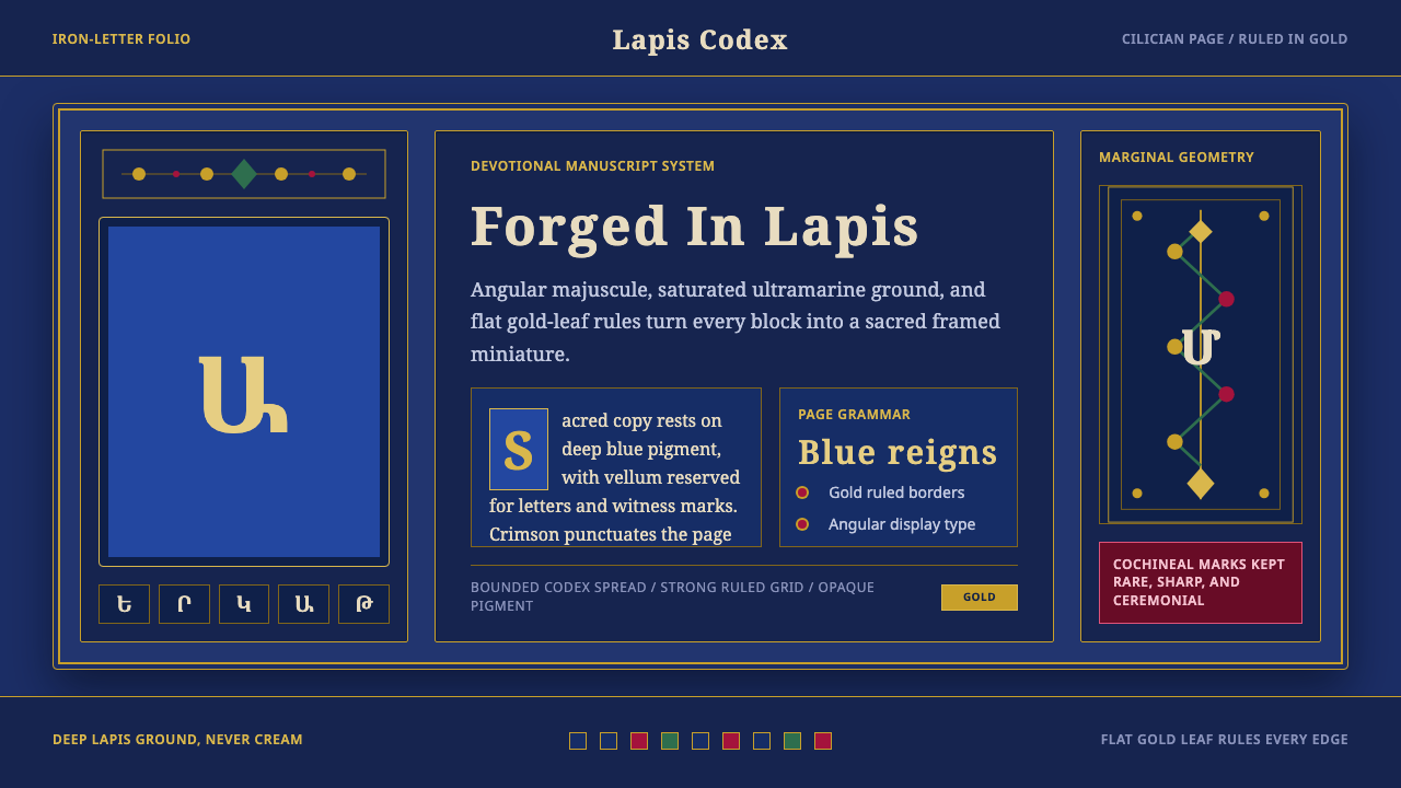
Armenian Erkatʿagir is a devotional visual system forged from iron-edged letterforms and lapis-blue conviction — a medieval Christian manuscript tradition where saturated ultramarine, gold leaf, and angular majuscule glyphs combine into one of the most spiritually charged design vocabularies in the history of the book.
Armenian Erkatʿagir in brief
Armenian Erkatʿagir takes its name from the 'iron-letter' majuscule script first codified in the fifth century as Armenians developed their own alphabet to translate Christian scriptures. The letterforms are angular, architecturally rigid, and deliberately monumental — each character behaves less like handwriting and more like a stone-cut inscription transferred to vellum. When medieval Armenian scribes in Cilicia began producing illuminated Gospel books in the twelfth and thirteenth centuries, they fused this iron script with a chromatic system of singular intensity: deep lapis-blue grounds, gold-leaf framing, and ink the color of dried blood.
The design system that emerges from this tradition is maximal without being chaotic. Every element earns its place through devotional logic rather than decorative whim. The saturated blue field is not a background in the modern sense — it is a sacred ground, an assertion that the space surrounding the sacred text participates in holiness. Gold leaf delineates borders and frames ornamental drop initials, creating a visual hierarchy in which the divine word is literally illuminated. Vellum shows only as a small, precious accent, never as the dominant surface.
Visually, the style is immediately recognizable by three interlocking signatures: the angular, compressed letterforms that pack dense information into a tight grid; the chromatic commitment to deep ultramarine and burnished gold as a paired system; and the ornamental vocabulary of interlaced vine scrolls, stylized birds, and carpet-page geometric patterns borrowed from both Byzantine and Persian traditions. This is not eclectic borrowing — it is a synthesis that produced a distinctly Armenian visual identity, one immediately distinguishable from the Latin, Byzantine, or Syriac manuscript traditions that surrounded it.
Where does Armenian Erkatʿagir come from?
The story of Armenian manuscript art begins with the invention of the Armenian alphabet itself. In approximately 405 CE, the monk and theologian Mesrop Mashtots created a thirty-six-character alphabet specifically to translate the Bible and patristic texts into Armenian. The alphabet's design reflected its purpose: the letterforms were constructed to be unambiguous, angular, and legible at the scale of a manuscript page. Within decades of its invention, Armenian scribes had produced the first translations of the Old and New Testaments, and a scriptural culture rooted in the physical act of copying and illuminating sacred texts had taken root.
The golden age of Armenian illuminated manuscripts arrived in the twelfth and thirteenth centuries in Cilician Armenia — a kingdom established in southeastern Anatolia by Armenian nobles who had fled the Seljuk conquest of the Armenian homeland. The Cilician court at Sis and the scriptoria attached to its monasteries became centers of extraordinary artistic production. It was here that the visual system most people recognize as 'Armenian manuscript style' crystallized: the deep lapis-blue grounds, the elaborate knotwork and bird-inhabited vine-scroll borders, the full-page carpet illuminations, and the monumental columnar layouts. The pigment of choice — ultramarine, extracted from lapis lazuli sourced in Afghanistan — was among the most expensive colorants available in the medieval world, comparable in cost to gold leaf. Its use was a theological statement as much as an aesthetic one.
The supreme figure of the Cilician tradition was Toros Roslin, a scribe and illuminator active in the mid-thirteenth century under the patronage of the Catholicos Constantine I. Roslin's surviving manuscripts — among them the Gospels now held in Jerusalem, Baltimore, and Yerevan — demonstrate the full range of the style's ambitions: architectural canon tables, full-page Evangelist portraits, historiated initials inhabited by birds and angels, and carpet pages of such geometric density that they seem to anticipate the logic of fractal patterning. Roslin signed his work, an unusual act of individual authorship in a tradition that was otherwise largely anonymous, and his name has become synonymous with the highest register of Armenian manuscript art.
The tradition did not end with the fall of Cilician Armenia in 1375. Armenian scribal culture persisted through diaspora communities in Constantinople, Venice, Amsterdam, and later in Etchmiadzin and New Julfa. Manuscript production continued into the seventeenth and eighteenth centuries, with later examples adapting the established visual vocabulary to new formats while maintaining the core chromatic and typographic commitments. The invention of Armenian movable type — first used in Venice in 1512 — eventually displaced manuscript production, but the visual grammar of the illuminated tradition survived in printed book ornament, ecclesiastical embroidery, and the decorative arts of the Armenian diaspora for centuries beyond its scribal origin.
What defines the Armenian Erkatʿagir look?
Color
The palette is built around a single, commanding ground color: deep, saturated ultramarine. This blue does not function as backdrop — it is the primary chromatic fact of the page, asserting the sacred weight of the space around the text. Against this ground, burnished gold leaf creates illuminated borders, frames, and initial letters, forming the second pole of a two-color core system. The third element is the vellum itself — a warm, parchment tone that appears as a precious minority note, never as a field. Vermilion and mineral greens appear as secondary accents in figural scenes, but the lapis-gold opposition governs the overall chromatic identity. In a contemporary application, the spirit of this palette means committing to one deep, saturated anchor color and using metallic or warm neutrals as framing counterparts — never diluting both simultaneously toward middle values.
Typography
The Erkatʿagir majuscule is the typographic spine of the system — angular, compressed, and architecturally dense. Each letterform is constructed from relatively few strokes, but those strokes are decisive: hard horizontal bases, vertical shafts with minimal curve, and angular junctions that give the script a lapidary quality, as if the letters were cut rather than drawn. Text is set in tight columns with generous gilded margins, creating a page structure in which the column of text and the frame of gold operate as two distinct spatial layers. Ornamental drop initials — sometimes enlarged to span several lines, decorated with interlace and zoomorphic motifs — mark sacred divisions in the text, functioning simultaneously as typographic hierarchy markers and miniature works of art.
Ornamental Vocabulary
The border and header decorations of Armenian manuscripts draw from a distinctive synthesis of sources: Byzantine interlace patterns, Persian carpet geometry, and a locally developed vocabulary of stylized birds — doves, peacocks, eagles — perched on vine scrolls or locked into geometric latticework. This zoomorphic tradition is not merely decorative; in the theological reading of the manuscripts' original audiences, the birds and vines carried symbolic meaning related to paradise, resurrection, and the nourishing Word of God. Contemporary applications that borrow from this vocabulary are most effective when they understand the motifs as structural elements — geometric and interlocking — rather than as surface embellishment applied on top of an existing layout.
Layout and Grid
The canonical Armenian Gospel page is organized around a double-column text block, flanked by wide gilded margins and topped by an ornamental header band. This architecture is not merely practical — it is cosmological. The symmetry of the two columns mirrors the bilateral structure of the codex; the framing gold margins signal the transition from profane to sacred space. Canon tables — comparative indexes of parallel Gospel passages — are designed as arcaded architectural structures, with text nested inside columns topped by decorative arches, making the organizational logic of the text visible as a built form. In contemporary use, this sensibility translates to a high-structure layout philosophy: text and image are separated by explicit framing rather than whitespace alone, and organizational elements are made visually legible rather than implied.
Gold as Structure
In Western manuscript traditions, gold is often applied as a background for haloes and sacred figures — a symbolic aura. In Armenian illumination, gold functions more architecturally: it outlines, frames, and delineates spatial boundaries. The gilded border is not a decoration around the page — it is the page's structural skeleton, the element that organizes all other visual information into a legible whole. This distinction matters for contemporary application: using a metallic or warm-toned gold analog as a framing and structural device, rather than as a fill or decorative flourish, is the authentic translation of this principle. Gold that gilds without framing is ornament; gold that frames without gilding is structure.
Figural Representation
Evangelist portraits and narrative scenes in Armenian manuscripts follow a frontal, hieratic convention that shares Byzantine precedent while developing its own intensity. Figures are elongated and static, with faces that confront the viewer directly and drapery rendered as schematic parallel folds rather than naturalistic cloth. The figure occupies a saturated blue ground, often surrounded by a mandorla or architectural niche rendered in gold. This is not failed naturalism — it is deliberate abstraction in service of spiritual intensity. The body is flattened to direct attention to the face and gesture; the gold field around it removes any sense of physical location, placing the figure in an eternal, non-spatial sacred present.
Darkness as Devotion
Armenian Erkatʿagir is a dark-ground system — which distinguishes it sharply from most European manuscript and print traditions that assume a light vellum or paper ground. The dark ground is not a deficit of light but an assertion of depth and weight. The system's visual logic inverts what contemporary designers might expect: the lightest elements (gold, vellum accent) are the structural and sacred markers, while the deepest color (ultramarine) is the ground from which everything emerges. This makes the style unusually well-suited to dark-mode interface design when understood correctly — but it demands that gold or light-toned structural elements carry the full organizational burden, since there is no light background to provide passive contrast.
Who shaped Armenian Erkatʿagir?
The fifth-century monk and theologian who invented the Armenian alphabet around 405 CE, creating the typographic foundation upon which the entire manuscript tradition rests. Mashtots designed the letters specifically for the translation of Christian scripture, and his choices — angular, unambiguous, constructed letterforms — shaped Armenian visual culture for the next fifteen centuries. He is venerated as a saint in the Armenian Apostolic Church, and his alphabet is now recognized by UNESCO as part of the Intangible Cultural Heritage of Humanity.
The greatest named master of Cilician Armenian manuscript illumination, active in the mid-thirteenth century at the Monastery of Hromkla. Roslin produced at least six surviving Gospel books between approximately 1256 and 1268, each demonstrating extraordinary technical mastery: his ultramarine grounds are applied with exceptional evenness, his gold leaf is burnished to a mirror-like finish, and his figural compositions balance Byzantine formalism with a distinctive Armenian expressiveness. His practice of signing his work identifies him as one of the first medieval illuminators to claim individual artistic authorship.
The religious leader of the Armenian Apostolic Church who served as primary patron of Toros Roslin's workshop in the thirteenth century. Constantine's patronage transformed manuscript production from a monastic undertaking into a court art, raising the technical and material standards of illumination to a level that required sourcing the finest pigments — including Afghan lapis lazuli — and commissioning the most skilled craftsmen available. His understanding of the manuscript as both a devotional object and a diplomatic gift shaped the format and ambition of the surviving Roslin Gospels.
A fourteenth-century Cilician illuminator and close associate of Toros Roslin's circle whose surviving work demonstrates how the Roslin workshop conventions were transmitted across generations. Pidzak's manuscripts show the characteristic ultramarine grounds and gold-framing vocabulary of the mature Cilician style, while introducing subtle variations in border ornament and figural treatment that document the tradition's capacity for internal evolution. His work serves as evidence that the Erkatʿagir visual system was not frozen in a single master's hand but was a living, transmissible craft.
Not a single person but a productive workshop based at the Glajor monastery in the Vayots Dzor region of Greater Armenia (present-day Armenia), active primarily in the late thirteenth and early fourteenth centuries. The Glajor school represents the transmission of Cilician illumination techniques into the Armenian homeland after the decline of Cilician political power, demonstrating that the visual system had become sufficiently codified to be relocated and reconstituted. Glajor manuscripts are distinguished by their complex narrative programs and the richness of their marginal ornament, extending the Erkatʿagir vocabulary into new compositional territory.
How do you use Armenian Erkatʿagir today?
Armenian Erkatʿagir is one of the most atmospherically powerful historical styles available to contemporary designers, but it requires understanding its internal logic rather than simply borrowing its surface signals. The system's authority comes from constraint and commitment: a deep blue ground, gold structural framing, angular dense type, and intricate but geometrically organized border ornament. Applying any subset of these without the others risks producing something that looks like a generic 'medieval' pastiche rather than the specific visual intensity of the Armenian tradition.
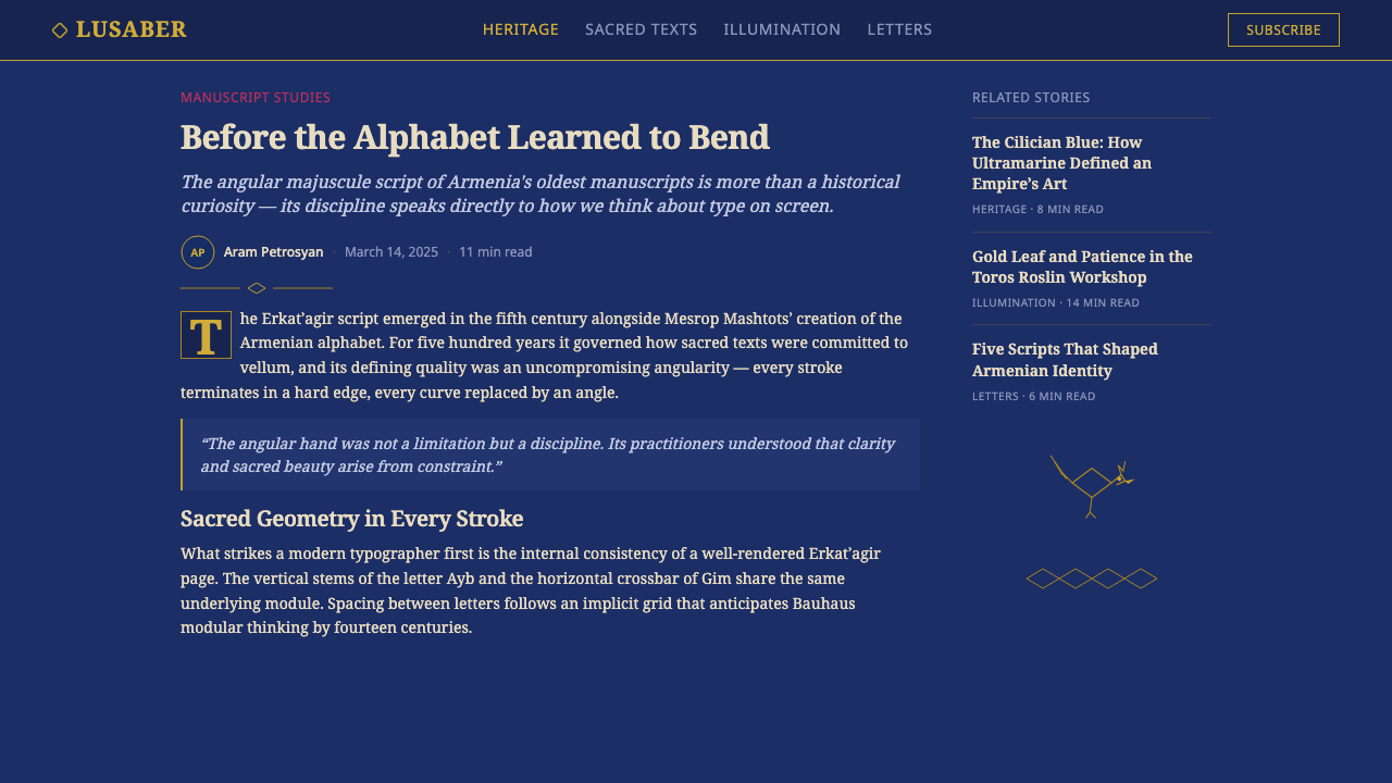
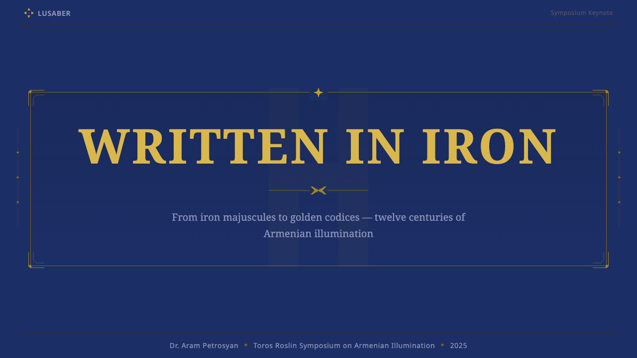
For presentation slides, this style works with exceptional force on cover pages and section dividers. A cover built on a deep saturated blue field with gold-toned title text and a framing border element immediately communicates weight, duration, and craftsmanship — qualities useful for any presentation that wants to signal seriousness or cultural depth. Content slides require more restraint: use a light-ground variant (vellum-tone or cream background) for text-heavy pages, reserving the deep blue field for high-impact visual moments. Data slides can borrow the carpet-page principle — dense geometric patterning used to fill space — by treating chart elements as interlocking geometric units rather than floating shapes on a white ground.
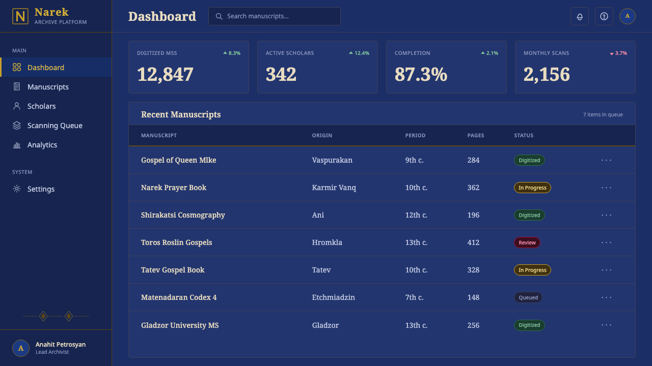
For web interfaces and digital products, the style is best suited to high-ceremony contexts: luxury brands, cultural institutions, religious or heritage organizations, editorial platforms emphasizing depth and craft. The practical translation involves committing to a dark, saturated primary background color for key screens, using gold or warm metallic tones for navigational framing and interactive highlights, and reserving light-toned surfaces for reading-focused content areas. Border and frame elements should be explicit and structural — thin gold lines delineating content regions — rather than the soft card shadows typical of contemporary design systems.
For editorial and marketing applications, the style's most transferable quality is its treatment of hierarchy through framing rather than scale alone. A Erkatʿagir-informed editorial layout uses explicit borders to demarcate content zones, places pull-quotes within gilded or framed containers, and uses an angular, compressed typeface for display text while allowing body text more contemporary legibility conventions. Marketing work benefits from the style's poster-like boldness: a full-bleed deep blue hero image with gold typographic framing will read with immediate authority in any channel where visual distinction matters.
The most common mistake when applying this style is mistaking richness for clutter. The Armenian manuscript tradition is maximalist in its chromatic commitment but highly structured in its spatial organization — every element has a defined zone and a defined relationship to the grid. Designers who borrow the deep blue and gold palette but then arrange elements loosely produce work that feels heavy and confused rather than weighty and sacred. The corrective is to impose an explicit grid framework first, assign each element to a specific zone, and only then apply the chromatic and ornamental vocabulary. A second common error is using the gold tone as a fill color for large shapes rather than as a framing and outlining element — when gold becomes the dominant surface rather than the structural edge, the system's polarity collapses and the work loses its distinctive sacred-and-earthly tension.
Armenian Erkatʿagir — FAQ
How does Armenian Erkatʿagir differ from Byzantine manuscript illumination?
They share a common theological context and some visual conventions — frontal figural representation, gold grounds for holy figures, and the general format of the illuminated codex. But the differences are significant. Byzantine manuscripts typically use a gold ground behind sacred figures rather than a blue ground as the dominant field. The Armenian tradition inverts this: the deep blue is the comprehensive ground color, and gold functions primarily as a framing and structural element rather than an atmospheric aura. Armenian ornamental borders also draw more heavily on interlaced geometric patterns and zoomorphic motifs with connections to Persian decorative traditions, giving the page borders a geometric density that differs from the more architectural Byzantine approach. The Erkatʿagir letterform itself has no Byzantine equivalent — it is uniquely Armenian, and its angular, compressed character gives Armenian text a visual weight and density that distinguishes it immediately from Greek or Syriac scripts on the page.
Can this style work for light-background digital interfaces, or does it require dark grounds?
The historic system is built around a dark ground — the deep lapis-blue field is inseparable from the tradition's identity. However, a light-background translation is possible and does appear in later periods of Armenian manuscript production, where vellum-ground pages with ultramarine and gold accents create a quieter register. In contemporary digital use, a light-ground variant works well for reading-focused interfaces: cream or warm white backgrounds with deep blue used for headlines, navigational elements, and structural rules, and gold or amber tones reserved for interactive highlights and framing details. The caution is that the light-ground version feels less distinctive — it begins to resemble other historically-inspired aesthetic systems. To maintain the Armenian identity, keep the angular compressed typeface, maintain the explicit framing convention (borders that define zones rather than whitespace that separates them), and use the zoomorphic or geometric ornamental vocabulary at least in accent positions.
Is this style appropriate for secular or commercial projects, or does its religious origin make it feel out of place?
Most great historical design traditions originated in a religious or ceremonial context — Gothic architecture, Japanese lacquer art, Mesoamerican pattern systems, Islamic geometric ornament — and are routinely applied to secular projects without loss of effectiveness. What travels from a religious tradition into secular use is not the theology but the visual logic: the color relationships, the structural conventions, the ornamental vocabulary. Armenian Erkatʿagir's deep blue and gold palette, its high-structure layout philosophy, and its emphasis on craftsmanship translate effectively to luxury brands, cultural institutions, heritage publications, and any context where the product wants to communicate permanence, depth, and careful making. The style becomes awkward when applied to contexts that want to communicate speed, lightness, or casual accessibility — its visual weight and ceremonial seriousness work against those values.
What is the single most important rule for avoiding a generic 'medieval' look?
Commit to the specific color polarity: deep blue as ground, gold as structure. The most common reason Armenian-inspired work slides into generic medievalism is substituting parchment beige for the lapis-blue ground — which collapses the system into conventional historical pastiche. The lapis-blue ground is not one of several options; it is the defining chromatic fact of the tradition. Everything else — the gold framing, the angular typeface, the interlaced ornament — derives its identity from its contrast with that deep, saturated blue field. Remove the blue, and you have decoration without a design system. Keep the blue, set the gold against it, hold the ornament to its geometric logic, and the work will read as Armenian regardless of whether you use any other period-specific motifs.
How should the ornamental vocabulary — the birds, vines, and interlace — be used without becoming kitsch?
The ornamental vocabulary of Armenian illumination is geometrically derived — the vine scrolls follow repeating mathematical curves, the birds are stylized to the point of near-abstraction, and the interlace patterns are based on over-under grid logic. Using this vocabulary without becoming kitsch requires approaching the motifs as geometric systems rather than as period props. A border composed of actual interlace geometry will read as structural; a border composed of clip-art birds and vines will read as costume. The practical test is whether the ornamental elements could be removed from their historical context and still function as design decisions in their own right. If the pattern holds its visual logic without the historical reference, it is structural ornamentation. If it only reads as 'old-looking,' it is pastiche.
Related design styles
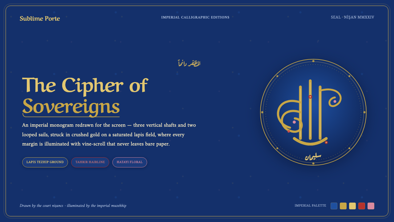 Ottoman Tughra SealEvery surface is a state seal. Gold tughra cipher on lapis, Aref Ruqaa script…
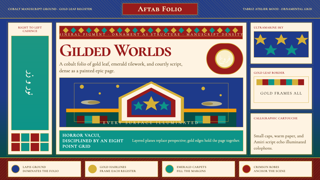 Persian Miniature (Shahnameh era)Manuscript luxury turns maximal. Cobalt ground, gold borders, and Cormorant S…
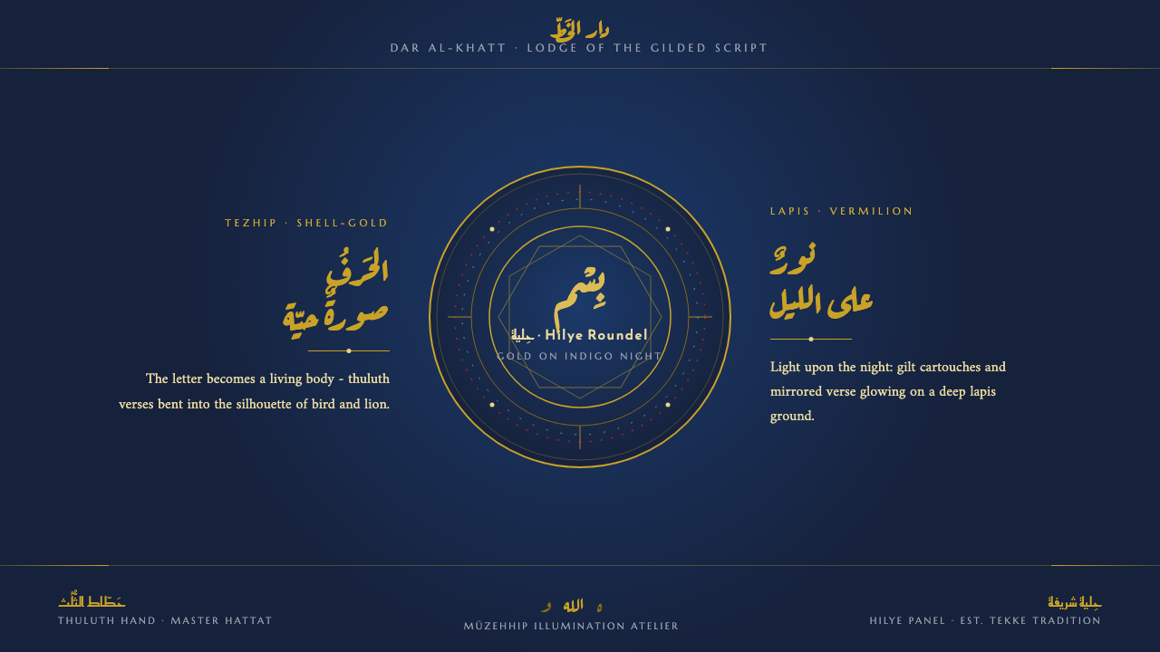 Sufi Zoomorphic CalligraphySacred script made flesh. Shell-gold thuluth on indigo-night grounds, framed…
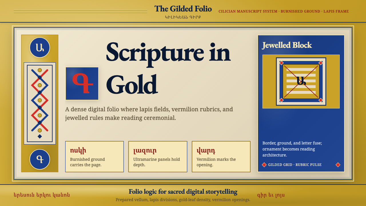 Armenian Illuminated ManuscriptGilded maximalism. Burnished gold, lapis frames, and vermilion initials build…
 Bhutanese Drukpa Kagyu ThangkaDevotion made cobalt. Gold frames, Cormorant serif, and vermilion marks hold…
 Buryat Buddhist Datsan ThangkaCold lapis holds silence. Gold mandala lines frame a solemn azurite field.