Design style guide设计风格指南
What is Iranian Shiraz Poetry Divan 1390?什么是 Iranian Shiraz Poetry Divan 1390?
The Shiraz divan tradition transformed the Persian manuscript into a total art object — where calligraphy, illumination, and poetry fused so completely that the line between text and image ceased to exist.设拉子诗集传统将波斯手抄本升华为浑然一体的艺术造物——书法、装饰与诗歌彼此融合,文字与图像的界限已然消失。
Iranian Shiraz Poetry Divan 1390 in briefIranian Shiraz Poetry Divan 1390 速览
The Iranian Shiraz Poetry Divan 1390 is a design system rooted in the illuminated manuscript culture of fourteenth-century Shiraz — a tradition in which court calligraphers and illuminators collaborated to produce books of ghazal poetry where every visual element, from the ground color to the margin ornament to the cadence of the script, was understood as part of a unified aesthetic whole.伊朗设拉子诗集1390是一套植根于十四世纪设拉子宫廷彩绘手抄本传统的设计体系——在这一传统中,宫廷书法家与装饰师协力创作加扎尔诗集,每一个视觉元素,从底色到边饰纹样,再到书写的韵律,都被理解为统一审美整体的组成部分。
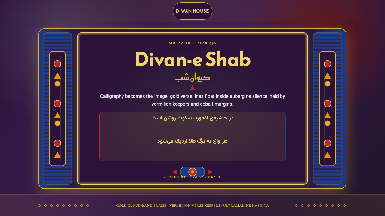
At its heart, the style is an expression of lamplight intimacy. The canonical visual language consists of deep aubergine fields that absorb and concentrate light, gold-leaf ornamental bands that frame and divide the written columns, cobalt margin accents that cool and deepen the edges, and vermilion verse-markers that punctuate the rhythm of the text. Nothing is incidental. Every color, every ruled border, every cloud-band cartouche carries the accumulated judgment of generations of workshop masters.这种风格的核心是一种灯下展卷的亲密感。其标志性视觉语言由以下元素构成:深茄紫底色凝聚并吸收光线;金箔装饰带框定并分隔书写栏;钴蓝边饰冷却并加深页面边缘;朱砂诗节标记为文本的节奏打上标点。没有任何元素是偶然的——每一种色彩、每一条边线、每一个云形框扇都承载着数代工坊匠师积累的审美判断。
The style translates this manuscript sensibility into a modern digital design language. It brings the same principle of total visual integration — where structure, type, ornament, and ground color work as one indivisible system — and the same commitment to richness over austerity. Applied well, it creates interfaces and compositions that feel simultaneously ancient and precise, intimate and authoritative.这种风格将手抄本的美学感知转化为现代数字设计语言,带来同样的视觉整合原则——结构、字体、纹饰与底色作为不可分割的整体协同运作——以及同样对丰盈而非简朴的执着。运用得当,它能创造出既古老又精确、既亲密又权威的界面与构图。
See the Iranian Shiraz Poetry Divan 1390 design system →查看 Iranian Shiraz Poetry Divan 1390 完整设计系统 →
Where does Iranian Shiraz Poetry Divan 1390 come from?Iranian Shiraz Poetry Divan 1390 从何而来?
The tradition that gave rise to this design system emerged under two successive Shiraz dynasties: the Inju governors (roughly 1303 to 1357) and the Muzaffarids (1314 to 1393), who ruled Fars province from Shiraz during the turbulent aftermath of the Mongol invasions. Both courts were patrons of Persian literature and book arts, and both competed to attract the finest calligraphers, illuminators, and binders in the Iranian world. It was under these patrons that Shiraz developed its distinctive school of manuscript production — characterized by a palette of deep jewel tones, elaborate floral and geometric illumination, and a style of calligraphy that was moving from the older Naskh and Muhaqqaq scripts toward the fluid, oblique forms that would eventually crystallize as Nastaliq.这一设计体系的源头传统兴起于设拉子相继统治的两个王朝:因朱总督(约1303—1357年)与穆扎法尔王朝(1314—1393年)——后者在蒙古入侵的动荡余波中从设拉子统治法尔斯省。两个宫廷都是波斯文学与书籍艺术的赞助者,都竞相延揽伊朗世界中最优秀的书法家、装饰师与装订匠。正是在这些赞助者的庇护下,设拉子发展出其独特的手抄本制作流派——以深宝石色系调色板、繁复的花卉与几何装饰,以及正从古老的纳斯赫和穆哈嘎格体向流动斜向形态演化(最终凝定为纳斯塔利格体)的书写风格为特征。
The peak of the tradition coincides with the life and posthumous fame of Hafez of Shiraz (c. 1315 to 1390), widely regarded as the greatest lyric poet in the Persian language. Hafez spent his entire life in Shiraz, serving at times in the Muzaffarid court, and his ghazals — intricate, multi-layered poems that combine erotic longing, mystical aspiration, and oblique political commentary — became the defining literary subject of the divan illumination tradition. A Hafez divan produced in Shiraz around 1390 was not simply a book; it was a devotional and aesthetic object, made to be handled slowly, read aloud, and looked at with sustained attention. The visual program of the manuscript — the color choices, the ornamental schemes, the proportion of margin to text column — was designed to honor and amplify the poems it contained.这一传统的鼎盛时期与设拉子的哈菲兹(约1315—1390年)的生平及其身后声誉相吻合。哈菲兹被公认为波斯语最伟大的抒情诗人,终生居于设拉子,一度供职于穆扎法尔王朝宫廷。他的加扎尔诗篇——兼容爱欲渴望、神秘玄思与隐晦政治评论的繁复多层诗体——成为诗集彩饰传统最核心的文学主题。一部约作于1390年的设拉子哈菲兹诗集,绝非仅仅是一本书,而是一件礼拜与审美兼具的对象,供人缓缓翻阅、朗声诵读、凝神赏看。手抄本的视觉方案——色彩选择、纹饰体系、页边与书写栏的比例——均为尊崇并放大所收诗篇而精心设计。
Calligraphy was the pre-eminent art form in this tradition, and the script masters of the Shiraz school were celebrated figures who signed their work and were remembered by name across generations. Mir Ali Tabrizi, working slightly later in the period, is traditionally credited with perfecting Nastaliq — the script that would become the dominant vehicle for Persian poetry — though the groundwork for this development was laid in precisely the Shiraz workshops of the late fourteenth century. Junayd al-Sultani, an illuminator active in the Jalayirid court but trained in the broader Iranian manuscript tradition of this era, exemplifies the high standard of technical mastery that manuscript patrons demanded: every cloud-band border, every arabesque scroll, every hashiya margin decoration was executed with a precision and density that still registers as extraordinary to modern eyes.书法是这一传统中最崇高的艺术形式,设拉子流派的书法大师是为人称道的知名人物,世代被铭记。稍晚的米尔·阿里·大不里兹被传统上视为纳斯塔利格体——波斯诗歌最主要书写载体——的完成者,而这一发展的基础,恰恰奠定于十四世纪末的设拉子工坊之中。朱纳伊德·苏丹尼是贾拉伊尔宫廷的装饰师,出身于这一时代更广泛的伊朗手抄本传统,他代表了手抄本赞助者所要求的高超技艺标准:每一条云形边框、每一卷阿拉伯式花草纹卷须、每一段哈希耶边饰,都以即便在现代眼光看来仍属非凡的精准与密度完成。
The dissolution of the Muzaffarid dynasty under the conquests of Timur in 1393 disrupted Shiraz as a manuscript center, but it did not end the tradition. Many of the workshops and their masters relocated or were absorbed into new Timurid patronage networks. The visual vocabulary they carried with them — the deep jewel-toned grounds, the gold-leaf ornament, the cobalt margin accents, the rhythmic verse-keepers — persisted through the Timurid and Safavid periods and became foundational to the broader Persianate manuscript tradition that extended from Istanbul to Delhi. The 1390 date in the system's name evokes this precise moment of peak intensity, just before the political rupture, when the Shiraz workshops were producing some of the most technically accomplished and visually concentrated manuscript pages in the entire history of Islamic book arts.穆扎法尔王朝在1393年帖木儿的征服中覆亡,使设拉子作为手抄本中心的地位受到冲击,但这一传统并未就此终结。许多工坊及其匠师迁移至他处,或被纳入新的帖木儿王朝赞助网络。他们携带的视觉词汇——深宝石色底面、金箔装饰、钴蓝边饰、有节奏的诗节标记——延续于帖木儿与萨法维时期,成为从伊斯坦布尔延伸至德里的整个波斯语手抄本传统的基础。体系名称中的1390年,正是为了唤起这一强度顶峰的时刻——政治断裂来临之前,设拉子工坊正制作着整个伊斯兰书籍艺术史上技艺最精湛、视觉最浓缩的手抄本页面。
What defines the Iranian Shiraz Poetry Divan 1390 look?Iranian Shiraz Poetry Divan 1390 的视觉特征是什么?
Ground and Atmosphere底色与氛围
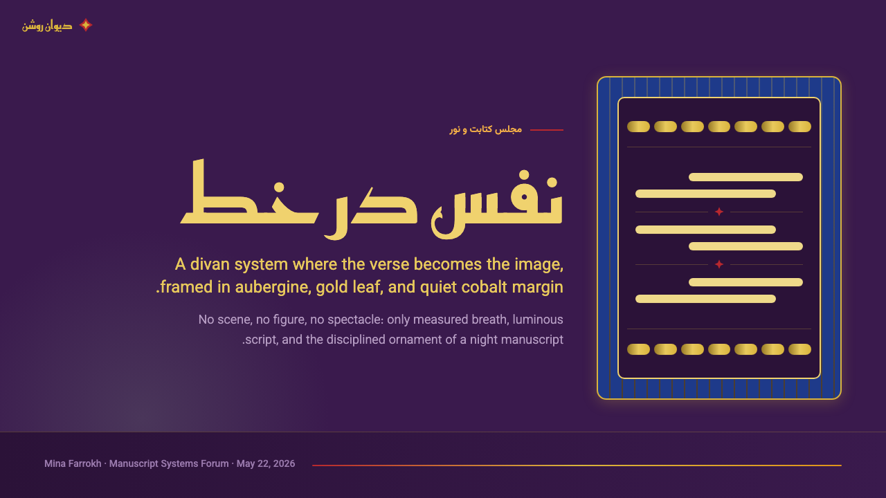
The defining ground color is a deep aubergine — a dark, saturated purple-brown that absorbs light rather than reflecting it. This creates the quality the tradition aims for above all else: the sense of a page that glows inward, like a lamp seen through parchment. Against this ground, all other colors achieve an intensity that would be impossible on a white or cream field. The aubergine is never the only darkness in the system; it reads as warm against the colder cobalt accents at the margins, and as deep but welcoming against the incandescent gold.这一体系最具定义性的底色是深茄紫——一种深沉、饱和的紫褐色,吸收光线而非反射光线。这创造出传统所追求的最高品质:一种页面向内发光的感觉,仿佛透过羊皮纸看见的烛火。在这片底色衬托下,其他所有色彩都能达到在白色或奶油色底面上不可能实现的强度。茄紫从不是体系中唯一的深色——映衬边缘处更冷的钴蓝,它显得温暖;映衬炽烈的金色,它显得深邃而富有包容性。
Gold Ornament金色装饰
Gold in this tradition is not a neutral highlight or a luxury signifier — it is the structural material of the page. Gold-leaf cloud bands divide the text columns from the illuminated borders. Gold arabesque scrolls fill the intercolumnar spaces. Gold cartouches frame the opening lines of poems. The effect is not opulence for its own sake but an almost architectural use of a luminous material to organize visual space. Gold creates the grid of the manuscript; the other colors inhabit the spaces the gold defines.在这一传统中,金色不是中性的高光或奢华的符号标记——它是页面的结构性材料。金箔云带将书写栏与彩饰边框分隔开来;金色阿拉伯式花草纹卷须填充栏间空白;金色框扇包裹诗篇的开篇诗行。这种效果并非以奢华为目的,而是以近乎建筑性的方式运用发光材料来组织视觉空间。金色构成手抄本的网格;其他色彩栖居于金色所界定的空间之内。
Cobalt Margin Accents钴蓝边饰
The margins of a Shiraz divan are rarely left as bare ground. They are animated by cobalt blue — a cool, intensely saturated blue that reads as a spatial deepening relative to the aubergine center. Cobalt appears in the hashiya border bands, in the geometric interlace patterns that frame the text blocks, and in the fine ruled lines that separate the calligraphic columns from the decorative margins. Its function is to create visual depth and to define the boundary between the written and the ornamented without interrupting the continuity of the page.设拉子诗集的页边很少留作空白底色。钴蓝——一种冷峻、高度饱和的蓝色——激活了页面边缘,相对于茄紫中心呈现出空间延伸的视觉感受。钴蓝出现在哈希耶边框带、围绕文本块的几何交错纹样,以及将书法栏与装饰页边分隔开来的细线中。它的功能是创造视觉深度,并在不打断页面连续性的前提下界定书写区域与装饰区域的边界。
Vermilion Verse-Markers朱砂诗节标记
The internal rhythm of a divan page is marked by vermilion — a warm, fire-like red used for the small ornamental dividers between verses, for the opening words of stanzas, and occasionally for the poet's name in the colophon. Vermilion does not compete with the gold or the cobalt; it punctuates them. Its role is fundamentally typographic: it teaches the eye where to pause and where to continue, giving the densely written column a breathing structure that pure calligraphy alone would not provide.诗集页面的内在节奏由朱砂来标记——一种温暖的火焰红,用于诗行间小型装饰分隔符、诗节首句,偶尔也用于版权页中诗人的名字。朱砂不与金色或钴蓝竞争,而是为它们打上标点。其作用从根本上是排版性的:它教导眼睛在何处停顿、在何处继续,为密集书写的栏目赋予一种仅凭书法本身无法提供的呼吸结构。
Calligraphic Presence书法的在场
Script in a Shiraz divan is not a neutral carrier of text; it is a visual force in its own right. The proto-Nastaliq letterforms of the late fourteenth century have a characteristic quality: they are oblique, fluid, and rhythmically varied, with broad diagonal strokes descending from thin horizontals. The overall impression of a column of this script is of cascading movement — not the rigid verticality of Kufic nor the upright regularity of Naskh, but a controlled flow that reads simultaneously as decoration and as writing. This calligraphic presence means that type in a design system derived from this tradition should carry visual weight and directional energy, not simply convey information.设拉子诗集中的文字不是文本的中性载体,而是自具力量的视觉元素。十四世纪末的原始纳斯塔利格体具有鲜明的特质:斜向、流动、节奏变化丰富,宽阔的对角笔画从纤细的横笔倾斜而下。一栏这种字体给人的整体印象是级联的运动感——既无库法体的严整垂直,也无纳斯赫体的直立规整,而是一种可控的流动,同时作为装饰和作为书写被阅读。这种书法的在场意味着:源自这一传统的设计体系中的文字,应当承载视觉重量与方向能量,而不仅仅是传递信息。
Geometric Interlace and Arabesque几何交错与阿拉伯式花草纹
The ornamental vocabulary of Shiraz manuscripts operates through two complementary modes: geometric interlace, in which star polygons and interlocking bands create infinitely extendable patterns at the borders and headers; and arabesque, in which sinuous plant-derived scrolls fill large grounds with organic, endlessly branching forms. Neither mode is random or purely decorative — both are expressions of a mathematical order that the Islamic arts understood as a reflection of divine pattern in the visible world. In a contemporary design system, this heritage suggests ornamental elements that are rule-governed, precise, and capable of filling space without becoming chaotic.设拉子手抄本的纹饰词汇通过两种互补模式运作:几何交错纹——星形多边形与相互咬合的带状纹样在边框与页首创造出可无限延展的图案;阿拉伯式花草纹——蜿蜒的植物卷须以有机的、无限分叉的形态填充大面积底色。两种模式都既不随机,也不纯粹为装饰——它们都是一种数学秩序的表达,伊斯兰艺术将其理解为可见世界中神圣图案的折射。在当代设计体系中,这一遗产意味着具有规则性、精准性、能够填充空间而不陷入混乱的装饰元素。
Luminous Density发光的密度
Perhaps the most important single quality of the Shiraz manuscript aesthetic is its density — not as visual noise, but as concentrated presence. Every zone of the page is considered and resolved; there are no accidents, no breathing spaces left by default. Yet the result is not claustrophobic. The luminosity of the gold and the depth of the aubergine work together to create a visual richness that the eye reads as generous rather than overwhelming. This is the most difficult quality to carry into digital design: density must be deliberate and controlled, with each element earning its place through visual necessity rather than filling space for its own sake.设拉子手抄本美学最重要的单一品质,或许是它的密度——不是视觉噪声意义上的密,而是凝聚的在场感。页面的每一区域都经过斟酌与解决,没有任何偶然,没有任何默认留下的呼吸空间。然而结果并不令人窒息。金色的光辉与茄紫的深邃协同创造出一种视觉丰盛,令眼睛感受到的是慷慨而非压迫。这是最难移植到数字设计中的品质:密度必须是刻意的、受控的,每一个元素都通过视觉必要性赢得其位置,而非为了填充空间而存在。

See the Iranian Shiraz Poetry Divan 1390 design system →查看 Iranian Shiraz Poetry Divan 1390 完整设计系统 →
Who shaped Iranian Shiraz Poetry Divan 1390?谁塑造了 Iranian Shiraz Poetry Divan 1390?
Hafez (c. 1315–1390) is the central literary figure of the divan tradition, and his ghazals provided the principal textual subject for the Shiraz school of manuscript illumination. His poetry operates simultaneously on multiple registers — as love lyric, as Sufi mystical allegory, and as oblique political commentary — and the manuscripts made to house his words were designed to honor this layered complexity through equally complex visual schemes. Hafez spent his life in Shiraz under Muzaffarid patronage and died there in 1390, the same year that marks the apogee of the tradition this design system evokes. His collected divan remains one of the most copied and illuminated texts in the history of Persian book arts, and his image as the defining lyric voice of the Persian tradition has given the entire Shiraz manuscript school its most durable cultural identity.哈菲兹(约1315—1390年)是诗集传统中最核心的文学人物,他的加扎尔诗篇为设拉子手抄本彩饰流派提供了最主要的文字主题。他的诗歌同时在多个层面运作——作为爱情抒情、作为苏菲神秘主义寓言、作为隐晦的政治评论——而专为承载他诗句而制作的手抄本,通过同样繁复的视觉方案来尊崇这种多层次的复杂性。哈菲兹在穆扎法尔王朝的庇护下终生居于设拉子,于1390年在那里离世——那一年正是这一设计体系所唤起的传统的顶峰之年。他的诗集至今仍是波斯书籍艺术史上被抄写与彩饰最多的文本之一,他作为波斯传统决定性抒情声音的形象,赋予了整个设拉子手抄本流派最持久的文化身份。
Mir Ali Tabrizi is traditionally credited in Persian art historical sources with the invention or perfection of Nastaliq — the suspended, diagonal, supremely fluid script that became the dominant vehicle for Persian poetry from the fifteenth century onward. Though his major activity is associated with Tabriz and with Jalayirid patronage rather than Shiraz directly, he represents the calligraphic ambition of the late fourteenth-century Iranian world that the Shiraz workshops were also part of. His work demonstrates the period's conviction that calligraphy was not a craft in the service of literature but an art form of equal standing with the poetry it rendered visible — a conviction that is foundational to the visual values of this design system.米尔·阿里·大不里兹在波斯艺术史料中传统上被归为纳斯塔利格体的发明者或完成者——这种悬浮、斜向、极度流动的字体从十五世纪起成为波斯诗歌最主要的书写载体。尽管他的主要活动与大不里兹和贾拉伊尔王朝的赞助相关,而非直接与设拉子相关,但他代表了十四世纪末伊朗世界整体的书法抱负,而设拉子工坊也是这一世界的组成部分。他的作品体现了这一时期的信念:书法不是服务于文学的手工艺,而是与它所呈现的诗歌地位平等的艺术形式——这一信念是本设计体系视觉价值观的根基。
Junayd al-Sultani was an illuminator and painter active under Jalayirid patronage in the late fourteenth century, and his surviving works are among the most technically accomplished examples of the Iranian manuscript tradition of the period. His name appears in colophons of manuscripts produced within decades of the 1390 date this system evokes, and his work exemplifies the standard of visual mastery that defined the Shiraz and broader Iranian court manuscript schools. Junayd's paintings demonstrate the period's characteristic integration of Chinese-influenced landscape elements — curved rocks, flowering trees, dynamic cloud forms — into an essentially Persianate visual framework, creating a visual cosmopolitanism that reflects the pan-Eurasian cultural exchange of the Mongol and post-Mongol period.朱纳伊德·苏丹尼是十四世纪末在贾拉伊尔王朝赞助下活跃的装饰师与画家,他现存的作品是这一时期伊朗手抄本传统技艺最精湛的典范之一。他的名字出现在距本体系所唤起的1390年数十年内制作的手抄本版权页中,他的作品体现了定义设拉子及更广泛伊朗宫廷手抄本流派的视觉精通标准。朱纳伊德的绘画展示了这一时期的特征性整合:将受中国影响的山水元素——弯曲的山石、繁花的树木、动态的云形——融入本质上属于波斯语框架的视觉体系,创造出一种反映蒙古及后蒙古时期欧亚大陆跨文化交流的视觉世界主义。
Saadi (c. 1210–1291) predates the period of peak manuscript illumination in Shiraz by a century, but his presence as the other great literary voice of the city is inseparable from the tradition. The Gulistan and Bustan — his prose-verse masterworks — were themselves subjects of Shiraz manuscript production, and his moral authority shaped the cultural context in which the later Hafez manuscripts were read and appreciated. The Shiraz tradition is unthinkable without Saadi's earlier establishment of the city as the literary capital of the Persian-speaking world. His work represents the literary depth and ethical seriousness that the visual richness of the divan manuscripts was understood to be in the service of.萨迪(约1210—1291年)比设拉子手抄本彩饰的全盛期早了约一个世纪,但他作为这座城市另一位伟大文学声音的在场,与这一传统密不可分。《蔷薇园》与《果园》——他的散文诗歌巨作——本身也是设拉子手抄本制作的主题,他的道德权威塑造了后来的哈菲兹手抄本被阅读与欣赏的文化语境。若无萨迪早先确立设拉子为波斯语世界文学之都的功绩,设拉子传统将无从想象。他的作品代表了文学的深度与伦理的严肃性——而诗集手抄本的视觉丰盛,正是被理解为服务于这种深度与严肃性的。
Unlike the calligraphers, who sometimes signed their work, the illuminators and decorators of the Inju and Muzaffarid manuscript workshops are largely anonymous to history. Yet the visual achievements credited to these unnamed masters are as significant as anything produced by the named figures. The hashiya border systems, the cloud-band cartouches, the interlace geometric patterns, and the arabesque grounds that define the Shiraz manuscript aesthetic were developed and refined by workshop practitioners whose individual identities were subordinated to the workshop tradition itself. This anonymity is part of the tradition's visual philosophy: the ornament serves the text and the text serves the poem; the maker's personal identity is not the point. The design system honors this collective visual intelligence by treating the ornamental vocabulary as a shared resource rather than an individual signature.与书法家(有时会在作品上署名)不同,因朱与穆扎法尔王朝手抄本工坊的装饰师和彩饰者,大多在历史上湮没无名。然而,归功于这些无名匠师的视觉成就,与任何有名有姓的人物的成就同样重要。定义设拉子手抄本美学的哈希耶边框体系、云形框扇、几何交错纹样和阿拉伯式花草纹底色,都是由工坊从业者发展与精炼的——他们的个体身份从属于工坊传统本身。这种匿名性是这一传统视觉哲学的一部分:纹饰服务于文本,文本服务于诗歌,匠师的个人身份并非重点。本设计体系通过将纹饰词汇视为共享资源而非个人签名,向这种集体视觉智慧致敬。
How do you use Iranian Shiraz Poetry Divan 1390 today?今天怎么用 Iranian Shiraz Poetry Divan 1390?
The Iranian Shiraz Poetry Divan 1390 style is a high-commitment aesthetic: it works best when applied comprehensively rather than as an accent layer over a neutral base. Its visual logic depends on the interaction of the deep aubergine ground, the gold structure, the cobalt margins, and the vermilion punctuation — remove any of these and the remaining elements lose their reference points and read as arbitrary richness rather than coordinated system. The style suits contexts where depth, cultural authority, and aesthetic seriousness are desired values, and where the audience is expected to slow down and look rather than scan and move on.伊朗设拉子诗集1390风格是一种高投入的美学——它在被全面应用时效果最佳,而非作为中性底色上的点缀层。其视觉逻辑依赖于深茄紫底色、金色结构、钴蓝页边与朱砂标点的相互作用——移除其中任何一个,其余元素便失去参照点,读来像是任意堆砌的华丽而非协调的体系。这种风格适合深度、文化权威与审美严肃性是期望价值的场景,以及受众被预期放慢速度凝视而非扫视一瞥便离开的情境。
For presentation slides, this style creates some of the most distinctive and memorable cover pages available to contemporary designers. A cover should commit fully to the aubergine ground, use gold for the primary title, and treat any subtitle or date in a warm light tone that reads as illuminated against the dark field. Content slides work best when they resist the temptation to lighten the ground — a consistent deep background across all slides creates the immersive manuscript quality that is the style's main strength. Data visualizations gain remarkable presence on this ground: charts and graphs treated as geometric objects in cobalt, gold, and vermilion against aubergine read with a precision and authority that white-ground charts rarely achieve.对于演示文稿,这种风格能创造当代设计师可以使用的最独特、最令人难忘的封面页之一。封面应完全投入茄紫底色,用金色呈现主标题,并以一种温暖的浅色调呈现任何副标题或日期,使其在深色底面上读来像是被照亮的。内容页在抵制减淡底色的诱惑时效果最佳——所有幻灯片保持一致的深色背景,创造出这种风格最主要优势所在的沉浸式手抄本品质。数据可视化在这片底色上获得非凡的存在感:以钴蓝、金色和朱砂处理的图表,在茄紫底色上呈现出白色底面图表很少能达到的精准与权威感。
For web interfaces and digital applications, the style is particularly well-suited to contexts that carry cultural or literary weight: digital humanities platforms, poetry or literary archives, museum digital collections, high-end editorial publications, and premium content platforms where the visual language needs to signal that the content inside has been curated and honored rather than merely aggregated. Dashboard applications in this style benefit from using gold for primary navigation and status indicators, cobalt for data ranges and secondary information, and vermilion sparingly for alerts or emphasis. The deep ground should be consistent throughout; avoiding the temptation to lighten secondary screens maintains the immersive atmosphere.对于网页界面与数字应用,这种风格尤其适合承载文化或文学分量的场景:数字人文平台、诗歌或文学档案库、博物馆数字馆藏、高端编辑出版物,以及视觉语言需要传达内容经过精心策划与尊崇对待而非仅仅汇聚堆砌的优质内容平台。以这种风格设计的仪表板应用,宜将金色用于主导航与状态指示器,将钴蓝用于数据范围与次要信息,将朱砂谨慎用于警示或强调。深色底面应贯穿始终;避免减淡次级页面的诱惑,可维持那种沉浸式氛围。
For editorial and marketing contexts, the style supports long-form reading environments and premium brand identities in sectors where heritage and depth are valued — luxury goods, cultural institutions, academic publishers, and any context where the product or service has a genuine historical or cultural dimension. A marketing page in this style works through contrast and ceremony: section headers treated with gold ornamental framing, body text set in a warm light tone against the aubergine, and call-to-action elements in vermilion that catch the eye without breaking the tonal atmosphere. Photography, if used, should be treated with a warm duotone overlay that integrates it into the color system rather than allowing it to read as a foreign element.对于编辑与营销场景,这种风格支持长篇阅读环境,以及遗产与深度被视为价值的行业中的高端品牌形象——奢侈品、文化机构、学术出版商,以及任何产品或服务具有真实历史或文化维度的场景。以这种风格设计的营销页面通过对比与仪式感运作:以金色装饰框架处理版块标题,以温暖浅色调在茄紫底面上呈现正文,以朱砂呈现行动号召元素——在不破坏整体色调氛围的前提下抓住眼球。若使用摄影图像,应施以温暖的双色调叠层,将其整合进色彩体系,而非让它读来像一个异质元素。
The most common failure when applying this style is treating it as a dark theme with gold accents rather than as a total visual system with its own internal logic. The aubergine is not simply dark blue or dark grey with a purple cast — it is a specific chromatic warmth that must be maintained consistently. Similarly, the gold must read as genuinely luminous rather than as a metallic texture effect — gold that looks flat or grey undermines the entire manuscript-lamplight quality the system is built around. A second common mistake is over-using vermilion: in the original manuscripts, vermilion is sparse and rhythmic, used to mark genuine structural moments. Applied too liberally, it competes with the gold and disrupts the hierarchy that the system depends on.应用这种风格时最常见的失误,是将其当作带有金色点缀的深色主题,而非具有自身内在逻辑的完整视觉体系。茄紫不仅仅是带紫色调的深蓝或深灰——它是一种特定的色彩温度,必须保持一致。同样,金色必须读来像真实的发光,而非金属质感效果——看起来平淡或灰暗的金色会破坏整个体系所围绕建立的手抄本烛光品质。另一个常见错误是过度使用朱砂:在原始手抄本中,朱砂是稀疏而有节奏的,用于标记真正的结构性时刻;过于宽泛地使用,它会与金色竞争,扰乱体系所依赖的层级关系。
This style demands patience and precision from the designer. Unlike styles that forgive approximation, the Shiraz manuscript aesthetic is unforgiving of carelessness: a wrong tone in the ground, a gold that is too pale, a cobalt that reads as navy rather than vivid ultramarine — each of these errors collapses the carefully constructed atmosphere. The payoff for getting it right, however, is a visual register that has no contemporary equivalent: ancient, intimate, authoritative, and unmistakably itself.
See the Iranian Shiraz Poetry Divan 1390 design system →查看 Iranian Shiraz Poetry Divan 1390 完整设计系统 →
Iranian Shiraz Poetry Divan 1390 — FAQIranian Shiraz Poetry Divan 1390 · 常见问题
Is this style appropriate for modern digital products, or does it only work for heritage or cultural contexts?这种风格适合现代数字产品吗,还是只适用于遗产或文化场景?
The Shiraz manuscript aesthetic is genuinely versatile, though it does require a product where visual richness is an asset rather than a liability. It works very well for premium content platforms, knowledge products, long-form reading applications, and any digital product positioned around depth, curation, and cultural authority. It is less suited to transactional products — quick-purchase e-commerce, task-management tools, or utility dashboards — where the atmosphere of contemplative slowness that the style creates would work against the user's goal. The key question is whether the product asks the user to slow down and engage, or to accomplish a task quickly; the Shiraz aesthetic serves the first purpose beautifully and the second poorly.设拉子手抄本美学具有真实的通用性,尽管它确实需要一个视觉丰盛是资产而非负担的产品。它非常适合优质内容平台、知识型产品、长篇阅读应用,以及任何围绕深度、策划与文化权威定位的数字产品。它不太适合交易性产品——快速购买的电商、任务管理工具或功能性仪表板——在这些场景中,这种风格所创造的沉思性缓慢氛围会与用户目标相悖。关键问题是:产品是否要求用户放慢脚步深度参与,还是快速完成一项任务——设拉子美学完美服务于前者,却不适合后者。
How does the Shiraz manuscript style differ from other Islamic design traditions?设拉子手抄本风格与其他伊斯兰设计传统有何不同?
Islamic visual arts encompass an enormous range of regional and period traditions, and the Shiraz manuscript school is one specific node within that range. The Shiraz style is distinguished by its particular color palette — aubergine and gold rather than the turquoise and ivory of Iznik ceramics, or the red and black of Mamluk bindings, or the lapis and gold of Timurid Herat manuscripts — and by its specific integration of calligraphy, illumination, and poetry into a single visual program. It is also distinguished by the literary identity at its core: this is a tradition organized around Hafez's ghazals, not around architectural decoration, carpet weaving, or ceramic arts. The visual richness serves a literary purpose, and this literary character shapes everything about the system's visual values.伊斯兰视觉艺术涵盖了庞大的地域与时期传统范围,设拉子手抄本流派是其中一个具体节点。设拉子风格以其特定的调色板为特征——茄紫与金色,而非伊兹尼克陶瓷的青绿与象牙,也非马穆鲁克装订的红与黑,或帖木儿赫拉特手抄本的青金石与金色——以及书法、装饰与诗歌融合为单一视觉方案的特定整合方式。它还以其核心的文学身份为特征:这是一个围绕哈菲兹加扎尔诗篇组织起来的传统,而非围绕建筑装饰、地毯编织或陶瓷艺术。视觉丰盛服务于文学目的,而这种文学性格塑造了体系视觉价值观的一切。
Can the style work in a lighter, less dark mode?这种风格能以更浅、较少深色的模式呈现吗?
A light-mode inversion of this style is possible but requires fundamental reinterpretation rather than simple value reversal. The original manuscripts do have lighter-ground variants — some Shiraz pages use a warm cream or pale gold ground with darker calligraphy — but these are not simply bright versions of the dark ones; they have a different visual weight and a different relationship between figure and ground. In a contemporary digital inversion, the most successful approach is to treat a warm ivory or aged-parchment tone as the ground, maintain the deep aubergine as an accent or frame color rather than a field, and allow the gold to shift toward a deeper amber that reads as warm rather than luminous. The key risk is that lightening the ground tends to drain the style of its defining quality — the sense of light emerging from depth — and leave behind only surface decoration.对这种风格进行浅色模式的翻转是可能的,但需要根本性的重新诠释,而非简单的明度反转。原始手抄本确实存在较浅底面的变体——一些设拉子页面使用温暖的奶油色或浅金色底面搭配较深的书法——但这些并不只是深色版本的明亮版;它们具有不同的视觉重量,图形与底色之间也有不同的关系。在当代数字翻转中,最成功的做法是以温暖的象牙色或陈旧羊皮纸色调作为底色,将深茄紫保留为强调色或框架色而非底色,并允许金色向更深的琥珀色转变——读来像温暖而非发光。关键风险在于:减淡底色往往会抽去这种风格的决定性品质——光线从深度中涌现的感觉——留下的只是表面装饰。
What makes a Shiraz-derived design feel authentic versus superficially imitative?什么使源自设拉子的设计感觉真实,而非流于表面的模仿?
The difference between authentic application and superficial imitation comes down to structural versus decorative use of the visual vocabulary. Superficial imitation borrows the color palette and perhaps some arabesque ornament, but applies them to a layout whose underlying structure follows a different logic — a standard grid with gold accents, essentially. Authentic application means treating the ornamental elements as structural devices: the gold bands actually divide and organize the content space rather than decorating it; the cobalt margin elements define real visual zones rather than providing border decoration; the vermilion marks genuine moments of punctuation in the content hierarchy. The second distinguishing factor is the quality of the ground: authentic work commits to the deep aubergine as a full, consistent, absorbing field, not as a dark background panel contrasted against white sections.真实应用与表面模仿之间的差异,归结为对视觉词汇的结构性使用与装饰性使用的区别。表面模仿借用了调色板,也许还有一些阿拉伯式花草纹饰,但将它们施加于底层结构遵循不同逻辑的版面——本质上是一个带金色点缀的标准网格。真实应用意味着将纹饰元素视为结构性装置:金色带状纹样实际上分割并组织内容空间,而非装饰它;钴蓝边缘元素界定真实的视觉区域,而非提供边框装饰;朱砂标记内容层级中真实的标点时刻。第二个区分因素是底色的品质:真实的作品将深茄紫作为完整、一致、具有吸收性的底色场来对待,而非作为与白色区域形成对比的深色背景板。
How does the Shiraz manuscript tradition relate to contemporary Persian and Iranian design?设拉子手抄本传统与当代波斯和伊朗设计有何关联?
Contemporary Iranian graphic design is a rich and sophisticated field that draws on multiple historical layers — the manuscript tradition, the modernist wave of the mid-twentieth century, and the politically charged visual culture of the post-1979 period — and does not treat the fourteenth-century Shiraz aesthetic as a direct template. However, the manuscript tradition's emphasis on calligraphy as a primary design element, its comfort with visual density and ornamental richness, and its integration of text and image into unified compositional schemes all persist as underlying sensibilities in Iranian visual culture. Designers drawing on this tradition today tend to do so through selective quotation rather than wholesale adoption — using the visual vocabulary of illuminated borders or proto-Nastaliq letterforms as reference points within a contemporary compositional framework, rather than attempting full historical recreation.当代伊朗平面设计是一个丰富而精密的领域,它汲取了多个历史层次——手抄本传统、二十世纪中叶的现代主义浪潮,以及1979年后充满政治张力的视觉文化——并不将十四世纪的设拉子美学作为直接模板。然而,手抄本传统对书法作为首要设计元素的强调、对视觉密度与装饰丰盛性的自如运用,以及将文字与图像整合为统一构图方案的方式,都作为底层感知持续存在于伊朗视觉文化之中。今天从这一传统中汲取灵感的设计师,倾向于通过选择性引用而非整体移植的方式——以彩饰边框或原始纳斯塔利格字形的视觉词汇作为当代构图框架内的参照点,而非尝试完整的历史再现。
Related design styles相关设计风格
 Jordanian Petra Rose NabataeanGeology feels monumental. Crevice umbra, rose strata, and Cinzel capitals car…地质感如纪念碑。暗峡底、玫瑰岩层与Cinzel碑铭体凿出页面。
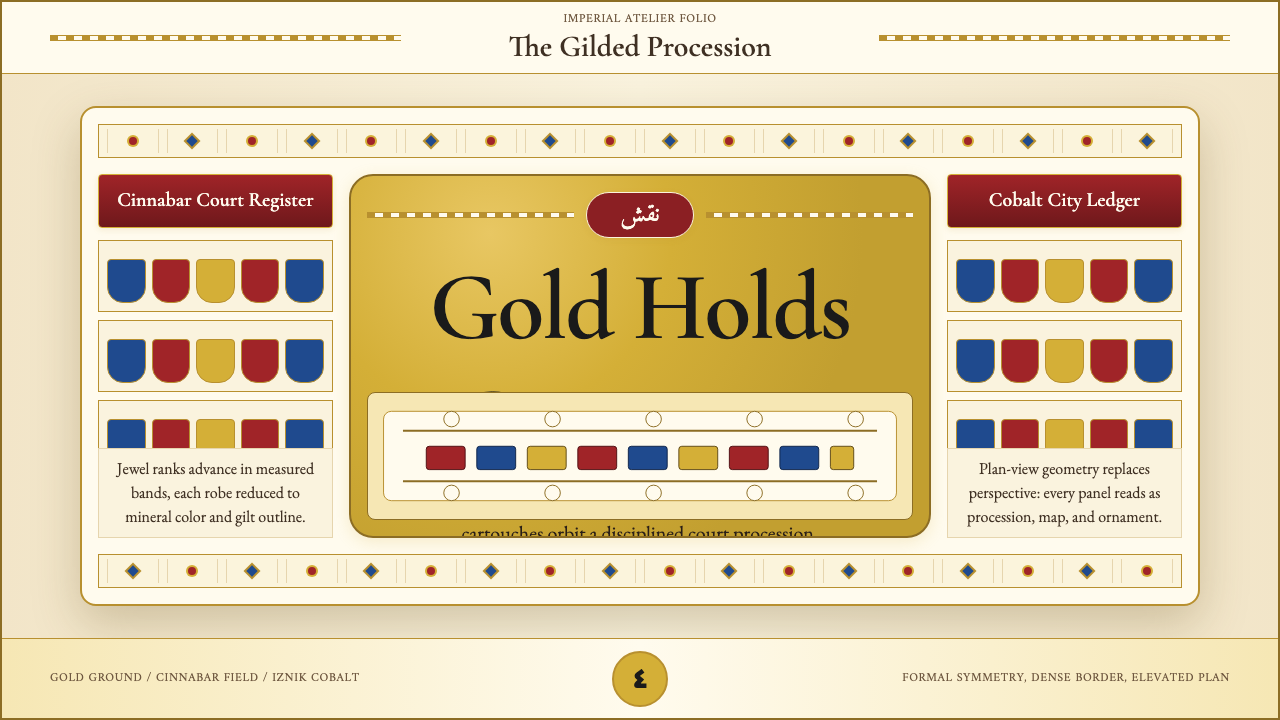 Ottoman Court Miniature (Topkapı)Ceremony made dense. Gold ground, cinnabar cartouches, cobalt procession geom…仪式感被压密:金底、朱砂题框与钴蓝游行几何。
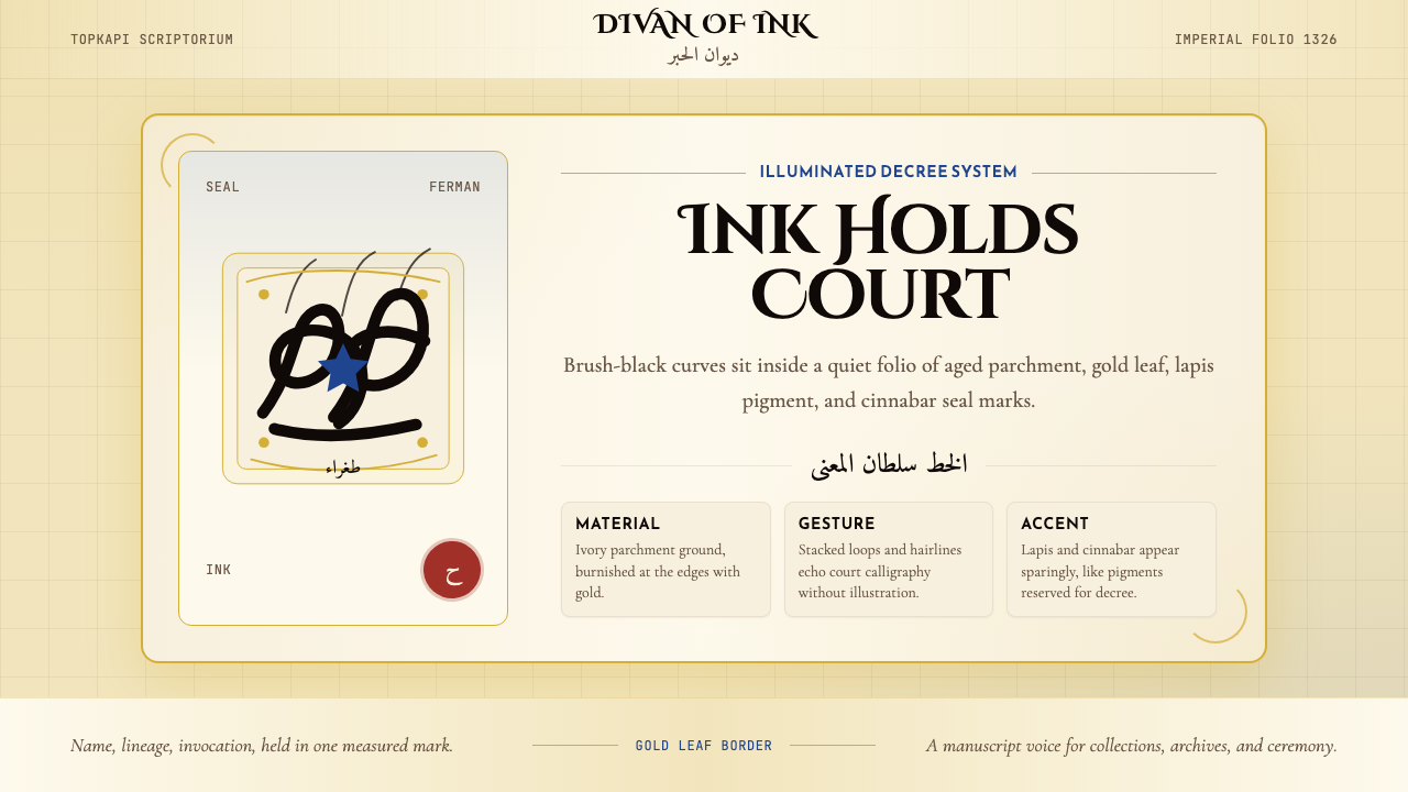 Ottoman Tughra CalligraphyImperial ink holds court. Gold borders, lapis panels, and Cinzel tughra-like…御墨自带威仪:金箔边框、青金石蓝与 Cinzel 花押式排版。
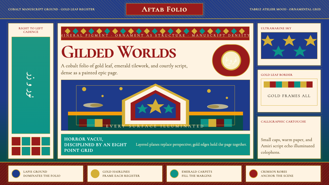 Persian Miniature (Shahnameh era)Manuscript luxury turns maximal. Cobalt ground, gold borders, and Cormorant S…手稿奢华走向极繁。钴蓝底、金边框与Cormorant SC填满每寸。
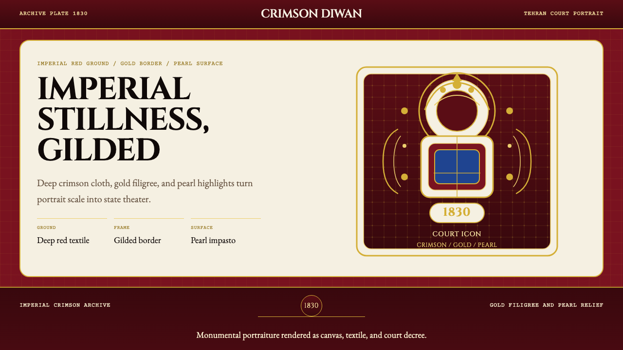 Persian Qajar Portrait (1830)Imperial stillness, gilded. Deep crimson, gold filigree, and pearl accents st…帝国深红与鎏金纹样,让肖像像王权圣像一样静立。
 Yemeni Mukarras VaultSolemn geometry, warmed by plaster. Cream gypsum, terracotta, and indigo buil…庄严几何被温暖托起。奶油石膏、赤陶与靛蓝构成穹顶。