What is Ottoman Court Miniature (Topkapı)?什么是 Ottoman Court Miniature (Topkapı)?
Ottoman Court Miniature is where ceremony becomes density — gilded heavens, cinnabar-red cartouches, and processions of jewel-toned kaftans arranged with the precision of a cartographer's eye.奥斯曼宫廷细密画是仪式感被压缩成密度的地方——镀金的苍穹、朱砂题框、宝石色卡夫坦袍的游行队列,以制图师的眼光精确排布。
Ottoman Court Miniature (Topkapı) in briefOttoman Court Miniature (Topkapı) 速览
Ottoman Court Miniature is the peak achievement of Islamic book art produced under the patronage of the Ottoman sultans, made primarily in the nakkaşhane — the royal painting atelier inside Topkapı Palace in Istanbul — between roughly 1500 and 1750. Unlike its Persian Safavid and Mughal Indian cousins, which often prioritize lyrical landscape, emotional portraiture, and sensuous floral elaboration, the Ottoman court style is architectural in temperament: dense, ceremonial, and topographically precise.奥斯曼宫廷细密画是奥斯曼苏丹庇护下的伊斯兰图书艺术登峰造极之作,主要在1500至1750年间产自托普卡帕宫内的纳卡什哈纳——皇家绘画工坊。与波斯萨法维和印度莫卧儿画派常见的抒情山水、情感肖像和感官花卉不同,奥斯曼宫廷风格在气质上更接近建筑:稠密、仪式化,具有测绘员式的空间精确性。
The visual grammar is distinctive and immediately recognizable. Deep gold grounds stand in for sky and atmosphere, eliminating spatial recession in favor of sacred presence. Saturated cinnabar reds and cobalt blues are deployed in interlocking geometric register bands, tulip-and-rose border patterns, and the formal kaftans worn by courtiers and sultans alike. Human figures are schematic — posed, ranked, and arrayed rather than psychologically individualized — because the subject is ceremony and institution, not private feeling.其视觉语法鲜明而易于辨认。深沉的金底替代天空与大气,消除了空间纵深感,代之以神圣在场。饱满的朱砂红与钴蓝被交替部署在几何分层带、郁金香玫瑰边饰图案,以及朝臣与苏丹所穿的正式卡夫坦袍中。人物形象是程式化的——被摆放、排列和编队,而非心理个体化——因为主题是仪式与体制,而非私人情感。
This is an art of the state record and the commemorative book. Its patron was the imperial chancery; its audience was the sultan and his court. Every image is simultaneously an act of documentation and a declaration of power, executed with the concentrated skill of craftsmen who trained for years inside the palace walls.这是一门为国家记录和纪念性书籍服务的艺术。它的赞助人是皇家御前机构,受众是苏丹及其宫廷。每幅图像同时是一次文献记录的行为和一次权力宣示,由在宫墙内经年训练的工匠以高度集中的技艺完成。
See the Ottoman Court Miniature (Topkapı) design system查看 Ottoman Court Miniature (Topkapı) 完整设计系统
Where does Ottoman Court Miniature (Topkapı) come from?Ottoman Court Miniature (Topkapı) 从何而来?
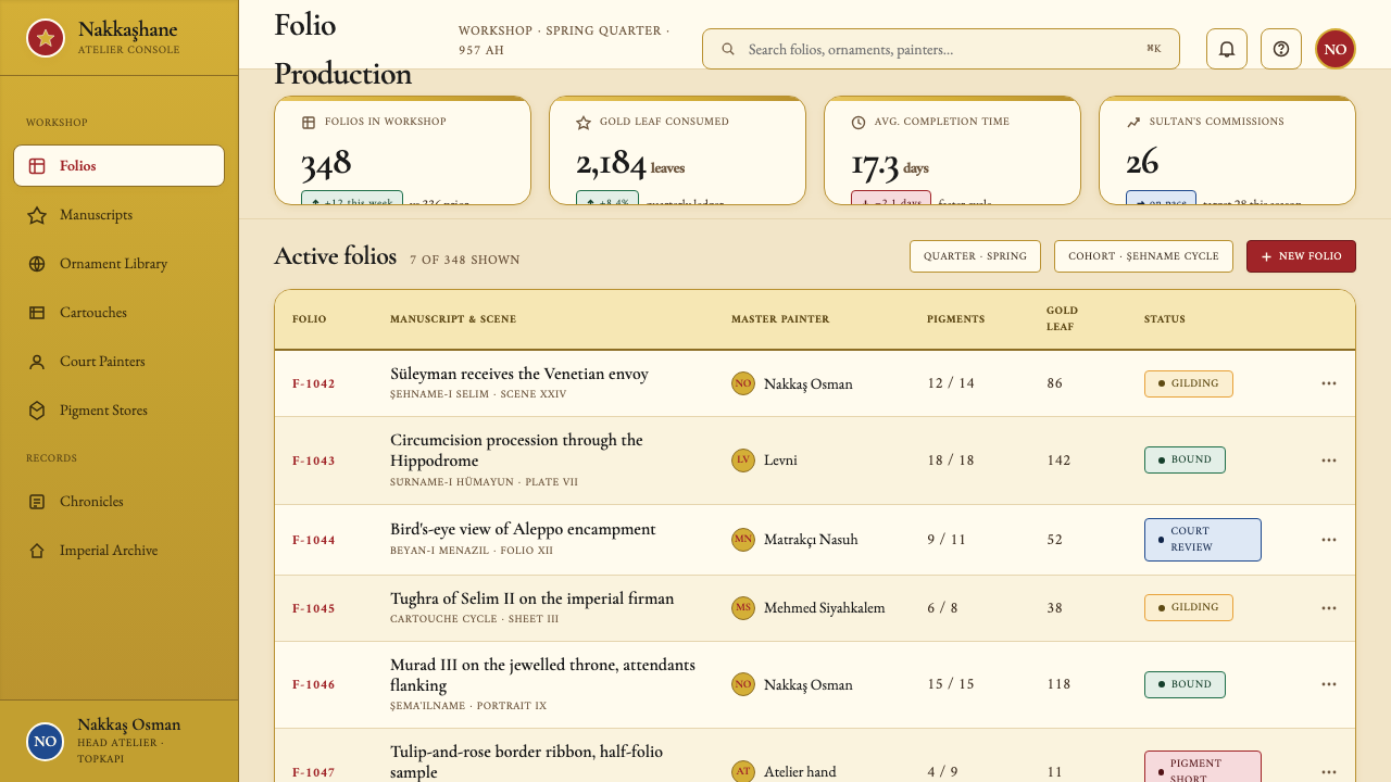
The Ottoman nakkaşhane traces its institutional origins to the mid-fifteenth century, when Mehmed II — the conqueror of Constantinople in 1453 — organized a court atelier on a Timurid-Persian model, importing artists and patterns from Tabriz and Herat. The style that would become distinctively Ottoman, however, crystallized during the long reign of Süleyman the Magnificent (1520–1566), when the empire reached its greatest territorial extent and the palace arts reached a corresponding ambition. Under Süleyman, the nakkaşhane employed hundreds of craftsmen across dozens of disciplines — illuminators, binders, calligraphers, painters — working in an organized hierarchy under a chief artist, the sernakkaş.奥斯曼纳卡什哈纳的制度渊源可追溯至十五世纪中叶。征服君士坦丁堡(1453年)的穆罕默德二世仿照帖木儿-波斯模式组建了宫廷画坊,从大不里士和赫拉特引进艺术家和图案。然而,真正成为奥斯曼独特风格的视觉语言,是在苏莱曼大帝漫长的统治期间(1520—1566年)凝固成形的。彼时帝国版图达到历史顶峰,宫廷艺术也随之展现出相应的雄心。苏莱曼治下,纳卡什哈纳雇用了数百名跨越数十个专业的工匠——装饰画师、装订师、书法家、画家——在首席艺术家「色纳卡什」的统领下按等级有序协作。
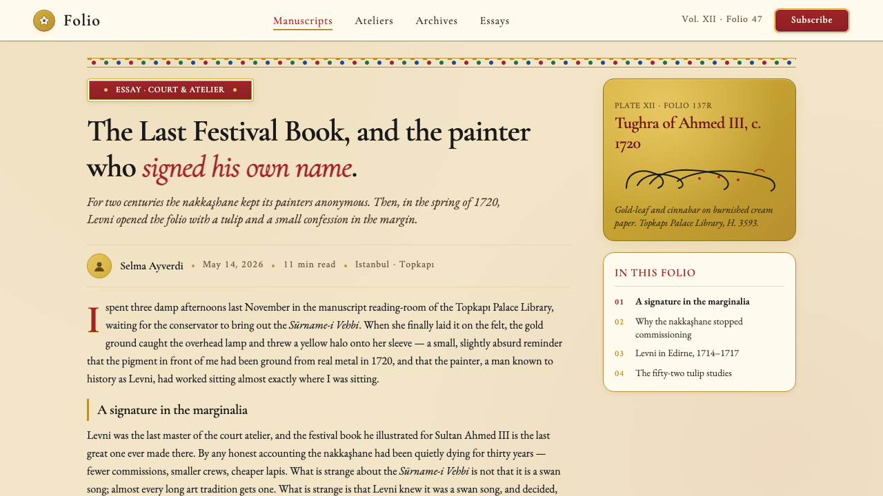
The defining visual documents of the classical Ottoman period are the şehnameler (books of the sultan's deeds) and the sürnameler (festival books recording imperial circumcision ceremonies and court celebrations). The Sürname-i Hümayun of 1582, commissioned by Murad III to record fifty-two days of circumcision festivities for his son, is perhaps the most spectacular surviving example: its hundreds of pages document guild processions, acrobatic performances, and naval displays along the Hippodrome with a panoramic, scrolling visual logic that has no parallel in Western book art of the same period. The work is attributed largely to Nakkaş Osman, the most important painter of the late sixteenth-century Ottoman court.古典奥斯曼时期最具定义性的视觉文献是「沙赫纳梅」(苏丹功业书)和「苏尔纳梅」(记录皇家割礼庆典与宫廷欢庆的节庆书)。1582年穆拉德三世委托制作的《皇家庆典书》——记录为其子举行的长达五十二天割礼庆典——或许是现存最壮观的范本:数百页内容在竞技场沿线以全景卷轴式视觉逻辑记录行会游行、杂技表演和海战展示,在同时代西方图书艺术中毫无可比之物。此作主要归属于纳卡什·奥斯曼——十六世纪末奥斯曼宫廷最重要的画家。
The style evolved through several distinct phases. The sixteenth century established the formal canon under Nakkaş Osman: gold-ground compositions, schematic facial typology, architectural cross-section views of palace interiors, and the characteristic tiered-horizon cityscape. The seventeenth century saw a gradual relaxation of the severe geometric order, with figures acquiring slightly more individual treatment. The reign of Ahmed III (1703–1730) brought the so-called Tulip Period, during which Ottoman court culture absorbed Baroque and Rococo influences from European diplomatic exchange, and the painter Levni produced a series of single-figure portraits and festival images that remain the most stylistically adventurous works in the tradition.这一风格经历了数个不同阶段的演变。十六世纪在纳卡什·奥斯曼主导下确立了正式规范:金底构图、程式化的面部类型、宫殿内部的建筑剖面视图,以及标志性的叠层地平线城市景观。十七世纪见证了严格几何秩序的逐渐松动,人物形象开始获得稍多的个体化处理。艾哈迈德三世统治时期(1703—1730年)带来了所谓的「郁金香时代」,奥斯曼宫廷文化在欧洲外交交流中吸纳了巴洛克和洛可可影响,画家莱夫尼创作了一系列单人肖像和节庆图像,成为这一传统中风格上最具冒险精神的作品。
The tradition declined after 1750 as the Tanzimat reform era brought Western academic painting into the Ottoman court, and the imperial patronage system that had sustained the nakkaşhane gradually gave way to European-trained studio painters. What remained was collected: the Topkapı Palace Museum now holds the world's most important concentration of Ottoman illustrated manuscripts, and it is from this archive that contemporary understanding of the style is almost entirely drawn.1750年之后,随着坦志麦特改革时代将西方学院派绘画引入奥斯曼宫廷,维系纳卡什哈纳的皇家赞助体系逐渐让位于接受欧洲训练的画室画家,这一传统随之衰落。留存下来的作品被系统收藏:托普卡帕宫博物馆如今保存着世界上最重要的奥斯曼插图手稿藏品,当代对这一风格的认知几乎完全源自这一档案库。
What defines the Ottoman Court Miniature (Topkapı) look?Ottoman Court Miniature (Topkapı) 的视觉特征是什么?
Gold Ground金底
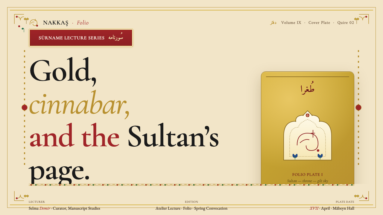
The most immediately distinctive feature of Ottoman court miniature is the pervasive use of burnished gold as a ground for sky, background, and atmospheric space. Where Persian and Mughal miniatures often use blue or gradated washes to suggest recession and luminosity, Ottoman court painting substitutes gold — a choice that collapses natural depth in favor of iconic presence. The gold is not decorative in a subsidiary sense; it is the primary visual fact of the image, establishing a register of sacred formality before any figure or building is introduced.奥斯曼宫廷细密画最直接的辨识特征是将磨光金箔作为天空、背景和大气空间的底色。波斯和莫卧儿细密画常以蓝色或晕染水洗暗示空间纵深与光感,奥斯曼宫廷画则以金底取而代之——这一选择消解了自然纵深,以神像式的存在感代之。金底不是从属性的装饰;它是图像最首要的视觉事实,在任何人物或建筑出现之前便确立了一种神圣仪式的格调。
Saturated Cinnabar and Cobalt饱满朱砂与钴蓝
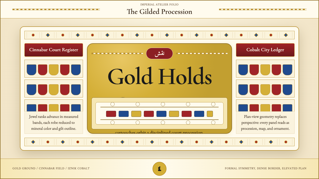
The Ottoman palette beyond gold is built on two anchoring hues: a deeply saturated, warm cinnabar red and a rich cobalt blue. These appear in cartouche panels framing inscriptions, in the decorative register bands separating pictorial zones, in the kaftans worn by courtiers, and in tiled architectural surfaces. The two colors are rarely softened or mixed; they function as structural declarations rather than descriptive tones. Against the gold ground, the cinnabar reads as both warm and commanding; the cobalt reads as cooling and spatially recessive, creating a rhythmic visual alternation across the page.在金底之外,奥斯曼色板以两种锚定色调为核心:深度饱和的暖朱砂红,以及浓郁的钴蓝。这两种颜色出现在框住题词的题框板块中、分隔画面区域的装饰分层带中、朝臣所穿的卡夫坦袍中,以及建筑表面的瓷砖图案中。两种颜色很少被柔化或混合;它们作为结构性宣示而存在,而非描述性色调。衬托金底时,朱砂既显温暖又具统领感;钴蓝则带来冷却感与空间后退感,在页面上创造出有节奏的视觉交替。
Topographical Precision地形测绘式精确
One of the most unusual qualities of the Ottoman court style is its commitment to topographical accuracy. Matrakçı Nasuh's city-view paintings, produced in the 1530s and 1540s, represent Istanbul, Tabriz, Baghdad, and other cities with a cartographic specificity that predates the Western bird's-eye-view tradition. Buildings are shown in architectural elevation or cross-section, their structural and spatial relationships preserved. Festival book scenes record actual buildings in the actual positions they occupied in Istanbul. This documentary impulse distinguishes Ottoman court miniature from the more fantastical or generalized landscape conventions of Persian painting.奥斯曼宫廷风格最不寻常的品质之一是其对地形精确性的执着。马特拉基·纳苏赫在1530至40年代创作的城市俯瞰图,以制图学般的精确性描绘了伊斯坦布尔、大不里士、巴格达等城市,早于西方鸟瞰图传统。建筑以立面图或剖面图呈现,其结构和空间关系得以保全。节庆书中的场景记录了伊斯坦布尔实际位置上的真实建筑。这种纪录性冲动使奥斯曼宫廷细密画有别于波斯绘画中更具幻想性或更为泛化的风景惯例。
Formal Court Composition正式宫廷构图
The canonical Ottoman court scene places the sultan on a throne at the upper center of the composition, attended by ranked rows of standing or kneeling courtiers. This hierarchical arrangement is strictly symmetrical about a vertical axis: figures are organized by proximity to the sultan, with senior officials and viziers closest. The sultan is often distinguished by scale — slightly enlarged — and by the richness of his kaftan, turban jewel, and surrounding setting. The composition does not attempt illusionistic depth; it reads as an organizational diagram as much as a pictorial scene, encoding protocol and precedence in its very structure.标准的奥斯曼宫廷场景将苏丹置于画面上方中心的宝座上,身旁是成排站立或跪伏的朝臣。这种等级制排列关于垂直轴线严格对称:人物按与苏丹的亲疏关系排布,高级官员和大维齐尔居于最近处。苏丹往往以体量——略有放大——以及卡夫坦袍的华丽程度、头巾宝石和周围环境加以区分。构图不追求空间幻觉;它既是图像场景,也是一张组织图,将礼仪和优先顺序编码进其自身的结构之中。
Arabesque and Tulip-Rose Border Bands蔓藤花纹与郁金香玫瑰边带
Pictorial scenes in Ottoman manuscripts are invariably enclosed within a system of framing elements: narrow outer border lines, wider bands of arabesque interlace or floral scrollwork, and inner cartouche panels bearing calligraphic inscriptions in Arabic or Ottoman Turkish. The floral repertoire centers on the tulip, hyacinth, carnation, and rose — the canonical Ottoman garden flowers — rendered in a stylized, non-shading mode that converts botanical form into geometric pattern. These border systems are not incidental ornament; they carry the same visual weight as the central image and encode the manuscript's cultural identity as clearly as its subject matter.奥斯曼手稿中的图像场景无一例外地被一套框架元素所包围:细窄的外框线、更宽的蔓藤花纹编织带或花卉卷草装饰,以及承载阿拉伯文或奥斯曼土耳其文书法题词的内侧题框。花卉图案以郁金香、风信子、石竹和玫瑰为核心——奥斯曼宫廷御花园的经典花卉——以风格化、无阴影的方式呈现,将植物形态转化为几何图案。这些边框系统绝非附带性的装饰;它们与中心图像承载同等视觉分量,与主题内容一样清晰地编码着手稿的文化身份。
Schematic Figuration程式化人物形象
Ottoman court figures are not portraits in the Western individualist sense. Faces tend toward a shared typology: a rounded oval, slightly down-turned almond eyes, a small curved mouth, a defined but undramatic nose. Individual identity is communicated through rank markers — the height and form of the turban, the pattern of the kaftan, the position in the composition — rather than through psychological rendering of the face. This schematic approach is consistent with Islamic visual tradition's wariness of naturalistic human representation, but it also serves the compositional logic of the festival book format, where dozens or hundreds of figures must be organized into legible processions across a horizontally unfolding scene.奥斯曼宫廷人物并非西方个人主义意义上的肖像。面孔倾向于共同的类型学:圆润的椭圆形脸,略向下撇的杏形眼,一张小巧弯曲的嘴,鼻梁清晰而不夸张。个人身份通过等级标志来传达——头巾的高度与形式、卡夫坦袍的图案、在构图中的位置——而非通过面部的心理性描绘。这种程式化方式与伊斯兰视觉传统对写实人物表现的审慎相一致,但它也服务于节庆书画幅格式的构图逻辑:在横向展开的场景中,数十甚至数百个人物必须被编排成清晰可读的游行队列。
Flat Planes and Absence of Shadow平面铺色与无投影
Ottoman court miniature employs pure, unmodulated areas of color with no cast shadows, shading, or tonal gradation to suggest volume or light source. Architectural surfaces, garments, and landscape elements are all rendered as interlocking flat planes distinguished by hue and pattern rather than by light and shadow. This is not a technical limitation but a deliberate aesthetic choice rooted in Islamic artistic philosophy: the image is a surface record, not a window into illusionistic space. The result is an image of concentrated graphic power — dense, legible at a distance, and formally unified in a way that deep spatial recession would compromise.奥斯曼宫廷细密画使用纯粹、未经调节的色块,没有投影、阴影渐变或明暗过渡来暗示体积或光源。建筑表面、服装和景观元素均被渲染为由色相与图案而非明暗关系区分的相互嵌套的平面。这不是技术局限,而是植根于伊斯兰艺术哲学的刻意美学选择:图像是表面记录,而非通往空间幻觉的窗口。结果是一种高度集中的图形力量——稠密、在远处清晰可辨,以一种深度空间退缩会破坏的方式在形式上浑然一体。
See the Ottoman Court Miniature (Topkapı) design system查看 Ottoman Court Miniature (Topkapı) 完整设计系统
Who shaped Ottoman Court Miniature (Topkapı)?谁塑造了 Ottoman Court Miniature (Topkapı)?
Nakkaş Osman served as the leading painter of the Ottoman nakkaşhane under sultans Murad III and Mehmed III in the latter half of the sixteenth century, and is the figure most responsible for the codification of the classical Ottoman court miniature style. His work on the Hünername (1584–1588), a biographical history of the Ottoman sultans, established the compositional conventions — the gold-ground throne scene, the ranked courtier procession, the architectural cross-section — that would define the tradition for the next century. His portraits of the sultans, produced in a series of album paintings, are the most authoritative images of the Ottoman dynasty from this period.纳卡什·奥斯曼在十六世纪后半叶分别侍奉穆拉德三世和穆罕默德三世,担任奥斯曼纳卡什哈纳的首席画家,是最终凝固古典奥斯曼宫廷细密画风格的关键人物。他在《苏丹传》(1584—1588年)上的创作——这是一部奥斯曼苏丹传记史——确立了金底宝座场景、排列整齐的朝臣游行、建筑剖面图等构图惯例,在此后一个世纪持续定义着这一传统。他在一系列册页绘画中创作的苏丹肖像,是这一时期最具权威性的奥斯曼王朝视觉图像。
Matrakçı Nasuh was a polymath in the service of Süleyman the Magnificent — mathematician, historian, soldier, and artist — who created the Beyân-ı Menâzil-i Sefer-i Irâkeyn (c. 1537), a remarkable illustrated travel chronicle recording Süleyman's eastern campaigns. His city-view illustrations of Istanbul, Tabriz, Baghdad, and other cities represent some of the earliest and most detailed topographical paintings in the Islamic world, anticipating the bird's-eye-view cartographic tradition by decades. His visual approach — aerial perspective without vanishing point, buildings shown simultaneously in elevation and plan — is one of the most distinctive contributions to the Ottoman court visual repertoire.马特拉基·纳苏赫是苏莱曼大帝麾下的全才人物——数学家、历史学家、军人和艺术家——他创作了《伊拉克两役行程图志》(约1537年),一部记录苏莱曼东部战役的卓越插图游记。他对伊斯坦布尔、大不里士、巴格达等城市的俯瞰画作,是伊斯兰世界最早、最详尽的地形绘画之一,比鸟瞰式制图传统早了数十年。他的视觉方式——无消失点的俯视透视、建筑同时以立面图和平面图呈现——是奥斯曼宫廷视觉图谱中最具独特性的贡献之一。
Levni was the court painter under Ahmed III during the Tulip Period (early eighteenth century), and his work represents the most significant departure from classical Ottoman conventions within the tradition. His single-figure images of court women, musicians, and dancers — produced as album paintings — show a new interest in the individual figure as subject, with more fluid contour lines, greater attention to the fall of drapery, and a lighter, more playful palette than the severe classicism of Nakkaş Osman. His contributions to the Sürname-i Vehbi (1720) bring a theatrical vivacity to the festival-book format that distinguishes it from its sixteenth-century predecessors.莱夫尼是郁金香时代(十八世纪初)艾哈迈德三世的宫廷画家,其作品代表了传统内部对古典奥斯曼规范最重要的一次偏离。他以册页绘画形式创作的宫廷女性、乐手和舞者单人像,展现出对个体人物作为主题的新兴趣:轮廓线更为流动,对布料垂落的关注更多,色调也比纳卡什·奥斯曼的严峻古典主义更轻盈、更具游趣。他对《维赫比庆典书》(1720年)的贡献,为节庆书格式注入了一种戏剧性活力,使之有别于十六世纪的前辈。
Mehmed Siyahkalem — whose name translates as 'black pen' — is associated with a body of brush-and-ink drawings in a pre-classical, fifteenth-century Ottoman or Turkic manner that remains partly enigmatic in attribution and date. His images of shamans, demons, wrestlers, and nomadic figures represent a strikingly different register from the formalized gold-ground court style — rawer, more kinetically drawn, influenced by Central Asian steppe visual traditions rather than Persian court refinement. Whether Siyahkalem was a single artist or an attribution name for a stylistic group remains debated, but the works associated with him are among the most powerful and unusual objects in the Topkapı collections.名字意为「黑笔」的穆罕默德·锡亚赫卡勒姆,与一批前古典时期十五世纪奥斯曼或突厥风格的笔墨素描相关联,其归属和年代至今仍有争议。他笔下的萨满、恶魔、摔跤手和游牧人物,代表了与程式化金底宫廷风格截然不同的面向——更粗粝、更富动势,受中亚草原视觉传统影响,而非波斯宫廷精致化。锡亚赫卡勒姆究竟是单一艺术家还是某种风格群体的归属名称,学界尚存争议;但与他相关的作品是托普卡帕藏品中最具力量感和独特性的对象之一。
How do you use Ottoman Court Miniature (Topkapı) today?今天怎么用 Ottoman Court Miniature (Topkapı)?
Ottoman Court Miniature is not among the immediately obvious historical styles for contemporary design work, but it rewards careful application. Its core visual logic — flat saturated planes, bold geometric framing, gold or deep-neutral grounds, and hierarchical figure arrangement — translates into a design vocabulary suited to contexts demanding ceremony, authority, and visual richness without photographic realism. The challenge is handling the density: Ottoman miniature is a maximalist style within a rule-governed system, and successful contemporary application requires understanding which rules generate the visual richness, not merely adding more decoration.奥斯曼宫廷细密画并非当代设计实践中最直观可用的历史风格,但经过审慎应用,它回报丰厚。其核心视觉逻辑——平面饱和色块、大胆几何框架、金色或深中性底色、等级化人物排列——转化为一套适合需要仪式感、权威感和视觉丰盛感(而非摄影写实)语境的设计词汇。挑战在于处理其密度:奥斯曼细密画是在规则约束系统内的最大化风格,成功的当代应用需要理解哪些规则在生成视觉丰富性,而不是仅仅叠加更多装饰。
For presentation slides, the Ottoman miniature sensibility works best on cover and section-divider pages rather than dense content pages. A cover page built on this aesthetic uses a rich, deep ground — a warm golden tone or a deep jewel-toned field — with the title set in high-contrast lettering framed by a decorative border band adapted from the arabesque or floral register motif. Section dividers can use a horizontal band of repeated geometric-floral pattern in cinnabar or cobalt as a visual reset marker. Content slides should be restrained by comparison: the ornamental richness belongs at the structural moments, not scattered through every data table. A subtle gold accent in chart titles or slide headers can carry the aesthetic thread without overwhelming readability.在演示文稿中,奥斯曼细密画的美学感觉最适合封面和章节分隔页,而非密集的内容页。基于这一美学的封面使用富丽的深底色——温暖的金黄调或深宝石色底面——标题以高对比度字体置于改编自蔓藤花纹或花卉分层母题的装饰边框之内。章节分隔页可以用一条朱砂色或钴蓝色重复几何花卉图案的横带作为视觉重置标记。相比之下,内容页应保持克制:装饰性丰盛感属于结构性时刻,而非分散在每张数据表格上。图表标题或幻灯片页眉中的微妙金色强调,可以传递美学线索而不影响可读性。
For web interfaces and dashboards, the Ottoman aesthetic suggests an approach built on deep, rich backgrounds — not the flat whites of minimalist UI, but warm parchment tones or deep indigo or emerald grounds — with content organized in clearly bordered card panels that echo the manuscript's framing cartouches. Navigation elements and tier labels can take on a banner-like horizontal register quality. Color is used as a rank signal: one dominant jewel tone identifies primary actions, a second anchors structural containers, and typography is kept clean and high-contrast against the enriched ground. Pricing pages benefit from a distinct tier structure where the premium tier carries the full gold-and-cinnabar treatment, establishing hierarchy through visual richness rather than just size or weight.对于网页界面和仪表板,奥斯曼美学指向一种建立在深邃富丽背景上的设计方法——不是极简主义界面的平白色,而是温暖的羊皮纸色调或深靛蓝、深祖母绿底面——内容组织在清晰边框的卡片面板中,呼应手稿的题框结构。导航元素和等级标签可以带有横幅式水平分层的品质。色彩用作等级信号:一种主宝石色标识主要操作,第二种锚定结构容器,文字在丰富底面上保持清晰高对比度。定价页面受益于鲜明的等级结构,其中高端层级承载完整的金色与朱砂色处理,通过视觉丰盛感而非仅靠尺寸或字重来确立层级。
For editorial design and marketing materials, the style supports a mode of high-ceremony visual communication well suited to luxury branding, cultural institution identity, event posters, and heritage product launches. An Ottoman-inflected editorial layout uses a deep-ground page with text set in high-contrast light type, bordered by a narrow geometric or floral band at the margins. Feature spreads can use a central image field framed by arabesque-derived ornamental borders that treat the photograph or illustration as a miniature-painting subject within a manuscript page. For digital marketing, the formal symmetry of the court scene — a centered, hierarchically organized composition — works well for announcement graphics and hero sections where the product or subject occupies the sultan's visual position at center.对于编辑设计和营销素材,这种风格支持一种高仪式感的视觉传达方式,非常适合奢侈品牌、文化机构视觉识别、活动海报和传统产品发布。奥斯曼风格的编辑版面使用深底色页面,文字以高对比度浅色排版,页边距处有细窄的几何或花卉边带。专题跨页展开可以使用以蔓藤花纹衍生装饰边框包围的中央图像区域,将照片或插图处理为手稿页面中的细密画主题。在数字营销方面,宫廷场景的正式对称性——居中的、等级化组织的构图——适用于公告图形和英雄区块,其中产品或主题占据视觉中心如苏丹般的位置。
The most common mistake when applying this aesthetic is treating the gold as a literal fill color and the floral patterns as freely repositionable clip-art. Ottoman court miniature achieves its density through a rigorously organized layered system: ground, register band, central field, inner frame, subject, inscription panel. Each layer has a defined function. Applying decorative elements without this structural logic produces pastiche — visually busy but incoherent. Similarly, the palette should not be extended into soft pastels or desaturated neutrals; the style's authority comes precisely from the commitment to full saturation against a richly toned ground. Diluting the palette produces something that reads as vaguely 'ornamental' rather than distinctively Ottoman.应用这一美学时最常见的错误,是将金色当作可以自由填充的颜色,将花卉图案当作可随意摆放的剪贴元素。奥斯曼宫廷细密画的稠密感来自严格组织的分层系统:底色、分层带、中心图像区、内框、主题、题词板。每一层都有明确的功能。在没有这种结构逻辑的情况下运用装饰元素,只会产生仿制品——视觉上繁杂却不连贯。同样,色板不应延伸至柔和粉彩或去饱和中性色;这种风格的权威感恰恰来自对丰富底色上完全饱和色彩的承诺。稀释色板只会产生某种模糊「装饰性」的感觉,而非鲜明的奥斯曼风格。
See the Ottoman Court Miniature (Topkapı) design system查看 Ottoman Court Miniature (Topkapı) 完整设计系统
Ottoman Court Miniature (Topkapı) — FAQOttoman Court Miniature (Topkapı) · 常见问题
How is Ottoman court miniature different from Persian miniature painting?奥斯曼宫廷细密画与波斯细密画有何不同?
They share a common ancestry — both derive from the Timurid-era Herat school — but evolved in distinct directions. Persian miniature painting, especially in its Safavid manifestation, tends toward lyrical landscape, elaborate floral background patterns, and emotionally expressive figurative scenes drawn from literary sources like the Shahnameh or the works of Rumi and Hafez. Ottoman court miniature is more documentary in purpose: its subjects are historical events, imperial ceremonies, and topographical records rather than poetic narratives. The Ottoman palette tends toward heavier gold grounds and more saturated, unmodulated color fields; the Persian palette allows greater gradation and atmospheric color. Ottoman figures are more schematic and rank-coded; Persian figures are more individually characterized.两者有共同的渊源——均源自帖木儿时代的赫拉特画派——但向不同方向演化。波斯细密画,尤其是萨法维时期的,倾向于抒情山水、精细花卉背景图案,以及取材自《列王纪》或鲁米、哈菲兹作品的情感表达性人物场景。奥斯曼宫廷细密画在目的上更具纪录性:其主题是历史事件、皇家仪典和地形记录,而非诗意叙事。奥斯曼色板倾向于更厚重的金底和更饱满、未经渐变的色块;波斯色板允许更多的明暗过渡和大气色彩。奥斯曼人物更为程式化并受等级编码;波斯人物的个体刻画则更为鲜明。
Can this style work in a digital interface without looking costume-like or pastiche?这种风格能否在数字界面中使用而不显得像服装道具或仿制品?
Yes, but restraint and structural integrity are essential. The risk of pastiche comes from applying decorative surface elements — arabesque borders, floral motifs, gold fills — without the underlying organizational logic of the original system. A successful digital application abstracts the principles rather than copying the ornament: a deep warm ground instead of white, a high-contrast bordered card structure instead of plain containers, jewel-toned accent colors used at high saturation but restricted to specific functional roles, and a typographic hierarchy that is formal and clear. The goal is to evoke the aesthetic register — ceremony, richness, authority — not to reproduce a digitized manuscript page.可以,但克制和结构完整性至关重要。仿制品的风险来自于不带原始系统底层组织逻辑地应用装饰表面元素——蔓藤花纹边框、花卉母题、金色填充。成功的数字化应用抽象的是原则,而非复制装饰:以深暖底色代替白色,以高对比度边框卡片结构代替普通容器,宝石色强调色以高饱和度使用但限定于特定功能角色,以及正式清晰的排版层级。目标是唤起美学格调——仪式感、丰盛感、权威感——而非复制一页数字化的手稿。
What makes the tulip such a central motif in this tradition?郁金香为何在这一传统中占据如此核心的地位?
The tulip has a layered significance in Ottoman culture that makes its visual ubiquity in the decorative arts legible as more than botanical preference. The tulip was among the first plants systematically cultivated in Ottoman palace gardens from the fifteenth century onward, and its cultivation became an imperial passion — by the early eighteenth century the Tulip Period under Ahmed III saw thousands of varieties bred and displayed in elaborate palace garden festivals. In Arabic script, the letters that spell 'tulip' (lâle) and the letters that spell 'God' (Allah) are the same, giving the flower a spiritual resonance beyond its horticultural prestige. In the visual arts, its clean, pointed-petal form translates readily into the geometric-floral pattern vocabulary that Ottoman decorators used across textiles, tiles, metalwork, and manuscript borders.郁金香在奥斯曼文化中具有多层次的意义,使它在装饰艺术中的视觉无处不在不仅仅是植物学偏好可以解释的。郁金香是从十五世纪起最早在奥斯曼宫廷花园中被系统栽培的植物之一,其培育成为皇室热情所在——到十八世纪初艾哈迈德三世治下的郁金香时代,数千个品种在精心设计的宫廷花园节庆中被培育展示。在阿拉伯文字中,拼写「郁金香」(lâle)和「真主」(Allah)的字母相同,赋予这种花卉超越园艺声望的精神共鸣。在视觉艺术中,其洁净的尖瓣形态很容易转化为奥斯曼装饰艺术家在织物、瓷砖、金属器皿和手稿边框中广泛运用的几何花卉图案词汇。
Is there a dark or night-mode variant that preserves the visual spirit of this style?是否有一种深色或夜间模式变体能保留这种风格的视觉精神?
The Ottoman style actually adapts more gracefully to deep or dark backgrounds than many historical styles, because the original gold-ground convention already operates outside a light-from-above logic. A dark adaptation built on very deep indigo, near-black, or dark emerald grounds can preserve the jewel-toned accent palette — cinnabar, cobalt, gold — without sacrificing the style's visual density. The key is maintaining high contrast between the ground and the accent colors, and keeping the framing and border elements present. What does not survive the dark inversion is the warm parchment-ground character of the illuminated manuscript page; the dark variant reads as more formal and nocturnal than the luminous gold of the original, which is a valid aesthetic register but a different one.奥斯曼风格实际上比许多历史风格更能优雅地适应深色或暗色背景,因为原始的金底惯例本来就不依赖从上而来的光照逻辑。建立在极深靛蓝、近黑或深祖母绿底面上的深色改编版本,可以在不牺牲风格视觉密度的情况下保留宝石色强调色板——朱砂、钴蓝、金色。关键是保持底色与强调色之间的高对比度,并保留框架和边框元素。深色反转中无法保存的,是发光手稿页面那种温暖羊皮纸底色的气质;深色版本读来比原作的金光更为正式而带有夜色感——这是一种有效的美学格调,但与原作不同。
How should typography be chosen to complement this aesthetic?应如何选择字体来配合这种美学?
Original Ottoman manuscripts use Arabic-script calligraphy — primarily Naskh and Nesta'liq forms — for their inscriptions and cartouches, and these have no direct Latin equivalent. For contemporary work in Latin script, the most compatible approach is a typeface with formal, classical proportions and visible stroke contrast, similar to what the calligraphic cartouche provides in the original: a sense of craft, weight, and ceremony in the letterform. High-contrast serif designs in a traditional or transitional style complement the aesthetic better than geometric sans-serifs, which read as too modern and structurally at odds with the handmade-manuscript origin. For East Asian languages, brush-influenced or carved-character styles with visible weight variation offer the closest equivalent to the calligraphic authority of the Nesta'liq inscription panel.原始奥斯曼手稿中的题词和题框使用阿拉伯文书法——主要是纳斯赫体和纳斯塔利克体——在拉丁文中没有直接对应物。对于当代拉丁文字作品,最兼容的方式是选用具有正式古典比例和可见笔画对比的字体,与原作中书法题框所提供的效果相近:字形中有手艺感、重量感和仪式感。传统或过渡风格的高对比衬线字体比几何无衬线字体更能与这一美学互补——后者读来过于现代,与手工手稿的起源在结构上相互抵触。对于中文等东亚语言,具有可见笔画粗细变化的笔触风格或刻字风格,最接近纳斯塔利克题词框的书法权威感。
Related design styles相关设计风格
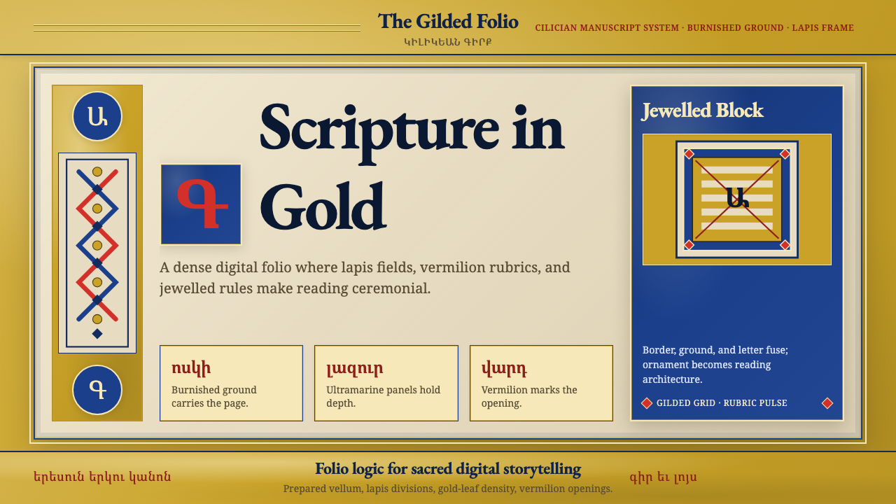 Armenian Illuminated ManuscriptGilded maximalism. Burnished gold, lapis frames, and vermilion initials build…鎏金极繁。金箔底、青金框与朱砂首字构成密实书页。
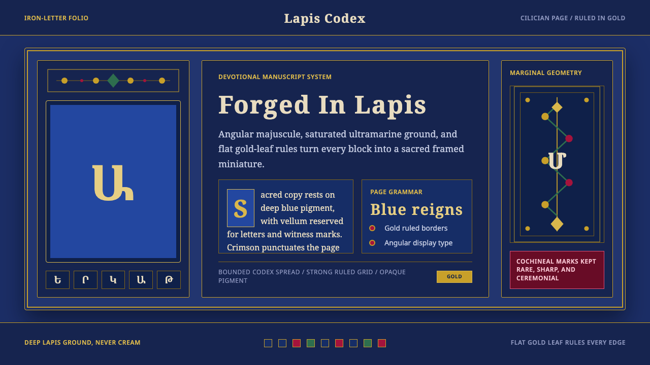 Armenian ErkatʿagirDevotional lapis reigns. Gold rules and angular serif glyphs frame a sacred g…虔敬青金石主宰:金色线框与棱角字形围合神圣网格。
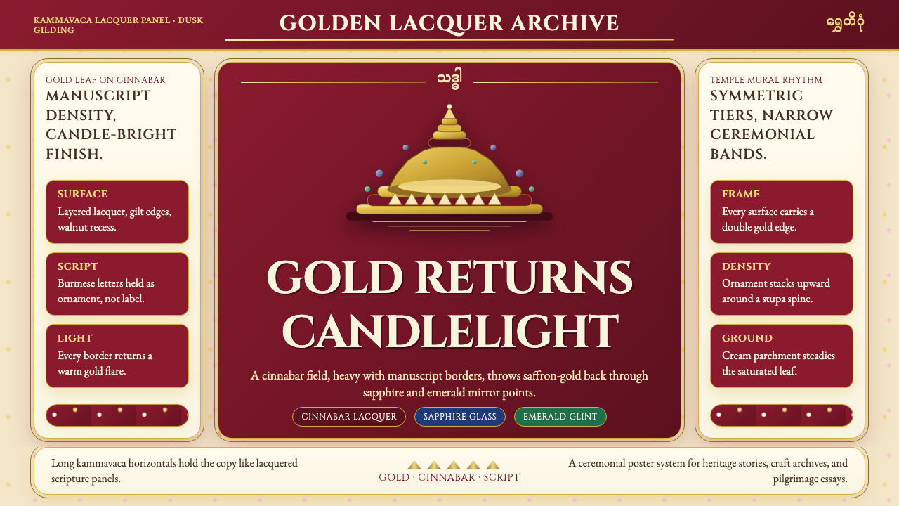 Burmese Shwedagon Gold-LacquerOpulence catches fire. Gold-leaf gradients on cinnabar panels frame a stupa s…虔诚的金色密度:朱漆面板上的金箔渐变,围出佛塔中轴。
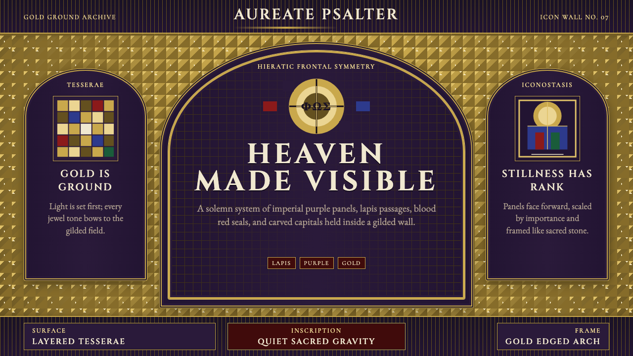 Byzantine Mosaic / IconSacred weight, tiled in light. Gold tesserae ground, Cinzel capitals, arch-fr…神圣重量被金光铺陈:金色镶嵌底、Cinzel碑刻大写、拱券对称。
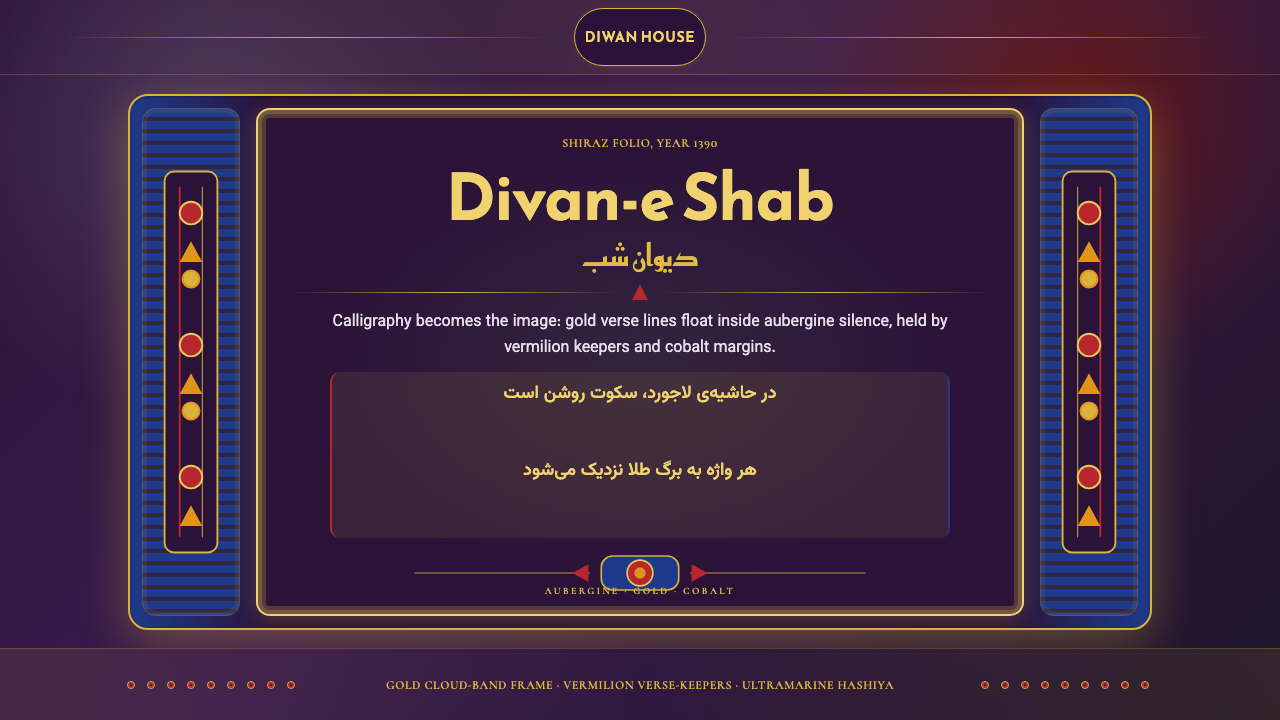 Iranian Shiraz Poetry Divan 1390Midnight manuscript glow. Aubergine fields, gold Kufi type, cobalt margins.午夜手稿般发光:茄紫底、金色库法体、钴蓝边框。
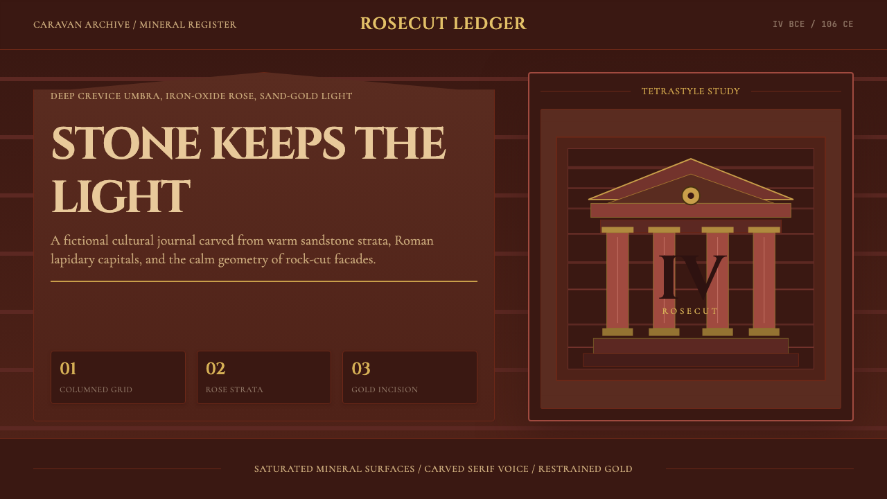 Jordanian Petra Rose NabataeanGeology feels monumental. Crevice umbra, rose strata, and Cinzel capitals car…地质感如纪念碑。暗峡底、玫瑰岩层与Cinzel碑铭体凿出页面。