What is Byzantine Mosaic / Icon?什么是 Byzantine Mosaic / Icon?
For over a thousand years, Byzantine artisans transformed flat gold tesserae and jewel-toned pigments into a visual theology — an art of sacred hierarchy, frontal stillness, and divine light that remains one of the most recognizable and emotionally potent design languages in human history.逾千年间,拜占庭工匠将扁薄的金色镶嵌片与宝石色颜料炼为一套视觉神学——一种以神圣层级、正面静默与永恒光芒构成的艺术语言,至今仍是人类历史上最具辨识度、最震撼心灵的设计体系之一。
Byzantine Mosaic / Icon in briefByzantine Mosaic / Icon 速览
Byzantine Mosaic is a visual system born from sacred purpose. Over the course of more than a millennium — from the founding of Constantinople in 330 CE to the fall of the empire in 1453, and continuing through the Orthodox icon tradition to the present day — mosaicists and icon painters developed a consistent formal language: gold as divine ground, frontal figures in jewel-toned robes, strict symmetry framed by arches, and inscriptional letterforms carved rather than drawn. Every element of this system carries theological meaning, and that fusion of form and meaning gives the style its extraordinary gravity.拜占庭马赛克是一套从神圣使命中诞生的视觉体系。在逾千年的时间跨度里——自公元330年君士坦丁堡建城,至1453年帝国覆灭,以及东正教圣像画传统延续至今——马赛克工匠与圣像画家发展出一套一贯的形式语言:以金为神圣之地,正面人物披着宝石色袍服,严格的对称构图以拱券为框,字体如碑刻般凿出而非书写而成。这套体系的每一个元素都承载着神学意义,正是形式与意义的这种融合,赋予了这种风格无与伦比的庄重感。
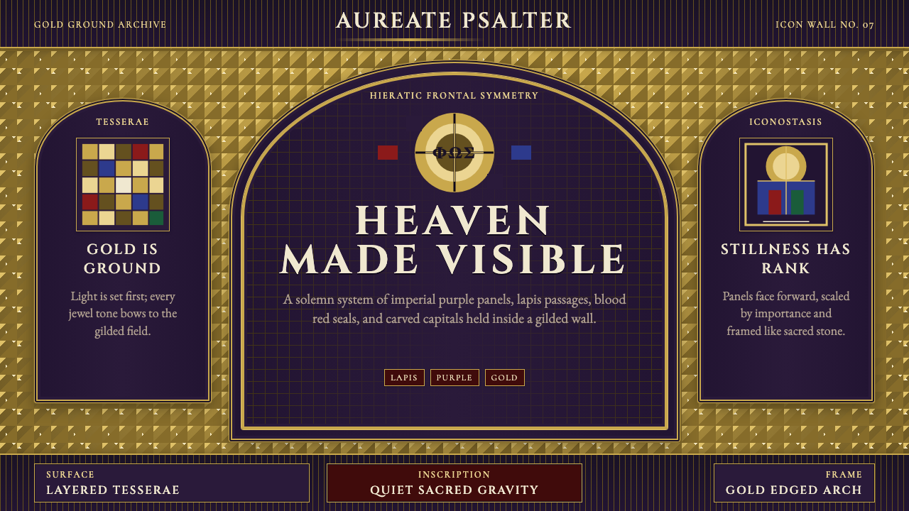
The defining visual move is the use of gold not as decoration but as the page itself. In Byzantine mosaic, the gold ground is understood as the infinite, uncreated light of God — the backdrop against which earthly figures and divine presences are rendered. Figures stand frontally, with large eyes that meet the viewer's gaze directly, rigid postures that signal eternity over motion, and robes in lapis blue, blood red, imperial purple, and emerald green. There are no casual poses, no atmospheric perspective, no shadows that suggest a worldly light source. The image is icon, not window.最核心的视觉手法,是将金色用作画面本身而非装饰。在拜占庭马赛克中,金色底面被理解为上帝无限的、未被创造的光——世间人物与神圣存在就在这光的背景中呈现。人物正面而立,硕大的双眼直视观者,僵直的姿态象征永恒而非运动,袍服以青金石蓝、殉道红、帝王紫与翡翠绿着色。没有随意的姿势,没有大气透视,没有暗示世俗光源的阴影。这幅图像是圣像,而非窗口。
This is also a hierarchical system. The size and placement of figures communicates their spiritual rank: Christ Pantocrator dominates the central dome or apse; the Theotokos (Mother of God) occupies the conch apse; emperors and empresses appear below, distinguished by gold and purple regalia. Architectural framing — the arch, the mandorla, the nimbus — demarcates sacred from secular space. Everything is ordered, nothing is accidental, and the viewer is positioned not as an observer of a scene but as a supplicant before a presence.这也是一套等级制度的系统。人物的大小与位置传达其精神地位:基督全能者主导中央穹顶或后殿半圆龛;圣母(神之母)占据半圆后殿壳龛;皇帝与皇后位于其下,以金色与紫色华服加以区分。建筑框架——拱券、杏仁形光环、圆形头光——将神圣空间与世俗空间区隔开来。一切皆有秩序,毫无偶然,观者被置于的位置不是场景的旁观者,而是在一种临在面前俯首的朝圣者。
See the Byzantine Mosaic / Icon design system查看 Byzantine Mosaic / Icon 完整设计系统
Where does Byzantine Mosaic / Icon come from?Byzantine Mosaic / Icon 从何而来?
The origins of Byzantine visual culture lie in the convergence of Roman imperial art, early Christian iconography, and Eastern Mediterranean craft traditions. When the Emperor Constantine moved his capital from Rome to the newly founded Constantinople in 330 CE, he brought with him the ambition to build a Christian empire as visually magnificent as its pagan predecessor. Roman mosaic technique — long used for floors, baths, and villa decorations — was elevated to the walls and vaults of churches, where gold tesserae replaced the naturalistic stone and glass of Roman work and became the medium of the divine.拜占庭视觉文化的源头,在于罗马帝国艺术、早期基督教图像学与东地中海工艺传统的交汇。公元330年,皇帝君士坦丁将都城从罗马迁往新建的君士坦丁堡,携来的雄心是建造一个在视觉壮丽程度上不输其异教前身的基督教帝国。罗马马赛克技艺——长期用于地板、浴室与别墅装饰——被提升至教堂的墙壁与穹顶,金色镶嵌片取代了罗马作品中写实的石材与玻璃,成为神性的媒介。
The sixth century, under Emperor Justinian I (reigned 527–565 CE), marks the great flowering of Byzantine mosaic. San Vitale in Ravenna, completed around 547 CE, contains the most celebrated surviving mosaic cycles from this era: the famous panels of Justinian and his court, and of Empress Theodora and her retinue, in which the figures stand in stiff frontal procession, wearing imperial regalia against a gold ground, their haloed heads suggesting divine sanction for earthly power. The mosaics at Hagia Sophia in Constantinople, though repeatedly altered, and those at the Monastery of Saint Catherine on Mount Sinai represent the breadth of Justinianic ambition. The master mosaicists of Ravenna — whose names are largely lost — created the definitive vocabulary of the Byzantine visual system in these decades.六世纪,查士丁尼一世皇帝(在位527—565年)治下,拜占庭马赛克迎来全盛时代。约于公元547年竣工的拉文纳圣维塔莱教堂,保存了这一时代最著名的马赛克群——查士丁尼及其廷臣、以及狄奥多拉皇后及其随从的著名壁板:人物以僵直的正面姿态列队而立,身着帝王华服,金色底面映衬其后,有圆光的头颅暗示着世俗权力的神圣认可。君士坦丁堡圣索菲亚大教堂的马赛克(尽管屡经改动),以及西奈山圣凯瑟琳修道院的镶嵌作品,共同呈现了查士丁尼时代的宏大抱负。拉文纳的马赛克大师——其名字大多已湮没无闻——在这数十年间确立了拜占庭视觉体系的经典词汇。
The eighth and ninth centuries brought the Iconoclast Controversy (726–843 CE), a theological and political crisis over whether figural images of the divine were legitimate or constituted idolatry. During Iconoclasm, figural mosaics were destroyed or plastered over; geometric and floral patterns replaced them. The Triumph of Orthodoxy in 843 CE restored the use of images and intensified the theological articulation of their purpose. Henceforth, Byzantine images were understood not merely as illustrations but as windows onto heavenly reality — a doctrine that made precise formal conventions a matter of spiritual necessity, not artistic preference.八至九世纪,圣像破坏运动(公元726—843年)带来了一场关于神圣具象图像是否合法、抑或构成偶像崇拜的神学与政治危机。破坏圣像期间,具象马赛克被摧毁或以灰浆覆盖,几何与花卉图案取而代之。公元843年正统的胜利恢复了图像的使用,并深化了对其用途的神学阐述。此后,拜占庭图像不再仅被理解为插图,而是通向天国实在的窗口——这一教义使精确的形式规范成为精神必要性,而非艺术偏好。
After the fall of Constantinople in 1453, the Byzantine visual tradition migrated. It was carried east and north through the Orthodox church: the monastic community of Mount Athos in Greece became a living repository of icon-painting technique; Kyivan Rus' (present-day Ukraine and Russia) absorbed the tradition and developed its own school, whose most celebrated practitioner was the monk Andrei Rublev (c. 1360–c. 1430), whose Trinity icon — three angels gathered around a table — is considered the supreme achievement of Russian icon painting. The Italo-Byzantine style, visible in the work of Duccio and early Cimabue in thirteenth-century Italy, transmitted the Byzantine visual grammar directly into the roots of Western Renaissance painting. The tradition persisted, transformed, and was never fully extinguished.1453年君士坦丁堡陷落后,拜占庭视觉传统开始迁移。它经由东正教会向东向北传播:希腊阿索斯山的修道院社区成为圣像绘制技艺的活态宝库;基辅罗斯(今乌克兰与俄罗斯)吸收了这一传统并发展出自己的流派,其最杰出的代表是修士安德烈·鲁布廖夫(约1360—约1430年),他的《三位一体》圣像——三位天使围坐于桌旁——被视为俄罗斯圣像画的至高成就。意大利拜占庭风格(见于十三世纪意大利杜乔与早期奇马布埃的作品)将拜占庭视觉语法直接输入西方文艺复兴绘画的根脉。这一传统延续、蜕变,从未真正熄灭。
What defines the Byzantine Mosaic / Icon look?Byzantine Mosaic / Icon 的视觉特征是什么?
Gold Ground金色底面
The defining feature of Byzantine Mosaic is the gold ground — tesserae of glass with gold leaf embedded at the back, set at slight angles so that they catch and scatter light differently depending on the viewer's position. The gold is not a background color; it is understood as the divine light itself, the infinite and uncreated luminosity against which sacred figures are presented. In digital and print applications, this principle translates to a deep, warm luminous ground — whether literal gold or a richly saturated amber-gold — that functions as the dominant field, with all other elements sitting within it rather than on top of a neutral surface.拜占庭马赛克的标志性特征是金色底面——背面嵌有金箔的玻璃镶嵌片,以微微倾斜的角度铺设,使光线依据观者位置以不同方式反射与散射。金色并非背景颜色,而是被理解为神性之光本身——神圣人物在其中呈现的那种无限的、未被创造的光辉。在数字与印刷应用中,这一原则转化为深沉而温暖的发光底面——无论是字面意义上的金色,还是饱和浓郁的琥珀金——作为主导性场域,所有其他元素置身其中,而非落在中性表面之上。
Frontal Hieratic Figures正面层级人物
Byzantine figures are hieratic — arranged and posed according to their spiritual rank rather than naturalistic observation. They stand or sit frontally, facing the viewer with large, almond-shaped eyes that command rather than suggest. Three-quarter poses and profile views are reserved for attendant figures or for Judas in narrative scenes. The body is dematerialized: robes fall in stylized folds that indicate spiritual gravity, not physical weight. Size communicates hierarchy — the most sacred figure is the largest, regardless of spatial logic. This use of scale and frontality as meaning-carriers, rather than as representational tools, is the style's most powerful transferable principle.拜占庭人物是层级化的——按其精神地位而非自然观察来布置与摆姿。人物正面而立或就坐,以硕大的杏仁形双眼直视观者,是命令而非示意。四分之三侧面与正侧面姿态保留给从属人物,或叙事场景中的犹大。身体被去物质化:袍服以程式化的褶皱垂落,传达的是精神重力而非肉体重量。大小传达层级——最神圣的人物最大,不受空间逻辑约束。将尺度与正面性作为意义载体而非再现工具,是这种风格最具移植价值的原则。
Jewel-Tone Palette宝石色色板
Against the gold ground, Byzantine color is saturated and symbolic: lapis lazuli blue for the Virgin's mantle and the heavenly realm, deep crimson for Christ's inner robe and sacrificial significance, imperial purple for royal and divine authority, and emerald green for life and renewal. These are not atmospheric colors — they carry fixed theological associations. White is used for resurrection light and angelic presence; black and deep umber anchor shadows without naturalism. The palette is simultaneously sumptuous and restrained: the colors are very few, each used purposefully, and the gold ground unifies them by setting each jewel-tone in the same luminous field.在金色底面映衬下,拜占庭色彩饱和而具象征性:青金石蓝用于圣母的外袍与天国领域,深红色用于基督的内袍与牺牲意涵,帝王紫用于皇家与神圣权威,翡翠绿用于生命与更新。这些不是大气色彩——它们承载着固定的神学关联。白色用于复活之光与天使存在;黑色与深褐色以非写实方式锚定阴影。这套色板既华美又克制:颜色极少,各有用途,金色底面将每种宝石色置于同一发光场域,使之统一。
Arch Framing and Symmetry拱券框架与对称
Byzantine compositions are organized around the arch, the apse, and the central axis. The apse half-dome, the triumphal arch, the mandorla surrounding Christ in majesty — these architectural frames are not decorative borders but structural theological statements, marking the boundary between the earthly and the divine. Symmetry in Byzantine work is a statement of cosmic order: the Pantocrator enthroned, flanked by symmetric archangels, represents the ordered heaven against the turbulence of the world below. In contemporary design applications, arch-framed panels, bilateral symmetry, and centralized compositions carry this sense of deliberate authority.拜占庭构图围绕拱券、后殿与中轴线组织。后殿半圆穹顶、凯旋拱、环绕荣耀基督的杏仁形光环——这些建筑框架不是装饰性边框,而是结构性的神学陈述,标示着世俗与神圣之间的边界。拜占庭作品中的对称是宇宙秩序的宣言:端坐宝座的全能者,两侧是对称的大天使,代表着有序的天国对抗着下方世间的动荡。在当代设计应用中,拱形框架的面板、双边对称与居中构图承载着这种审慎的权威感。
Inscriptional Typography碑刻式字体排印
Byzantine inscriptions are carved into the image, set in Roman capital letters that feel cut from stone rather than written on a surface. They identify figures — IC XC for Jesus Christ, MP OY for Mother of God — and mark boundaries between the sacred figures and the viewer. The letterforms are monumental, widely spaced, and carry the visual weight of permanent declaration rather than conversational notation. In design applications, this principle calls for Roman or classical capital letterforms set with wide tracking, at a scale that reads as authoritative inscription rather than label, with no lowercase informality.拜占庭铭文凿入图像之中,以罗马大写字母书写,感觉如同从石头中刻出而非书写于表面。它们标识人物身份——IC XC代表耶稣基督,MP OY代表神之母——并标记神圣人物与观者之间的边界。字形庄严宏伟,字距宽阔,承载着永久宣言而非日常注记的视觉分量。在设计应用中,这一原则要求使用罗马或古典大写字形,以宽字距排版,尺度达到被解读为权威铭文而非标签的级别,不带任何小写字母的随意性。
Flat Depth and Inverse Perspective平面深度与逆透视
Byzantine images deliberately invert or flatten the spatial conventions that Western art later codified. Objects closer to the divine center sometimes appear larger, not smaller. Architectural settings are shown from multiple viewpoints simultaneously. Figures cast no shadows, and the ground beneath them is gold — there is no floor, no horizon, no atmosphere. This is not failure of technique; it is a spatial theology: naturalistic depth would imply that the viewer occupies a fixed physical standpoint, but the sacred image is meant to transcend particular viewpoints and address the soul directly. In design terms, this translates to layered flatness — overlapping forms with consistent value rather than atmospheric recession.拜占庭图像有意颠覆或扁平化西方艺术后来系统化的空间惯例。靠近神圣中心的物体有时更大而非更小。建筑环境同时从多个视点呈现。人物不投射阴影,脚下是金色底面——没有地板,没有地平线,没有大气层。这不是技术的失败,而是一种空间神学:写实的深度意味着观者占据固定的物理立场,但神圣图像意在超越特定视点,直接诉诸灵魂。在设计层面,这转化为分层的平面性——重叠的形态保持一致的明度,而非大气式的远近渐退。
Nimbus, Mandorla, and Sacred Geometry圆形头光、杏仁形光环与神圣几何
The nimbus (circular halo) and the mandorla (the almond-shaped aureole of glory surrounding full figures) are the Byzantine system's primary geometric containers for sacred presence. They are not decorative additions but theological markers: the nimbus identifies a sanctified individual; the mandorla encloses Christ in his divine totality. These forms — perfect circle, vesica piscis — carry their own geometric dignity and impose a radial, centralized order on the composition. In contemporary applications, circular framing, vesica proportions, and radial symmetry evoke this quality of contained, centered authority.圆形头光(nimbus)与杏仁形光环(mandorla,环绕完整人物的荣耀光晕)是拜占庭体系中神圣临在的首要几何容器。它们不是装饰性添加,而是神学标记:圆形头光标识一位被圣化的个体;杏仁形光环将基督以其神性整体包裹其中。这些形态——完美的圆形、鱼腹形——自带几何尊严,并在构图上施加一种放射状的、居中的秩序。在当代应用中,圆形框架、鱼腹比例与放射对称唤起这种被包容、被居中的权威品质。

See the Byzantine Mosaic / Icon design system查看 Byzantine Mosaic / Icon 完整设计系统
Who shaped Byzantine Mosaic / Icon?谁塑造了 Byzantine Mosaic / Icon?
Justinian I (reigned 527–565 CE) was the greatest patron of Byzantine monumental art. His building program — which included the reconstruction of Hagia Sophia in Constantinople after the Nika riots, the completion of San Vitale in Ravenna, and the construction or restoration of churches across the empire — produced the canonical examples of Byzantine mosaic that defined the style for all subsequent centuries. The Ravenna panels depicting Justinian and Theodora in procession are among the most studied images in art history, demonstrating the fusion of imperial and sacred iconography: the emperor wears the purple and gold of imperial rank, carries the eucharistic paten, and is surrounded by clergy and soldiers — secular power and divine authority rendered as a single inseparable unity.查士丁尼一世(在位527—565年)是拜占庭纪念性艺术最伟大的赞助人。他的建筑规划——包括尼卡暴乱后重建君士坦丁堡圣索菲亚大教堂、建成拉文纳圣维塔莱教堂,以及在帝国各地建造或修复教堂——产生了此后数世纪定义这种风格的拜占庭马赛克经典范本。描绘查士丁尼与狄奥多拉列队的拉文纳壁板是艺术史上研究最深的图像之一,展示了帝国图像与神圣图像的融合:皇帝身着帝王紫金,手捧圣体盘,被神职人员与士兵环绕——世俗权力与神圣权威被呈现为一个不可分割的整体。
Andrei Rublev (c. 1360–c. 1430) is the most celebrated icon painter in the Russian Orthodox tradition. His Trinity icon — three angels seated around a table, painted in a palette of lapis blue, warm gold, and pale rose — represents the Byzantine visual tradition at its most refined: the gold ground, the frontal angelic presences, the circular movement implied by the three figures' inclined postures, and the inscriptional simplicity all achieve a contemplative stillness that transcends decoration. Rublev was canonized as a saint by the Russian Orthodox Church in 1988. His work is the clearest proof that the Byzantine visual system, transplanted through the Orthodox tradition, produced its own genius centuries after the empire's fall.安德烈·鲁布廖夫(约1360—约1430年)是俄罗斯东正教传统中最著名的圣像画家。他的《三位一体》圣像——三位天使围坐于桌旁,以青金石蓝、温暖金色与淡玫瑰色描绘——代表了拜占庭视觉传统在最精炼状态下的成就:金色底面、正面的天使临在、三位人物俯身姿态所暗示的圆形运动,以及铭文式的简洁,共同达到一种超越装饰的冥想性静默。鲁布廖夫于1988年被俄罗斯东正教会封圣。他的作品是拜占庭视觉体系最有力的证明——这一经由东正教传统移植的体系,在帝国覆灭数百年后仍孕育出自身的天才。
The mosaicists who produced the sixth-century cycles in Ravenna — at San Vitale, Sant'Apollinare Nuovo, and Sant'Apollinare in Classe — are largely anonymous, their names unrecorded, their identities absorbed into the collective theological project they served. What survives is their technical achievement: tesserae set at calculated angles to scatter light, gold grounds of extraordinary consistency, and figure cycles that resolved the fundamental challenge of Byzantine art — representing the infinite in finite materials. Their work is the primary evidence for how Byzantine visual conventions were established, and it remains the most complete surviving body of early Byzantine monumental mosaic.创作六世纪拉文纳系列作品的马赛克工匠——在圣维塔莱、圣阿波利纳雷-诺沃与克拉塞圣阿波利纳雷教堂——大多匿名,姓名未被记录,身份被其所服务的集体神学事业所吸纳。留存下来的是他们的技术成就:以精心计算的角度铺设的镶嵌片,异常匀整的金色底面,以及解决了拜占庭艺术根本挑战的人物群——用有限的材料再现无限。他们的作品是拜占庭视觉惯例如何确立的主要证据,至今仍是存留最完整的早期拜占庭纪念性马赛克作品群。
Duccio (c. 1255–c. 1319) was the leading Sienese painter of his generation and the central figure through whom Byzantine visual conventions entered the early Italian Renaissance. His Maestà altarpiece (1308–1311), painted for Siena Cathedral, fuses the gold ground, frontal hieratic postures, and jewel-tone palette of the Byzantine tradition with a new tenderness and spatial awareness that would eventually become the Renaissance. Duccio represents the Italo-Byzantine moment: the point at which Byzantine formal authority and a new Western humanism were still held in productive tension, before the naturalism of Giotto decisively broke from the iconic flatness of the Eastern tradition.杜乔(约1255—约1319年)是其同代锡耶纳画家中的领军人物,也是拜占庭视觉惯例进入意大利早期文艺复兴的核心人物。他为锡耶纳大教堂绘制的《庄严圣母》祭坛画(1308—1311年),将拜占庭传统的金色底面、正面层级姿态与宝石色板,与一种新的柔情和空间意识融为一体,后者最终将演变为文艺复兴。杜乔代表了意大利-拜占庭时刻:拜占庭形式权威与新兴西方人文主义仍处于富有成效的张力之中,乔托的写实主义尚未从东方传统的圣像平面性中决定性地决裂之前的那个时刻。
How do you use Byzantine Mosaic / Icon today?今天怎么用 Byzantine Mosaic / Icon?
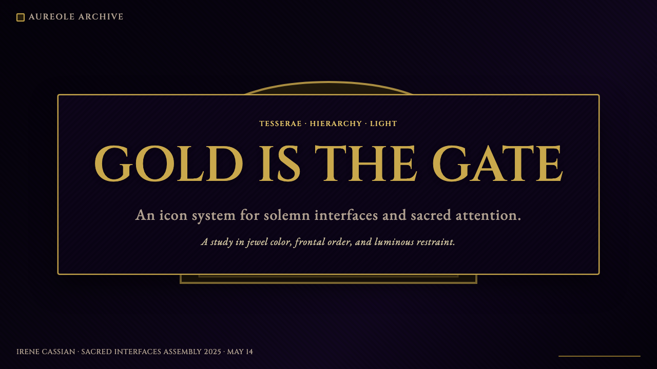
Byzantine Mosaic is among the most dramatic and emotionally potent historical styles available to contemporary designers, but it requires genuine commitment rather than surface borrowing. The style's authority depends on the coherence of its entire system: the gold ground as the primary field, the jewel-tone palette deployed sparingly against it, the hierarchical scale of elements, the arch-framed symmetry, and the inscriptional weight of the typography. Applying only the gold color without the frontal stillness and the structural hierarchy produces pastiche, not presence.拜占庭马赛克是当代设计师可取用的最具戏剧性与情感力量的历史风格之一,但它需要真正的投入,而非表面的借用。这种风格的权威性依赖于其整套体系的连贯性:金色底面作为首要场域,宝石色板克制地铺陈其上,元素的层级尺度,拱券框架的对称,以及字体排印的碑刻分量。仅仅采用金色而没有正面的静默与结构性的层级,只会产生仿制品,而非临在感。
For presentation slides, Byzantine Mosaic works with exceptional power on cover slides and chapter dividers. A cover built in this style uses a deep gold or richly saturated amber ground as the full-bleed background, with the title set in wide-tracked Roman capitals — large, centered, and treated as inscription rather than headline. Supporting text should be minimal and set at a smaller scale, placed symmetrically below the title. Figurative or architectural imagery, if used, should be flat, frontal, and placed within an arch-framed or circular medallion panel. Content slides benefit from adopting the hierarchical scale principle: primary headings at the scale of a declaration, secondary text significantly smaller, no decorative dividers — the gold ground itself provides the unifying field.对于演示文稿,拜占庭马赛克在封面幻灯片与章节分隔页上具有格外强大的效果。以这种风格构建的封面,将深金色或饱和浓郁的琥珀色底面作为满幅背景,标题以宽字距罗马大写字母排版——尺寸大、居中对齐,作为铭文而非标题处理。辅助文字应最少化,以更小的尺寸在标题下方对称排列。若使用具象或建筑图像,应是平面、正面的,置于拱形框架或圆形徽章面板之内。内容幻灯片适合采用层级尺度原则:主标题达到宣言的尺度,二级文字显著更小,无装饰性分割线——金色底面本身提供统一的场域。
For web interfaces, this style suits contexts where authority, reverence, and depth are desired — luxury goods, cultural institutions, premium editorial platforms, or any brand positioning itself as historically grounded or deeply considered. Dashboard applications in this style should use a warm, deep ground color as the primary surface, with interactive elements — buttons, cards, selected states — distinguished by jewel-tone accents rather than flat utility colors. Navigation should be centered and symmetrical, with the brand mark treated as a sacred seal rather than a wordmark. Pricing pages take on the quality of a tiered sacred hierarchy: each tier named with a single authoritative word, differentiated by scale and ornamental detail rather than color alone.对于网页界面,这种风格适合需要权威感、庄重感与深度的场景——奢侈品、文化机构、高端编辑平台,或任何将自身定位为历史根基深厚或深思熟虑的品牌。这种风格的仪表板应用,以温暖的深色底面色作为主要界面,交互元素——按钮、卡片、选中状态——以宝石色调点缀加以区分,而非使用平淡的功能色。导航应居中对称,品牌标志作为神圣印章而非文字标识处理。定价页面呈现出分层神圣层级的品质:每一等级以单一权威词命名,通过尺度与装饰细节加以区分,而非仅靠颜色。
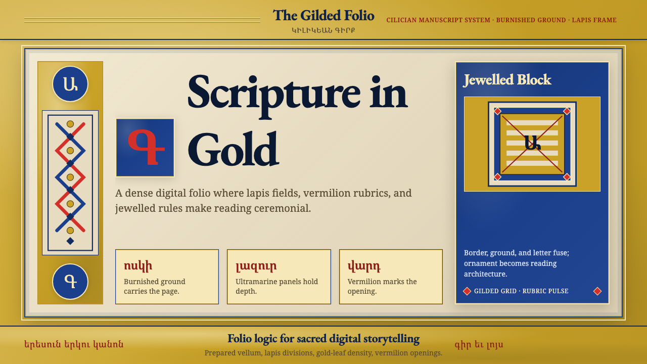
For editorial and marketing work, Byzantine Mosaic brings a quality of timelessness and gravitas that is rare in contemporary design. A magazine spread or long-form article in this style uses the gold or deep amber ground for full-bleed section headers, with the body text set against a much lighter or near-white field for readability. Pull quotes are treated as inscriptions — centered, wide-tracked, set at a scale that commands the page. Marketing materials, particularly for heritage brands, cultural events, or luxury launches, work well with arch-framed hero images, tessellated or mosaic-inspired background textures in the secondary design elements, and a typographic system that reads as carved rather than printed.对于编辑与营销内容,拜占庭马赛克带来一种当代设计中罕见的永恒感与庄重感。这种风格的杂志跨页或长篇文章,将金色或深琥珀色底面用于满幅章节标题,正文设置在亮度更高或接近白色的底面上以保证可读性。引言摘录作为铭文处理——居中、宽字距、以主导页面的尺度排版。营销物料,尤其是遗产品牌、文化活动或奢侈品发布的物料,适合使用拱形框架的主图,在次要设计元素中融入镶嵌或马赛克灵感的背景肌理,以及读起来像凿刻而非印刷的字体排印体系。
The most common mistake when applying Byzantine Mosaic is treating the gold as background decoration rather than as the primary field. In authentic Byzantine work, the gold is the subject — every other element exists within it. A layout that uses gold as a border, an accent stripe, or a hover state has inverted the logic of the system. The second common error is mixing the deep saturated jewel tones with lighter or more neutral colors in ways that dissolve the palette's intentional richness. A Byzantine-derived palette should feel like stained glass, not like a pastel gradient. Third: the style depends on stillness and symmetry — introducing casual asymmetry, playful scale variation, or informal typographic choices collapses the sense of hieratic authority that makes the style distinctive.应用拜占庭马赛克时最常见的错误,是将金色作为背景装饰而非首要场域处理。在真实的拜占庭作品中,金色是主体——所有其他元素都存在于其中。将金色用作边框、点缀条纹或悬停状态的版面,已经颠覆了这套体系的逻辑。第二个常见错误,是将深饱和宝石色调与更浅或更中性的颜色混合,以至于消解了色板刻意的浓郁感。拜占庭衍生的色板应该像彩绘玻璃,而非柔和渐变。第三:这种风格依赖于静默与对称——引入随意的不对称、轻松的尺度变化或非正式的字体选择,会瓦解使这种风格独特的层级权威感。
See the Byzantine Mosaic / Icon design system查看 Byzantine Mosaic / Icon 完整设计系统
Byzantine Mosaic / Icon — FAQByzantine Mosaic / Icon · 常见问题
Is Byzantine Mosaic the same as Byzantine Icon painting?拜占庭马赛克与拜占庭圣像画是同一回事吗?
They are closely related but distinct media with the same underlying visual theology. Mosaic is an architectural medium — tesserae of glass, stone, and gold leaf set into wet plaster on walls, vaults, and apses. Icon painting is a portable medium — egg-tempera pigments applied to prepared wooden panels. Both systems use the gold ground, the frontal hieratic figure, the jewel-tone palette, and the inscriptional text, but mosaic is monumental and fixed, while icons are intimate and portable. For design purposes, the combined tradition is treated as a single visual system because the formal principles are shared: it is the architecture of meaning, not the physical medium, that defines the style.两者关系密切,但是拥有相同底层视觉神学的不同媒介。马赛克是建筑媒介——将玻璃、石材与金箔镶嵌片嵌入墙壁、穹顶与后殿的湿灰泥中。圣像画是便携媒介——蛋彩颜料涂绘于处理过的木板上。两种体系都使用金色底面、正面层级人物、宝石色板与碑刻文字,但马赛克是纪念碑式且固定的,而圣像是私密且可移动的。在设计用途上,合并的传统被视为单一视觉体系,因为形式原则是共享的:定义这种风格的是意义的架构,而非物理媒介。
Can this style work on a light or white background, or does it require the gold ground?这种风格能用于浅色或白色背景吗,还是必须使用金色底面?
The gold ground is the defining architectural element of the Byzantine system — removing it fundamentally changes the style's character. That said, there are legitimate reduced applications. A light-mode interface can use a warm ivory or parchment ground instead of deep gold, with gold reserved for structural accents, borders, and selected states. The jewel-tone palette and the frontal, arch-framed compositional logic can function against pale grounds and still read as Byzantine-derived. What the style cannot survive is a cold white or neutral grey background — these grounds dissolve the warmth and sacred gravity that the system depends on. If a light background is required, lean warm: the ground should feel like aged vellum or sunlit marble, not a digital default.金色底面是拜占庭体系的决定性建筑元素——去除它从根本上改变了这种风格的性格。话虽如此,仍存在合理的简化应用。浅色模式界面可以用温暖的象牙色或羊皮纸色底面代替深金色,将金色保留给结构性点缀、边框与选中状态。宝石色板以及正面、拱形框架的构图逻辑,在浅色底面上仍能有效运作,读起来仍有拜占庭衍生的感觉。这种风格无法承受的,是冷白色或中性灰色背景——这些底面会消解这套体系所依赖的温暖感与神圣庄重感。如果必须使用浅色背景,请偏暖处理:底面应该像陈年羊皮纸或阳光下的大理石,而非数字默认值。
How do I use Byzantine Mosaic without making it feel costume-like or theatrical?如何运用拜占庭马赛克而不让它显得像戏服或过于戏剧化?
The risk of theatricality comes from decorative excess — using Byzantine motifs as surface ornament without committing to the underlying structural logic. Authentic Byzantine work achieves solemnity through restraint within richness: the palette is saturated but few colors are used; the gold is pervasive but not varied; the compositions are symmetrical but not busy. To avoid costume-effect, commit fully to one or two Byzantine principles — the gold ground and inscriptional typography, for instance — and apply them with discipline across an otherwise restrained design system. The moment you start adding mosaiced borders, arch-shaped decorative elements, and jewel-tone gradients simultaneously, the design tips into pastiche. One deep principle, rigorously applied, reads as authority; many surface motifs applied loosely read as imitation.戏剧化风险源于装饰性过剩——将拜占庭母题用作表面装饰而不投入底层结构逻辑。真实的拜占庭作品通过在丰富中保持克制来达到庄严:色板饱和但颜色极少;金色无处不在但变化极少;构图对称但不繁杂。为避免戏服效应,请完全投入一两个拜占庭原则——比如金色底面与碑刻式字体排印——并以纪律贯穿于其他方面保持克制的设计体系中。一旦你开始同时叠加马赛克边框、拱形装饰元素与宝石色渐变,设计就会滑向仿制品。一个深层原则被严格应用,读起来是权威;许多表面母题被松散应用,读起来是模仿。
What contexts are a poor fit for Byzantine Mosaic?哪些场景不适合使用拜占庭马赛克?
Byzantine Mosaic is poorly suited to any context requiring approachability, playfulness, speed, or informality. The style is inherently slow — it asks the viewer to stop, look, and be in the presence of something weighted and deliberate. Startup products, social apps, children's platforms, fast-food brands, sports applications, and any context built around energy and momentum will find the style's gravity oppressive rather than powerful. Similarly, functional utility applications — forms, task managers, workflow tools — need the kind of typographic and spatial informality that Byzantine visual logic specifically refuses. The style performs best when the product itself is positioned as rare, considered, and deserving of the viewer's full attention: luxury, cultural heritage, ceremonial, or archival contexts.拜占庭马赛克不适合任何需要亲切感、活泼感、速度感或非正式感的场景。这种风格本质上是缓慢的——它要求观者停下来,凝视,并在某种有分量、有意味的事物面前临在。初创产品、社交应用、儿童平台、快餐品牌、体育应用,以及任何以能量与动势为核心构建的场景,都会发现这种风格的庄重感压迫而非强大。同样,功能性实用应用——表单、任务管理器、工作流工具——需要一种拜占庭视觉逻辑明确拒绝的字体与空间非正式感。这种风格在产品本身被定位为稀少、审慎、值得观者全情关注时表现最佳:奢侈品、文化遗产、典礼或档案类场景。
How does Byzantine Mosaic relate to Art Nouveau or other ornamental styles?拜占庭马赛克与新艺术运动或其他装饰性风格有什么关系?
They are superficially related — both use richly saturated color, intricate surface patterning, and architectural framing — but structurally opposite. Art Nouveau is organic, sinuous, and naturalistic in its references, drawing on plant forms, flowing hair, and the curved line as a value in itself. Byzantine Mosaic is frontal, geometric, and theological in its references, drawing on the flat gold ground, the symmetrical arch, and the hieratic figure. Art Nouveau decoration is applied to surfaces; Byzantine visual logic is the surface. The two styles are occasionally confused because both feel opulent and deliberate, but Art Nouveau is sensuous and earthly where Byzantine is sacred and transcendent. Mixing elements of both — organic curves with gold grounds, flowing naturalistic figures in hieratic poses — produces visual incoherence rather than synthesis.两者表面上有关联——都使用高度饱和的色彩、精密的表面图案与建筑式框架——但在结构上截然相反。新艺术运动是有机的、曲线的,其参照是自然主义的,汲取植物形态、流动的发丝,以曲线本身为价值。拜占庭马赛克是正面的、几何的,其参照是神学性的,汲取平面金色底面、对称拱券与层级人物。新艺术运动的装饰被施加于表面;拜占庭视觉逻辑本身就是表面。这两种风格偶尔被混淆,因为两者都感觉华美而刻意,但新艺术运动是感官性的、世俗的,而拜占庭是神圣的、超越的。混合两者的元素——有机曲线与金色底面,流动的写实人物置于层级姿态中——产生的是视觉上的不连贯而非综合。
Related design styles相关设计风格
 Armenian Illuminated ManuscriptGilded maximalism. Burnished gold, lapis frames, and vermilion initials build…鎏金极繁。金箔底、青金框与朱砂首字构成密实书页。
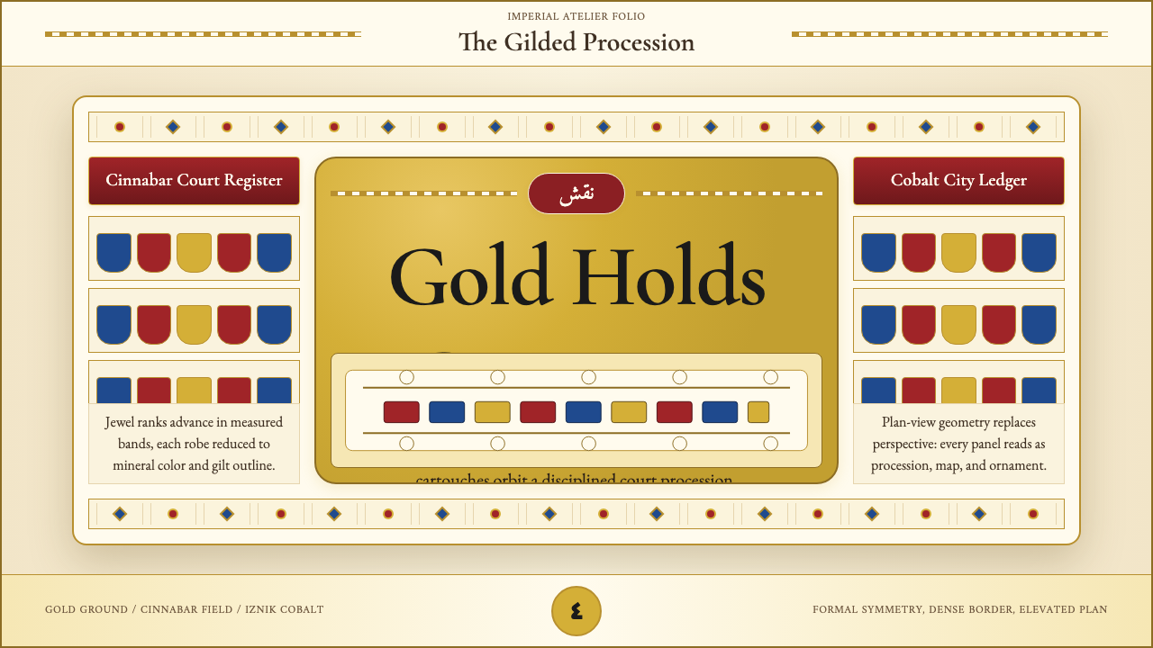 Ottoman Court Miniature (Topkapı)Ceremony made dense. Gold ground, cinnabar cartouches, cobalt procession geom…仪式感被压密:金底、朱砂题框与钴蓝游行几何。
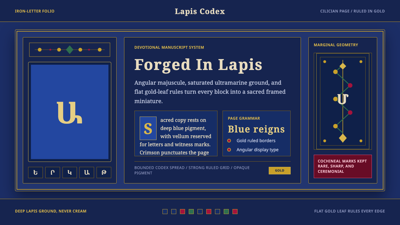 Armenian ErkatʿagirDevotional lapis reigns. Gold rules and angular serif glyphs frame a sacred g…虔敬青金石主宰:金色线框与棱角字形围合神圣网格。
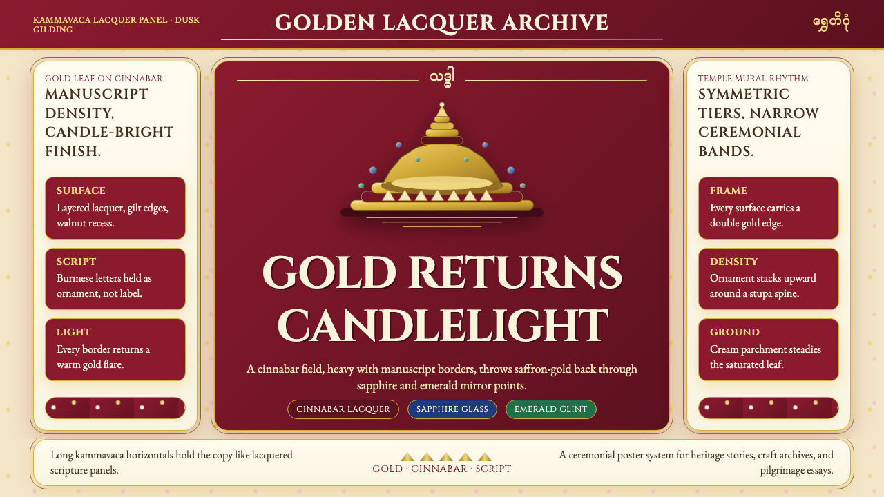 Burmese Shwedagon Gold-LacquerOpulence catches fire. Gold-leaf gradients on cinnabar panels frame a stupa s…虔诚的金色密度:朱漆面板上的金箔渐变,围出佛塔中轴。
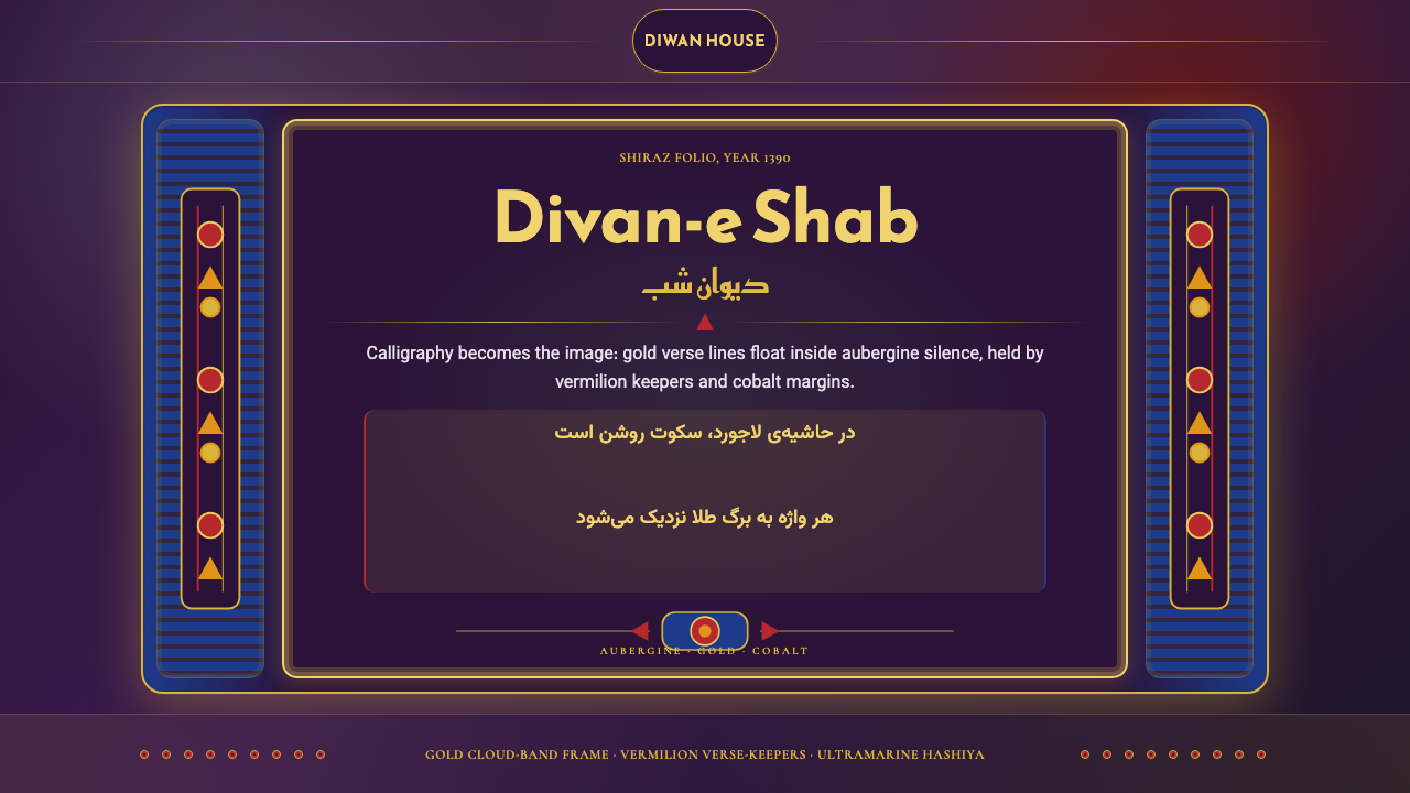 Iranian Shiraz Poetry Divan 1390Midnight manuscript glow. Aubergine fields, gold Kufi type, cobalt margins.午夜手稿般发光:茄紫底、金色库法体、钴蓝边框。
 Jordanian Petra Rose NabataeanGeology feels monumental. Crevice umbra, rose strata, and Cinzel capitals car…地质感如纪念碑。暗峡底、玫瑰岩层与Cinzel碑铭体凿出页面。